Чтобы создать в Word форму, которую могут заполнить другие, начните с шаблона или документа и добавьте элементы управления содержимым. К таким элементам относятся, например, флажки, текстовые поля, элементы выбора даты и раскрывающиеся списки. Если вы знакомы с базами данных, вы можете даже связывать элементы управления содержимым с данными.
Отображение вкладки «Разработчик»
Если вкладка «Разработчик» не отображается на ленте, см. раздел Отображение вкладки «Разработчик».
Откройте шаблон или пустой документ, на основе которого будет формироваться форма.
Для экономии времени начните с шаблона формы или начните с нуля с пустого шаблона.
-
Перейдите к пункту Файл > Новый.
-
В поле Поиск шаблонов в сети введите Формы или тип нужной формы и нажмите клавишу ВВОД.
-
Выберите шаблон формы, а затем выберите Создать или Скачать.
-
Перейдите к пункту Файл > Новый.
-
Выберите Пустой документ.
Добавьте содержимое в форму
Перейдите в раздел Разработчик и выберите элементы управления для добавления в документ или форму. Чтобы удалить элемент управления содержимым, выберите его и нажмите кнопку DELETE. После вставки свойств элементов управления можно настроить свойства.
Примечание: Форму с элементами управления содержимым можно распечатать, однако поля вокруг них напечатаны не будут.
В элементе управления содержимым «форматированный текст» пользователи могут выделять текст полужирным шрифтом или курсивом, а также вводить несколько абзацев текста. Чтобы ограничить возможности пользователей, вставьте элемент управления содержимым «обычный текст».
-
Щелкните или коснитесь места, куда вы хотите вставить элемент управления.
-
Выберите Разработчик > Управление содержимым форматированного текста
или Управление содержимым обычного текста
.
Чтобы задать определенные свойства элемента управления, см. раздел Установка или изменение свойств элементов управления содержимым.
Элемент управления «рисунок» часто используется в шаблонах, однако его можно добавить и в форму.
-
Щелкните или коснитесь места, куда вы хотите вставить элемент управления.
-
Выберите Разработчик > Управление содержимым изображений
.
Чтобы задать определенные свойства элемента управления, см. раздел Установка или изменение свойств элементов управления содержимым.
Используйте стандартные блоки, когда хотите предоставить пользователям возможность выбрать определенный блок текста. Например, элементы управления стандартными блоками полезны, когда вам нужно добавить другой шаблонный текст в зависимости от конкретных требований контракта. Вы можете создать для каждого варианта элемент управления содержимым «форматированный текст» и поместить их все в элемент управления «стандартный блок», который будет служить контейнером.
-
Щелкните или коснитесь места, куда вы хотите вставить элемент управления.
-
Перейдите в раздел РазработчикЭлемент управления содержимым галереи стандартных блоков
(или Элемент управления содержимым стандартных блоков).
-
Выберите Разработчик и элементы управления содержимым для стандартного блока.
-
Щелкните или коснитесь места, куда вы хотите вставить элемент управления.
Чтобы задать определенные свойства элемента управления, см. раздел Установка или изменение свойств элементов управления содержимым.
В поле со списком пользователи могут выбрать один из предложенных вами пунктов или ввести собственный вариант. В раскрывающемся списке пользователи могут только выбрать один из имеющихся пунктов.
-
Перейдите в раздел Разработчик > Управление содержимым поля со списком
или Управление содержимым раскрывающегося списка
.
-
Выберите элемент управления содержимым, а затем выберите Свойства.
-
Чтобы создать список вариантов, выберите Добавить в разделе Свойства раскрывающегося списка.
-
Введите вариант в поле Отображаемое имя, например Да, Нет или Возможно.
Повторяйте этот шаг до тех пор, пока все нужные вам значения не окажутся в раскрывающемся списке.
-
При необходимости задайте остальные свойства.
Примечание: Если установить флажок Содержимое нельзя редактировать, пользователи не смогут изменять выбранные пункты.
-
Щелкните или коснитесь того места, где вы хотите вставить элемент управления выбора даты.
-
Выберите Разработчик > Управление содержимым средства выбора даты
.
Чтобы задать определенные свойства элемента управления, см. раздел Установка или изменение свойств элементов управления содержимым.
-
Щелкните или коснитесь того места, где вы хотите вставить элемент управления «флажок».
-
Выберите Разработчик > Элемент управления содержимым «флажок»
.
Чтобы задать определенные свойства элемента управления, см. раздел Установка или изменение свойств элементов управления содержимым.
Элементы управления формы прежних версий предназначены для совместимости с предыдущими версиями Word и состоят из традиционной формы и элементов управления Active X.
-
Щелкните или коснитесь того места, где вы хотите вставить традиционный элемент управления.
-
Перейдите в раскрывающийся список Разработчик > Формы прежних версий
.
-
Выберите нужный элемент управления в разделе Формы предыдущих версий или Элементы ActiveX.
Установка или изменение свойств элементов управления содержимым
У каждого элемента управления содержимым есть параметры, которые можно установить или изменить. Например, для элемента управления «Выбор даты» вы можете выбрать различные форматы отображения даты.
-
Выберите элемент управления содержимым, который вы хотите изменить.
-
Перейдите в раздел Разработчик > Свойства.
-
Измените нужные свойства.
Добавить защиту формы
Если вы хотите ограничить возможности редактирования или форматирования формы пользователями, воспользуйтесь командой Ограничить редактирование.
-
Откройте форму, которую хотите заблокировать или защитить.
-
Выберите Разработчик > Ограничить правку.
-
После выбора ограничений выберите Да, начать применение защиты.
Дополнительный совет:
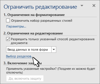
Если вы хотите защитить только части документа, разделите его на разделы и защитите только определенные разделы.
Для этого выберите Выбрать разделы на панели Ограничить правку. Дополнительные сведения о разделах см. в разделе Вставка разрыва раздела.
Отображение вкладки «Разработчик»
Если вкладка «Разработчик» не отображается на ленте, см. раздел Отображение вкладки «Разработчик».
Откройте шаблон или используйте пустой документ
Чтобы создать в Word форму, которую могут заполнить другие, начните с шаблона или документа и добавьте элементы управления содержимым. Элементы управления содержимым включают в себя такие элементы, как флажки, текстовые поля и раскрывающиеся списки. Если вы знакомы с базами данных, вы можете даже связывать элементы управления содержимым с данными.
-
Выберите Файл > Создание из шаблона.
-
В области поиска введите форму.
-
Дважды щелкните нужный шаблон.
-
Выберите Файл > Сохранить как, и выберите место для сохранения формы.
-
В области Сохранить как введите имя файла и выберите Сохранить.
-
Перейдите в раздел Файл > Новый документ.
-
Выберите Файл > Сохранить как.
-
В области Сохранить как введите имя файла и выберите Сохранить.
Добавьте содержимое в форму
Перейдите в раздел Разработчик и выберите элементы управления для добавления в документ или форму. Чтобы удалить элемент управления содержимым, выберите его и нажмите кнопку DELETE. Вы можете установить параметры для элементов управления после вставки. В меню «Параметры» можно добавить макросы входа и выхода для запуска при взаимодействии пользователей с элементами управления, а также элементы списка для полей со списком,
-
В документе щелкните или коснитесь того места, где нужное добавить элемент управления содержимым.
-
В разделе Разработчик выберите Текстовое поле, Флажок или Поле со списком.
-
Чтобы задать определенные свойства для элемента управления, выберите Параметры, и настройте .
-
Повторите шаги 1–3 для каждого из элементов управления, который хотите добавить.
Параметры позволяют устанавливать общие параметры, а также управлять конкретными параметрами. Выберите элемент управления, а затем выберите Параметры, чтобы настроить или внести изменения.
-
Установите общие свойства.
-
Выбор макроса для запуска позволяет выбрать записанный или пользовательский макрос для запуска при Входе илиВыходе из поля.
-
Закладка Укажите уникальное имя или закладку для каждого элемента управления.
-
Вычислять при выходе Это заставляет Word запускать или обновлять любые вычисления, такие как общая стоимость, когда пользователь выходит из поля.
-
Добавить текст справки Предоставьте подсказки или инструкции для каждого поля.
-
ОК Сохраняет параметры и закрывает панель.
-
Отмена Забывает изменения и закрывает панель.
-
-
Установите определенные свойства для текстового поля
-
Тип Выберите форму «Обычный текст», «Число», «Дата», «Текущая дата», «Текущее время» или «Вычисление».
-
Текст по умолчанию задает необязательный текст инструкций, отображаемый в текстовом поле до ввода пользовательского текста в поле. Установите включенное текстовое поле, чтобы разрешить пользователю вводить текст в поле.
-
Максимальная длина устанавливает длину текста, который может ввести пользователь. Значение по умолчанию — Не ограничено.
-
Формат текста может указывать, будет ли текст автоматически форматироваться в верхнем регистре, нижнем регистре, с первой заглавной буквой, или в заглавном регистре.
-
Текстовое поле включено Позволяет пользователю вводить текст в поле. Если есть текст по умолчанию, пользовательский текст заменяет его.
-
-
Задайте определенные свойства для флажка.
-
Значение по умолчанию Выберите между Не отмечено или Отмечено по умолчанию.
-
Размер флажка Установите размер Точно или Автоматически, чтобы изменять размер по мере необходимости.
-
Флажок включен Позволяет пользователю пометить или очистить текстовое поле.
-
-
Установите определенные свойства для поля со списком
-
Элемент раскрывающегося меню Введите строки для элементов списка. Нажмите + или ВВОД, чтобы добавить элемент в список.
-
Элементы в раскрывающемся списке Отображает текущий список. Выберите элемент и используйте стрелки вверх или вниз, чтобы изменить порядок. Нажмите — чтобы удалить выбранный элемент.
-
Раскрывающееся меню включено Позволяет пользователю открыть поле со списком и сделать выбор.
-
-
Перейдите в раздел Разработчик > Защита формы.
Примечание: Чтобы снять защиту с формы и продолжить правку, снова выберите Защитить форму.
-
Сохраните и закройте форму.
При необходимости вы можете проверить форму, прежде чем распространять ее.
-
Защитите форму.
-
Откройте форму еще раз, заполните ее обычным способом и сохраните как копию.
Отображение вкладки «Разработчик»
-
В правой части ленты выберите
, а затем выберите Параметры ленты.
-
В разделе Настройка, выберите Разработчик .
Откройте шаблон или документ, на основе которого будет формироваться форма
Вы можете можно начать работу с пустого документа и создать собственную форму с нуля. Чтобы сэкономить время, можно использовать шаблон.
-
Выберите Файл > Создание из шаблона.
-
На левой панели разверните Веб-шаблоны и выберите Формы.
-
Дважды щелкните шаблон формы, который нужно использовать.
Добавление элементов управления содержимым в форму
-
В документе щелкните место, куда нужно добавить элемент управления содержимым.
-
На вкладке Разработчик в разделе Элементы управления формой выберите Текстовое поле, Флажок, или Поле со списком.
-
Чтобы задать определенные свойства для элемента управления, выберите Параметры и настройте нужные свойства.
Примечание: Чтобы составить раскрывающийся список для поля со списком, выберите заполнитель поля, щелкните Параметры и добавьте в список нужные пункты.
-
Повторите шаги 1–3 для каждого из элементов управления, который хотите добавить.
Добавьте пояснительный текст (необязательно)
Пояснительный текст (например, «введите имя») в текстовом поле позволит сделать форму более удобной. По умолчанию текстовое поле остается пустым, но вы можете добавить в него текст.
-
Выберите элемент управления текстовым полем, к которому нужно добавить пояснительный текст.
-
На вкладке Разработчик в разделе Элементы управления формой выберите пункт Настройки.
-
В поле Текст по умолчанию введите текст инструкции.
-
Проверьте, выбран ли пункт включить заливку, и выберите ОК.
Защитите форму.
-
На вкладке Разработчик в разделе Элементы управления формой выберите Защитить форму.
Примечание: Чтобы снять защиту формы и продолжить редактирование, щелкните Защита формы еще раз.
-
Сохраните и закройте форму.
Проверка формы (необязательно)
При необходимости вы можете проверить форму, прежде чем распространять ее.
-
Защитите форму.
-
Откройте форму еще раз, заполните ее обычным способом и сохраните как копию.
Создание заполняемых форм недоступно в Word в Интернете.
Вы можете создать форму в настольной версии Word, следуя инструкциям в разделе Создание заполняемой формы.
Когда вы сохраните документ и откроете его в Word в Интернете, то увидите внесенные изменения.
В случае, если вам необходимо создать документ Word для заполнения другими людьми, например, создать анкету участника конференции, чтобы упростить процесс, вы можете создать форму для заполнения в Microsoft Word. Форма в ворде позволяет создавать заполнители для различных типов информации, таких как текст, дата, да-нет вопросы и т. д.
Включение вкладки «Разработчик»
Прежде чем перейти к созданию формы в ворде, вам нужно активировать вкладку «Разработчик» на ленте. Для этого нажмите «Файл» —> «Параметры», чтобы открыть диалоговое окно «Параметры Word». Выберите «Настроить ленту», затем установите флажок для вкладки «Разработчик».
Создание формы в Word – Параметры Word
Теперь на ленте появится вкладка «Разработчик».
Создание формы в Word – Вкладка Разработчик
Добавление полей формы в ворде
Теперь мы готовы перейти к созданию формы в ворде. Для этого мы будем использовать разнообразные поля, которые будут являться составляющими нашей будущей формы для заполнения в ворде.
Чтобы добавить поле формы для заполнения, поместите курсор в нужное место, затем выберите необходимый элемент из группы «Элементы управления» на вкладке «Разработчик». Вы можете навести указатель мыши на поля, чтобы увидеть различные параметры. В этом примере мы добавляем текстовое поле, чтобы пользователи могли вводить свои имена.
Создание формы в Word – Элементы управления для создания формы в ворде
В документе появится тестовое поле:
Создание формы в Word – Текстовое поле
Вы можете добавить несколько типов полей для создания формы в ворде. Например, вы можете добавить флажок для выбора:
Создание формы в Word – Поле «флажок»
Или даже поле выбора даты:
Создание формы в Word – Поле для выбора даты
После того, как вы добавили все поля в документ, ваша форма в ворде готова, и вы можете отправлять ее другим пользователям!
Настройка полей формы в ворде
Если вы хотите еще больше контролировать способ отображения полей своей формы в ворде, вы можете включить «Режим конструктора» в группе «Элементы управления» на вкладке «Разработчик».
Создание формы в Word – Режим конструктора
Затем вы можете изменить свойства для каждого поля вашей формы в ворде, включая текст, который будет отображаться в каждом поле. Если вы готовы потратить немного времени на настройку каждого поля, вы можете создать довольно прочную форму. Например, вы можете создать в своей форме заполнения собственный выпадающий список, как в приведенном ниже примере:
Создание формы в Word – Использование выпадающего списка в форме
В итоге в нашем примере, мы получили следующую форму для заполнения в ворде:
Создание формы в Word – Пример формы для заполнения в ворде
В этой статье мы рассмотрели основы создания формы в ворде. Теперь вы можете с легкостью создать собственную форму для заполнения в Microsoft Word.
156
156 people found this article helpful
How to Create a Fillable Form In Word for Windows
Use Word to make custom interactive forms
Updated on January 3, 2021
What to Know
- To add a fillable object, place the cursor where you want it and go to Developer tab > control type > click on page.
- To add the Developer tab, go to File > Options > Customize Ribbon > Main Tab > Developer > OK.
This article explains how to create a fillable form document in Word for Microsoft 365, Word 2019, 2016, 2013, and 2010.
How to Add the Developer Tab in Microsoft Word
The form data you create can include the option to choose a date, mark a checkbox, select Yes or No, and more. Before you can configure these controls, you must add the Developer tab to Microsoft Word as they are called. You can create and configure any form data using this tab.
-
Select File from the top menu.
-
Then, choose Options.
-
Select Customize Ribbon.
-
In the right pane of the dialog of Customize Ribbon part, choose Main Tabs.
-
Check the box for Developer.
-
Press OK.
How to Create a Fillable Form in Word with a Checkbox
There are several types of fillable form options in Word. These are called “Controls”. The options are in the Controls group on the Ribbon. You can include a checkbox, date selection box, a combo box with choices you create, drop-down lists, and more. These controls are on the Developer tab.
To create a basic fillable form in Word by providing a checkbox:
-
Type the text to apply the checkbox. Examples include:
- “Opt into promotional emails”.
- “I agree to the terms stated in this document”.
- “I have completed all tasks”.
-
Select the Developer tab.
-
Place your cursor at the beginning of the sentence you’ve written.
-
Select the Check Box Content Control that adds a check mark. (It has a blue checkmark on it.)
-
Choose somewhere else in the document to apply it.
To remove any fillable entry, right-click it and choose Remove Content Control. Then use the Delete key on the keyboard to delete anything remains. In some instances simply clicking Delete will suffice.
How to Make a Form in Word with a Date Control
You add a Date Control from the Developer tab to enable users to select a date from a pop-up calendar that appears when they click the control.
To add a Date Control fillable form entry:
-
Place your cursor in the document where you’d like to add the Date Control.
-
Select the Developer tab.
-
Choose the Date Picker Content Control entry for inserting a date control.
-
Select somewhere outside the new entry to apply it.
How to Make a Form in Word for a Combo Box
If you want to have users choose something from a list that you provide, you use a Combo Box. After you create the box using the Developer tab options, you then access the Properties options for it to enter the available choices. In this example you will create a drop-down list for a party invitation, with options including Yes, No, Maybe.
To create a Combo Box to Make a Form in Word:
-
Write a sentence that will precede the options you’ll provide. Examples include:
- “Will you attend the party?”
- “Will you be bringing a dish to the party”
-
Select the Developer tab.
-
Place the cursor in the document where you want the options to appear.
-
Select the Combo Box Content Control icon. (It’s generally located to the right of the blue checkbox icon.)
-
On the Developer tab, in the Controls section, choose Properties.
-
Press Add.
-
Type Yes, and press OK.
-
Press Add.
-
Type No, and press OK.
-
Press Add again.
-
Type Maybe, and press OK.
-
Make any other changes (if desired).
-
Press OK.
-
Select somewhere outside the box to apply it; select inside the box to see how it works.
There are other types of form options you can create in Word. When experimenting with these, you’ll generally work in this order:
-
Type an introductory sentence or paragraph.
-
Place the cursor where you want the new control to go.
-
Choose the control from the Controls group on the Developer tab (hover your mouse over any control to see its name).
-
If applicable, select Properties.
-
Configure properties as necessary for the control you’ve selected.
-
Press OK.
Thanks for letting us know!
Get the Latest Tech News Delivered Every Day
Subscribe
A simple registration form already comes by default with WordPress. However, with the right tools, advanced customizations are plentiful, whether you add a logo to the form or include that form on a more public page.
Each website requires a different version of the user registration module and that’s why it’s important to learn how to add and manage a custom WordPress registration form.
The good news is that a registration form comes in many shapes and styles. You have the option to build and manage a custom WordPress registration form with a user registration plugin, adding membership profiles and branding elements.
As an alternative, you may want to integrate with a third-party registration tool or stick to the basics and slightly customize the default registration module from WordPress.
Regardless of your needs and desires for a custom WordPress registration form, various solutions are available for activating more simplistic registration forms, or advanced login and registration pages with features for user messaging and logging in with social media accounts.
Keep reading to learn more about user registration in general and the basics behind adding a new, and fully customizable, WordPress registration form to your website.
Create a ✨ fully customized ✨ WordPress registration form quickly and easily with this guide👇Click to Tweet
What Is User Registration?
User registration is the simple process of a website visitor creating an account on your website.
This registration, or sign up, involves a new customer on a site like an ecommerce store, or a member joining a forum, or a reader registering on a blog, just to name a few.
The user registration process requires a person to type in some sort of contact information to make an account. Sometimes it’s as simple as creating a username and password. However, it’s more common to at least have an email address field to ensure that a password recovery process is possible.
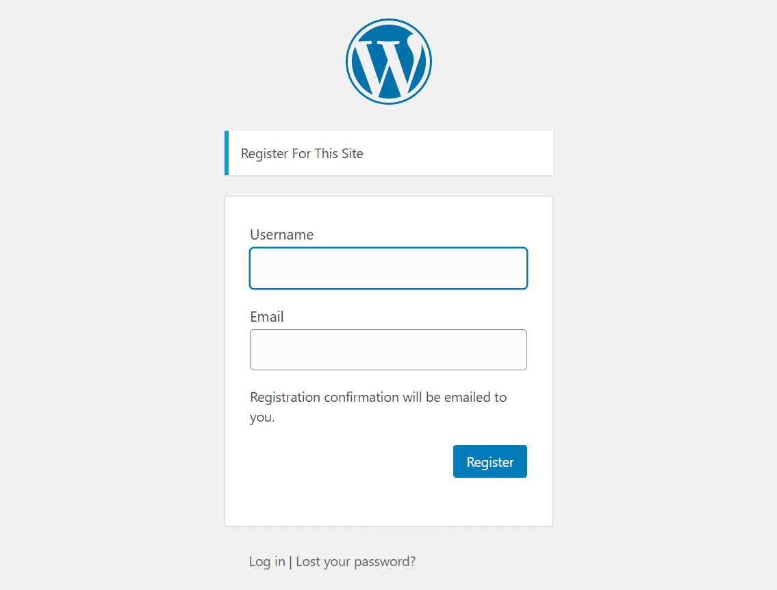
The standard WordPress registration page asks for a username and email. After that, a password is requested.
As an alternative, you may find far more extensive user registration forms, with fields asking for information like gender, address, or birthdate. It’s not uncommon to see in-depth forms like this from places like dating sites or social networks. Even sites like Netflix offer optional user registration questions to hone in on the types of videos you like to watch.
A user registration form isn’t necessary if you’re not offering anything special to those users or if you’re uninterested in managing a user database. However, a website visitor is a rather valuable part of running an online business, so it’s often better to figure out reasons to have users.
User registration also opens up possibilities for setting user roles, where some users have different capabilities or access to your site compared to others.
In general, a user registration module tends to lead the person to an online space for that user to understand their standing and activity on your site. A site like eBay, for example, shows past bids and purchases in the user profile. And this is only possible if someone walks through the user registration form to make that profile area.
Now that we’ve talked about the basics of user registration, and the function it serves, keep reading to learn about why you may consider adding a WordPress user registration form to your site.
Advantages of WordPress Registration Forms
When building a site, you may wonder about the purpose of adding a WordPress registration form. Overall, a registration area shows visitors that they may find some sort of benefit from creating an account. Sometimes this means they’ll open up access to a forum, or maybe it lets them log all past purchases or interactions with other users.
Registration forms add value for the users making the accounts. As a bonus, the site owners gain significant returns in the form of organization and data collection.
The benefits are many, but here are the primary ones:
- Improved user organization, interaction, and feedback – Registered users submit a significant amount of information, allowing you to manage these users in a more controlled fashion. It also opens up options for reaching out to those site visitors and gaining valuable feedback to improve your site, instead of wondering who’s buying your products or reading your blog.
- Email list growth – As long as your user registration form asks for an email, you’re collecting data that’s useful in the future. Registered users join your email marketing program, making it easier for you to send out emails with coupons, new products, or blog posts.
- Custom data collection – A registration form doesn’t only have to ask for a name and email address. They work for diving deep into the user’s background. You can add custom fields that ask for anything from height and weight to specific preferences like their favorite book.
- Security for your site and users – User registration spam adds an unwanted level of clutter to a website, much of which requires deleting or filtering by site owners and moderators. A strong registration form boosts security and prevents unwanted members.
- Advanced user permission options – Registration has opportunities for you to set user permissions (sometimes called user types or roles,) allowing some user types to see certain content or take advantage of site functionality. Other user roles may have access to part of the site but not everything. This is particularly important for membership sites and operations where you have multiple site contributors, like authors and editors.
- A friendlier user experience – One of the main goals with user registration is to provide a consolidated area for individual users to check on their status as a user. These profiles improve the overall user experience by showing important information, such as past purchases or messaging with other users.
- Membership website building with profile management – A registration form comes in handy for constructing a full-fledged membership site, seeing as how it’s one of the primary features you offer with a membership website. Users enjoy managing their profiles, whether it’s on a social network, forum, or exclusive online course.
What’s the Best Way to Offer a Registration Form on WordPress?
There are technically hundreds of ways to add a registration form to your WordPress site. The way you go about designing your form makes each process entirely unique, especially once you start adding unique custom fields.
However, four primary methods exist for adding a user registration form, all of which are possible with the right knowledge and tools.
You can activate a registration module with the following methods:
- Turn on the built-in WordPress user registration functionality.
- Embed a WordPress user registration form with a third-party solution.
- Install a registration module with a WordPress plugin.
- Custom code a registration area.
The big question is, which of the methods is ideal for your situation?
It’s tricky to choose which path you should take, but your business format and feature-set desires do play a role in which one to consider:
- The default WordPress registration – This is the fastest and simplest method for incorporating user registration into your site. It’s not for those who need a custom or lengthy form for registration. The built-in WordPress registration stands out for smaller websites and blogs that only need to collect a name and email address. Keep in mind, design opportunities are limited with the default WordPress registration form.
- Embedding a third-party registration module – A separate software or app is integrated with your WordPress site. This process makes sense if you locate a registration form builder with your favorite features but lacking a WordPress plugin. A third-party form is sometimes more complicated than a plugin because you typically have to figure out how to install or display the registration module on your WordPress site, like with an embed code.
- Using a registration plugin – We like user registration plugins for two reasons. First of all, they eliminate the need for custom coding and messing with third-party tools. Second, solid plugins have long feature lists, making it easy for anyone to design and implement beautiful registration forms. So, plugins make sense for both beginners without coding knowledge and developers who crave an easier solution.
- Custom coding the registration form – This option is reserved for those organizations that require a completely unique interface for registering users. It’s also necessary to either have the resources to pay for a developer to make that custom form.
How to Create a WordPress Registration Form Without a Plugin
It’s possible to add a registration form to WordPress without having to seek out and install a new plugin. The reasoning for this approach varies, but in general, site owners can either opt for the built-in registration form from WordPress or consider a more advanced route with third-party software or custom coding.
We’ll cover the steps on how to approach each method.
Activating the Default User Registration Feature in WordPress
WordPress already provides a registration form and user management area when you install the Content Management System. The registration features aren’t necessarily turned on by default, so there are some steps to walk through in order to ensure that your site visitors have the ability to make an account.
Keep in mind that this version of a registration form is the bare minimum when it comes to designing forms for registration and login modules. However, it does the trick for blogs and smaller communities that only need to obtain users and give people a way to login with a username and password.
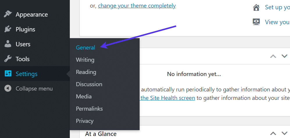
To begin, go to your WordPress dashboard.
Click on Settings > General.
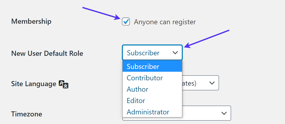
As you scroll down in the Settings, find the Membership heading. Check this box to ensure that anyone who comes to your site can register as a new user.
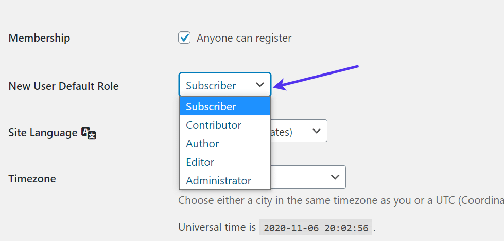
After that, modify the New User Default Role field so that each new user is assigned a role with permissions.
The Subscriber user role is the most common for members and customers. Contributors and Authors have access to some content creation tools, like blog posts, while the Editors can publish and the Administrators maintain control over every aspect of the website.
Be sure to save the changes.
This activation turns on a unique registration and login page for people to go to when they’d like to gain access to your website.
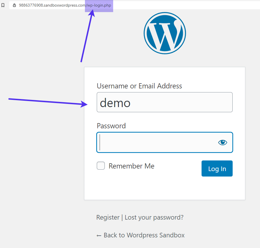
By default, the form is reachable at: myexamplewebsite.com/wp-login.php. It’s possible to change this URL, but all WordPress login and registration pages usually start with the wp-login.php subdirectory.
You should see a form that asks for the visitor to login with a username or email address, along with their password. The page also includes a link to register for the site, recover a forgotten password, and go back to the site’s homepage.
Now that you’ve activated user registration, it’s time to place a registration form on the frontend of the site.
The easiest way to install a registration form on WordPress is by adding a widget.
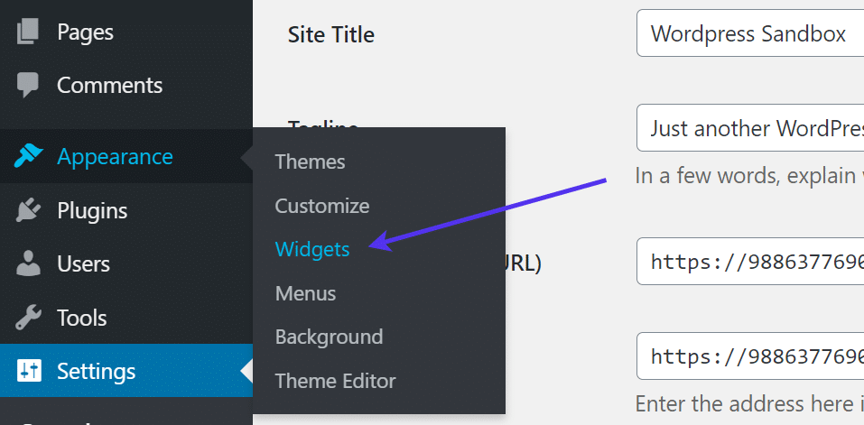
Go to Appearance > Widgets in the WordPress dashboard.
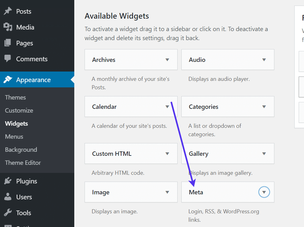
The list of Available Widgets shows several options to choose from, including custom HTML, images, and a Meta widget. These widgets are all provided by default in WordPress, so you don’t have to install anything else.
Look for the Meta widget. It activates a module for users to login, register, and click through some other WordPress links.
Select the Meta widget.
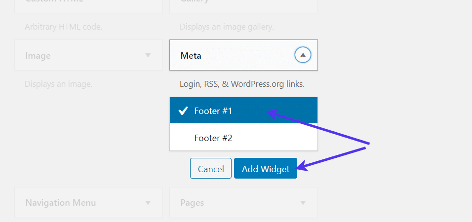
All themes vary, so you may have a footer, sidebar, header, or some combination of those widget areas. You’re able to place the Meta widget in any of those.
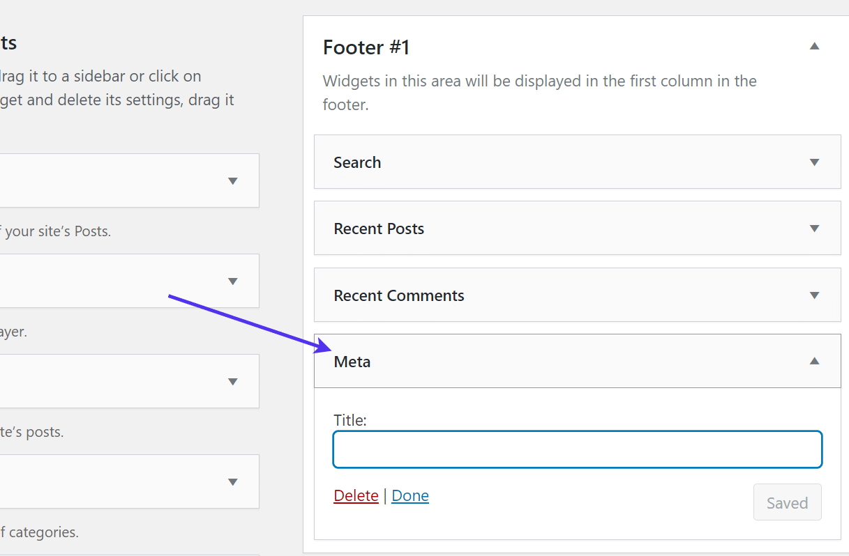
Our current test theme only has a few footers, so we’ll place my Meta widget in the first one. This way, site visitors see the login and registration form no matter which page they end up at.
Select the widget area of your choice and click the Add Widget button.
The Meta widget is now placed and saved in the footer area, or whichever widget area you decided.
When you click on the Meta widget, you’ll notice that it doesn’t contain much content or any customizable fields. It’s all configured for you.
However, the Meta widget allows you to adjust the Title if you’d like. Make sure to save the widget if it didn’t save automatically.
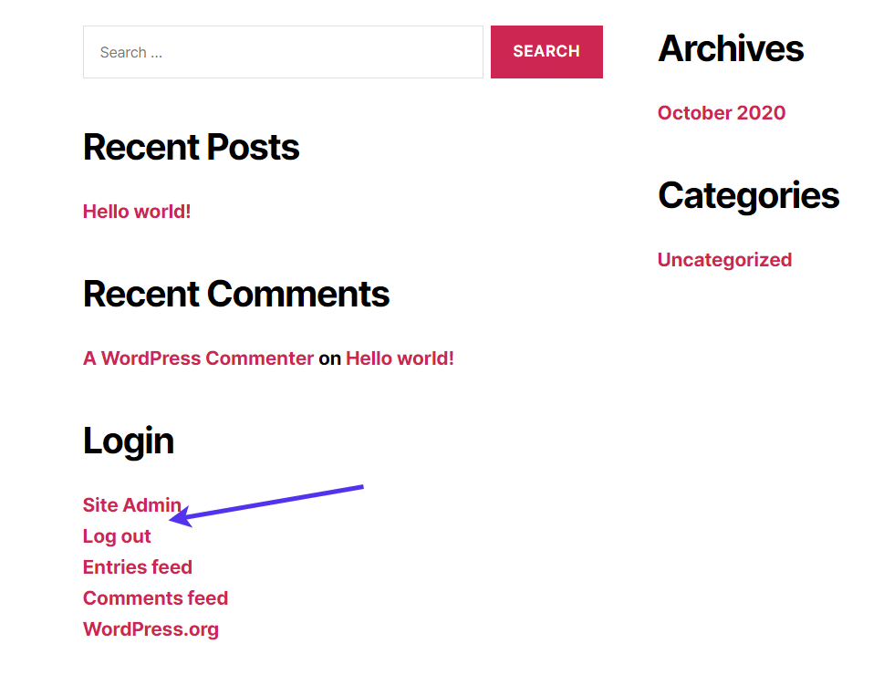
Go to the frontend of your website to view what the registration link looks like:
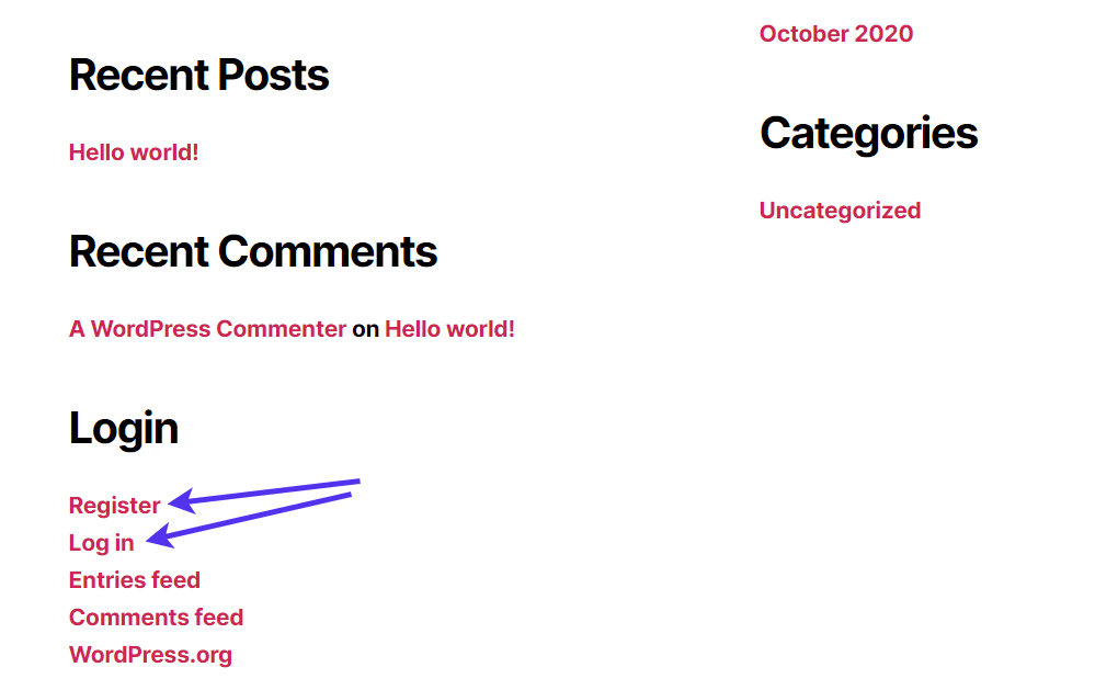
Once you log out of your test account, you’ll notice a Register and Log In links are presented for users to click on and either log in to their previously created accounts or to make new ones.
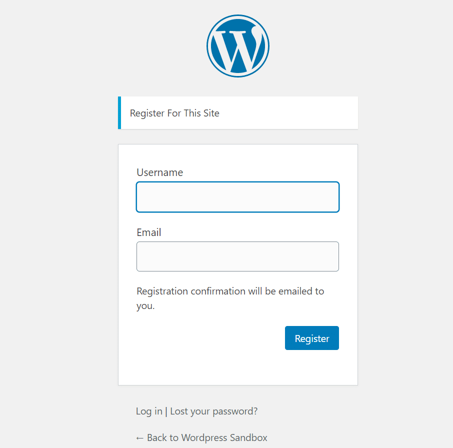
Similar to what we saw before, clicking through the Log In or Register links brings the user to the standard WordPress registration page, asking them to make a username, type in their email address and create a password.
How to Change the Registration and Login Form
Outside of custom coding, several options are available for customizing the default WordPress login and registration page.
Changing the design of the WordPress login page helps with branding and security. It makes sense to have your own logo and colors on the registration page, especially when it comes to customer-facing online communities where the login page is one of the first areas a customer sees.
The other reason you may decide to change the structure of the login page is to prevent intruders from gaining access. This can be done by changing the URL of said registration page (since anyone can think of and go to the /wp-login.com URL) and by adding additional protection like a spam security check.
Changing the Registration Page Logo and Design
Quickly removing the WordPress logo and swapping it out for your own on the registration page adds a hint of your own brand when users attempt to log in and register.
You also have the option to completely modify the design of that page with a plugin, incorporating unique styles and colors that look different from the standard WordPress designs.
Some people only want to add a new logo and get rid of the WordPress logo. That’s simple enough and doesn’t require a plugin.
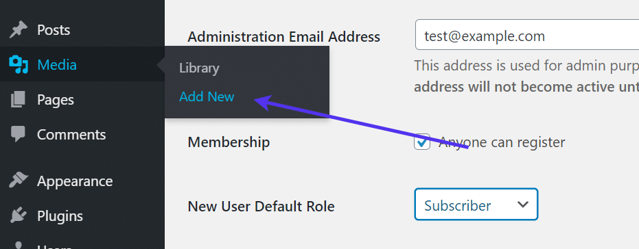
To do so, upload the logo to your WordPress media library. This is done by going to Media > Add New.
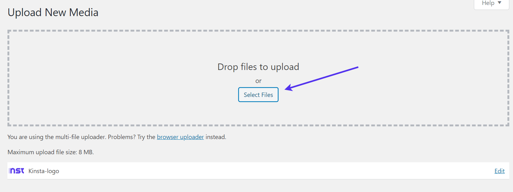
On that page, you upload the logo from your computer by clicking on the Select Files button and selecting the logo from your computer files.
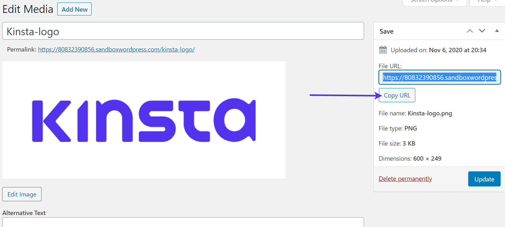
Once it’s uploaded, find and click on the Edit link for that logo image.
Copy the image’s File URL to the clipboard. Save that for later in a text editor or something similar.
Moving forward, navigate to the site’s functions.php file. Paste the following bit of code into the functions.php file. It’s usually best to paste the code at the end of the file:
function wpb_login_logo() { ?>
<style type="text/css">
#login h1 a, .login h1 a {
background-image: url(http://your-logo.png);
height:200px;
width:600px;
background-size: 600px 200px;
background-repeat: no-repeat;
padding-bottom: 20px;
}
</style>
<?php }
add_action( 'login_enqueue_scripts', 'wpb_login_logo' );
Find the text that says “http://your-logo.png” and replace it with the image URL you saved from before.
You also have the option to change the height and width of your logo based on the actual size of the file. Feel free to play around with the code and preview the result until you render it to a perfect display.
Check out the official WordPress documentation on customizing the login form if you have any questions or would like to tackle any other customizations.
Using a Plugin for Further Registration Page Customizations
As an alternative, several plugins are available for changing the login page logo.
In fact, the LoginPress Customizer plugin provides a complete system for swapping out the logo and customizing just about every aspect of your registration page.
To utilize LoginPress, install the plugin and go to LoginPress > Customizer in the WordPress dashboard.
The plugin offers additional settings but we’re mainly looking at the customization tools.
This brings you to the regular WordPress Customizer, but with a special page just for modifying the registration form and page.
The plugin has several prebuilt themes in the premium version, but most of the design capabilities are provided for free.
As you can see, settings are available for adjusting the logo, background, login form, and more. It already automatically incorporated a background that looks drastically different than the default background from WordPress.
The plugin has a visual builder. So to change the logo, all you have to do is scroll over the logo and click the Change Logo icon.
Upload a logo from your computer and move the logo width and height settings to ensure it looks good.
Next up, go to the Background tab to either select a provided background from LoginPress or upload your own. You can also go with a blank white background or a solid color.
With the click of a button, you can switch the flowery background to one with leaves.
Quite a few other tabs are provided for you to tweak the registration page settings.
We recommend looking through all of them, including the option to completely transform the size and location of the form. You can modify everything from welcome messages to Google Fonts, all without having to touch a line of code.
Changing the Registration Page URL
It’s important to decide if you’d like to make a new URL for the registration page. We discussed earlier that the registration page is reachable at myexamplewebsite.com/wp-login.php.
Since WordPress uses the /wp-login.php subdirectory for all login pages, it’s not difficult for a hacker to know the exact location. Although they still need to brute force attack the login form, you add a layer of security by minimizing the chance of them getting to the page in the first place.
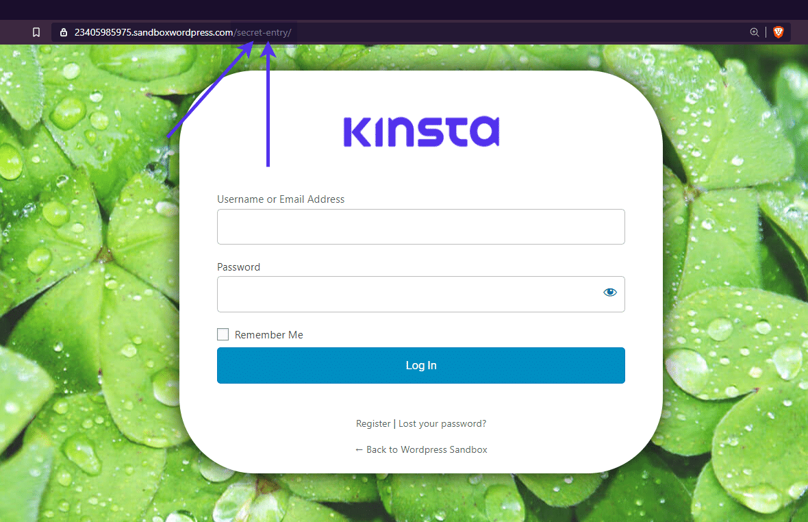
Your best bet is to install and activate the WPS Hide Login plugin to get the job done. The plugin instantly handles the redirect and hiding of your old registration page, only asking you to decide on the subdirectory name.
We have a tutorial for installing and using the WPS Hide Login plugin right here. Please follow those steps to change your login URL. Essentially, it’s an almost completely automated process where you type in a new sub-directory for the login URL and the redirection URL (if you want to adjust that).
Then, the plugin does the rest of the work for you, creating something like in the following screenshot.
How to Create a WordPress Registration Form With an Advanced Plugin
The previous tactics to activate and customize the registration form work by modifying the already implemented login form from WordPress. That WordPress form has the basics, but it’s not for everyone.
What if your website requires additional fields for collecting phone numbers or physical addresses? Wouldn’t it be nice to generate your own custom fields so that the limits on registration forms are virtually non-existent?
Although a custom coded registration form is the most effective way to get the most unique design for a form, a WordPress plugin is the next best thing.
In addition, you don’t have to spend all that time and money developing a form that could potentially be created with a plugin.
Best WordPress Registration Form Plugins
Take a look at our article on the best WordPress user registration plugins. It covers a large collection of plugins that are suitable for designing and formating registration modules without much coding knowledge at all.
Some of them provide unique tools for utilizing large collections of custom fields, while others immediately activate member directories for organizing your membership base.
We highly recommend reading through that article to decide on the best registration form plugin for your situation, but below is a list of our favorites:
- User Registration
- RegistrationMagic
- Ultimate Member
- WP User Manager
- Easy Registration Forms
These plugins focus on building membership login forms and niche registration areas to move your users through a smooth process when signing up for your website.
As an alternative, you could use a general form plugin so that you don’t get stuck with a plugin that’s limited to a certain industry or function.
For instance, it’s possible to make a custom WordPress registration form with the Contact Form 7 and Gravity Forms plugins.
We’ll cover those steps in the sections below.
Making a WordPress Registration Form with Contact Form 7
Contact Form 7 offers the most basic of contact form tools on WordPress. It’s extremely popular, reliable, and simple enough so that it looks nice on any website. Not to mention, this basic design ensures that any developer can go in and customize with their own code.
A standard form could very well serve as a registration solution, but those form submissions go to a different database and don’t actually register new users into your WordPress user database. Instead, you receive emails with the contact form submission and whatever user data you asked for in the form. You could log that user information in a spreadsheet, but that’s not always ideal.
For some, this may work just fine. You can import your list from Contact Form 7 into any contact management plugin or software. You also have the option to import that list into the WordPress user section.
However, we’d like to make it a little streamlined by linking Contact Form 7 to an extension that converts your Contact Form 7 forms into the actual user registration form for WordPress.
There are two methods for turning your Contact Form 7 creations into legitimate user registration forms:
- Use a plugin.
- Insert some custom code.
As with many tasks in WordPress, we often like to stick with plugins if it becomes too complicated with custom coding.
Therefore, the first step is to install the Contact Form 7 plugin and an extension plugin called Frontend Registration – Contact Form 7.
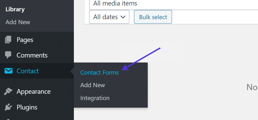
Once both are activated, go to your WordPress dashboard menu and navigate to Contact > Contact Forms.
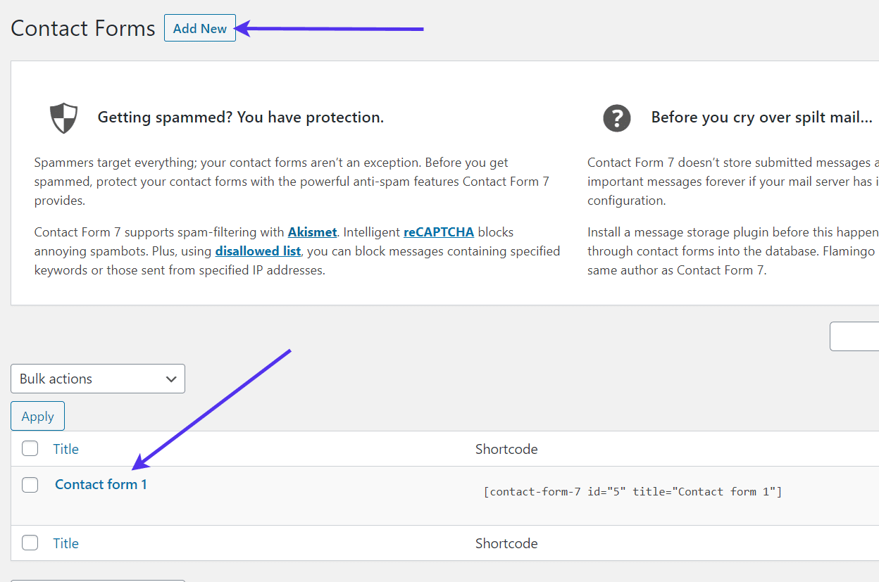
Either click on the Add New button to make a new form or select the default form already created by the plugin.
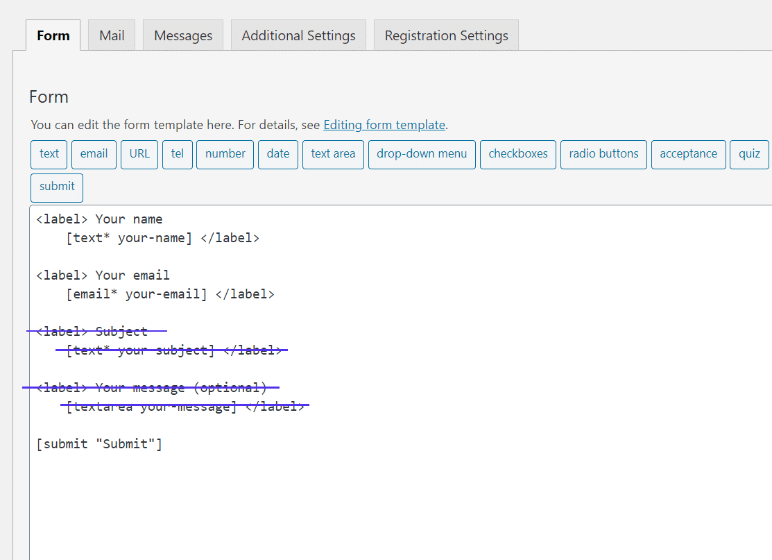
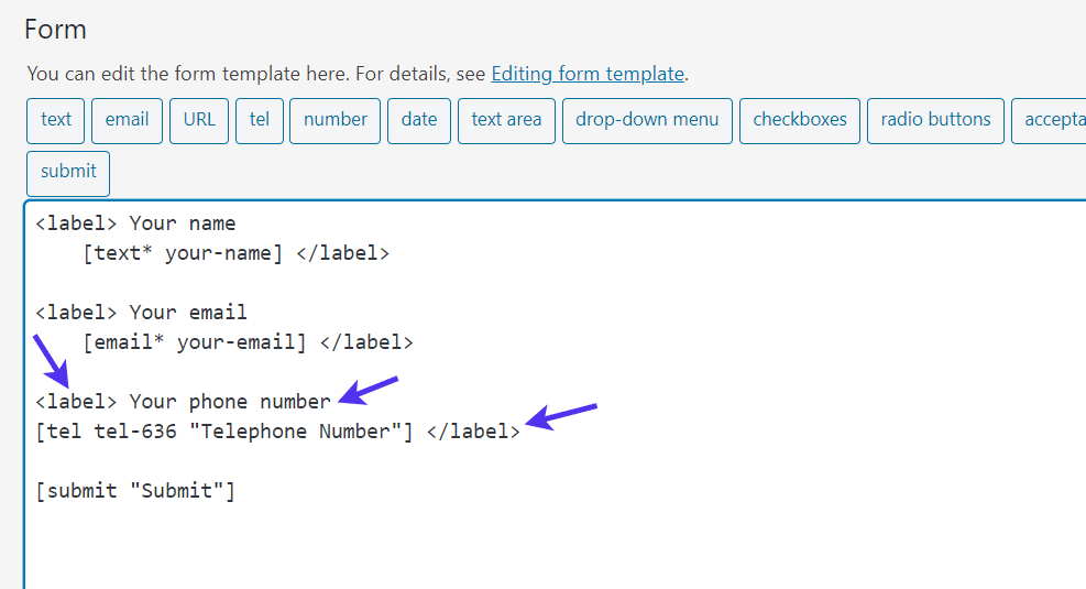
In Contact Form 7, all forms are created with a simple template using bits of coded tags. For each field, the label tag is the text shown above each field on the form.
The form tag – or the bit of text between the [ ] brackets – generates the actual form field where the user types in the information.
The premade form from Contact Form 7 includes a field for Name, Email, Subject, and Message. This makes sense for a regular contact form, but there’s no reason to have a Subject and Message field on a registration form.
Remove those.
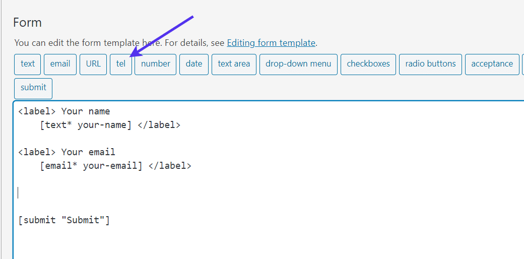
The buttons above your form creator are there for incorporating additional field tags.
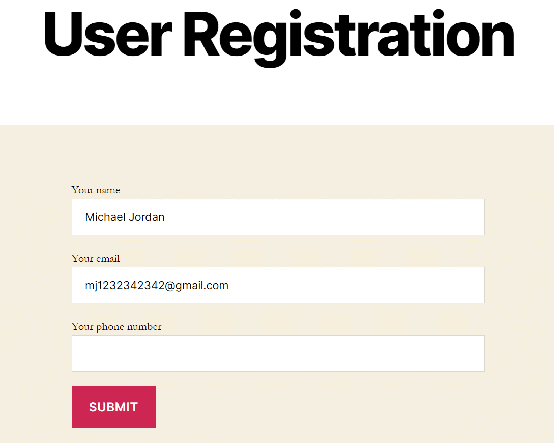
For instance, you may want to also collect telephone numbers from your new users. In order to do so, select the “tel” tag and place it into your form. Other tags include the URL option for websites and checkboxes or radio buttons to ask specific questions.
The plugin adds the field, but you have to place the Label tags in there manually. You can simply copy these from one of the other fields and change the label to something like “Your phone number.”
Make sure you close the label with </label>.
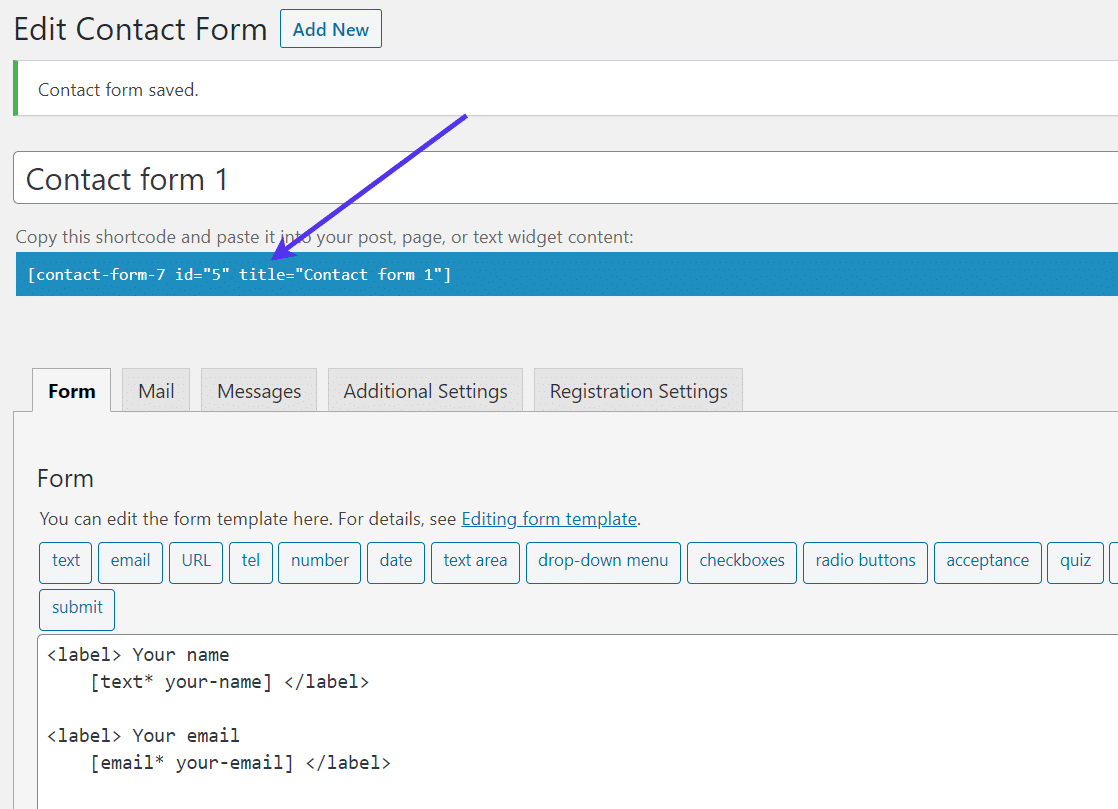
Save the form.
You’ll notice a shortcode assigned to each of the forms you create in Contact Form 7. This is to place the form anywhere you want on your site, from sidebars to regular pages.
Feel free to copy that shortcode if you plan on using a shortcode to display your form.
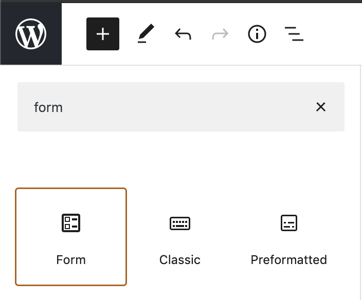
There’s also another option to use a block through the Gutenberg editor.
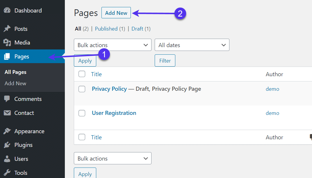
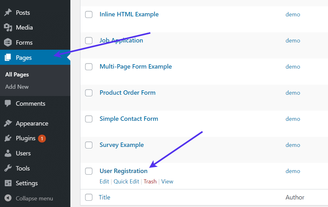
Now it’s time to add your form to a page. Click on the Pages tab in WordPress, then either add a new page or go to one that you already created.
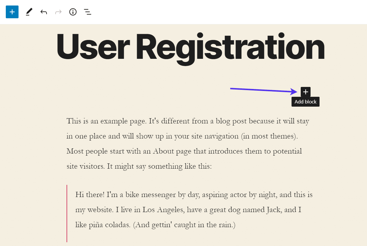
For this tutorial, we’re calling this page “User Registration.” It serves as the primary location visitors come to for signing up and registering on the test site.
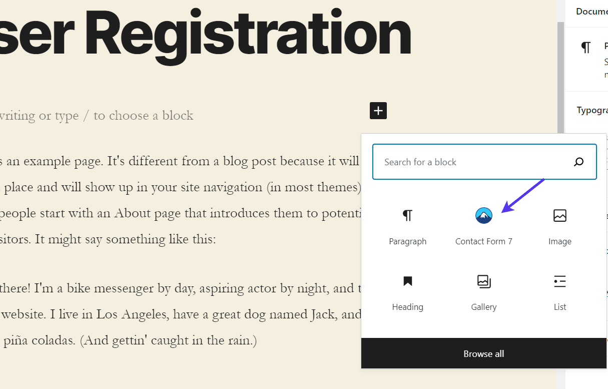
In the visual editor, click on an Add Block button.
Locate the Contact Form 7 block and select that.
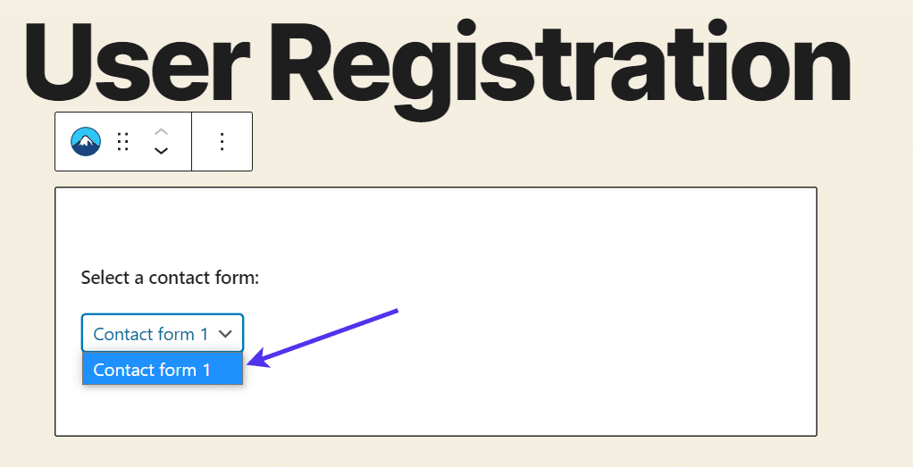
This provides a dropdown menu with all of the contact forms you’ve generated in the Contact Form 7 plugin.
We only have one right now, so let’s choose that.
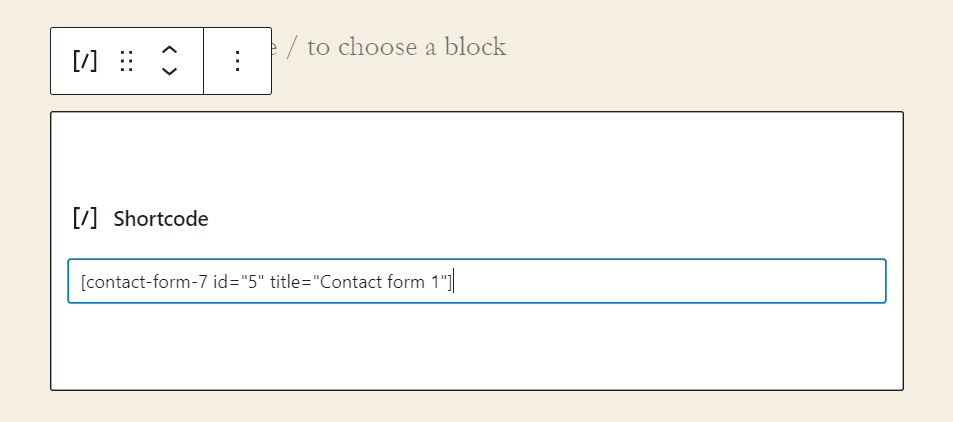
An alternative to using the Gutenberg Editor blocks is inserting the form’s shortcode into the page. You can either do this in the traditional WordPress editor or with the Gutenberg Shortcode block. Both accomplish the same goal.
Publish this page to ensure it’s available on the frontend of your website.
Next up is activating the user registration features for Contact Form 7. That’s where the Frontend Registration plugin comes into play.
As of right now, the form is still a standard contact form, where the user would click the Submit button and an email sends out to the admin of the site.
We’d rather have the submission register a new user in the WordPress database.
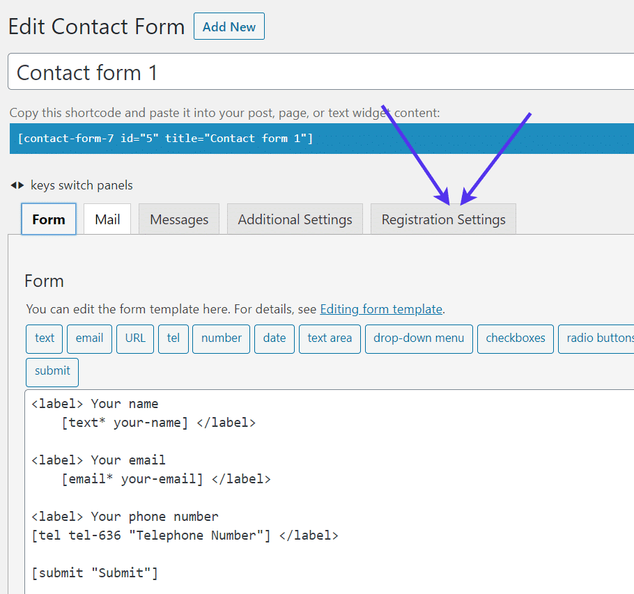
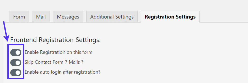
Therefore, navigate back to the contact form editor. After installing the Frontend Registration plugin you should now see a tab called Registration Settings. Click on that.
Toggle the switch for all three items under the Registration Settings.
The first one enables registrations on the form, making it the most important of the three.
The second setting skips sending out any emails for that form. Therefore, you don’t receive a contact form message as you would before.
The last one isn’t required but it’s nice to make for a smooth registration process. It logs in the user so they don’t have to go through the steps twice.
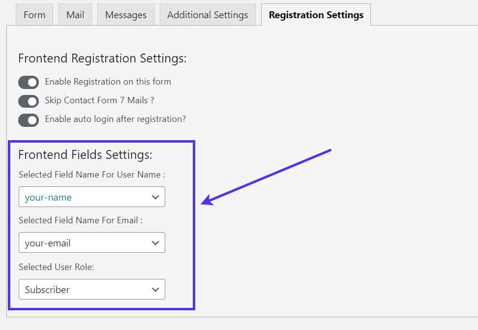
Below that, choose the field names that register into WordPress user elements.
For instance, a WordPress user must have a user name and email for their account to work. You can set the “your-name” form field to be made as their username and the “your-email” field to be used as their email address.
The last step is to choose a default user role, like Subscriber. We typically recommend the Subscriber user role for most websites seeing as how any permissions above that provide intimate access to website settings.
Go to the frontend of that page and test it out and click the Submit button.
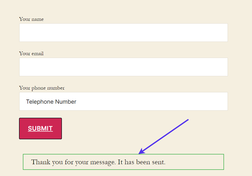
It appears to be working. The only problem is that the success message makes it sound like the user just submitted a contact form.
We need to change that. To do so, go back to the form editor in the WordPress dashboard.
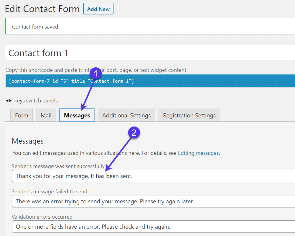
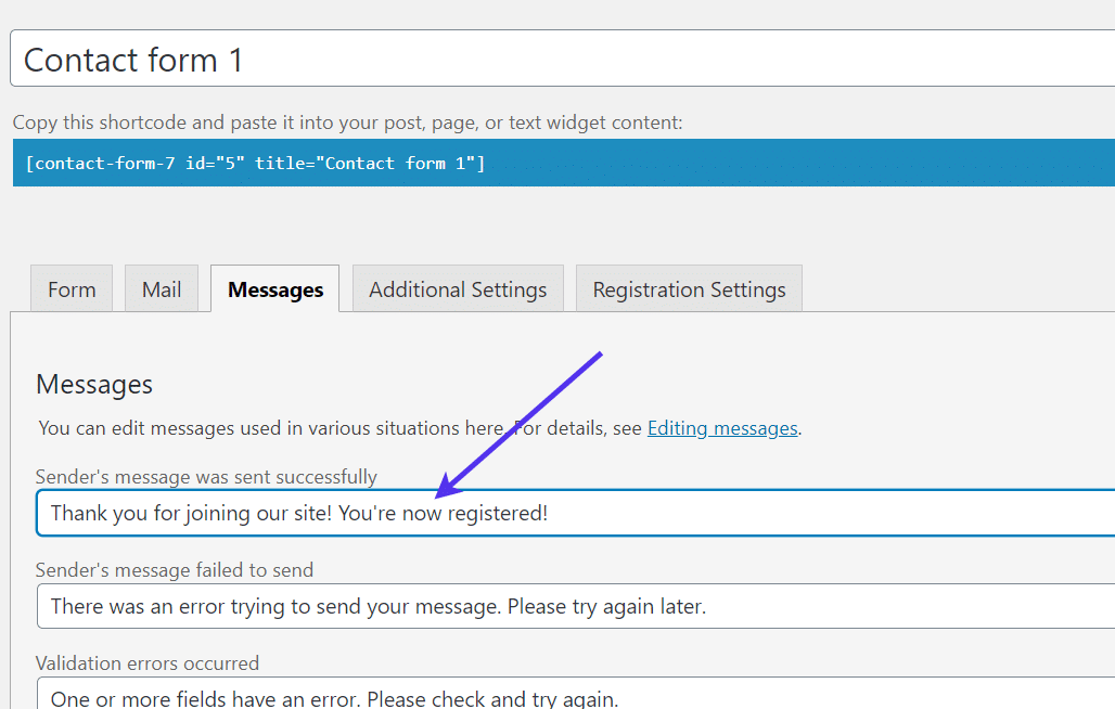
Click the Messages tab and find the Sender’s Message Was Sent Successfully field. All you need to do is modify this message.
An example is to say thank you for joining or registering with the site.
Finally, we should check to see if that user was in fact registered into the WordPress user database.
If you’re logged into the website as the test user, you’ll see an error message like this when trying to check on the user list. That’s because Subscriber user roles can’t check or manage users on your site.
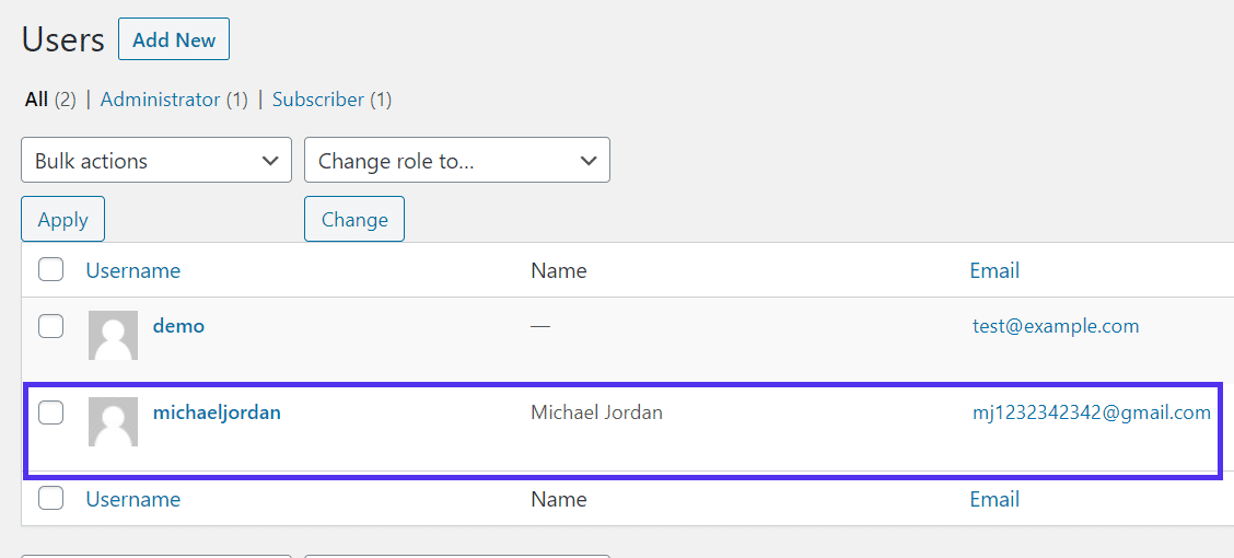
When getting logged back into the admin account, it’s clear that the new user information is stored in the Users database list!
Making a WordPress Registration Form with Gravity Forms
Gravity Forms is a well-known, reputable form builder that generates many unique types of forms and links to its own plugins for advanced capabilities.
Gravity Forms is a premium solution, but you can test out the entire interface and build your own forms with the free demo. Gravity Forms starts at $59, but the User Registration add-on is only included in the Elite plan, which is $259.
Yes, it’s a bit pricey, but Gravity Forms is one of the best options to consider when trying to customize your user registration area and incorporate other elements, like payments with your gateway of choice.
To begin, go to the Gravity Forms website.
Once there, choose to sign up for the Elite plan in order to activate the User Registration add-on. Download the Gravity Forms plugin file, upload it to your WordPress dashboard, and activate the plugin to begin the form creation process.
By default, Gravity Forms has options to construct standard website forms. They’re absolutely beautiful, but there are a few settings to adjust if you’d like to achieve a user registration form where each submission gets placed into your WordPress user database.
Once active, the Gravity Forms plugin reveals a Forms tab in the WordPress dashboard.
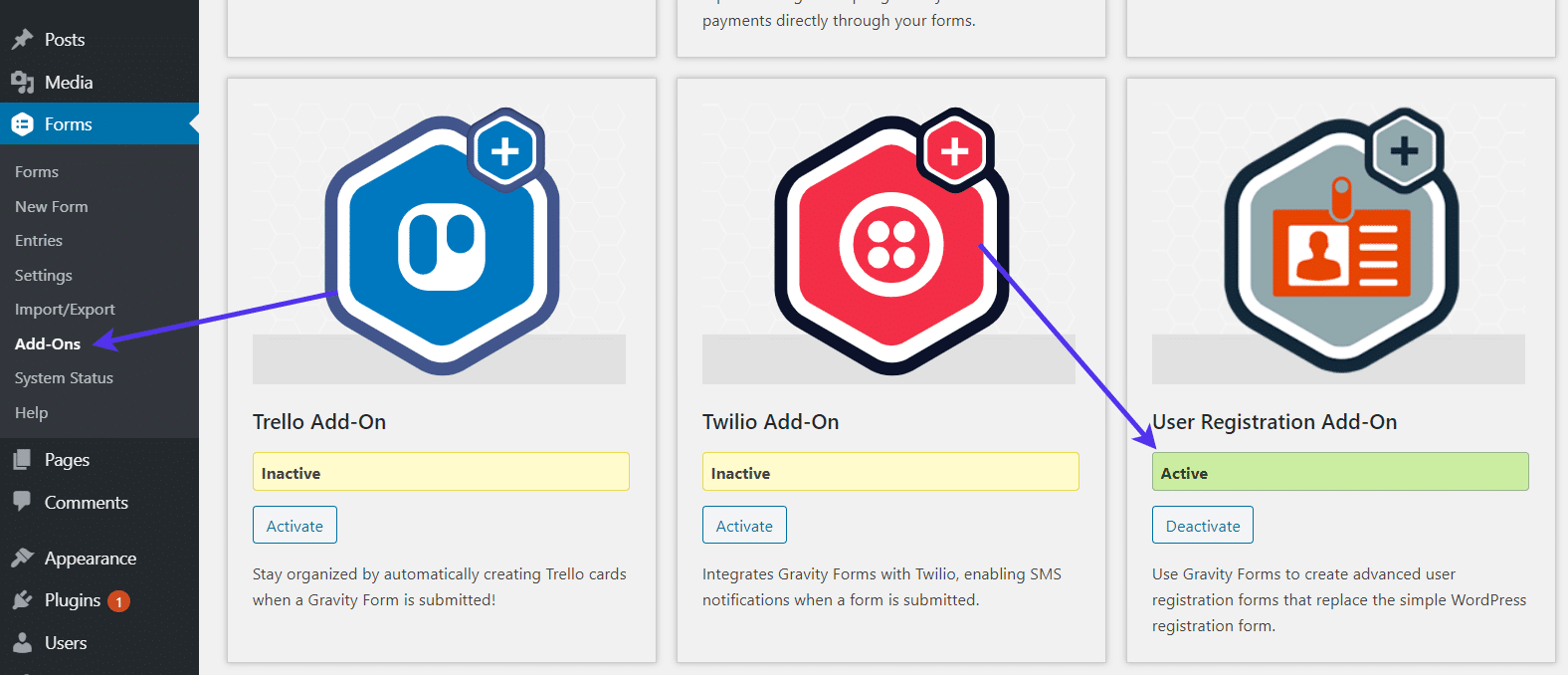
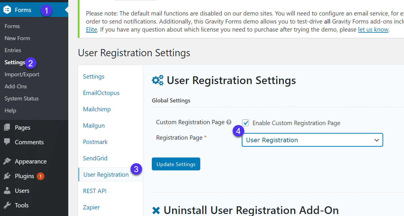
Go to Forms > Add-ons.
Locate the User Registration Add-on and click on the Activate button.
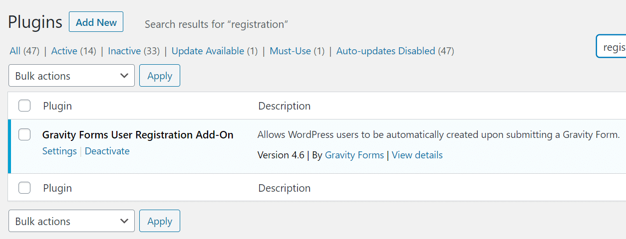
Once a Gravity Forms add-on is activated, it shows up in your list of plugins, just like Gravity Forms itself.
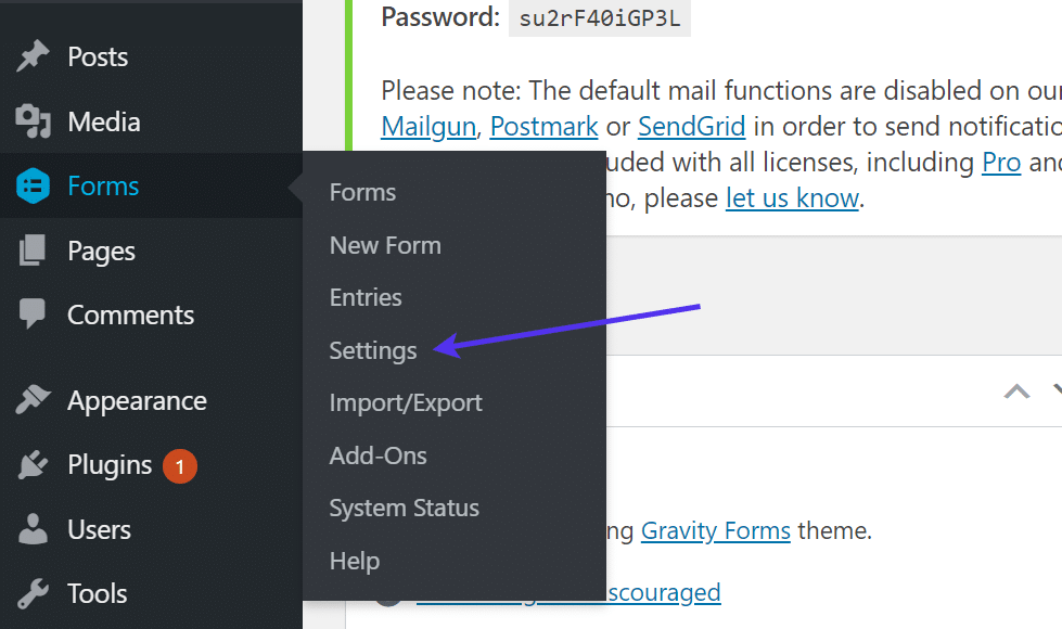
Moving forward, click on Forms > Settings.
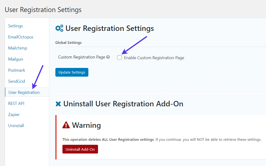
Locate the User Registration tab in the Settings. Here, you’ll want to enable the custom registration page option.
Check the box to ensure that all registrations through your form are added as regular WordPress users.
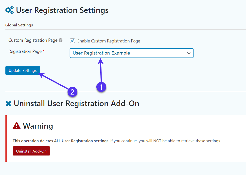
You’ll also need to select a page to serve as your registration page. The default WordPress registration page redirects to the custom page if this is enabled. If you already have one, feel free to select the page from the dropdown menu.
If not, we’ll walk through making the registration page below.
Always make sure you click the Update Settings button whenever finished changing settings in Gravity Forms.
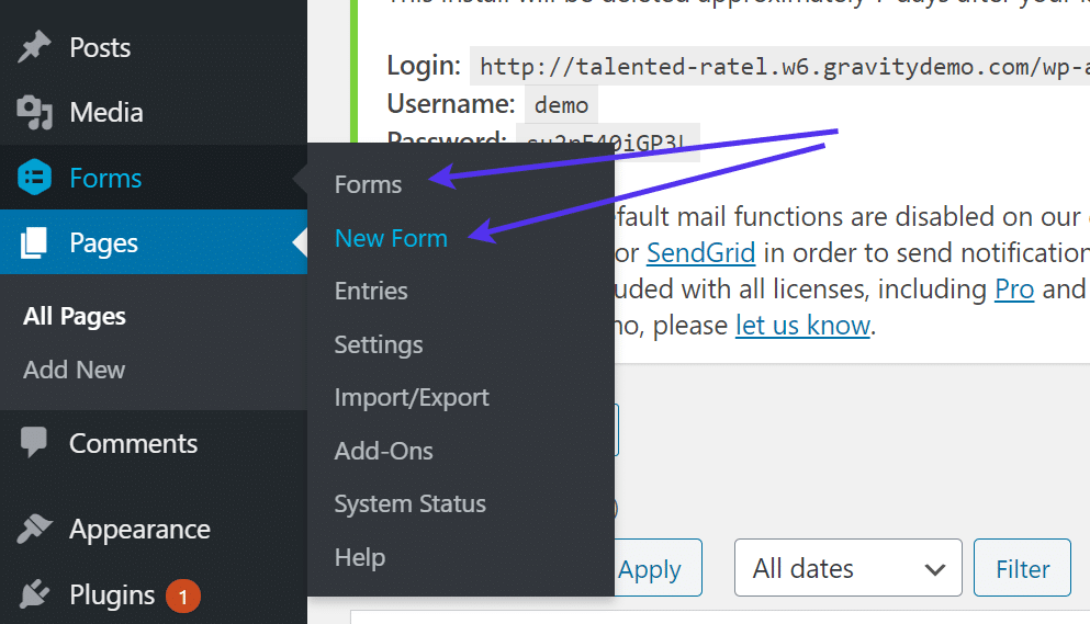
Go to Forms > Forms or Forms > New Form. The Forms page reveals a list of all forms you’ve created in the past with Gravity Forms. It could be blank if you haven’t made anything yet.
If you haven’t made a form yet, opt for the New Form button.
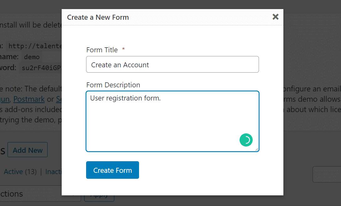
Make a Form Title and a Form Description. Click Create Form.
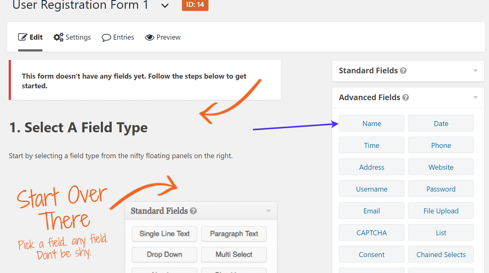
Gravity Forms provides a visual, drag-and-drop editor with a module on the right side for including field elements.
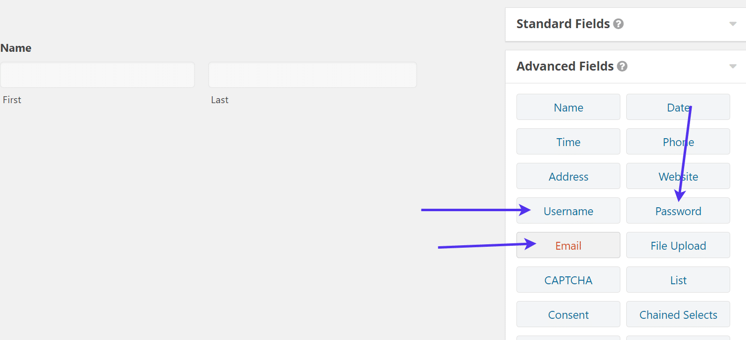
Since we’re currently looking at a blank user registration form, we’ll begin by dragging the Name module into the form itself. This is done by clicking on and moving the module to the left.
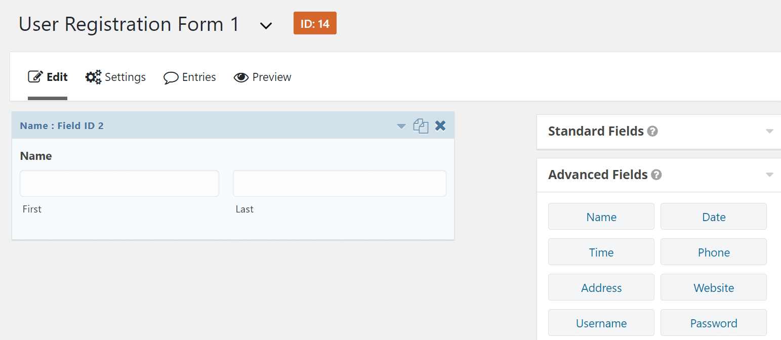
Once any module is dropped into your form you should see it rendered in the preview.
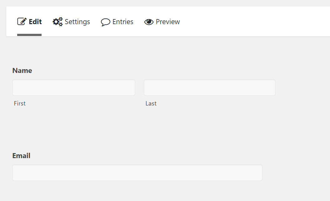
For instance, we now see the Name fields, with First and Last name fields shown by default.
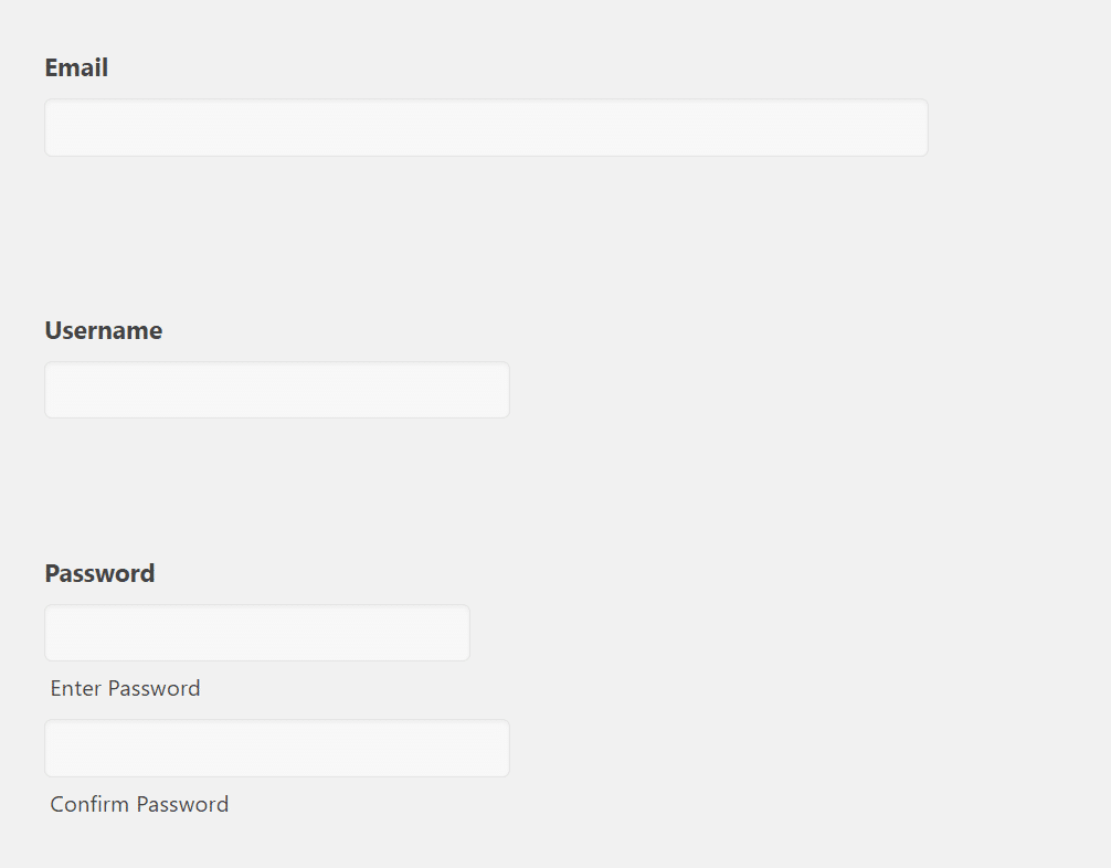
For a user registration form, it makes sense to also include the Username, Password, and Email fields.
Once placed into the form, the Email field shows the option for users to type in their email addresses.
The Username field is for making a brand new username for the site, while the Password module asks for the user to type in their new password twice.
It’s possible that your registration form requires other elements, like maybe a field for phone numbers or website URLs.
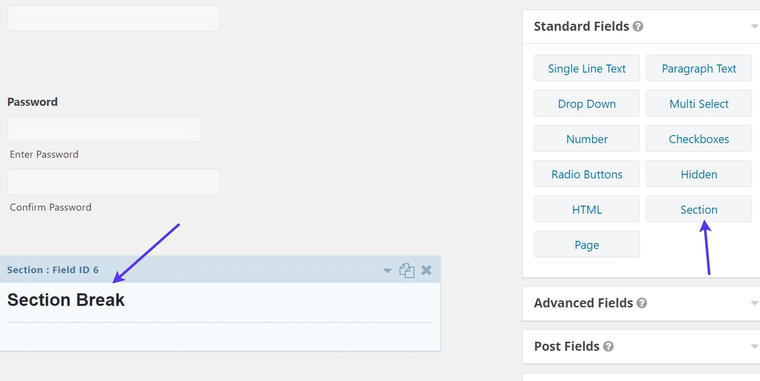
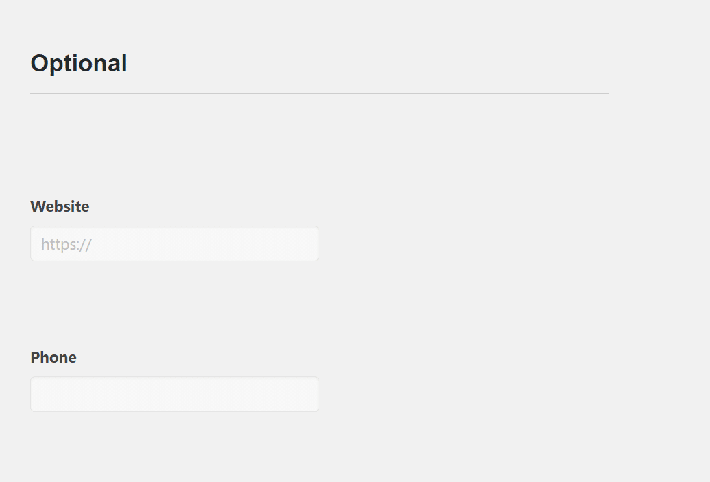
For this tutorial, we added a Section module to incorporate a section break and indicate that everything below that line is optional.
We then added the Website and Phone modules under that Optional section.
Like mentioned before, these types of fields are optional for your own user registration forms. There are plenty of other fields to insert if you’d like.
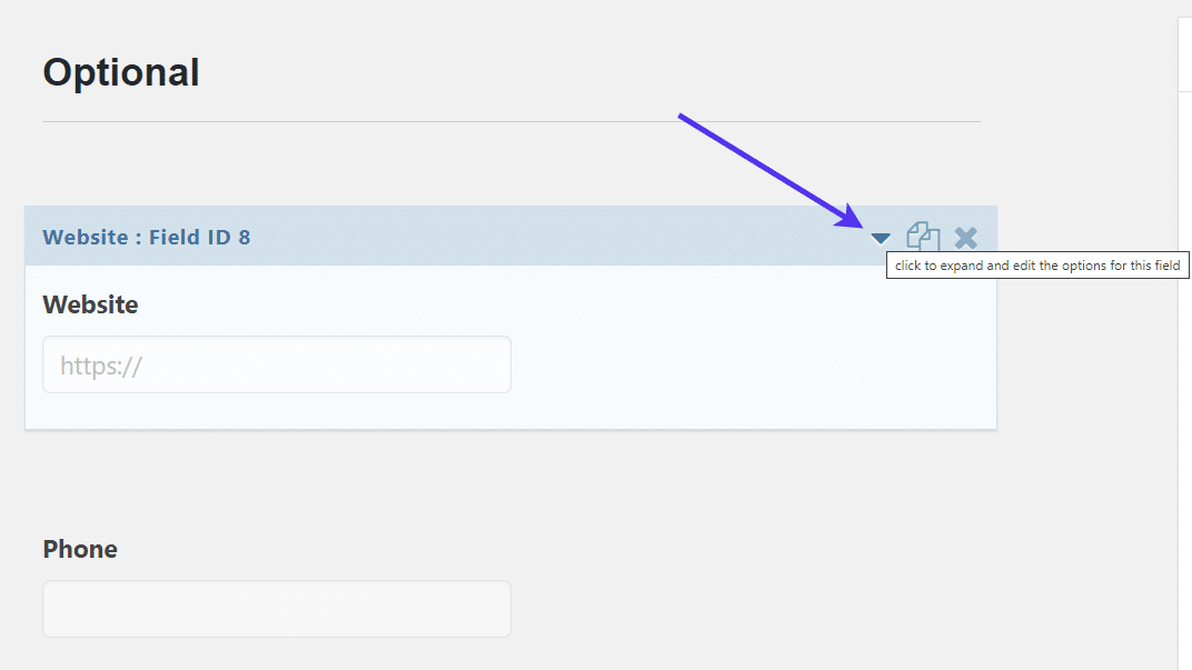
As you place the Gravity Forms drag-and-drop modules into the form, you can click on each module’s dropdown button to expand the settings and edit options for the field.
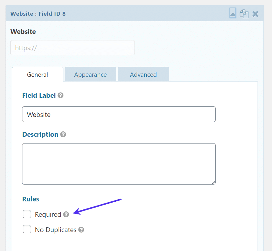
For example, the settings under the Website field ask for the Field Label and whether or not you’d like to make this field required.
Seeing as how we already labeled the Website field optional in the section headline, we’ll leave this unchecked so that users don’t have to type in a website in order to register for the site.
In general, the vast majority of the fields should not be required for a registration form.
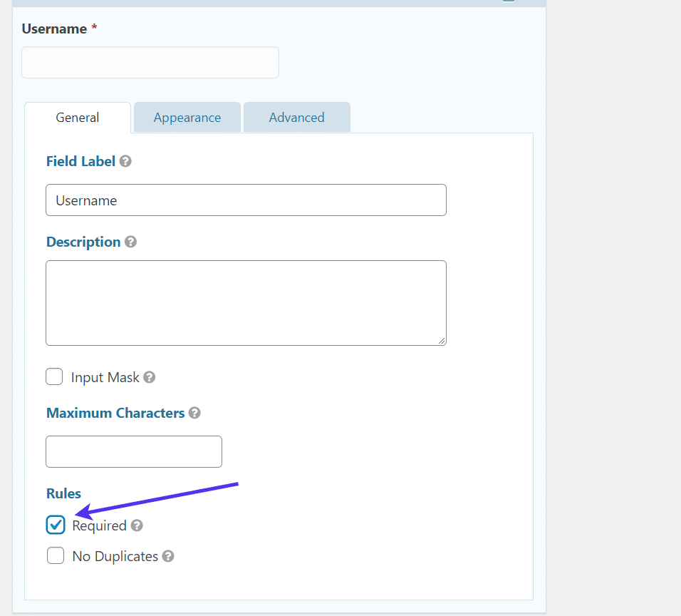
Fields for the username, email, and password are necessary to generate a WordPress user and log it in to the database. Therefore, it’s better to mark those as required.
Feel free to adjust the settings for each of the field modules you add to the registration form. It’s usually best to rename the Field Name and decide whether you’d like to make the field required.
You also have the option to adjust the field appearance and make advanced edits in the other settings tabs.
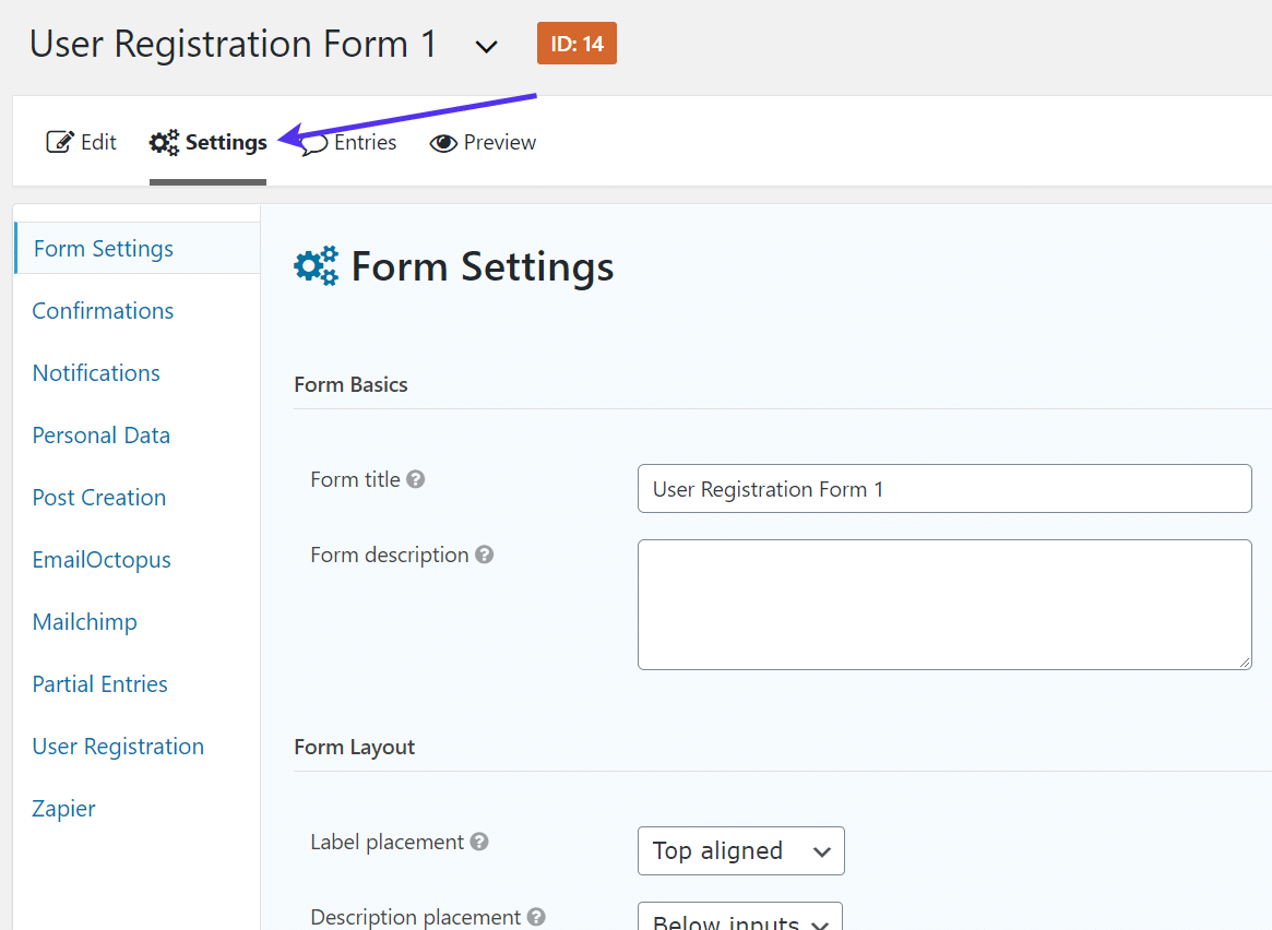
Once you design the registration form the way you want, move to the Settings tab.
These are the overall settings for the entire form, not just for the individual fields.
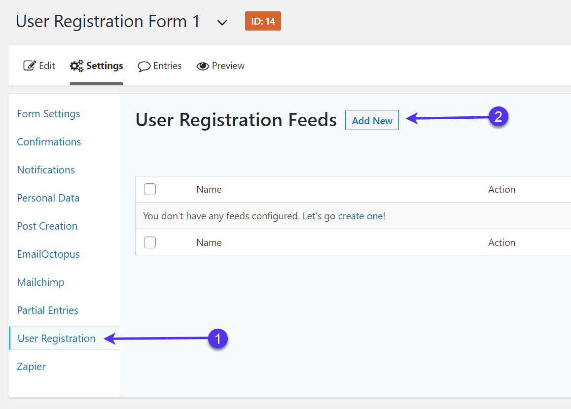
Under Settings, go to the User Registration tab.
Click on the Add New button.
For this step, you’re making a user registration feed that automatically creates a user for each submission and transfers the field submissions into the default fields in the WordPress user database.
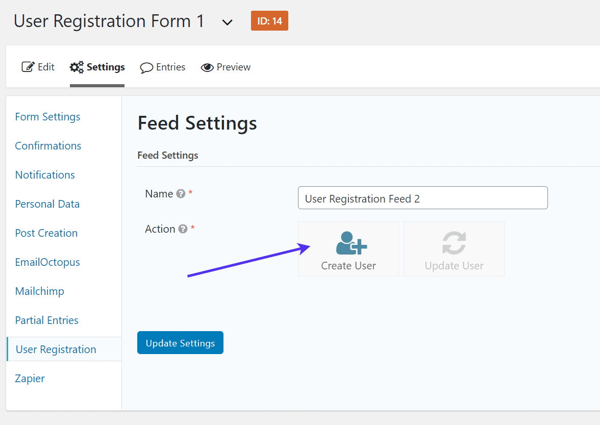
Name the user registration feed for your own internal reference.
You have two options for making a feed, either to Create User or Update User.
The Update User feed option is more useful if you offer a page for users to update their current profile information. You can absolutely include this on your registration/login page, but for now, we’re more interested in creating a new user.
Click on the Create User option.
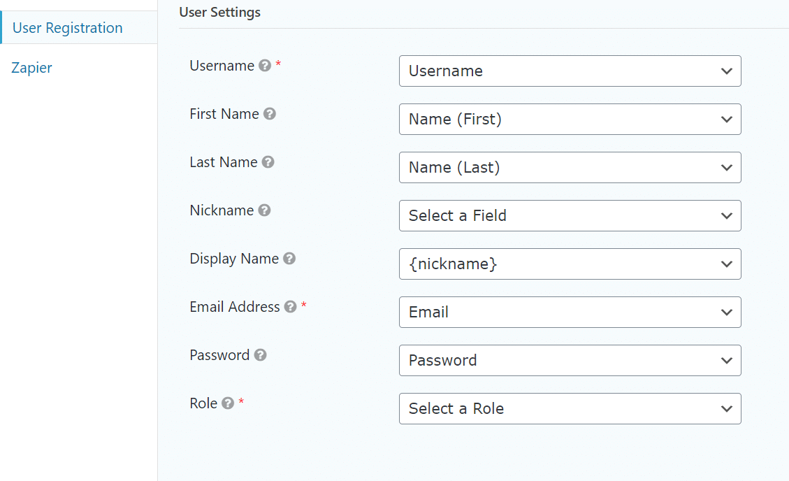
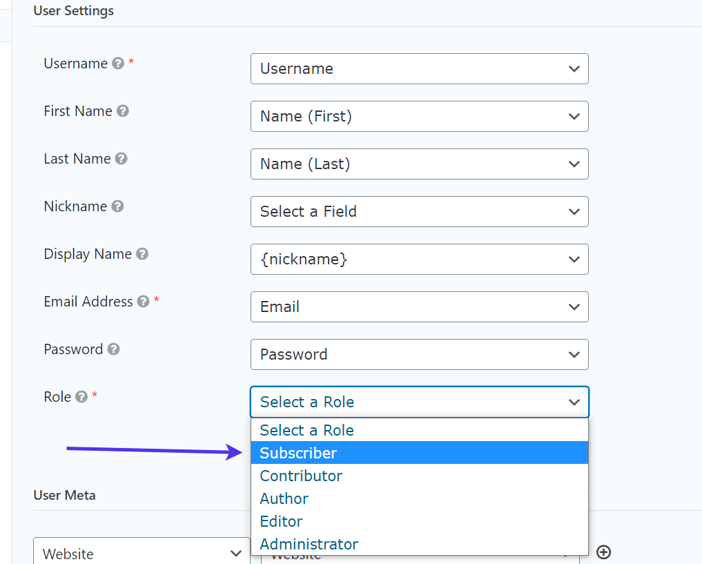
The User Registration feed automatically generates most of the user settings for taking a field submission from the form and transferring it into the fields for a new user in the WordPress user database.
However, you may have to modify a few of them.
For instance, we want to ensure that the text typed into the Username form field is used as the new user’s actual username.
You could also make this the Email field if you’d rather just have your users log in with their email addresses.
The First Name and Last Name fields and user settings look good. So do the Email Address and Password settings. Go ahead and choose a Nickname reference and a Display Name if you’d like.
One of the most important parts of this step is selecting a default user role when the user profile is created.
You probably don’t want every user being made into an Admin or Author (that would give random people too much control over your site,) so your best bet is to go with the Subscriber role.
Scroll down to complete the rest of the user feed settings. If you have any optional, or additional, fields think about whether or not the default WordPress user profiles have any fields for this as well.
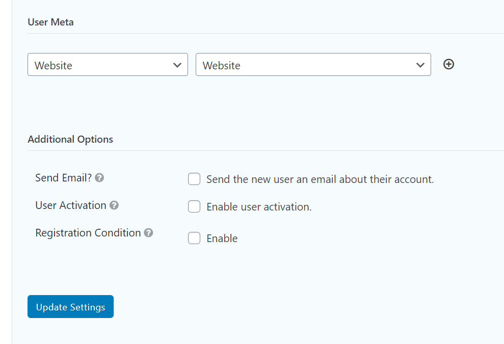
The WordPress user database has optional fields for websites. Therefore, we’ll link our form’s Website field to that of the WordPress user database.
The Additional Options section asks if you want to send out notification emails upon registration. That’s best practice to notify your users that they’ve successfully created an account.
The User Activation checkbox only generates a user when that person clicks through a verification link sent to their email address. That setting usually just slows down the registration process but it could help with cutting down on spam.
The Registration Condition is another setting that you must decide to use or not. The feature only allows a registration if it meets a custom condition, such as email addresses with the @ symbol in the address. Again, we like this for cutting down on spam and potentially stopping poorly filled out forms, but it’s not entirely necessary for your registration form to function properly.
Once your form settings are completed, click the Update Settings button.
That covers most of the form creation process for making a custom registration WordPress form with Gravity Forms. You’ll now want to feature the form on a page to replace the default login page from WordPress.
There are two methods for adding the user registration form on a page.
One involves utilizing a shortcode, while the other takes advantage of the Gutenberg blocks system.
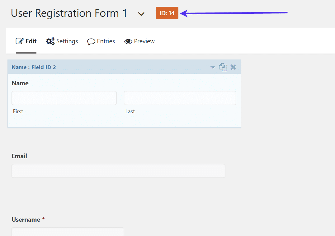
If you plan on using a shortcode, take a look at the user registration form you just created. An ID number gets assigned to each form in Gravity Forms.
Write down or remember this ID.
Go to Pages > Add New in your WordPress dashboard. Or, if you’ve already made a designated page for the form, navigate to that page.
For this tutorial, we’ll name it the User Registration page.
To utilize the shortcode option, paste the following shortcode anywhere on that page:
[gravityform id="#" title="true" description="true]
Replace the # sign with the ID number from your registration form.
After the shortcode is added, and the page is saved, you can go to the frontend of your published page to see the form in action.
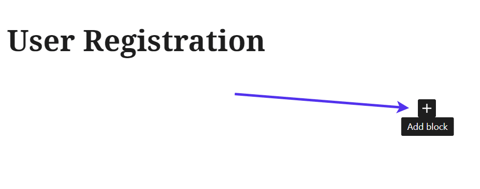
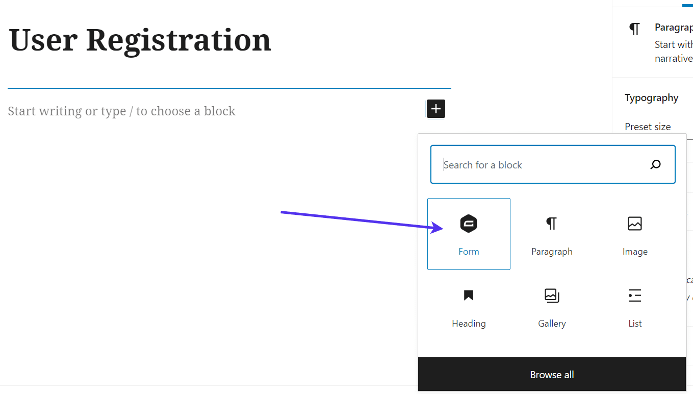
Another option to consider is the WordPress Gutenberg block system. If you’re using Gutenberg, click on the Add Block button in your page editor.
Either search for the Gravity Forms block or scroll through the list to find it.
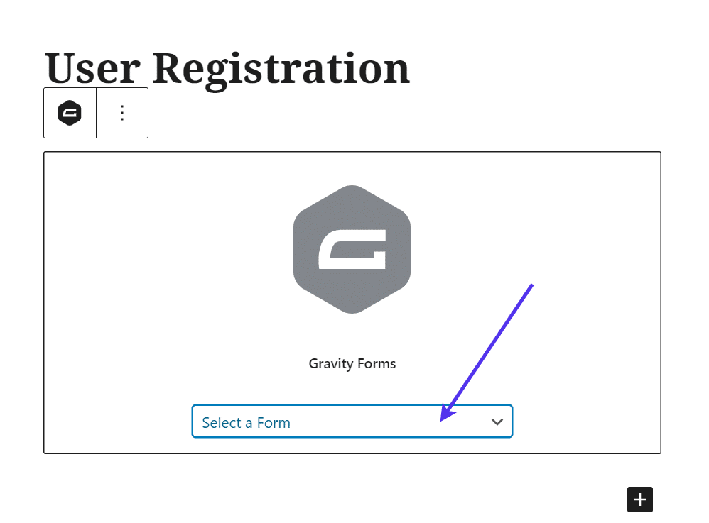
Select the Gravity Forms block. It’s labeled “Form” with the Gravity Forms logo as the icon.
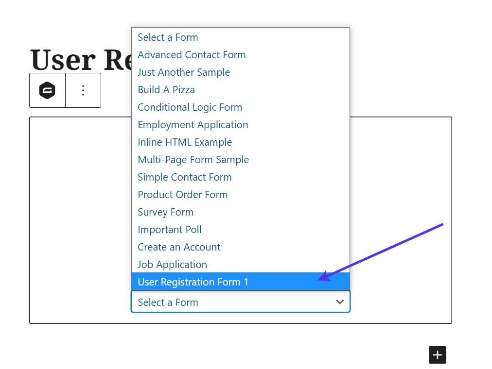
Once the block is enabled, click the dropdown menu to choose a form.
You may have a long list of forms or you may only have one or two. Find the one that you previously made for the user registration form.
In this case, we called the form User Registration Form 1.
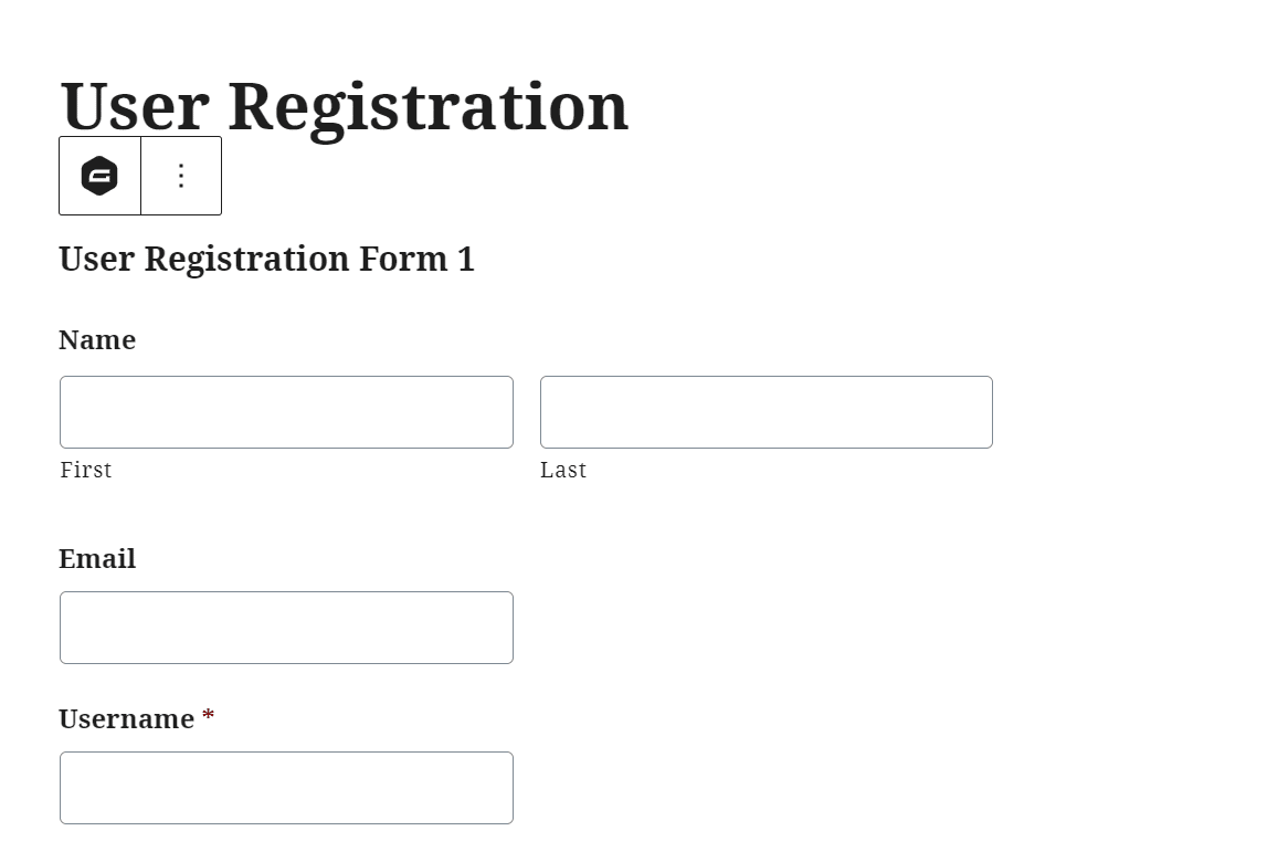
Selecting a form from the dropdown menu immediately renders a visual view of the form on your page editor.
As you can see, the User Registration Form we built before is shown in the WordPress page’s backend. If you see anything wrong with the form, go back to the Forms section to edit the fields in there.
Finally, go to the frontend of your website to view that specific page. The registration form is shown with all the appropriate fields. Not only that, but we’ve already set that form as the redirect from the default WordPress login page – and every form submission becomes a new WordPress user.
At this point, check the form for accuracy and that your labels are spelled correctly. Furthermore, fill out the form as a test user to see if it’s working and how the process goes.
After submitting the form, go to the Users section in your WordPress dashboard to check if that user has been correctly added to the user database.
You can also complete the testing for other reasons, like seeing if your optional confirmation messages are going out or if the form stops someone from registering if they don’t meet one of your conditions.
As one last reminder, be sure to go to Forms > Settings to ensure that you have the right page configured to function as your custom registration area.
In short, all you have to do is enable the custom registration form by checking the box and selecting the right registration page from the dropdown. For this example, the User Registration page is the right one.
Click on the Update Settings button to finish the process.
How to Install a WordPress Registration Form With a Payment Plugin
Gravity Forms has a multitude of potential add-ons to create incredibly unique forms. One of the reasons you may consider Gravity Forms is because of the payment add-ons.
Overall, a payment add-on turns your form into a payment processor, only allowing people to create user accounts if they pay a subscription or a one-time fee.
This comes in handy for membership sites and those with exclusive content where you won’t reveal the content, community, or entire website unless the user makes that payment right from the form.
If there’s any reason your registration requires a payment module, Gravity Forms provides several payment processing add-ons. You simply have to choose the one that’s most convenient and affordable for your brand.
It’s also worth mentioning that add-ons for PayPal, Stripe, and Square come with the $159 Pro plan from Gravity Forms. More advanced payment gateways like 2Checkout and Authorize.net are provided in the $259 Elite Gravity Forms plan. The User Registration add-on (covered earlier in the article) requires the Elite theme, so you technically should already have access to every add-on if you’ve decided to use Gravity Forms for your user registration module.
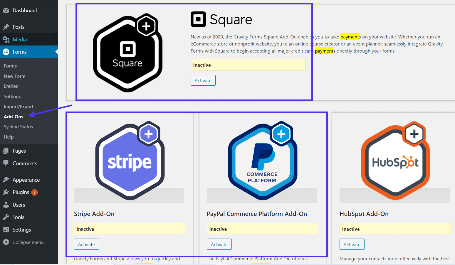
To get started, go to your WordPress dashboard and click on Forms > Add-ons.
This reveals a long list of add-ons to choose from, some of which include Square, PayPal, and Stripe.
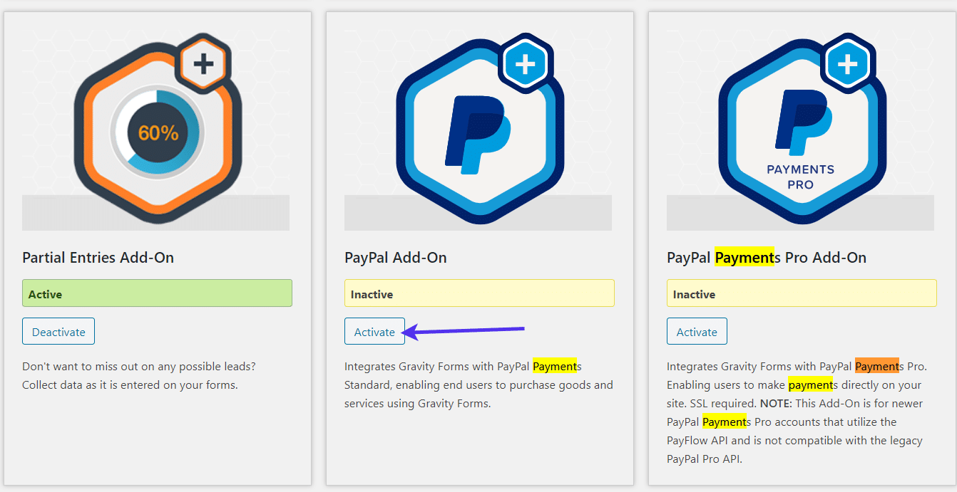
Although you can select any of the payment gateways, we’re sticking with PayPal Payments Standard for this tutorial.
Go to the add-on and click on the Activate button.
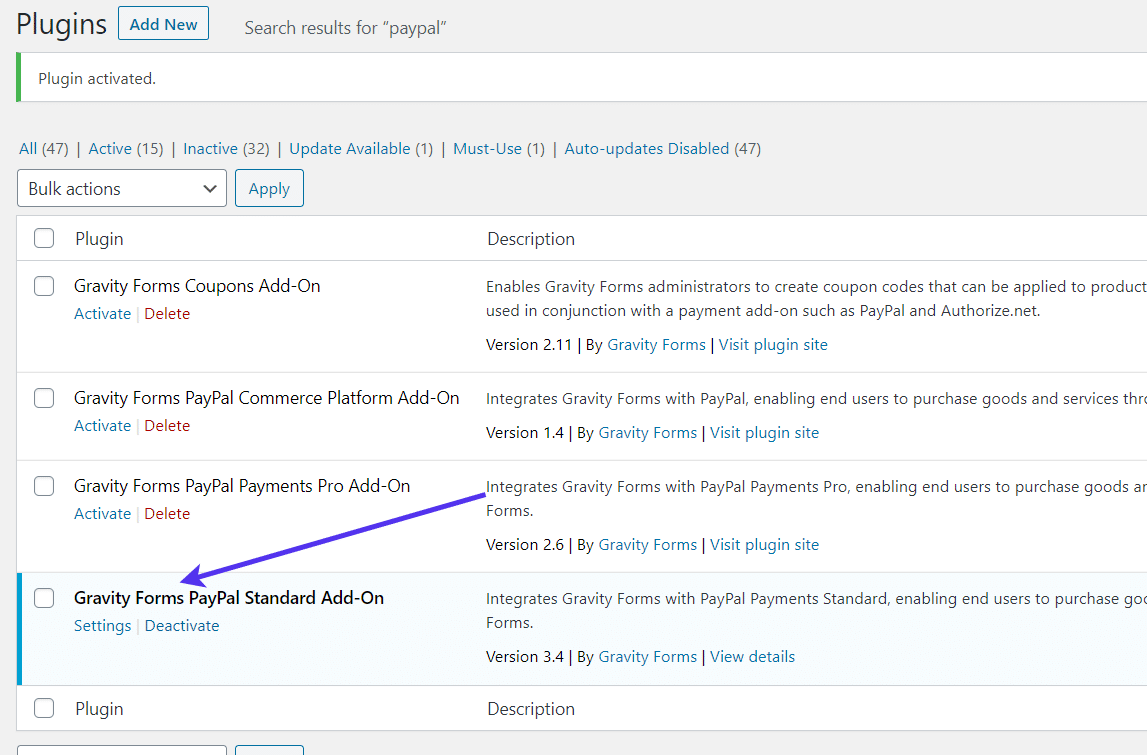
Once an add-on is in fact activated, it shows up in your Plugins section of WordPress.
All Gravity Forms add-ons are really just extra WordPress plugins that interact with the Gravity Forms plugin. Therefore, take a look at the Plugins section to make sure that the PayPal Standard – or your payment add-on of choice – is activated.
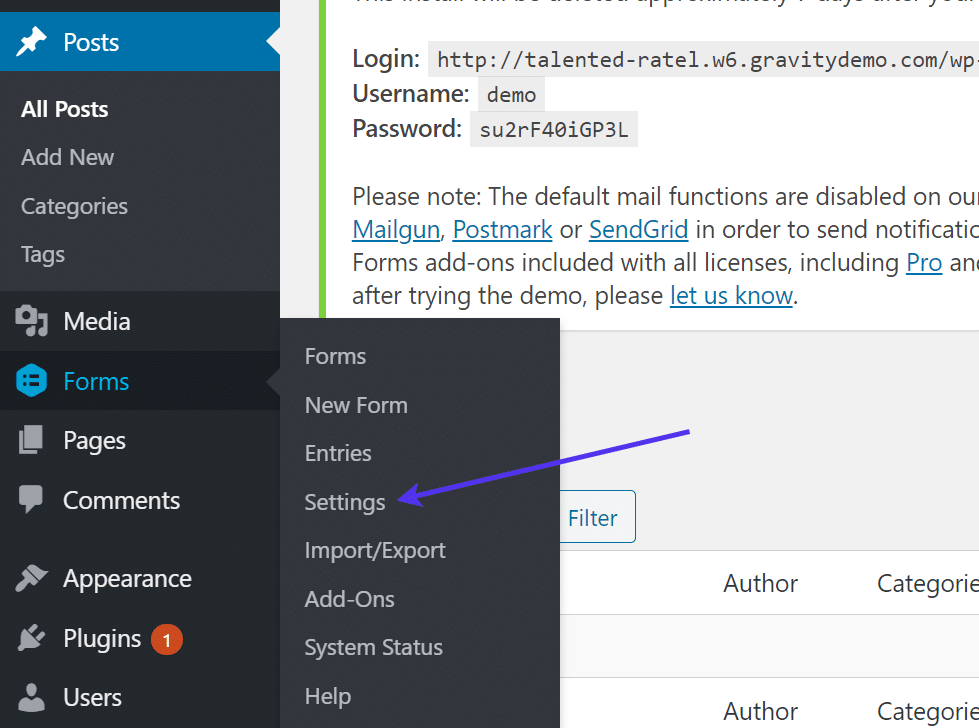
To configure your payment add-on, go to Forms > Settings.
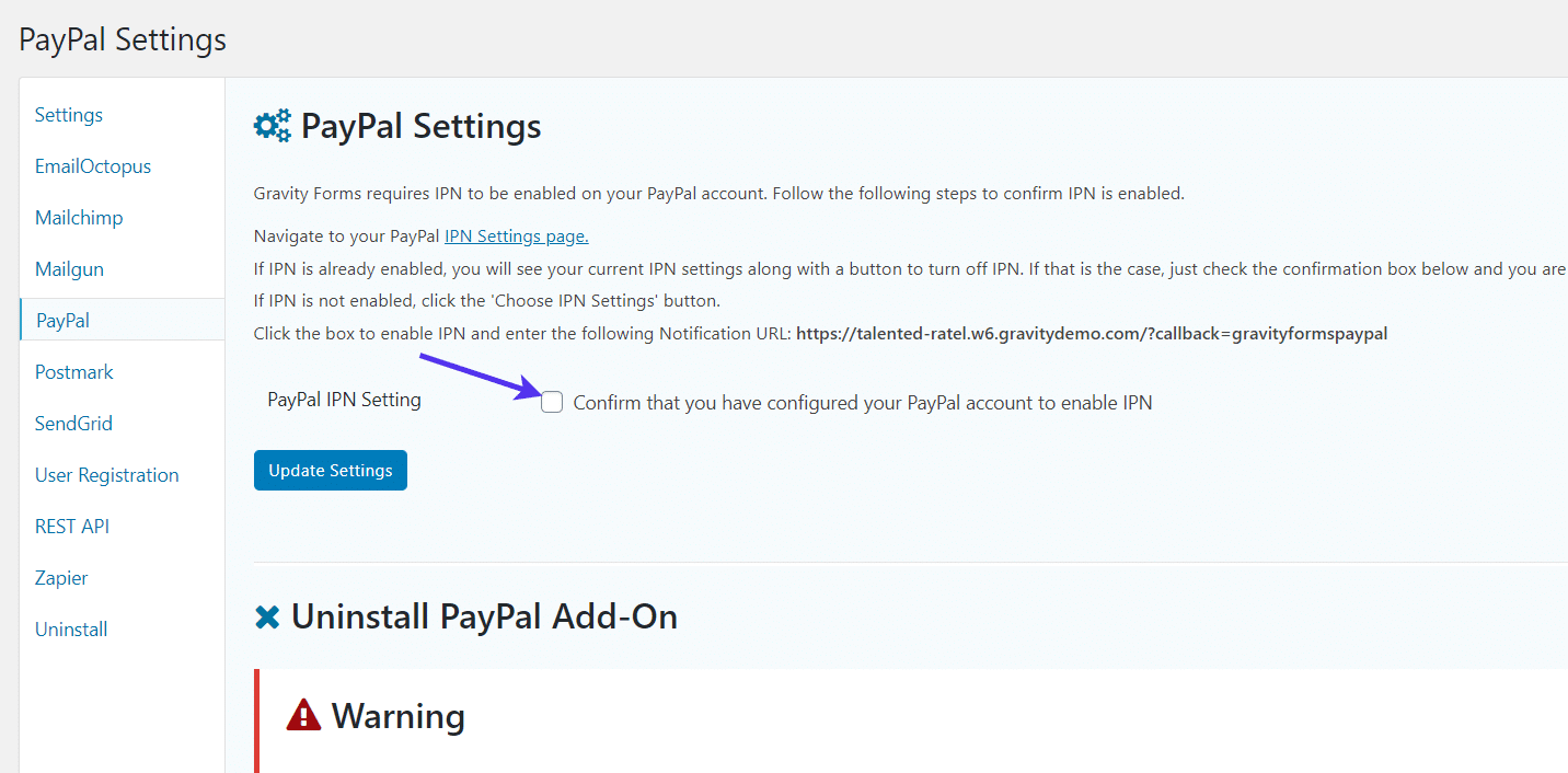
Choose the PayPal tab (or your other payment add-on). Each payment add-on has its own verification and connection process. You can typically walk through the unique steps provided on the dashboard.
For PayPal, it asks for you to confirm that you’ve configured the PayPal IPN settings. Check that box and click Update Settings.
You should also copy the provided Notification URL on this page.
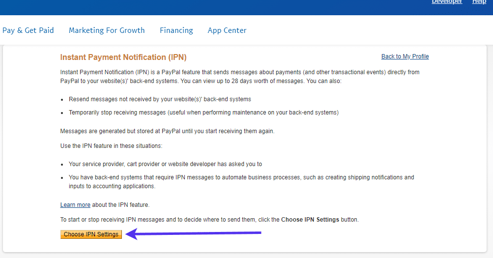
Gravity Forms sends you to the PayPal configuration page. Again, this will look different if you’re using an add-on for Stripe or Square or any other payment gateway.
For PayPal, click on the Choose IPN Settings button.
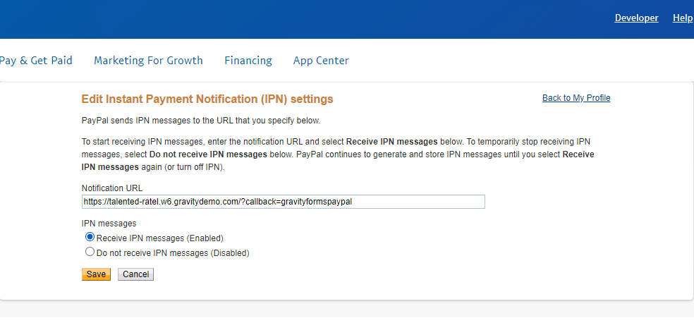
Here’s where you paste in the Notification URL from before.
It essentially activates the right steps and notifications to occur after someone tries to register on your form and pay through PayPal.
Click the Save button.
Just like the registration form configured earlier, a feed must be created for the payment add-on.
To do so, go to Forms > Forms in the WordPress menu.
Find that registration form from before. You need to not only connect the payment add-on to that particular form but also generate a feed for the payment add-on to function properly and associate each payment with a specific user.
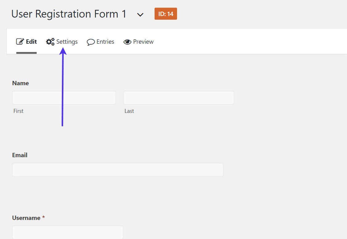
Once you’re back to your registration form editor, click on the Settings button.
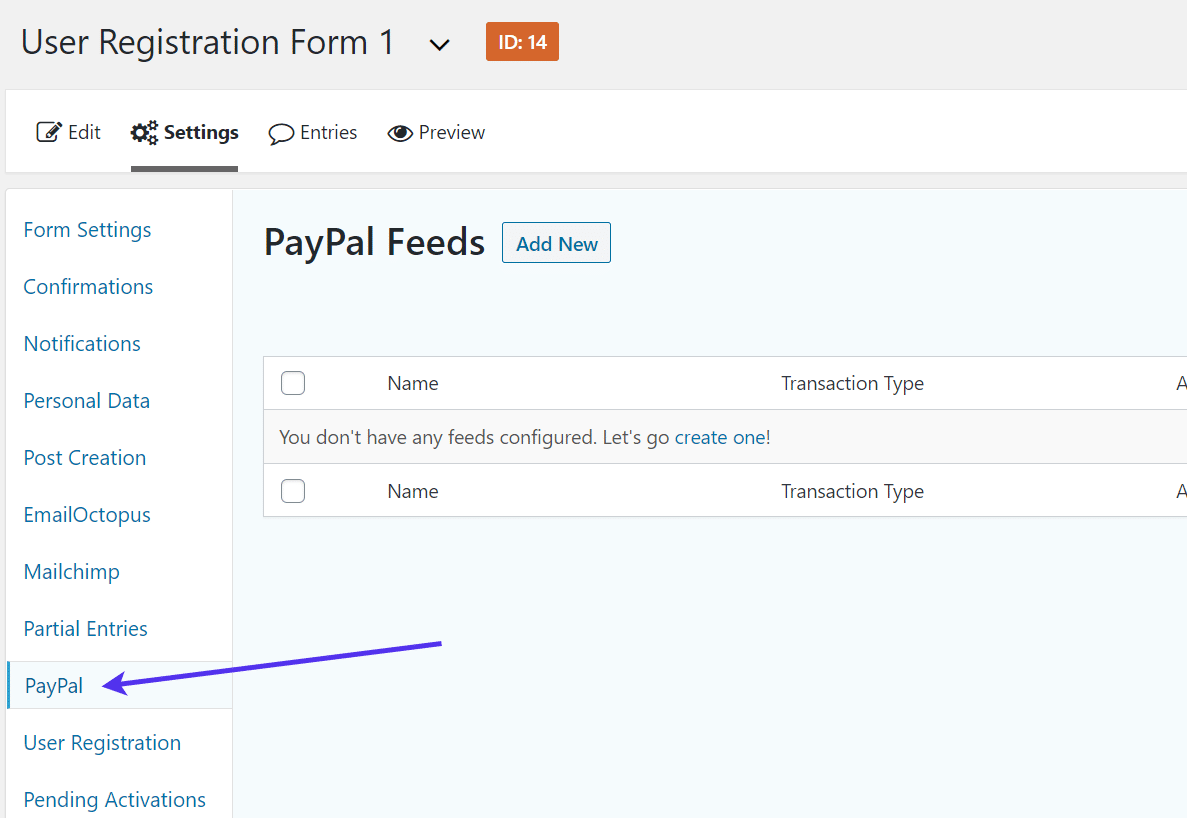
Locate the payment add-on tab, in this case, the PayPal tab.
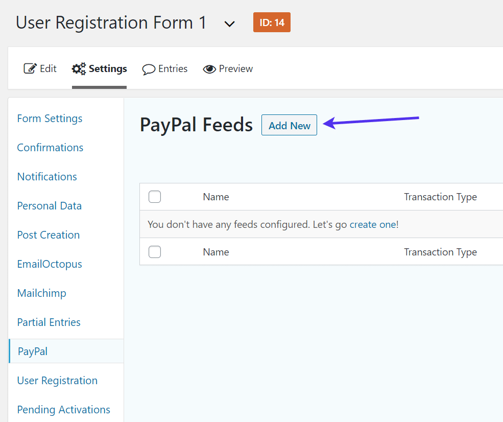
Click the Add New button to generate a new PayPal feed for this form.
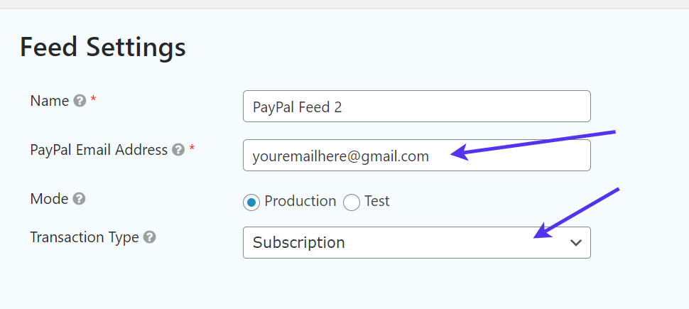
The Feed Settings for PayPal, and most payment gateway integrations, are quick and straightforward. Start by naming the feed and adding your PayPal email address. Choose the Test or Production Mode.
Test Mode is for running the payment processor during the testing phases of your site development. If you’d like to begin collecting real payments, go with the Production Mode.
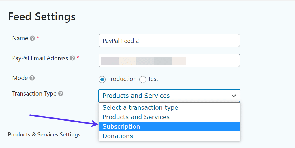
Finally, you’ll need to select a Transaction Type.
In general, the Subscription Transaction Type often makes the most sense for an online magazine or community, but you can also choose a Product Type or something different.
Save your PayPal feed and go back to the form builder.
It’s essential to insert a field on the registration form that indicates to the system and the user that payment must be made.
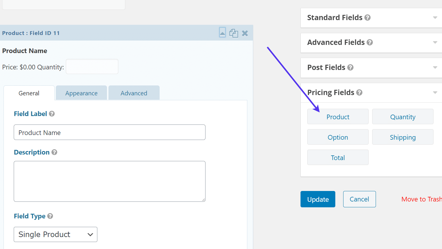
We recommend the Product module, but you do have some other options for setting prices or tabulating totals.
Drag the Product field into your form builder.
For this tutorial, we’re setting a subscription price. We’ll also show you how to configure multiple plans and a one-time payment for that subscription.
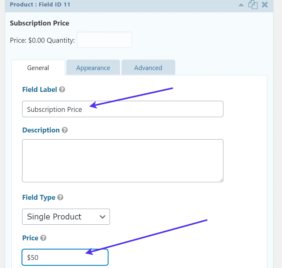
Change the Field Label to reflect what this field is all about.
Also, set the price for your subscription in the Price field.
We typically recommend going with the Single Product Field Type and sticking to a set price. However, many other organizations may have other plans.
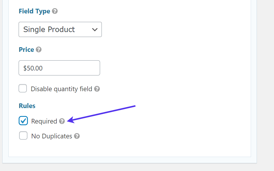
We also recommend checking off the Required box under the Rules header. This way, someone can’t come to your site and make a user profile without paying for the content.
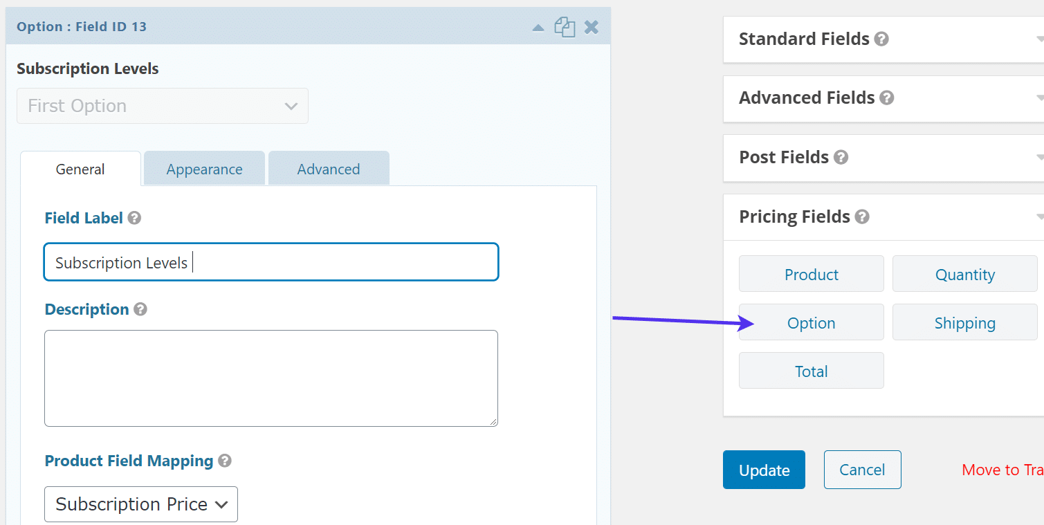
Another field to consider is the Option module.
This opens up the opportunity to set subscription levels where you may have three or four plans based on the number of features or content delivered.
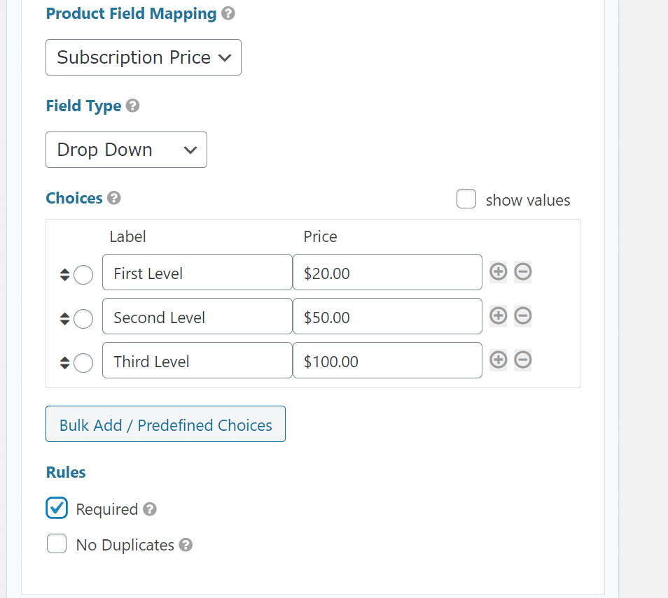
For those using the Option field, set it to Subscription Price for the Product Field Mapping.
Go with whatever Field Type you want and set the Choices with their labels and pricing.
As an example, you may have three subscription levels, all of which increase in pricing as the levels go up.
Be sure to check off the Required box under rules, as this is also a payment field where you don’t want people making accounts without paying.
The type of payment module you decide on also affects the Feed Settings we configured before.
If you’d like to activate a subscription-based registration process, your PayPal Feed settings should also have the Subscription Transaction Type. As an alternative, you’re more than welcome to set the Transaction Type as a one-time product or service or even a donation.
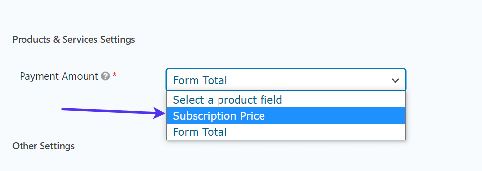
Also under the PayPal Feed settings, you’ll want to tell Gravity Forms where the Payment Amount is coming from in the form. For instance, you could have a Total Price field in the form and a Subscription Price field. Which one should PayPal use to process the transaction?
Use the Payment Amount dropdown to select the correct form field that dictates the total payment. Some people like to simply use the Form Total, but you could also go with the Subscription Price or whatever field you just implemented in the form.
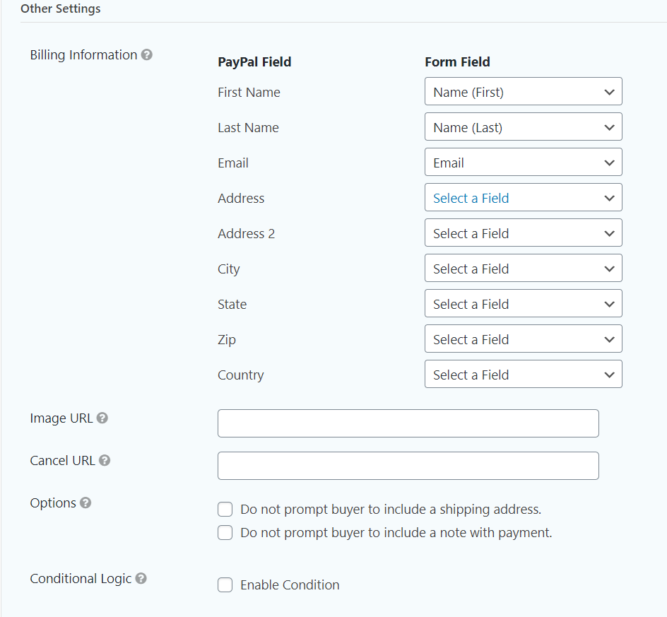
While still in the PayPal Feed settings, take a look at the Other Settings area.
Similar to the User Registration Feed configuration, you have to link the form fields to the correct fields for PayPal. This way, PayPal knows where to place the user’s first name, email, and other information when it gets transferred over to the PayPal interface.
Under the Other Settings area, go through every item on the Billing Information list. Some of these should be set by default, but make sure to double-check.
For instance, the First Name and Last Name fields on your form should correspond with the First Name and Last Name fields in PayPal. This may require you to insert a few more fields on your WordPress registration form. As an example, we didn’t include an Address field on our user registration form, but it would speed up the process by asking for all billing information upfront on the form.
These aren’t entirely necessary, but like mentioned before, they could speed up the registration and payment processes. All payment add-ons are different, and the PayPal connection will simply pull billing information from the user’s PayPal account or ask for those details when they get to PayPal.
Some other settings to think about include the Image URL and Cancel URL. Feel free to insert an Image URL for your logo or any image that represents the product being sold. The Cancel URL serves as a redirect that sends users to a specific page if they happen to cancel the payment prior to completing the process.
The Options area asks whether or not you’d like to prompt users to include a shipping address or note during the payment process. For many online services or communities, there’s no need to ask for a shipping address. Therefore, you may want to check that box to ensure a customer doesn’t get confused.
As for the note setting, that’s entirely optional and usually not necessary, unless you’re offering some sort of custom service or product where you want feedback or details from the user upon payment.
The Conditional Logic checkbox prompts you to add logic rules for accepting payments from customers. For instance, you could exclude users from getting through the payment process if they don’t opt for a certain payment plan or if their email address doesn’t look real.
Overall, conditional logic can assist with preventing spam and providing benefits to users who are in a certain user type or payment level.
The last setting to configure involves delaying the user registration. As with many of the settings covered above, this is optional. However, it’s not a bad idea to only consider processing the feed after payment has been received. This way, a user isn’t created in your WordPress database until you know for certain that the payment has been declined.
If you leave this box blank, you may find that several users are cluttering up your database even though they didn’t pay to gain access.
Click on the Update Settings button once you’ve decided on all the proper settings for your organization.
To test out the payment configuration on your form, go to the Pages tab in WordPress.
Click back to the form you created before. In our case, that’s the User Registration form.
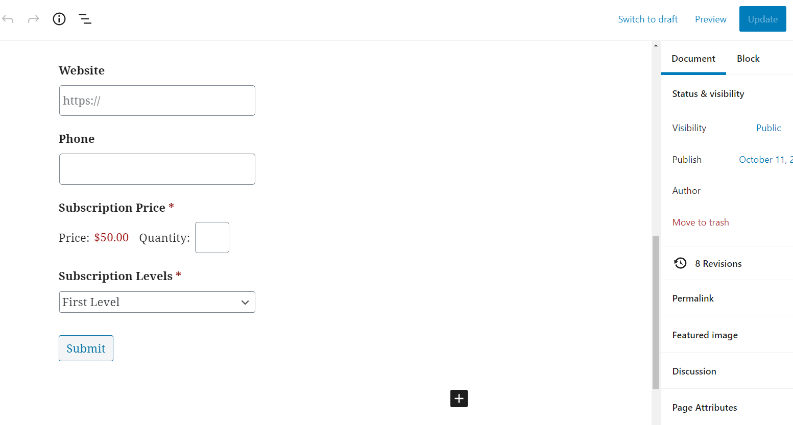
Seeing as how you’ve already generated a user registration form on this page, and linked the PayPal or payment gateway feed to the form, the payment fields should appear in the visual builder.
We have both a one-time subscription price and a field with different subscription levels to show the various options you can include in a form like this. In a real-world situation, you’d most likely choose one or the other.
It’s essential to test out a form with a payment option. The last thing you want is for a wave of customers to get stuck because of a misconfigured payment setting.
Fill out some test user information on the form, like a password, and maybe select a subscription level or buy an individual, one-time payment subscription.
Click the Submit button to see the WordPress registration form and payment processing in action.
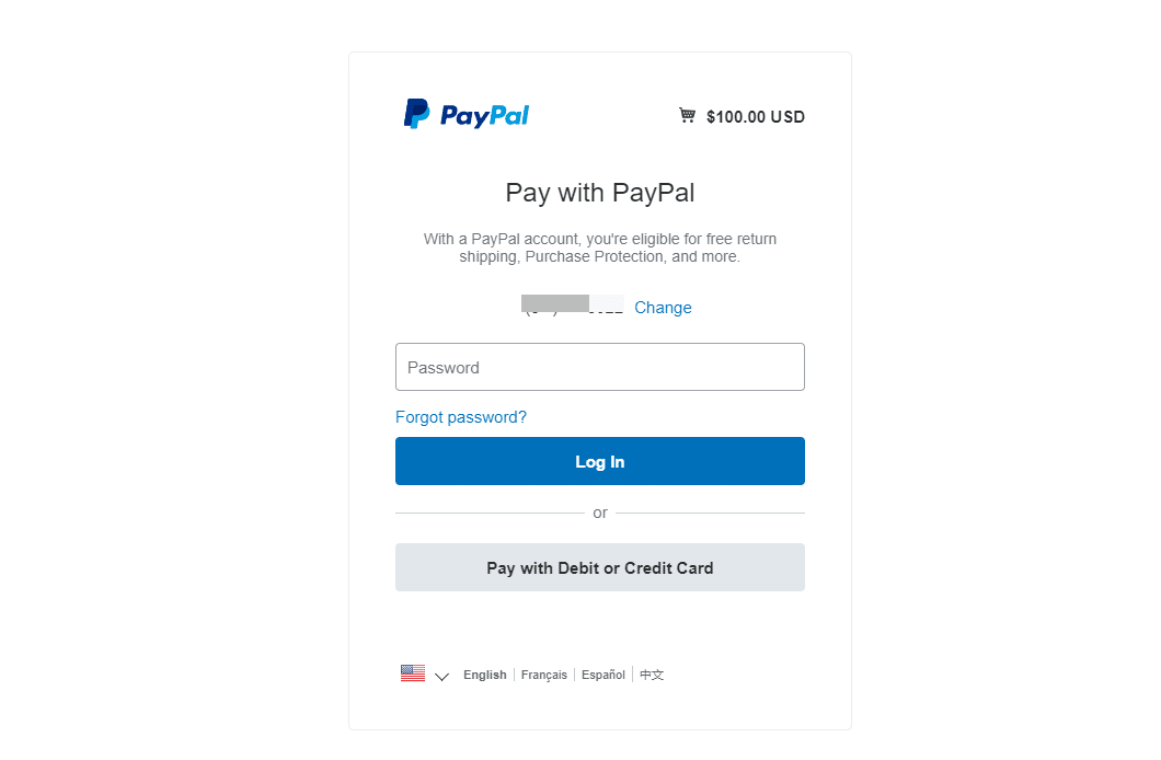
After the submission, the page redirects to PayPal, showing the total price and prompting the user to either log into their PayPal account or pay with a debit or credit card.
Remember, an alternative payment add-on like Stripe or Square or Authorize.net looks different than PayPal when it comes to processing the payment. Each one will bring the user to a new page to complete the payment, but they will all have slightly different steps.
How to Add Users to an Email Marketing List Through a WordPress Registration Form
When a new user comes to your website, it makes sense to try to get them as a registered user. In addition to offering the user access to features or content, the registration form serves as an opportunity to instantly place that user data into your email marketing list.
The benefit of doing so revolves around automation. Yes, a WordPress registration form logs that person’s email and name in WordPress, but the process of getting that data into a respectable email marketing software requires a manual export from WordPress and an import to the email marketing tool.
There’s nothing wrong with that in theory. Imports and exports get the job done. Yet, it takes a significant amount of time out of your day to complete this task on a regular basis. Furthermore, your email marketing list doesn’t get updated in real-time. A user might provide their email and end up sitting in your user database for days, weeks, or indefinitely.
That’s why it’s essential to link an email marketing and design tool to your registration form.
Quite a few email newsletter builders are available for you to send out batch messages and categorize your email lists into different groups. The more popular ones offer integrations with many user registration plugins, allowing you to combine the two platforms into the email collection system.
You may have heard of companies like Mailchimp, Constant Contact, and Mailgun. All of these offer similar email design and segmentation features, and you can usually find a simple integration that achieves what we’re talking about.
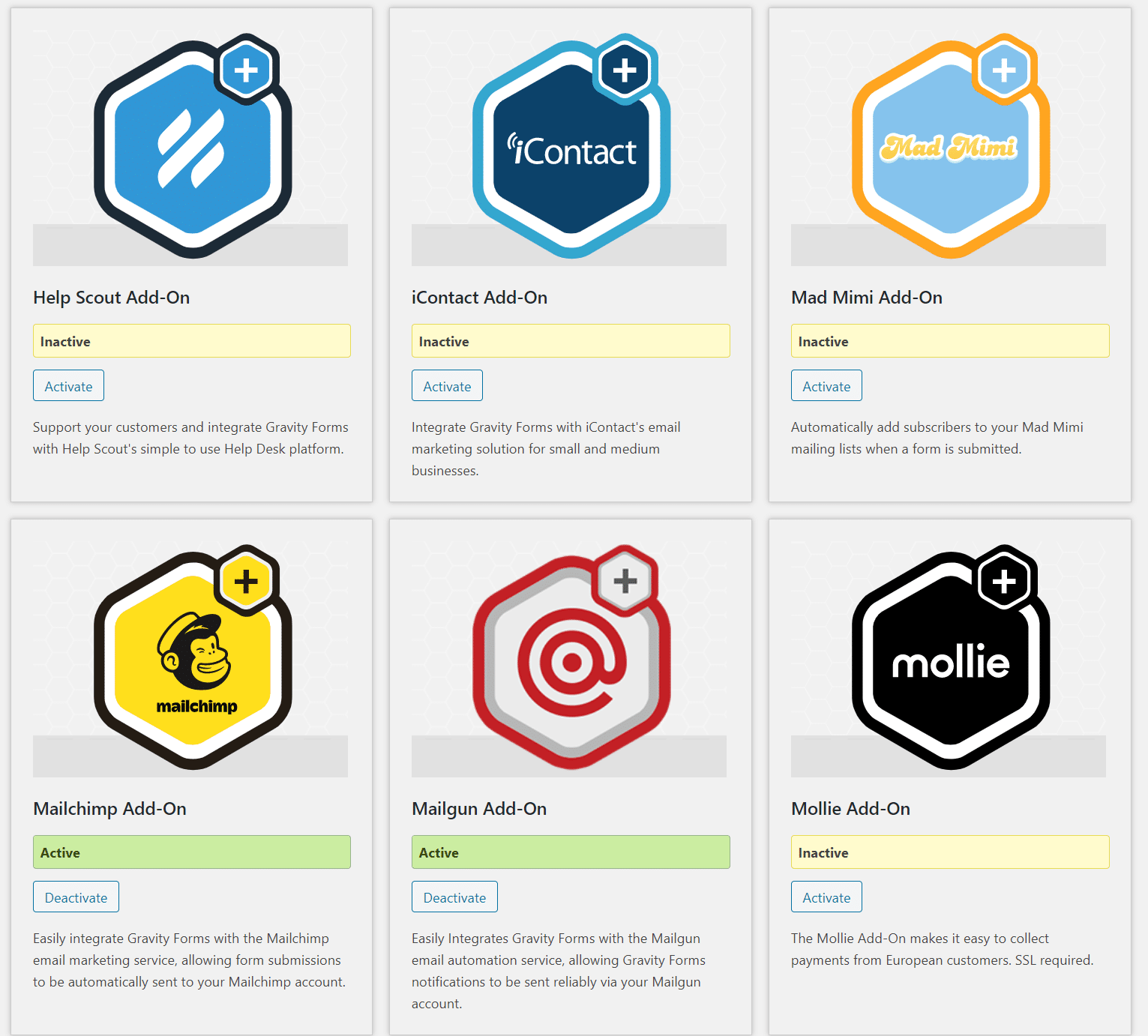
Luckily, another category of add-ons within Gravity Forms offers direct links to email marketing platforms. As with most add-ons from Gravity Forms, the email marketing solutions require a premium plan.
Moving forward, the list of email marketing add-ons from Gravity forms is a long one.
Each of them works similarly, yet all of them have their own distinct interfaces for sending emails and getting integrated with Gravity Forms.
For simplicity, we’ll use the Mailchimp add-on as an example, seeing as how it’s a rather popular and affordable email marketing app.
Ready?
Then, navigate to the Add-ons section in the Gravity Forms WordPress plugin.
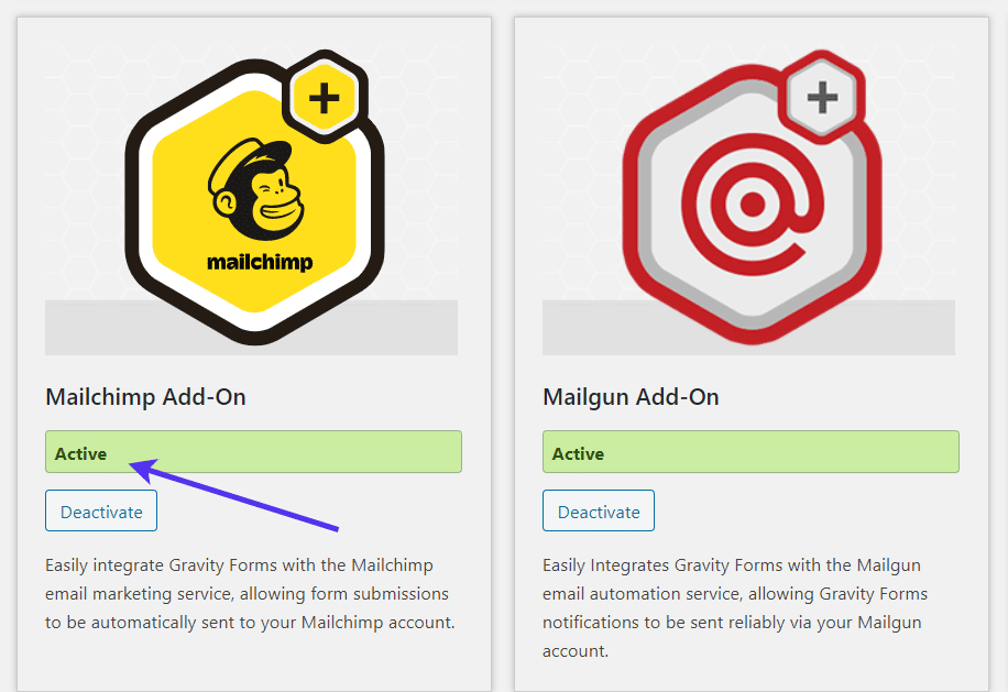
Scroll down through the list of add-ons to locate the Mailchimp option. If it’s not already turned on, click the Activate button.
We’re assuming a registration form has already been created (see above for steps to get that done).
Go to Forms > Forms in the WordPress menu.
Find the User Registration Form you created before in your list of published forms.
Click on the form to edit the fields.
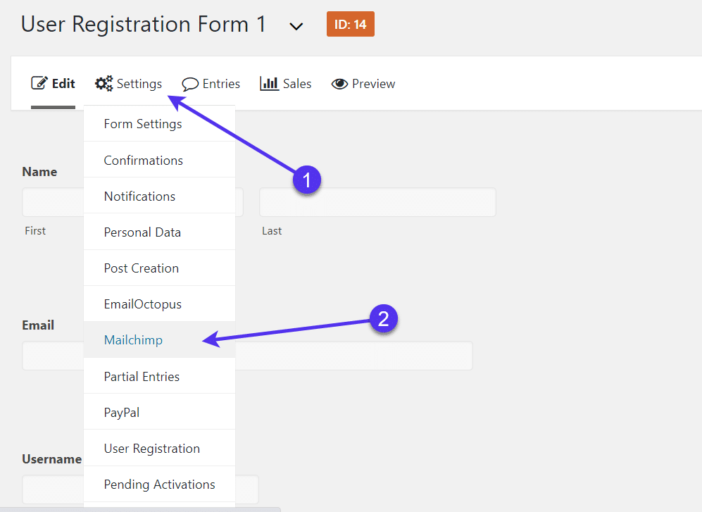
Go to Settings > Mailchimp. If you’re using an alternative mailing service integration, find the tab for that one.
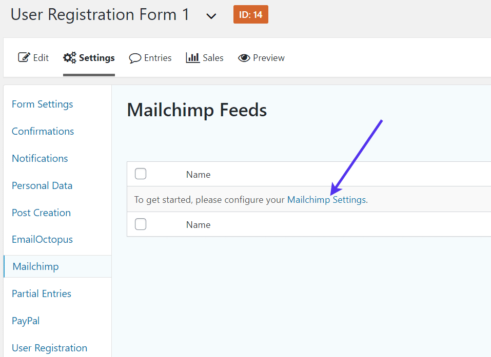
The goal is to make a Mailchimp Feed that tells Gravity Forms to send submissions to Mailchimp in addition to the WordPress user database. But first, you must configure the Mailchimp Settings.
Click on the link that says Mailchimp Settings.
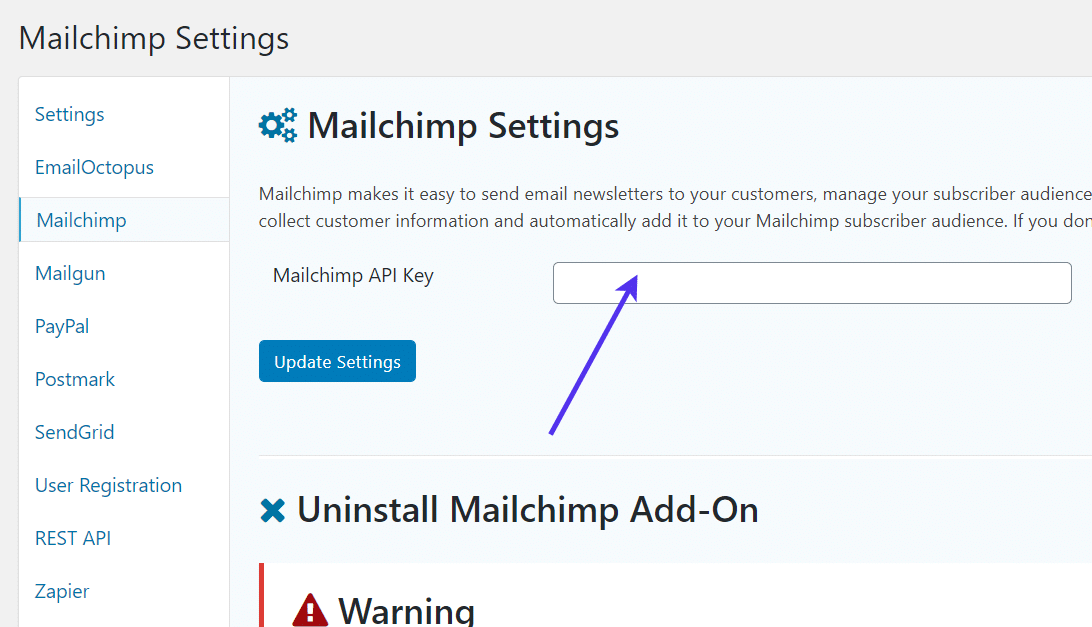
The next page requests that you paste in the Mailchimp API key. To find your API key, move onto the next step.
Go to the Mailchimp website and either create an account or log into your already created profile.
The Mailchimp dashboard organizes campaigns, lists, and other elements in the menu. You should make an email list (also called an Audience in MailChimp) prior to setting up this integration with the API key. The reason for this is because you’ll eventually need to select an email list to send over the user registration information.
Once you have a list created, find the Profile icon at the bottom of the Mailchimp dashboard.
Click this to reveal a menu.
Select the Account tab to proceed.
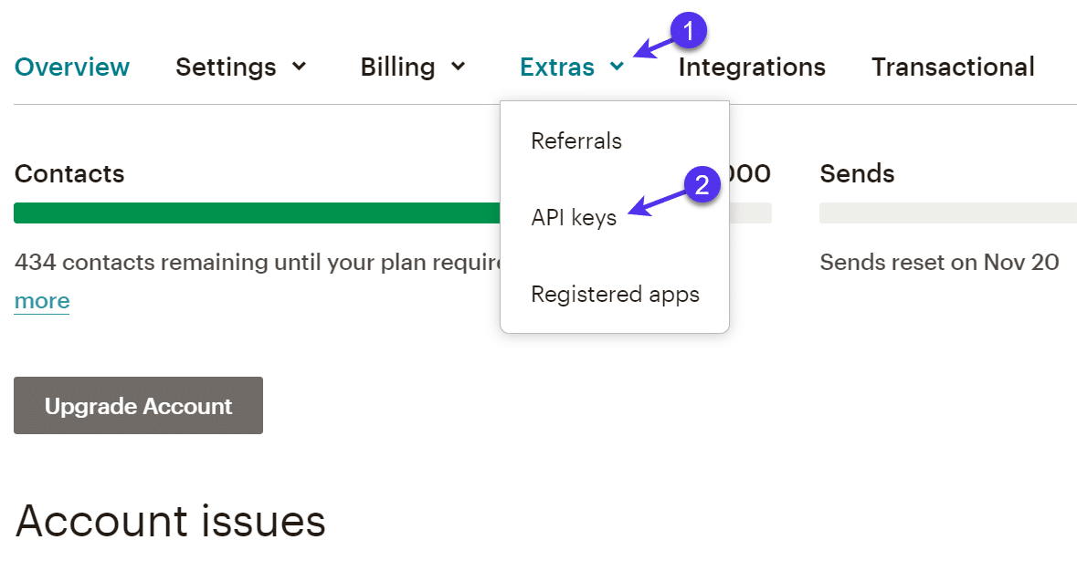
Once in the Account panel, click the Extras tab. You should see a few items to choose from. Click on the API Keys option.
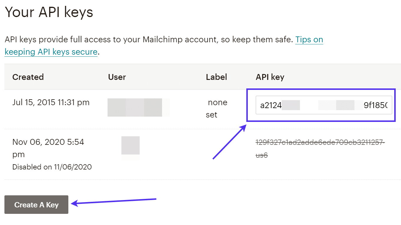
An API key is a code that offers the potential for linking multiple systems together. In Mailchimp, all you have to do is click on the Create A Key button to manufacture a key.
You can make as many keys as you want, but it’s a good practice to keep them to a minimum. The API key is shown in a list with a label and when it was created.
Copy the API key to your clipboard. Feel free to exit out of the Mailchimp dashboard.
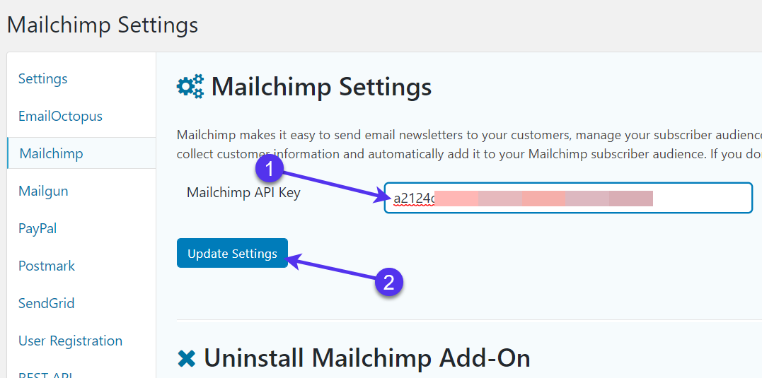
Open the Mailchimp Settings again in your WordPress dashboard. Paste the key into the field that reads Mailchimp API Key.
Click on the Update Settings button to register the change.
Now it’s time to go back to the User Registration Form from before.
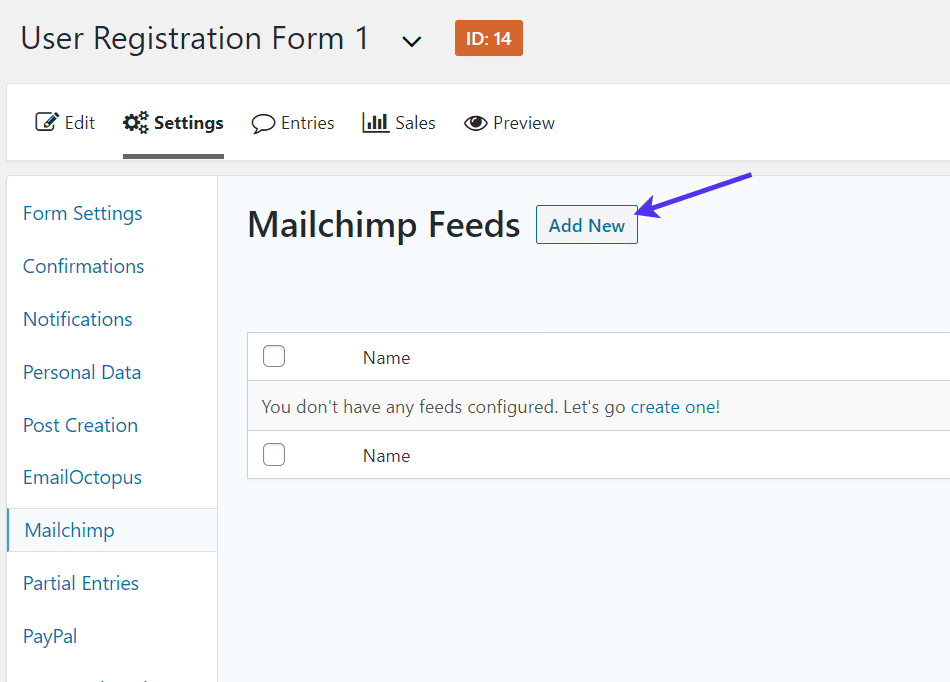
Go to Settings > MailChimp under the registration form menu.
This is the area that asks you to make a Mailchimp feed. Again, this is how Gravity Forms ensures that data is passed from one app to another.
Click the Add New button.
Name the feed something you can remember. That name is only for your own reference.
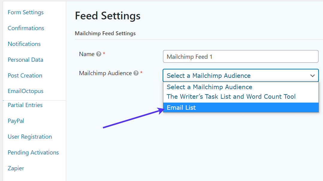
Under the Mailchimp Audience field, click the dropdown menu to choose the name of one of your Mailchimp email lists.
If you haven’t made an email audience list, you need to go back to Mailchimp to complete this process. Otherwise, there’s no database to start logging your email addresses.
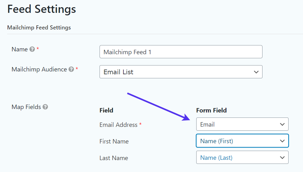
An area for Map Fields appears, and it prompts you to link the form fields from the User Registration plugin to the forms that need filling in on Mailchimp.
This is fairly easy considering you would select Email to go along with the Email Address field, and the First and Last Name form fields for the First and Last Name Mailchimp fields.
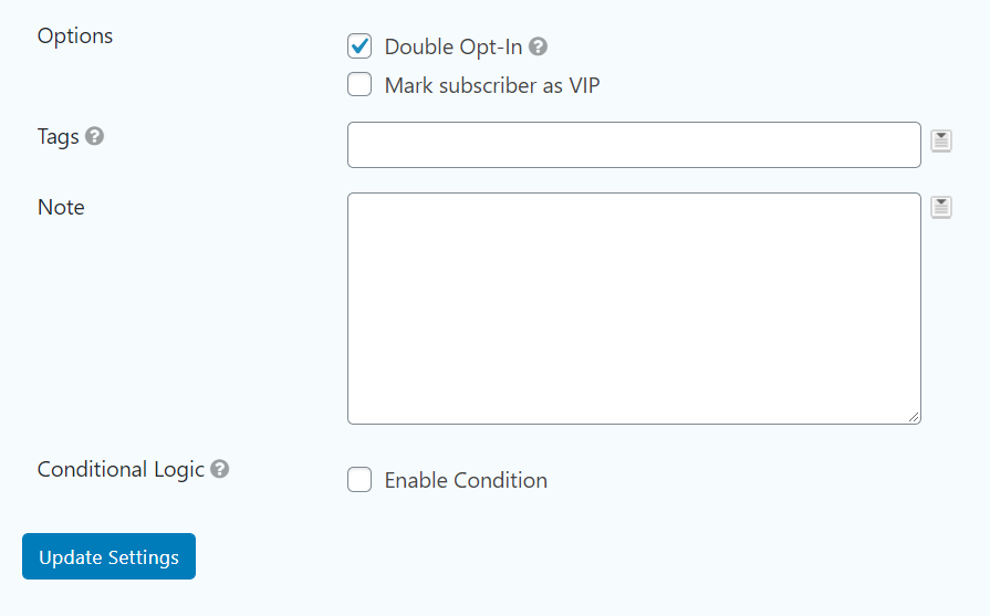
Go down to the additional options.
These are entirely optional depending on how you’d like the email collection process to work.
For instance, you may want to activate a double opt-in situation, where the user must click on a confirmation email prior to getting registered into your list. This is both for security and because some areas of the world require it.
Other settings include the option to log subscribers as VIPs, set tags, and write a note. The note field could help with organizing where the email subscriptions are coming from compared to other forms you may have.
Once all of that is done., click the Update Settings button.
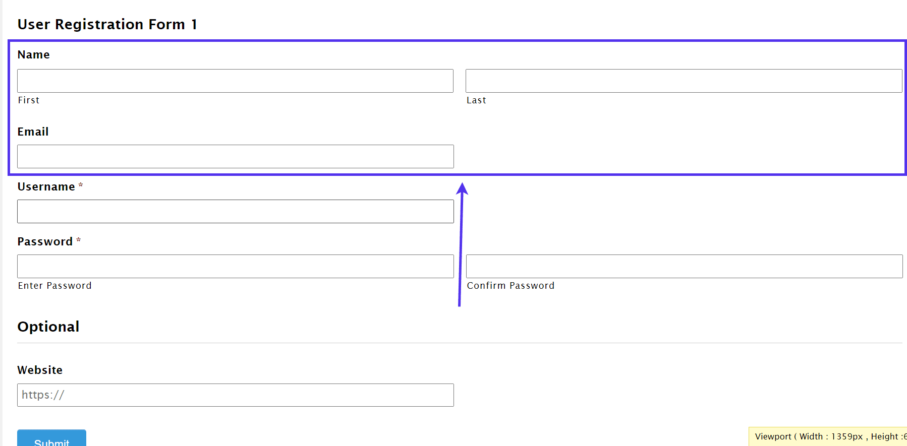
If you go to test the map fields (or other email marketing add-on) integration on the frontend of your site, you may notice that not much has visually changed. However, you can run a mock user test once again by filling in the user registration form and seeing if it works properly.
With this configuration, you should be able to go to map fields after the test submission and see a brand new user subscribed to your designated email list audience.
The standard fields to log include Name and Email, but you’re able to get creative and store even more than that with the help of the map fields and Gravity Forms features.
How to Let Users Register to Your Website Using a Social Profile
The social profile login has become more common around the internet due to its quick login process and the fact that people don’t have to generate a completely new account for every website they want to join.
A community or membership site that needs every advantage in convincing users to sign up could definitely benefit from a social login, seeing as how it removes a few barriers to entry right from the start.
The User Registration plugin from WPEverest serves as the ideal plugin for customizing your user registration page and incorporating a social login option. The core plugin is free, but the Social Connect extension – which adds those social login buttons – requires you to sign up for a $69 per year plan.
We’ll show you how to install and use the plugin below, but keep in mind that several other similar plugins are available for you to consider.
To get started, install and activate the User Registration plugin and upgrade to the Personal plan to receive the Social Connect extension.
In your WordPress dashboard, activate the Social Connect extension as well. Both the User Registration and Social Connect items show up in the Plugins area of WordPress.
Go ahead and activate the User Registration Social Connect plugin.
Now, go to User Registration > User Registration. The plugin has a few templates to start your registration form. If you’d rather begin from scratch, click on the Add New button.
Once you get to the form editor, utilize the User Fields area to drag-and-drop modules into your form.
The default registration form from the plugin includes the User Email, Username, and Password fields.
We’d recommend mimicking this if you’re building a form from the ground up. You can also incorporate other modules by selecting them from the User Field panel.
Each field has its own options for you to edit if you click on each one.
However, the most important part of activating the form for user registration is under the Form Setting tab.
Here, you adjust a wide range of settings to tell WordPress that you’d like this form to function as a new user creator. For example, you can set which user role is created and have each user either manually or automatically log in after the registration.
It’s time to place the user registration form on a page once all desired fields are implemented.
The User Registration plugin uses shortcodes to put forms on pages and posts. You’ll find them above your form builder.
Copy this code to your clipboard.
Go to Pages > Add New.
If you already have a registration page ready to go, navigate to that page instead.
In the page builder section, paste that shortcode wherever you want it to show up on the page.
Make sure you save or update the page so that it renders on the frontend. As always, it’s better to test out the WordPress registration form and see if it’s working.
You may need to log out of your admin account to see the form as a regular user.
The whole point of this section is to show you how to insert social media login buttons. So, the next few steps cover that.
Click on User Registration > Settings.
We’re assuming that the Social Connect extension is already activated on your WordPress dashboard.
Therefore, you should find a Social Connect tab in the Settings panel. Click on that.
The Social Connect settings require you to check some boxes and enable the API settings for each social network you want to allow people to log in and register with.
If you want to have a Facebook button, check that box. The same goes for Twitter.
Same thing for Google and LinkedIn.
Here comes the slightly confusing part.
Each social login button functions by linking to the social network’s API. The only way to connect to the API is by making an app and using elements like social App IDs, Keys, and Secrets.
It doesn’t matter if you have no idea what these mean. For each desired social button, scroll over the question mark next to each settings field. For this tutorial, we’ll only locate the Facebook App ID and Secret.
The question mark shows a popup with a link to Facebook. Click on it.
This redirects you to the Facebook Apps page, where you’re able to create an App for running your WordPress registration form with social media connections.
Click the Create App button.
Go through the steps of making an app on Facebook, including naming the app and setting any app domains you may need.
Once the app is configured, go to the Settings > Basic page.
Here you can find the App ID and App Secret.
Click the Show button to reveal and copy that App Secret. You’ll also want to copy the App ID at some point.
Go back to those API Settings in the WordPress dashboard.
Paste the App ID in the appropriate field. Also, paste the App Secret in the corresponding field.
Save the settings to continue.
There are a few remaining steps to not only activate the social media buttons but to customize how they look on the form.
Click the Advanced Settings tab, next to the API Settings tab you were just in.
The Advanced Settings contain a wide range of options to check off.
First of all, make sure you indicate that you’d like to enable the social registration.
Next, tell the plugin that you want to display social buttons for registration.
Click on the following Default User Role field to select a primary user role that gets created whenever someone registers for your site with a social profile. Subscriber is the standard for this situation.
Moving on, click on the next dropdown field to choose the form in which you’re using for your user registration. We created that from before, so make sure you locate the right one. In this tutorial, it’s named Registration Form, but you might have called yours something different.
Finally, move onto the other settings to adjust the physical appearance of the buttons. One of those settings is for showing the buttons near the top or bottom of the form.
The Social Login Templates provide a quick way for stylizing your buttons without any code or visual adjustments.
Pick one of the four styles.
The Social Text settings indicate the wording that’s shown on the social buttons. You can typically stick with the default text, but feel free to change it if you want.
Finally, click the Save Changes button.
You can preview the WordPress registration form from your form builder or go directly to the registration page you made earlier. Either way, this allows you to view the form with its social media buttons.
To remove a social login option, or to change the settings, simply go back to the settings we just went through.
We highly recommend testing each of the social login buttons you offer on your registration form, seeing as how every social network has its own API connection and you at least want to make sure the apps and app keys work for all users.
How to Create a WordPress Registration Form With Rich Membership Profiles
Modifying the default WordPress user registration can be done with most of the plugins we cover in this article. Yet, what if your website is an actual community? Let’s say your site operates as a social network, dating site, or internal client hub.
You need feature-rich profiles for those users to customize their information, potentially upload photos, and even communicate with other users.
The average user registration plugins have profiles, but nothing too powerful.
That’s why we want to show you how to activate a membership-style user registration where the user receives a beautiful profile that they control.
To begin the process, install and activate the Ultimate Member plugin. This plugin provides custom user registration and login forms for free. Not to mention, you can add powerful user profiles to make for a quality membership or profile area. Quite a few similar plugins are available with this functionality as well, but we’ll focus on the Ultimate Member plugin for this tutorial.
The goal is to achieve a more useful customer area, with an in-depth profile experience for users, incorporating buttons for things like reviews, comments, groups, and much more.
The great part about the Ultimate Member plugin is that the vast majority of settings are already configured upon activating the plugin. It also creates pages for your profiles, registration pages, and more.
The plugin’s settings are consolidated under the Ultimate Member tab in the WordPress dashboard.
Click on the Create Pages button to continue.
This activates the right pages and brings you to the Settings module of the Ultimate Member plugin.
You can change the pages that function as the corresponding registration and profile pages, but that’s only if you want to customize your own.
As of right now, the premade pages generated by the plugin will do. Therefore, you can typically leave all fields under the General > Pages tab untouched.
The next step is to customize the look of the profile pages and registration modules. As mentioned, the registration page is already configured for you, so there’s not much to complete in that area.
Every person that goes to the Registration page and makes an account will have a WordPress user profile.
In the Appearance tab, adjust the elements you find important. For instance, you may want to choose a different template for the form or decrease its width. There are also fields for adjusting the sizes and icons for buttons and text elements.
Scrolling down in the settings areas, the plugin asks if you’d like to have a default profile and cover photo in each profile.
You can also adjust items like the default cover size and whether or not you even want to have a cover photo.
While still in the Appearance section, click the Profile Menu link. This area shows the primary components that make up the user profile. Although you have the freedom to leave everything as is, there are some settings you may want to modify.
Consider keeping things like the About tab and the entire profile menu. We recommend having the Posts tab if your members contribute to your blog or function as your content creators.
The Comments tab is rather important for blogs and communities, considering the readers and members probably want the ability to go back and check on their comments.
After all profile settings are configured, click the Save Changes button.
A few other settings panels provide options for the registration form, login form, and more. Make sure you adjust the emails that go out for new registrations and change many parts of your WordPress registration form, including the width and alignment.
Although we won’t cover all of these settings, it’s nice to know where they’re located to ensure all forms look suitable for your brand.
A registration form is required in order to give your users a place to make their usernames and get to their profiles.
To create one, go to Ultimate Member > Forms.
Again, the Ultimate Member plugin provides several premade forms so that most of the work is done for you.
A Default Registration form is ready to go, as the Default Profile form is, or the hub where people customize their user profiles.
What’s more, is that the plugin automatically creates pages for you as well.
Go to Pages > All Pages to see options like the Account and Login pages. The Register page is where a user registers and logs into their account, while the Account page holds the Default Profile form, where they manage their profile.
All of the appropriate shortcodes for the right forms are already inserted into the correlating pages.
You can test them out by viewing the published page versions. For instance, click on the Register page to see it in action.
On the frontend, a visitor can type in their username and email and create a password.
You may want to look at the User page as well.
The User page is the profile module we’ve been talking about. It’s a hub for users to manage everything from profile photos to potential groups and friends. The default features include a cover photo, profile photo, and a biography.
It only takes a few clicks to incorporate those elements into the profile page.
Each profile page provides additional buttons for editing the profile and checking out the user account.
Other tabs include a Comments button and a Posts button.
What about adding more advanced profile tabs for things like private messages and friends?
The Ultimate Member plugin has a fairly clean and powerful user profile feature already, but it allows you to expand upon those features with extensions. Most of the profile-oriented extensions require you to pay a fee.
To see the extensions and add them to your site, go to Ultimate Member > Extensions.
There’s a long list of potential profile features to include as tabs in your user profiles.
The Friends extension lets your users interact with other users and add them as friends.
The Notices add-on pings your users when a message comes through. You can also incorporate powerful profile management tools for private messaging, followers, and groups, just to name a few. Each one is added by making a payment and clicking on the Get This Add-on button.
It all depends on what type of profile features you’d like to provide. A membership website typically requires a place to make groups. A social network needs friend groups and messaging. An online course website might need reviews and notes and messages. There’s even a place to configure a job list if you want to provide an employment board for your users.
The example below is a taste of what’s possible with the Ultimate Member plugin, especially when you begin tapping into the advanced extensions.
Want to add a logo, a social login, or otherwise customize your WordPress registration form? 🤔 This guide has you covered ⬇️Click to Tweet
Summary
Overall, the WordPress user registration module provides the potential every website needs for creating users and receiving data from those users. The average blog or small online community may only need the default WordPress registration form.
If that’s the case, leave the login and registration form the way it is and maybe change the URL for better security. You can even add your own logo to make it look like your brand actually runs that page.
Plugins open up opportunities for customizing every aspect of your user registration form, especially when it comes to adding unique fields and redesigning the way your form looks.
It’s possible to add extra, advanced features to your user registration forms. Some of the options we covered in this article include forms that place new users into email marketing lists. You may also consider collecting payments for exclusive content or if you run a membership site.
It’s also not a bad idea to consider offering a social login form to speed up the registration process for users. Finally, an advanced user profile is a great way to expand upon your current user registration form so that the customer gets a chance to manage every aspect of their user profile.
If you have any questions about managing or customizing your WordPress registration form, or you’d like to suggest other plugins or techniques for customizing registration forms, let us know in the comments section below.
Благодаря блоку «Форма» читатели могут связываться с вами через веб-сайт. Блок «Форма» позволяет добавлять формы различного типа, включая контактную форму, форму записи на определённое время, форму регистрации событий, форму обратной связи и многое другое.
Если вам нужно, чтобы посетители подписывались на ваш сайт или на новостную рассылку, используйте блок «Подписка» или следуйте инструкциям по созданию новостной рассылки.
Обучающее видео
Добавление блока «Форма»
Чтобы добавить блок «Форма», щёлкните значок + Вставка блоков и выполните поиск по ключевому слову «форма». Щёлкните его, чтобы добавить его в запись или на страницу.
Вы можете ознакомиться с подробными инструкциями по добавлению блоков.
💡
Чтобы быстро добавить новый блок «Форма», можно также набрать
/formв новой строке и нажать Enter.
При первом добавлении блока «Форма» предлагается выбрать тип вставляемой формы. Выберите тип, который лучше всего соответствует вашим потребностям. После добавления блока «Форма» вы сможете изменять поля формы.
💡
Если вы желаете добавить форму подписки, используйте блок «Подписка». Сведения о блоке «Подписка» можно найти здесь.
Выбрав тип формы, задайте ключевые настройки справа.
- Адрес электронной почты для отправки уведомлений (подробности)
- Тема письма (подробности)
- Что происходит, когда кто-то отправляет форму (подробности)
Если вас устраивает вид формы, щёлкните Опубликовать или Обновить чтобы изменения вступили в силу (блок «Форма» не будет работать на странице, которая является неопубликованным черновиком). Либо ознакомьтесь со сведениями о дальнейшей настройке формы перед публикацией.
Настройка формы
Вы можете управлять полями в форме и настраивать их. При первом добавлении блока «Форма» вы увидите несколько полей формы, с которых можно начать, например «Имя» и «Адрес электронной почты».
Чтобы добавить новое поле в форму, щёлкните значок + Вставка блоков, который отображается под последним полем, как показано здесь:
Щёлкните Просмотреть все и прокрутите вниз, чтобы увидеть все поля формы, которые можно выбрать:
- Название
- Электронная почта
- Веб-сайт
- Текст
- Выбор даты
- Сообщение
- Номер телефона
- Флажок
- Группа флажков
- Согласие
- Переключатель
- Выбор
Можно также добавить другие блоки, не относящиеся к формам, например «изображение» или «текст».
Настройки поля
Добавив все поля в форму, щёлкните любое поле, чтобы внести дальнейшие изменения, в том числе следующие:
- Переместить поле вверх или вниз с помощью кнопок со стрелкой.
- Сделать поле обязательным (это означает, что такое поле необходимо заполнить до отправки формы). Чтобы сделать поле формы обязательным, нажмите кнопку «*» или кнопку Обязательное для заполнения поле на боковой панели справа.
Можно также настроить ширину поля с помощью настройки Ширина поля справа. Если для двух последовательных полей задать ширину 50 %, они будут отображаться на одной строке.
Настройки блока «Форма»
Панель настроек блока
В дополнение к настройкам на панели инструментов для каждого блока имеются свои настройки на боковой панели редактора. Если вы не видите боковую панель, просто нажмите значок шестеренки рядом с кнопкой «Опубликовать».

Изменение адреса электронной почты для отправки сообщений
По умолчанию сообщения будут отправляться на тот же адрес электронной почты, который задан в настройках учётной записи. Если вы хотите изменить адрес электронной почты для отправки сообщений формы, выполните следующее:
- Нажмите кнопку Список в верхней части экрана (выглядит как три горизонтальные линии). Она отмечена цифрой 1 на изображении справа.
- Выберите «Форма» (отмечена цифрой 2 на изображении справа.)
- В правой части экрана в разделе «Настройки формы» появится поле Адрес электронной почты для отправки. Введите здесь адрес электронной почты.
- Вы можете указать через запятую нескольких получателей.
- После этого нажмите Обновить, чтобы сохранить изменения.

Тема письма
С помощью этой настройки можно указать тему сообщений, которые вы будете получать каждый раз, когда кто-то отправит вам своё сообщение с помощью формы.
При отправке
С помощью опции При отправке можно указать, что будет происходить после отправки формы посетителем. Вот эти опции:
- Показывать итог по отправленным полям.
- Показывать текстовое сообщение, которое вы можете написать.
- Перенаправлять на другую веб-страницу (можно использовать для переадресации посетителей на другую страницу вашего или любого другого сайта).
Заголовок сообщения
Когда пользователь отправит сообщение, используя вашу форму, появится текст «Сообщение отправлено». Этот текст можно изменить с помощью раздела Заголовок сообщения.
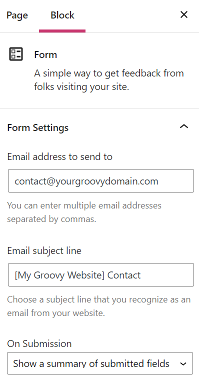
Просмотр всех сообщений
Вы будете получать уведомления по электронной почте каждый раз, когда какой-либо посетитель отправит сообщение с помощью вашей формы.
Вы также можете прочитать все сообщения, отправленные с помощью формы в вашей учётной записи, перейдя в раздел Обратная связь на левой боковой панели на консоли сайта.
Управление обратной связи во многом похоже на управление комментариями. Если отзыв является спамом, наведите на него курсор и нажмите Спам. Если вы хотите удалить отзыв, наведите на него курсор и щёлкните значок Корзина. Если корректная информация ошибочно помечена как спам, нажмите Не спам.

Нежелательные сообщения и спам
Чтобы защитить форму от спама и нежелательного содержимого, в раздел Запрещённые комментарии можно добавить ключевые слова, имена пользователей, IP-адреса, адреса электронной почты и многое другое. Для доступа к этому разделу выберите Настройки → Обсуждение.
Отзывы, в которых используются слова, добавленные в разделе «Запрещённые комментарии», будут сразу отправляться в корзину в разделе «Отзыв».
Полезные советы
- Этот метод не безопасен. Форма не защищает персональную информацию, в частности номера кредитных карт и банковских счетов, имена и пароли пользователей и т. д., поскольку для передачи информации используется электронная почта. Для получения платежей используйте блок «Платежи» или аналогичную службу обработки платежей, которая надёжным образом обрабатывает финансовые транзакции.
- Встроенный фильтр спама. Мы фильтруем отправляемые данные при помощи Akismet для борьбы со спамом, а затем вносим их в область управления отзывами, которая доступна редакторам и администраторам вашего веб-сайта. Мы также отправим вам копию по электронной почте.
- Доступность на WordPress.org. Если вы работаете с собственной копией WordPress.org, используйте плагин Jetpack, чтобы получить те же возможности.
- Ответ. Для ответа при отправке контактной формы потребуется использовать ваш персональный адрес электронной почты. Вы можете использовать для ответа специальный адрес электронной почты, создав учётную запись в одной из служб, указанных здесь.
Дополнительно
На вкладке дополнительных настроек можно добавить к блоку класс CSS, что позволяет записывать пользовательские CSS и настраивать стиль блока по своему усмотрению. Дополнительные сведения.
Страниц: 1 2

 или Управление содержимым обычного текста
  .
. .
. (или Элемент управления содержимым стандартных блоков).
 или Управление содержимым раскрывающегося списка
  .
. .
. .
. .
.

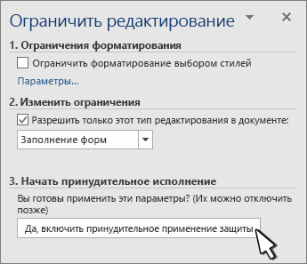
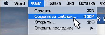

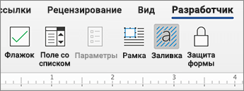
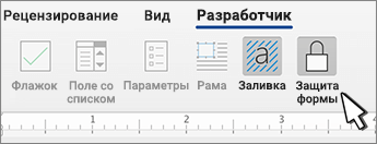
 , а затем выберите Параметры ленты.


