
Chart Elements in Excel VBA (Part 1) — Chart Title, Chart Area, Plot Area, Chart Axes, Chart Series, Data Labels, Chart Legend
Contents:
Chart Title
Chart Area
Plot Area
Chart Axis
This chapter discusses some important chart elements contained on a chart, which include: chart area (ChartArea object); chart title (ChartTitle object); plot area (PlotArea object); chart series (Series object — single series in a chart, SeriesCollection object — a collection of all the Series objects in a chart, Error Bars, Leader Lines, Trendlines, Point object — single points, Points object — collection of all Point objects in a series); chart axis (Axis Object — a single axis, Axes Object — collection of all the Axis objects in a chart, Gridlines object — major & minor gridlines, TickLabels Object — tick marks on an axis); chart Legend (Legend object, LegendEntry object — a single legend entry, LegendEntries object — a collection of legend entries, LegendKey object); data labels (DataLabel object — a single data label, DataLabels object — all data labels in a chart or series).
Individual chart elements can be formatted & manipulated in vba code, such as: Chart Area (A 2-D chart’s chart area contains: the axes, the chart title, the axis titles & the legend. A 3-D chart’s chart area contains the chart title & the legend, without including the plot area); Plot Area (area where chart data is plotted — the Plot Area is surrounded by the Chart Area. A 2-D chart’s plot area contains: the data markers, gridlines, data labels, trendlines & optional chart items placed in the chart area. A 3-D chart’s plot area additionally contains: the walls, floor, axes, axis titles & tick-mark labels in the chart.); Data Series (chart series are related data points plotted in a chart, each series having a distinct color or pattern and is represented in the chart legend); Chart Axis (the plot area is bordered by a line that is used as a frame of reference for measurement — axis which displays categories is referred as the x-axis, axis which displays values is referred as y-axis, for 3-D charts the z-axis represents depth of the chart); Chart or Axis Title (descriptive text displaying title for chart or axis, by default centered at the chart top or aligned to an axis); Tick Marks (small lines of measurement which intersect an axis, equated to divisions on a ruler); Gridlines (tick marks are extended by Gridlines from horizontal or vertical axis across the chart’s plot area which enables easier display & readability of chart data); Data Labels (applied to a chart series, a label provides additional information about a data marker or a point in a series — you can apply data labels to each or all points of a data series to display the series name / category names / data values / percentages / bubble size), Chart Legend (a graphic visually linking a legend entry with its associated series or trendline so that any formatting change in one automatically changes the other’s formatting).
This Chapter illustrates Chart Title, Chart Area, Plot Area & Chart Axes. Chart Elements — Chart Series, Data Labels & Chart Legend — are illustrated in Part 2.
Chart Title
Use the ChartTitle Property of the Chart object to return a ChartTitle object which represents the chart title — Syntax: objChart.ChartTitle. The chart title is accessed & manipulated through the properties & methods of the ChartTitle object, some of which are detailed below. The ChartTitle object exists and can be used only if the HasTitle property (of the Chart object) is True — Set (or return) to True for the chart title to be visible viz. objChart.HasTitle = True.
|
Commonly used Properties of the ChartTitle object: |
||
| Property | Syntax | Description |
| AutoScaleFont Property | objChartTitle.AutoScaleFont | Set (or returns) True where the chart title’s text font size will change whenever the chart size changes. False setting will keep the chart title font at the same size even when there is a change in chart size. |
|
Sheets(«Sheet1»).Activate |
||
| Caption Property | objChartTitle.Caption | Sets or returns the text for the chart title, as a string value. |
| Text Property | objChartTitle.Text | Sets or returns the text for the chart title, as a string value. |
| Characters Property | objChartTitle.Characters(Start, Length) | Use the Characters property which returns a Characters object representing a range of characters within the text string of chart title, and this will enable formatting these specific characters. Both arguments are optional — the Start argument specifies the first character for the range of characters where 1 is the default value which means that omitting the argument will start the range of characters returned from the first character. The Length argument specifies the number of characters & omitting it will return all characters after the character specified in the Start argument. |
|
With Sheets(«Sheet1»).ChartObjects(1).Chart.ChartTitle ‘set the text for chart title ‘format characters within a text string — starting at 4th character & a length of 3 characters — representing the word «Qtr» .Font.Italic = True End With End With |
||
| Format Property | objChartTitle.Format | Returns a ChartFormat object which contains the line, fill & effect formatting for a chart element. The ChartFormat object provides access to the new Office Art formatting options that are available in Excel 2007 so that by using this object you can apply many new graphics to chart elements using vba formatting. |
| Left Property | objChartTitle.Left | Sets or returns the distance, in points, from the chart title’s left edge to the left edge of the chart area |
| Top Property | objPlotArea.Top | Sets or returns the distance, in points, from the chart title’s top edge to the top edge of the chart area. |
| HorizontalAlignment Property | objChartTitle.HorizontalAlignment | Sets or returns a value (xlCenter, xlDistributed, xlJustify, xlLeft or xlRight) for the horizontal alignment of the chart title. |
| VerticalAlignment Property | objChartTitle.VerticalAlignment | Sets or returns a value (xlBottom, xlCenter, xlDistributed, xlJustify or xlTop) for the vertical alignment of the chart title. |
| Shadow Property | objChartTitle.Shadow |
Sets or returns a Boolean value determining if the chart title has a shadow or not . Use True to add a shadow: Sheets(«Sheet1»).ChartObjects(1).Chart.ChartTitle.Shadow = True |
| Orientation Property | objChartTitle.Orientation | Sets or returns a value [xlDownward (-4170), xlHorizontal (-4128), xlUpward (-4171), xlVertical (-4166), or an integer value from -90 to 90 degrees] that determines the text orientation. The constants indicate whether Text runs downward / Horizontal / Upward / Downward & is Centered in the cell, respectively. |
| Name Property | objChartTitle.Name | returns the name of the ChartTitle object, as a string value. |
| Parent Property | objChartTitle.Parent |
returns the parent object for the chart title viz. returns the chart name: MsgBox Sheets(«Sheet1»).ChartObjects(1).Chart.ChartTitle.Parent.Name |
| Position Property | objChartTitle.Position | Sets or returns the chart title’s position on the chart, wherein the constant xlChartElementPositionCustom (-4114) specifies a specific position for the chart title & the constant xlChartElementPositionAutomatic (-4105) automatically sets the chart title’s position. |
|
Commonly used Methods of the ChartTitle object: |
||
| Method | Syntax | Description |
| Delete Method | objChartTitle.Delete | deletes the ChartTitle object |
| Select Method | objChartTitle.Select | selects the ChartTitle object |
Child Objects for the ChartTitle Object: Above we have discussed: the ChartFormat object — use the Format Property — objChartTitle.Format — to return the ChartFormat object which contains the line, fill & effect formatting for the chart title; the Characters Object — use the Characters property — objChartTitle.Characters(Start, Length) — to return a Characters object representing a range of characters within the text string of chart title, and this will enable formatting these specific characters. Some other child objects which are often used with the ChartTitle Object include: ChartFillFormat Object — use the Fill Property — objChartTitle.Fill — to return a ChartFillFormat object (valid only for charts), to manipulate fill formatting for chart elements; Interior Object — use the Interior property — objChartTitle.Interior — to return the Interior object, to manipulate the chart element’s interior (inside area); Border Object — use the Border Property — objChartTitle.Border — to return a Border object, to manipulate a chart element’s border; Font Object — use the Font Property — objChartTitle.Font — to return a Font object, to manipulate the font attributes viz. font name, font size, font color, … The difference between ChartFillFormat object & the Interior object may be somewhat blurred, but seemingly the ChartFillFormat object emphasises gradient & texture fills, whereas the Interior object emphasises solid fills & pattern fills (though ChartFillFormat object also has a Pattern property).
Example: Part 2 of 8 — Manipulate Chart Title — refer Image 1.2

Sub EmbChart_ChartTitle_2()
‘manipulate Chart Title — refer Image 1.2
Dim wsChart As Worksheet
‘declare a ChartObject object
Dim oChObj As ChartObject
Set wsChart = Sheets(«Sheet19»)
‘set ChartObject object by index number
Set oChObj = wsChart.ChartObjects(1)
‘using the Chart Property of the ChartObject returns a Chart object which refers to a chart
With oChObj.Chart
‘the ChartTitle object represents the chart title
With .ChartTitle
‘set the text for the chart title, using the Text Property of the ChartTitle object
.Text = «Sales-Profit-Mktg Exp«
‘set the font to Bold Arial 12 point
.Font.Name = «Arial«
.Font.Size = 12
.Font.Bold = True
‘dark blue
.Font.Color = RGB(0, 30, 90)
‘Format property of the ChartTitle returns returns the ChartFormat object — using the Fill Property of the ChartFormat object to return a FillFormat object (which contains fill formatting properties), to set the foreground fill color &
gradient for the ChartTitle
.Format.Fill.ForeColor.RGB = RGB(228, 109, 10)
‘the OneColorGradient Method of the FillFormat object, sets a one-color gradient for the specified fill — specifying the style for a gradient fill with the MsoGradientStyle Enumeration ‘msoGradientHorizontal’ for a Gradient running
horizontally across the shape.
‘gradient variant of 2 & gradient degree of 1 (lightest)
.Format.Fill.OneColorGradient msoGradientHorizontal, 2, 1
‘use the Border property to return a Border object — use the LineStyle Property of the Border object to set a line style for the border — use the XlLineStyle Enumeration of xlDot to set a dotted line
.Border.LineStyle = xlDot
‘use the Weight Property of the Border object to set the border weight — use the XlBorderWeight Enumeration of xlThin for specifying the weight of the border as Thin
.Border.Weight = xlThin
‘set border color with Color Property of the Border object
.Border.Color = RGB(0, 30, 90)
End With
End With
End Sub
Chart Area
The area where chart data is plotted is the Plot Area — the Plot Area is surrounded by the Chart Area. A 2-D chart’s chart area contains: the axes, the chart title, the axis titles & the legend. A 3-D chart’s chart area contains the chart title & the legend, without including the area where the data is plotted within the chart area (ie. the plot area). The ChartArea object is used to format the chart area. You will use the chart area fill separately, which is distinct from the fill for plot area.
Use the ChartArea Property of the Chart object to return a ChartArea object which refers to the chart area in a chart. Syntax: objChart.ChartArea.
|
Commonly used Properties of the ChartArea object: |
||
| Property | Syntax | Description |
| Format Property | objChartArea.Format | Returns a ChartFormat object which contains the line, fill & effect formatting for a chart element. The ChartFormat object provides access to the new Office Art formatting options that are available in Excel 2007 so that by using this object you can apply many new graphics to chart elements using vba formatting. |
| Height Property | objChartArea.Height | Sets or returns the height, in points, of the chart area |
| Width Property | objChartArea.Width | Sets or returns the width, in points, of the chart area |
| Left Property | objChartArea.Left | Returns the distance, in points, from the left edge of the chart area to the left edge of the chart. To set the distance, in points, from the left edge of the embedded chart to the left edge of column A on a worksheet use the Left property of the ChartObject object viz objChartObject.Left. |
| Top Property | objChartArea.Top | Returns the distance, in points, from the top edge of the chart area to the top of the chart. To set the distance, in points, from the top edge of the embedded chart to the top of row 1 on a worksheet, use the Top property of the ChartObject object viz objChartObject.Top. |
| Name Property | objChartArea.Name | returns the name of the ChartArea object, as a string value. |
| Parent Property | objChartArea.Parent | returns the parent object for the chart area |
| RoundedCorners Property | objChartArea.RoundedCorners | sets or returns a Boolean value determining if the chart area has rounded corners or not — True indicates rounded corners. |
| Shadow Property | objChartArea.Shadow | sets or returns a Boolean value determining if the chart area has a shadow or not |
|
Commonly used Methods of the ChartArea object: |
||
| Method | Syntax | Description |
| ClearContents Method | objChartArea.ClearContents | clears all data from the chart area but does not clear the formatting which remains intact. |
| ClearFormats Method | objChartArea.ClearFormats | clears all formatting from the chart area |
| Clear Method | objChartArea.Clear | clears the Chart Area — clears all, including data and the formatting. |
| Select Method | objChartArea.Select | selects the chart area |
| Copy Method | objChartArea.Copy | copies chart area to clipboard |
Child Objects for the ChartArea Object: Above we have discussed: the ChartFormat object — use the Format Property — objChartArea.Format — to return the ChartFormat object which contains the line, fill & effect formatting for the chart area. Some other child objects which are often used with the ChartArea Object include: ChartFillFormat Object — use the Fill Property — objChartArea.Fill — to return a ChartFillFormat object (valid only for charts), to manipulate fill formatting for chart elements; Interior Object — use the Interior property — objChartArea.Interior — to return the Interior object, to manipulate the chart element’s interior (inside area); Border Object — use the Border Property — objChartArea.Border — to return a Border object, to manipulate a chart element’s border; Font Object — use the Font Property — objChartArea.Font — to return a Font object, to manipulate the font attributes viz. font name, font size, font color, … The difference between ChartFillFormat object & the Interior object may be somewhat blurred, but seemingly the ChartFillFormat object emphasises gradient & texture fills, whereas the Interior object emphasises solid fills & pattern fills (though ChartFillFormat object also has a Pattern property).
Example: Part 3 of 8 — Manipulate Chart Area — refer Image 1.3

Sub EmbChart_ChartArea_3()
‘manipulate Chart Area — refer Image 1.3
Dim wsChart As Worksheet
‘declare a ChartObject object
Dim oChObj As ChartObject
Set wsChart = Sheets(«Sheet19»)
‘set ChartObject object by name
Set oChObj = wsChart.ChartObjects(«QtrlySalesProfitChart»)
‘using the Chart Property of the ChartObject returns a Chart object which refers to a chart
With oChObj.Chart
‘using the ChartArea Property of the Chart object returns the ChartArea object which represents the chart area
With .ChartArea
‘the Format Property of the ChartArea object returns the ChartFormat object, and the Line Property of the ChartFormat object returns a LineFormat object that contains line formatting properties for the specified Chart Area — for a chart with a border, the LineFormat object represents the border
‘turn on the border for the chart area
.Format.Line.Visible = True
‘using the Weight Property of the LineFormat object, to set the weight for the border
.Format.Line.Weight = 2
‘using the Fill Property of the ChartFormat object returns a FillFormat object, that contains fill formatting properties for the for the ChartArea object. Then use the ForeColor Property to return a ColorFormat object to specify the
foreground fill or solid color to green
.Format.Fill.ForeColor.RGB = RGB(0, 255, 0)
‘use the ColorIndex Property of the Border object to set the border color: to set no line color use ColorIndex = xlNone, or use ColorIndex 3 for red, 5 for blue, 4 for green, 6 for yellow, and so on.
.Border.ColorIndex = 3
‘use the LineStyle Property of the Border object to set a line style for the Border — continuous line
.Border.LineStyle = xlContinuous
End With
End With
End Sub
Plot Area
The area where chart data is plotted is the Plot Area — the Plot Area is surrounded by the Chart Area. A 2-D chart’s plot area contains: the data markers, gridlines, data labels, trendlines & optional chart items placed in the chart area. A 3-D chart’s plot area additionally contains: the walls, floor, axes, axis titles & tick-mark labels in the chart. You will use the chart area fill separately, which is distinct from the fill for plot area. The PlotArea Object is used to format the plot area.
Use the PlotArea property of the Chart object to return a PlotArea object which refers to the plot area of a chart. Syntax: objChart.PlotArea.
|
Commonly used Properties of the PlotArea object: |
||
| Property | Syntax | Description |
| Format Property | objPlotArea.Format | Returns a ChartFormat object which contains the line, fill & effect formatting for a chart element. The ChartFormat object provides access to the new Office Art formatting options that are available in Excel 2007 so that by using this object you can apply many new graphics to chart elements using vba formatting. |
| Height Property | objPlotArea.Height | Sets or returns the height, in points, of the plot area — the axis labels are included within the bounding rectangle for determining the height. |
| InsideHeight Property | objPlotArea.InsideHeight | Sets or returns the inside height, in points, of the plot area without including the axis labels. |
| Width Property | objPlotArea.Width | Sets or returns the width, in points, of the plot area — the axis labels are included within the bounding rectangle for determining the width. |
| InsideWidth Property | objPlotArea.InsideWidth | Sets or returns the inside width, in points, of the plot area without including the axis labels. |
| Left Property | objPlotArea.Left | Sets or returns the distance, in points, from the left edge of the chart area to the left edge of the plot area — the axis labels are included within the bounding rectangle for determining the distance. |
| InsideLeft Property | objPlotArea.InsideLeft | Sets or returns the distance, in points, from the left edge of the chart area to the inside left edge of the plot area without including the axis labels. |
| Top Property | objPlotArea.Top | Sets or returns the distance, in points, from the top edge of the chart area to the top edge of the plot area — the axis labels are included within the bounding rectangle for determining the distance. |
| InsideTop Property | objPlotArea.InsideTop | Sets or returns the distance, in points, from the top edge of the chart area to the inside top edge of the plot area without including the axis labels. |
| Name Property | objPlotArea.Name | returns the name of the PlotArea object, as a string value. |
| Parent Property | objPlotArea.Parent |
returns the parent object for the plot area viz. returns the chart name: MsgBox Sheets(«Sheet1»).ChartObjects(1).Chart.PlotArea.Parent.Name |
| Position Property | objPlotArea.Position | Sets or returns the plot area’s position on the chart, wherein the constant xlChartElementPositionCustom (-4114) specifies a specific position for the plot area & the constant xlChartElementPositionAutomatic (-4105) automatically sets the plot area’s position. |
|
Commonly used Methods of the PlotArea object: |
||
| Method | Syntax | Description |
| ClearFormats Method | objPlotArea.ClearFormats | clears all formatting from the plot area |
| Select Method | objPlotArea.Select | selects the plot area |
|
Sheets(«Sheet1»).ChartObjects(1).Chart.PlotArea.Select |
Child Objects for the PlotArea Object: Above we have discussed: the ChartFormat object — use the Format Property — objPlotArea.Format — to return the ChartFormat object which contains the line, fill & effect formatting for the plot area. Some other child objects which are often used with the PlotArea Object include: ChartFillFormat Object — use the Fill Property — objPlotArea.Fill — to return a ChartFillFormat object (valid only for charts), to manipulate fill formatting for chart elements; Interior Object — use the Interior property — objPlotArea.Interior — to return the Interior object, to manipulate the chart element’s interior (inside area); Border Object — use the Border Property — objPlotArea.Border — to return a Border object, to manipulate a chart element’s border. The difference between ChartFillFormat object & the Interior object may be somewhat blurred, but seemingly the ChartFillFormat object emphasises gradient & texture fills, whereas the Interior object emphasises solid fills & pattern fills (though ChartFillFormat object also has a Pattern property).
Example: Illustrating the chart’s plot area / inside plot area — using Left / InsideLeft, Top / InsideTop, Width / InsideWidth, Height / InsideHeight properties — refer Image 1

Sub BoundingRectangle_PlotArea_InsidePlotArea()
‘illustrating the inside of chart’s plot area / the chart’s plot area, within bounding rectangles — refer Image 1
‘create a text box representing the inside of chart’s plot area without including the axis labels within the bounding rectangle (red lines of round dots)
With Sheets(«Sheet1»).ChartObjects(1).Chart
With .Shapes.AddTextbox(msoTextOrientationDownward, .PlotArea.InsideLeft, .PlotArea.InsideTop, .PlotArea.InsideWidth, .PlotArea.InsideHeight)
.Line.Weight = 4
.Line.DashStyle = msoLineRoundDot
.Line.ForeColor.RGB = RGB(255, 0, 0)
End With
‘create a text box representing the chart’s plot area by including the axis labels within the bounding rectangle (green lines of long dashes)
With .Shapes.AddTextbox(msoTextOrientationDownward, .PlotArea.Left, .PlotArea.Top, .PlotArea.Width, .PlotArea.Height)
.Line.Weight = 2
.Line.DashStyle = msoLineLongDash
.Line.ForeColor.RGB = RGB(0, 255, 0)
End With
End With
End Sub
Example: PlotArea Alignment with VBA — Centering a PlotArea
Sub PlotArea_Center()
‘center Plot Area within the Chart
Dim wsChart As Worksheet
Dim objChartObj As ChartObject
Dim sChartTitleWidth As Single
Set wsChart = Sheets(«Sheet1»)
Set objChartObj = wsChart.ChartObjects(1)
‘center PlotArea within the Chart Area
With objChartObj.Chart
‘center vertically
.PlotArea.Top = (.ChartArea.Height — .PlotArea.Height) / 2
‘center horizontally
.PlotArea.Left = (.ChartArea.Width — .PlotArea.Width) / 2
End With
End Sub
Example: ChartTitle Alignment with VBA — Centering a ChartTitle Horizontally
Sub ChartTitle_HorizontalCenterInChart()
‘horizontally center the chart title in a chart
‘the ChartTitle does not have a Width property so that you cannot determine its width, which would have made horizontal centering easier
Dim wsChart As Worksheet
Dim objChartObj As ChartObject
Dim sChartTitleWidth As Single
Set wsChart = Sheets(«Sheet1»)
Set objChartObj = wsChart.ChartObjects(1)
‘—————————
‘OPTION 1 — default position of ChartTitle aligns it top-center in the chart
With objChartObj.Chart
‘if the ChartTitle is presently not centered because its position has been changed, you can first remove & then show because the default position of ChartTitle aligns it top-center in the chart
.HasTitle = False
.HasTitle = True
End With
‘—————————
‘OPTION 2 — center ChartTitle, within the chart area
With objChartObj.Chart
If .HasTitle Then
‘move the chart title to the extreme right of the chart area — the title will touch the right edge of the chart
.ChartTitle.Left = .ChartArea.Width
‘center the ChartTitle, within the chart area
.ChartTitle.Left = .ChartTitle.Left / 2
End If
End With
‘—————————
‘OPTION 3 — center ChartTitle, within the chart area
With objChartObj.Chart
If .HasTitle Then
‘move the chart title to the extreme right of the chart area — the title will touch the right edge of the chart
.ChartTitle.Left = .ChartArea.Width
‘calculate the ChartTitle width
sChartTitleWidth = .ChartArea.Width — .ChartTitle.Left
‘center the ChartTitle, within the chart area
.ChartTitle.Left = (.ChartArea.Width — sChartTitleWidth) / 2
End If
End With
End Sub
Example: ChartTitle Alignment with VBA — Center ChartTitle, both horizontally & vertically, wrt Plot Area.
Sub ChartTitle_CenterInPlotArea()
‘center ChartTitle, both horizontally & vertically, wrt plot area
‘note that the ChartTitle does not have a Width or Height property
Dim wsChart As Worksheet
Dim objChartObj As ChartObject
Dim sChartTitleWidth As Single, sChartTitleHeight As Single
Set wsChart = Sheets(«Sheet1»)
Set objChartObj = wsChart.ChartObjects(1)
‘center ChartTitle, both horizontally & vertically, wrt plot area
With objChartObj.Chart
‘move the chart title to the extreme right of the chart area — the title will touch the right edge of the chart
.ChartTitle.Left = .ChartArea.Width
‘calculate the ChartTitle width
sChartTitleWidth = .ChartArea.Width — .ChartTitle.Left
‘horizontally center the ChartTitle, within the plot area’s inside
.ChartTitle.Left = .PlotArea.InsideLeft + (.PlotArea.InsideWidth — sChartTitleWidth) / 2
‘move the chart title to the extreme bottom of the chart area — the title will touch the bottom edge of the chart
.ChartTitle.Top = .ChartArea.Height
‘calculate the ChartTitle height
sChartTitleHeight = .ChartArea.Height — .ChartTitle.Top
‘vertically center the ChartTitle, in the top area ‘within Plot Area Top’ & ‘Chart Area Top’
.ChartTitle.Top = (.PlotArea.Top — sChartTitleHeight) / 2
‘to vertically center the ChartTitle in top area within ‘Plot Area Inside Top’ & ‘Chart Area Top’, use:
‘.ChartTitle.Top = (.PlotArea.InsideTop — sChartTitleHeight) / 2
End With
End Sub
Example: AxisTitle Alignment with VBA — horizontally / vertically center the Axis Title with re to Plot Area
Sub AxisTitle_Center()
‘center the axis title in a chart
Dim wsChart As Worksheet
Dim objChartObj As ChartObject
Dim sChartTitleWidth As Single, sAxisTitleHeight As Single
Set wsChart = Sheets(«Sheet1»)
Set objChartObj = wsChart.ChartObjects(1)
‘horizontally center the primary category axis title with re to plot area
With objChartObj.Chart
‘move the axis title to the extreme right of the chart area
.Axes(xlCategory, xlPrimary).AxisTitle.Left = .ChartArea.Width
‘determine width of axis title
sAxisTitleWidth = .ChartArea.Width — .Axes(xlCategory, xlPrimary).AxisTitle.Left
‘horizontally center axis title between plot area
.Axes(xlCategory, xlPrimary).AxisTitle.Left = .PlotArea.InsideLeft + (.PlotArea.InsideWidth — sAxisTitleWidth) / 2
End With
‘vertically center the primary value axis title with re to plot area
With objChartObj.Chart
‘move the axis title to the bottom edge of the chart area
.Axes(xlValue, xlPrimary).AxisTitle.Top = .ChartArea.Height
‘determine height of axis title
sAxisTitleHeight = .ChartArea.Height — .Axes(xlValue, xlPrimary).AxisTitle.Top
‘vertically center axis title between plot area
.Axes(xlValue, xlPrimary).AxisTitle.Top = .PlotArea.InsideTop + (.PlotArea.InsideHeight — sAxisTitleHeight) / 2
End With
End Sub
Example: Legend Alignment with VBA — position the legend to align in the bottom left corner within the plot area
Sub Legend_Position_BottomLeftCorner()
‘position the legend — align the chart legend in the bottom left corner within the plot area
Dim wsChart As Worksheet
Dim objChartObj As ChartObject
Set wsChart = Sheets(«Sheet1»)
Set objChartObj = wsChart.ChartObjects(1)
‘—————————
‘ignoring border / line thickness for legend placement
‘position the legend — align the chart legend in the bottom left corner within the plot area, without considering borders’ thickness or axis’ line thickness
With objChartObj.Chart
If .HasLegend = True Then
‘aligns the legend’s left edge to the inside left of the plot area
.Legend.Left = .PlotArea.InsideLeft
‘aligns the legend’s top to the inside top of the plot area by ADDING (i) plot area’s inside top & (ii) plot area’s inside height & then DEDUCTING (i) legend’s height
.Legend.Top = .PlotArea.InsideTop + .PlotArea.InsideHeight — .Legend.Height
End If
End With
‘—————————
‘border / line thickness can affect the legend placement, if the thickness is significant
‘position the legend — align the chart legend in the bottom left corner within the plot area, taking into account the legend’s border thickness & plot area border’s thickness & primary value axis’ line thickness & category axis’ line thickness
With objChartObj.Chart
If .HasLegend = True And .Legend.Border.LineStyle <> xlLineStyleNone And .PlotArea.Border.LineStyle <> xlLineStyleNone And .Axes(xlValue, xlPrimary).Border.LineStyle <> xlLineStyleNone Then
‘aligns the legend’s left edge to the inside left of the plot area by ADDING (i) plot area’s inside left & (ii) half of legend’s border thickness & (iii) half of the — maximum of (a) Value Axis line thickness & (b) plot area border’s thickness
.Legend.Left = .PlotArea.InsideLeft + .Legend.Format.Line.Weight / 2 + WorksheetFunction.Max(.PlotArea.Format.Line.Weight, .Axes(xlValue, xlPrimary).Format.Line.Weight) / 2
‘aligns the legend’s top to the inside top of the plot area by ADDING (i) plot area’s inside top & (ii) plot area’s inside height & (iii) half of legend’s border thickness & then DEDUCTING (i) legend’s height & (ii) half of the — maximum of
(a) Category Axis line thickness & (b) plot area border’s thickness
.Legend.Top = .PlotArea.InsideTop + .PlotArea.InsideHeight — .Legend.Format.Line.Weight / 2 — .Legend.Height — WorksheetFunction.Max(.PlotArea.Format.Line.Weight, .Axes(xlCategory, xlPrimary).Format.Line.Weight) / 2
End If
End With
End Sub
Example: Legend Alignment with VBA — position the legend to align in the top right corner within the plot area, taking into account borders / lines thickness
Sub Legend_Position_TopRightPlotArea()
‘align the chart Legend in the top right corner within the plot area
‘this code takes into account the legend’s border thickness & plot area border’s thickness & the secondary value axis’ line thickness, which might affect the legend placement if the thickness is significant
‘this code also takes into account whether, legend’s border or plot area’s border or the secondary value axis, exist or not
Dim wsChart As Worksheet
Dim objChartObj As ChartObject
Set wsChart = Sheets(«Sheet8»)
Set objChartObj = wsChart.ChartObjects(1)
‘position the Legend — align the chart Legend in the top right corner within the plot area — you dont know if chart elements have a border / line or not, & if yes then what is their thickness
With objChartObj.Chart
If .HasLegend = False Then
MsgBox «Legend does not exist, exit sub»
Exit Sub
Else
‘if secondary value axis exists
If .HasAxis(xlValue, xlSecondary) = True Then
‘legend border & plot area border & axis border exist
If .Legend.Border.LineStyle <> xlLineStyleNone And .PlotArea.Border.LineStyle <> xlLineStyleNone And .Axes(xlValue, xlSecondary).Border.LineStyle <> xlLineStyleNone Then
.Legend.Left = .PlotArea.InsideLeft + .PlotArea.InsideWidth — .Legend.Width — .Legend.Format.Line.Weight / 2 — WorksheetFunction.Max(.PlotArea.Format.Line.Weight, .Axes(xlValue, xlSecondary).Format.Line.Weight) / 2
.Legend.Top = .PlotArea.InsideTop + .Legend.Format.Line.Weight / 2 + .PlotArea.Format.Line.Weight / 2
‘only plot area border & axis border exist
ElseIf .Legend.Border.LineStyle = xlLineStyleNone And .PlotArea.Border.LineStyle <> xlLineStyleNone And .Axes(xlValue, xlSecondary).Border.LineStyle <> xlLineStyleNone Then
.Legend.Left = .PlotArea.InsideLeft + .PlotArea.InsideWidth — .Legend.Width — WorksheetFunction.Max(.PlotArea.Format.Line.Weight, .Axes(xlValue, xlSecondary).Format.Line.Weight) / 2
.Legend.Top = .PlotArea.InsideTop + .PlotArea.Format.Line.Weight / 2
‘only legend border & axis border exist
ElseIf .Legend.Border.LineStyle <> xlLineStyleNone And .PlotArea.Border.LineStyle = xlLineStyleNone And .Axes(xlValue, xlSecondary).Border.LineStyle <> xlLineStyleNone Then
.Legend.Left = .PlotArea.InsideLeft + .PlotArea.InsideWidth — .Legend.Width — .Legend.Format.Line.Weight / 2 — .Axes(xlValue, xlSecondary).Format.Line.Weight / 2
.Legend.Top = .PlotArea.InsideTop + .Legend.Format.Line.Weight / 2
‘only legend border & plot area border exist
ElseIf .Legend.Border.LineStyle <> xlLineStyleNone And .PlotArea.Border.LineStyle <> xlLineStyleNone And .Axes(xlValue, xlSecondary).Border.LineStyle = xlLineStyleNone Then
.Legend.Left = .PlotArea.InsideLeft + .PlotArea.InsideWidth — .Legend.Width — .Legend.Format.Line.Weight / 2 — .PlotArea.Format.Line.Weight / 2
.Legend.Top = .PlotArea.InsideTop + .Legend.Format.Line.Weight / 2 + .PlotArea.Format.Line.Weight / 2
‘only axis border exists
ElseIf .Legend.Border.LineStyle = xlLineStyleNone And .PlotArea.Border.LineStyle = xlLineStyleNone And .Axes(xlValue, xlSecondary).Border.LineStyle <> xlLineStyleNone Then
.Legend.Left = .PlotArea.InsideLeft + .PlotArea.InsideWidth — .Legend.Width — .Axes(xlValue, xlSecondary).Format.Line.Weight / 2
.Legend.Top = .PlotArea.InsideTop
‘only plot area border exists
ElseIf .Legend.Border.LineStyle = xlLineStyleNone And .PlotArea.Border.LineStyle <> xlLineStyleNone And .Axes(xlValue, xlSecondary).Border.LineStyle = xlLineStyleNone Then
.Legend.Left = .PlotArea.InsideLeft + .PlotArea.InsideWidth — .Legend.Width — .PlotArea.Format.Line.Weight / 2
.Legend.Top = .PlotArea.InsideTop + .PlotArea.Format.Line.Weight / 2
‘only legend border exists
ElseIf .Legend.Border.LineStyle <> xlLineStyleNone And .PlotArea.Border.LineStyle = xlLineStyleNone And .Axes(xlValue, xlSecondary).Border.LineStyle = xlLineStyleNone Then
.Legend.Left = .PlotArea.InsideLeft + .PlotArea.InsideWidth — .Legend.Width — .Legend.Format.Line.Weight / 2
.Legend.Top = .PlotArea.InsideTop + .Legend.Format.Line.Weight / 2
‘NO legend border OR plot area border OR axis border — none exist
ElseIf .Legend.Border.LineStyle = xlLineStyleNone And .PlotArea.Border.LineStyle = xlLineStyleNone And .Axes(xlValue, xlSecondary).Border.LineStyle = xlLineStyleNone Then
.Legend.Left = .PlotArea.InsideLeft + .PlotArea.InsideWidth — .Legend.Width
.Legend.Top = .PlotArea.InsideTop
End If
‘if secondary value axis does NOT exist
Else
‘only legend border & plot area border exist
If .Legend.Border.LineStyle <> xlLineStyleNone And .PlotArea.Border.LineStyle <> xlLineStyleNone Then
.Legend.Left = .PlotArea.InsideLeft + .PlotArea.InsideWidth — .Legend.Width — .Legend.Format.Line.Weight / 2 — .PlotArea.Format.Line.Weight / 2
.Legend.Top = .PlotArea.InsideTop + .Legend.Format.Line.Weight / 2 + .PlotArea.Format.Line.Weight / 2
‘only plot area border exists
ElseIf .Legend.Border.LineStyle = xlLineStyleNone And .PlotArea.Border.LineStyle <> xlLineStyleNone Then
.Legend.Left = .PlotArea.InsideLeft + .PlotArea.InsideWidth — .Legend.Width — .PlotArea.Format.Line.Weight / 2
.Legend.Top = .PlotArea.InsideTop + .PlotArea.Format.Line.Weight / 2
‘only legend border exists
ElseIf .Legend.Border.LineStyle <> xlLineStyleNone And .PlotArea.Border.LineStyle = xlLineStyleNone Then
.Legend.Left = .PlotArea.InsideLeft + .PlotArea.InsideWidth — .Legend.Width — .Legend.Format.Line.Weight / 2
.Legend.Top = .PlotArea.InsideTop + .Legend.Format.Line.Weight / 2
‘NO legend border OR plot area border OR axis border — none exist
ElseIf .Legend.Border.LineStyle = xlLineStyleNone And .PlotArea.Border.LineStyle = xlLineStyleNone Then
.Legend.Left = .PlotArea.InsideLeft + .PlotArea.InsideWidth — .Legend.Width
.Legend.Top = .PlotArea.InsideTop
End If
End If
End If
End With
End Sub
Example: Part 6 of 8 — Manipulate Plot Area — refer Image 1.6

Sub EmbChart_PlotArea_6()
‘manipulate Plot Area — refer Image 1.6
Dim wsChart As Worksheet
‘declare a ChartObject object
Dim oChObj As ChartObject
Set wsChart = Sheets(«Sheet19»)
‘an embedded chart is active if selected or if the ChartObject object (in which it is contained) is activated using the Activate method
wsChart.ChartObjects(1).Activate
‘use the ActiveChart property to refer to a chart which is the active object
With ActiveChart
‘using the PlotArea Property of the Chart object returns the PlotArea object which represents the plot area
With .PlotArea
‘for InsideLeft (or InsideWidth / InsideHeight) property, the plot area excludes the axis labels, whereas using the Left (or Width / Height) property uses the bounding rectangle which includes the axis labels.
‘set the distance from the chart edge to the left edge of the plot area, in points
.Left = 30
‘set plot area width
.Width = ActiveChart.ChartArea.Width — .Left — ActiveChart.Legend.Width — 10
‘set plot area height
.Height = ActiveChart.ChartArea.Height — 55
‘remove fill color from Plot Area
.Fill.Visible = False
‘add fill color to Plot Area — set the interior color for the plot area to Yellow
.Fill.Visible = True
.Interior.Color = vbYellow
‘alternatively:
‘.Interior.ColorIndex = 6
‘Format property of the PlotArea returns returns the ChartFormat object — using the Fill Property of the ChartFormat object to return a FillFormat object (which contains fill formatting properties), to set the foreground fill color &
gradient for the plot area
‘the OneColorGradient Method of the FillFormat object, sets a one-color gradient for the specified fill — specifying the style for a gradient fill with the MsoGradientStyle Enumeration ‘msoGradientDiagonalUp’ for a Diagonal gradient
moving from a bottom corner up to the opposite corner, gradient variant of 4 & gradient degree of 1 (lightest)
.Format.Fill.OneColorGradient msoGradientDiagonalUp, 4, 1
‘use the Border property to return a Border object — use the ColorIndex Property of the Border object to set the border color: to set no line color use ColorIndex = xlNone, or use ColorIndex 3 for red, 5 for blue, 4 for green, 6 for
yellow, and so on.
.Border.ColorIndex = 5
‘set border width to 2 points
.Border.Weight = xlMedium
End With
End With
End Sub
Example: Part 7 of 8 — Align chart elements — display unit label, value axis title, secondary value axis title, category axis title, chart title & chart legend — refer Image 1.7
To download Excel file with live code, click here.

Sub EmbChart_Align_7()
‘align chart elements — display unit label, value axis title, secondary value axis title, category axis title, chart title & chart legend — refer Image 1.7
Dim wsChart As Worksheet
‘declare a ChartObject object
Dim oChObj As ChartObject
Set wsChart = Sheets(«Sheet19»)
‘set ChartObject object by name
Set oChObj = wsChart.ChartObjects(«QtrlySalesProfitChart»)
‘using the Chart Property of the ChartObject object returns a Chart object which refers to a chart
With oChObj.Chart
‘top align display unit label, of primary value axis, with the axis top
.Axes(xlValue, xlPrimary).DisplayUnitLabel.Top = .PlotArea.Top
‘left alignment of display unit label (of primary value axis)
Dim sDisplayUnitLabelWidth As Single
‘move the display unit label to the extreme right of the chart area
.Axes(xlValue, xlPrimary).DisplayUnitLabel.Left = .ChartArea.Width
‘calculate width of display unit label
sDisplayUnitLabelWidth = .ChartArea.Width — .Axes(xlValue, xlPrimary).DisplayUnitLabel.Left
‘left align display unit label next to the primary value axis
.Axes(xlValue, xlPrimary).DisplayUnitLabel.Left = .PlotArea.Left — sDisplayUnitLabelWidth
‘horizontal / left alignment of axis title, of primary value axis
Dim sPrimaryAxisTitleWidth As Single
‘move the axis title to the extreme right of the chart area
.Axes(xlValue, xlPrimary).AxisTitle.Left = .ChartArea.Width
‘calculate width of axis title
sPrimaryAxisTitleWidth = .ChartArea.Width — .Axes(xlValue, xlPrimary).AxisTitle.Left
‘align axis title — horizontally center between plot area left & chart area left edge
.Axes(xlValue, xlPrimary).AxisTitle.Left = (.PlotArea.Left — sPrimaryAxisTitleWidth) / 2
‘distance between secondary axis title left edge & plot area right edge equated with distance between primary axis title left edge & chart area left edge
.Axes(xlValue, xlSecondary).AxisTitle.Left = .PlotArea.Left + .PlotArea.Width + .Axes(xlValue, xlPrimary).AxisTitle.Left
‘vertical alignment of primary value axis title
Dim sPrimaryAxisTitleHeight As Single
‘move the axis title to the bottom edge of the chart area
.Axes(xlValue, xlPrimary).AxisTitle.Top = .ChartArea.Height
‘calculate height of axis title
sPrimaryAxisTitleHeight = .ChartArea.Height — .Axes(xlValue, xlPrimary).AxisTitle.Top
‘vertically center axis title between plot area
.Axes(xlValue, xlPrimary).AxisTitle.Top = .PlotArea.InsideTop + (.PlotArea.InsideHeight — sPrimaryAxisTitleHeight) / 2
‘vertical alignment of secondary value axis title
Dim sSecAxisTitleHeight As Single
‘move the axis title to the bottom edge of the chart area
.Axes(xlValue, xlSecondary).AxisTitle.Top = .ChartArea.Height
‘calculate height of axis title
sSecAxisTitleHeight = .ChartArea.Height — .Axes(xlValue, xlSecondary).AxisTitle.Top
‘vertically center axis title between plot area
.Axes(xlValue, xlSecondary).AxisTitle.Top = .PlotArea.InsideTop + (.PlotArea.InsideHeight — sSecAxisTitleHeight) / 2
‘vertical alignment of category primary axis title
Dim sCategoryAxisTitleHeight As Single
‘move the axis title to the bottom edge of the chart area
.Axes(xlCategory, xlPrimary).AxisTitle.Top = .ChartArea.Height
‘calculate height of axis title
sCategoryAxisTitleHeight = .ChartArea.Height — .Axes(xlCategory, xlPrimary).AxisTitle.Top
‘vertically center axis title between plot area bottom & chart area bottom
.Axes(xlCategory, xlPrimary).AxisTitle.Top = .PlotArea.Top + .PlotArea.Height + (.ChartArea.Height — .PlotArea.Top — .PlotArea.Height — sCategoryAxisTitleHeight) / 2
‘horizontally center the category primary axis title
Dim sCatAxisTitleWidth As Single
‘move the axis title to the extreme right of the chart area
.Axes(xlCategory, xlPrimary).AxisTitle.Left = .ChartArea.Width
‘calculate width of axis title
sCatAxisTitleWidth = .ChartArea.Width — .Axes(xlCategory, xlPrimary).AxisTitle.Left
‘horizontally center axis title between plot area
.Axes(xlCategory, xlPrimary).AxisTitle.Left = .PlotArea.InsideLeft + (.PlotArea.InsideWidth — sCatAxisTitleWidth) / 2
‘horizontally center the chart title, within the plot area
Dim sChartTitleWidth As Single
‘move the chart title to the extreme right of the chart area — the title will touch the right edge of the chart
.ChartTitle.Left = .ChartArea.Width
‘calculate the ChartTitle width
sChartTitleWidth = .ChartArea.Width — .ChartTitle.Left
‘horizontally center the ChartTitle, within the plot area
.ChartTitle.Left = .PlotArea.InsideLeft + (.PlotArea.InsideWidth — sChartTitleWidth) / 2
‘vertically center the chart title, in the top area
Dim sChartTitleHeight As Single
‘move the chart title to the extreme bottom of the chart area — the title will touch the bottom edge of the chart
.ChartTitle.Top = .ChartArea.Height
‘calculate the ChartTitle height
sChartTitleHeight = .ChartArea.Height — .ChartTitle.Top
‘vertically center the ChartTitle, in the top area ‘within Plot Area Top’ & ‘Chart Area Top’
.ChartTitle.Top = (.PlotArea.Top — sChartTitleHeight) / 2
‘vertical alignment of chart legend
.Legend.Position = xlLegendPositionRight
‘move the legend to the bottom edge of the chart area
.Legend.Top = .ChartArea.Height
‘raise legend 50 points from the bottom
.Legend.Top = .Legend.Top — 50
End With
End Sub
Chart Axis
Axes Object (Axes collection) refers to a collection of all the Axis objects in a chart. Axis Object refers to a single axis & is a member of of the Axes collection.
Chart.Axes Method. Use the Axes Method of the Chart object to return a single Axis or Axes collection (collection of all Axis objects) in a chart. Syntax: objChart.Axes(Type, AxisGroup). Both arguments are optional to specify. Specify the axis to be returned in the Type argument — you can use any of the 3 constants for this argument: xlCategory (value 1) — Axis displays categories, also referred as the x-axis; xlValue (value 2) — Axis displays values, also referred as y-axis; xlSeriesAxis (value 3) — Axis displays data series for 3-D charts, also referred as the z-axis representing depth of the chart. Specify the axis group in the AxisGroup argument — xlPrimary (value 1) — primary axis (default axis); xlSecondary (value 2) — secondary axis. The axis group can either be xlPrimary which is the default, or it can be xlSecondary where the chart has multiple series. 3-D charts cannot have secondary axis.
Axes.Item Method. To refer to a single Axis (ie. Axis object) from Axes collection, use the the Item Method of the Axes object. Syntax: objAxes.Item(Type, AxisGroup), where the Type argument is necessary to specify. To return a primary category axis: ActiveChart.Axes(1,1) or ActiveChart.Axes(1) or ActiveChart.Axes(xlCategory, xlPrimary) or ActiveChart.Axes(xlCategory) or ActiveChart.Axes.Item(xlCategory). To return a secondary value axis: ActiveChart.Axes(xlValue, xlSecondary) or ActiveChart.Axes(2, 2). Use the Count Property of the Axes object to return the number of Axis objects in an Axes collection viz. MsgBox Sheets(«Sheet1»).ChartObjects(1).Chart.Axes.Count.
Sub AxesCollectionObj_AxisObj()
‘axes collection & axis object
Dim objAxis As Axis
’embedded chart
With Sheets(«Sheet1»).ChartObjects(1).Chart
‘refer single axis (axis object) — primary category axis — you can alternatively use: With .Axes(xlCategory)
With .Axes.Item(xlCategory)
‘set the axis title to be visible
.HasTitle = True
‘set text for axis title
.AxisTitle.Caption = «Dates«
End With
‘refer axes collection using the Chart.Axes method- each axis object in the axes collection
For Each objAxis In .Axes
‘if axis object has title
If objAxis.HasTitle = True Then
‘return axis title for a an axis object which has a title
MsgBox objAxis.AxisTitle.Caption
End If
Next objAxis
‘returns the number of Axis objects in the Axes Collection
MsgBox .Axes.Count
End With
End Sub
HasAxis Property. Syntax: objChart.HasAxis(Index1, Index2). This property sets (or returns) the axes which will be displayed for a chart. Atleast one argument is required to be specified. The Index1 argument specifies the axis Type as defined in the XlAxisType Enumeration: xlCategory (value 1), xlValue (value 2), or xlSeriesAxis (value 3). The Index2 argument specifies the Axis Group as defined in the XlAxisGroup Enumeration: xlPrimary (value 1), or xlSecondary (value 2). To turn on the primary x-axis for a chart: Sheets(«Sheet1»).ChartObjects(1).Chart.HasAxis(xlCategory) = True.
Tick Marks & Gridlines. Tick marks are small lines of measurement which intersect an axis (equated to divisions on a ruler), and these tick marks are extended by Gridlines from horizontal or vertical axis across the chart’s plot area which enables easier display & readability of chart data. Using the Gridlines object, you can manipulate / format all gridlines together (not single gridline at a time) and turn on or off either all or none, and these gridlines can exist only for the primary axis group.
|
Commonly used Properties of the Axis object: |
||
| Property | Syntax | Description |
| AxisGroup Property | objAxis.AxisGroup | Returns a value per XlAxisGroup Enumeration (value 1 for xlPrimary, or value 2 for xlSecondary), specifying the AxisGroup for the Axis object. |
| Type Property | objAxis.Type | Returns a value per XlAxisType Enumeration (value 1 for xlCategory, value 2 for xlValue, or value 3 for xlSeriesAxis), specifying the Axis Type for the Axis object. Note that for the horizontal axis of scatter charts, Axis Type returned will be xlCategory. |
| HasTitle Property | objAxis.HasTitle |
This property uses a Boolean value — the AxisTitle object exists and can be used only if the HasTitle property (of the Axis object) is True viz. set to True for the axis title to be visible: objAxis.HasTitle = True. To add an axis label to the secondary value axis of a chart: Sheets(«Sheet1»).ChartObjects(1).Chart.Axes(xlValue, xlSecondary).HasTitle = True. |
| AxisTitle Property | objAxis.AxisTitle | Returns a AxisTitle object which represents the axis title. The title for a specified chart axis is accessed & manipulated through the properties & methods of the AxisTitle object. The AxisTitle object exists and can be used only if the HasTitle property (of the Axis object) is True viz. set to True for the axis title to be visible: objAxis.HasTitle = True. Refer below for summarized Properties & Methods of the AxisTitle object. |
| Format Property | objAxis.Format | Returns a ChartFormat object which contains the line, fill & effect formatting for a chart element. The ChartFormat object provides access to the new Office Art formatting options that are available in Excel 2007 so that by using this object you can apply many new graphics to chart elements using vba formatting. |
| Border Property | objAxis.Border | Returns a Border object, to manipulate a chart element’s border (ie. Axis border). |
| Left Property | objAxis.Left | Returns the distance (Read-only), in points, from the left edge of the chart area to the left edge of the Axis. |
| Top Property | objAxis.Top | Returns the distance (Read-only), in points, from the top edge of the Axis to the top edge of the chart area. |
| Height Property | objAxis.Height | Returns the height (Read-only), in points, of the Axis object. |
| Width Property | objAxis.Width | Returns the width (Read-only), in points, of the Axis object. |
| Parent Property | objAxis.Parent |
returns the parent object for the Axis viz. returns the chart name: MsgBox Sheets(«Sheet1»).ChartObjects(1).Chart.Axes(xlValue, xlPrimary).Parent.Name |
| CategoryNames Property | objAxis.CategoryNames | Using this property the category names for a category axis, are set or returned as a text array. You can set the category names for a chart to the values contained in a range of cells (ie. Range object) or to a text array containing category names. |
| TickLabels Property | objAxis.TickLabels | Returns a TickLabels Object representing the tick-mark labels associated with tick marks on an axis, and with this object you can manipulate / format all tick-mark labels together as a unit (not single tick-mark label at a time). Refer below for summarized Properties & Methods of the TickLabels object. |
| TickLabelPosition Property | objAxis.TickLabelPosition | Sets or returns the tick-mark labels position on a chart axis, where the position is specified using XlTickLabelPosition constants — xlTickLabelPositionNone (value -4142) indicates no tick marks; xlTickLabelPositionLow (value -4134) indicates tick marks position at bottom or left side of the chart; xlTickLabelPositionHigh (value -4127) indicates tick marks position at top or right side of the chart; xlTickLabelPositionNextToAxis (value 4) indicates tick marks position at next to axis when axis is not at either side of the chart. |
| TickLabelSpacing Property | objAxis.TickLabelSpacing | For the category & series axes, this property sets or returns the interval between tick-mark lables (ie. the number of categories or series between tick-mark labels), using a long value between 1 & 31999. For the value axis, Excel automatically calculates the tick-mark label spacing. |
| TickLabelSpacingIsAuto Property | objAxis.TickLabelSpacingIsAuto | Sets or returns a Boolean value for this property where a True value (Default) enables Excel to automatically set the tick label spacing (Read-write). To return the current setting for tick label spacing & if it is automatic or not, use the the TickLabelSpacing property. |
|
Sub AxisTickLabels() With Sheets(«Sheet1»).ChartObjects(1).Chart.Axes(xlCategory) ‘REFER IMAGE 1a ‘REFER IMAGE 1b End With End Sub |
||
| HasDisplayUnitLabel Property | objAxis.HasDisplayUnitLabel | This property uses a Boolean value — True (Default) indicates that a unit label for the axis (a DisplayUnitLabel object) is displayed. For a value axis whose DisplayUnit property has been set, & unless the HasDisplayUnitLabel property is set to False, the DisplayUnitLabel (or DisplayUnitCustom) property returns the DisplayUnitLabel object with whose properties & methods you can manipulate the unit label. |
| DisplayUnit Property | objAxis.DisplayUnit | For the value axis, this property sets or returns a numeric scale used for axis values, as per constants defined in XlDisplayUnit Enumeration — xlNone (Default); xlHundreds (value -2); xlThousands (value -3); xlTenThousands (value -4); xlHundredThousands (value -5); xlMillions (value -6); xlTenMillions (value -7); xlHundredMillions (value -8); xlThousandMillions (value -9); xlMillionMillions (value -10); xlCustom. When you set this property, a DisplayUnitLabel object is added which represents a unit label for that axis. Using numeric scaling makes tick mark labels for value axis more readable because smaller numeric values will be used instead of large numbers at all tick marks on the axis. Example. objAxis.DisplayUnit = xlThousands sets the units displayed on a value axis to thousands — this numerically scales axis values to thousands so that a value of 50,000 will display as 50 (Refer Image 2b). |
| DisplayUnitLabel Property | objAxis.DisplayUnitLabel | For a value axis whose DisplayUnit property has been set, & unless the HasDisplayUnitLabel property is set to False, this property returns the DisplayUnitLabel object which represents a unit label on the specified axis, & using the object’s properties & methods you can manipulate the unit label. |
|
‘refer Image 2b ‘using the DisplayUnit Property of the Axis object, to set the unit label for the primary value axis ‘using the DisplayUnitLabel property of the Axis object, to return the DisplayUnitLabel object which represents a unit label on the specified axis ‘set the label caption to «‘000» for the primary value axis End With End With |
||
| DisplayUnitCustom Property | objAxis.DisplayUnitCustom | Use the DisplayUnitCustom property to set or return the unit for the numeric scale wherein DisplayUnit property of a value axis is set to xlCustom. You can set the unit value as Double data type, between 0 to 1e+308. Example. to set the units displayed on the value axis to a scale of 5000 & in this case a value of 50,000 will be scaled & displayed as 10 (refer Image 2c). |
|
‘refer Image 2c .DisplayUnit = xlCustom .Caption = «‘5000« End With End With |
||
| AxisBetweenCategories Property | objAxis.AxisBetweenCategories | Uses a Boolean value — True setting will have the value axis to cross the category axis between categories. This property is valid only for category axes, & does not apply to value axis or to 3-D charts. |
| Crosses Property | objAxis.Crosses | Sets or returns the point on an axis (category or value axes) where the other axis crosses, as per specified XlAxisCrosses constants — xlMinimum (value 4: other axis crosses at the minimum value, & for category axis the value axis — which is the other axis — crosses at the first category); xlMaximum (value 2: other axis crosses at the maximum value, & for category axis the other value axis crosses at the last category); xlAxisCrossesCustom (value -4114: the axis crossing point is specified by CrossesAt property); xlAxisCrossesAutomatic (value -4105: the axis crossing point is set by Excel). We have noticed that using xlMinimum for value axis may not always be reliable in determining the crossing point at the minimum axis value — refer below example. This property is not valid for for radar charts, & is applicable only to a value axis in 3-D charts, wherein it refers to where the plane (defined by the category axes) crosses the value axis. |
| CrossesAt Property | objAxis.CrossesAt | For a value axis, this property sets or returns the point (Double value) where the category axis crosses. When this property is set, the Crosses property automatically gets set to xlAxisCrossesCustom. This property is not valid for for radar charts, & is applicable only to a value axis in 3-D charts, wherein it refers to where the plane (defined by the category axes) crosses the value axis. |
|
Sub AxisCrosses() With Sheets(«Sheet1»).ChartObjects(1).Chart ‘sets the value axis to cross the category axis where the axis crossing point is set by Excel — refer Image 3a ‘format value axis border — medium thickness & green color ‘sets the value axis to cross the category axis at the last category — refer Image 3b ‘sets the value axis to cross the category axis at the first category — refer Image 3a ‘sets the category axis to cross where the value axis’ value is minimum — using xlMinimum for value axis may not always be reliable, & here the category axis crosses at 0 even though value axis has negative numbers — refer Image 3a ‘when «Crosses At» property is set, the Crosses property automatically gets set to xlAxisCrossesCustom End With End Sub |
||
| MajorTickMark Property / MinorTickMark Property | objAxis.MajorTickMark / objAxis.MinorTickMark | Sets or returns the type of major / minor tick mark used for an axis, per defined XlTickMark constants — xlTickMarkNone (value -4142: no tickmark), xlTickMarkInside (value 2: tickmark is inside the axis), xlTickMarkOutside (value 3: tickmark is outside the axis), xlTickMarkCross (value 4: tickmark crosses the axis). |
| MajorGridlines Property / MinorGridlines Property | objAxis.MajorGridlines / objAxis.MinorGridlines | Use the MajorGridlines Property to return a Gridlines object representing the major gridlines for an axis, whereas the MinorGridlines property returns a GridLines object representing the minor gridlines. Using the Gridlines object, you can manipulate / format all gridlines together (not a single gridline at a time) and turn on or off either all or none, and these gridlines can exist only for the primary axis group. |
| HasMajorGridlines Property | objAxis.HasMajorGridlines | This property uses a Boolean value — True displays the major gridlines for an axis (Read-write). Note that gridlines can exist only for the primary axis group. |
| HasMinorGridlines Property | objAxis.HasMinorGridlines | This property uses a Boolean value — True displays the minor gridlines for an axis (Read-write). Note that gridlines can exist only for the primary axis group. |
|
Sub Axis_TickMarks_Gridlines() ‘Embedded Chart ‘Value Axis ‘display MajorGridlines for value axis ‘turn off MinorGridlines ‘major tickmark is outside the value axis End With ‘Category Axis ‘display MajorGridlines for category axis ‘display MinorGridlines for category axis ‘major tickmark crosses the category axis End With End With End Sub |
||
| CategoryType Property | objAxis.CategoryType | Sets or returns the type of category axis (not valid for value axis), per XlCategoryType Enumeration: xlCategoryScale (value 2) — data is grouped in Axis by an arbitrary set of categories; xlTimeScale (value 3) — data is grouped in Axis on a time scale; xlAutomaticScale (value -4105) — axis type is controlled by Excel. |
| BaseUnit Property | objAxis.BaseUnit | Use this property to set or return a category axis’ base unit of time, except when category axis type is specified as xlCategoryScale. Use the XlTimeUnit Enumeration to specify base unit of time: xlDays (value 0) to set unit of time to Days, xlMonths (value 1) to set unit of time to Months, xlYears (value 2) to set Years as the base unit of time. |
| BaseUnitIsAuto Property | objAxis.BaseUnitIsAuto | This property uses a Boolean value — a True value (Default) enables Excel to automatically choose a base unit of time for a category axis. |
| TickMarkSpacing Property | objAxis.TickMarkSpacing | For the category & series axes, this property sets or returns the interval between tick marks (ie. the number of categories or series between tick marks), using a long value between 1 & 31999. To set the interval between tick marks for the value axis, use the MajorUnit Property & MinorUnit Property. |
| MajorUnit Property | objAxis.MajorUnit | Sets or returns the major units, which is the interval between tick marks, for the value axis. The MajorUnitIsAuto property is automatically set to False when you set the MajorUnit property. Use the TickMarkSpacing Property to set the interval (ie. the number of categories) between tick marks on the category axis. |
| MajorUnitScale Property | objAxis.MajorUnitScale | When the CategoryType property is set to xlTimeScale, use this property to set or return the category axis’ major unit scale value (ie. the interval between tick marks), as per the XlTimeUnit constants — xlDays, xlMonths, xlYears. |
| MajorUnitIsAuto Property | objAxis.MajorUnitIsAuto | A True value (Default) enables Excel to automatically calculate the major units for the value axis. This property is automatically set to False when you set the MajorUnit property. |
| MinorUnit Property | objAxis.MinorUnit | Sets or returns the minor units, which is the interval between minor tick marks, for the value axis. The MinorUnitIsAuto property is automatically set to False when you set the MinorUnit property. Use the TickMarkSpacing Property to set the interval (ie. the number of categories) between tick marks on the category axis. |
| MinorUnitScale Property | objAxis.MinorUnitScale | When the CategoryType property is set to xlTimeScale, use this property to set or return the category axis’ minor unit scale value (ie. the interval between tick marks), as per the XlTimeUnit constants — xlDays, xlMonths, xlYears. |
| MinorUnitIsAuto Property | objAxis.MinorUnitIsAuto | This property uses a Boolean value — a True value (Default) enables Excel to automatically calculate the minor units for the value axis. This property is automatically set to False when you set the MinorUnit property. |
| MaximumScale Property / MinimumScale Property | objAxis.MaximumScale / objAxis.MinimumScale | Sets or returns the maximum / minimum value (Double data type), for the value axis. The MaximumScaleIsAuto Property / MinimumScaleIsAuto Property, is automatically set to False when you set the maximum / minimum value. |
| MaximumScaleIsAuto Property / MinimumScaleIsAuto Property | objAxis.MaximumScaleIsAuto / objAxis.MinimumScaleIsAuto | A True value (Default) enables Excel to automatically calculate the maximum / minimum value for the value axis. This property is automatically set to False when you set the MaximumScale / MinimumScale Property. |
|
Sub CategoryAxis_TimeScale() ‘Embedded Chart ‘sets the category axes to display ‘primary category axis ‘set the axis title to be visible End With ‘secondary value axis ‘set the minimum and maximum values for the value axis End With End With End Sub |
||
|
Sub CategoryAxis_AutomaticScale_ValueAxis() ‘Embedded Chart ‘sets the category axes to display ‘set the category names for a category axis, to a text array ‘use the TickLabels property to return a TickLabels Object representing the tick-mark labels, and with this object you can format all tick-mark labels together as a unit ‘set the text orientation for tick lables End With ‘set the interval between tick marks ie. the number of categories or series between tick marks End With ‘secondary value axis ‘set the minimum and maximum values for the secondary value axis End With End With End Sub |
||
|
Commonly used Methods of the Axis object: |
||
| Method | Syntax | Description |
| Delete Method | objAxis.Delete | deletes the axis object |
| Select Method | objAxis.Select | selects the axis object |


Properties & Methods of the AxisTitle object, summarized: Caption Property — objAxisTitle.Caption — sets or returns the axis title text; Text Property — objAxisTitle.Text — sets or returns the axis title text; Characters Property — objAxisTitle.Characters(Start, Length) — represents a range of characters within the text string of axis title & enables formatting these specific characters by specifying the first (Start) character & the number of characters (Length); Format Property — objAxisTitle.Format — returns a ChartFormat object which contains the line, fill & effect formatting for a chart element; HorizontalAlignment Property — objAxisTitle.HorizontalAlignment — sets or returns the horizontal alignment of axis title using constants xlLeft, xlRight, xlCenter, xlJustify, xlDistributed; VerticalAlignment Property — objAxisTitle.VerticalAlignment — sets or returns the vertical alignment of axis title using constants xlTop, xlBottom, xlCenter, xlJustify, xlDistributed; ReadingOrder Property — objAxisTitle.ReadingOrder — sets or returns the reading order per the constants — xlRTL (right-to-left), xlLTR (left-to-right), or xlContext; IncludeInLayout Property — objAxisTitle.IncludeInLayout — use a Boolean value to determine whether a layout space is occupied by axis title during a chart layout wherein True is the default value; Left Property — objAxisTitle.Left — sets or returns the distance, in points, from the left edge of the chart area to the left edge of the Axis Title; Top Property — objAxisTitle.Top — sets or returns the distance, in points, from the top edge of the chart area to the top edge of the Axis Title; Orientation Property — objAxisTitle.Orientation — sets or returns the axis title’s text orientation as an integer value from -90 to 90 degrees or per the constants xlDownward, xlUpward, xlHorizontal, xlVertical. Position Property — objAxisTitle.Position — sets or returns the position of the axis title on the chart as per constants xlChartElementPositionAutomatic (-4105), xlChartElementPositionCustom (-4114). Shadow Property — objAxisTitle.Shadow — sets or returns a Boolean value determining a shadow for the axis title. The AxisTitle has 2 methods: Delete Method — objAxisTitle.Delete — deletes the axis title; Select Method — objAxisTitle.Select — selects the axis title.
Properties & Methods of the TickLabels object, summarized: Alignment Property — objTickLabels.Alignment — sets or returns (long value) the alignment for tick-mark labels; Depth Property — objTickLabels.Depth — returns the number of levels of category tick labels; MultiLevel Property — objTickLabels.MultiLevel — use a boolean value to set an axis as multilevel; Font Property — objTickLabels.Font — returns a Font object, to manipulate tick labels’ font attributes viz. font name, font size, font color, …; Format Property — objTickLabels.Format — returns a ChartFormat object which contains the line, fill & effect formatting for a chart element; NumberFormat Property — objTickLabels.NumberFormat — sets or returns the format code (similar to the Format Codes option in the Format Cells dialog box) using a String value; NumberFormatLinked Property — objTickLabels.NumberFormatLinked — Boolean, read-write, use the True setting to link the number format to the cells so that the number format in the labels changes when changes are made in the cells; NumberFormatLocal Property — objTickLabels.NumberFormatLocal — sets or returns the format code as a String in the language of the user; Offset Property — objTickLabels.Offset — sets or returns the distance as a long value (between 0 to 1000 percent, relative to the axis label’s font size) between the levels of axis’ labels, and the distance between the axis line & the first level — the default distance between the axis labels & the axis line is 100 percent; ReadingOrder Property — objTickLabels.ReadingOrder — sets or returns the reading order per the constants — xlRTL (right-to-left), xlLTR (left-to-right), or xlContext; Orientation Property — objTickLabels.Orientation — sets or returns the tick-mark labels’ text orientation as an integer value from -90 to 90 degrees or per the constants xlTickLabelOrientationAutomatic, xlTickLabelOrientationDownward, xlTickLabelOrientationUpward, xlTickLabelOrientationHorizontal, xlTickLabelOrientationVertical. The TickLabels object has 2 methods: Delete Method — objTickLabels.Delete — deletes the tick-mark labels; Select Method — objTickLabels.Select — selects the tick-mark labels.
Child Objects for the Axis Object: Above we have discussed: the ChartFormat object — use the Format Property — objAxis.Format — to return the ChartFormat object which contains the line, fill & effect formatting for the chart axis. Some other child objects discussed above are: AxisTitle Object; DisplayUnitLabel Object; Gridlines Object; TickLabels Object. Other child objects often used with chart axis include the Border Object — use the Border Property — objAxis.Border — to return a Border object, to manipulate a chart element’s border.
Example: refer to & manipulate chart axis, create new series & axis — refer Images 6a (source data range), 6b (existing chart before running code) & 6c (chart after running this code)


Sub ChartAxis_1()
‘refer to & manipulate chart axis, create new series & axis
‘refer Images 6a (source data range), 6b (existing chart before running code) & 6c (chart after running this code)
With Sheets(«Sheet2»).ChartObjects(1).Chart
‘refers to primary value axis
If .HasAxis(2) Then
MsgBox .Axes(2).AxisTitle.Text
End If
‘use the NewSeries Method of the SeriesCollection object, to create a new series and add to the chart as a member of its SeriesCollection
With .SeriesCollection.NewSeries
‘set the axis group (Secondary axis group) for the specified series using the Series.AxisGroup Property
‘the Secondary Value axis is displayed without using the HasAxis property of the Chart object
.AxisGroup = xlSecondary
‘name the series
.Name = Sheets(«Sheet1»).Range(«E1»)
‘using the Values property of the Series object, set Y values for new series
.Values = Sheets(«Sheet1»).Range(«E2:E9»)
End With
‘refer the Axis object — Value axis in the Secondary axis group — Axis object is a member of the Axes collection
With .Axes(xlValue, xlSecondary)
‘set the minimum and maximum values for the value axis
.MinimumScale = 40000
.MaximumScale = 80000
.MajorUnit = 5000
‘the AxisTitle object exists and can be used only if the HasTitle property (of the Axis object) is True
.HasTitle = True
‘the AxisTitle Object represents an axis title for the chart — set the text for axis title
.AxisTitle.Caption = «Profit«
End With
‘refers to primary category axis
If .HasAxis(1) Then
MsgBox .Axes(1).AxisTitle.Text
Else
MsgBox «primary category axis does not exist»
‘turn on / display category axis
.HasAxis(xlCategory, xlPrimary) = True
With .Axes(xlCategory, xlPrimary)
.CategoryNames = Sheets(«Sheet1»).Range(«A2:B9»)
.TickLabels.Font.Bold = True
‘the AxisTitle object exists and can be used only if the HasTitle property (of the Axis object) is True
.HasTitle = True
‘the AxisTitle Object represents an axis title for the chart — set the text for axis title, set the font to Bold Arial 10 point & red color
With .AxisTitle
.Caption = «Yr-Qtr«
.Font.Name = «Arial«
.Font.Size = 10
.Font.Bold = True
.Font.Color = RGB(255, 0, 0)
End With
End With
End If
‘refers to secondary category axis
If .HasAxis(1, 2) Then
MsgBox .Axes(1, 2).AxisTitle.Text
‘turn off the secondary category axis ie. the category axis will no exist / display
.HasAxis(xlCategory, xlSecondary) = False
MsgBox «secondary category axis turned off»
Else
MsgBox «secondary category axis does not exist»
End If
End With
End Sub
Example: Custom NumberFormat for Chart Axis Tick Lables, Data Labels — refer Image 7

Sub ChartAxis_CustomNumberFormat()
‘Custom NumberFormat for Chart Axis Tick Lables, Data Labels — refer Image 7
With Sheets(«Sheet1»).ChartObjects(1).Chart
‘primary value axis
With .Axes(xlValue)
.TickLabels.NumberFormat = «[Cyan][<=60000]Low #,##0;[Magenta][>100000]High #,##0;Avg #,##0;«
.TickLabels.Font.Bold = True
End With
‘secondary value axis
With .Axes(xlValue, xlSecondary)
.TickLabels.Font.Bold = True
.TickLabels.NumberFormat = «[Red][<2000]$#,##0;[Green][>=2000]$#,##0«
End With
‘category axis
With .Axes(xlCategory)
.TickLabels.Font.Color = vbBlue
.TickLabels.Font.Bold = True
.TickLabels.Font.Italic = True
End With
‘data labels for series no 2
With .SeriesCollection(2)
.DataLabels.Font.Bold = True
.DataLabels.NumberFormat = «[Red][<2000]$#,##0;[Green][>=2000]$#,##0«
End With
End With
End Sub
Example: Part 4 of 8 — Manipulate Chart Axis & Axis Title — refer Image 1.4
Sub EmbChart_ChartAxis_AxisTitle_4()
‘manipulate Chart Axis & Axis Title — refer Image 1.4
Dim wsData As Worksheet, wsChart As Worksheet
‘declare a ChartObject object
Dim oChObj As ChartObject
Set wsData = Sheets(«Sheet18»)
Set wsChart = Sheets(«Sheet19»)
‘set ChartObject object by index number
Set oChObj = wsChart.ChartObjects(1)
‘using the Chart Property of the ChartObject returns a Chart object which refers to a chart
With oChObj.Chart
‘—————————————
‘VERTICAL Y-AXIS, PRIMARY:
‘refer the Axis object — Value axis in the Primary axis group — Axis object is a member of the Axes collection
With .Axes(xlValue, xlPrimary)
‘set the minimum and maximum values for the value axis
.MaximumScale = WorksheetFunction.RoundUp(WorksheetFunction.Max(wsData.Range(«C2:C9»)) * 1, -5)
.MinimumScale = WorksheetFunction.RoundDown(WorksheetFunction.Min(wsData.Range(«E2:E9»)) * 1, -5)
‘set the major units, which is the interval between tick marks, for the value axis
.MajorUnit = 100000
‘set a numeric scale used for axis values — using unit labels for charting large values will make tick mark labels more readable by using a single unit label smaller numeric values will be used instead of large numbers at the tick marks
‘using the DisplayUnit Property of the Axis object, to set the unit label for the primary value axis — set the units displayed on the primary value axis to thousands
.DisplayUnit = xlThousands
.HasDisplayUnitLabel = True
‘using the DisplayUnitLabel property of the Axis object, to return the DisplayUnitLabel object which represents a unit label on the specified axis
‘set the label caption to «‘000s» for the primary value axis, & turn off automatic font scaling
With .DisplayUnitLabel
.Caption = «‘000s«
.AutoScaleFont = False
‘set font color to red
.Font.Color = RGB(255, 0, 0)
End With
‘the AxisTitle object exists and can be used only if the HasTitle property (of the Axis object) is True
.HasTitle = True
‘the AxisTitle Object represents an axis title for the chart
With .AxisTitle
‘set the text for axis title, set the font to Bold Arial 10 Point
.Caption = «Sales-Mktg«
.Font.Name = «Arial«
.Font.Size = 10
.Font.Bold = True
‘Format property of the ChartTitle returns returns the ChartFormat object — using the Fill Property of the ChartFormat object to return a FillFormat object (which contains fill formatting properties), to set the foreground fill color &
gradient for the axis title
.Format.Fill.ForeColor.RGB = RGB(255, 0, 0)
‘the OneColorGradient Method of the FillFormat object, sets a one-color gradient for the specified fill — specifying the style for a gradient fill with the MsoGradientStyle Enumeration ‘msoGradientFromCenter’ for a Gradient running
from the center out to the corners, gradient variant of 2 & gradient degree of 1 (lightest)
.Format.Fill.OneColorGradient msoGradientFromCenter, 2, 1
‘set Shadow Property to True which determines a shadow for the AxisTitle object
.Shadow = True
End With
‘set the HasMajorGridlines property (of the Axis object) to True, to display the major gridlines for an axis (primary axis group)
.HasMajorGridlines = True
‘using the MajorGridlines Property of the Axis object returns the Gridlines object which represents the major gridlines for that axis — either all gridlines for an axis can be turned on or all of them be turned off, but not a single gridline
at a time
With .MajorGridlines
‘set gridlines color to dark red
.Border.ColorIndex = 9
‘set gridlines line style — XlLineStyle Enumeration: xlContinuous (Continuos Line), xlDash (Dashed line), …
.Border.LineStyle = xlContinuous
End With
‘the TickLabels property returns a TickLabels Object representing the tick-mark labels associated with tick marks on an axis, and with this object you can manipulate / format all tick-mark labels together as a unit (not single tick-mark
label at a time).
With .TickLabels
.Font.Bold = True
.Font.Color = RGB(255, 0, 0)
End With
End With
‘—————————————
‘VERTICAL Y-AXIS, SECONDARY:
‘refer the Axis object — Value axis in the Secondary axis group — Axis object is a member of the Axes collection
With .Axes(xlValue, xlSecondary)
‘set the minimum and maximum values for the value axis
.MaximumScale = 0.095
.MinimumScale = 0.065
‘set the major units, which is the interval between tick marks, for the value axis
.MajorUnit = 0.005
‘set the minor units, which is the interval between minor tick marks, for the value axis
.MinorUnit = 0.001
.HasTitle = True
With .AxisTitle
.Caption = «Profit«
.Font.Name = «Arial«
.Font.Size = 10
.Font.Bold = True
.Format.Fill.ForeColor.RGB = RGB(0, 0, 255)
.Format.Fill.OneColorGradient msoGradientFromCenter, 2, 1
.Shadow = True
End With
With .TickLabels
.Font.Bold = True
.Font.Color = RGB(0, 0, 255)
‘set number format for tick-mark labels
.NumberFormat = «0.0%«
End With
End With
‘—————————————
‘HORIZONTAL X-AXIS, PRIMARY:
‘refer the Axis object — category axis
With .Axes(xlCategory, xlPrimary)
‘use the CategoryNames property for setting the category names for a category axis, as a text array, to the values contained in a range of cells (ie. Range object) or to a text array containing category names.
.CategoryNames = wsData.Range(«A2:B9»)
‘using the Offset Property of the TickLabels object to set the distance between the levels of axis labels, and the distance between the axis line & the first level — the default distance between the axis labels & the axis line is 100
percent
.TickLabels.Offset = 10
.TickLabels.Font.Bold = True
.HasTitle = True
With .AxisTitle
.Caption = «Yr-Qtr«
.Font.Name = «Arial«
.Font.Size = 10
.Font.Bold = True
‘format the word «Qtr» as italic — format characters within a text string, starting at 4th character & a length of 3 characters, representing the word «Qtr»
.Characters(4, 3).Font.Italic = True
.Format.Fill.OneColorGradient msoGradientHorizontal, 1, 1
.Shadow = False
End With
‘set the HasMinorGridlines property (of the Axis object) to True, to display the minor gridlines for an axis (primary axis group)
.HasMinorGridlines = True
‘using the MinorGridlines Property of the Axis object returns the Gridlines object which represents the minor gridlines for that axis — either all gridlines for an axis can be turned on or all of them be turned off, but not a single gridline
at a time
With .MinorGridlines
‘set gridlines color to dark red
.Border.ColorIndex = 9
‘set gridlines line style — XlLineStyle Enumeration: xlContinuous (Continuos Line), xlDash (Dashed line), …
.Border.LineStyle = xlContinuous
End With
End With
End With
End Sub
Содержание
Диаграммы и графики Excel используются для визуального отображения данных. В этом руководстве мы расскажем, как использовать VBA для создания диаграмм и элементов диаграмм и управления ими.
Вы можете создавать встроенные диаграммы на листе или диаграммы на отдельных листах диаграмм.
Создание встроенной диаграммы с помощью VBA
У нас есть диапазон A1: B4, который содержит исходные данные, показанные ниже:

Вы можете создать диаграмму с помощью метода ChartObjects.Add. Следующий код создаст на листе встроенную диаграмму:
| 12345678 | Sub CreateEmbeddedChartUsingChartObject ()Уменьшить размер встроенной диаграммы как ChartObjectУстановите embeddedchart = Sheets («Sheet1»). ChartObjects.Add (Left: = 180, Width: = 300, Top: = 7, Height: = 200)embeddedchart.Chart.SetSourceData Источник: = Sheets («Sheet1»). Range («A1: B4»)Конец подписки |
Результат:

Вы также можете создать диаграмму с помощью метода Shapes.AddChart. Следующий код создаст на листе встроенную диаграмму:
| 12345678 | Подложка CreateEmbeddedChartUsingShapesAddChart ()Заменить встроенную диаграмму как фигуруУстановите embeddedchart = Sheets («Sheet1»). Shapes.AddChartembeddedchart.Chart.SetSourceData Source: = Sheets («Sheet1»). Range («A1: B4»)Конец подписки |
Указание типа диаграммы с помощью VBA
У нас есть диапазон A1: B5, который содержит исходные данные, показанные ниже:

Вы можете указать тип диаграммы, используя свойство ChartType. Следующий код создаст круговую диаграмму на листе, поскольку для свойства ChartType задано значение xlPie:
| 123456789 | Sub SpecifyAChartType ()Dim chrt как ChartObjectУстановите chrt = Sheets («Sheet1»). ChartObjects.Add (Left: = 180, Width: = 270, Top: = 7, Height: = 210)chrt.Chart.SetSourceData Source: = Sheets («Sheet1»). Range («A1: B5»)chrt.Chart.ChartType = xlPieКонец подписки |
Результат:
Вот некоторые из популярных типов диаграмм, которые обычно указываются, хотя есть и другие:
- xlArea
- xlPie
- xlLine
- xlRadar
- xlXYScatter
- xlSurface
- xlBubble
- xlBarClustered
- xlColumnClustered
Добавление заголовка диаграммы с помощью VBA
У нас есть диаграмма, выбранная на листе, как показано ниже:

Сначала необходимо добавить заголовок диаграммы с помощью метода Chart.SetElement, а затем указать текст заголовка диаграммы, установив свойство ChartTitle.Text.
В следующем коде показано, как добавить заголовок диаграммы и указать текст заголовка активной диаграммы:
| 123456 | Sub AddingAndSettingAChartTitle ()ActiveChart.SetElement (msoElementChartTitleAboveChart)ActiveChart.ChartTitle.Text = «Продажи продукта»Конец подписки |
Результат:

Примечание. Сначала необходимо выбрать диаграмму, чтобы сделать ее активной, чтобы можно было использовать объект ActiveChart в своем коде.
Изменение цвета фона диаграммы с помощью VBA
У нас есть диаграмма, выбранная на листе, как показано ниже:

Вы можете изменить цвет фона всей диаграммы, установив свойство RGB объекта FillFormat объекта ChartArea. Следующий код придаст диаграмме светло-оранжевый цвет фона:
| 12345 | Sub AddingABackgroundColorToTheChartArea ()ActiveChart.ChartArea.Format.Fill.ForeColor.RGB = RGB (253, 242, 227)Конец подписки |
Результат:

Вы также можете изменить цвет фона всей диаграммы, установив свойство ColorIndex объекта Interior объекта ChartArea. Следующий код придаст диаграмме оранжевый цвет фона:
| 12345 | Sub AddingABackgroundColorToTheChartArea ()ActiveChart.ChartArea.Interior.ColorIndex = 40Конец подписки |
Результат:
Примечание. Свойство ColorIndex позволяет указать цвет на основе значения от 1 до 56, взятого из предустановленной палитры, чтобы увидеть, какие значения представляют разные цвета, щелкните здесь.
Изменение цвета области графика диаграммы с помощью VBA
У нас есть диаграмма, выбранная на листе, как показано ниже:

Вы можете изменить цвет фона только области построения диаграммы, установив свойство RGB объекта FillFormat объекта PlotArea. Следующий код придаст области построения диаграммы светло-зеленый цвет фона:
| 12345 | Sub AddingABackgroundColorToThePlotArea ()ActiveChart.PlotArea.Format.Fill.ForeColor.RGB = RGB (208, 254, 202)Конец подписки |
Результат:
Добавление легенды с помощью VBA
У нас есть диаграмма, выбранная на листе, как показано ниже:

Вы можете добавить легенду с помощью метода Chart.SetElement. Следующий код добавляет легенду слева от диаграммы:
| 12345 | Подложка AddingALegend ()ActiveChart.SetElement (msoElementLegendLeft)Конец подписки |
Результат:
Вы можете указать положение легенды следующими способами:
- msoElementLegendLeft — отображает легенду в левой части диаграммы.
- msoElementLegendLeftOverlay — накладывает легенду на левую часть диаграммы.
- msoElementLegendRight — отображает легенду в правой части диаграммы.
- msoElementLegendRightOverlay — накладывает легенду на правую часть диаграммы.
- msoElementLegendBottom — отображает легенду внизу диаграммы.
- msoElementLegendTop — отображает легенду вверху диаграммы.
Добавление меток данных с помощью VBA
У нас есть диаграмма, выбранная на листе, как показано ниже:

Вы можете добавлять метки данных с помощью метода Chart.SetElement. Следующий код добавляет метки данных на внутренний конец диаграммы:
| 12345 | Sub AddingADataLabels ()ActiveChart.SetElement msoElementDataLabelInsideEndКонец подписки |
Результат:

Вы можете указать расположение меток данных следующими способами:
- msoElementDataLabelShow — отображать метки данных.
- msoElementDataLabelRight — отображает метки данных в правой части диаграммы.
- msoElementDataLabelLeft — отображает метки данных в левой части диаграммы.
- msoElementDataLabelTop — отображает метки данных вверху диаграммы.
- msoElementDataLabelBestFit — определяет наилучшее соответствие.
- msoElementDataLabelBottom — отображает метки данных внизу диаграммы.
- msoElementDataLabelCallout — отображает метки данных в виде выноски.
- msoElementDataLabelCenter — отображает метки данных в центре.
- msoElementDataLabelInsideBase — отображает метки данных на внутренней основе.
- msoElementDataLabelOutSideEnd — отображает метки данных на внешнем конце диаграммы.
- msoElementDataLabelInsideEnd — отображает метки данных на внутреннем конце диаграммы.
Добавление оси X и заголовка в VBA
У нас есть диаграмма, выбранная на листе, как показано ниже:

Вы можете добавить заголовок оси X и оси X с помощью метода Chart.SetElement. Следующий код добавляет к диаграмме заголовки осей X и X:
| 123456789 | Sub AddingAnXAxisandXTitle ()С ActiveChart.SetElement msoElementPrimaryCategoryAxisShow.SetElement msoElementPrimaryCategoryAxisTitleHorizontalКонец сКонец подписки |
Результат:

Добавление оси Y и заголовка в VBA
У нас есть диаграмма, выбранная на листе, как показано ниже:

Вы можете добавить заголовок оси Y и оси Y с помощью метода Chart.SetElement. Следующий код добавляет к диаграмме заголовки по осям Y и Y:
| 1234567 | Дополнительное добавлениеAYAxisandYTitle ()С ActiveChart.SetElement msoElementPrimaryValueAxisShow.SetElement msoElementPrimaryValueAxisTitleHorizontalКонец сКонец подписки |
Результат:

Изменение числового формата оси
У нас есть диаграмма, выбранная на листе, как показано ниже:

Вы можете изменить числовой формат оси. Следующий код изменяет числовой формат оси Y на валюту:
| 12345 | Sub ChangingTheNumberFormat ()ActiveChart.Axes (xlValue) .TickLabels.NumberFormat = «$ #, ## 0.00″Конец подписки |
Результат:

Изменение форматирования шрифта на диаграмме
У нас на листе выбрана следующая диаграмма, как показано ниже:

Вы можете изменить форматирование всего шрифта диаграммы, обратившись к объекту шрифта и изменив его имя, толщину и размер шрифта. Следующий код изменяет тип, вес и размер шрифта всей диаграммы.
| 12345678910 | Sub ChangingTheFontFormatting ()С ActiveChart.ChartArea.Format.TextFrame2.TextRange.Font.Name = «Times New Roman».ChartArea.Format.TextFrame2.TextRange.Font.Bold = Истина.ChartArea.Format.TextFrame2.TextRange.Font.Size = 14Конец с |
Результат:

Удаление диаграммы с помощью VBA
У нас есть диаграмма, выбранная на листе, как показано ниже:

Мы можем использовать следующий код, чтобы удалить эту диаграмму:
| 12345 | Sub DeletingTheChart ()ActiveChart.Parent.DeleteКонец подписки |
Ссылаясь на коллекцию ChartObjects
Вы можете получить доступ ко всем встроенным диаграммам на листе или в книге, обратившись к коллекции ChartObjects. У нас есть две диаграммы на одном листе, показанном ниже:

Мы обратимся к коллекции ChartObjects, чтобы дать обеим диаграммам на листе одинаковую высоту и ширину, удалить линии сетки, сделать цвет фона одинаковым, дать диаграммам одинаковый цвет области графика и сделать одинаковый цвет линии области графика. цвет:
| 12345678910111213141516 | Sub ReferringToAllTheChartsOnASheet ()Dim cht As ChartObjectДля каждого cht в ActiveSheet.ChartObjectscht.Height = 144,85cht.Width = 246,61cht.Chart.Axes (xlValue) .MajorGridlines.Deletecht.Chart.PlotArea.Format.Fill.ForeColor.RGB = RGB (242, 242, 242)cht.Chart.ChartArea.Format.Fill.ForeColor.RGB = RGB (234, 234, 234)cht.Chart.PlotArea.Format.Line.ForeColor.RGB = RGB (18, 97, 172)Следующий чтКонец подписки |
Результат:

Вставка диаграммы на отдельный лист диаграммы
У нас есть диапазон A1: B6, который содержит исходные данные, показанные ниже:

Вы можете создать диаграмму, используя метод Charts.Add. Следующий код создаст диаграмму на собственном листе диаграммы:
| 123456 | Sub InsertingAChartOnItsOwnChartSheet ()Листы («Лист1»). Диапазон («A1: B6»). ВыберитеCharts.AddКонец подписки |
Результат:
См. Некоторые из наших других руководств по построению графиков:
Графики в Excel
Создайте гистограмму в VBA
In this Article
- Creating an Embedded Chart Using VBA
- Specifying a Chart Type Using VBA
- Adding a Chart Title Using VBA
- Changing the Chart Background Color Using VBA
- Changing the Chart Plot Area Color Using VBA
- Adding a Legend Using VBA
- Adding Data Labels Using VBA
- Adding an X-axis and Title in VBA
- Adding a Y-axis and Title in VBA
- Changing the Number Format of An Axis
- Changing the Formatting of the Font in a Chart
- Deleting a Chart Using VBA
- Referring to the ChartObjects Collection
- Inserting a Chart on Its Own Chart Sheet
Excel charts and graphs are used to visually display data. In this tutorial, we are going to cover how to use VBA to create and manipulate charts and chart elements.
You can create embedded charts in a worksheet or charts on their own chart sheets.
Creating an Embedded Chart Using VBA
We have the range A1:B4 which contains the source data, shown below:
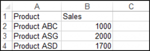
You can create a chart using the ChartObjects.Add method. The following code will create an embedded chart on the worksheet:
Sub CreateEmbeddedChartUsingChartObject()

Dim embeddedchart As ChartObject

Set embeddedchart = Sheets("Sheet1").ChartObjects.Add(Left:=180, Width:=300, Top:=7, Height:=200)
embeddedchart.Chart.SetSourceData Source:=Sheets("Sheet1").Range("A1:B4")

End Sub
The result is:
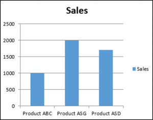
You can also create a chart using the Shapes.AddChart method. The following code will create an embedded chart on the worksheet:
Sub CreateEmbeddedChartUsingShapesAddChart()

Dim embeddedchart As Shape

Set embeddedchart = Sheets("Sheet1").Shapes.AddChart
embeddedchart.Chart.SetSourceData Source:=Sheets("Sheet1").Range("A1:B4")

End Sub
Specifying a Chart Type Using VBA
We have the range A1:B5 which contains the source data, shown below:
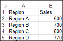
You can specify a chart type using the ChartType Property. The following code will create a pie chart on the worksheet since the ChartType Property has been set to xlPie:
Sub SpecifyAChartType()

Dim chrt As ChartObject

Set chrt = Sheets("Sheet1").ChartObjects.Add(Left:=180, Width:=270, Top:=7, Height:=210)
chrt.Chart.SetSourceData Source:=Sheets("Sheet1").Range("A1:B5")
chrt.Chart.ChartType = xlPie

End Sub
The result is:
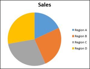
These are some of the popular chart types that are usually specified, although there are others:
- xlArea
- xlPie
- xlLine
- xlRadar
- xlXYScatter
- xlSurface
- xlBubble
- xlBarClustered
- xlColumnClustered
Adding a Chart Title Using VBA
We have a chart selected in the worksheet as shown below:
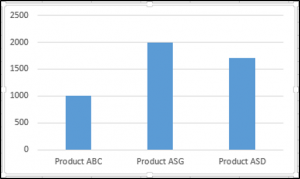
You have to add a chart title first using the Chart.SetElement method and then specify the text of the chart title by setting the ChartTitle.Text property.
The following code shows you how to add a chart title and specify the text of the title of the Active Chart:
Sub AddingAndSettingAChartTitle()

ActiveChart.SetElement (msoElementChartTitleAboveChart)
    ActiveChart.ChartTitle.Text = "The Sales of the Product"

End Sub
The result is:
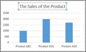
Note: You must select the chart first to make it the Active Chart to be able to use the ActiveChart object in your code.
Changing the Chart Background Color Using VBA
We have a chart selected in the worksheet as shown below:
You can change the background color of the entire chart by setting the RGB property of the FillFormat object of the ChartArea object. The following code will give the chart a light orange background color:
Sub AddingABackgroundColorToTheChartArea()

ActiveChart.ChartArea.Format.Fill.ForeColor.RGB = RGB(253, 242, 227)

End Sub
The result is:
You can also change the background color of the entire chart by setting the ColorIndex property of the Interior object of the ChartArea object. The following code will give the chart an orange background color:
Sub AddingABackgroundColorToTheChartArea()

ActiveChart.ChartArea.Interior.ColorIndex = 40

End Sub
The result is:
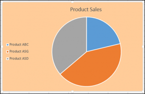
Note: The ColorIndex property allows you to specify a color based on a value from 1 to 56, drawn from the preset palette, to see which values represent the different colors, click here.
Changing the Chart Plot Area Color Using VBA
We have a chart selected in the worksheet as shown below:
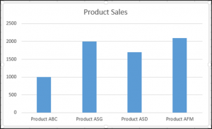
You can change the background color of just the plot area of the chart, by setting the RGB property of the FillFormat object of the PlotArea object. The following code will give the plot area of the chart a light green background color:
Sub AddingABackgroundColorToThePlotArea()

ActiveChart.PlotArea.Format.Fill.ForeColor.RGB = RGB(208, 254, 202)

End Sub
The result is:
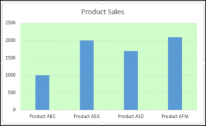
Adding a Legend Using VBA
We have a chart selected in the worksheet, as shown below:

You can add a legend using the Chart.SetElement method. The following code adds a legend to the left of the chart:
Sub AddingALegend()

ActiveChart.SetElement (msoElementLegendLeft)

End Sub
The result is:
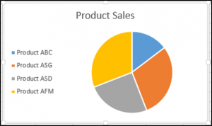
You can specify the position of the legend in the following ways:
- msoElementLegendLeft – displays the legend on the left side of the chart.
- msoElementLegendLeftOverlay – overlays the legend on the left side of the chart.
- msoElementLegendRight – displays the legend on the right side of the chart.
- msoElementLegendRightOverlay – overlays the legend on the right side of the chart.
- msoElementLegendBottom – displays the legend at the bottom of the chart.
- msoElementLegendTop – displays the legend at the top of the chart.
VBA Coding Made Easy
Stop searching for VBA code online. Learn more about AutoMacro — A VBA Code Builder that allows beginners to code procedures from scratch with minimal coding knowledge and with many time-saving features for all users!
Learn More
Adding Data Labels Using VBA
We have a chart selected in the worksheet, as shown below:

You can add data labels using the Chart.SetElement method. The following code adds data labels to the inside end of the chart:
Sub AddingADataLabels()

ActiveChart.SetElement msoElementDataLabelInsideEnd

End Sub
The result is:

You can specify how the data labels are positioned in the following ways:
- msoElementDataLabelShow – display data labels.
- msoElementDataLabelRight – displays data labels on the right of the chart.
- msoElementDataLabelLeft – displays data labels on the left of the chart.
- msoElementDataLabelTop – displays data labels at the top of the chart.
- msoElementDataLabelBestFit – determines the best fit.
- msoElementDataLabelBottom – displays data labels at the bottom of the chart.
- msoElementDataLabelCallout – displays data labels as a callout.
- msoElementDataLabelCenter – displays data labels on the center.
- msoElementDataLabelInsideBase – displays data labels on the inside base.
- msoElementDataLabelOutSideEnd – displays data labels on the outside end of the chart.
- msoElementDataLabelInsideEnd – displays data labels on the inside end of the chart.
Adding an X-axis and Title in VBA
We have a chart selected in the worksheet, as shown below:
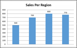
You can add an X-axis and X-axis title using the Chart.SetElement method. The following code adds an X-axis and X-axis title to the chart:
Sub AddingAnXAxisandXTitle()

With ActiveChart
.SetElement msoElementPrimaryCategoryAxisShow
.SetElement msoElementPrimaryCategoryAxisTitleHorizontal
End With


End Sub
The result is:
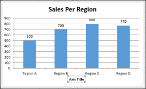
Adding a Y-axis and Title in VBA
We have a chart selected in the worksheet, as shown below:
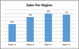
You can add a Y-axis and Y-axis title using the Chart.SetElement method. The following code adds an Y-axis and Y-axis title to the chart:
Sub AddingAYAxisandYTitle()

With ActiveChart
.SetElement msoElementPrimaryValueAxisShow
.SetElement msoElementPrimaryValueAxisTitleHorizontal
End With
End Sub
The result is:
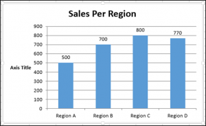
VBA Programming | Code Generator does work for you!
Changing the Number Format of An Axis
We have a chart selected in the worksheet, as shown below:
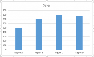
You can change the number format of an axis. The following code changes the number format of the y-axis to currency:
Sub ChangingTheNumberFormat()

ActiveChart.Axes(xlValue).TickLabels.NumberFormat = "$#,##0.00"

End Sub
The result is:
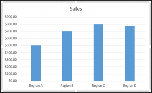
Changing the Formatting of the Font in a Chart
We have the following chart selected in the worksheet as shown below:

You can change the formatting of the entire chart font, by referring to the font object and changing its name, font weight, and size. The following code changes the type, weight and size of the font of the entire chart.
Sub ChangingTheFontFormatting()

With ActiveChart


.ChartArea.Format.TextFrame2.TextRange.Font.Name = "Times New Roman"
.ChartArea.Format.TextFrame2.TextRange.Font.Bold = True
.ChartArea.Format.TextFrame2.TextRange.Font.Size = 14

End With
The result is:
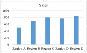
Deleting a Chart Using VBA
We have a chart selected in the worksheet, as shown below:
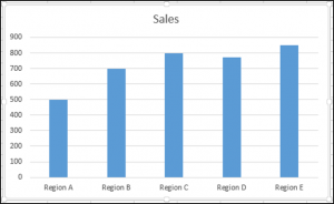
We can use the following code in order to delete this chart:
Sub DeletingTheChart()

ActiveChart.Parent.Delete

End Sub
Referring to the ChartObjects Collection
You can access all the embedded charts in your worksheet or workbook by referring to the ChartObjects collection. We have two charts on the same sheet shown below:
We will refer to the ChartObjects collection in order to give both charts on the worksheet the same height, width, delete the gridlines, make the background color the same, give the charts the same plot area color and make the plot area line color the same color:
Sub ReferringToAllTheChartsOnASheet()

Dim cht As ChartObject

For Each cht In ActiveSheet.ChartObjects
cht.Height = 144.85
cht.Width = 246.61

cht.Chart.Axes(xlValue).MajorGridlines.Delete
cht.Chart.PlotArea.Format.Fill.ForeColor.RGB = RGB(242, 242, 242)
cht.Chart.ChartArea.Format.Fill.ForeColor.RGB = RGB(234, 234, 234)
cht.Chart.PlotArea.Format.Line.ForeColor.RGB = RGB(18, 97, 172)

Next cht

End Sub
The result is:
Inserting a Chart on Its Own Chart Sheet
We have the range A1:B6 which contains the source data, shown below:
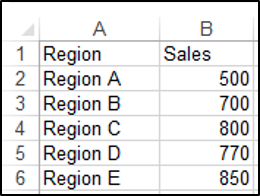
You can create a chart using the Charts.Add method. The following code will create a chart on its own chart sheet:
Sub InsertingAChartOnItsOwnChartSheet()

Sheets("Sheet1").Range("A1:B6").Select
Charts.Add

End Sub
The result is:
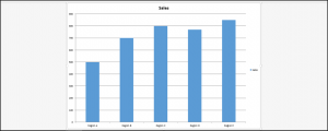
See some of our other charting tutorials:
Charts in Excel
Create a Bar Chart in VBA
Программное создание графика (диаграммы) в VBA Excel с помощью метода Charts.Add на основе данных из диапазона ячеек на рабочем листе. Примеры.
Метод Charts.Add
В настоящее время на сайте разработчиков описывается метод Charts.Add2, который, очевидно, заменил метод Charts.Add. Тесты показали, что Charts.Add продолжает работать в новых версиях VBA Excel, поэтому в примерах используется именно он.
Синтаксис
|
Charts.Add ([Before], [After], [Count]) |
|
Charts.Add2 ([Before], [After], [Count], [NewLayout]) |
Параметры
Параметры методов Charts.Add и Charts.Add2:
| Параметр | Описание |
|---|---|
| Before | Имя листа, перед которым добавляется новый лист с диаграммой. Необязательный параметр. |
| After | Имя листа, после которого добавляется новый лист с диаграммой. Необязательный параметр. |
| Count | Количество добавляемых листов с диаграммой. Значение по умолчанию – 1. Необязательный параметр. |
| NewLayout | Если NewLayout имеет значение True, диаграмма вставляется с использованием новых правил динамического форматирования (заголовок имеет значение «включено», а условные обозначения – только при наличии нескольких рядов). Необязательный параметр. |
Если параметры Before и After опущены, новый лист с диаграммой вставляется перед активным листом.
Примеры
Таблицы
В качестве источников данных для примеров используются следующие таблицы:

Пример 1
Программное создание объекта Chart с типом графика по умолчанию и по исходным данным из диапазона «A2:B26»:
|
Sub Primer1() Dim myChart As Chart ‘создаем объект Chart с расположением нового листа по умолчанию Set myChart = ThisWorkbook.Charts.Add With myChart ‘назначаем объекту Chart источник данных .SetSourceData (Sheets(«Лист1»).Range(«A2:B26»)) ‘переносим диаграмму на «Лист1» (отдельный лист диаграммы удаляется) .Location xlLocationAsObject, «Лист1» End With End Sub |
Результат работы кода VBA Excel из первого примера:

Пример 2
Программное создание объекта Chart с двумя линейными графиками по исходным данным из диапазона «A2:C26»:
|
Sub Primer2() Dim myChart As Chart Set myChart = ThisWorkbook.Charts.Add With myChart .SetSourceData (Sheets(«Лист1»).Range(«A2:C26»)) ‘задаем тип диаграммы (линейный график с маркерами) .ChartType = xlLineMarkers .Location xlLocationAsObject, «Лист1» End With End Sub |
Результат работы кода VBA Excel из второго примера:

Пример 3
Программное создание объекта Chart с круговой диаграммой, разделенной на сектора, по исходным данным из диапазона «E2:F7»:
|
Sub Primer3() Dim myChart As Chart Set myChart = ThisWorkbook.Charts.Add With myChart .SetSourceData (Sheets(«Лист1»).Range(«E2:F7»)) ‘задаем тип диаграммы (пирог — круг, разделенный на сектора) .ChartType = xlPie ‘задаем стиль диаграммы (с отображением процентов) .ChartStyle = 261 .Location xlLocationAsObject, «Лист1» End With End Sub |
Результат работы кода VBA Excel из третьего примера:

Примечание
В примерах использовались следующие методы и свойства объекта Chart:
| Компонент | Описание |
|---|---|
| Метод SetSourceData | Задает диапазон исходных данных для диаграммы. |
| Метод Location | Перемещает диаграмму в заданное расположение (новый лист, существующий лист, элемент управления). |
| Свойство ChartType | Возвращает или задает тип диаграммы. Смотрите константы. |
| Свойство ChartStyle | Возвращает или задает стиль диаграммы. Значение нужного стиля можно узнать, записав макрос. |
Свойства — участники объекта Chart
Объекты, вложенные в Chart, представлены на рис. 3.18, а на следующем рисунке показана структура объектов ChartGroup и Series.

Рис.
3.18.
Структура объекта Chart
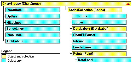
Рис.
3.19.
Структура объектов ChartGroup и Series
Давайте познакомимся с объектами, вложенными в Chart:
- PivotLayout — это новый объект, появившийся в Office 2000. Его появление связано с усилением внимания к обработке многомерных источников данных, а, следовательно, и к сводным таблицам и диаграммам. Объект имеет много свойств, позволяющих добраться до полей сводной таблицы, и много методов, например, метод AddFields, позволяющий добавить новое поле. С его помощью можно также работать с осями сводной диаграммы.
- ChartArea — представляет область, отведенную под диаграмму. Для двумерных диаграмм эта область включает заголовок диаграммы, легенду, оси и их заголовки, а для трехмерных — только заголовок диаграммы и легенду. Вложенные в ChartArea объекты: Border, Font, Interior, FillFormat позволяют задать границы области, используемый для подписей шрифт, формат заполнения, цвет, образец заполнения фона и другие характеристики. Терминальные свойства Height, Width, Left, Top задают границы области. Методы Select, Clear, Copy позволяют выделить область, очистить ее содержимое или поместить его в буфер.
- PlotArea — задает внутреннюю часть области диаграммы, отведенную непосредственно для графического отображения данных. Эту область окружает область объекта ChartArea. В область объекта PlotArea для двумерных диаграмм входят маркеры данных, линии сетки, линии тренда и те возможные элементы диаграммы, которые помещаются в ее область. Для трехмерных диаграмм к этой области относятся также оси и их заголовки, а также нижняя грань и боковые грани трехмерного куба, рисуемого для создания иллюзии трехмерного пространства. PlotArea имеет свойства и методы, сходные с объектом ChartArea.
- ChartTitle — является «полноценным» объектом. Помимо свойства Text, задающего текст заголовка диаграммы в него встроены собственные объекты: Border, Font, Interior, FillFormat. Кроме этого можно задать ориентацию заголовка, выравнивание, расположение. Есть даже собственные методы — Select и Delete.
-
Axes(Axis) — С осями диаграммы есть смысл разобраться подробнее. Во-первых, есть некоторая путаница в классификации — что есть Axes -метод или свойство? Будем считать, что есть и метод и свойство. Метод Axes(Type, AxisGroup) возвращает одну ось — объект Axis. Параметр Type имеет три значения: xlValue, xlCategory, или xlSeriesAxis (только для трехмерных диаграмм), указывающих, какая из трех возможных осей возвращается. Второй параметр — AxisGroup указывает, какая ось возвращается — основная или вспомогательная. Этот параметр имеет два значения: xlPrimary или xlSecondary. Для трехмерных диаграмм возможно использование только основных осей. Свойство Axes (или метод, вызываемый без параметров) возвращает коллекцию осей. Метод Item этой коллекции позволяет добраться до нужной оси. Пример работы с этим объектом был приведен. Замечу, что вспомогательные оси полезны,
когда на диаграмме
отображаются несколько рядов данных, имеющих разные масштабы. Соответствующий пример построения такой оси уже был приведен. -
SeriesCollection(Series) — коллекция рядов данных. Как обычно, параметр Index или метод Item позволяют добраться до элемента коллекции — объекта класса Series, представляющего конкретный ряд данных. Коллекция имеет следующие методы:
- Add, позволяющий добавить новый ряд данных,
- Extend, добавляющий новые точки в ряды данных коллекции,
- NewSeries, создающий новый ряд данных и возвращающий в качестве результата объект класса Series.
Конечно, непросто устроен и объект Series, задающий сам ряд данных. Его структура показана на рис. 3.19, а некоторые из основных его свойств были продемонстрированы в предыдущем примере.
- DataTable — объект, представляющий таблицу данных. Основными методами являются Select и Delete, основные свойства связаны с рамкой, строящейся вокруг таблицы. Вся содержательная работа с данными таблицы ведется через другие объекты (ряды данных). Так что по существу этот объект представляет рамку таблицы данных.
- Legend — задает легенду диаграммы. O сущности этого объекта мы уже говорили, так что его поведение должно быть понятно.
- Shapes — эта коллекция нам хорошо знакома. В диаграммах она используется редко, но иногда можно категории изображать рисунками, что повышает эстетику диаграммы.
-
ChartGroups(ChartGroup) — возвращает коллекцию групп. Элементами коллекции являются объекты класса ChartGroup. Каждый такой объект представляет группу, связанную с одним или несколькими рядами данных, отображаемых диаграммой одного и того же типа, о чем я уже подробно рассказывал. Параметр Index позволяет добраться до конкретной группы в коллекции. Поскольку при форматировании одной из группы индексы изменяются, то иногда удобнее пользоваться специальными методами, которые возвращают группы фиксированного типа. Такими методами являются: AreaGroups, BarGroups, ColumnGroups, DoughnutGroups, LineGroups и PieGroups. Эти методы для двумерных диаграмм возвращают коллекцию групп типа, указанного методом. К конкретной группе можно добраться опять — таки с помощью индекса. Для трехмерных диаграмм может быть только одна группа определенного формата. Поэтому есть методы, возвращающие эту единственную группу: Area3DGroup, Bar3DGroup,
Column3DGroup, Line3DGroup, Pie3DGroup, SurfaceGroup. - Floor, Walls и Corners объекты используются при работе с трехмерными диаграммами. При отображении таких диаграмм для создания иллюзии трехмерного пространства диаграмма отображается на фоне открытого куба, имеющего основание, заданное объектом Floor, и две боковые грани — объекты Walls. Объект Corners задает углы куба. Манипулируя этими объектами, можно, например, развернуть куб или изменить заливку и узор стенок куба, добиваясь большей наглядности изображения.
Терминальные свойства объекта Chart
Основные терминальные свойства сведены в таблицу.
| Свойство | Описание |
|---|---|
| ChartType | Позволяет прочесть или задать тип и формат стандартной диаграммы. Возможные значения задаются константами, которых около сотни. Напомним, что с каждым из 14 стандартных типов связано до 10 форматов. |
| AutoScaling | Булево свойство, имеющее значение True, когда трехмерная диаграмма автоматически масштабируется так, чтобы совпадать по размеру с двумерной. Свойство RightAngleAxes должно также иметь значение True. |
| BarShape | Мы ранее говорили, что двумерные гистограммы изображаются в виде прямоугольников. Для изображения трехмерных гистограмм обычно используются параллелепипеды, но можно применять и другие геометрические фигуры. Свойство BarShape задает вид используемой фигуры. Оно имеет следующие значения: xlBox, xlConeToMax, xlConeToPoint, xlCylinder, xlPyramidToMax, или xlPyramidToPoint. Использовать это свойство вряд ли стоит. Все эти фигуры- «изыски от лукавого». |
| DepthPercent, HeightPercent | Свойства применимы только к трехмерным диаграммам. Позволяют установить глубину и высоту диаграммы в процентах относительно ее ширины. |
| DisplayBlanksAs | Устанавливает способ интерпретации данных при встрече с пустой ячейкой. Следующие константы: xlNotPlotted, xlInterpolated, или xlZero задают три возможные стратегии- игнорировать ячейку, провести интерполяцию или считать нулем. |
| Elevation, Rotation, Perspective, RightAngleAxes | Можно попытаться повысить наглядность изображения диаграммы. Свойство Elevation задает возвышение (в градусах) точки, с которой Вы смотрите на диаграмму. Rotation задает поворот вокруг оси Z, а Perspective — перспективу. Булево свойство RightAngleAxes задает «угол зрения». |
| GapDepth | Задает в трехмерной диаграмме расстояние между рядами данных. Значение может быть в интервале от 0 до 500. |
| HasAxis, HasDataTable, HasLegend, HasTitle | Булевы свойства, показывающие, какие элементы диаграммы присутствуют в ней. |
| PlotBy | Имеет два значения: xlColumns и xlRows, указывающие столбцы или строки следует использовать как ряды данных. |
| PlotVisibleOnly | Булево свойство, имеющее значение True, если отображаются только данные из видимых ячеек. В противном случае диаграмма отображает все данные, включая скрытые ячейки. |
| ProtectContents, ProtectData, ProtectDrawingObjects, ProtectFormatting, ProtectGoalSeek, ProtectionMode, ProtectSelection | Булевы свойства, позволяющие установить защиту соответствующих элементов диаграммы. Часть из них имеет статус «только для чтения». |
| ShowWindow | Булево свойство, применяемое только к встроенным диаграммам. Имеет значение True, если диаграмма отображается в отдельном окне. |
| Visible | Напомним, имеет три значения: True, False и xlVeryHidden. |
Методы объекта Chart
Мы не будем рассматривать методы, которые так или иначе уже встречались. Рассмотрим только основные методы, определяющие новое поведение объекта Chart:
-
Sub ChartWizard([Source], [Gallery], [Format], [PlotBy], [CategoryLabels], [SeriesLabels], [HasLegend], [Title], [CategoryTitle], [ValueTitle], [ExtraTitle]) Этот метод позволяет построить или модифицировать существующую диаграмму. В отличие от мастера диаграмм (ChartWizard), который вызывается при построении диаграммы вручную, метод не является интерактивным, более того он не позволяет задать все возможные свойства. С его помощью можно выполнить основную работу, а детали строятся с использованием других свойств и методов объекта Chart. В одном из ранее приведенных примеров (процедуре AddChart ) я демонстрировал применение этого метода для программного построения диаграммы. Дадим краткое описание параметров метода, все из которых являются необязательными:
- Source — объект Range, содержащий исходные данные для построения новой диаграммы. Если параметр опущен, то метод позволяет отредактировать существующую диаграмму — либо выделенную диаграмму рабочего листа, либо диаграмму активного листа диаграмм.
- Gallery — задает тип диаграммы и может быть одной из следующих констант: xlArea, xlBar, xlColumn, xlLine, xlPie, xlRadar, xlXYScatter, xlCombination, xl3DArea, xl3DBar, xl3DColumn, xl3DLine, xl3DPie, xl3DSurface, xlDoughnut, или xlDefaultAutoFormat.
- Format — задает формат для данного типа диаграммы. Каждому типу диаграммы соответствует некоторое число возможных форматов. Параметр задает номер формата, по умолчанию выбирается первый формат данного типа.
- PlotBy — соответствует терминальному свойству PlotBy.
- CategoryLabels и SeriesLabels — целые, указывающие число строк или столбцов с метками категорий и рядов данных в области, заданной параметром Source. Указывать эти числа нужно на единицу меньше фактического значения.
- Остальные параметры позволяют добавить легенду, задать название диаграммы и ее осей — они совпадают с соответствующими терминальными свойствами.
- Sub SetSourceData(Source As Range, [PlotBy]) Устанавливает источник данных диаграммы. Второй параметр соответствует терминальному свойству PlotBy.
- Sub ApplyCustomType(ChartType As XlChartType, [TypeName]) Метод позволяет модифицировать диаграмму, применив к ней новый тип — стандартный или настраиваемый. Если этот тип стандартный, то тогда первый параметр полностью его определяет. Его возможные значения совпадают со значениями соответствующего терминального свойства ChartType. Если же тип настраиваемый, то первый параметр должен иметь одно из следующих значений: xlBuiltIn, xlUserDefined или xlAnyGallery. В этом случае второй параметр задает имя типа диаграммы.
- Function Export(Filename As String, [FilterName], [Interactive]) As Boolean Позволяет экспортировать диаграмму, преобразуя ее в графический формат. Первый параметр задает имя файла, в который будет записана диаграмма в графическом формате, второй — задает имя графического фильтра в том виде, как оно записано в системном регистре. Булев параметр Interactive должен иметь значение True, если мы хотим вызвать диалоговое окно в процессе фильтрации. Функция Export возвращает значение True в случае успешного завершения работы.
- Sub GetChartElement(X As Long, Y As Long, ElementID As Long, Arg1 As Long, Arg2 As Long). Представьте себе, что пользователь щелкнул кнопку мыши где-то над диаграммой. Обработав это событие, можно получить координаты курсора мыши — X и Y. Если теперь вызвать метод GetChartElement с этими координатами, то он вернет значение параметра ElementID — идентификатор элемента диаграммы и значения двух параметров, связанных с этим элементом. Конечно, параметры зависят от типа того элемента, чьи координаты X и Y заданы.
-
Function Location(Where As XlChartLocation, [Name]) As Chart. Передвигает диаграмму в новое местоположение. Параметр Where имеет следующие значения: xlLocationAsNewSheet, xlLocationAsObject, или xlLocationAutomatic.
В первом случае диаграмма помещается на новый лист диаграммы и параметр Name задает имя этого листа. Во втором случае диаграмма помещается как встроенный объект и Name задает имя рабочего листа. Вот пример, в котором диаграмму, построенную на рабочем листе книги «BookOne» мы переносим на отдельный лист диаграмм:
Public Sub MoveChart() Workbooks("BookOne").Worksheets("Sheet1").ChartObjects(4) _ .Chart.Location Where:=xlLocationAsNewSheet, Name:="Динамика продаж" End Sub - Sub SetSourceData(Source As Range, [PlotBy]) Позволяет установить новый источник данных. Параметры в пояснениях не нуждаются.
В заключение приведем процедуру, создающую трехмерную диаграмму по данным нашего примера с дилерами и продажами:
Public Sub Chart3D()
	Workbooks("BookFour").Activate
	With Worksheets("Лист3")
		Dim myRange As Range
		Set myRange = .Range("C23:F27")
		Dim myChart As ChartObject
		'Создаем контейнер объекта Chart
		Set myChart = .ChartObjects.Add(myRange.Left - 100, _
		myRange.Top + myRange.Height, 400, 300)
	End With
	'Определяем параметры объекта Chart
	With myChart.Chart
		.ChartType = xl3DColumn
		.SetSourceData Source:=myRange, PlotBy:=xlRows
		.Location Where:=xlLocationAsObject, Name:="Лист3"
	End With
	With ActiveChart
		.HasTitle = True
		.ChartTitle.Characters.Text = "Динамика продаж"
	End With
	'Диалог с пользователем
	If MsgBox("Хотите изменить угол зрения?", vbYesNo) = vbYes Then
		ActiveChart.RightAngleAxes = True
	End If
End Sub
Дадим некоторые комментарии к этой программе:
- В качестве источника данных выступает известная по предыдущим примерам таблица Excel.
- Я ввел объекты myRange и myChart класса ChartObjects. Это позволило задать нужные размеры и положение диаграммы, привязанное к таблице данных.
- Ранее при построении диаграмм я использовал метод ChartWizard и работу с коллекциями SEriesCollection. Теперь продемонстрирован еще один способ, когда задаются свойства и методы объекта Chart, в частности, для указания источника данных используется метод SetSourceData.
- Свойство ChartType позволяет указать тип диаграммы, а метод Location определяет ее, как встроенный объект.
- В диалоге с пользователем изменяется угол зрения, задаваемый булевым свойством RightAngleAxes.
- Задав еще заголовок диаграммы, и приняв остальные свойства диаграммы по умолчанию, я получил диаграмму, представленную на рис.3.14.
События объекта Chart
В отличие от объекта Worksheet, все события которого могут быть обработаны на верхнем уровне, объект Chart имеет специфические события, сообщения о которых направляются только ему одному. Встроенные диаграммы и листы диаграмм, имеют одни и те же события. Разница состоит в том, что события встроенных диаграмм по умолчанию выключены, поэтому необходимо потрудиться, чтобы стало возможным их подключение и написание обработчиков событий. Рассмотрим список событий, связанных с объектом Chart:
| Событие | Появляется, когда пользователь или программа |
|---|---|
| Activate | Активизировал лист диаграмм. Естественно, его нет у встроенных диаграмм. |
| BeforeDoubleClick | Дважды щелкает кнопкой мыши на диаграмме |
| BeforeRightClick | Щелкает правой кнопкой мыши на диаграмме |
| Calculate | Добавил или изменил данные на диаграмме. |
| Deactivate | Активизировал новый лист и тем самым деактивировал старый. |
| DragOver | Перетащил данные, расположив их поверх диаграммы. |
| DragPlot | Перетащил диапазон ячеек, расположив их поверх диаграммы. |
| MouseDown | Нажал кнопку мыши при позиционировании ее над диаграммой. |
| MouseMove | Передвигает указатель мыши по диаграмме. |
| MouseUp | Закончил перемещение мыши и освободил кнопку. |
| Resize | Изменил размер диаграммы. |
| Select | Выделил некоторый элемент диаграммы |
| SeriesChange | Изменил значение точки ряда данных. |
Построение обработчиков событий
Обработчики событий для объектов Workbook, Worksheet и объектов Chart, задающих листы диаграмм, построить нетрудно. Все эти события по умолчанию включены, поэтому для построения обработчика достаточно перейти в окно проектов, выбрать модуль, обрабатывающий события этого объекта, в окне объектов этого модуля выбрать нужный объект, а затем в окне событий и процедур выбрать из списка имя события. В результате этих действий появится заготовка, содержащая заголовок обработчика события, после чего останется написать код обработчика. Более сложно строятся обработчики событий для объектов Chart, задающих встроенные диаграммы. О том как создаются обработчики событий для тех объектов, у которых события по умолчанию выключены, я подробно рассказал при рассмотрении событий объекта Application. Остается только коротко напомнить схему действий:
- Вначале нужно создать класс, в котором следует объявить объект Chart с событиями (With Events)
- Затем нужно объявить глобальный объект созданного класса — объект, уже имеющий события. После этого остается написать инициализирующую процедуру, в которой связывается глобальный объект с объектом, задающим встроенную диаграмму.
- Поскольку объект Chart с событиями появляется в окне созданного класса, то к нему применяется обычная схема создания обработчиков событий.
- После запуска инициализирующей процедуры, объект, задающий встроенную диаграмму, будет реагировать на события.
Возможно, следует обратиться к началу главы, где все подробно описано на примере работы с объектом Application.