
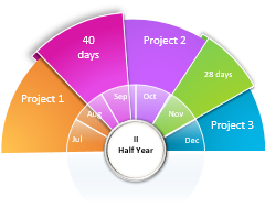
Добавьте в свою презентацию диаграмму или блок-схему
Эта обширная коллекция диаграмм содержит все инструменты для коммуникации и отслеживания, которые потребуются вам для работы, учебы, дома или игры. Найдите блок-схему из разных стилей, цветов и временных интервалов, чтобы создать расписание и пометить вехи для проекта любого размера. Блок-схема может содержать различные данные, например ответственных за задачи, даты начала и окончания, а также различные функции, такие как автоматическое обновление. Для процессов, включающих несколько групп, функциональная блок-схема — это универсальное средство для описания сложных действий и определения обязанностей. Эта коллекция также включает классическую диаграмму Ганта с различными макетами. Для добавления текстуры в блок-схему просмотрите различные панели коллекции, чтобы найти конкретные графические элементы, включая кольцевые, линейчатые и круговые диаграммы, карты и шкалы. И не забудьте о полезной организационной диаграмме, поделившись ею с новыми сотрудниками или проверив с ее помощью цепочку подотчетности. Шаблоны диаграмм для личного использования включают диаграммы планирования пенсии, журналы питания и упражнений, временные шкалы событий, генеалогические древа, маршруты поездок, схемы рассадки гостей и даже турнирные сетки. Ознакомьтесь с шаблонами диаграмм, чтобы найти подходящий для вас.
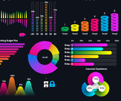
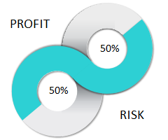
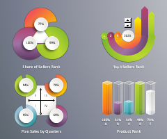
Бесплатно скачать готовые примеры шаблонов для дашбордов, динамических графиков и диаграмм с интерактивным функционалом.
Каталог шаблонов дашбордов и диаграмм
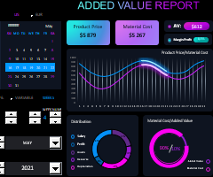 Пример добавленной стоимости скачать бесплатно в Excel
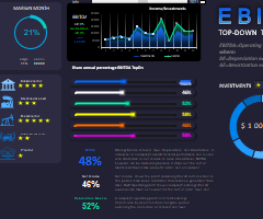 Дашборд для анализа EBITDA инвестиций в Excel скачать
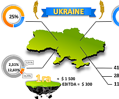 Презентация анализа стоимости пахотной земли скачать в Excel
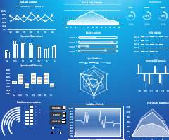 Дашборд облачного аудита скачать бесплатно в Excel
 Красивый дашборд для анализа силы бренда в Excel
 Простой пример создания элементов инфографики в Excel
 График рейтинга данных для визуализации скачать в Excel
 График ранжирования для визуализации данных скачать в Excel
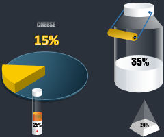 3D-инфографика для презентации в Excel отчета продаж сыра
 Простой пример 3D-диаграммы со значением больше 100% в Excel
 Сравнительная диаграмма и создание инфографики 20/80 в Excel
 Ассоциативные приемы визуализации выборки данных в Excel
 Дашборд для анализа диверсификации и теста бизнес-ниш в Excel
 Визуализация для анализа истории болезни пациента в Excel
 Сравнительный анализ продаж по дням недели в Excel
 5 красивых идей для создания интерактивной инфографики в Excel
 Дашборд взаимосвязи бизнес-интеллекта менеджера и продаж в Excel
 Дашборд для анализа факторов ранжирования продаж в Excel
 Красивая диаграмма для презентации отчетов в Excel
 Скачать шаблон анализа учета продаж продуктов кафе в Excel
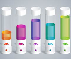 График с визуализацией данных для лабораторных работ в Excel
1
2
3
4
5
Excel Chart Templates — Free Downloads

PINE BI: Ultimate Excel Charting Add-in: Insert custom charts with a simple click & other charting tools!
Excel also allows almost unlimited chart customizations, by which you can create many advanced chart types, not found in Excel. Below you will also find these advanced chart templates available for download.
You will also find some chart templates available for download for standard Excel charts.
Instead, click here if you are looking for information about creating, saving, and using Chart Templates within Excel.
Advanced Chart Templates

Gauge Chart
Also known as: Dial Chart, Speedometer Chart
Description: Gauge charts use needles to show information as a reading on a dial. They are often used when comparing KPIs or business results against a stated goal.
Learn More: Gauge Chart Tutorial
Gauge Chart Builder Add-in
7 Different Gauge Chart Templates. 5 Style Presets. 9 Color Palettes. Fully customizable.

Tornado Chart
Also known as: Sales Funnel Chart, Butterfly Chart
Description: A Tornado Chart is a modified version of the bar chart where the data categories are displayed vertically in a way that resembles a tornado.
Learn More: Tornado Chart Tutorial

Burndown Chart
Also known as: N/A
Description: Burndown charts represent work left to do vs. time. It is useful for predicting when all work will be completed.
Learn More: Burndown Chart Tutorial

Step Chart
Also known as: N/A
Description: A Step Chart is a line chart that uses vertical and horizontal lines to connect data points in a series, creating a step-like progression.
Learn More: Step Chart Tutorial

Thermometer Chart
Also known as: Goal Chart
Description: Thermometer charts show the current completed percentage of a task or goal relative to the goal.
Learn More: Thermometer Tutorial

Quadrant Chart
Also known as: N/A
Description: Quadrant charts are scatter charts with a background that is divided into four equal sections, allowing you to categorize data points into the four quadrants
Learn More: Quadrant Tutorial

Ogive Chart
Also known as: Cumulative Frequency Graph
Description: Ogive charts are graphs used in statistics to illustrate cumulative frequencies.
Learn More: Ogive Chart Tutorial

Bullet Chart
Also known as: Steven Few’s Bullet Graph
Description: A modified column or bar chart used for tracking performance(s) against goal(s). Alternative to Gauge chart.
Learn More: Bullet Chart Tutorial

Mekko Chart
Also known as: Marimekko Chart, Mosaic Plot
Description: 2D stacked chart where the column width usually represents the relative size of a segment and the height breaks down each segment.
Learn More: Mekko Chart Tutorial

Normal Distribution Curve
Also known as: Bell Curve, Gaussian Curve, Bell Plot
Description: Symmetrical graph that illustrates the tendency of data to cluster around the mean.
Learn More: Bell Curve Tutorial

Stem and Leaf Plot
Also known as: Stemplot
Description: Diagram that splits each data point into a «stem» (the first number(s)) and «leaf» (usually last digit) to display the frequency distribution of a data set.
Learn More: Stem and Leaf Tutorial

Polar Plot
Also known as: N/A
Description: A polar plot is used to define points in space within what is called the polar coordinate system.
Learn More: Polar Plot Tutorial

Venn Diagram
Also known as: N/A
Description: A Venn Diagram uses circles to show relationships among sets where sets have some commonalities.
Learn More: Venn Diagram Tutorial

Panel Chart
Also known as: N/A
Description: Panel charts are charts that have multiple regions, each region displaying a different set of data, rather than showing all data in a single region.
Learn More: Panel Chart Tutorial

Timeline Chart
Also known as: Milestone Chart
Description: Timeline charts are used to visualize status of projects in chronological order.
Learn More: Timeline Chart Tutorial

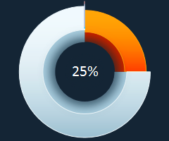
Progress (Bar and Circle) Charts
Also known as: N/A
Description: Progress charts are used to display your progress towards a goal.
Learn More: Progress Chart Tutorial

Population Pyramid
Also known as: N/A
Description: Population Pyramids are used to visually display subsets within a population.
Learn More: Population Pyramid Tutorial

Excel Basic Chart Templates

Column Charts
Description: A Column Chart is a data visualization where each item is represented by a rectangle, where the magnitude of the values determines the height of the rectangle.
Learn More: Column Chart Tutorial

Bar Charts
Description: A Bar Chart is a data visualization where each item is represented by a rectangle, where the magnitude of the values determines the width of the rectangle.
Learn More: Bar Chart Tutorial

Area Charts
Description: An Area Chart is similar to a line chart, except the area below the line is colored in to emphasize magnitude.
Learn More: Area Chart Tutorial

Line Charts
Description: A line chart is a graph that uses lines to connect individual data points over a time interval.
Learn More: Line Chart Tutorial

Pareto Chart
Description: A Pareto Chart is a hybrid of column and line charts that displays the relative importance of factors in a data set.
Learn More: Pareto Chart Tutorial

Waterfall Chart
Also Known As: Bridge Chart, Flying Bricks Chart, Cascade Chart, or Mario Chart
Description: A Waterfall Chart visually breaks down the cumulative impact of sequential positive or negative values on a final outcome (ex. various income and expense items on the final profitability).
Learn More: Waterfall Chart Tutorial

Sales Funnel Chart
Description: A Sales Funnel Chart dissects different stages of a process, typically sorting the values in descending order (from largest to smallest) in a way that visually looks like a funnel—hence the name.
Learn More: Sales Funnel Chart Tutorial

Candlestick Charts
Description: A candlestick chart shows the open, high, low, close prices of an asset over a period of time.
Learn More: Candlestick Chart Tutorial

5 шаблонов профессиональных и популярных диаграмм в Excel
Ссылка на это место страницы:
#more
ДИАГРАММЫ, КОТОРЫЕ ВЫ ПОЛУЧИТЕ
А здесь вы можете увидеть,
как работать с полным набором из
100+ профессиональных диаграмм в Excel
Свяжитесь с нами любым удобным способом, чтобы получить на него ответ.
шаблоны диаграмм для excel

Excel 37. Шаблон диаграммы
Достаточно часто мне проходится делать презентации с большим количеством диаграмм. Чтобы сберечь время на создание диаграмм, я использую шаблон диаграммы и даже не один. По окончании этого урока вы сможете: Создать шаблон диаграммы Применить шаблон Дальше