
Sometimes, when you open an Excel spreadsheet, you can’t see the text you have typed in a cell.
The text may be visible on the formula bar but not in the cell itself. For instance, in the image below, the data in cell C2 is not visible but you can see it in the formula bar.
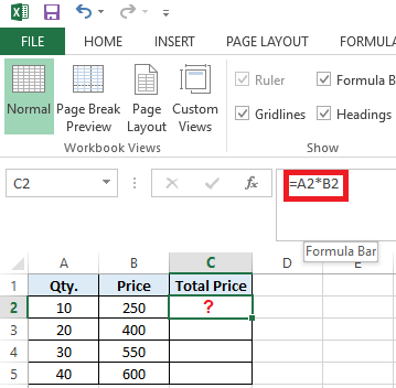
Figure 1 — Excel Not Showing Data in Cells
Also Read: Data Disappears in Excel – How to Get it Back?
Workarounds to Fix ‘Excel Not Showing Data in Cells’
Note: Before trying these workarounds, make sure that your Office program is updated.
Workaround 1 – Check for Hidden Cell Values
If cell values are hidden, you won’t be able to see data when a cell is selected. But the data will be visible in the formula bar. To display hidden cell values in a worksheet, follow these steps:
- Select a single cell or range of cells that doesn’t show the text.
- Right-click on the selected cell or range of cells and choose Format Cells.
Figure 2 — Select Format Cells
- A ‘Format Cells’ window opens. On the Number tab, choose Custom and check if 3 semi-colons (;;;) appear in the Type textbox.
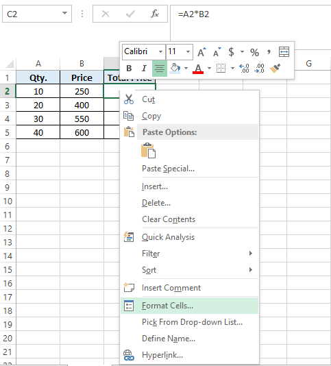
Figure 3 — Check for Semi-Colons in Type Box
- If you can see the 3 semi-colons, delete them and then click OK. If you cannot see semi-colons in the ‘Type’ textbox, skip to the next workaround.
Workaround 2 – Change the Default Font
The font of cells in your Excel worksheet may be creating the problem. So, try changing the default font of cells or ranges:
- Select a cell or cell range where the text is not showing up.
- Right-click on the selected cell or cell range and click Format Cells.
- From the pop-up window, click on the Font tab and then change the default font (usually Calibri) to any other font, like ‘Arial’ or ‘Times New Roman’. Press the OK button.
Figure 4 – Format Cells Window
If changing the default font doesn’t fix the ‘Excel data not showing in cell’ problem, proceed with the next workaround.
Workaround 3 – Disable Allow Editing Directly in Cell Option
Some users have reported that they were able to resolve the ‘Excel data not showing in cells’ issue by unchecking the ‘Allow editing directly in cells’ option. To do so, follow these steps:
- In Excel, click on the File menu and then click on Options.
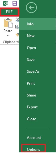
Figure 5 — Excel Options
- From the Excel Options window, choose Advanced in the left pane and then uncheck ‘Allow editing directly in cells’.
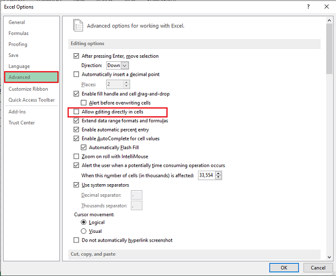
Figure 6 — Uncheck Allow Editing Directly in Cells
- Click OK.
If you are unable to view the text in Excel cells, try the next workaround.
Workaround 4 – Adjust Row Height to Make the Cell Data Visible
If you have cells with wrapped text, then try adjusting the row height of the cell or range to make the data visible. Here are the steps:
- Select a specific cell or range for adjusting the row height.
- On the Home tab, click Format from the Cells group.
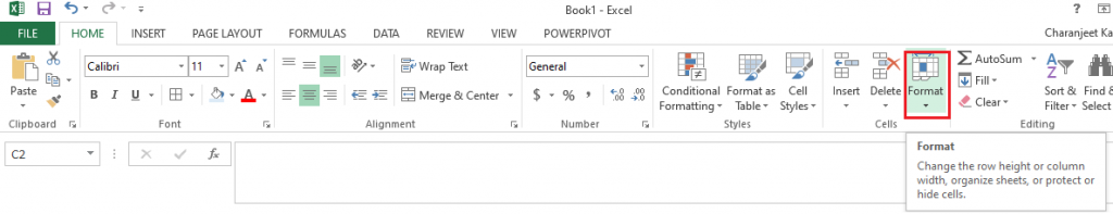
Figure 7 — Format Option in Cells Group
- Under Cell Size, perform any of these actions:
- Click AutoFit Row Height to automatically adjust the row height of your cell or cell range.
- Click Row Height to manually enter a cell’s row height. This will open a ‘Row Height’ box. In the box, enter the row height that you want.
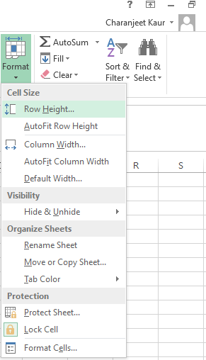
Figure 8 – Cell Size Options
Tip: You can also adjust a cell’s row height by dragging the bottom border of the row till the height when the wrapped text is visible.
Workaround 5 – Recover Missing Cell Content
Your Excel worksheet won’t display data in cells if it is corrupted. In other words, the cell values won’t display any result if the data in your Excel worksheet is damaged or corrupted. In that case, you can manually fix and recover corrupt Excel files or use an Excel repair tool, such as Stellar Repair for Excel.

Read this: How to Recover Corrupted Excel File?
Using the Excel file repair tool can help you retrieve all your worksheet data, including cell content, tables, numbers, text, rules, etc.
Wrapping Up
Oftentimes, when opening an Excel worksheet or while working on one, clicking on a cell or cell range doesn’t show any data. You may be able to see the data in the formula bar of your worksheet but not within the cells. This may prevent you from doing anything constructive in Excel. Try troubleshooting the issue by using the workarounds discussed in this article. If nothing works, chances are that corruption in the Excel file is causing it to behave oddly. Try repairing corrupt Excel file by using the built-in ‘Open and Repair’ feature or use Excel file repair software by Stellar to quickly restore your worksheet with all its data intact.
You might also be interested in reading:
[Fix] Excel formula not showing result
Easy Steps to Make Excel Hyperlinks Working
Microsoft Excel Tips
It’s time to dump the pie charts and move to donuts or even waterfalls to show off your data in ways people can better grasp.
Thinkstock 
- Sparklines: A heads-up display for your data
- Make failures jump out with in-cell charts
- Put your smarts on the table
- Sunburst charts: so much better than pie!
- Waterfall charts for clean, clear data
- Mmm… doughnuts
- Roll your own project-tracking Gannt chart
- Show your goal with a thermometer chart
- Charts that change as you enter data
- More ways to that dynamic chart
Show More
Have you noticed that people groan when you pop open a spreadsheet to share your brilliant data insights? Maybe it’s not you — or your audience — that’s to blame. Maybe you suffer from Dull-and-Overused-Chart-Syndrome?
Here are 10 charts that can present data in clever ways that make it easy for people to grasp what you’re talking about. They don’t require people to squint and overthink; instead, these charts do to your data what a photo does to everything else: Show not tell.
You can stop boring everyone with the same old pie slices. Try serving doughnuts or showing them a waterfall. It’s more fun.
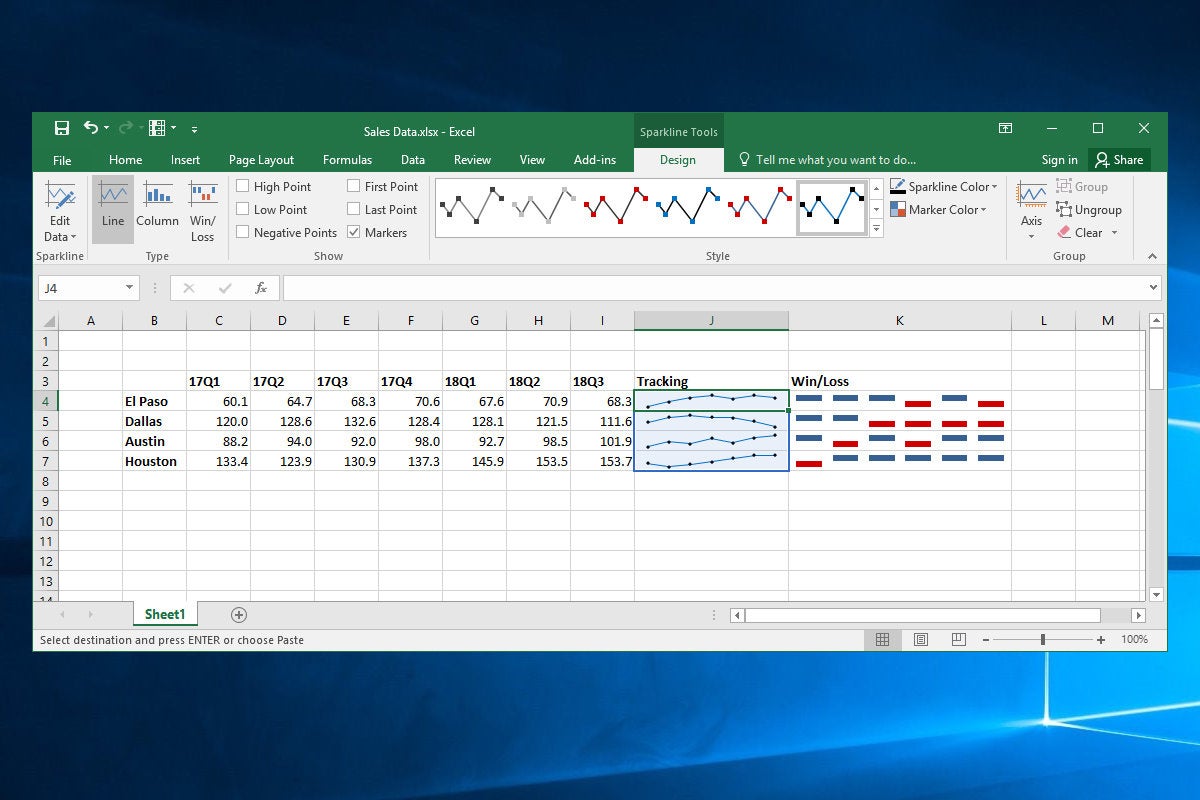
Sparklines: A heads-up display for your data
In-cell charts are like a heads-up display for your data, providing an immediate visual context in spreadsheets. The Sparkline feature, introduced in Excel 2013, lets you select data from rows or columns of cells and display line, column or handy win/loss charts.
 Jim Desmond
It’s easy! Just select a range of cells next to the data you want to chart, then click Insert on the UI ribbon and click Line in the Sparklines group (you can also click Column or Win/Loss). In the Create Sparklines dialog box, click in the Data Range text box and select the rows or columns of data you want to depict. The Location Range text box should show the cells used to hold the Sparkline graphs, but you can adjust this by selecting the text in that box and using the mouse to select a row or column of cells. Click OK, and the in-cell charts appear, displaying the data. Select the Sparkline chart cell, click the Design item in the Ribbon, and play with the formatting options to get the look you want.
Make failures jump out with in-cell charts
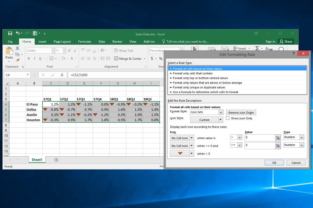
Sparklines are handy. I especially like the Win/Loss option that displays iconography and color based on whether a value is positive or negative. Use it to, say, normalize regional sales data against projection and flag underperformers. But what if you want to embed visual context within the cell itself, rather than off to the side? Time for some conditional formatting and in-cell charts!
 Jim Desmond
Select a range of data, click the Conditional Formatting item in the Ribbon, and click Icon Sets, then one of the simple options under Directional. Now each data cell displays an arrow icon. But these aren’t aligned relative to zero (and it’s visually quite busy).
So, with the range selected, click Conditional Formatting, Manage Rules, and double-click the rule you just created. In the Edit Rule Description dialog box, set the two top Icon drop downs to No Cell Icon, and the two top Value items to 0. Click the ‘greater than’ drop down and set the first the “>” and the second to “>=”. Set both Type drop downs to Number. In the bottommost Icon item, set the icon to a red down arrow. Click OK and OK again. Now, all negative cells (and only negative cells) are flagged.
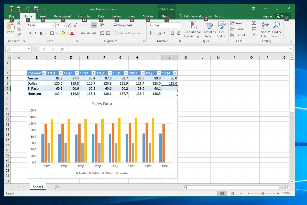
Put your smarts on the table
Tables are one of my favorite features in Excel, thanks to the powerful Filter feature that can sort and filter even the largest data sets with a mouse click. But a hidden benefit is the magic it affords your charts. For instance, add a new column of data to the end of a table, and the linked chart automatically expands to add the new data series. Nice.
 Jim Desmond
To Table-ize a data range, select the relevant cells (including header rows and columns) and click Insert, then Table in the Ribbon menu. Make sure the My Table Has Headers checkbox is checked, then click OK. Boom! The data gets some handy formatting and adds filter drop-down controls along the header row. Now, with an embedded chart displayed next to your data, enter a new header row item and some underlying data in the cells below it. As soon as you hit return in the header row cell, your chart resizes and sets aside a new item on the chart axis. As you add data to each cell, the chart updates to display the new data.
Even better, Tables bring the useful magic of Filters to your charts. Suppose you have a table with monthly budget figures from 100 field offices. You can visualize only offices in, say, Ohio, by clicking the Filter drop down in the State column, then unchecking the Select All checkbox, before scrolling down to Ohio in the list and checking it. Click OK and the chart updates.
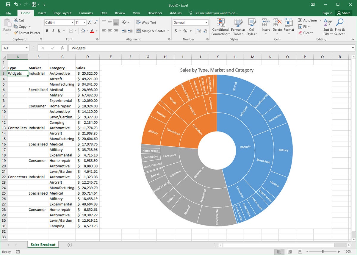
Sunburst charts: so much better than pie!
The new sunburst chart type in Excel 2016 is incredibly useful for understanding the relationship among data, taking nested hierarchies of data and showing how the granular elements combine to populate larger data groups. Think of it as a multi-level pie chart.
 Jim Desmond
Sunburst charts in Excel do their thing by reading the structure of your data set. For instance, our fictional company has three strategic product lines (widgets, controllers, connectors) and keeps a spreadsheet that tracks sales for these product lines across industrial, specialized, and consumer markets. They further break these categories out by industry (automotive, medical, etc.). Once the data is properly laid out, select the relevant cells and click Insert, Chart, Recommended Charts, and click the All Charts tab, then click Sunburst from the list.
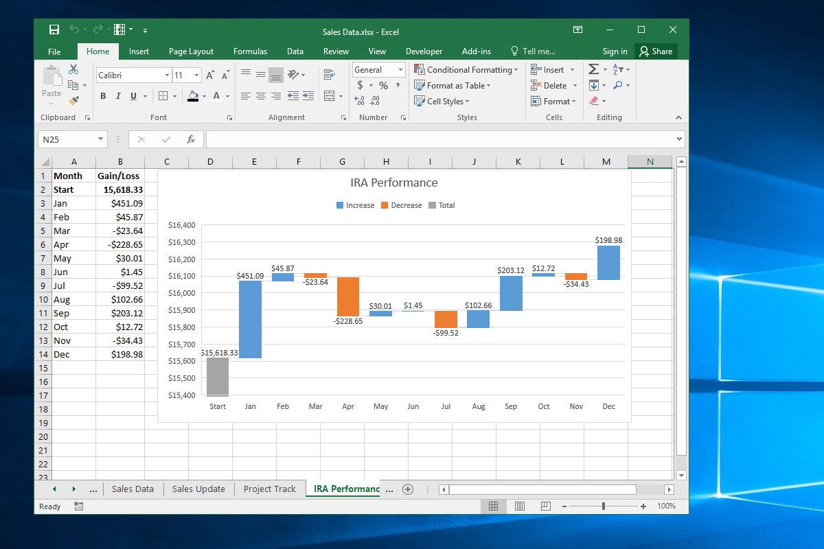
Waterfall charts for clean, clear data
Office 2016 introduces a new chart type to Excel’s arsenal — the waterfall chart. It’s great for showing how positive and negative values contribute to a total — like tracking the worth of a financial portfolio over time or visualizing income and expenses. Unlike a line chart, which reveals trends, a waterfall chart emphasizes individual gains and losses.
 Jim Desmond
To create a waterfall chart, make a simple two-column array, with months in the left column and dollar amounts (positive and negative) in the right. Select the array and click Insert and click the Recommended Charts icon. Then click the All Charts tab on the insert Charts dialog box. Click Waterfall in the right pane and click OK. A rather poorly formatted chart greets you.
Next, we will rein in that Y axis so the hefty Start amount doesn’t swamp the other data. Right-click the Y-axis labels and click Format Axis. In the Axis Options pane, enter 15400 and click OK. Then click the Number item and in Category select Currency and, in the Decimal places box that appears, type 0, and press Enter. Finally, set that first data point on the chart as a Total item. Click on the first column in the chart and click on it again so that only that column is highlighted (the others should look faded). In the Format Data Point pane, click the Series Options icon and then check the Set as total checkbox. The selected column now turns gray.
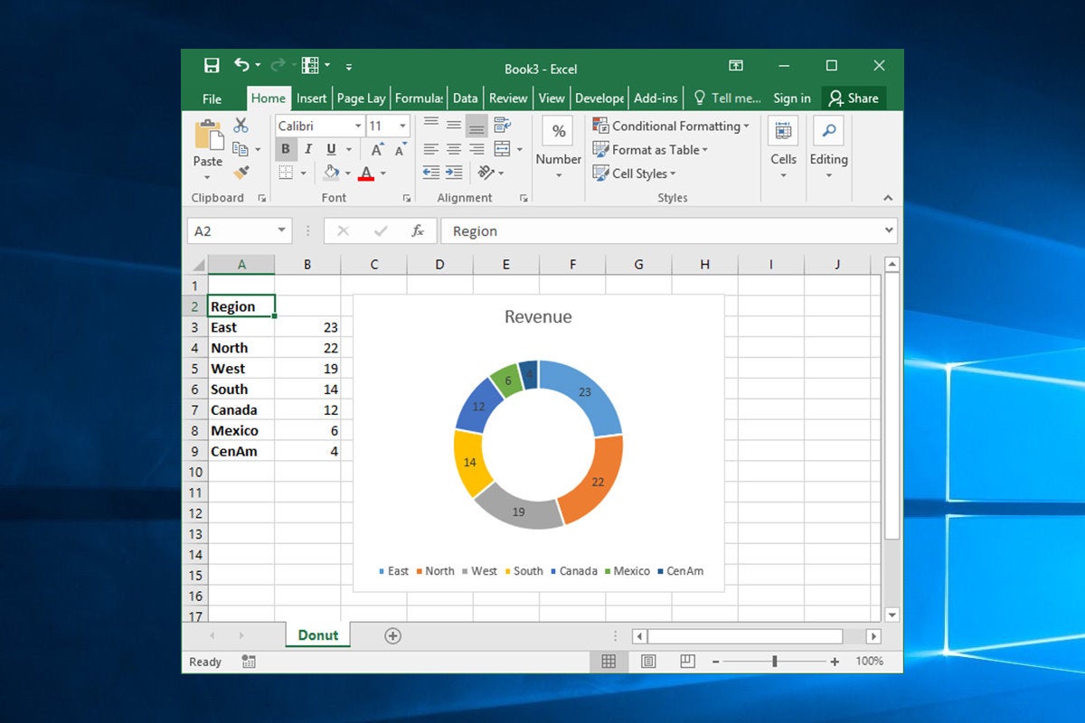
Mmm… doughnuts
Pie charts can be the worst. They lack the visual precision of stacked column charts, and they’re often crowded, reducing smaller data points to inscrutable wedges. What’s more, they invite abuse, in the form of baroque 3D pies and extracted slices that can confuse hapless viewers.
That’s why you might consider serving doughnuts the next time you reach for an Excel pie chart. Like pie charts, doughnut charts are great for visualizing contributions to a total. But the additional white space and less common usage make them a refreshing change of pace on the corporate charting circuit.
 Jim Desmond
To create a doughnut chart, select your data, then click Insert, click the Insert Pie or Doughnut Chart icon, and click Doughnut Chart. To tailor the presentation, right-click the chart body and click Format Data Series. In the pane that appears, change the Doughnut Hole Size value to somewhere around 60%. (I find the default 75% is too skinny.)
Roll your own project-tracking Gannt chart
You can turn a stacked bar chart into a project-savvy Gannt chart.
![]() Jim Desmond
Jim Desmond
Make a four-column table with «Start,» «Stage,» «Date» and «On Task» across the top row. In Cells B2 through B7, enter project stages like Plan, Build, Approve, etc. In Cell A2, under Start, enter the start date for the first stage item, then in Cells D2 through D7 (under On Task), enter the number of days for each stage to complete. In Cell C2 enter «=A2» and format the cell as General. You’ll see a number like 43205, which is Excel’s time/date code needed for the chart layout. Finally, in C3 enter «=C2+D2», then copy and paste this formula into cells C4 through C7.
Select the cells you’ve entered from Column B through D and click Insert. Click the column chart icon and then the stacked bar chart. Now let’s bring the chart into focus. Right-click the X-axis labels and click Format Axis. In the Axis Options pane, click the Number item and, in Category, select Date from the drop-down. In Type, select a shorter date format. Then, at the top of the pane under Bounds, in the Minimum text box, enter the value from Column C of the first item in your task list. It should be something like 43205. You’ll note that the Stages are in reverse order. Right-click the vertical axis and click Format Axis. In the Axis Options pane, click the Categories in Reverse Order checkbox.
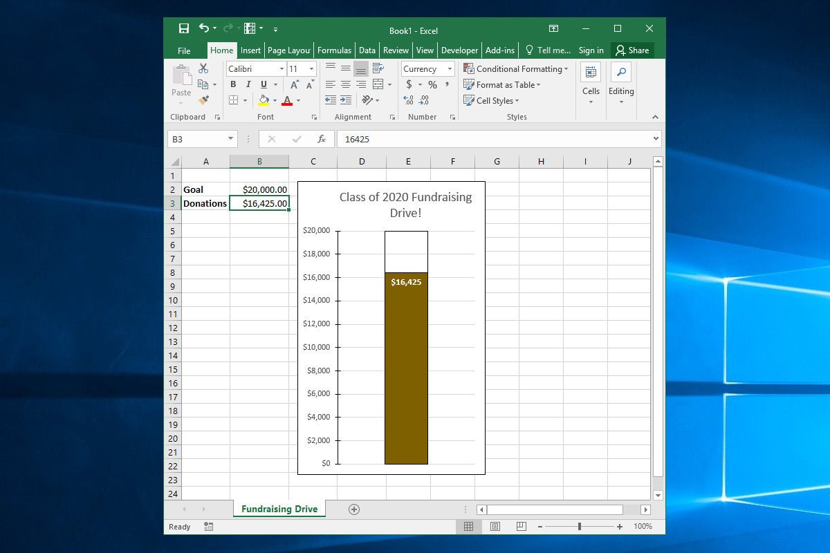
Show your goal with a thermometer chart
Want to visualize an achievement against a goal? How about a fundraiser trying to raise $20,000? A thermometer chart is great for this.
 Jim Desmond
We’ll keep it simple with a four-cell array with Goal and Donations on the left, and $20,000 and $16,425 on the right. Select the cells, click Insert in the Ribbon, click the Column Chart icon and then click on the Clustered Column Chart item. Click the Switch Row/Column icon in the Ribbon so the chart box displays a “1” in the X-axis label.
Right-click the smaller Donations bar and click Format Data Series. Then click Secondary Axis in the Series Options pane. The bar will disappear behind the larger Goal bar and a secondary Y-axis label appears. Right click the left axis, click Format Axis, and then enter 20000 in the Maximum box in the Axis Options pane. Do the same for the right (secondary) axis.
Empty the Goal bar by right-clicking it, clicking the Fill & Line icon in the pane, and clicking No fill and setting the Border to a black line. Format the Donations bar with a fill color of your choice and setting the border to No line. Clean up the chart by deleting the right axis and the X-axis labels. Also, tighten up the left axis in the Format Axis pane. In Axis Options, set the Number Decimal places box to 0. Add tick marks as you wish.
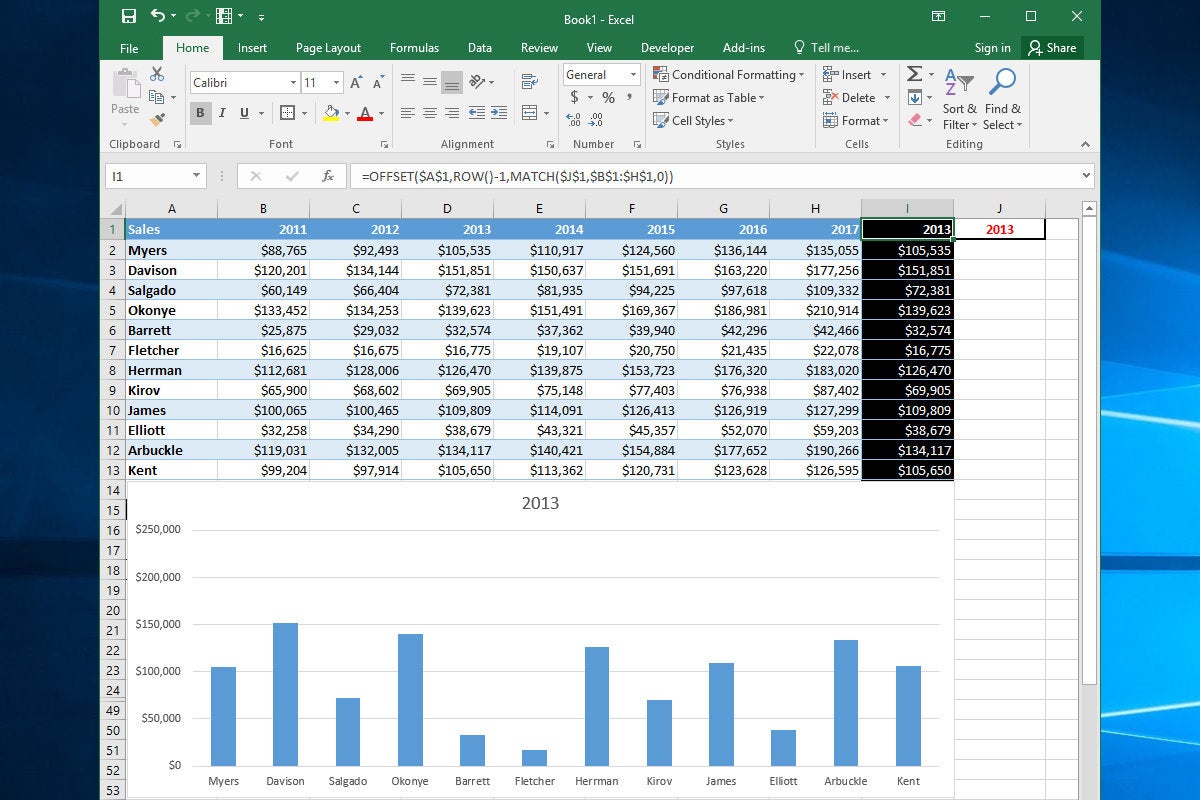
Charts that change as you enter data
Here’s a trick: an Excel chart that displays specific data from a large array based on your input.
 Jim Desmond
You do this with the (incredibly useful) MATCH and OFFSET functions, which pluck data from an array and present it in cells that the chart is linked to. Let’s say you have seven columns representing years and 12 rows representing sales reps, with the cells containing yearly sales amounts.
In the column to the right of the last column, enter the following formula in each cell:
=OFFSET($A$1,ROW()-1,MATCH($J$1,$B$1:$H$1,0))
This tells Excel to look in the header row of the array for a value that matches the year to cell J1, so Excel can use the OFFSET function to pull the data from that year and display it in the cells in column I. So, if you enter 2014 in Cell J1, the formulas in Column I display the data that’s in the cells under 2014 (in this case, Column E). Now, all you have to do is create a chart that uses column A for its X-axis and Column I for its data. The column will update to display the data for whatever year you enter into Cell J1. Nifty.
More ways to that dynamic chart
OK, let’s take this a step further and update a line chart based on a scrollable list.
 Jim Desmond
Just below the same array of data we used in the last slide, we’ll use the handy OFFSET and MATCH functions to add cells to Row 15, with formulas that pull sales data based on which rep’s name is entered into Cell A18. These formulas are in cells A15 through H15 and read as follows:
=OFFSET($A$1,MATCH($A$18,$A$1:$A$13,0)-1,COLUMN()-1)
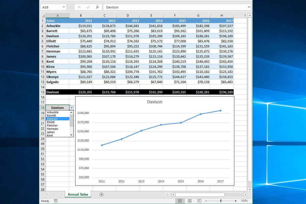
Select Cells A1:H1 (X-axis values) and Cells A15:H15 (rep name and related sales data) and click Insert, Recommended Charts, and select Line chart from the top of the list. Now set up the drop-down list control to read names from Cells A2:A13. Click on A18, click the Data tab in the Ribbon, and click Data Validation and then Data Validation again. Click List from the Allow Drop-Down control, then click in the Source box and use the mouse to select cells A2 through A13. Click OK.
Now when you click on A18, a drop-down control appears. Click it and you’ll see a scrollable list of all your reps’ names. Select one and not only does A18 update to show that name, but the cells in Row 15 all update with that reps’ data, and the linked chart updates as well.
Copyright © 2018 IDG Communications, Inc.
Excel has tools for easily viewing of a sheet with a lot of data, as well as tools for viewing several sheets and several books at the same time.
For example, we are going to take big prices, that need to be prepared in advance. When viewing ones with horizontal or vertical scrolling of the sheet, we lose the headings of the columns and rows of the tables at once.
To conveniently view the data on an Excel sheet, let’s make the first row and the first two columns are constantly displayed, independently of the position of the scroll bars.
Splitting of a window when viewing in Excel
Viewing two parts of a sheet in separate panels:
- Go to the cell C2 and select the tool in the panel: «VIEW»-«Window»-«Split». The window is divided into 4 independent panels (sub-windows).
- You need to scroll lower right panel down and right.
- Clicking again on the «Split» tool, you disable to the window mode.
To lock the table header while scrolling
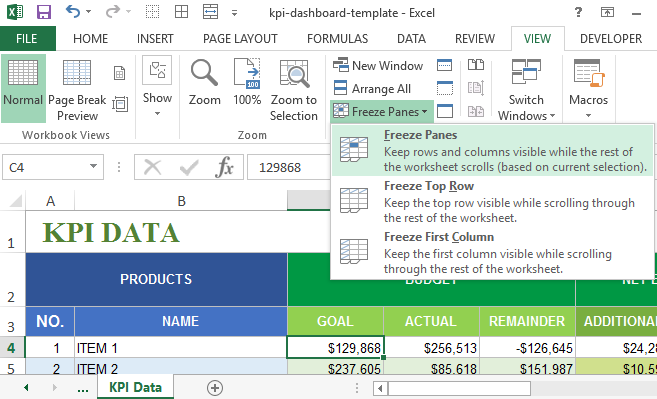
You can block the scrolling of selected rows and columns when viewing the Excel spreadsheet in the width or length of a document. To do this, we do the following:
- Go to the cell C2 and select the tool: «View» – «Freeze Panes».
- Using the scroll bars, make sure that columns A and B, as well as row 1 are fixed and do not move when the sheet is scrolled, but constantly display the header of the table and allow you to conveniently read a large amount of data.
- To unfasten the areas, you need to re-select the tool: «Freeze Panes», and in this time an option is available in the drop-down list – «Unfreeze Panes».
Review of a sheet in individual windows
One and the same large sheet can be viewed in several windows. For this:
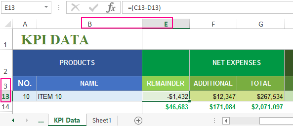
- Select the tool: «VIEW» – «New window».
- For more convenient control of viewing in this mode, use the tool: «VIEW» – «Arrange All».
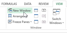
In the dialog window that appears, there are available several options for you. Select, for example, the option «Cascade» and press OK. Now the windows are convenient to manage and switch between ones when viewing.
Each Excel file opens in a new child window. The «Arrange all» tool allows you to manage these individual windows. And if you mark the «Only the windows of the current workbook» option, you can control only the child windows of one book separately. This is useful when several files are open, but you need only to manage copies created with the «New Window» tool.
The notation. Each child window can be individually closed, minimized and deployed by standard Windows window controls.
Hiding and displaying of the grid in Excel
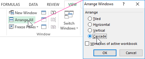
For easy viewing in Excel, you can disable the gray grid. To do this, go to the Tools tab: «VIEW» and in the «Show» section, uncheck the «Gridlines» option.
The grid is disconnected mainly when creating user interfaces and beautiful templates. As well you must not forget about the presentation of the reports with graphs and diagrams. Sometimes for formalization forms of documents in electronic form it is necessary to disconnect the background grid Excel. Without the mesh, it is much more convenient to view document forms electronically.
What is Data Table in Excel?
A Data Table in Excel helps study the different outputs obtained by changing one or two inputs of a formula. A data table does not allow changing more than two inputs of a formula. However, these two inputs can have as many possible values (to be experimented) as one wants. Excel Data tables, along with Scenarios and Goal Seek are parts of the What-If Analysis tools.
For example, an organization may want to study how changes in the cash possessed impact its working capital. A data table will help the organization know the optimum level of cash (from the specified possible values) to be held to meet its short-term obligations.
The purpose of creating data tables in Excel is to analyze the variation in outputs resulting from a change in the inputs. Moreover, one can have all the outputs in a single table which eases interpretation and allows quick sharing with other users.
Table of contents
- What is Data Table in Excel?
- Types of Data Tables in Excel
- One-Variable Data Table in Excel
- Example #1
- Two-Variable Data Table in Excel
- Example #2
- The Key Points Governing Data Tables in Excel
- Frequently Asked Questions
- Recommended Articles
- One-Variable Data Table in Excel
Types of Data Tables in Excel
The kinds of data tables in Excel are specified as follows:
- One-variable data table
- Two-variable data table
Let us discuss each type of data table one by one with the help of examples.
Note: A data table is different from a regular Excel tableIn excel, tables are a range with data in rows and columns, and they expand when new data is inserted in the range in any new row or column in the table. To use a table, click on the table and select the data range.read more. The former shows the various combinations of inputs and outputs. These outputs are calculated by considering the source dataset as the base. In contrast, an Excel table shows related data that is grouped in one place.
One-Variable Data Table in Excel
A one-variable data tableOne variable data table in excel means changing one variable with multiple options and getting the results for multiple scenarios. The data inputs in one variable data table are either in a single column or across a row.read more is created to study how a change in one input of the formula causes a change in the output. A one-variable data table in excel can be either row-oriented or column-oriented. This implies that all the possible values that an input can assume are listed in either a single row (row-oriented) or a single column (column-oriented) of Excel.
You can download this DATA Table Excel Template here – DATA Table Excel Template
Example #1
There are two images titled “image 1” and “image 2.” The following information is given:
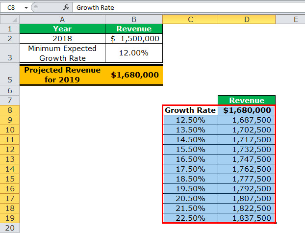
- Image 1 shows an organization’s revenue (in $) for 2018 in cell B2. The minimum growth rate expected is given as 12% in cell B3. The projected revenue (in $ in cell B5) for 2019 has been calculated by using the formula “=B2+(B2*B3).”
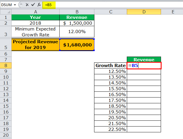
- Image 2 shows the possible values (in column C) that the growth rate can assume. The value of cell D8 has been explained in steps 1 and 2 (given further in this example).
We want to perform the following tasks:
- Calculate the projected revenues (in column D) according to the different growth rates (in column C) given in image 2.
- Create a “line with markers” chart showing the growth rates on the x-axis and the projected revenues on the y-axis. Replace the markers of the chart with arrows.
Use a one-variable data table of Excel. Interpret the data table thus created.
Image 1
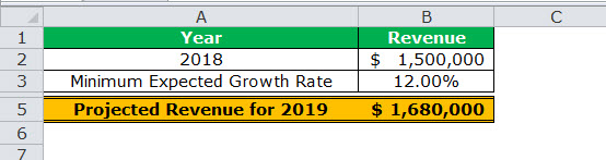
Image 2

The steps for performing the given tasks by using a one-variable data table are listed as follows:
- Enter the data of the two images in Excel. In cell D8, type “equal to” (=) followed by the reference B5. This links cell D8 to cell B5.
The linking of the two cells is shown in the following image.
Since all the growth rates have been entered vertically (C9:C19), our data table is said to be column-oriented. The entire range C8:D19 is our one-variable data table. We are creating a one-variable data table as the change in outputs will be observed against a change in one input, i.e., the growth rate.
Note: Notice that either the formula “=B2+(B2*B3)” could be typed directly in cell D8 or cell D8 can be linked to cell B5. We have chosen to link the two cells.
The linking of cell D8 to cell B5 ensures that any updates in the formula of the latter are automatically reflected in the range D9:D19 of the data table. For instance, if the formula of cell B5 is multiplied by 2 [like =B2+(B2*B3)*2], all the outputs obtained in the range D9:D19 are automatically multiplied by 2.
Had we not linked cells D8 and B5, any changes to the formula of cell B5 would not have changed the value in cell D8. Consequently, the outputs in the range D9:D19 would not have been updated automatically.

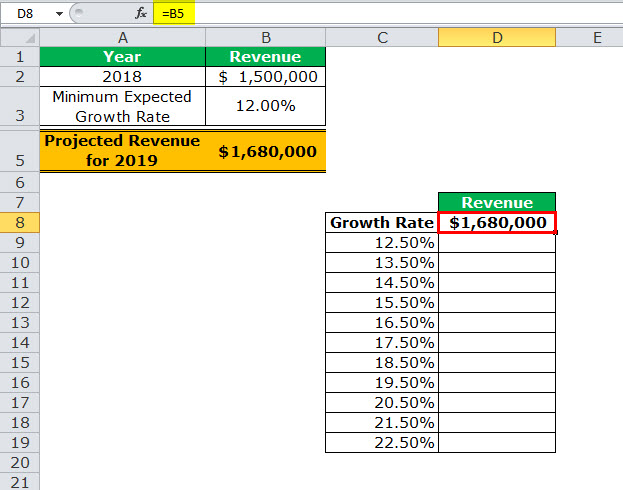
- Press the “Enter” key. Cell D8 shows the value of cell B5, as shown in the following image.
Notice that if one manually enters the value (1680000) in cell D8, the data table will not work. Moreover, one should always type the formula [=B2+(B2*B3)] or link the cell that is one row above and one column to the right of the possible input values (C9:C19). This is the reason we chose to link cell D8 to cell B5.
Note: If the data table is row-oriented, type the formula or link the cell that is one column to the left and one cell below the first possible input value. For instance, had the possible input values been in the range F2:P2, we would have entered the formula or linked cell E3 to cell B5.

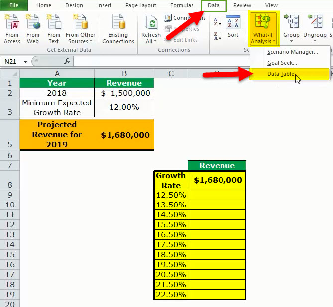
- Select the range of the data table. This selection should include the linked cell (D8), the possible input values (C9:C19), and the empty cells for outputs (D9:D19). Hence, we have selected the range C8:D19, as shown in the following image.

- From the Data tab, click the “what-if analysis” drop-down (in the “data tools” or “forecast” group). Select the option “data table.” This option is shown in the following image.

- The “data table” dialog box opens, as shown in the following image. In the box of “column input cell,” select cell B3, which contains the minimum expected growth rate. As a result, the reference $B$3 appears in this box. Leave the box of “row input cell” blank.
By giving the reference to cell B3 in the “column input cell,” we are telling Excel that at the growth rate of 12%, the projected revenue is $1,680,000. So, with this data table, Excel is being asked the projected revenue when the growth rates vary from 12.5% to 22.5%.
Note 1: A “row input cell” or “column input cell” is a reference to a cell that contains the input. This is the input that can assume the different possible values. Moreover, this input must necessarily be used in the formula whose outputs are to be studied.
In a one-variable data table, either the “row input cell” or the “column input cell” is specified depending on whether the data table is row-oriented or column-oriented.
Note 2: In a one-variable data table, Excel uses either the formula “=TABLE(row_input_cell,)” or “=TABLE(,column_input_cell)” to calculate the different outputs. The former formula is used when the possible input values are in a row, while the latter is used when the possible input values are in a column.
To view the TABLE formula, select any of the output cells and check the formula bar. In this example, the formula “=TABLE(,B3)” is used to calculate the outputs.
Further, Excel uses these TABLE formulas as array formulasArray formulas are extremely helpful and powerful formulas that are used in Excel to execute some of the most complex calculations. There are two types of array formulas: one that returns a single result and the other that returns multiple results.read more. However, these formulas cannot be edited manually, unlike the regular array formulas. But, one can delete all the output cells containing the TABLE formulas.

- Click “Ok” in the “data table” window. The range D9:D19 of the data table has been filled with values. The different outputs are shown in the following image.

Interpretation of the one-variable data table: By looking at the data table in the preceding image, one can say that when the growth rate is 12.5%, the projected revenue is $1,687,500. Likewise, when the growth rate is 13.5%, the projected revenue is $1,702,500. Hence, the larger the growth rate, the more the increase in the projected revenue.
The projected revenue is at its maximum ($1,837,500) when the growth rate is at its highest (22.5%). So, the organization can study the variation in outputs when a single input (growth rate) changes.
Note: For more examples related to the one-variable data table of Excel, refer to the hyperlink given before step 1.
- To create a “line with markers” chart that displays the growth rates on the x-axis and the projected revenues on the y-axis, follow the listed steps:
a. Select the range D9:D19 and click the Insert tab on the Excel ribbon.
b. Click the “insert line or area chart” icon from the “charts” group. Select the “line with markers” chart under the 2-D line charts. A “line with markers” chart appears, which displays the projected revenues on the y-axis.
c. Click anywhere on the chart. The “chart tools” menu becomes visible. This menu consists of the Design and Format tabs.
d. Click the Design tab of the “chart tools” menu. Choose “select data” from the “data” group. The “select data source” window opens.
e. Click “edit” under “horizontal (category) axis labels.” The “axis labels” window opens.
f. Select the range C9:C19 in the “axis label range” box. Click “Ok.” Click “Ok” again in the “select data source” window.The “line with markers” chart is created whose x-axis and y-axis look the way they are shown in the image of step 8.
- To replace the default markers of the chart with arrows, follow the listed steps:
a. Select the markers of the chart and right-click them. Choose the “format data series” option from the context menu. The “format data series” pane opens.
b. Click the “fill & line” tab. Expand the “line” tab. In “end arrow type,” select any of the arrows. We have chosen “open arrow.”
c. Select “marker” and expand the “marker options.” Choose the option “none.”
d. Close the “format data series” pane.The “line with markers” chart looks the way it is displayed in the following image. Notice that since the chart shows the projected revenues, we have titled it accordingly.


Two-Variable Data Table in Excel
A two-variable data table in excelA two-variable data table helps analyze how two different variables impact the overall data table. In simple terms, it helps determine what effect does changing the two variables have on the result.read more helps study how changes in two inputs of a formula cause a change in the output. In a two-variable data table, there are two ranges of possible values for the two inputs. From these two ranges, one range is in a row and the other is in a column of Excel.
Example #2
There are three images titled “image 1,” “image 2,” and “image 3.” The following information is given:
- Image 1 shows an organization’s revenue (in $ in 2018) and the minimum growth rate in cells B2 and B3 respectively. Both these figures are the same as that of the previous example. Additionally, the organization gives a 2% discount (in cell B4) to its customers. This is given to boost sales.
- Image 2 shows how the projected revenue (in $ in cell B6) for 2019 has been calculated. The formula “=B2+(B2*B3)-(B2*B4)” is used for this purpose. The amount obtained ($1,650,000) is the projected revenue after the discount.
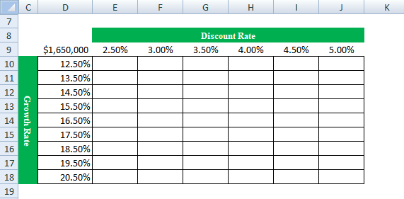
- Image 3 shows the different values in row 9 that the discount rate can assume. The possible values that the growth rate can assume are given in column D. The value of cell D9 has been explained in steps 1 and 2 (given further in this example).
Calculate the projected revenues (in E10:J18) according to the various discount rates (in row 9) and growth rates (in column D). Use a two-variable data table of Excel. Interpret the data table thus created.
Image 1

Image 2
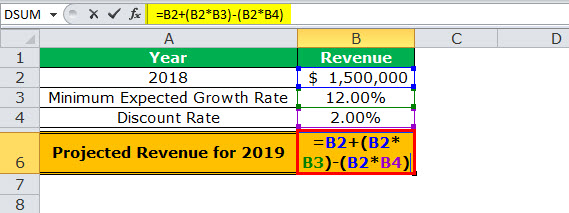
Image 3
The steps for creating a two-variable data table are listed as follows:
Step 1: Enter the data of the preceding images in Excel. In cell D9, type the “equal to” operator followed by the reference B6.
This time we have chosen to link cell D9 to cell B6. Alternatively, we could have also entered the formula [=B2+(B2*B3)-(B2*B4)] in cell D9. This is because, in a two-variable data table, one should type the formula or link the cell that is one column to the left of the first horizontal input value (2.5%). At the same time, this cell should be one row above the first vertical input value (12.5%).
The linking of cells ensures that any changes to the formula of cell B6 are reflected in the value of cell D9. Further, any change in the value of cell D9 will update the outputs (in E10:J18) automatically.
Note: Please ignore the differences in font, colors, and alignment across the images of this example. These differences may be due to the different versions of Excel being used to create the images.

Step 2: Press the “Enter” key. Cell D9 shows the value of cell B6, which is 1,650,000. This is shown in the following image.
The entire range D9:J18 is our two-variable data table. Notice that the excel data table shows the possible discount rates horizontally (in bold in row 9) and the possible growth rates vertically (in column D). This time the variation in outputs resulting from changes in both these inputs (discount rate and growth rate) need to be studied.
Note: If the value is entered manually in cell D9, the excel data table will not work.

Step 3: Select the range D9:J18. Note that the selection should include the linked cell (D9), possible discount rates (E9:J9), possible growth rates (D10:D18), and the empty cells for the outputs (E10:J18).
The selection is shown in the following image.

Step 4: Click the “what-if analysis” drop-down (in the “data tools” or “forecast” group) of the Data tab. Select the option “data table.”
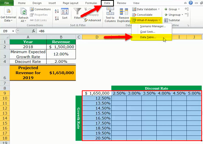
Step 5: The “data table” window opens, as shown in the following image. In the box of “row input cell,” select cell B4. In the box of “column input cell,” select cell B3. The absolute referencesAbsolute reference in excel is a type of cell reference in which the cells being referred to do not change, as they did in relative reference. By pressing f4, we can create a formula for absolute referencing.read more to cells B4 and B3 appear in the two boxes.
Cells B4 and B3 contain the minimum expected growth rate and the discount rate of the source dataset.
By making these selections, Excel is told that at a discount rate of 2% and a growth rate of 12%, the projected revenue is $1,650,000. Therefore, our two-variable data table instructs Excel to calculate the projected revenues when the discount rates and growth rates vary from 2.5% to 5% and 12.5% to 20.5% respectively.
Note: In a two-variable data table, both the “row input cell” and “column input cell” are specified, unlike a one-variable data table where one has to specify either of the two inputs.
Further a two-variable data table uses the formula “=TABLE(row_input_cell,column_input_cell)” to calculate the outputs. So, in this example, the formula “=TABLE(B4,B3)” has been used for the calculations. This formula is visible in the formula bar when an output cell is selected.
For the meaning of the “row input cell” and the “column input cell,” refer to “note 1” under step 5 of example #1.
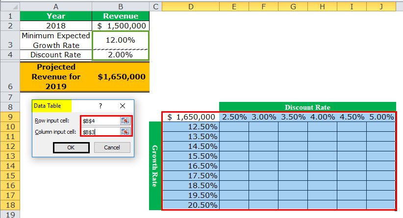
Step 6: Click “Ok” in the “data table” window. The outputs appear in the range E10:J18, as shown in the following image.

Interpretation of the two-variable data table: When the discount rate is 2.5% and the growth rate is 12.5%, the organization’s projected revenue is $1,650,000 (in cell E10). Notice that this figure is the same as that of cell B6. However, the value in cell B6 takes into account 2% and 12% as the discount rate and growth rate respectively.
Notice that the numbers of cells E10 and B6 match those of cells G11 and I12. This implies that when the discount rate and growth rate are increased in the same proportion (like by 0.5%, 1.5% or 2.5%), the resulting value is the same as the output of the source dataset (in cell B6). Cells E10, G11, and I12 reflect 0.5%, 1.5%, and 2.5% increase in the two rates.
Likewise, had we increased both the discount and growth rates by 1%, the resulting value would have again been $1,650,000. In this case, the discount rate and growth rate would have been 3% and 13% respectively.
By obtaining the projected revenues in the range E10:J18, the organization can sell at an optimum discount rate and, at the same time, target an attainable growth rate. Hence, the organization can choose the most suitable combination of the two rates.
Note: For more examples related to the two-variable data table of Excel, click the hyperlink given before step 1 of this example.
The Key Points Governing Data Tables in Excel
The important points related to data tables of Excel are listed as follows:
- It helps select those input values that fit the business in the best possible manner.
- It facilitates the comparison of the different outputs as all the results are consolidated in one place.
- It presents the results in a tabular format that can neither be edited nor undone with the shortcut “Ctrl+Z.” The outputs can only be deleted by selecting them and pressing the “Delete” key.
- It uses the TABLE array formulas to calculate the outputs. The “row input cell” and the “column input cell” must be selected carefully to get accurate results. Moreover, the input cell or cells must be on the same worksheet as the data table.
- It need not be refreshed, unlike a pivot table. A change in the values or the formula of the source dataset causes the excel data table to update automatically.
Frequently Asked Questions
1. Define a data table and suggest when it should be used in Excel.
A data table helps analyze how a change in one or two inputs of a formula causes a change in the output. The resulting outputs are arranged in a tabular format, making them easy to compare and interpret.
A data table of Excel should be used in the following situations:
• When the outputs resulting from a change in one or two inputs need to be studied
• When the most optimum input value or values need to be chosen
• When all the combinations of inputs and outputs need to be explored in one glance
2. How to create a data table in Excel?
The steps to create a data table in Excel are listed as follows:
a. Enter the source dataset in an Excel worksheet. Use one or two inputs to calculate an output.
b. Arrange the possible values, which an input can assume, in a row and/or column.
c. Link one cell of the data table to the output cell of the source dataset. Alternatively, in a cell of the data table, enter the formula whose outputs need to be studied.
d. Select the data table. The selection should include the linked cell (or the formula cell of the data table), the possible input values, and the empty cells for outputs.
e. Select the “data table” option from the “what-if analysis” drop-down of the Data tab. The “data table” window opens.
f. Enter either the “row input cell” or “column input cell” if the impact of changing one input is to be studied. To study the impact of changing two inputs, enter both “row input cell” and “column input cell.”
g. Click “Ok” in the “data table” window.
A one-variable or two-variable data table is created depending on the execution of steps “a,” “b,” and “f.”
Note: For more details on creating a data table in Excel, refer to the examples of this article.
3. How does a data table work in Excel?
A data table works on the policy “what will be the result if one or two inputs of a formula are changed?” One cell of the data table is linked to the source dataset. In this way, Excel is told how the inputs are to be used in calculating the output.
Next, as the possible input values are supplied, Excel is asked to calculate the outputs using the same formula as that of the source dataset. The resulting table shows the different mixes of inputs and outputs, thereby assisting the user in decision-making.
Recommended Articles
This has been a guide to Data Tables in Excel. Here we discuss how to create one-variable and two-variable data tables along with practical Excel examples. You may learn more about Excel from the following articles–
- Two-Variable Data Table in ExcelA two-variable data table helps analyze how two different variables impact the overall data table. In simple terms, it helps determine what effect does changing the two variables have on the result.read more
- VBA Refresh Pivot TableWhen we insert a pivot table in the sheet, once the data changes, pivot table data does not change itself; we need to do it manually. However, in VBA, there is a statement to refresh the pivot table, expression.refreshtable, by referencing the worksheet.read more
- Merge Tables ExcelWe can use a number of different methods to merge tables in Excel, including the VLOOKUP function, the INDEX function, and the MATCH function.read more
- Data Validation in ExcelThe data validation in excel helps control the kind of input entered by a user in the worksheet.read more
How to Make a Data Table in Excel: Step-by-Step Guide (2023)
Data tables in Excel are used to perform What-if Analysis on a given data set.
Using data tables, you can analyze the changes to the output value by changing the input values to a formula.
There is so much that you can do using data tables in Excel. 😀
Continue reading the article below to learn it all.
Also, download our sample workbook here to practice the examples given in this guide.
What is an Excel data table?
An Excel Data table is a What-if Analysis tool. It allows users to use different input values for a variable and assess the changes to the output value.

These are especially of help if you are operating a formula in Excel where the output depends on several variables. And you are keen to compare the results for different inputs to the formula.
Presently, Excel offers a one-variable and two-variable data table only. This means you can choose any two variable values (at max) from any formula to test.
Jump right into the article below to learn all about a data table in Excel. 🔔
How to create a one-variable data table in Excel
A one-variable data table in Excel allows users to test one variable.
For example, see the image below.

The image shows the particulars of a loan. We have three main variables in the data.
- The amount of loan
- The rate of interest/profit
- The tenure of the loan (until it is paid back)
Example 1: Column Input Cells
In this example, let’s see keep the interest rate as the variable.
What is the yearly payment to be made against the loan?
1. Write the PMT function to find the yearly repayment against the loan.
= PMT (B3, B4, B2)
= PMT (Interest Rate, Periods of Repayment, Amount of Loan Today)

2. Multiply this number by the number of payments to be made.

That’s the total amount to be paid against the loan over 5 years.
So how much is the interest on the loan?
3. Subtract the amount of loan from the amount of repayment.

Everything’s good and sorted.
Now, what if you want to see how the repayments change if one variable (the interest rate) changes?
Do not re-perform the entire calculation all over again. The Data Table (What-if analysis) will do it for you.
4. List down the variable (interest rate in this case) that is to be changed.

5. Create a link by referring to the targeted output for each interest rate in the corresponding column.
We want Excel to give us the repayments for different interest rates. So, we have created a link to the repayment in the original calculation.

6. Select the Inputs table (the interest rates and the corresponding column for targeted output).

7. Go to Data Tab > Forecast > What-If Analysis Tools > Data Table.

This will take you to the Data Table dialog box.
8. In the Column Input Cell box, create a reference to the ‘Interest Rate’ from the original table.

Reference is made to the Interest rate because that is the variable in our data. We want to experiment with how the changing interest rates affect repayments.
We have created a reference in the Column Input Cell box and not the Row Input Cell box. This is because our Input data is in the form of a column and not a row.
9. All set. Hit Okay and Ta-da! 😃

Excel creates a one-variable data table to calculate the repayments for different interest rates.
Example 2: Row Input Cells
Let’s bring a slight variation to the above data. This time the one variable of the data is the amount of the loan.
Also, let’s change the shape of Input Data from a Column to a Row.

1. Select the Inputs Data.

2. Go to Data Tab > Forecast > What-If Analysis Tools > Data Table.
3. In the ‘Data Table’ dialog box, create a reference to the Loan amount in the Row Input Cell box.

This time the variable is the amount of the loan. We want to experiment with how the changing loan amount affects the repayments.
Must note that we have created a reference to the ‘Row Input Cell’ this time. This is because our Input Data is row-oriented.
4. Click ‘Okay’ to see the repayment amount for differing amounts of loans.

What if we want to see how the total interest changes by the change in the loan amount?
Simple, refer to the amount of interest in the Inputs Data.

And there it is! Excel shows the changes to total interest instead of repayments.

How to create multiple one-variable data tables?
In the above example, what if you want to see the change in interest rates on both the repayments and total interest?
Create multiple Excel data tables. Simple.
1. In the Input Data, make two columns next to the variable interest rates.
2. In the first column, create a reference to the repayment calculation in the original data.

3. In the second column, create a reference to the total interest in the original data.

4. Create a one-variable data table by referring to the interest rate in the Column Input Cell box.

5. Click Okay, and there you go! 🙂

Excel shows the result of changes in interest rates on repayments and loan amounts.
How to make a two-variable data table in Excel?
The two-variable data table is more of a two-dimensional table. It allows you to analyze how your final output changes from the changes in any two variables of your data.
Let’s continue the example above to create a two-variable data table in Excel.
This time, let’s select two variables from the data, Interest Rate, and Loan Amount. We want to see how the repayments change when both these variables change.
1. Create a two-dimensional data table with each variable on one side of the table.

In the above image, we have set the interest rates in a columnar format. Whereas the loan amount takes the shape of a row.
2. Select the intersecting cell of both the data sides.
3. In this cell, create a reference to the calculation of the repayment in the original table.

This is because we want to see how the repayments change with changes in the interest rate and the loan amount.
Our Input Data is now ready. Let’s now create a data table and perform the What-if Analysis.
4. Select the entire Data Table.
5. Go to Data Tab > Forecast > Click What-if Analysis Tools > Data table.

6. This opens up the data table dialog box.
7. Against the Column Input Cell box, create a reference to the interest rate from the source data.

Pay attention to how a reference is created to the interest rate against the Column Input Cell. This is because the possible input values for interest rate (the first variable) are in the shape of a column.
8. Against the ‘Row Input Cell’, create a reference to the amount of loan from the source data.

The Row Input Cell refers to the amount of the loan. This is because possible input values for the loan (second variable) are in the shape of a row.
9. Click ‘Okay’, and you’re good to go.

Woah! This seems like a very densely packed data table.
What is this? See below.

Each cell of this data table is mutual to two cells. For example, in the image above, the highlighted cell shows the amount of repayment, if the interest rate changes to 12% and the loan amount changes to 2000.
Must Note: A two-variable data table is a two-dimensional table. It captures the result of the change in any two variables at the same time.
The data table formula above is an array formula. To double-check, click on any cell from the data table and see the formula bar.
You will find the formula enclosed in curly brackets. A formula enclosed in curly brackets is an Array formula.
Trouble Shooting the Two-Variable Data Table
The Two-Variable data table in Excel seems no less than magic. A heap of calculations is only a click away.
A two-variable data table is an array, and there is something you must know about a table array.
1. Editing a two-variable data table
Once you have created a two-variable data table, try clicking on any individual cell from the data table and making some changes to it.

You cannot make changes to a part of this data! This is all that Excel has to say in return.
A data table is an array, and you cannot make changes to individual cells of an array.
To make any changes to the data table, click the data table and select the whole of it.
1. From the formula bar, delete the Table formula.

2. Type in the desired value (let’s say 10) and hit Ctrl + Enter.
3. The entire table will be replaced by 10.

You can now make changes to any individual cells as it is no more an array.
2. Deleting a two-variable data table
Deleting two-variable data is a little science.
You cannot delete an individual value from the data table. However, you can only delete the whole data table.
- Select the entire array (whole data table).
- Press the delete key.
- And your data table is gone.
That’s it – Now what?
Data Tables can save you big on time.
In the article above, we have learned almost all about data tables in Excel – starting from creating a single-variable data table, and multiple single-variable data tables (in one go) to creating multiple-variable data tables.
And of course, many tips.
While data tables help data analysis in Excel, you’d need many other functions of Excel to handle big data sets in Excel. The most important of these include the VLOOKUP, SUMIF, and IF functions.
Learn each of these three functions by signing up for my free 30-minute email course that teaches you these functions (and more!).
Kasper Langmann2023-01-19T12:23:16+00:00
Page load link