
What is a table?
Tables present the results of data or information collected from a study. The purpose of a table is to present data summaries to help the reader to understand what was found. Not all data needs to go into a table: some results are simply presented as written text in the results section; data that shows a trend or a pattern in between variables is presented in figures, while additional data not necessary to explain the study should go into the appendix.
Tables should convey data or information clearly and concisely and allow the key message to be interpreted at a glance. Tables often include detailed data in rows and columns, while sub-columns are often nested within larger columns.
Designing your table
Once you have decided what data to present, jot down a rough draft of the table headings on paper to determine how many columns and rows you need. Choose categories with accurate labels that match your methodology and analysis. Before you spend too much time designing the layout of your table, check that you are following the format expected within your discipline or organisation as table formatting requirements often vary considerably; if you are preparing a science report, refer to the relevant In-House Style Guide(s) or if you are preparing a journal article, meticulously follow the journal’s Instruction to Authors.
Title or Legend
Consider the objective and key message of each table. The table title is typically placed at the top of the table. It should stand alone: it needs to be clearly understood by your target audience without them needing to go back to the results or methods sections. The title should be concise and describe what was measured, e.g. ‘Reproductive hormone levels during contraceptive administration in men’. Frame the title so that it conveys the key results, e.g. ‘Reproductive hormones are suppressed during contraceptive administration in men’.
Sub-headings
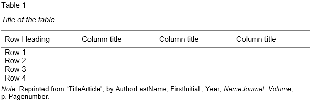
Take care to ensure the sub-headings are meaningful and accurate. The row and column headings clearly explain the treatment or data type, and include units. In the sample table below, the experimental details are given in the row headings (time points during the administration of a contraceptive), and the data measured (hormones) are given in the column headings.
Example Table
Explanatory notes
Explanatory notes and footnotes are placed at the end of the table. Make sure that all abbreviations are defined and that the values are explained. For example, if the values are a percentage, mean ± SEM, n per group.
Drawing and formatting the table
Tables for publication can be created in Word, using the ‘Insert Table’ function. For instructions see: Office Support: Insert or create a table.
— Tables can also be created from existing datasets in Excel, and then cut and pasted into Word, or exported into Word as an image.
— Use a separate cell for each piece of information; avoid having to insert tabs or spaces which may cause the text to be unintentionally moved when the formatting is adjusted.
— Add your headings and data to each cell. Cells can be merged to create headings above sub-headings. Select the cells you want to merge then select the ‘Merge Cells’ option.
— The table then needs to be formatted to improve readability and clarity. Select the entire table or individual rows or columns and right click. Options will appear where you can modify the table size, cell height and width, and format the borders. Word tables will have borders on each side of the cell by default.
— Format the borders by selecting columns, rows or individual cells will help the table to take shape and improve visual clarity. Text within the table can be formatted by selecting the text, then formatting it as normal.
— Make sure that the columns and rows are well separated and that the table is not cluttered and is easy to read. Imagine the reader looking at your table: do they have access to all of the information they need and can they easily understand the results?
Citing the table
Always cite the table at the relevant point in your text. Avoid repeating the details that are presented in the table, and use the text to direct the reader to the main message, e.g. ‘Contraceptive administration at 14 and 20 weeks significantly suppressed FSH, LH and testosterone levels in men (Table 1)’. Tables should be numbered consecutively throughout the document.
Further reading: (external links)
* Creating tables in scientific papers: basic formatting and titles
* How to create and customize tables in Microsoft Word
* Tips on effective use of tables and figures in research papers
* Tables and Figures
* Office Support: Insert or create a table
© Dr Liza O’Donnell & Dr Marina Hurley 2019 www.writingclearscience.com.au
Any suggestions or comments please email info@writingclearscience.com.au
Find out more about our new online course…
SUBSCRIBE to the Writing Clear Science Newsletter
to keep informed about our latest blogs, webinars and writing courses.
At this point, you should all know that it is generally a bad idea to submit raw R output as part of a report, presentation, or publication. You should also understand when it is most appropriate to use tables, as opposed to charts and graphs, to present your results. If not, please stop here and read Chapter 7 of Successful Scientific Writing, which discusses the “why” behind much of what I will show you “how” to do in this chapter.14
R for Epidemiology is predominantly a book about using R to manage, visualize, and analyze data in ways that are common in the field epidemiology. However, in most modern work/research environments it is difficult to escape the requirement to share your results in a Microsoft Word document. And often, because we are dealing with data, those results include tables of some sort. However, not all tables communicate your results equally well. In this chapter, I will walk you through the process of starting with some results you calculated in R and ending with a nicely formatted table in Microsoft Word. Specifically, we are going to create a Table 1.
Table 1
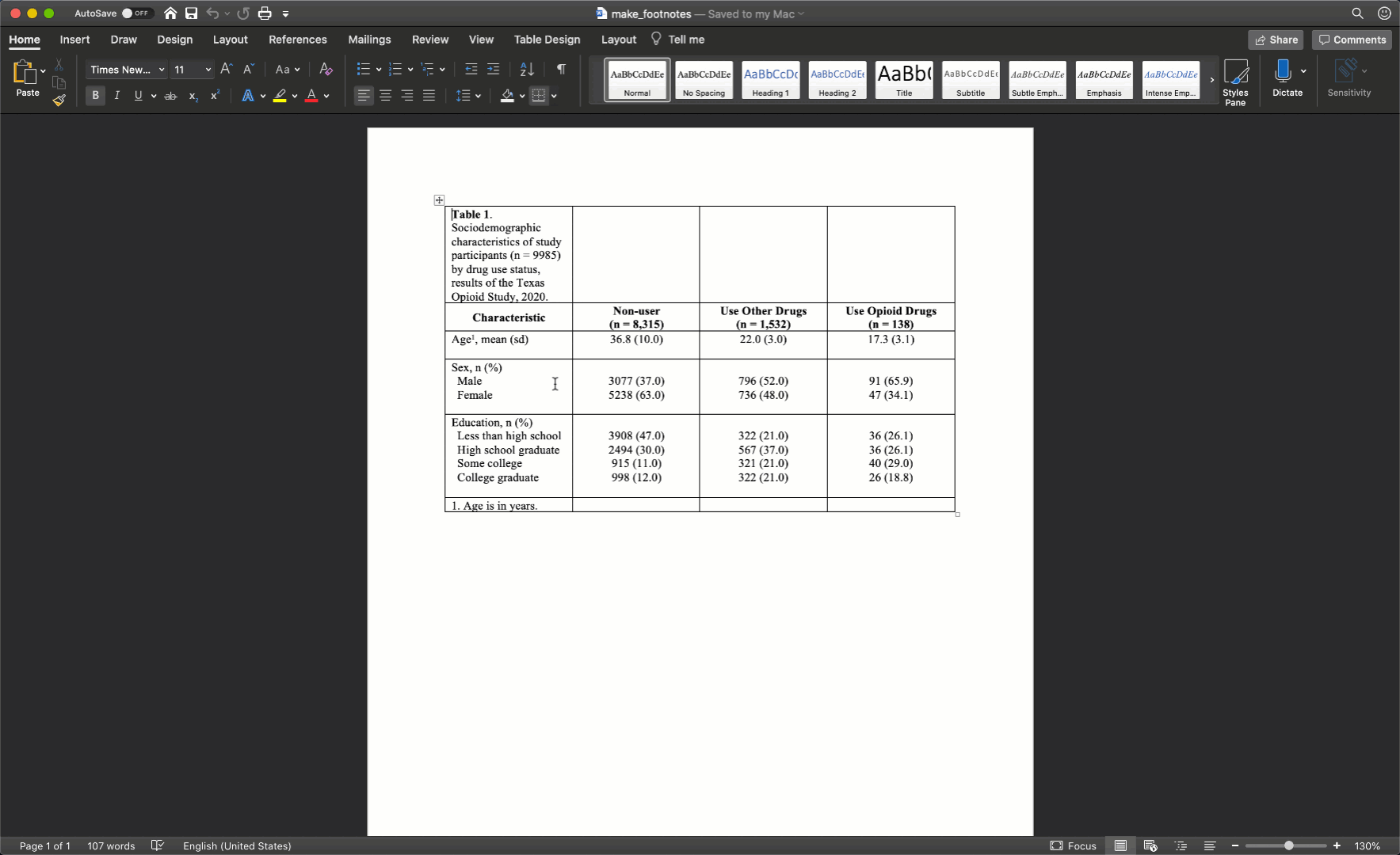
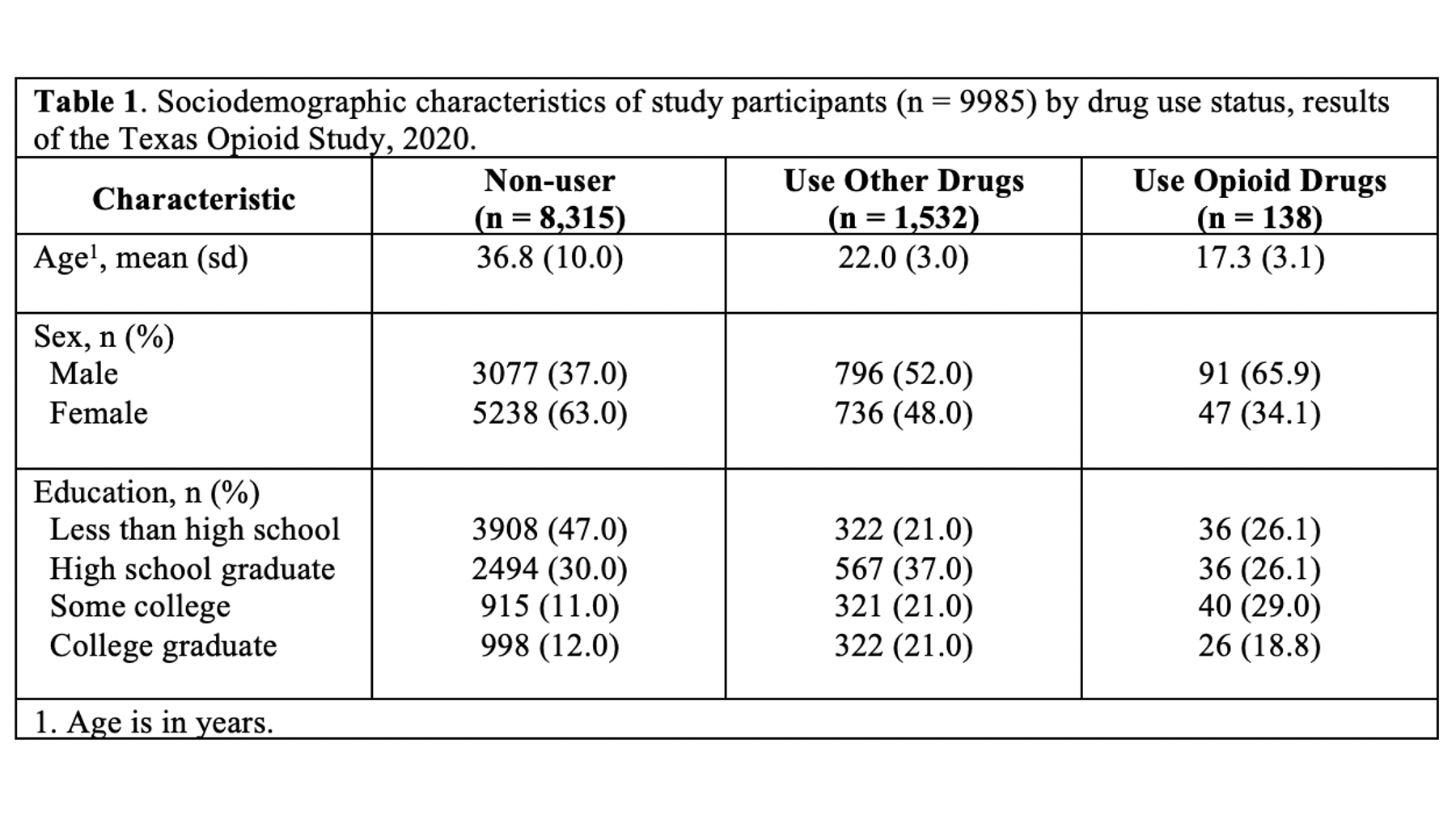
In epidemiology, medicine, and other disciplines, “Table 1” has a special meaning. Yes, it’s the first table shown to the reader of your article, report, or presentation, but the special meaning goes beyond that. In many disciplines, including epidemiology, when you speak to a colleague about their “Table 1” it is understood that you are speaking about a table that describes (statistically) the relevant characteristics of the sample being studied. Often, but not always, the sample being studied is made up of people, and the relevant descriptive characteristics about those people include sociodemographic and/or general health information. Therefore, it is important that you don’t label any of your tables as “Table 1” arbitrarily. Unless you have a really good reason to do otherwise, your Table 1 should always be a descriptive overview of your sample.
Here is a list of other traits that should consider when creating your Table 1:
-
All other formatting best practices that apply to scientific tables in general. This includes formatting requirements specific to wherever you are submitting your table (e.g., formatting requirements in the American Journal of Public Health).
-
Table 1 is often, but not always, stratified into subgroups (i.e., descriptive results are presented separately for each subgroup of the study sample in a way that lends itself to between-group comparisons).
-
When Table 1 is stratified into subgroups, the variable that contains the subgroups is typically the primary exposure/predictor of interest in your study.
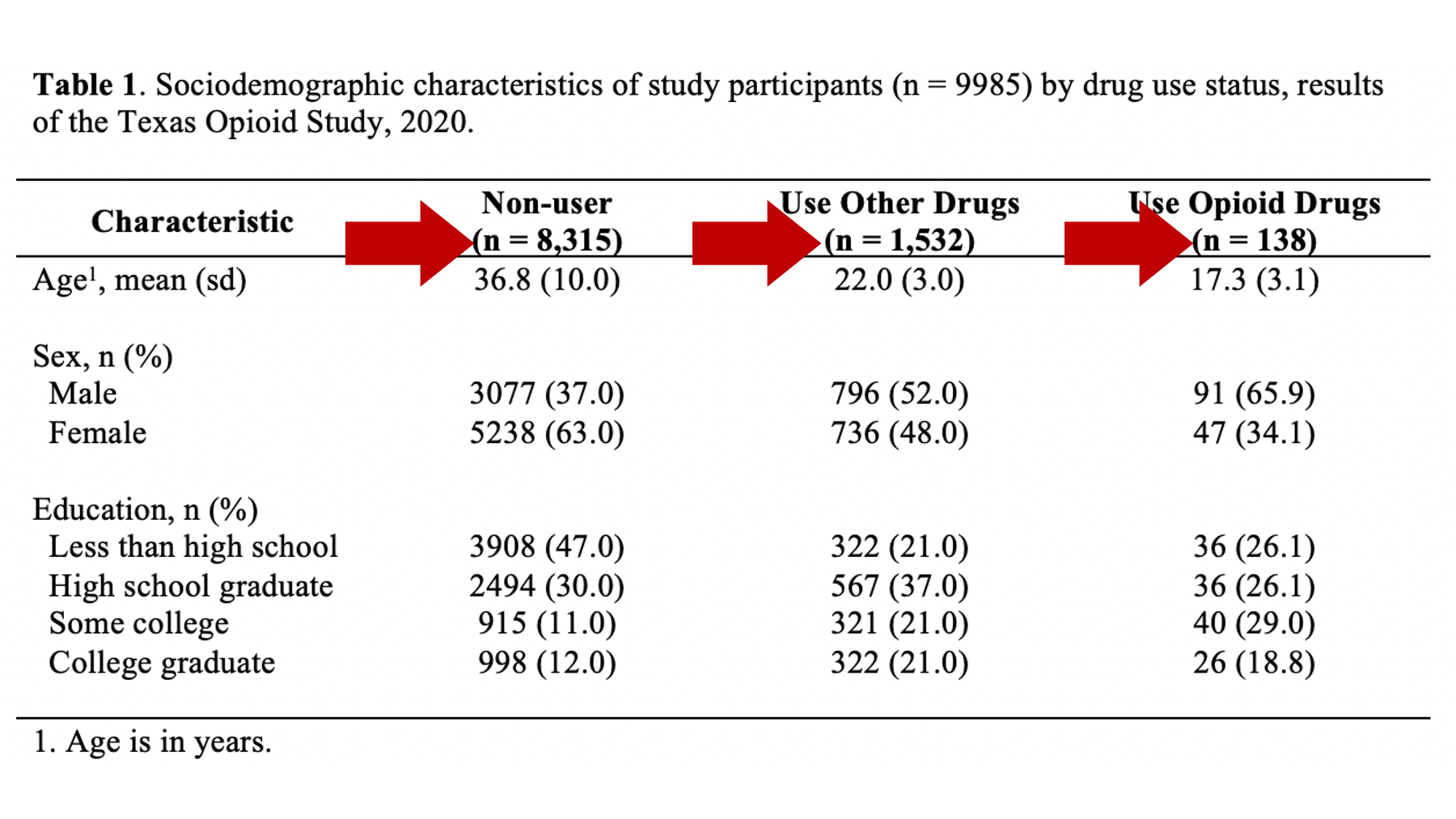
Opioid drug use
As a motivating example, let’s say that we are working at the North Texas Regional Health Department and have been asked to create a report about drug use in our region. Our stakeholders are particularly interested in opioid drug use. To create this report, we will analyze data from a sample of 9,985 adults who were asked about their use of drugs. One of the first analyses that we did was a descriptive comparison of the sociodemographic characteristics of 3 subgroups of people in our data. We will use these analyses to create our Table 1.
You can view/download the data by clicking here
drugs <- readr::read_csv("data/drugs.csv")## Rows: 9985 Columns: 4
## ── Column specification ──────────────────────────────────────────────────────────────────────────────────
## Delimiter: ","
## dbl (4): age, edu, female, use
##
## ℹ Use `spec()` to retrieve the full column specification for this data.
## ℹ Specify the column types or set `show_col_types = FALSE` to quiet this message.# Making factor levels more readable
drugs <- drugs %>%
mutate(
edu_f = factor(
edu, labels = c("Less than high school", "High school", "Some college", "College graduate")
),
female_f = factor(female, labels = c("No", "Yes")),
use_f = factor(use, labels = c("Non-users", "Use other drugs", "Use opioid drugs"))
)## var cat n n_total percent se t_crit lcl ucl
## 1 use_f Non-users 8315 9985 83.274912 0.3734986 1.960202 82.52992 83.994296
## 2 use_f Use other drugs 1532 9985 15.343015 0.3606903 1.960202 14.64925 16.063453
## 3 use_f Use opioid drugs 138 9985 1.382073 0.1168399 1.960202 1.17080 1.630841## var use n mean sd t_crit sem lcl ucl
## 1 age 0 8315 36.80173 9.997545 1.960249 0.10963828 36.58681 37.01665
## 2 age 1 1532 21.98362 2.979511 1.961515 0.07612296 21.83431 22.13294
## 3 age 2 138 17.34740 3.081049 1.977431 0.26227634 16.82877 17.86603## row_var row_cat col_var col_cat n n_row n_total percent_total se_total t_crit_total lcl_total
## 1 use 0 female_f No 3077 8315 9985 30.8162243 0.46210382 1.960202 29.9178650
## 2 use 0 female_f Yes 5238 8315 9985 52.4586880 0.49979512 1.960202 51.4781679
## 3 use 1 female_f No 796 1532 9985 7.9719579 0.27107552 1.960202 7.4565108
## 4 use 1 female_f Yes 736 1532 9985 7.3710566 0.26150858 1.960202 6.8745702
## 5 use 2 female_f No 91 138 9985 0.9113671 0.09510564 1.960202 0.7426382
## 6 use 2 female_f Yes 47 138 9985 0.4707061 0.06850118 1.960202 0.3538217
## ucl_total percent_row se_row t_crit_row lcl_row ucl_row
## 1 31.7293461 37.00541 0.5295162 1.960202 35.97359 38.04924
## 2 53.4373162 62.99459 0.5295162 1.960202 61.95076 64.02641
## 3 8.5197562 51.95822 1.2768770 1.960202 49.45247 54.45417
## 4 7.9003577 48.04178 1.2768770 1.960202 45.54583 50.54753
## 5 1.1179996 65.94203 4.0488366 1.960202 57.62323 73.38214
## 6 0.6259604 34.05797 4.0488366 1.960202 26.61786 42.37677## row_var row_cat col_var col_cat n n_row n_total percent_total se_total t_crit_total
## 1 use 0 edu_f Less than high school 3908 8315 9985 39.1387081 0.48845160 1.960202
## 2 use 0 edu_f High school 2494 8315 9985 24.9774662 0.43322925 1.960202
## 3 use 0 edu_f Some college 915 8315 9985 9.1637456 0.28874458 1.960202
## 4 use 0 edu_f College graduate 998 8315 9985 9.9949925 0.30017346 1.960202
## 5 use 1 edu_f Less than high school 322 1532 9985 3.2248373 0.17680053 1.960202
## 6 use 1 edu_f High school 567 1532 9985 5.6785178 0.23161705 1.960202
## 7 use 1 edu_f Some college 321 1532 9985 3.2148222 0.17653492 1.960202
## 8 use 1 edu_f College graduate 322 1532 9985 3.2248373 0.17680053 1.960202
## 9 use 2 edu_f Less than high school 36 138 9985 0.3605408 0.05998472 1.960202
## 10 use 2 edu_f High school 36 138 9985 0.3605408 0.05998472 1.960202
## 11 use 2 edu_f Some college 40 138 9985 0.4006009 0.06321673 1.960202
## 12 use 2 edu_f College graduate 26 138 9985 0.2603906 0.05100282 1.960202
## lcl_total ucl_total percent_row se_row t_crit_row lcl_row ucl_row
## 1 38.1855341 40.1002400 46.99940 0.5473707 1.960202 45.92799 48.07358
## 2 24.1379137 25.8362747 29.99399 0.5025506 1.960202 29.01822 30.98824
## 3 8.6132458 9.7456775 11.00421 0.3432094 1.960202 10.34925 11.69521
## 4 9.4217947 10.5989817 12.00241 0.3564220 1.960202 11.32112 12.71881
## 5 2.8957068 3.5899942 21.01828 1.0412961 1.960202 19.04975 23.13209
## 6 5.2411937 6.1499638 37.01044 1.2339820 1.960202 34.62587 39.46012
## 7 2.8862151 3.5794637 20.95300 1.0401075 1.960202 18.98696 23.06466
## 8 2.8957068 3.5899942 21.01828 1.0412961 1.960202 19.04975 23.13209
## 9 0.2601621 0.4994549 26.08696 3.7515606 1.960202 19.42163 34.07250
## 10 0.2601621 0.4994549 26.08696 3.7515606 1.960202 19.42163 34.07250
## 11 0.2939655 0.5457064 28.98551 3.8761776 1.960202 22.00774 37.12261
## 12 0.1773397 0.3821865 18.84058 3.3408449 1.960202 13.13952 26.26721Above, we have the results of several different descriptive analyses we did in R. Remember that we never want to present raw R output. Perhaps you’ve already thought to yourself, “wow, these results are really overwhelming. I’m not sure what I’m even looking at.” Well, that’s exactly how many of the people in your audience will feel as well. In its current form, this information is really hard for us to process. We want to take some of the information from the output above and use it to create a Table 1 in Word that is much easier to read.
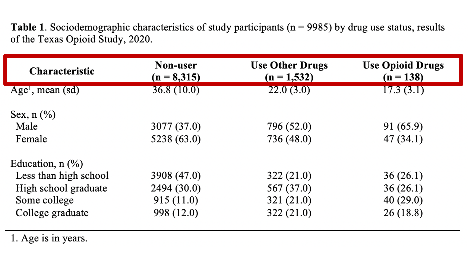
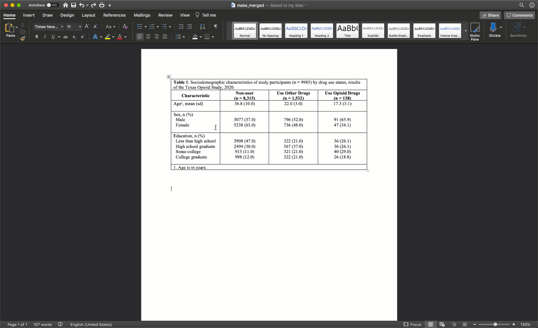
Specifically, we want our final Table 1 to look like this:
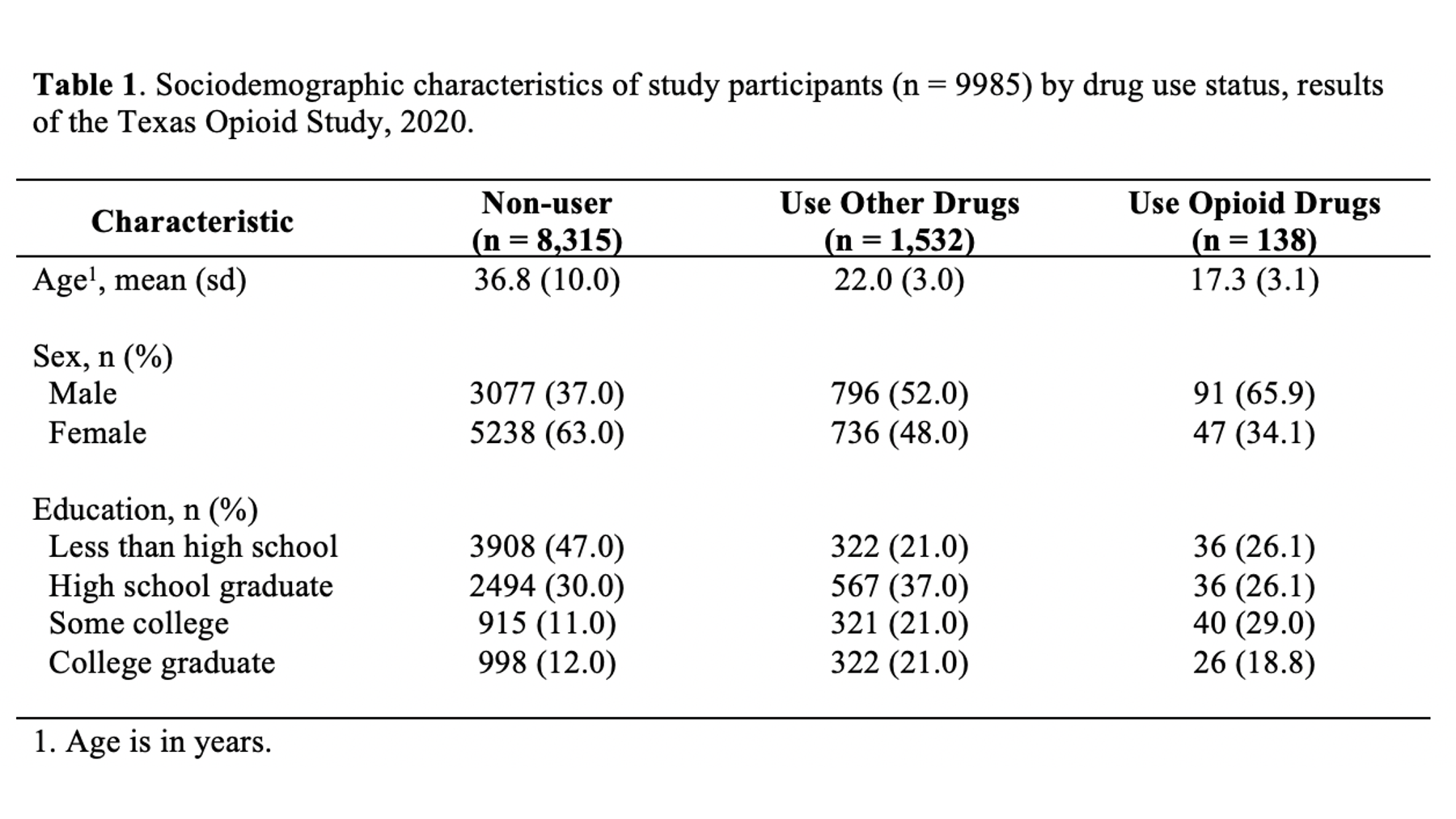
You may also click here to view/download the Word file that contains the Table 1.
Now that you’ve seen the end result, let’s learn how to make this Table 1 together, step-by-step. Go ahead and open Microsoft Word now if you want to follow along.
Table columns
The first thing I typically do is figure out how many columns and rows my table will need. This is generally pretty straightforward; although, there are exceptions. For a basic Table 1 like the one we are creating above we need the following columns:
One column for our row headers (i.e., the names and categories of the variables we are presenting in our analysis).
One column for each subgroup that we will be describing in our table. In this case, there are 3 subgroups so we will need 3 additional columns.
So, we will need 4 total columns.
🗒Side Note: If you are going to describe the entire sample overall without stratifying it into subgroups then you would simply have 2 columns. One for the row headers and one for the values.
Table rows
Next, we need to figure out how many rows our table will need. This is also pretty straightforward. Generally, we will need the following rows:
One row for the title. Some people write their table titles outside (above or below) the actual table. I like to include the title directly in the top row of the table. That way, it moves with the table if the table gets moved around.
One row for the column headers. The column headers generally include a label like “Characteristic” for the row headers column and a descriptive label for each subgroup we are describing in our table.
One row for each variable we will analyze in our analysis. In this example, we have three – age, sex, and education. NOTE that we do NOT need a separate row for each category of each variable.
One row for the footer.
So, we will need 6 total rows.
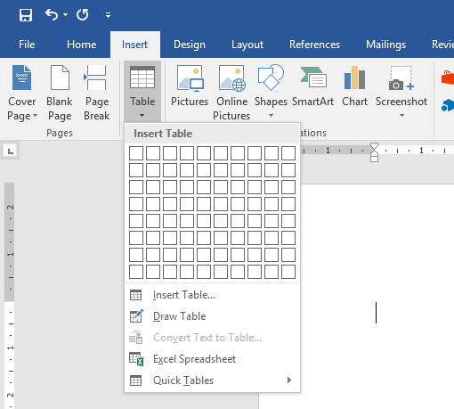
Make the table skeleton
Now that we know we need to create a table with 4 columns and 6 rows, let’s go ahead and do that in Microsoft Word. We do so by clicking the Insert tab in the ribbon above our document. Then, we click the Table button and select the number of columns and rows we want.
Fill in column headers
Now we have our table skeleton. The next thing I would typically do is fill in the column headers. Remember that our column headers look like this:
Here are a couple of suggestions for filling in your column headers:
-
Put your column headers in the second row of the empty table shell. The title will eventually go into the first row. I don’t add the title right away because it is typically long and will distort the table’s dimensions. Later, we will see how to horizontally merge table cells to remove this distortion, but we don’t want to do that now. Right now, we want to leave all the cells unmerged so that we can easily resize our columns.
-
The first column header is generally a label for our row headers. Because the rows are typically characteristics of our sample, I almost always use the word “characteristic” here. If you come up with a better word, please feel free to use it.
-
The rest of the column headers are generally devoted to the subgroups we are describing.
-
The subgroups should be ordered in a way that is meaningful. For example, by level of severity or chronological order. Typically, ordering in alphabetical order isn’t that meaningful.
-
The subgroup labels should be informative and meaningful, but also succinct. This can sometimes be a challenge.
-
I have seen terms like “Value”, “All”, and “Full Sample” used when Table 1 was describing the entire sample overall rather than describing the sample by subgroups.
-
Group sample sizes
You should always include the group sample size in the column header. They should typically be in the format “(n = sample size)” and typed in the same cell as the label, but below the label (i.e., hit the return key). The group sample sizes can often provide important context to the statistics listed below in the table, and clue the reader into missing data issues.
Formatting column headers
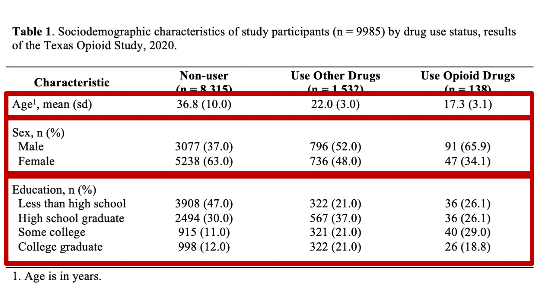
I generally bold my column headers, horizontally center them, and vertically align them to the bottom of the row.
At this point, your table should look like this in Microsoft Word:
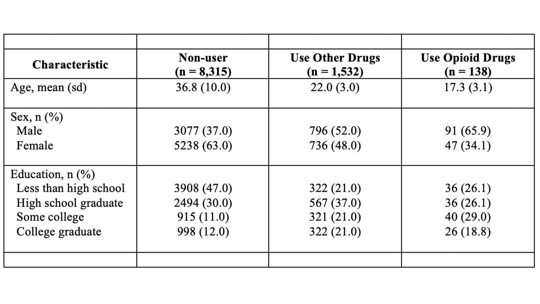
Fill in data values
So, we have some statistics visible to us on the screen in RStudio. Somehow, we have to get those numbers over to our table in Microsoft Word. There are many different ways we can do this. I’m going to compare a few of those ways here.
Manually type values
One option is to manually type the numbers into your word document.
👍 If you are in a hurry, or if you just need to update a small handful of statistics in your table, then this option is super straightforward. However, there are at least two big problems with this method.
👎 First, it is extremely error prone. Most people are very likely to type a wrong number or misplace a decimal here and there when they manually type statistics into their Word tables.
👎 Second, it isn’t very scalable. What if you need to make very large tables with lots and lots of numbers? What if you update your data set and need to change every number in your Word table? This is not fun to do manually.
Copy and paste values
Another option is to copy and paste values from RStudio into Word. This option is similar to above, but instead of typing each value into your Word table, you highlight and copy the value in RStudio and paste it into Word.
👍 If you are in a hurry, or if you just need to update a small handful of statistics in your table, then this option is also pretty straightforward. However, there are still issues associated with this method.
👎 First, it is still somewhat error prone. It’s true that the numbers and decimal placements should always be correct when you copy and paste; however, you may be surprised by how often many people accidently paste the values into the wrong place or in the wrong order.
👎 Second, I’ve noticed that there are often weird formatting things that happen when I copy from RStudio and paste into Word. They are usually pretty easy to fix, but this is still a small bit of extra hassle.
👎 Third, it isn’t very scalable. Again, if we need to make very large tables with lots and lots of numbers or update our data set and need to change every number in your Word table, this method is time-consuming and tedious.
Knit a Word document
So far, we have only used the HTML Notebook output type for our R markdown files. However, it’s actually very easy have RStudio create a Word document from you R markdown files. We don’t have all the R knowledge we need to fully implement this method yet, so I don’t want to confuse you by going into the details here. But, I do want to mention that it is possible.
👍 The main advantages of this method are that it is much less error prone and much more scalable than manually typing or copying and pasting values.
👎 The main disadvantages are that it requires more work on the front end and still requires you to open Microsoft Word a do a good deal of formatting of the table(s).
flextable and officer
A final option I’ll mention is to create your table with the flextable and officer packages. This is my favorite option, but it is also definitely the most complicated. Again, I’m not going to go into the details here because they would likely just be confusing for most readers.
👍 This method essentially overcomes all of the previous methods’ limitations. It is the least error prone, it is extremely scalable, and it allows us to do basically all the formatting in R. With a push of a button we have a complete, perfectly formatted table output to a Word document. If we update our data, we just push the button again and we have a new perfectly formatted table.
👎 The primary downside is that this method requires you to invest some time in learning these packages, and requires the greatest amount of writing code up front. If you just need to create a single small table that you will never update, this method is probably not worth the effort. However, if you absolutely need to make sure that your table has no errors, or if you will need to update your table on a regular basis, then this method is definitely worth learning.
Significant digits
No matter which of the methods above you choose, you will almost never want to give your reader the level of precision that R will give you. For example, the first row of the R results below indicates that 83.274912% of our sample reported that they don’t use drugs.
##     var              cat    n n_total   percent        se   t_crit      lcl       ucl
## 1 use_f        Non-users 8315    9985 83.274912 0.3734986 1.960202 82.52992 83.994296
## 2 use_f  Use other drugs 1532    9985 15.343015 0.3606903 1.960202 14.64925 16.063453
## 3 use_f Use opioid drugs 138 9985 1.382073 0.1168399 1.960202 1.17080 1.630841Notice the level of precision there. R gives us the percentage out to 6 decimal places. If you fill your table with numbers like this, it will be much harder for your readers to digest your table and make comparisons between groups. It’s just the way our brains work. So, the logical next question is, “how many decimal places should I report?” Unfortunately, this is another one of those times that I have to give you an answer that may be a little unsatisfying. It is true that there are rules for significant figures (significant digits); however, the rules are not always helpful to students in my experience. Therefore, I’m going to share with you a few things I try to consider when deciding how many digits to present.
-
I don’t recall ever presenting a level of precision greater than 3 decimal places in the research I’ve been involved with. If you are working in physics or genetics and measuring really tiny things it may be totally valid to report 6, 8, or 10 digits to the right of the decimal. But, in epidemiology – a population science – this is rarely, if ever, useful.
-
What is the overall message I am trying to communicate? That is the point of the table, right? I’m trying to clearly and honestly communicate information to my reader. In general, the simpler the numbers are to read and compare, the clearer the communication. So, I tend to error on the side of simplifying as much as possible. For example, in the R results below, we could say that 83.274912% of our sample reported that they don’t use drugs, 15.343015% reported that they use drugs other than opioids, and 1.382073% reported that they use opioid drugs. Is saying it that way really more useful than saying that “83% of our sample reported that they don’t use drugs, 15% reported that they use drugs other than opioids, and 1% reported that they use opioid drugs”? Are we missing any actionable information by rounding our percentages to the nearest integer here? Are our overall conclusions about drug use any different? No, probably not. And, the rounded percentages are much easier to read, compare, and remember.
-
Be consistent – especially within a single table. I have experienced some rare occasions where it made sense to round one variable to 1 decimal place and another variable to 3 decimals places in the same table. But, circumstances like this are definitely the exception. Generally speaking, if you round one variable to 1 decimal place then you want to round them all to one decimal place.
Like all other calculations we’ve done in this book, I suggest you let R do the heavy lifting when it comes to rounding. In other words, have R round the values for you before you move them to Word. R is much less likely to make a rounding error than your are! You may recall that we learned how to round in the chapter on numerical descriptions of categorical variables.
Formatting data values
Now that we have our appropriately rounded values in our table, we just need to do a little formatting before we move on.
First, make sure to fix any fonts, font sizes, and/or background colors that may have been changed if you copied and pasted the values from RStudio into Word.
Second, make sure the values line up horizontally with the correct variable names and category labels.
Third, I tend to horizontally center all my values in their columns.
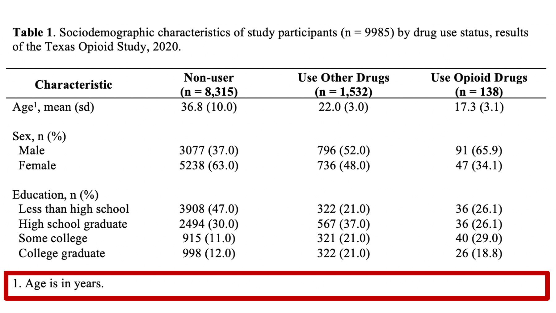
At this point, your table should look like this in Microsoft Word:
Fill in title
At this point in the process, I will typically go ahead and add the title to the first cell of my Word table. The title should always start with “Table #.” In our case, it will start with “Table 1.” In general, I use bold text for this part of the title. What comes next will change a little bit from table to table but is extremely important and worth putting some thought into.
Remember, all tables and figures need to be able to stand on their own. What does that mean? It means that if I pick up your report and flip straight to the table, I should be able to understand what it’s about and how to read it without reading any of the other text in your report. The title is a critical part of making a table stand on its own. In general, your title should tell the reader what the table contains (e.g., sociodemographic characteristics) and who the table is about (e.g., results of the Texas Opioid Study). I will usually also add the size of the sample of people included in the table (e.g., n = 9985) and the year the data was collected (e.g., 2020).
In different circumstances, more or less information may be needed. However, always ask yourself, “can this table stand on its own? Can most readers understand what’s going on in this table even if they didn’t read the full report?”
At this point, your table should look like this in Microsoft Word:
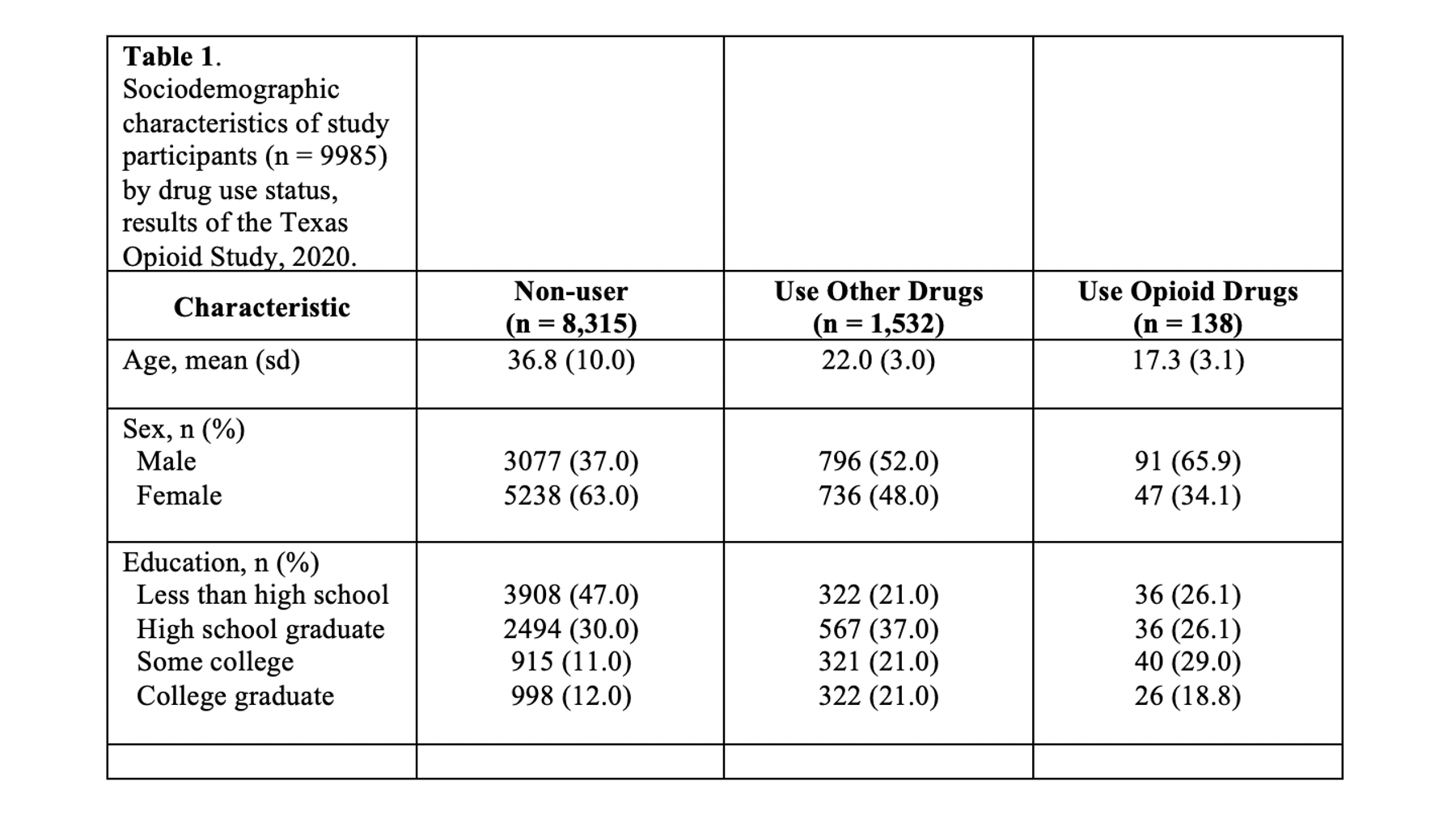
Don’t worry about your title being all bunched up in the corner. We will fix it soon.
Final formatting
We have all of our data and explanatory text in our table. The last few remaining steps are just about formatting our table to make it as easy to read and digest as possible.
Adjust column widths
As I’ve already mentioned more than once, we don’t want our text carryover onto multiple lines whenever we can help it. In my experience, this occurs most often in the row headings. Therefore, I will often need to adjust (widen) the first column of my table. You can do that by clicking on the black border that separates the columns and moving your mouse left or right.
After you adjust the width of your first column, the widths of the remaining columns will likely be uneven. To distribute the remaining space in the table evenly among the remaining columns, first select the columns by clicking immediately above the first column you want to select and dragging your cursor across the remaining columns. Then, click the layout tab in ribbon above your document and the Distribute Columns button.
In our particular example, there was no need to adjust column widths because all of our text fit into the default widths.
Merge cells
Now, we can finally merge some cells so that our title and footnote spread the entire width of the table. We waited until now to merge cells because if we had done so earlier it would have made the previous step (i.e., adjust column widths) more difficult.
To spread our title out across the entire width of the table, we just need to will select all the cells in the first row, then right click and select merge cells.
After merging the footnote cells in exactly the same way, your table should look like this:
Remove cell borders
The final step is to clean up our borders. In my experience, students like to do all kinds of creative things with cell borders. However, when it comes to borders, keeping it simple is usually the best approach. Therefore, we will start by removing all borders in the table. We do so by clicking the little cross with arrowheads that pops up diagonal to the top-left corner of the table when you move your mouse over it. Clicking this button will highlight your entire table. Then, we will click the downward facing arrow next to the borders button in the ribbon above your document. Then, we will click the No Border option.
Our final step will be to add a single horizontal border under the title, as single horizontal border under the column header row, and a single horizontal border above the footnotes. We will add the borders by highlighting the correct rows and selecting the correct options for the same borders dropdown menu we used above.
Notice that there are no vertical lines (borders) anywhere on our table. That should almost always be the case for your tables too.
Summary
Just like with guidelines we’ve discussed about R coding style; you don’t have to create tables in exactly the same way that I do. But, you should have a good reason for all the decisions you make leading up to the finished table, and you should apply those decisions consistently across all your tables within a given project or report. Having said that, in the absence of needing to adhere to specific guidelines that conflict with the table we’ve created above, this is the general template I would ask someone working on my team to use when creating a table for a report or presentation.
Word’s field code language does not have a format specifier for this, so you have to take another approach, e.g.
- Embed an Excel table in your Word document instead of using a Word
table - Use VBA instead of Field codes to calculate the table values
- Use a field code calculation to format the number
- Use a DATABASE field in conjunction with an Access database to
format the number
(1) is probably your best bet, especially if the calculations are complex, because Word table formulas are really limited compared to Excel’s
(2) means that you lose the benefit of what Word’s field codes do.
(3) is clunky, but I think it can be done. However, the biggest problem is that unlike Excel, Word does not make a distinction between the value of the cell and the formatted value of the cell. For example, suppose a cell calculates an intermediate result of 1234.5678 that you want to display, and you are displaying results to 2DP. Then you have to put a calculation in the cell that will result in 1.23E+3. But when you now reference that cell in another calculation, its value will be 1230, not 1234.5678. So if you need to do that, I think you will have to use one cell for the real intermediate result, and another for the display. Also, the methods described here aren’t going to deal properly with variable precision.
(4) is very clunky. It is for Windows versions of Word only. It’s actually only really suited to formatting values outside a table, because the DATABASE field cannot be used inside a Word table. It means you have to create an external Access/Jet .mdb and put it somewhere where Word can open it. If you want to distribute your solution, that can be difficult. You then use the Jet SQL format() function to format each number. Word will execute a query every time you want to format a number.
The approach for (3) was originally created by macropod — you can find his tutorial on «Word Field Maths» here (you may need to sign up to get it).
I don’t actually have the current version of the tutorial but the version I have seen only deals with positive numbers (and 0) from about 1.E-9 up to about 1.0E+10. It has fields like this:
{QUOTE
{SET a {SourceVal}}
{SET
b{=9-(a<10^9)-(a<10^8)-(a<10^7)-(a<10^6)-(a<10^5)-(a<10^4)-(a<10^3)-(a<10^2)
-(a<10^1)-(a<10^0)-(a<10^-1)-(a<10^-2)-(a<10^-3)-(a<10^-4)-(a<10^-5)-(a<10^-
6)-(a<10^-7)-(a<10^-8)}}
{SET c{=int(a/10^b)+mod(a,10^b)/10^b}}
{c # 0.00}E{b # +00;-00}}
All the {} are the special field code brace pairs that you can insert in Windows Word using ctrl—F9. In the case of table fields, what you would do is copy the entire set of fields into the table cell, and replace the {SourceVal} field by the {=} field that you actually want in the cell.
However, I think there are some problems in the version of the formula I have quoted, e.g.
- It is obviously trying to create a normalised result, but if
SourceVal is a power of 10 >= 100000, the formula will count the
powers of 10 wrongly — e.g. 100000 is converted to 10.00E+04 when it
should be 1.00E+05 - If the number would result in a normalised value of 9.99xEy, where
«x» is 5,6,7,8,9, the number will be rounded up to 10 and again will
not be properly normalised. - I think the formula is intended to put a «+» sign in from the power
of 10 when it is a positive, no sign if it is 0, and a «-» if it is negative, i.e. 0.1 would be 1.00E-01, 10 would be 1.00E+01 and 1 would be 1.00E 00. There is nothing wrong with that, but if you also want Word to recognise the formatted values as numbers, you have to format 1 as 1.00E+00 (1.00E-00 does not work either) - 0 is formatted as 0.00E-09, which is also valid, but not normalised. Since the definition of normalisation doesn’t work for 0 there isn’t really a correct choice, but maybe it should be 0.00E+00
I believe problem (1) results from the fact that when Word calculates 10^6 (for example), the result is not exactly 1000000. (You can check using { =10^6-1000000 #0. }
Finally, macropod clearly had a reason to calculate the value of c using the int and mod functions. I don’t know why, but it may become apparent to you, in which case you will probably need to modify the version I give below.
Although it is a lot less clear, I think the following coding will probably solve all those problems, but you should check.
First, at the beginning of your document (or perhaps in a header) you need to put the following fields and execute them:
{ SET p_1 100000000000000000 }{ SET p_2 10000000000000000 }{ SET p_3 1000000000000000 }
{ SET p_4 100000000000000 }{ SET p_5 10000000000000 }{ SET p_6 1000000000000 }
{ SET p_7 100000000000 }{ SET p_8 10000000000 }{ SET p_9 1000000000 }{ SET p_10 100000000 }
{ SET p_11 10000000 }{ SET p_12 1000000 }{ SET p_13 100000 }{ SET p_14 10000 }
{ SET p_15 1000 }{ SET p_16 100 }{ SET p_17 10 }{ SET p_18 1 }{ SET p_19 .1 }
{ SET p_20 .01 }{ SET p_21 .001 }{ SET p_22 .0001 }{ SET p_23 .00001 }{ SET p_24 .000001 }
{ SET p_25 .0000001 }{ SET p_26 .00000001 }{ SET p_27 .000000001 }{ SET p_28 .0000000001 }
{ SET p_29 .00000000001 }{ SET p_30 .000000000001 }{ SET p_31 .0000000000001 }
{ SET p_32 .00000000000001 }{ SET p_33 .000000000000001 }{ SET p_34 .0000000000000001 }
By using these, we avoid calculating powers of 10.
Then use the following fields to perform the format:
{ QUOTE
{ SET w { SourceVal } }
{ SET x { =abs(w) }
{ SET y { =1+(x<p_1)+(x<p_2)+(x<p_3)+(x<p_4)+(x<p_5)+(x<p_6)+(x<p_7)+(x<p_8)+(x<p_9)+(x<p_10)+(x<p_11)+(x<p_12)+(x<p_13)+(x<p_14)+(x<p_15)+(x<p_16)+(x<p_17)+(x<p_18)+(x<p_19)+(x<p_20)+(x<p_21)+(x<p_22)+(x<p_23)+(x<p_24)+(x<p_25)+(x<p_26)+(x<p_27)+(x<p_28)+(x<p_29)+(x<p_30)+(x<p_31) +(x<p_32) +(x<p_33) +(x<p_34) }
{ IF w = 35 "0.00E+00"
"{ =w #;- }{ SET z "p_{ y }" }{ IF { =x/{ z } #0.00 } = 10
"{ SET y { =y-1 } }{ SET z "p_{ y }" }"
}{ =x/{ z } #0.00 }{ =18-w #'+'00;00 }" } }
(I may have missed a closing brace or a » mark out in that lot)
You can put all that lot on one line. You can also leave a lot of spaces out of that if you prefer:
{QUOTE
{SET w {SourceVal}}
{SET x {=abs(w)}
{SET y {=1+(x<p_1)+(x<p_2)+(x<p_3)+(x<p_4)+(x<p_5)+(x<p_6)+(x<p_7)+(x<p_8)+(x<p_9)+(x<p_10)+(x<p_11)+(x<p_12)+(x<p_13)+(x<p_14)+(x<p_15)+(x<p_16)+(x<p_17)+(x<p_18)+(x<p_19)+(x<p_20)+(x<p_21)+(x<p_22)+(x<p_23)+(x<p_24)+(x<p_25)+(x<p_26)+(x<p_27)+(x<p_28)+(x<p_29)+(x<p_30)+(x<p_31)+(x<p_32)+(x<p_33)+(x<p_34)}
{IF w = 35 "0.00E+00"
"{=w #;-}{SET z "p_{y}"}{IF {=x/{z} #0.00} = 10
"{SET y {=y-1}}{SET z "p_{y}"}"}{=x/{z} #0.00}{=18-w #'+'00;00}"}}
You can obviously modify the precision with a few small changes.
Finally, if you want to try the DATABASE field approach, what you will need is to put the DATABASE fields outside the table, then copy their results back into the appropriate cells in the table. e.g. suppose you want E5 to contain the formatted result of E2*E3*E4. Then one way to proceed is to bookmark the table (let’s call the bookmark «mytable»). Outside the table, you can then reference the cells, but only by enclosing their references in a suitable function.
In this case, you can do
{ =PRODUCT(mytable E2:E4) }
or
{ =PRODUCT(mytable E2,mytable E3, mytable E4) }
but if instead you needed E2+(E3/E4), you would probably need something like
{ =SUM(mytable E2,{=SUM(mytable E3)}/{=SUM(mytable E4)})}
Or you might be able to do the calculation in a cell, e.g. F4, then use the following field code to use the result outside the table:
{ =SUM(mytable F4) }
For the formatting, let’s say you have a database called a.mdb in c:a. Then you can use (say)
{ SET result { QUOTE { DATABASE d "c:\a\a.mdb" s "SELECT format({ =SUM(mytable F4) },'Scientific')" } } }
Then in E5 you could put
{ =result }
You can modify the formatting options — see, e.g. the MS documentation for the format function
I am looking for a way to create nice looking algorithm tables, which are mostly generated in latex documents and used in scientific papers e.g.

Is there a good tutorial how to do it?
I become desperate when I try to reduce the height of the first row in a table in MS Word 2016, although I set all the height parameters and the ceiling parameters to 0, there is plenty of space after a text (marked with red crosses).
My Word problem:

![]()
DavidPostill♦
150k77 gold badges348 silver badges386 bronze badges
asked Jul 17, 2018 at 17:32
![]()
4
Select the row then set the Alignment to Align Center Left and check if it is what you want.

answered Jul 18, 2018 at 10:01
![]()
WinniLWinniL
6823 silver badges4 bronze badges
Utpal
Kumar
3 minute read
UTILITIES
October 20, 2020
It is essential to insert equation numbers in your thesis and/or any scientific paper. In this post, I will show you some of the easiest ways to insert equations. Templates are available to use directly.
Introduction
It is essential to insert equation numbers if you are working on your thesis and/or any scientific paper consisting of a lot of equations. If your paper has many equations, then probably the best and the easiest way for you would be to write your manuscript in latex. Latex can do it smoothly and efficiently. But MS word offers several features like a spelling and grammar checker, easy writing without memorizing the codes for different tasks that have a definite advantage over the latex. The most important of all is the collaborative purpose. Almost all people are familiar with MS word, but only a fraction of our collaborators are familiar with the latex.
Similar posts
There are many new apps such as Ulysses, etc that rely on Markdown to provide all sorts of tools to easily write manuscript. Many writers love Ulysses more than Word or Latex, as they can finish their task much faster.
MS Word has been evolving fast. It is now quite responsive for longer documents (one of my biggest complaints with older versions of MS Word), and now it offers the insertion of equations in the latex syntax. They are adding more and more features with time. Probably add-ons are my next favorite feature.
Writing and formatting a scientific manuscript in Microsoft Word
If you are ready to use the Microsoft Word as your favourite tool for writing your awesome scientific thoughts and ideas into a manuscript, then I would like…
Download the word file for quick insertion of the format:
![]()
Step-by-step demo
I have a manuscript where I want to insert several equations in order. Following is the step by step tutorial of how to insert auto-numbering to the equations. For the details on how to write a scientific manuscript with steps on how to properly include Figures, Tables, Citations, etc, visit my another post.

Let’s first start with one equation. The aim is to create a template that can be used to automatically generate the table and equation with equation number to the right.
- We select the equation, and then go to the references tab

Select equation to edit - We click on the `Insert Caption` option and select the `label` as an equation. We can exclude the label from the caption if desired.

Insert Caption -> Select label - We can also edit the numbering format.

Equation number format We can select to include the chapter number where the chapter starts with heading 1 numbering and use the separator as «period». Here, I chose to exclude the chapter number in the numbering.Manuscript with an equation - Now, we insert the table with three columns and format the cell size according to our requirement.
Insert table to properly insert equation and equation number - Now, we cut and paste the equation and equation number in the second and third column respectively.
Insert equations inside table - Now, we need to align everything. We do this by selecting the table and going to the layout tab and `align center`.
Align equations - For the table, we don’t need a border, so remove it.
Hide table borders - Now, we have an equation and its number. We can now write as many equations as we like by just copy and paste the format. We can right click and update the field to get the ordered numbering of equations.
Update equation numbers We can also edit the equation label and use `Eq.` instead of just a number.
Add equation prefix


If you want to create high-resolution maps for your manuscript (two or three dimensional), you can copy the python script from here and modify the data and location coordinates to obtain beautiful map for your manuscript.
I have also created a list of templates for plotting two-dimensional XY plots using Python.
Template for easy insertion of equations
- We can save the equation to the equation gallery for later use as a template. To do this:
- Highlight the equation table
- Select Insert → Equation → Save Selection to Equation Gallery
Select Insert → Equation → Save Selection to Equation Gallery
Create equation template for quick insertion
We can save the equation to the equation gallery for later use as a template. To do this:
- Highlight the equation table
- Select Insert → Equation → Save Selection to Equation Gallery
Disclaimer of liability
The information provided by the Earth Inversion is made
available for educational purposes only.
Whilst we endeavor to keep the information up-to-date and correct. Earth Inversion makes no representations or
warranties of any kind, express or implied about the completeness, accuracy, reliability, suitability or
availability with respect to the website or the information, products, services or related graphics content on the
website for any purpose.
UNDER NO CIRCUMSTANCE SHALL WE HAVE ANY LIABILITY TO YOU FOR ANY LOSS OR DAMAGE OF ANY
KIND INCURRED AS A RESULT OF
THE USE OF THE SITE OR RELIANCE ON ANY INFORMATION PROVIDED ON THE SITE. ANY RELIANCE YOU PLACED ON SUCH MATERIAL IS
THEREFORE STRICTLY AT YOUR OWN RISK.
Published on
November 2, 2016
by
Kirsten Dingemanse.
Revised on
January 31, 2020.
Dissertations and theses often include tables. One advantage of tables is that they allow you to present data in a clear and concise manner without having to provide a lengthy explanation in the text. This is particularly helpful in sections such as your results chapter.
The steps presented below will help to ensure that any tables you use in your dissertation follow the basic rules and standards. If you are using the MLA citation style, you should follow the guidelines for tables and figures in our MLA format guide.
Table of contents
- Step 1. Decide where to insert a table
- Step 2. Create your table
- Example of a table in APA Style
- Step 3. Assign your table a number and title
- Step 4. Clarify your table with a note (optional)
- Step 5. Cite the table within the text
Step 1. Decide where to insert a table
Where should you add a table?
Tables are often included in the main body of a dissertation, so that readers can view them straight away. In this case, place the table immediately above or below the paragraph in which you introduce or refer to it.
If you are not allowed to include tables within your main text or your tables are very long, you can instead put them in an appendix to your dissertation. However, bear in mind that doing so might make your text less readable, as readers will always have to turn to an appendix. It’s thus better to include at least key tables in the main document.
Be careful. Never directly import tables from a statistical analysis program such as SPSS, as these tables provide too much detailed information. For instance, if you just want to report the results of a t-test from SPSS, your table likely does not need to include figures related to the standard mean error.
Step 2. Create your table
All word processing programs include an option to create a table. For example, in Word’s top menu bar you can either click on the “Table” tab or select Insert -> Table -> New.
To keep your tables consistent, it’s important that you use the same formatting throughout your dissertation. For example, make sure that you always use the same line spacing (e.g., single vs. double), that the data is aligned the same way (namely center, left or right) and that your column and row headings always reflect the same style same (for example, bold).
If you are using Word, you can also opt to use one of the program’s pre-set table styles. Doing so will ensure that all of the tables throughout your dissertation have the same formatting. You can apply one of these styles by selecting the table and then selecting one of the preformatted “Table Styles.”
Example of a table in APA Style

For examples of tables in MLA format, check our guide here.
Step 3. Assign your table a number and title
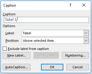
Once you have decided where to incorporate a table, assign it a number (which should then be noted at the top of the table). Different numbering schemes can be used, but the easiest is to just use Table 1, Table 2 and so forth. Numbers will allow you to easily refer to the correct table within the text.
You can also set a table up so that Word automatically assigns it a number. We recommend that you do this, as it will ensure that your table numbers are always correct. For instance, if you add a new table in the middle of your dissertation, Word will automatically adjust the table numbers throughout the rest of the document. Using this Word feature also makes it easy to generate a list of tables.
Automatically numbering tables
To use automatic numbering, click on the tab ‘Reference’ and select ‘Insert Caption’.
Titling tables
It is important that you always give each table a title. If you use automatic table numbering, a table’s title will automatically be noted after its number.
A table title should be clear and comprehensive enough that it does not need to be explained in the text. Readers should be able to understand what a table contains solely on the basis of its title.
Make sure you also follow any title specifications that either your academic program or the citation style you are using dictates. For instance, in APA Style it is customary to put a table’s title under its number.
Step 4. Clarify your table with a note (optional)
A note can be used for information that helps to clarify the data in a table. For example, you can specify p-values, define abbreviations or explain further details related to a particular row or column. If you don’t have anything special to convey (and the table is your own creation), you don’t need to include a note.
Table from another source
If you have taken a table from another source, it’s mandatory that you explain this in a note. However, how this should be done varies by citation style. Below we explain how you should handle a table from another source according to the APA Style.
The APA Style specifies that you should write “Reprinted from” or “Adapted from” followed by the title and complete source information of the book or article that you have taken the table from.
| APA Style | Note. Reprinted from “Title of Article“, by AuthorLastName, FirstInitial., Year, JournalTitle, Volume, p. PageNumber. |
| Example note | Note. Reprinted from “The Theory of Planned Behavior”, by Ajzen, I., 1991, Organizational Behavior and Human Decision Processes, 50, p. 179. |
| APA Style | Note. Reprinted from “BookTitle“, by AuthorLastName, FirstInitial., Year, p. PageNumber, City, State/Country: Publisher. |
| Example note | Note. Reprinted from The Harvard Medical School Guide to Men’s Health, by Simon, H. B., 2002, p. 107, New York, NY: Free Press. |
Step 5. Cite the table within the text
It is important that you always refer to your table in the text. This helps readers to understand why the table is included and ensures that you don’t have any “free-floating” tables in your dissertation. All tables should have a clear function.
When citing a table in your running text, mention the table’s number instead of using phrases such as “the table below” (which can create confusion for your readers).
A numbered table in the main document
The table below shows that…
Table 1 shows that…
When referring to a table in an appendix, include both the table number and the appendix number.
A numbered table in the appendix
Table 2 (see Appendix 1) shows that…
There is evidence that… (see Table 2, Appendix 1)
Cross-references
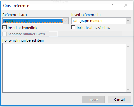
If you automate the numbering of your tables, you can choose to apply cross-references. This feature creates links in your text that lead directly to the corresponding table when clicked. The advantage of this is that the numbering is always correct.
In Word, cross-referencing can be activated by selecting Insert -> Cross-Reference from the top menu bar. From there set the “Reference type” to “Table” and “Insert reference to” to whatever you wish to include (for example, the entire caption or only the table’s name and number). Then select the table to which you want to link and click “Insert”.
In your running text, you only need to address the most important aspects of a table. For example, you might discuss results that are critical for answering your research questions without addressing all of the results that are presented. The idea is that readers can obtain the full picture by looking at the table themselves.
-
Each table has a number.
-
Each table has a clear, descriptive title.
-
All tables are consistently formatted according to my style guide or department’s requirements.
-
The content of each table is clearly understandable in its own right.
-
I have referred to each table in the main text.
-
I have correctly cited the source of any tables reproduced or adapted from other authors.
Cite this Scribbr article
If you want to cite this source, you can copy and paste the citation or click the “Cite this Scribbr article” button to automatically add the citation to our free Citation Generator.
Dingemanse, K.
(2020, January 31). Tables in your dissertation. Scribbr.
Retrieved April 12, 2023,
from https://www.scribbr.com/tips/tables-in-your-dissertation/
Is this article helpful?
You have already voted. Thanks 
Your vote is saved
Processing your vote…
- Software
- Open Access
- Published: 27 August 2014
SpringerPlus
volume 3, Article number: 474 (2014)
Cite this article
-
20k Accesses
-
95 Citations
-
2 Altmetric
-
Metrics details
Abstract
Background
Statistical tables are an important component of data analysis and reports in biological sciences. However, the traditional manual processes for computation and presentation of statistically significant results using a letter-based algorithm are tedious and prone to errors.
Results
Based on the R language, we present two web-based software for individual and summary data, freely available online, at https://houssein-assaad.shinyapps.io/TableReport/ and https://houssein-assaad.shinyapps.io/SumAOV/, respectively. The software are capable of rapidly generating publication-ready tables containing one-way analysis of variance (ANOVA) results. No download is required. Additionally, the software can perform multiple comparisons of means using the Duncan, Student-Newman-Keuls, Tukey Kramer, and Fisher’s least significant difference (LSD) tests. If the LSD test is selected, multiple methods (e.g., Bonferroni and Holm) are available for adjusting p-values. Using the software, the procedures of ANOVA can be completed within seconds using a web-browser, preferably Mozilla Firefox or Google Chrome, and a few mouse clicks. Furthermore, the software can handle one-way ANOVA for summary data (i.e. sample size, mean, and SD or SEM per treatment group) with post-hoc multiple comparisons among treatment means. To our awareness, none of the currently available commercial (e.g., SPSS and SAS) or open-source software (e.g., R and Python) can perform such a rapid task without advanced knowledge of the corresponding programming language.
Conclusions
Our new and user-friendly software to perform statistical analysis and generate publication-ready MS-Word tables for one-way ANOVA are expected to facilitate research in agriculture, biomedicine, and other fields of life sciences.
Introduction
Statistical tables are ubiquitous in agricultural, biological, and biomedical studies (Steel et al.1997). An example is shown in Table 1, reporting the effects of oral administration of interferon tau (IFNT) on concentrations of amino acids, glucose, lipids, and hormones in the plasma of Zucker diabetic fatty (ZDF) rats (Tekwe et al.2013). Here, we focus on generating tables from one-way analysis of variance (ANOVA) models where measurements are summarized as mean ± SEM for each treatment group. Typically, post-hoc test results are also included in these tables using a letter-based algorithm (Piepho2004) to indicate which treatment groups are significantly different. With this algorithm, means for treatments are assigned letters (e.g., a, b, and c) to highlight significant differences. Those means that are not significantly different are assigned a common letter. In other words, two treatments without a common letter are statistically significant at the chosen level of significance (e.g., P ≤ 0.05 or ≤ 0.01). The Tukey-Kramer (TK), Student-Newman-Keuls (SNK), Fisher’s least significant difference (LSD), Duncan (DC), and Bonferroni (BF) tests are among the most popular multiple comparison procedures used in life science research (Steel et al.1997), including amino acid biochemistry, nutrition, pharmacology, and physiology (Wang et al.2014a,b; Wu and Meininger1997; Wu1997).
Effects of oral administration of IFNT on concentrations of amino acids, glucose, lipids and hormones in the plasma of ZDF rats
Full size table
In this paper, we introduce two software, freely available online, at (https://houssein-assaad.shinyapps.io/TableReport/ and https://houssein-assaad.shinyapps.io/SumAOV/) for one-way ANOVA. The software are capable, within few clicks, of generating publication-ready MS-Word tables corresponding to multiple data sets, and of exporting them to Microsoft Word or any RTF reader, with all the post-hoc tests results being included therein. The software can also handle situations where only summary data are available (i.e., sample size, mean, and SD or SEM per group), without the need to use the original individual observations. We believe that our new method will save biologists, and applied scientists in general, an ample amount of time and avoid inputting, by hand, superscript letters (see Table 1) derived from the appropriate statistical tests. This offers a distinct advantage over the traditional manual processes for computation and presentation of results in tables that are not only tedious but are also prone to errors.
Several software packages can perform one-way ANOVA, followed by post-hoc analysis (e.g., R, SAS, JMP, and SPSS). To our knowledge, none of them is capable of exporting the multiple comparison results into an RTF reader in a format similar to that of Table 1 without advanced knowledge of the corresponding programming language. Also, SAS, SPSS and JMP are not free. The main challenge lies in exporting the superscripts used to summarize the significance results to an RTF reader. A simple Google search of the terms “ANOVA calculator” or “ANOVA from summary data” reveals many free web-based programsa that can construct ANOVA tables based either on original or summary data. Despite their simple interface, these programs suffer from major drawbacks. The majority cannot perform post-hoc analysis of any kind. Additionally, none of them can export results to an RTF reader in a publication-ready format, making their usage by a broad community very unlikely. To overcome these disadvantages, we wrote our software in the R language (R core Team,2014) and used the following R packages: grifExtra (Auguie2012), XLConnect (Mirai Solutions GmbH2014), agricolae (Mendiburu2014), rtf (Schaffer2013), and shiny (Rstudio Inc2013).
In the following sections, we introduce necessary background materials for one-way ANOVA coupled with multiple comparison techniques. The main goal is to highlight some of the limitations of the statistical tests included in the software. We also wanted to underline the necessary assumptions required by one-way ANOVA and emphasize that the software should be used only when such assumptions are nearly satisfied. In addition, we present several options to prepare the data for input into the software. Different toy datasets can be downloaded from the software webpage to be used throughout the paper to illustrate the functionality of our software. We also describe the different components of the software and the steps required to generate the tables in MS Word. Furthermore, we offer various tips and useful links to cover more input and output scenarios. Concluding remarks are given towards the end of this article.
Background and materials
1. One-way ANOVA
Here, we present a brief non-technical description of one-way ANOVA and introduce few terms that will be used throughout the rest of this paper. One-way ANOVA, also known as single-factor ANOVA, involves the analysis of data sampled from two or more numerical populations (probability distributions). The characteristic that labels the different populations is called the factor under study. This factor variable can take different values known as factor levels. For example, in a published study involving dietary supplementation with 0, 0.5, 1, 2, and 4% monosodium glutamate to young pigs (Rezaei et al.2013), the experiment consisted of one factor (i.e., monosodium glutamate) with five different levels. Also, let us consider an experiment to assess the effect of four brands of gasoline automobile on engine operating efficiency (measured in mpg). Here, the brand of gasoline is the factor variable and it has four levels (the four brands). The response variable is the engine operating efficiency. One-way ANOVA assumes that the numerical populations or probability distributions of each factor level follow a normal distribution with a common variance, and differ only with respect to their means. Therefore, differences in the means reflect the effect of the essential factor levels, and it is for this reason that ANOVA focuses on the mean responses for the different factor levels. If the factor has only two levels, ANOVA is equivalent to an unpaired t-test comparing two group means. One-way ANOVA usually proceeds in two steps. First, it determines whether or not the factor level means are the same using an overall test. Second, if the factor level means differ, the researcher will conduct a follow-up analysis, known-as post-hoc analysis, to examine how they differ. Our software offers a variety of statistical tests to perform pair-wise comparisons in the post-hoc analysis step.
2. Multiple comparison methods
The main purpose of this section is to provide the reader with some insight into the limitations of the different testing procedures available in the software. For any testing problem, there are two types of errorsb. A false positive (also called Type I error) occurs when we detect an effect that does not really exist. A false negative (Type II error) occurs when we fail to declare a truly existing effect. Most of the classical multiple comparison procedures (MCP), such as the DC, SNK and LSD tests, control the Type I error [more precisely, the family-wise error rate (FWER), which is the probability of committing at least one Type I error in a series of hypotheses testing] in the weak sense. Namely, all computations (e.g. p-values) are conducted under the assumption that all null hypotheses are true. In practice, this assumption is rarely expected to hold, allowing the Type I error to be in excess of the usual 5% value. Therefore, a stronger control for Type I error rate under less restrictive assumptions is often required. A MCP controls the Type I error rate in the strong sense if this error is controlled under any partial configuration of true and false hypotheses. While TK and BF do control the FWER in the strong sense, they have a relatively low power. In other words, TK and BF are more likely to correctly identify true hypothesis as being true, but also might fail to declare false hypothesis as being false (the two methods generate larger p-values than they truly are). A summary of the previous discussion is given in Table 2, which is taken from Christensen (2011) with some modifications. Ideally, it is desired to choose a method that controls the FWER in the strong sense, while achieving the highest possible power. Increasing the power can be done by extending single-stepc testing procedures into stepwise procedures via a technique known as the closure principle (Bretz et al.2010). For instance, the stepwise Holm procedure is an extension of the single-step BF test. By construction, step-wise procedures are more powerful and control the FWER in the strong sense. The general recommendation is to use a testing procedure that controls Type I error in the strong sense while accounting for logical constraintsd and potential correlation among the tests. The books by Westfall et al. (2011) and Bretz et al. (2010) offer a thorough and accessible introduction to the MCP. Furthermore, these books provide the necessary code in SAS and R, respectively.
Summary of multiple comparison methods
Full size table
The software
1. Working with software 1
Software 1 (https://houssein-assaad.shinyapps.io/TableReport/) can handle multiple scenarios where data should be arranged accordingly to obtain the sought results without generating errors. For illustration purposes, different toy data sets that correspond to each scenario can be downloadedefrom the software webpage under the “About” panel (see Figure 1). We distinguish the following settings:
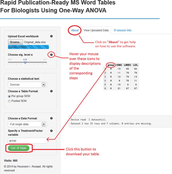
A screenshot of software 1 for setting (S1).
Full size image
-
(S1). A single data set arranged in one Excel sheet: The file should be saved as an Excel workbook ‘Filename.xls’ or ‘Filename.xlsx’, depending on which version of Microsoft Excel the researcher is using (see file ‘Single_data.xlsx’).
-
(S2). Multiple data sets arranged within multiple Excel sheets (one data set per sheet) and saved in one Excel workbook (see file ‘Multiple_data.xlsx’).
-
(S3). Single data set of summary measurements arranged in one Excel sheet (see file ‘Single_Summary_Data.xlsx’).
-
(S4). Multiple data sets of summary measurements in multiple Excel sheets (see file ‘Multiple_Summary_Data.xlsx’).
For the first two scenarios, data rows should correspond to different subjects or experimental units, whereas data columns should describe different variables. The Excel sheets must only contain the data set without any comments or explanations (see file ‘Single_data.xlsx’ for example). Also, an appropriate name should be assigned to each variable. Note that each data set (in one Excel sheet) should contain exactly one factor variable and at least one response variable. For instance, the file Single_data.xlsx contains a single data set with one factor variable (group) with four levels A, B, C and D and six response variables V1 to V6. In this case, the software will conduct six one-way ANOVAs, one for each response variable, and summarize the results in one table in a format similar to Table 1. It should be borne in mind that all the six one-way ANOVAs share the same factor variable ‘group’. Missing values should be left as empty cells. The data set, within an Excel sheet, doesn’t have necessarily to start from the top left cell in Excel (cell A1), as long as the tabular (rectangular) form is maintained.
The last two scenarios are especially useful in cases where the original individual observations are not available, and where only the sample size, mean, and SD or SEM for each factor level are known. For example, this might happen, if the researcher wants to analyze data that have been summarized in a submitted or published article. Refer to files Single_Summary_Data.xlsx and Multiple_Summary_Data.xlsx to prepare data for scenarios (S3) and (S4), respectively. Note that the software can acquire the mean and SEM or SD for each treatment group from the summarized table, but requires the user to enter the sample size. For example, consider the file Single_Summary_Data.xlsx, which has two response variables Var1 and Var2 and one factor variable with 4 levels L1 to L4. By uploading this file into the software, it will automatically detect the mean and SEM or SD for each group for all the response variables. All is left now is to specify the sample sizes as shown in Figure 2. If the design is balanced, enter the common value for sample size per group (e.g., 15). If the design is unbalanced, enter one value for each factor level, in the order they appear in the Excel file, separated by spaces (e.g., 15 14 15 16 for L1 to L4, respectively). Having borders around the researcher’s table cells does not affect the functionality of the software. In the next section, we present software 2 that offers a more user-friendly interface to deal with summary data. At first, it might seem that one should make some effort to get the summary data ready for the software in scenarios S3 and S4 (see Single_Summary_Data.xlsx). However, several free online programsf are currently available to convert a PDF document, which is the standard format for submitted or published papers, to a Word file. Once the table is opened in Word, it can be copied to Excel and then loaded into the software after removing all the superscripts from the table. The latter procedure can be done easily using the “Find and Replace” feature (click CTRL + F to open it) in Excel by replacing all the superscripts with an empty space.
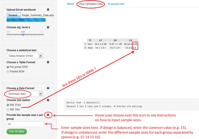
A Screenshot of software 1 for setting (S3).
Full size image
The user of our software should follow the steps below:
-
1.
Upload an excel workbook (both .xls and .xlsx format are supported) and select the level of significance α.
-
2.
Specify a statistical test to perform all pair-wise comparisons. Currently available are the Tukey-Kramer (also known as Tukey’s HSD) test, the Duncan test, the Student-Newman-Keuls (SNK) test, and the least significant difference (LSD) test. If the researcher selects the LSD test, multiple methods (e.g., Bonferroni and Holm) are available for adjusting p-values.
-
3.
Choose the table’s output format. Two formats are widely used in the literature. By selecting ‘Per group SEM’, the table will report the mean and SEM for each group (see Table 1). The ‘Pooled SEM’ option will only report the means for each group and one pooled SEM for all the treatment groups (see Table 3).
Effects of oral administration of IFNT on concentrations of amino acids, glucose, lipids and hormones in the plasma of ZDF rats
Full size table
-
4.
Choose a data format. For setting (S1) select “Full single data” and then specify the factor variable in the researcher’s data set (names are case-sensitive). For (S2) select “Workbook (multiple sheets)”. Choose “Summary data” for setting (S3), while for (S4) select “Workbook (multiple sheets)” and check the summary data checkbox. For both (S3) and (S4), the researcher has to provide the sample size per group, as well as SDs or SEMs in the summary data.
-
5.
Click on the green button to download the table with all statistical results included.
The publication-ready table for one-way ANOVA and multiple comparison results should now open in the MS Word or in the default RTF reader on the researcher’s computer system. The table can now be edited as desired (e.g., adding rows, columns, and borders).
2. Working with software 2
Our main intention behind this software (https://houssein-assaad.shinyapps.io/SumAOV/) is to provide reviewers of scientific papers with a quick and simple tool to check the statistical results summarized in a certain table. This method might be cumbersome if used to check results in a relatively large table containing several response variables (e.g., Table 1) because results must be checked one row at a time. An efficient alternative is to consider using software 1 under the (S3) and (S4) settings, which allow researchers to feed the whole table to the software at once after removing the superscripts from it (after all, the main goal is to check whether these superscripts are correct!). The user should carry out these steps in the given order (see Figure 3):
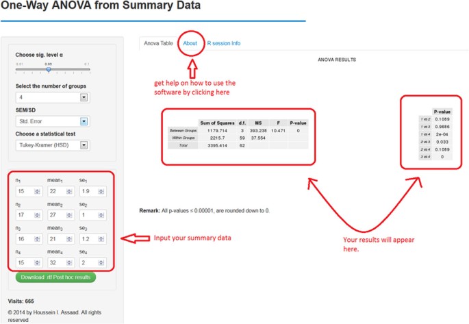
A screenshot of software 2.
Full size image
-
1.
Choose the level of significance α. By default, it equals 0.05.
-
2.
Indicate the number of treatment/group means to compare. Enough fields to input the researcher’s data will be available based on that number.
-
3.
Specify whether the researcher will provide SD or SEM for each group.
-
4.
Select a statistical test for pair-wise comparisons.
-
5.
Input the
-
a.
Sample size for each group, n1, n2, n3, etc.
-
b.
Mean (average) for each treatment group, mean1, mean2, mean3, etc.
-
c.
The SEM or SD for each treatment group, depending on the researcher’s selection in step 3.
-
a.
The ANOVA table and a table containing all the pair-wise comparisons should now appear on the right (see Figure 2). Note that the results will be automatically updated if the researcher introduces any changes to their input (e.g., changing the statistical test and sample sizes).
3. Caution regarding the names of variables
Spaces in variable names should be avoided as they might lead the software to generate an error instead of a correct table output. Also, if the length of a variable’s name in the dataset is larger than 10 characters, which might be the rule rather than the exception in many cases in biological studies, the software will abbreviate the variable’s name. This can lead to ambiguous or unpleasant terms. We, therefore, advise researchers to subjectively assign descriptive abbreviations for variables with long names before loading their dataset into the software.
4. Transposing the output table
The software generates a table for one-way ANOVA and multiple comparisons in a format similar to that of Table 1. The response variables are in different rows and the factor levels occupy different columns. We do not include a functionality that reverses this order because such a task can be easily done in Word or Excel. Typing “Transposing table in Word/Excel” in the Google search engine return many helpful links. Choose the one that corresponds to the researcher’s version of Word or Excel.
Concluding remarks
We presented two free web-based software capable of generating publication-ready RTF tables for one-way ANOVA with pair-wise comparison results included therein. These tables are often prepared for writing agricultural, biological, and medical science papers. Due to its simple interface, the software spare the researcher a considerable amount of time and eliminate errors introduced by human input. The software can handle an Excel workbook with multiple datasets saved in multiple sheets, creating one table per dataset. Our software also support two of the most commonly used table outputs in life science articles (see Tables 1 and2 for example). Additionally, tables can be generated based solely on summary results (i.e., the sample size, mean, and SD or SEM for each treatment group). This need might arise if the researcher wants to analyze data that have been summarized in a submitted or published manuscript. The software can be extended in several directions. For instance, it is possible to include additional multiple comparison tests that might improve the power of the currently available methods. Another option is to cover more families of elements to be tested, in addition to all pair-wise comparisons, such as general contrasts and linear functions.
Endnotes
aSee http://statpages.org/anova1sm.html, http://vassarstats.net/anova1u.html, and http://www.danielsoper.com/statcalc3/calc.aspx?id=43.
bThere is also a Type III error in two-sided test problems. It is defined as the correct rejection of the null hypothesis coupled with a wrong directional decision.
cWhen testing multiple hypotheses, a test procedure is called a single-step method if the rejection or non-rejection of a null hypothesis does not take the decision of any other hypothesis into account, e.g. the BF and TK tests. On the other hand, step-wise methods differ from single-step procedures in that the results of a given test depend upon the results of other tests, e.g., Holm.
dFor example, consider all pair-wise comparisons of 3 treatment means M1, M2 and M3. If M1 ≠ M2, then logically, M1 = M3 and M2 = M3 cannot be true simultaneously. Choosing a test that does not account for these logical constraints might lead to problems with the interpretation of the test results.
eAccess to Dropbox is required in order to download the corresponding toy datasets.
fSee http://www.pdfonline.com/pdf-to-word-converter/.
Availability and requirements
-
Project name: Rapid publication-ready MS Word tables for one-way ANOVA.
-
Project home page:https://houssein-assaad.shinyapps.io/TableReport/ and https://houssein-assaad.shinyapps.io/SumAOV/.
-
Operating system(s): Platform independent.
-
Programming language: R, HTML/CSS, RTF.
-
Other requirements: internet connection, Mozilla Firefox, or Google Chrome.
-
Any restriction to use by non-academics: None.
Abbreviations
- ANOVA:
-
Analysis of variance
- IFNT:
-
Interferon tau
- SAS:
-
Statistical analysis system
- SD:
-
Standard deviation
- SEM:
-
Standard error of the mean
- ZDF:
-
Zucker diabetic fatty.
References
-
Auguie B: gridExtra: functions in Grid graphics. R package version 0.9.1. 2012. http://CRAN.R-project.org/package=gridExtra
Google Scholar
-
Bretz F, Hothorn T, Westfall P: Multiple comparisons using R. CRC Press, Boca Raton, FL; 2010.
MATH
Google Scholar
-
Christensen R: Plane answers to complex questions, the theory of linear models. 4th edition. Springer, New York; 2011.
Book
Google Scholar
-
Meininger CJ, Wu G: L-Glutamine inhibits nitric oxide synthesis in bovine venular endothelial cells. J Pharmacol Exp Ther 1997, 281: 448-453.
CAS
PubMedGoogle Scholar
-
Mendiburu F: agricolae: statistical procedures for agricultural research. R package version 1.1-7. 2014. http://CRAN.R-project.org/package=agricolae
Google Scholar
-
Mirai Solutions GmbH: XLConnect: Excel connector for R. R package version 0.2-7. 2014. http://CRAN.R-project.org/package=XLConnect
Google Scholar
-
Piepho HP: An algorithm for a letter-based representation of all-pairwise comparisons. J Comput Graph Statist 2004, 13: 456-466.
Article
MathSciNetGoogle Scholar
-
R Core Team: R: A language and environment for statistical computing. R Foundation for Statistical Computing, Vienna, Austria; 2014. URLhttp://www.R-project.org
Google Scholar
-
Rezaei R, Knabe DA, Tekwe CD, Dahanayaka S, Ficken MD, Fielder SE, Eide SJ, Lovering SL, Wu G: Dietary supplementation with monosodium glutamate is safe and improves growth performance in postweaning pigs. Amino Acids 2013, 44: 911-923.
Article
CASGoogle Scholar
-
RStudio Inc: shiny: web application framework for R. R package version 0.8.0. 2013. http://CRAN.R-project.org/package=shiny
Google Scholar
-
Schaffer ME: rtf: rich text format (RTF) output. R package version 0.4–11. 2013. http://CRAN.R-project.org/package=rtf
Google Scholar
-
Steel RGD, Torrie JH, Dickey DA: Principles and procedures of statistics; a biometrical approach. 3rd edition. McGraw-Hill, Boston; 1997.
Google Scholar
-
Tekwe CD, Lei J, Yao K, Rezaei R, Li X, Dahanayaka S, Carroll RJ, Meininger CJ, Bazer FW, Wu G: Oral administration of interferon tau enhances oxidation of energy substrates and reduces adiposity in Zucker diabetic fatty rats. BioFactors 2013, 39: 552-563.
Article
CASGoogle Scholar
-
Wang XQ, Frank JW, Little DR, Dunlap KA, Satterfiled MC, Burghardt RC, Hansen TR, Wu G, Bazer FW: Functional role of arginine during the peri-implantation period of pregnancy. I. Consequences of loss of function of arginine transporter SLC7A1 mRNA in ovine conceptus trophectoderm. FASEB J 2014, 28: 2852-2863.
Article
CASGoogle Scholar
-
Wang WW, Dai ZL, Wu ZL, Lin G, Jia SC, Hu SD, Dahanayaka S, Wu G: Glycine is a nutritionally essential amino acid for maximal growth of milk-fed young pigs. Amino Acids 2014, 46: 2037-2045.
Article
CASGoogle Scholar
-
Westfall P, Tobias R, Wolfinger R: Multiple comparisons and multiple testing using SAS. 2nd edition. SAS Institute, Cary, NC; 2011.
Google Scholar
-
Wu G: Synthesis of citrulline and arginine from proline in enterocytes of postnatal pigs. Am J Physiol Gastrointest Liver Physiol 1997, 272: G1382-G1390.
Article
CASGoogle Scholar
Download references
Acknowledgments
Dr. H. Assaad and Dr. R.J. Carroll were supported by a postdoctoral training grant (R25T-CA090301) and a research grant (R37-CA057030) from the National Cancer Institute, respectively. Dr. G. Wu was supported by Agriculture and Food Research Initiative Competitive Grants No. 2008-35203-19120, 2011-67015-20028, and 2014-67015-21770 from the USDA National Institute of Food and Agriculture, as well as by a Hatch project from Texas A&M AgriLife Research (H-8200).
Author information
Authors and Affiliations
-
Department of Statistics, Texas A&M University, College Station, TX, 77843, USA
Houssein I Assaad, Lan Zhou & Raymond J Carroll
-
Department of Animal Science, Texas A&M University, College Station, TX, 77843, USA
Houssein I Assaad & Guoyao Wu
-
Department of Medical Physiology, Texas A&M University, College Station, TX, 77843, USA
Guoyao Wu
Authors
- Houssein I Assaad
You can also search for this author in
PubMed Google Scholar - Lan Zhou
You can also search for this author in
PubMed Google Scholar - Raymond J Carroll
You can also search for this author in
PubMed Google Scholar - Guoyao Wu
You can also search for this author in
PubMed Google Scholar
Corresponding authors
Correspondence to
Houssein I Assaad or Guoyao Wu.
Additional information
Competing interest
The authors declare no conflict of interest.
Authors’ contributions
HA and GW conceived this project. HA wrote the software R code. LZ and RJC contributed to software development. HA, LZ, RJC, and GW wrote the manuscript. HA and GW had the primary responsibility for the final content. All authors read and approved the final manuscript.
Authors’ original submitted files for images
Rights and permissions
Open Access This article is distributed under the terms of the Creative Commons Attribution 4.0 International License (https://creativecommons.org/licenses/by/4.0), which permits use, duplication, adaptation, distribution, and reproduction in any medium or format, as long as you give appropriate credit to the original author(s) and the source, provide a link to the Creative Commons license, and indicate if changes were made.
Reprints and Permissions
About this article
Cite this article
Assaad, H.I., Zhou, L., Carroll, R.J. et al. Rapid publication-ready MS-Word tables for one-way ANOVA.
SpringerPlus 3, 474 (2014). https://doi.org/10.1186/2193-1801-3-474
Download citation
-
Received: 25 July 2014
-
Accepted: 12 August 2014
-
Published: 27 August 2014
-
DOI: https://doi.org/10.1186/2193-1801-3-474
Keywords
- Statistical analysis
- Multiple comparisons
- Online software
- Computation
- Biology
- R
- Shiny
1. WHEN TO USE TABLES
Before proceeding to the “how to” of tables, let us first examine the question of “whether to.”
As a rule, do not construct a table unless repetitive data must be presented. There are two reasons for this general rule. First, it is simply not good science to regurgitate reams of data just because you have them in your laboratory notebooks; only samples and breakpoints need be given. Second, the cost of publishing tables can be high compared with that of text, and all of us involved with the generation and publication of scientific literature should worry about the cost.
If you made (or need to present) only a few determinations, give the data in the text. Tables 16.1 and 16.2 are useless, yet they are typical of many tables that are submitted to journals.
Table 16.1 is faulty because two of the columns give standard conditions, not variables and not data. If temperature is a variable in the experiments, it can have its column. If all experiments were done at the same temperature, however, this single bit of information should be noted in the materials and methods section and perhaps as a footnote to the table, but not in a column in the table. The data presented in the table can be given in the text itself in a form that is readily comprehensible to the reader, without taking up space with a table. Very simply, these results would read: “Aeration of the growth medium was essential for the growth of Streptomyces coelicolor. At room temperature (24°C), no growth was evident in stationary (unaerated) cultures, whereas substantial growth (OD, 78 Klett units) occurred in shaken cultures.”

Table 16.2 has no columns of identical readings, and it looks like a good table. But is it? The independent variable column (temperature) looks reasonable enough, but the dependent variable column (growth) has a suspicious number of zeros. You should question any table with a large number of zeros (whatever the unit of measurement) or a large number of 100s when percentages are used. Table 16.2 is a useless table because all it tells us is that “The oak seedlings grew at temperatures between 20 and 40°C; no measurable growth occurred at temperatures below 20°C or above 40°C.”
In addition to zeros and 100s, be suspicious of plus and minus signs. Table 16.3 is of a type that often appears in print, although it is obviously not very informative. All this table tells us is that “S. griseus, S. coelicolor, S. everycolor, and S. rainbowensky grew under aerobic conditions, whereas S. nocolor and S. greenicus required anaerobic conditions.” Whenever a table, or columns within a table, can be readily put into words, do it.
Some authors believe that all numerical data must be put in a table. Table 16.4 is a sad example. It gets sadder when we learn (at the end of the footnote) that the results were not statistically significant anyway (P = 0.21). If these data were worth publishing (which seems doubtful), one sentence in the results would have done the job: “The difference between the failure rates—14 percent (5 of 35) for nocillin and 26 percent (9 of 34) for potassium penicillin V—was not significant (P = 0.21).”


In presenting numbers, give only significant figures. Nonsignificant figures may mislead the reader by creating a false sense of precision; they also make comparison of the data more difficult. Unessential data, such as laboratory numbers, results of simple calculations, and columns that show no significant variations, should be omitted.
Another very common but often useless table is the word list. Such a list might be suitable for a slide in a presentation, but it does not belong in a scientific paper. Table 16.5 is an example. This information could easily be presented in the text. A good copy editor will kill this kind of table and incorporate the data into the text. Yet, when copy editors do so (and this leads to the next rule about tables), they often find that much or all of the information was already in the text. Thus, the rule: Present the data in the text, or in a table, or in a figure. Never present the same data in more than one way. Of course, selected data can be singled out for discussion in the text.
Tables 16.1 to 16.5 provide typical examples of the kinds of material that should not be tabulated. Now let us look at material that should be tabulated.
2. HOW TO ARRANGE TABULAR MATERIAL
Having decided to tabulate, you ask yourself the question: “How do I arrange the data?” Since a table has both left-right and up-down dimensions, you have two choices. The data can be presented either horizontally or vertically. But can does not mean should; the data should be organized so that the like elements read down, not across.
Examine Tables 16.6 and 16.7. They are equivalent, except that Table 16.6 reads across, whereas Table 16.7 reads down. To use an old fishing expression, Table 16.6 is “bass ackward.” Table 16.7 is the preferred format because it allows the reader to grasp the information more easily, and it is more compact and thus less expensive to print. The point about ease for the reader would seem to be obvious. (Did you ever try to add numbers that were listed horizontally rather than vertically?) The point about reduced printing costs refers to the fact that all columns must be wide or deep in the across arrangement because of the diversity of elements, whereas some columns (especially those with numbers) can be narrow without runovers in the down arrangement. Thus, Table 16.7 appears to be smaller than Table 16.6, although it contains the same information.

Words in a column are lined up on the left. Numbers are lined up on the right (or on the decimal point). Table 16.7, for example, illustrates this point.
Table 16.8 is an example of a well-constructed table. It reads down, not across. Its title and headings are clear enough for readers to understand the data without referring to the text. Items in the body of the table appear in a logical order. The footnote provides supplementary information on how the data were obtained rather than repeating excessive methodological detail.
Note that these tables have three horizontal rules (lines) but no vertical rules. Virtually all tables are constructed this way. Occasionally, straddle rules (as below “Hospitalizations” and “Total charges” in Table 16.8) are used. Vertical rules normally are not used in tables.
3. EXPONENTS IN TABLE HEADINGS
If possible, avoid using exponents in table headings. Confusion has resulted because some journals use positive exponents and some use negative exponents to mean the same thing. For example, some have used “cpm x 103” to refer to thousands of counts per minute, whereas others have used “cpm x 10-3” for the same thousands of counts. If it is not possible to avoid such labels in table headings (or in figures), it may be worthwhile to state in a footnote (or in the figure legend), in words that eliminate the ambiguity, what convention is being used.
4. FOLLOWING THE JOURNAL’S INSTRUCTIONS
Instructions to authors commonly include a section about tables. Before preparing your tables, check the instructions to authors of your target journal. These instructions may indicate such items as the dimensions of the space available, the symbols or form of lettering for indicating footnotes to tables, and the electronic tools to use in preparing tables. Looking at tables in the journal as examples also can aid in preparing suitable tables.
Style manuals in the sciences provide guidance in preparing not only text but also tables and figures. If your target journal specifies a style manual that it follows, consult it in this regard. Even if the journal does not specify a style manual, looking at one relevant to your field can aid in preparing effective tables and figures.
Traditionally, journals have asked authors to submit each table on a separate page at the end of the text. In addition, some journals have said to identify in the margin of the text the first mention of each table, for example, by writing “Table 3” and circling it. This procedure helps ensure that the author has indeed cited each table in the text, in numerical order. It also indicates to the compositor, at the page makeup stage, where to break the text to insert the tables. Today, some journals ask authors to embed tables in the text near their first mention. And some journals ask authors to submit tables as separate files. To determine whether tables should be placed within the text, placed at the end, or provided in separate files (and to determine how, if requested, to indicate their placement), consult the instructions to authors.
5. TITLES, FOOTNOTES, AND ABBREVIATIONS
The title of the table (or the legend of a figure) is like the title of the paper itself. That is, the title or legend should be concise and not divided into two or more clauses or sentences. Unnecessary words should be omitted.
Give careful thought to the footnotes to your tables. If abbreviations must be defined, you often can give all or most of the definitions in the first table. Then later tables can carry the simple footnote: “Abbreviations as in Table 1.”
Note that “temp” (Tables 16.1, 16.2, 16.6, and 16.7) is used as an abbreviation for “temperature.” Because of space limitations in tables, almost all journals encourage abbreviation of certain words in tables that would not be abbreviated in the text. Capitalize any such abbreviations used as the first word in a column heading; do not use periods (except after “no.,” which might be misread without the period). To identify abbreviations that your target journal considers acceptable in tables, you can look at tables published in the journal. Also, some journals list in their instructions to authors the abbreviations that can be used without definition in tables that they publish.
6. ADDITIONAL TIPS ON TABLES
The following are some further tips to help ensure that you design and use tables effectively.
Use wording that will be clear without reference to the text. For example, a table should not just refer to “Group 1” and “Group 2.” Rather, it should identify each group by a more meaningful designation (examples: “High-Dose Group” and “Low-Dose Group,” “REM Sleep Group” and “NREM Sleep Group,” and “Graduate Students” and “Professors”).
If a paper includes a series of tables presenting analogous data, use an analogous format for each. For example, if several tables compare the same four groups from different standpoints, list the four groups in the same order in each table. Or if different tables present data on the same variables at different times, keep listing the variables in the same order. Such consistency saves readers effort. (And it is easier for you, too.)
Finally, remember to mention every table in the text. Do so as soon as readers are likely to want to see the table. You have gone to the effort of preparing good tables. Be sure that readers can benefit fully from them.
Source: Gastel Barbara, Day Robert A. (2016), How to Write and Publish a Scientific Paper, Greenwood; 8th edition.