
Excel for Microsoft 365 Excel for Microsoft 365 for Mac Excel 2021 Excel 2021 for Mac Excel 2019 Excel 2019 for Mac Excel 2016 Excel 2016 for Mac Excel 2013 Excel 2010 More…Less
Scatter charts and line charts look very similar, especially when a scatter chart is displayed with connecting lines. However, the way each of these chart types plots data along the horizontal axis (also known as the x-axis) and the vertical axis (also known as the y-axis) is very different.
Before you choose either of these chart types, you might want to learn more about the differences and find out when it’s better to use a scatter chart instead of a line chart, or the other way around.
The main difference between scatter and line charts is the way they plot data on the horizontal axis. For example, when you use the following worksheet data to create a scatter chart and a line chart, you can see that the data is distributed differently.
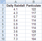
In a scatter chart, the daily rainfall values from column A are displayed as x values on the horizontal (x) axis, and the particulate values from column B are displayed as values on the vertical (y) axis. Often referred to as an xy chart, a scatter chart never displays categories on the horizontal axis.

A scatter chart always has two value axes to show one set of numerical data along a horizontal (value) axis and another set of numerical values along a vertical (value) axis. The chart displays points at the intersection of an x and y numerical value, combining these values into single data points. These data points may be distributed evenly or unevenly across the horizontal axis, depending on the data.
The first data point to appear in the scatter chart represents both a y value of 137 (particulate) and an x value of 1.9 (daily rainfall). These numbers represent the values in cell A9 and B9 on the worksheet.
In a line chart, however, the same daily rainfall and particulate values are displayed as two separate data points, which are evenly distributed along the horizontal axis. This is because a line chart only has one value axis (the vertical axis). The horizontal axis of a line chart only shows evenly spaced groupings (categories) of data. Because categories were not provided in the data, they were automatically generated, for example, 1, 2, 3, and so on.
This is a good example of when not to use a line chart.

A line chart distributes category data evenly along a horizontal (category) axis , and distributes all numerical value data along a vertical (value) axis.
The particulate y value of 137 (cell B9) and the daily rainfall x value of 1.9 (cell A9) are displayed as separate data points in the line chart. Neither of these data points is the first data point displayed in the chart — instead, the first data point for each data series refers to the values in the first data row on the worksheet (cell A2 and B2).
Axis type and scaling differences
Because the horizontal axis of a scatter chart is always a value axis, it can display numeric values or date values (such as days or hours) that are represented as numerical values. To display the numeric values along the horizontal axis with greater flexibility, you can change the scaling options on this axis the same way that you can change the scaling options of a vertical axis.
Because the horizontal axis of a line chart is a category axis, it can be only a text axis or a date axis. A text axis displays text only (non-numerical data or numerical categories that are not values) at evenly spaced intervals. A date axis displays dates in chronological order at specific intervals or base units, such as the number of days, months, or years, even if the dates on the worksheet are not in order or in the same base units.
The scaling options of a category axis are limited compared with the scaling options of a value axis. The available scaling options also depend on the type of axis that you use.
Scatter charts are commonly used for displaying and comparing numeric values, such as scientific, statistical, and engineering data. These charts are useful to show the relationships among the numeric values in several data series, and they can plot two groups of numbers as one series of xy coordinates.
Line charts can display continuous data over time, set against a common scale, and are therefore ideal for showing trends in data at equal intervals or over time. In a line chart, category data is distributed evenly along the horizontal axis, and all value data is distributed evenly along the vertical axis. As a general rule, use a line chart if your data has non-numeric x values — for numeric x values, it is usually better to use a scatter chart.
Consider using a scatter chart instead of a line chart if you want to:
-
Change the scale of the horizontal axis Because the horizontal axis of a scatter chart is a value axis, more scaling options are available.
-
Use a logarithmic scale on the horizontal axis You can turn the horizontal axis into a logarithmic scale.
-
Display worksheet data that includes pairs or grouped sets of values In a scatter chart, you can adjust the independent scales of the axes to reveal more information about the grouped values.
-
Show patterns in large sets of data Scatter charts are useful for illustrating the patterns in the data, for example by showing linear or non-linear trends, clusters, and outliers.
-
Compare large numbers of data points without regard to time The more data that you include in a scatter chart, the better the comparisons that you can make.
Consider using a line chart instead of a scatter chart if you want to:
-
Use text labels along the horizontal axis These text labels can represent evenly spaced values such as months, quarters, or fiscal years.
-
Use a small number of numerical labels along the horizontal axis If you use a few, evenly spaced numerical labels that represent a time interval, such as years, you can use a line chart.
-
Use a time scale along the horizontal axis If you want to display dates in chronological order at specific intervals or base units, such as the number of days, months, or years, even if the dates on the worksheet are not in order or in the same base units, use a line chart.
Note: The following procedure applies to Office 2013 and newer versions. Office 2010 steps?
Create a scatter chart

So, how did we create this scatter chart? The following procedure will help you create a scatter chart with similar results. For this chart, we used the example worksheet data. You can copy this data to your worksheet, or you can use your own data.
-
Copy the example worksheet data into a blank worksheet, or open the worksheet that contains the data you want to plot in a scatter chart.
1
2
3
4
5
6
7
8
9
10
11
A
B
Daily Rainfall
Particulate
4.1
122
4.3
117
5.7
112
5.4
114
5.9
110
5.0
114
3.6
128
1.9
137
7.3
104
-
Select the data you want to plot in the scatter chart.
-
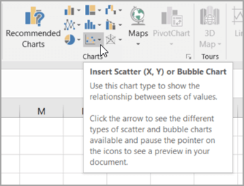
Click the Insert tab, and then click Insert Scatter (X, Y) or Bubble Chart.

-
Click Scatter.
Tip: You can rest the mouse on any chart type to see its name.
-
Click the chart area of the chart to display the Design and Format tabs.
-
Click the Design tab, and then click the chart style you want to use.
-
Click the chart title and type the text you want.
-
To change the font size of the chart title, right-click the title, click Font, and then enter the size that you want in the Size box. Click OK.
-
Click the chart area of the chart.
-
On the Design tab, click Add Chart Element > Axis Titles, and then do the following:
-
To add a horizontal axis title, click Primary Horizontal.
-
To add a vertical axis title, click Primary Vertical.
-
Click each title, type the text that you want, and then press Enter.
-
For more title formatting options, on the Format tab, in the Chart Elements box, select the title from the list, and then click Format Selection. A Format Title pane will appear. Click Size & Properties
, and then you can choose Vertical alignment, Text direction, or Custom angle.
-
-
Click the plot area of the chart, or on the Format tab, in the Chart Elements box, select Plot Area from the list of chart elements.
-
On the Format tab, in the Shape Styles group, click the More button
, and then click the effect that you want to use. -
Click the chart area of the chart, or on the Format tab, in the Chart Elements box, select Chart Area from the list of chart elements.
-
On the Format tab, in the Shape Styles group, click the More button
, and then click the effect that you want to use. -
If you want to use theme colors that are different from the default theme that is applied to your workbook, do the following:
-
On the Page Layout tab, in the Themes group, click Themes.
-
Under Office, click the theme that you want to use.
-
 , and then you can choose Vertical alignment, Text direction, or Custom angle.
 , and then click the effect that you want to use.
Create a line chart

So, how did we create this line chart? The following procedure will help you create a line chart with similar results. For this chart, we used the example worksheet data. You can copy this data to your worksheet, or you can use your own data.
-
Copy the example worksheet data into a blank worksheet, or open the worksheet that contains the data that you want to plot into a line chart.
1
2
3
4
5
6
7
8
9
10
11
A
B
C
Date
Daily Rainfall
Particulate
1/1/07
4.1
122
1/2/07
4.3
117
1/3/07
5.7
112
1/4/07
5.4
114
1/5/07
5.9
110
1/6/07
5.0
114
1/7/07
3.6
128
1/8/07
1.9
137
1/9/07
7.3
104
-
Select the data that you want to plot in the line chart.
-
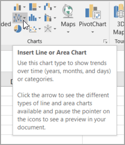
Click the Insert tab, and then click Insert Line or Area Chart.
-
Click Line with Markers.
-
Click the chart area of the chart to display the Design and Format tabs.
-
Click the Design tab, and then click the chart style you want to use.
-
Click the chart title and type the text you want.
-
To change the font size of the chart title, right-click the title, click Font, and then enter the size that you want in the Size box. Click OK.
-
Click the chart area of the chart.
-
On the chart, click the legend, or add it from a list of chart elements (on the Design tab, click Add Chart Element > Legend, and then select a location for the legend).
-
To plot one of the data series along a secondary vertical axis, click the data series, or select it from a list of chart elements (on the Format tab, in the Current Selection group, click Chart Elements).
-
On the Format tab, in the Current Selection group, click Format Selection. The Format Data Series task pane appears.
-
Under Series Options, select Secondary Axis, and then click Close.
-
On the Design tab, in the Chart Layouts group, click Add Chart Element, and then do the following:
-
To add a primary vertical axis title, click Axis Title >Primary Vertical. and then on the Format Axis Title pane, click Size & Properties
to configure the type of vertical axis title that you want. -
To add a secondary vertical axis title, click Axis Title > Secondary Vertical, and then on the Format Axis Title pane, click Size & Properties
to configure the type of vertical axis title that you want. -
Click each title, type the text that you want, and then press Enter
-
-
Click the plot area of the chart, or select it from a list of chart elements (Format tab, Current Selection group, Chart Elements box).
-
On the Format tab, in the Shape Styles group, click the More button
, and then click the effect that you want to use.
-
Click the chart area of the chart.
-
On the Format tab, in the Shape Styles group, click the More button
, and then click the effect that you want to use. -
If you want to use theme colors that are different from the default theme that is applied to your workbook, do the following:
-
On the Page Layout tab, in the Themes group, click Themes.
-
Under Office, click the theme that you want to use.
-
Create a scatter or line chart in Office 2010
So, how did we create this scatter chart? The following procedure will help you create a scatter chart with similar results. For this chart, we used the example worksheet data. You can copy this data to your worksheet, or you can use your own data.
-
Copy the example worksheet data into a blank worksheet, or open the worksheet that contains the data that you want to plot into a scatter chart.
1
2
3
4
5
6
7
8
9
10
11
A
B
Daily Rainfall
Particulate
4.1
122
4.3
117
5.7
112
5.4
114
5.9
110
5.0
114
3.6
128
1.9
137
7.3
104
-
Select the data that you want to plot in the scatter chart.
-
On the Insert tab, in the Charts group, click Scatter.
-
Click Scatter with only Markers.
Tip: You can rest the mouse on any chart type to see its name.
-
Click the chart area of the chart.
This displays the Chart Tools, adding the Design, Layout, and Format tabs.
-
On the Design tab, in the Chart Styles group, click the chart style that you want to use.
For our scatter chart, we used Style 26.
-
On the Layout tab, click Chart Title and then select a location for the title from the drop-down list.
We chose Above Chart.
-
Click the chart title, and then type the text that you want.
For our scatter chart, we typed Particulate Levels in Rainfall.
-
To reduce the size of the chart title, right-click the title, and then enter the size that you want in the Font Size box on the shortcut menu.
For our scatter chart, we used 14.
-
Click the chart area of the chart.
-
On the Layout tab, in the Labels group, click Axis Titles, and then do the following:
-
To add a horizontal axis title, click Primary Horizontal Axis Title, and then click Title Below Axis.
-
To add a vertical axis title, click Primary Vertical Axis Title, and then click the type of vertical axis title that you want.
For our scatter chart, we used Rotated Title.
-
Click each title, type the text that you want, and then press Enter.
For our scatter chart, we typed Daily Rainfall in the horizontal axis title, and Particulate level in the vertical axis title.
-
-
Click the plot area of the chart, or select Plot Area from a list of chart elements (Layout tab, Current Selection group, Chart Elements box).
-
On the Format tab, in the Shape Styles group, click the More button
, and then click the effect that you want to use.For our scatter chart, we used the Subtle Effect — Accent 3.
-
Click the chart area of the chart.
-
On the Format tab, in the Shape Styles group, click the More button
, and then click the effect that you want to use.For our scatter chart, we used the Subtle Effect — Accent 1.
-
If you want to use theme colors that are different from the default theme that is applied to your workbook, do the following:
-
On the Page Layout tab, in the Themes group, click Themes.
-
Under Built-in, click the theme that you want to use.
For our line chart, we used the Office theme.
-

So, how did we create this line chart? The following procedure will help you create a line chart with similar results. For this chart, we used the example worksheet data. You can copy this data to your worksheet, or you can use your own data.
-
Copy the example worksheet data into a blank worksheet, or open the worksheet that contains the data that you want to plot into a line chart.
1
2
3
4
5
6
7
8
9
10
11
A
B
C
Date
Daily Rainfall
Particulate
1/1/07
4.1
122
1/2/07
4.3
117
1/3/07
5.7
112
1/4/07
5.4
114
1/5/07
5.9
110
1/6/07
5.0
114
1/7/07
3.6
128
1/8/07
1.9
137
1/9/07
7.3
104
-
Select the data that you want to plot in the line chart.
-
On the Insert tab, in the Charts group, click Line.
-
Click Line with Markers.
-
Click the chart area of the chart.
This displays the Chart Tools, adding the Design, Layout, and Format tabs.
-
On the Design tab, in the Chart Styles group, click the chart style that you want to use.
For our line chart, we used Style 2.
-
On the Layout tab, in the Labels group, click Chart Title, and then click Above Chart.
-
Click the chart title, and then type the text that you want.
For our line chart, we typed Particulate Levels in Rainfall.
-
To reduce the size of the chart title, right-click the title, and then enter the size that you want in the Size box on the shortcut menu.
For our line chart, we used 14.
-
On the chart, click the legend, or select it from a list of chart elements (Layout tab, Current Selection group, Chart Elements box).
-
On the Layout tab, in the Labels group, click Legend, and then click the position that you want.
For our line chart, we used Show Legend at Top.
-
To plot one of the data series along a secondary vertical axis, click the data series for Rainfall, or select it from a list of chart elements (Layout tab, Current Selection group, Chart Elements box).
-
On the Layout tab, in the Current Selection group, click Format Selection.
-
Under Series Options, select Secondary Axis, and then click Close.
-
On the Layout tab, in the Labels group, click Axis Titles, and then do the following:
-
To add a primary vertical axis title, click Primary Vertical Axis Title, and then click the type of vertical axis title that you want.
For our line chart, we used Rotated Title.
-
To add a secondary vertical axis title, click Secondary Vertical Axis Title, and then click the type of vertical axis title that you want.
For our line chart, we used Rotated Title.
-
Click each title, type the text that you want, and then press ENTER.
For our line chart, we typed Particulate level in the primary vertical axis title, and Daily Rainfall in the secondary vertical axis title.
-
-
Click the plot area of the chart, or select it from a list of chart elements (Layout tab, Current Selection group, Chart Elements box).
-
On the Format tab, in the Shape Styles group, click the More button
, and then click the effect that you want to use.For our line chart, we used the Subtle Effect — Dark 1.
-
Click the chart area of the chart.
-
On the Format tab, in the Shape Styles group, click the More button
, and then click the effect that you want to use.For our line chart, we used the Subtle Effect — Accent 3.
-
If you want to use theme colors that are different from the default theme that is applied to your workbook, do the following:
-
On the Page Layout tab, in the Themes group, click Themes.
-
Under Built-in, click the theme that you want to use.
For our line chart, we used the Office theme.
-
Create a scatter chart
-
Select the data you want to plot in the chart.
-
Click the Insert tab, and then click X Y Scatter, and under Scatter, pick a chart.
-
With the chart selected, click the Chart Design tab to do any of the following:
-
Click Add Chart Element to modify details like the title, labels, and the legend.
-
Click Quick Layout to choose from predefined sets of chart elements.
-
Click one of the previews in the style gallery to change the layout or style.
-
Click Switch Row/Column or Select Data to change the data view.
-
-
With the chart selected, click the Design tab to optionally change the shape fill, outline, or effects of chart elements.
Create a line chart
-
Select the data you want to plot in the chart.
-
Click the Insert tab, and then click Line, and pick an option from the available line chart styles .
-
With the chart selected, click the Chart Design tab to do any of the following:
-
Click Add Chart Element to modify details like the title, labels, and the legend.
-
Click Quick Layout to choose from predefined sets of chart elements.
-
Click one of the previews in the style gallery to change the layout or style.
-
Click Switch Row/Column or Select Data to change the data view.
-
-
With the chart selected, click the Design tab to optionally change the shape fill, outline, or effects of chart elements.
See Also
Save a custom chart as a template
Need more help?
Excel has some useful chart types that can be used to plot data and show analysis.
A common scenario is where you want to plot X and Y values in a chart in Excel and show how the two values are related.
This can be done by using a Scatter chart in Excel.
For example, if you have the Height (X value) and Weight (Y Value) data for 20 students, you can plot this in a scatter chart and it will show you how the data is related.
Below is an example of a Scatter Plot in Excel (also called the XY Chart):

In this tutorial, I will show you how to make a scatter plot in Excel, the different types of scatter plots, and how to customize these charts.
What is a Scatter Chart and When To Use It?
Scatter charts are used to understand the correlation (relatedness) between two data variables.
A scatter plot has dots where each dot represents two values (X-axis value and Y-axis value) and based on these values these dots are positioned in the chart.
A real-life example of this could be the marketing expense and the revenue of a group of companies in a specific industry.
When we plot this data (Marketing Expense vs. Revenue) in a scatter chart, we can analyze how strongly or loosely these two variables are connected.
Creating a Scatter Plot in Excel
Suppose you have a dataset as shown below and you want to create a scatter plot using this data.

The aim of this chart is to see whether there is any correlation between the marketing budget and the revenue or not.
For making a scatter plot, it’s important to have both the values (of the two variables that you want to plot in the scatter chart) in two separate columns.
The column on the left (Marketing Expense column in our example) would be plotted on the X-Axis and the Revenue would be plotted on the Y-Axis.
Below are the steps to insert a scatter plot in Excel:
- Select the columns that have the data (excluding column A)

- Click the Insert option

- In the Chart group, click on the Insert Scatter Chart icon
- Click on the ‘Scatter chart’ option in the charts thats show up

The above steps would insert a scatter plot as shown below in the worksheet.
The column on the left (Marketing Expense column in our example) would be plotted on the X-Axis and the Revenue would be plotted on the Y-Axis. It’s best to have the independent metric in the left column and the one for which you need to find the correlation in the column on the right.
Adding a Trend Line to the Scatter Chart
While I will cover more ways to customize the scatter plot in Excel later in this tutorial, one thing that you can do immediately after building the scatter plot is to add a trend line.
It helps you quickly get a sense of whether the data is positively or negatively correlated, and how tightly/loosely correlated it is.
Below are the steps to add a trendline to a scatter chart in Excel:
- Select the Scatter plot (where you want to add the trendline)
- Click the Chart Design tab. This is a contextual tab which only appears when you select the chart

- In the Chart Layouts group, click on the ‘Add Chart Element’ option

- Go to the ‘Trendline’ option and then click on ‘Linear’

The above steps would add a linear trendline to your scatter chart.

Just by looking at the trendline and the data points plotted in the scatter chart, you can get a sense of whether the data is positively correlated, negatively correlated, or not correlated.
In our example, we see a positive slope in the trendline indicating that the data is positively correlated. This means that when the marketing expenses go up then the revenue goes up and if the marketing expenses go down then the revenue goes down.
In case the data is negatively correlated, then there would be an inverse relation. In that case, if the marketing expenses go up then the revenue would go down and vice versa.
And then there is a case where there is no correlation. In this case, when the marketing expenses increase, their revenue may or may not increase.
Note that the slope only tells us whether the data is positively or negatively correlated. it doesn’t tell us how closely it’s related.
For example, in our example, by looking at the trendline we cannot say how much the revenue will go up when the marketing expense increases by 100%. This is something that can be calculated using the correlation coefficient.
You can find that using the below formula:
=CORREL(B2:B11,C2:C11)
The correlation coefficient varies between -1 and 1, where 1 would indicate a perfectly positive correlation and -1 would indicate a perfectly negative correlation
In our example, it returns 0.945, indicating that these two variables have a high positive correlation.
Identifying Clusters using Scatter Chart (Practical Examples)
One of the ways I used to use scatter charts in my work as a financial analyst was to identify clusters of data points that exhibit a similar kind of behavior.
This usually works well when you have a diverse data set with less overall correlation.
Suppose you have a data set as shown below, where I have 20 companies with their revenue and profit margin numbers.

When I create a scatterplot for this data, I get something as shown below:

In this chart, you can see that the data points are all over the place and there is a very low correlation.
While this chart doesn’t tell us much, one way you can use it to identify clusters in the four quadrants in the chart.
For example, the data point in the bottom left quadrant are those companies where the revenue is low and the net profit margin is low, and the companies in the bottom right quadrant are those where the revenue is high but the net profit margin is low.
This used to be one of the highly discussed charts in the management meeting when we used to identify prospective customers based on their financial data.
Different Types of Scatter Plots in Excel
Apart from the regular scatter chart that I have covered above, you can also create the following scatter plot types in Excel:
- Scatter with Smooth Lines
- Scatter with Smooth Lines and Markers
- Scatter with Straight Lines
- Scatter with Straight Lines and Markers
All these four above scatter plots are suitable when you have fewer data points and when you’re plotting two series in the chart.
For example, suppose you have the Marketing Expense vs Revenue data as shown below and you want to plot a scatter with smooth lines chart.
Below are the steps to do this:
- Select the dataset (excluding the company name column)
- Click the Insert tab
- In the Charts group, click on the Insert Scatter Chart option
- Click on Scatter with Smooth Lines and Markers options

You will see something as shown below.

This chart can quickly become unreadable if you have more data points. This is why it is recommended to use this with fewer data points only.
I have never used this chart in my work as I don’t think it gives any meaningful insight (since we can’t plot more data points to it).
Customizing Scatter Chart in Excel
Just like any other chart in Excel, you can easily customize the scatter plot.
In this section, I will cover some of the customizations you can do with a scatter chart in Excel:
Adding / Removing Chart Elements
When you click on the scatter chart, you will see plus icon at the top right part of the chart.
When you click on this plus icon, it will show you options that you can easily add or remove from your scatter chart.
Here are the options that you get:
- Axes
- Axis Title
- Chart Title
- Data Labels
- Error Bars
- Gridlines
- Legend
- Trendlines
Some of these options are already present in your chart, and you can remove these elements by clicking on the checkbox next to the option (or add these by clicking the checkbox if not checked already).
For example, if I want to remove the Chart Title, I can simply uncheck the option and it would be gone,
In case you need more control, you can click on the little black arrow that appears when you hover the cursor hover over any of the options.

Clicking on it will give you more options for that specific chart element (these open as a pane on the right side).
Note: All the screenshots I have shown you are from a recent version of Excel (Microsoft 365). In case you’re using an older version, you can get the same options when you right-click on any of the chart elements and click on the Format option.
Let’s quickly go through these elements and some of the awesome customizations you can do to scatter charts using it.
Axes
Axes are the vertical and horizontal values that you see right next to the chart.
One of the most useful customizations you can do with axes is to adjust the maximum and minimum value it can show.
To change this, right-click on the axes in the chart and then click on Format axes. This will open the Format Axis pane.

In the Axis option, you can set the minimum and maximum bounds as well as the major and minor units.

In most cases, you can set this to automatic, and Excel will take care of it based on the dataset. But in case you want specific values, you can change them from here.
One example could be when you don’t want the minimum value in the Y-axis to be 0, but something else (say 1000). Changing the lower bound to 1000 will adjust the chart so that the minimum value in the vertical axis would then be 1000.
Axis Title
The Axis title is something you can use to specify what the X and Y-axis represent in the scatter chart in Excel.
In our example, it would be the Net Income for the X-axis and Marketing Expense for the Y-axis.
You can choose to not show any axis title, and you can remove these by selecting the chart, clicking on the plus icon, and then unchecking the box for Axis title.

To change the text in the axis title, simply double-click on it and then type whatever you want as the axis title.
You can also link the Axis title value to a cell.
For example, if you want the value in cell B1 to show up in the vertical axis title, click on the axis title box and then enter =B1 in the formula bar. This will show the value in cell B1 in the axis title.
You can do the same for the horizontal axis title and link it to a specific cell. This makes these titles dynamic and if the cell value changes, the axis titles will also change.
If you need more control on formatting the axis titles, click on any axis, right-click and then click on Format Axis Title.

With these options, you can change the fill and border of the title, change the text color, alignment, and rotation.

Chart Title
Just like Axis titles, you can also format the Chart title in a scatter plot in Excel.
A chart title is usually used to describe what the chart is about. For example, I can use ‘Marketing Expense Vs Revenue’ as the chart title.

If you don’t want the chart title, you can click and delete it. And in case you don’t have it, select the chart, click on the plus icon and then check the Chart Title option.

To edit the text in the Chart title, double-click on the box and manually type the text you want there. And in case you want to make the chart title Dynamic, you can click the title box and then type the cell reference or the formula in the formula bar.
To format the chart title, right-click on the Chart Title and then click on the ‘Format Chart Title’ option. This will show the Format Chart Title pane on the right.

With these options, you can change the fill and border of the title, change the text color, alignment, and rotation.

Data Labels
By default, data labels are not visible when you create a scatter plot in Excel.
But you can easily add and format these.
Do add the data labels to the scatter chart, select the chart, click on the plus icon on the right, and then check the data labels option.

This will add the data labels that will show the Y-axis value for each data point in the scatter graph.
To format the data labels, right-click on any of the data labels and then click on the ‘Format Data Labels’ option.

This will open the former data labels pane on the right, and you can customize these using various options listed in the pane.
Apart from the regular formatting such as fill, border, text color, and alignment, you also get some additional label options that you can use.
In the ‘Label Contains’ options, you can choose to show both the X-axis and the Y-axis value, instead of just the Y-axis.

You can also choose the option ‘Value from Cells’. which will allow you to have data labels that are there in a column in the worksheet (it opens a dialog box when you select this option and you can choose a range of cells whose values would be displayed in the data labels. In our example, I can use this to show company names in the data labels

You can also customize the position of the label and the format in which it’s shown.
Error Bars
While I have not seen error bars being used in scatter charts, Excel does have an option that allows you to add these error bars for each data point in the scatterplot in Excel.
To add the error bars, select the chart, click on the plus icon, and then check the Error Bars option.

And if you want to customize these error bars further, right-click on any of these error bars and then click on the ‘Format Error Bars’ option.

This will open the ‘Format Error Bars’ pane on the right, where you can customize things such as color, direction, and style of the error bars.

Gridlines
Gridlines are useful when you have a lot of data points on your chart as it allows the reader to quickly understand the position of the data point.
When you create a scatterplot in Excel, gridlines are enabled by default.
You can format these gridlines by right-clicking on any of the gridlines and clicking on the Format Gridlines option.

This will open the Format Gridlines pane on the right way you can change the formatting such as the color, thickness, of the gridline.
Apart from the major gridlines that are already visible when you create the scatter diagram, you can also add minor gridlines.
Between two major gridlines, you can have a few minor gridlines that further improve the readability of the chart in case you have a lot of data points.
To add minor horizontal or vertical gridlines, select the chart, click the plus icon, and hover the cursor over the Gridlines option.
Click the thick black arrow there appears and then check the ‘Primary Minor Horizontal’ or ‘Primary Minor Vertical’ option to add the minor gridlines

Legend
If you have multiple series plotted in the scatter chart in Excel, you can use a legend that would denote what data point refers to what series.
By default, there is no legend when you create a scatter chart in Excel.
To add a legend to the scatter chart, select the chart, click the plus icon, and then check the legend option.

To format the legend, right-click on the legend that appears and then click on the ‘Format Legend’ option.

In the Format Legend pane that opens up, you can customize the fill color, border, and position of the legend in the chart.

Trendline
You can also add a trendline in the scatter chart that would show whether there is a positive or negative correlation in the data set.
I’ve already covered how to add a trendline to a scatter chart in Excel in one of the sections above.
3D Scatter Plot in Excel (are best avoided)
Unlike a Line chart, Column chart, or Area chart, there is no inbuilt 3D scatter chart in Excel.
While you can use third-party add-ins and tools to do this, I cannot think of any additional benefit that you will get with a 3D scatter chart as compared to a regular 2D scatter chart.
In fact, I recommend staying away from any kind of 3D chart as it has the potential of misrepresenting the data and portions in the chart.
So this is how you can create a scatter plot in Excel and customize it to make it fit your brand and requirements.
I hope you found this tutorial useful.
Other Excel tutorials you may also like:
- How to Spot Data Point in Excel Scatter Chart
- KPI Dashboard in Excel – Extract List of Companies from the Scatter Chart
- How to Make a PIE Chart in Excel
- How to Create an Area Chart in Excel
- How to Create Combination Charts in Excel
- Creating Actual vs Target Chart in Excel
- Calculate Area Under Curve in an Excel
Excel Scatter Chart (Table of Contents)
- Scatter Chart in Excel
- How to Create Scatter Chart in Excel?
Scatter Chart in Excel
A scatter chart in excel normally called an X and Y graph which is also called a scatter diagram with a two-dimensional chart that shows the relationship between two variables. In the scatter chart, we can see that both horizontal and vertical axes indicated numeric values that plot numeric data in excel.
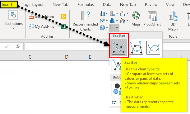
We can find the scatter charts in excel under the INSERT menu CHART group, which is shown in the below screenshot.
In excel, we have a list of scatter chart, which is listed below.
- Scatter with only Markers.
- Scatter with Smooth Lines and Markers.
- Scatter with Smooth Lines.
- Scatter with Straight Lines and Markers.
- Scatter with Straight Lines.
We will see the above mentioned scatter chart with a clear example where all the above graphs need X and Y values to display it.
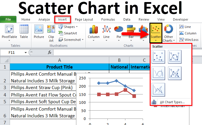
How to Create a Scatter Chart in Excel?
Scatter Chart in Excel is very simple and easy to create. Let us now see how to create Scatter Chart in Excel with the help of some examples.
You can download this Scatter Chart Excel Template here – Scatter Chart Excel Template
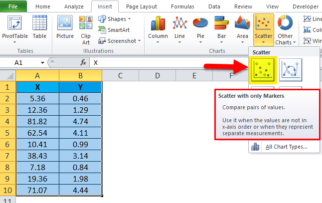
Example #1 – Using Scatter Chart with only Markers
In this example, we will see how to apply to excel scatter chart with only Markers by using the below example.
Consider the below table, which has random X and Y values as shown below.
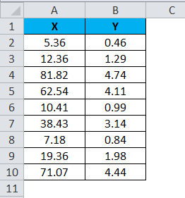
To apply the scatter chart by using the above figure, follow the below-mentioned steps as follows.
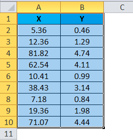
Step 1 – First, select the X and Y columns as shown below.
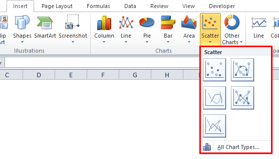
Step 2 – Go to the Insert menu and select the Scatter Chart.
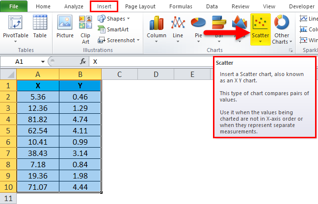
Step 3 – Click on the down arrow so that we will get the list of scatter chart list which is shown below.
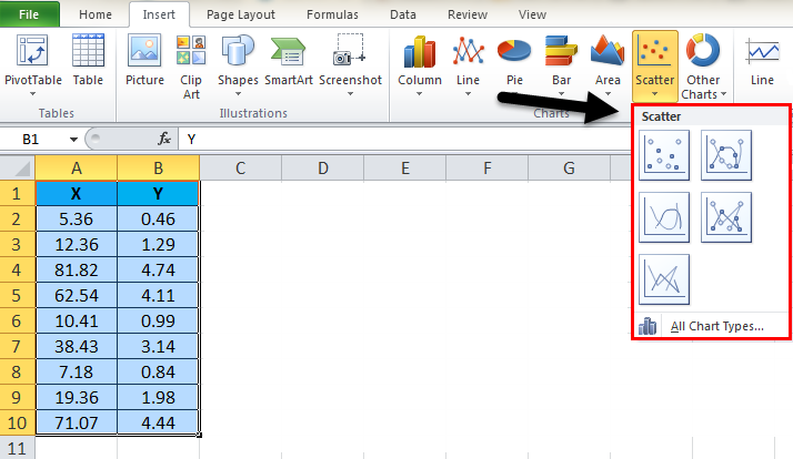
Step 4 – Next, select the first option, which shows Scatter with only Markers.
So that the selected numeric values will get displayed in markers as shown in the below result.
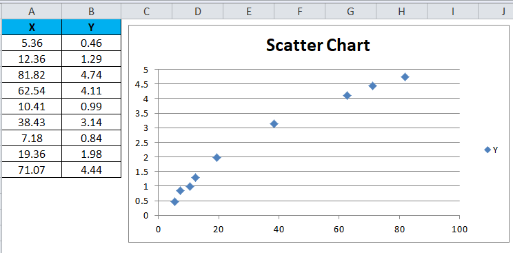
We can see that X and Y values lie between the exact figure with dots in the above result. For example, the X value 38.43 exactly lies with the Y value 3.14.
Example #2 – Using Scatter Chart with Smooth Lines and Markers
This example shows how to apply the scatter chart with a smooth line and markers. Consider the below example, which shows sales value with local and zonal.
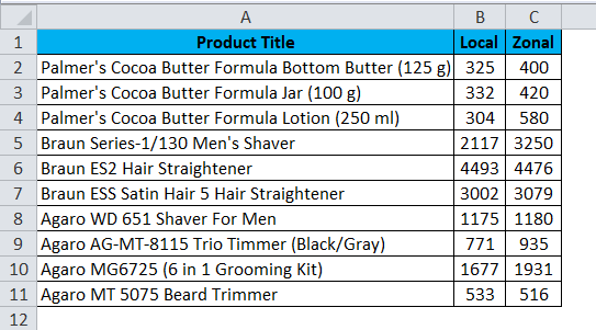
Assume that we need to compare the sales of local and zonal locations. In such a case, we can use excel scatter chat which will give us the exact result to compare it, and we can apply the Scatter Chart with Smooth Lines and Markers by following the below steps.
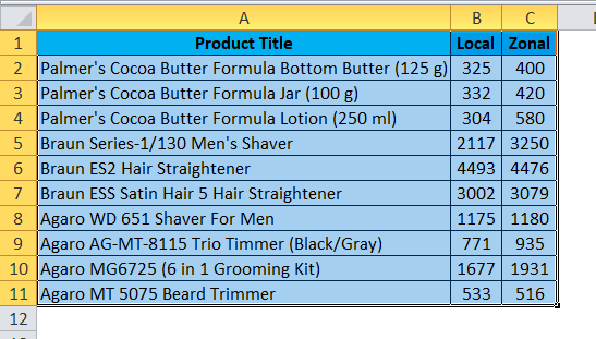
Step 1 – First, select the entire column cell A, B, and Product Title, Local and Zonal, as shown below.
Step 2 – Now go to the Insert menu and select the Scatter chart as shown below.
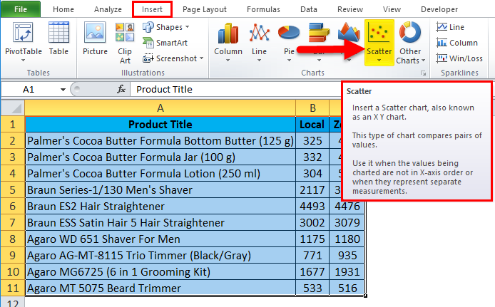
Step 3 – Click on the down arrow so that we will get a list of scatter chart as shown below.
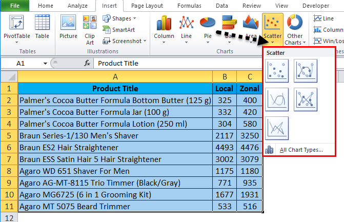
Step 4 – Click on the second scatter chart called Scatter with smooth lines and markers.
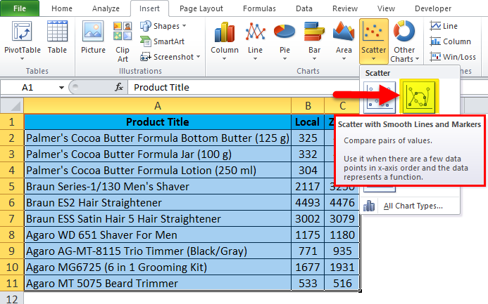
Once we select the specific chart, we will get the below output result as shown below.
In the below scatter chart, we can easily compare the sales figure, which shows up’s and downs depending on the sales value.
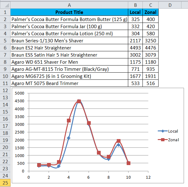
Also, we can check the scatter chart by placing the cursor on the dots so that excel will display the X and Y values, as shown below.
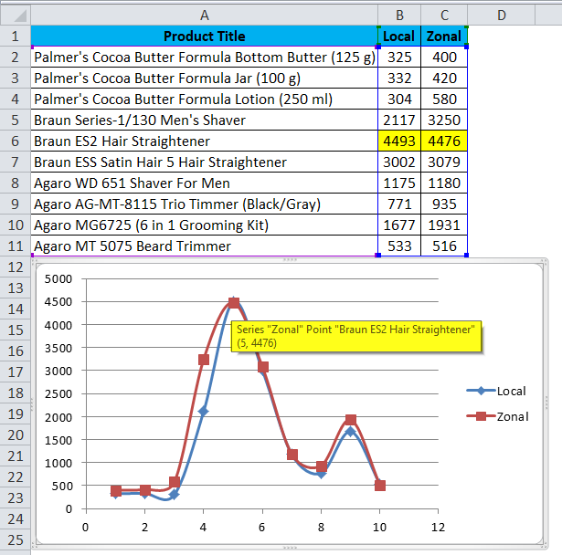
As we can see in the above screenshot, the local and zonal sales values are almost close to the product name “Braun ES2 Hair Straightener”, which shows the dotted lined with exact merge as shown above.
Example #3 – Using Scatter Chart with smooth Lines
In this example, we will see how to apply the excel scatter chart with lines using the below example.
Consider the below sales dump data which shows sales value Zonal and National wise.
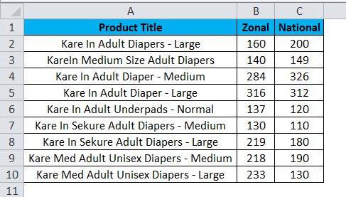
By using the above figure, we can compare the sales for Zonal and National using the scatter chart with smooth lines by following the below steps.
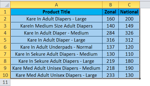
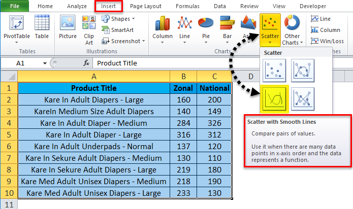
Step 1 – First, select the entire column cell A, B and C named as Product Title, Zonal and National as shown below.
Step 2 – Now go to the Insert menu and select Scatter chart with smooth lines as shown below.
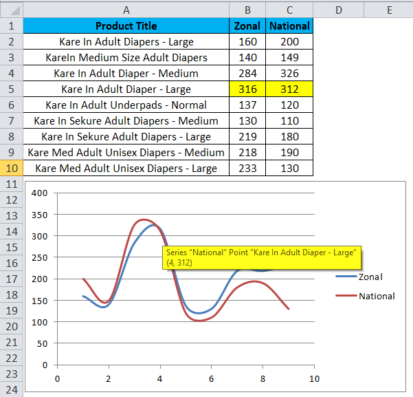
Once we click on the scatter chart with smooth lined, we will get the below output chart as shown below. In the below result, we can see that scatter chart with smooth lines which shows the comparison result for the zonal and national wise sales.
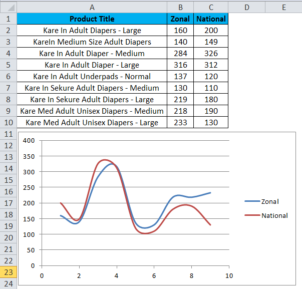
As we can check from the above screenshot, the Zonal and National Sales lines merges exactly with the Zonal sales values as 316 and National as 312, shown below.
Example #4 – Using Scatter Chart with Straight Lines and Markers
This example shows how to apply an excel Scatter chart with a straight line and markers with the below example.
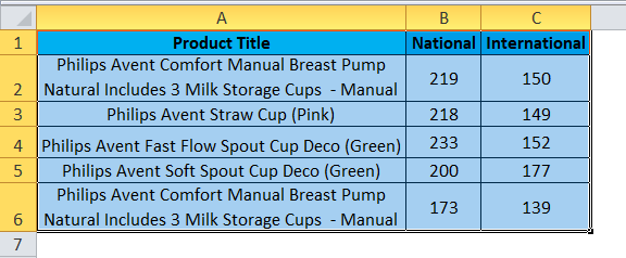
Consider the below figure, which shows sales data National and International wise. Here we can compare the sales by using the scatter chart with straight lines and markers by following the below steps.
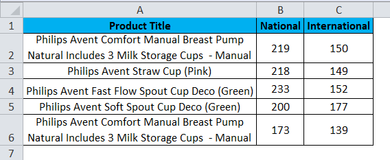
Step 1 – First, select the entire column cell A, B, and C named Product Title, National and International.
Step 2 – Now go to the Insert menu and select the Scatter with straight lines and markers as shown below.
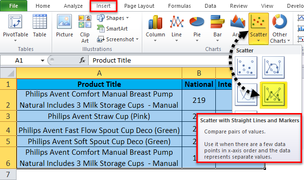
Once we click on the scatter chart with straight lines and markers, we will get the below result as shown below.
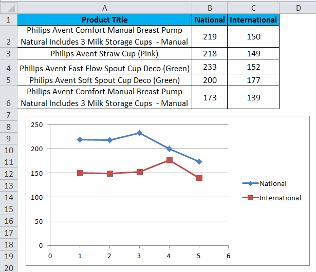
In the above screenshot, we can see the scatter chart with a straight line and markers which shows ups and down where international sales are high at 177 for the product “Philips Avent Soft Spout Cup Deco (Green)” and National sales is high at 233 for the product “Philips Avent Fast Flow Spout Cup Deco (Green)”
Things to Remember
- While using a scatter chart, always use X and Y values with correctly or else we will not get the exact chart.
- We cannot apply the scatter chart with only one values where it needs both X and Y values to display the chart in excel.
Recommended Articles
This has been a guide to Scatter Chart in Excel. Here we discuss how to create a Scatter Chart in excel along with excel examples and a downloadable excel template. You may also look at these suggested articles –
- Excel Clustered Column Chart
- Excel Scatter Plot Chart
- 3D Scatter Plot in Excel
- Excel Animation Chart
What is the Scatter Plot Chart in Excel?
A scatter plot in Excel is a two-dimensional chart representing data. It has various names, such as XY chart or scatter diagram in Excel. In addition, the scatter chart has correlated two data sets on the X and Y-axis. It is mostly used in correlation studies and regression studies of data.
The scatter plots are a set of many points on vertical and horizontal axes. The scatter charts are very important in insights since they can demonstrate the degree of connection, assuming any, between the estimations of observed quantity or values, which are also called “variables.”
Table of contents
- What is the Scatter Plot Chart in Excel?
- How to Make a Scatter Plot Chart in Excel?
- Types of Relationship in Scatter Plots in Excel
- Advantages
- Disadvantages
- Things to Remember
- Recommended Articles
How to Make a Scatter Plot Chart in Excel?
You can download this Scatter Chart Excel Template here – Scatter Chart Excel Template
- Select the two segments in the information and incorporate the headers.

- Tap on the “Inset tab,” in the “Charts” gathering, tap the “Scatter” diagram or some other as the required symbol. Select the chart which suits the information:

- Click to select the scatter plot chart which you want. After selecting the chart, you may get the chart next to the Excel data table.

- Here is the scatter plot chart after selecting the “Scatter” chart.

- We can modify the chart when required and fill the hues and lines of your decision. For instance, we can pick alternate shading and utilize a strong line of a dashed line. In addition, we can customize the graph as we want to customize it.
Click on the right-click of the scatter chart, click on the “Format Data Point” select the diagram color, and customize it as required.

- Below is a scatter plot after customizing it as required:

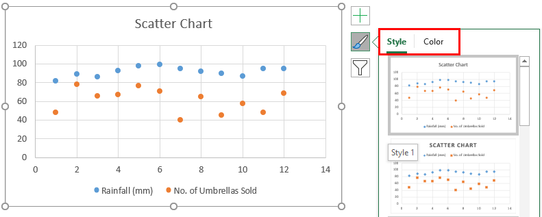
- We can change the chart style/color by clicking right on the chart and clicking on the icon mentioned below screenshot:


Types of Relationship in Scatter Plots in Excel
#1 – No Correlation: This is when there is no direct connection between the factors. E.g., computers and salaries have no relation between them.
#2 – Positive: This is the point at which the factors move similarly. E.g., salary and promotion. It means that when the employee gets an upgrade, it is obvious that their salary will increase.
#3 – Negative: This is the point at which the factors move inversely. It means that when one variable is increased, the other variable decreases. E.g., time spent playing badminton and time spent studying. It means the more time a person plays. Conversely, it leads to a decline in study time.
Advantages
- It helps to obtain the relationship between two or more variables.
- A scatter plot is the best method to show the non-linear pattern.
- Anyone can easily determine the minimum and maximum value of the range of data flow.
- Perception and reading are so clear.
- Plotting the graph is moderately basic.
Disadvantages
- A scatter plot chart does not help determine the variables’ precise relationship.
- A scatter plot chart is not a quantitative measure, which helps to get the result numerically.
- It only gives an estimated idea of the relationship.
- When data is huge, sometimes, it creates a mess on the scatter chart.
Things to Remember
- The scatter plots are exceptionally helpful tools for passing on the connection between two factors. But, first, we must realize how to utilize and interpret them legitimately.
- The variable should be in the numeric term. Otherwise, we would not be able to create the chart.
- We must choose the data carefully to avoid any error in the analysis.
- We must start practicing with small data to understand the easier analysis and use of scatter charts on data.
- We must always make your chart more attractive to show clear information using different colors.
- If you want to communicate your data through scattering, it is mandatory to understand the audition and whether they know the data. If necessary, use a line on the chart that connects the points.
- Sometimes, alternate shading for the objective information point may be improper. So, we can shade it with indistinguishable shading from whatever remains of the focuses and afterward make it emerge by applying another option.
Recommended Articles
This article is a guide to Scatter Plot in Excel. Here, we discuss how to make a scatter chart, its advantages and disadvantages, and an Excel example and downloadable Excel template. You may also look at these useful functions in Excel: –
- Excel 3D Scatter PlotA 3D scatter plot in excel is an option which the user can opt to present an XY chart, i.e., where the two data sets are graphically represented in a three-dimensional format.read more
- Plots in ExcelPlots in Excel are graphs that show how the data in two columns is related. Plots are nothing more than a scatter diagram or a scatter chart used to correlate two columns of data sets. read more
- 3D Plot in Excel3D plots is also known as surface plots in excel which is used to represent three dimensional data. To represent a three dimensional plot, three dimensional range of data which can be used from the insert tab in excel.read more
- Dynamic Chart in Excel
- Excel Open XMLXML (Extensible Markup Language) is a text-based mark-up language that stores & organizes data in a human & machine-readable format. As it follows a specific script, you need to fulfill a particular set of prerequisites for importing the data into Excel or opening Excel Data into this format. read more
Reader Interactions
Only Markers | Straight Lines
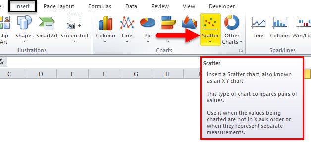
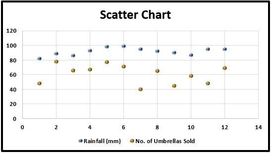
Use a scatter plot (XY chart) to show scientific XY data. Scatter plots are often used to find out if there’s a relationship between variable X and Y.
Only Markers
To find out if there is a relationship between X (a person’s salary) and Y (his/her car price), execute the following steps.
1. Select the range A1:B10.

2. On the Insert tab, in the Charts group, click the Scatter symbol.

3. Click Scatter.

Result:

Note: we added a trendline to clearly see the relationship between these two variables.
Straight Lines
To create a scatter plot with straight lines, execute the following steps.
1. Select the range A1:D22.

2. On the Insert tab, in the Charts group, click the Scatter symbol.
3. Click Scatter with Straight Lines.

Note: also see the subtype Scatter with Smooth Lines.
Result:

Note: we added a horizontal and vertical axis title. The horizontal axis of a scatter plot is a value axis, so you have more axis scaling options (the same as a vertical axis which always is a value axis).