
Sankey diagrams are used to show flow between two or more categories, where the width of each individual element is proportional to the flow rate. These chart types are available in Power BI, but are not natively available in Excel. However, today I want to show you that it is possible to create a Sankey diagram in Excel with the right mix of simple techniques.
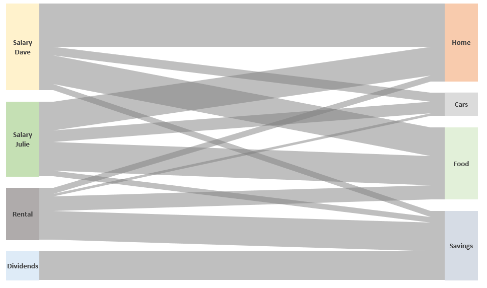
While Sankey diagrams are often used to show energy flow through a process, being a finance guy, I’ve decided to show cashflow. The simple Sankey diagram above shows four income streams and how that cash then flows into expenditure or savings.
Download the example file: Click the link below to download the example file used for this post:
Watch the video
This blog post will be slightly different from others; rather than show you how to do each step, I will demonstrate the overall approach. There are additional details covered in the YouTube video.
Watch the video on YouTube.
While I should wait to reveal the secret until the end of the post, I think it will help to explain how it all fits together if I reveal it upfront.
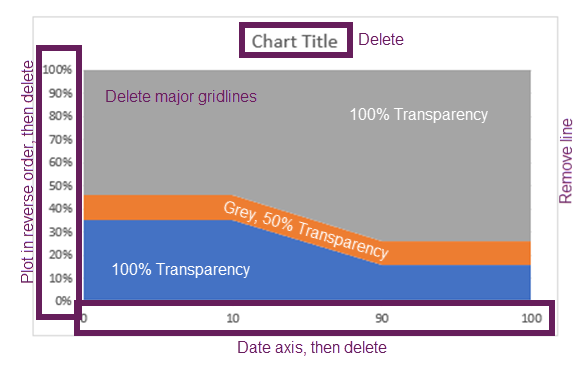
Here is the secret: the Sankey diagram you see in the example file is not one chart, far from it. There are actually 21 charts all stacked on top of each other.
The following image shows the 21 individual charts that could make up a Sankey diagram.
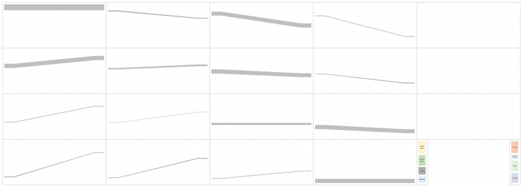
By setting the backgrounds to be fully transparent, and the shaded lines as partially transparent; overlaying the charts on top of each other creates the Sankey effect. The pillars at each end are 100% stacked column charts, which are also overlaid on top.
Now that I’ve revealed how simple this secret is, let’s look at each stage in a bit more detail. Then you will be able to create your own Sankey diagram templates.
Initial data
Our initial data is a two-dimensional table. The rows are the start point for our Sankey diagram, while the columns are the endpoint. The value at the intersection of these is the flow rate.
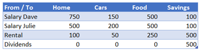
Within the template, we also have a named range called Blank. The value in here represents the spacing to be applied between each category.![]()
Interim calculation tables
To create the Sankey effect from our initial data, we need to create interim calculations.
- SankeyLines table
- SankeyStartPillar table
- SankeyEndPillar table
- Spacing named range
Let’s look at each in turn.
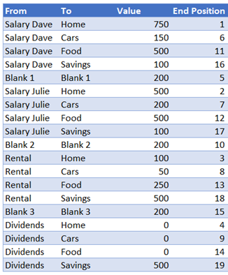
SankeyLines table
From the source data, we create a table with a row for each possible combination of rows and columns. This table is called SankeyLines table in the example file. Each row category is separated by an additional line which creates the blank spaces we see in the charts.
Our initial SankeyLines table needs to contain the following base information:
Value
The formula in the Value column is:
=IF(LEFT([@From],5)="Blank",Blank,
INDEX(SankeyData,MATCH([@From],SankeyData[From / To],0),
MATCH([@To],SankeyData[#Headers],0)))
This formula retrieves either:
- Value from the source table
- Value of the Blank named range (where it is a row used for spacing between categories).
End Position
The End Position column determines the order of the lines at the end of the Sankey diagram. Where 1 is finishes at the top, 2 is the second item from the top, etc.
SankeyLines table additional data points
To create the data for the 100% stacked area chart, we need to calculate some additional data points:
- Space above the shaded Sankey line
- Value of the shaded Sankey line
- Space below the shaded Sankey line
Our SankeyLines table needs to expand with the following calculations.
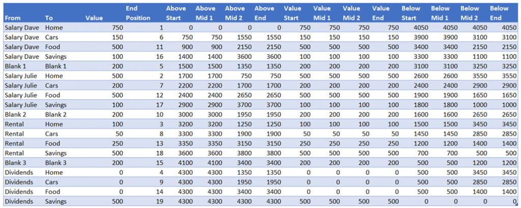
The formulas in each column are as follows:
Above Start
=SUM(SankeyLines[[#Headers],[Value]]:[@Value])-[@Value]
This calculates the amount of space required above the Sankey line at the start point.
Above Mid 1
=[@[Above Start]]
This is sent to equal the Above Start column.
Above Mid 2
=[@[Above End]]
This is set to equal the Above End column (see below)
Above End
=SUM([Value])-SUMIFS([Value],[End Position],">="&[@[End Position]])
This calculates the amount of space required above the Sankey line at the end point.
Value Start, Value Mid 1, Value Mid 2, Value End
=[@Value]
The height of the shaded Sankey line never changes. Therefore, we can set the value of all 4 columns to equal the Value column.
Below Start, Below Mid 1, Below Mid 2, Below End
The columns calculate the amount of space required below the shaded Sankey line. Each calculation is constructed the same way. It takes the SUM([Value]) then takes away the value from the equivalent Start, Mid 1, Mid 2 or End columns.
Below Start:
=SUM([Value])-[@[Above Start]]-[@[Value Start]]
Below Mid 1:
=SUM([Value])-[@[Above Mid 1]]-[@[Value Mid 1]]
Below Mid 2:
=SUM([Value])-[@[Above Mid 2]]-[@[Value Mid 2]]
Below End:
=SUM([Value])-[@[Above End]]-[@[Value End]]
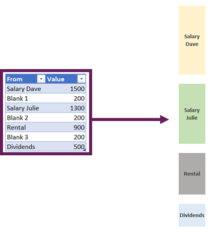
SankeyStartPillars table
The SankeyStartPillar table is reasonably easy to understand. It just needs each row category from the source data listed with a “Blank” item in between.
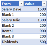
The formula for the Value column is:
=SUMIFS(SankeyLines[Value],SankeyLines[From],[@From])
End pillars
The SankeyEndPillar table is similar to the SankeyStartPillar table. It just needs each column category from the source data listed with a “Blank” item in between.
The formula for the Value is:
=SUMIFS(SankeyLines[Value],SankeyLines[To],[@To])
Spacing named range
The final part of the interim calculations is a named range called Spacing. This is used as the Category (horizontal) Axis for the chart. It determines at what point the slope of the chart starts and finishes.
![]()
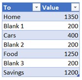
Chart layering
Once all the interim calculations are ready, the chart creation can begin.
Create the individual shaded Sankey lines
Each row of the SankeyLines table needs to be a separate 100% stacked area chart with 3 data series:
Once the chart has the correct series data, it then all comes down to formatting.
After all the formatting has been completed the chart will become a single grey line.
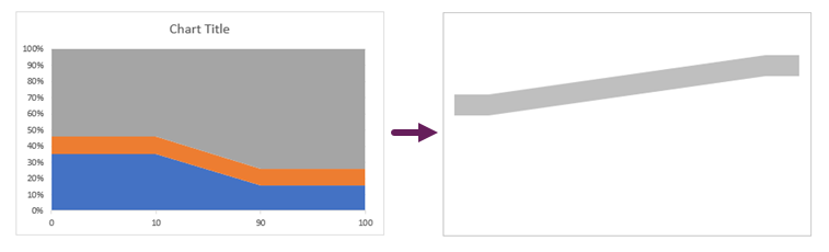
If the row in the SankeyLines table starts with “Blank”, then technically it can be deleted, however for completeness, I prefer to keep it there, but set it to No Fill. It means that if I ever need to use it, I can just change the fill color and it can be used as a standard shaded Sankey line.
Once all the shaded Sankey lines have been created, they can be overlaid on top of each other.

Create the Sankey pillars
Most of the hard work has now been completed. We just need to create two 100% stacked column charts—one for the start pillar and one for the end pillar.
The pillars are set to be formatted as follows:
- Plot series in reverse order
- Your preferred fill colors
- Set the “Blank” sections with No Fill
- Add data labels to the relevant points.
After all of that, we overly the pillars on top of our chart. Finally, our Sankey diagram is complete.
Conclusion
That’s it. Individually there is nothing too difficult with any of the techniques involved. But they need to be combined in the right way to create the Sankey effect. Initially, this takes quite a long time to create, but once set-up, it can be used over and over with different categories. It’s definitely the case of invest the time once, to create a template big enough then and reuse it.
Related Posts:
- Ultimate Guide: VBA for Charts & Graphs in Excel (100+ examples)
- Variable width column charts and histograms in Excel
- Creating custom Map Charts using shapes and VBA

About the author
Hey, I’m Mark, and I run Excel Off The Grid.
My parents tell me that at the age of 7 I declared I was going to become a qualified accountant. I was either psychic or had no imagination, as that is exactly what happened. However, it wasn’t until I was 35 that my journey really began.
In 2015, I started a new job, for which I was regularly working after 10pm. As a result, I rarely saw my children during the week. So, I started searching for the secrets to automating Excel. I discovered that by building a small number of simple tools, I could combine them together in different ways to automate nearly all my regular tasks. This meant I could work less hours (and I got pay raises!). Today, I teach these techniques to other professionals in our training program so they too can spend less time at work (and more time with their children and doing the things they love).
Do you need help adapting this post to your needs?
I’m guessing the examples in this post don’t exactly match your situation. We all use Excel differently, so it’s impossible to write a post that will meet everybody’s needs. By taking the time to understand the techniques and principles in this post (and elsewhere on this site), you should be able to adapt it to your needs.
But, if you’re still struggling you should:
- Read other blogs, or watch YouTube videos on the same topic. You will benefit much more by discovering your own solutions.
- Ask the ‘Excel Ninja’ in your office. It’s amazing what things other people know.
- Ask a question in a forum like Mr Excel, or the Microsoft Answers Community. Remember, the people on these forums are generally giving their time for free. So take care to craft your question, make sure it’s clear and concise. List all the things you’ve tried, and provide screenshots, code segments and example workbooks.
- Use Excel Rescue, who are my consultancy partner. They help by providing solutions to smaller Excel problems.
What next?
Don’t go yet, there is plenty more to learn on Excel Off The Grid. Check out the latest posts:
Any great story means great details and strategic use of visuals.
Besides, it’s a proven fact people don’t like numbers. They are interested in insights. So how can you represent insights in a simple and compelling way?


You guessed it right. The solution is incorporating easy-to-read charts into your data story. Sankey Chart for Excel version is one of the easiest charts to understand in the world of data visualization.
Table of Content:
- Sankey Chart Definition
- Components of a Sankey Chart
- How to Create Sankey Diagram in Excel? Step by Step Guide with Example
- Why should you use Sankey?
- Best Tool to Use to Visualize Data Using Sankey in Excel
- How to Install ChartExpo In Excel To Access Sankey For Free
- Data Storytelling with Sankey Charts
- Wrap Up
Video Tutorial:
What is A Sankey Chart in Excel?
Definition: Sankey Chart visualizes “a flow” from one set of values to the next. The two items being connected are referred to as “nodes.” The connections are labeled as “links.”
Besides, it’s named after an Irishman, Capt. Matthew Sankey, who first used them in a publication on the energy efficiency of a steam engine in 1898. Sankey diagrams were initially used to visualize and analyze energy flows, but they’re a great tool to depict the flow of money, time, and resources.
Directional arrows between the nodes show the flows in:
- Processes
- Production system
- Supply chain
Let’s head to the next section where you’ll learn the building blocks of the Sankey diagram.
Components of a Sankey Chart in Excel
A Sankey is a minimalist diagram that consists of the following:
- Nodes: This is an element linked by “Flows.” Furthermore, it represents the events in each path.
- Flows: Flows link the nodes. And each flow is specified by the names of its source and target nodes in the “from” and “to” fields. Besides, the value in the width field defines the thickness of the flow.
- Drop-offs: A drop-off is a flow without a target node.
This brings us to the meaty part of the blog: the best tool to use to create a Sankey Chart in Excel that complements your data story.
Please pay attention because this is one of the essential parts of the blog.
How to Create Sankey Diagram in Excel – Step by Step Guide with Example?
Creating a Sankey diagram in Excel is very easy if you have ChartExpo add-in installed. You just need to select the Sankey diagram, check the sample data provided with this chart, replace the data with your own data and in one click your visualization will be ready.
Storytelling with data is the best way to present your data in a meaningful way. Sankey is one of the best visualizations which gives colors and life to your data story. Let’s have one practical application of the Sankey diagram.
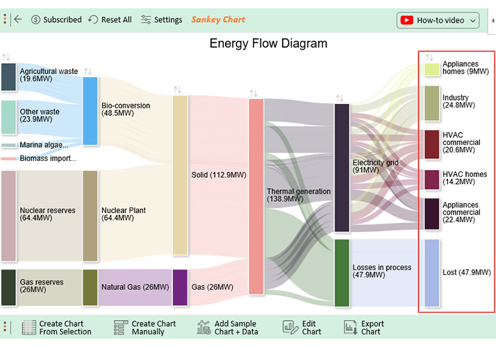
Energy Management Application
Imagine you’ve been tasked by the Energy Commission of a hypothetical country to analyze their gigantic data. They want to know various details about domestic energy consumption, namely:
- The contribution of each energy-generating source
- The amount of energy lost
- The energy contribution of cleaner and greener sources
- Common uses of energy by consumer segments (commercial versus domestic use)
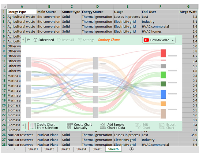
The Energy Commission wants a data story to use for the forthcoming launch of their 10-year Plan. The table below has the sample data we’ll use for the scenario above.
Note: the table below is pretty long to show you that Sankey can visualize gigantic data sets without obscuring key insights.
Apologies in advance if you find the table below weirdly long.
| Energy Type | Main Source | Source type | Energy Source | Usage | End-User | MegaWatt |
| Agricultural waste | Bio-conversion | Solid | Thermal generation | Losses in process | Lost | 5 |
| Agricultural waste | Bio-conversion | Solid | Thermal generation | Electricity grid | Industry | 7.3 |
| Agricultural waste | Bio-conversion | Solid | Thermal generation | Electricity grid | Heating and cooling – commercial | 5.1 |
| Agricultural waste | Bio-conversion | Solid | Thermal generation | Electricity grid | Heating and cooling – homes | 3.7 |
| Agricultural waste | Bio-conversion | Solid | Thermal generation | Electricity grid | Lighting & appliances – commercial | 4.9 |
| Agricultural waste | Bio-conversion | Solid | Thermal generation | Electricity grid | Lighting & appliances – homes | 2 |
| Other waste | Bio-conversion | Solid | Thermal generation | Losses in process | Lost | 7.2 |
| Other waste | Bio-conversion | Solid | Thermal generation | Electricity grid | Industry | 5.4 |
| Other waste | Bio-conversion | Solid | Thermal generation | Electricity grid | Heating and cooling – commercial | 6.7 |
| Other waste | Bio-conversion | Solid | Thermal generation | Electricity grid | Heating and cooling – homes | 4.8 |
| Other waste | Bio-conversion | Solid | Thermal generation | Electricity grid | Lighting & appliances – commercial | 7.4 |
| Other waste | Bio-conversion | Solid | Thermal generation | Electricity grid | Lighting & appliances – homes | 2.5 |
| Marina algae | Bio-conversion | Solid | Thermal generation | Losses in process | Lost | 0.7 |
| Marina algae | Bio-conversion | Solid | Thermal generation | Electricity grid | Industry | 0.5 |
| Marina algae | Bio-conversion | Solid | Thermal generation | Electricity grid | Heating and cooling – commercial | 0.9 |
| Marina algae | Bio-conversion | Solid | Thermal generation | Electricity grid | Heating and cooling – homes | 0.5 |
| Marina algae | Bio-conversion | Solid | Thermal generation | Electricity grid | Lighting & appliances – commercial | 0.8 |
| Marina algae | Bio-conversion | Solid | Thermal generation | Electricity grid | Lighting & appliances – homes | 0.6 |
| Land-based bioenergy | Bio-conversion | Solid | Thermal generation | Losses in process | Lost | 1.3 |
| Land-based bioenergy | Bio-conversion | Solid | Thermal generation | Electricity grid | Industry | 2.5 |
| Land-based bioenergy | Bio-conversion | Solid | Thermal generation | Electricity grid | Heating and cooling – commercial | 3.2 |
| Land-based bioenergy | Bio-conversion | Solid | Thermal generation | Electricity grid | Heating and cooling – homes | 0.7 |
| Land-based bioenergy | Bio-conversion | Solid | Thermal generation | Electricity grid | Lighting & appliances – commercial | 1.4 |
| Land-based bioenergy | Bio-conversion | Solid | Thermal generation | Electricity grid | Lighting & appliances – homes | 0.9 |
| Biomass import | Bio-conversion | Solid | Thermal generation | Losses in process | Lost | 0.4 |
| Biomass import | Bio-conversion | Solid | Thermal generation | Electricity grid | Industry | 0.7 |
| Biomass import | Bio-conversion | Solid | Thermal generation | Electricity grid | Heating and cooling – commercial | 0.8 |
| Biomass import | Bio-conversion | Solid | Thermal generation | Electricity grid | Heating and cooling – homes | 0.3 |
| Biomass import | Bio-conversion | Solid | Thermal generation | Electricity grid | Lighting & appliances – commercial | 0.6 |
| Biomass import | Bio-conversion | Solid | Thermal generation | Electricity grid | Lighting & appliances – homes | 0.2 |
| Nuclear reserves | Nuclear Plant | Solid | Thermal generation | Losses in process | Lost | 50 |
| Nuclear reserves | Nuclear Plant | Solid | Thermal generation | Electricity grid | Industry | 13 |
| Nuclear reserves | Nuclear Plant | Solid | Thermal generation | Electricity grid | Heating and cooling – commercial | 8 |
| Nuclear reserves | Nuclear Plant | Solid | Thermal generation | Electricity grid | Heating and cooling – homes | 6 |
| Nuclear reserves | Nuclear Plant | Solid | Thermal generation | Electricity grid | Lighting & appliances – commercial | 11 |
| Nuclear reserves | Nuclear Plant | Solid | Thermal generation | Electricity grid | Lighting & appliances – homes | 4 |
| Coal reserves | Coal | Solid | Thermal generation | Losses in process | Lost | 4.7 |
| Coal reserves | Coal | Solid | Thermal generation | Electricity grid | Industry | 3.1 |
| Coal reserves | Coal | Solid | Thermal generation | Electricity grid | Heating and cooling – commercial | 4.2 |
| Coal reserves | Coal | Solid | Thermal generation | Electricity grid | Heating and cooling – homes | 0.7 |
| Coal reserves | Coal | Solid | Thermal generation | Electricity grid | Lighting & appliances – commercial | 4.8 |
| Coal reserves | Coal | Solid | Thermal generation | Electricity grid | Lighting & appliances – homes | 0.5 |
| Gas reserves | Natural Gas | Gas | Thermal generation | Losses in process | Lost | 5.1 |
| Gas reserves | Natural Gas | Gas | Thermal generation | Electricity grid | Industry | 8.4 |
| Gas reserves | Natural Gas | Gas | Thermal generation | Electricity grid | Heating and cooling – commercial | 7.9 |
| Gas reserves | Natural Gas | Gas | Thermal generation | Electricity grid | Heating and cooling – homes | 4.8 |
| Gas reserves | Natural Gas | Gas | Thermal generation | Electricity grid | Lighting & appliances – commercial | 7.3 |
| Gas reserves | Natural Gas | Gas | Thermal generation | Electricity grid | Lighting & appliances – homes | 3.5 |
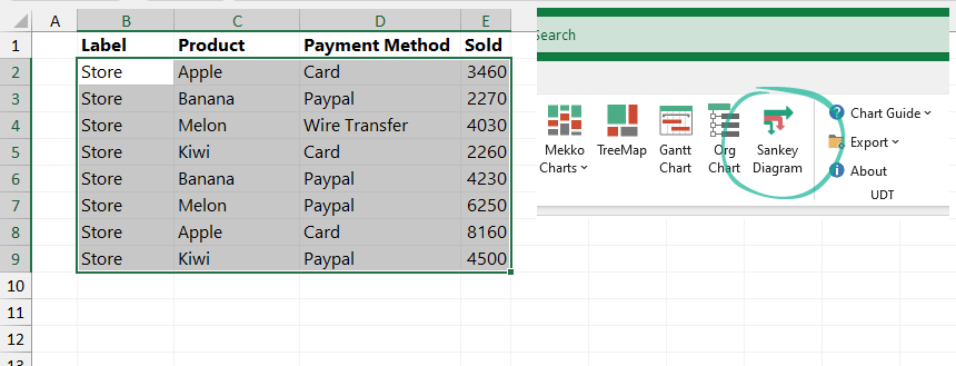
Let’s unleash ChartExpo Add-in on this data.
Follow the incredibly simple and easy steps below to visualize your data using Sankey Charts.
- Click on Add-ins > ChartExpo > Insert, as shown below

- Click Sankey Chart.

- Select the variables: Type, Main Source, and Source type, Energy Source, Usage, End User, Mega Watt .
- Click on Create Chart from sheet data, as shown below.
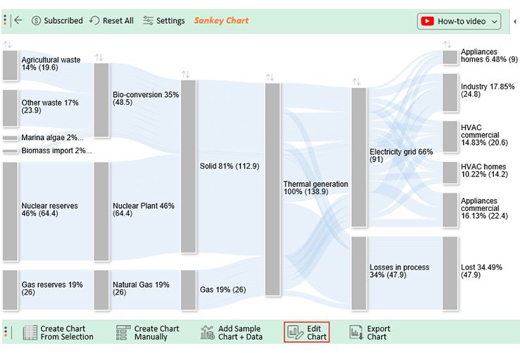
Let’s check out our resulting chart.

- You have the freedom to edit the chart to highlight key Just press the Edit Chart button, as shown above.
Check our resulting chart after editing.

Insights
- Energy from cleaner sources
- Energy from nuclear sources

- The amount of energy

- The amount of energy used for industrial purpose

As you’ve seen above in the Energy Flow Diagram generated using Sankey Chart, I’ve cherry-picked the insights that are relevant to the data story. Congratulations if you’ve reached this point. The long but insightful journey is coming to a conclusion.
If you have not installed ChartExpo yet or having any kind of difficulty installing it you can watch out guide to install ChartExpo for Excel next in the blog.
Why should you use Sankey?
- Sankey Charts for Excel spreadsheet allows you to show complex processes visually, with a focus on a single aspect or resource that you want to highlight.
- Sankey offers the added benefit of supporting multiple viewing levels.
Besides, audiences can get a high-level view, see specific details, or generate interactive views.
- These visualization charts make dominant contributors or consumers stand out. So your audience can see critical insights, such as relative magnitudes and areas with the largest opportunities.
Let’s assume you have data from different but interlinked segments. You’ve noticed that there’s a leakage point. And you want to bring this to the attention of your company management.
How would you go about it?
You guessed it absolutely right. A data story is a very powerful tool you can use to persuade the management to act on your recommendations.
But then, how would you make this story irresistible?
You need to use simple and easy-to-interpret visualizations. You don’t want your audience to drown in confusion trying to decode insights from a chart. This is a morale killer.
A Sankey is strategically positioned to visualize the data scenario above. And this is because it can help paint a vivid picture of the leakage in the audience’s minds (in our case, company management). Yes, you heard that right.
This chart will show the exact points where the leakage is occurring. Like we said earlier, leakages, also known as drop-off zones, are flows without a target node.
Choosing relevant and easy-to-interpret charts makes it easy for your audience to understand and engage with the data.
The Best Tool to Use to Visualize Your Data Using Sankey Diagram in Excel
Before we delve right into the tools you can use, we’ll answer the question that’s lingering in your mind.
Where can you apply Sankey Charts for Excel?
Like we said earlier, these charts are strategically positioned to visualize data with flow characteristics, namely:
- Supply chain management
- Energy management
- Cash Flow Diagrams for budget and revenue allocation
- The flow of customers in a website (digital marketing)
- Survey analysis
We’ll later cover energy management use in detail in the coming section. Keep reading to avoid missing this highly insightful part of the blog.
Let’s talk about Excel because it is one of the most used tools for visualizing data besides Google Sheets. This spreadsheet app is incredibly popular because it’s easy to use. Besides, it has been there for decades, making it familiar to almost anyone who works with data.
So how can you use Excel to create Sankey Charts that are easy to read and interpret?
Remember, for a data story to be compelling to your target audience, it should have charts that lend clarity. You don’t want any critical insight to be obscured by unnecessary stuff, such as heavy colors.
We’re sorry to disappoint you, but Excel does not have Sankey templates.
Yes, you heard that right. Even Microsoft Office 365, which is the most updated version, doesn’t have Sankey templates.
So What’s The Solution?
The solution is not to ditch your beloved Excel. No, we’re not advocating you to do away with the spreadsheet tool you’ve probably known since childhood.
You need to supercharge it with an add-in to make it a reliable partner for data visualization.
Microsoft knew very well it’s impossible to cater to all the data visualization needs you may have. And that’s why they came up with an app store where you can access third-party add-ins to get various specialized tasks done with ease.
Well, there’s a reliable and incredibly easy-to-use add-in called ChartExpo. And it comes jam-packed with Sankey templates and other 80-plus charts.
What is ChartExpo?
ChartExpo is a cloud-hosted add-in that transforms your Excel spreadsheet app into a highly responsive data visualization tool.
Wait! That’s not all.
This highly affordable data visualization tool comes with over 80 chart templates to grant you a broader choice of visuals to select. With ChartExpo, you don’t need to know programming or coding. Yes, it’s that easy peasy to use.
When you’re curating a data story, feel confident you have a reliable data visualization buddy on your side. ChartExpo provides you unlimited freedom to customize your Sankey Chart.
Remember, you can highlight the key insights you want your audience to take in with ease. You just need a few mouse clicks to access a Sankey Chart for Excel that fits seamlessly within your data narrative.
More Money-saving Benefits For You!
- ChartExpo has an in-built library with 80-plus charts to ensure you’ve got enough stock to test for the best.
- ChartExpo add-in for Excel comes with a free 7-day trial.
- Essentially, if you’re not satisfied with the tool within a week, you can opt out as quickly as signing up for a trial.
- The number of paying users after the trial period is a staggering 80%. And this means that ChartExpo does not disappoint.
- ChartExpo add-in is ONLY $10 a month after the end of the trial period.
- You have a 100% guarantee that your computer or Excel application won’t be slowed down. If it does, just opt out of the risk-free 7-day trial.
- You can export your insightful, easy-to-read, and intuitive charts in JPEG and PNG: the world’s most-used formats for sharing images.
Let’s head to the meaty part of the blog: the section where you get to practice what you’ve learned. Follow the simple steps below in preparation for the next section.
How to Install ChartExpo In Excel To Access Sankey For Free?
To Get Started with ChartExpo for Excel add-In, follow the Simple and Easy Steps Below.
- Open your Excel application (Excel 2013 with sp1) or later).
- Open the worksheet and click on the INSERT menu
- You’ll see the My Apps option.
- Click on My Apps and then click on See All.

- You will see the screen, as shown in the screenshot below.
- Search for ChartExpo Add-in on my Apps Store.
- Click on the Insert button.
- The add-in will be added to the Excel application, as shown in the screenshot below.
- Log in with your Microsoft account or create a new account by clicking the Create New link
- Login with the newly created account and start using the add-in.
- Enter your newly created account and start using the ChartExpo add-in. You’re only required to log in for the first time. Next time, ChartExpo won’t ask for your details again.
- Now you can start using ChartExpo for Excel to access incredible Sankey visualization of your data.

- You’ll see an extensive library of visual charts categorized into 6 different groups.
- More so, you can expand any group by clicking on it to see a list of available visualizations.

- Click on the Sankey Chart button (red box), as shown
Now you have a clue about why data stories matter to you, let’s delve into its core building blocks.
5 Building Blocks of a Compelling Data Story
#1: Select the Best Chart for Your Data Narrative
Selecting the best visualization possible to highlight key insights in a narrative depends on your goals. Yes, it depends on the key takeaway you want to communicate to your audiences.
If you’ve ever been a victim of boring, long, and disorganized presentations and meetings, raise your hand.
We’re kidding, just give us a slight nod.
Well, one of the biggest fails in storytelling with data is the use of charts haphazardly. Different charts come with different uses. So your choice of data is influenced by multiple factors, such as the target audience type, nature of the data, and most importantly, the main goal.
#2: Context
Data storytelling needs context. Yes, it requires an understanding of the circumstances that surround each metric (variable). These circumstances (usually in the form of related data sets or events) shed light on information that would otherwise be nothing more than rows of numbers in a spreadsheet.
Essentially, context turns facts into actionable information and – in the end – decisions that have a positive impact on your business or company.
Simply put, the context of your data environment is the situation that created the data.
Let’s say you’re in the education sector. If you’re drawing enrollment data from multiple universities, each campus is its own data environment. If one university increases funding for scholarships while others don’t, that school might see increased student enrollment and retention.
When comparing that particular school with others, it’s important to take those environmental factors into consideration to gain a better understanding of your data and its implications.
So creating contextual labels provides guidance for your audience.
Creating context, therefore, is your responsibility, as a data storyteller. There are many methods to create context (labeling, chart choice, color, etc.). Remember, a line graph and a scatter chart can hold the same data but communicate different ideas.
The key is to understand what you need to communicate and then find the right visual elements to convey it.
Ask these questions: what is the message, and what base information does my audience need to understand that message? If, for example, you need your audience to understand why website traffic suddenly increased, consider a month-over-month graph and an area chart to help them understand. By illuminating different angles of the same information, you give your data context and – most importantly – help your audience see the context.
#3: Audiences
We’re sure you get motivated to tell your story more and more if people are listening. Yes, the listening factor matters a lot to the progress of any story.
Just imagine trying to communicate a story to people who aren’t paying attention.
It hurts, right?
In data storytelling, you can refocus your audience’s attention to particular insights with strategic use of colors and the size of the chart.
Take a look at the screenshot below: Can you spot the two-digit number repeating in the cluster of numbers shown below?

Now, answer the question above using the screenshot below. Which two digit repeating numbers are there in our data?

Of course, it’s easier to spot the answers. And this is because of strategic highlighting of the details we want you to see. Similarly, you should deploy this strategy of highlighting the insights you want your listeners to take home when storytelling with data.
Rather than let your audience do all the work, make the findings easier to cherry-pick with strategic use of colors.
And this brings us to the other crucial element that can make or break your data story.
#4: The Key Takeaway
The key takeaway is the theme of your presentation. Essentially, this is the part that answers the ‘So what?’ question.
For instance, you’ve just discovered that sales in March and April have declined. What would be the key takeaway for the scenario above?
“In March and April, our sales declined 25%, thereby erasing all the gains we made in the third quarter because:
- An increase in the number of product returns
- Refunds
We should investigate further into the product development process to know the cause of the money-draining problem”.
For you to create a compelling big idea, you’ve got to know your presentation very well. And I mean inside-out. The section can boil down into a sentence or a paragraph.
And this brings us to the critical part of your data story: the action you want your audience to take.
#5: Call for Action
Insights have little value if you don’t recommend action, such as whether to invest or divest.
Providing actionable information is, after all, the goal of good data visualization and storytelling. And it’s thinking through the layers and making sure there’s continuity between where your story starts and its ending.
After doing all this, how do you make your story compelling?
This other section provides you with the fundamental building blocks of a story.
So how can you tell a story with your data?
Use the steps below to get started.
i Pick a Narrative for your Data
The first step to telling a good data story is to uncover a story worth telling. And you can start by asking a question or forming a hypothesis, then compiling and digging into relevant data to find answers.
As you consider your data story, ask:
- What are you trying to explain?
- What are your goals?
There are several ways to approach data to uncover a story—and the story you set out to tell may not end up being the story you find. As you analyze your data, consider using the following approaches to help you identify a theme and develop a structure for your story:
ii. Identify Trends and Relationships in your Data
What connections do you see between data? And are there interesting or surprising correlations?
These relationships can provide a compelling foundation for a story.
Let’s talk about trends.
For starters, trends indicate the direction of change.
It can go either upwards or downwards. For example, is there growth in a particular product or service your business offers? Or maybe you want to know your website traffic patterns over time—you may discover that certain days or times tend to be higher or lower volume.
Identifying new or evolving trends in your data is crucial.
iii- Look for Outliers
Outliers are one-off occurrences you may spot in your data. And data that doesn’t fit in with the rest of your data settings can be just as valuable for you. Look for outliers and ask questions. Besides, pay attention to any data that is counterintuitive or surprises you.
- Why is the data behaving that way?
- And what is the cause?
- Are there any results that you didn’t expect?
- What might be the cause for those results?
iv-Mind your Audience
Always be aware of your audience when developing and sharing your data narratives. And if the story you want to tell isn’t relevant or interesting to your intended audience, it won’t have the impact you want.
As you build your data narrative, ask yourself:
- Who is my audience?
- Is this story relevant to my audience? Does it solve a problem they care about or provide needed insight?
Your audience’s age, demographics, job, and subject matter expertise influence how they understand and respond to your stories. Besides, it should inform how you tell your narrative.
So if you’re speaking to a room full of engineers, you may want to provide more technical details and dig into the data sets more thoroughly as you tell a story. However, an audience of executives will likely be looking for simplified data with clear insights.
Develop a habit of customizing your story and approaching it from different angles depending on your audience.
v-Use Visuals to Complement your Data Story
Lastly, a good data story needs visuals. Charts, such as Sankey Charts for Excel are a powerful way to engage your audience and improve retention—especially when communicating with non-technical audiences.
Visualizing your data story enhances understanding at every level by simplifying the information, highlighting the most important data, and most importantly, communicating critical insights quickly.
There are many ways to visualize your data, including:
- Flowcharts
- Bar graphs
- Infographics
- Pie charts
- Scatterplots
- Sankey diagrams
So how can you tell a data story with Sankey?
Data Storytelling with Sankey Charts
This section is full of golden tips and strategies that can take your data storytelling skills to the next level. Yes, the level where you move audiences without struggle or breaking a sweat.
So why is data storytelling important?
Data without a story lacks impact for two reasons, namely:
The data seldom comes distilled. And this means you don’t necessarily need more data to solve your problems or uncover opportunities. But you do need to identify and communicate value from the data you already have.
Secondly, data on its own cannot support your key takeaway. And this makes it difficult for our audience to grasp the actionable “news” it brings quickly.
-
Stories Attract and Maintain Audiences
We live in a world characterized by information overload, ads, and trend news. So it takes strategic use of emotional triggers, such as captivating narratives, to capture their full attention of the target audience.
So if you have numbers and want to explain their changes to any form of the audience (including engineers): use stories. And you’ll find your audience taking action you desire at the end of it all.
-
Numbers Without Stories are Boring.
Like we said earlier, numbers without stories are pretty much noise. So if you want your audience to tune their ears to you, you need to arouse their emotions. Stories have been tested and proven to do so.
Use stories to transform your data into actionable insights to empower data-driven decision-making in your organization.
So let’s agree that numbers without captivating narratives are pretty dry and less attractive to audiences. And this brings us to the other crucial benefit.
-
Stories Communicate Insights with Unmatched Clarity.
One of the core ingredients of a compelling story is simplicity in details. You might have stumbled upon a fascinating insight in your data that either communicates opportunity or impending risks.
But your problem is to share these insights with the decision-makers for action-taking. Use data narrative for a change. There’s no doubt that stories can lead your audiences in the direction you want.
This implies that if you use this visualization strategically to support your data story, you’ll move audiences in the direction you want. As Aristotle put it thousands of years ago, the building blocks of a persuasive narrative are logos (appeal to logic), ethos (appeal to emotions), and pathos (personality). Charts, which transform abstract numbers into insightful diagrams that appeal to the logic part of our brains.
For you to nail your data story, you have to get the chart part right.
You see, the human brain processes visual content over 60,000 times faster than texts and numbers. And this creates a strong case for incorporating relevant visuals into your data story.
Storytelling with data can be intimidating, especially if you’re not an expert in data visualization. To create a compelling data story, you need a strategy, a plan, a thesis statement, and most importantly, an easy-to-use visualization tool.
In this blog post, we’ve rounded up thought-provoking tips, how-to strategies, and other ingredients to help you craft compelling data stories using Sankey Chart for Excel.
These tips are tested and proven.
We use them to create compelling and actionable narratives for our clients, presentations, and meetings. And every time we use them, we get an overwhelming response.
We hope you’ll gain immense value from the blog.
FAQs:
-
How do I create a Sankey Chart in Excel?
Excel spreadsheet does NOT have Sankey templates. To create a Sankey chart in Excel, start by installing an external ChartExpo Add-in. And then, browse to find the Sankey chart. It’s the first chart in ChartExpo’s ultra-friendly user interface. Use this chart to visualize flows and processes in business settings.
-
How can you create a Sankey Chart in Excel?
Now it’s possible to create a Sankey chart using ChartExpo Add-in for Excel. No matter how complex your data is, you can trust Sankey to get the job done.
ChartExpo provides you with unlimited freedom to customize your charts to highlight key insights supporting your data story.
-
Can you make a Sankey Chart in Google Sheets?
Yes. You can achieve this by downloading and installing ChartExpo Add-on in your Google Sheets. And this is because Google Sheets lacks chart templates for Sankey. This version of ChartExpo (Google Sheets Add-on) is the same as the one for Excel with regard to the user interface. You can also refer to our guide on Sankey Diagram Google Sheets to create Sankey Chart.
-
What is the use of the Sankey diagram?
If your data represents some processes, transfer flows, and relationships: then Sankey is the best option to use for your data story. You can use this chart for visualizing the following classes of data:
- Energy management
- Supply chain
- Revenue flow
- Visits to websites (funnels in digital marketing) etc.
- Survey analysis
-
How do you read a Sankey Chart in Excel?
First, you need to identify the Sankey categories. These categories can be read from either of the sides: left to right or right to left.
Typically, we read everything including books and charts from the left side. We suggest you read charts including Sankey from the left.
-
Why is it called a Sankey diagram?
Sankey diagram was named after Irish captain Captain Matthew Henry who first used this diagram in 1898 to visualize the energy efficiency and losses of a steam engine. Initially, these charts were confined to engineering fields. But now you can use them to visualize various aspects of the business.
Wrap Up:
Sankey Charts for Excel is among the best charts you can use to make your data narrative irresistible to your audiences. This chart is amazingly easy to read and interpret. You can bet on it to highlight the key insights supporting the thesis statement of your data story. You can draw this chart with very easy steps by using ChartExpo library in Excel.
Diagramming can get tough when it comes to Sankey charts, especially because of the fact that it doesn’t come with standard flowchart or tree diagram templates. But, with special add ins like Power User, the process does become a lot easier and more streamlined that what you could even think of.
To be honest, creating a Sankey diagram with Power User on MS Excel takes you about 5-10 minutes, even with all the customizations. It is the data entry part that takes you the maximum time. So, if you have been wondering how to draw a Sankey diagram in Excel, follow through the steps that we have mentioned below.
Before we shed some light on the step by step breakdown of how to draw Sankey charts in Excel, we would like to give a brief description of what Sankey charts actually are.
The Sankey charts or diagrams are a form of flow diagram which helps in representing the flow rate, ensuring that the width of the diagram is proportional to the flow rate as well.
- Also check: Sankey Diagram in Tableau Tutorial here.
This helps in highlighting the primary energy flow involved in any process, be it with the energy or even with the money involved in a process.
Best Charts, Graphs, and Diagram Tools
- 10 Best Online Chart Maker of 2023
- 10 Best Microsoft Visio Alternatives 2023
- 10 Best Org Chart Maker of 2023
- 10 Best UML Diagram Tools 2023
- 10 Best Entity Relationship Diagram (ERD) Tools 2023
So, how can you draw the Sankey Chart on MS Excel using Power User? Let us take a look at the steps, shall we?
Step 1: Installing Power User
Before we start creating the Sankey diagram, it is necessary that one installs the Power User first.
For this, follow through the following steps.
- Go to https://www.powerusersoftwares.com/ and from there click on the “Free Download” option on the top.
- Once the download is complete, click on the downloaded file and install it.
- To add it in MS Excel, click on the “File” option and then click on the “Excel Options” on the bottom.
- From there, go to “Add Ins” and enable the Power User option.
- Once that is enabled, you will be able to see it on the Toolbar of MS Excel.
Step 2: Drawing the Sankey Chart
Once you have installed the Power User, the next steps are where you follow through to create the Sankey chart. Let us take a look.
- Start by opening your MS Excel sheet and enter the data that you want to be transformed into a chart.
- On the top, on the tool bar, you will find the “Power User” tab. Click on that and you will find the Create Sankey Chart Option.
- Select the cells with the input data and then click on “OK” to proceed creating the chart.
- The moment you click on “OK”, the Power User add in creates the Sankey chart automatically for you as shown below.
- Once the chart has been created, you can open the customization options on the right and change the color scheme, the titles and the rest of the prospects that you need to be changed in accordance to your needs.
- Following that, you can save the changes and finally save the Excel sheet with the final Sankey chart prepared.
Often times, the installation process under the Power User can be a bit difficult and can show errors. For any such issues and discrepancies that you are facing, make sure that you go through the Power User FAQs to get a better idea of things.
Learn how to create a Sankey diagram in Excel to display quantities in proportion to one another and to tell a data-driven story.
Before deep diving into data visualization, it is worth knowing: What is a Sankey diagram, and how to use it? It provides detailed, multi-level flows of values and changes between main stages.
Good to know that this type of visualization is not available in Excel by default. You can build the flow diagram using VBA, .NET, or other programming languages. If you want to learn more about chart templates, we recommend our definitive guide.
How to create a Sankey diagram in Excel?
To create a dynamic flow diagram, use the steps below:
- Install the UDT for Excel chart add-in
- Select the data you want to visualize
- Click on the Sankey diagram icon
- The chart will be inserted automatically
Create a data structure and build the chart
If you want to create a Sankey diagram in Excel, use the following structure. The selected range should contain a minimum of three rows, and the last column should contain positive numbers.
Here is an example of the initial data set.
Analyze the Sankey diagram
After clicking the icon, the add-in generates the flow diagram in real time and shows the connections between stages.

You can click on the main blocks like this. In the example, you selected the Paypal payment gateway and got a breakdown asap.
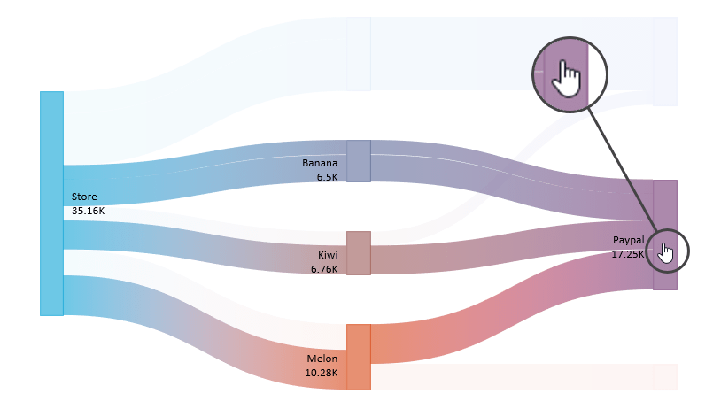
To reset the layout, click on the diagram background.
Additional information: This diagram is a technical preview. What does it mean? All integrated functions work fine, but the visualization is not final; it will be available in the next version of our add-in very soon.
You can look at the examples; we prepared various data sets to demonstrate the power of the Sankey diagram. Download the practice file.

Istvan is the co-founder of Visual Analytics Ltd. He writes blog posts and helps people to reach the top in Excel.
Data has become the story of the day in organizations and academic institutions—almost every sector of our government, functions with data.


Imagine what it would be like if every sector did not utilize data. Think about this for a moment, and you will realize that data is the heartbeat of everything you do.
This fact can be evident to you as a data analyst. What crucial is how you can present your data to interested parties.
An exemplary data visualization diagram will compel your audience to answer this question. How the audience reacts to your presentation is crucial to your success.
To analyze data critically, one of the best visualization you can use is Sankey Diagram. Do you want to know how to create a Sankey Diagram in Excel? The secret is through the simple steps we will cover.
In this blog, you will learn:
Table of Content:
- What is a Sankey Diagram in Excel?
- What are the Components of a Sankey Diagram in Excel?
- Best Sankey Chart Generator in Excel
- How to Create Sankey Diagram in Excel?
- How to Edit Sankey Chart in Excel?
- Create Multi-Level Sankey Diagram in Excel
- Video Tutorial: How to Make Sankey Chart in Excel?
- Why should you use the Sankey Graph in Excel?
- Application of Sankey Chart in Excel
- Wrap up
Let’s begin by knowing what a Sankey Diagram is.
What is a Sankey Diagram in Excel?
Definition: A Sankey Diagram is a visualization diagram that presents data with value sets from one point to another.
Here is an interesting historical fact about a Sankey Diagram. An engineer around the 1890s called Matthew Sankey discovered the chart. The engineer found it by studying how a steam engine conducts energy.
The bottom line is that you can also use a Sankey Diagram to visualize information related to energy or income flow.
With these fun facts in mind, let’s jump right into the components of a Sankey Diagram you need to know about.
What are the Components of a Sankey Diagram in Excel?
Every statistical diagram has unique components that are crucial in providing insights. Well, a Sankey Diagram is one of those charts.
Let’s take a closer look at some of these components:
Nodes:
They look like bars in a standard bar chart. The size of the node represents the value of the variables.
Flows:
The nodes in a Sankey chart in excel are connected with flow path structures called links. Flows connect one node to another with a source name.
In addition, flows have a target node that serves as an ending point.
Drop-offs:
This is a type of flow. Its unique feature is that it does not have a target node.
You will realize from the components we have just listed for you that a Sankey Chart is not stylish. It is one of the most detailed charts in excel you will come across.
In the next section, you will learn how to create a Sankey plot in excel using Sankey Chart examples. We have to use the Sankey diagram in excel using sample data.
You want to know how it works. Let us show you how.
Best Sankey Chart Generator in Excel
Before we get down into business, here is a fun fact you need to know about Excel.
Excel has billions of users because it is our most common spreadsheet. With this spreadsheet in your office tool, you can create a Sankey graph in excel.
Here is the truth, Excel worksheet does not have a Sankey diagram in its list of graphs. Excel is limited to a few basic charts.
But don’t lose hope just yet. There is a solution to our problem. You want to know what it is. Let’s get to it.
What is the solution?
Think about this for a moment, if excel does not have a Sankey chart, how can we create one? One of the crucial actions you can take is to supercharge it with an excel add-in for creating a Sankey diagram.
One of the add-ins of particular interest is called ChartExpo. This add-in cannot let you down when visualizing your data.
In other words, we can refer to it as a Sankey diagram generator in excel.
Let us explain ChartExpo and how it can help you as a data analyst.
What is ChartExpo?
In brief, ChartExpo is an add-in that utilizes cloud-hosting features to create statistical visualizations.
This add-in to your Excel worksheet allows you to create many graphical presentations. It is one of the simplest add-ins you can use for your excel charts.
But that is not all.
You do not need a fancy manual to work your way around the add-in. This is because it takes quick and easy steps to create a chart of your choice.
If you ever find yourself in a dilemma about which chart to use, ChartExpo has got you covered. It is a unique Sankey diagram generator in excel.
Let us dig deeper using a practical example of how to make a Sankey Diagram in Excel using ChartExpo.

How to Create Sankey Diagram in Excel? Complete Step-by-Step Guide with Example
This section will use a Sankey Chart in Excel to visualize the table below.
| Energy Type | Main Source | Source type | Energy Source | Usage | End-User | Mega Watt |
| Agricultural waste | Bio-conversion | Solid | Thermal generation | Losses in process | Lost | 3.5 |
| Agricultural waste | Bio-conversion | Solid | Thermal generation | Electricity grid | Industry | 5.1 |
| Agricultural waste | Bio-conversion | Solid | Thermal generation | Electricity grid | HVAC commercial | 3.6 |
| Agricultural waste | Bio-conversion | Solid | Thermal generation | Electricity grid | HVAC homes | 2.6 |
| Agricultural waste | Bio-conversion | Solid | Thermal generation | Electricity grid | Appliances commercial | 3.4 |
| Agricultural waste | Bio-conversion | Solid | Thermal generation | Electricity grid | Appliances homes | 1.4 |
| Other waste | Bio-conversion | Solid | Thermal generation | Losses in process | Lost | 5.0 |
| Other waste | Bio-conversion | Solid | Thermal generation | Electricity grid | Industry | 3.8 |
| Other waste | Bio-conversion | Solid | Thermal generation | Electricity grid | HVAC commercial | 4.7 |
| Other waste | Bio-conversion | Solid | Thermal generation | Electricity grid | HVAC homes | 3.4 |
| Other waste | Bio-conversion | Solid | Thermal generation | Electricity grid | Appliances commercial | 5.2 |
| Other waste | Bio-conversion | Solid | Thermal generation | Electricity grid | Appliances homes | 1.8 |
| Marina algae | Bio-conversion | Solid | Thermal generation | Losses in process | Lost | 0.5 |
| Marina algae | Bio-conversion | Solid | Thermal generation | Electricity grid | Industry | 0.4 |
| Marina algae | Bio-conversion | Solid | Thermal generation | Electricity grid | HVAC commercial | 0.6 |
| Marina algae | Bio-conversion | Solid | Thermal generation | Electricity grid | HVAC homes | 0.4 |
| Marina algae | Bio-conversion | Solid | Thermal generation | Electricity grid | Appliances commercial | 0.6 |
| Marina algae | Bio-conversion | Solid | Thermal generation | Electricity grid | Appliances homes | 0.4 |
| Biomass import | Bio-conversion | Solid | Thermal generation | Losses in process | Lost | 0.3 |
| Biomass import | Bio-conversion | Solid | Thermal generation | Electricity grid | Industry | 0.5 |
| Biomass import | Bio-conversion | Solid | Thermal generation | Electricity grid | HVAC commercial | 0.6 |
| Biomass import | Bio-conversion | Solid | Thermal generation | Electricity grid | HVAC homes | 0.2 |
| Biomass import | Bio-conversion | Solid | Thermal generation | Electricity grid | Appliances commercial | 0.4 |
| Biomass import | Bio-conversion | Solid | Thermal generation | Electricity grid | Appliances homes | 0.1 |
| Nuclear reserves | Nuclear Plant | Solid | Thermal generation | Losses in process | Lost | 35.0 |
| Nuclear reserves | Nuclear Plant | Solid | Thermal generation | Electricity grid | Industry | 9.1 |
| Nuclear reserves | Nuclear Plant | Solid | Thermal generation | Electricity grid | HVAC commercial | 5.6 |
| Nuclear reserves | Nuclear Plant | Solid | Thermal generation | Electricity grid | HVAC homes | 4.2 |
| Nuclear reserves | Nuclear Plant | Solid | Thermal generation | Electricity grid | Appliances commercial | 7.7 |
| Nuclear reserves | Nuclear Plant | Solid | Thermal generation | Electricity grid | Appliances homes | 2.8 |
| Gas reserves | Natural Gas | Gas | Thermal generation | Losses in process | Lost | 3.6 |
| Gas reserves | Natural Gas | Gas | Thermal generation | Electricity grid | Industry | 5.9 |
| Gas reserves | Natural Gas | Gas | Thermal generation | Electricity grid | HVAC commercial | 5.5 |
| Gas reserves | Natural Gas | Gas | Thermal generation | Electricity grid | HVAC homes | 3.4 |
| Gas reserves | Natural Gas | Gas | Thermal generation | Electricity grid | Appliances commercial | 5.1 |
| Gas reserves | Natural Gas | Gas | Thermal generation | Electricity grid | Appliances homes | 2.5 |
To get started with Sankey Diagram in Excel, install the ChartExpo add-in for Excel from this link.
- Click on your Excel spreadsheet to open your workbook.
- On your worksheet menu, click on Insert.
- The Insert menu will display the My Apps.

- Select ChartExpo add-in and click the Insert.

- Click on the Sankey Chart shown below in the available charts list.

- After selecting the data click on Create Chart From Selection button, as shown below.
- Check out the final Sankey Chart below.

How to Edit Sankey Chart in Excel using ChartExpo?
You can edit the Sankey chart in excel with the colors you choose and for adding a heading. Simply click Edit Chart.
Here are some of the insights from your table that will appear like this in your Sankey Diagram.


Amount of Energy Used
Energy from Nuclear Sources
Create Multi-Level Sankey Diagram in Excel
You can create a multi-level Sankey in excel if your data has much information. Let’s take the example we mentioned above. How easily we were able to create the Multi-level Sankey Chart in Excel in a few clicks because we had the data available in layers.

You can comfortably create a Sankey Diagram in Excel from the example above. As a data analyst for your power company, you can help stakeholders understand the long-term plans for power supply.
With many visual presentations in ChartExpo, why did we use Sankey in Excel to visualize your data? Let’s jump right into those reasons.
Video Tutorial: How to Make Sankey Chart in Excel?
In the following video, you will learn how to make a Sankey Chart in Excel without any coding in a few clicks.
Why should you use the Sankey Graph in Excel?
Using a Sankey diagram to represent your data lets you see it from different levels.
A Sankey diagram in an Excel spreadsheet allows you to evaluate complex metrics graphically. Additionally, you can draw attention to one element of your data story for your audience.
It can assist you in visualizing customer behavior and opportunities provided by influential contributors from a business perspective.
A Sankey Diagram in Excel is essential in getting stakeholders to implement your ideas when presenting a project to management.
Make your Sankey graph in Excel simple to read for the audience when utilizing it to illustrate your point. Make sure your Sankey in excel doesn’t mislead your readers.
Application of Sankey Chart in Excel
Where can we use Sankey Charts in Excel? This is the one thing we need to ask ourselves. You can use a Sankey Diagram in Excel to see data that seems like a flow, such as:
- Presenting survey results
- A website’s customer base for digital marketing
- Supply chain administration
- Visualizing hierarchical data
- Energy Administration
- Visualizing the customer journey
- Revenue information, particularly for budgetary and cash flow analysis.
FAQs:
How do I create a Sankey chart in excel?
To create Sankey Chart in Excel in a few clicks without any coding, follow the simple steps below.
- Open your Excel Application.
- Click Insert>My Apps>ChartExpo for Excel.
- Look for the Sankey Chart in the charts list.
- Select your data and click Create Chart From Selection.
- You will get the Sankey Chart in Excel, which you can edit and customize.
To better learn with the help of images you can read our blog above or you can watch a video tutorial here.
Can you make a Sankey diagram in excel?
Yes, you can achieve this by downloading and installing an excel add-in for creating a Sankey diagram called ChartExpo. This is because Excel lacks chart templates for Sankey.
ChartExpo has several templates, including a Sankey Diagram. With ChartExpo, you can create a Sankey Visualization in excel.
Wrap Up
Let’s recap everything we have discussed.
We now know that Sankey Charts in Excel are among the best charts you can employ to capture your audience’s interest in your data story.
You now know how to make a Sankey diagram in excel.
Sankey Diagrams in Excel are impressively simple to read and evaluate insights, as we have also discovered.
The most admirable feature of the Sankey graph in Excel that we now know is that it can draw attention to the critical details of your data story for the audience.