
Charts help you visualize your data in a way that creates maximum impact on your audience. Learn to create a chart and add a trendline. You can start your document from a recommended chart or choose one from our collection of pre-built chart templates.

Create a chart
-
Select data for the chart.
-
Select Insert > Recommended Charts.
-
Select a chart on the Recommended Charts tab, to preview the chart.
Note: You can select the data you want in the chart and press ALT + F1 to create a chart immediately, but it might not be the best chart for the data. If you don’t see a chart you like, select the All Charts tab to see all chart types.
-
Select a chart.
-
Select OK.
Add a trendline
-
Select a chart.
-
Select Design > Add Chart Element.
-
Select Trendline and then select the type of trendline you want, such as Linear, Exponential, Linear Forecast, or Moving Average.
Note: Some of the content in this topic may not be applicable to some languages.
Charts display data in a graphical format that can help you and your audience visualize relationships between data. When you create a chart, you can select from many chart types (for example, a stacked column chart or a 3-D exploded pie chart). After you create a chart, you can customize it by applying chart quick layouts or styles.
Charts contain several elements, such as a title, axis labels, a legend, and gridlines. You can hide or display these elements, and you can also change their location and formatting.
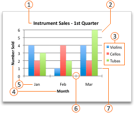
 Chart title
 Plot area
 Legend
 Axis titles
 Axis labels
 Tick marks
 Gridlines
You can create a chart in Excel, Word, and PowerPoint. However, the chart data is entered and saved in an Excel worksheet. If you insert a chart in Word or PowerPoint, a new sheet is opened in Excel. When you save a Word document or PowerPoint presentation that contains a chart, the chart’s underlying Excel data is automatically saved within the Word document or PowerPoint presentation.
Note: The Excel Workbook Gallery replaces the former Chart Wizard. By default, the Excel Workbook Gallery opens when you open Excel. From the gallery, you can browse templates and create a new workbook based on one of them. If you don’t see the Excel Workbook Gallery, on the File menu, click New from Template.
-
On the View menu, click Print Layout.
-
Click the Insert tab, and then click the arrow next to Chart.

-
Click a chart type, and then double-click the chart you want to add.
When you insert a chart into Word or PowerPoint, an Excel worksheet opens that contains a table of sample data.
-
In Excel, replace the sample data with the data that you want to plot in the chart. If you already have your data in another table, you can copy the data from that table and then paste it over the sample data. See the following table for guidelines for how to arrange the data to fit your chart type.
For this chart type
Arrange the data
Area, bar, column, doughnut, line, radar, or surface chart
In columns or rows, as in the following examples:
Series 1
Series 2
Category A
10
12
Category B
11
14
Category C
9
15
or
Category A
Category B
Series 1
10
11
Series 2
12
14
Bubble chart
In columns, putting x values in the first column and corresponding y values and bubble size values in adjacent columns, as in the following examples:
X-Values
Y-Value 1
Size 1
0.7
2.7
4
1.8
3.2
5
2.6
0.08
6
Pie chart
In one column or row of data and one column or row of data labels, as in the following examples:
Sales
1st Qtr
25
2nd Qtr
30
3rd Qtr
45
or
1st Qtr
2nd Qtr
3rd Qtr
Sales
25
30
45
Stock chart
In columns or rows in the following order, using names or dates as labels, as in the following examples:
Open
High
Low
Close
1/5/02
44
55
11
25
1/6/02
25
57
12
38
or
1/5/02
1/6/02
Open
44
25
High
55
57
Low
11
12
Close
25
38
X Y (scatter) chart
In columns, putting x values in the first column and corresponding y values in adjacent columns, as in the following examples:
X-Values
Y-Value 1
0.7
2.7
1.8
3.2
2.6
0.08
or
X-Values
0.7
1.8
2.6
Y-Value 1
2.7
3.2
0.08
-
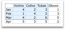
To change the number of rows and columns included in the chart, rest the pointer on the lower-right corner of the selected data, and then drag to select additional data. In the following example, the table is expanded to include additional categories and data series.
-
To see the results of your changes, switch back to Word or PowerPoint.
Note: When you close the Word document or the PowerPoint presentation that contains the chart, the chart’s Excel data table closes automatically.
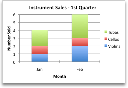
After you create a chart, you might want to change the way that table rows and columns are plotted in the chart. For example, your first version of a chart might plot the rows of data from the table on the chart’s vertical (value) axis, and the columns of data on the horizontal (category) axis. In the following example, the chart emphasizes sales by instrument.

However, if you want the chart to emphasize the sales by month, you can reverse the way the chart is plotted.
-
On the View menu, click Print Layout.
-
Click the chart.
-
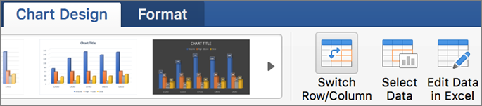
Click the Chart Design tab, and then click Switch Row/Column.
If Switch Row/Column is not available
Switch Row/Column is available only when the chart’s Excel data table is open and only for certain chart types. You can also edit the data by clicking the chart, and then editing the worksheet in Excel.
-
On the View menu, click Print Layout.
-
Click the chart.
-
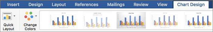
Click the Chart Design tab, and then click Quick Layout.
-
Click the layout you want.
To immediately undo a quick layout that you applied, press
+ Z .
 + Z .
+ Z .Chart styles are a set of complementary colors and effects that you can apply to your chart. When you select a chart style, your changes affect the whole chart.
-
On the View menu, click Print Layout.
-
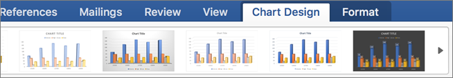
Click the chart.
-
Click the Chart Design tab, and then click the style you want.
To see more styles, point to a style, and then click
.To immediately undo a style that you applied, press
+ Z .
 .
.-
On the View menu, click Print Layout.
-
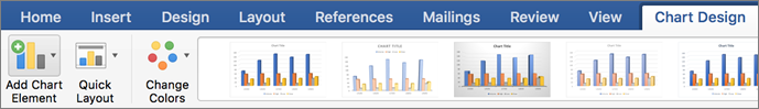
Click the chart, and then click the Chart Design tab.
-
Click Add Chart Element.
-
Click Chart Title to choose title format options, and then return to the chart to type a title in the Chart Title box.
See also
Update the data in an existing chart
Chart types
Create a chart
You can create a chart for your data in Excel for the web. Depending on the data you have, you can create a column, line, pie, bar, area, scatter, or radar chart.
-
Click anywhere in the data for which you want to create a chart.
To plot specific data into a chart, you can also select the data.
-
Select Insert > Charts > and the chart type you want.
-
On the menu that opens, select the option you want. Hover over a chart to learn more about it.
Tip: Your choice isn’t applied until you pick an option from a Charts command menu. Consider reviewing several chart types: as you point to menu items, summaries appear next to them to help you decide.
-
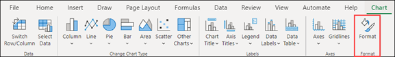
To edit the chart (titles, legends, data labels), select the Chart tab and then select Format.
-
In the Chart pane, adjust the setting as needed. You can customize settings for the chart’s title, legend, axis titles, series titles, and more.


Available chart types
It’s a good idea to review your data and decide what type of chart would work best. The available types are listed below.
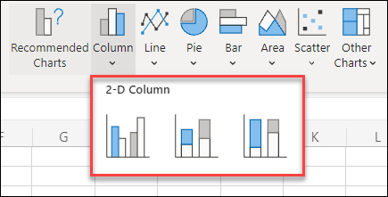
Data that’s arranged in columns or rows on a worksheet can be plotted in a column chart. A column chart typically displays categories along the horizontal axis and values along the vertical axis, like shown in this chart:

Types of column charts
-
Clustered column A clustered column chart shows values in 2-D columns. Use this chart when you have categories that represent:
-
Ranges of values (for example, item counts).
-
Specific scale arrangements (for example, a Likert scale with entries, like strongly agree, agree, neutral, disagree, strongly disagree).
-
Names that are not in any specific order (for example, item names, geographic names, or the names of people).
-
-
Stacked column A stacked column chart shows values in 2-D stacked columns. Use this chart when you have multiple data series and you want to emphasize the total.
-
100% stacked column A 100% stacked column chart shows values in 2-D columns that are stacked to represent 100%. Use this chart when you have two or more data series and you want to emphasize the contributions to the whole, especially if the total is the same for each category.
Data that is arranged in columns or rows on a worksheet can be plotted in a line chart. In a line chart, category data is distributed evenly along the horizontal axis, and all value data is distributed evenly along the vertical axis. Line charts can show continuous data over time on an evenly scaled axis, and are therefore ideal for showing trends in data at equal intervals, like months, quarters, or fiscal years.

Types of line charts
-
Line and line with markers Shown with or without markers to indicate individual data values, line charts can show trends over time or evenly spaced categories, especially when you have many data points and the order in which they are presented is important. If there are many categories or the values are approximate, use a line chart without markers.
-
Stacked line and stacked line with markers Shown with or without markers to indicate individual data values, stacked line charts can show the trend of the contribution of each value over time or evenly spaced categories.
-
100% stacked line and 100% stacked line with markers Shown with or without markers to indicate individual data values, 100% stacked line charts can show the trend of the percentage each value contributes over time or evenly spaced categories. If there are many categories or the values are approximate, use a 100% stacked line chart without markers.
Notes:
-
Line charts work best when you have multiple data series in your chart—if you only have one data series, consider using a scatter chart instead.
-
Stacked line charts add the data, which might not be the result you want. It might not be easy to see that the lines are stacked, so consider using a different line chart type or a stacked area chart instead.
-
Data that is arranged in one column or row on a worksheet can be plotted in a pie chart. Pie charts show the size of items in one data series, proportional to the sum of the items. The data points in a pie chart are shown as a percentage of the whole pie.

Consider using a pie chart when:
-
You have only one data series.
-
None of the values in your data are negative.
-
Almost none of the values in your data are zero values.
-
You have no more than seven categories, all of which represent parts of the whole pie.
Data that is arranged in columns or rows only on a worksheet can be plotted in a doughnut chart. Like a pie chart, a doughnut chart shows the relationship of parts to a whole, but it can contain more than one data series.

Tip: Doughnut charts are not easy to read. You may want to use a stacked column or stacked bar chart instead.
Data that is arranged in columns or rows on a worksheet can be plotted in a bar chart. Bar charts illustrate comparisons among individual items. In a bar chart, the categories are typically organized along the vertical axis, and the values along the horizontal axis.

Consider using a bar chart when:
-
The axis labels are long.
-
The values that are shown are durations.
Types of bar charts
-
Clustered A clustered bar chart shows bars in 2-D format.
-
Stacked bar Stacked bar charts show the relationship of individual items to the whole in 2-D bars
-
100% stacked A 100% stacked bar shows 2-D bars that compare the percentage that each value contributes to a total across categories.
Data that is arranged in columns or rows on a worksheet can be plotted in an area chart. Area charts can be used to plot change over time and draw attention to the total value across a trend. By showing the sum of the plotted values, an area chart also shows the relationship of parts to a whole.

Types of area charts
-
Area Shown in 2-D format, area charts show the trend of values over time or other category data. As a rule, consider using a line chart instead of a non-stacked area chart, because data from one series can be hidden behind data from another series.
-
Stacked area Stacked area charts show the trend of the contribution of each value over time or other category data in 2-D format.
-
100% stacked 100% stacked area charts show the trend of the percentage that each value contributes over time or other category data.
Data that is arranged in columns and rows on a worksheet can be plotted in an scatter chart. Place the x values in one row or column, and then enter the corresponding y values in the adjacent rows or columns.
A scatter chart has two value axes: a horizontal (x) and a vertical (y) value axis. It combines x and y values into single data points and shows them in irregular intervals, or clusters. Scatter charts are typically used for showing and comparing numeric values, like scientific, statistical, and engineering data.

Consider using a scatter chart when:
-
You want to change the scale of the horizontal axis.
-
You want to make that axis a logarithmic scale.
-
Values for horizontal axis are not evenly spaced.
-
There are many data points on the horizontal axis.
-
You want to adjust the independent axis scales of a scatter chart to reveal more information about data that includes pairs or grouped sets of values.
-
You want to show similarities between large sets of data instead of differences between data points.
-
You want to compare many data points without regard to time — the more data that you include in a scatter chart, the better the comparisons you can make.
Types of scatter charts
-
Scatter This chart shows data points without connecting lines to compare pairs of values.
-
Scatter with smooth lines and markers and scatter with smooth lines This chart shows a smooth curve that connects the data points. Smooth lines can be shown with or without markers. Use a smooth line without markers if there are many data points.
-
Scatter with straight lines and markers and scatter with straight lines This chart shows straight connecting lines between data points. Straight lines can be shown with or without markers.
Data that is arranged in columns or rows on a worksheet can be plotted in a radar chart. Radar charts compare the aggregate values of several data series.

Type of radar charts
-
Radar and radar with markers With or without markers for individual data points, radar charts show changes in values relative to a center point.
-
Filled radar In a filled radar chart, the area covered by a data series is filled with a color.
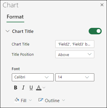
Add or edit a chart title
You can add or edit a chart title, customize its look, and include it on the chart.
-
Click anywhere in the chart to show the Chart tab on the ribbon.
-
Click Format to open the chart formatting options.
-
In the Chart pane, expand the Chart Title section.
-
Add or edit the Chart Title to meet your needs.
-
Use the switch to hide the title if you don’t want your chart to show a title.
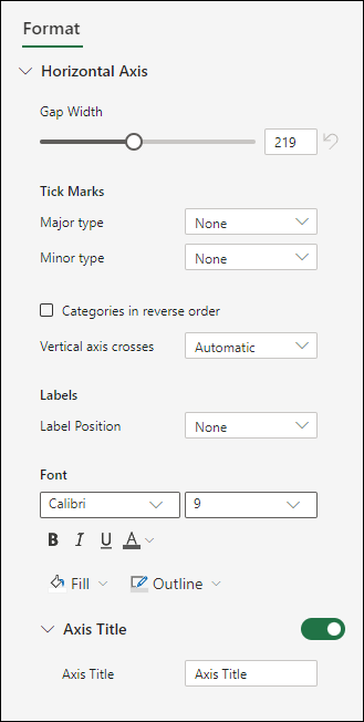
Add axis titles to improve chart readability
Adding titles to the horizontal and vertical axes in charts that have axes can make them easier to read. You can’t add axis titles to charts that don’t have axes, such as pie and doughnut charts.
Much like chart titles, axis titles help the people who view the chart understand what the data is about.

-
Click anywhere in the chart to show the Chart tab on the ribbon.
-
Click Format to open the chart formatting options.
-
In the Chart pane, expand the Horizontal Axis or Vertical Axis section.
-
Add or edit the Horizontal Axis or Vertical Axis options to meet your needs.
-
Expand the Axis Title.
-
Change the Axis Title and modify the formatting.
-
Use the switch to show or hide the title.

Change the axis labels
Axis labels are shown below the horizontal axis and next to the vertical axis. Your chart uses text in the source data for these axis labels.

To change the text of the category labels on the horizontal or vertical axis:
-
Click the cell which has the label text you want to change.
-
Type the text you want and press Enter.
The axis labels in the chart are automatically updated with the new text.
Tip: Axis labels are different from axis titles you can add to describe what is shown on the axes. Axis titles aren’t automatically shown in a chart.
Remove the axis labels
To remove labels on the horizontal or vertical axis:
-
Click anywhere in the chart to show the Chart tab on the ribbon.
-
Click Format to open the chart formatting options.
-
In the Chart pane, expand the Horizontal Axis or Vertical Axis section.
-
From the dropdown box for Label Position, select None to prevent the labels from showing on the chart.

Need more help?
You can always ask an expert in the Excel Tech Community or get support in the Answers community.
A picture is worth of thousand words; a chart is worth of thousand sets of data. In this tutorial, we are going to learn how we can use graph in Excel to visualize our data.
What is a chart?
A chart is a visual representative of data in both columns and rows. Charts are usually used to analyse trends and patterns in data sets. Let’s say you have been recording the sales figures in Excel for the past three years. Using charts, you can easily tell which year had the most sales and which year had the least. You can also draw charts to compare set targets against actual achievements.
We will use the following data for this tutorial.
Note: we will be using Excel 2013. If you have a lower version, then some of the more advanced features may not be available to you.
| Item | 2012 | 2013 | 2014 | 2015 |
|---|---|---|---|---|
| Desktop Computers | 20 | 12 | 13 | 12 |
| Laptops | 34 | 45 | 40 | 39 |
| Monitors | 12 | 10 | 17 | 15 |
| Printers | 78 | 13 | 90 | 14 |
Different scenarios require different types of charts. Towards this end, Excel provides a number of chart types that you can work with. The type of chart that you choose depends on the type of data that you want to visualize. To help simplify things for the users, Excel 2013 and above has an option that analyses your data and makes a recommendation of the chart type that you should use.
The following table shows some of the most commonly used Excel charts and when you should consider using them.
| S/N | CHART TYPE | WHEN SHOULD I USE IT? | EXAMPLE |
|---|---|---|---|
| 1 | Pie Chart | When you want to quantify items and show them as percentages. |
|
| 2 | Bar Chart | When you want to compare values across a few categories. The values run horizontally |
|
| 3 | Column chart | When you want to compare values across a few categories. The values run vertically |
|
| 4 | Line chart | When you want to visualize trends over a period of time i.e. months, days, years, etc. |
|
| 5 | Combo Chart | When you want to highlight different types of information |
|


The importance of charts
- Allows you to visualize data graphically
- It’s easier to analyse trends and patterns using charts in MS Excel
- Easy to interpret compared to data in cells
Step by step example of creating charts in Excel
In this tutorial, we are going to plot a simple column chart in Excel that will display the sold quantities against the sales year. Below are the steps to create chart in MS Excel:
- Open Excel
- Enter the data from the sample data table above
- Your workbook should now look as follows

To get the desired chart you have to follow the following steps

- Select the data you want to represent in graph
- Click on INSERT tab from the ribbon
- Click on the Column chart drop down button
- Select the chart type you want
You should be able to see the following chart

Tutorial Exercise
When you select the chart, the ribbon activates the following tab

Try to apply the different chart styles, and other options presented in your chart.
Download the above Excel Template
Summary
Charts are a powerful way of graphically visualizing your data. Excel has many types of charts that you can use depending on your needs.
Conditional formatting is also another power formatting feature of Excel that helps us easily see the data that meets a specified condition
How to Make Charts or Graphs in Excel?
Steps in making graphs in Excel:
- Numerical Data: The first thing required in your Excel is numerical data. Charts or graphs can only be built using numerical data sets.
- Data Headings: These are often called data labels. The headings of each column should be understandable and readable.
- Data in Proper Order: It is very important how the data looks in Excel. If the information to build a chart is bits and pieces, we might find it difficult to construct a chart. So arrange the data properly.
Table of contents
- How to Make Charts or Graphs in Excel?
- Examples (Step by Step)
- Example #1
- Example #2
- Things to Remember
- Recommended Articles
- Examples (Step by Step)
Examples (Step by Step)
Below are some examples of how to make charts in Excel.
You can download this Make Chart Excel Template here – Make Chart Excel Template
Example #1
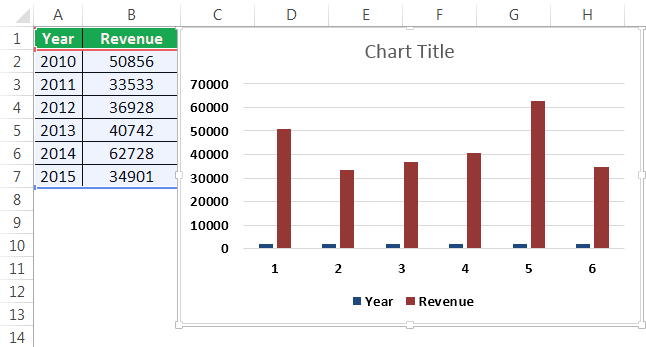
Assume we have passed six years of sales data. We want to show them in visuals or graphs.
- First, we must select the date range we are using for a graph.

- Then, go to the “INSERT” tab > under the “Charts” section, and select the “COLUMN” chart. We can see many other types under the “Column” chart but prefer the first one.

- As soon as we have selected the chart, we can see the below chart in Excel.

- It is not the finished product yet. We need to make some arrangements here. So, we must select the blue-colored bars and press the “Delete” button. Else, right-click on bars and choose “Delete.”

- Now, we do not know which bar represents which year. So, right-click on the chart and select “Select Data.”

- In the below window, we must click on “EDIT,” which is on the right-hand side.

- After we click on the “EDIT option,” we will see a small dialog box below. It will ask to select the “Horizontal Axis Labels.” So, choose the “Year” column.

- Now, we have the “Year” name below each bar.

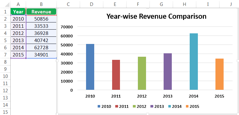
- After that, change the heading or title of the chart as per the requirement by double-clicking on the existing header.
- Add “Data Labels” for each bar. The “Data Labels” are each bar’s numbers to convey the message perfectly. Right-click on the column bars and select “Add Data Labels.”

- Change the color of the column bars to different colors. Next, select the bars and press “Ctrl + 1.” We may see the format chart dialog box on the right-hand side.

- Now, go to the “FILL” option, and select the option “Vary colors by point.”

Now, we have a neatly arranged chart in front of us.


Example #2
We have seen how to create a graph with auto-selection of the data range. Next, we will show you how to build an Excel chart with a manual data selection.
- Step 1: First, we must place the cursor in the empty cell and click on the “Insert Chart.”

- Step 2: After we click on the “Insert Chart,” we can see a blank chart.

- Step 3: Right-click on the chart and choose the “Select Data” option.

- Step 4: In the below window, click on “Add.”

- Step 5: In the below window, under “Series name,” select the heading of the data series, and under the “Series values,” select data series values.

- Step 6: Now, the default chart is ready.

Now, we must apply the steps shown in the previous example to modify the chart. Next, refer to steps 5 to 12 to alter the chart.
Things to Remember
- For the same data, we can insert all types of charts. It is important to identify a suitable chart.
- If the data is smaller, it is easy to plot a graph without any hurdles.
- In the case of percentage data, we must select the PIE chartMaking a pie chart in excel can help you with the pictorial representation of your data and simplifies the analysis process. There are multiple kinds of pie chart options available on excel to serve the varying user needs.read more.
- We must try using different charts for the same data to identify the best fit chart for the data set.
Recommended Articles
This article is a guide to Making Charts in Excel. Here, we discuss how to make charts or graphs in Excel, practical examples, and a downloadable Excel template. You may learn more about Excel from the following articles: –
- Organization Chart in Excel
- Examples of Line Chart in Excel
- Excel Chart Templates
- 8 Types of Charts in Excel
- Infographics in Excel
Reader Interactions
Excel Chart Templates — Free Downloads

PINE BI: Ultimate Excel Charting Add-in: Insert custom charts with a simple click & other charting tools!
Excel also allows almost unlimited chart customizations, by which you can create many advanced chart types, not found in Excel. Below you will also find these advanced chart templates available for download.
You will also find some chart templates available for download for standard Excel charts.
Instead, click here if you are looking for information about creating, saving, and using Chart Templates within Excel.
Advanced Chart Templates

Gauge Chart
Also known as: Dial Chart, Speedometer Chart
Description: Gauge charts use needles to show information as a reading on a dial. They are often used when comparing KPIs or business results against a stated goal.
Learn More: Gauge Chart Tutorial
Gauge Chart Builder Add-in
7 Different Gauge Chart Templates. 5 Style Presets. 9 Color Palettes. Fully customizable.

Tornado Chart
Also known as: Sales Funnel Chart, Butterfly Chart
Description: A Tornado Chart is a modified version of the bar chart where the data categories are displayed vertically in a way that resembles a tornado.
Learn More: Tornado Chart Tutorial

Burndown Chart
Also known as: N/A
Description: Burndown charts represent work left to do vs. time. It is useful for predicting when all work will be completed.
Learn More: Burndown Chart Tutorial

Step Chart
Also known as: N/A
Description: A Step Chart is a line chart that uses vertical and horizontal lines to connect data points in a series, creating a step-like progression.
Learn More: Step Chart Tutorial

Thermometer Chart
Also known as: Goal Chart
Description: Thermometer charts show the current completed percentage of a task or goal relative to the goal.
Learn More: Thermometer Tutorial

Quadrant Chart
Also known as: N/A
Description: Quadrant charts are scatter charts with a background that is divided into four equal sections, allowing you to categorize data points into the four quadrants
Learn More: Quadrant Tutorial

Ogive Chart
Also known as: Cumulative Frequency Graph
Description: Ogive charts are graphs used in statistics to illustrate cumulative frequencies.
Learn More: Ogive Chart Tutorial

Bullet Chart
Also known as: Steven Few’s Bullet Graph
Description: A modified column or bar chart used for tracking performance(s) against goal(s). Alternative to Gauge chart.
Learn More: Bullet Chart Tutorial

Mekko Chart
Also known as: Marimekko Chart, Mosaic Plot
Description: 2D stacked chart where the column width usually represents the relative size of a segment and the height breaks down each segment.
Learn More: Mekko Chart Tutorial

Normal Distribution Curve
Also known as: Bell Curve, Gaussian Curve, Bell Plot
Description: Symmetrical graph that illustrates the tendency of data to cluster around the mean.
Learn More: Bell Curve Tutorial

Stem and Leaf Plot
Also known as: Stemplot
Description: Diagram that splits each data point into a «stem» (the first number(s)) and «leaf» (usually last digit) to display the frequency distribution of a data set.
Learn More: Stem and Leaf Tutorial

Polar Plot
Also known as: N/A
Description: A polar plot is used to define points in space within what is called the polar coordinate system.
Learn More: Polar Plot Tutorial

Venn Diagram
Also known as: N/A
Description: A Venn Diagram uses circles to show relationships among sets where sets have some commonalities.
Learn More: Venn Diagram Tutorial

Panel Chart
Also known as: N/A
Description: Panel charts are charts that have multiple regions, each region displaying a different set of data, rather than showing all data in a single region.
Learn More: Panel Chart Tutorial

Timeline Chart
Also known as: Milestone Chart
Description: Timeline charts are used to visualize status of projects in chronological order.
Learn More: Timeline Chart Tutorial

Progress (Bar and Circle) Charts
Also known as: N/A
Description: Progress charts are used to display your progress towards a goal.
Learn More: Progress Chart Tutorial

Population Pyramid
Also known as: N/A
Description: Population Pyramids are used to visually display subsets within a population.
Learn More: Population Pyramid Tutorial

Excel Basic Chart Templates

Column Charts
Description: A Column Chart is a data visualization where each item is represented by a rectangle, where the magnitude of the values determines the height of the rectangle.
Learn More: Column Chart Tutorial

Bar Charts
Description: A Bar Chart is a data visualization where each item is represented by a rectangle, where the magnitude of the values determines the width of the rectangle.
Learn More: Bar Chart Tutorial

Area Charts
Description: An Area Chart is similar to a line chart, except the area below the line is colored in to emphasize magnitude.
Learn More: Area Chart Tutorial

Line Charts
Description: A line chart is a graph that uses lines to connect individual data points over a time interval.
Learn More: Line Chart Tutorial

Pareto Chart
Description: A Pareto Chart is a hybrid of column and line charts that displays the relative importance of factors in a data set.
Learn More: Pareto Chart Tutorial

Waterfall Chart
Also Known As: Bridge Chart, Flying Bricks Chart, Cascade Chart, or Mario Chart
Description: A Waterfall Chart visually breaks down the cumulative impact of sequential positive or negative values on a final outcome (ex. various income and expense items on the final profitability).
Learn More: Waterfall Chart Tutorial

Sales Funnel Chart
Description: A Sales Funnel Chart dissects different stages of a process, typically sorting the values in descending order (from largest to smallest) in a way that visually looks like a funnel—hence the name.
Learn More: Sales Funnel Chart Tutorial

Candlestick Charts
Description: A candlestick chart shows the open, high, low, close prices of an asset over a period of time.
Learn More: Candlestick Chart Tutorial
[icon name=”area-chart” class=”” unprefixed_class=””] Area
[icon name=”bar-chart” class=”” unprefixed_class=””] Bar
[icon name=”line-chart” class=”” unprefixed_class=””] Bar, Line
[icon name=”circle-thin” class=”” unprefixed_class=””] Bubble
[icon name=”column” class=”” unprefixed_class=””] Column
[icon name=”line-chart” class=”” unprefixed_class=””] Column, Line
[icon name=”paint-brush” class=”” unprefixed_class=””] Formatting Charts
[icon name=”info-circle” class=”” unprefixed_class=””] Infographic
[icon name=”line-chart” class=”” unprefixed_class=””] Line
[icon name=”plus-circle” class=”” unprefixed_class=””] New Chart Types
[icon name=”pie-chart” class=”” unprefixed_class=””] Pie
[icon name=”table” class=”” unprefixed_class=””] Pivot Charts
[icon name=”ellipsis-h” class=”” unprefixed_class=””] Scatter
[icon name=”check” class=”” unprefixed_class=””] Smart Art
[icon name=”lightbulb-o” class=”” unprefixed_class=””] Sparklines
Click on any Excel Charts link below and it will take you to the free example tutorial & downloadable Excel workbook for you to practice!