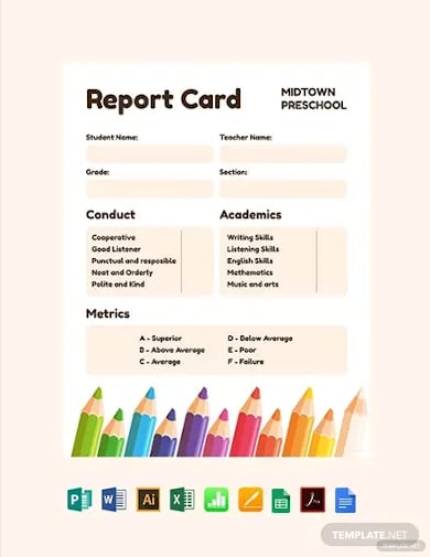
Constructing of financial analyses for evaluation of business activity and investment projects. Forming reports and documents forms in Excel for accounts department, marketing department, warehouse facilities, and other structures of the company.
Forming of reports analyses with examples
How to make the sales funnel in Excel using formulas, the SmartArt drawing and the Charts tool. The description of different methods with step-by-step instructions and illustrations.
The coefficient of the financial activity shows how much the enterprise depends on borrowed funds. It characterizes financial stability and profitability. How to calculate the indicator by the formula?
The financial and statistical analysis in Excel: automation of calculations. How to analyze the time series and forecast sales, taking into account the trend component and seasonality?
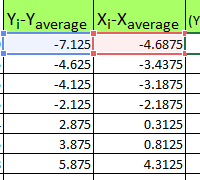
The correlation coefficient (the paired correlation coefficient) allows us to discover the interconnection between the series of values. How to calculate the coefficient of pair correlation? The construction of the correlation matrix.
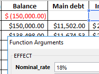
Calculation of the effective interest rate on the loan, leasing and government bonds is performed using the functions EFFECT, IRR, XIRR, FV, etc. Let’s look at examples of how real interest is considered.
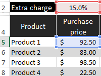
Template for planning the budget of the trading company with the calculation of providing customers discounts. The main advantage is the ability to create loyalty programs with control over the company’s profit. Management of discounts, their impact on margin.
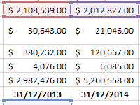
The factor of turnover of receivables shows the rate of conversion of goods sold into the money supply. Formula by balance, calculation of the indicator in days.
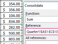
Let’s look at the example of practical work how to do data consolidation. Combining the ranges on different sheets and in different books. Consolidated report using formulas.
Содержание
- Financial Statements
- Financial Statement Templates
- Business Plan Workbook ▶
- Balance Sheet Template ▶
- Income Statement Template ▶
- Cash Flow Statement Template ▶
- Business Budget Template ▶
- 12-Month Business Budget ▶
- Business Budget and COGS Analysis ▶
- Break Even Analysis Calculator ▶
- Profit and Loss Projection Template ▶
- Sales Forecast Template ▶
- Business Startup Costs Template ▶
- Depreciation Schedule Template ▶
- Billing Statement Template ▶
- Personal Financial Statement ▶
- Net Worth Calculator for Excel ▶
- Petty Cash Log Template ▶
- SWOT Analysis Template ▶
- Waterfall Chart Template ▶
- Управленческие отчеты в Excel
- Дашборд в Excel с картой
- Dashboard с динамическими массивами
- Анализ бюджета доходов и расходов (БДР) по месяцам
- Dashboard в Excel с кроссфильтрацией
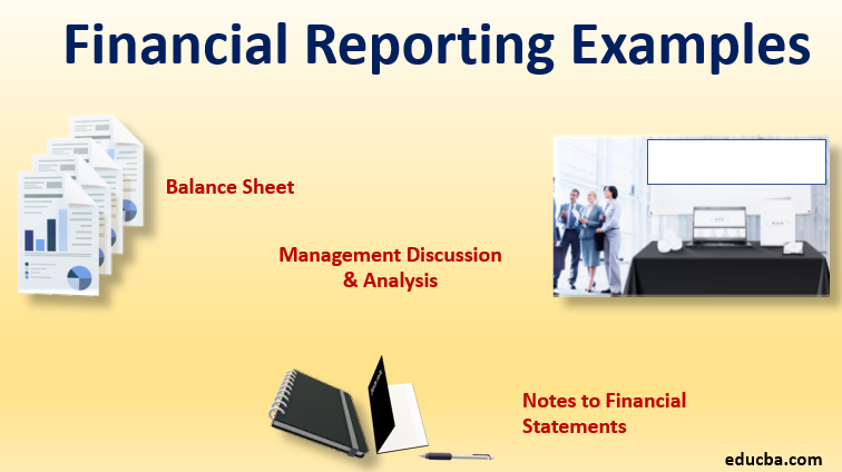
- Financial Reporting Examples
- Definition of Financial Reporting Examples
- Examples of Financial Reporting (With Excel Template)
- Example #1 – Balance Sheet
- Example #2 – Notes to Financial Statements
- Example #3 – Management Discussion & Analysis (MD&A)
- Conclusion
- Recommended Articles
- Chart report on financial results of company download in Excel
- How to make a chart report without using macros in Excel
- Download example chart report in Excel
Financial Statements
The Vertex42™ collection of financial spreadsheets includes templates designed specifically for small business owners. We hope that you will find them as useful as we have! The spreadsheets featured below also work with OpenOffice and Google Spreadsheets, so if you are operating your business on a very tight budget, hopefully you’ll be able to make these financial templates work for you.
Financial Statement Templates
 Business Plan Workbook ▶
Create a business plan using Word with a companion Excel workbook for customizing financial statements.
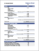
 Balance Sheet Template ▶
Summarize what your company owns and owes. Compare to previous year(s).
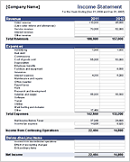
 Income Statement Template ▶
Provides a measure of economic performance for your company. Also called a Profit and Loss Statement
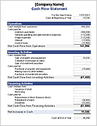
 Cash Flow Statement Template ▶
Where does your company get and spend its cash?
 Business Budget Template ▶
Contains two worksheets for creating a yearly business budget — for service providers or companies producing and selling goods. Based on the Income Statement template, with similar categories and layout.
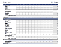
 12-Month Business Budget ▶
Create a 12-month breakdown of your sales and business expenses.
 Business Budget and COGS Analysis ▶
Perform a detailed analysis of expenses and cost of goods sold (COGS) for multiple products.
 Break Even Analysis Calculator ▶
Calculate the Break-Even Point or Payback Period for a new venture or product.
 Profit and Loss Projection Template ▶
Based on the Business Budget template — helps you create a 3-year profit and loss projection.
 Sales Forecast Template ▶
Create a sales forecast spreadsheet to use in your business plan, including estimated sales, COGS, and gross profit on a monthly basis over 3 years. Includes sample charts.
 Business Startup Costs Template ▶
Estimate the startup costs for your new business. Essential for any business plan.
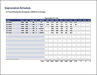
 Depreciation Schedule Template ▶
Calculate yearly depreciation for multiple assets using the straight-line or declining balance methods.
 Billing Statement Template ▶
A billing statement can be used as an invoice as well as an accounts receivable ledger. This works well as a customer account statement. It can also be used to bill a customer.
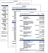
 Personal Financial Statement ▶
Create and maintain your own personal financial statements, including a balance sheet for calculating net worth and a cash flow statement for budgeting.
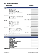
 Net Worth Calculator for Excel ▶
Calculate your net worth based on the total of all your assets minus your liabilities.
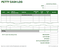
 Petty Cash Log Template ▶
Customize and print a petty cash form for your business. Includes a reconciliation section.
 SWOT Analysis Template ▶
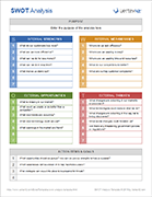
Use a SWOT Analysis to routinely evaluates the health or your business or personal finances and find ways to grow and improve.
 Waterfall Chart Template ▶
Create a horizontal or vertical waterfall chart using Excel.
Источник
Управленческие отчеты в Excel
Подготовили подборку разработанных нами интерактивных управленческих отчетов в Excel для экономистов и финансистов. Эти отчеты или дашборды можно скачать, заполнить данные и вносить изменения, а еще разобраться с тем, как они построены и «прокачать» свои навыки в Excel. Но не обещаем, что это будет легко )
Скачивайте файлы — это бесплатно. А если вы хотите научиться строить такие отчеты самостоятельно, приходите к нам на курсы .
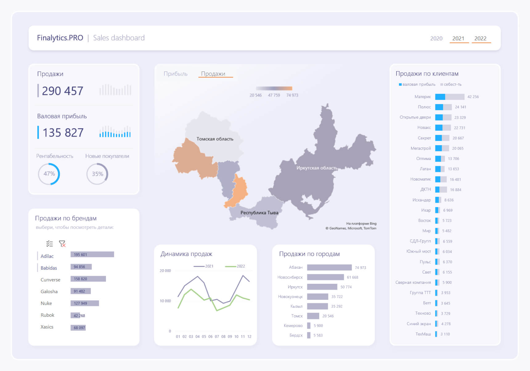
Дашборд в Excel с картой
Dashboard реализован обычными инструментами Excel с интерактивными срезами, которые переключают данные, а также карту и линейчатую диаграмму. Подробнее >>
Dashboard с динамическими массивами
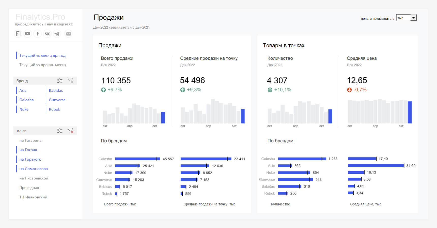
Файл создан ради эксперимента, с помощью формул динамических массивов, сводных таблиц и срезов. Подробнее >>
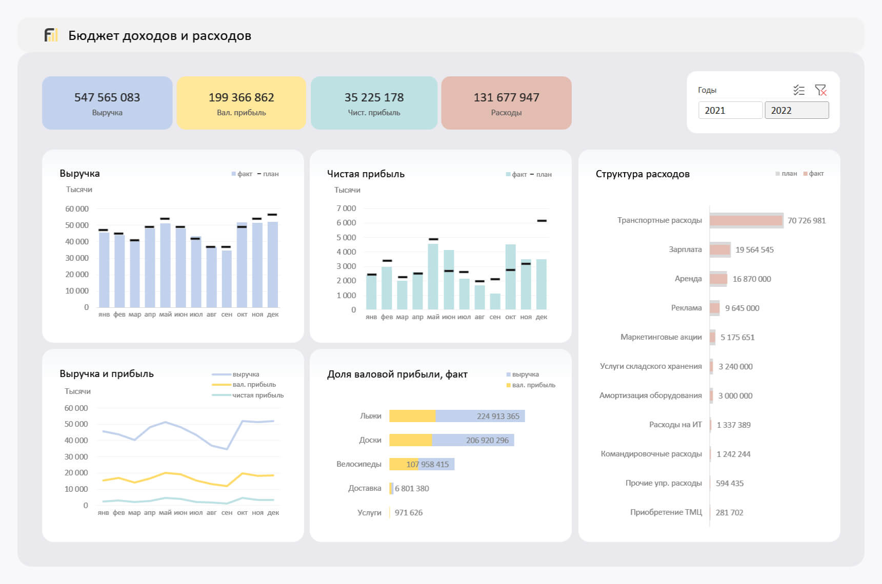
Анализ бюджета доходов и расходов (БДР) по месяцам
Отчет показывает динамику изменения основных показателей БДР по месяцам: прибыль, расходы и выручку, а также позволяет сравнить план и факт. Подробнее >>
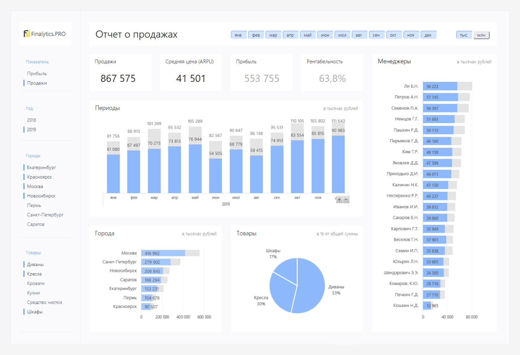
Dashboard в Excel с кроссфильтрацией
Подготовили для вас Dashboard с надстройкой Power Pivot. Он замаскирован под Power BI с кроссфильтрацией, подсветкой элементов, переключением показателей и другими полезными штуками. Подробнее >>
Если вы хотите научиться консолидировать бюджеты с использованием Power Query и выполнять расчеты ключевых показателей с помощью DAX-формул, приходите к нам на курс « Бюджетирование с Business Intelligence ».
Источник
Financial Reporting Examples
Definition of Financial Reporting Examples
Financial reporting is the summary of the performance of concern over a given period of time. The end reporting could be a look into the day to day working, position of assets and liabilities at a particular point of time, the cash flow and positions over the course of a period or any other such analysis as the case may be which is required by the interested parties to the concern.
Given, the vast coverage of the scope of this reporting, below are mentioned some of the examples describing the various forms in which the reporting exists.
Download Corporate Valuation, Investment Banking, Accounting, CFA Calculator & others
Examples of Financial Reporting (With Excel Template)
Let’s take an example to understand the calculation of Financial Reporting in a better manner.
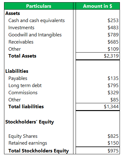
Example #1 – Balance Sheet
A balance sheet reports the financial position of an entity as on a particular date. These are generally prepared at the end of the financial year i.e. 31 st March or 31 st December depending on the custom followed in a particular country. The balance sheet typically reports the following three classes
- Assets – These are a measure of the resources owned by the concern. These help in creating future value and enabling revenue and inflows of funds in the coming time. The assets exist both in tangible and intangible form and some of the items depicted in it might refer to the receivables from external parties.
- Liabilities – These depict the resources owned by the concern in financial terms. The concern needs to settle this sometime in the future to continue running the business in a healthy way. Non-fulfillment of such liabilities beyond a period of time would lead to loss of reputation, penalties, and ultimately a shut-down of the business. These exist primarily in two forms, those that will be settled within 12 months referred to as short term liabilities, and those that will be paid after a duration of 12 months called long term liabilities
- Shareholders Equity – It is a measure of the amount the concern owes to its owners or shareholders. It will be equal to the difference between the assets and the liabilities the concern owes to external parties. It consists of equity capital, preferred shared capital along the earnings that have been retained to be utilized in the business.
Below is an example of a balance sheet of entity A which has just started with its operations
Example #2 – Notes to Financial Statements
The face of the financial statements (balance sheet, income statement, and cash flows) summarizes the activities performed in the year in financial figures, however, it is important to understand the accounting principles, policies, and assumptions under which they are prepared. Notes to accounts fulfill this purpose. Some of these notes are required compulsorily by the accounting board governing standards under which the financial reports are prepared while some of the notes are prepared to aid understanding and give an explanation for the items mentioned in the statements.
Usually, the following notes to accounts are present
- Accounting policies – It lists the important accounting principles that are followed like revenue recognition, depreciation, inventory method, evaluation of intangible assets, foreign currency fluctuation, etc. These are important to understand in trying to make sense of the information that is provided in the statements. Different numbers would be plotted if different principles are instead followed. Also, if there is any change in the method from previous periods, that has to brought to the attention of the stakeholders along with the impact thus induced.
- Fair value measurements – All items that are susceptible to fair value treatment (e.g. investments) would be mentioned here along with the values followed among the choice between historic and fair value.
- Mergers & acquisitions – any transactions relating to the merger between the reporting entity and any external party is expounded here along with the details of the deal
- Contingencies – Any potential liability that could materialize in the future is mentioned here along with the impact. Also, any litigations against the company that could potentially induce penalties or fines are summarized.
- Exceptions – any event beyond the scope of normal business activity that needs to be communicated to the stakeholders is lineated here. Usually, these are events that could potentially affect the working of the entity in the upcoming years.
Example #3 – Management Discussion & Analysis (MD&A)
This is a section in the annual report following the financial statements and notes to accounts that is an explanation of the events that have conspired during the reporting period from the management to the stakeholders. It lists down causes for the performance of the entity, what were the major factors that affected the growth in the current period, how the performance measures against that of its competitors and the outlook towards the future. This is an unaudited section of the annual report.
The following are the functions of this section
- Commentary on the performance of the entity, the compliance with the law and regulations, and the major changes that impact its growth in the reporting period
- It lists down the current risks affecting the entity and the industry in general, the controls that have been taken to evade such risks, and the new projects/plans for the future
- It mentions the major capital expenditures that took place, the liquidity position, and the management plan for any future intake of debt or issuing of equity.
- It explains the critical accounting policies and estimates and how changes in them have affected the concern
Conclusion
Financial reporting is the vital cog in the wheel of understanding the operations and position of a concern. Although the major forms of reporting like the financial statements ensure the operations are adequately captured it is essential that the reporting also makes way for the understanding and readability of such figures. Recently, therefore a lot of emphases have been put on the notes to accounts and such functional parts.
It is important that the reporting captures the major attributes of the functioning without being vague or overly complex. Given the high importance that is placed on its shoulders, financial reporting and those that are involved in its orientation have a big responsibility towards the stakeholders.
Recommended Articles
This is a guide to the Financial Reporting Examples. Here we discuss the introduction and practical Example of Balance Sheet, Notes to Financial Statements, Management Discussion & Analysis along with detailed explanation and downloadable excel template. You can also go through our other suggested articles to learn more –
Источник
Chart report on financial results of company download in Excel
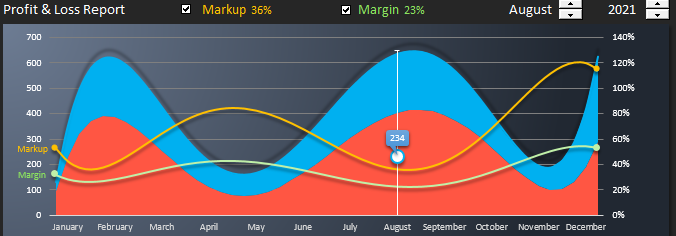
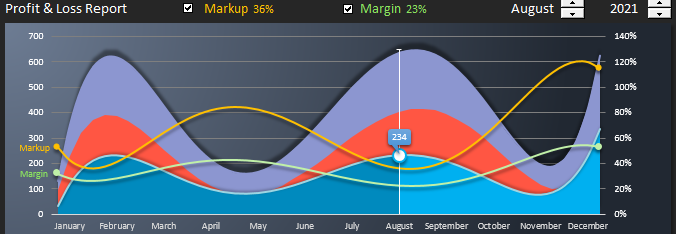
Standard Excel tools, you can create beautiful graphical reports from boring monotonous data tables. In such graphical reports, you can use the controls making them also interactive. There is no need to resort to VBA macros. You just need to select the controls for the values on the tab “DEVELOPER” in the group of tools “Controls” — “Insert”. Let’s take a closer look at the graphical report, and at the end of the review you can download the finished example in the Excel file.
How to make a chart report without using macros in Excel
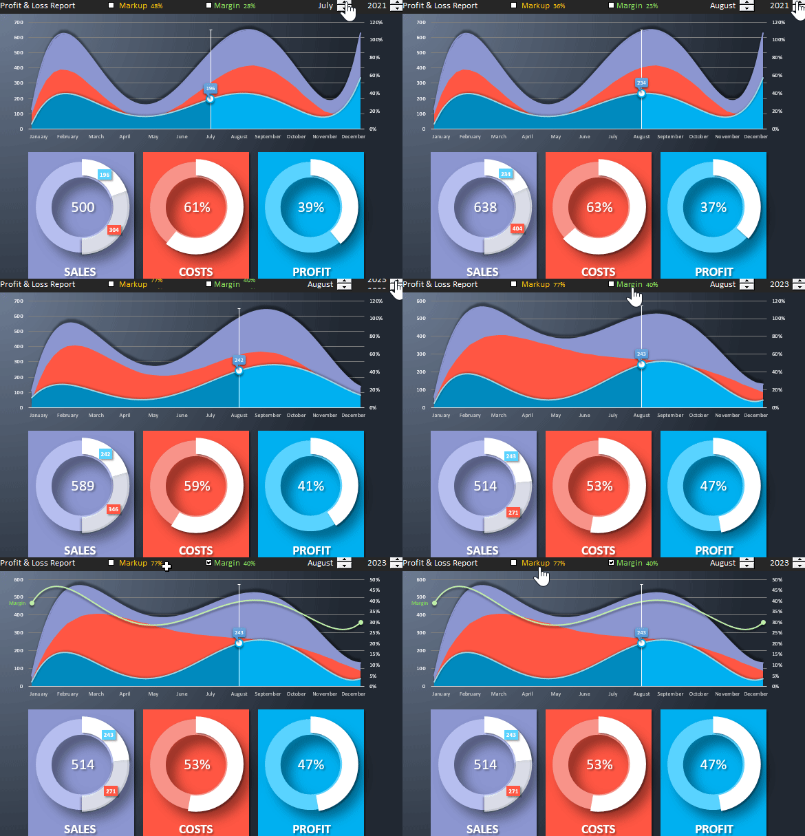
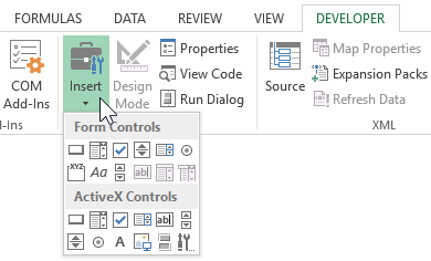
As you can see from the animated *.gif image above, for the interactive interaction with the report data, built-in Excel value control elements (2 counters and 2 flags) are used. All these and other elements are located on the tab of the DEVELOPER toolbar:
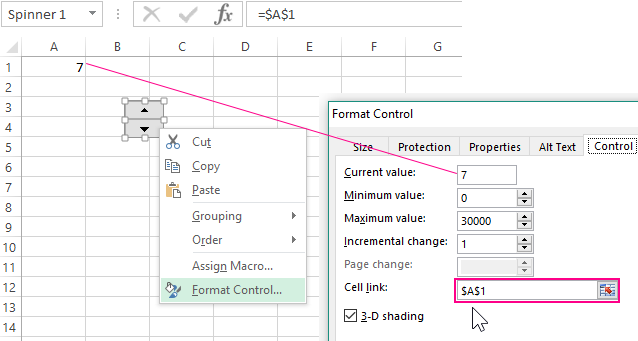
Not all, but most of these controls in their properties have the option “Cell link:”, as shown in the figure below:
If we provide a link to the cell we need, then when interacting with the element, we change the values in the same cell. The conditions and parameters of changes are configured in other options of the element.
This approach opens up wide interactive possibilities without using VBA macros! After all, controlling the value of at least one cell, we can, with the help of many formulas, construct an entire program in Excel without programming! Next, consider a simple example.
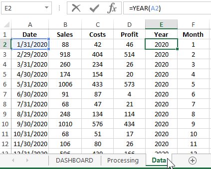
For example, simulate a situation. Suppose on the “Data” sheet we have a table with statistical values of the monthly financial indicators for the company’s sales:
Even based on this primitive data, you can already build many reports. In this example, we should visually present the data like this:
- Correlation of volatility with dynamic fluctuations of average monthly sales, expenses and profits.
- Dependence and correlation of markup and margins at different average indicators for sales, expenses and profits.
- What and how is the markup and margin different in numbers and visually.
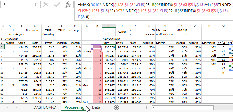
Before displaying dynamic changes on the chart and giving them user interactivity, it is necessary to process and prepare the initial data using formulas. All this is implemented on the sheet «Processing»:
Pay attention to cells A1, B1, D1 and E1. These cells are referenced by their respective controls from the DASHBOARD sheet. They change the values in these cells, and then the formulas of the “Processing” sheet recalculate their values referring to the same cells. As a result, all graphs and charts on the DASHBOARD sheet are automatically redrawn with respect to data changes in the calculation results by formulas. Therefore, the graphs and charts refer to the same results.
Thus we get the program in the form of an interactive report. We can safely call this graphic report template in Excel a program, despite the fact that when we created it, we did not use the VBA macro programming language. After all, the essence of any program is data processing, it does not matter what kind of program: games, working with databases, ERP or CRM systems, etc. Each program, by its nature, receives data at the input, and outputs the result of its processing at the output. And it doesn’t matter for users in which programming languages and which technologies the program was created and the quality result is important, as well as for everything to be fast, simple and beautiful. After all, this is magic.
Having dealt with the device of the template for a graphical report on the financial results of the company, you can change it to reconfigure for other types of reports based on the same source data. For example, in the profit graph, you can change the links not to the average values by Approximation, but to the actual ones, while not changing the average expense graph. As a result, we get another type of graphical presentation of data: Report on the method of average costs plus profit in Excel.
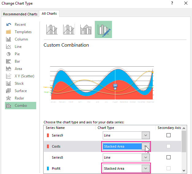
You can also abandon a number of graphs of average monthly sales indicators in order to change the semantic design of areas on the tab “CHART TOOLS” — “DESIGN” — “Type” — “Change Chart Type”.
In the window that appears, for the series of average expenses and average profit, apply the chart type “Stacked Area”:
Thus, the values of these two indicators will be added to the third indicator “Average monthly sales”:
Profit + Costs = Sales Amounts. And combining the formulas and graphs of this template, you can create many other graphical reports on the same statistics.
Download example chart report in Excel
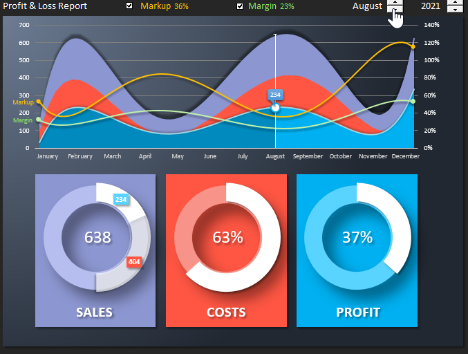
We will briefly review the initial version of the graphic report template on the financial results of the company in Excel. And in the end, you can download an example template from the link to the Excel file for a detailed and practical introduction to the principles of operation and formulas. On the main sheet of «DASHBOARD» there are 2 main blocks of visualization of company activity data for the last 5 years (from 2020 to 2025).
- The first block contains a chart with areas and controls for a graphical report. Using the interactive controls, you can switch by year, move the cursor by month and enable or disable markup and margin curves:
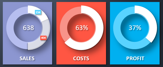
- In the second block are 3 charts with average sales, expenses and profits for each month. When you move the cursor on the upper chart by months, the chart data in the lower block is updated automatically:
- the first chart shows the ratio of profit, expenses and sales;
- the second chart shows the share of expenses in sales;
- the third is the share of profit.
This is a fairly simple example that clearly demonstrates how to create graphical interactive reports with animated data visualization without using VBA macro programming in Excel. If desired, and a certain level of skills, you can create even more complex and functionally beautiful reports than this:
In the following articles, we will repeatedly consider the creation of interactive reports, dashboards, examples of data visualization with charts and graphs in Excel without using macros. In the security policy of many companies, it is forbidden to run macros from files in any Excel format. But thanks to built-in special tools and formulas, you can do without programming to make interesting reports. Anyone who knows how to present their work is moving up the career ladder faster than anyone!
Источник
Planning a project only gets you so far. You also have to monitor your progress and performance to track if you’re on schedule and within budget. Then there are your stakeholders whose expectations must be managed. That’s where Excel report templates come in.
Project reports are tools that project managers use to extract valuable project data. Excel report templates are a great tool to determine how you’re doing and keep your stakeholders updated.
Using Excel Report Templates for Project Management
The great thing about Excel report templates is that they’re free to download. Below are 10 essential Excel report templates that you can use now to get valuable data on your project. These Excel report templates cover everything from status reports to risk registers for a clear view of how your project is doing.
Microsoft Excel is a great tool as these Excel report templates show, but they only go so far. Excel report templates must be imputed manually and are labor-intensive. They also don’t reflect real-time data so they’re always slightly behind. Project management software is the next step to gaining greater efficiency in managing your project, but if you’re not ready for that, Excel report templates will help.
Excel Report Templates for Project Management
Below are Excel report templates for project management, but they’re only a small sampling of the free project management templates we have to download on our template page. There are dozens of Word and Excel templates to help you through every stage of your project’s lifecycle.
We’ve culled through that pack of templates to highlight our free Excel report templates. Download one or all of them now and use them to extract the information you need to deliver a successful project. When you’re ready to take your project templates one step further, read to the end and see how project management software leaves Excel project templates in the dust.
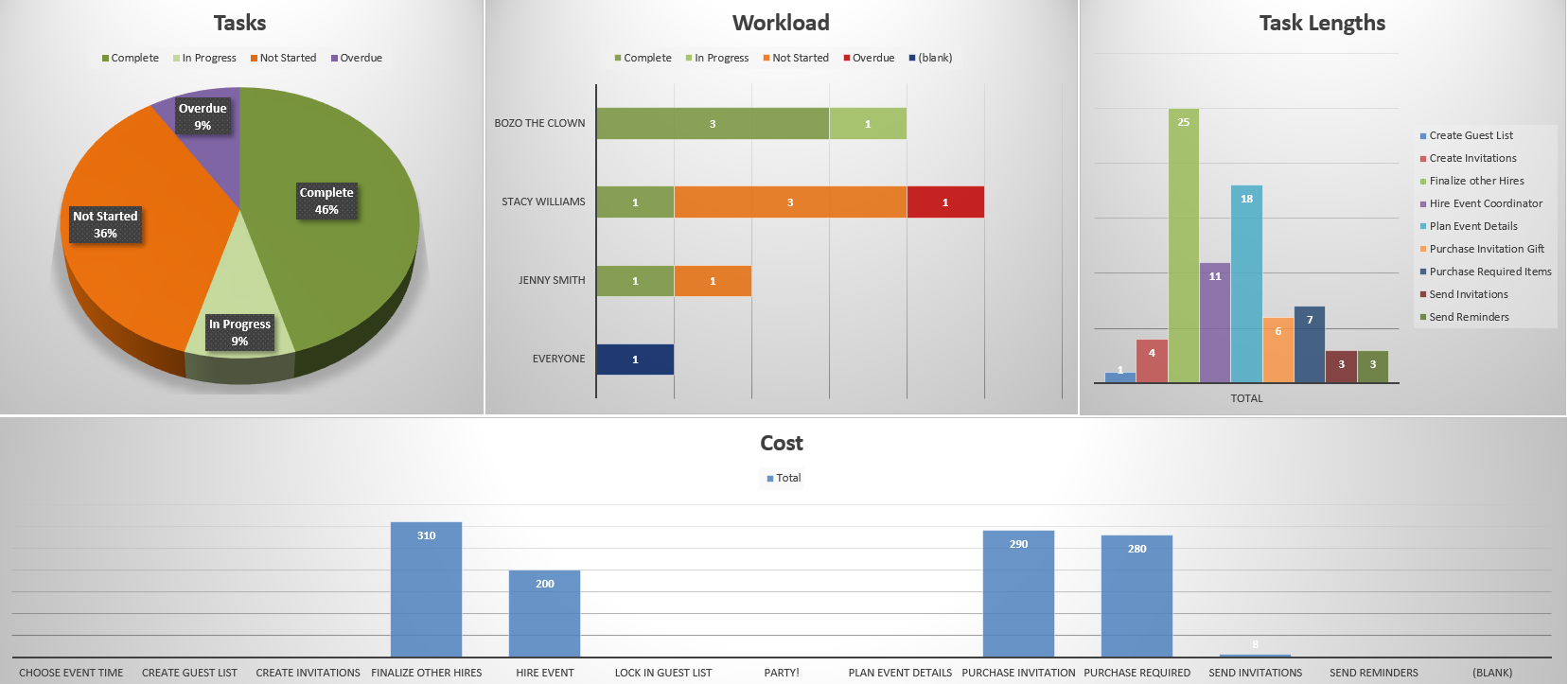
1. Project Dashboard Template
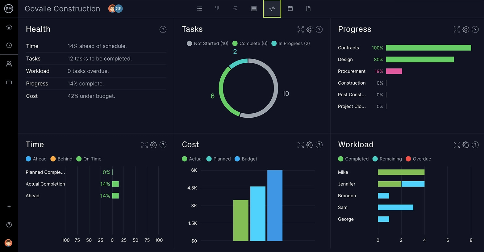
Just as the dashboard on your car helps you track speed, mileage, gas consumption and more, our free project dashboard template is a window into the progress and performance of your project. It’s made up of a variety of graphs, such as a pie graph that shows how your team is progressing on their tasks to bar charts on workload, task lengths and project costs.
The free project dashboard template is a high-level view of your project. It gives project managers a glimpse into what’s going on in the project so they can make better decisions. This Excel report template makes for a great communicative tool. Numbers can end up floating around on the page if math isn’t your strong suit, but the visual elements of the free project dashboard template create a quick and easily digestible way to deliver project data to stakeholders.
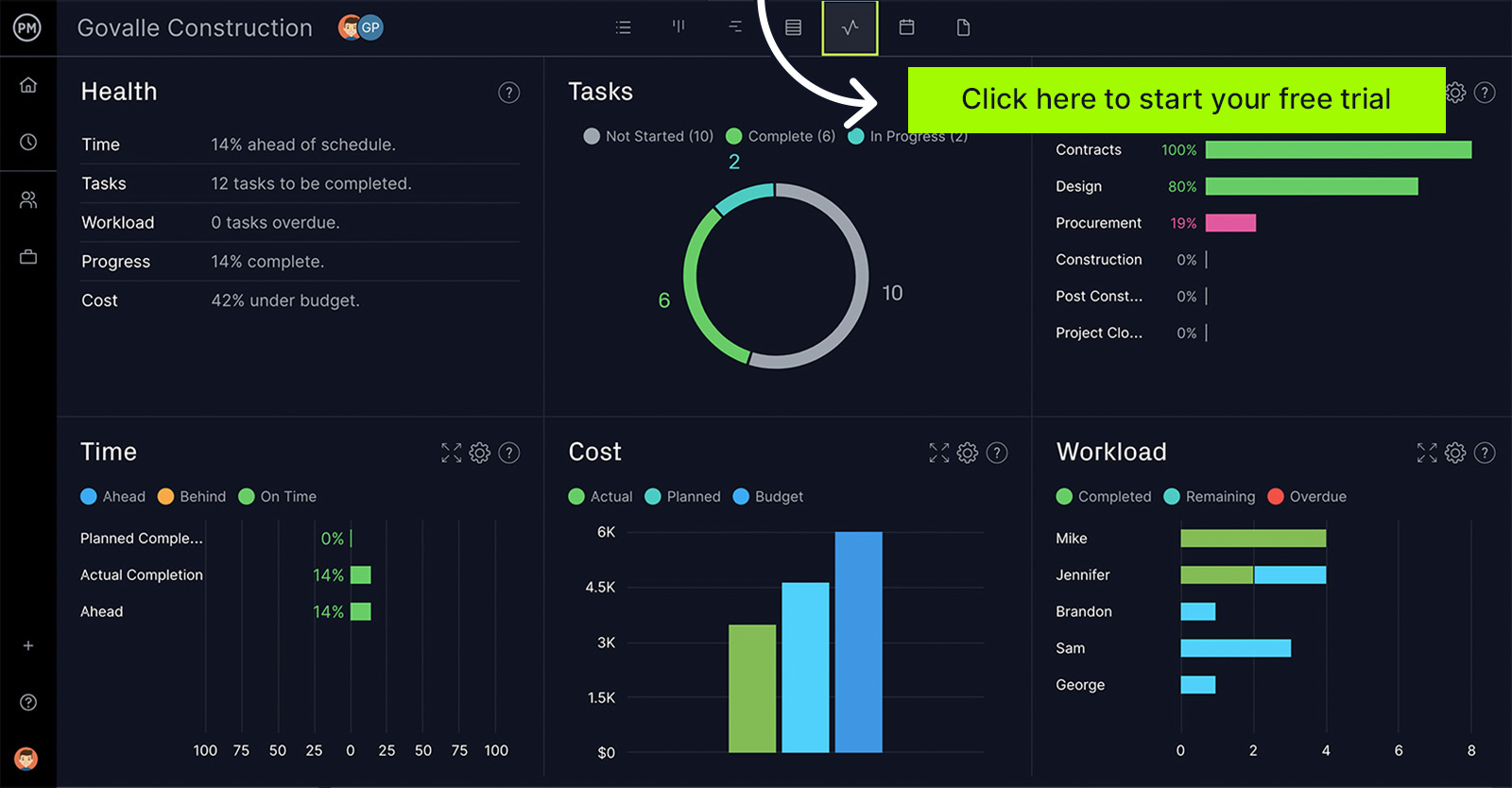
ProjectManager software delivers more than any template. ProjectManager is online software that isn’t static like a template but instead connects to your project plan, schedule, resources and more. Our real-time dashboard receives live data as teams update their status so you’re always seeing current and accurate project information. There’s no data to input and it’s all done automatically. Get started with ProjectManager today for free.
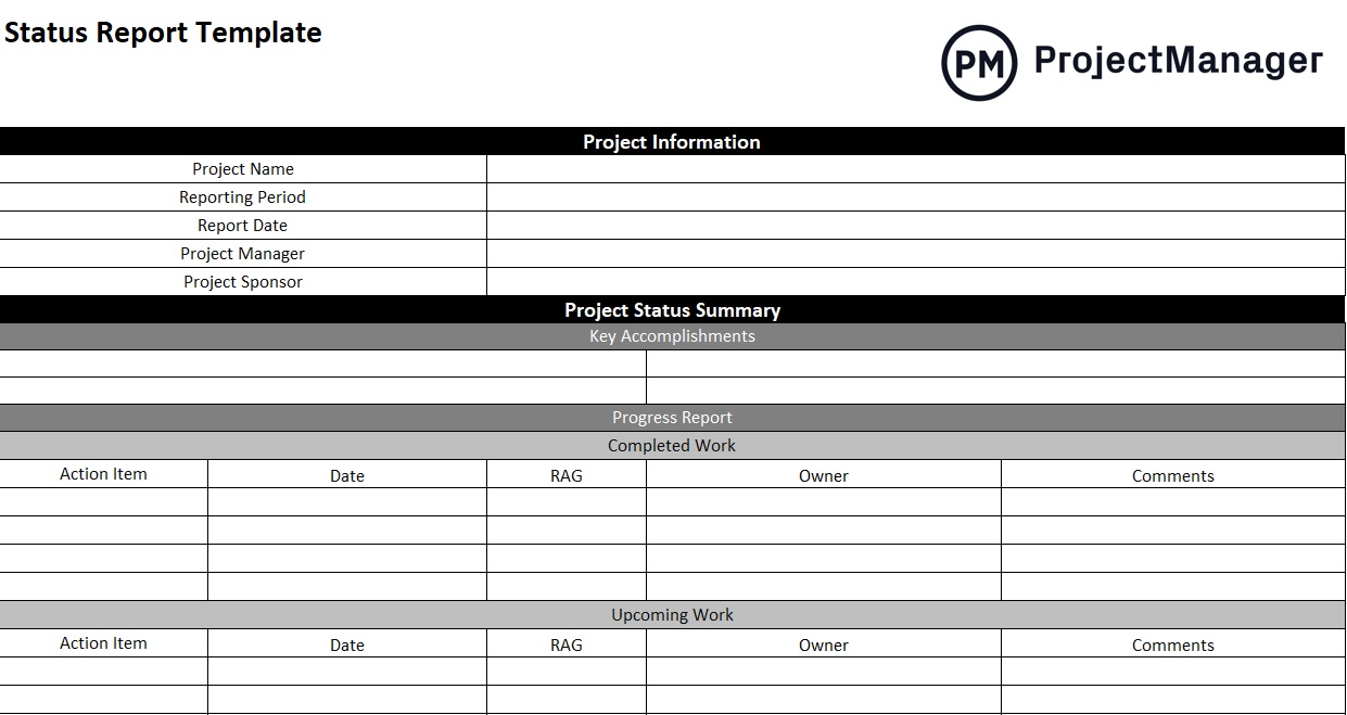
2. Project Status Report Template
Being able to get a snapshot of your project that shows its current state is critical for proper management. Our free project status report template lets you see the health of your project and how it’s progressing against your project plan. It can be used to communicate with stakeholders who prefer a more general synopsis of how the project is doing.
This Excel report template is still a wealth of important information, from a summary to project health to risks and recommendations. That includes key accomplishments, what work is completed, what’s still ahead, milestones that have been reached and deliverables. There’s also a place for action items, overviews of the budget, schedule, quality and scope, and even roadblocks that need to be addressed.
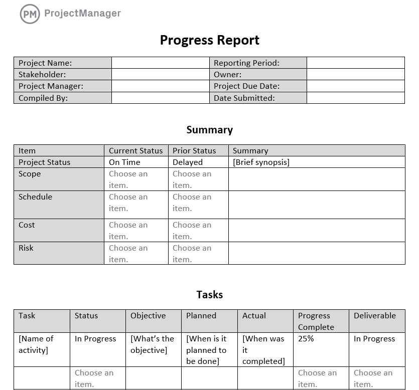
3. Progress Report Template
Knowing the progress of your project is one of the best ways to make sure you’re meeting scheduled milestones. Our free progress report template is a way to record the movement of your project over a specific period of time. That timeframe can be a week, a month or whatever is appropriate for your project Our free Excel report template captures the data.
The Excel report template provides a summary of the project status, scope, schedule, cost and risk and then goes into more detail about all the tasks executed over the timeframe. It also looks at any issues that came up over this time period and how they impacted the budget. It then notes any existing or expected accomplishments.
4. Project Task Tracking Template
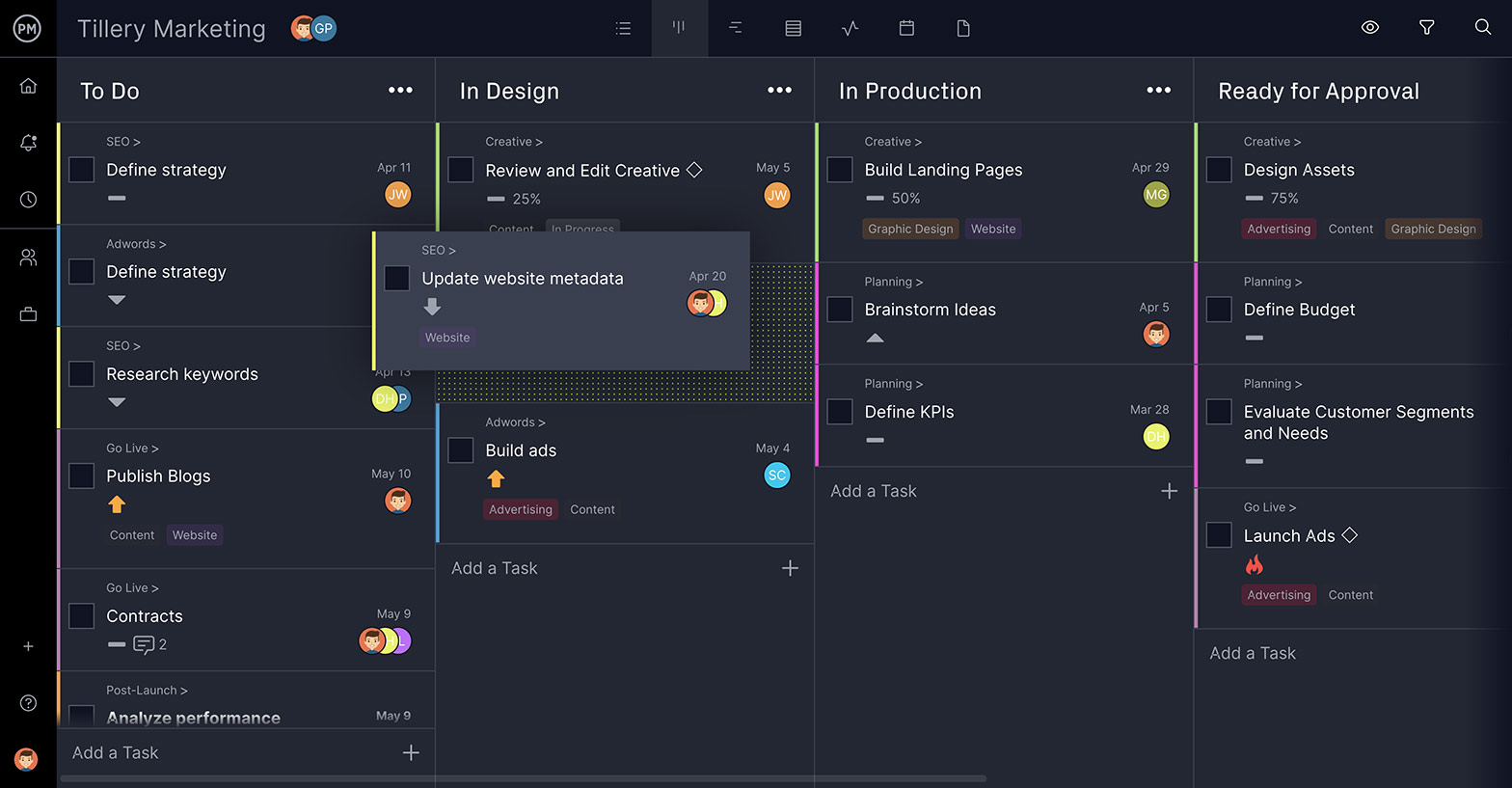
Keeping a project on schedule is one of the main responsibilities of a project manager. One way to accomplish this goal is with our free project task tracking template. It’s a tool that allows you to create a task list and use that to make sure each task in your project is on track to make its deadline. If not, you can reallocate resources to get it back on schedule.
The Excel report template is set up to capture the task and a brief description. It outlines if it’s a dependent task and who it’s assigned to. There are also pulldown menus to note the priority, start date, planned end date and actual end date for each task. There’s a status column to note if the tasks are opened or closed and a space to add other details not collected already.
Of course, tracking tasks is even easier in project management software like ProjectManager. You can create subtasks, assign work, filter for tags and update progress in real time. Managing tasks in the kanban board lets you visually monitor a task’s lifecycle and eliminate bottlenecks to keep work moving.
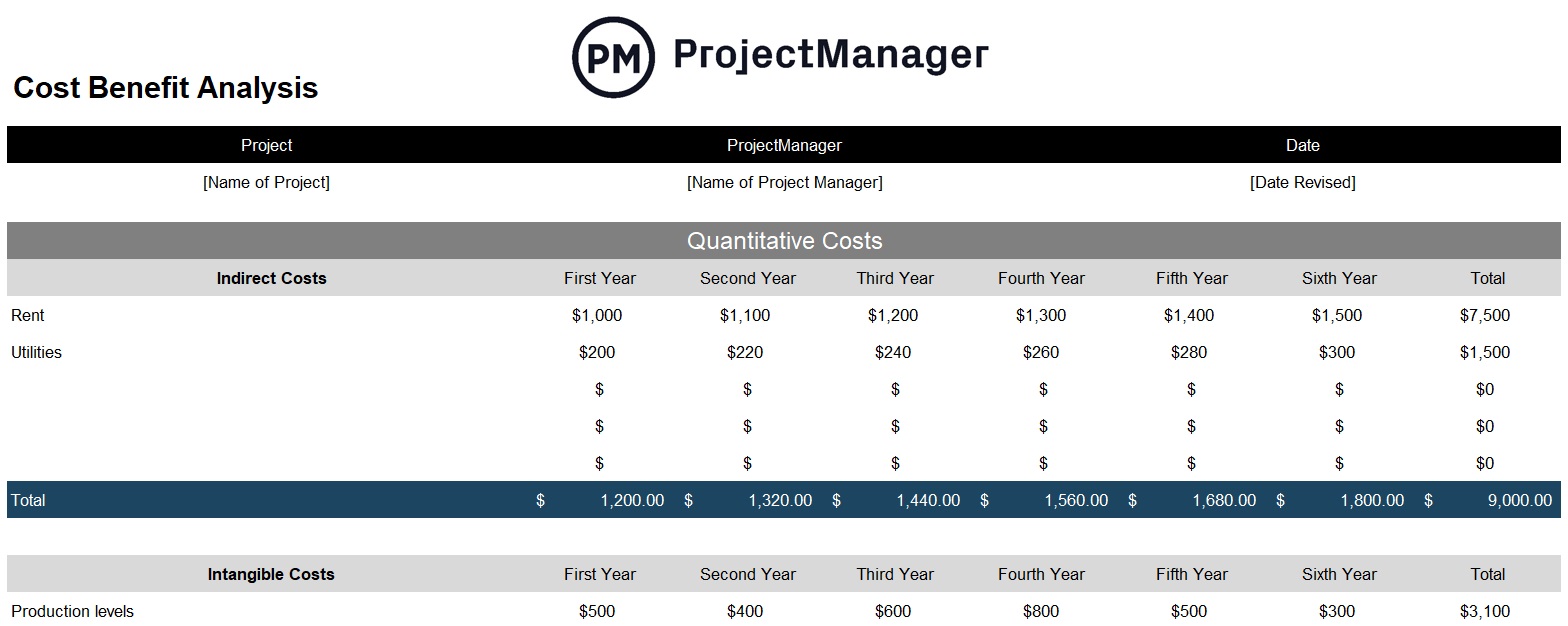
5. Cost Benefit Analysis Template
This Excel report template is a bit different. You use a cost-benefit analysis template to see if the project is viable and worth funding. There are always questions to answer before initiating a project, such as whether will meet a need, provide a service and whether you can deliver on deadline and for a reasonable cost.
The cost-benefit analysis is a way to answer those questions before investing and risking the financial solvency of the organization. It lets you examine the numbers and make a knowledgeable decision about whether to go through with the project or not. This might be one of the most important Excel report templates you’ll use and it should always be part of your research.
6. Gap Analysis Template
Whether you’re managing a project or an organization, you’re always on the lookout for ways to innovate and be more efficient and effective in meeting your long-term goals. A gap analysis template is a tool that helps conduct a strategic analysis of when you are, where you want to be and, most importantly, how to get there.
Using this Excel report template is the first step to making an action plan that can help you close the gap you’ve found in your analysis. It helps you see the path to achieving those strategic long-term goals that help you grow and stay competitive. Like many Excel report templates, it also acts as a communication tool for stakeholders and employees, providing a lodestar to follow.
7. Lessons Learned Template
After you’ve delivered a project, it’s important to learn from it. What worked? What didn’t work? You can then take that knowledge and apply it to future projects to manage them better. One of the most important Excel report templates you can use is this free lessons learned template.
The lessons learned template creates a space in which you can capture all the information you need from what is a win or a loss, describing what happened, the impact, how to change things to improve and then a list of action items to implement those changes. Use this Excel report template when doing a post-mortem with the project team. Get their feedback as they were on the front lines of the project and can offer a unique perspective.
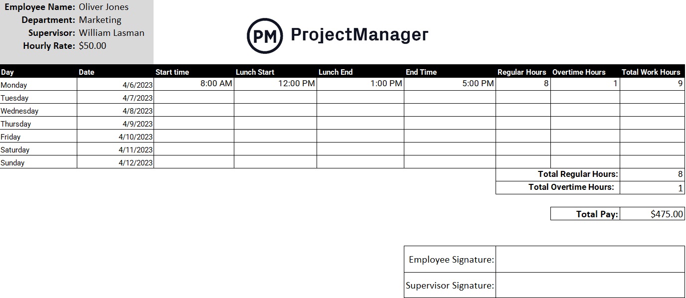
8. Timesheet Template
Another Excel report template is our free timesheet template. It’s a tool that not only helps with payroll but allows project managers to track the time each team member is spending on their tasks. You can track cost per hour, vacation and overtime to help stay on schedule.
This free Excel report template captures the personal data of each team member, including the department in which they work, their supervisor and their hourly rate. Their weekly hours are then collected and totaled to show you how much time they put in and what tasks they’ve completed or are still working on. Finally, there’s a signature line for the employee and supervisor.
9. Risk Register Template
All projects have risks associated with them. We think of risks as bad, but some risks are good in that they open up an unforeseen opportunity. Our free risk register template helps you plan for risks, set priorities and outline who on the team is responsible for following through.
This free Excel report template is important in helping you identify and respond quickly to any issues that show up in the project. You can’t know every risk that might show up, but with the help of your team’s experience, you can outline a majority of the likely risks and have a plan in place to effectively mitigate risks or take advantage of them.
10. Change Log Template
Having a change log template is key to any change management process. Project plans are important but they’re not etched in stone. When changes occur in your project, whether external or internal, you need to have this free Excel report template to capture that change and track it throughout the project or until it’s resolved.
The free change log template has a place for everything you need to identify and track changes in your project, such as when it was first discovered and who discovered it. The more data around the change, the more you can control it and make sure it doesn’t derail your project.
How ProjectManager Makes Reporting More Robust
These Excel report templates are a good start, but if you want to cross that project finish line on time and without accruing extra costs, then you need project management software. ProjectManager is online project management software that automates reporting and delivers real-time data for more accuracy and better decision-making.
Use Real-Time Dashboards
The dashboard template only gives you a taste of what a dashboard can do. Our real-time dashboard automatically captures live data. You don’t have to manually input it. It also does the calculations for you and then displays the results in easy-to-read graphs and charts. This high-level view is constantly updating so it’s like a high-level status report that’s always at your fingertips. While other project management tools have dashboards, often you have to set them up. That wastes time. Our dashboard is ready to go when you are.

Get Customizable Reports
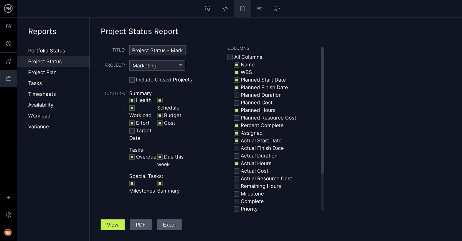
All of the Excel report templates we’ve featured for free download are static documents. Our reports can be generated quickly and each can be filtered to show only the data you want to see or share with stakeholders. There are reports on portfolio status, project status, project plan, task, timesheets, availability, workload and various others to help you see in real time how the project is progressing and performing. Excel report templates don’t take the complex data from your project and turn it into helpful and digestible information, but our software does.
The dashboard and reports are all collecting data from the many features that make our software unique in the project management space. We have robust Gantt charts that schedule tasks, resources and costs. Our kanban boards help to visualize your workflow while the sheet, list and calendar views are all designed to help you work how you want. Our collaborative platform connects everyone on your team, different departments and even outside enterprises so your reports can be shared with those who need to see them.
ProjectManager is award-winning project management software that creates efficiencies by connecting everyone in real time. With features to plan, monitor and report on projects, and manage resources and risks, we have the one tool for all your project management needs. Join teams from NASA, Siemens and Nestle, among other organizations, delivering success. Get started with ProjectManager today for free.
Related Posts
Report Templates
Reports are very essential to all the departments and divisions of the company. They all do these simple reports to present the needed information that can allow a business to do the next steps of planning to achieve its goals. Data that were being gathered should all be recorded accurately so that results will show the real status of the operations and other transactions of the business. There are design templates for a photo project, executive summary, nursing incident, university student, monthly consumption, school layout, audit sheet, software installation, and much more. You may also see report samples.
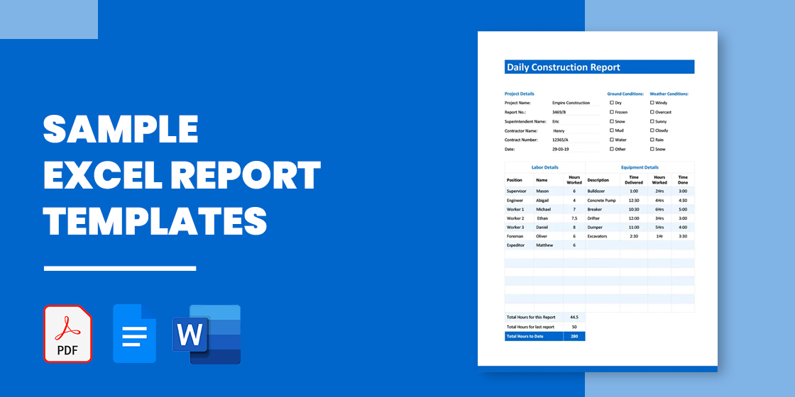
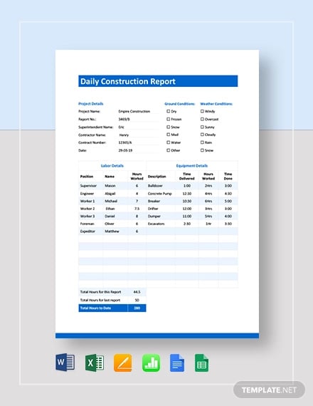
Daily Construction Report Sample
Details
File Format
- Google Docs
- Google Sheets
- MS Excel
- MS Word
- Numbers
- Pages
Size: A4, US
Download
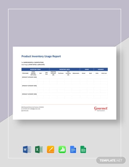
Product Inventory Usage Report Template
Details
File Format
- Google Docs
- Google Sheets
- MS Excel
- MS Word
- Numbers
- Pages
Size: A4, US
Download
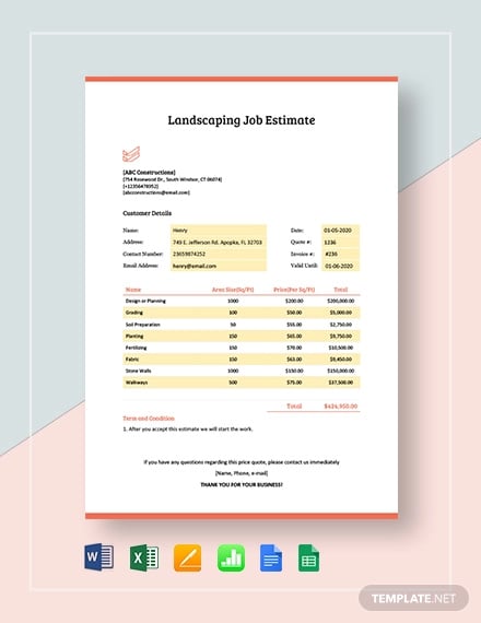
Sample Landscaping Job Estimate Report Template
Details
File Format
- Google Docs
- Google Sheets
- MS Excel
- MS Word
- Numbers
- Pages
Size: A4, US
Download
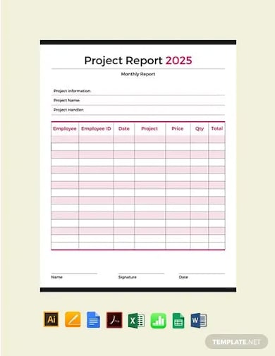
Design Project Report Template
Details
File Format
- MS Excel
- Illustrator
- MS Word
- Apple Numbers
- Apple Pages
Download
School Student Report Card Template
Details
File Format
- MS Excel
- Illustrator
- MS Word
- Apple Numbers
- Apple Pages
- Publisher
Download
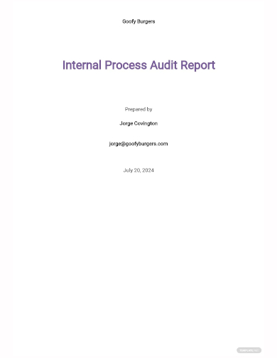
Sample Internal Process Audit Report Template
Details
File Format
- MS Word
- Google Docs
Download
Security Incident Report Document Template
Details
File Format
- MS Word
- Google Docs
Download
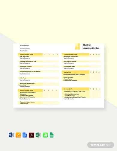
Preschool Progress Report Card Layout Template
Details
File Format
- MS Excel
- Illustrator
- MS Word
- Apple Numbers
- Apple Pages
- Publisher
Download
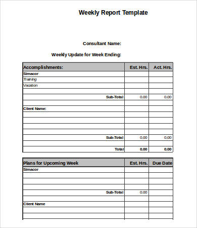
Free Executive Summary Weekly Excel Report Template
Details
File Format
- XLS
- XLSX
Size: 43 kB
Download
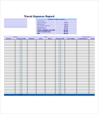
Free Sample Excel Expense Report Template
Details
File Format
- XLS
- XLSX
Size: 10 kB
Download
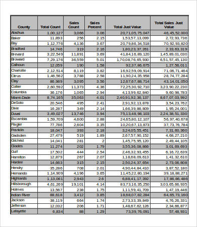
Free Excel Consumption Sales Report Template
Details
File Format
- XLS
- XLSX
Size: 24 kB
Download
Using an excel report can give a positive impact on the working environment as it can provide both accuracy and efficiency in presenting data. Especially to those companies who are working with large information and a wide scope of operations, using an excel sample report would be of the most advantage. You may use our available Excel report templates and other kinds of Report in Google Docs samples for your data presentation and reporting purposes.
If you are running a business reports are very important in every sphere of your departments. They will help you provide important information for the smooth running of your business firm through proper communication. So, check out this Report Templates in Microsoft Excel format. Download now!
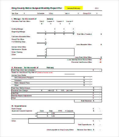
Free Sample Excel Business Monthly Report Template
Details
File Format
- XLS
- xlsx
Size: 9 kB
Download
Uses of an Excel Report
Because of the functionality that it can provide, an excel basic report may be used for a lot of purposes. A few of these are the following:
- Call Reports
- Tracking Reports
- Daily Work Progress Reports
- Activity Report
- Weekly Inventory Reports
- Monthly Production, Sales, and Operation Reports
- Expense and Financial Reports; and
- Sales Generation Reports
Advantages of Using an Excel Report
With the formulas that you can easily use and the ability to track data faster, an Excel report is truly an important tool that can make our work easier. Other advantages that you may have in using an excel report layout are as follows:
- Getting the totality of information, especially on numbers is easier with Excel
- It removes errors in the entire process of recording, in the exemption of human errors being done by the person who inputs the data, hence making the process more effective
- It is very easy to use and there are a lot of tutorials on how you can learn its functions
- It allows the user to manipulate and manage the data needed to be in a design report
We have more specific samples on our Monthly Excel Report Template and Excel Sales Report Template collection found on our website.
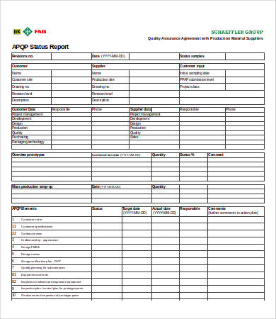
Free Sample Excel Installation Status Report Template
Details
File Format
- XLS
- xlsx
Size: 68 kB
Download
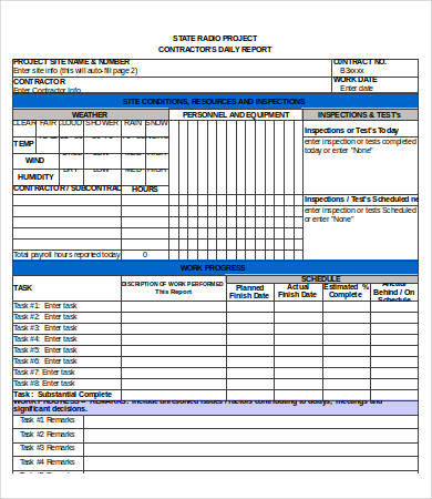
Free Sample Excel Daily Research Report Template
Details
File Format
- XLS
- XLSX
Size: 18 kB
Download
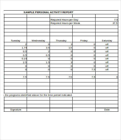
Free Financial Collection Activity Reporting Template Excel
Details
File Format
- 18 kB
Size: 7 kB
Download
Free Sample Excel Writing Report Tracking Template
pdhonline.com
Details
File Format
- XLS
- xlsx
Size: 7 kB
Download
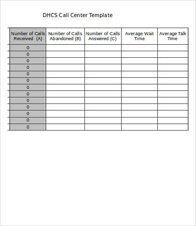
Free Nursing Technical Call Report Template Excel
Details
File Format
- XLS
- xlsx
Size: 10 kB
Download
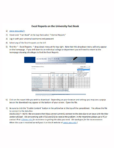
Free Sample University Excel Annual Report Template
Details
File Format
Size: 756 KB
Download
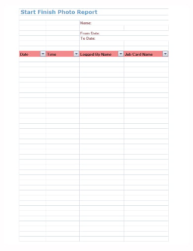
Free Sample Photo Excel Report Template
Details
File Format
- XLS
Size: 20 KB
Download
Learn to Create and Fully Maximize the Use of an Excel Report
Learning the process of creating an excel report in Google Sheets may vary depending on the person who is to learn and the conditions on how he or she can learn faster in the most comfortable way. One option that you can do is to do trial and error testing. Just try to learn the entire process and how certain computations and other functions may be done. Learning the basics is always a good foundation in learning more complicated functions. You can also see more on Annual Reports in Excel.
Also, there are a lot of videos and manuals that may help you widen your knowledge in the usage of this tool. You can also ask someone who has already used it to serve as your tutor regarding the processes that you wanted to learn about. You can also see more on School Reports in Excel.
Aside from our Excel expense report templates, you may also download our Call Center Report Template samples on our website.
More in Report Templates
| 13+ Board Report Templates — Free Sample, Example Format … | Production Report Templates — 10+ Free Sample, Example, Format … |
| 310+ Report Templates – Free Sample, Example, Format Download … | 14+ Internal Audit Report Templates – Free Sample, Example … |
| 8+ End of Year Report Templates – Free Sample, Example, Format … | 21+ Monthly Sales Report Templates – Free Sample, Example … |
| Report Outline Template – 10+ Free Sample, Example, Format … | Investigation Report Templates — 12+ Free Sample, Example, Format … |
Excel reports output a downloadable Excel spreadsheet that contains the defined data set and any templates, charts, tables, or other elements added to the customized Excel template. Excel reports use the Report wizard’s filters and groupings/summaries, and once the report parameters have been defined in the rest of the wizard, you can download the Excel template in the Customize Excel tab of the Report wizard and begin to customize it. For example, after defining the data, filters, groupings, and other parameters, you might customize the template to include a PivotTable analyzing the data, and a PivotChart to display the results at a glance.
Unlike graphical, HTML, and text reports, Excel reports can pull data from multiple tables. You can then use PivotTables and charts to analyze the data in any combination. To create an Excel report with data from multiple tables, configure an Excel report in each table with the data you want to use, and then create a combined report that uses those reports as data sources.
Excel reports look different from other reports, so if you haven’t worked with them before, we recommend exploring the Example Reports before you begin.
Example Reports
Before you create your own Excel reports, it can be helpful to explore an example to see how these reports work differently from graphical charts, custom summary reports, or HTML and text reports. In this section, you can follow a guided tour of two example Excel templates.
Single-Source Example
Let’s begin with a simple example template that pulls data from a single source.
- Download Contracts Excel Dashboard.zip, extract the Excel file, and open it.
- Explore the contents of the Sample Dashboard worksheet. This worksheet arranges all the configured charts onto one screen to function as a dashboard.
- Click through the next worksheets, which each contain one of the charts shown on the Sample Dashboard worksheet. In this example, each chart is placed with its corresponding PivotTable on its own worksheet, and duplicated on the Dashboard worksheet. Keeping PivotTables separated can help prevent problems and make maintenance easier.
- Open the last worksheet, titled Data. This worksheet contains the data pulled by the report and placed into the Excel file. The columns are determined by the report’s defined view, and the records included are determined by the report parameters. The charts and PivotTables we explored in steps 2 and 3 refer to this worksheet, so it’s important to preserve the layout and format of the Data worksheet. For example, if someone updated the view for this report and removed the Contract Start Date, several of the charts would break.
To create a similar single-source Excel report, complete the steps in the Create a Basic Excel Report and the Customize the Excel Template sections.
Multi-Source Example
Now, let’s explore a more complex example that pulls data from four sources.
- Download Combined Dashboard.zip, extract the Excel file, and open it.
- Explore the contents of the Dashboard worksheet. This worksheet arranges several charts onto one screen to function as a dashboard.
- Open the next worksheet, Pivot Tables. This example places all the PivotTables onto a single worksheet. These tables are used to create the charts on the Dashboard worksheet. When the template includes several automatically-created Data worksheets, you might find it helpful to concentrate your PivotTables onto a single shared worksheet to make the file easier to navigate.
- Click through the last four worksheets, titled Data1, Data2, Data3, and Data4. Each worksheet contains the data pulled by one of the specified source reports. Each worksheet has its own set of columns defined by the view of the source report, and the records included are determined by the source report parameters. The charts and PivotTables we explored in steps 2 and 3 refer to these worksheets, so it’s important to preserve the layout and format of the Data worksheet, and not to change the order of the source reports after you’ve configured the Excel template.
To create a similar multi-source Excel report, create a basic Excel report for each source table. Then, create a combined report using the basic reports you created, and finally complete the steps to Customize the Excel Template.
Create a Basic Excel Report
In general, report parameters depend heavily on your specific reporting needs. When you set up an Excel report, there are additional considerations for certain parameters.
If you’re planning to create a combined Excel report with data from several tables, you need to configure an Excel report in each table that identifies the data using the steps in this section. Make sure you configure a report in each table you want to include in your final report.
Create a View for the Report
The view you choose for an Excel report determines how the report data is imported and formatted into the Data worksheet of the final file. All your template customization will rely on the column arrangement of the Data worksheet, so it is important to configure the view correctly the first time you set up the report, to avoid accidentally breaking the report.
-
Before you begin, determine the purpose of this view. Specifically, decide whether the view will be used outside of Excel reporting, and whether the view will be used for just this report or for multiple Excel reports.
We recommend creating a view specifically for Excel reports that is not used in the normal table view. If you are comfortable working with Excel, you might be able to create one view to use in all Excel reports for the table; this requires including more data than you need for any individual report and combing through the data in Excel later. If you are less comfortable working with lots of data in Excel, or if your system has an unusually large amount of data, you should consider creating individual views for each Excel report you create.
- Either from the Grouping/Summary tab in the Report wizard or from the table you are reporting on, create a new view.
- If you plan to use this view only for Excel reports, clear the check boxes for selection, edit, and view icons. In Excel, these icons don’t do anything.
- Set Max lines per record and Max lines per linked field to all. This makes sure the complete value is sent to Excel.
- Check the Display check box for the appropriate fields, with the following considerations:
- If you aren’t sure whether you need a field, it’s better to include it. You can always ignore the data in Excel, but it’s difficult to add fields to the view after you create an Excel report.
- If you plan to use this view for other Excel reports, select every field you might need in any of those reports. If you don’t select a field, your Excel reports will not receive any data for that field.
- Always include the ID field and, if possible, a second field with unique values, such as the summary field.
- Go to the Order/Colors tab and configure the field order. This corresponds to the order of the columns in the Excel data worksheet. We recommend putting the ID field and other important fields on the left, just like you do for regular views.
- If you plan to use this view outside of Excel, configure row coloring or notification icons as desired. If you plan to use this view only for Excel reports, you can configure row coloring directly in Excel later.
- Go to the General tab and name the view. Include «DO NOT EDIT» in the name to help prevent users from accidentally editing the view and breaking the report. If you plan to use this view only for Excel reports or only for a specific Excel report, mention that in the name as well.
- Set the Maximum View Width to a high value, such as 900 characters. You can adjust the column width in Excel later.
- Set the Records Per Page to the highest value available.
- Go to the Apply tab and make the view visible to every group that needs to view or edit the Excel report.
Set Up the Report
With your view ready to go, set up your Excel report as desired, with the following options:
- If you’re using this report to create a combined report, on the General tab, make sure the report title mentions the table name. For example, you might name your report «Service Requests Data for Combined Dashboard».
- On the Filter tab, leave the saved search set to None. Results can be filtered using a PivotTable in Excel, so usually a saved search filter isn’t necessary.
- On the Grouping/Summary tab, select the view you created and set a high value in Show not more than X records in each grouping, such as 100,000. This determines how many records are sent to Excel.
- If you aren’t using this report to create a combined report, when you reach the Customize Excel tab, click Create/Download New Excel File and proceed to the Customize the Excel Template section. If you’re using this report to create a combined report, you can skip the customized template.
Combined Reports
If you’re creating a combined Excel report with data from many tables, the first step is creating individual Excel reports in each table you’ll use as a data source. For example, if your combined report includes data from the Service Requests, Incidents, Problems, and Change Requests tables, you need to create an Excel report in each of those tables to identify the data set you want to use. For more guidance on creating usable Excel reports, refer to the Excel Report Parameters section.
After you create all the necessary source reports, your next step is creating a combined report that pulls from the other reports you created.
- In the left pane, expand the Home section and click Summary/combined reports.
- Click New.
- Give your report a title and description. Make sure the description lists the tables you’re using to provide source data.
- Select the Excel output format.
- Go to the Select Reports tab and click New.
- In the Combined Report wizard, select the table and then select the Excel report you created. Click Finish.
-
Repeat step 6 for each table and Excel report you want to include. Each one you select will create a separate Data worksheet in the Excel file.
The reports are sent to the Excel template in the same order they’re listed here. If you want to change the order, click and drag to move the reports.
- Go to the Customize Excel tab.
- Click Create/Download New Excel File and proceed to the Customize the Excel Template section.
- When you finish your Excel template, configure the Schedule and Apply tabs as needed. For details, see Create and Edit Charts and Reports.
Customize the Excel Template
After you configure the first set of report parameters, you need to create a template the system will use to generate your Excel reports. When a report is generated, your template is replicated exactly with the exception of the Data worksheet. The Data worksheet is replaced with new data from the system, pulled in using the parameters and view you configured. The rest of your template is automatically refreshed so the new data is applied.
This section includes tips for working in Excel, but some functionality might be slightly different depending on the version of Excel you are using. For additional help working with Excel, or for information about more advanced Excel features, refer to Microsoft Office support.
- In the Customize Excel tab, click Create/Download New Excel File to download the report with the current parameters.
- If necessary, customize the column width and text wrapping on the Data worksheets to make them readable.
Important: Do not rename Data, Data1, Data2, or similarly named worksheets. The system uses these worksheet names to generate the report correctly. - Add any necessary customization to create your report.
- Create new worksheets for your tables, charts, and dashboards as needed
-
Create PivotTables and PivotCharts on the new worksheets
- Set the design and colors appropriately
- Arrange charts and tables to make the report easy to use
- Save the file.
- Click Choose File and select the Excel report.
- Click Upload Customized Excel File.
- Test the report thoroughly and make adjustments as needed.
- When the report is next run according to the schedule, the system will take the run-time data and apply it to the new Excel report template.
This approach provides a high level of customization using advanced Excel features such as pivot tables, which allow you to segregate a lot of different data into easy views for granular analysis. In this case,
Agiloft simply provides the report data, and the template handles all of the presentation and formatting requirements. This requires the person building the template to have familiarity with advanced Excel functions.
Detailed Excel Customization Example
If you haven’t worked with Excel in the past, you can use this section to learn how to make a basic Excel report using your data. Note that this section assumes you have already completed the steps in
Agiloft to determine your report parameters and specify what data to pull from the system.
Note that the steps refer to the Data worksheet, but if you are working on a combined report, you will have multiple Data worksheets that the steps apply to.
- In the Customize Excel tab, click Create/Download New Excel File to download the report with the current parameters.
- On the Data worksheet, see how your report looks. The Data worksheet is overwritten each time the report is run, so we won’t spend much time on customization here, but you can adjust the column width and turn Wrap Text on or off. For example, if your Data worksheet includes a working notes field with lots of text, you might want to turn Wrap Text on for that column to make the text readable, or turn Wrap Text off and make the column narrow if you don’t intend for anyone to read the text in those fields.
- When you’re satisfied with your Data worksheet formatting, go to Insert > PivotTable.
- Make sure the New Worksheet option is selected and click OK.
- To keep our report tidy, double-click the Sheet1 worksheet at the bottom and rename it PivotTables.
-
Review the PivotTable Fields list and drag some fields into the rows, columns, and values boxes. You can use the drop-down arrow to see additional analysis options for the field, and you can create nested fields by dragging additional fields on top of fields you already added. Experiment with the options until you are satisfied with your table.
If you’ve never created a PivotTable before, start by dragging the ID field into the Values box. Click the drop-down arrow in the box and select Value Field Settings, then change the selection from Sum to Count and click OK. Now, drag another field, such as Status or Priority, into the Rows box. Finally, drag a third field, such as Assigned Team or Department, into the Filters box. This will give you a basic table to use for this exercise.
Now that you’ve created a table, you can create slicers. Slicers make it easy to filter the data without changing the configuration of the PivotTable. Later, we’ll put the slicers on the dashboard next to the corresponding PivotChart, so we can use our dashboard without looking at the PivotTable at all.
- Select a cell inside the PivotTable and go to Analyze > Insert Slicer. Slicers make it easy to filter data directly in the PivotChart we will create from the table, without having to filter the data out of the report entirely or having to narrow your report parameters too closely. For example, you might want to be able to see the number of tickets for a specific team; with a slicer, you can switch between different teams easily, without removing any data from your report.
- If you added a field to the Filters box, select that field for your filter. Otherwise, choose a field such as Assigned Team or Department.
- Click OK.
- With the slicer selected, open the Options ribbon and select a color for this filter. Use the same color for the same type of filter consistently in your report so that your report is easier to read. For example, if you set a Priority slicer to dark blue, you should use the same color for Priority slicers in other tables, and not use dark blue for any other slicers.
- Right-click inside the PivotTable and click PivotTable Options.
- Give the table a clear, descriptive name to differentiate it from other PivotTables you might create later.
- Clear the «Autofit column widths on update» check box. This prevents the column widths from changing unexpectedly when you run the report.
- Click OK.
- Now that the PivotTable is set up, select a cell in the table and open the Design ribbon. Explore the options to change the presentation of the table. For example, change the Report Layout to Tabular Form and see what changes. Play around with these settings to find the best design for your report.
With the PivotTable finalized, it’s time to create a chart and build our dashboard.
- Go to Analyze > PivotChart. Select one of the simple charts, such as a basic bar or line graph, and click OK.
- We want to show our chart on a dashboard, not the PivotTable worksheet. Right-click the worksheet farthest on the left and click Insert. Click OK to add a worksheet, double-click the new worksheet, and rename it Dashboard.
- Go back to the PivotTables worksheet. Right-click the chart and click Cut.
- Go back to the Dashboard worksheet and Paste the chart.
- Cut the slicer from the PivotTables worksheet and Paste it on the Dashboard worksheet.
- Arrange the chart and the slicer together on the page.
The dashboard is starting to come together. Now, clean up the look of the chart:
- Right-click the field buttons in the upper-left corner and click Hide All Field Buttons on Chart.
- Open the Design ribbon and select a default chart design.
- Right-click a data point on the chart and click Format Data Series. Open the paint bucket tab, expand the Fill options, and select the Vary colors by point check box.
- Open the Design ribbon and click Add Chart Element to add or remove any chart element as needed. For example, if the axis labels and the legend show the same information, you could change the Legend element to None.
- Adjust the format of the chart as needed by right-clicking the element you want to change and opening the options for that element.
Finally, clean up the dashboard:
- Select a cell outside the chart and slicer.
- Open the View ribbon and clear the Gridlines check box.
- Open the Home ribbon and use the paint bucket tool to fill in the background with a contrasting color, like dark gray.
Now, you have a basic Excel report with a dashboard and a worksheet for PivotTables. You can add new tables and charts to your report using the same steps as above.
If you add more than one PivotTable in the same worksheet, place the tables in a row horizontally rather than stacking them vertically. If you run the report and a lot of data is found, the tables might become much longer than you expected, and if they are placed in a column, upper tables will overwrite lower tables and break them.

 Business Plan Workbook ▶
  Balance Sheet Template ▶
  Income Statement Template ▶
  Cash Flow Statement Template ▶
  Business Budget Template ▶
  12-Month Business Budget ▶
  Business Budget and COGS Analysis ▶
 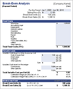 Break Even Analysis Calculator ▶
 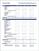 Profit and Loss Projection Template ▶
 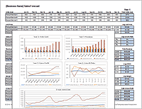 Sales Forecast Template ▶
 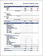 Business Startup Costs Template ▶
  Depreciation Schedule Template ▶
  Billing Statement Template ▶
  Personal Financial Statement ▶
  Net Worth Calculator for Excel ▶
  Petty Cash Log Template ▶
  SWOT Analysis Template ▶
  Waterfall Chart Template ▶