
Important: In Excel for Microsoft 365 and Excel 2021, Power View is removed on October 12, 2021. As an alternative, you can use the interactive visual experience provided by Power BI Desktop, which you can download for free. You can also easily Import Excel workbooks into Power BI Desktop.
Abstract: In this tutorial, you will learn how to create interactive Power View reports: multiples charts, interactive reports, and scatter charts and bubble charts with time-based play visualizations.
Note, too, that when you publish these reports and make them available on SharePoint, these visualizations are just as interactive as they are in this tutorial, for anyone viewing them.
The sections in this tutorial are the following:
-
Create Multiples Charts
-
Build Interactive Reports using Cards and Tiles
-
Create Scatter Charts and Bubble Charts with Time-based Play Visualizations
-
Checkpoint and Quiz
At the end of this tutorial is a quiz you can take to test your learning. You can also see a list of videos that show many of the concepts and capabilities of Power View in action.
This series uses data describing Olympic Medals, hosting countries, and various Olympic sporting events. The tutorials in this series are the following:
-
Import Data into Excel 2013, and Create a Data Model
-
Extend Data Model relationships using Excel 2013, Power Pivot, and DAX
-
Create Map-based Power View Reports
-
Incorporate Internet Data, and Set Power View Report Defaults
-
Create Amazing Power View Reports
We suggest you go through them in order.
These tutorials use Excel 2013 with Power Pivot enabled. For more information on Excel 2013, see Excel 2013 Quick Start Guide. For guidance on enabling Power Pivot, see Power Pivot Add-in.
Create Multiples Charts
In this section, you continue creating interactive visualizations with Power View. This section describes creating a few different types of Multiples charts. Multiples are sometimes also called Trellis Charts.
Create Interactive
Vertical
Multiples Charts
To create multiples charts, you begin with another chart, such as a pie chart or a line chart.
-
In Excel, select the Bar and Column worksheet. Create a new Power View report by selecting POWER VIEW > Insert > Power View from the ribbon. A blank Power View report sheet is created. Rename the report Multiples, by right-clicking the tab along the bottom and selecting Rename from the menu that appears. You can also double-click the tab to rename it.
-
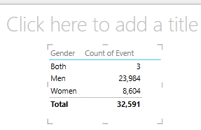
Expand the Medals table in Power View Fields and select the Gender and then the Event fields. From the FIELDS area, select the arrow button beside Event, and select Count (Not Blank). The table Power View creates looks like the following screen.

-
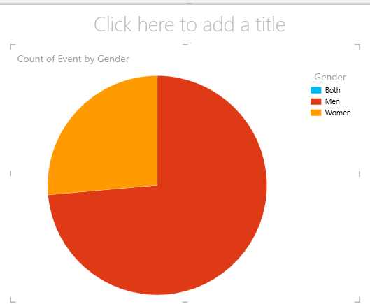
From the ribbon, select DESIGN > Switch Visualization > Other Chart > Pie Chart. Now your report looks like the following screen.
-
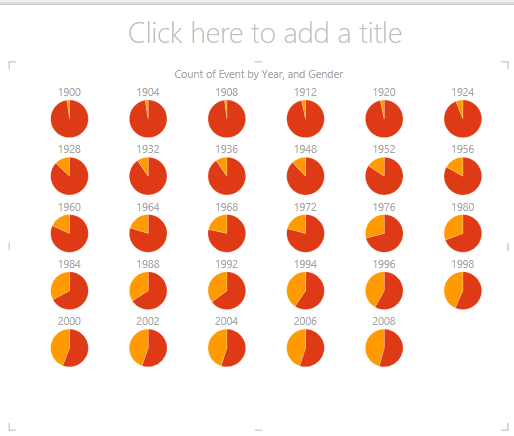
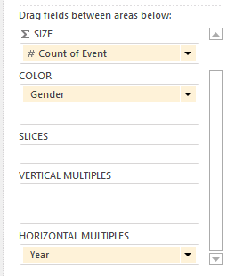
You decide it would be interesting to view the number of events by gender over time. One way to view that information is to use multiples. From the Medal table, drag Year to the VERTICAL MULTIPLES field. In order to view more multiples, remove the legend from the report by selecting LAYOUT > Legend > None from the ribbon.
-
Change the layout so the multiples grid shows six charts wide by six charts tall. With the chart selected, select LAYOUT > Grid Height > 6 and then LAYOUT > Grid Width > 6. Your screen now looks like the following screen.
-
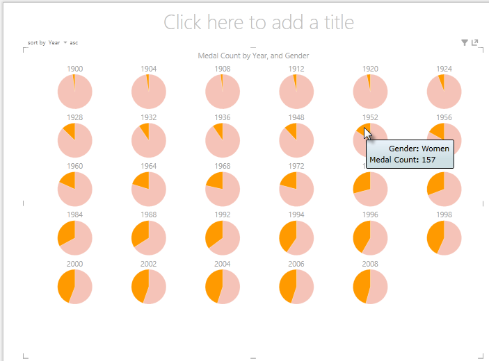
The multiples chart type is interactive too. Hover over any pie chart, and information about that slice is displayed. Click any pie slice in the grid, and that selection is highlighted for each chart in the multiple. In the screen below the yellow slice (women) for 1952 was selected, and all other yellow slices are highlighted. When more charts are available than Power View can display in one screen, a vertical scroll bar is displayed along the right edge of the visualization.
Create Interactive Horizontal Multiples Charts
Horizontal charts behave similar to Vertical Multiple Charts.
-
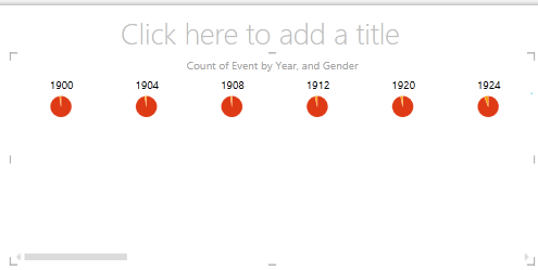
You want to change your Vertical Multiples Charts to Horizontal Verticals. To do so, drag the Year field from the VERTICAL MULTIPLES area into the HORIZONTAL MULTIPLES area, as shown in the following screen.
-
The Power View report visualization changes to a Horizontal Multiples Chart. Notice the scroll bar along the bottom of the visualization, shown in the following screen.
Create Multiples Line Charts
Creating line charts as multiples is easy, too. The following steps show you how to create multiple line charts based on the count of medals for each year.
-
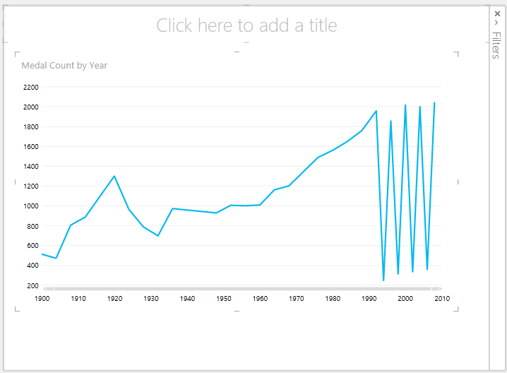
Create a new Power View sheet, and rename it Line Multiples. From Power View Fields, select Medal Count and Year from the Medals table. Change the visualization to a line chart by selecting DESIGN > Other Chart > Line. Now drag Year to the AXIS area. Your chart looks like the following screen.
-
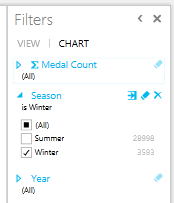
Let’s focus on Winter medals. In the Filters pane, select CHART, then drag Season from the Medals table into the Filters pane. Select Winter, as shown in the following screen.
-
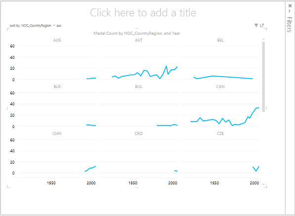
To create the multiples line charts, drag NOC_CountryRegion from the Medals table into the VERTICAL MULTIPLES area. Your report now looks like the following screen.
-
You can choose to arrange the multiple charts based on different fields, and in ascending or descending order, by clicking on the selections in the upper left corner of the visualization.
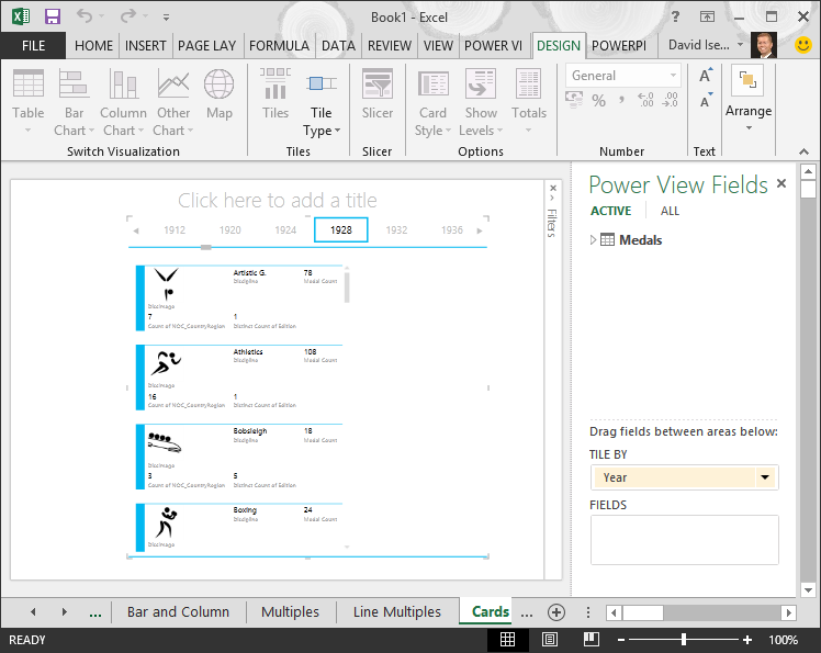
Build Interactive Reports using Cards and Tiles
Tiles and cards convert tables to a series of snapshots that visualize the data, laid out in card format, much like index cards. In the following steps, you use cards to visualize the number of medals awarded in various sports, and then, refine that visualization by tiling the results based on Edition.
Create Card Visualizations
-
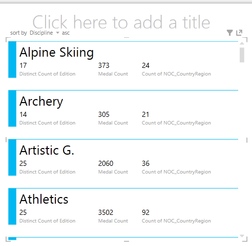
Create a new Power View Report, and rename it Cards. From Power View Fields, from the Disciplines table, select Discipline. From the Medals table, select Distinct Count of Edition, Medal Count, and NOC_CountryRegion. In the FIELDS area of Power View Fields, click the arrow next to NOC_CountryRegion, and select Count (Distinct).
-
In the ribbon, select DESIGN > Switch Visualization > Table > Card. Your table looks like the following screen.
-
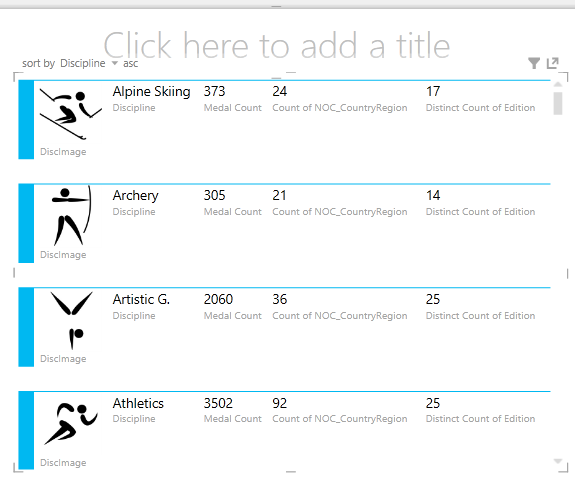
With the card visualization selected, select DiscImage from the DiscImage table. You may get a security warning that prompts you to click a button to Enable Content in order to get the images to display, as shown in the following screen.
-
In the FIELDS area, arrange the fields in the following order: DiscImage, Discipline, Medal Count, Count of NOC_CountryRegion, and last, Distinct Count of Edition. Your Cards now look similar to the following screen.

Use Tiles with Card Visualizations
-
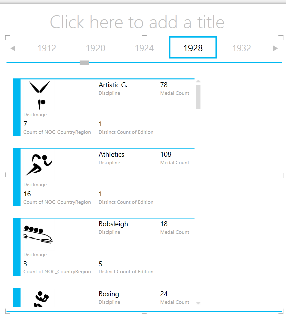
Reviewing these cards based on the year in which the medals were awarded is easy. In Power View Fields, from the Medals table, drag the Year field into the TILE BY area. Your visualization now looks like the following screen.
-
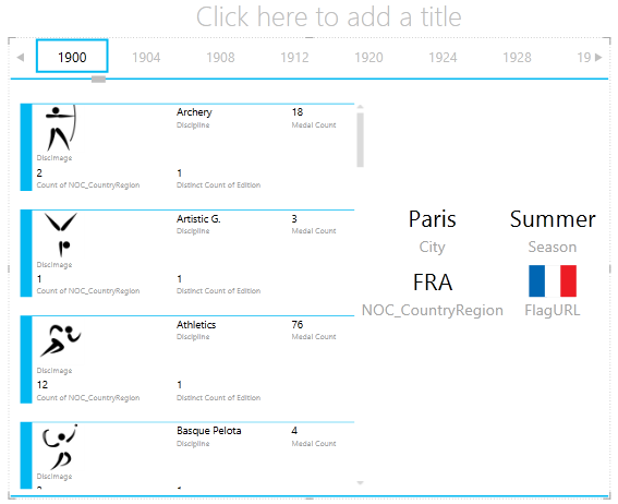
Now the cards are tiled by Year, but something else happened as well. The TILE BY field became a container, which at this point only contains the cards you created in the previous steps. We can add to that container, however, and see how using TILE BY can create interactive reports that coordinate the view of your data.
-
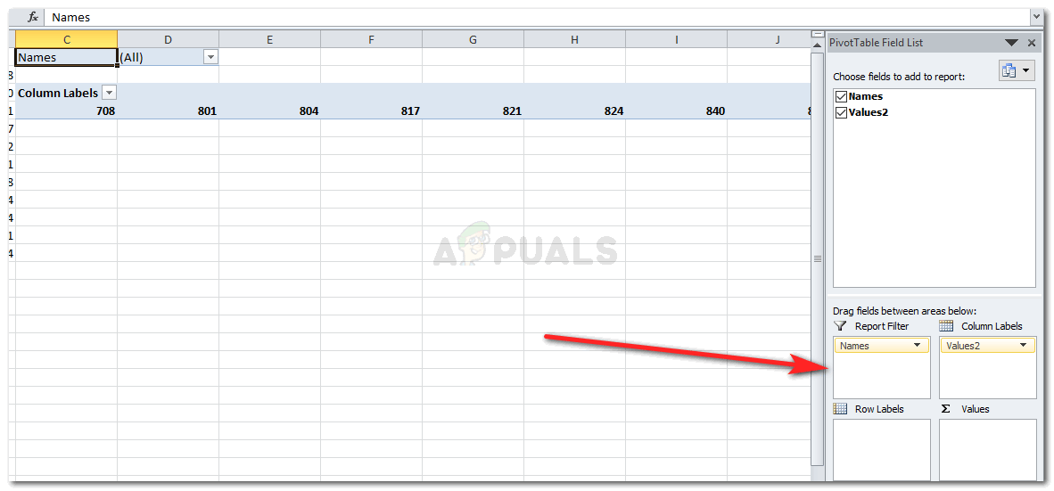
Click in the area beside the cards visualization, but still inside the TILE BY container. The Power View Fields pane changes to reflect that you are still in the TILE BY container, but you are not in the cards visualization. The following screen shows how this appears in the Power View Fields pane.
-
In Power View Fields, select ALL to show all available tables. From the Hosts table, select City, Season, NOC_CountryRegion, and FlagURL. Then from the ribbon, select DESIGN > Switch Visualization > Table > Card. You want the table you just created to fill up more of the available report space, so you decide to change the type of Card visualization. Select DESIGN > Options > Card Style > Callout. That’s better. Your report now looks like the following screen.
-
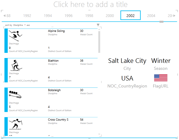
Notice how, when you select a different Year from the Tiles along the top of the TILE BY container, the callout card you just created is also synchronized with your selection. That’s because both card visualizations reside within the TILE BY container you created. When you scroll the TILE BY selection and select 2002, for example, your report looks like the following screen.
-
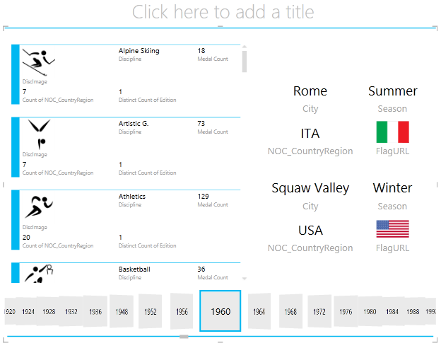
You can also change the way Power View tiles information. From the ribbon, select DESIGN > Tiles > Tile Type > Tile Flow. The tile visualizations changes, and Power View moves the tiles to the bottom of the tile container, as shown in the following screen.
As mentioned previously, when you publish these reports and make them available on SharePoint, these visualizations are just as interactive for anyone viewing them.
Create Scatter Charts and Bubble Charts with Time-based Play Visualizations
You can also create interactive charts that show changes over time. In this section you create Scatter Charts and Bubble Charts, and visualize the Olympics data in ways that will allow anyone viewing your Power View reports to interact with them in interesting and amazing ways.
Create a Scatter Chart and Bubble Chart
-
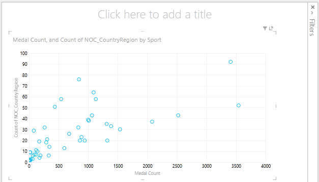
Create a new Power View report by selecting POWER VIEW > Insert > Power View from the ribbon. Rename the report Bubbles. From the Medals table, select Medal Count and NOC CountryRegion. In the FIELDS area, click the arrow beside NOC_CountryRegion and select Count (Distinct) to have it provide a count of country or region codes, rather than the codes themselves. Then from the Events table, select Sport.
-
Select DESIGN > Switch Visualization > Other Chart > Scatter to change the visualization to a scatter chart. Your report looks like the following screen.
-
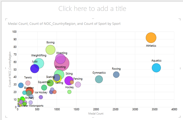
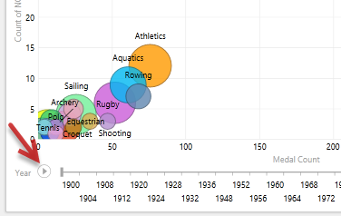
Next drag Event from the Events table into the SIZE area of Power View Fields. Your report becomes much more interesting, and now looks like the following screen.
-
Your scatter chart is now a bubble chart, and the size of the bubble is based on the number of medals awarded in each sport.
-
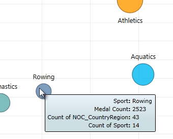
Your bubble chart is interactive too. When you hover over the Rowing bubble, Power View presents you with additional data about that sport, as shown in the following image.
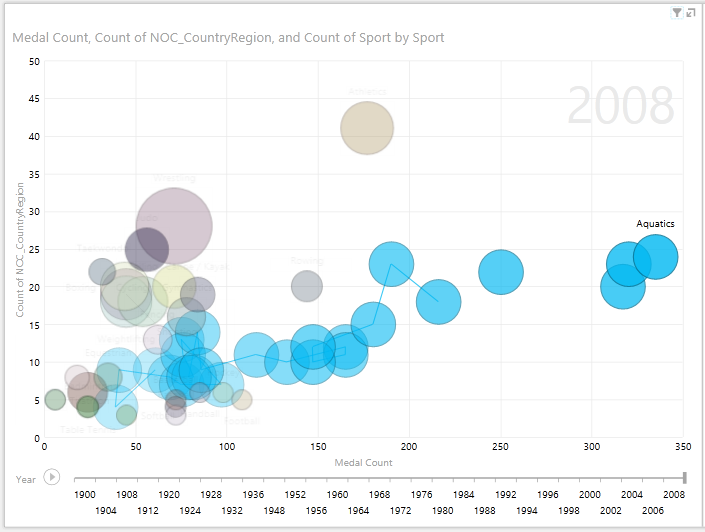
Create Time-Based Play Visualizations
Many of the visualizations you create are based on events that happen over time. In the Olympics data set, it’s interesting to see how medals have been awarded throughout the years. The following steps show you how to create visualizations that play, or animate, based on time-based data.
-
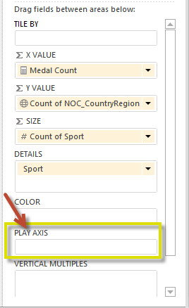
In the Scatter Chart you created in the previous steps, notice the PLAY AXIS area in Power View Fields, as shown in the following screen.
-
From the Medals table, drag Year to the PLAY AXIS area. Here comes the fun part. An axis is created along the bottom of the scatter chart visualization, and a PLAY icon appears beside it, as shown in the following screen. Press play.
-
Watch as the bubbles move, grow, and contract as the years move along the Play axis. You can also highlight a particular bubble, which in this case is a particular Sport, and clearly see how it changes as the Play axis progresses. A line follows its course, visually highlighting and tracking its data points as the axis moves forward.
-
Select Aquatics, then click Play. Aquatics is highlighted, and a watermark in the upper right corner of the report displays the Year (the PLAY axis) as the PLAY axis moves ahead. At the end, the path Aquatics has taken is highlighted in the visualization, while other sports are dimmed. The following screen shows the report when the Play axis completes.
-
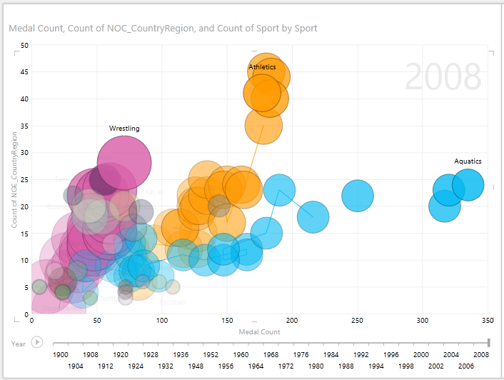
You can select more than one sport by holding the CTRL key and making multiple selections. Try it for yourself. In the following screen, three sports are selected: Wrestling, Athletics, and Aquatics.
-
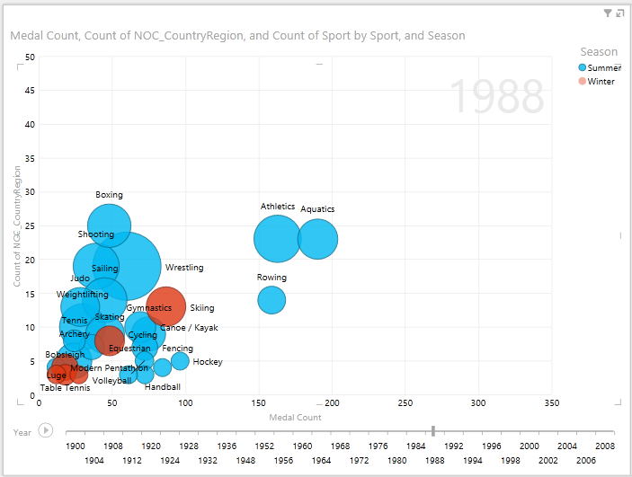
Lastly, you can filter Scatter charts just like any other visualization. There are a lot of colors, because there are a lot of sports in the data set. From the Medals table, drag Season into the COLOR area of Power View Fields. Now only two colors are used, one for each Season (Summer or Winter). The following screen shows this, but to see how cool this looks, watch the video at the end of this tutorial.
There are all sorts of amazing, compelling reports you can create with Power View. Each visualization brings a certain and distinct view onto your data. To provide even more compelling reports, you can combine different visualizations on a single report page, and make your data come alive.
Checkpoint and Quiz
Review What You’ve Learned
In this tutorial you learned how to create multiples charts, line charts, bubble charts, and scatter charts. You also learned how to tile your report, and how to create a container into which many reports can be included.
This tutorial rounds out the series on creating Power View reports.
Videos from the Olympics Data Set
Sometimes it’s nice to see these tasks in action. In this section you’ll find links to videos that were created using the Olympics data set. These videos are similar to the tutorials, but some of the workbooks, Power Pivot images, or Power View sheets might be slightly different.
Power Pivot videos
Power View video
Thank you! I hope you’ve enjoyed this tutorial series, and found it helpful in understanding how to make your own Power View reports. You can create amazing, immersive, and interactive reports with Power View, and share them using the Business Intelligence Portal on SharePoint.
Tutorials in this Series
The following list provides links to all tutorials in this series:
-
Import Data into Excel 2013, and Create a Data Model
-
Extend Data Model relationships using Excel 2013, Power Pivot, and DAX
-
Create Map-based Power View Reports
-
Incorporate Internet Data, and Set Power View Report Defaults
-
Create Amazing Power View Reports
QUIZ
Want to see how well you remember what you learned? Here’s your chance. The following quiz highlights features, capabilities, or requirements you learned about in this tutorial. At the bottom of the page, you’ll find the answers. Good luck!
Question 1: What is another name for the Multiples chart type?
A: Scrolling Charts.
B: Tuples Charts.
C: Trellis Charts.
D: Page Charts
Question 2: Which Area in Power View Fields lets you create a container, into which you could put multiple visualizations?
A: The COLUMNS area.
B: The SUMMARIZE area.
C: The TILE BY area.
D: The CONTAINER area.
Question 3: To create an animated visualization based on a field, such as a date field, which Power View Fields Area should you use?
A: The PLAY AXIS area.
B: The HORIZONTAL MULTIPLES area.
C: The ANIMATION area.
D: You can’t create visualizations that are that cool, can you?
Question 4: What happens on Multiples charts if there are more pie charts than what can fit on one screen?
A: Power View automatically begins scrolling through the pie charts.
B: Power View provides a scroll bar, allowing you to scroll through the other pie charts.
C: Power View creates a report for only as many pie charts that can be seen on the screen at once.
D: Power View automatically puts all pie charts on one screen, regardless of how many pie charts are required.
Quiz answers
-
Correct answer: C
-
Correct answer: C
-
Correct answer: A
-
Correct answer: B
Notes: Data and images in this tutorial series are based on the following:
-
Olympics Dataset from Guardian News & Media Ltd.
-
Flag images from CIA Factbook (cia.gov)
-
Population data from The World Bank (worldbank.org)
-
Olympic Sport Pictograms by Thadius856 and Parutakupiu
37
37 people found this article helpful
How to Create a Report in Excel
Using charts, graphs, and pivot tables makes it easy
Updated on September 25, 2022
What to Know
- Create a report using charts: Select Insert > Recommended Charts, then choose the one you want to add to the report sheet.
- Create a report with pivot tables: Select Insert > PivotTable. Select the data range you want to analyze in the Table/Range field.
- Print: Go to File > Print, change the orientation to Landscape, scaling to Fit All Columns on One Page, and select Print Entire Workbook.
This article explains how to create a report in Microsoft Excel using key skills like creating basic charts and tables, creating pivot tables, and printing the report. The information in this article applies to Excel 2019, Excel 2016, Excel 2013, Excel 2010, and Excel for Mac.
Creating Basic Charts and Tables for an Excel Report
Creating reports usually means collecting information and presenting it all in a single sheet that serves as the report sheet for all of the information. These report sheets should be formatted in a way that’s easy to print as well.
One of the most common tools people use in Excel to create reports is the chart and table tools. To create a chart in an Excel report sheet:
-
Select Insert from the menu, and in the charts group, select the type of chart you want to add to the report sheet.
-
In the Chart Design menu, in the Data group, select Select Data.
-
Select the sheet with the data and select all cells containing the data you want to chart (include headers).
-
The chart will update in your report sheet with the data. The headers will be used to populate the labels in the two axis.
-
Repeat the above steps to create new charts and graphs that appropriately represent the data you want to show in your report. When you need to create a new report, you can just paste the new data into the data sheets, and the charts and graphs update automatically.
There are different ways to lay out a report using Excel. You can include graphs and charts on the same page as tabular (numeric) data, or you can create multiple sheets so visual reporting is on one sheet, tabular data is on another sheet, and so on.
Using PivotTables to Generate a Report From an Excel Spreadsheet
Pivot tables are another powerful tool for creating reports in Excel. Pivot tables help with digging more deeply into data.
-
Select the sheet with the data you want to analyze. Select Insert > PivotTable.
-
In the Create PivotTable dialogue, in the Table/Range field, select the range of data you want to analyze. In the Location field, select the first cell of the worksheet where you want the analysis to go. Select OK to finish.
-
This will launch the pivot table creation process in the new sheet. In the PivotTable Fields area, the first field you select will be the reference field.
In this example, this pivot table will show website traffic information by month. So, first, you’d select Month.
-
Next, drag the data fields you want to show data for into the values area of the PivotTable fields pane. You’ll see the data imported from the source sheet into your pivot table.
-
The pivot table collates all of the data for multiple items by adding them (by default). In this example, you can see which months had the most page views. If you want a different analysis, just select the drop-down arrow next to the item in the Values pane, then select Value Field Settings.
-
In the Value Field Settings dialog box, change the calculation type to whichever you prefer.
-
This will update the data in the pivot table accordingly. Using this approach, you can perform any analysis you like on source data, and create pivot charts that display the information in your report in the way you need.
How to Print Your Excel Report
You can generate a printed report from all the sheets you created, but first you need to add page headers.
-
Select Insert > Text > Header & Footer.
-
Type the title for the report page, then format it to use larger than normal text. Repeat this process for each report sheet you plan to print.
-
Next, hide the sheets you don’t want included in the report. To do this, right-click the sheet tab and select Hide.
-
To print your report, select File > Print. Change orientation to Landscape, and scaling to Fit All Columns on One Page.
-
Select Print Entire Workbook. Now when you print your report, only the report sheets you created will print as individual pages.
You can either print your report out on paper, or print it as a PDF and send it out as an email attachment.
FAQ
-
How do I create an expense report in Excel?
Open an Excel spreadsheet, turn off gridlines, and enter your basic expense report information, such as a title, time period, and employee name. Add data columns for Date and Description, and then add columns for expense specifics, such as Hotel, Meals, and Phone. Enter your information and create an Excel table.
-
How do I create a scenario summary report in Excel?
To use Excel’s scenario manager function, select the cells with the information you’re exploring, and then go to the ribbon and select Data. Select What-If Analysis > Scenario Manager. In the Scenario Manager dialog box, select Add. Name the scenario and change your data to see various outcomes.
-
How do I export a Salesforce report to Excel?
In Salesforce, go to Reports and find the report you want to export. Select Export and choose an export view (Formatted Report or Details Only). Formatted Report will export in .xlsx format, while Details Only gives you other choices. Select Export when ready.
Thanks for letting us know!
Get the Latest Tech News Delivered Every Day
Subscribe
All the people working in a professional environment understand the need to create a report. It summarizes the whole data of your work or the company’s in a very accurate manner. You can create a report of the data you entered on an Excel Sheet by adding a PivotTable for your entries. A Pivot table is a very useful tool as it calculates the total for your data automatically and helps you analyse your data with different series. You can use a PivotTable to summarize your data and present it to the concerned parties as a report.
Here is how you can make a PivotTable on MS Excel.
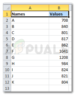
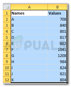
- It is easier to make a report on your Excel sheet when it has the data . After the data has been added, you will have to select the columns or rows you want a PivotTable for.

add the data 
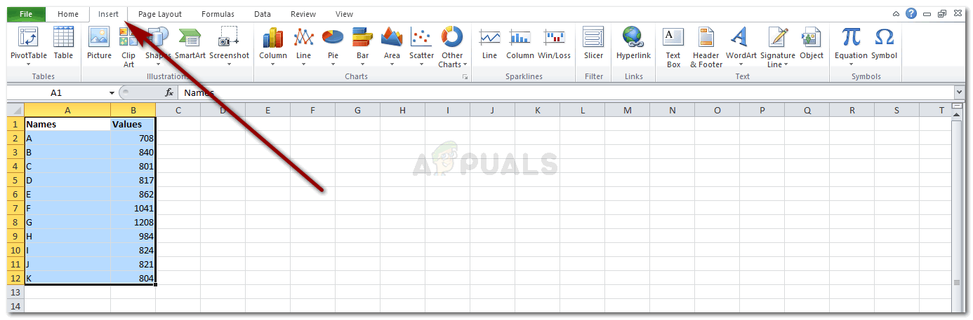
Selecting the rows and columns for your data - Once the data has been selected, go to Insert that is showing on the top tool bar on your Excel software.

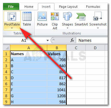
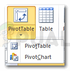
Insert Clicking on Insert will direct you to many options for tables and other important features. On the extreme left, you will find the tab for ‘PivotTable’ with a downward arrow.

Locate PivotTable on your screen - Clicking on the downward arrow will show you two options to choose from. PivotTable or PivotChart. Now it is up to you and your requirements what you want to make a part of your report. You can try both to see which one looks more professional.

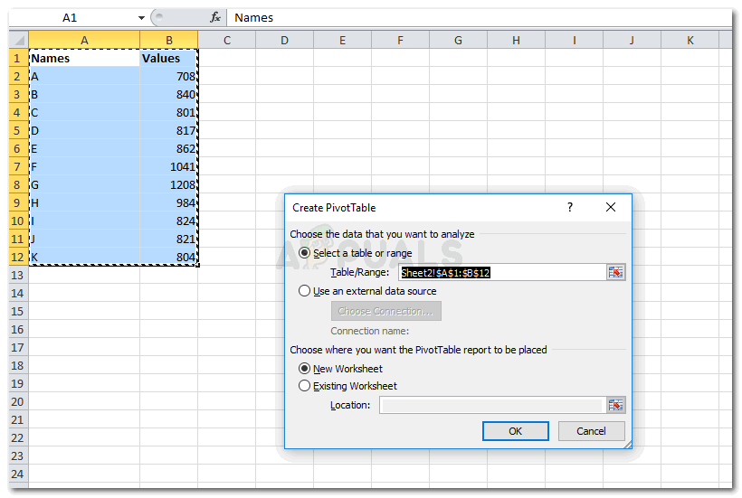
PivotTable to make a report - Clicking on PivotTable will lead you to a dialogue box where you can edit the range of your data, and other choices of whether you want the PivotTable on the same worksheet or you want it on a completely new one. You can also use an external data source if you don’t have any data on your excel. This means, having data on your Excel is not a condition for PivotTable.

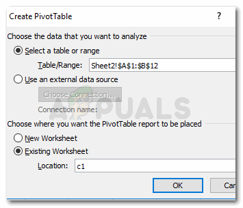
selecting the data and clicking on PivotTable You need to add a location if you want the table to appear on the same worksheet. I wrote c1, you can choose the middle of your sheet as well to keep it all organized.

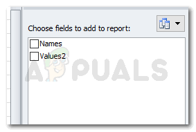
PivotTable: selection of data and location - When you click on OK, your table will not appear as yet. You need to select the fields from the field list provided on the right of your screen just as shown in the picture below.

Your report still needs to go through another set of options to finally be made - Check either of the two options for which you want a PivotTable for.

Check the field you want to show on your report You can choose one of them, or both of them. You decide.
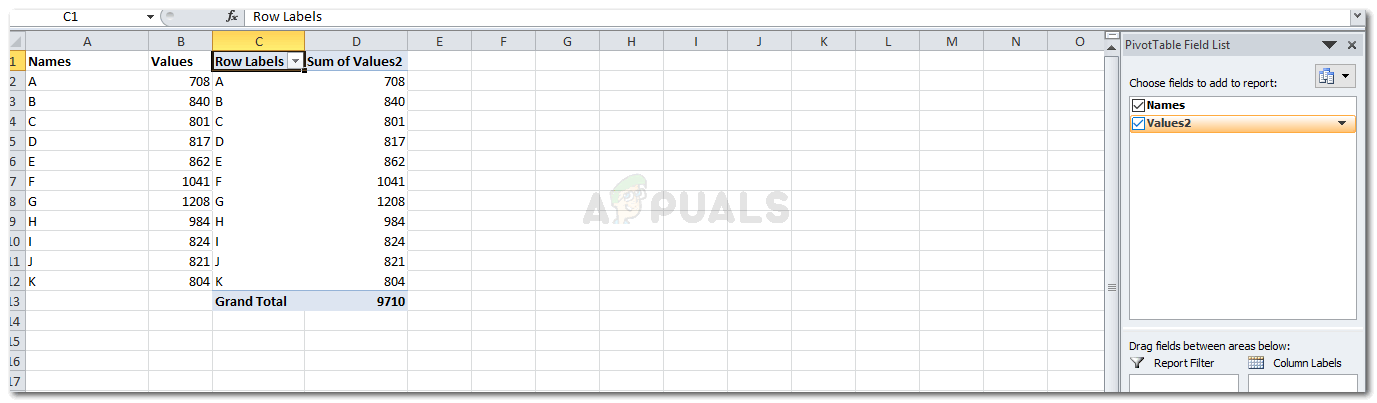
- This is how your PivotTable will look like when you choose both.

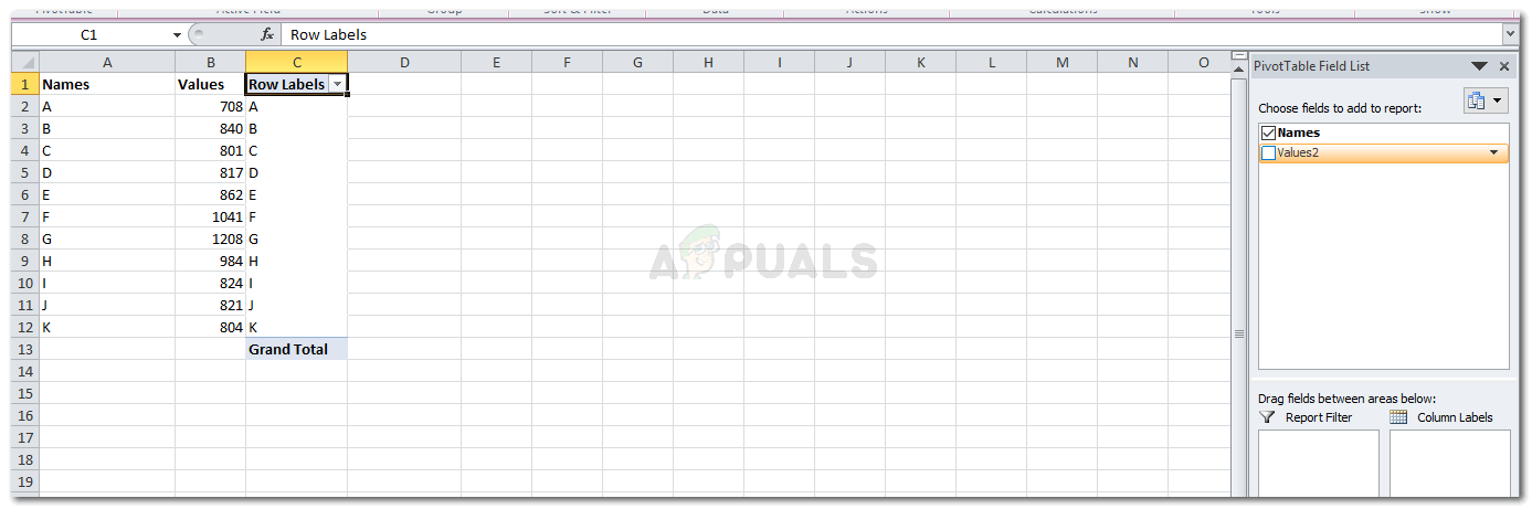
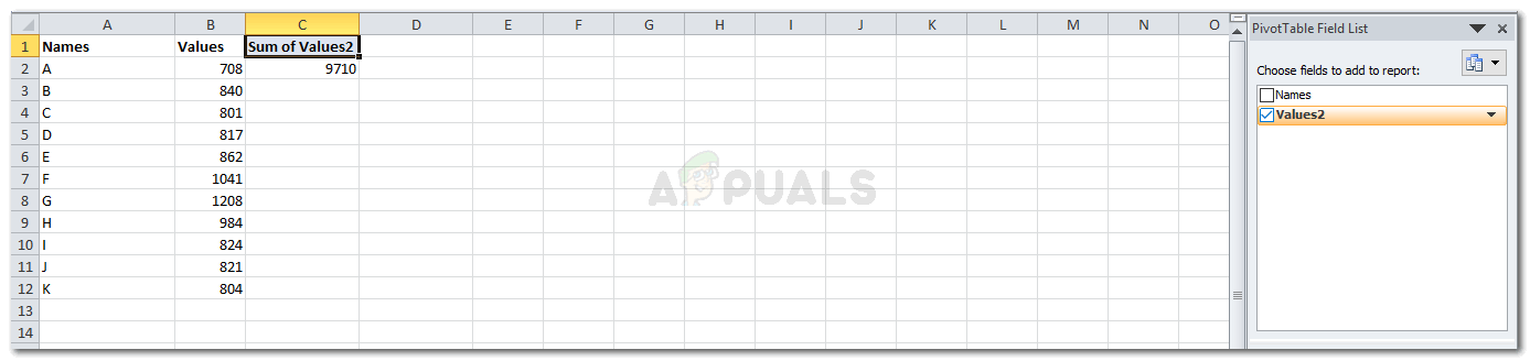
Displaying both the fields And when you select one of the fields, this is how your table will appear.

Displaying one field 
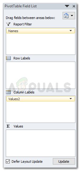
Displaying one field - The option on the right of your screen as shown in the picture below are very important for your report. It helps you make your report even better and more organized. You can drag the columns and rows in between these four spaces to alter the way your report appears.

Important for placement of your report data 
Your report has been made - The following tab on the Field list on your right makes your view of all the fields more easy. You can change it with this icon on the left.

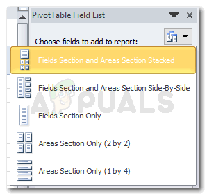
Options for the way your field view looks like. And choosing any of the options from these would change the way your field list shows. I selected ‘Areas Section Only 1 by 4’

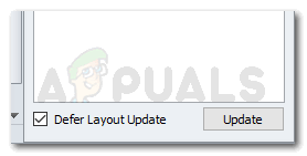
Field List view - Note: The option for ‘Defer Layout Update’ which is right at the end of your PivotTable Field List,is a way of finalizing the fields that you want displaying on your report. When you check the box next to it and click on update, you cannot change anything manually on the excel sheet. You will have to un-check that box to edit anything on the Excel. And even for opening the downward arrow showing on the columns labels cannot be clicked on unless you un-check the Defer Layout Update.

‘Defer Layout Update’, acts more like a lock to keep your edits to the content of the report untouched - Once you are done with your PivotTable, you can now edit it further by using the PivotTable Tools which appear right at the end of all the tools on your tool bar on the top.

PivotTable Tools for editing how it looks 
All the options for Design


Habiba Rehman
Major love for reading, but writing is what keeps me going. Dream to publish my own novels someday.


In Excel 2016, users will find that they have numerous ways of organizing and visualizing their records. Making use of these options will allow you to put tables and charts together to create reports worthy of praise.
- Basic chart and table creation
- How to create PivotTables
- How to create a Dashboard
- Timelines and Slicers
Basic chart and table creation
Before you can impress your team with an in-depth report, you need to learn how to generate charts, tables, and other visual elements. Here are a few types to get you started.
How to create a basic forecast report
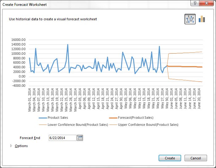
- Load a workbook into Excel
- Select the top-left cell in the source data
- Click on Data tab in the navigation ribbon
- Click on Forecast Sheet under the Forecast section to display the Create Forecast Worksheet dialog box
- Choose between a line graph or bar graph
- Choose Forecast end date
- Click Options for customization
- Select Forecast start date
Forecast reports are useful for calculating projections for sales, growth or revenue.
How to create hierarchal charts
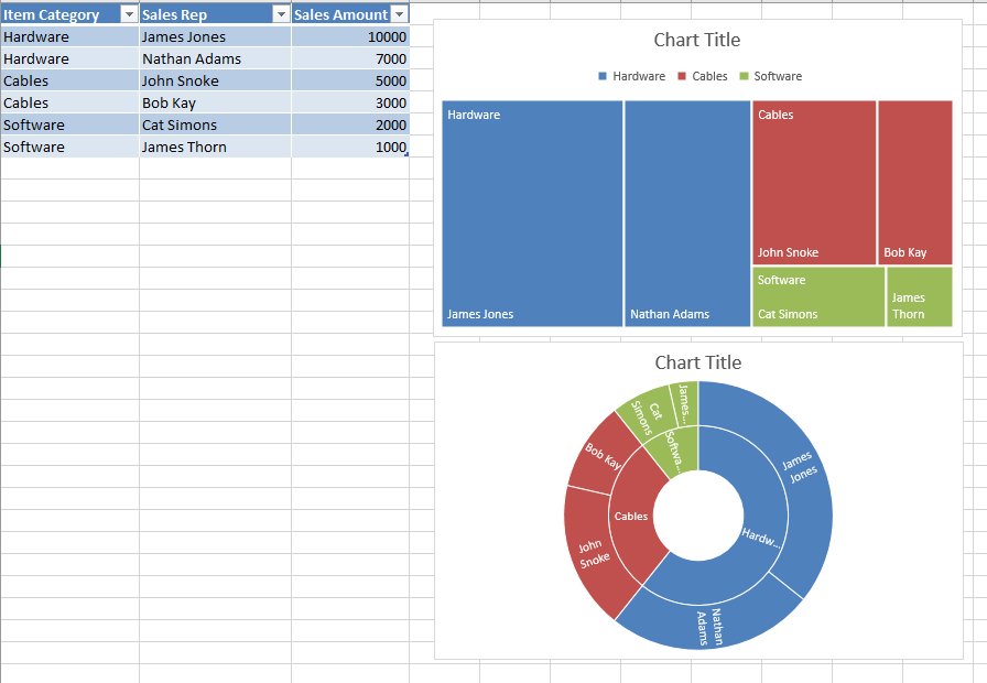
- Select a cell inside of the data table
- Click on Insert in the ribbon
- Click Insert Hierarchy Chart under the Charts group
- Select between TreeMap or Sunburst chart
- Click on the + (plus) sign to add or remove chart elements such as title, data labels, and legend
- Click on the right arrow for each element to customize the appearance or behavior
The Charts group itself is an effective way to find the chart that best suits your data. In fact, Excel 2016 has a Recommended Charts option, which allows you to scroll through shortlisted charts or through all available charts.
How to create PivotTables
A PivotTables enable users to sort through and reorganize data in columns and rows in order to find the most effective view. It’s especially useful when you are working with vast amounts of data.
How to create a recommended P{ivotTable
- Select a cell within the table range or source data
- Navigate to the Tables section in the Insert ribbon tab
- Select Recommended PivotTable
- Browse through the presented types of PivotTables
- Click on the PivotTable you want
- Click OK to generate
- Select Seasonality options
- Modify timeline and value ranges
- Select to fill any missing points by zeros or by interpolation
- Select criteria to aggregate duplicates by
- Select Create to finish
How to create your own PivotTable
- Click on a cell within the source data or table range
- Click on the Insert tab in the navigation ribbon
- Select PivotTable in the Tables section to generate the Create PivotTable dialog box
- Decide on the data source in the Choose the data that you want to analyze section, in case you don’t want to use the selected source
- Select New or Existing Worksheet under the Choose where you want the PivotTable to be placed section
- Click Add this data to the Data Model to incorporate additional data sources in the PivotTable
- Click on fields to include in the report in the PivotTable Fields
- Click and drag fields to reside in either Filters, Columns, Rows, and Values
Once you have decided on the layout and contents of your PivotTable fields, you can use it as the foundation for other Pivot Tables.
How to create a Dashboard
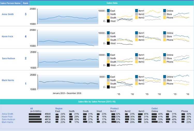
Once you have become comfortable enough to generate charts and tables using your provided data, it’s time to begin piecing the story together in a dashboard. The Dashboard is your chance to showcase your data in an attractive, informative and insightful hub view. It provides a top-level view of the data, allowing your audience to quickly see data and trends in order to view results and make decisions. This reporting tool is highly adaptable and can be used to report a plethora of results regardless of your line of business.
How to prepare your PivotTables for the Dashboard
- Select the original PivotTable that wish to use as your master or reference table
- Right-click on the selection
- Choose Copy
- Select another cell on your worksheet
- Right-click on the selected cell
- Choose Paste to duplicate
- Repeat steps No. 4 to No. 6 as needed
- Click on PivotTable Tools for each table
- Click Analyze
- Insert a name in the PivotTable Name box to identify the function of each table
How to generate PivotCharts from PivotTables
- Select the original PivotTable
- Click on PivotTable Tools
- Select Analyze
- Select PivotChart
- Choose the type of chart that you need
- Choose formatting options in the PivotChart Tools tab
- Click on Analyze under PivotChart Tools
- Enter a name in the Chart Name box
- Apply steps No. 1 to No. 8 as needed for all PivotTables in use
Timelines and Slicers
With your multiple PivotCharts and PivotTables created, you’ll need to be able to find specific information that supports the details you wish to share in the dashboard. Slicers and Timelines provide a way to filter through the data with ease. Timelines allow you to filter by time to locate a specific period. Slicers are essentially click-to-filter options for PivotTables. Not only do they apply a filter, they also indicate the filter currently in use.
How to add a Slicer
- From a PivotTable click on PivotTable Tools
- Select Analyze
- Select Filter
- Select Insert Slicer
- Select the items to be used as slicers
- Click Ok
- Select a Slicer
- Click on Slicer Tools
- Select Options
- Select Report Connections
- Choose the PivotTables that connect to the chosen Slicer
How to add a Timeline
- Click on a PivotTable
- Select Analyze
- Select Filter
- Select Insert Timeline
- Click on the items to use in the Timeline
- Click on the Timeline
- Select Tools
- Select Options
- Select Report Connections
- Select PivotTables to link the Timeline to
With each resulting chart, you can choose to copy and paste it on your dashboard. You can then decide how the dashboard should appear, what will tell the best story for your report.
This results in a dynamic dashboard that allows recipients to look over your presented data while allowing them to sort through the data to give them customization options pertinent to them. If you are creating a Dashboard to be used on a regular basis, you only need to update the source data to recreate the report with new information.
Wrapping Up
There isn’t one report to rule them all, but Excel has the tools to help you make the report you need. How often do you have to create reports in Excel? Which one are you most proud of? Let us know in the comments. And be sure to visit our Office 101 help hub for more related articles!
- Microsoft Office 101: Help, how-tos and tutorials
All the latest news, reviews, and guides for Windows and Xbox diehards.
Maintenance Alert: Saturday, April 15th, 7:00pm-9:00pm CT. During this time, the shopping cart and information requests will be unavailable.
Categories: Basic Excel
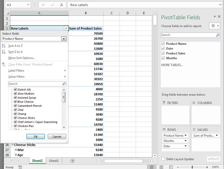
Excel is a powerful reporting tool, providing options for both basic and advanced users. One of the easiest ways to create a report in Excel is by using the PivotTable feature, which allows you to sort, group, and summarize your data simply by dragging and dropping fields.
First, Organize Your Data
Record your data in rows and columns. For example, data for a report on sales by territory and product might look like this:
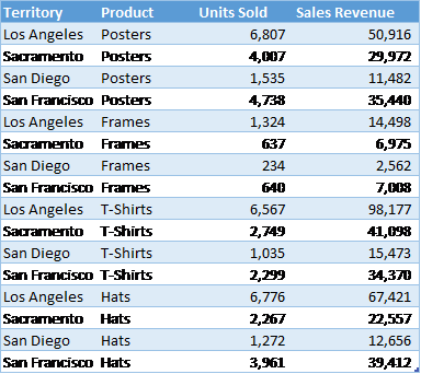
A PivotTable report works best when the source data have:
1. One record in each row;
2. One column for each category for sorting and grouping (such as “Territory” and “Product” in the example above; and
3. One column for each metric (such as “Units Sold” and “Sales Revenue” above). Recording some sales revenue in a different column complicates the task of adding up all of the sales revenue.
Create the PivotTable
Next, create the PivotTable report:
1. Highlight your data table.
2. From the Insert ribbon, click the PivotTable button.
3. On the far right, select fields that you would like on the left-hand side of the report and drag them to the Rows box.
4. Also on the far right, select fields that you would like to appear across the top of the report and drag them to the Columns box.
5. Select the data that you would like to summarize and drag it to the Values box.
6. For each item under Values, specify how to aggregate the data—with a sum, average, or some other function. This is a great time-saving step!
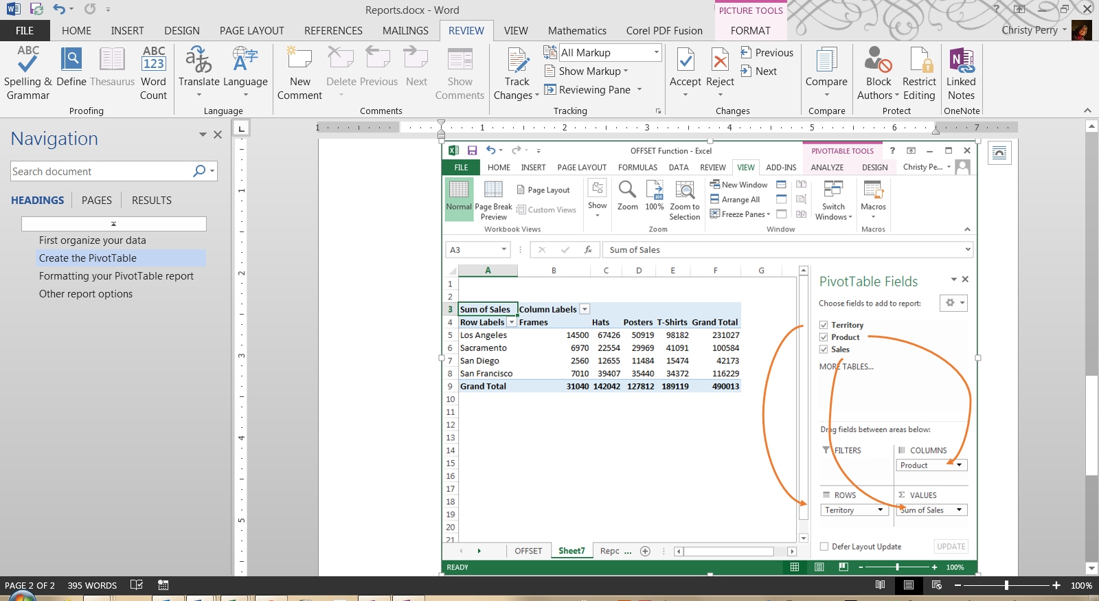
With each change, you’ll see your PivotTable report take shape. If you decide you don’t like the layout, just drag the fields to other positions.
Formatting Your PivotTable Report
From the PivotTable Design ribbon, choose a style for your report based on your theme’s color schemes with options for header rows, header columns, totals, and subtotals. From the Home ribbon, set the number format for your data, or right-click your data, choose Value Field Settings, and click Number Format.
Other Report Options
Do you want even more flexibility in your reports? Do you ever need to, say, connect to data in an external database or create charts based on your reports? All of these options are available with PivotTables!
Or, if you need more flexibility than PivotTables provide, you can:
1. Create a freeform report by adding totals and subtotals directly to your source data,
2. Use the Group and Subtotal options on the new Outline section of the Data ribbon, or
3. If you’re using Excel 2013, use the new Quick Analysis button.
No matter which option you choose, Excel is one of the most flexible reporting tools available today!
PRYOR+ 7-DAYS OF FREE TRAINING
Courses in Customer Service, Excel, HR, Leadership,
OSHA and more. No credit card. No commitment. Individuals and teams.