
In this article, I will show you how to perform a simple linear regression test in Microsoft Excel.
Not only will I show you how to perform the linear regression, but I’ll show you how to analyse the outputs of the regression test.
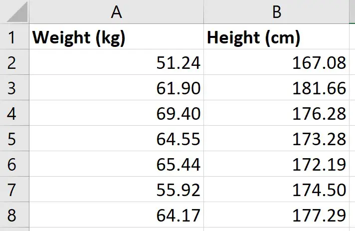
My example data
For this example, I just have two variables of data:
- Weight (kg)
- Height (cm)
I have these measures for 49 different participants; each row represents a different participant.
So, for the first participant, I can see that they had a weight of 51.24 kg and a height of 167.08 cm.
What I want to do is to perform a simple linear regression to see how well the measures of height in my sample can predict the measures of weight.
Installing the Analysis ToolPak
There are a few ways you can perform a linear regression in Excel, but perhaps the easiest method is to use the Analysis ToolPak. This is an add-on created by Microsoft to provide data analysis tools for statistical analyses.
Here are the intrustions for installing the Analysis Toolpak:
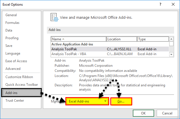
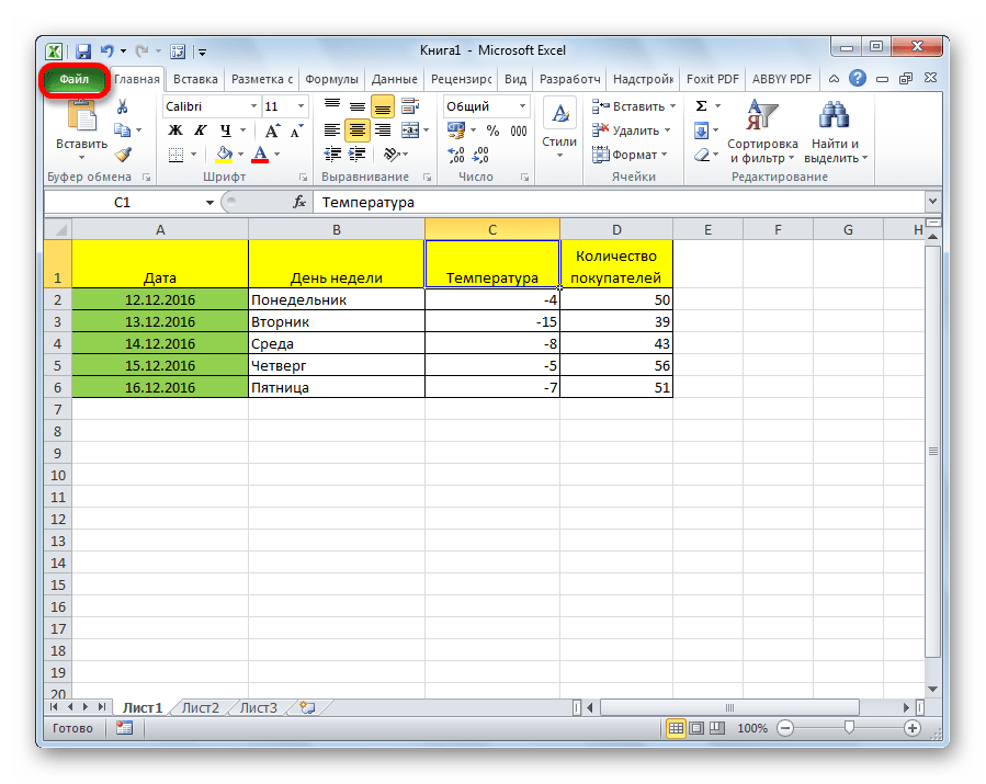
- Go to File>Options
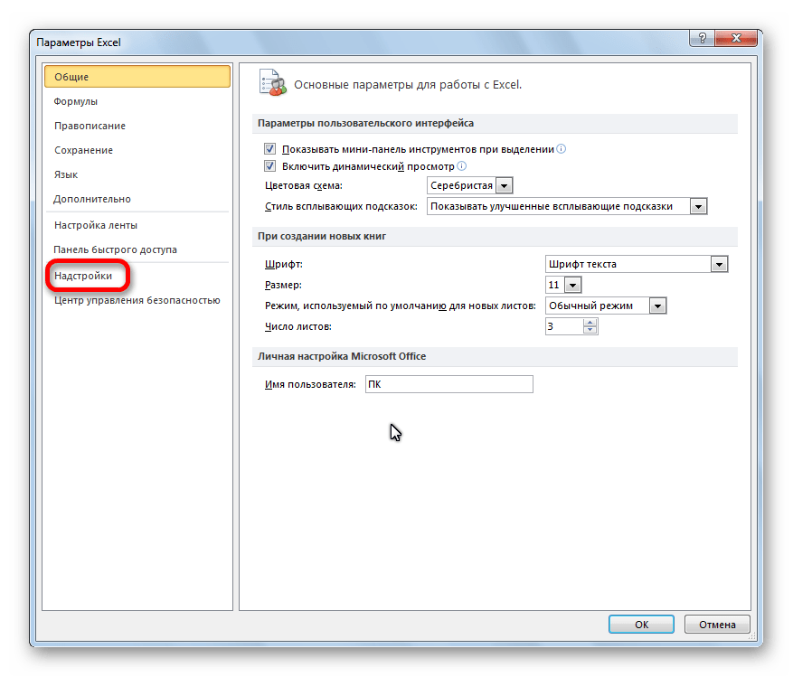
- Then click on Add-ins
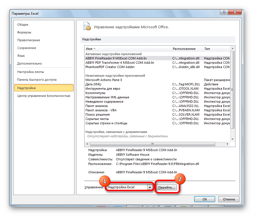
- At the bottom, you want to manage the Excel add-ins and click the Go button
- Then, ensure you tick the Analysis ToolPak add-in, and click OK
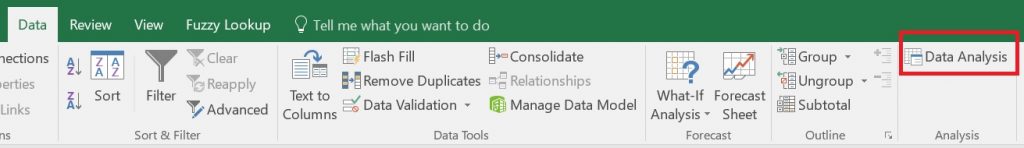
Now, when you click on the Data ribbon, you should see a Data Analysis button in a sub-section called Analyze
We are now ready to perform the linear regression in Excel.
Performing the linear regression in Excel
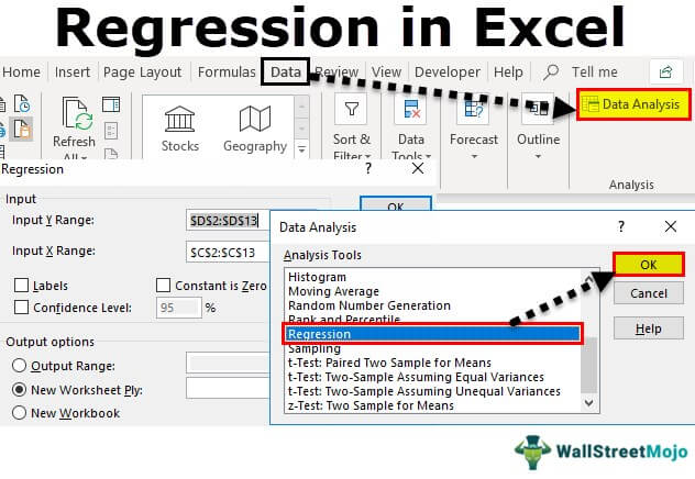
To perform the linear regression, click on the Data Analysis button.
Then, select Regression from the list.
You must then enter the following:
- Input Y Range – this is the data for the Y variable, otherwise known as the dependent variable. The Y variable is the one that you want to predict in the regression model. For me, this will be the weight data
- Input X Range – this is the data for the X variable, otherwise known as the independent variable. For me, this will be the height data
If you have highlighted the labels of the columns when selecting the data, then tick the Labels options. If you didn’t have any labels when you selected your data, then you should not tick this option.
The next option called Constant is Zero is used if you want the regression line to start at 0, otherwise known as the origin. Doing so would mean there is no Y intercept in the model. Generally, for linear regression, this option is not selected, so I will leave it unchecked for this example.
It is also possible to specify the confidence level for the test. By default, the results will return the 95% confidence intervals without having to change any options. However, if you want to use a different confidence level than 95%, then you need to select this option and enter the desired value here.
Output options
For the Output Options, you can specify where you want the regression results to be placed.
- Output Range – you can highlight where you want the results to be placed in that worksheet
- New Worksheet Ply – lets you place the results in a new worksheet
- New Workbook – lets you save the results in an entirely separate workbook
For my example, I’m going to select the second option and have the results placed in a new worksheet.
Residuals
The final set of options concerns the residuals in the analysis.
- Residuals – will return the list of predicted dependent values, based on the regression line, as well as the residual values for each point
- Standardized Residuals – will return the standardized residuals; these values can be useful when identifying potential outliers
- Residual Plots – will create a scatter graph where the residuals are plotted on the Y axis and the X variable is plotted on the X axis
- Line Fit Plots – will create another scatter graph where the Y and X variables are plotted, but it will also add the predicted Y values onto the graph
Finally, the Normal Probability Plots option plots another scatter plot, which is used to determine whether the Y variable data fits a normal distribution.
Interpretation of the linear regression results
Depending on the options selected in the set-up window, you will have quite a lot of information in the results sheet.
I’ll now break down the output and go through each in more detail.
- Summary Output table
- ANOVA table
- Coefficients table
- Residual Output table
- Residual plot
- Standardized Residuals
- Line Fits plot
- Normal Probability plot
Summary Output table
In the first table called Summary Output, there are some regression statistics from the test.
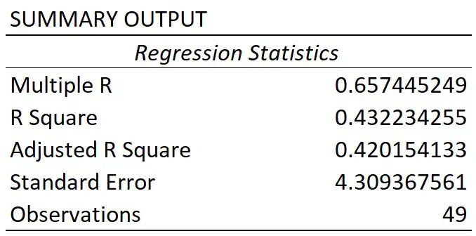
Multiple R
This is the absolute value of the correlation coefficient between the two variables of interest. Briefly, it is a value that tells you how strong the linear relationship is.
A value of 0.65 in this case indicates a fairly strong linear correlation between height and weight measures.
If you’re interested to learn more about correlation, then I suggest you refer to the What is Pearson Correlation post.
R square
You may sometimes see the R square being referred to as the coefficient of determination.
To get this value, you simple square the multiple R value.
The R square value tells you how much variance the dependent variable can be accounted for by the values of the independent variable. Researchers often multiple this value by 100 to get a percentage value.
So, for my example, I can say that 43% of the variance in weight can be accounted for by the height measures. The other 57% of the variance is therefore caused by other factors, such as measurements errors.
Adjusted R square
The adjusted R square takes into account the number of independent variables in the regression analysis, and corrects for bias.
Usually, this value is only relevant when you are performing multiple linear regression, where there are more than 1 independent variables in the model.
Standard error
The standard error of the regression is the average distance that the observed values fall from the regression line.
What’s useful about the standard error is that it is in the same units as the dependent variable. So, here my standard error is 4.31 kg, when rounded. This means, on average, my observed values were 4.31 kg from the regression line.
The smaller the standard error, the more precise the linear regression model is.
Observations
Finally, we have the number of observations. This is just the number of subjects in the test.
So, for my example, I had 49 participants.
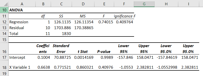
ANOVA table
The main thing you will be concerned with when looking at this table is the value under the Significance F header; this is in fact the P value for the regression model.
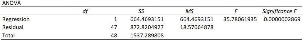
To be able to interpret this, we need our hypotheses:
- Null hypothesis – there is no linear relationship between the height and weight measures
- Alternative hypothesis – there is a linear relationship between the height and weight measures
If my alpha was 0.05, this means I will reject the null and accept the alternative hypothesis if P≤0.05. The opposite will be true if P>0.05; in this case, I would fail to reject the null hypothesis.
As you can see, the P value (Significance F) for the model was considerably lower than my alpha value of 0.05. So, I can conclude that the linear regression model is significant.
Coefficients table
Let me now move on to the final table of results regarding the coefficients.

The first row displays the results for the intercept, this is the point where the line of best fit (regression line) crosses the Y axis when the value of X is zero.
The second row displays the results for the slope.
For a simple linear regression model, the most basic version of the equation is Y = m.X + b.

Using the information reported from the results, we can then say:
Y = 0.800264.X – 79.599
So, in this example, if we knew a participants height (in cm), we can predict their weight (in kg) by using this equation. For example, if a participant measured 175 cm, the model estimates their height to be 60.45 kg.
Looking back at the coefficient results table, we can see there are other columns which tells us the standard error, as well as the lower and upper 95% confidence intervals, or a different confidence interval if a different confidence level was entered. And these values are for the intercept and slope values.
You will also notice each also has a T-statistic. This value is used to compute the P value.
Again, to interpret this P value we need our hypotheses:
- Null hypothesis – the intercept or slope is 0
- Alternative hypothesis – the slope of the line is not 0
As you can see, both values are less than my alpha of 0.05. However, we usually ignore the P value for the intercept.
For the slope, this means that height is a significant variable that impacts weight in this case.
Residual options
So, that’s an overview of the regression model results, let me know cover the other outputs from the regression test.
Residual Output
If you selected to have the Residuals option during the regression set-up, you will have a table titled Residual Output.

For each observation from your data that was entered into the regression test, you will get a predicted value of Y based on the regression model.
For example, if you look at the first observation in my original data, you see this participant had a height of 167.08 cm. If I put this into the regression equation, along with the slope and intercept values, I get the predicted weight value of 54.10999 kg.
This is what the Predicted column represents; Excel does this for each of the observations.
Using the predicted values, Excel can then calculate the residuals.
A residual is simply the distance between the actual data point and the line of best fit.
For my first participant they had a height of 167.08 cm and a weight of 51.24 kg. As calculated above, the predicted weight value based on the model was 54.10999 kg. The residual for this point therefore is the difference between the actual weight value (51.24 kg), and the predicted weight value (54.10999 kg), which comes out at around -2.867 kg.
Excel then repeats this process for the rest of the observations.
Residual Plot
If you also selected the Residual Plots option in the Regression set-up window, you will also get a graph returned.
Here is my Residual Plot.
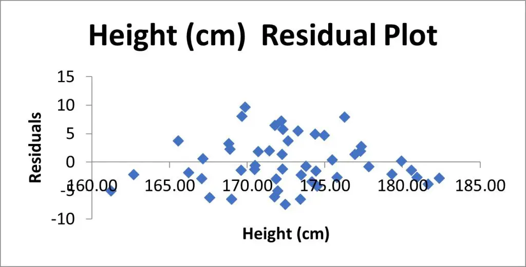
This is a scatter plot of the residuals on the Y axis and the values of the independent variable on the X axis.
Residual plots are useful to look at when investigating homogeneity of variance, which is an assumption of the linear regression test.
What you are looking for here is a random pattern to the graph; there should be roughly half the number of data points above 0 and below 0, and there vertical spread of the data points should be roughly constant the further along the X axis you go.
Standardized Residuals
If you selected the Standardized Residuals option in the regression options, you will also see a column called Standard Residuals in the residuals table.
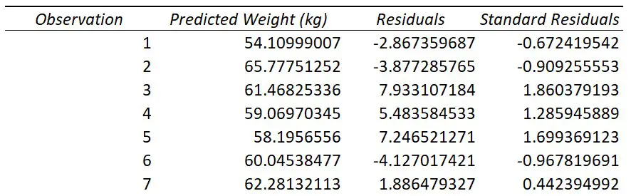
The standardized residual is the residual divided by an estimate of its standard deviation. You can think of them as Z scores.
These values are useful to look at when trying to identify potential outliers in your sample.
Generally, any standardized residuals with a value greater than 3 or -3 is a sign that it may be an outlier.
Line Fits Plot
If you selected to have the Line Fit Plots option, you will also see a scatter plot containing the data that was entered into the regression test.
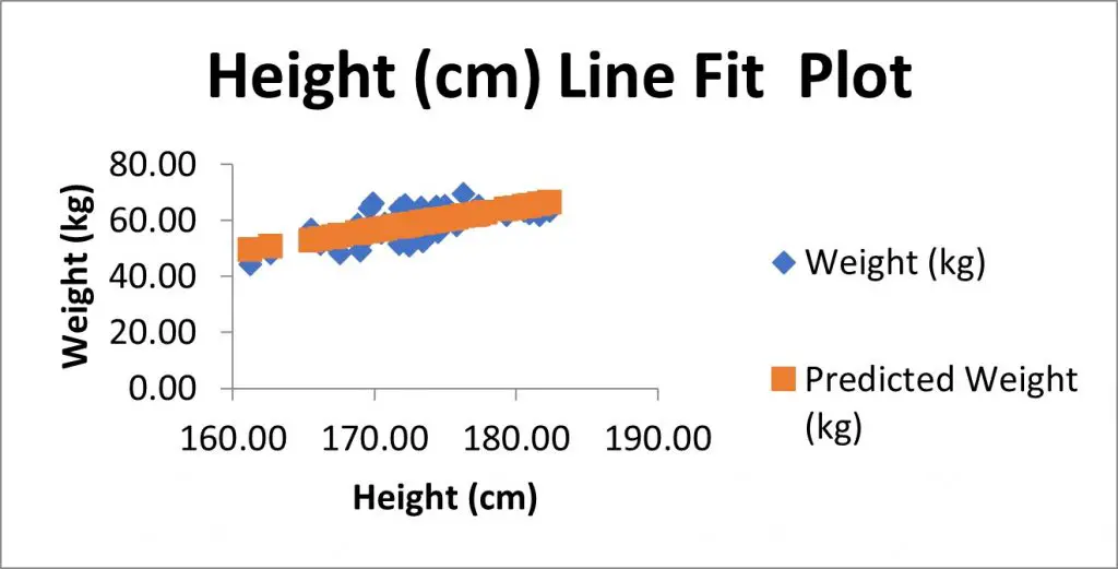
In my example, I have the height measures on the X axis and the weight measures on the Y axis.
There is also another set of data, as shown in orange here, which are in fact the predicted Y value based on the model. These are the Predicted values from the residuals table.
If instead of showing the Predicted values on the graph, but you instead wanted to plot the line of best fit (which will pass through the predicted values), then you could remove the predicted values from the graph.
To do this:
- Right-click on on the graph, and go to Select Data
- Highlight the predicted Y variable in the legend entry, select remove, and click Okay
- Select the graph, then go to Add Chart Element>Trendline, and select the Linear option
- If you also want to show the equation of the line, then double-click on the line
- Then, in the Format Trendline options that have opened to the right, scroll down and select Display Equation on Chart
Normal Probability plot
Finally, if you selected the Normal Probability plots option in the regression setup window, you will also see a table called Probability Output and a graph, called the Normal Probability Plot, which is a scatter plot of this data in the graph.
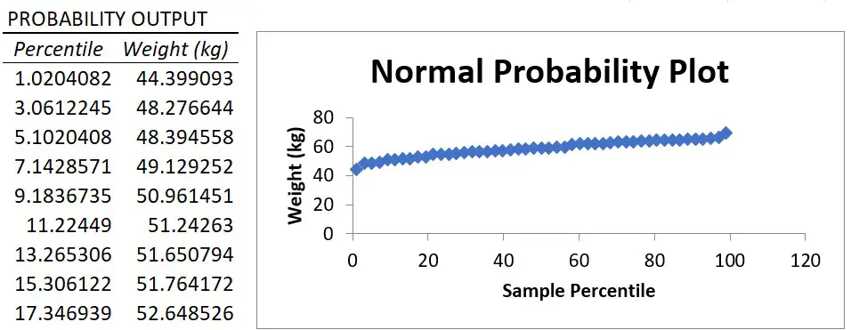
The X axis plots the percentile value ranging from 0 to 100 and the Y axis plots the Y variable data.
The normal probability plot is used to determine whether the data fits a normal distribution.
Essentially, what you are looking for is a straight line of data. And, as you can see, there is a nice straight line of data for my example, which suggests the weight data are normally distributed.
However, it’s worth noting that the Y variable does not actually have to be normally distributed when fitting a linear regression model. I’ll go into a bit more detail about the assumptions of linear regression in a future tutorial.
Wrapping up
You now know how to perform a simple linear regression test in Microsoft Excel, and how to interpret the output of results.
Microsoft Excel version used: 365 ProPlus
In Excel for the web, you can view the results of a regression analysis (in statistics, a way to predict and forecast trends), but you can’t create one because the Regression tool isn’t available.
You also won’t be able to use a statistical worksheet function such as LINEST to do a meaningful analysis because it requires you enter it as an array formula, which isn’t supported in Excel for the web.
If you have the Excel desktop application, you can use the Open in Excel button to open your workbook and use either the Analysis ToolPak’s Regression tool or statistical functions to perform a regression analysis there.
Click Open in Excel and perform a regression analysis.
For news about the latest Excel for the web updates, visit the Microsoft Excel blog.
For the full suite of Office applications and services, try or buy it at Office.com.
Need more help?
Want more options?
Explore subscription benefits, browse training courses, learn how to secure your device, and more.
Communities help you ask and answer questions, give feedback, and hear from experts with rich knowledge.
Regression is done to define relationships between two or more variables in a data set. In statistics, regression is done by some complex formulas. But, Excel has provided us with tools for regression analysis. So, in the Excel Analysis ToolPak, click “Data Analysis” and “Regression” to conduct regression analysis in Excel.
Table of contents
- What is Regression Analysis in Excel?
- Explained
- Examples
- How to Run Regression Analysis Tool in Excel?
- How to Use Regression Analysis Tool in Excel?
- Steps to Create Regression Chart in Excel
- Things to Remember
- Recommended Articles
Explained
The Regression analysis tool performs linear regression in excelLinear Regression is a statistical excel tool that is used as a predictive analysis model to examine the relationship between two sets of data. Using this analysis, we can estimate the relationship between dependent and independent variables.read more examination using the “minimum squares” technique to fit a line through many observations. You can examine how an individual dependent variable is influenced by the estimations of at least one independent variable. For instance, you can investigate how such factors influence a sportsman’s performance as age, height, and weight. You can distribute shares in the execution measure to every one of these three components, given a lot of execution information, and then utilize the outcomes to foresee the execution of another person.
The Excel regression analysis tool helps you see how the dependent variable changes when one of the independent variables fluctuates and permits you to numerically figure out which of those variables truly has an effect.
You are free to use this image on your website, templates, etc, Please provide us with an attribution linkArticle Link to be Hyperlinked
For eg:
Source: Regression Analysis in Excel (wallstreetmojo.com)
Examples
- Sales of shampoo are dependent upon the advertisement. If $1 million increases advertising expenditure, sales will be expected to increase by $23 million. If there were no advertising, we would expect sales without any increment.
- House sales (selling price, number of bedrooms, location, size, design) predict the selling price of future sales in the same area.
- Soft drink sales massively increase in summer when the weather is too hot. People purchase more and more soft drinks to keep them cool. The higher the temperature, the higher the sales and vice versa.
- In March, exam season started, and sales increased due to students purchasing exam pads. Exam pads sale depends upon the examination season.
How to Run Regression Analysis Tool in Excel?
- We must enable the Analysis ToolPak Add-in.
- In Excel, click on the “File” on the extreme left-hand side, go and click on the “Options” at the end.

- On clicking on “Options,” select “Add-ins” on the left side. Excel Add-ins are chosen in the “View and manage Microsoft Add-ins” and “Manage” boxes. Then, click “Go.”

- In the Add-in dialog box, click on Analysis Toolpak, and click OK:

It will add the “Data Analysis” tools on the right-hand side to the Excel ribbon’s “Data” tab.


How to Use Regression Analysis Tool in Excel?
We must use the data for regression analysis in Excel.
You can download this Regression Excel Template here – Regression Excel Template
Once Analysis ToolpakExcel’s data analysis toolpak can be used by users to perform data analysis and other important calculations. It can be manually enabled from the addins section of the files tab by clicking on manage addins, and then checking analysis toolpak.read more is added and enabled in the Excel workbook, follow the steps mentioned below to practice the analysis of regression in Excel:
- Step 1: On the Data tab in the Excel ribbonThe ribbon is an element of the UI (User Interface) which is seen as a strip that consists of buttons or tabs; it is available at the top of the excel sheet. This option was first introduced in the Microsoft Excel 2007.read more, click the Data Analysis

- Step 2: Click on the “Regression” and click “OK” to enable the function.

- Step 3: On clicking the “Regression“ dialog box, we must arrange the accompanying settings:
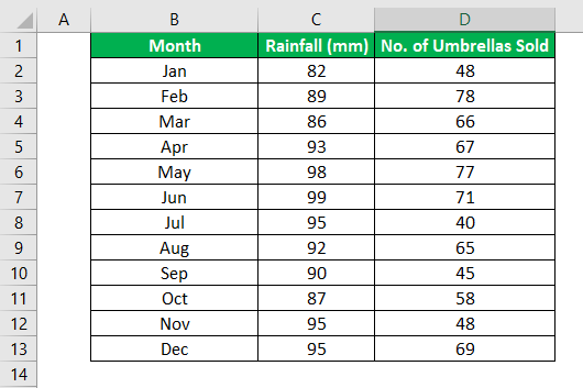
- For the dependent variable, select the “Input Y Range,” which denotes the dependent data. Here, in the below-given screenshot, we have selected the range from $D$2:$D$13.

- Select the “Input X Range,” which denotes the independent data for the independent variable. Here, in the below-given screenshot, we have selected the range from $C$2:$C$13.

- Step 4: Click “OK” and analyze the data accordingly.

When you run the regression analysis in Excel, the following output will come:


You can also make a scatter plot in excelScatter plot in excel is a two dimensional type of chart to represent data, it has various names such XY chart or Scatter diagram in excel, in this chart we have two sets of data on X and Y axis who are co-related to each other, this chart is mostly used in co-relation studies and regression studies of data.read more of these residuals.
Steps to Create Regression Chart in Excel
- Step 1: Select the data as given in the below screenshot.

- Step 2: Tap on the “Inset” tab. In the “Charts” gathering, tap the “Scatter” diagram or some other as a required symbol. Select the chart which suits the information.

- Step 3: We can modify the chart when required and fill in the hues and lines of your decision. For instance, we can pick alternate shading and utilize a strong line of a dashed line. We can customize the graph as we want to customize it.

Things to Remember
- We must always check the dependent and independent values. Otherwise, the analysis will be wrong.
- If you test a huge number of data and thoroughly rank them based on their validation period statisticsStatistics is the science behind identifying, collecting, organizing and summarizing, analyzing, interpreting, and finally, presenting such data, either qualitative or quantitative, which helps make better and effective decisions with relevance.read more.
- Choose the data carefully to avoid any kind of error in excel analysis.
- We can optionally check any of the boxes at the bottom of the screen, although none of these is necessary to obtain the line best-fit formula.
- Start practicing with small data to understand the better analysis and run the regression analysis tool in Excel easily.
Recommended Articles
This article is a step-by-step guide to Regression Analysis in Excel. Here we discuss how to run regression in Excel, its interpretation, and use this tool along with Excel examples and downloadable Excel templates. You may also look at these useful functions in Excel: –
- Examples of Normal Distribution Graph in Excel
- Regression vs. ANOVABoth the Regression and ANOVA are the statistical models which are used in order to predict the continuous outcome but in case of the regression, continuous outcome is predicted on basis of the one or more than one continuous predictor variables whereas in case of ANOVA continuous outcome is predicted on basis of the one or more than one categorical predictor variables.read more
- Excel Exponential Smoothing
- Exponential Function ExcelExponential Excel function(EXP) is an inbuilt function in excel used to calculate the exponent raised to the power of any number you provide. In this function the exponent is constant and is also known as the base of the natural algorithm.read more
Reader Interactions
Содержание
- Подключение пакета анализа
- Виды регрессионного анализа
- Линейная регрессия в программе Excel
- Разбор результатов анализа
- Вопросы и ответы

Регрессионный анализ является одним из самых востребованных методов статистического исследования. С его помощью можно установить степень влияния независимых величин на зависимую переменную. В функционале Microsoft Excel имеются инструменты, предназначенные для проведения подобного вида анализа. Давайте разберем, что они собой представляют и как ими пользоваться.
Подключение пакета анализа
Но, для того, чтобы использовать функцию, позволяющую провести регрессионный анализ, прежде всего, нужно активировать Пакет анализа. Только тогда необходимые для этой процедуры инструменты появятся на ленте Эксель.
- Перемещаемся во вкладку «Файл».
- Переходим в раздел «Параметры».
- Открывается окно параметров Excel. Переходим в подраздел «Надстройки».
- В самой нижней части открывшегося окна переставляем переключатель в блоке «Управление» в позицию «Надстройки Excel», если он находится в другом положении. Жмем на кнопку «Перейти».
- Открывается окно доступных надстроек Эксель. Ставим галочку около пункта «Пакет анализа». Жмем на кнопку «OK».

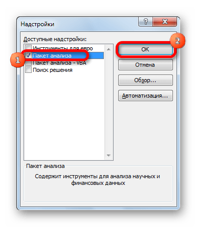
Теперь, когда мы перейдем во вкладку «Данные», на ленте в блоке инструментов «Анализ» мы увидим новую кнопку – «Анализ данных».
Виды регрессионного анализа
Существует несколько видов регрессий:
- параболическая;
- степенная;
- логарифмическая;
- экспоненциальная;
- показательная;
- гиперболическая;
- линейная регрессия.
О выполнении последнего вида регрессионного анализа в Экселе мы подробнее поговорим далее.
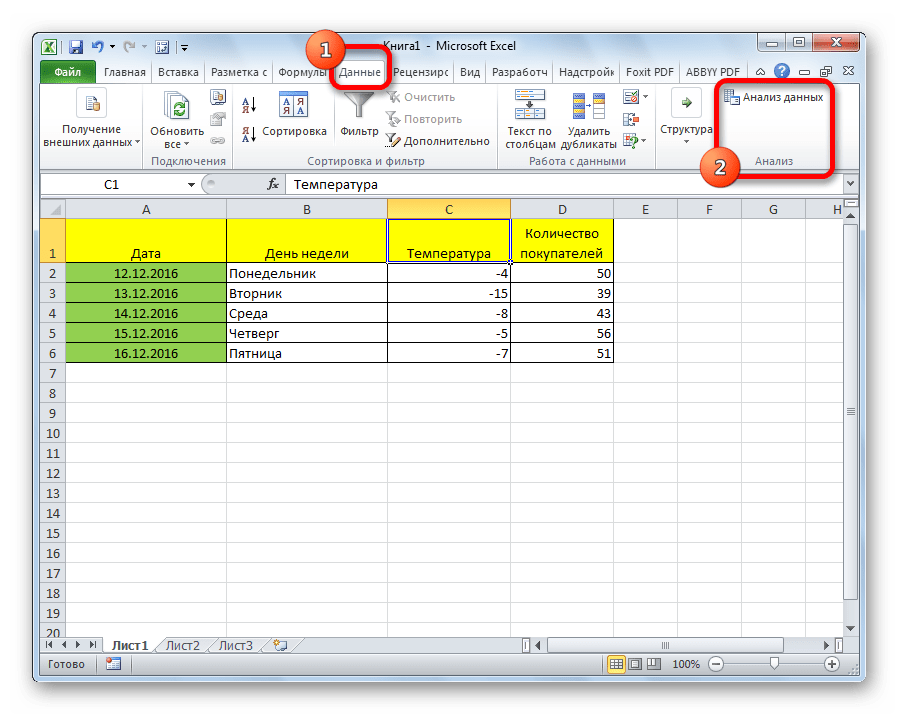
Внизу, в качестве примера, представлена таблица, в которой указана среднесуточная температура воздуха на улице, и количество покупателей магазина за соответствующий рабочий день. Давайте выясним при помощи регрессионного анализа, как именно погодные условия в виде температуры воздуха могут повлиять на посещаемость торгового заведения.
Общее уравнение регрессии линейного вида выглядит следующим образом: У = а0 + а1х1 +…+акхк. В этой формуле Y означает переменную, влияние факторов на которую мы пытаемся изучить. В нашем случае, это количество покупателей. Значение x – это различные факторы, влияющие на переменную. Параметры a являются коэффициентами регрессии. То есть, именно они определяют значимость того или иного фактора. Индекс k обозначает общее количество этих самых факторов.
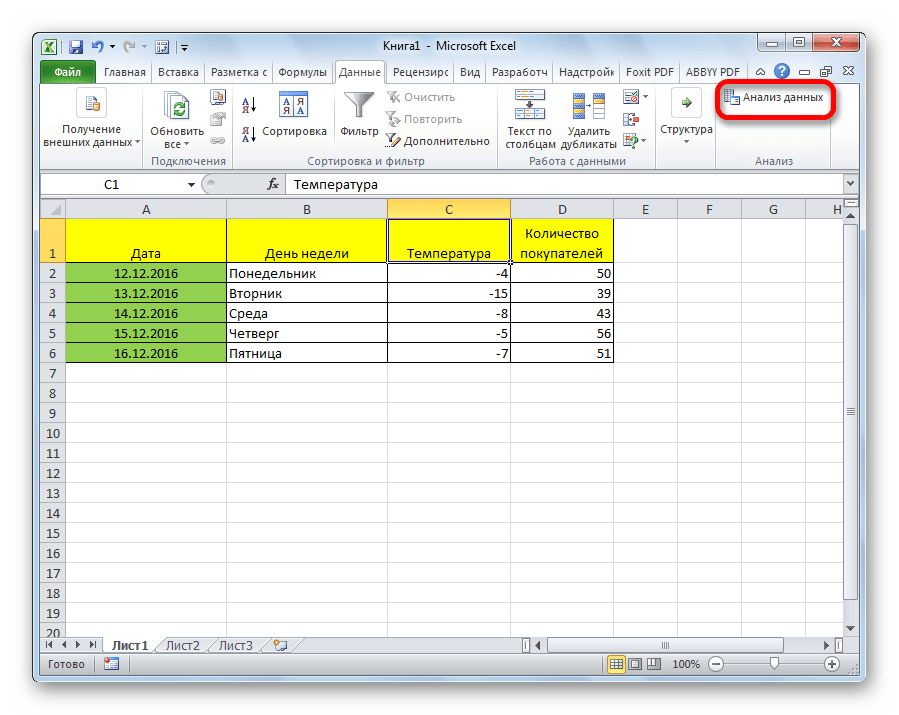
- Кликаем по кнопке «Анализ данных». Она размещена во вкладке «Главная» в блоке инструментов «Анализ».
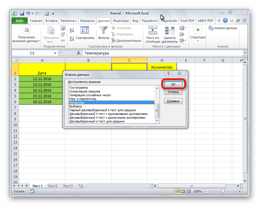
- Открывается небольшое окошко. В нём выбираем пункт «Регрессия». Жмем на кнопку «OK».
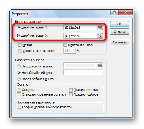
- Открывается окно настроек регрессии. В нём обязательными для заполнения полями являются «Входной интервал Y» и «Входной интервал X». Все остальные настройки можно оставить по умолчанию.
В поле «Входной интервал Y» указываем адрес диапазона ячеек, где расположены переменные данные, влияние факторов на которые мы пытаемся установить. В нашем случае это будут ячейки столбца «Количество покупателей». Адрес можно вписать вручную с клавиатуры, а можно, просто выделить требуемый столбец. Последний вариант намного проще и удобнее.
В поле «Входной интервал X» вводим адрес диапазона ячеек, где находятся данные того фактора, влияние которого на переменную мы хотим установить. Как говорилось выше, нам нужно установить влияние температуры на количество покупателей магазина, а поэтому вводим адрес ячеек в столбце «Температура». Это можно сделать теми же способами, что и в поле «Количество покупателей».

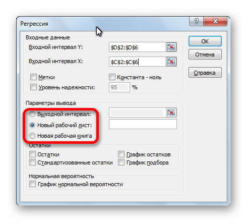
С помощью других настроек можно установить метки, уровень надёжности, константу-ноль, отобразить график нормальной вероятности, и выполнить другие действия. Но, в большинстве случаев, эти настройки изменять не нужно. Единственное на что следует обратить внимание, так это на параметры вывода. По умолчанию вывод результатов анализа осуществляется на другом листе, но переставив переключатель, вы можете установить вывод в указанном диапазоне на том же листе, где расположена таблица с исходными данными, или в отдельной книге, то есть в новом файле.
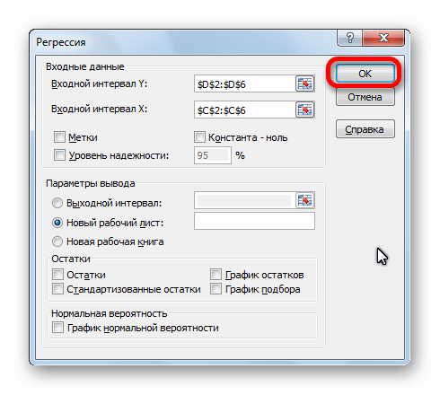
После того, как все настройки установлены, жмем на кнопку «OK».

Разбор результатов анализа
Результаты регрессионного анализа выводятся в виде таблицы в том месте, которое указано в настройках.
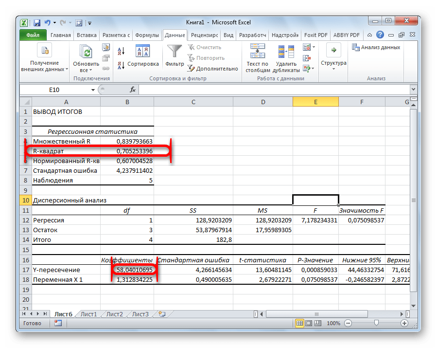
Одним из основных показателей является R-квадрат. В нем указывается качество модели. В нашем случае данный коэффициент равен 0,705 или около 70,5%. Это приемлемый уровень качества. Зависимость менее 0,5 является плохой.
Ещё один важный показатель расположен в ячейке на пересечении строки «Y-пересечение» и столбца «Коэффициенты». Тут указывается какое значение будет у Y, а в нашем случае, это количество покупателей, при всех остальных факторах равных нулю. В этой таблице данное значение равно 58,04.
Значение на пересечении граф «Переменная X1» и «Коэффициенты» показывает уровень зависимости Y от X. В нашем случае — это уровень зависимости количества клиентов магазина от температуры. Коэффициент 1,31 считается довольно высоким показателем влияния.
Как видим, с помощью программы Microsoft Excel довольно просто составить таблицу регрессионного анализа. Но, работать с полученными на выходе данными, и понимать их суть, сможет только подготовленный человек.
In the real world, you will probably never conduct multiple regression analysis by hand.
Most likely, you will use computer software (SAS, SPSS, Minitab, Excel, etc.).
Excel is a widely-available software application that supports multiple regression. In this lesson,
we use Excel to demonstrate multiple regression analysis. (Other software packages produce
outputs similar to Excel; so if you understand the outputs from Excel, you will understand
similar outputs from other software.)
Sample Problem With Excel
Consider the table below. It shows three performance measures for 10 students.
| Student | Test score | IQ | Study hours |
|---|---|---|---|
| 1 | 100 | 125 | 30 |
| 2 | 95 | 104 | 40 |
| 3 | 92 | 110 | 25 |
| 4 | 90 | 105 | 20 |
| 5 | 85 | 100 | 20 |
| 6 | 80 | 100 | 20 |
| 7 | 78 | 95 | 15 |
| 8 | 75 | 95 | 10 |
| 9 | 72 | 85 | 0 |
| 10 | 65 | 90 | 5 |
In this lesson, using data from the table, we are going to complete the following tasks:
- Develop a least-squares regression equation to predict test score, based on (1) IQ and (2) the number of hours
that the student studied. - Assess how well the regression equation predicts test score, the dependent variable.
- Assess the contribution of each independent variable (i.e., IQ and study hours) to the prediction.
These are common tasks in regression analysis. With the right software, they are easy to accomplish. We’ll
walk you step by step through each task, starting with setting up Excel.
How to Enable Excel
When you open Excel, the module for regression analysis may or may not be enabled. So, before you do anything else, you need to
determine whether Excel is enabled. Here’s how to do that:
- Open Excel.
- Click the Data tab.
- If you see the Data Analysis button in the upper right corner, the Analysis TookPak is enabled and you are ready to go.


If the Data Analysis button is not visible, the Analysis ToolPak is not enabled. In that case, do the following:
- Click the File tab.
- Select Options to open the Excel Options dialog box.
- Click the Add-Ins item, from the left column. This opens the View and Manage Microsoft Office Add-ins screen.
- From the Manage drop-down box, choose Excel Add-Ins and click the Go button. This opens the Add-Ins dialog box.
- From the Add-Ins dialog, check the box beside Analysis ToolPak and click Go.
This enables the Analysis ToolPak. Now, when you click the Data tab, you will see a Data Analysis button in the upper right corner under the Data tab.
(If this explanation of how to enable the Analysis ToolPak is unclear, go to
https://stattrek.com/anova/excel-analysis-toolpak for more detailed instruction.)
Data Entry With Excel
Data entry with Excel is easy. There are three main steps:
- Enter data on spreadsheet.
- Identify independent and dependent variables.
- Specify desired analyses.
To illustrate the process, we’ll walk through each step, using data from our sample problem. First, we want to
enter data on an Excel spreadsheet. This means listing data for each variable in adjacent columns, as shown below:

Next, we want to identify the independent and dependent variables. Begin by clicking the Data tab and the Data Analysis button.


This will open the Data Analysis dialog box. From the drop-down list, select «Regression» and click OK.


Excel will display the Regression dialog box. This is where you identify data fields for the independent and dependent variables. In the Input Y Range, enter
coordinates for the dependent variable. In the Input X Range, enter coordinates for the independent variable(s). If you include column
labels in these input ranges, check the Labels box. In the example below, we have included labels, so the Labels box is checked.


By default, Excel will produce a standard set of outputs. For this sample problem, that’s all we
need; so click OK to generate standard regression outputs.
Note: If desired, you can request additional outputs in the form of
residual plots and normal probability plots.
To produce the plots, check the appropriate box(es) under Output options on the Regression dialog box.
Data Analysis With Excel
Excel provides everything we need to address the tasks we defined for this sample problem. Recall that
we wanted to do three things:
- Develop a least-squares regression equation to predict test score, based on (1) IQ and (2) the number of hours
that the student studied. - Assess how well the regression equation predicts test score, the dependent variable.
- Assess the contribution of each independent variable (i.e., IQ and study hours) to the prediction.
Let’s review the output produced by Excel and see how it addresses each task.
Regression Equation
The first task in our analysis is to define a linear, least-squares regression equation to predict test score,
based on IQ and study hours. Since we have two independent variables, the equation takes the following form:
ŷ = b0 + b1x1 + b2x2
In this equation, ŷ is the predicted test score. The independent variables are IQ and study hours,
which are denoted by x1 and x2, respectively. The regression coefficients are
b0, b1, and b2. On the right side of the equation, the
only unknowns are the regression coefficients; so to specify the equation, we need to assign values
to the coefficients.
In the previous lesson, we showed how to assign values to regression coefficients, using matrix algebra — a
time-consuming, labor-intensive process by hand. Excel does all the hard work behind the scenes, and displays the result in a regression coefficients table:


Here, we see that the regression intercept (b0) is 23.156, the regression coefficient for IQ (b1) is 0.509, and the regression coefficient
for study hours (b2) is 0.467. So the least-squares regression equation can be re-written as:
ŷ = 23.156 + 0.505 * IQ + 0.467 * Hours
This is the only linear equation that satisfies a least-squares criterion. That means this equation fits the data from which it was created
better than any other linear equation.
Coefficient of Multiple Determination
The fact that our equation fits the data better than any other linear equation does not guarantee that it fits the data well. We still need to
ask: How well does our equation fit the data?
To answer this question, researchers look at the coefficient of multiple determination (R2). The coefficient of multiple determination
measures the proportion of variation in the dependent variable that can be predicted from the set of independent
variables in the regression equation. When the regression equation fits the data well, R2 will be large (i.e., close to 1);
and vice versa.
The coefficient of multiple determination can be defined in terms of sums of squares:
SSR = Σ ( ŷ — y )2
SSTO = Σ ( y — y )2
R2 = SSR / SSTO
where SSR is the sum of squares due to regression, SSTO is the total sum of squares,
ŷ is the predicted value of the dependent variable, y is the dependent variable mean,
and y is the dependent variable raw score.
Luckily, you will never have to compute the coefficient of multiple determination by hand. It is a standard output of Excel
(and most other analysis packages), as shown below.

A quick glance at the output suggests that the regression equation fits the data pretty well. The coefficient of muliple
determination is 0.905. For our sample problem, this means 90.5% of test score variation can be explained by IQ and by hours
spent in study.
An Alternative View of R2
The coefficient of multiple correlation (R2) is the square of the correlation between actual and predicted
values of the dependent variable. Thus,
R2 = r2y, ŷ
where y is the dependent variable raw score, ŷ is the predicted value of the dependent variable,
and ry, ŷ is the correlation between y and ŷ.
ANOVA Table
Another way to evaluate the regression equation would be to assess the statistical significance of the regression
sum of squares. For that, we examine the ANOVA table produced by Excel:


This table tests the statistical significance of the independent variables as predictors of the dependent variable.
The last column of the table shows the results of an overall F test. The F statistic (33.4) is big, and the
p value (0.00026)
is small. This indicates that one or both independent variables has explanatory power beyond what would be expected by
chance.
Like the coefficient of multiple correlation, the overall F test found in the ANOVA table suggests that the
regression equation fits the data well.
Significance of Regression Coefficients
With multiple regression, there is more than one independent variable; so it is natural to ask whether a particular
independent variable contributes significantly to the regression after effects of other variables are taken
into account. The answer to this question can be found in the regression coefficients table:


The regression coefficients table shows the following information for each coefficient: its value, its standard error,
a t-statistic, and the significance of the t-statistic. In this example, the t-statistics for IQ and study hours are
both statistically significant at the 0.05 level. This means that IQ contributes significantly to the regression
after effects of study hours are taken into account. And study hours contribute significantly to the
regression after effects of IQ are taken into account.
Note: This analysis omits any consideration of multicollinearity, a topic we will cover in the
next lesson. Be aware, however, that it is best practice to assess
multicollinearity in the independent variables before testing significance of regression coefficients.
Final Thoughts
This lesson was all about multiple regression analysis. We used Excel, but the analysis would be much the same with other
software packages. All major software packages (SAS, SPSS, Minitab, etc.) produce three key outputs:
- Regression coefficients, based on a least-squares criterion.
- Measures of goodness of fit, like a coefficient of multiple determination and/or an overall F test.
- Significance tests for individual regression coefficients.
If you can interpret these regression outputs from Excel, you should have no trouble interpreting the same outputs from other packages.