
What Is Linear Regression?
Linear regression is a type of data analysis that considers the linear relationship between a dependent variable and one or more independent variables. It is typically used to visually show the strength of the relationship or correlation between various factors and the dispersion of results – all for the purpose of explaining the behavior of the dependent variable. The goal of a linear regression model is to estimate the magnitude of a relationship between variables and whether or not it is statistically significant.
Say we wanted to test the strength of the relationship between the amount of ice cream eaten and obesity. We would take the independent variable, the amount of ice cream, and relate it to the dependent variable, obesity, to see if there was a relationship. Given a regression is a graphical display of this relationship, the lower the variability in the data, the stronger the relationship and the tighter the fit to the regression line.
In finance, linear regression is used to determine relationships between asset prices and economic data across a range of applications. For instance, it is used to determine the factor weights in the Fama-French Model and is the basis for determining the Beta of a stock in the capital asset pricing model (CAPM).
Here, we look at how to use data imported into Microsoft Excel to perform a linear regression and how to interpret the results.
Key Takeaways
- Linear regression models the relationship between a dependent and independent variable(s).
- Also known as ordinary least squares (OLS), a linear regression essentially estimates a line of best fit among all variables in the model.
- Regression analysis can be considered robust if the variables are independent, there is no heteroscedasticity, and the error terms of variables are not correlated.
- Modeling linear regression in Excel is easier with the Data Analysis ToolPak.
- Regression output can be interpreted for both the size and strength of a correlation among one or more variables on the dependent variable.
Important Considerations
There are a few critical assumptions about your data set that must be true to proceed with a regression analysis. Otherwise, the results will be interpreted incorrectly or they will exhibit bias:
- The variables must be truly independent (using a Chi-square test).
- The data must not have different error variances (this is called heteroskedasticity (also spelled heteroscedasticity)).
- The error terms of each variable must be uncorrelated. If not, it means the variables are serially correlated.
If those three points sound complicated, they can be. But the effect of one of those considerations not being true is a biased estimate. Essentially, you would misstate the relationship you are measuring.
Outputting a Regression in Excel
The first step in running regression analysis in Excel is to double-check that the free Excel plugin Data Analysis ToolPak is installed. This plugin makes calculating a range of statistics very easy. It is not required to chart a linear regression line, but it makes creating statistics tables simpler. To verify if installed, select «Data» from the toolbar. If «Data Analysis» is an option, the feature is installed and ready to use. If not installed, you can request this option by clicking on the Office button and selecting «Excel options».
Using the Data Analysis ToolPak, creating a regression output is just a few clicks.
The independent variable in Excel goes in the X range.
Given the S&P 500 returns, say we want to know if we can estimate the strength and relationship of Visa (V) stock returns. The Visa (V) stock returns data populates column 1 as the dependent variable. S&P 500 returns data populates column 2 as the independent variable.
- Select «Data» from the toolbar. The «Data» menu displays.
- Select «Data Analysis». The Data Analysis — Analysis Tools dialog box displays.
- From the menu, select «Regression» and click «OK».
- In the Regression dialog box, click the «Input Y Range» box and select the dependent variable data (Visa (V) stock returns).
- Click the «Input X Range» box and select the independent variable data (S&P 500 returns).
- Click «OK» to run the results.
[Note: If the table seems small, right-click the image and open in new tab for higher resolution.]
Interpret the Results
Using that data (the same from our R-squared article), we get the following table:
The R2 value, also known as the coefficient of determination, measures the proportion of variation in the dependent variable explained by the independent variable or how well the regression model fits the data. The R2 value ranges from 0 to 1, and a higher value indicates a better fit. The p-value, or probability value, also ranges from 0 to 1 and indicates if the test is significant. In contrast to the R2 value, a smaller p-value is favorable as it indicates a correlation between the dependent and independent variables.
Interpreting the Results
The bottom line here is that changes in Visa stock seem to be highly correlated with the S&P 500.
- In the regression output above, we can see that for every 1-point change in Visa, there is a corresponding 1.36-point change in the S&P 500.
- We can also see that the p-value is very small (0.000036), which also corresponds to a very large T-test. This indicates that this finding is highly statistically significant, so the odds that this result was caused by chance are exceedingly low.
- From the R-squared, we can see that the V price alone can explain more than 62% of the observed fluctuations in the S&P 500 index.
However, an analyst at this point may heed a bit of caution for the following reasons:
- With only one variable in the model, it is unclear whether V affects the S&P 500 prices, if the S&P 500 affects V prices, or if some unobserved third variable affects both prices.
- Visa is a component of the S&P 500, so there could be a co-correlation between the variables here.
- There are only 20 observations, which may not be enough to make a good inference.
- The data is a time series, so there could also be autocorrelation.
- The time period under study may not be representative of other time periods.
Charting a Regression in Excel
We can chart a regression in Excel by highlighting the data and charting it as a scatter plot. To add a regression line, choose «Add Chart Element» from the «Chart Design» menu. In the dialog box, select «Trendline» and then «Linear Trendline». To add the R2 value, select «More Trendline Options» from the «Trendline menu. Lastly, select «Display R-squared value on chart». The visual result sums up the strength of the relationship, albeit at the expense of not providing as much detail as the table above.
How Do You Interpret a Linear Regression?
The output of a regression model will produce various numerical results. The coefficients (or betas) tell you the association between an independent variable and the dependent variable, holding everything else constant. If the coefficient is, say, +0.12, it tells you that every 1-point change in that variable corresponds with a 0.12 change in the dependent variable in the same direction. If it were instead -3.00, it would mean a 1-point change in the explanatory variable results in a 3x change in the dependent variable, in the opposite direction.
How Do You Know If a Regression Is Significant?
In addition to producing beta coefficients, a regression output will also indicate tests of statistical significance based on the standard error of each coefficient (such as the p-value and confidence intervals). Often, analysts use a p-value of 0.05 or less to indicate significance; if the p-value is greater, then you cannot rule out chance or randomness for the resultant beta coefficient. Other tests of significance in a regression model can be t-tests for each variable, as well as an F-statistic or chi-square for the joint significance of all variables in the model together.
How Do You Interpret the R-Squared of a Linear Regression?
R2 (R-squared) is a statistical measure of the goodness of fit of a linear regression model (from 0.00 to 1.00), also known as the coefficient of determination. In general, the higher the R2, the better the model’s fit. The R-squared can also be interpreted as how much of the variation in the dependent variable is explained by the independent (explanatory) variables in the model. Thus, an R-square of 0.50 suggests that half of all of the variation observed in the dependent variable can be explained by the dependent variable(s).
Содержание
- Подключение пакета анализа
- Виды регрессионного анализа
- Линейная регрессия в программе Excel
- Разбор результатов анализа
- Вопросы и ответы

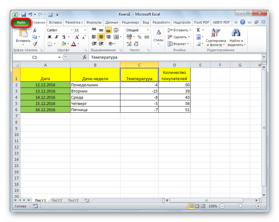
Регрессионный анализ является одним из самых востребованных методов статистического исследования. С его помощью можно установить степень влияния независимых величин на зависимую переменную. В функционале Microsoft Excel имеются инструменты, предназначенные для проведения подобного вида анализа. Давайте разберем, что они собой представляют и как ими пользоваться.
Подключение пакета анализа
Но, для того, чтобы использовать функцию, позволяющую провести регрессионный анализ, прежде всего, нужно активировать Пакет анализа. Только тогда необходимые для этой процедуры инструменты появятся на ленте Эксель.
- Перемещаемся во вкладку «Файл».
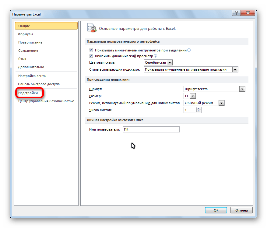
- Переходим в раздел «Параметры».
- Открывается окно параметров Excel. Переходим в подраздел «Надстройки».
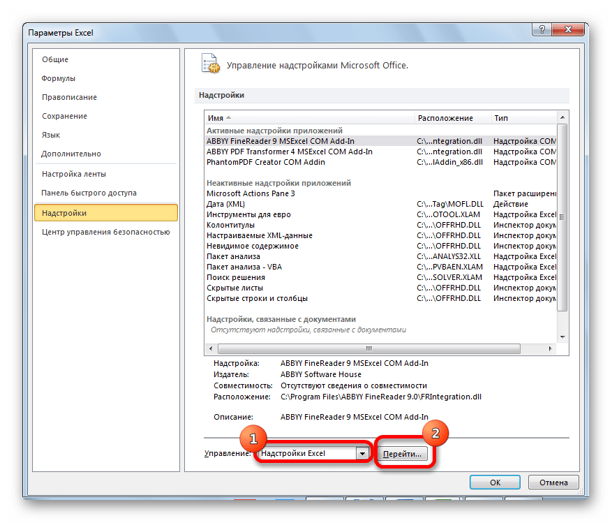
- В самой нижней части открывшегося окна переставляем переключатель в блоке «Управление» в позицию «Надстройки Excel», если он находится в другом положении. Жмем на кнопку «Перейти».
- Открывается окно доступных надстроек Эксель. Ставим галочку около пункта «Пакет анализа». Жмем на кнопку «OK».


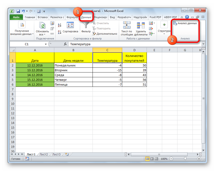
Теперь, когда мы перейдем во вкладку «Данные», на ленте в блоке инструментов «Анализ» мы увидим новую кнопку – «Анализ данных».
Виды регрессионного анализа
Существует несколько видов регрессий:
- параболическая;
- степенная;
- логарифмическая;
- экспоненциальная;
- показательная;
- гиперболическая;
- линейная регрессия.
О выполнении последнего вида регрессионного анализа в Экселе мы подробнее поговорим далее.
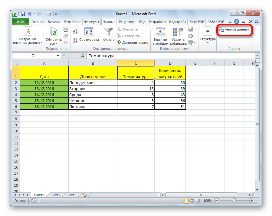
Внизу, в качестве примера, представлена таблица, в которой указана среднесуточная температура воздуха на улице, и количество покупателей магазина за соответствующий рабочий день. Давайте выясним при помощи регрессионного анализа, как именно погодные условия в виде температуры воздуха могут повлиять на посещаемость торгового заведения.
Общее уравнение регрессии линейного вида выглядит следующим образом: У = а0 + а1х1 +…+акхк. В этой формуле Y означает переменную, влияние факторов на которую мы пытаемся изучить. В нашем случае, это количество покупателей. Значение x – это различные факторы, влияющие на переменную. Параметры a являются коэффициентами регрессии. То есть, именно они определяют значимость того или иного фактора. Индекс k обозначает общее количество этих самых факторов.
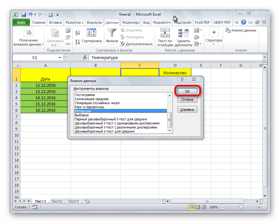
- Кликаем по кнопке «Анализ данных». Она размещена во вкладке «Главная» в блоке инструментов «Анализ».
- Открывается небольшое окошко. В нём выбираем пункт «Регрессия». Жмем на кнопку «OK».
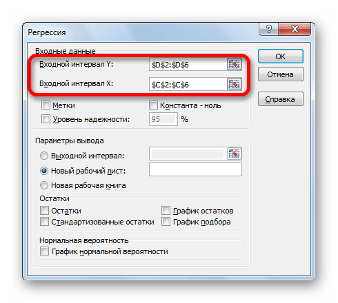
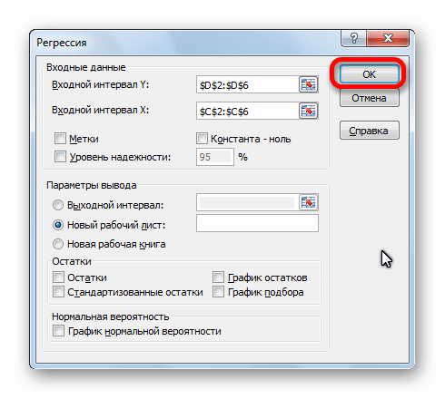
- Открывается окно настроек регрессии. В нём обязательными для заполнения полями являются «Входной интервал Y» и «Входной интервал X». Все остальные настройки можно оставить по умолчанию.
В поле «Входной интервал Y» указываем адрес диапазона ячеек, где расположены переменные данные, влияние факторов на которые мы пытаемся установить. В нашем случае это будут ячейки столбца «Количество покупателей». Адрес можно вписать вручную с клавиатуры, а можно, просто выделить требуемый столбец. Последний вариант намного проще и удобнее.
В поле «Входной интервал X» вводим адрес диапазона ячеек, где находятся данные того фактора, влияние которого на переменную мы хотим установить. Как говорилось выше, нам нужно установить влияние температуры на количество покупателей магазина, а поэтому вводим адрес ячеек в столбце «Температура». Это можно сделать теми же способами, что и в поле «Количество покупателей».

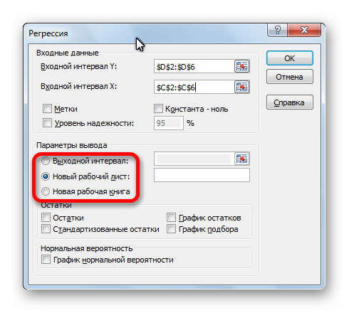
С помощью других настроек можно установить метки, уровень надёжности, константу-ноль, отобразить график нормальной вероятности, и выполнить другие действия. Но, в большинстве случаев, эти настройки изменять не нужно. Единственное на что следует обратить внимание, так это на параметры вывода. По умолчанию вывод результатов анализа осуществляется на другом листе, но переставив переключатель, вы можете установить вывод в указанном диапазоне на том же листе, где расположена таблица с исходными данными, или в отдельной книге, то есть в новом файле.
После того, как все настройки установлены, жмем на кнопку «OK».

Разбор результатов анализа
Результаты регрессионного анализа выводятся в виде таблицы в том месте, которое указано в настройках.
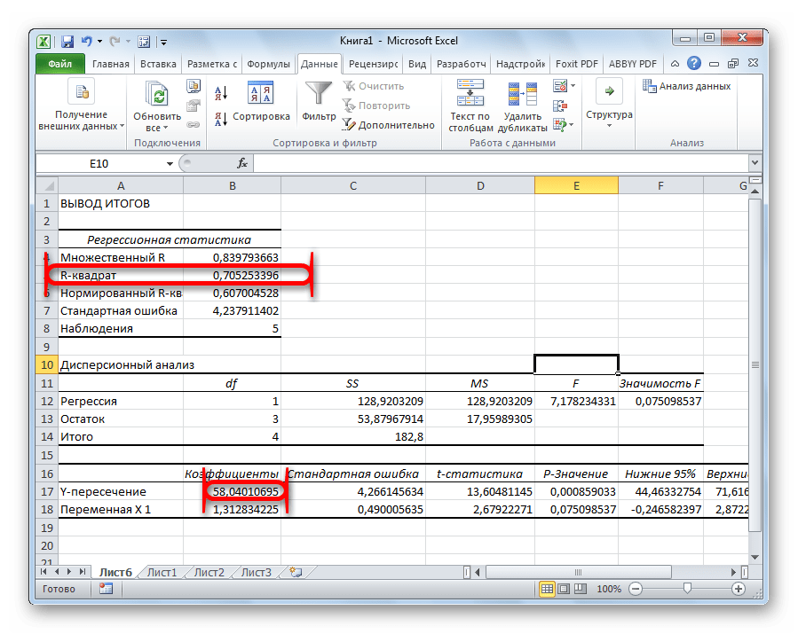
Одним из основных показателей является R-квадрат. В нем указывается качество модели. В нашем случае данный коэффициент равен 0,705 или около 70,5%. Это приемлемый уровень качества. Зависимость менее 0,5 является плохой.
Ещё один важный показатель расположен в ячейке на пересечении строки «Y-пересечение» и столбца «Коэффициенты». Тут указывается какое значение будет у Y, а в нашем случае, это количество покупателей, при всех остальных факторах равных нулю. В этой таблице данное значение равно 58,04.
Значение на пересечении граф «Переменная X1» и «Коэффициенты» показывает уровень зависимости Y от X. В нашем случае — это уровень зависимости количества клиентов магазина от температуры. Коэффициент 1,31 считается довольно высоким показателем влияния.
Как видим, с помощью программы Microsoft Excel довольно просто составить таблицу регрессионного анализа. Но, работать с полученными на выходе данными, и понимать их суть, сможет только подготовленный человек.
Содержание
- Как выполнить логистическую регрессию в Excel
- Пример: логистическая регрессия в Excel
- Creating a Linear Regression Model in Excel
- What Is Linear Regression?
- Key Takeaways
- Important Considerations
- Outputting a Regression in Excel
- Interpret the Results
- Interpreting the Results
- Charting a Regression in Excel
- How Do You Interpret a Linear Regression?
- How Do You Know If a Regression Is Significant?
- How Do You Interpret the R-Squared of a Linear Regression?
Как выполнить логистическую регрессию в Excel

Логистическая регрессия — это метод, который мы используем для подбора регрессионной модели, когда переменная ответа является бинарной.
В этом руководстве объясняется, как выполнить логистическую регрессию в Excel.
Пример: логистическая регрессия в Excel
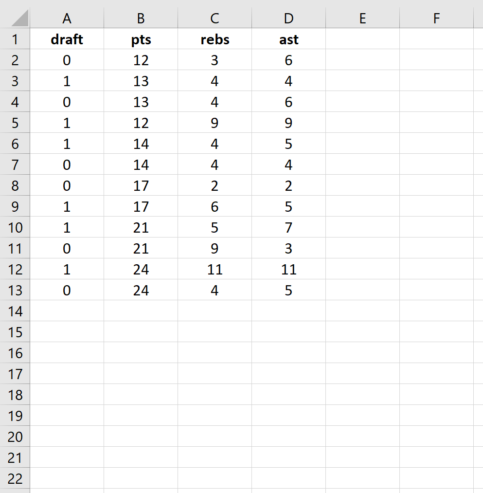
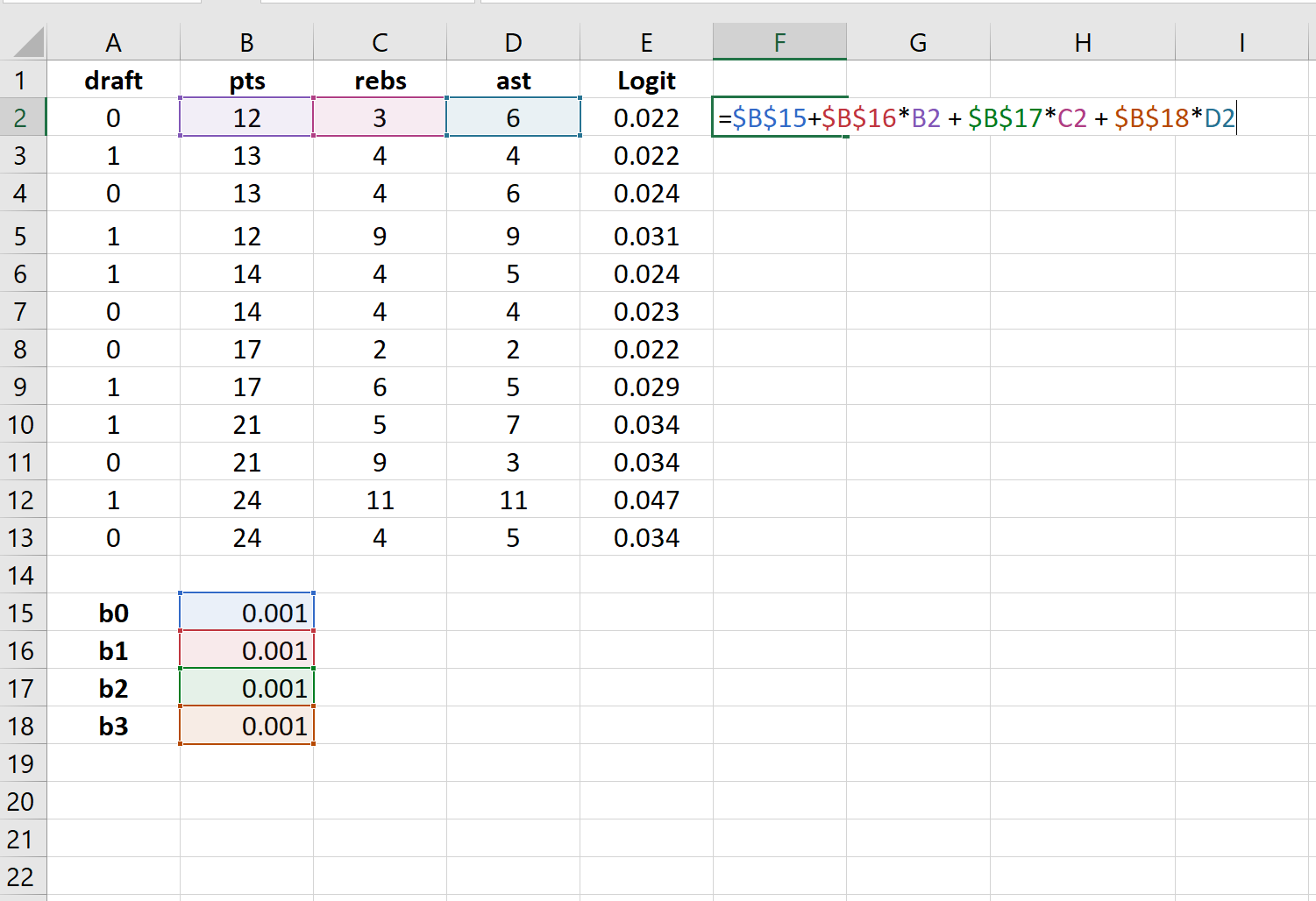
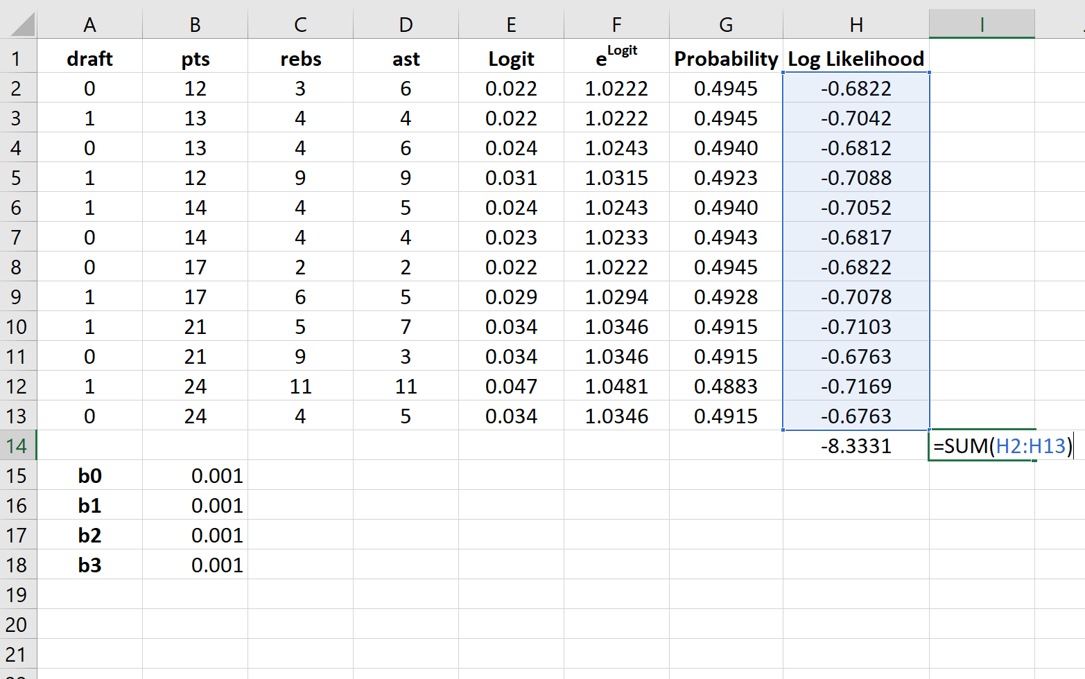
Используйте следующие шаги, чтобы выполнить логистическую регрессию в Excel для набора данных, который показывает, были ли баскетболисты колледжей выбраны в НБА (драфт: 0 = нет, 1 = да) на основе их среднего количества очков, подборов и передач в предыдущем время года.
Шаг 1: Введите данные.
Сначала введите следующие данные:
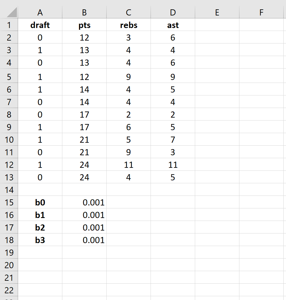
Шаг 2: Введите ячейки для коэффициентов регрессии.
Поскольку в модели у нас есть три объясняющие переменные (pts, rebs, ast), мы создадим ячейки для трех коэффициентов регрессии плюс один для точки пересечения в модели. Мы установим значения для каждого из них на 0,001, но мы оптимизируем их позже.
Далее нам нужно будет создать несколько новых столбцов, которые мы будем использовать для оптимизации этих коэффициентов регрессии, включая логит, e логит , вероятность и логарифмическую вероятность.
Шаг 3: Создайте значения для логита.
Далее мы создадим столбец logit, используя следующую формулу:
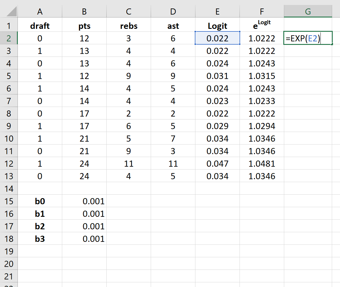
Шаг 4: Создайте значения для e logit .
Далее мы создадим значения для e logit , используя следующую формулу:
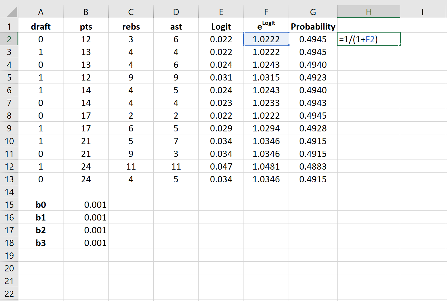
Шаг 5: Создайте значения для вероятности.
Далее мы создадим значения вероятности, используя следующую формулу:
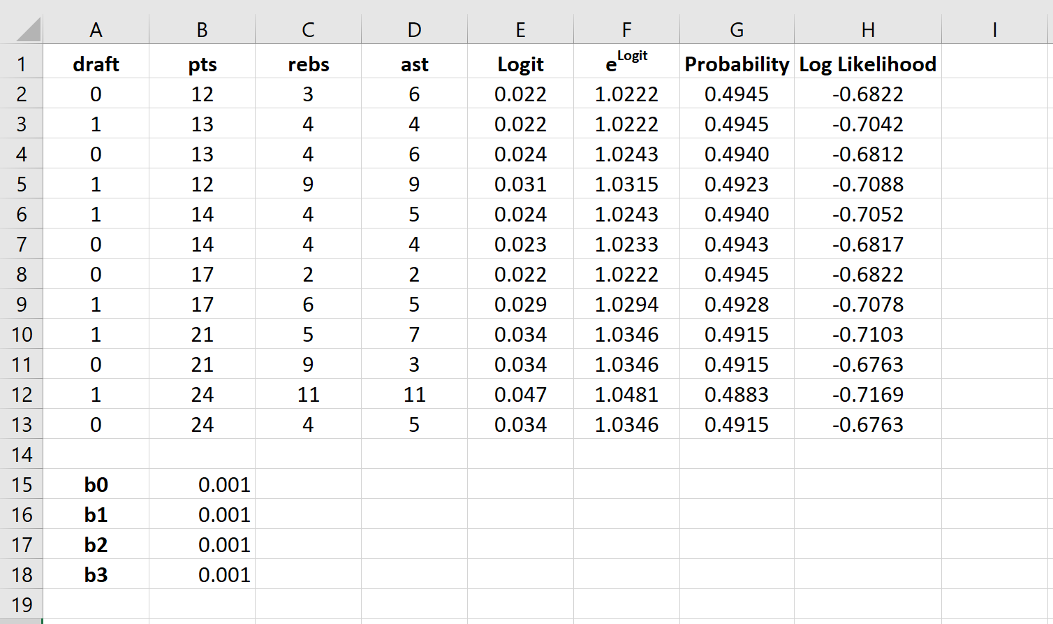
Шаг 6: Создайте значения для логарифмической вероятности.
Далее мы создадим значения для логарифмической вероятности, используя следующую формулу:
Логарифмическая вероятность = LN (вероятность)
Шаг 7: Найдите сумму логарифмических вероятностей.
Наконец, мы найдем сумму логарифмических правдоподобий, то есть число, которое мы попытаемся максимизировать, чтобы найти коэффициенты регрессии.
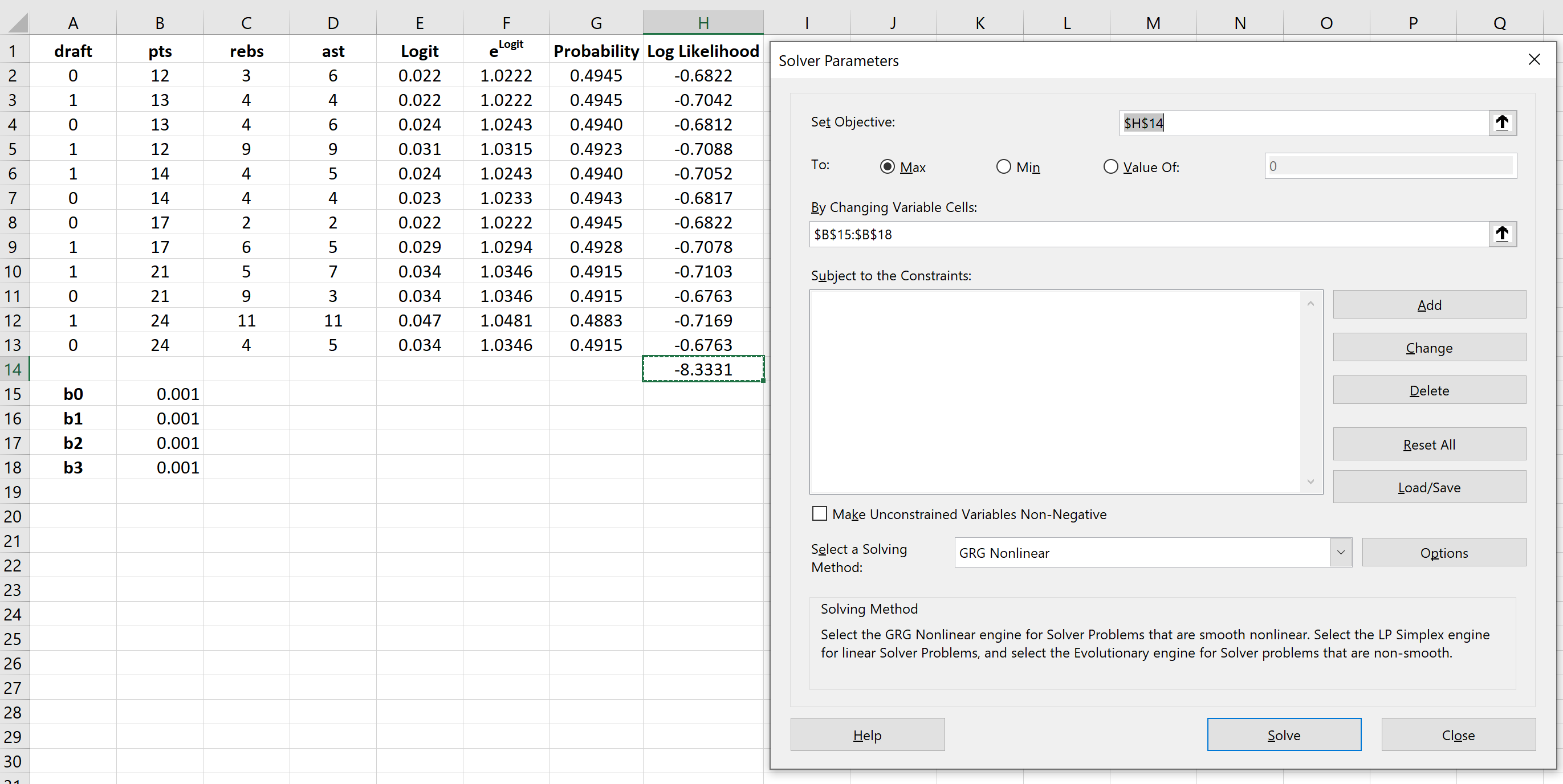
Шаг 8: Используйте Решатель, чтобы найти коэффициенты регрессии.
Если вы еще не установили Solver в Excel, выполните следующие действия:
- Щелкните Файл .
- Щелкните Параметры .
- Щелкните Надстройки .
- Нажмите Надстройка «Поиск решения» , затем нажмите «Перейти» .
- В новом всплывающем окне установите флажок рядом с Solver Add-In , затем нажмите «Перейти» .
После установки Солвера перейдите в группу Анализ на вкладке Данные и нажмите Солвер.Введите следующую информацию:
- Установите цель: выберите ячейку H14, содержащую сумму логарифмических вероятностей.
- Путем изменения ячеек переменных: выберите диапазон ячеек B15:B18, который содержит коэффициенты регрессии.
- Сделать неограниченные переменные неотрицательными: снимите этот флажок.
- Выберите метод решения: выберите GRG Nonlinear.
Затем нажмите «Решить» .
Решатель автоматически вычисляет оценки коэффициента регрессии:
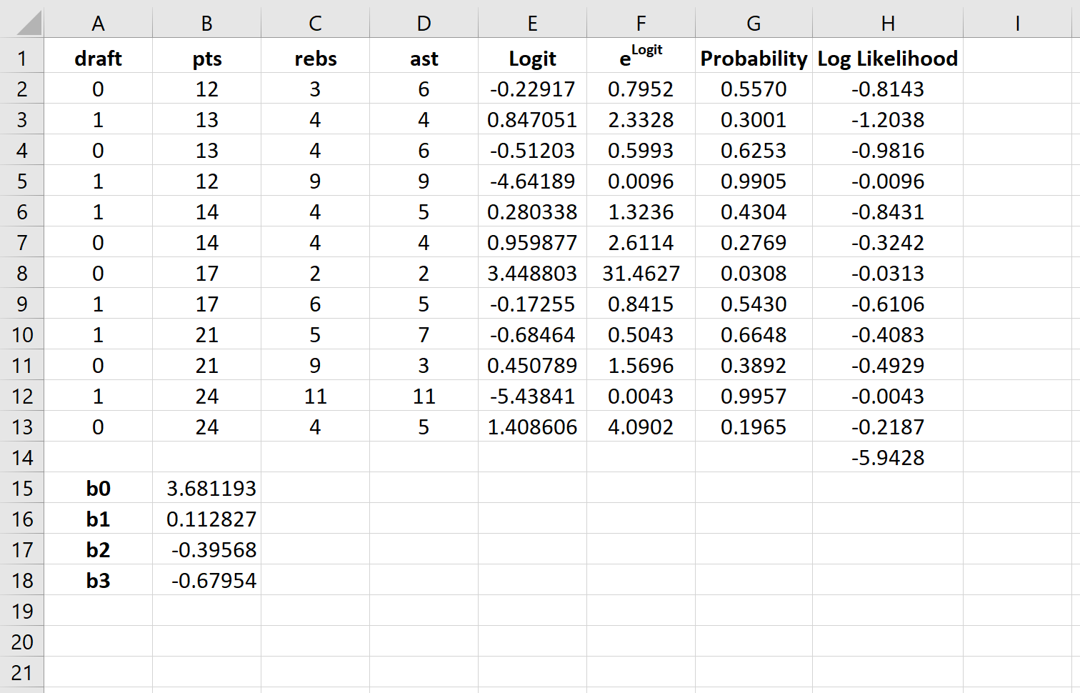
По умолчанию коэффициенты регрессии можно использовать для определения вероятности того, что осадка = 0. Однако обычно в логистической регрессии нас интересует вероятность того, что переменная отклика = 1. Таким образом, мы можем просто поменять знаки на каждом из коэффициенты регрессии:
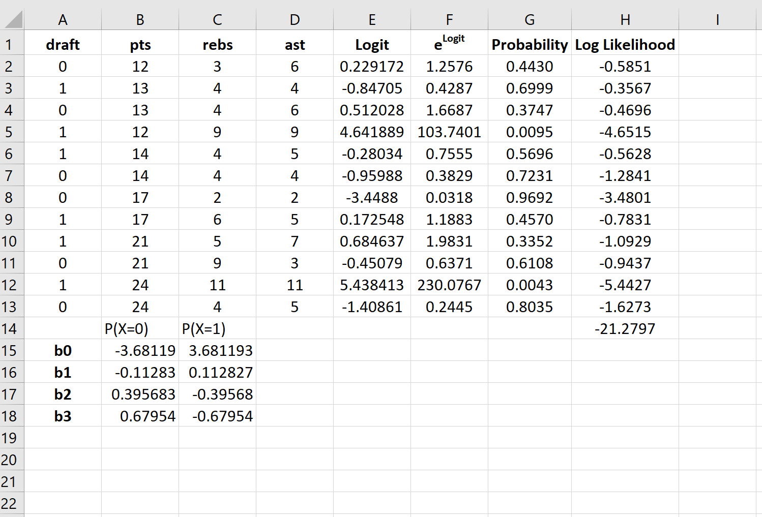
Теперь эти коэффициенты регрессии можно использовать для определения вероятности того, что осадка = 1.
Например, предположим, что игрок набирает в среднем 14 очков за игру, 4 подбора за игру и 5 передач за игру. Вероятность того, что этот игрок будет выбран в НБА, можно рассчитать как:
P(draft = 1) = e 3,681193 + 0,112827*(14) -0,39568*(4) – 0,67954*(5) / (1+e 3,681193 + 0,112827*(14) -0,39568*(4) – 0,67954*(5) ) ) = 0,57 .
Поскольку эта вероятность больше 0,5, мы прогнозируем, что этот игрокпопасть в НБА.
Источник
Creating a Linear Regression Model in Excel
Graph the relationship between two variables
:max_bytes(150000):strip_icc()/troypic__troy_segal-5bfc2629c9e77c005142f6d9.jpg)
:max_bytes(150000):strip_icc()/InvestopediaHeadShot-988693bb87b54bb095bd3789cd117a50.jpg)
What Is Linear Regression?
Linear regression is a type of data analysis that considers the linear relationship between a dependent variable and one or more independent variables. It is typically used to visually show the strength of the relationship or correlation between various factors and the dispersion of results – all for the purpose of explaining the behavior of the dependent variable. The goal of a linear regression model is to estimate the magnitude of a relationship between variables and whether or not it is statistically significant.
Say we wanted to test the strength of the relationship between the amount of ice cream eaten and obesity. We would take the independent variable, the amount of ice cream, and relate it to the dependent variable, obesity, to see if there was a relationship. Given a regression is a graphical display of this relationship, the lower the variability in the data, the stronger the relationship and the tighter the fit to the regression line.
In finance, linear regression is used to determine relationships between asset prices and economic data across a range of applications. For instance, it is used to determine the factor weights in the Fama-French Model and is the basis for determining the Beta of a stock in the capital asset pricing model (CAPM).
Here, we look at how to use data imported into Microsoft Excel to perform a linear regression and how to interpret the results.
Key Takeaways
- Linear regression models the relationship between a dependent and independent variable(s).
- Also known as ordinary least squares (OLS), a linear regression essentially estimates a line of best fit among all variables in the model.
- Regression analysis can be considered robust if the variables are independent, there is no heteroscedasticity, and the error terms of variables are not correlated.
- Modeling linear regression in Excel is easier with the Data Analysis ToolPak.
- Regression output can be interpreted for both the size and strength of a correlation among one or more variables on the dependent variable.
Important Considerations
There are a few critical assumptions about your data set that must be true to proceed with a regression analysis. Otherwise, the results will be interpreted incorrectly or they will exhibit bias:
- The variables must be truly independent (using a Chi-square test).
- The data must not have different error variances (this is called heteroskedasticity (also spelled heteroscedasticity)).
- The error terms of each variable must be uncorrelated. If not, it means the variables are serially correlated.
If those three points sound complicated, they can be. But the effect of one of those considerations not being true is a biased estimate. Essentially, you would misstate the relationship you are measuring.
Outputting a Regression in Excel
The first step in running regression analysis in Excel is to double-check that the free Excel plugin Data Analysis ToolPak is installed. This plugin makes calculating a range of statistics very easy. It is not required to chart a linear regression line, but it makes creating statistics tables simpler. To verify if installed, select «Data» from the toolbar. If «Data Analysis» is an option, the feature is installed and ready to use. If not installed, you can request this option by clicking on the Office button and selecting «Excel options».
Using the Data Analysis ToolPak, creating a regression output is just a few clicks.
The independent variable in Excel goes in the X range.
Given the S&P 500 returns, say we want to know if we can estimate the strength and relationship of Visa (V) stock returns. The Visa (V) stock returns data populates column 1 as the dependent variable. S&P 500 returns data populates column 2 as the independent variable.
- Select «Data» from the toolbar. The «Data» menu displays.
- Select «Data Analysis». The Data Analysis — Analysis Tools dialog box displays.
- From the menu, select «Regression» and click «OK».
- In the Regression dialog box, click the «Input Y Range» box and select the dependent variable data (Visa (V) stock returns).
- Click the «Input X Range» box and select the independent variable data (S&P 500 returns).
- Click «OK» to run the results.
[Note: If the table seems small, right-click the image and open in new tab for higher resolution.]
Interpret the Results
Using that data (the same from our R-squared article), we get the following table:
The R 2 value, also known as the coefficient of determination, measures the proportion of variation in the dependent variable explained by the independent variable or how well the regression model fits the data. The R 2 value ranges from 0 to 1, and a higher value indicates a better fit. The p-value, or probability value, also ranges from 0 to 1 and indicates if the test is significant. In contrast to the R 2 value, a smaller p-value is favorable as it indicates a correlation between the dependent and independent variables.
Interpreting the Results
The bottom line here is that changes in Visa stock seem to be highly correlated with the S&P 500.
- In the regression output above, we can see that for every 1-point change in Visa, there is a corresponding 1.36-point change in the S&P 500.
- We can also see that the p-value is very small (0.000036), which also corresponds to a very large T-test. This indicates that this finding is highly statistically significant, so the odds that this result was caused by chance are exceedingly low.
- From the R-squared, we can see that the V price alone can explain more than 62% of the observed fluctuations in the S&P 500 index.
However, an analyst at this point may heed a bit of caution for the following reasons:
- With only one variable in the model, it is unclear whether V affects the S&P 500 prices, if the S&P 500 affects V prices, or if some unobserved third variable affects both prices.
- Visa is a component of the S&P 500, so there could be a co-correlation between the variables here.
- There are only 20 observations, which may not be enough to make a good inference.
- The data is a time series, so there could also be autocorrelation.
- The time period under study may not be representative of other time periods.
Charting a Regression in Excel
We can chart a regression in Excel by highlighting the data and charting it as a scatter plot. To add a regression line, choose «Add Chart Element» from the «Chart Design» menu. In the dialog box, select «Trendline» and then «Linear Trendline». To add the R 2 value, select «More Trendline Options» from the «Trendline menu. Lastly, select «Display R-squared value on chart». The visual result sums up the strength of the relationship, albeit at the expense of not providing as much detail as the table above.
:max_bytes(150000):strip_icc()/dotdash_Final_Creating_a_Linear_Regression_Model_in_Excel_Sep_2020-01-13cd503cc6e244c48ea436c71ebec7ec.jpg)
How Do You Interpret a Linear Regression?
The output of a regression model will produce various numerical results. The coefficients (or betas) tell you the association between an independent variable and the dependent variable, holding everything else constant. If the coefficient is, say, +0.12, it tells you that every 1-point change in that variable corresponds with a 0.12 change in the dependent variable in the same direction. If it were instead -3.00, it would mean a 1-point change in the explanatory variable results in a 3x change in the dependent variable, in the opposite direction.
How Do You Know If a Regression Is Significant?
In addition to producing beta coefficients, a regression output will also indicate tests of statistical significance based on the standard error of each coefficient (such as the p-value and confidence intervals). Often, analysts use a p-value of 0.05 or less to indicate significance; if the p-value is greater, then you cannot rule out chance or randomness for the resultant beta coefficient. Other tests of significance in a regression model can be t-tests for each variable, as well as an F-statistic or chi-square for the joint significance of all variables in the model together.
How Do You Interpret the R-Squared of a Linear Regression?
R 2 (R-squared) is a statistical measure of the goodness of fit of a linear regression model (from 0.00 to 1.00), also known as the coefficient of determination. In general, the higher the R 2 , the better the model’s fit. The R-squared can also be interpreted as how much of the variation in the dependent variable is explained by the independent (explanatory) variables in the model. Thus, an R-square of 0.50 suggests that half of all of the variation observed in the dependent variable can be explained by the dependent variable(s).
Источник
Простая линейная регрессия — это метод, который мы можем использовать для понимания взаимосвязи между объясняющей переменной x и переменной отклика y.
В этом руководстве объясняется, как выполнить простую линейную регрессию в Excel.
Пример: простая линейная регрессия в Excel
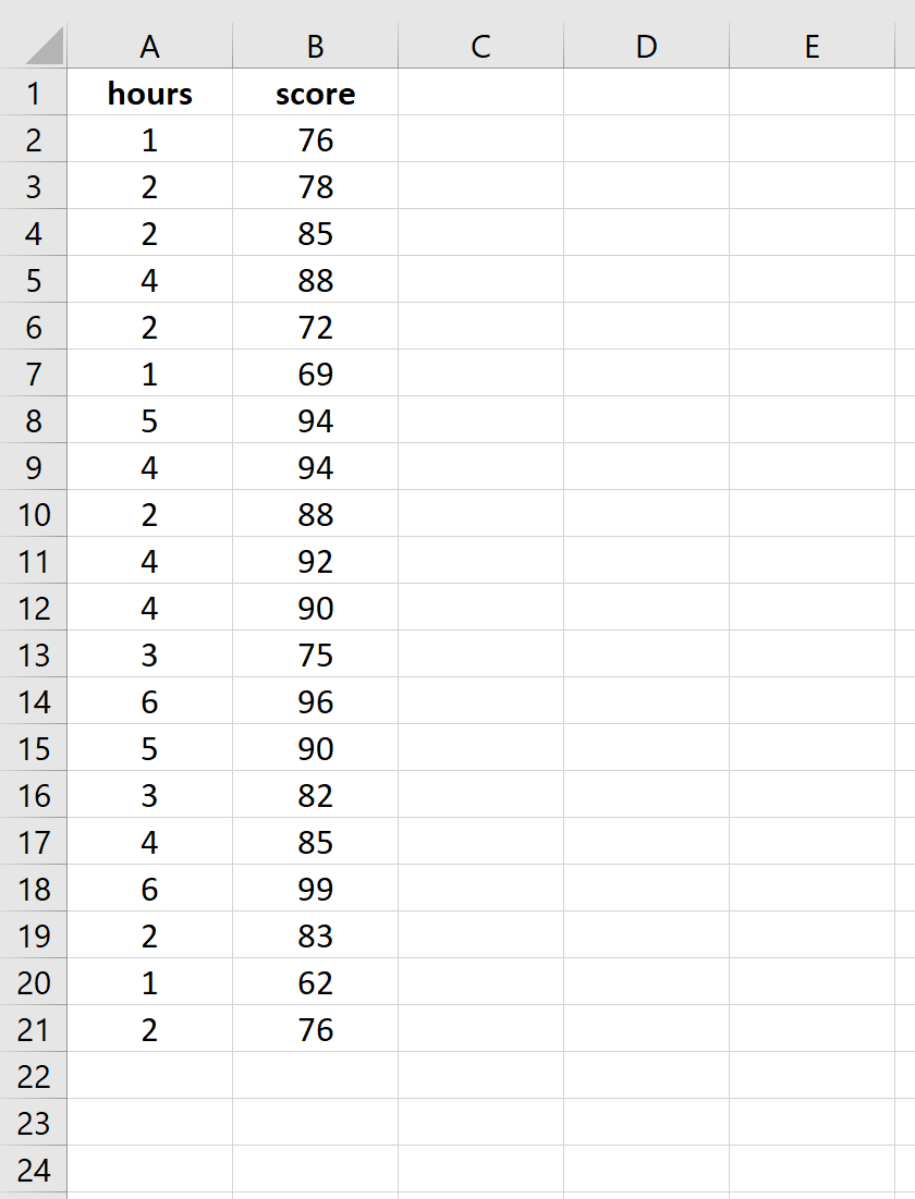
Предположим, нас интересует взаимосвязь между количеством часов, которое студент тратит на подготовку к экзамену, и полученной им экзаменационной оценкой.
Чтобы исследовать эту взаимосвязь, мы можем выполнить простую линейную регрессию, используя часы обучения в качестве независимой переменной и экзаменационный балл в качестве переменной ответа.
Выполните следующие шаги в Excel, чтобы провести простую линейную регрессию.
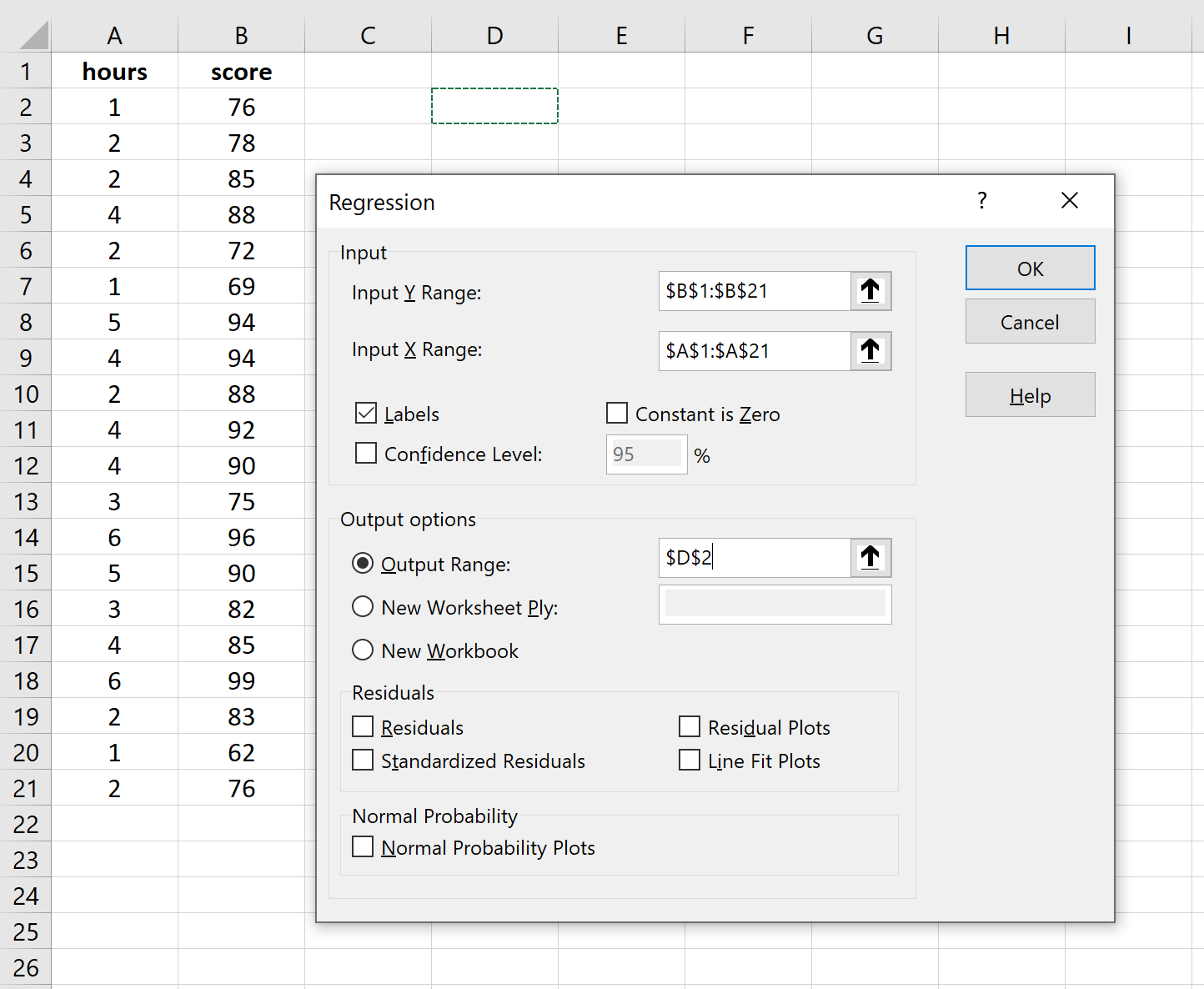
Шаг 1: Введите данные.
Введите следующие данные о количестве часов обучения и экзаменационном балле, полученном для 20 студентов:
Шаг 2: Визуализируйте данные.
Прежде чем мы выполним простую линейную регрессию, полезно создать диаграмму рассеяния данных, чтобы убедиться, что действительно существует линейная зависимость между отработанными часами и экзаменационным баллом.
Выделите данные в столбцах A и B. В верхней ленте Excel перейдите на вкладку « Вставка ». В группе « Диаграммы » нажмите « Вставить разброс» (X, Y) и выберите первый вариант под названием « Разброс ». Это автоматически создаст следующую диаграмму рассеяния:
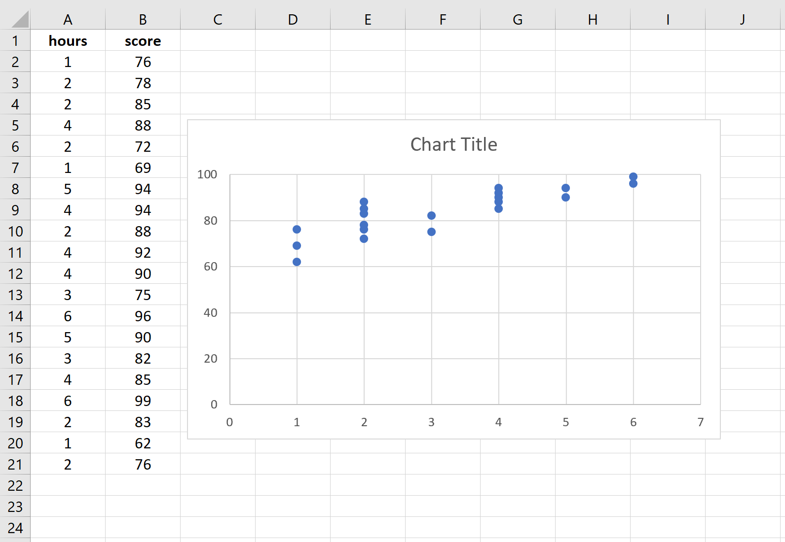
Количество часов обучения показано на оси x, а баллы за экзамены показаны на оси y. Мы видим, что между двумя переменными существует линейная зависимость: большее количество часов обучения связано с более высокими баллами на экзаменах.
Чтобы количественно оценить взаимосвязь между этими двумя переменными, мы можем выполнить простую линейную регрессию.
Шаг 3: Выполните простую линейную регрессию.
В верхней ленте Excel перейдите на вкладку « Данные » и нажмите « Анализ данных».Если вы не видите эту опцию, вам необходимо сначала установить бесплатный пакет инструментов анализа .
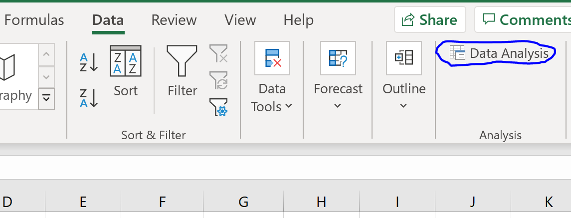
Как только вы нажмете « Анализ данных», появится новое окно. Выберите «Регрессия» и нажмите «ОК».
Для Input Y Range заполните массив значений для переменной ответа. Для Input X Range заполните массив значений для независимой переменной.
Установите флажок рядом с Метки , чтобы Excel знал, что мы включили имена переменных во входные диапазоны.
В поле Выходной диапазон выберите ячейку, в которой должны отображаться выходные данные регрессии.
Затем нажмите ОК .
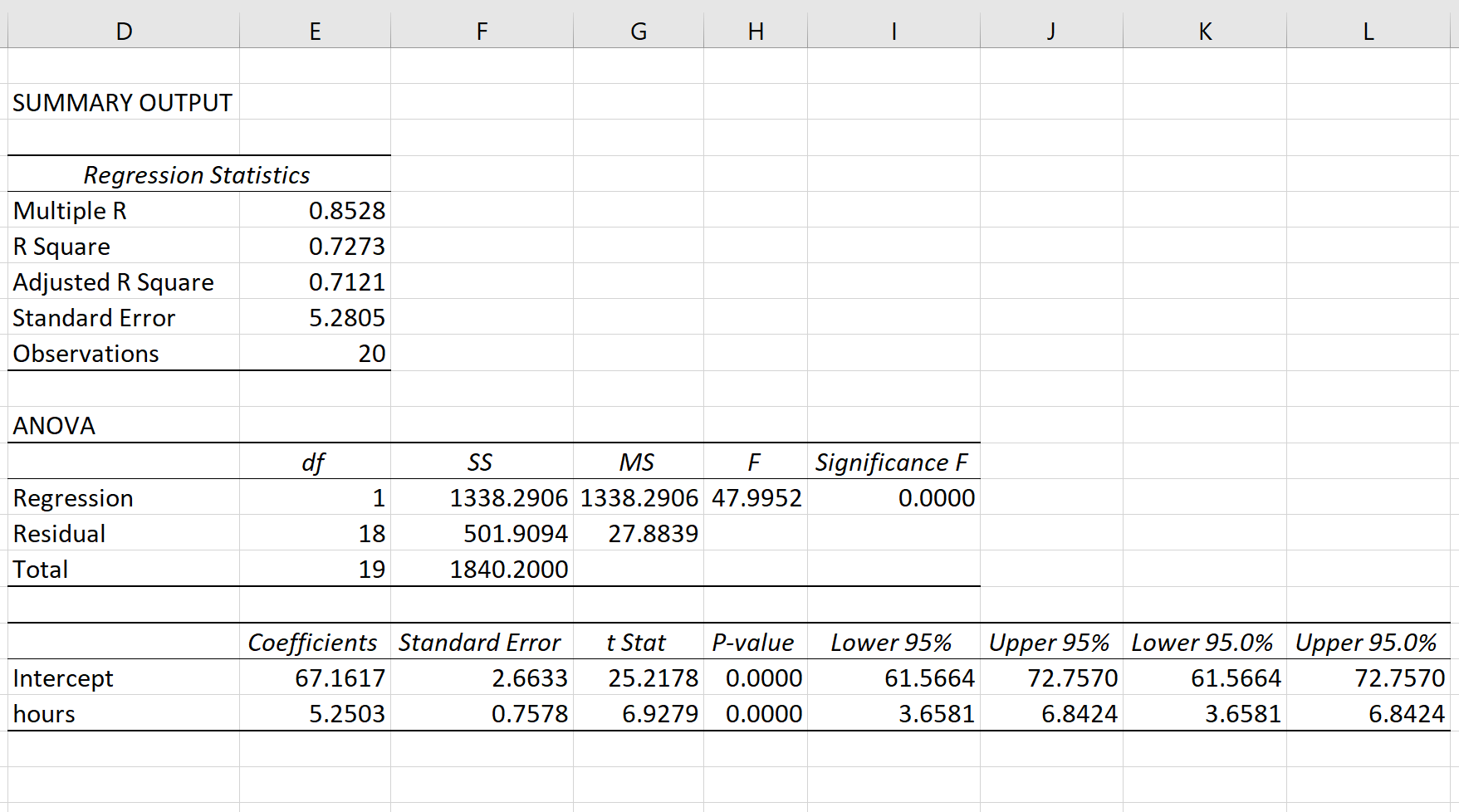
Автоматически появится следующий вывод:
Шаг 4: Интерпретируйте вывод.
Вот как интерпретировать наиболее релевантные числа в выводе:
R-квадрат: 0,7273.Это известно как коэффициент детерминации. Это доля дисперсии переменной отклика, которая может быть объяснена объясняющей переменной. В этом примере 72,73 % различий в баллах за экзамены можно объяснить количеством часов обучения.
Стандартная ошибка: 5.2805.Это среднее расстояние, на которое наблюдаемые значения отходят от линии регрессии. В этом примере наблюдаемые значения отклоняются от линии регрессии в среднем на 5,2805 единиц.
Ф: 47,9952.Это общая F-статистика для регрессионной модели, рассчитанная как MS регрессии / остаточная MS.
Значение F: 0,0000.Это p-значение, связанное с общей статистикой F. Он говорит нам, является ли регрессионная модель статистически значимой. Другими словами, он говорит нам, имеет ли независимая переменная статистически значимую связь с переменной отклика. В этом случае p-значение меньше 0,05, что указывает на наличие статистически значимой связи между отработанными часами и полученными экзаменационными баллами.
Коэффициенты: коэффициенты дают нам числа, необходимые для написания оценочного уравнения регрессии. В этом примере оцененное уравнение регрессии:
экзаменационный балл = 67,16 + 5,2503*(часов)
Мы интерпретируем коэффициент для часов как означающий, что за каждый дополнительный час обучения ожидается увеличение экзаменационного балла в среднем на 5,2503.Мы интерпретируем коэффициент для перехвата как означающий, что ожидаемая оценка экзамена для студента, который учится без часов, составляет 67,16 .
Мы можем использовать это оценочное уравнение регрессии для расчета ожидаемого экзаменационного балла для учащегося на основе количества часов, которые он изучает.
Например, ожидается, что студент, который занимается три часа, получит на экзамене 82,91 балла:
экзаменационный балл = 67,16 + 5,2503*(3) = 82,91
Дополнительные ресурсы
В следующих руководствах объясняется, как выполнять другие распространенные задачи в Excel:
Как создать остаточный график в Excel
Как построить интервал прогнозирования в Excel
Как создать график QQ в Excel
In Excel for the web, you can view the results of a regression analysis (in statistics, a way to predict and forecast trends), but you can’t create one because the Regression tool isn’t available.
You also won’t be able to use a statistical worksheet function such as LINEST to do a meaningful analysis because it requires you enter it as an array formula, which isn’t supported in Excel for the web.
If you have the Excel desktop application, you can use the Open in Excel button to open your workbook and use either the Analysis ToolPak’s Regression tool or statistical functions to perform a regression analysis there.
Click Open in Excel and perform a regression analysis.
For news about the latest Excel for the web updates, visit the Microsoft Excel blog.
For the full suite of Office applications and services, try or buy it at Office.com.
Need more help?
Want more options?
Explore subscription benefits, browse training courses, learn how to secure your device, and more.
Communities help you ask and answer questions, give feedback, and hear from experts with rich knowledge.