
Содержание
- Подключение пакета анализа
- Виды регрессионного анализа
- Линейная регрессия в программе Excel
- Разбор результатов анализа
- Вопросы и ответы

Регрессионный анализ является одним из самых востребованных методов статистического исследования. С его помощью можно установить степень влияния независимых величин на зависимую переменную. В функционале Microsoft Excel имеются инструменты, предназначенные для проведения подобного вида анализа. Давайте разберем, что они собой представляют и как ими пользоваться.
Подключение пакета анализа
Но, для того, чтобы использовать функцию, позволяющую провести регрессионный анализ, прежде всего, нужно активировать Пакет анализа. Только тогда необходимые для этой процедуры инструменты появятся на ленте Эксель.
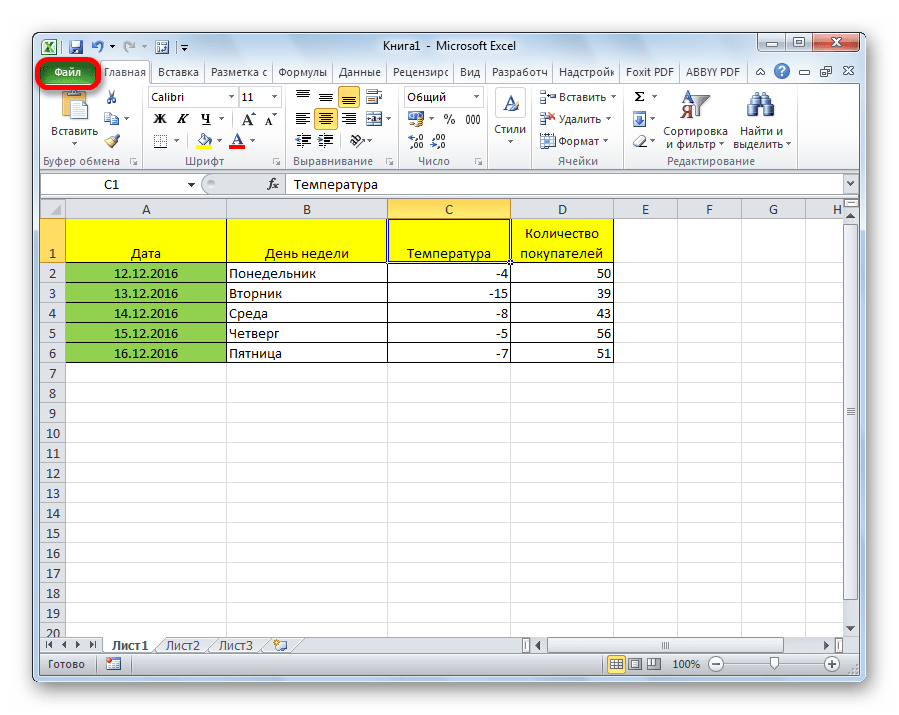
- Перемещаемся во вкладку «Файл».
- Переходим в раздел «Параметры».
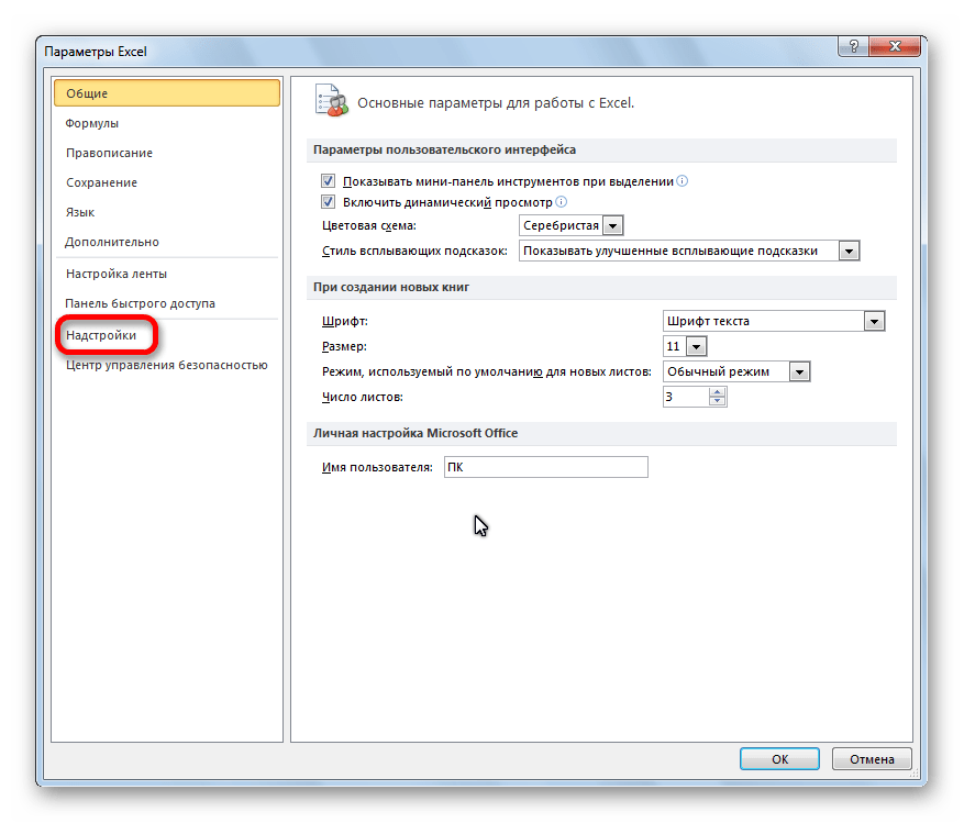
- Открывается окно параметров Excel. Переходим в подраздел «Надстройки».
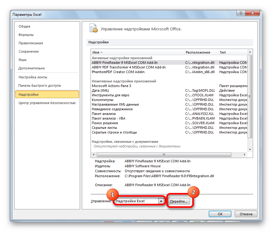
- В самой нижней части открывшегося окна переставляем переключатель в блоке «Управление» в позицию «Надстройки Excel», если он находится в другом положении. Жмем на кнопку «Перейти».
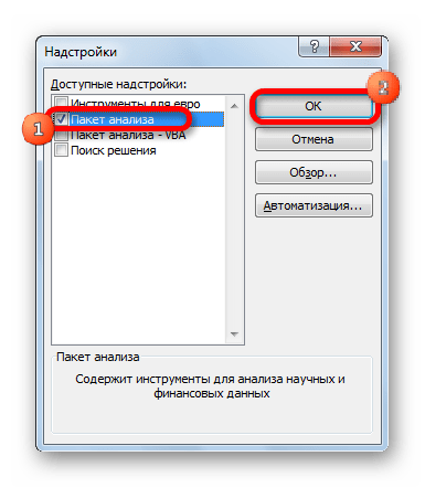
- Открывается окно доступных надстроек Эксель. Ставим галочку около пункта «Пакет анализа». Жмем на кнопку «OK».

Теперь, когда мы перейдем во вкладку «Данные», на ленте в блоке инструментов «Анализ» мы увидим новую кнопку – «Анализ данных».
Виды регрессионного анализа
Существует несколько видов регрессий:
- параболическая;
- степенная;
- логарифмическая;
- экспоненциальная;
- показательная;
- гиперболическая;
- линейная регрессия.
О выполнении последнего вида регрессионного анализа в Экселе мы подробнее поговорим далее.
Внизу, в качестве примера, представлена таблица, в которой указана среднесуточная температура воздуха на улице, и количество покупателей магазина за соответствующий рабочий день. Давайте выясним при помощи регрессионного анализа, как именно погодные условия в виде температуры воздуха могут повлиять на посещаемость торгового заведения.
Общее уравнение регрессии линейного вида выглядит следующим образом: У = а0 + а1х1 +…+акхк. В этой формуле Y означает переменную, влияние факторов на которую мы пытаемся изучить. В нашем случае, это количество покупателей. Значение x – это различные факторы, влияющие на переменную. Параметры a являются коэффициентами регрессии. То есть, именно они определяют значимость того или иного фактора. Индекс k обозначает общее количество этих самых факторов.
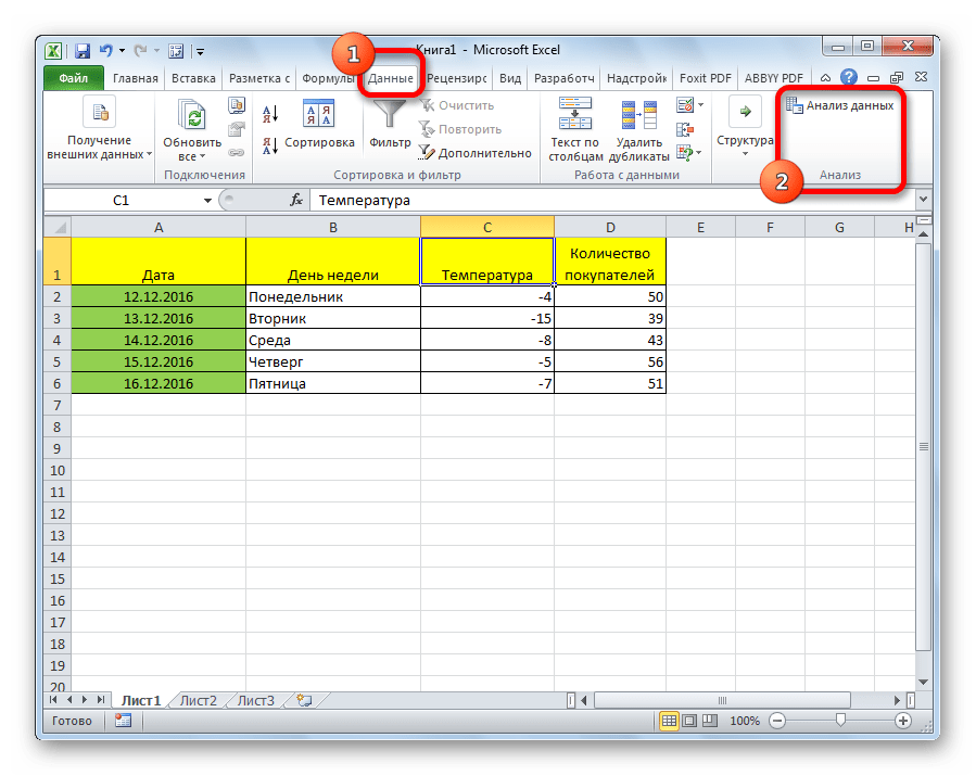
- Кликаем по кнопке «Анализ данных». Она размещена во вкладке «Главная» в блоке инструментов «Анализ».
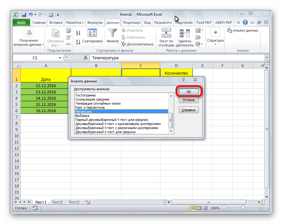
- Открывается небольшое окошко. В нём выбираем пункт «Регрессия». Жмем на кнопку «OK».
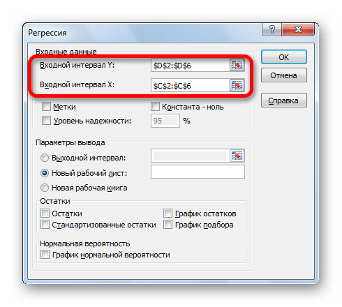
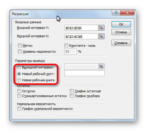
- Открывается окно настроек регрессии. В нём обязательными для заполнения полями являются «Входной интервал Y» и «Входной интервал X». Все остальные настройки можно оставить по умолчанию.
В поле «Входной интервал Y» указываем адрес диапазона ячеек, где расположены переменные данные, влияние факторов на которые мы пытаемся установить. В нашем случае это будут ячейки столбца «Количество покупателей». Адрес можно вписать вручную с клавиатуры, а можно, просто выделить требуемый столбец. Последний вариант намного проще и удобнее.
В поле «Входной интервал X» вводим адрес диапазона ячеек, где находятся данные того фактора, влияние которого на переменную мы хотим установить. Как говорилось выше, нам нужно установить влияние температуры на количество покупателей магазина, а поэтому вводим адрес ячеек в столбце «Температура». Это можно сделать теми же способами, что и в поле «Количество покупателей».

С помощью других настроек можно установить метки, уровень надёжности, константу-ноль, отобразить график нормальной вероятности, и выполнить другие действия. Но, в большинстве случаев, эти настройки изменять не нужно. Единственное на что следует обратить внимание, так это на параметры вывода. По умолчанию вывод результатов анализа осуществляется на другом листе, но переставив переключатель, вы можете установить вывод в указанном диапазоне на том же листе, где расположена таблица с исходными данными, или в отдельной книге, то есть в новом файле.
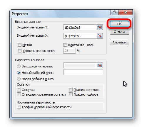
После того, как все настройки установлены, жмем на кнопку «OK».

Разбор результатов анализа
Результаты регрессионного анализа выводятся в виде таблицы в том месте, которое указано в настройках.
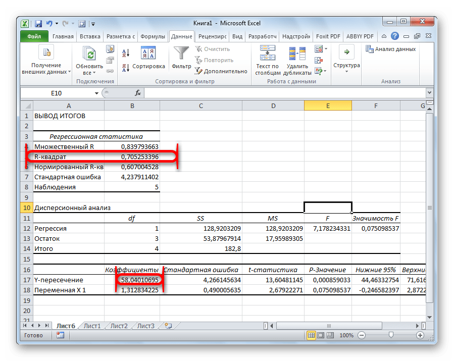
Одним из основных показателей является R-квадрат. В нем указывается качество модели. В нашем случае данный коэффициент равен 0,705 или около 70,5%. Это приемлемый уровень качества. Зависимость менее 0,5 является плохой.
Ещё один важный показатель расположен в ячейке на пересечении строки «Y-пересечение» и столбца «Коэффициенты». Тут указывается какое значение будет у Y, а в нашем случае, это количество покупателей, при всех остальных факторах равных нулю. В этой таблице данное значение равно 58,04.
Значение на пересечении граф «Переменная X1» и «Коэффициенты» показывает уровень зависимости Y от X. В нашем случае — это уровень зависимости количества клиентов магазина от температуры. Коэффициент 1,31 считается довольно высоким показателем влияния.
Как видим, с помощью программы Microsoft Excel довольно просто составить таблицу регрессионного анализа. Но, работать с полученными на выходе данными, и понимать их суть, сможет только подготовленный человек.
17 авг. 2022 г.
читать 2 мин
Вы можете использовать функцию ЛИНЕЙН , чтобы быстро найти уравнение регрессии в Excel.
Эта функция использует следующий базовый синтаксис:
LINEST(known_y's, known_x's)
куда:
- known_y’s : столбец значений для переменной ответа.
- known_x’s : один или несколько столбцов значений для переменных-предикторов.
В следующих примерах показано, как использовать эту функцию для поиска уравнения регрессии для простой модели линейной регрессии и модели множественной линейной регрессии .
Пример 1: Найдите уравнение для простой линейной регрессии
Предположим, у нас есть следующий набор данных, который содержит одну предикторную переменную (x) и одну переменную ответа (y):

Мы можем ввести следующую формулу в ячейку D1 , чтобы вычислить простое уравнение линейной регрессии для этого набора данных:
=LINEST( A2:A15 , B2:B15 )
Как только мы нажмем ENTER , будут показаны коэффициенты для простой модели линейной регрессии:

Вот как интерпретировать вывод:
- Коэффициент на перехват 3,115589.
- Коэффициент наклона равен 0,479072.
Используя эти значения, мы можем написать уравнение для этой простой модели регрессии:
у = 3,115589 + 0,478072 (х)
Примечание.Чтобы найти p-значения для коэффициентов, значение r-квадрата модели и другие показатели, следует использовать функцию регрессии из пакета анализа данных. В этом руководстве объясняется, как это сделать.
Пример 2: найти уравнение для множественной линейной регрессии
Предположим, у нас есть следующий набор данных, который содержит две переменные-предикторы (x1 и x2) и одну переменную ответа (y):

Мы можем ввести следующую формулу в ячейку E1 , чтобы вычислить уравнение множественной линейной регрессии для этого набора данных:
=LINEST( A2:A15 , B2:C15 )
Как только мы нажмем ENTER , будут показаны коэффициенты для модели множественной линейной регрессии:

Вот как интерпретировать вывод:
- Коэффициент на перехват 1.471205
- Коэффициент для x1 равен 0,047243.
- Коэффициент для x2 равен 0,406344.
Используя эти значения, мы можем написать уравнение для этой модели множественной регрессии:
у = 1,471205 + 0,047243 (х1) + 0,406344 (х2)
Примечание.Чтобы найти p-значения для коэффициентов, значение r-квадрата модели и другие показатели для модели множественной линейной регрессии в Excel, следует использовать функцию регрессии из пакета анализа данных. В этом руководстве объясняется, как это сделать.
Дополнительные ресурсы
В следующих руководствах представлена дополнительная информация о регрессии в Excel:
Как интерпретировать вывод регрессии в Excel
Как добавить линию регрессии на диаграмму рассеяния в Excel
Как выполнить полиномиальную регрессию в Excel
Regression is an Analysis Tool, which we use for analyzing large amounts of data and making forecasts and predictions in Microsoft Excel.
Want to predict the future? No, we are not going to learn astrology. We are into numbers and we will learn regression analysis in Excel today.
To predict future estimates, we will study:
- REGRESSION ANALYSIS USING EXCEL FUNCTIONS (MANUAL REGRESSION FINDING)
- REGRESSION ANALYSIS USING EXCEL’S ANALYSIS TOOLPAK ADD-IN
- REGRESSION CHART IN EXCEL
Let’s do it…
Scenario:
Let’s assume you sell soft drinks. How cool will it be if you can predict:
- How many soft drinks will be sold next year based on previous year’s data?
- Which fields need to be focused?
- And how can you increase your sales by changing your strategy?
It will be profitably awesome. Right?… I know. So let’s get started.
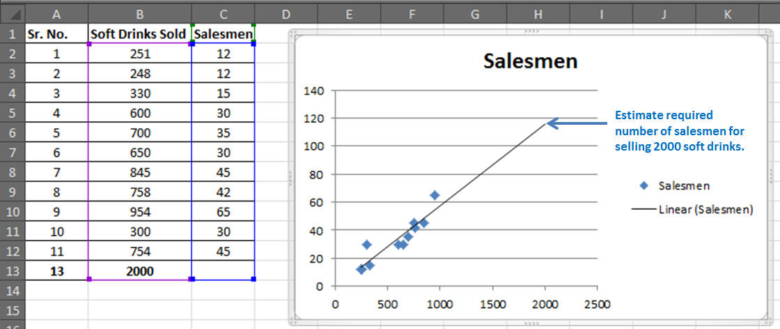
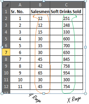
You have 11 records of salesmen and soft drinks sold.
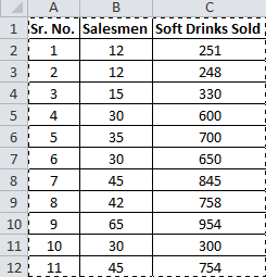
Now based on this data you want to predict the number of salesmen required to achieve 2000 sales of soft drinks.

The regression equation is a tool to make such close estimates. To do so, we need to know Regression first.
REGRESSION ANALYSIS USING EXCEL FUNCTIONS (MANUAL REGRESSION FINDING)
This part will make you understand regression better than just telling excel regression procedure.
Introduction:
Simple Linear Regression:
The study of the relationship between two variables is called Simple Linear Regression. Where one variable depends on the other independent variable. The dependent variable is often called by names such as Driven, Response, and Target variable. And the independent variable is often pronounced as a Driving, Predictor or simply Independent variable. These names clearly describe them.

Now let’s compare this with your scenario. You want to know the number of salesmen required to achieve 2000 sales. So here, the dependent variable is the number of salesmen and the independent variable is sold soft drinks.
The independent variable is mostly denoted as x and dependent variable as y.
In our case, soft drinks are sold x and the number of salesmen is y.
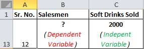
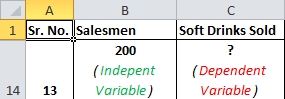
If we want to know how many soft drinks will be sold if we appoint 200 salesmen, then the scenario will be vice-versa.
Moving On.
The “Simple” Math of Linear Regression Equation:
Well, it’s not simple. But Excel made it simple to do.
We need to predict the required number of salesmen for all 11 cases to get the 12th closest prediction.
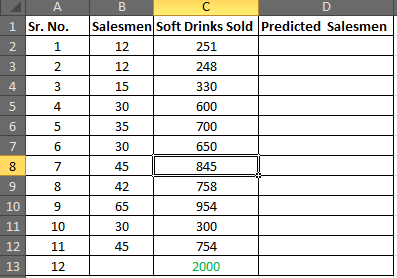
Let’s say:
Soft Drink Sold is x
The number of Salesmen is y
The predicted y (number of salesmen) also called Regression Equation, would be
Now you must be wondering where the stat will you get the slope and intercept. Don’t worry, excel has functions for them. You do not need to learn how to find the slope and intercept it manually.
If you want, I will prepare a separate tutorial for that. Let me know in the comments section. These are some important data analytics tools.
Now let’s step into our calculation:
Step1: Prepare this small table
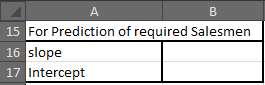
Step 2: Find the slope of the regression line
Excel Function for slopes is
=SLOPE(known_y’s,known_x’s)
Your known_y’s are in range B2:B12 and known_x’s are in range C2:C12

In cell B16, write the formula below
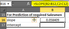
(Note: Slope is also called coefficient of x in the regression equation)
You will get 0.058409. Round up to 2 decimal digits and you will get 0.06.
Step 3: Find the Intercept of Regression Line
Excel function for the intercept is
=INTERCEPT(known_y’s, known_x’s)
We know what our known x’s and y’s
In cell B17, write down this formula

=INTERCEPT(B2:B12, C2:C12)
You will get a value of -1.1118969. Roundup to 2 decimal digits. You will get -1.11.
Our Linear Regression Equation is = x*0.06 + (-1.11). Now we can predict possible y depending on the target x easily.
Step 4: In D2 write the formula below
=C2*$B$16+$B$17 (Regression Equation)
You will get a value of 13.55.
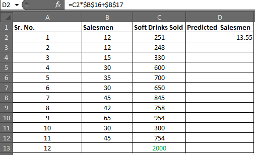
Select D2 to D13 and press CTRL+D to fill down the formula in the range D2:D13
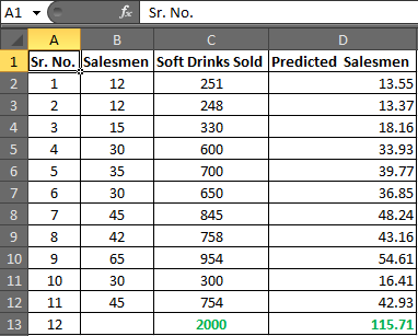
In cell D13 you have your required number of salesmen.
Hence, to achieve the target of 2000 Soft Drink Sales, you need an estimate of 115.71 salesmen or say 116 since it is illegal to cut humans into pieces.
Now using this you can easily conduct What-If analysis in excel. Just change the number of sales and it will show you many salesmen will it take to get that sales target achieved.
Play around it to find out:
How much workforce do you need to increase sales?
How many sales will increase if you increase your salesmen?
Make Your Estimate More Reliable:
Now you know that you need 116 salesmen to get 2000 sales done.
In analytics, nothing is just said and believed. You must give a percentage of reliability on your estimate. It is like giving a certificate of your equation.

Correlation Coefficient Formula:
The next thing you will be asked is how much these two variables are related. In static terms, you need to tell the coefficient of correlation.
Excel function for correlation is
In your case, known_x’s and Know_y’s are array1 and array2 irrespectively.
In B18 enter this formula
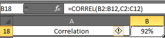
You will have 0.919090. Formate cell B2 into the percentage. Now have 92% of correlation.
Now, what this 92% means. It means, there 92% of chances of sales increase if you increase the number of salesmen and 92% of sales decrease if you decrease the number of salesmen. It is called Positive Correlation Coefficient.
R Squire (R^2) :
R Squire value tells you, by what percentage your regression equation is not a fluke. How much it is accurate by the data provided.
The Excel function for R squire is RSQ.
RSQ(known_y’s, Known_x’s)
In our case, we will get R squire value in cell B19.
In B19 enter this formula

So we have 84% of r Square value. Which is a very good explanation of our regression. It says that 84% of our data is just not by chance. Y (number of salesmen) is very much dependent on X (sales of soft drinks).
There are many other tests we can do on this data to ensure our regression. But manually it will be a complex and lengthy procedure. That is why excel provides Analysis Toolpak. Using this tool we can do this regression analysis in seconds.
REGRESSION IN EXCEL USING EXCEL’S ANALYSIS TOOLPAK ADD-IN
If you already know what regression equations are, and you just want your results quickly then this part is for you. But if you want to understand regression equations easily then scroll up to REGRESSION ANALYSIS USING EXCEL FUNCTIONS (MANUAL REGRESSION FINDING).
Excel provides a whole bunch of tools for analysis in its Analysis Toolpak. By default, it is not available in the Data tab. You need to add it. So let’s add it first.
Adding Analysis Toolpak to Excel 2016
If you don’t know where is data analysis in excel follow these steps
Step 1: Go to Excel Options: File? Options? Add-Ins
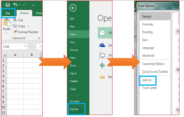
Step 2: Click on Add-Ins. You will see a list of available add-Ins.
Select Analysis ToolPak and at the bottom of the window, find manage. In manage select Excel Add-Ins and Click on GO.
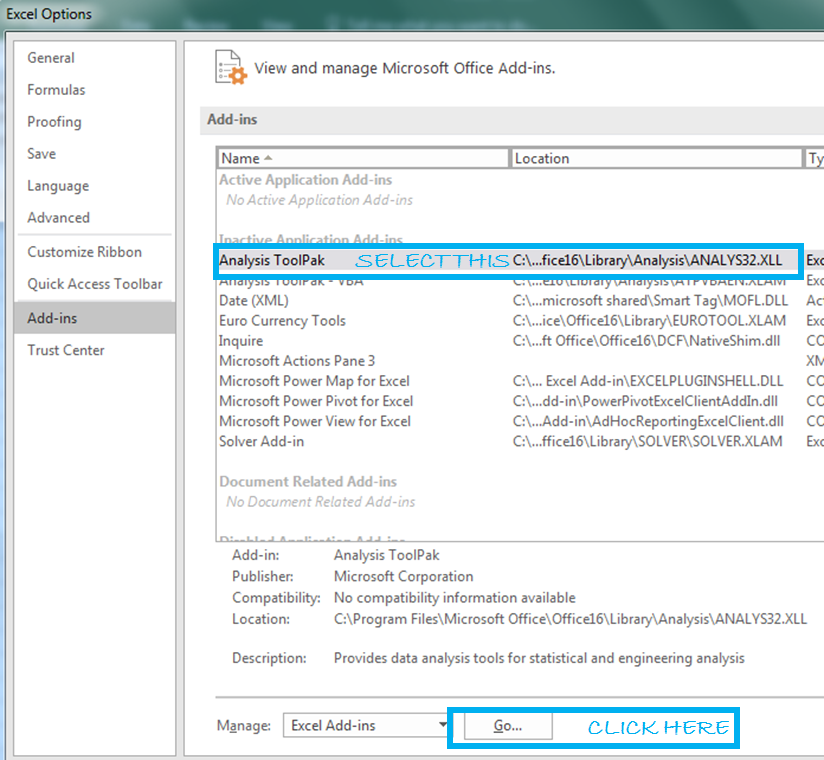
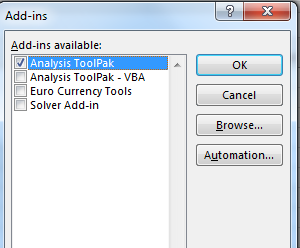
Add-ins window will open. Here, select Analysis ToolPak. Then click the ok button.
Now you can access all functions of data analysis ToolPak from Data Tab.
Using Analysis ToolPak for Regression
Step 1: Go to the Data tab, Locate Data Analysis. Then click on it.

A dialogue box will pop up.
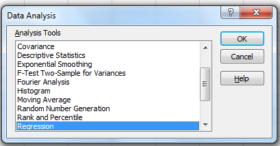
Step 2: Find ‘Regression’ in Analysis Tools list and hit the OK button.
The regression input window will pop up. You will see a number of available input options. But for now, we will just concentrate on Y Range and X Range, leaving everything else to default.

Step 4: Provide Inputs:
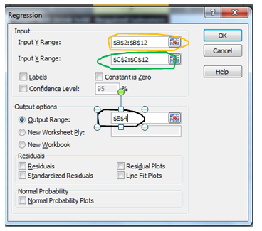
No. of Salesmen is Y
Sales of soft drinks are X
Hence
- Y Range= B2:B11
And
- X Range = C2:C11
For the output range, I have selected E4 on the same sheet. You may select a new worksheet to get results on a new worksheet in the same workbook or a complete new workbook. When you are done with your inputs, hit the OK button.
Results:
You will be served with a variety of information from your data. Don’t get overwhelmed. You don’t need to consume all the dishes.
We will only deal with those results which will help us to estimate the required number of salesmen
Step 5: We know the regression equation for estimation of y, that is
x*Slope+Intercept
We just need to locate Slope and Intercept in results.
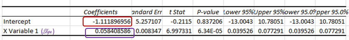
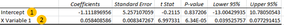
And here they are.
The intercept Coefficient is clearly mentioned.
The slope is written as ‘X Variable 1’, some times also mentioned as the coefficient of X. Round up them and we will get -1.11 as Intercept and 0.06 as Slope.
Step 6: From results, we can drive the Regression equation. And that would be
=x*(0.06) + (-1.11)
Prepare this table in excel.

For now, x is 2000, which is in cell E2.
In Cell F2 enter this formula
=E2*F21+F20
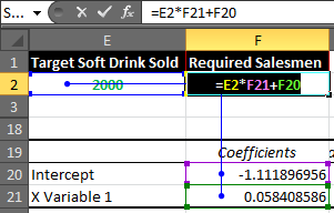
You will get a result of 115.7052757.

Rounding it up will give us 116 of Required Salesmen.
So we have learned how to form the regression equation manually and using Analysis ToolPak. How can you use this equation to estimate future stats?
Now let’s understand the regression output given by Analysis Toolpak.
Understanding the Regression Output:
There is no benefit, if you do regression analysis using analysis tool pack in excel and can’t interpret its meaning.
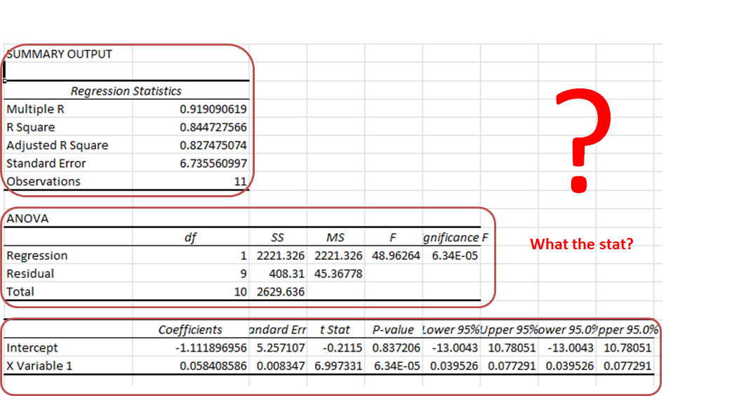
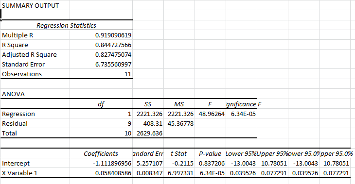
Summary Section:
As the name suggests, it is a summary of the data.

-
- Multiple R: It tells how fit the regression equation is to the data. It is also called the correlation coefficient.
In our case, it is 0.919090619 or 0.92 (roundup). This means that there is a 92% chance of an increase in sales if we increase our salesmen count.
-
- R Square: It tells the reliability of found regression. It tells us how many observations are part of our line of regression. In our case, it is 0.844727566 or 0.85. It means that our regression is fit by 85%.
- Adjusted R Square: Theadjusted square is just a more testified version of R square. Mainly useful in Multiple Regression Analysis.
- Standard Error: While R. Squire tells you how many data points fall near the regression line, the standard error tells you how far a data point can go from the regression line.
In our case, it is 6.74.
- Observation: This is simply the number of observations, which is 11 in our example.
Anova Section:
This section is hardly used in linear regression.
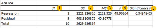
- df. It is a degree of freedom. It is used when calculating regression manually.
- SS. Sum of squares. It is just a sum of squares of variances. Used to find R squire values.
- MS. This means squared value.
- And 5. F and Significance of F. If the significance of F (p-value of the slope) is less than the F test than you can discard the null hypothesis and prove your hypothesis. In simple language, you can conclude that there is some effect of x on y when changed.
In our case, F is 48.96264 and Significance of F is 0.000063. It means our regression fits the data.
Regression Section:
In this section, we have the two most important values for our regression equation.
- Intercept: We have an intercept here that tells where x-intercepts on Y. This is an important part of the regression equation. It is -1.11 in our case.
- X variable 1 (Slope). Also called the coefficient of x. It defines the tangent of the regression line.
REGRESSION CHART IN EXCEL
In excel, it is easy to plot a regression chart. Just follow these steps. To add Regression Chart in Excel 2016, 2013, and 2010 follow these simple steps.
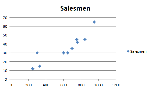
Step 1. Have your known x’s in the first column and know y’s in the second.
In our case, we know Known_ x’s are Soft Drinks Sold. And known_y’s are Salesmen.

Step 2. Select your known x’s and y’s range.

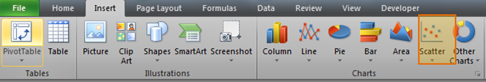
Step 3: Go to the Insert tab and click on the scatter chart.
You will have a chart that looks like this.
Step 4. Add the trend line: Goto layout and locate the trendline option in the analysis section.
Under the Trendline option, click on Linear Trendline.
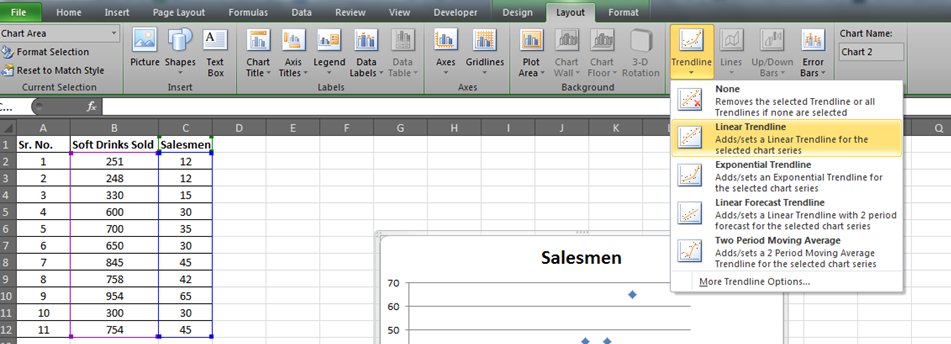
You will have your graph looking like this.
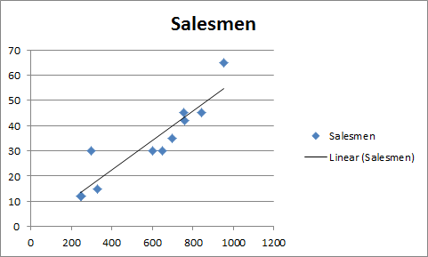
This is your regression graph.
Now if you add the data below and extend the selected data. You will see a change in your graph.
For our example, we added 2000 to the Soft Drink Sold and left the Salesmen blank. And when we extend the range of the graph, this is what we will have.
It will give the required number of salesmen for doing 2000 sales of soft drinks in graphical form. Which is slightly below 120 in the graph. And from our regression equation, we know it is 116.

In this article, I tried to cover everything under Excel Regression Analysis. I explained regression in excel 2016. Regression in excel 2010 and excel 2013 is same as in excel 2016.
For any further query on this topic, use the comments section. Ask a question, give an opinion or just mention my grammatical mistakes. Everything is welcome. Just don’t hesitate to use the comment section.
Related Data:
How to Use STDEV Function in Excel
How To Calculate MODE function in Excel
How To Calculate Mean function in Excel
How to Create Standard Deviation Graph
Descriptive Statistics in Microsoft Excel 2016
How to Use Excel NORMDIST Function
How to use the Pareto Chart and Analysis
Popular Articles:
50 Excel Shortcut to Increase Your Productivity
How to use the VLOOKUP Function in Excel
How to use the COUNTIF function in Excel 2016
How to use the SUMIF Function in Excel
Содержание
- Regression
- R Square
- Significance F and P-values
- Coefficients
- Residuals
- Как быстро найти уравнение регрессии в Excel
- Пример 1: Найдите уравнение для простой линейной регрессии
- Пример 2: найти уравнение для множественной линейной регрессии
- Дополнительные ресурсы
- Как интерпретировать вывод регрессии в Excel
- Пример: интерпретация выходных данных регрессии в Excel
- Как написать оценочное уравнение регрессии
- Linear regression analysis in Excel
- Regression analysis in Excel — the basics
- Linear regression equation
- How to do linear regression in Excel with Analysis ToolPak
- Enable the Analysis ToolPak add-in
- Run regression analysis
- Interpret regression analysis output
- Regression analysis output: Summary Output
- Regression analysis output: ANOVA
- Regression analysis output: coefficients
- Regression analysis output: residuals
- How to make a linear regression graph in Excel
- How to do regression in Excel using formulas
Regression
This example teaches you how to run a linear regression analysis in Excel and how to interpret the Summary Output.
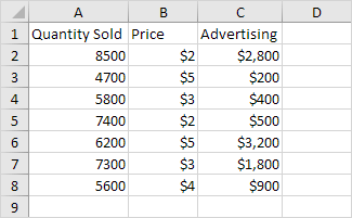
Below you can find our data. The big question is: is there a relation between Quantity Sold (Output) and Price and Advertising (Input). In other words: can we predict Quantity Sold if we know Price and Advertising?
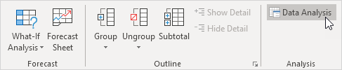
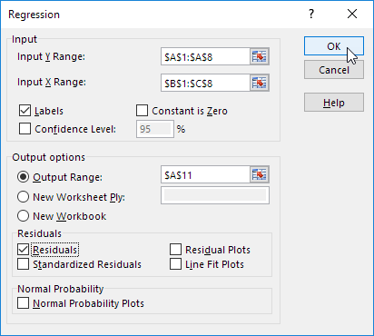
1. On the Data tab, in the Analysis group, click Data Analysis.
Note: can’t find the Data Analysis button? Click here to load the Analysis ToolPak add-in.
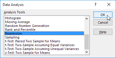
2. Select Regression and click OK.
3. Select the Y Range (A1:A8). This is the predictor variable (also called dependent variable).
4. Select the X Range(B1:C8). These are the explanatory variables (also called independent variables). These columns must be adjacent to each other.
6. Click in the Output Range box and select cell A11.
7. Check Residuals.
Excel produces the following Summary Output (rounded to 3 decimal places).
R Square
R Square equals 0.962 , which is a very good fit. 96% of the variation in Quantity Sold is explained by the independent variables Price and Advertising. The closer to 1, the better the regression line (read on) fits the data.
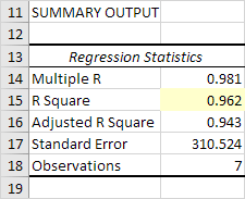
Significance F and P-values
To check if your results are reliable (statistically significant), look at Significance F ( 0.001 ). If this value is less than 0.05, you’re OK. If Significance F is greater than 0.05, it’s probably better to stop using this set of independent variables. Delete a variable with a high P-value (greater than 0.05) and rerun the regression until Significance F drops below 0.05.
Most or all P-values should be below below 0.05. In our example this is the case. ( 0.000 , 0.001 and 0.005 ).

Coefficients
The regression line is: y = Quantity Sold = 8536.214 -835.722 * Price + 0.592 * Advertising. In other words, for each unit increase in price, Quantity Sold decreases with 835.722 units. For each unit increase in Advertising, Quantity Sold increases with 0.592 units. This is valuable information.
You can also use these coefficients to do a forecast. For example, if price equals $4 and Advertising equals $3000, you might be able to achieve a Quantity Sold of 8536.214 -835.722 * 4 + 0.592 * 3000 = 6970.
Residuals
The residuals show you how far away the actual data points are fom the predicted data points (using the equation). For example, the first data point equals 8500. Using the equation, the predicted data point equals 8536.214 -835.722 * 2 + 0.592 * 2800 = 8523.009, giving a residual of 8500 — 8523.009 = -23.009 .
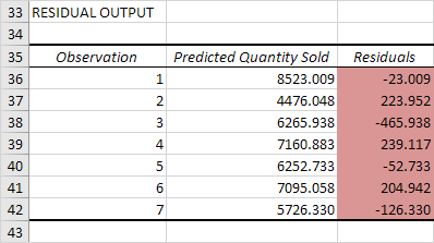
You can also create a scatter plot of these residuals.
Источник
Как быстро найти уравнение регрессии в Excel

Вы можете использовать функцию ЛИНЕЙН , чтобы быстро найти уравнение регрессии в Excel.
Эта функция использует следующий базовый синтаксис:
- known_y’s : столбец значений для переменной ответа.
- known_x’s : один или несколько столбцов значений для переменных-предикторов.
В следующих примерах показано, как использовать эту функцию для поиска уравнения регрессии для простой модели линейной регрессии и модели множественной линейной регрессии .
Пример 1: Найдите уравнение для простой линейной регрессии
Предположим, у нас есть следующий набор данных, который содержит одну предикторную переменную (x) и одну переменную ответа (y):
Мы можем ввести следующую формулу в ячейку D1 , чтобы вычислить простое уравнение линейной регрессии для этого набора данных:
Как только мы нажмем ENTER , будут показаны коэффициенты для простой модели линейной регрессии:
Вот как интерпретировать вывод:
- Коэффициент на перехват 3,115589.
- Коэффициент наклона равен 0,479072.
Используя эти значения, мы можем написать уравнение для этой простой модели регрессии:
у = 3,115589 + 0,478072 (х)
Примечание.Чтобы найти p-значения для коэффициентов, значение r-квадрата модели и другие показатели, следует использовать функцию регрессии из пакета анализа данных. В этом руководстве объясняется, как это сделать.
Пример 2: найти уравнение для множественной линейной регрессии
Предположим, у нас есть следующий набор данных, который содержит две переменные-предикторы (x1 и x2) и одну переменную ответа (y):
Мы можем ввести следующую формулу в ячейку E1 , чтобы вычислить уравнение множественной линейной регрессии для этого набора данных:
Как только мы нажмем ENTER , будут показаны коэффициенты для модели множественной линейной регрессии:
Вот как интерпретировать вывод:
- Коэффициент на перехват 1.471205
- Коэффициент для x1 равен 0,047243.
- Коэффициент для x2 равен 0,406344.
Используя эти значения, мы можем написать уравнение для этой модели множественной регрессии:
у = 1,471205 + 0,047243 (х1) + 0,406344 (х2)
Примечание.Чтобы найти p-значения для коэффициентов, значение r-квадрата модели и другие показатели для модели множественной линейной регрессии в Excel, следует использовать функцию регрессии из пакета анализа данных. В этом руководстве объясняется, как это сделать.
Дополнительные ресурсы
В следующих руководствах представлена дополнительная информация о регрессии в Excel:
Источник
Как интерпретировать вывод регрессии в Excel

Множественная линейная регрессия является одним из наиболее часто используемых методов во всей статистике.
В этом руководстве объясняется, как интерпретировать каждое значение в выходных данных модели множественной линейной регрессии в Excel.
Пример: интерпретация выходных данных регрессии в Excel
Предположим, мы хотим знать, влияет ли количество часов, потраченных на учебу, и количество сданных подготовительных экзаменов на балл, который студент получает на определенном вступительном экзамене в колледж.
Чтобы исследовать эту взаимосвязь, мы можем выполнить множественную линейную регрессию, используя часы обучения и подготовительные экзамены, взятые в качестве переменных-предикторов, и экзаменационный балл в качестве переменной ответа.
На следующем снимке экрана показаны выходные данные регрессии этой модели в Excel:
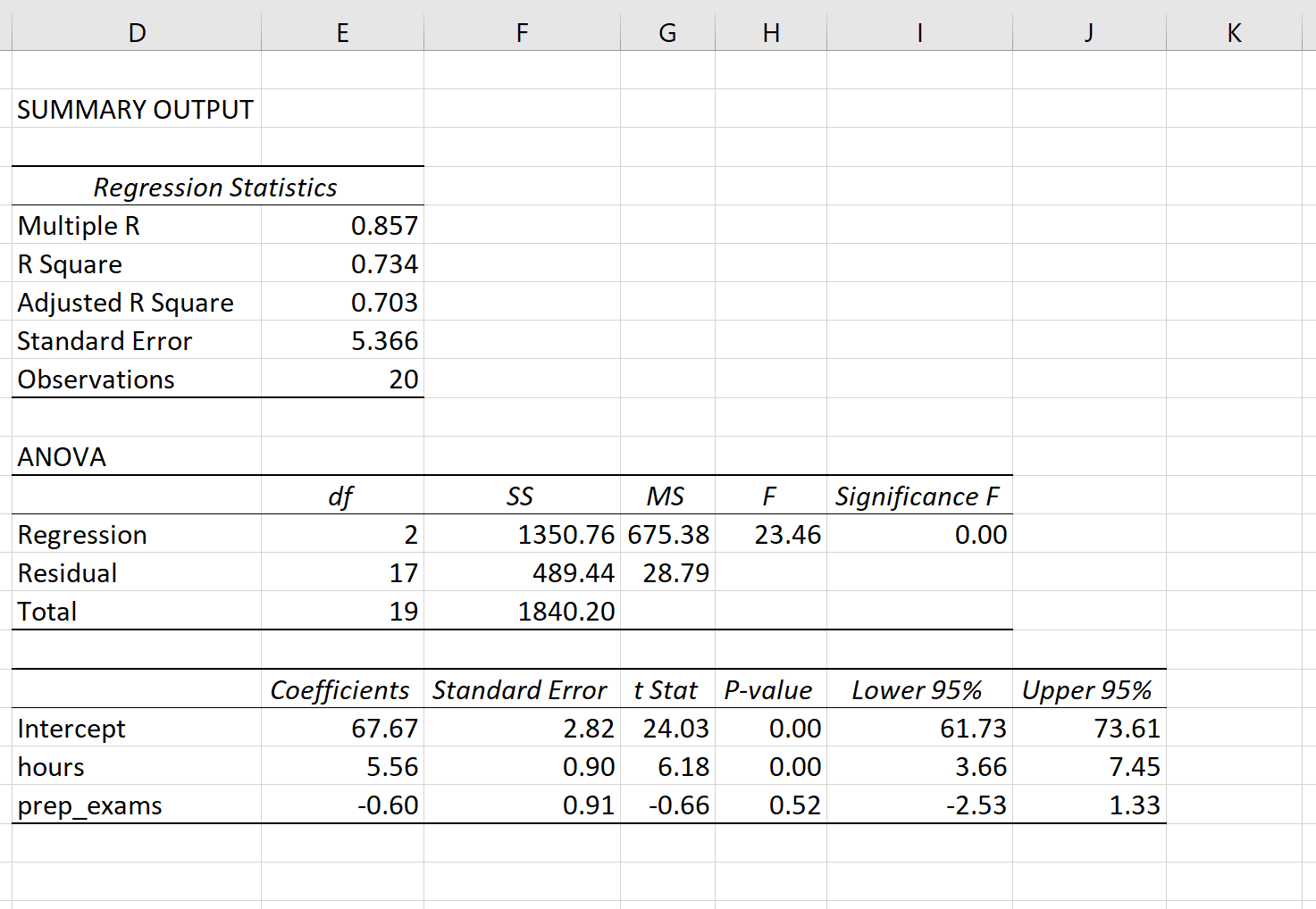
Вот как интерпретировать наиболее важные значения в выводе:
Несколько R: 0,857.Это представляет собой множественную корреляцию между переменной ответа и двумя переменными-предикторами.
R-квадрат: 0,734.Это известно как коэффициент детерминации. Это доля дисперсии переменной отклика, которая может быть объяснена объясняющими переменными. В этом примере 73,4% вариаций в экзаменационных баллах можно объяснить количеством часов обучения и количеством сданных подготовительных экзаменов.
Скорректированный квадрат R: 0,703.Это представляет собой значение R-квадрата, скорректированное с учетом количества переменных-предикторов в модели.Это значение также будет меньше, чем значение для R Square, и наказывает модели, которые используют в модели слишком много переменных-предикторов.
Стандартная ошибка: 5,366.Это среднее расстояние, на которое наблюдаемые значения отходят от линии регрессии. В этом примере наблюдаемые значения отклоняются от линии регрессии в среднем на 5,366 единицы.
Наблюдения: 20.Общий размер выборки набора данных, используемого для создания регрессионной модели.
Ф: 23,46.Это общая F-статистика для регрессионной модели, рассчитанная как MS регрессии / остаточная MS.
Значение F: 0,0000.Это p-значение, связанное с общей статистикой F. Он говорит нам, является ли регрессионная модель в целом статистически значимой.
В этом случае p-значение меньше 0,05, что указывает на то, что независимые переменные количество часов обучения и количество сданных подготовительных экзаменов вместе имеют статистически значимую связь с экзаменационным баллом .
Коэффициенты: коэффициенты для каждой независимой переменной говорят нам о среднем ожидаемом изменении переменной отклика при условии, что другая независимая переменная остается постоянной.
Например, ожидается, что за каждый дополнительный час, потраченный на учебу, средний экзаменационный балл увеличится на 5,56 при условии, что количество сданных подготовительных экзаменов останется неизменным.
Мы интерпретируем коэффициент для перехвата как означающий, что ожидаемая оценка экзамена для студента, который учится ноль часов и сдает нулевые подготовительные экзамены, составляет 67,67 .
P-значения. Отдельные p-значения говорят нам, является ли каждая независимая переменная статистически значимой. Мы можем видеть, что изученные часы статистически значимы (p = 0,00), в то время как пройденные подготовительные экзамены (p = 0,52) не являются статистически значимыми при α = 0,05.
Как написать оценочное уравнение регрессии
Мы можем использовать коэффициенты из выходных данных модели, чтобы создать следующее оценочное уравнение регрессии:
Экзаменационный балл = 67,67 + 5,56*(часы) – 0,60*(подготовительные экзамены)
Мы можем использовать это оценочное уравнение регрессии, чтобы рассчитать ожидаемый балл экзамена для учащегося на основе количества часов, которые он изучает, и количества подготовительных экзаменов, которые он сдает.
Например, студент, который занимается три часа и сдает один подготовительный экзамен, должен получить 83,75 балла:
Экзаменационный балл = 67,67 + 5,56*(3) – 0,60*(1) = 83,75
Имейте в виду, что, поскольку пройденные подготовительные экзамены не были статистически значимыми (p = 0,52), мы можем решить удалить их, поскольку они не улучшают общую модель.
В этом случае мы могли бы выполнить простую линейную регрессию, используя только часы изучения в качестве независимой переменной.
Источник
Linear regression analysis in Excel
 by Svetlana Cheusheva, updated on March 16, 2023
The tutorial explains the basics of regression analysis and shows a few different ways to do linear regression in Excel.
Imagine this: you are provided with a whole lot of different data and are asked to predict next year’s sales numbers for your company. You have discovered dozens, perhaps even hundreds, of factors that can possibly affect the numbers. But how do you know which ones are really important? Run regression analysis in Excel. It will give you an answer to this and many more questions: Which factors matter and which can be ignored? How closely are these factors related to each other? And how certain can you be about the predictions?
Regression analysis in Excel — the basics
In statistical modeling, regression analysis is used to estimate the relationships between two or more variables:
Dependent variable (aka criterion variable) is the main factor you are trying to understand and predict.
Independent variables (aka explanatory variables, or predictors) are the factors that might influence the dependent variable.
Regression analysis helps you understand how the dependent variable changes when one of the independent variables varies and allows to mathematically determine which of those variables really has an impact.
Technically, a regression analysis model is based on the sum of squares, which is a mathematical way to find the dispersion of data points. The goal of a model is to get the smallest possible sum of squares and draw a line that comes closest to the data.
In statistics, they differentiate between a simple and multiple linear regression. Simple linear regression models the relationship between a dependent variable and one independent variables using a linear function. If you use two or more explanatory variables to predict the dependent variable, you deal with multiple linear regression. If the dependent variable is modeled as a non-linear function because the data relationships do not follow a straight line, use nonlinear regression instead. The focus of this tutorial will be on a simple linear regression.
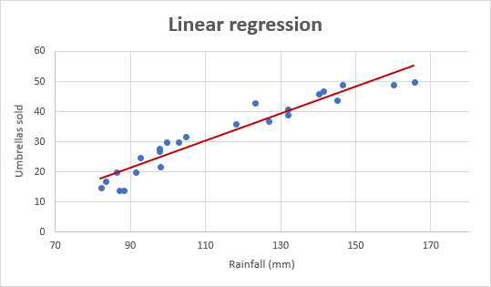
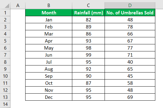
As an example, let’s take sales numbers for umbrellas for the last 24 months and find out the average monthly rainfall for the same period. Plot this information on a chart, and the regression line will demonstrate the relationship between the independent variable (rainfall) and dependent variable (umbrella sales):
Linear regression equation
Mathematically, a linear regression is defined by this equation:
- x is an independent variable.
- y is a dependent variable.
- a is the Y-intercept, which is the expected mean value of y when all x variables are equal to 0. On a regression graph, it’s the point where the line crosses the Y axis.
- b is the slope of a regression line, which is the rate of change for y as x changes.
- ε is the random error term, which is the difference between the actual value of a dependent variable and its predicted value.
The linear regression equation always has an error term because, in real life, predictors are never perfectly precise. However, some programs, including Excel, do the error term calculation behind the scenes. So, in Excel, you do linear regression using the least squares method and seek coefficients a and b such that:
For our example, the linear regression equation takes the following shape:
Umbrellas sold = b * rainfall + a
There exist a handful of different ways to find a and b. The three main methods to perform linear regression analysis in Excel are:
- Regression tool included with Analysis ToolPak
- Scatter chart with a trendline
- Linear regression formula
Below you will find the detailed instructions on using each method.
How to do linear regression in Excel with Analysis ToolPak
This example shows how to run regression in Excel by using a special tool included with the Analysis ToolPak add-in.
Enable the Analysis ToolPak add-in
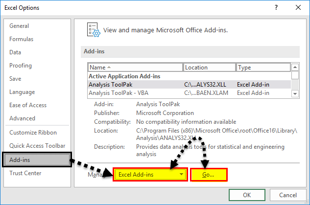
Analysis ToolPak is available in all versions of Excel 365 to 2003 but is not enabled by default. So, you need to turn it on manually. Here’s how:
- In your Excel, click File >Options.
- In the Excel Options dialog box, select Add-ins on the left sidebar, make sure Excel Add-ins is selected in the Manage box, and click Go.
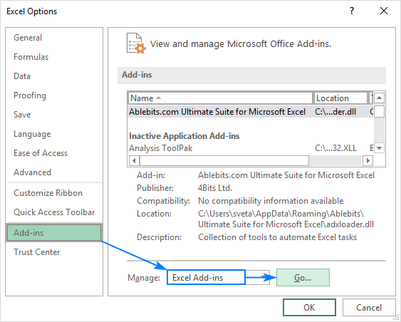
In the Add-ins dialog box, tick off Analysis Toolpak, and click OK:

This will add the Data Analysis tools to the Data tab of your Excel ribbon.
Run regression analysis
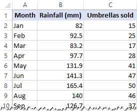
In this example, we are going to do a simple linear regression in Excel. What we have is a list of average monthly rainfall for the last 24 months in column B, which is our independent variable (predictor), and the number of umbrellas sold in column C, which is the dependent variable. Of course, there are many other factors that can affect sales, but for now we focus only on these two variables:
With Analysis Toolpak added enabled, carry out these steps to perform regression analysis in Excel:
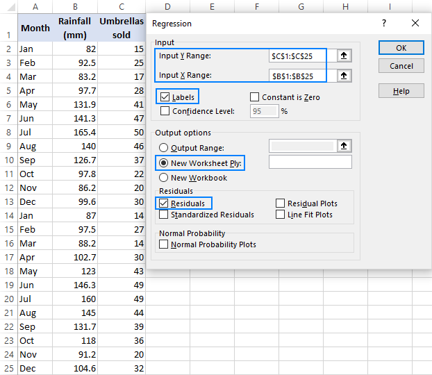
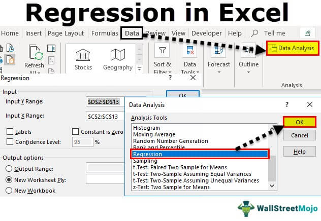
- On the Data tab, in the Analysis group, click the Data Analysis button.

Select Regression and click OK.

- Select the Input Y Range, which is your dependent variable. In our case, it’s umbrella sales (C1:C25).
- Select the Input X Range, i.e. your independent variable. In this example, it’s the average monthly rainfall (B1:B25).
If you are building a multiple regression model, select two or more adjacent columns with different independent variables.
- Check the Labels box if there are headers at the top of your X and Y ranges.
- Choose your preferred Output option, a new worksheet in our case.
- Optionally, select the Residuals checkbox to get the difference between the predicted and actual values.
Interpret regression analysis output
As you have just seen, running regression in Excel is easy because all calculations are preformed automatically. The interpretation of the results is a bit trickier because you need to know what is behind each number. Below you will find a breakdown of 4 major parts of the regression analysis output.
Regression analysis output: Summary Output
This part tells you how well the calculated linear regression equation fits your source data.

Here’s what each piece of information means:
Multiple R. It is the Correlation Coefficient that measures the strength of a linear relationship between two variables. The correlation coefficient can be any value between -1 and 1, and its absolute value indicates the relationship strength. The larger the absolute value, the stronger the relationship:
- 1 means a strong positive relationship
- -1 means a strong negative relationship
- 0 means no relationship at all
R Square. It is the Coefficient of Determination, which is used as an indicator of the goodness of fit. It shows how many points fall on the regression line. The R 2 value is calculated from the total sum of squares, more precisely, it is the sum of the squared deviations of the original data from the mean.
In our example, R 2 is 0.91 (rounded to 2 digits), which is fairy good. It means that 91% of our values fit the regression analysis model. In other words, 91% of the dependent variables (y-values) are explained by the independent variables (x-values). Generally, R Squared of 95% or more is considered a good fit.
Adjusted R Square. It is the R square adjusted for the number of independent variable in the model. You will want to use this value instead of R square for multiple regression analysis.
Standard Error. It is another goodness-of-fit measure that shows the precision of your regression analysis — the smaller the number, the more certain you can be about your regression equation. While R 2 represents the percentage of the dependent variables variance that is explained by the model, Standard Error is an absolute measure that shows the average distance that the data points fall from the regression line.
Observations. It is simply the number of observations in your model.
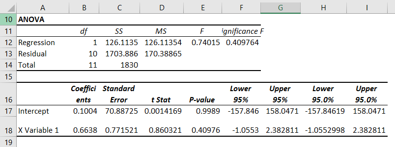
Regression analysis output: ANOVA
The second part of the output is Analysis of Variance (ANOVA):

Basically, it splits the sum of squares into individual components that give information about the levels of variability within your regression model:
- df is the number of the degrees of freedom associated with the sources of variance.
- SS is the sum of squares. The smaller the Residual SS compared with the Total SS, the better your model fits the data.
- MS is the mean square.
- F is the F statistic, or F-test for the null hypothesis. It is used to test the overall significance of the model.
- Significance F is the P-value of F.
The ANOVA part is rarely used for a simple linear regression analysis in Excel, but you should definitely have a close look at the last component. The Significance F value gives an idea of how reliable (statistically significant) your results are. If Significance F is less than 0.05 (5%), your model is OK. If it is greater than 0.05, you’d probably better choose another independent variable.
Regression analysis output: coefficients
This section provides specific information about the components of your analysis:

The most useful component in this section is Coefficients. It enables you to build a linear regression equation in Excel:
For our data set, where y is the number of umbrellas sold and x is an average monthly rainfall, our linear regression formula goes as follows:
Y = Rainfall Coefficient * x + Intercept
Equipped with a and b values rounded to three decimal places, it turns into:
For example, with the average monthly rainfall equal to 82 mm, the umbrella sales would be approximately 17.8:
In a similar manner, you can find out how many umbrellas are going to be sold with any other monthly rainfall (x variable) you specify.
Regression analysis output: residuals
If you compare the estimated and actual number of sold umbrellas corresponding to the monthly rainfall of 82 mm, you will see that these numbers are slightly different:
- Estimated: 17.8 (calculated above)
- Actual: 15 (row 2 of the source data)
Why’s the difference? Because independent variables are never perfect predictors of the dependent variables. And the residuals can help you understand how far away the actual values are from the predicted values:

For the first data point (rainfall of 82 mm), the residual is approximately -2.8. So, we add this number to the predicted value, and get the actual value: 17.8 — 2.8 = 15.
How to make a linear regression graph in Excel
If you need to quickly visualize the relationship between the two variables, draw a linear regression chart. That’s very easy! Here’s how:
- Select the two columns with your data, including headers.
- On the Inset tab, in the Chats group, click the Scatter chart icon, and select the Scatter thumbnail (the first one):
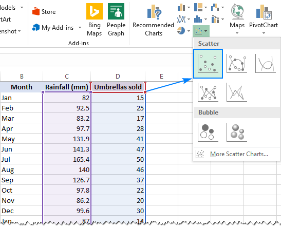
This will insert a scatter plot in your worksheet, which will resemble this one:

Now, we need to draw the least squares regression line. To have it done, right click on any point and choose Add Trendline… from the context menu.

On the right pane, select the Linear trendline shape and, optionally, check Display Equation on Chart to get your regression formula:
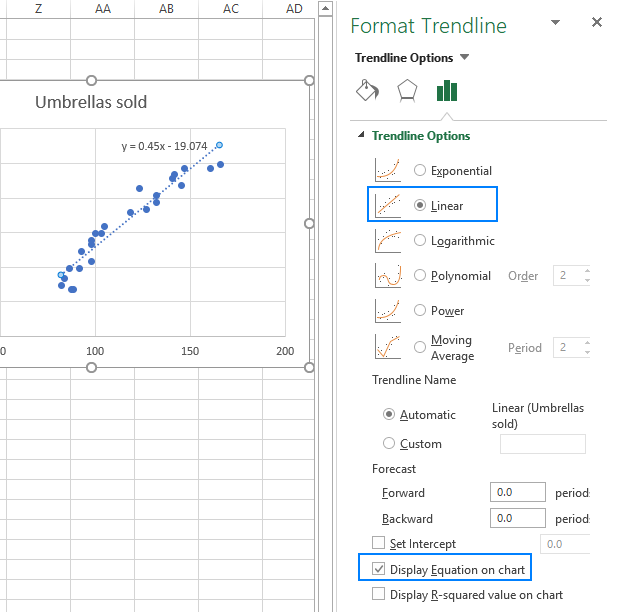
As you may notice, the regression equation Excel has created for us is the same as the linear regression formula we built based on the Coefficients output.
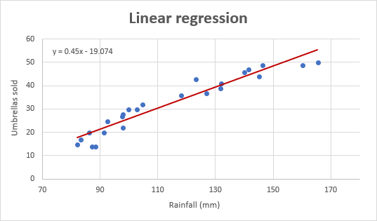
Switch to the Fill & Line tab and customize the line to your liking. For example, you can choose a different line color and use a solid line instead of a dashed line (select Solid line in the Dash type box):

At this point, your chart already looks like a decent regression graph:

Still, you may want to make a few more improvements:
- Drag the equation wherever you see fit.
- Add axes titles (Chart Elements button >Axis Titles).
- If your data points start in the middle of the horizontal and/or vertical axis like in this example, you may want to get rid of the excessive white space. The following tip explains how to do this: Scale the chart axes to reduce white space.
And this is how our improved regression graph looks like:
Important note! In the regression graph, the independent variable should always be on the X axis and the dependent variable on the Y axis. If your graph is plotted in the reverse order, swap the columns in your worksheet, and then draw the chart anew. If you are not allowed to rearrange the source data, then you can switch the X and Y axes directly in a chart.
How to do regression in Excel using formulas
Microsoft Excel has a few statistical functions that can help you to do linear regression analysis such as LINEST, SLOPE, INTERCEPT, and CORREL.
The LINEST function uses the least squares regression method to calculate a straight line that best explains the relationship between your variables and returns an array describing that line. You can find the detailed explanation of the function’s syntax in this tutorial. For now, let’s just make a formula for our sample dataset:
Because the LINEST function returns an array of values, you must enter it as an array formula. Select two adjacent cells in the same row, E2:F2 in our case, type the formula, and press Ctrl + Shift + Enter to complete it.
The formula returns the b coefficient (E1) and the a constant (F1) for the already familiar linear regression equation:

If you avoid using array formulas in your worksheets, you can calculate a and b individually with regular formulas:
Get the Y-intercept (a):
Get the slope (b):
Additionally, you can find the correlation coefficient (Multiple R in the regression analysis summary output) that indicates how strongly the two variables are related to each other:
The following screenshot shows all these Excel regression formulas in action:

Tip. If you’d like to get additional statistics for your regression analysis, use the LINEST function with the stats parameter set to TRUE as shown in this example.
That’s how you do linear regression in Excel. That said, please keep in mind that Microsoft Excel is not a statistical program. If you need to perform regression analysis at the professional level, you may want to use targeted software such as XLSTAT, RegressIt, etc.
To have a closer look at our linear regression formulas and other techniques discussed in this tutorial, you are welcome to download our sample workbook below. Thank you for reading!
Источник
Regression is done to define relationships between two or more variables in a data set. In statistics, regression is done by some complex formulas. But, Excel has provided us with tools for regression analysis. So, in the Excel Analysis ToolPak, click “Data Analysis” and “Regression” to conduct regression analysis in Excel.
Table of contents
- What is Regression Analysis in Excel?
- Explained
- Examples
- How to Run Regression Analysis Tool in Excel?
- How to Use Regression Analysis Tool in Excel?
- Steps to Create Regression Chart in Excel
- Things to Remember
- Recommended Articles
Explained
The Regression analysis tool performs linear regression in excelLinear Regression is a statistical excel tool that is used as a predictive analysis model to examine the relationship between two sets of data. Using this analysis, we can estimate the relationship between dependent and independent variables.read more examination using the “minimum squares” technique to fit a line through many observations. You can examine how an individual dependent variable is influenced by the estimations of at least one independent variable. For instance, you can investigate how such factors influence a sportsman’s performance as age, height, and weight. You can distribute shares in the execution measure to every one of these three components, given a lot of execution information, and then utilize the outcomes to foresee the execution of another person.
The Excel regression analysis tool helps you see how the dependent variable changes when one of the independent variables fluctuates and permits you to numerically figure out which of those variables truly has an effect.
You are free to use this image on your website, templates, etc, Please provide us with an attribution linkArticle Link to be Hyperlinked
For eg:
Source: Regression Analysis in Excel (wallstreetmojo.com)
Examples
- Sales of shampoo are dependent upon the advertisement. If $1 million increases advertising expenditure, sales will be expected to increase by $23 million. If there were no advertising, we would expect sales without any increment.
- House sales (selling price, number of bedrooms, location, size, design) predict the selling price of future sales in the same area.
- Soft drink sales massively increase in summer when the weather is too hot. People purchase more and more soft drinks to keep them cool. The higher the temperature, the higher the sales and vice versa.
- In March, exam season started, and sales increased due to students purchasing exam pads. Exam pads sale depends upon the examination season.
How to Run Regression Analysis Tool in Excel?
- We must enable the Analysis ToolPak Add-in.
- In Excel, click on the “File” on the extreme left-hand side, go and click on the “Options” at the end.

- On clicking on “Options,” select “Add-ins” on the left side. Excel Add-ins are chosen in the “View and manage Microsoft Add-ins” and “Manage” boxes. Then, click “Go.”

- In the Add-in dialog box, click on Analysis Toolpak, and click OK:

It will add the “Data Analysis” tools on the right-hand side to the Excel ribbon’s “Data” tab.


How to Use Regression Analysis Tool in Excel?
We must use the data for regression analysis in Excel.
You can download this Regression Excel Template here – Regression Excel Template
Once Analysis ToolpakExcel’s data analysis toolpak can be used by users to perform data analysis and other important calculations. It can be manually enabled from the addins section of the files tab by clicking on manage addins, and then checking analysis toolpak.read more is added and enabled in the Excel workbook, follow the steps mentioned below to practice the analysis of regression in Excel:
- Step 1: On the Data tab in the Excel ribbonThe ribbon is an element of the UI (User Interface) which is seen as a strip that consists of buttons or tabs; it is available at the top of the excel sheet. This option was first introduced in the Microsoft Excel 2007.read more, click the Data Analysis

- Step 2: Click on the “Regression” and click “OK” to enable the function.

- Step 3: On clicking the “Regression“ dialog box, we must arrange the accompanying settings:
- For the dependent variable, select the “Input Y Range,” which denotes the dependent data. Here, in the below-given screenshot, we have selected the range from $D$2:$D$13.

- Select the “Input X Range,” which denotes the independent data for the independent variable. Here, in the below-given screenshot, we have selected the range from $C$2:$C$13.

- Step 4: Click “OK” and analyze the data accordingly.

When you run the regression analysis in Excel, the following output will come:


You can also make a scatter plot in excelScatter plot in excel is a two dimensional type of chart to represent data, it has various names such XY chart or Scatter diagram in excel, in this chart we have two sets of data on X and Y axis who are co-related to each other, this chart is mostly used in co-relation studies and regression studies of data.read more of these residuals.
Steps to Create Regression Chart in Excel
- Step 1: Select the data as given in the below screenshot.

- Step 2: Tap on the “Inset” tab. In the “Charts” gathering, tap the “Scatter” diagram or some other as a required symbol. Select the chart which suits the information.

- Step 3: We can modify the chart when required and fill in the hues and lines of your decision. For instance, we can pick alternate shading and utilize a strong line of a dashed line. We can customize the graph as we want to customize it.

Things to Remember
- We must always check the dependent and independent values. Otherwise, the analysis will be wrong.
- If you test a huge number of data and thoroughly rank them based on their validation period statisticsStatistics is the science behind identifying, collecting, organizing and summarizing, analyzing, interpreting, and finally, presenting such data, either qualitative or quantitative, which helps make better and effective decisions with relevance.read more.
- Choose the data carefully to avoid any kind of error in excel analysis.
- We can optionally check any of the boxes at the bottom of the screen, although none of these is necessary to obtain the line best-fit formula.
- Start practicing with small data to understand the better analysis and run the regression analysis tool in Excel easily.
Recommended Articles
This article is a step-by-step guide to Regression Analysis in Excel. Here we discuss how to run regression in Excel, its interpretation, and use this tool along with Excel examples and downloadable Excel templates. You may also look at these useful functions in Excel: –
- Examples of Normal Distribution Graph in Excel
- Regression vs. ANOVABoth the Regression and ANOVA are the statistical models which are used in order to predict the continuous outcome but in case of the regression, continuous outcome is predicted on basis of the one or more than one continuous predictor variables whereas in case of ANOVA continuous outcome is predicted on basis of the one or more than one categorical predictor variables.read more
- Excel Exponential Smoothing
- Exponential Function ExcelExponential Excel function(EXP) is an inbuilt function in excel used to calculate the exponent raised to the power of any number you provide. In this function the exponent is constant and is also known as the base of the natural algorithm.read more
Reader Interactions