
The Real Statistics Resource Pack contains a variety of supplemental functions and data analysis tools not provided by Excel. These complement the standard Excel capabilities and make it easier for you to perform the statistical analyses described in the rest of this website.
We now explain how to download and install the Real Statistics Resource Pack for use with Excel 2010, 2013, 2016, 2019, 2021 or 365 on Windows. If you are using Excel 2007 click here. If you are using Excel 2003 or a prior version of Excel click here. If you are using Excel for the Macintosh click here.
Keep in mind that there are also two versions of Excel, at least for Excel 2010, 2013, 2016, 2019, 2021 and 365, the 32-bit version and the 64-bit version. Most people use the 32-bit version. The Real Statistics Resource Pack works in both versions of Excel.
Download
Real Statistics Resource Pack for Excel 2010, 2013, 2016, 2019, 2021 or 365 for Windows
- If you accept the License Agreement, click here on Real Statistics Resource Pack for Excel 2010/2013/2016/2019/2021/365 to download the latest Excel for Windows version of the resource pack that accompanies this website (Release 8.6.2).
This software is compatible with all Windows releases of Excel from 2010 until the present and is named XRealStats.xlam. After downloading the software make sure that you install the software as described below.
Downloading this resource pack means that you accept the License Agreement.
Real Statistics Resource Pack for Excel 2002, 2003 or 2007
If you are using Excel 2007, click here for instructions on how to download and install the Real Statistics Resource Pack.
If you are using Excel 2003 or a prior version of Excel, click here for instructions on how to download and install the Real Statistics Resource Pack.
Real Statistics Resource Pack for Excel 2011, 2016, 2019 or 365 for Mac
If you are using a Macintosh version of Excel, click here for instructions on how to download and install the Real Statistics Resource Pack.
Installation
Before trying to install the Real Statistics Resource Pack make sure that Excel’s Solver capability is installed on your computer. Check this as follows:
- Open up a blank Excel spreadsheet
- Press Alt-TI (i.e. hold down the Alt key and press the T and I keys).
- On the dialog box that appears make sure that the Solver add-in is checked. If not, check it and click on the OK button.
- If the Solver add-in was not checked you need to close the Excel file before proceeding to the next step.
Solver Installation
Once you have downloaded the Resource Pack and made sure that Solver is installed, you need to install the Real Statistics Real Pack using the following steps:
- Move the Resource Pack to where you want it located on your computer (see our recommendation below). Caution: once you install the resource pack at a particular location it will be more difficult to move it later.
- Open Excel, but don’t try to open the XRealStats.xlam file that you downloaded earlier.
- Select File > Help|Options > Add-Ins and click on the Go button at the bottom of the window (see Figure 1). Alternatively, you can simply press Alt-TI (i.e. hold the Alt key down and simultaneously press T followed by I) and the dialog box shown in Figure 2 will appear.

Figure 1 – Add-ins dialog box 1 - Check the Xrealstats option on the dialog box that appears (see Figure 2) and click the OK button. NOTE: If you have previously activated Realstats you must uncheck the Realstats option.
- If this option doesn’t appear, click on Browse to find and choose the xrealstats.xlam file. Then complete step 4 as described above.


While you can place the Real Statistics Resource Pack anywhere on your computer, we recommend that you put the file in the following folder:
C:Usersuser-nameAppDataRoamingMicrosoftAddIns
where user-name is your user name in Microsoft Windows. Since some of these folders are hidden, you may find it convenient to enable showing hidden folders. E.g., in Windows 10 or 11 you can do this by opening Settings and then typing Show Hidden Files and Folders in the search field. Next, check on the Show hidden files, folders, and drives option in the dialog box that appears, and then click on the OK button.
Installation of Upgrades
Once you have installed the Real Statistics Resource Pack as described above, to install a new version of the software you don’t need to repeat these steps. You only need to delete the previous version of the resource pack and put the new version of the software in the same location as the previous version.
Troubleshooting
If there is a problem during the installation try one or more of the following:
- If Excel is running, close it. Find the file with the Real Statistics add-in. Right-click on the file and click on the Properties option from the menu that appears. Towards the bottom of the General tab of the Properties window you will see the security message “This file came from another computer and might be blocked to help protect this computer”. Next to this message is the Unblock checkbox. Make sure this is checked and press the OK button. Start Excel.
- Click on Options from the File ribbon and then choose the Trust Center option on the left side. Next click on Trust Center Settings …. Now, click on the Macro Settings option on the left side and make sure that it is Disable all Macros with Notification. Also, click on the Trusted Locations option on the left side and click on the Add New Location… button to add the folder that contains XRealStats file as a trusted location.
- Try opening a blank Excel worksheet and press Alt-TI. Uncheck the Xrealstats add-in and close Excel. Now open a blank Excel worksheet and press Alt-TI. This time check the Xrealstats add-in
Most important, remember that Solver must be installed. To check this, press Alt-TI and make sure that Solver (as well as Xrealstats) is on the list of add-ins with a checkmark next to it.
Real Statistics Functions
Once you have installed the Real Statistics Resource Pack you can use the Real Statistics functions in the same way as you use the built-in worksheet functions supplied with Excel. These functions are described throughout the rest of this website. A complete list of these functions can be found on the Tools menu of the website (or at Real Statistics Software Capabilities).
Real Statistics Data Analysis Tools
You can access the Real Statistics data analysis tools in one of the following ways, as described in Accessing Real Statistics Data Analysis Tools:
- By pressing Ctrl-m or
- By clicking on an icon on the Add-Ins ribbon or
- By clicking on an icon on the Quick Access Toolbar or
- Via the Macro dialog box
A dialog box will now appear that lists all the available Real Statistics data analysis tools. You need to choose one of the data analysis tools from this list.
A dialog box will then appear as described in Real Statistics Supplemental Data Analysis Tools which enables you to specify your input data and choose from available options. You can also access Help to get more information about the selected data analysis tool.
A complete list of Real Statistics data analysis tools can be found in Real Statistics Supplemental Data Analysis Tools.
Uninstalling the Real Statistics Resource Pack
- Open Excel
- Press Alt-TI
- Uncheck the Xrealstats option on the dialog box that appears and click the OK button.
- Close Excel and delete the file that contains the Real Statistics Resource Pack.
Содержание
- Using Real Statistics Tools
- General Overview
- Return to Main Menu Option
- Percentage Option
- Built-in Statistical Functions
- Basic statistical functions
- Correlation and covariance functions
- Regression function
- Other statistical functions
- Statistical distribution functions
- Excel 2010 functions
- Excel 2013 functions
- Excel 2016 forecast functions
- Free Download
- 370 thoughts on “Free Download”
General Overview
You can access the Real Statistics data analysis tools by pressing Ctrl-m or via the Add-Ins ribbon (as described in Accessing Real Statistics Tools). One of two dialog boxes will appear which lists all the available supplemental data analysis tools (see Figures 1 and 2).
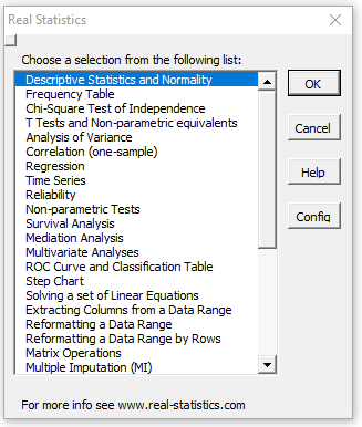
Figure 1 – Original Real Statistics data analysis tools main menu
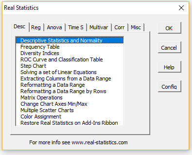
Figure 2 – Multipage data analysis tools main menu
Next, choose one of the data analysis tools from this list. A dialog box will now appear which is similar to that presented in Figure 2 of Excel’s Data Analysis Tools. Suppose by way of example that you choose the Matrix Operations data analysis tool from the menu in Figure 1 (or the Misc tab in Figure 2). You will now be presented with the dialog box shown in Figure 3.
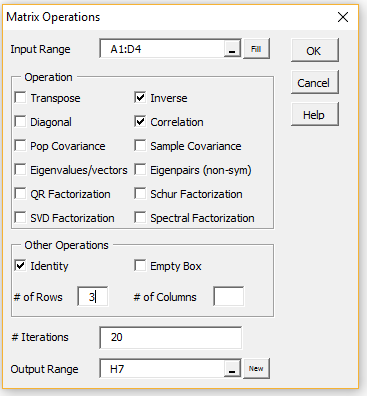
Figure 3 – Dialog box for Matrix Operations
The Input Range consists of the Excel range where the data elements to be analyzed are stored. Suppose, by way of example, this data consists of a 4 × 4 array shown in Figure 4.
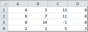
Figure 4 – Sample input range
You can insert the range A1:D4 in the Input Range field. Alternatively, you highlight the range A1:D4 and it will automatically be inserted into the Input Range field.
The approach is slightly different in the Mac environment. See Using Real Statistics Tools on a Mac.
In this example, the input range is quite small, but when using a data range with many rows, it can be time-consuming and tiresome to highlight the entire range. Instead, you can highlight just the first row of the desired data range (A1:D1 above) and then click on the Fill button right next to the Input Range field. The range will then be modified to include all the rows down to the last row above a row with only empty cells (A1:D4 above).
Next click on the checkbox for all the matrix operations you desire (Inverse, Correlation and Identity in the example above). The selected operations would then be applied to the matrix in the Input Range (except for Identity and Empty Box), with the results being displayed starting at the cell in the Output Range field.
If the Identity option is selected then the value entered in # of Rows determines the size of the identity matrix displayed. If the Empty Box option is selected then the values entered in # of Rows and # of Columns determine the size/shape of the empty box that is displayed.
If the Eigenvalues/vectors (for symmetric matrices), Eigenpairs (for non-symmetric matrices), QR Factorization, Schur Factorization, SVD Factorization or Spectral Factorization option is chosen then the # of Iterations field may be filled in with the number of iterations used in the algorithm employed (default 20).
The Output Range is automatically filled in with the address of the currently selected cell in the active worksheet (H7 in the example above), as described below. This value can be manually overridden.
The Output Range must be on the same worksheet as the Input Range, although if the Output Range field is empty then the output will be displayed on a new worksheet in the same workbook (similar to the New Worksheet Ply option described in Figure 2 of Excel Data Analysis Tools ). You can also accomplish the same thing by clicking on the New button next to the Output Range field.
Once you have filled in all the fields you should press the OK button.
If you click on any cell in the current worksheet prior to using any of the data analysis tools, that cell is used as the default location of the output. However, if you highlight more than one cell, then the resulting range is used as the default Input Range (or if there is more than one input range, then the first input range defaults to the highlighted range). In this case, the Output Range defaults to blank, which means that the output will be written to a new worksheet. You can manually override any of these defaults.
If you place the mouse pointer over any element in the dialog box (Figure 3) you will receive information about how to use that element (tool tip). If you need further information, click on the Help button (shown in Figure 3). The resulting message for Matrix Operations is displayed in Figure 5.
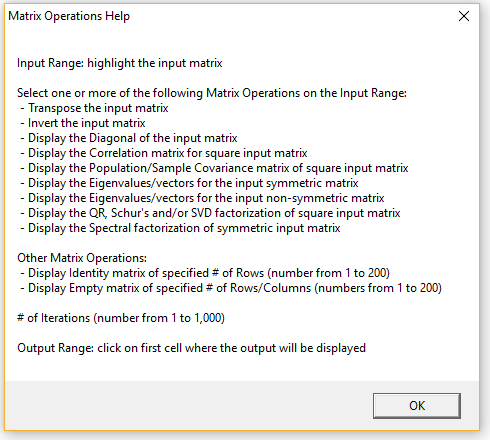
Figure 5 – Help message for Matrix Operations
Return to Main Menu Option
When one of the Real Statistics data analysis tools has completed its task, users can be prompted to choose another data analysis tool (which usually means that the dialog box in Figure 1 or 2 is redisplayed). Whether or not to prompt for another data analysis tool or terminate is configurable.
The default is to terminate after one data analysis tool has completed execution (although the Color Assignment and Statistical Power and Sample Size data analysis tools are exceptions).
If you always want to see a prompt for another data analysis tool, then you need to click on the Config button on the main dialog box and then check the Return to main menu option on the Configuration dialog box that appears (see Figure 2 of Real Statistics Main Menu). You can click on the Config button to change this option at any time.
Percentage Option
Note that a number of the Real Statistics dialog boxes contain an Alpha field, which contains the significance level for the desired statistical test. This value defaults 0.05 (or 0,05 on systems that use a comma instead of a period for the decimal symbol), although you can change it to some other value (e.g. 0.01).
You can optionally check the Use Percentage option on the Configuration dialog box (as shown in Figure 2 of Real Statistics Main Menu). In this case, the label Alpha will be replaced by Alpha % and its default value will be shown as 5 (representing 5%). You can override the default value by entering some other whole number (e.g. 1 representing 1%). This approach has the advantage that no decimal number is necessary. For some users, this is important since on some Excel implementations there may be a problem when using the 0,05 notation instead of 0.05.
Whether or not you use the Use Percentage option, you can always enter a value of 0 for Alpha and then override this value in the output.
Источник
Built-in Statistical Functions
Excel provides a variety of statistical functions, which we list below. Since these have been covered in the rest of the website, we won’t go into any detail here.
Basic statistical functions
 Figure 1 – Basic Excel statistics functions
Click below for more information about each of these functions:
Correlation and covariance functions
 Figure 2 – Excel correlation and covariance functions
Click below for more information about each of these functions:
Regression function
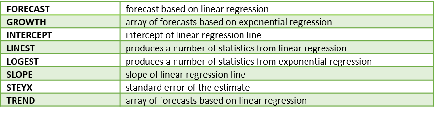 Figure 3 – Excel regression functions
Click below for more information about each of these functions:
Other statistical functions
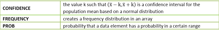 Figure 4 – Other Excel statistical functions
Click below for more information about each of these functions:
Statistical distribution functions
The following table provides a list of the distributions supported by Excel. For each, the name of cumulative distribution functions (CDF) is given, and where available the name of the inverse function is also provided. For a few of the distributions, the CDF function also has an option to provide the probability density function (PDF). Finally, additional test functions are listed where available.
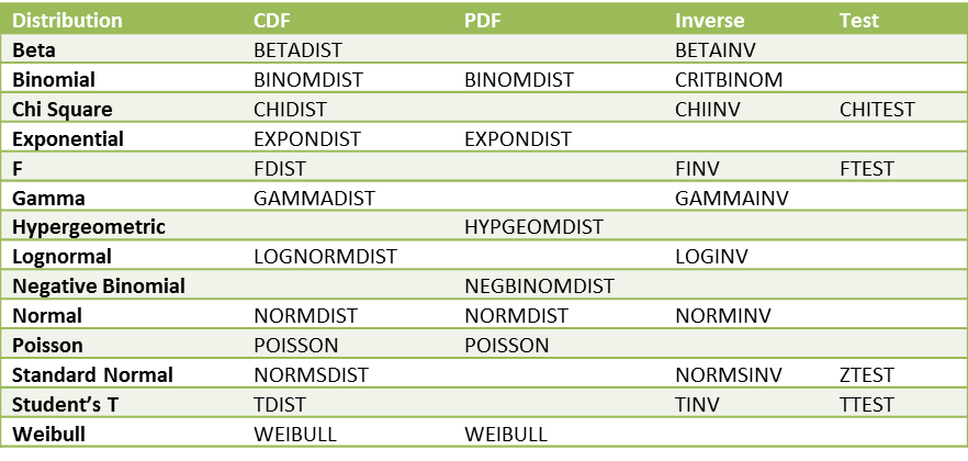
Figure 5 – Excel 2007 distribution functions
Excel 2010 functions
All the functions defined in previous versions of Excel are available in Excel 2010 and later versions of Excel, but the mathematical accuracy of many of these functions has been improved in Excel 2010 and later versions. In addition, a few new functions have been added and more consistent naming conventions have been introduced, including the following:
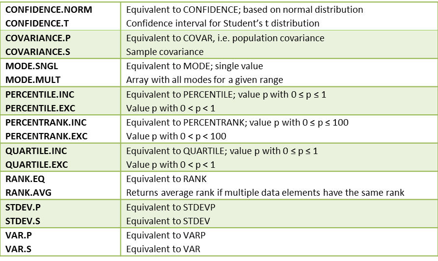 Figure 6 – New Excel 2010 statistical functions
For example, if R = <4,6,4,7,6,6>, then RANK(4,R) = 5, RANK(6,R) = 2 and RANK(7,R) = 1, while RANK.AVG(4,R) = 5.5, RANK.AVG(6,R) = 3 and RANK.AVG(7,R) = 1. Also RANK.EQ is the same as RANK. Similarly, RANK(4,R,1) = 1, RANK(6,R,1) = 3 and RANK(7,R,1) = 6, while RANK.AVG(4,R,1) = 1.5, RANK.AVG(6,R,1) = 4 and RANK.AVG(7,R,1) = 6.
MODE.MULT is an array function that is useful with multimodal data. Before using the function you need to highlight a vertical range (i.e. column vector) with at least as many cells as modes and then enter =MODE.MULT(R) and Ctrl-Shft-Enter (or simply Enter if using Excel 365). If you highlight more cells than modes the extra cells will contain the error values #N/A.
The function GAMMALN.PRECISE, which is equivalent to GAMMALN, has also been added in Excel 2010.
Starting with Excel 2010 there are the following alternative names for the distribution functions:
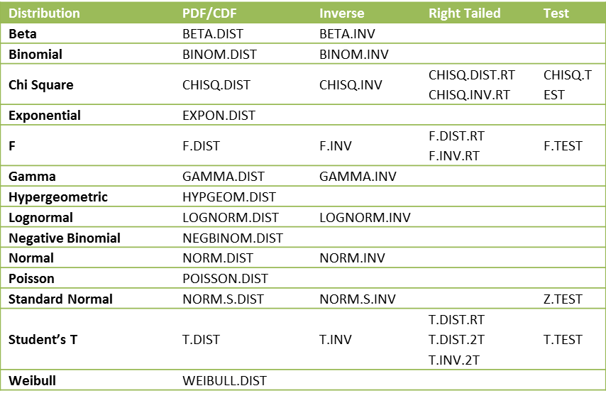 Figure 7 – Excel 2010 distribution functions
The functions that end in .DIST all provide both the probability distribution function (when the cum parameter is FALSE) as well as the left-tailed cumulative distribution function (when the cum parameter is TRUE). These are all left-tailed functions. For the chi-square and F distributions, there is also a right-tailed version (indicated by .RT in the above table) of the distribution and inverse cumulative functions. There is also a right-tailed version of the distribution function and a two-tailed version of the t distribution and its inverse.
The syntax for the various new t distribution functions is T.DIST(x,df,cum), T.DIST.RT(x,df) and T.DIST.2T(x,df). The syntax for the new inverse function is T.INV(p,df) and T.INV.2T(p,df). We have the following equivalences between the Excel 2007 and later versions of the t distribution functions:
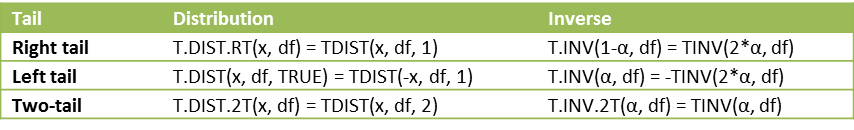 Figure 8 – Equivalences for the t distribution
Note that while the old t distribution functions worked differently from the normal and binomial distribution functions, the new functions are all consistent. Also, we can now explicitly calculate the pdf of the t distribution as T.DIST(x, df, FALSE) instead of having to use a complicated formula based on Definition 1 of t Distribution.
We also have the following equivalences between the Excel 2007 and later versions of the chi-square distribution functions:
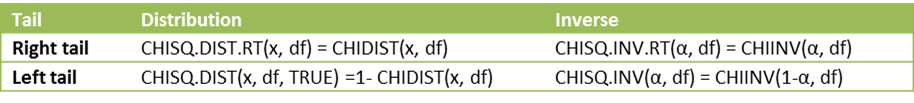 Figure 9 – Equivalences for the chi-square distribution
Finally, we can now explicitly calculate the pdf of the chi-square distribution as CHISQ.DIST(x, df, FALSE). The equivalences for the F distribution between Excel 2007 and later versions are similar.

Figure 10 – Equivalences for the F distribution
Excel 2013 functions
All the functions defined in previous versions of Excel are available in Excel 2013, but the following additional functions are available in versions of Excel starting with Excel 2013:
 Figure 11 – New Excel 2013 statistical functions
Excel 2016 forecast functions
The following forecast functions were introduced with Excel 2016. More details about these functions can be found at Excel 2016 Forecasting Functions.
Источник
Free Download
Click on one of the icons below for a free download of any of the following files.
Real Statistics Resource Pack: contains a variety of supplemental functions and data analysis tools not provided by Excel. These complement the standard Excel capabilities and make it easier for you to perform the statistical analyses described in the rest of this website.

Real Statistics Examples Workbooks: 14 Excel workbooks can be downloaded for free. These contain worksheets that implement the various tests and analyses described in the rest of this website.

Quick Access Toolbar (QAT): One way to access the Real Statistics data analysis tools is via the QAT. To accomplish this you need to download a file named RS_QAT.xlsm. Click here to download this file.
370 thoughts on “Free Download”
Charles, I just deployed this to some student workstations & is it normal to see a pop up for visual basic that says can’t find project or library and a pop up that says project locked – project is unviewable. After saying OK to these pop ups – it seems to work OK but i wanted to ask if something is functionally wrong if you see these pop ups at first login to excel after adding the resource pack add in. Thanks for assistance / advice / expertise.
Hello Devon,
I don’t know why this message popped up. The software should work in any case. The “project locked” message just means that the code can’t be changed, which you probably don’t need to do in any case.
Charles
i am student and use this app for paper prepration
I recently downloaded real statistics and it is a very powerful tool. However, when I use any of the package’s functions, I don’t get the “suggestions” pointing out the function’s arguments. I would like to know of there’s a way to enable this. As a beginner it makes learning the order of arguments a bit easier.
Hello Rodrigo,
I agree that suggestions are a useful capability. See the following webpage for how to do this for the Real Statistics worksheet functions:
https://www.real-statistics.com/real-statistics-environment/using-real-statistics-functions/
Charles
Hello Charles, This is a great tool. Thanks a lot. I am looking to use moderation analysis however I am unable to find it under the Reg Tab. Was it removed or renamed to something else? Thank you!
Hello Hemal,
Glad that you like the software.
I see it on the Reg tab on my computer. I am using the latest release, Rel 8.4.
What release of the Real Statistics software are you using? You can find this out by entering the formula =VER() in any cell.
Charles
Hello Dr. Charles,
I hope you are doing great. I downloaded and used your RealStats from 2017. It works perfectly. However, I tried to add it to two new PCs, but I couldn’t add it because of the error. I don’t know if the file is not compatible with new Microsoft office version. I hope you can help. By the way, for my previous usage, the file had a conflict with Solver sometimes. I don’t know how to fix it.
Thank you so much for your supports
Hello William,
I am doing well. I hope that you are doing well too.
1. What sort of error are you getting? The usual problem relates to trust. You can address this issue as described in the Troubleshooting section of
https://www.real-statistics.com/free-download/real-statistics-resource-pack/
2.The key is that Solver needs to load before the Real Statistics add-in. Many months ago, I changed the name of the Real Statistics add-in to XRealstats.xlam to ensure that this would happen.
Charles
Dear Dr. Charles,
Thank you for your develop Real Statistics. We have download and use it well, but we can’t use the OUTLIERS. The output dialogue showed the error named “misc”, we have checked our version of EXCEL and it goes well.
Pleas help us to check it.
We are looking forward your reply.
Thank you very much.
Hello April,
I just tried it on my computer and it seems to be working fine.
If you email me an Excel file with your data and explain the formula (or data analysis tool settings), I will try to figure out why you are getting an error.
Charles
HOLA ESTOY DESCARGE Y AL PARECER FUNCIONA PERO AL MOMENTO DE INGRESAR MIS VARIABLES EN LA OPCION MULTIVAR- FACTOR ANALYSIS-EXTRACT-COMPONENTES PRINCIPALES.
APARECE UN ERROR QUE DICE QUE NO COINCIDEN LOS TIPOS VOLVI A TRATAR LAS VARIBLES Y CAMBIA LA NOMENCLATURA DE LOS DATOS PERO SIGUE APARECIENDO, MI DUDA Y ESPERO ME PUEDAS AYUDAR ES COMO SOLUCIONAR ESTO.
TRATE DE DESCARGAR LA VERCION DE 64 BTS TRATANDO DE MANEJARLO COMO UN ERROR DE COMPATIBILIDAD EN LA DESCARGA DE WINDOWS 2016 PERO NO PUEDO ENCONTRAR DONDE LO PUEDO DESCARGAR
See my last two responses.
Charles
Hello,
some 35 years ago I started working with Statistica. It was a fine program. Since I was retired 12 years ago I have been trying to make my own programs for time series analysis, mainly in VBA for Excel but the development of the statistical know how is going much faster then my abillity to make my (working!) programs so I am happy to find the Real Statistic Resource Software Pack and I am going to download it. At least my recent hobby helps me to understand what it is all about. I should have got this knowledge 45 years ago!
Matija
Hello Matija,
Thank you for your comment. I hope that you find Real Statistics useful.
Charles
Hello,
I have downloaded the add on and have used it but now can’t find it on my mac. Can you help me please?
Enter the formula =VER() in any cell. If you get an error value, then I suggest that you download the Real Statistics file and install it from scratch.
Charles
Cuando introduzco mis valores (enteros o decimales) en Imput range me sale el siguiente enunciado “Outlier Multiplier Factor must be a number between 1.0 and 6.0 or blank (default 2.2)” y no me permite calcular lo deseado, que hago? Mi excel es 2019 Windows
Hello Teresa,
What do you want to do? Is the default of 2.2 not acceptable?
Charles
Quiero realizar la opción de Descriptive Statistics and Normality
Hello I have the same problem … HELP!
Can you explain what you want to do?
Charles
I successfully loaded the XRealStats add-in. However, when I put in G2:G2168 for Input Range (ARIMA Model and Forecast), I get:
Invalid input range selected
G2:G2168 is the data range with time-series data (cyclical, seasonal .. )
Same error message with Seasonal ARIMA (SARIMA).
Why? How can I input my data range in column G?
If you send me an email with an Excel file containing your data, I will try to figure out why you are getting this message.
Charles
Hello, thank you very much for sharing this resource. I downloaded it without problems, but unfortunately the KAPPA DE FLEISS does not appear as a formula. Why will it be?
Greetings from Chile
Christina
Hello Cristina,
Good to communicate with you in Chile.
The worksheet function used to calculate Fleiss’ Kappa is KAPPA. See the following webpage for more information
https://www.real-statistics.com/reliability/interrater-reliability/fleiss-kappa/
You can also access this capability via the Interrater Reliability data analysis tool (on the Corr tab).
Keep in mind that you need to install the Real Statistics software after you download it in order to use these capabilities. The installation instructions appear on this webpage.
Charles
Hola, muchas gracias por compartir este recurso. Lo descargué sin problemas, pero lamentablemente no me aparece el KAPPA DE FLEISS como formula. Porqué sera?
Saludos desde Chile
Cristina
First thank you for the clear explanation of k-means clustering. I don’t know if this has been addressed in the comments already. I did encounter an issue with a VBA code I wrote. If I start with the same initial Clustering I get exactly the answer you have on your example. But when I start with a different initial clustering then sometimes I get the same answer as your example sometimes a different answer which clusters a couple of data points to a different cluster, these are outliers points so it kind of makes sense that they cloud if the centroid are slightly different.
I use the RANDARRAY Excel function the assign the initial cluster. I did 11 trials with trial 0 have the initial clustering from the example. The values I get for the ten other trials are (1.25,
3.00) & (4.00, 1.67 ) 3 times (example values); (1.67, 2.33 )&(4.75, 2.00) 6 times; (1.40, 2.60)& (4.40, 1.80) 1 time. Any insights to why? (I haven’t tried with your file)
Hello Angel,
Without seeing your code, I can’t say for sure what is happening, but it is quite likely that you will get different clusterings if the initial cluster assignments change. If you use the Real Statistics data analysis tool, then you should pick the version that has the smallest value in the Error field of the output.
Charles
hey,very wonderful thing,i do not need python or R language anymore。——from China
Источник
Excel provides a Sampling data analysis tool that can be used to create samples. The tool works by defining the population as an array in an Excel worksheet and then using the following input parameters to determine how you would like to carry out the sampling.
Input Range – Specify the range of data that contains the population of values you want to sample. Excel draws samples from the first column, then the second column, and so on.
Sampling Method – Select one of the following two sampling intervals:
- Periodic – In this case, you specify the Period n at which you want sampling to take place. The nth value in the input range and every nth value thereafter is copied to the output column. Sampling stops when the end of the input range is reached.
- Random – In this case, you specify the Random Number of Samples. This number of values is drawn from random positions in the input range. A value can be selected more than once. (i.e. sampling is with replacement).
Example 1: From a population of 10 women and 10 men as given in the table in Figure 1 on the left below, create a random sample of 6 people for Group 1 and a periodic sample consisting of every 3rd woman for Group 2.

Figure 1 – Creating random and periodic samples
You need to run the sampling data analysis tool twice, once to create Group 1 and again to create Group 2. For Group 1 you select all 20 population cells as the Input Range and Random as the Sampling Method with 6 for the Random Number of Samples. For Group 2 you select the 10 cells in the Women column as Input Range and Periodic with Period 3.
Observation: The Sampling data analysis tool has a number of limitations which unfortunately reduces its usefulness. These include:
- Only numeric data (including blank) can be used.
- If in the example above the number of women is not equal to the number of men any blank cells will simply be treated as data and can be chosen for inclusion in a sample.
- The Label option does not function properly and so should not be used
- Random sampling is with replacement. As you can see from the example, the number 2 is chosen twice in the Group 1 sample.
As a result, it often better to use other approaches to create a sample. We now show how to create the Group 1 sample above without duplicates.
Example 2: Recreate Group 1 from Example 1 without allowing any duplicates.
We accomplish this by creating a worksheet as in Figure 2.

Figure 2 – Creating a random sample without replacement
Column A consists of the data elements in the population (as taken from Figure 1). Column B consists of random numbers between 0 and 1. These are generated using the Excel function RAND(). Simply enter =RAND() in cell B4 and then highlight the range B4:B23 and enter Ctrl-D. This will place the formula =RAND() in every cell in the range B4:B23.
Finally create column C by putting the following formula in cell C4 and then copying it down (using Ctrl-D as described above) for as many rows as you want items in the sample.
=INDEX(A$4:A$23,RANK(B4,B$4:B$23))
Observation: If we wanted to generate a sample of size 6 with replacement, we would use the following formula in cell C4 instead (column B would not be necessary):
=INDEX(A$4:A$23,RANDBETWEEN(1,COUNT(A$4:A$23)))
Real Statistics Excel Functions: The Real Statistics Resource Pack provides the following useful array functions that allow you to avoid the complex syntax described above.
SHUFFLE(R1, filler, nrows, ncols): returns an nrows ⨯ ncols array with elements from R1 drawn at random without replacement (i.e. it shuffles the elements in R1). The string filler is used as a filler in case the output array has more cells than R1. This second argument is optional and defaults to the error value #N/A; ncols defaults to 1.
RANDOMIZE(R1, nrows, ncols): returns an nrows ⨯ ncols array with elements from R1 drawn at random with replacement; ncols defaults to 1.
If nrows = 0 or is omitted then the output array is the highlighted range on the active worksheet. If nrows < 0 then the output is an array of the same size and shape as R1; in both these cases, ncols is not used and can be omitted.
The Real Statistics Resource Pack also provides the following functions which support dynamic arrays:
SHUFFLES(R1): returns an array of the same size and shape as R1 with elements from R1 drawn at random without replacement (i.e. it shuffles the elements in R1).
RANDOMIZES(R1): returns an array of the same size and shape as R1 with elements from R1 drawn at random with replacement
Real Statistics Using Excel. 102521088 吳 柏葦. Out line . Confidence and prediction intervals for regression Exponential Regression Model Power Regression Model Linear regression models for comparing means. Confidence and prediction intervals for regression. — PowerPoint PPT Presentation
PowerPoint
Real Statistics Using Excel102521088 Confidence and prediction
intervals for regression
Exponential Regression Model
Power Regression Model
Linear regression models for comparing meansOut line Confidence
and prediction intervals for regression
The 95% confidence interval for the forecasted values ofxis
Where
This means that there is a 95% probability that the true linear
regression line of the population will lie within the confidence
interval of the regression line calculated from the sample
data.
The 95% prediction interval of the forecasted value 0forx0is
where thestandard error of the predictionis
For any specific valuex0the prediction interval is more
meaningful than the confidence interval.
Figure 2 Confidence and prediction intervals for data in Example
1Find the 95% confidence and prediction intervals for the
forecasted life expectancy for men who smoke 20 cigarettes in
Example 1 ofMethod of Least SquaresReferring to Figure 2, we see
that the forecasted value for 20 cigarettes is given by FORECAST
(20,B4:B18,A4:A18) = 73.16. The confidence interval, calculated
using the standard error 2.06 (found in cell E12), is (68.70,
77.61).
The prediction interval is calculated in a similar way using the
prediction standard error of 8.24 (found in cell J12). Thus life
expectancy of men who smoke 20 cigarettes is in the interval
(55.36, 90.95) with 95% probability.
Example 2: Test whether the y-intercept is 0.We use the same
approach as that used in Example 1 to find the confidence interval
of whenx= 0 (this is the y-intercept). The result is given in
column M of Figure 2. Here the standard error is And so the
confidence interval is
Since 0 is not in this interval, the null hypothesis that the
y-intercept is zero is rejected.Exponential Regression Model
Observation: Sincee(x+1)=exe, we note that an increase inxof 1
unit results in y being multiplied bye.Observation: A model of the
form ln y =x + is referred to as alog-level regression model.
Clearly any such model can be expressed as an exponential
regression model of form y =exby setting = e.
Example 1: Determine whether the data on the left side of Figure
1 fits with an exponential model.
Figure 1 Data for Example 1 and log transformThe table on the
right side of Figure 1 shows ln y (the natural log of y) instead of
y. We now use the Regression data analysis tool to model the
relationship between ln y andx.
Figure 2 Regression data analysis forxvs. ln yfrom Example 1
We can also see the relationship between and by creating a
scatter chart for the original data and choosingLayout >
Analysis|Trendlinein Excel and then selecting the Exponential
Trendline option. We can also create a chart showing the
relationship between and ln and use Linear Trendline to show the
linear regression line .
As usual we can use the formula y = 14.05(1.016)xdescribed above
for prediction. Thus if we want the y value corresponding tox= 26,
using the above model we get =14.05(1.016)26= 21.35.We can get the
same result using Excels GROWTH function, as described below.Excel
Functions:Excel supplies two functions for exponential regression,
namely GROWTH and LOGEST.LOGESTis the exponential counterpart to
the linear regression function LINEST described inTesting the Slope
of the Regression Line. Once again you need to highlight a 5 2 area
and enter the array function =LOGEST(R1, R2, TRUE, TRUE), where R1
= the array of observed values for y (not ln y) and R2 is the array
of observed values forx, and then press Ctrl-Shft-Enter. LOGEST
doesnt supply any labels and so you will need to enter these
manually.
Essentially LOGEST is simply LINEST using the mapping described
above for transforming an exponent model into a linear model. For
Example 1 the output for LOGEST(B6:B16, A6:A16, TRUE, TRUE) is as
in Figure 4.
GROWTHis the exponential counterpart to the linear regression
function TREND described inMethod of Least Squares. For R1 = the
array containing the y values of the observed data and R2 = the
array containing thexvalues of the observed data, GROWTH(R1, R2,x)
= EXP(a) * EXP(b)^xwhere EXP(a) and EXP(b) are as defined from the
LOGEST output described above (or alternatively from the Regression
data analysis). E.g., based on the data from Example 1, we
have:GROWTH(B6:B16, A6:A16, 26) = 21.35which is the same result we
obtained earlier using the Regression data analysis tool.GROWTH can
also be used to predict more than one value. In this case,
GROWTH(R1, R2, R3) is an array function where R1 and R2 are as
described above and R3 is an array ofxvalues. The function returns
an array of predicted values for thexvalues in R3 based on the
model determined by the values in R1 and R2.
Power Regression Model
Example 1: Determine whether the data on the left side of Figure
1 is a good fit for a power model.
The table on the right side of Figure 1 shows y transformed into
ln y andxtransformed into lnx. We now use the Regression data
analysis tool to model the relationship between ln y and lnx.
We can also see the relationship between and by creating a
scatter chart for the original data and choosingLayout >
Analysis|Trendlinein Excel and then selecting the Power Trendline
option (after choosing More Trendline Options). We can also create
a chart showing the relationship between lnxand ln y and use Linear
Trendline to show the linear regression line
As usual we can use the formula described above for prediction.
For example, if we want the y value corresponding tox= 26, using
the above model we getExcel doesnt provide functions like
TREND/GROWTH (nor LINEST/LOGEST) for power/log-log regression, but
we can use the TREND formula as
follows:=EXP(TREND(LN(B6:B16),LN(A6:A16),LN(26)))to get the same
result.Observation: Thus the equivalent of the array formula
GROWTH(R1, R2, R3) for log-log regression is =EXP(TREND(LN(R1),
LN(R2), LN(R3))).Observation: In the case where there is one
independent variablex, there are four ways of making log
transformations, namelylevel-level regression: y =x +log-level
regression: lny =x +level-log regression:y =lnx +log-log
regression: lny =lnx +We dealt with the first of these in ordinary
linear regression (no log transformation). The second is described
inExponential Regressionand the fourth is power regression as
described on this webpage. We havent studied the level-log
regression, but it too can be analyzed using techniques similar to
those described here.
Linear regression models for comparing meansIn this section we
show how to use dummy variables to model categorical variables
using linear regression in a way that is similar to that employed
inDichotomous Variables and the t-test. In particular we show that
hypothesis testing of the difference between means using the t-test
(seeTwo Sample t Test with Equal VariancesandTwo Sample t Test with
Unequal Variances) can be done by using linear regression.Example
1: Repeat the analysis of Example 1 ofTwo Sample t Test with Equal
Variances(comparing means from populations with equal variance)
using linear regression.
The leftmost table in Figure 1 contains the original data from
Example 1 ofTwo Sample t Test with Equal Variances. We define the
dummy variablexso thatx= 0 when the data element is from the New
group andx= 1 when the data element is from the Old group. The data
can now be expressed with an independent variable and a dependent
variable as described in the middle table in Figure 1.Running the
Regression data analysis tool onxand y, we get the results on the
right in Figure 1. We can now compare this with the results we
obtained using the t-test data analysis tool, which we repeat here
in Figure 2.
Effect SizeWe can also see from the above discussion that the
regression coefficient can be expressed as a function of the t-stat
using the following formula:
The impact of this is that the effect size for the t-test can be
expressed in terms of the regression coefficient. The general
guidelines are thatr= .1 is viewed as a small effect,r= .3 as a
medium effect andr= .5 as a large effect. For Example 1,r= 0.456
which is close to .5, and so is viewed as a large effect.Note that
this formula can also be used to measure the effect size for
t-tests even when the population variances are unequal (see next
example) and for the case of paired samples.Model coefficientsAlso
note that the coefficients in the regression model y =bx + acan be
calculated directly from the original data as follows. First
calculate the means of the data for each flavoring (new and old).
The mean of the data in the new flavoring sample is 15 and the mean
of the data in the old flavoring sample is 11.1. Sincex= 0 for the
new flavoring sample andx= 1 for the old flavoring sample, we
have
This means thata= 15 andb= 11.1 a= 11.1 15 = -3.9, and so the
regression line is y = 15 3.9x,which agrees with the coefficients
in Figure 1.Unequal varianceAs was mentioned in the discussion
following Figure 4 ofTesting the Regression Line Slope, the
Regression data analysis tool provides an optional Residuals Plot.
The output for Example 1 is displayed in Figure 3.
From the chart we see how the residual values corresponding tox=
0 andx= 1 are distributed about the mean of zero. The spreading
aboutx= 1 is a bit larger than forx= 0, but the difference is quite
small, which is an indication that the variances forx= 0 andx= 1
are quite equal. This suggests that the variances for the New and
Old samples are roughly equal.Example 2: Repeat the analysis of
Example 2 ofTwo Sample t Test with Unequal Variances(comparing
means from populations with unequal variance) using linear
regression.
We note that the regression analysis displayed in Figure 4
agrees with the t-test analysis assuming equal variances (the table
on the left of Figure 5).
Unfortunately, since the variances are quite unequal, the
correct results are given by the table on the right in Figure 5.
This highlights the importance of the requirement that variances of
the values for each be equal for the results of the regression
analysis to be useful.Also note that the plot of the Residuals for
the regression analysis clearly shows that the variances are
unequal (see Figure 6).
Thanks for your attention
Если вы хотите еще больше возможностей, обязательно ознакомьтесь с другими надстройками
Независимо от того, какой статистический тест вы выполняете, вы, вероятно, сначала захотите получить описательную статистику Excel. Это даст вам информацию о средних значениях, медиане, дисперсии, стандартном отклонении и ошибке, эксцессах, асимметрии и множестве других цифр.
Выполнение описательной статистики в Excel легко. Нажмите « Анализ данных» на вкладке «Данные», выберите « Описательная статистика» и выберите диапазон ввода. Нажмите стрелку рядом с полем диапазона ввода, щелкните и перетащите, чтобы выбрать ваши данные, и нажмите Enter (или щелкните соответствующую стрелку вниз), как показано в GIF ниже.
После этого обязательно сообщите Excel, имеют ли ваши данные метки, хотите ли вы выводить данные на новом листе или на том же листе, а также хотите ли вы получить сводную статистику и другие параметры.

После этого нажмите ОК , и вы получите описательную статистику:

Студенческий т-тест в Excel
T- тест является одним из самых основных статистических тестов, и его легко вычислить в Excel с помощью Toolpak. Нажмите кнопку « Анализ данных» и прокрутите вниз, пока не увидите параметры t -test.

У вас есть три варианта:
- t-тест: две пары для средних значений должны использоваться, когда ваши измерения или наблюдения были спарены. Используйте это, когда вы делали два измерения одного и того же человека, например, измеряли артериальное давление до и после вмешательства.
- t-критерий: две выборки, предполагающие равные отклонения, должны использоваться, когда ваши измерения независимы (что обычно означает, что они были сделаны на двух разных предметных группах). Мы обсудим часть «равных дисперсий» чуть позже.
- t-критерий: две выборки, предполагающие неравные отклонения , также предназначены для независимых измерений, но используются, когда отклонения не равны.
Чтобы проверить, равны ли отклонения ваших двух выборок, вам нужно запустить F-тест. Найдите F-Test Two-Sample для отклонений в списке инструментов анализа, выберите его и нажмите OK .

Введите два набора данных в поля ввода диапазона. Оставьте альфа-значение на уровне 0,05, если у вас нет причин для его изменения — если вы не знаете, что это значит, просто оставьте. Наконец, нажмите ОК .
Excel выдаст вам результаты на новом листе (если вы не выбрали Выходной диапазон и ячейку на текущем листе):

Вы смотрите на P-значение здесь. Если оно меньше 0,05, у вас неравные отклонения . Таким образом, чтобы запустить t -test, вы должны использовать опцию неравных отклонений.
Чтобы запустить t -тест, выберите соответствующий тест в окне инструментов анализа и выберите оба набора данных таким же образом, как вы делали для F-теста. Оставьте значение альфа на 0,05 и нажмите ОК .

Результаты включают все, что вам нужно сообщить для t- теста: средние значения, степени свободы (df), t-статистику и P-значения для одно- и двусторонних тестов. Если значение P составляет менее 0,05, два образца значительно различаются.
Если вы не уверены, следует ли использовать одно- или двусторонний t- тест, обратитесь к этому объяснителю из UCLA .
ANOVA в Excel
Пакет инструментов анализа данных Excel предлагает три типа дисперсионного анализа (ANOVA). К сожалению, это не дает вам возможности запустить необходимые дополнительные тесты, такие как Tukey или Bonferroni. Но вы можете увидеть, есть ли связь между несколькими разными переменными.
Вот три теста ANOVA в Excel:
- ANOVA: Single Factor анализирует дисперсию с одной зависимой переменной и одной независимой переменной. Предпочтительно использовать несколько t- тестов, когда у вас более двух групп.
- ANOVA: двухфакторный с репликацией подобен парному t- тесту; это включает многократные измерения на единственных предметах. «Двухфакторная» часть этого теста указывает на наличие двух независимых переменных.
- ANOVA: двухфакторный без репликации включает две независимые переменные, но не репликации в измерении.
Здесь мы рассмотрим однофакторный анализ. В нашем примере мы рассмотрим три набора чисел, помеченных «Вмешательство 1», «Вмешательство 2» и «Вмешательство 3.». Чтобы запустить ANOVA, нажмите « Анализ данных» , затем выберите « ANOVA: однофакторный фактор» .

Выберите диапазон ввода и убедитесь, что в Excel указано, находятся ли ваши группы в столбцах или строках. Я также выбрал здесь «Метки в первом ряду», чтобы названия групп отображались в результатах.
После нажатия OK мы получаем следующие результаты:

Обратите внимание, что значение P меньше 0,05, поэтому мы получаем значительный результат. Это означает, что есть существенная разница между по крайней мере двумя группами в тесте. Но поскольку Excel не предоставляет тесты для определения того, какие группы отличаются, лучшее, что вы можете сделать, это посмотреть на средние значения, отображаемые в сводке. В нашем примере Intervention 3 выглядит так, как будто она отличается.
Это не является статистически обоснованным. Но если вы просто хотите увидеть, есть ли разница, и посмотреть, какая группа, вероятно, вызывает это, это сработает.
Двухфакторный ANOVA сложнее. Если вы хотите узнать больше о том, когда использовать двухфакторный метод, посмотрите это видео с Sophia.org, а также примеры « без репликации » и « с репликацией » из Real Statistics.
Корреляция в Excel
Вычисление корреляции в Excel намного проще, чем t- тест или ANOVA. Используйте кнопку « Анализ данных» , чтобы открыть окно «Инструменты анализа» и выбрать « Корреляция» .

Выберите диапазон ввода, определите группы в виде столбцов или строк и скажите Excel, есть ли у вас метки. После этого нажмите ОК .

Вы не получите никаких показателей значимости, но вы можете увидеть, как каждая группа соотносится с другими. Значение, равное единице, является абсолютной корреляцией, указывающей, что значения в точности совпадают. Чем ближе к единице значение корреляции, тем сильнее корреляция.
Регрессия в Excel
Регрессия является одним из наиболее часто используемых статистических тестов в промышленности, и Excel предоставляет удивительные возможности для этого расчета. Мы запустим быструю множественную регрессию в Excel здесь. Если вы не знакомы с регрессией, ознакомьтесь с руководством HBR по использованию регрессии для бизнеса .
Допустим, нашей зависимой переменной является артериальное давление, а двумя независимыми переменными являются вес и потребление соли. Мы хотим посмотреть, что является лучшим показателем артериального давления (или если они оба хороши).
Нажмите « Анализ данных» и выберите « Регрессия» . На этот раз вы должны быть осторожны при заполнении полей ввода. Поле Input Y Range должно содержать вашу единственную зависимую переменную. Поле Input X Range может включать несколько независимых переменных. Для простой регрессии не беспокойтесь об остальном (хотя не забудьте сообщить Excel, если вы выбрали метки).
Вот как выглядит наш расчет:

После нажатия OK вы получите большой список результатов. Я выделил P-значение здесь для веса и потребления соли:

Как вы можете видеть, значение P для веса больше 0,05, поэтому здесь нет существенной зависимости. Однако значение P для соли ниже 0,05, что указывает на то, что он является хорошим предиктором артериального давления.
Если вы планируете представлять данные регрессии, помните, что вы можете добавить линию регрессии к диаграмме рассеяния в Excel. Это отличное наглядное пособие. для этого анализа.
Статистика Excel: удивительно способна
Хотя Excel не известен своей статистической мощью, он на самом деле обладает некоторыми действительно полезными функциями, такими как инструмент PowerQuery , который удобен для таких задач, как объединение наборов данных . (Узнайте, как создать свой первый сценарий Microsoft Power Query Script .) Существует также дополнение статистики для Data Analysis Toolpak, которое действительно раскрывает некоторые из лучших функций Excel. Я надеюсь, что вы узнали, как использовать Toolpak, и что теперь вы можете поиграть самостоятельно, чтобы выяснить, как использовать больше его функций.
Теперь вы можете поднять свои навыки работы с Excel на новый уровень с нашими статьями об использовании функции поиска целей в Excel для дополнительного анализа данных и поиска значений с помощью vlookup . В какой-то момент вы также можете узнать, как импортировать данные Excel в Python импортировать данные Excel в импортировать данные Excel в
![]() Download
Download

Skip this Video
Loading SlideShow in 5 Seconds..
Real Statistics Using Excel PowerPoint Presentation


Download Presentation
Real Statistics Using Excel
— — — — — — — — — — — — — — — — — — — — — — — — — — — E N D — — — — — — — — — — — — — — — — — — — — — — — — — — —
Presentation Transcript
-
Real Statistics Using Excel 102521088 吳柏葦
-
Out line Confidence and prediction intervals for regression Exponential Regression Model Power Regression Model Linear regression models for comparing means
-
Confidence and prediction intervals for regression
-
The 95% confidence interval for the forecasted values ŷ of xis Where This means that there is a 95% probability that the true linear regression line of the population will lie within the confidence interval of the regression line calculated from the sample data.
-
The 95% prediction interval of the forecasted value ŷ0 for x0 is where the standard error of the prediction is For any specific value x0 the prediction interval is more meaningful than the confidence interval.
-
Find the 95% confidence and prediction intervals for the forecasted life expectancy for men who smoke 20 cigarettes in Example 1 of Method of Least Squares Figure 2 – Confidence and prediction intervals for data in Example 1
-
Referring to Figure 2, we see that the forecasted value for 20 cigarettes is given by FORECAST(20,B4:B18,A4:A18) = 73.16. The confidence interval, calculated using the standard error 2.06 (found in cell E12), is (68.70, 77.61). The prediction interval is calculated in a similar way using the prediction standard error of 8.24 (found in cell J12). Thus life expectancy of men who smoke 20 cigarettes is in the interval (55.36, 90.95) with 95% probability.
-
Example 2: Test whether the y-intercept is 0. We use the same approach as that used in Example 1 to find the confidence interval of ŷ when x = 0 (this is the y-intercept). The result is given in column M of Figure 2. Here the standard error is And so the confidence interval is Since 0 is not in this interval, the null hypothesis that the y-intercept is zero is rejected.
-
Exponential Regression Model
-
Sometimes linear regression can be used with relationships which are not inherently linear, but can be made to be linear after a transformation. In particular, we consider the following exponential model: y= α
-
y= α ln y = lnα + β Y’ = α’+ β + ε
-
Observation: Since αeβ(x+1) = αeβx · eβ, we note that an increase in x of 1 unit results in y being multiplied by eβ. Observation: A model of the form ln y = βx + δ is referred to as a log-level regression model. Clearly any such model can be expressed as an exponential regression model of form y = αeβxby setting α = eδ.
-
Example 1: Determine whether the data on the left side of Figure 1 fits with an exponential model. Figure 1 – Data for Example 1 and log transform
-
The table on the right side of Figure 1 shows ln y (the natural log of y) instead of y. We now use the Regression data analysis tool to model the relationship between ln y and x. Figure 2 – Regression data analysis for x vs. ln y from Example 1
-
The table in Figure 2 shows that the model is a good fit and the relationship between ln y and x is given by • ln y = 0.016+2.64 Applying e to both sides of the equation yields
-
We can also see the relationship between and by creating a scatter chart for the original data and choosing Layout > Analysis|Trendline in Excel and then selecting the Exponential Trendline option. We can also create a chart showing the relationship between and ln and use Linear Trendline to show the linear regression line .
-
As usual we can use the formula y = 14.05∙(1.016)x described above for prediction. Thus if we want the y value corresponding to x = 26, using the above model we get ŷ =14.05∙(1.016)26 = 21.35. We can get the same result using Excel’s GROWTH function, as described below. Excel Functions: Excel supplies two functions for exponential regression, namely GROWTH and LOGEST. LOGEST is the exponential counterpart to the linear regression function LINEST described in Testing the Slope of the Regression Line. Once again you need to highlight a 5 × 2 area and enter the array function =LOGEST(R1, R2, TRUE, TRUE), where R1 = the array of observed values for y (not ln y) and R2 is the array of observed values for x, and then press Ctrl-Shft-Enter. LOGEST doesn’t supply any labels and so you will need to enter these manually.
-
Essentially LOGEST is simply LINEST using the mapping described above for transforming an exponent model into a linear model. For Example 1 the output for LOGEST(B6:B16, A6:A16, TRUE, TRUE) is as in Figure 4.
-
GROWTH is the exponential counterpart to the linear regression function TREND described in Method of Least Squares. For R1 = the array containing the y values of the observed data and R2 = the array containing the x values of the observed data, GROWTH(R1, R2, x) = EXP(a) * EXP(b)^x where EXP(a) and EXP(b) are as defined from the LOGEST output described above (or alternatively from the Regression data analysis). E.g., based on the data from Example 1, we have: GROWTH(B6:B16, A6:A16, 26) = 21.35 which is the same result we obtained earlier using the Regression data analysis tool. GROWTH can also be used to predict more than one value. In this case, GROWTH(R1, R2, R3) is an array function where R1 and R2 are as described above and R3 is an array ofx values. The function returns an array of predicted values for the x values in R3 based on the model determined by the values in R1 and R2.
-
Power Regression Model
-
Another non-linear regression model is the power regression model, which is based on the following equation: y= α lny = lnα + βln y= α+ β + ε Observation: A model of the form ln y = βln x + δ is referred to as a log-log regression model. Since if this equation holds, we have it follows that any such model can be expressed as a power regression model of form y =αxβby setting α = eδ.
-
Example 1: Determine whether the data on the left side of Figure 1 is a good fit for a power model.
-
The table on the right side of Figure 1 shows y transformed into ln y and x transformed into lnx. We now use the Regression data analysis tool to model the relationship between ln y and lnx.
-
Figure 2 shows that the model is a good fit and the relationship between lnx and ln y is given by ln y = 0.234 + 2.81 ln Applying e to both sides of the equation yields We can also see the relationship between and by creating a scatter chart for the original data and choosing Layout > Analysis|Trendline in Excel and then selecting the Power Trendline option (after choosing More Trendline Options). We can also create a chart showing the relationship between lnx and ln y and use Linear Trendline to show the linear regression line
-
As usual we can use the formula described above for prediction. For example, if we want the y value corresponding to x = 26, using the above model we get Excel doesn’t provide functions like TREND/GROWTH (nor LINEST/LOGEST) for power/log-log regression, but we can use the TREND formula as follows: =EXP(TREND(LN(B6:B16),LN(A6:A16),LN(26))) to get the same result. Observation: Thus the equivalent of the array formula GROWTH(R1, R2, R3) for log-log regression is =EXP(TREND(LN(R1), LN(R2), LN(R3))). Observation: In the case where there is one independent variable x, there are four ways of making log transformations, namely level-level regression: y = βx + α log-level regression: ln y = βx + α level-log regression: y = β ln x + α log-log regression: ln y = β ln x + α We dealt with the first of these in ordinary linear regression (no log transformation). The second is described in Exponential Regression and the fourth is power regression as described on this webpage. We haven’t studied the level-log regression, but it too can be analyzed using techniques similar to those described here.
-
Linear regression models for comparing means
-
In this section we show how to use dummy variables to model categorical variables using linear regression in a way that is similar to that employed in Dichotomous Variables and the t-test. In particular we show that hypothesis testing of the difference between means using the t-test (see Two Sample t Test with Equal Variances and Two Sample t Test with Unequal Variances) can be done by using linear regression.
-
Example 1: Repeat the analysis of Example 1 of Two Sample t Test with Equal Variances (comparing means from populations with equal variance) using linear regression. The leftmost table in Figure 1 contains the original data from Example 1 of Two Sample t Test with Equal Variances. We define the dummy variable x so that x = 0 when the data element is from the New group and x = 1 when the data element is from the Old group. The data can now be expressed with an independent variable and a dependent variable as described in the middle table in Figure 1.
-
Running the Regression data analysis tool on x and y, we get the results on the right in Figure 1. We can now compare this with the results we obtained using the t-test data analysis tool, which we repeat here in Figure 2.
-
We now make some observations regarding this comparison: F = 4.738 in the regression analysis is equal to the square of the t-stat (2.177) from the t-test, which is consistent with Property 1 of F Distribution R Square = .208 in the regression analysis is equal to = where t is the t-stat from the t-test, which is consistent with the observation following Theorem 1 of One Sample Hypothesis Testing for Correlation The p-value = .043 from the regression analysis (called Significance F) is the same as the p-value from the test (called P(T<=t) two-tail).
-
Effect Size We can also see from the above discussion that the regression coefficient can be expressed as a function of the t-stat using the following formula: The impact of this is that the effect size for the t-test can be expressed in terms of the regression coefficient. The general guidelines are that r = .1 is viewed as a small effect, r= .3 as a medium effect and r = .5 as a large effect. For Example 1, r = 0.456 which is close to .5, and so is viewed as a large effect. Note that this formula can also be used to measure the effect size for t-tests even when the population variances are unequal (see next example) and for the case of paired samples.
-
Model coefficients Also note that the coefficients in the regression model y = bx + a can be calculated directly from the original data as follows. First calculate the means of the data for each flavoring (new and old). The mean of the data in the new flavoring sample is 15 and the mean of the data in the old flavoring sample is 11.1. Since x = 0 for the new flavoring sample and x = 1 for the old flavoring sample, we have This means that a = 15 and b = 11.1 – a = 11.1 – 15 = -3.9, and so the regression line is y = 15 – 3.9x, which agrees with the coefficients in Figure 1.
-
Unequal variance As was mentioned in the discussion following Figure 4 of Testing the Regression Line Slope, the Regression data analysis tool provides an optional Residuals Plot. The output for Example 1 is displayed in Figure 3. From the chart we see how the residual values corresponding to x = 0 and x = 1 are distributed about the mean of zero. The spreading about x = 1 is a bit larger than for x = 0, but the difference is quite small, which is an indication that the variances for x = 0 andx = 1 are quite equal. This suggests that the variances for the New and Old samples are roughly equal.
-
Example 2: Repeat the analysis of Example 2 of Two Sample t Test with Unequal Variances (comparing means from populations with unequal variance) using linear regression.
-
We note that the regression analysis displayed in Figure 4 agrees with the t-test analysis assuming equal variances (the table on the left of Figure 5).
-
Unfortunately, since the variances are quite unequal, the correct results are given by the table on the right in Figure 5. This highlights the importance of the requirement that variances of the values for each be equal for the results of the regression analysis to be useful. Also note that the plot of the Residuals for the regression analysis clearly shows that the variances are unequal (see Figure 6).
-
Thanks for your attention
In the modern data-driven business world, we have sophisticated software dedicatedly to working towards “Statistical Analysis.” Amidst all these modern, technologically advanced excel software is not a bad tool to do your statistical analysis of the data. Of course, we can do all statistical analysis using Excel, but you should be an advanced Excel user. This article will show you some basic to intermediate-level statistics calculations using Excel.
Table of contents
- Excel Statistics
- How to use Excel Statistical Functions?
- #1: Find Average Sale per Month
- #2: Find Cumulative Total
- #3: Find Percentage Share
- #4: ANOVA Test
- Things to Remember
- Recommended Articles
- How to use Excel Statistical Functions?
How to use Excel Statistical Functions?
You can download this Statistics Excel Template here – Statistics Excel Template
#1: Find Average Sale per Month
The average rate or trend is what the decision-makers look at when they want to make crucial and quick decisions. So finding the average sales, cost, and profit per month is a common task everybody does.
For example, look at the below data of monthly sales value, cost value, and profit value columns in Excel.

So, by finding the average per month from the whole year, we can see what per month numbers are.
Using the AVERAGE functionThe AVERAGE function in Excel gives the arithmetic mean of the supplied set of numeric values. This formula is categorized as a Statistical Function. The average formula is =AVERAGE(read more, we can find the average values from 12 months, which boils down to per month on an average.
- Open the AVERAGE function in the B14 cell.

- Select the values from B2 to B13.

- The average value for sales is:

- Copy and paste cell B14 to the other two cells to get the average cost and profit. The average value for the cost is:

- The average value for the profit is:

So, on average, per month, the sale value is $25,563, the cost value is $24,550, and the profit value is $1,013.
#2: Find Cumulative Total
Finding the cumulative total is another set of calculations in excel statistics. Cumulative is nothing but adding all the previous month’s numbers together to find the current total for the period.
The steps to find the cumulative total are as follows:
- First, look at the below 6 months sales numbers.

- Open the SUM function in the C2 cell.

- Select the cell B2 cell and make the range reference.

From the range of cells, make the first part of the cell reference B2 an absolute reference by pressing the F4 key. - Close the bracket and press the “Enter” key.

- Drag and drop the formula below one cell.

- Now, we have the first two months’ cumulative total. At the end of the first two months, revenue was $53,835. Drag and drop the formula to other remaining cells.

From this cumulative, we can find in which month there was a less revenue increase.


Out of twelve months, you may have got $1,000,000 in revenue. But, still, maybe in one month, you must have achieved the majority of the revenue, and finding the month’s percentage share helps us find the particular month’s percentage share.
For example, look at the below data of the monthly revenue.

To find the percentage share first, we need to see what the overall 12 months total is, so by applying the SUM function in excelThe SUM function in excel adds the numerical values in a range of cells. Being categorized under the Math and Trigonometry function, it is entered by typing “=SUM” followed by the values to be summed. The values supplied to the function can be numbers, cell references or ranges.read more, find the overall sales value.

We can use the formula to find the percentage share of each month.
% Share = Current Month Revenue / Overall Revenue
To apply the formula as B2 / B14.

The percentage share for Jan month is:

Note: Make the overall sales total cell (B14 cell) an absolute referenceAbsolute reference in excel is a type of cell reference in which the cells being referred to do not change, as they did in relative reference. By pressing f4, we can create a formula for absolute referencing.read more because this cell will be a common divisor value across 12 months.
Copy and paste the C2 cell to the below cells as well.

Apply the “Percentage” format to convert the value to percentage values.

So, from the above percentage share, we can identify that the “Jun” month has the highest contribution to overall sales value, i.e., 11.33%, and the “May” month has the lowest contribution to overall sales value, i.e., 5.35%.

#4: ANOVA Test
Analysis of Variance (ANOVA) is the statistical tool in excel used to find the best available alternative from the lot. For example, if you are introducing four new kinds of food to the market. You gave a sample of each food to get the public’s opinion and from the opinion score given by the public by running the ANOVA test. We can choose the best from the lot.
ANOVA is a data analysis tool available in Excel under the “DATA” tab. By default, it is not available. You need to enable it.

Below are the scores of three students from 6 different subjects.

Click on the “Data Analysis” option under the “Data” tab. It will open up below the “Data Analysis” tab.

Scroll up and choose “Anova: Single Factor.”

Choose “Input Range” as B1 to D7 and tick “Labels in first row.”

Select the “Output Range” as any of the cells in the same worksheet.

We will have an “ANOVA” analysis ready.

Things to Remember
- All the basic and intermediate statistical analyses are possible in Excel.
- We have formulas under the category of “Statistical” formulas.
- If you are from a statistics background, it is easy to do fancy and important statistical analyses in Excel like T-TEST, Z-TEST, Descriptive StatisticsDescriptive statistics is used to summarize information available in statistics, and there is a descriptive statistics function in Excel as well. This built-in tool is found in the data tab, in the data analysis section.read more,” etc.
Recommended Articles
This article is a guide to statistics in excel. Here, we discuss using Excel statistical functions, practical examples, and a downloadable Excel template. You may learn more about Excel from the following articles: –
- Group Data in Excel
- Excel Convert Function
- Median FormulaThe median formula in statistics is used to determine the middle number in a data set that is arranged in ascending order. Median ={(n+1)/2}thread more
- Formula of Arithmetic Mean
history 4 июля 2021 г.
- Группы статей
В
первом разделе статьи
модели для прогнозирования временных рядов сравниваются с моделями, построение которых основано на причинно-следственных закономерностях.
Во
втором разделе
приведен краткий обзор трендов временных рядов (линейный и сезонный тренд, стационарный процесс). Для каждого тренда предложена модель для прогнозирования.
Затем даны ссылки на сайты по теории прогнозирования временных рядов и содержащие базы статистических данных.
Disclaimer:
Напоминаем, что задача сайта excel2.ru (раздел
Временные ряды
) продемонстрировать использование MS EXCEL для решения задач, связанных с прогнозированием временных рядов. Поэтому, статистические термины и определения приводятся лишь для логики изложения и демонстрации идей. Сайт не претендует на математическую строгость изложения статистики. Однако в наших статьях:
• ПОЛНОСТЬЮ описан встроенный в EXCEL инструментарий по анализу временных рядов (в составе
надстройки Пакет анализа
, различных
типов Диаграмм
(
гистограмма
,
линия тренда
) и формул);
• созданы файлы примера для построения соответствующих графиков, прогнозов и их интервалов предсказания, вычисления ошибок, генерации рядов (с
трендами
и
сезонностью
) и пр.
Модели временных рядов и модели предметной области
Напомним, что временным рядом (англ. Time Series) называют совокупность наблюдений изучаемой величины, упорядоченную по времени. Наблюдения производятся через одинаковые периоды времени. Другой информацией, кроме наблюдений, исследователь не обладает.
Основной целью исследования временного ряда является его прогнозирование – предсказание будущих значений изучаемой величины. Прогнозирование основывается только на анализе значений ряда в предыдущие периоды, точнее — на идентификации трендов ряда. Затем, после определения трендов, производится моделирование этих трендов и, наконец, с помощью этих моделей — экстраполяция на будущие периоды.
Таким образом, прогнозирование основывается на фактических данных (значениях временного ряда) и модели (
скользящее среднее
,
экспоненциальное сглаживание
,
двойное и тройное экспоненциальное сглаживание
и др.).
Примечание
: Прогнозирование методом Скользящее среднее в MS EXCEL подробно рассмотрено в
одноименной статье
.
В отличие от методов временных рядов,
где зависимости ищутся внутри самого процесса
, в «моделях предметной области» (англ. «Causal Models») кроме самих данных используют еще и законы предметной области.
Примером построения «моделей предметной области» (
моделей строящихся на основе причинно-следственных закономерностей, априорно известных независимо от имеющихся данных
) может быть промышленный процесс изготовления защитной ткани. Пусть в таком процессе известно, что прочность материала ткани зависит от температуры в реакторе, в котором производится процесс полимеризации (температура — контролируемый фактор). Однако, прочность материала является все же случайной величиной, т.к. зависит помимо температуры также и от множества других факторов (качества исходного сырья, температуры окружающей среды, номера смены, умений аппаратчика реактора и пр.). Эти другие факторы в процессе производства стараются держать постоянными (сырье проходит входной контроль и его поставщик не меняется; в помещении, где стоит реактор, поддерживается постоянная температура в течение всего года; аппаратчики проходят обучение и регулярно проводится переаттестация). Задачей статистических методов в этом случае – предсказать значение случайной величины (прочности) при заданном значении изменяемого фактора (температуры).
Обычно для описания таких процессов (зависимость случайной величины от управляемого фактора) являются предметом изучения в разделе статистики «
Регрессионный анализ
», т.к. есть основания сделать гипотезу о существовании причинно-следственной связи между управляемым фактором и прогнозируемой величиной.
Модели, строящиеся на основе причинно-следственных закономерностей, упомянуты в этой статье для того чтобы акцентировать, что их изучение предшествует теме «временные ряды». Так, часть методов, например «Регрессионный анализ» (используется
метод наименьших квадратов — МНК
), используется при анализе временных рядов, но изучаются в моделях предметной области, поэтому неподготовленным «пытливым умам» не стоит игнорировать раздел статистики «
Статистический вывод
», в котором проверяются гипотезы о
равенстве среднего значения
и строятся
доверительные интервалы для оценки среднего
, и упомянутый выше «Регрессионный анализ».
Кратко о типах процессов и моделях для их прогнозирования
Выбор подходящей модели прогнозирования делается с учетом типа моделируемого процесса (наличие трендов). Рассмотрим основные типы процессов.

1. Стационарный процесс
Стационарный процесс – это случайный процесс чьи характеристики не зависят от времени их наблюдения. Этими характеристиками являются
среднее значение
,
дисперсия
и автоковариация. В стационарном процессе не могут быть выделены предсказуемые паттерны. Соответственно ряды демонстрирующие тренд и сезонность — не стационарны. А вот ряд с цикличностью (апериодической) является стационарным, т.к. на долгосрочном временном интервале появление циклов предсказать невозможно.
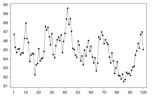
Почему стационарный процесс важен? Так как стационарность подразумевает нахождение процесса в состоянии статистической стабильности, то такие временные ряды имеют постоянное среднее значение и дисперсию, которые определяются стандартным образом.
Также для стационарного процесса определяется
функция автокорреляции
– совокупность коэффициентов корреляции значений временного ряда с собственными значениями, сдвинутыми по времени на один или несколько периодов. Сдвиг на несколько временных периодов часто называется лагом (обозначается k).
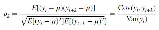
Функция автокорреляции является важным источником информации о временном ряде.
Примером стационарного процесса является колебания биржевого индекса, состоящего из стоимости акций нескольких компаний, около определённого значения (в период стабильности рынка).
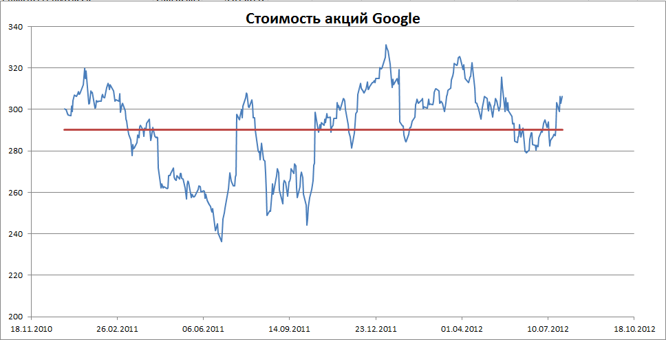
Примечание
: график стоимости акций построен на реальных данных, см.
файл примера Google
.
Специальным видом стационарного процесса является белый шум. У этого процесса: среднее значений ряда равно 0, имеется конечная дисперсия и отсутствует корреляция между значениями исходного ряда и рядом сдвинутым на произвольное количество периодов (лагов). В MS EXCEL белый шум можно сгенерировать функцией СЛЧИС().
2. Линейный тренд
Некоторые процессы генерируют тренд (монотонное изменение значений ряда). Например, линейный тренд y=a*x+b, точнее y=a*t+b, где t – это время. Примером такого (не стационарного) процесса может быть монотонный рост стоимости недвижимости в некотором районе.
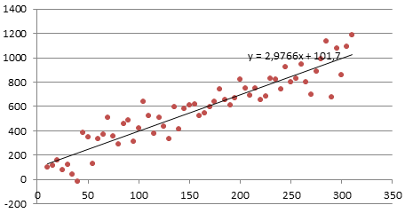
Для вычисления прогнозного значения можно воспользоваться методами
Регрессионного анализа
и подобрать параметры тренда: наклон и смещение по вертикали.
Примечание
: Про генерацию случайных значений, демонстрирующих линейный тренд, можно посмотреть в статье
Генерация данных для простой линейной регрессии в EXCEL
.
3. Процессы, демонстрирующие сезонность
В сезонном процессе присутствует точно или примерно фиксированный интервал изменений, например, продажи некоторых товаров имеют четко выраженный пик в ноябре-декабре каждого года в связи с праздником.
Для прогнозирования вычисляется индекс сезонности, затем ряд очищается от сезонной компоненты. Если ряд также демонстрирует тренд, то после очистки от сезонности используются методы регрессионного анализа для вычисления тренда.
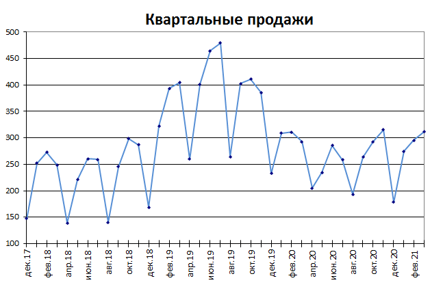
Примечание
: Про генерацию случайных значений, демонстрирующих сезонность, можно посмотреть в статье Генерация сезонных трендов в EXCEL.
Часто на практике встречаются ряды, являющиеся комбинацией вышеуказанных типов тенденций.
О моделях прогнозирования
В качестве простейшей модели для прогноза можно взять последнее значение индекса. Этой модели соответствует следующий ход мысли исследователя: «Если значение индекса вчера было 306, то и завтра будет 306».
Этой модели соответствует формула Y
прогноз(t)
= Y
t-1
(прогноз в момент времени t равен значению временного ряда в момент t-1).
Другой моделью является среднее за последние несколько периодов (
скользящее среднее
). Этой модели соответствует другой ход мысли исследователя: «Если среднее значение индекса за последние n периодов было 540, то и завтра будет 540». Этой модели соответствует формула Y
прогноз(t)
=(Y
t-1
+ Y
t-2
+…+Y
t-n
)/n
Обратите внимание, что значения временного ряда берутся с одинаковым весом 1/n, то есть более ранние значения (в момент t-n) влияют на прогноз также как и недавние (в момент t-1). Конечно, в случае, если речь идет о стационарном процессе (без тренда), такая модель может быть приемлема. Чем больше количество периодов усреднения (n), тем меньше влияние каждого индивидуального наблюдения.
Третьей моделью для стационарного процесса может быть
экспоненциальное сглаживание
. В этом случае веса более ранних периодов будут меньше чем веса поздних. При этом учитываются все предыдущие наблюдения. Вес каждого последующего наблюдения больше на 1-α (Фактор затухания), где α (альфа) – это константа сглаживания (от 0 до 1).
Этой модели соответствует формула Y
прогноз(t)
=α*Y
t-1
+ α*(1-α)*Y
t-2
+ α*(1-α)2*Y
t-3
+…)
Формулу можно переписать через предыдущий прогноз Y
прогноз(t)
=α*Y
t-1
+(1- α)* Y
прогноз(t-1)
= α*(Y
t-1
— Y
прогноз(t-1)
)+Y
прогноз(t-1)
= α*(ошибка прошлого прогноза)+ прошлый прогноз
При экспоненциальном сглаживании прогнозное значение равно сумме последнего наблюдения с весом альфа и предыдущего прогноза с весом (1-альфа). Этой модели соответствует следующий ход мысли исследователя: «Вчера рано утром я предсказывал, что индекс будет равен 500, но вчера в конце дня значение индекса составило 480 (ошибка составила 20). Поэтому за основу сегодняшнего прогноза я беру вчерашний прогноз и корректирую его на величину ошибки, умноженную на альфа. Параметр альфа (константа) я найду методом экспоненциального сглаживания».
Подробнее о методе прогнозирования на основе экспоненциального сглаживания можно
найти в этой статье
.
Полезный сигнал и шум
Из-за случайного разброса, присущему временному ряду, временной ряд представляют как комбинацию двух различных компонентов: полезного сигнала и шума (ошибки). Полезный сигнал следует одному из 3-х вышеуказанных типов процессов. Сигнал может быть смоделирован и соответственно спрогнозирован. Шум представляет собой случайные ошибки (со средним значением =0, отсутствием корреляции и с фиксированной
дисперсией
).
Основной задачей моделирования идентификация полезного сигнала, имеющего определенный тренд, от непредсказуемого шума. Для этого как раз и используются Модели сглаживания.

Ссылки на источники статистических данных и обучающие материалы
Все источники англоязычные.
Сайт о применении EXCEL в статистике
Национальный Институт Стандартов и технологии
https://www.itl.nist.gov/div898/handbook/pmc/section4/pmc4.htm
Using R for Time Series Analysis
https://a-little-book-of-r-for-time-series.readthedocs.io/en/latest/src/timeseries.html#time-series-analysis
Учебник по прогнозированию временных рядов
https://otexts.com/fpp2/
Данные по болезням в Великобритании
https://ms.mcmaster.ca/~bolker/measdata.html
Курсы в Eberly College of Science (есть ссылки на базы данных)
https://online.stat.psu.edu/stat501/lesson/welcome-stat-501
https://online.stat.psu.edu/stat510/