
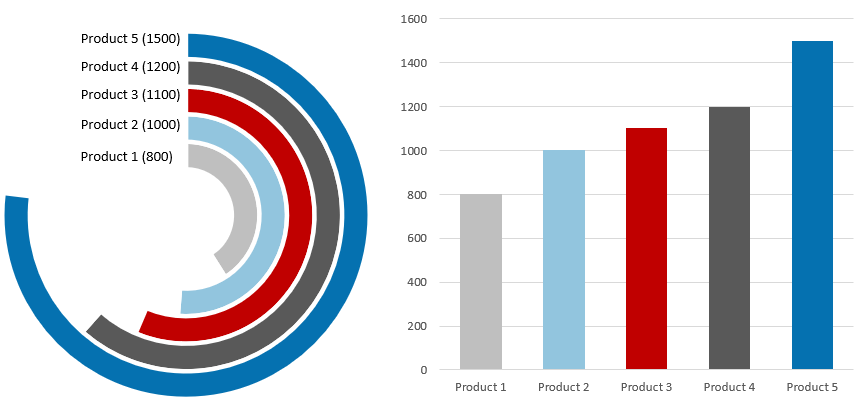
This tutorial will show you how to create a radial bar chart in Excel using stunning visualization to compare sales performance.
Good to know that a radial bar chart is one of the best solutions to create impressive infographic-style visualizations. Data visualization is king! First, let’s see a short introduction! After this, we’ll take you through creating the chart step by step. Finally, we’ll show you the VBA-based solution.
What is a radial bar chart?
A radial bar chart is called a multilayered doughnut chart because of its layout, but it is better to call it appropriately by its usual name because its origin is from the bar charts. It can help you get a better perspective on the numbers in your data, whether it relates to sales comparison, production, demographics, or more.
This article is a part of our Chart Templates series.
Radial Bar Chart: Differences between Cartesian and Polar coordinate systems
The radial bar chart evolved from the classical bar chart. The difference is that one uses polar and the other Cartesian coordinate systems. Let’s see the comparison with the help of a simple figure. On the left-hand side, we can see the info-graphics-style graph and, on the other hand, the classical bar chart.
Even if you are not familiar with data visualization, you can easily decide that the bar chart is very easily understandable at first glance.
What is the reason behind all this, and when is it more useful to apply one solution? As we have said, the radial bar chart represents a much higher visualization level. The problem is that our eyes are used to boring, ordinary charts and may misinterpret their meaning. Every column (bar) closes at a different angle, so the differences look relatively larger / smaller. This is most true about the outer rings.
Finally, we can conclude: Use a bar chart if the goal is to create an old-school report. But if our object is to build an impressive presentation, we can bravely choose the new generation of data visualization. If you follow this subject closely, you have seen that, for example, Tableau can create the chart in question. The time has finally come to enable Excel for this task.
How to create a radial bar chart in Excel?
Steps to create the base chart
This tutorial will show you how to create a radial bar chart to measure sales performance. First, let us see the initial data set! After that, we’ll compare five products.
Step 1: Check this range below! You can include the Product Name and Sales fields. The first field is placed in column ‘B’, and the second field is in column ‘C’. Using this data set, we’ll build a colorful radial bar chart in Excel.
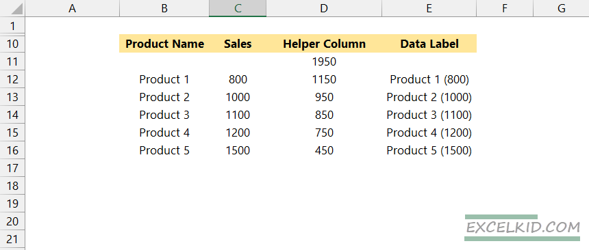
Step 2: Insert a helper column using column D. Enter the following formula in cell D11:
=MAX(C12:C16)*1.30Step 3: Add the formula “=$D$11-C12” to cell D12 and fill down the formula using the range “D12:D16”
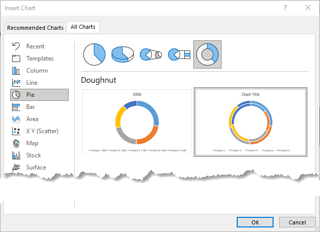
Step 4: Select the range “B11:D16”. Then, go to Ribbon and Insert tab, Chart, and Insert a Doughnut Chart.
text
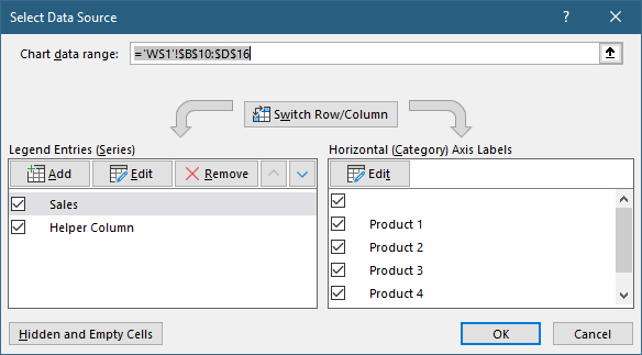
Step 5: Click on the inserted chart. Select the chart area. Right-click on the chart, and finally click on Select data”. Excel will open a new window.
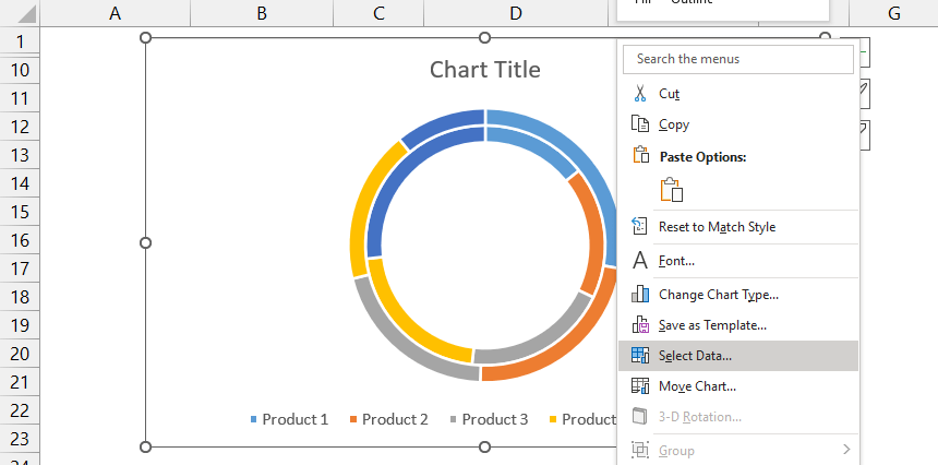
Step 6: Click on the Switch Row/Column button.
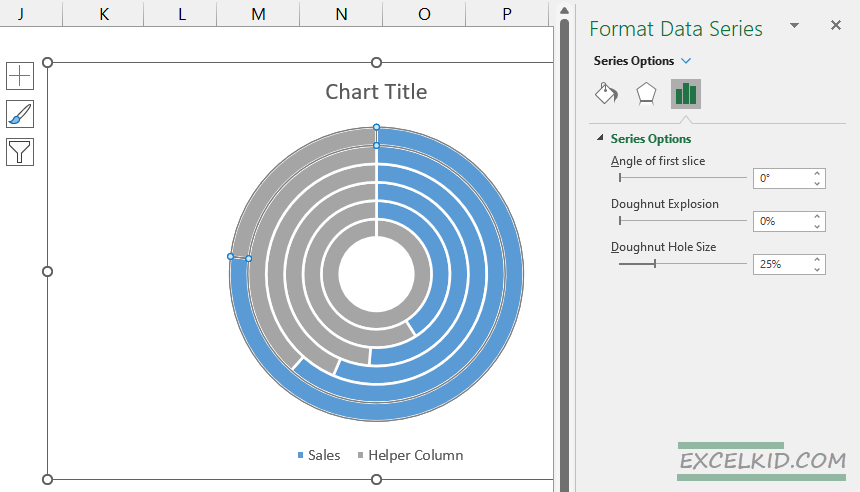
Step 7: Now, right-click on the doughnut and click on Format Data Series. Choose the donut hole size slider and set it to 25%.
Step 8: The most important step! Select the outer ring. Use the right-side pane and fill the orange area as No fill. Repeat these steps for the inner slices too.
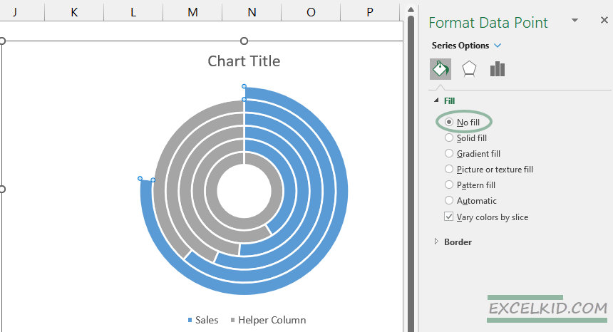
Step 9: Select the first grey slice and fill it in as your favorite color. We strongly recommend using divergent color schemes. You can create stunning schemes using ColorBrewer.
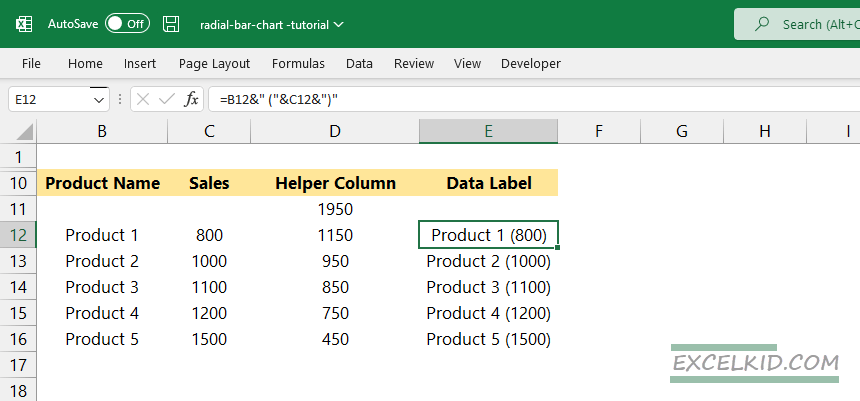
Prepare the labels for the radial bar chart
First, create a helper column for the data labels on column E. Then enter the formula =B12&” (“&C12&”)” on cell E12. You can use the CONCATENATE function also. Finally, fill down the formula for “E12:E16”.
Go to the Ribbon, and click on the Insert tab. Insert a Text box.
Now we’ll create a linked cell to the Text box. First, select the inserted text box. Next, jump to the formula bar and type: “=$E$12”.
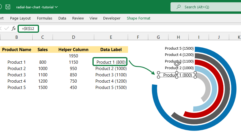
Insert the four more textboxes and link with cells D13, D14, D15, and D16.
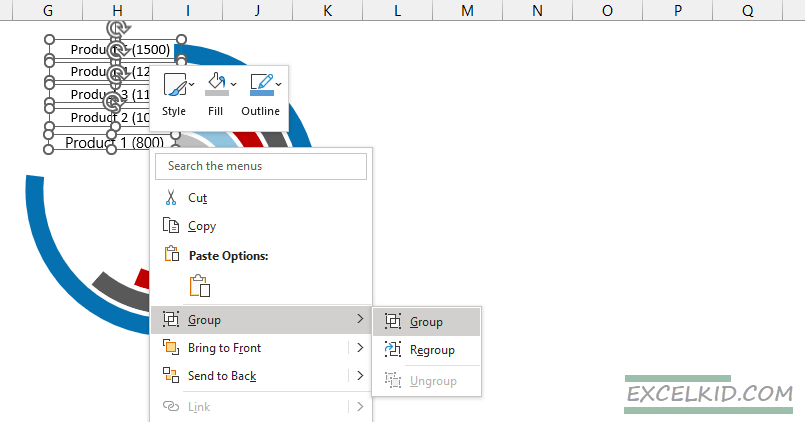
Format the labels together to create Groups
Hold Ctrl and select the five text boxes. Right-click, then choose Group from the list. You can apply various formatting methods. First, use No fill to create a transparent background for text boxes. Next, remove the border and select your favorite font.
The radial bar chart is ready to use!
Download the chart!
As you can see, it is not rocket science to create such a visualization in Excel. Of course, it needs manual work, but it’s manageable with some time. But what if we need to make ten, twenty, or even more charts in a short time? Excel doesn’t contain this type of chart as a default. Fortunately, there’s an automated answer for this challenge.
UDT is a professional Excel data visualization and chart add-in containing many special chart functions.
You can create spectacular presentations in two steps (in a mare of seconds). The dynamical radial bar chart is ready after giving the initial data sets with only one click. I think we don’t need to explain how much easier this makes the daily life of those involved in infographics.
The add-in is very easy to use; you don’t have to go outside Excel to get these done. The workflow is easy and allows you more productivity. You can focus on your primary business goals!
Final thoughts
The relationship between Excel and the radial bar chart didn’t start easy because we had to close a hole. But the work is worth it; we get a custom, easy-to-read graph. So if you need to build a sales comparison, we strongly recommend its use.
If you are familiar with VBA, you can create unique charts. Furthermore, you can automate everything with its help that has anything to do with Microsoft Office. Let it be Excel, Word, or even PowerPoint.
Additional resources:
- How to create a gauge chart in Excel
- Progress circle chart
The Radial Bar Chart is one of the best charts you can use to compare different categories in your raw data.
And this is because the chart is easy to read and interpret, just like a typical Bar Chart but this chart has a circular bar chart look.


One of the critical components of a compelling data story is the use of easy-to-interpret and straightforward visualizations. And this is where the Radial Bar Chart comes in.
Visualizing your data using Radial Bar Chart in Excel does not need to be overwhelming and time-consuming, primarily if you use Excel.
Why?
To visualize your data using Radial Bar Chart in Excel, you have to follow complex and time-consuming steps. Besides, getting lost through the process is incredibly easy.
Did you know you can supercharge your Excel by installing a third-party add-in with a ready-to-use Radial Bar Chart?
Well, in this blog, you’ll learn:
- How to use a Radial Bar Chart in your data stories.
- The best add-in to install to access ready-to-use Radial Bar Chart in Excel.
Before we delve right into the how-to guide, let’s define the chart and explore its practical application in-depth.
In this blog you will learn:
- What is a Radial Bar Chart?
- Video Tutorial: How to Create Radial Bar Chart in Excel
- The Best Visualization Tool to Generate Radial Bar Chart
- How to Install ChartExpo in Excel to Create Radial Bar Graph?
- How to Create Radial Bar Chart in Excel: Easy to Follow Steps
- Customizing the Radial Bar Chart in Excel:
- Uses of a Radial Bar Chart in Excel
- When Should You Use a Radial Bar Chart in Excel?
- Advantages of Radial Bar Chart
Video Tutorial: How to Create Radial Bar Chart in Excel?
Let’s learn how you can create Radial Bar Graph in Excel using your data in the following video.
What is a Radial Bar Chart?
Definition: A Radial Bar Chart is a version of Bar visualization plotted on a polar coordinate system, rather than on a Cartesian one.
This chart shares immense similarities with the multilayered Donut Chart, (also a version of the Bar Chart). In other words, interpreting this chart is just as easy as getting insights from Bar Visualization Designs.
Each bar on the outside gets relatively longer than the preceding one. In addition, each bar has a varying radius and angle.

Visualization Source: ChartExpo
Just like a Bar Graph, the circular bars in a Radial Chart represent the changes in variables in your data. In other words, the sizes of the almost circular bars depict the magnitude of change in variables.
For instance, in the Radial Chart (above), the US beats all other countries in terms of medals won. The shorter the bar: the smaller the change in a variable. Similarly, longer bars depict massive changes in the metric under study.
The Best Visualization Tool to Generate Radial Bar Chart
There are a plethora of tools out there you can use to visualize your data using a Radial Bar Chart.
Excel is one of them.
It’s very understandable why people trust Excel as their chosen tool for visualizing data. For starters, the tool has been there for decades. Furthermore, Excel’s interface is familiar and friendly to a majority of business owners and professionals.
But, generating Radial Bar Chart in Excel is not a walk in the park. Excel lacks a ready-made Radial Bar Graph you can use to visualize data.
Besides, the process of customizing existing charts to create a Radial Bar Visualization is time-consuming and complex.
Here’s the kicker.
You don’t have to do away with Excel. You can simply download and install a third-party add-in called ChartExpo.
What is ChartExpo?
ChartExpo is loaded with a ready-to-use Radial Bar Chart, plus 50 other insightful and visually-appealing advanced graphs.
You don’t have to be armed with coding/programming skills to use ChartExpo. In fact, you only need basic knowledge of visualization to operate the Excel add-in without hitches.
Why should you sign up for ChartExpo?
- ChartExpo has an in-built library with over 50 ready-to-use charts.
- ChartExpo is cloud-hosted, which makes it extremely light. You have a 100% guarantee that your computer or Excel won’t be slowed down.
- You can export your Radial Bar Chart in JPEG and PNG, the world’s most-used formats for sharing images.
- ChartExpo add-in for Excel comes with a free 7-day trial. If not satisfied with the tool within a week, you can opt out with no strings attached.
How to Install ChartExpo in Excel to Create Radial Bar Graph?
Here is the complete step-by-step guide on how you can install the ChartExpo add-in Excel application.
How can you access ChartExpo in Excel?
Once you have installed ChartExpo, you can simply access it in Excel by following the steps mentioned below:
- Open your Excel application.
- Open the worksheet and click the Insert button to access the My Apps option.
- Click the My Apps button and then the See All button to view ChartExpo, among other add-ins.

- Select ChartExpo add-in and click the Insert button.

- It may ask you the login for the first time, once you are logged in, it won’t ask you again. You will find the following list of charts on your screen.

How to Create Radial Bar Chart in Excel? Easy to Follow Steps
There’re two ways you can access your Radial Bar Chart in Excel.
Method #1:
- Click the search box and type “Radial Chart.”
- Once the Chart pops up, click on it to continue.

Method #2
- Browse through the 6 main categories of charts.
- The Radial Chart is located in the Pay-per-Click category, as shown below.

How to Visualize Data Using ChartExpo’s Radial Bar Chart in Excel?
Let’s use the tabular data below for our example. We’ll be comparing the performance of various regions in terms of sales generated for a hypothetical brand.
| Regions | Sales ($) |
| USA | 1,200,000 |
| Canada | 750,000 |
| UK | 500,000 |
| Australia | 240,000 |
| China | 190,000 |
You can put your above data in Excel Sheet and then click on “Create Chart From Selection” button on ChartExpo window.

- Check out the final Radial Bar Chart.

Customizing the Radial Bar Chart in Excel:
You can click on “Edit Chart” button to change the different properties to add some header on chart, put some dollar sign with stats and much more. The following look can be created by changing the properties.

Insights
- The United States lead in sales ($1.2 million) followed by Canada ($750,000).
- China is the worst-performing region. It accounts for $ 190,000 of the total sales ($2.8 million)
Example #2
In this example, we’ll use the Radial Bar Chart in Excel to visualize the data (below). We’ll be comparing the performance of countries in terms of gold medals won in a hypothetical sports competition.
Let’s dive in.
| Countries | Gold Medals |
| USA | 39 |
| China | 38 |
| ROC | 20 |
| UK | 22 |
| Japan | 27 |
| Australia | 17 |
| Italy | 10 |
| Germany | 10 |
To visualize the data above, follow the steps below.
- Select the relevant sheet then relevant columns and rows in which data is present.
- Click “Create Chart From Selection” button, as shown.


- The title You can put as “Olympic Gold Medal 2021 Analysis” by clicking on Edit Chart button and then click pencil icon on header section to see the properties.
Insights
- In 2021, The United States has the highest number of gold won (39) followed closely by China (38).
- Germany and Italy have the lowest number of gold won (10 each).
Uses of a Radial Bar Chart in Excel
One of the key uses of a Radial Bar Chart is comparing key data points.
The chart uses circular-colored shapes to display comparison insights into key categories in your raw data. The angle and radius of the bar play a vital role in the visualization design.
Secondly, you can use the chart to create compelling data stories for your target audiences (and readers). And this is because a Radial Bar Chart is incredibly easy to interpret.
Lastly, you can use the chart to visualize continuous data series across time, such as sales revenue.
When Should You Use a Radial Bar Chart in Excel?
Use the Radial Bar Chart in situations that require you to display multivariable data in a 2D plane.
To get the most from this chart, use it to perform the following tasks:
-
Comparison of entities
You can use the Radial Bar Chart to compare varying metrics in your data. For instance, you can use the chart to compare the profitability of various locations in a given period.
The chart displays comparison insights using different color shades.
-
In-depth Analysis
A Radial Bar Chart in Excel is the go-to visualization design if your goal is to uncover hidden insights into key variables in your data. For instance, you can easily point out how a particular metric, such as expenses has changed over time.
-
Decision-making With Summary View
You can leverage the Radial Bar Graph to display insights in a data story to power strategic decisions in your workplace or business.
And this is because the chart is amazingly easy to interpret.
You can also use the chart to visualize data in a wider range of sectors, such as digital marketing, sales, research, education, finance, among others.
Advantages of Radial Bar Chart
- The Radial Bar Chart is the go-to visualization design if you want to compare key data points.
- The chart is amazingly easy to interpret, irrespective of your experience or expertise.
- You can easily decode insights by simply checking the size of circular bars and varying color shades.
Avoid a Radial Bar Chart in Excel in the following scenarios
- Visualizing a lot of variables simultaneously can result in clutter. And this can obscure the key takeaways you want your audience (or readers) to take note of.
- We recommend you avoid using a Radial Bar Chart to visualize trade-off decisions or compare vastly distinctive variables in your data.
FAQs:
What is a Radial Bar Chart?
A Radial Bar Chart (also called a Circular Bar Chart) uses circular shapes to compare key metrics in your data.
The chart shares a resemblance with Bar Charts. But, they use circular bars to display insights. Use this chart to compare the performance of key variables in your raw data.
How can you make a Radial Bar Chart?
Excel spreadsheet’s library lacks ready-made Radial Bar Graphs. Essentially, you have to follow a super time-consuming process to visualize your data using the chart.
But, you can supercharge your Excel with third-party add-ins, such as ChartExpo to access ready-to-use Radial Charts.
Wrap Up:
Extracting comparison insights from raw data is one of the key steps towards tracking growth.
Yes, you read that right.
You need the best chart for displaying comparison insights.
This is where the Radial Bar Chart comes in.
Use the chart if your goal is to display in-depth insights into how key metrics stack up against others. Avoid using Excel if your goal is to save time and generate ready-to-use, high quality, and easy-to-interpret Radial Bar Chart in Excel.
To visualize your data using this chart in Excel, you have to follow a super-long and time-consuming process.
To avoid the challenge (above), we recommend you to install third-party apps, such as ChartExpo into your Excel to access ready-made and visually stunning Radial Bar Charts.
Essentially, ChartExpo is an add-in you can easily download and install in your Excel app. More so, the tool comes loaded with ready-to-use Radial Charts, plus over 50 more advanced visualization designs.
Sign up for a 7-day trial to enjoy unlimited access to easy-to-interpret and visually appealing Radial Bar Charts.
These days, there are many fun, vibrant and creative ways to visualize your data. Beyond the usual bar, line, and pie charts, there are many add-ins that can help you spruce up your data and related reports. One of these is the Radial Bar Chart add-in for Excel.
The Radial Bar Chart add-in by Keyur Patel is a very colorful radial bar chart app that you can use within Excel. It can help you make your data interesting and eye-catching. Still, you can be confident that you’re displaying your data accurately and in a way that can allow you or your audience to identify trends and analyze the information clearly.
Clearly Visualize Data and Relationships in Excel
Having the Radial Bar Chart provides you with a clear-cut representation of various aspects and values related to your selected data set in Excel. The vibrant colors allow you to differentiate one information from the other. Furthermore, the look of your Radial Bar Chart can be easily customized to suit your brand, color scheme, or simply your preference. The add-in is very easy to use and best of all, you don’t have to go outside Excel to get these done.
All you have to do is to download the Radial Bar Chart from the Microsoft AppSource. You just have to login with your Microsoft account and access a wide range of add-ins to extend the functionality of your Office programs, in this case, Excel.
In the AppSource portal, you can go over the wide range of add-in offerings in the categories section. You can also search for the specific add-in or keyword in the search bar for faster results.
You can also download the add-in within Excel so you don’t have to leave your program or be distracted from your work. You don’t have to download a separate program or subscribe to anything. The workflow is seamless, allowing you more efficiency so you can focus on what really needs to be done. Furthermore, you can work seamlessly as well across all devices. This is because all you have to do is to download your desired add-ins only once in one device, and as long as all your other devices are logged in with your Microsoft credentials, they will all be synced. This means you don’t have to keep installing every add-in on every device and run the risk of losing track of your important add-ins, therefore disrupting your work and making you even less productive.
Visualize Date Clearly and Creatively
With the help of the Radial Chart add-in for Excel, you can create great-looking data visualizations that represent how each item relates to the whole. It can help you get better perspective on the numbers in your data, whether it relates to sales, employee performance, production, manufacturing, delivery, logistics, demographics, and many more.
Best of all, using this Radial Chart is free. There’s no need to sign up for any service or to give out your account information. After downloading and installing the add-in, you can go ahead and use it right away. You can also create as many radial charts as you want, and customize them based on your desired color scheme or your brand requirements.
You can also embed this in your PowerPoint presentations, Word documents, and other programs for reports and presentations without worrying about losing the data or disrupting its look.
This add-in is great for work or school use, allowing you to beautifully and clearly visualize your data.
В Excel радиальная линейчатая диаграмма развивается из классической линейчатой диаграммы, ее также называют многослойной кольцевой диаграммой из-за ее макета, как показано на скриншоте ниже. По сравнению с обычной гистограммой, радиальная гистограмма отображается в полярной системе координат, что более профессионально и впечатляет людей, кроме того, она позволяет лучше использовать пространство, чем длинная гистограмма. В этой статье я расскажу, как шаг за шагом создать этот тип диаграммы в Excel.

- Создать радиальную гистограмму в Excel
- Создавайте радиальную гистограмму в Excel с помощью удобной функции
- Загрузите файл примера радиальной гистограммы
- Видео: создание радиальной гистограммы в Excel
Создать радиальную гистограмму в Excel
Предположим, у вас есть список заказов на продажу на каждый месяц, как показано на следующем снимке экрана. Чтобы создать радиальную гистограмму на основе этих данных, выполните следующие действия:

Сначала создайте данные вспомогательного столбца
1. Сначала вставьте новую пустую строку под строкой заголовка, а затем введите следующую формулу в ячейку C2 и нажмите клавишу Enter ключ для получения результата, см. снимок экрана:
=MAX(B3:B7)*1.3

2. Продолжайте вводить приведенную ниже формулу в ячейку C3 и перетащите дескриптор заполнения вниз к ячейкам, чтобы применить эту формулу, см. Снимок экрана:
=$C$2-B3

3. После получения первых вспомогательных данных создайте вторые вспомогательные данные, которые используются в качестве метки данных для диаграммы, введите приведенную ниже формулу в ячейку D3, а затем перетащите дескриптор заполнения в ячейки для заполнения этой формулы, см. Снимок экрана. :
=A3&», «&B3

Во-вторых, создайте диаграмму на основе данных
4. Выберите диапазон данных от A3 до C7, а затем нажмите Вставить > Вставить круговую или кольцевую диаграмму > Пончик, см. снимок экрана:

5. И диаграмма была вставлена в лист, теперь выберите диаграмму, затем нажмите Переключить строку / столбец под Дизайн вкладку, см. снимок экрана:

6. Затем вы получите диаграмму, как показано на скриншоте ниже:

7. Щелкните пончик правой кнопкой мыши и выберите Форматировать ряд данных из контекстного меню см. снимок экрана:

8. В открытом Форматировать ряд данных панель, под Варианты серий выберите вкладку Размер отверстия для пончика и установите его на 25%. Смотрите скриншот:

9. Затем дважды щелкните, чтобы выбрать внешнее кольцо (оранжевое кольцо), а затем выберите Без заливки из Заполнять раздела под Заливка и линия вкладку, см. снимок экрана:

10. Повторите вышеуказанный шаг, чтобы заполнить Без заливки для внутренних ломтиков один за другим, и все апельсиновые ломтики невидимы, см. снимок экрана:

11. Теперь, пожалуйста, дважды щелкните, чтобы выбрать первый синий кусочек и залейте его желаемым цветом, а затем залейте другие синие кусочки разными цветами, которые вам нужны, см. Снимок экрана:

12. Затем вы должны добавить метки данных в диаграмму, нажмите Вставить > текст Box > Нарисовать горизонтальное текстовое поле, а затем вставьте нужное текстовое поле, а затем выберите вставленное текстовое поле и перейдите к строке формул, введите = $ D $ 7 чтобы создать связанную ячейку с текстовым полем, см. снимок экрана:
Внимание: D7 — это метка данных, которую вы хотите добавить в диаграмму, срезы диаграммы инвертированы диапазону данных, поэтому последняя строка ячейки в диапазоне является меткой данных внешнего кольца.

13. Затем повторите описанный выше шаг, чтобы вставить текстовые поля для других 4 срезов и связать их с ячейками D6, D5, D4, D3 от внешнего к внутреннему кольцу. А затем вы можете отформатировать текстовое поле без заливки и без рамки, как вам нужно, тогда вы получите диаграмму, как показано ниже:

14. После вставки текстового поля удерживайте Ctrl нажмите клавишу, чтобы выбрать все текстовые поля, а затем щелкните правой кнопкой мыши, выберите группы > группы чтобы сгруппировать текстовые поля вместе, см. снимок экрана:

15. Затем вы должны сгруппировать текстовое поле с диаграммой, нажмите Ctrl , чтобы выбрать текстовое поле и область диаграммы, а затем щелкните правой кнопкой мыши, чтобы выбрать группы > группы, см. снимок экрана:

16. Наконец, радиальная линейчатая диаграмма была успешно создана, при перемещении диаграммы метки данных также будут перемещены.

Создавайте радиальную гистограмму в Excel с помощью удобной функции
Загрузите файл примера радиальной гистограммы

Видео: создание радиальной гистограммы в Excel
Лучшие инструменты для работы в офисе
Kutools for Excel — Помогает вам выделиться из толпы
Хотите быстро и качественно выполнять свою повседневную работу? Kutools for Excel предлагает 300 мощных расширенных функций (объединение книг, суммирование по цвету, разделение содержимого ячеек, преобразование даты и т. д.) и экономит для вас 80 % времени.
- Разработан для 1500 рабочих сценариев, помогает решить 80% проблем с Excel.
- Уменьшите количество нажатий на клавиатуру и мышь каждый день, избавьтесь от усталости глаз и рук.
- Станьте экспертом по Excel за 3 минуты. Больше не нужно запоминать какие-либо болезненные формулы и коды VBA.
- 30-дневная неограниченная бесплатная пробная версия. 60-дневная гарантия возврата денег. Бесплатное обновление и поддержка 2 года.
")
Вкладка Office — включение чтения и редактирования с вкладками в Microsoft Office (включая Excel)
- Одна секунда для переключения между десятками открытых документов!
- Уменьшите количество щелчков мышью на сотни каждый день, попрощайтесь с рукой мыши.
- Повышает вашу продуктивность на 50% при просмотре и редактировании нескольких документов.
- Добавляет эффективные вкладки в Office (включая Excel), точно так же, как Chrome, Firefox и новый Internet Explorer.
")
Here is a free Excel add-in to create radial bar chart for table data. That means if a data is created using Table feature of Excel, then this add-in can help you generate a beautiful radial chart using that data. The name of this add-in is ‘Radial Bar Chart‘ and it works with Excel 2013 or later.
This add-in can generate bar chart for all the columns available in your table data. However, at a time, it can generate the graph for two selected columns only. It also provides three different color themes for the graph. All these features are really good, but you can’t save the generated chart, which I didn’t like. At least, there should be an option available to save the graph as an image.

Above you can see the radial bar chart created by me for a table data using this Excel add-in.
Here are some other Excel related tutorials for you:
- How to Create Lists, Navigate, Highlight Rows.
- How To Round Numbers In Excel Worksheets Easily.
- How To Filter Multiple Items From Columns In Excel.
How To Create Radial Bar Chart from Table Data Using This Excel Add-In?
Step 1: Use this link to install this Excel add-in. You must be signed in to your Office account to install the add-in.
Step 2: After installation, open Excel 2013 or the higher version installed on your PC.
Step 3: Now create a data table or load an Excel file that contains your table data. After that, go to INSERT tab and click on Apps for Office option. This will help you select the add-in and insert. You must have signed in with the same account to access and insert the add-in.

Step 4: The pop-up of the add-in will be in front of you. On that pop-up, there will be a Settings icon. Click that icon.

Step 5: Now you need to set a couple of options. First of all, you have to select data (rows and columns). When the data is selected, it will let you select Label and Number (for which the graph will be generated) using the drop down icons.

Step 6: Select a particular theme (Orange & Blue, Night Vision, and Touch of Pink), give a name to the output graph, and press Save button. A beautiful radial bar chart will be in front of you.
You can again access Settings to change the options and generate the graph.
The Verdict:
The add-in is fantastic and very easy to use to generate radial bar chart for table data. Three different themes are also available. Everything is really good, except the missing feature (save the graph as an image).
Get this add-in.
|
Editor Ratings: |
|
|
User Ratings: [Total: 5 Average: 2.6] |
|
| Home Page URL: | Click Here |
| Works With: | Excel 2013 or Later |
| Free/Paid: | Free |
|
Tags: excel |
Tracking how much of the planned activity, progress or goals have been completed is a crucial task in any project.
Why?
It enables project managers to allocate resources in a way that minimizes costs and maximizes value. Besides, it promotes efficiency and ensures a project is completed within the set time frame.
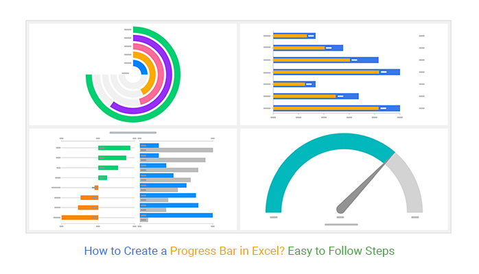


To track milestones achieved, you need the best charts in the business, which are Gauge Charts, Overlapping Bar Charts, and Radial Charts.
These Progress Bar Charts are amazingly easy to read and interpret, even for non-technical audiences.
So how can you access a ready-made Progress Bar Chart in Excel?
Excel is one of the popular visualization tools among project management professionals. However, Progress Bar in Excel is pretty basic, which means you have to spend more time editing them to fit within your requirements.
You have an option of installing an add-in into your Excel to access ready-to-use and visually appealing work progress charts.
In this blog, you’ll discover:
Table of Content:
- What are Progress Bar Chart?
- What does a Progress Bar Do?
- Tool for Generating Ready-made Progress Bar in Excel
- How to Create Progress Bar Chart in Excel?
- Video Tutorial: How to Create Overlapping Bar Chart to show Progress Bar in Excel?
- What are the Advantages of Progress Bar in Excel?
- How to Choose the Right Visual for Your Data?
- How to Improve your Business Performance with Charts?
- Wrap up
Before we jump right into the heart of the blog, let’s define the chart.
What are Progress Bar Charts?
Progress Bar Charts are visualization designs that display the progress made in a task, activity or project. You can use these charts to monitor and prioritize your objectives, providing critical data for strategic decision-making.
The Progress bar in Excel uses filled bars to display how much of the planned activity or goal has been completed.
There are different types of progress bar charts that can be used for displaying progress. Charts shown in this blog are created by ChartExpo which is a Chart Add-in for Excel.
-
Overlapping Bar Chart
An Overlapping Bar chart is best-suited in comparing two distinct variables. An Overlapping Bar Chart is more valuable than the Stacked Bar Chart, especially if your goal is to display comparison insights.
![]()
The visualization design is similar to a standard Stacked Bar Chart. However, unlike a Stacked Diagram, its composite variables that contribute to the whole, start at the baseline.
Besides, the chart requires three data columns or rows from your data set one for categories, one for the series in each category, and one for values.
The chart is more valuable than the Grouped Bar Chart because it uses color strategically to display comparison insights. More so, you can leverage the chart to display insights into current progress against the benchmark.
-
Gauge Chart
A Gauge Chart is one of the most commonly used progress charts for visualizing progressive values. Besides, it’s also known as a speedometer chart.
![]()
The chart looks like a speedometer or a dial (in most cases) with a needle pointing to a certain value over the pivot point. The dial usually has different colors that divide the scale into several parts.
The use of contrasting colors has profound effects on our brains to easily identify “target” and “achieved”.
-
Radial Bar Chart
A Radial Bar Chart is a version of Progress Bar Charts plotted on a polar coordinate system rather than on a Cartesian one. A Radial Chart is also called a Circular Bar Chart.
![]()
This chart shares immense similarities with the multilayered Donut Chart. A version of the Classical Bar Chart. In other words, interpreting this chart is just as easy as getting insights from the Bar Visualization Designs.
Each bar on the outside gets relatively longer than the preceding one. In addition, each bar has a varying radius and angle.
Like a bar chart, the bars in this chart represent the changes in variables in your data. So the sizes of the almost circular bars depict the magnitude of change in variables. Let’s analyze the progress of the sales by the team using an easy-to-use Radial chart maker.
-
Progress Chart
This progress chart is specially provided by ChartExpo to use in Excel. You can see the results side by side and also can see the difference between them in the same visualization.
![]()
If the difference is positive it will appear as the green color and if it will be negative it will appear as red color. These colors, sorting of data and other properties are all customizable.
Have you installed ChartExpo yet in your Excel? If not then click on the link below and install it in your desired tool.
What does a Progress Bar Do?
A Progress Chart is significant, especially in tasks that require continuous monitoring and evaluation. These charts use bars to show the growth of a variable under study.
To visualize your data using Progress Bar Charts, you need a tool. The best visualization tool should have the following attributes, namely:
- Flexibility
To have a seamless experience in visualizing your data, you need a flexible tool.
- Aesthetics
The aesthetics of an online charting tool comes in handy when choosing the right data visualization tool for your work. Yes, aesthetics may not have any functional value, but it adds spice to your data stories.
- Shareability
A tool that allows you to collaborate with others is very handy, especially in the pandemic period. It would help if you had a tool to share and collaborate with others in visualization tasks.
Keep reading because, in the coming section, we’ll be recommending the best excel add-in you should download and install in Excel to access the ready-to-go Progress Bar Charts.
Besides, the add-on (mentioned above) meets all the attributes we’ve just highlighted above.
Excel does not natively support all types of Progress Bar Graphs. And this means you have to plot the chart from scratch using other tools.
You have an option of installing a particular add-in called ChartExpo to access ready-to-use Progress Bar visualizations.
A Progress Bar in Excel such as an overlapping bar chart uses different lengths and colors to track the pattern of variables. Its rectangular bars are oriented horizontally or vertically. One axis depicts categories, while the other shows numerical values related to two variables.
Take a look at the table below.
Can you provide meaningful insights by just taking a look at the table below?
| Projects | Expectation | Progress |
| Breeze | 100 | 66 |
| Point | 100 | 88 |
| Mecha | 100 | 60 |
| Synergy | 100 | 88 |
| Zen | 100 | 52 |
Note the difference after visualizing the data above.

Insights
- Point and Synergy projects are 88% completed.
- Zen is the least completed project.


How to Create Progress Bar Charts in Excel? Step by Step Guide with Example
ChartExpo is a data visualization tool that goes above and beyond data.
Using a complete set of tools (below):
- A graph maker
- Chart templates
- A data widget library
You can easily create Work Progress Bar Charts that are simple, easy, and clear to read.
The tool comes with a library with many advanced charts and graphs. Did we mention you can easily export charts to make stunning social media reports, sales reports, and goal projections easily using a wide range of ready-to-go charts?
ChartExpo is for anyone who needs to create data visualizations and visual graphics for various purposes, such as blogs and reports.
But most of all, ChartExpo is for professionals and business owners who need to create beautiful excel charts and graphs without design skills.
Example of Creating Progress Bar Chart (Overlapping Bar Chart) in Excel:
Once you’ve installed ChartExpo in Excel, follow the steps below
- Copy your data into Excel.
- Open the worksheet and click the Insert button to access the My Apps.

- You can select ChartExpo from the list and click on Insert.

You will see a list of charts available.

- Click on “Overlapping Bar Chart” in the list of charts as shown below.
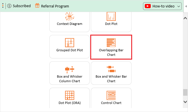
- You can click on it to see the details so that you can create this chart.
- Select the columns and rows where your data is present and then click on Create Chart From Selection.
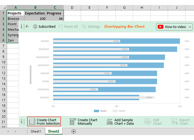
- Check out the final Progress Bar (Overlapping Bar) in Excel, as shown below.

How to create Progress Bar Chart in Excel should never be a complex or overwhelming task. Use ChartExpo to create Progress Bar Chart in Excel in a few clicks as shown above.


How to Edit Chart Using ChartExpo?
A title is one of the key pieces of information you need to help your audience understand the context of your data story.
To add a title to the Chart, follow the easy steps below:

- Click the Edit button and then click the pencil-like icons, near the title placeholder.
- Once the Chart Header Top Properties window pops up, in Line 1, fill in the title- Projects Progress Analysis, click on Toggle to show, change the font size and click on Apply.

- Similarly, you can add label text to the left axis.
- Save your new changes by clicking the Apply button, as shown below.

- As this data is about progress, we should have a “%” sign with the axis values.
- You can set this property for both the left and right axis by clicking on the pencil icon. Once done you can click Apply All.

- Similarly, you can add a Postfix for values.
- Once you are done with all these, you can click on Save Changes.
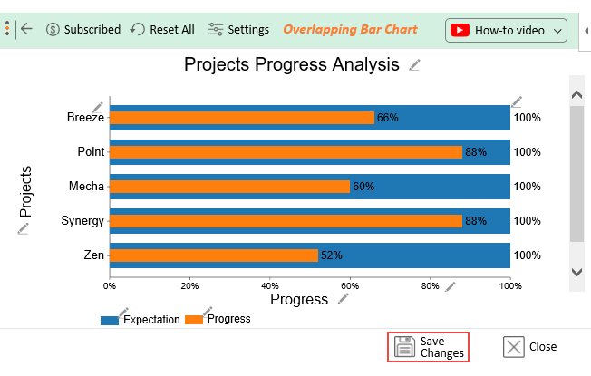
- You will have a final visualization as shown below.

Now you have learned how easily you can show the progress of different projects or tasks in excel.
Video Tutorial: How to Create Overlapping Bar Chart to show Progress Bar in Excel?
In the following video, you can learn how to create Overlapping Bar Chart in excel. You can use this chart to show the progress of different tasks and projects.
What are the Advantages of Progress Bar in Excel?
- Progress Bar Graphs (also known as Work Progress Charts) are pretty easy to interpret. The red bars denote decline while the blue ones show growth of a variable.
- You can use Progress Bar Charts in Google Sheets and Excel to visualize bulky and complex data without clutter.
- The purpose of a Progress Bar Chart is to convey relational insights into your data faster.
How to Choose the Right Visual for Your Data?
Charts, such as Progress Bar in Excel, are incredibly significant to businesses as they promote data-driven decision-making.
Visualization charts can convey much information faster than spreadsheets and tables full of numbers. And this means they empower business people to make reliable and informed decisions.
But which kind of chart or graph should you choose?
If you click on the chart option in your spreadsheet program, you’ll likely be presented with many styles. They all look visually appealing, but which one works best for your data and audience?
Not all visualizations are for every data.
Date-based data is best visualized using Line Charts. On the other hand, Pie Charts are mostly used to display part-to-whole relationships in raw data. Similarly, you can use Sankey Diagram to show the flow of data and comparison charts to compare different dimensions and categories.
The following factors should guide your preference:
- Size of data
- Nature of the audience
- Data type
- Clutter
How to Improve your Business Performance with Charts?
Check out below how your business can benefit from charts.
-
Analyze Data for Insights Faster
Charts, such as Progress Bar in Excel, can help your business focus on the areas that require urgent attention.
-
Faster Decision Making
We naturally interpret visual content faster than numbers and texts. Visualization designs, such as Work Progress Charts act as a bridge between raw data and decision-making in today’s world.
-
Handle Bulky and Complex Data
Business charts and graphs can help you gain insights into vast and bulky data sets. Making sense of the insights puts you in a strategic position to spot red flags or progress.
FAQs:
How is the Progress Bar in Excel best used?
A Progress Bar Chart is a visualization design you can leverage to display the progress made in a task or project. The visualization design is best suited to monitor and prioritize your objectives, providing critical data for strategic decision-making.
It uses filled bars to display milestones achieved in a project.
Why is a Progress Bar Chart more effective than other Graphs?
Progress Bar Charts are amazingly easy to read and interpret. You can use the chart to track the milestones achieved against a particular target or deadline.
The visualization design uses a series of red and green bars to depict decline and growth, respectively.
Wrap Up
Tracking how much of the planned activity or goals have been completed is a crucial undertaking in any project.
And this is because it enables project management professionals to allocate resources to minimize costs and maximize value. Also, ensures a project is completed within the set time frame.
To track milestones achieved in a project, you need the best charts in the business, which is where the Progress Bar in Excel comes in.
Progress Bar Charts are amazingly easy to read and interpret due to their minimalist design.
So how can you access ready-made Work Progress Charts?
Excel should not be your go-to visualization tool if you want to leverage the chart for in-depth insights. The spreadsheet application lacks ready-to-use and visually appealing Stacked Bar Charts.
How to create Progress Bar Chart in Excel should never be a complex or overwhelming task.
We recommend you install third-party apps, such as ChartExpo, into your Excel to access ready-made and visually appealing Progress Charts.
ChartExpo is an Excel-based add-in with an insightful and easy-to-interpret Progress Bar Chart, plus many more advanced visualization designs. You don’t need programming or coding skills to visualize your data using the tool in your Excel.
Sign up for a 7-day free trial today to access ready-made and visually appealing Progress Bar Charts for your data story.
Microsoft Excel in its 2016 or 2019 editions becomes one of the most complete, dynamic and versatile solutions for everything related to the management of large amounts of data which would be complex to work under other circumstances. The data can be text, dates or numerical and when we implement Microsoft Excel for this data control we will have a large set of tools to represent this data in a complete, professional and true way..
One of the most common ways to present a report of the data provided is by using Excel charts, we have more than 10 alternatives such as:
Excel charts
- Linear graphics
- Column charts
- Map graphics
- Bar charts
- Waterfall graphics and many more
One of the most versatile graphics integrated in Microsoft Excel 2016 or 2019, is the radial chart which can also be known as Spider chart, Network chart, Polar chart or Star chart and which has three categories that are:
Excel graphics
- Radial graphic
- Radial chart with markers
- Radial Fill Chart
By using a radial graph it will be possible to visualize the selected data in a two-dimensional way and in the process show the differences between the existing subgroups in the selected range. Basically when we create a radar chart, it will be possible to make a comparison between the values of three or more selected variables taking as a relation a central point in the active Excel sheet.
One of the main functions of a radar chart is to determine which variables have highs or lows within the selected data set and thus define precisely the results that you want to show to users. In a radar chart, each variable has an axis located in the center of the graph, so all axes will be located radially, using equal distances from each other, this allows the scaling to be identical between all the axes available in the graphic..
The grid lines, which are connected from axis to axis, are useful as a guide and each variable value will be plotted along its own individual axis and to all the variables that are connected and this results in them being form a polygon figure.
Note
This tutorial will be done in Excel 2019 but the same process applies to Excel 2016.
1. How to create a radial chart in Microsoft Excel 2019, 2016
Step 1
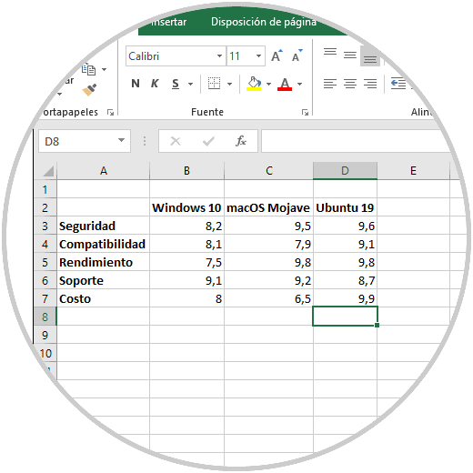
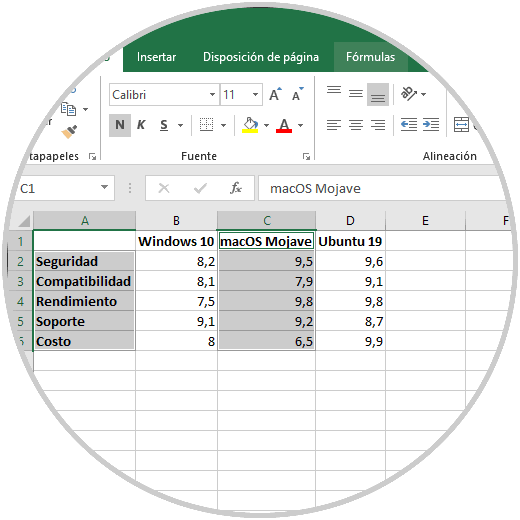
To start the process of creating our radial chart in Excel 2019 we have the following data where a series of characteristics of some of the best known operating systems will be evaluated:
Step 2
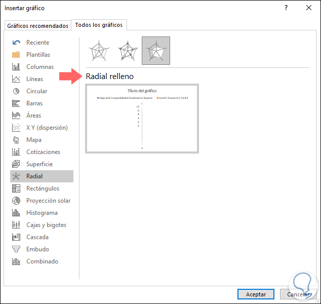
To create our radial graph, we will select the cells where the data is registered and we go to the Insert menu and in the «Graphics» group we click on the «Cascade Graphics» icon and in the displayed list we locate the various options of «radial graph » on the bottom: 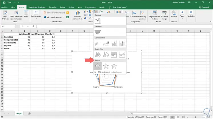
Step 3
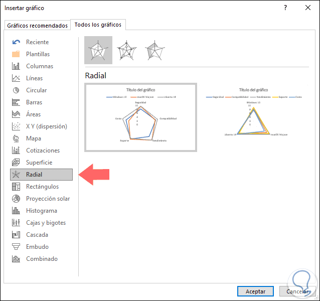
We can see that automatically the selected graphic is integrated into the active sheet where the data is registered. It is also possible to access these options by clicking on the «Recommended graphics» option and on the «All graphics» tab go to the «Radar» section where we will see a preview of each result:
Step 4
Once we select the desired graphic, it will be inserted in the sheet with the selected data represented there: 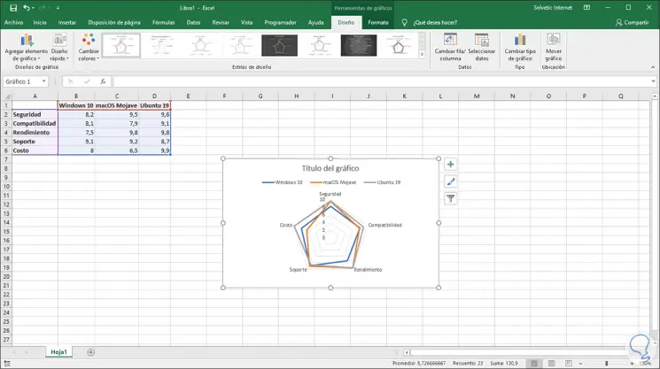
Step 5
We can see that a new menu called Graphics Tools with two tabs will be displayed at the top:
Design
There it will be possible to make changes in the radial graph such as:
- Adding new elements to the graphic.
- Adjust an automatic design.
- Change the colors of the graph.
- Apply a design style different from the default
- Swap rows by columns
- Choose the source data if necessary
- Modify the chart type
- Move the chart to another sheet or Excel workbook 2019
Format
From this tab it will be possible:
- Apply new text formats to the graphic.
- Integrate a new style of form.
- Add WordArt.
- Edit the outline, fill or shape effects.
- Edit chart dimensions.
Step 6
The first step to take will be to add a name to the chart. For this we click on the graph and then on the title for your selection, once this is done, enter the desired name in the formula bar. 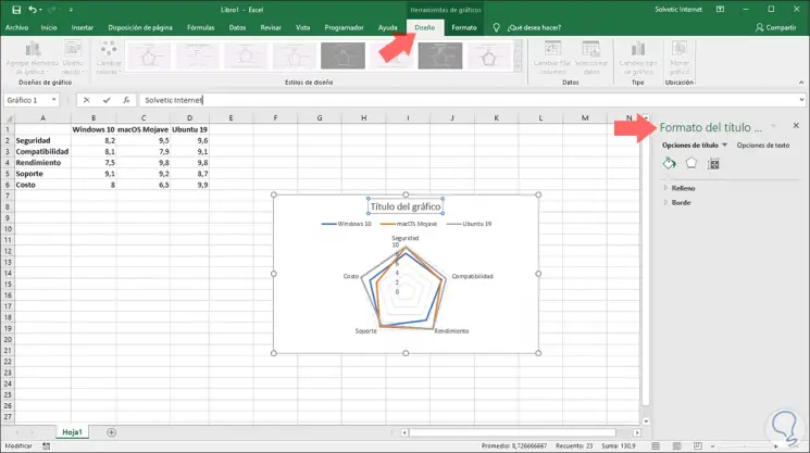
Step 7
Press Enter and the name will be modified automatically. We will see that some options are displayed both in the sidebar of the sheet, as well as in the title, from here it will be possible to edit the graphic style, add filters, etc. 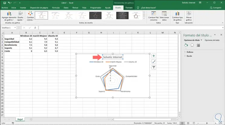
Step 8
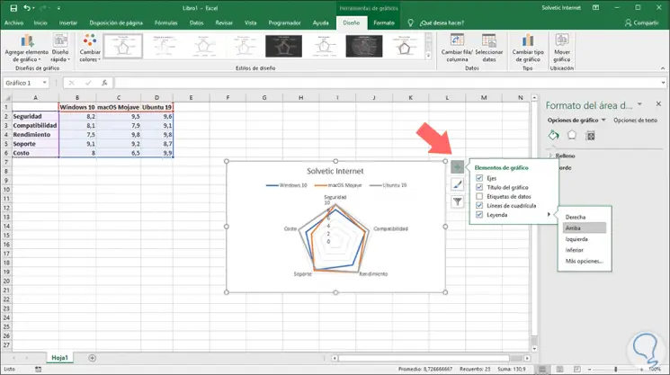
Another action that we can carry out in the radial graph is to change the position of the legends if we wish that they are visible in another position within the graph. For this we click on the + icon and then we go to the «Legends» line and we can move it in one of the following positions:
- Right
- Above
- Left
- lower
Step 9
If we select the «More options» line it will be possible to move the legend manually to the desired location. In this case we have selected the Left option: 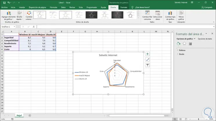
Step 10
Following the radial graph editing options, it is possible that for some reason of presentation we want to move the axes of the original location, this can help us generate a better visualization of the recorded data. To perform this action, we click on the + sign again and see it select the More options line in the Axes section:
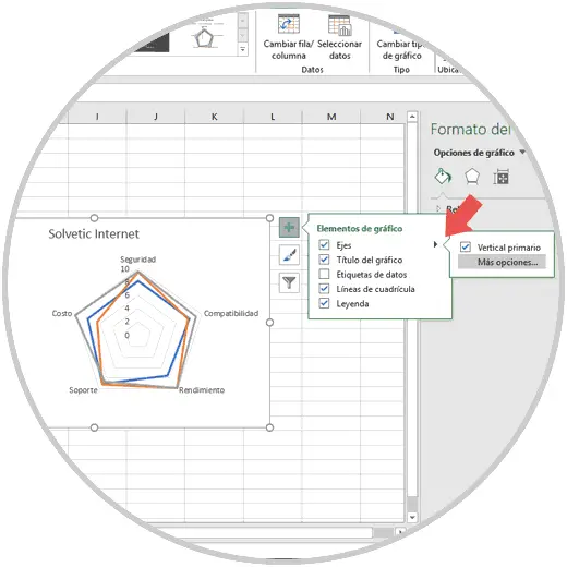
Step 11
The options will be displayed in the sidebar and there we click on the columns icon and in the «Axis options» section in the «Minimum» field, enter the value 3.0. At the bottom we can set a maximum value as necessary. 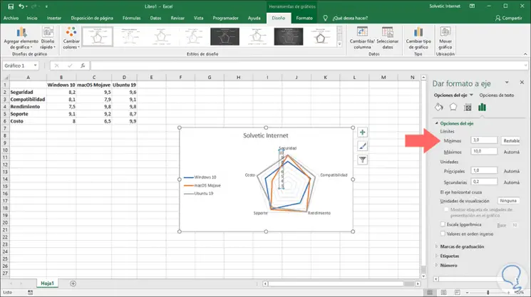
Step 12
Once we make the changes, they will be applied automatically and to see the graph more completely we can change its size using its corners. 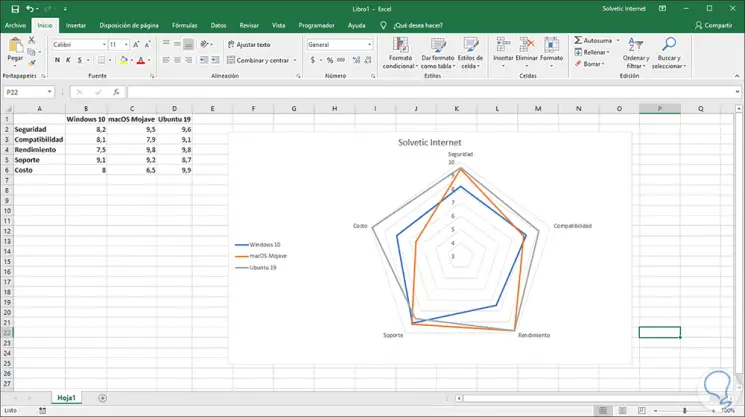
Step 13
As we have mentioned, it will be possible to make use of the formatting options to add a much more professional visual touch to the radial graphic: 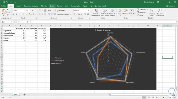
2. How to create a radial fill chart Excel 2019, 2016
This is another of the options offered by the radial graph, this is useful to represent only part of the data to be used and not all in general.
Step 1
For this case, we must select the data to be represented in the graph. To select cells in different locations we must use the Ctrl key and make the selection:
Step 2
Now we will insert the radial fill graph using one of the following options:
- From the Insert menu, Graphics group, by clicking on the Waterfall Graphics icon and at the bottom select Radial Fill.
- By clicking on Recommended graphics and on the All graphics tab go to the Radial section and there choose Radial fill.
Step 3
In this type of filled graph, the data will not start from scratch, here they will start using the lowest number available in the selected cell range: 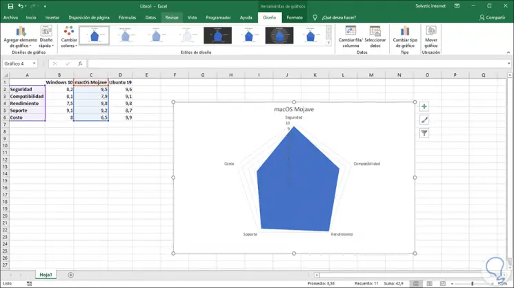
Step 4
In this case the title will be integrated by default and we have the same editing options available in the radial graph: 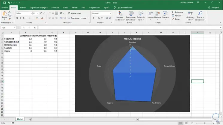
Step 5
Another of the practical options when using the radial graph, independent of its category, is the possibility of applying filters to it, this allows to display results only by certain criteria, for this we click on the filter icon located on the right side of the graph and the various data options to be filtered will be displayed: 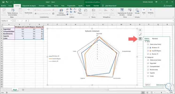
Step 6
There we can uncheck the boxes of the elements that we do not want are visible in the radial graph:
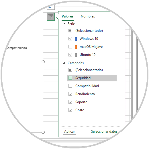
Step 7
When defining the filter criteria click on Apply and the radial graph will be based on the selected filter: 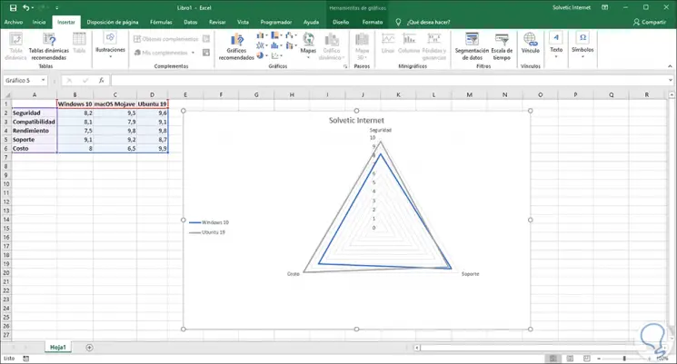
Thanks to the radial graphs we have a new function to represent the data in Excel 2016 or 2019 in a much more versatile and complete way..
Microsoft Excel имеет множество полезных функций для создания мощных электронных таблиц с диаграммами и таблицами. Но если вы хотите поднять свою электронную таблицу на новый уровень, помимо необычного текста или тем, вам может понадобиться помощь надстройки.
С помощью этих удобных инструментов вы можете создавать более визуально стимулирующие представления ваших данных. Для печати напечатать , представив или предоставив лучший обзор ваших электронных таблиц и их содержимого, ознакомьтесь с этими замечательными надстройками для Excel.
1. Excel Colorizer
Надстройка Excel Colorizer отлично работает для простого добавления цвета в данные вашей электронной таблицы. Чтобы упростить чтение ваших данных, просто выберите цвета и рисунок, а надстройка сделает всю остальную работу.

Вы можете выбрать тип из равномерного, горизонтального, вертикального или матричного и выбрать четыре цвета. Затем настройте интерполяцию для сглаживания или линейности, а цветовое пространство — для RGB или HSV. Вы также можете выбрать шаблон из чересстрочной или волны. Итак, выберите ваши данные, сделайте так, чтобы они выглядели потрясающе, и нажмите Colorize! заканчивать.
2. Радиальная гистограмма
В то время как Microsoft Excel предлагает множество опций диаграммы , Radial Bar Chart дает вам еще один. Это дополнение следует за своим названием, предоставляя именно то, что написано: радиальная гистограмма. Получите доступ к надстройке, выберите ячейки, содержащие ваши данные, а затем настройте диаграмму по своему усмотрению.
Вы можете выбрать метки, номера и установить заголовок. Нажмите Сохранить, и ваш график будет создан автоматически. Переместите или измените размер диаграммы и наведите указатель мыши на столбцы, чтобы отобразить данные для каждого из них. Надстройка является быстрой, простой и предоставляет вам другой вариант стиля диаграммы для ваших данных.

3. HierView
Для отображения организационной структуры HierView является надстройкой для вас. Ваши данные должны включать идентификатор строки с информацией, включенной в столбцы. Затем настройте данные с фильтрацией, автоматическим обновлением, именами столбцов и данными на узел.

Как только ваша диаграмма будет завершена, вы можете увеличивать или уменьшать масштаб, перемещаться во всех четырех направлениях или подгонять диаграмму к нанесенной области. Вы также можете переместить весь график или изменить его размер, если это необходимо. Отрегулируйте настройки или получите помощь в любое время с помощью удобных кнопок в верхней части графика.
4. Пузыри
Будут ли ваши данные выглядеть лучше в виде всплывающей подсказки ? Если так, то Bubbles — это надстройка, которую вы должны попробовать. Этот интерактивный инструмент пузырьковой диаграммы позволяет отображать информацию уникальным способом. Просто откройте надстройку и выберите таблицу данных. Когда диаграмма создана, вы можете перемещать пузырьки, представляя или оставляя их как есть.
Bubbles имеет несколько настроек, которые можно настроить для основного или детального режима, цветового диапазона, а также отображения заголовка и столбца. Вы также можете использовать сочетания клавиш, показанные в нижней части диаграммы, для таких вещей, как сокрытие или отображение дополнительной информации, или всплывающие пузырьки.

5. Карты Bing
Если добавление карты в электронную таблицу полезно, надстройка Bing Maps упрощает ее. Ваши данные могут включать адреса, города, штаты, почтовые индексы или страны, а также долготу и широту. Просто откройте надстройку, выберите ячейки данных и нажмите кнопку « Расположение» на карте.

Инструмент Bing Maps идеально подходит для отображения числовых данных, связанных с местоположениями. Таким образом, если вы работаете в сфере продаж, вы можете показать новые рынки для покрытия или, если вы работаете в компании с несколькими офисами, вы можете четко представить эти возможности клиентам.
6. Географическая тепловая карта
Когда тепловая карта — это то, что вам действительно нужно, надстройка Geographic Heat Map является потрясающей. От того же разработчика, что и надстройка Radial Bar Chart, у вас есть похожие настройки. Выберите ваши данные, выберите карту США или мира, выберите заголовки столбцов и добавьте заголовок.

Вы можете повторно выбрать набор данных, если добавите больше столбцов или строк, и если вы измените значение, уже имеющееся в наборе, вы увидите обновление тепловой карты автоматически. Чтобы быстро взглянуть на данные, относящиеся к странам, штатам или регионам, вы можете легко вставить эту тепловую карту в свою электронную таблицу.
7. Pickit бесплатные картинки
Для добавления фотографий и других изображений в ваши электронные таблицы Pickit Free Images является идеальным инструментом. Как только вы получите доступ к надстройке, у вас есть несколько вариантов для поиска нужного изображения. Вы можете выполнить поиск по ключевым словам, просмотреть коллекции или выбрать категорию из огромного выбора.

Щелкните место, чтобы поместить его в электронную таблицу, выберите нужное изображение и нажмите кнопку « Вставить» . Вы можете перемещать, изменять размер или обрезать изображения по мере необходимости. И, если вы создаете бесплатную учетную запись Pickit, вы можете отмечать избранное для повторного использования и следить за другими пользователями или категориями, чтобы быть в курсе новых загрузок.
8. Веб-видео плеер
Возможно, у вашей компании есть видео на YouTube или учебные пособия по Vimeo, которые будут полезны для вашей книги. С помощью надстройки Web Video Player вы можете вставить видео из любого из этих источников прямо в вашу электронную таблицу.
Откройте надстройку, а затем либо введите URL-адрес видео, либо нажмите, чтобы перейти на YouTube или Vimeo, чтобы получить ссылку. Нажмите кнопку Установить видео , и все готово. Затем, когда вы открываете электронную таблицу, видео уже готово, и вы можете нажать кнопку «Воспроизвести».

За единовременную плату в размере 5 долларов США вы можете настроить автоматическое воспроизведение видео или начинать и заканчивать его в определенных местах клипа. Эта опция включена в надстройку.
Найти, установить и использовать надстройки
Вы можете получить доступ к хранилищу надстроек. надстроек надстроек легче из Excel. Откройте книгу, выберите вкладку « Вставка » и нажмите « Сохранить» . Когда откроется Магазин надстроек Office, найдите по категории или найдите конкретную надстройку. Вы также можете посетить сайт Microsoft AppsSource в Интернете и просмотреть или выполнить поиск там.
Когда вы найдете нужную надстройку, вы можете выбрать ее для получения дополнительной информации или просто установить ее. Тем не менее, целесообразно сначала просмотреть описание, чтобы проверить положения и условия, заявления о конфиденциальности и системные требования.

После установки надстройки откройте вкладку « Вставка » и нажмите кнопку « Мои надстройки» . Когда откроется всплывающее окно, вы можете просмотреть установленные надстройки и дважды щелкнуть по нему, чтобы открыть его. Вы также можете нажать стрелку на кнопке « Мои надстройки» , чтобы быстро выбрать недавно использованную.

Как вы выделяете свои данные?
Возможно, вы форматируете свои электронные таблицы вручную. или используйте совершенно другие надстройки, чем перечисленные здесь.
Дайте нам знать, какой ваш предпочтительный способ сделать ваши данные визуально привлекательными в Excel, поделившись ими в комментариях ниже.
Кредит изображения: spaxiax / Depositphotos