
A radar chart in Excel is also known as the spider chart, web, or polar chart. It is used to demonstrate data in two-dimensional for two or more data series. The axes start on the same point in a radar chart. This chart is used to compare more than one or two variables. There are three different types of radar charts available to use in Excel.
The radar chart in Excel visualizes the performance and makes concentrations of strengths and weaknesses visible.
Table of contents
- What is Radar Chart in Excel (Spider Chart)
- Different Types of Radar Chart in Excel
- #1 Radar Chart
- #2 Radar Chart with Markers
- #3 Radar Chart with fills (Filled Spider Chart)
- How to Understand the Radar Chart?
- How to Create a Radar Chart in Excel?
- Radar Chart Example #1 – Sales Analysis in 4 different quarters
- Radar Chart Example #2 – Target vs. Customer Satisfaction Level
- Interpretation of the Spider Chart in Excel
- Advantages of using Spider chart in Excel
- Disadvantages of using Spider chart in Excel
- Things to consider while creating a radar chart in excel to visualize your report.
- Recommended Articles
- Different Types of Radar Chart in Excel
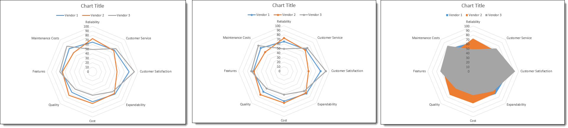
Different Types of Radar Chart in Excel
#1 Radar Chart
Display values relative to a center point. It is best used when the categories are not directly comparable. Given below is an example of this type of chart.
#2 Radar Chart with Markers
It is similar to the earlier type, but the only difference is that it has markers in each data point. Given below is an example of this type of chart.

#3 Radar Chart with fills (Filled Spider Chart)
Everything remains the same as shown in the previous two types, but it fills the color to the entire radar. Given below is an example of this type of chart.

How to Understand the Radar Chart?
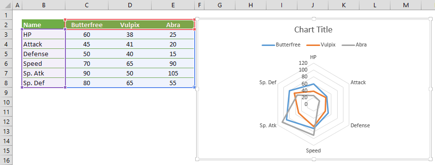
Like in the column chart in the spider chart in excel, also we have the X-axis and Y-axis. The X-axis is each end of the spider, and each step is considered the Y-axis. For example, in the below-given image, circles that are marked in orange are X-axis, and circles, which are marked in blue, are Y-axis. The zero-point of the radar chart in Excel starts from the center of the wheel. A point reaches the edge of the spike, the higher the value.

How to Create a Radar Chart in Excel?
The radar chart in Excel is very simple and easy to use. Let us understand the working of some radar chart examples.
You can download this Radar Chart Excel Template here – Radar Chart Excel Template
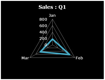
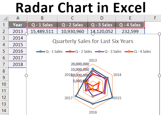
Radar Chart Example #1 – Sales Analysis in 4 different quarters
Below are the steps for creating a radar chart in Excel: –
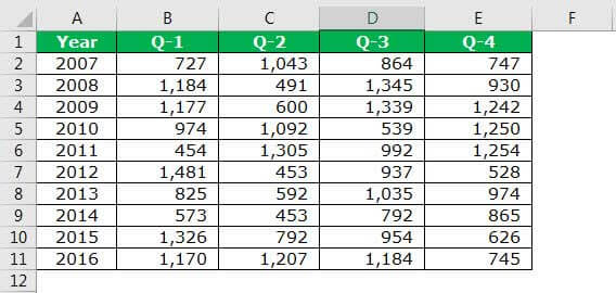
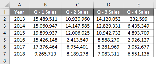
- Create data in the below format. The below data shows quarterly sales performance over 10 years. So now, let us present this in a spider chart.

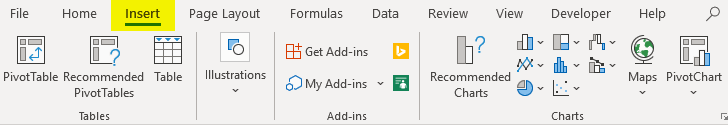
- Go to the “Insert” tab in Excel. Then, in “Other Charts,” select the “Radar with Markers” chart. It will insert a blank radar chart in Excel.

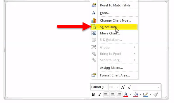
- Right-click on the chart and select “Select Data” below.

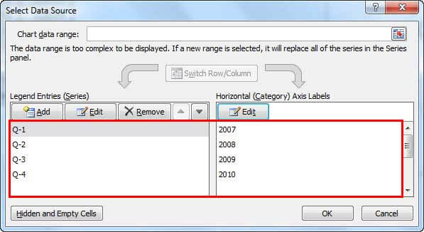
Click on the “Add” button.

Select “Series name” as “Q-1” and “Series values” as values. Then, click “OK.”.

Again, repeat this procedure for all the quarters. After that, your screen should look like this.
After this, click on “OK.” It will insert the chart. Below is the illustration of how the radar chart in Excel looks before formatting.

- Format the Chart as per our wish.
Right-click on each line and, change the line color, change the marker style option as per your needs. Next, add chart titles to tell the user what it is. And finally, your chart will look like this.


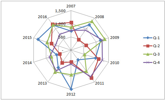
Interpretation of the data:
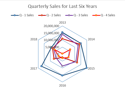
- Looking at the spider’s outset, we can see that in 2012, Q1 revenue was the highest among all the 10 years of revenue. And in 2011, Q1 revenue was the lowest.
- In Q2, the highest revenue was in 2011, and the lowest point was in 2014.
- In Q3, the highest revenue was in 2009, and the lowest was in 2010.
- In Q4, the highest revenue was in 2011, and the lowest revenue occurred in 2012.
- In none of the years, there has been a consistent growth of revenue over 4 quarters. There is always volatility in revenue generation across quarters.
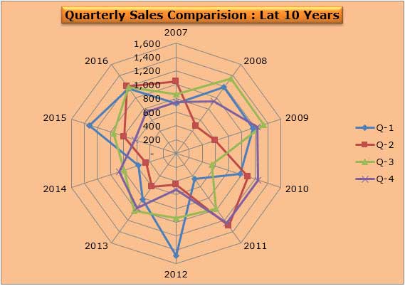
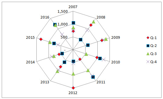
Additionally, you can remove the chart’s lines but highlight only the markers. The advanced formatting is always a treat to watch.
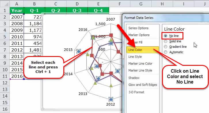
- Select each line and press Ctrl + 1 > Line Colour > Select no line.
- Select marker options > select built-in > choose the color per your wish.

- Repeat this for all the lines. Ensure you select different marker colors but the same markers.
- Click on spider lines and press Ctrl + 1 > Line Colour > Solid Line > Select the colour.
- Select Line Style > Dash Type > Select dotted lines.
- Select the background color from the “Format” tab.

- So, the chart looks beautifully like the one below.

Radar Chart Example #2 – Target vs. Customer Satisfaction Level
Step 1: Create the data in the below format and apply chart type 1 (ref types of the chart).

Step 2: Select the data to apply chart type 1. Insert > Other Charts > Select Radar Chart.

Initially, your chart looks like the one below.
Step 3: Do the formatting as per your ideas (to do the formatting, refer to the last example and play with it).
- Change the target line color to red and the achieved line color to green.
- Change spider line color to light blue and the line style to dotted lines.
- Change X-axis values to word art styles.
- Insert the header for the chart and format it nicely.
After all the formatting, your chart should look like the one below.

Step 4: Get rid of the legends and use manual legends to adjust the chart neatly. To insert manually, go to the “Insert” tab and “Insert Shapes.”
Before removing and inserting manual legends
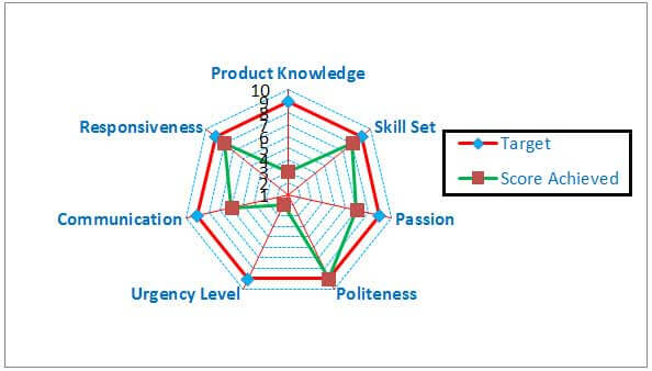
After removing and inserting manual legends.

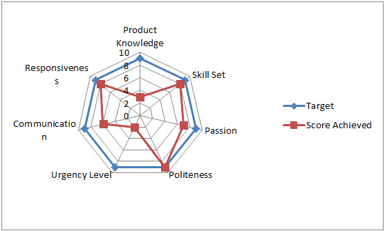
Interpretation of the Spider Chart in Excel
- The red line shows the target level of each category, and similarly, the green line indicates the achieved level of each category.
- The politeness category achieved a 100% score by reaching 9 out of 9.
- Next, the closest categories are responsiveness and skill set, scoring 8 out of 9.
- The least anchored category is urgency level. It achieved only 2 out of 9.
- There is conclusive evidence that customer care executives need to work on the urgency level and gain more knowledge on the product.
- Maybe they require training to know more about the product.
- They need to create an urgency level to close more deals often.
Advantages of using Spider chart in Excel
- When presenting a two-dimensional dataset, it is very useful to tell the story of the data set just by creating the radar chart in Excel.
- The radar chart in Excel is more suitable when the exact values are not critical for a reader, but the overall chart tells some story.
- We can easily compare each category along with its axis, and overall differences are apparent by the size of each radar.
- Spider charts in Excel are more effective when comparing target and achieved performance.
Disadvantages of using Spider chart in Excel
- Comparing observations on a radar chart in Excel could be confusing once more than a couple of webs are on the chart.
- When there are too many variables, it creates too many axes. The crowd is too much.
- Though multiple axes have gridlines connecting them for reference, issues arise when you try to compare values across different axes.
Things to consider while creating a radar chart in excel to visualize your report.
- Make sure you are not using more than two variables. Otherwise, it will be tedious for a user to understand and conclude.
- We must try to cover the background with light colors to tell the story colorfully.
- We must use different line styles to attract users’ attention.
- We must arrange the data schematically.
- Enlarge the spider web to give clear visualization
- Work on-axis values to avoid too many intervening axis values.
- Get rid of legends to enlarge the spider web, but insert the legends by adding shapes.
- To make the chart easier to read, one of the simplest things to alter is the size of the text. Do all these in the “Formatting” section.
Recommended Articles
This article is a guide to Radar Chart in Excel. Here, we discuss its uses and how to create a spider chart in Excel, along with Excel examples and downloadable Excel templates. You may also look at these useful functions in Excel: –
- Create a Legends Chart in ExcelLegends in excel is used to differentiate the categories which help user or viewer to understand the data more properly. It is located on the right-hand side of the given excel chart.read more
- Stacked Chart in ExcelIn stacked charts data series are stacked over one another for a particular axes, in stacked column chart the series are stacked vertically while in bar the series are stacked horizontally.read more
- Histogram Excel ChartThe histogram excel chart is a built-in data analysis chart that displays data in histograms. The data compared in a histogram chart is classified into ranges.read more
- Gantt Chart in ExcelGantt chart is a type of project manager chart that shows the start and completion time of a project, as well as the time it takes to complete each step. The representation in this chart is shown in bars on the horizontal axis.read more
- Leading Zeros in ExcelLeading zeros are zeros that are added to figures without altering their mathematical values. This is done to keep a specific format in a sheet or to prevent errors. We may add Leading Zeros in Excel by utilizing the Right, TEXT, and Concatenate Functions.read more
A radar chart is a graphic representation using lines placed on axes that diverge from the center of the chart. A radar chart is very useful for visualizing performance analysis or survey data, that involves comparing multiple properties side by side. The radar chart is also known as a web or spider chart due to its shape.

Radar Chart Basics
Sections

A radar chart mainly consists of three sections:
- Plot Area: Where the visual representation of data takes place.
- Chart Title: The title of the chart. Giving your chart a descriptive name will help your users easily understand the visualization.
- Legend: The legend is an indicator that helps distinguish the data series.
Types

There are three types of commonly used radar charts.
- Radar: The default radar chart featuring straight lines.
- Radar with Markers: This type places markers on data points to make them easier to read.
- Filled Radar: Puts more emphasize in the areas between chart lines.
Inserting a Radar Chart in Excel
Begin by selecting your data in Excel. If you include data labels in your selection, Excel will automatically assign them to each column and generate the chart.

Go to the INSERT tab in the Ribbon and click on the Radar Chart icon to see the pie chart types. Click on the desired chart to insert. In this example, we’re going to be using Radar.

Clicking the icon inserts the default version of the chart. Now, let’s take a look at some customization options.
Customizing a Radar Chart in Excel
You can customize pretty much every chart element and there are a few ways you can do this. Let’s look at each method.
Double-Clicking
Double-clicking on any item in the chart area pops up the side panel where you can find options for the selected element. Please keep in mind that you don’t need to double click another element to edit it once the side panel is open, the side menu will switch to the element. The side panel contains element specific options, as well as other generic options like coloring and effects.

Right-Click (Context) Menu
Right-clicking an element will display the contextual menu, where you can modify basic element styling like colors, or you can activate the side panel for more options. To display the side panel, choose the option that starts with Format. For example, this option is labeled as Format Data Series… in the following image.

Chart Shortcut (Plus Button)
In Excel 2013 and newer versions, charts also support shortcuts. You can add/remove elements, apply predefined styles and color sets and filter values very quickly.
With shortcuts, you can also see the effects of options on the fly before applying them. In the following image, the mouse is on the Data Labels item and the labels are visible on the chart.

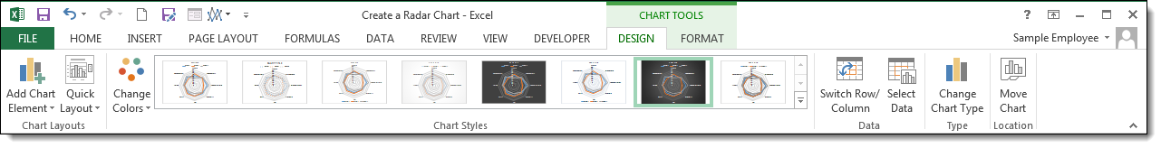
Ribbon (Chart Tools)
Whenever you activate a special object, Excel adds a new tab(s) to the Ribbon. You can see these chart specific tabs under CHART TOOLS. There are 2 tabs — DESIGN and FORMAT. While the DESIGN tab contains options to add elements, apply styles, modify data and modify the chart itself, the FORMAT tab provides more generic options that are common with other objects.

Customization Tips
Preset Layouts and Styles
Preset layouts are always a good place to start for detailing your chart. You can find styling options from the DESIGN tab under CHART TOOLS or by using the brush icon on Chart Shortcuts. Below are some examples.
Applying a Quick Layout:

Changing colors:

Update Chart Style:

Changing chart type
You can change the type of your chart any time from the Change Chart Type dialog. Although you can change your chart to any other chart type, in this example we’re going to focus on Pie chart variations.
To change the chart type, click on the Change Chart Type items in Right-Click (Context) Menu or DESIGN tab.

In the Change Chart Type dialog, you can see the options for all chart types with their previews. Here, you can find other pie chart types like Radar with Marker and Filled Radar variations. Select your preferred type to continue.

Switch Row/Column
By default, Excel assumes that vertical labels of your data are the categories, and the horizontal ones are the data series. If your data is reversed, click Switch Row/Column button in the DESIGN tab, when your chart is selected.

Move a chart to another worksheet
By default, charts are created inside the same worksheet as the selected data. If you need to move your chart into another worksheet, use the Move Chart dialog. Begin by clicking the Move Chart icon under the DESIGN tab or from the right-click menu of the chart itself. Please keep in mind you need to right-click in an empty place in chart area to see this option.

In the Move Chart menu, you have 2 options:
- New sheet: Select this option and enter a name to create a new sheet under the specified name and move your chart there.
- Object in: Select this option and select the name of an existing sheet from the dropdown input to move your chart to that sheet.

Radar Chart in Excel (Table of Contents)
- What is Radar Chart?
- Example to Create a Radar Chart in Excel
Introduction to Radar Chart in Excel
Being an Excel users, we might frequently have worked on Bar Chart, Pie Chart, Line Chart, etc., and can say we are aware of those. Even we may have seen some Gantt Chart or Combination Charts as well in Excel. However, we might not be well aware of a Radar Chart and how to use it under Microsoft Excel (It is well and good if you know). This article will make you aware of the Radar Chart and some super easy ways to make it work under Microsoft Excel.
What is Radar Chart?
Radar Chart, also known as Spider Chart or Web Chart or Star Chart, got its name because of its structure. Because it looks like a spider web, it is called by those names. It is best used when you have three or more than three variables with different values of sub-groups associated with the central value. It is especially a great way of visualization for employee/student performance analysis or customer satisfaction analysis. It allows you to compare multiple parameter values against the criteria associated with performance or satisfaction.
Example to Create a Radar Chart in Excel
Suppose we have quarterly sales data available as shown below from the year 2013 to the year 2018. We wanted to see how sales values are going across the years as well as how those are performing within a year for different quarters.
We would like to see a visualization of this data using the radar chart in excel.
You can download this Radar Chart Excel Template here – Radar Chart Excel Template
Step 1 – In the active excel worksheet, select all the data across A1 to E7 and then click on the “Insert” tab placed at the third place on the upper hand ribbon of excel. You’ll see a lot of inserting options.
Step 2 – Under the Charts option, click on the “Recommended Charts” icon.
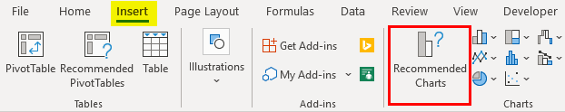
- Select the “All Charts” option through the window popping up named “Insert Chart”.
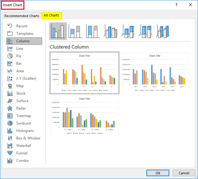
Step 3 – Inside the All chart option, you will see a list of all chart templates that are compatible in excel on the left-hand side of the window. Out of those, click on the “Radar option”. A soon as you click on the Radar option, you’ll be able to see multiple radar chart layouts, namely Radar, Radar With Markers and Filled Radars. Each of these categories has three sub-layouts of radar charts based on the visuality as well.
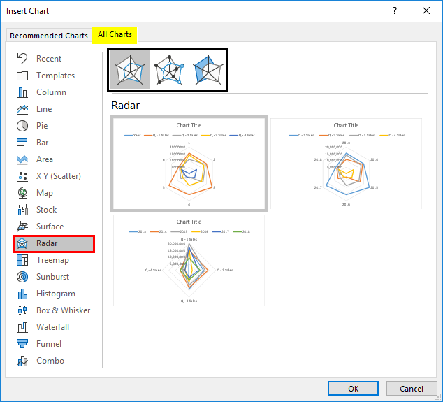
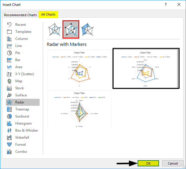
Step 4 – You can choose any radar chart for proceeding as per your convenience. I will choose the second one, “Radar with Markers”. It allows me to have bullet markers at each intersection point of the web. Inside this, I will choose the second layout as it has years marked as legend entries. Once done with choosing the layout of your interest, click on the OK button.
Once you click OK, you’ll be able to see a radar chart, as shown in the image below.
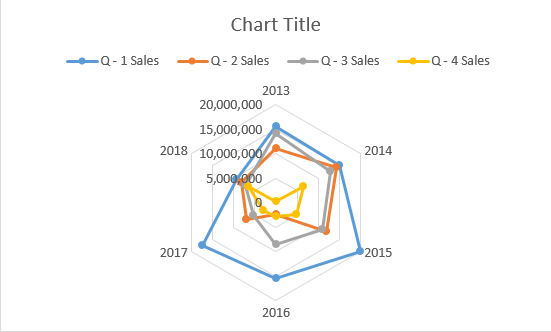
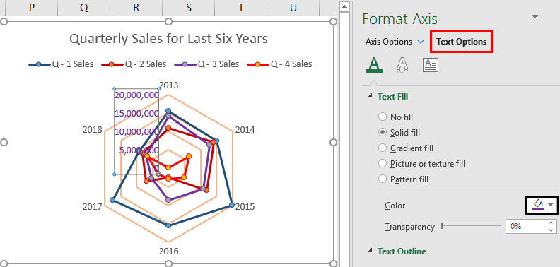
Step 5 – You can add the title for this report under Title Section. I will add the title as Quarterly Sales for the Last Six Years.
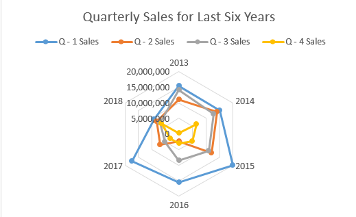
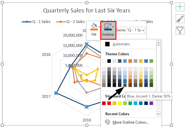
Step 6 – You can change the color of the webs associated with each quarter. Click on the line associated with first-quarter values (Blue line) and right-click on it; you’ll see a series of options popping up there; you have one option called Outline.
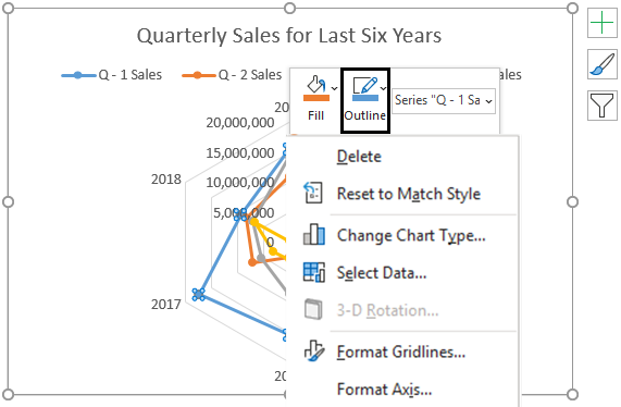
Step 7 – As soon as you click on that Outline option, you’ll be able to customize the colors of quarter web lines. I will choose a different color for the first-quarter sales line. See the image below.
Step 8 – Now, change the colors of the other quarter sales line as well in the chart. See the final chart below.
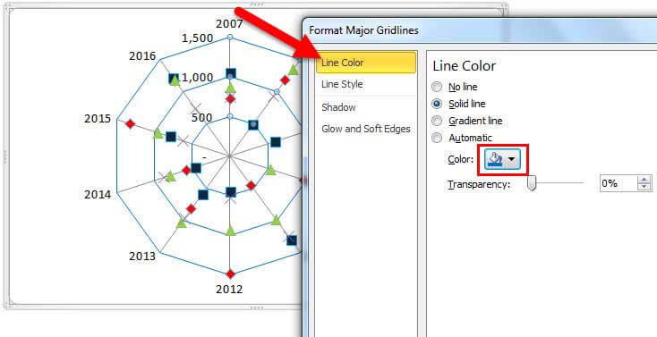
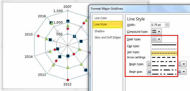
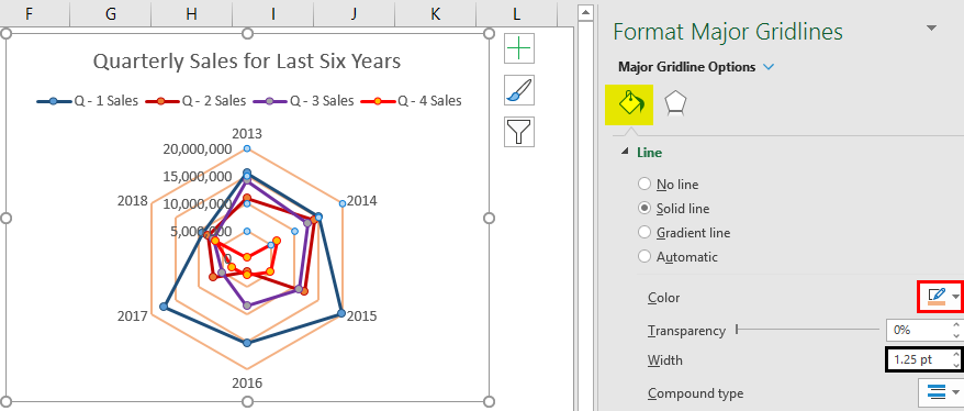
Step 9 – You also can change the color of “Major Gridlines”. Select major gridlines and right-click on them to open an Options Menu. There, select the option “Format Gridlines”. A new pane of Formatting will open up on the right side of the excel sheet.
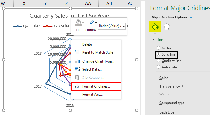
Step 10 – Inside Format Major Gridlines window, under “Fill & Line section”, you can change the color of the gridline. I will change the color of gridlines as well as will change the width of gridlines. Please, see the screenshot below.
Step 11 – I would also like to change the color of axis legend entries of sales values (as those are with really very faint color). For that, select the axis legend entries and right-click on those to see the formatting option; click on the “Format Axis” option.
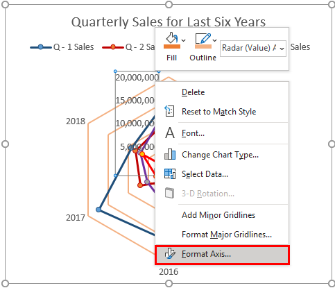
Step 12 – As soon as you click on the “Format Axis” option, the pane will open up at the right-hand side of the excel, where you can see all axis formatting options.
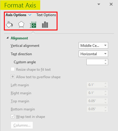
Step 13 – You have two sub-options inside the Format Axis pane. Axis Options and “Text Options”. Go to “Text Options”. Under “Text Fills” inside “Text Options”, you will be able to change the color of these axis legend sales values. I will choose a custom color of my choice here. See the screenshot below for your reference.
Step 14 – Go to the “Text Effects” option and select the shadow effect below to better visualise those legend entries.
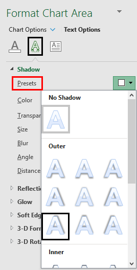
Step 15 – The final visualization would be something like this after we add the above-shown shadow effect.
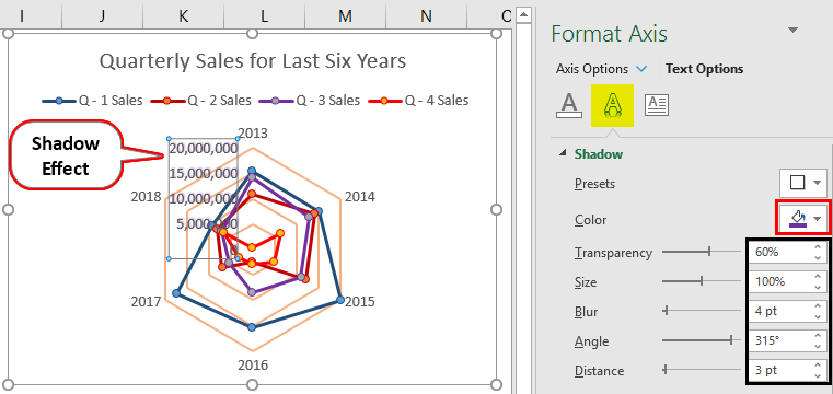
In this way, we create the Radar Chart. In this chart, we can see all the quarter sales for each year where different quarters are represented by different lines (with different colors to identify each one of them). Also, all six-year values are at each joint of the hexagon formed with major Gridlines. Each marker point represents the value for one particular year with one particular quarter.
This is from the article. Let’s wrap things up with some things to be remembered.
Things to Remember
- It is beneficial to those who have to compare multiple values along with multiple sets of categories.
- Quickly gives a visualization of trends In given data. Whether the performance is going up or down or disturbing
- It can be more confusing to someone who is not used to complex graphical visualization techniques as well as analysis.
Recommended Articles
This is a guide to the Radar Chart in Excel. Here we discuss how to create a Radar Chart in Excel along with practical examples and a downloadable excel template. You can also go through our other suggested articles –
- Marimekko Chart Excel
- Chart Wizard in Excel
- Interactive Chart in Excel
- Excel Animation Chart

A radar chart compares the values of three or more variables relative to a central point. It’s useful when you cannot directly compare the variables and is especially great for visualizing performance analysis or survey data.
Here’s a sample radar chart, so you can see what we’re talking about. It’s likely you’ve run across them before, even if you didn’t know that’s what they were.

Creating Radar Charts in Excel is straightforward. In this article, we’ll show you how to create two types of Radar Chart: a regular chart (like the one above) and a filled chart (like the one below, which fills in the areas instead of just showing the outlines).
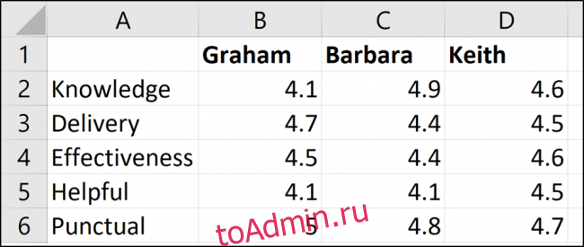
The Sample Data
Let’s first take a look at the sample data we’ll be using for our examples.
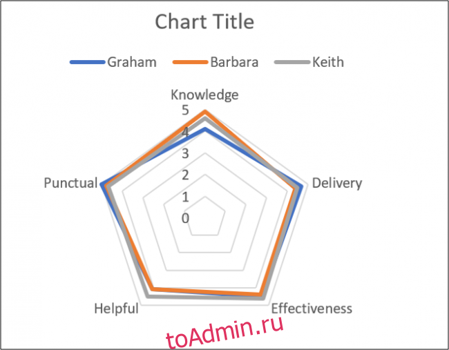
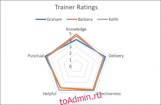
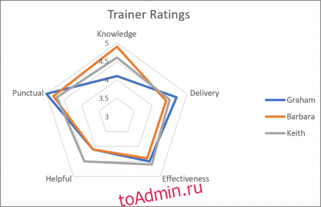
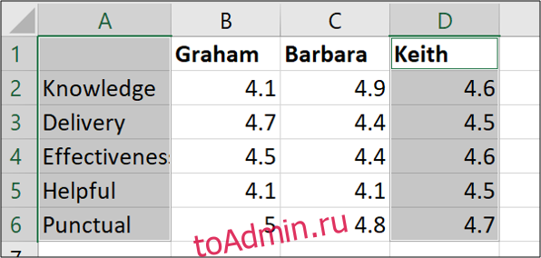
We have three trainers: Graham, Barbara, and Keith. We’ve assessed them in five different categories (Knowledge, Delivery, and so on) and our Excel table contains those ratings.
In this first example, we will create a Radar Chart that shows the assessment of all three trainers.
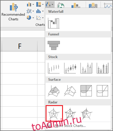
Select all the cells, including the row that contains the names and the column that contains the assessment titles. Switch to the “Insert” tab and then click the “Waterfall Chart” button.
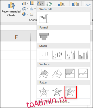
You can choose from three Radar Charts from which to pick. Choose the first Radar Chart option for this example. (The second option just adds markers to the values on the lines; the third option fills the chart, and we’ll be looking at that one a bit later.)
Now that you’ve inserted the chart into the worksheet, you can begin to make some improvements to it.
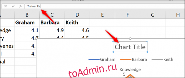
Enter a Chart Title
Select the chart title and then type a new title. As you type, the text will appear in the Formula Bar.
When you press Enter, your chart will have a new title.
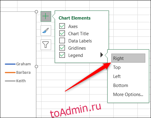
Move the Legend
For another change, we could move the legend from above the chart to the right.
When the chart is selected, you’ll see four buttons hovering at its top right. Click the “Chart Elements” button at the top, and then hover your mouse over the “Legend” option. You’ll see an arrow to the right. Click that and then click the “Right” option on the menu that appears.
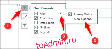
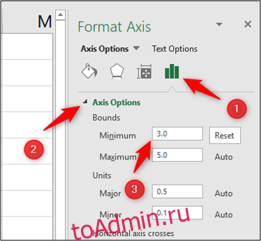
Modify the Radar Chart Axis
To give our Radar chart a greater impact, and more data clarity, we will modify the axis to begin at three instead of zero.
Click the “Chart Elements” button again, hover over the “Axes” option, click the arrow that appears next to it, and then select “More Options.”
The Format Axis pane appears on the right. We want to edit the “Minimum” setting under the “Bounds” section, so click that field and type “3” there.
The radar chart updates immediately and now that we’ve increased the minimum Bounds value, you can more clearly see the differences in the assessments of the three trainers.
This example gives us a nice view of which trainers excel at which qualities, and also how rounded their skill sets are.
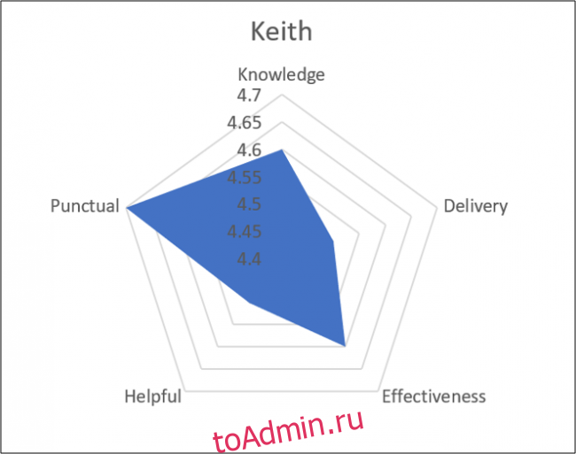
Create a Filled Radar Chart
For a second example, we will create a filled radar chart for just one of the trainers. We will use Keith for this example.
First, select the range of cells that you need. In our example, we want the range A1:A6 and the range D1:D6 as shown below. To do this, hold the Ctrl key while you select each additional cell you want to add to your selection.
Now head to Insert > Waterfall Chart > Filled Radar.
When you create a radar chart using only one data series, the axis does not start from zero the way it did in our previous example. Instead, the minimum bound will be the lowest number in the range of cells you selected. In our case, the minimum bound is 4.4—one tick below Keith’s minimum score.
This chart helps you visualize how strong Keith is in each of the assessed qualities.
Note that if we were creating more than one radar chart (like, say, we wanted to show a separate chart for each of our trainers), we would want to make sure the axis ranges are consistent so that the data presentation is not misleading. So, for example, we would set the minimum bound to be a bit below the lowest ranking of any trainer and the maximum bound to be a bit higher than the highest ranking of any trainer. You could even remove the axis itself to reduce clutter on the chart.
Creating radar charts in Excel is simple, but getting the most out of them can require some extra attention. They can be a useful addition to your Excel reports in the future.
READ NEXT
- › How to Choose a Chart to Fit Your Data in Microsoft Excel
- › How Long Do CDs and DVDs Last?
- › HoloLens Now Has Windows 11 and Incredible 3D Ink Features
- › How to Adjust and Change Discord Fonts
- › Google Chrome Is Getting Faster
- › This New Google TV Streaming Device Costs Just $20
- › Liquid Metal vs. Thermal Paste: Is Liquid Metal Better?
Maintenance Alert: Saturday, April 15th, 7:00pm-9:00pm CT. During this time, the shopping cart and information requests will be unavailable.
Categories: Charts, Excel®
Tags: how to make a radar chart
Pie charts, bar charts and line charts are familiar friends to Excel users. But there’s a less well-known chart out there that can pack a lot of information into a single, visually powerful image. The Radar Chart, also sometimes called a spider or star chart, lets you compare multiple items against multiple criteria. You could use it to see how temperatures change in multiple locations over the course of a year, or quickly compare products in several different areas.
We are going to create a chart that will help us choose a new phone system for our office. We have gathered information from three different vendors and given each a performance score of 1-100 in eight areas that are important to us such as reliability and maintenance costs. Our table conveys the information, but doesn’t really help us understand which vendor might perform best overall, if any do.

To follow using our example, download Create a Radar Chart.xlsx This article applies to Excel 2007 and later versions. Images were taken using Excel 2013 on Windows 7.
Create a Radar Chart
- Select the data that you want to use for the chart.
- On the Insert tab, click the Stock, Surface or Radar Chart button and select an option from the Radar A preview of your chart will be displayed to help you choose.
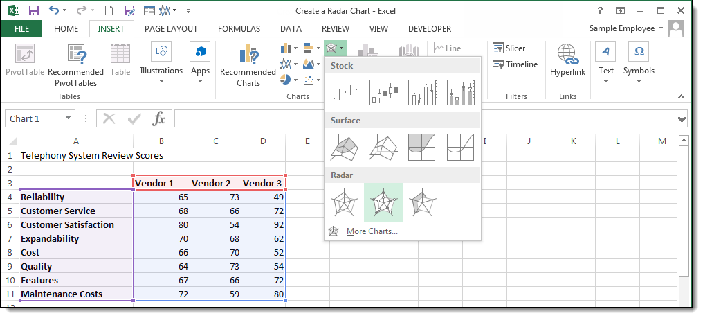
Note: In Excel 2010, the Radar charts are located under the Other Charts button.
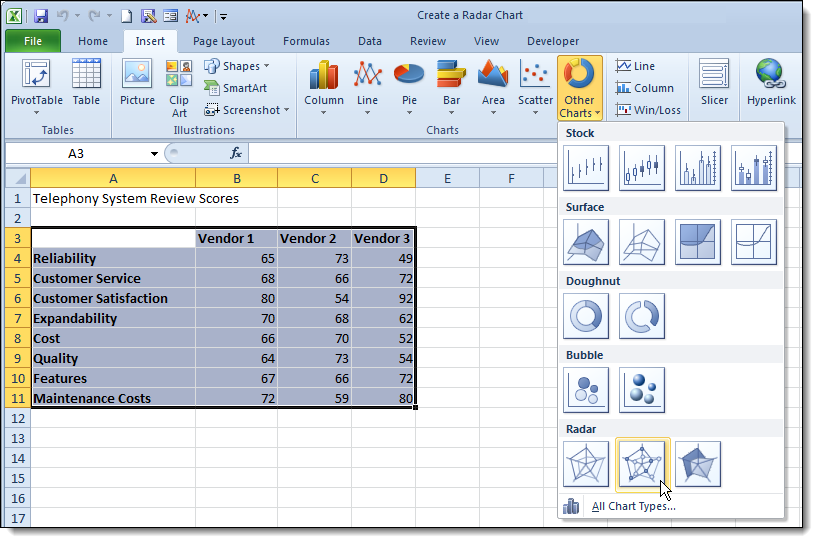
There are three default Radar charts you can choose from: Basic Radar, Radar with Markers, and Filled Radar.
Once your chart is created, you can customize the colors, labels, and text as you would any chart. Click on the Design and Format tabs in the Chart Tools contextual tab to find Chart styles and other editing tools.
The radar chart is one of those “love it or hate it” tools. This is probably because there is some data that it works really well for, and for some it merely creates confusion and annoyance. The trick is to use it sparingly, and only on those specific tasks to which it is most suited.
PRYOR+ 7-DAYS OF FREE TRAINING
Courses in Customer Service, Excel, HR, Leadership,
OSHA and more. No credit card. No commitment. Individuals and teams.
A Radar Chart is one of the informative graphical designs you can use to compare two or more key variables on a two-dimension plane, such as your dashboard.


The chart (also called a Spider or Polar Graph) is incredibly easy to read and interpret. Besides, it displays a lot of information using limited space.
So how can you generate the chart?
Excel seems to be the obvious choice because it’s almost free to access. However, the spreadsheet application does not natively support Polar graphs. In other words, the spreadsheet app is not the best-suited Radar Chart generator.
Think beyond Excel if you intend to access ready-made, visually appealing, easy-to-read Radar Charts.
The tested and proven option is downloading and installing a particular add-in (which we’ll talk about later) into your Excel.
In this blog, you’ll learn:
Table of Content:
- What is a Radar Chart in Excel?
- How to Create a Spider or Radar Chart in Excel?
- Video Tutorial: How to Create a Radar Chart in Excel?
- How to Read a Radar Chart in Excel?
- How are Radar Charts used in Business?
- Why Use a Radar Chart?
- Wrap up
Before jumping into the heart of the blog, let’s address the following question: what is a Radar Chart in Excel?
What is a Radar Chart in Excel?
Definition: A Radar Chart (also called a Spider or Polar Graph) is a two-dimensional chart you can use to display two or more key variables on an axis that starts from the same point.
The chart is straightforward to understand and customize. Furthermore, you can show several metrics across a single dimension.
Radar charts are best used for showing outliers and commonalities in your data. You can use Radar Chart in Excel to display performance metrics, such as clicks, sessions, new users, and page views, among others.
Also, the graph can help you to display insights into different data points on a radial axis. The visualization design is often used to compare multivariate data sets.
You can plot the chart in a Cartesian plane where the x-axis is wrapped around the perimeter.
Georg Mayr first used the visualization design in 1877. Besides, it has multiple monikers, such as
- Spider Chart
- Polar Chart
- Web Chart
- Star Plot
Keep reading because we’ll cover how to create a Radar Chart in Excel in the coming section.
How to Create a Spider or Radar Chart in Excel?
We understand that Excel is among the best data visualization tools for professionals and business owners.
However, it lacks Polar Graphs in its library. In other words, you cannot enjoy the benefits of a Radar Chart with multiple scales by relying on Excel.
You don’t want your audiences to struggle to decode the meaning of the raw data. That’s not their job. Their job is to decide the viability (and profitability) of the ideas or findings you’re trying to sell to them.
You have the option to supercharge your Excel with third-party add-ins to access ready-made and visually stunning Radar Chart in Excel. We recommend you download and install the ChartExpo add-in in your Excel.
ChartExpo is a super user-friendly add-in you can install in your Excel to access ready-to-use and visually appealing Radar Graphs.
Also, the Radar Chart Generator has many ready-made and advanced visualization designs like Sankey Diagram, Pareto Chart, Likert Chart, and Spider Chart to help you succeed in data storytelling.


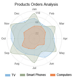
Example
This section will use the Radar Chart to display insights into the table below.
| Product | Month | Orders |
| TV | Jan | 80 |
| TV | Feb | 65 |
| TV | Mar | 75 |
| TV | Apr | 80 |
| TV | May | 90 |
| TV | Jun | 85 |
| TV | Jul | 65 |
| TV | Aug | 70 |
| TV | Sep | 80 |
| TV | Oct | 93 |
| TV | Nov | 99 |
| TV | Dec | 80 |
| Smart Phones | Jan | 100 |
| Smart Phones | Feb | 60 |
| Smart Phones | Mar | 95 |
| Smart Phones | Apr | 75 |
| Smart Phones | May | 100 |
| Smart Phones | Jun | 60 |
| Smart Phones | Jul | 95 |
| Smart Phones | Aug | 75 |
| Smart Phones | Sep | 109 |
| Smart Phones | Oct | 80 |
| Smart Phones | Nov | 109 |
| Smart Phones | Dec | 75 |
| Computers | Jan | 50 |
| Computers | Feb | 55 |
| Computers | Mar | 51 |
| Computers | Apr | 40 |
| Computers | May | 45 |
| Computers | Jun | 30 |
| Computers | Jul | 39 |
| Computers | Aug | 45 |
| Computers | Sep | 56 |
| Computers | Oct | 39 |
| Computers | Nov | 48 |
| Computers | Dec | 44 |
To install the ChartExpo add-in into your Excel, click this link.
- Open your Excel and paste the table above.
- Open the worksheet and click the Insert.
- Click the My Apps button and then look for ChartExpo.

- Click the Insert button to initiate the ChartExpo engine.

- You will see the list of charts, as shown below.

- Look for the “Radar Chart” in the list of charts.
- Once the Radar Chart pops up, click on its icon to get started, as shown below.

- Select the sheet holding your data and click the Create Chart From Selection button, as shown below.
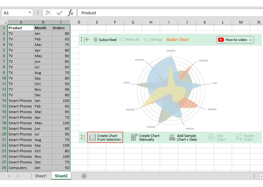
- Check out the final Radar Chart below.
Insights
- TVs outperformed other products during February, April, June, October, and December.
- Smartphones performed well in January, March, May, July, September, and November.
- Computers were the worst sellers in the inventory.


ChartExpo does not natively support a Radar Chart with multiple scales. The tool has only a Dual Axis Radar Chart, supporting two scales.
Keep reading because we’ll show you how to create a Radar Chart in Excel with the help of video.
Video Tutorial: How to Create a Radar Chart in Excel?
In the following video, you will learn how to create a Radar Chart in Excel without any coding in a few clicks.
Keep reading because we’ll address the following question in the coming section: How to read a Radar Chart?
How to Read a Radar Chart in Excel?
-
Identify the Category Each Axis Represents
The first key step is determining the category of data each axis of the Radar Chart in Excel represents.
For example, for a Radar Chart that displays the sales metrics of an employee, the expected key categories can be lead response time, customer acquisition cost, customer lifetime value, monthly new leads, and time spent selling, among others.
-
Determine How Categories Relate
Once you’ve determined the category each axis depicts, evaluate the existing relationships between composite variables. Besides, each variable should use a homogenous scale to improve the reliability and accuracy of insights.
-
Check the Resulting Shape
Evaluate the overall shape created by connecting each data point on your Radar Chart in Excel. You can easily pinpoint the hidden relationships between data points under study.
-
Compare Key Variables
The Spider Chart in Excel is best-suited in comparing key variables in your data. More so, it uses shapes and contrasting colors to bring out distinction insights.
How are Radar Charts used in Business?
-
Employee Appraisals and Reviews
You can use the Radar Chart in Excel to visualize employees’ appraisals and reviews for in-depth and actionable insights. For instance, you can compare variables that sum up to the desired score in a performance review.
-
Product comparisons
The chart is also best suited in comparing variables. You can leverage it to compare the performance of products in inventory.
Why Use a Radar Chart?
Check out the benefits of a Radar Chart below:
-
Compare bulky and complex data sets
One of the key advantages of a Radar Chart in Excel is you can easily display insights into two or more significant data points. In other words, you can display multiple variables within a limited space without cluttering.
-
Make comparisons
You can use a Spider Chart in Excel with multiple scales to compare two or more significant variables in your data. For instance, you can compare gross profits, net profits, and dividends issued within a single chart.
-
Outliers
One of the reasons why seasoned data visualization experts use the Radar Chart/ Polar Graph in Excel is that it displays hidden outliers and anomalies within your data.
-
Track Performance
You can also use the charts to track the performance of key metrics in your business (or workplace).
FAQs:
Why should you use a Radar Chart?
One of the key advantages of a Radar Chart in Excel is you can easily display insights into two or more significant data points.
You can use a Radar Chart to compare two or more significant variables in your data. Data visualization experts use the Radar Chart in Excel to display hidden insights within your data.
When should you not use a Radar Chart?
Avoid using Radar Chart in Excel if you expect comparison insights with a significant degree of accuracy of strategic decision-making. Radar Charts are not the best alternative for comparing values across each variable.
Also, the chart is not best suited in visualizing bulky and complex data because it’s prone to clutter.
Wrap Up
A Radar Chart is one of the informative graphical designs you can use to compare two or more key variables on a two-dimension plane, such as your dashboard.
The chart (also called a Spider or Polar Graph) is incredibly easy to read and interpret. Besides, it displays a lot of information using limited space.
Excel seems to be the obvious choice because it’s almost free to access. However, the spreadsheet application does not natively support Polar graphs. In other words, the spreadsheet app is not the best-suited Radar Chart generator.
Think beyond Excel if you intend to access ready-made, visually appealing, easy-to-read Radar Chart in Excel.
We recommend installing third-party apps, such as ChartExpo, into your Excel to access ready-made Radar Charts. It’s an add-in you can easily download and install in your Excel spreadsheet.
ChartExpo is loaded with ready-to-use to interpret Radar Chart, plus over 50 more advanced visualization designs.
Sign up for a 7-day free trial today to access easy-to-interpret and visually appealing Radar Graphs in Excel.
Create a Radar Chart
- Select the data that you want to use for the chart.
- On the Insert tab, click the Stock, Surface or Radar Chart button and select an option from the Radar A preview of your chart will be displayed to help you choose.
Contents
- 1 What is a radar chart in Excel?
- 2 How do you make a radar chart sheet?
- 3 How do you make a spider chart in Excel?
- 4 How do I fill a radar color chart in Excel?
- 5 How do you use a radar chart?
- 6 What type of chart is radar chart?
- 7 What is a radar chart in sheets?
- 8 How do you make a spider map?
- 9 How do you make a spider web diagram?
- 10 What is a polar chart?
- 11 How do I create a bubble chart in Excel?
- 12 How do you add an axis to a radar chart?
- 13 What is the difference between radar chart and stock chart?
- 14 What is the main problem associated with radar charts?
- 15 How do you describe a radar graph?
- 16 How do you label a radar chart?
- 17 How do I make a diagram in Google Docs?
- 18 What is the spider map?
- 19 What is spider concept map?
- 20 Is concept map a graphic organizer?
The Radar Chart is a built-in chart type in Excel. Radar charts, sometimes called spider charts, have one axis per category which all use the same scale. The axes of a radar chart radiate out from the center of the chart and data points are plotted on each axis using a common scale.
How do you make a radar chart sheet?
Enter the variables and data into the Google Sheet. Select all of the data with your cursor, and then select the “Insert Chart” icon on the toolbar. In the Chart editor → Setup → Chart type drop-down menu, scroll down and select Radar Chart. You have created your spider chart/radar chart.
How do you make a spider chart in Excel?
To create a radar or spider chart in Excel, select your data, then click on the Insert tab, Other Charts, then Radar.
How do I fill a radar color chart in Excel?
However, you can use controls on the Home tab of the ribbon, or right-click and use the mini toolbar to set the fill color. If you want to change transparency, select more fill options, then use the transparency control near the bottom. Radar charts have a certain appeal that comes from being sleek and different.
How do you use a radar chart?
Creating a radar chart
- Click Diagram > New from the toolbar.
- In the New Diagram window, select Radar Chart, then click Next.
- Name the diagram, then click OK.
- You will see something like this:
- The colors of the polygons is randomized.
- Double click variable Variable then rename the variable to Durability.
What type of chart is radar chart?
A radar chart is a graphical method of displaying multivariate data in the form of a two-dimensional chart of three or more quantitative variables represented on axes starting from the same point.
What is a radar chart in sheets?
What is Radar Chart in Google Sheets. Radar Chart is a simple two-dimensional chart. Here in Radar chart, you can show one or more variables or you can say multivariate data with one spoke for each variable. Data points are drawn clockwise around the chart. The Radar chart is also known as Spider Chart.
How do you make a spider map?
How to make a spider diagram
- Choose a broad concept and place it in a circle.
- Use lines to link to ideas that relate to your concept.
- Get more detailed by linking from one idea to another, getting more specific as you go.
- Once finished, review your diagram to see if it makes sense and fine-tune if needed.
How do you make a spider web diagram?
How to make a spider diagram
- Write the main topic or concept in the middle of the page and draw a circle around it.
- Draw lines from your main idea that lead out to each subtopic.
- Add subordinate ideas to your subtopics until you have all your information present in the diagram.
What is a polar chart?
Polar charts are circular charts that use values and angles to show information as polar coordinates. Polar charts are useful for showing scientific data.The distance along the radial axis represents quantity, and the angle around the polar axis represents revenue.
How do I create a bubble chart in Excel?
How to quickly create a bubble chart in Excel?
- Enable the sheet which you want to place the bubble chart, click Insert > Scatter (X, Y) or Bubble Chart (in Excel 2010, click Insert > Other Charts) >Bubble.
- Right click the inserted blank chart, and click Select Data from the context menu.
How do you add an axis to a radar chart?
Click on Change Chart Type and select Radar, then “Radar with Markers” or “Filled Radar”; Click on Add Chart Elements (on the toolbar), then click on Axes, More Axes Options…; Click on Fill & Line icon (under the button “Axis Options”), find Line section and click on Solid line.
What is the difference between radar chart and stock chart?
Explanation: Stock charts are designed to display stock market data.Radar charts are ideal for showing values relative to a center point and are ideally suited for showing exceptions to a trend.
What is the main problem associated with radar charts?
One problem with radar charts is that they over-encode shape, meaning for humans the minor differences on each axis are not prominent, but the weird polygon shape of a single data point is.Here’s how: humans are good at noticing differences between shapes.
How do you describe a radar graph?
A radar chart is a 2D chart presenting multivariate data by giving each variable an axis and plotting the data as a polygonal shape over all axes.Typically a radar chart looks like an irregular polygon, or like several irregular polygons stacked on top of each other, all with the same center.
How do you label a radar chart?
Label placement. A radar chart’s radial axis is centered horizontally in the middle of the chart, and its labels could be placed on either side. To place its labels on the left side, click to select the radial axis labels, and in the Properties window’s Text tab, click Label Style. Select Place Left under Layout.
How do I make a diagram in Google Docs?
Use the add-on to insert it directly into your document.
- Open the correct Google Doc.
- Go to Add-ons > Lucidchart Diagrams > Insert Diagram.
- Find the diagram you need to insert into your doc.
- Click the orange “+” button in the corner of the preview image.
- Click “Insert.” Now you’ve added your diagram to your Google Doc!
What is the spider map?
Spider Map | NCpedia. noun. Definition: A graphic organizer used to describe the attributes and functions of a central idea or theme. Each central theme has four or more branches to organize details, resembling a spider.
What is spider concept map?
A spider map is a brainstorming or organizational tool that provides a visual framework for students to use. Sometimes, this graphic organizer is called a “concept map” or a “spider web graphic organizer”. A spider map has a main idea or topic in the center, or the body, of the diagram.
Is concept map a graphic organizer?
A concept map is a visual organizer that can enrich students’ understanding of a new concept. Using a graphic organizer, students think about the concept in several ways.
На радарной диаграмме сравниваются значения трех или более переменных относительно центральной точки. Это полезно, когда вы не можете напрямую сравнивать переменные, и особенно хорошо подходит для визуализации анализа производительности или данных опросов.
Вот образец радиолокационной диаграммы, чтобы вы могли понять, о чем мы говорим. Скорее всего, вы уже сталкивались с ними раньше, даже если не знали, что они такие.
Создать радарные диаграммы в Excel просто. В этой статье мы покажем вам, как создать два типа радарных диаграмм: обычную диаграмму (например, приведенную выше) и диаграмму с заполнением (например, приведенную ниже, которая заполняет области, а не просто показывает контуры).
Образцы данных
Давайте сначала взглянем на образцы данных, которые мы будем использовать в наших примерах.
У нас есть три тренера: Грэм, Барбара и Кейт. Мы оценили их по пяти различным категориям (знания, доставка и т. Д.), И наша таблица Excel содержит эти оценки.
В этом первом примере мы создадим радарную диаграмму, на которой будут показаны оценки всех трех тренеров.
Выделите все ячейки, включая строку, содержащую имена, и столбец, содержащий заголовки экзаменов. Перейдите на вкладку «Вставка» и нажмите кнопку «График водопада».
Вы можете выбрать одну из трех радарных диаграмм. Для этого примера выберите первую опцию Radar Chart. (Второй вариант просто добавляет маркеры к значениям на линиях; третий вариант заполняет диаграмму, и мы рассмотрим это чуть позже.)
Теперь, когда вы вставили диаграмму в рабочий лист, вы можете начать вносить в нее некоторые улучшения.
Введите название диаграммы
Выберите заголовок диаграммы, а затем введите новый заголовок. По мере ввода текст будет отображаться на панели формул.
Когда вы нажмете Enter, ваша диаграмма получит новый заголовок.
Переместить легенду
Для другого изменения мы могли бы переместить легенду сверху диаграммы вправо.
Когда диаграмма выбрана, вы увидите четыре кнопки, парящие вверху справа. Нажмите кнопку «Элементы диаграммы» вверху, а затем наведите указатель мыши на опцию «Легенда». Вы увидите стрелку вправо. Щелкните по нему, а затем выберите параметр «Вправо» в появившемся меню.
Изменить ось диаграммы радара
Чтобы сделать нашу радарную диаграмму более впечатляющей и ясной, мы изменим ось, чтобы она начиналась с трех, а не с нуля.
Снова нажмите кнопку «Элементы диаграммы», наведите указатель мыши на параметр «Оси», щелкните появившуюся рядом стрелку и выберите «Дополнительные параметры».
Панель «Ось формата» появится справа. Мы хотим отредактировать настройку «Минимум» в разделе «Границы», поэтому щелкните это поле и введите там «3».
Радарная диаграмма обновляется немедленно, и теперь, когда мы увеличили минимальное значение Bounds, вы можете более четко увидеть различия в оценках трех тренеров.
Этот пример дает нам хорошее представление о том, какие тренеры выделяются в каких качествах, а также насколько разнообразны их наборы навыков.
Создайте заполненную радарную диаграмму
Во втором примере мы создадим заполненную радарную диаграмму только для одного из тренеров. В этом примере мы будем использовать Кейта.
Для начала выберите нужный вам диапазон ячеек. В нашем примере нам нужен диапазон A1: A6 и диапазон D1: D6, как показано ниже. Для этого удерживайте клавишу Ctrl, пока вы выбираете каждую дополнительную ячейку, которую хотите добавить к своему выделению.
Теперь перейдите в меню «Вставка»> «Карта водопада»> «Заполненный радар».
Когда вы создаете радиолокационную диаграмму, используя только один ряд данных, ось не начинается с нуля, как это было в нашем предыдущем примере. Вместо этого минимальной границей будет наименьшее число в выбранном вами диапазоне ячеек. В нашем случае минимальная граница составляет 4,4 — на один тик ниже минимальной оценки Кита.
Эта диаграмма помогает вам представить, насколько Кит силен по каждому из оцениваемых качеств.
Обратите внимание, что если бы мы создавали несколько радарных диаграмм (например, мы хотели бы показать отдельную диаграмму для каждого из наших тренеров), мы бы хотели убедиться, что диапазоны осей согласованы, чтобы представление данных не вводило в заблуждение. Так, например, мы бы установили минимальную границу немного ниже самого низкого рейтинга любого тренера, а максимальную границу — немного выше, чем наивысший рейтинг любого тренера. Вы даже можете удалить саму ось, чтобы уменьшить беспорядок на диаграмме.
Создавать радарные диаграммы в Excel просто, но чтобы получить от них максимальную отдачу, может потребоваться дополнительное внимание. В будущем они могут стать полезным дополнением к вашим отчетам Excel.
Radar Chart is a pictorial representation of multivariate data. Multivariate data analysis in statistics is nothing but dealing with more than one outcome or observations. Radar graphs can be of two dimensions, three dimensions, or more on the basis of the multiple comparable variables used. The variables are represented on the axis starting from the same points with equal intervals on the axes. The number of axes in a radar graph solely depends on the number of variables used.
The Radar Chart has various other names like spider chart, web chart, spider web chart, cobweb chart, irregular polygon, star chart, Kiviat Diagram, etc. The data from the observations in the form of tables are plotted on each axis and by joining all these points in the axes a polygon type structure is formed. So, the number of polygons is dependent on the number of observations.
In this article, we will see how to plot a Radar Chart in Microsoft Excel for a given data set using two examples.
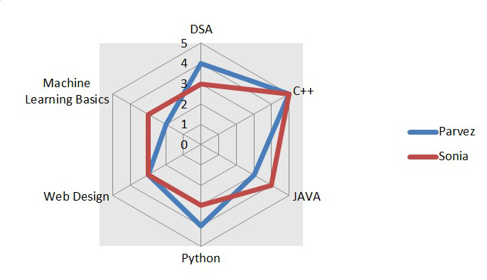
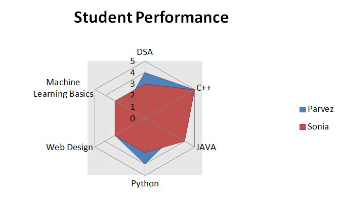
Example 1 : Consider the table shown below which consists of the data of two Geek students who enrolled in our various courses. Our mentors have rated them on the basis of the student’s performance in the individual course. The rating is on a scale of 0 to 5. The demonstration is done in Microsoft Excel Version 2010.
|
Students Performance in GeeksforGeeks (Scale 0-5, 5 is the maximum rating) |
||
| Courses | Parvez | Sonia |
| 1. Data Structures Algorithms | 4 | 3 |
| 2. C++ | 5 | 5 |
| 3. JAVA | 3 | 4 |
| 4. Python | 4 | 3 |
| 5. Web Design | 3 | 3 |
| 6. Machine Learning Basics | 2 | 3 |
Implementation :
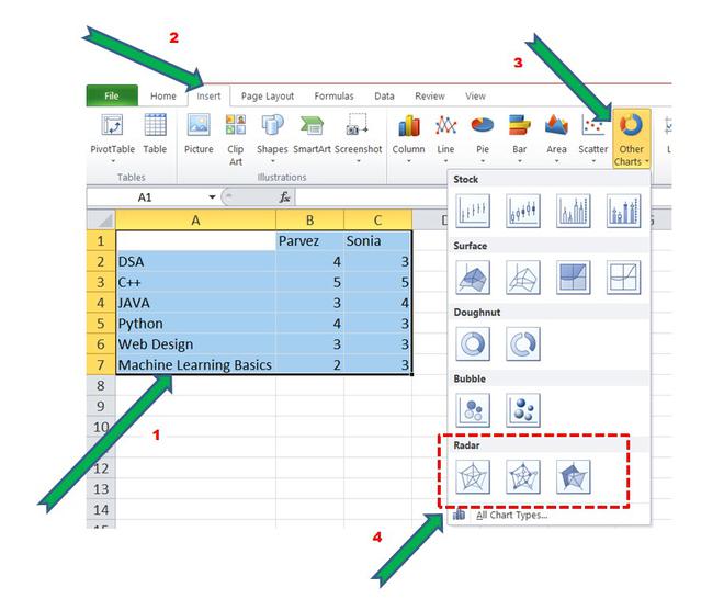
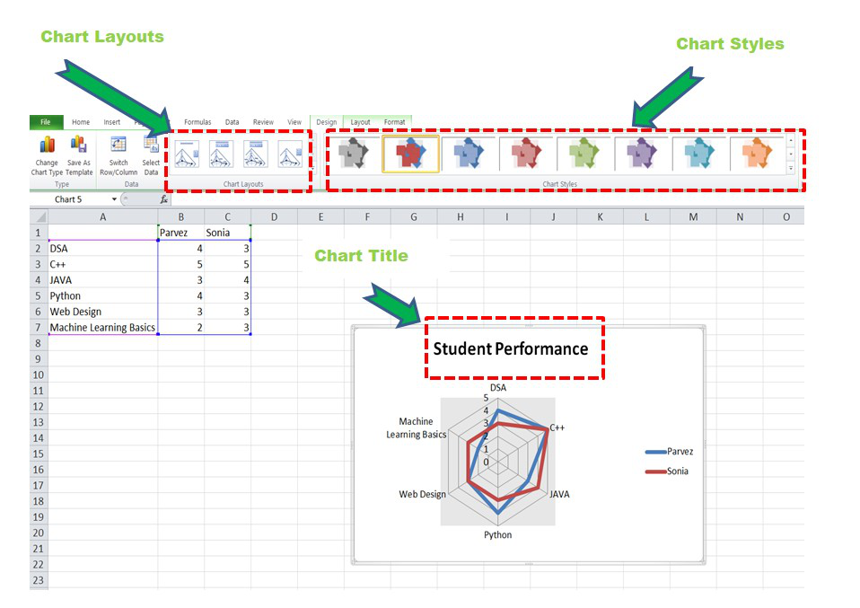
Step 1: Make the above dataset in MS Excel. There should be three columns and six rows. Now select all the rows and columns and click on the “Insert” button as shown below. Then click on the “Other Charts” followed by Radar.
Select -> Insert -> Other Charts -> Radar
Creating a Radar Chart
Step 2: There are basically three types of Radar Charts in SQL. They are “Radar”, “Radar with Markers”, “Filled Radar”. Let’s select normal radar and observe the chart for the given dataset.
Radar Chart
We can observe that two polygons are formed by joining all the data points in the axes. The blue polygon depicts the performance of Parvez in the courses and similarly, the dark red polygon is about Sonia’s performance.
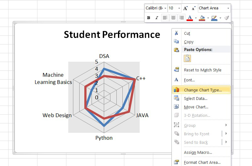
Step 3: Now, we can perform various format operations and make the chart more informative and beautiful by adding titles and changing color. We can select from various chart layouts and styles according to our requirements. To add Title, select the first option from the “Chart Layout” option as highlighted in the image below and add a suitable title.
Unlike Excel Version 2016 or higher, there is no direct drop-down menu to format the graph. So, just right-click on the point in the chart which needs to be formatted.
To perform more operations like changing the color, increasing the font, etc. simply right-click and do the formatting.
Formatting the Radar Chart
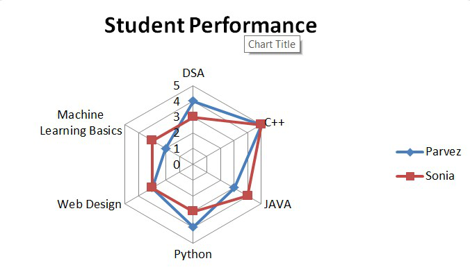
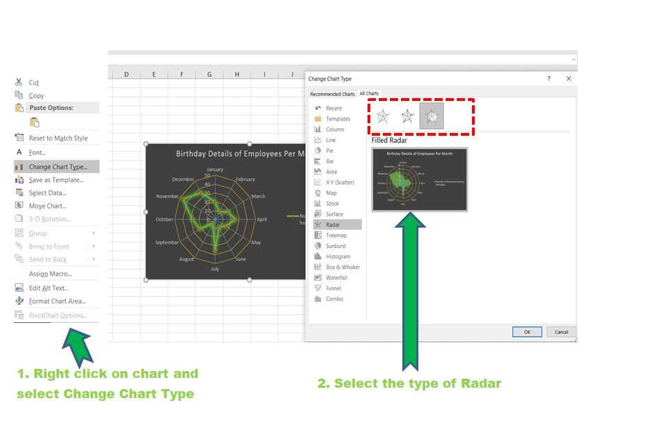
Step 4: Now to change the Radar type, right-click on the chart and select the “Change Chart Type” option and then select the Radar with marker chart or Filled Radar Chart.
Radar Chart with Marker
Filled Radar Chart
The above two polygons are equally likely. Their size and shape almost the same which infer that both have similar performance in the courses. Geek Parvez got better ratings in DSA and Python courses and in Java Geek Sonia got better ratings than Parvez. Similarly, we can do comparative analysis on the basis of the polygons formed.
Now let’s take a second example and see how we can make a Radar Chart in Excel 2016 version or higher.
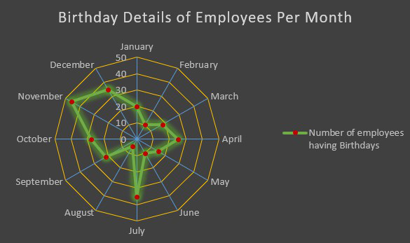
Example 2: Consider the table shown below which consists of the data about the count of the number of employees having birthdays per month.
| Birthday Details of Employees in an organization every month | |
|---|---|
| Month | Number of Employees |
| January | 20 |
| February | 10 |
| March | 18 |
| April | 25 |
| May | 15 |
| June | 10 |
| July | 35 |
| August | 5 |
| September | 22 |
| October | 28 |
| November | 46 |
| December | 35 |
Implementation :
Step 1: It is exactly the same as above. The only difference would be the change of icon for adding the Radar Chart as shown below :
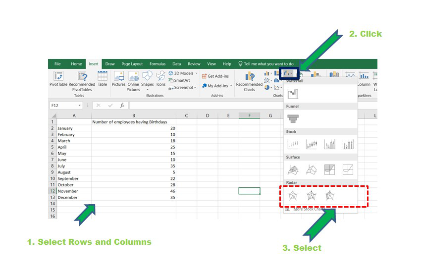
Creating Radar Chart
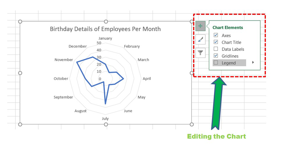
Step 2: The chart will be formed and now various formatting operations can be done as shown. Click on the ” [+] ” symbol in the top right corner for adding titles, legends, formatting, etc.
For formatting, select the chart and then click on the chart elements needed to be formatted and then click on More Options.
Select Chart -> Click on Plus Button -> Click on Chart Elements ->
Click on the Black arrow beside the Chart element to be edited   -> Click More Options -> Format Window Opens
Radar Chart
Step 3: A suitable Chart Style can be selected from the menu in the top right corner of the chart.

Step 4: Axis can be modified using the format window as discussed above. The gridlines on the axes can be added by clicking on Radar (Value) Axis in the Format Axis window and then make the line “Solid Line”.
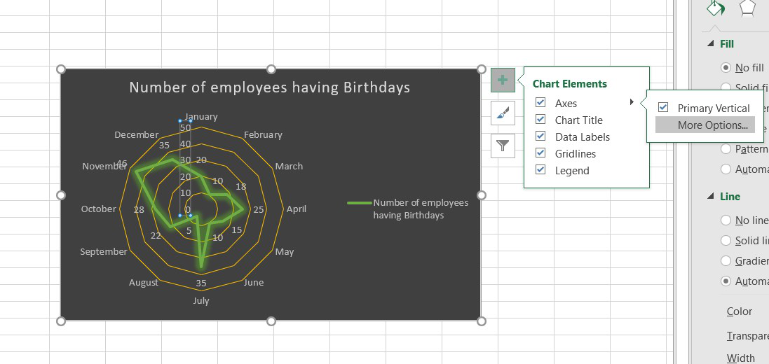
Opening the Format Window
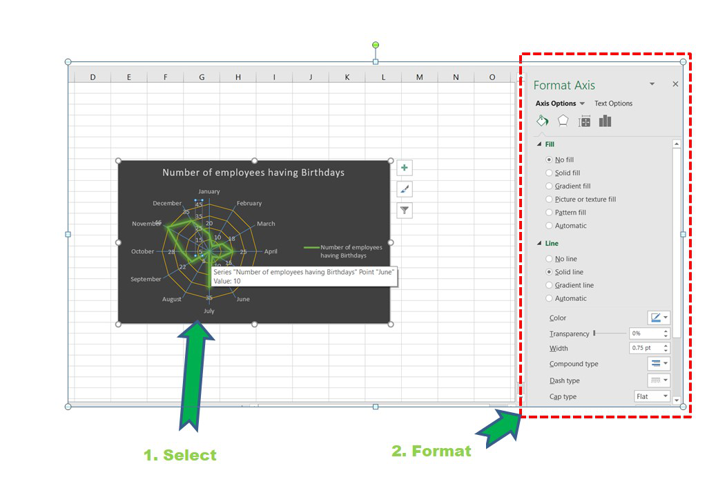
Formatting the Axis
Step 5: Some other modifications can be done in the above chart according to one’s requirements. Now, we can also change the Radar Type as discussed in Example 1.
Radar Type
Finally, after all the modifications and addition of legends, titles, type the chart looks like :
Marked Radar Chart
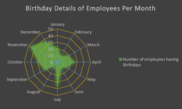
Filled Radar Chart
From the polygon, we can infer that the maximum employees birthdays fall in the month of November and the minimum in the month of August.
Disadvantage of Radar Chart :
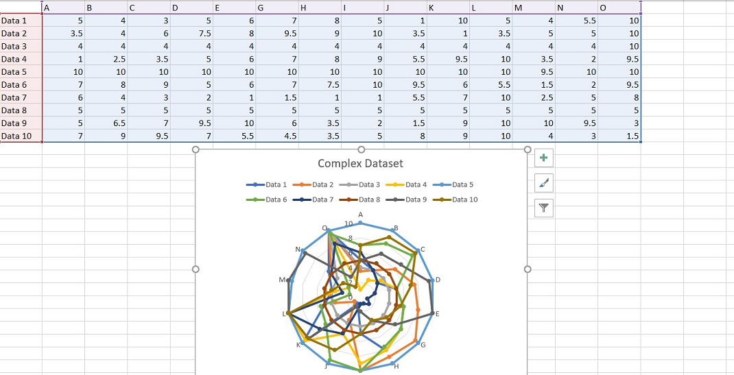
The major flaw is when the number of axes and variables increases the number of polygons also increases. So, the spider chart becomes confusing and crowded with data as shown below. There is a high chance that a lot of polygons will overlap with each other. This will prohibit doing correct comparative analysis. It is recommended to keep few variables for forming polygons and few axes for better inferences from the chart.
Complex Radar Chart