
17 авг. 2022 г.
читать 3 мин
График QQ , сокращенно от «квантильный-квантильный» график, часто используется для оценки того, потенциально ли набор данных получен из некоторого теоретического распределения. В большинстве случаев этот тип графика используется для определения того, соответствует ли набор данных нормальному распределению.
В этом руководстве объясняется, как создать график QQ для набора данных в Excel.
Пример: График QQ в Excel
Выполните следующие шаги, чтобы создать график QQ для набора данных.
Шаг 1: Введите и отсортируйте данные.
В одну колонку введите следующие данные:
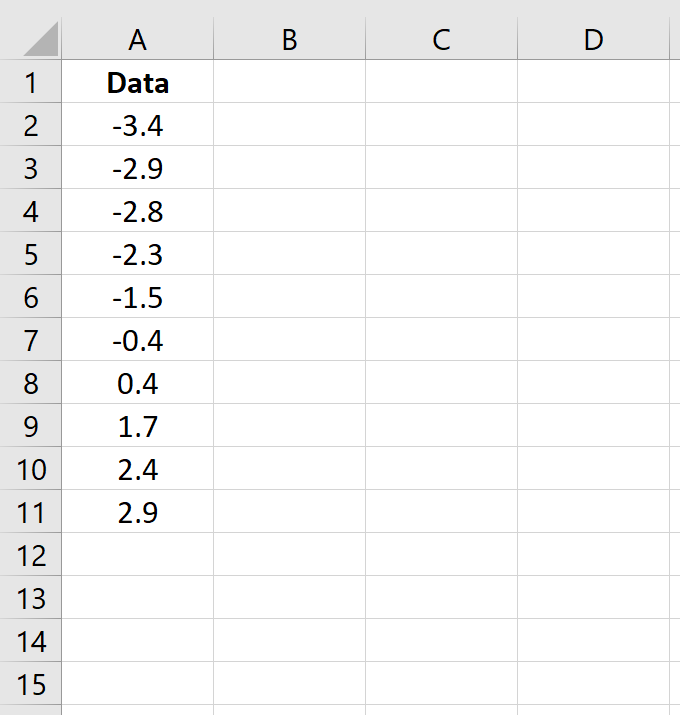
Обратите внимание, что эти данные уже отсортированы от меньшего к большему. Если ваши данные еще не отсортированы, перейдите на вкладку « Данные » на верхней ленте в Excel, затем перейдите в группу « Сортировка и фильтр » и щелкните значок « Сортировка от А до Я ».
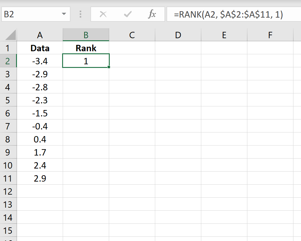
Шаг 2: Найдите ранг каждого значения данных.
Затем используйте следующую формулу для вычисления ранга первого значения:
=РАНГ(A2, $A$2:$A$11, 1)
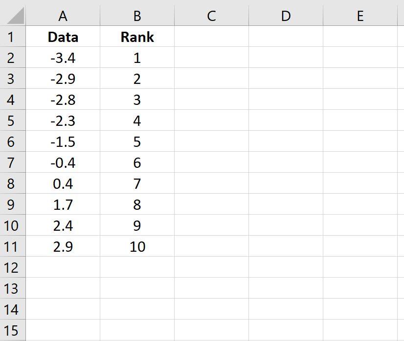
Скопируйте эту формулу во все остальные ячейки столбца:
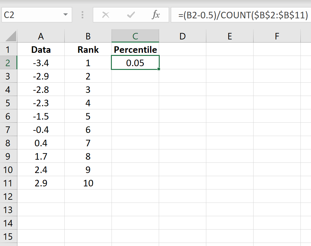
Шаг 3: Найдите процентиль каждого значения данных.
Затем используйте следующую формулу для расчета процентиля первого значения:
=(B2-0,5)/СЧЁТ($B$2:$B$11)
Скопируйте эту формулу во все остальные ячейки столбца:
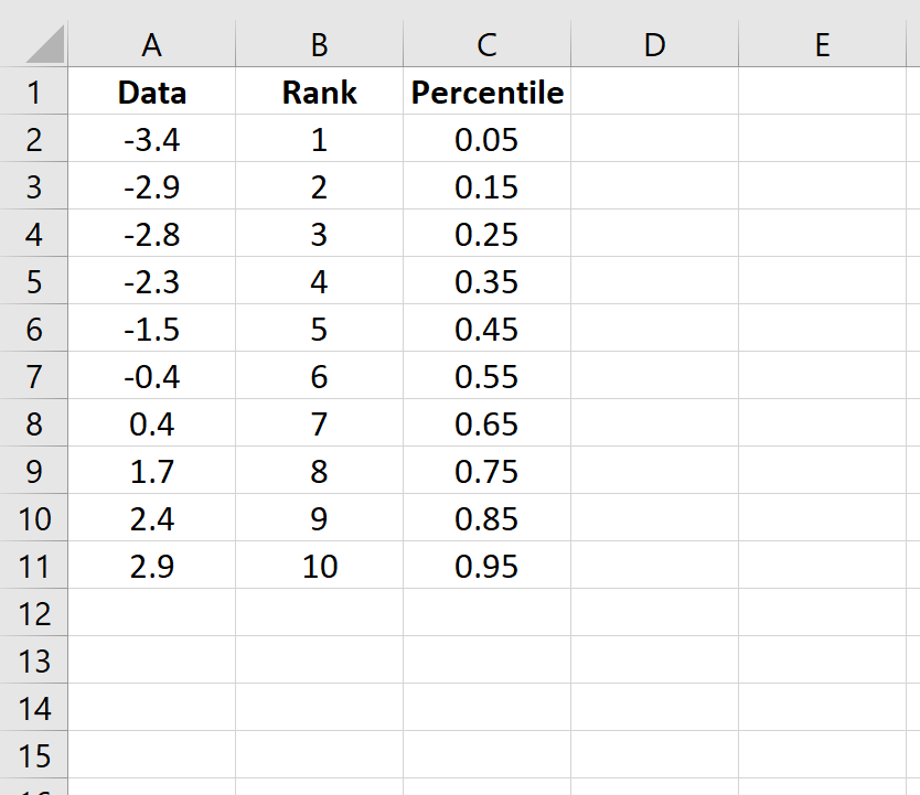
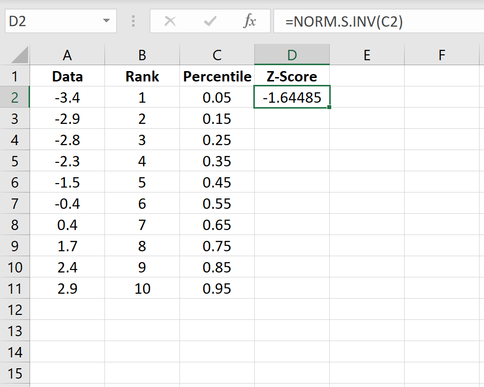
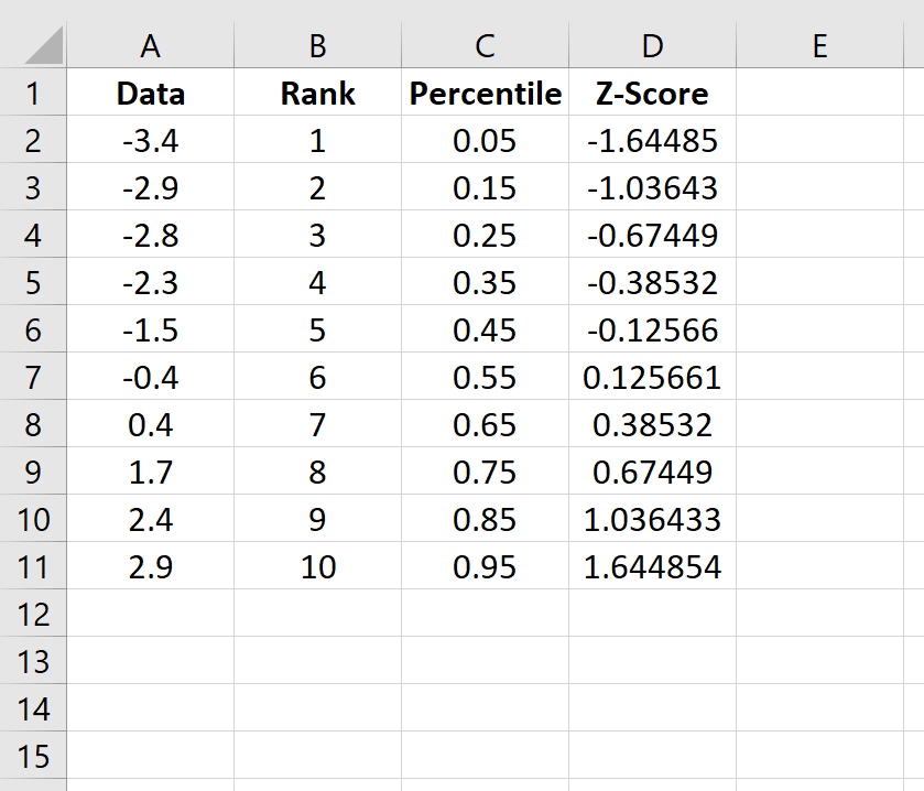
Шаг 4: Рассчитайте z-оценку для каждого значения данных.
Используйте следующую формулу для расчета z-показателя для первого значения данных:
=НОРМ.С.ОБР(C2)
Скопируйте эту формулу во все остальные ячейки столбца:
Шаг 5: Создайте график QQ.
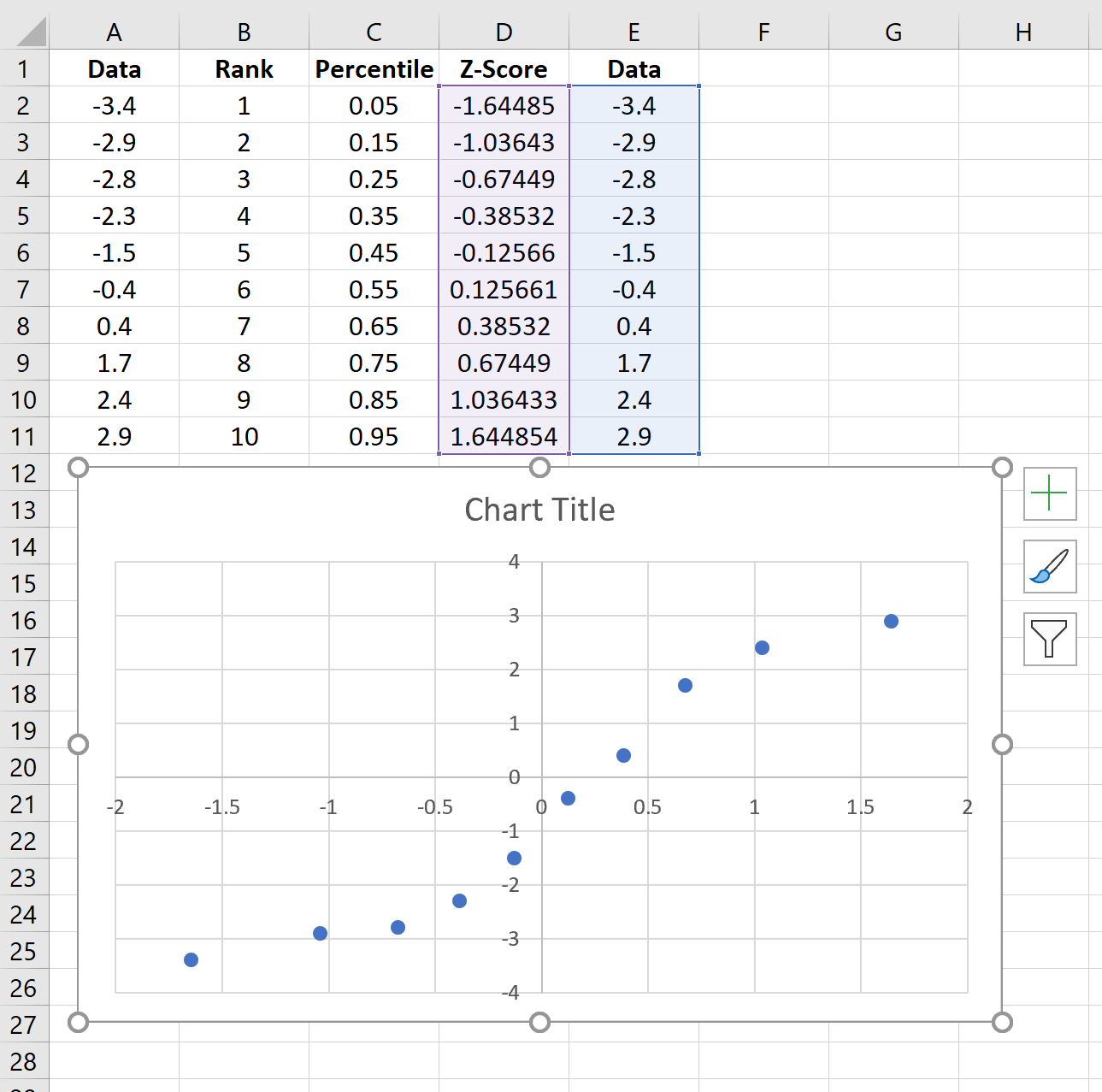
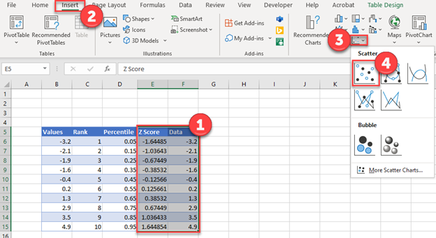
Скопируйте исходные данные из столбца A в столбец E, затем выделите данные в столбцах D и E.
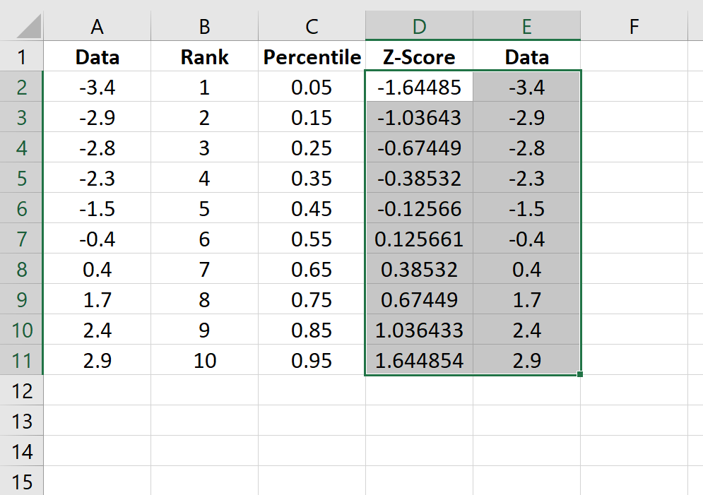
На верхней ленте перейдите к пункту « Вставка ». В группе « Диаграммы » выберите « Вставить разброс» (X, Y) и щелкните параметр с надписью « Разброс ». Это создаст следующий график QQ:
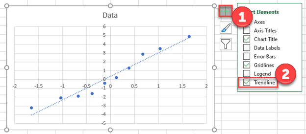
Щелкните значок плюса в правом верхнем углу графика и установите флажок рядом с линией тренда.Это добавит на диаграмму следующую строку:
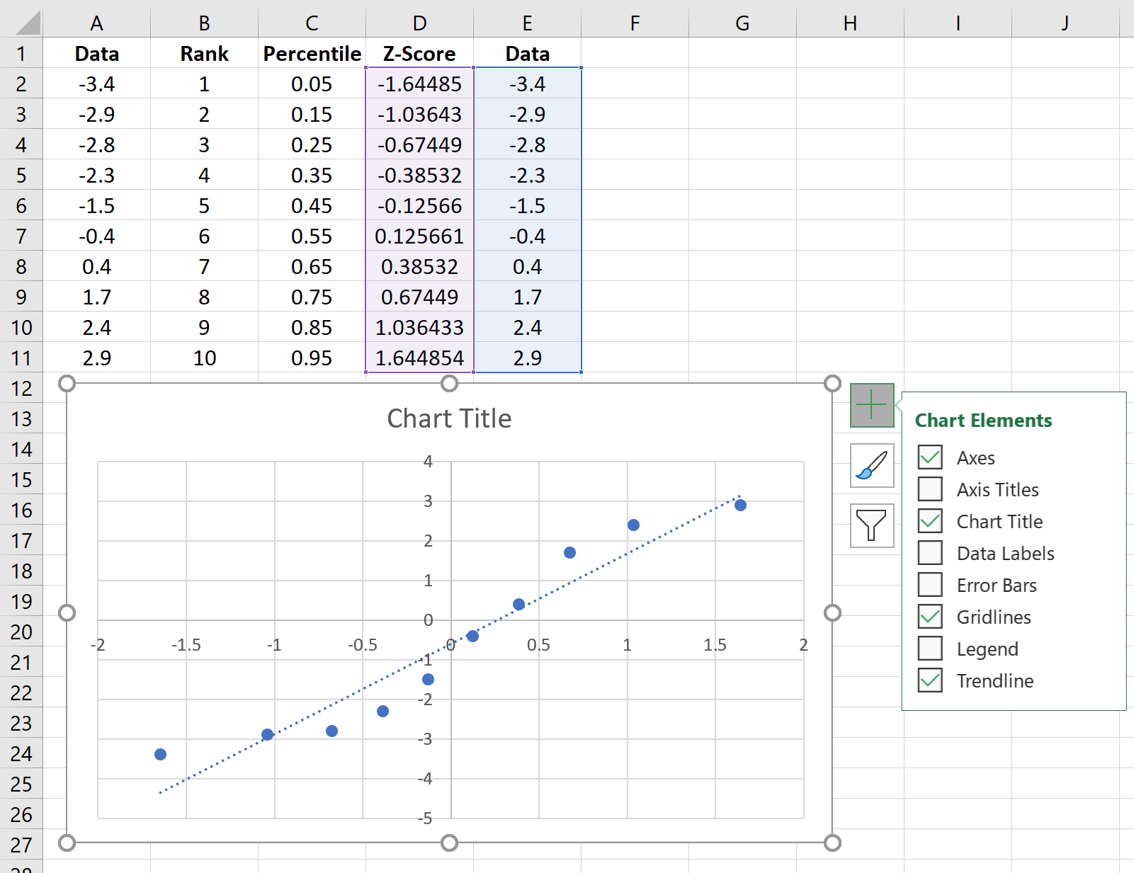
Не стесняйтесь добавлять метки для заголовка и осей графика, чтобы сделать его более эстетичным:
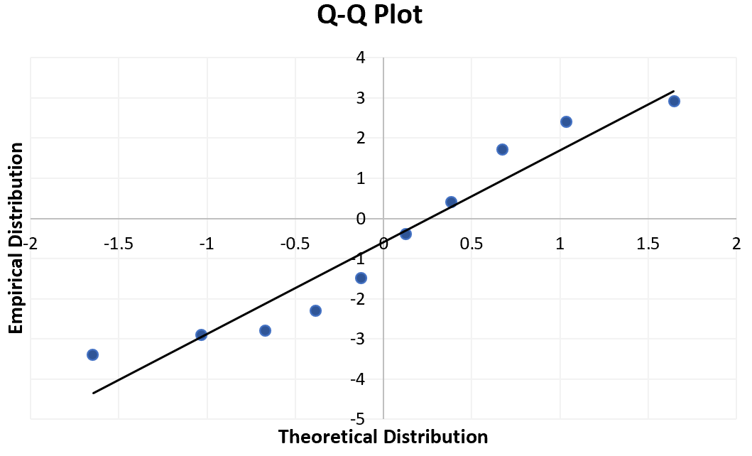
Способ интерпретации графика QQ прост: если значения данных падают примерно по прямой линии под углом 45 градусов, то данные распределяются нормально. Мы можем видеть на нашем графике QQ выше, что значения данных имеют тенденцию отклоняться от 45-градусной линии совсем немного, особенно на концах, что может указывать на то, что набор данных не распределен нормально.
Хотя график QQ не является формальным статистическим тестом, он предлагает простой способ визуально проверить, нормально ли распределен набор данных.
In this tutorial, I’m going to show you how to create a quantile-quantile plot, otherwise known as a QQ plot, in Microsoft Excel.
QQ plots are great visual aids to inspect the distribution of your data. Most commonly, QQ plots are used to see if the data follows a normal distribution.
Here’s a sneak peak at the end product.
In this example, I have a sample containing 49 different data points. These data points have been entered into the first column of my Excel sheet.
What I want to do for this example is to create a QQ plot in Excel to determine if my sample data has a normal distribution.
Step 1: Rank the data
The first step to create a QQ plot in Excel is to rank the data in ascending order (from smallest to largest). This is really easy to do with the RANK AVERAGE function.
=RANK.AVG(number, ref, [order])
- number – The cell containing the data point you want to rank
- ref – The range of cells containing the complete data
- [order] – Enter 1 to rank the cell in ascending order
Here’s what the formula looks for my example.
=RANK.AVG(A2,$A$2:$A$50,1)
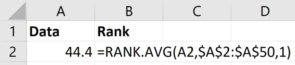
Notice that I have also included a $ symbol before the column letters and row numbers in the ref part of the formula. This is because I want these particular cells to remain constant when I copy the formula down.
Once running this formula, you need to copy the formula down to repeat the process for all the data points.
You should be left with a ranking order of your data.
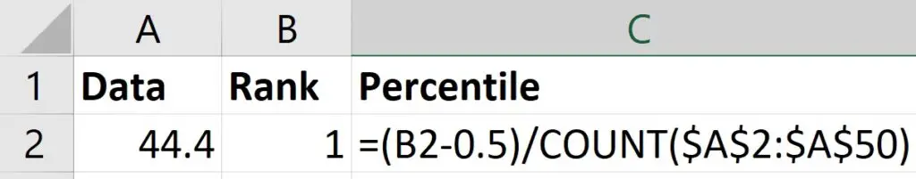
Step 2: Calculate the percentiles
For the next step, you need to calculate the percentile value of the ranks.
To do this, you simply take the rank of the data point and subtract 0.5 from it. You then divide this answer by the number of data points in your sample.
Here’s an overview for what the formula will look like in Excel.
=(rank-0.5)/COUNT(data)
- rank – The cell containing the rank
- data – The range of cells containing the complete data
And here’s what this looks like for the first rank in my data.
Within the COUNT function, notice that the range of cells are also locked (contain the $ symbols).
As with the first step, you want to repeat the function so that all the percentile values for all your ranks are calculated.
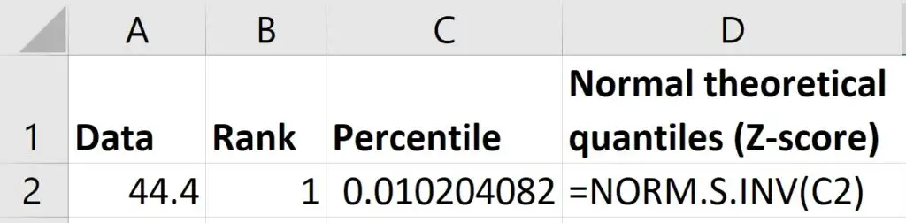
Step 3: Calculate the normal theoretical quantiles
The next step to calculating the QQ plot in Excel is to work out the normal theoretical quantiles.
Specifically, these quantiles are Z-scores based on a normal distribution, where the mean is 0 and the standard deviation is 1.
To do this, I will use the NORM.S.INV function.
=NORM.S.INV(probability)
- probability – The cell containing the percentile
Simply add in the cell containing the percentile values calculated in the previous step.
Step 4: Calculate the data quantiles
Now we have the normal theoretical quantiles, the final calculations we need are the Z-scores for the quantiles based on the original data.
To do this, I will use the STANDARDIZE function to create Z-scores.
=STANDARDIZE(x, mean, standard_dev)
- x – The cell containing the data point
- mean – The average value of the data
- standard_dev – The standard deviation of the data
Note, calculating Z-scores in Excel is discussed in more detail in this post.
For the mean and standard_dev parts of the formula above, you can use the AVERAGE and STDEV (or STDEV.S) functions, respectively.
Here’s what the formula looks like for my first data point in my example.
=STANDARDIZE(A2,AVERAGE($A$2:$A$50),STDEV($A$2:$A$50))
Again, the $ symbols are included to lock the range of cells inside the AVERAGE and STDEV functions. The formula is then copied down to calculate the Z-scores for all my data.
Step 5: Create the QQ plot
Now we have everything we need to create the QQ plot in Excel.
The QQ plot is simply a scatter plot with the normal theoretical quantiles (X axis) against the data quantiles (Y axis).
To create the plot, go to Insert>Insert Scatter>Scatter.
How to adjust the axes
One thing you will probably want to do is adjust the axes, so that they are not placed in the middle of the graph.
To do this, right-click on the graph and select Format Chart Area.
Use the dropdown menu to select either Horizontal (Value) Axis or Vertical (Value) Axis.
In the Axis Options, I recommend adjusting where the axis crosses by defining your own Axis value.
How to add a linear trendline
A common feature of a QQ plot is to add a linear trendline to the graph to make it easier when interpreting the results.
To do this, with the graph selected, go to Chart Design>Add Chart Element>Trendline>Linear.
How to interpret a QQ plot
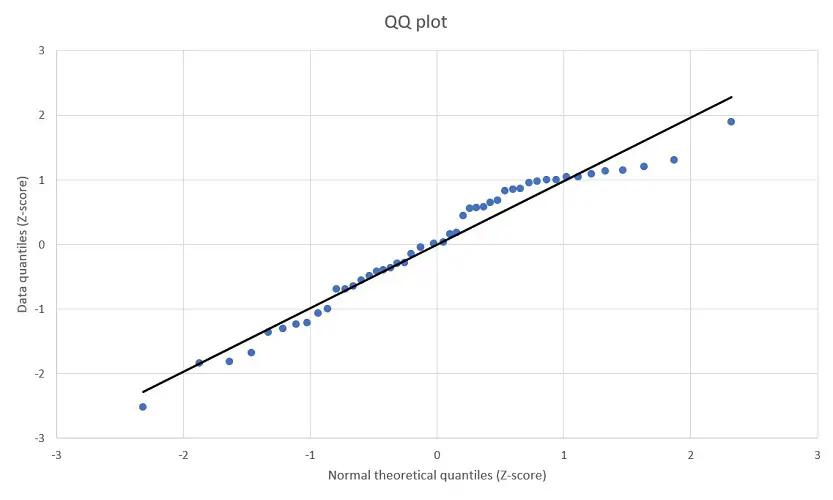
To interpret the QQ plot, you want to look at the data points on the graph and how they fit on the linear line.
If the data has a completely normal Gaussian distribution, then all data points will fit perfectly on the linear line. The data will also follow the linear line in a 45 degree angle.
Looking at my example, I can see that the majority of my data points are either on or are close to the linear line.
So, I’m fairly confident that I have an approximately normal or Gaussian distribution.
It’s also worth plotting a frequency histogram to explore normality further.
How to create a QQ plot in Excel: Final words
In this tutorial, I have shown you how to create a QQ plot in Microsoft Excel. I’ve also shown to you to interpret the results of the plot.
To create a QQ plot to assess data normality, you must manually calculate the normal theoretical quantiles and plot these in a scatter plot against the actual data quantiles.
Microsoft Excel version used: 365 ProPlus
A Q-Q plot, short for “quantile-quantile” plot, is often used to assess whether or not a set of data potentially came from some theoretical distribution. In most cases, this type of plot is used to determine whether or not a set of data follows a normal distribution.
This tutorial explains how to create a Q-Q plot for a set of data in Excel.
Example: Q-Q Plot in Excel
Perform the follow steps to create a Q-Q plot for a set of data.
Step 1: Enter and sort the data.
Enter the following data into one column:

Note that this data is already sorted from smallest to largest. If your data is not already sorted, go to the Data tab along the top ribbon in Excel, then go to the Sort & Filter group, then click the Sort A to Z icon.
Step 2: Find the rank of each data value.
Next, use the following formula to calculate the rank of the first value:
=RANK(A2, $A$2:$A$11, 1)

Copy this formula down to all of the other cells in the column:

Step 3: Find the percentile of each data value.
Next, use the following formula to calculate the percentile of the first value:
=(B2-0.5)/COUNT($B$2:$B$11)

Copy this formula down to all of the other cells in the column:

Step 4: Calculate the z-score for each data value.
Use the following formula to calculate the z-score for the first data value:
=NORM.S.INV(C2)

Copy this formula down to all of the other cells in the column:

Step 5: Create the Q-Q plot.
Copy the original data from column A into column E, then highlight the data in columns D and E.

Along the top ribbon, go to Insert. Within the Charts group, choose Insert Scatter (X, Y) and click the option that says Scatter. This will produce the follow Q-Q plot:

Click the plus sign on the top right-hand corner of the graph and check the box next to Trendline. This will add the following line to the chart:

Feel free to add labels for the title and axes of the graph to make it more aesthetically pleasing:

The way to interpret a Q-Q plot is simple: if the data values fall along a roughly straight line at a 45-degree angle, then the data is normally distributed. We can see in our Q-Q plot above that the data values tend to deviate from the 45-degree line quite a bit, especially on the tail ends, which could be an indication that the data set is not normally distributed.
Although a Q-Q plot isn’t a formal statistical test, it offers an easy way to visually check whether or not a data set is normally distributed.
Return to Charts Home
This tutorial will demonstrate how to create a Q-Q Plot in Excel & Google Sheets.
Q-Q Plot Excel
We’ll start with this dataset showing 10 different values.
Sorting your Data
- Highlight and right click on the data
- Select Sort
- Click on Sort Smallest to Largest
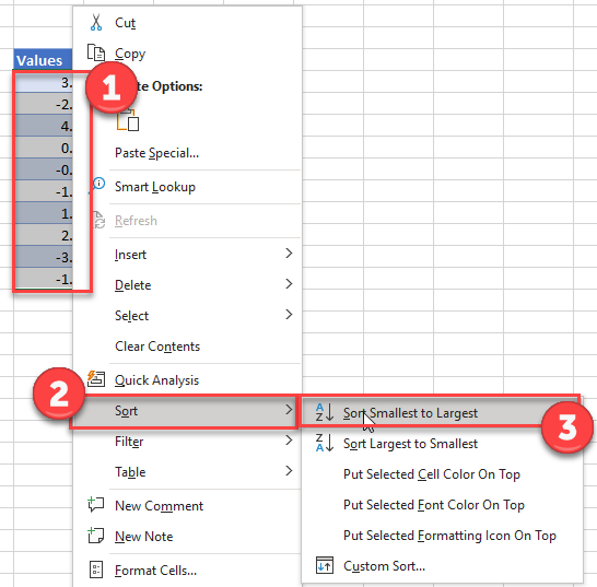
Calculate the Rank of Each Value
Add a column “Rank” and use the RANK Function to rank each value.
=RANK(B6,$B$6:$B$15,1)![]()
Note: Above we’ve locked cell references so we can copy and paste the formula down.
Calculate the Percentile of Each Value
Add a Percentile Column and enter the formula with the COUNT Function:
=(C6-0.5)/COUNT($C$6:$C$15)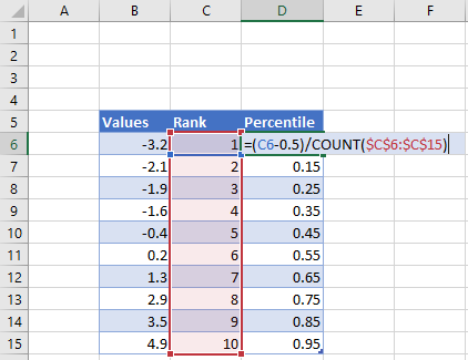
Calculate Z-Score of Each Value
Add a column for Z-Score and enter the NORM.S.INV Function:
=NORM.S.INV(D6)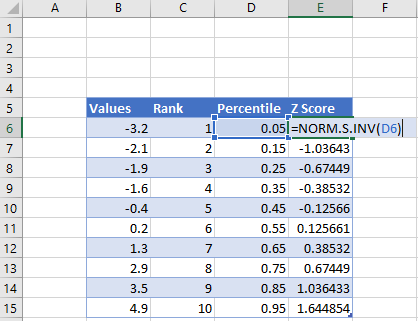
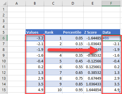
Repeat the Data Column from Column B to Column F
Create the Graph
- Highlight the Z Score and Data
- Select Insert
- Click Scatter
- Click Scatterplot
Add a Trendline
- Click on + Sign in top right of the graph
- Select Trendline
Q-Q Plot Google Sheets
Create a Scatterplot
Using the same table as we made in the Excel tutorial
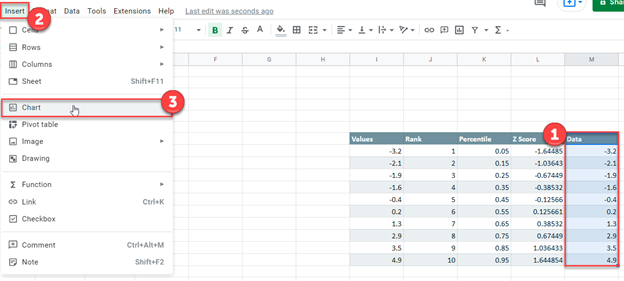
- Highlight the Data Column
- Select Insert
- Click Chart
4. Change Chart type to Scatter Chart
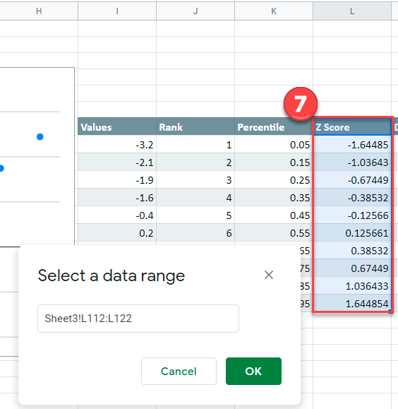
5. Click on X-Axis
6. Click Select a data range square
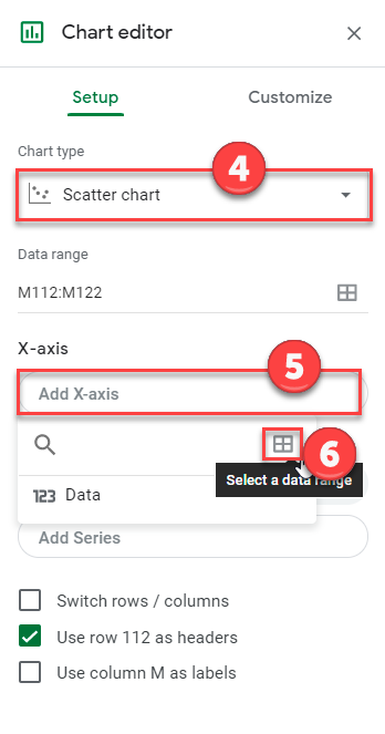
7. Highlight the Z Score Data and click OK.
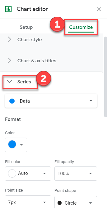
Create a Trendline
- Click on Customize
- Select Series
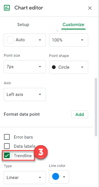
3. Check Trendline
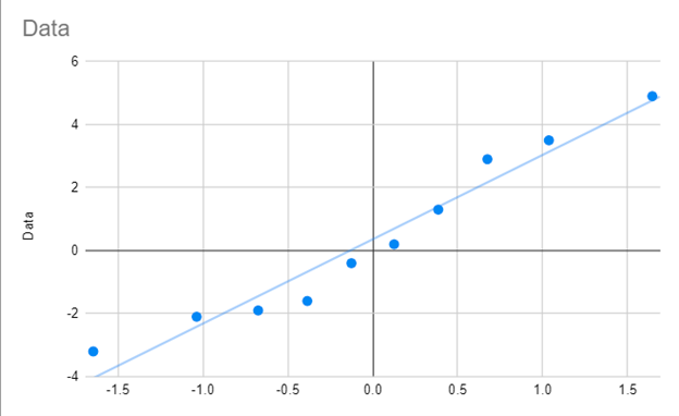
Final Q-Q Graph
Your final Q-Q Graph in Google Sheets should look similar to the one below.
Histogram
A histogram can be used to determine whether data is normally distributed. This test consists of looking at the histogram and discerning whether it approximates the bell curve shape of a normal distribution.
Example 1: Determine whether the data in column B of Figure 1 are normally distributed using a histogram.

Figure 1 – Testing for normality using a histogram
The sample contains 20 data elements. To make sure that the intervals in the histogram are equal and consistent, we first standardize the data points (in column C) as described in Expectation. E.g. the formula in cell C4 is =STANDARDIZE(B4,$B$24,$B$25). Choosing bins from -2 to 2 standard deviations, we create a histogram as described in Histograms.
As you can see from Figure 1, the histogram doesn’t look particularly normal in shape. Caution should be exercised when using a histogram to test for normality since the choice of bin sizes may have a dramatic effect on the result. See Histograms for how to choose the correct bin size.
QQ Plot
A PP plot (point-point plot) is simply a scatter plot comparing two samples of the same size. The more similar the underlying distributions, the more closely the scatter points will conform to a line with slope 1. If the data are standardized then the scatter points would be close to the line y = x.
We can also use a PP plot to compare a data set with a distribution. If the distribution has cdf F(x) and the data set has elements x1, …, xn in ascending order, then the PP plot is the scatter diagram of the set {F(x1), …, F(xn)} versus the set {1/2n, 3/2n, …, 1−1/2n}. Here the second set is an attempt to divide the interval between 0 and n into n evenly spaced intervals (except for the first and last elements which are half the length).
A QQ plot (quantile-quantile plot) is also used to compare a data set with a distribution, and consists of a scatter plot of the data set {x1, …, xn} in ascending order with the values {F-1(1/2n), F-1(3/2n), …, F-1(1−1/2n)}. Here the ith value F-1(i/n−1/2n) is the inverse of the cdf at i/n−1/2n (these are the quantiles).
As for PP plots, if the points on the scatter plot align with the diagonal line y = x then the data set conforms with the distribution.
When using a QQ plot to see whether a data set is normally distributed, you create a scatter diagram between range R1 consisting of the elements x1, …, xn in ascending order and R2 consisting of the values NORM.INV(1/2n, x̄, s), …, NORM.INV(1−1/2n, x̄, s), where x̄ = AVERAGE(R1) and s = STDEV.S(R1).
Alternatively, you can create a scatter diagram between range R1 consisting of the standardized elements z1, …, zn, where each zi = STANDARDIZE(xi, x̄, s), and range R2 consisting of the values NORM.S.INV(1/2n), …, NORM.S.INV(1−1/2n).
A QQ plot is used much more often than a PP plot. PP plots tend to magnify deviations from the distribution in the center, QQ plots tend to magnify deviation in the tails.
Example 2: Using a QQ plot determine whether the data set with 8 elements {-5.2, -3.9, -2.1, 0.2, 1.1, 2.7, 4.9, 5.3} is normally distributed.
The mean of this data set is .375 and the standard deviation is 3.89. If the data set is normally distributed then for any value x, the cumulative distribution at x would be given by
F(x) = NORM.DIST(x, .375, 3.89, TRUE)
We now split the interval (-∞, ∞) into 8 sub-intervals (-∞, x1 ), (x1, x2), …, (x7, x8), (x8, ∞) such that the area under the standard normal curve for the 2nd through 7th intervals are equal and the area under the curve of the first and last intervals are half the size of the middle intervals. This is equivalent to finding points z1, z3, z5, z7, z9, z11, z13 and z15 such that zi = NORM.S.INV(i/16). Thus xi = z2i-1 and if the original data are normally distributed then
F(xi) = NORM.S.INV((2i–1)/16).
We summarize this approach in Figure 2, where we have also standardized the original data so that it is easier to compare the standardized data with the standard normal approximation for each data point (under the assumption that the original data are normally distributed). Finally, we have included a scatter diagram (the QQ plot) of the data vs. the standardized normal data.
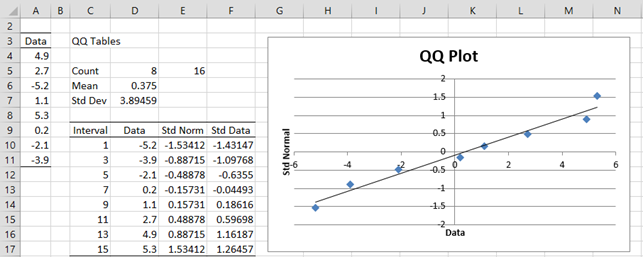
Figure 2 – Using a QQ plot to test for normality
Cells E5. D6 and D7 contain the formulas =2*COUNT(A4:A11), AVERAGE(A4:A11) and STDEV.S(A4:A11). The range D10:D17 contains the data in sorted order, e.g. by using the formula =QSORT(A3:A11). Cell E10 contains the formula =NORM.S.INV(C10/E5) and cell F10 contains the formula =STANDARDIZE(D4,D$6,D$7), and similarly for the other cells in columns E and F.
We then create a scatter chart from the data in range E10:F17 (as described in Excel Charts) and add a linear trend line (as described in Scatter Plots).
We can see that the data pretty well fits with the trend line, which is a good indicator that the original data is roughly normal. In fact, if the original data is normally distributed, then when the standardized data is plotted against the standard normal values the trend line should be the diagonal line through the origin y = x.
QQ Plot Data Analysis Tool
Real Statistics Data Analysis Tool: The Descriptive Statistics and Normality data analysis tool contained in the Real Statistics Resource Pack allows you to create QQ plots automatically. We illustrate this capability in the following example.
Example 3: Determine whether the data in Example 1 is normal by using a QQ plot. The data is repeated in range A3:A23 of Figure 4.
To run the analysis, press Ctrl-m and select the Descriptive Statistics and Normality option (from the Desc tab when using the multipage user interface). Fill in the dialog box that appears as shown in Figure 3, choosing the QQ Plot option, and press the OK button.

Figure 3 – QQ Plot dialog box
When you click on the OK button, the output shown in Figure 4 is displayed.

Figure 4 – QQ plot for data in Example 1
This time you can see that the data is not particularly normally distributed.
Box Plots
While box plots can’t actually be used to test for normality, they can be useful in testing for symmetry, which sometimes is a sufficient substitute for normality.
Example 4: Use a box plot to gain more evidence as to whether the data in Example 1 is symmetric.
To produce the box plot, press Ctrl-m and select the Descriptive Statistics and Normality option (from the Desc tab when using the multipage user interface). Fill in the dialog box that appears as shown in Figure 3, choosing the Box Plot option instead of (or in addition to) the QQ Plot option, and press the OK button. The output is shown in Figure 5.

As we can see from Figure 5, the data is relatively symmetric, and so although as we saw in Example 1 and 3, the data is probably not normally distributed, it does appear to be relatively symmetric, which is sufficient for some of the tests that we would like to use.
References
Howell, D. C. (2010) Statistical methods for psychology (7th ed.). Wadsworth, Cengage Learning.
https://labs.la.utexas.edu/gilden/files/2016/05/Statistics-Text.pdf