
Choosing and implementing color palettes is a difficult task in visualizing data. Color can be used to highlight and draw attention, but also to confuse. It can be used to make things seem drab or to make them “pop”. As Maureen Stone once famously wrote, “Color used poorly will obscure, muddle and confuse.”
Using color in some of the default tools such as Excel and Tableau will yield visualizations that look just like everything else. For me, using those default colors suggests a level of laziness—that the creator couldn’t bother to consider alternative colors to better display the data or convey their argument.
But how do you choose alternative color palettes? If you’re not a designer (like me), this might seem an impossible task. Fortunately, there are lots of creative people out there willing to provide you with samples, or at least a start. For example, in two posts from Canva last year, they provided over 150 different color palettes derived from and photos and “impactful websites”. (In my opinion, Canva’s “Design School” provides some of the best beginner design work out there, which is why I’ve included them in my list of Design Resources.)
At the beginning of this year, Pablo Sáenz de Tejada turned all of those color palettes into a free, downloadable text file you can use to input them into Tableau. In turn, I’ve taken Pablo’s color palettes (thanks again, Pablo!) and converted them into 150 files you can input into Excel for your own use.
How I Created Them
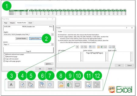
In case you don’t know, every modern version of Excel contains more than 50 alternative color palettes to the default Excel colors. In the left side of the Page Layout tab (and this applies to Excel 2010, 2013, and 2016 on PCs; Macs are a little different and I explain this in a Note below), there is a Themes group, which, among others options, contains a Colors dropdown menu (the images here are all from Excel 2013).

Selecting any of these alternatives changes the default colors applied in your Excel workbook. You may also notice at the very bottom that there is a Customize Colors… option. Selecting that option allows you to manually change each of the colors in the palette that you can save in an XML file format.

Instead of creating 150 palettes manually by clicking and typing in each color code, I took Pablo’s text file and created 150 separate XML files that you can input directly into Excel. (Excel requires 6 colors for each palette, plus a Background and Text color), but because the Canva palettes only have 4 colors, I added black and a gray to the 5th and 6th colors. If you want to change those colors, see the Note at the end.)
(Note: I find it interesting, actually, that to create a custom palette manually in Excel you need to use the RGB or HSL color models, but in the direct-input approach, you can use the HEX color model. Fortunately, this is the format Canva and Pablo provided, so I didn’t need to do any converting. I’d be curious to know why that is—if any of you Excel wizards know, please drop me a line.)
How You Use Them
To input the palettes into your own version of Excel, all you need to do is place the XML file in the appropriate folder. At least on Windows 7 computers, this Theme Colors folder can be found here:
C:UsersUSERNAMEAppDataRoamingMicrosoftTemplatesDocument ThemesTheme Colors.
If that doesn’t work, you need to find the folder manually. I find the best way is to pretend you are going to save a new Theme and then copy the folder location. So, in that same Themes group, use the drop-down menu under Themes and select Save Current Theme at the very bottom. The folder location that will subsequently open should contain the Theme Colors folder—copy the folder location and drop the color palette(s) you want to use in there.

 When you open the Colors dropdown in Excel, all of the color palettes you copied to that Theme Colors folder will appear, as you can see in this side-by-side screenshot.

I hope this is helpful and you find some good colors to use. Be sure to browse the Canva posts to find a palette you like and then install the XML file. You can download a zip file with all of the color palettes below; just unzip and use those you like best.
Excel Color Palettes Download
Note 1: Macs
On the Mac OS, the process is slightly different. For whatever reason, you need to add the Theme Color file through PowerPoint. You basically follow the same procedure described above, but go through PowerPoint and the color palette will then appear in Excel.
Note 2: Changing the Palettes
As I noted above, Excel requires 6 colors for each palette and because Canva provided 4 colors, I simply added a black and gray to each. If you want to change the black and gray or any of the other colors, or you want to create your own palettes, here’s how you do so.
Open any of these XML files in a text editor (I prefer TextWrangler for this purpose). The code looks like this:

Notice the name of the palette on line 3 (and is in quotes). Change this if you like and save the file (with the .xml extension) with that new palette name.
To change any of the colors, simply replace the HEX codes; for example, the first fill color code in this palette is on line 7 and the code is ‘c06014’. The black color palette is on line 11 (000000) and the gray on line 12 (8A8A8A8A). Note that you don’t need to include the hashtag in front of the code as is usually the case. (If you have an RGB palette that you need to convert to HEX, you can use a converter like this one from COLORRRS.) Save the file with the new name of the palette to the Theme Colors menu as described above.
Creating Excel workbooks is often a long process: Setting up the structure, importing inputs, conducting the calculations and eventually tidying it up and sharing it. So once you are done organizing the contents, you have to make sure that the contents are delivered and received well. Therefore it’s crucial that the workbook shows a certain level of professionalism. In this article, we’ll explore 7 simple tricks for making your Excel workbook look professional.
1. Hide gridlines
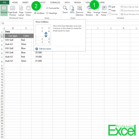
One of the easiest steps: Hide the gridlines. Of course gridlines provide some help for reading the tables. What about this suggestion: Hide the gridlines and manually define borders. Maybe you could try not to use the standard 1pt border but instead go with some dotted lines?
You can hide the gridlines on the View ribbon: Just untick ‘Gridlines’ within the Show group. If you need more assistance, please refer to this article.
2. Use of space
If the rows and columns are too narrow, your workbook easily looks crammed. Worst case, instead of values it shows ‘#####’ errors. Therefore, we got the following recommendations:
- Don’t always go with the minimum width and height of rows and columns. E.g. if you only got a few rows, why don’t you spread them further across the worksheet?
- Pay attention to the alignment of the content. Should the values and texts be aligned to the top, center or bottom of the cells?
- In some cases it can be useful to add (small) empty rows or columns. That way you can indicate that a new content block starts.
3. Fonts and Colors
There are some default fonts in Excel: For example, the later versions of Excel use the Calibri font. There are other fonts, which look more professional. Although boring – why don’t you try the Arial font family?
But even more important: Don’t use too many different fonts and font sizes. Stick with one font type and max. 2-3 different font sizes e.g. for highlighting headlines.
How many different colors do you use in your workbook? There is a general rule of thumb: The less, the better. Colors should help the user to understand your workbook and tables. Not to make him or her confused. So we suggest: Use max. 3-4 different colors, for example for symbolizing different cell types:
- Headlines
- Input or fixed values
- Calculations
- Comments
4. Number formats
The format of the numbers in your workbook should support your data and analysis. Therefore please consider these points:
- Is it really important to show the 3rd decimal number?
- Can you help the user to understand the values by adding thousands separators?
- Would it be helpful if the number would be displayed in thousands or millions?
Also in this case the consistency is crucial. For the same data type you should use the same number format.
If necessary add some information about the values, for example the currency or indicating that values are percentage values.
Do you want to boost your productivity in Excel?
Get the Professor Excel ribbon!
Add more than 120 great features to Excel!
5. Professional workbook structure
If you do complex calculations in Excel, usually you got some kind of input data, some kind of calculations and eventually outputs and results. We recommend separating each type into different worksheets. So for each input, each calculation step and each output you could have separated sheets. If that way your workbook becomes very large, you could insert separator sheets. For example, add a sheet called ‘Inputs–>’ in front of all your input data worksheets.
6. Printable
Many people are still printing out Excel workbooks. So unless you are sure that your workbook won’t be printed, better set a nice printing layout. That includes:
- Print ranges: What range of your worksheet should be printed out?
- Scale: What size should the printout be? This also defines the number of printout pages.
- Page orientation: If possible it’s nice if all pages got the same orientation.
- Margins
- Rows and columns to repeat: If your worksheets stretches over several print pages, make sure that the heading row is still visible on the last printout page.
- Headers and footers: They should contain some basic information on the data, file name, sheet name and page numbers.
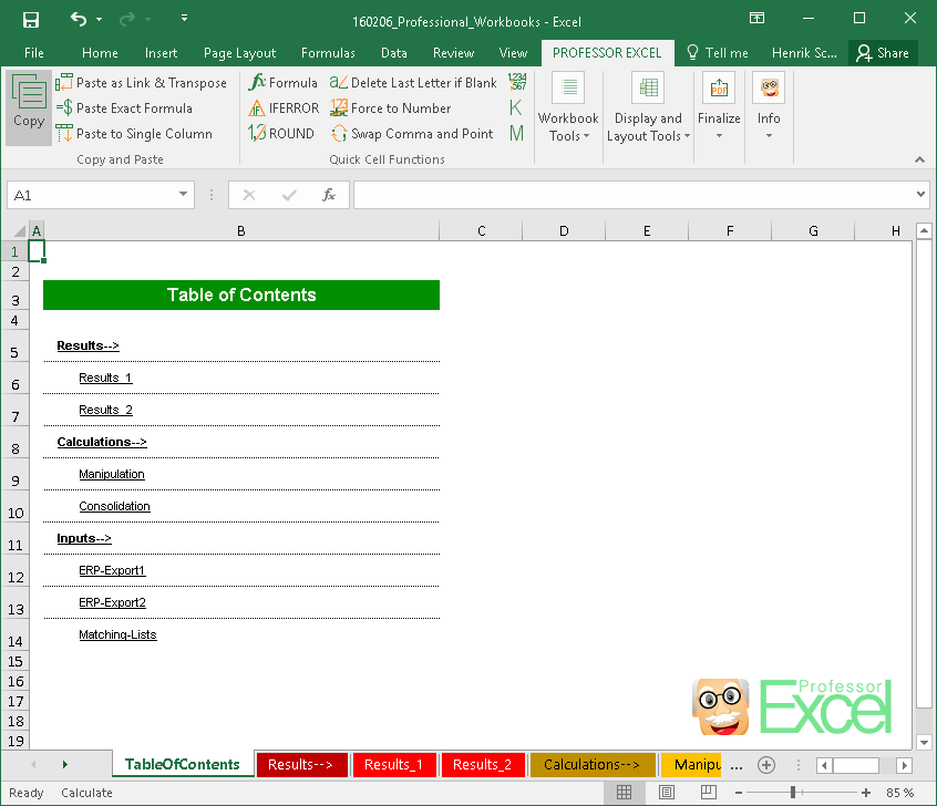
7. Table of contents
If your workbook contains more than – let’s say – 7 sheets you could consider adding a table of contents. You could add a table of contents as the first worksheet. On this table of contents worksheet you should have a list of all worksheets, possibly even with links to each worksheet. Furthermore you can add comments or instructions here.
In this article we describe 3 methods of how to insert tables of contents.

This function is included in our Excel Add-In ‘Professor Excel Tools’
(No sign-up, download starts directly)
Summary:
When you read all these recommendations, please keep in mind: The most important guideline should be to help new users to understand your workbook as easy as possible. Usually don’t need any fancy design.
In many cases, these tricks can help with that but for all these points there are good reasons to disregard them.
To further simplify the process of applying professional layouts to workbooks, we’ve included many layout options – easy to find – in our Excel Add-In: Professor Excel Tools. Please try it for free!
The Excel color palette
As explained in my article about Theme-Enabled Templates, the color Palette in Microsoft Office makes it a lot easier to create a spreadsheet with decent color schemes. You can also generate your own color theme. We created the tool on this page to aid in the creation of set of theme colors that is based on a single primary color.
This will make it a LOT easier for you to customize your color palette. Simply enter the main color you want to use, and our tool will automatically generate the XML file.
Enter the Color for Accent 1
Hue (0-255)
▲1
▲2
▲3
▲4
▲5
▲6
▲D
▲L
Luminosity (Brightness) (0-255)
▲
|
Accent 1 -80% -60% -40% +25% +50% |
Accent 2 Text Text Text Text Text |
Accent 3 Text Text Text Text Text |
Accent 4 Text Text Text Text Text |
Accent 5 Text Text Text Text Text |
Accent 6 Text Text Text Text Text |
Dark 2 Text Text Text Text Text |
Light 2 Text Text Text Text Text |
Simple Budget Worksheet
Expenses
$1
Mortgage
$1
Printer Ink
$6
Flight Lessons
$9
Snacks
$2
Movies
$19
Total
Savings
Income
$20
Expenses
$19
Total Savings
$1
Color Theme
Sample Subtitle
How to Create Your Custom Color Palette
Step 1: Choose a color for Accent 1 that may be based on your brand or just something you think will look great. You can enter the RGB value using RGB(0, 150, 255), the HTML hexidecimal value (such as #557799).
Step 2: Adjust the Saturation and Luminosity to your liking, using the sample graph and budget table to get an idea how the colors will work together.
Step 3: Adjust the Hues of each of the separate Accent colors to your liking. Currently, the color scheme uses Analogous and Complimentary Colors.
Step 4: Download the XML file and store the color theme file in the special «Theme Colors» folder that Excel users to load all custom theme colors (see below).
Note: Typically, the Hue of a color ranges from 1-360 degrees (because it is usually represented in a color wheel), but Excel uses the range 0-255 if you are entering the colors manually using the HSL values.
How to Use the XML File
Excel stores your Color Theme files as separate XML documents inside the program’s user settings on your computer. If you need help finding this location, see Customize how Excel Starts at support.office.com. The location of the folder that contains the XML files for Theme Colors may look like this:
C:UsersusernameAppDataRoamingMicrosoftTemplatesDocument ThemesTheme Colors
The color theme that you use for a workbook in Excel is saved with that workbook. This means that you can save the current color theme in your workbook as a named color theme and use that theme in other workbooks.
After saving the XML file in this location, when you open Excel, you’ll be able to find this color theme listed as an option under Page Layout > Themes > Colors.
Неправильно подобранные оттенки делают таблицу неуклюжей и сложной для восприятия. Придется либо все переделывать, либо лишний раз объяснять. Пользователю, который ее просматривает, может быть непонятно:
- где искать основные моменты
- где заканчивается одна категория и начинается другая
- по каким критериям отсортированы данные
Собрали советы, которые помогут комбинировать цвета в Excel, чтобы сделать документ удобным и полезным.
Люди воспринимают цвета по-разному
Знаете ли вы, что:
- компьютер способен показывать 16,7 млн разных цветов, а люди могут различать лишь 60% из них.
- цветопередача отличается на разных компьютерах.
- освещение в комнате, разрешение экрана и настройки браузера могут искажать цвет.
- около 8% мужчин и 1% женщин испытывают трудности с восприятием цвета. Более половины из них не осознают, что оттенки, которые они видят как идентичные, для других людей выглядят разными.
Мы не можем контролировать все эти факторы, оформляя таблицу Excel. Но каждому под силу выбрать оттенки, которые не будут утомлять глаза, подобрать удачный контраст фона и текста, добавить условные обозначения. Учитывайте это, раскрашивая ячейки, чтобы сделать таблицу понятной для всех.
Как создать контраст между фоном и текстом в Excel
Контраст между фоном страницы, цветом ячеек и текста должен быть достаточно заметным. Иначе придется щуриться и глаза быстро устанут.
Чтобы выбрать правильное сочетание цветов в Excel:
- Закрашивайте ячейки насыщенными цветами, оставляя фон листа белым или светло-серым. Если нужно использовать для фона другой оттенок или картинку, снизьте его яркость до минимальных значений.

Как использовать подложку в Excel. Источник: Spreadsheetweb.com
- Работая над заливкой ячеек, не используйте рядом похожие цвета — красный и оранжевый, синий и фиолетовый. Старайтесь выбирать контрастные и дополняющие оттенки — например, красный и зеленый, синий и желтый. Этот цветовой круг можно использовать как шпаргалку:

#1. Похожие цвета расположены рядом (красный и оранжевый, красный и темно-красный).
#2. Контрастные — находятся на расстоянии трех оттенков друг от друга (синий и зеленый контрастные по отношению к красному).
#3. Дополняющие цвета расположены друг напротив друга (зеленый по отношению к красному).
- Если нельзя избежать сочетания похожих оттенков, создайте контраст, изменив цвет и толщину границ таблицы.

- Чтобы сделать текст более четким, используйте полужирное начертание или увеличьте размер шрифта — чем крупнее текст, тем проще различить его цвет.
- Сочетайте темную заливку для ячеек со светлым текстом — и наоборот.

Проверьте, как выглядят ваши цвета на разных компьютерах, и распечатайте документ, чтобы понять, как таблица смотрится на бумаге.
Excel цвета: лучшие комбинации для оформления таблиц
Microsoft рекомендует использовать следующие сочетания для заливки ячеек таблиц и сортировки данных:

Эти цвета обеспечивают наиболее резкий контраст, и большинство людей могут легко их различить. Можно использовать и другие их оттенки. Но при этом учитывайте, что слишком яркие цвета могут быстро надоесть и сильно напрягают глаза. Лучше выбирать более спокойные оттенки.
Предположим, вам нужно разделить данные на четыре категории. Чтобы сделать таблицу более выразительной, вы можете выделить их цветом, используя комбинацию №4. В итоге первая группа ячеек будет закрашена красным цветом, вторая — голубым, третья — зеленым, а четвертая — желтым.

Как использовать темы в таблицах Excel
Темы — это готовые решения, в которых продумано все: от размера шрифта до цвета фона страницы и заливки ячеек. Темы Excel применяются на все рабочие листы книги и распространяются на все элементы: таблицы, графики, диаграммы.
Кроме того, во всех приложениях Microsoft Office набор тем одинаковый. Это позволяет создавать таблицы, презентации и текстовые документы в одном стиле.
Как поменять тему в Excel:
#1. Заполните таблицу данными.
#2. В главном меню кликните на «Разметка страницы» в Microsoft Excel или «Формат» в Google Таблицах.
#3. В предложенном меню выберите «Темы». Перед вами появится список возможных вариантов. Можно наводить курсор на каждый из них, чтобы посмотреть, как будет выглядеть ваша таблица.

#4. Чтобы выбрать одну из тем, просто кликните на нее. Темы можно настраивать: менять цвета, шрифты и эффекты.
Пример:
Элементы электронной таблицы, использующие тему Office по умолчанию:

Те же элементы электронной таблицы, использующие тему Facet:

Как использовать стили в таблицах Excel
Эта опция позволяет изменить внешний вид границ таблицы, обводку строк и столбцов за один шаг.
Чтобы применить стиль, нужно:
#1. Выбрать диапазон ячеек, которые необходимо преобразовать в таблицу
#2. На вкладке «Главная» в группе «Стили» нажать «Форматировать как таблицу»

Перед вами откроется окно стилей. Наведите курсор на один из них, чтобы сделать предварительный просмотр. Цвета будут отображаться в соответствии с темой, которую вы выбрали для своего документа. На примере ниже показаны оттенки стандартной темы Microsoft.

Чтобы применить новый стиль, нужно нажать на него и подтвердить границы таблицы, нажав «Ок».

Как закрасить ячейку на основе значения Excel
С помощью цвета можно передать смысл текста. Помните об этом, даже если ваша таблица состоит из одних только цифр. Вот несколько примеров:
- В финансовых отчетах отрицательные значения, как правило, обозначаются розовым цветом, положительные — зеленым, нейтральные — оранжевым.
- В таблице температур логичнее обозначить высокие значения теплыми цветами (красным, оранжевым, желтым), а низкие — холодными (синим, зеленым)


Хотите получать дайджест статей?
Одно письмо с лучшими материалами за неделю. Подписывайтесь, чтобы ничего не упустить.
Спасибо за подписку!
- Запреты обычно обозначаются красным цветом, разрешения — зеленым, предупреждения — желтым.
Вы также можете использовать оттенки, которые имеют определенное значение для вашей компании или аудитории. Сбоку можно сделать сноску, чтобы объяснить другим пользователям значение каждого цвета.

Кроме того, в Excel есть раздел Стили ячеек. Он может помочь выбрать правильные цвета, шрифты, выравнивание, заголовки в соответствии с данными и их значением. Эта опция избавит вас от необходимости делать все вручную.
Чтобы выбрать стиль ячеек, нужно выделить данные, которые вы хотите отформатировать, а затем нажать на иконку Cell Styles во вкладке Home.

Откроется окно стилей, характерных для выбранной вами темы:
- Стиль Good, Bad and Neutral и Normal поможет отсортировать цветом типы данных в зависимости от значения. Например, высокие расходы — это обычно не очень хороший показатель. Выделите ячейки, в которых они указаны, и выберите стиль Bad. Нужные области автоматически окрасятся в розовый.
- Стиль Date and Model позволяет задать определенный стиль ячейкам с результатами вычислений, примечаниями и пояснениями. К примеру, вы можете кликнуть на стиль Explanations, выделить соответствующие ячейки — и все пояснения в вашей таблице будут написаны курсивом на белом фоне.
- Стиль Titles and Headings позволяет использовать разные типы заголовков и подзаголовков для форматирования текста. Например, можно выбрать стиль Total, чтобы обратить внимание на результаты вычислений.
- Стиль Themed Cell Styles позволяет расставить цветовые акценты. Допустим, выделить темным оттенком более важные данные и светлым — менее значимые.
- Стиль Number format предлагает 5 вариантов отображения чисел. Например, вы можете выбрать вариант с запятой, с процентами, валютой и т. д.
Хотите получать дайджест статей?
Одно письмо с лучшими материалами за неделю. Подписывайтесь, чтобы ничего не упустить.
Спасибо за подписку!
Color Palette
Excel’s Color Palette has an index of 56 colors which can be used throughout your spreadsheet. Each of these colors in the palette is associated with a unique value in the ColorIndex. For reasons unknown, aside from the index value, Excel also recognizes the names for Colors 1 through 8 (Black, White, Red, Green, Blue, Yellow, Magenta, and Cyan).
| interior | ColorIndex | HTML | bgcolor= | Red | Green | Blue | Color |
| Black | [Color 1] | #000000 | #000000 | 0 | 0 | 0 | [Black] |
| White | [Color 2] | #FFFFFF | #FFFFFF | 255 | 255 | 255 | [White] |
| Red | [Color 3] | #FF0000 | #FF0000 | 255 | 0 | 0 | [Red] |
| Green | [Color 4] | #00FF00 | #00FF00 | 0 | 255 | 0 | [Green] |
| Blue | [Color 5] | #0000FF | #0000FF | 0 | 0 | 255 | [Blue] |
| Yellow | [Color 6] | #FFFF00 | #FFFF00 | 255 | 255 | 0 | [Yellow] |
| Magenta | [Color 7] | #FF00FF | #FF00FF | 255 | 0 | 255 | [Magenta] |
| Cyan | [Color 8] | #00FFFF | #00FFFF | 0 | 255 | 255 | [Cyan] |
| [Color 9] | [Color 9] | #800000 | #800000 | 128 | 0 | 0 | [Color 9] |
| [Color 10] | [Color 10] | #008000 | #008000 | 0 | 128 | 0 | [Color 10] |
| [Color 11] | [Color 11] | #000080 | #000080 | 0 | 0 | 128 | [Color 11] |
| [Color 12] | [Color 12] | #808000 | #808000 | 128 | 128 | 0 | [Color 12] |
| [Color 13] | [Color 13] | #800080 | #800080 | 128 | 0 | 128 | [Color 13] |
| [Color 14] | [Color 14] | #008080 | #008080 | 0 | 128 | 128 | [Color 14] |
| [Color 15] | [Color 15] | #C0C0C0 | #C0C0C0 | 192 | 192 | 192 | [Color 15] |
| [Color 16] | [Color 16] | #808080 | #808080 | 128 | 128 | 128 | [Color 16] |
| [Color 17] | [Color 17] | #9999FF | #9999FF | 153 | 153 | 255 | [Color 17] |
| [Color 18] | [Color 18] | #993366 | #993366 | 153 | 51 | 102 | [Color 18] |
| [Color 19] | [Color 19] | #FFFFCC | #FFFFCC | 255 | 255 | 204 | [Color 19] |
| [Color 20] | [Color 20] | #CCFFFF | #CCFFFF | 204 | 255 | 255 | [Color 20] |
| [Color 21] | [Color 21] | #660066 | #660066 | 102 | 0 | 102 | [Color 21] |
| [Color 22] | [Color 22] | #FF8080 | #FF8080 | 255 | 128 | 128 | [Color 22] |
| [Color 23] | [Color 23] | #0066CC | #0066CC | 0 | 102 | 204 | [Color 23] |
| [Color 24] | [Color 24] | #CCCCFF | #CCCCFF | 204 | 204 | 255 | [Color 24] |
| [Color 25] | [Color 25] | #000080 | #000080 | 0 | 0 | 128 | [Color 25] |
| [Color 26] | [Color 26] | #FF00FF | #FF00FF | 255 | 0 | 255 | [Color 26] |
| [Color 27] | [Color 27] | #FFFF00 | #FFFF00 | 255 | 255 | 0 | [Color 27] |
| [Color 28] | [Color 28] | #00FFFF | #00FFFF | 0 | 255 | 255 | [Color 28] |
| [Color 29] | [Color 29] | #800080 | #800080 | 128 | 0 | 128 | [Color 29] |
| [Color 30] | [Color 30] | #800000 | #800000 | 128 | 0 | 0 | [Color 30] |
| [Color 31] | [Color 31] | #008080 | #008080 | 0 | 128 | 128 | [Color 31] |
| [Color 32] | [Color 32] | #0000FF | #0000FF | 0 | 0 | 255 | [Color 32] |
| [Color 33] | [Color 33] | #00CCFF | #00CCFF | 0 | 204 | 255 | [Color 33] |
| [Color 34] | [Color 34] | #CCFFFF | #CCFFFF | 204 | 255 | 255 | [Color 34] |
| [Color 35] | [Color 35] | #CCFFCC | #CCFFCC | 204 | 255 | 204 | [Color 35] |
| [Color 36] | [Color 36] | #FFFF99 | #FFFF99 | 255 | 255 | 153 | [Color 36] |
| [Color 37] | [Color 37] | #99CCFF | #99CCFF | 153 | 204 | 255 | [Color 37] |
| [Color 38] | [Color 38] | #FF99CC | #FF99CC | 255 | 153 | 204 | [Color 38] |
| [Color 39] | [Color 39] | #CC99FF | #CC99FF | 204 | 153 | 255 | [Color 39] |
| [Color 40] | [Color 40] | #FFCC99 | #FFCC99 | 255 | 204 | 153 | [Color 40] |
| [Color 41] | [Color 41] | #3366FF | #3366FF | 51 | 102 | 255 | [Color 41] |
| [Color 42] | [Color 42] | #33CCCC | #33CCCC | 51 | 204 | 204 | [Color 42] |
| [Color 43] | [Color 43] | #99CC00 | #99CC00 | 153 | 204 | 0 | [Color 43] |
| [Color 44] | [Color 44] | #FFCC00 | #FFCC00 | 255 | 204 | 0 | [Color 44] |
| [Color 45] | [Color 45] | #FF9900 | #FF9900 | 255 | 153 | 0 | [Color 45] |
| [Color 46] | [Color 46] | #FF6600 | #FF6600 | 255 | 102 | 0 | [Color 46] |
| [Color 47] | [Color 47] | #666699 | #666699 | 102 | 102 | 153 | [Color 47] |
| [Color 48] | [Color 48] | #969696 | #969696 | 150 | 150 | 150 | [Color 48] |
| [Color 49] | [Color 49] | #003366 | #003366 | 0 | 51 | 102 | [Color 49] |
| [Color 50] | [Color 50] | #339966 | #339966 | 51 | 153 | 102 | [Color 50] |
| [Color 51] | [Color 51] | #003300 | #003300 | 0 | 51 | 0 | [Color 51] |
| [Color 52] | [Color 52] | #333300 | #333300 | 51 | 51 | 0 | [Color 52] |
| [Color 53] | [Color 53] | #993300 | #993300 | 153 | 51 | 0 | [Color 53] |
| [Color 54] | [Color 54] | #993366 | #993366 | 153 | 51 | 102 | [Color 54] |
| [Color 55] | [Color 55] | #333399 | #333399 | 51 | 51 | 153 | [Color 55] |
| [Color 56] | [Color 56] | #333333 | #333333 | 51 | 51 | 51 | [Color 56] |
The values in the above table were generated with help from the following macro.
Sub colors56()
  Application.ScreenUpdating = False
  Application.Calculation = xlCalculationManual
Dim i As Long
Dim str0 As String, str As String
For i = 0 To 56
  Cells(i + 1, 1).Interior.colorindex = i
  Cells(i + 1, 1).Value = "[Color " & i & "]"
  Cells(i + 1, 2).Font.colorindex = i
  Cells(i + 1, 2).Value = "[Color " & i & "]"
  str0 = Right("000000" & Hex(Cells(i + 1, 1).Interior.color), 6)
  'Excel shows nibbles in reverse order so make it as RGB
  str = Right(str0, 2) & Mid(str0, 3, 2) & Left(str0, 2)
  'generating 2 columns in the HTML table
  Cells(i + 1, 3) = "#" & str & "#" & str & ""
  Cells(i + 1, 4).Formula = "=Hex2dec(""" & Right(str0, 2) & """)"
  Cells(i + 1, 5).Formula = "=Hex2dec(""" & Mid(str0, 3, 2) & """)"
  Cells(i + 1, 6).Formula = "=Hex2dec(""" & Left(str0, 2) & """)"
  Cells(i + 1, 7) = "[Color " & i & ")"
Next i
done:
  Application.Calculation = xlCalculationAutomatic
  Application.ScreenUpdating = True
End Sub
Hex equivalents used in HTML
| #000000 | #993300 | #333300 | #003300 | #003366 | #000080 | #333399 | #333333 | ||||||||
| #800000 | #FF6600 | #808000 | #008000 | #008080 | #0000FF | #666699 | #808080 | ||||||||
| #FF0000 | #FF9900 | #99CC00 | #339966 | #33CCCC | #3366FF | #800080 | #969696 | ||||||||
| #FF00FF | #FFCC00 | #FFFF00 | #00FF00 | #00FFFF | #00CCFF | #993366 | #C0C0C0 | ||||||||
| #FF99CC | #FFCC99 | #FFFF99 | #CCFFCC | #CCFFFF | #99CCFF | #CC99FF | #FFFFFF | ||||||||
| Additional 16 colors below are not shown on the 40 color toolbar palette but can be seen under Format, Cells, Pattern | |||||||||||||||
| #9999FF | #993366 | #FFFFCC | #CCFFFF | #660066 | #FF8080 | #0066CC | #CCCCFF | ||||||||
| #000080 | #FF00FF | #FFFF00 | #00FFFF | #800080 | #800000 | #008080 | #0000FF |
 The following Excel chart shows that Excel really CAN generate professional-quality chart figures.
Here are some general strategies to consider…
1. Set up your data-plumbing correctly. Here, the figure references a Staging Table, which references a Data Table maintained by Power Query, which updates the data from the Web in less than five seconds.

2. Think of chart FIGURES, not charts. Here, the chart object displays only the line plots, axes, and gridlines. Everything else in the figure is on the worksheet.
3. Get your colors right. These are from a book of color indexes. I kept the same hues but changed their luminance, using Excel’s HSL color model in the Colors dialog for Excel 365.
4. Get your number of periods right. My Staging Table has 61 rows. And 61 divided by the label interval of 10 gives me 6 date labels, plus one more.
5. Use shapes. The headline and subtitle on the left are in text boxes, not in cells. By using text boxes, I could position and wrap the text more easily.
6. Use the appropriate unit of measure. Almost always, the price of crude oil is expressed in barrels. But a few seconds on the Internet can tell you that those barrels hold 42 gallons of crude. By charting crude by the gallon, the chart is not only easier to create, it allows us to view the relative prices of gas and Diesel on the one hand and crude on the other.
7. Feel free to create your own legends. Here, the legends are just a narrow column with various fill colors. Not only does that design look professional, it allows you to add more than mere titles with each legend.
If you want to look polished, then you have no other choice but to customize your visualization’s color palette. Don’t worry–customizing your colors is an easy low-hanging-fruit edit. Locate your style guide, scroll down to the color section, and decode the jargon. If you don’t have a style guide, or can’t find it, identify your color codes with an eyedropper or with Paint.
Then, enter your color codes in Excel!
Step 1: Make Your Chart
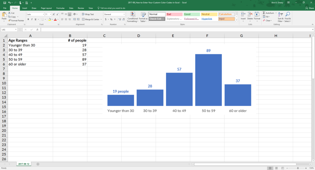
Build your graph. Here’s a histogram that displays how many people fell into each age range. The default graph has Microsoft’s blue.

Step 2: Edit Your Chart as Needed
Declutter that cluttered graph. Delete the border, grid lines, title, and vertical axis. Label the columns directly. Nudge the columns closer together.
Step 3: Select Your Chart
Now it’s time to customize the color. Click on the bar, line, or pie wedge that you want to adjust. Can you see that the columns are selected?

Step 4: Click on More Fill Colors
Go to Chart Tools, then Format, and then Shape Outline (line graphs) or Shape Fill (all other types of graphs, like this one). Ignore the default colors! Go to the bottom where it says More Fill Colors.

Step 5: Choose a Custom Fill
On the pop-up window, click on the Custom tab.

Step 6: Type Your RGB Codes
Enter your RGB code. RGB stands for red, green, and blue. This is the recipe of reds, greens, and blues that get mixed together to produce your exact shade.
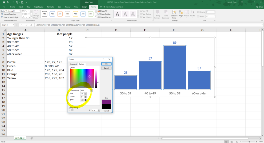
I used 120, 29, 125, which is the exact shade of purple from a client’s logo. Now I can quickly customize other pieces of the graph, like the numeric labels, because that purple is already stored under Recent Colors.

Bonus
With just a few clicks, custom colors reinforce branding and make you look professional.
Purchase the histogram template ($5)
More about Ann K. Emery
Ann K. Emery is a sought-after speaker who is determined to get your data out of spreadsheets and into stakeholders’ hands. Each year, she leads more than 100 workshops, webinars, and keynotes for thousands of people around the globe. Her design consultancy also overhauls graphs, publications, and slideshows with the goal of making technical information easier to understand for non-technical audiences.
Наименования цветов стандартной палитры Excel из 56 оттенков на русском и английском языках. Соответствие цветов индексам VBA и их RGB и HEX коды.
Стандартная палитра из 56 цветов — это ограниченная палитра оттенков, которая существовала до версии Excel 2007 года, но продолжает использоваться до сих пор.
За ограниченную палитру в VBA Excel отвечает свойство ColorIndex, которое используется для записи и чтения:
|
Sub Primer() Range(«A1»).Interior.ColorIndex = 10 MsgBox Range(«A1»).Interior.ColorIndex End Sub |
Свойство ColorIndex принимает и возвращает значения от 1 до 56.
Наименования 56 цветов палитры
Наименования 56 цветов стандартной ограниченной палитры Excel на русском и английском языках:
| Индекс | Наименование по-русски |
Наименование по-английски | Оттенок |
|---|---|---|---|
| 1 | Черный | Black | |
| 2 | Белый | White | |
| 3 | Красный | Red | |
| 4 | Лайм | Lime | |
| 5 | Синий | Blue | |
| 6 | Желтый | Yellow | |
| 7 | Фуксия* | Fuchsia* | |
| 8 | Цвет морской волны | Aqua | |
| 9 | Темно-бордовый | Maroon | |
| 10 | Зеленый | Green | |
| 11 | Темно-синий | Navy blue | |
| 12 | Оливковый | Olive | |
| 13 | Пурпурный | Purple | |
| 14 | Бирюзовый | Teal | |
| 15 | Серебряный | Silver | |
| 16 | Серый | Gray | |
| 17 | Светло-пурпурно-синий | Light purple blue | |
| 18 | Розовато-лиловый | Mauve | |
| 19 | Бледно-желто-зеленый | Pale yellow green | |
| 20 | Бледно-голубой | Pale blue | |
| 21 | Сливовый | Plum | |
| 22 | Лососевый | Salmon | |
| 23 | Темно-сине-голубой | Light navy blue | |
| 24 | Барвинок | Periwinkle | |
| 25 | Темно-синий | Navy blue | |
| 26 | Фуксия* | Fuchsia* | |
| 27 | Желтый | Yellow | |
| 28 | Цвет морской волны | Aqua | |
| 29 | Пурпурный | Purple | |
| 30 | Коричнево-малиновый | Maroon | |
| 31 | Сине-зеленый | Teal | |
| 32 | Синий | Blue | |
| 33 | Небесно-голубой | Vivid sky blue | |
| 34 | Бледно-голубой | Pale blue | |
| 35 | Бледно-зеленый | Pale green | |
| 36 | Светло-желтый | Light yellow | |
| 37 | Сине-голубой | Shade of blue | |
| 38 | Бледно-пурпурно-розовый | Pale magenta pink | |
| 39 | Светло-сиреневый | Light lilac | |
| 40 | Оранжево-персиковый | Peach-orange | |
| 41 | Светло-синий | Light blue | |
| 42 | Светло-бирюзовый | Light turquoise | |
| 43 | Желто-зеленый | Yellow green | |
| 44 | Желтый мандарин | Tangerine yellow | |
| 45 | Сигнальный оранжевый | Safety orange | |
| 46 | Оранжевый | Orange | |
| 47 | Темно-сине-серый | Dark blue gray | |
| 48 | Светло-серый | Light gray | |
| 49 | Полуночно-синий | Midnight blue | |
| 50 | Зеленая трава | Green grass | |
| 51 | Темно-зеленый | Dark green | |
| 52 | Темно-коричневый | Dark brown | |
| 53 | Темно-красный | Dark red | |
| 54 | Розовато-лиловый | Mauve | |
| 55 | Синий пигмент | Blue pigment | |
| 56 | Темный уголь | Dark charcoal |
* Вместо термина Фуксия (Fuchsia) можно использовать термин Маджента (Magenta), так как в RGB-модели Фуксия и Маджента являются одним и тем же цветом.
Обратите внимание, что в стандартной палитре Excel из 56 цветов есть повторяющиеся оттенки. Наименования цветов (по их HEX-кодам) подобраны, главным образом, по статьям, опубликованным в Википедии.
RGB и HEX коды оттенков палитры
RGB и HEX коды оттенков 56-цветной палитры Excel:
| Индекс | Код HEX | Код RGB | Оттенок |
|---|---|---|---|
| 1 | #000000 | RGB(0, 0, 0) | |
| 2 | #ffffff | RGB(255, 255, 255) | |
| 3 | #ff0000 | RGB(255, 0, 0) | |
| 4 | #00ff00 | RGB(0, 255, 0) | |
| 5 | #0000ff | RGB(0, 0, 255) | |
| 6 | #ffff00 | RGB(255, 255, 0) | |
| 7 | #ff00ff | RGB(255, 0, 255) | |
| 8 | #00ffff | RGB(0, 255, 255) | |
| 9 | #800000 | RGB(128, 0, 0) | |
| 10 | #008000 | RGB(0, 128, 0) | |
| 11 | #000080 | RGB(0, 0, 128) | |
| 12 | #808000 | RGB(128, 128, 0) | |
| 13 | #800080 | RGB(128, 0, 128) | |
| 14 | #008080 | RGB(0, 128, 128) | |
| 15 | #c0c0c0 | RGB(192, 192, 192) | |
| 16 | #808080 | RGB(128, 128, 128) | |
| 17 | #9999ff | RGB(153, 153, 255) | |
| 18 | #993366 | RGB(153, 51, 102) | |
| 19 | #ffffcc | RGB(255, 255, 204) | |
| 20 | #ccffff | RGB(204, 255, 255) | |
| 21 | #660066 | RGB(102, 0, 102) | |
| 22 | #ff8080 | RGB(255, 128, 128) | |
| 23 | #0066cc | RGB(0, 102, 204) | |
| 24 | #ccccff | RGB(204, 204, 255) | |
| 25 | #000080 | RGB(0, 0, 128) | |
| 26 | #ff00ff | RGB(255, 0, 255) | |
| 27 | #ffff00 | RGB(255, 255, 0) | |
| 28 | #00ffff | RGB(0, 255, 255) | |
| 29 | #800080 | RGB(128, 0, 128) | |
| 30 | #800000 | RGB(128, 0, 0) | |
| 31 | #008080 | RGB(0, 128, 128) | |
| 32 | #0000ff | RGB(0, 0, 255) | |
| 33 | #00ccff | RGB(0, 204, 255) | |
| 34 | #ccffff | RGB(204, 255, 255) | |
| 35 | #ccffcc | RGB(204, 255, 204) | |
| 36 | #ffff99 | RGB(255, 255, 153) | |
| 37 | #99ccff | RGB(153, 204, 255) | |
| 38 | #ff99cc | RGB(255, 153, 204) | |
| 39 | #cc99ff | RGB(204, 153, 255) | |
| 40 | #ffcc99 | RGB(255, 204, 153) | |
| 41 | #3366ff | RGB(51, 102, 255) | |
| 42 | #33cccc | RGB(51, 204, 204) | |
| 43 | #99cc00 | RGB(153, 204, 0) | |
| 44 | #ffcc00 | RGB(255, 204, 0) | |
| 45 | #ff9900 | RGB(255, 153, 0) | |
| 46 | #ff6600 | RGB(255, 102, 0) | |
| 47 | #666699 | RGB(102, 102, 153) | |
| 48 | #969696 | RGB(150, 150, 150) | |
| 49 | #003366 | RGB(0, 51, 102) | |
| 50 | #339966 | RGB(51, 153, 102) | |
| 51 | #003300 | RGB(0, 51, 0) | |
| 52 | #333300 | RGB(51, 51, 0) | |
| 53 | #993300 | RGB(153, 51, 0) | |
| 54 | #993366 | RGB(153, 51, 102) | |
| 55 | #333399 | RGB(51, 51, 153) | |
| 56 | #333333 | RGB(51, 51, 51) |
RGB-коды можно использовать в VBA Excel наряду с индексами цветов стандартной палитры, а HEX-коды — в HTML.
Процент черного в оттенках серого
Процентное соотношение черного цвета в оттенках серого:
| Индекс | Наименование | Процент черного | Оттенок |
|---|---|---|---|
| 1 | Черный | 100% | |
| 2 | Белый | 0% | |
| 15 | Серебряный | 25% | |
| 16 | Серый | 50% | |
| 48 | Светло-серый | 40% | |
| 56 | Темный уголь | 80% |
Вывод 56-цветной палитры на лист
Вывод на рабочий лист Excel 56-цветной палитры с помощью кода VBA:
|
1 2 3 4 5 6 7 8 9 10 11 12 13 14 15 16 17 18 19 |
‘Функция, преобразующая десятичный код цвета в аргументы RGB Function DecToRGB(ByVal ColDec As Long) As String Dim r As Long Dim g As Long Dim b As Long r = (ColDec And &HFF&) 256 ^ 0 g = (ColDec And &HFF00&) 256 ^ 1 b = ColDec 256 ^ 2 DecToRGB = CStr(r) & «, « & CStr(g) & «, « & CStr(b) End Function ‘Вывод 56-цветной палитры на активный лист Sub Color56() Dim i As Integer For i = 1 To 56 Cells(i, 1) = i Cells(i, 2).Interior.ColorIndex = i Cells(i, 3).Value = «RGB(« & DecToRGB(Cells(i, 2).Interior.Color) & «)» Next End Sub |
Процедура Color56 записывает в ячейку первого столбца индекс цвета, ячейке второго столбца присваивается соответствующая индексу заливка, в ячейку третьего столбца записывается RGB-код соответствующего индексу цвета.