
Use charts and graphs in your presentation
You can make a chart in PowerPoint or Excel. If you have lots of data to chart, create your chart in Excel, and then copy it into your presentation. This is also the best way if your data changes regularly and you want your chart to always reflect the latest numbers. In that case, when you copy and paste the chart, keep it linked to the original Excel file.
Try it!
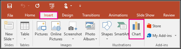
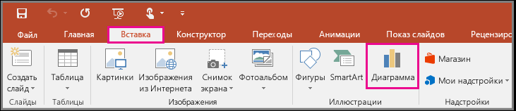
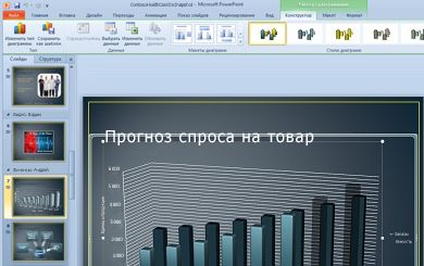
To create a simple chart from scratch in PowerPoint, click Insert > Chart and pick the chart you want.

-
Click Insert > Chart.

-
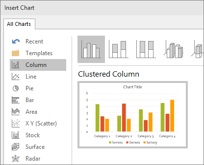
Click the chart type and then double-click the chart you want.
-
In the worksheet that appears, replace the placeholder data with your own information.
-
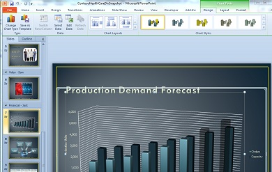
When you insert a chart, small buttons appear next to its upper-right corner. Use the Chart Elements
button to show, hide, or format things like axis titles or data labels. Or use the Chart Styles button to quickly change the color or style of the chart. -
When you’ve finished, close the worksheet.
Want more?
Create an org chart in PowerPoint
Create charts in Excel
Important:
Office 2010 is no longer supported. Upgrade to Microsoft 365 to work anywhere from any device and continue to receive support.
Upgrade now
To create a simple chart from scratch in PowerPoint, click Insert > Chart and pick the chart you want.
-
On the Insert tab, in the Illustrations group, click Chart.
-
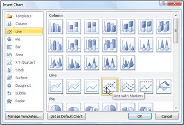
In the Insert Chart dialog box, click the arrows to scroll through the chart types.
Select the type of chart that you want and then click OK.
Tip: When you rest the mouse pointer over any chart type, a ScreenTip displays its name.
-
Edit the data in Excel 2010.
When you are finished editing your data, you can close Excel.
-
Click the File tab and then click Close. The chart in PowerPoint is automatically updated with the new data.
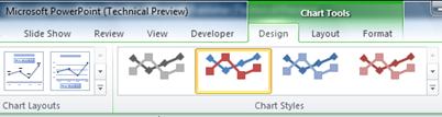
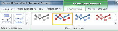
You can modify the chart in PowerPoint, including changes to appearance, size or position. Click the chart, then on the green Chart Tools tab, use the Design, Layout or Format tab to make changes. To add animation effects to the chart, use tools on the Animations tab.
Note: If you don’t see the Chart Tools, make sure that you click anywhere inside the chart to activate it.
You can change chart data in PowerPoint. Click the chart, then on the green Chart Tools tab, select the Design tab, and then click Edit Data. For more details, see Change the data in an existing chart.
Top of page
Tips
-
To get a good idea of what you can add to or change in your chart, under Chart Tools, click the Design, Layout, and Format tabs, and then explore the groups and options that are provided on each tab.
-
You can also access design, layout, and formatting features that are available for specific chart elements (such as chart axes or the legend) by right-clicking those chart elements.
-
Some types of charts, such as organization charts, flow charts, hierarchical diagrams, or showing repetitive information, might be more easily and effectively created using SmartArt.
More information
-
For more information about how to insert a linked Excel chart, see Insert a linked Excel chart in PowerPoint 2010.
-
For more information about how to edit data in a chart, see Edit data in a chart.
Top of page
Important:
Office 2007 is no longer supported. Upgrade to Microsoft 365 to work anywhere from any device and continue to receive support.
Upgrade now
Insert a chart or graph in your presentation
To create a simple chart from scratch in PowerPoint, click Insert > Chart and pick the chart you want.
-
In PowerPoint 2007, click the placeholder that you want to contain the chart.
-
On the Insert tab, in the Illustrations group, click Chart.
-
In the Insert Chart dialog box, click a chart, and then click OK.
Office Excel 2007 opens in a split window and displays sample data on a worksheet.
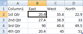
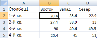
Figure 1: Sample data on an Excel worksheet
-
In Excel, to replace the sample data, click a cell on the worksheet, and then type the data that you want.
You can also replace the sample axis labels in Column A and the legend entry name in Row 1.
Note: After you update the worksheet, the chart in PowerPoint 2007 updates automatically with the new data.
-
When you are finished inputting the data in Excel, on the File menu, click Close.
Note:
To change the data in a chart you’ve inserted, use the Edit Data command. To learn more about the Edit Data command, see Change the data in an existing chart.
Paste an Excel chart or graph into your presentation and link to data in Excel
You create and copy the chart or graph in Office Excel 2007 and then paste it into your PowerPoint 2007 presentation. When you update the data in the linked Office Excel 2007 file, you can update the chart in PowerPoint by using the Refresh Data command.
To learn more about copying and pasting Excel charts and graphs into your PowerPoint presentation, see the article Copy an Excel chart to another Office program.
Note: If you want to be able to automatically update or refresh the data in your chart or graph, you must save the Excel file before inserting the chart or graph.
-
In Excel, select the chart by clicking its border, and then on the Home tab, in the Clipboard group, click Cut.
-
In PowerPoint 2007, click the placeholder on the slide or notes page that you want to insert the chart on.
-
On the Home tab, in the Clipboard group, click the arrow under Paste, and then click Paste.
Top of page
Create an organization chart, a timeline, or add a chart from Excel
-
To create an organization chart, see the article Create an organization chart.
-
To create a timeline using a SmartArt graphic, see the article Create a SmartArt graphic.
-
To learn about the different types of Excel charts that you can add to your PowerPoint slides, see the article Available chart types.
Top of page
Overview of data charting and graphing
You can add a data chart or graph to your presentation in one of two ways:
-
You can create a chart or graph in your presentation. When you create a new chart in PowerPoint 2007, you edit the data for that chart in Office Excel 2007, but the data is saved with the PowerPoint file.
-
You can paste an Excel chart or graph into your presentation and link to the data in an Office Excel 2007 file. When you copy a chart from a saved Office Excel 2007 file and paste it into your presentation, the data in the chart is linked to that Excel file. If you want to change the data in the chart, you must make your changes to the linked worksheet in Office Excel 2007 and then refresh the data in your PowerPoint presentation. The Excel worksheet is a separate file and is not saved with the PowerPoint file.
Note: If you open a presentation that was created in an earlier version of PowerPoint and the presentation contains a graph or chart that was created by using Microsoft Graph, PowerPoint 2007 maintains the look and feel of the graph or chart and lets you continue to update your graph or chart.

Figure 2: A chart in PowerPoint that is made up of sample data from an Excel worksheet
Need more help?
Want more options?
Explore subscription benefits, browse training courses, learn how to secure your device, and more.
Communities help you ask and answer questions, give feedback, and hear from experts with rich knowledge.
![]()
Download Article
![]()
Download Article
This wikiHow teaches you how to add an Excel graph to a PowerPoint Slide. You can simply copy and paste the graph/chart itself and choose how it appears on the slide using «Paste Special.» You’ll even have the option of inserting it as static image or making sure the graph updates when the Excel file’s data changes.
Steps
-
1
Open your graph in Microsoft Excel. You can open your workbook in Excel by double-clicking its file name.
-
2
Click the graph to select it. A bounding box should now surround the data.
Advertisement
-
3
Copy the graph to your clipboard. If you’re using a PC, press Ctrl + C to do so. If you’re on a Mac, use Cmd + C.
-
4
Open the slide you want to edit in PowerPoint. Once the presentation is open, click the slide on which you want to insert the graph. Your slide are located in the left panel.
-
5
Click the Home tab in PowerPoint. You should be there by default if you just opened PowerPoint, but you’ll need to return to Home if you’ve been working in another menu.
-
6
Click the small triangle below «Paste.» The «Paste» icon, which looks like a clipboard and a sheet of paper in the upper-left corner, has a small triangle below it. You’ll want to click this triangle instead of clicking the icon, as it opens a special menu.
-
7
Click Paste Special on the menu. This opens a dialog that contains several options for pasting the graph.[1]
-
8
Select a pasting option. The option you choose will vary depending on how you want the graph to appear and behave. These options are best for pasting charts and graphs:
- Microsoft Excel Chart Object: This pastes the entire chart and corresponding data into your slide. This option ensures that if the data in the Excel file changes, it will also change on the PowerPoint slide.
- Picture (Enhanced Metalfile): This pastes the chart as a high-quality image. This is great if you want to be able to enlarge the chart and focus on details.
- Picture (JPEG): Really, any of the Picture options will work if you’re not concerned about quality. This is best for a very simple chart that doesn’t need to be huge.
-
9
Click OK. This inserts the graph into the slide.
- If you inserted the graph as an Object, make sure you do not move the original Excel file to a different location. If you do, the graph you pasted into PowerPoint will no longer display the correct data.[2]
- If you inserted the graph as an Object, make sure you do not move the original Excel file to a different location. If you do, the graph you pasted into PowerPoint will no longer display the correct data.[2]


Advertisement
Ask a Question
200 characters left
Include your email address to get a message when this question is answered.
Submit
Advertisement
Thanks for submitting a tip for review!
References
About This Article
Article SummaryX
1. Copy the graph in Excel.
2. Go to the PowerPoint slide where you want to insert the graph.
3. Click the menu icon under «Paste.»
4. Click Paste Special.
5. Select a pasting option.
6. Click OK.
Did this summary help you?
Thanks to all authors for creating a page that has been read 13,370 times.
Is this article up to date?
Содержание
- Use charts and graphs in your presentation
- Try it!
- Want more?
- More information
- Insert a chart or graph in your presentation
- Paste an Excel chart or graph into your presentation and link to data in Excel
- Create an organization chart, a timeline, or add a chart from Excel
- Overview of data charting and graphing
- How to Add an Excel Chart to a PowerPoint Presentation
- Copy Your Chart From Excel
- Choose How to Paste Your Chart
- Update Excel Charts in PowerPoint
- Microsoft Office Update Prompt
- Использование диаграмм и графиков в презентации
- Проверьте, как это работает!
- Хотите узнать больше?
- Советы
- Дополнительные сведения
- Вставка диаграммы или графика в презентацию
- Вставка диаграммы или графика Excel в презентацию и связывание их с данными в Excel
- Создание организационной диаграммы, временной шкалы или добавление диаграммы из Excel
- Общие сведения о диаграммах и графиках
Use charts and graphs in your presentation
You can make a chart in PowerPoint or Excel. If you have lots of data to chart, create your chart in Excel, and then copy it into your presentation. This is also the best way if your data changes regularly and you want your chart to always reflect the latest numbers. In that case, when you copy and paste the chart, keep it linked to the original Excel file.
Try it!
To create a simple chart from scratch in PowerPoint, click Insert > Chart and pick the chart you want.
Click Insert > Chart.
Click the chart type and then double-click the chart you want.
Tip: For help deciding which chart is best for your data, see Available chart types.
In the worksheet that appears, replace the placeholder data with your own information.

When you insert a chart, small buttons appear next to its upper-right corner. Use the Chart Elements  button to show, hide, or format things like axis titles or data labels. Or use the Chart Styles
  button to quickly change the color or style of the chart.
Tip: The Chart Filters  button is a more advanced option that shows or hides data in your chart.
When you’ve finished, close the worksheet.
Want more?
Important: Office 2010 is no longer supported. Upgrade to Microsoft 365 to work anywhere from any device and continue to receive support.
To create a simple chart from scratch in PowerPoint, click Insert > Chart and pick the chart you want.
On the Insert tab, in the Illustrations group, click Chart.
In the Insert Chart dialog box, click the arrows to scroll through the chart types.
Select the type of chart that you want and then click OK.
Tip: When you rest the mouse pointer over any chart type, a ScreenTip displays its name.
Edit the data in Excel 2010.
When you are finished editing your data, you can close Excel.
Click the File tab and then click Close. The chart in PowerPoint is automatically updated with the new data.
You can modify the chart in PowerPoint, including changes to appearance, size or position. Click the chart, then on the green Chart Tools tab, use the Design, Layout or Format tab to make changes. To add animation effects to the chart, use tools on the Animations tab.
Note: If you don’t see the Chart Tools, make sure that you click anywhere inside the chart to activate it.
You can change chart data in PowerPoint. Click the chart, then on the green Chart Tools tab, select the Design tab, and then click Edit Data. For more details, see Change the data in an existing chart.
To get a good idea of what you can add to or change in your chart, under Chart Tools, click the Design, Layout, and Format tabs, and then explore the groups and options that are provided on each tab.
You can also access design, layout, and formatting features that are available for specific chart elements (such as chart axes or the legend) by right-clicking those chart elements.
Some types of charts, such as organization charts, flow charts, hierarchical diagrams, or showing repetitive information, might be more easily and effectively created using SmartArt.
More information
For more information about how to insert a linked Excel chart, see Insert a linked Excel chart in PowerPoint 2010.
For more information about how to edit data in a chart, see Edit data in a chart.
Important: Office 2007 is no longer supported. Upgrade to Microsoft 365 to work anywhere from any device and continue to receive support.
Insert a chart or graph in your presentation
To create a simple chart from scratch in PowerPoint, click Insert > Chart and pick the chart you want.
In PowerPoint 2007, click the placeholder that you want to contain the chart.
On the Insert tab, in the Illustrations group, click Chart.
In the Insert Chart dialog box, click a chart, and then click OK.
Office Excel 2007 opens in a split window and displays sample data on a worksheet.
Figure 1: Sample data on an Excel worksheet
In Excel, to replace the sample data, click a cell on the worksheet, and then type the data that you want.
You can also replace the sample axis labels in Column A and the legend entry name in Row 1.
Note: After you update the worksheet, the chart in PowerPoint 2007 updates automatically with the new data.
When you are finished inputting the data in Excel, on the File menu, click Close.
Note: To change the data in a chart you’ve inserted, use the Edit Data command. To learn more about the Edit Data command, see Change the data in an existing chart.
Paste an Excel chart or graph into your presentation and link to data in Excel
You create and copy the chart or graph in Office Excel 2007 and then paste it into your PowerPoint 2007 presentation. When you update the data in the linked Office Excel 2007 file, you can update the chart in PowerPoint by using the Refresh Data command.
To learn more about copying and pasting Excel charts and graphs into your PowerPoint presentation, see the article Copy an Excel chart to another Office program.
Note: If you want to be able to automatically update or refresh the data in your chart or graph, you must save the Excel file before inserting the chart or graph.
In Excel, select the chart by clicking its border, and then on the Home tab, in the Clipboard group, click Cut.
In PowerPoint 2007, click the placeholder on the slide or notes page that you want to insert the chart on.
On the Home tab, in the Clipboard group, click the arrow under Paste, and then click Paste.
Create an organization chart, a timeline, or add a chart from Excel
To create an organization chart, see the article Create an organization chart.
To create a timeline using a SmartArt graphic, see the article Create a SmartArt graphic.
To learn about the different types of Excel charts that you can add to your PowerPoint slides, see the article Available chart types.
Overview of data charting and graphing
You can add a data chart or graph to your presentation in one of two ways:
You can create a chart or graph in your presentation. When you create a new chart in PowerPoint 2007, you edit the data for that chart in Office Excel 2007, but the data is saved with the PowerPoint file.
You can paste an Excel chart or graph into your presentation and link to the data in an Office Excel 2007 file. When you copy a chart from a saved Office Excel 2007 file and paste it into your presentation, the data in the chart is linked to that Excel file. If you want to change the data in the chart, you must make your changes to the linked worksheet in Office Excel 2007 and then refresh the data in your PowerPoint presentation. The Excel worksheet is a separate file and is not saved with the PowerPoint file.
Note: If you open a presentation that was created in an earlier version of PowerPoint and the presentation contains a graph or chart that was created by using Microsoft Graph, PowerPoint 2007 maintains the look and feel of the graph or chart and lets you continue to update your graph or chart.
Figure 2: A chart in PowerPoint that is made up of sample data from an Excel worksheet
Источник
How to Add an Excel Chart to a PowerPoint Presentation
Copy and paste, or use the Link Data command
Charts add a little extra punch to your PowerPoint presentation instead of listing bullet points of data. Conveniently, charts created in Excel can be copied and pasted into your PowerPoint presentations. As an added bonus, update charts in your PowerPoint presentation when changes are made to the original Excel data.
Instructions in this article apply to PowerPoint for Microsoft 365, PowerPoint 2019, PowerPoint 2016, PowerPoint 2013, PowerPoint 2010, and Excel.
Copy Your Chart From Excel
Any chart that you create in Excel can be copied and pasted into any Microsoft Office app.
Open the Excel file that contains the chart you want to copy and select the chart.
Select Home > Copy.
:max_bytes(150000):strip_icc()/Capture-5c0dd5e34cedfd00015a3e3c.JPG)
There are other ways to copy the chart. Right-click on the chart and select Copy. Or, use the Ctrl+C shortcut.
Choose How to Paste Your Chart
The chart you copied in Excel is stored on the Clipboard. Now it’s time to paste it into a PowerPoint slide.
Open PowerPoint and navigate to the slide where you wish to paste the Excel chart.
Select Home and select the Paste down arrow. Or, right-click the slide. The different options for pasting a chart display.
:max_bytes(150000):strip_icc()/Capture-5c0dd82cc9e77c0001858043.JPG)
Choose Use Destination Theme & Embed Workbook to paste your chart into PowerPoint with the ability to edit it in PowerPoint and match your presentation’s color scheme.
Choose Keep Source Formatting & Embed Workbook to be able to edit it in PowerPoint and keep the original color scheme from Excel.
Choose Use Destination Theme & Link Data to be able to edit it by making changes to your original data in Excel. The chart will match your PowerPoint presentation’s color scheme.
Choose Keep Source Formatting & Link Data to edit it by making changes to your original data in Excel. The chart will keep the original color scheme from Excel.
Choose Picture to paste a picture of your chart into PowerPoint. The picture cannot be edited and is not tied to any data.
Update Excel Charts in PowerPoint
If you chose to Link Data when pasting your Excel chart into PowerPoint, changes made to the original spreadsheet file will update the chart in PowerPoint.
To manually update chart data:
Select the chart in PowerPoint.
Select Chart Tools Design.
:max_bytes(150000):strip_icc()/Capture-5c0ddde5c9e77c000182015d.JPG)
Select Refresh Data.
Microsoft Office Update Prompt
Each time you open a PowerPoint presentation that is linked to another Microsoft Office app, such as Excel or Word, you’re prompted to update the links in the presentation file. If you trust the source of the presentation, choose Update Links. All links to other documents are updated with any new changes.
Источник
Использование диаграмм и графиков в презентации
Создать диаграмму можно в PowerPoint или Excel. Если данных много, создайте диаграмму в Excel, а затем скопируйте ее в презентацию. Этот способ также оптимален, если данные регулярно изменяются и нужно, чтобы диаграмма всегда была актуальной. В этом случае при копировании диаграммы сохраните ее связь с исходным файлом Excel.
Проверьте, как это работает!
Чтобы в PowerPoint создать простую диаграмму с нуля, на вкладке Вставка нажмите кнопку Диаграмма, а затем выберите нужную диаграмму.

На вкладке Вставка нажмите кнопку Диаграмма.
Выберите тип диаграммы и дважды щелкните нужную диаграмму.
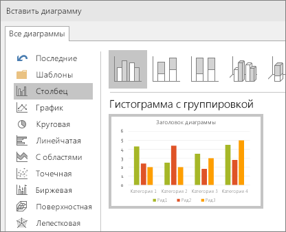
Совет: Сведения о том, как выбрать диаграмму, наилучшим образом подходящую для представления тех или иных данных, см. в разделе Доступные типы диаграмм.
На появившемся листе замените заполнители собственными данными.
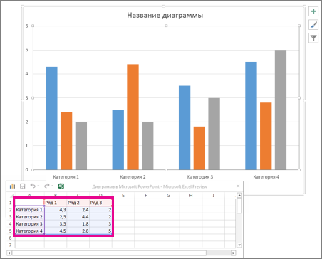
При вставке диаграммы рядом с ее правым верхним углом появляются небольшие кнопки. Используйте кнопку Элементы диаграммы  для отображения, скрытия или форматирования таких элементов, как названия осей или подписи данных. Используйте кнопку Стили диаграмм
  для быстрого изменения цвета или стиля диаграммы.
Совет: С помощью кнопки Фильтры диаграммы  можно отобразить или скрыть данные на диаграмме.
По завершении закройте лист.
Хотите узнать больше?
Важно: Office 2010 больше не поддерживается. Перейдите на Microsoft 365, чтобы работать удаленно с любого устройства и продолжать получать поддержку.
Чтобы в PowerPoint создать простую диаграмму с нуля, на вкладке Вставка нажмите кнопку Диаграмма, а затем выберите нужную диаграмму.
На вкладке Вставка в группе Иллюстрации нажмите кнопку Диаграмма.
В диалоговом окне Вставка диаграммы щелкайте стрелки для просмотра типов диаграмм.
Выберите нужный тип диаграммы и нажмите кнопку ОК.
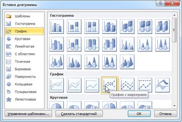
Совет: При наведении указателя мыши на тип диаграммы появляется всплывающая подсказка с его названием.
Измените данные в Excel 2010.
После этого Excel можно закрыть.
На вкладке Файл нажмите кнопку Закрыть. Диаграмма в PowerPoint автоматически обновится с учетом новых данных.
Вы можете изменить диаграмму в PowerPoint, настроив ее внешний вид, размер и расположение. Щелкните диаграмму, а затем внесите изменения на вкладке Конструктор, Макет или Формат под зеленой вкладкой Работа с диаграммами. Чтобы добавить эффекты анимации, используйте инструменты на вкладке Анимация.
Примечание: Если группа Работа с диаграммами не отображается, щелкните в любом месте диаграммы.
Вы можете изменить данные диаграммы в PowerPoint. Щелкните диаграмму, а затем под зеленой вкладкой Работа с диаграммами выберите вкладку Конструктор и нажмите кнопку Изменить данные. Дополнительные сведения см. в статье Изменение данных в существующей диаграмме.
Советы
Чтобы получить представление о том, что можно добавлять в диаграмму или изменять в ней, в разделе Работа с диаграммами откройте вкладки Конструктор, Макет и Формат и просмотрите группы и параметры на каждой из них.
Чтобы настроить структуру, макет и формат для определенных элементов диаграммы (например, осей диаграммы или легенды), также можно щелкнуть их правой кнопкой мыши.
Некоторые типы диаграмм, например организационные и иерархические диаграммы, блок-схемы и диаграммы с повторяющимися данными, может быть проще создать с помощью графических элементов SmartArt.
Дополнительные сведения
Дополнительные сведения о том, как вставить связанную диаграмму Excel, см. в статье Вставка связанной диаграммы Excel в PowerPoint 2010.
Сведения об изменении данных в диаграмме см. в статье Изменение данных в диаграмме.
Важно: Office 2007 больше не поддерживается. Перейдите на Microsoft 365, чтобы работать удаленно с любого устройства и продолжать получать поддержку.
Вставка диаграммы или графика в презентацию
Чтобы в PowerPoint создать простую диаграмму с нуля, на вкладке Вставка нажмите кнопку Диаграмма, а затем выберите нужную диаграмму.
В PowerPoint 2007 щелкните заполнитель, в который вы хотите поместить диаграмму.
На вкладке Вставка в группе Иллюстрации нажмите кнопку Диаграмма.
В диалоговом окне Вставка диаграммы выберите диаграмму и нажмите кнопку ОК.
Office Excel 2007 откроется в разделенном окне и выведет пример данных на листе.
Рисунок 1. Данные примера на листе Excel
В Excel замените пример данных, щелкнув ячейку на листе и введя нужные данные.
Вы также можете заменить примеры подписей осей в столбце A и подпись легенды в строке 1.
Примечание: После обновления листа диаграмма в PowerPoint 2007автоматически обновляется с учетом новых данных.
Завершив ввод данных в Excel, выберите в меню Файл пункт Закрыть.
Примечание: Чтобы изменить данные во вставленной диаграмме, используйте команду Изменить данные. Дополнительные сведения о команде Изменить данные см. в статье Изменение данных в существующей диаграмме.
Вставка диаграммы или графика Excel в презентацию и связывание их с данными в Excel
Создайте диаграмму или график в Office Excel 2007 и скопируйте их, а затем вставьте в презентацию PowerPoint 2007. Если данные в связанном файле Office Excel 2007 обновились, вы можете обновить диаграмму в PowerPoint с помощью команды Обновить данные.
Дополнительные сведения о вставке диаграмм и графиков Excel в презентацию PowerPoint см. в статье Копирование диаграммы Excel в другую программу Office.
Примечание: Если вы хотите автоматически обновлять данные на диаграмме или графике, сохраните файл Excel перед вставкой диаграммы или графика.
В Excel выберите диаграмму, щелкнув его границу, а затем на вкладке Главная в группе Буфер обмена щелкните Вырезать.
В PowerPoint 2007 щелкните заполнитель на слайде или на странице заметок, куда вы хотите поместить диаграмму.
На вкладке Главная в группе Буфер обмена щелкните стрелку под кнопкой Вставить и выберите команду Вставить.
Создание организационной диаграммы, временной шкалы или добавление диаграммы из Excel
Инструкции по созданию организационной диаграммы см. в статье Создание организационной диаграммы.
Инструкции по созданию временной шкалы с помощью графического элемента SmartArt см. в статье Создание рисунка SmartArt.
Сведения о различных типах диаграмм Excel, которые можно добавлять на слайды PowerPoint, см. в статье Типы диаграмм.
Общие сведения о диаграммах и графиках
Диаграмму или график данных можно добавить в презентацию двумя способами:
Создание диаграммы или графика в презентации. При создании диаграммы в PowerPoint 2007 ее данные вводятся и редактируются с помощью Office Excel 2007, но сохраняются в файле PowerPoint.
Вставка диаграммы или графика Excel в презентацию и создание связи с данными в файле Office Excel 2007. При копировании диаграммы из сохраненного файла Office Excel 2007 и вставке ее в презентацию данные диаграммы связываются с этим файлом Excel. Если вы хотите изменить данные на диаграмме, нужно внести изменения в связанный лист в Office Excel 2007, а затем обновить данные в презентации PowerPoint. Лист Excel — это отдельный файл, и он не сохраняется вместе с файлом PowerPoint.
Примечание: При открытии презентации, которая была создана в более ранней версии PowerPoint и в которой есть график или диаграмма, созданные с помощью приложения Microsoft Graph, PowerPoint 2007 сохранит прежнее оформление и позволит продолжить редактирование графика или диаграммы.
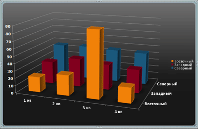
Рисунок 2. Диаграмма в PowerPoint, созданная на основе данных примера на листе Excel
Источник
Easily Insert Excel Linked Charts or Graphs onto PowerPoint Slides
by Avantix Learning Team | Updated May 16, 2022
Applies to: Microsoft® PowerPoint® 2013, 2016, 2019, 2021 and 365, (Windows)
It’s easy to insert a linked Excel chart or graph into PowerPoint by copying and pasting. There are two common methods you can use – copy and paste to insert a linked chart or copy and paste special to insert an embedded chart with a link. If you insert a linked or embedded Excel chart, you can update the chart in PowerPoint when the Excel source file changes.
If you created a linked chart in PowerPoint by copying and pasting a chart from Excel, the chart displays in PowerPoint and you can format it, refresh it and even animate the chart elements. A linked chart can be updated by refreshing the data. If you embed an Excel chart using Paste Special and then Paste link, you will need to format the chart in Excel as it is displayed as an embedded object in PowerPoint. You can double-click an embedded chart object to open the Excel file and then edit the file.
Linked and embedded charts with a link are stored in the source Excel file. The PowerPoint presentation (destination file) stores the location of the source file.
If you add a lot embedded Excel charts with a link in a PowerPoint deck, it will increase the size of the PowerPoint file so you may want to break the links when the presentation is finalized if you need to reduce the size of your PowerPoint file. It’s best to break links in a copy of the presentation.
Recommended article: How to Break, Update or Change Links to Excel Charts or Worksheets in PowerPoint
Do you want to learn more about PowerPoint? Check out our virtual classroom or in-person classroom PowerPoint courses >
Insert a linked Excel chart into PowerPoint using Copy and Paste
To insert a linked Excel chart or graph onto a PowerPoint slide by copying and pasting:
- Open the Excel workbook containing the chart you want to use.
- Save the workbook.
- Click in a blank area in the chart or on the edge of the chart.
- Press Ctrl + C. Alternatively, right-click and select Copy. You can also press Shift + F10 or press the Context button on your keyboard to display the context menu and then select Copy.
- Open the PowerPoint presentation in which you want to insert the chart.
- Go to Normal View (click the Normal button on the bottom right) and display the slide where you want to insert the chart.
- Click the Home tab in the Ribbon and in the Slides group, select the Title Only layout from the Layout drop-down menu. You can also delete the body placeholder on the slide by clicking its edge and then pressing Delete.
- Click in a blank area on the slide.
- Press Ctrl + V to paste the chart onto the slide. A Smart Tag appears on the bottom right of the chart.
- Click the Smart Tag. A drop-down menu appears.
- Select one of the options (hover over the icons to view a pop-up about each option). You can select Use Destination Theme and Embed Workbook, Keep Source Formatting & Embed Workbook, Keep Source Formatting & Link Data, Use Destination Theme & Link Data or Picture. You can also press Shift + F10 or the Context button on your keyboard to display the context menu and then select the desired option. The two Link options will create links to the original Excel file and can be managed and updated.
- If necessary, resize the chart by dragging the corner handles and move the chart by dragging it by its edge.
If you want the chart to keep the formatting from the Excel file, select Keep Source Formatting & Link Data. If you want the chart to use the formatting in the PowerPoint presentation, select Use Destination Theme & Link Data.
The following options appear when you click the Smart Tag:

If you use the same theme colors in both the Excel file and the PowerPoint deck, you should achieve more consistent chart formatting. If the chart does not format in PowerPoint using the destination theme method, the chart may have been formatted in Excel using standard colors (which override theme colors) and non-theme fonts.
Update or refresh a linked chart
If you use the copy and paste method to insert a linked chart, you will be able to refresh it using the chart tools in PowerPoint.
To update or refresh a linked chart:
- In Normal View, click the chart on the slide.
- Click the Chart Design or Chart Tools Design tab in the Ribbon.
- Click Refresh Data in the Data group.
Refresh data appears in the Ribbon in PowerPoint when you click a linked chart:

Insert an embedded Excel chart with a link into PowerPoint using Paste Special
To insert an embedded Excel chart or graph with a link onto a PowerPoint slide using Paste Special:
- Open the Excel workbook containing the chart you want to use.
- Save the workbook.
- Click in a blank area in the chart.
- Click the Home tab in the Ribbon and click Copy in the Clipboard group.
- Go to Normal View (click the Normal button on the bottom right) and display the slide where you want to insert the chart.
- Click the Home tab in the Ribbon and in the Slides group, select the Title Only layout from the Layout drop-down menu. You can also delete the body placeholder on the slide by clicking its edge and then pressing Delete.
- Click in a blank area on the slide.
- Click the Home tab in the Ribbon and click Paste in the Clipboard group. A drop-down menu appears.
- Select Paste Special. A dialog box appears.
- Click Paste link and then select Microsoft Excel Chart Object. If you click Paste, not Paste link, the embedded object will not be linked to the source Excel file.
- Click on OK.
- If necessary, resize the chart by dragging the corner handles and move the chart by dragging it by its edge.
Below is the Paste Special dialog box in PowerPoint:

Excel will insert an embedded chart that is linked to the original chart. You will not be able to format the embedded chart object in PowerPoint.
Refresh or update embedded Excel charts
To update an embedded chart with a link in PowerPoint if the Excel data has changed:
- Save the PowerPoint file.
- Click the File tab in the Ribbon and then click Info.
- On the bottom right, click Edit Links. A dialog box appears.
- Click the link path you want to update and then click Update.
- Click OK.
If both the Excel and PowerPoint files are open, embedded charts should automatically update.
Open presentations with embedded charts with links
If you have embedded charts with links in a PowerPoint presentation, each time you open the presentation, PowerPoint should prompt you to update the links or Enable Content.
Troubleshoot linked or embedded Excel charts
In order to insert a linked or embedded Excel chart with links and maintain the links, you should:
- Save the Excel workbook first before linking with PowerPoint
- Keep the Excel file in the same folder as the PowerPoint file if you can
- Ensure the Excel file is not moved to another folder or the link will break (you can fix this issue)
- Ensure the Excel file is not renamed or the link will break (you can fix this issue)
If the Excel file has been moved or renamed, you’ll still be able to view the chart in PowerPoint but you won’t be able to update or edit the chart unless you change the source using Edit Links.
You can double-click an embedded chart object to open the Excel source file and then edit the data in Excel. When you save the edited file and return to PowerPoint, the updated chart should appear automatically in your presentation.
Linked or embedded charts with links can present a security issue as users may be able to access the source Excel file and select other tabs in the workbook. If you email the presentation without the source Excel files, this is not an issue. You can also break links to embedded charts before sharing the PowerPoint presentation.
This article was first published on December 16, 2016 and has been updated for clarity and content.
Subscribe to get more articles like this one
Did you find this article helpful? If you would like to receive new articles, join our email list
More resources
3 Ways to Change the Font on All Slides in PowerPoint
How to Quickly Remove All Speaker Notes in PowerPoint (PC or Mac)
How to Insert Linked or Unlinked Excel Worksheet Data into PowerPoint
How to Reduce PowerPoint File Size (10 Ways to Compress PowerPoint Decks)
How to Break, Update or Change Links to Excel Charts or Worksheets in PowerPoint
Related courses
Microsoft PowerPoint: Intermediate / Advanced
Microsoft PowerPoint: Design for Non-Designers
Microsoft Excel: Intermediate / Advanced
VIEW MORE COURSES >
Our instructor-led courses are delivered in virtual classroom format or at our downtown Toronto location at 18 King Street East, Suite 1400, Toronto, Ontario, Canada (some in-person classroom courses may also be delivered at an alternate downtown Toronto location). Contact us at info@avantixlearning.ca if you’d like to arrange custom instructor-led virtual classroom or onsite training on a date that’s convenient for you.
Copyright 2023 Avantix® Learning
Microsoft, the Microsoft logo, Microsoft Office and related Microsoft applications and logos are registered trademarks of Microsoft Corporation in Canada, US and other countries. All other trademarks are the property of the registered owners.
Avantix Learning |18 King Street East, Suite 1400, Toronto, Ontario, Canada M5C 1C4 | Contact us at info@avantixlearning.ca
What happens when we want to combine each app’s strengths? When you’re ready to take your data and charts from Excel to PowerPoint, you have options. There are different ways to paste and link your data between these apps.
In this tutorial, you’ll learn how to embed or link an Excel file in PowerPoint. Soon, you’ll know how to embed Excel graphs and charts inside of a PowerPoint presentation. Embedding Excel into PowerPoint is a top skill in 2023, and you’ll find yourself doing it every day.
We also have a useful complement to this tutorial. Quickly grab it before you read on. Download our FREE eBook: The Complete Guide to Making Great Presentations, which will help you write, design, and deliver the perfect presentation.


How to Embed Excel Files & Link Data into PowerPoint (Quick Video)
In this quick three minute screencast below, I’ll show you how to work back and forth between Excel and PowerPoint. You’ll learn to embed Excel files in PowerPoint, link your data between the two apps, and can keep your data up to date.
Read on to learn more about different methods for working with data between Excel and PowerPoint.
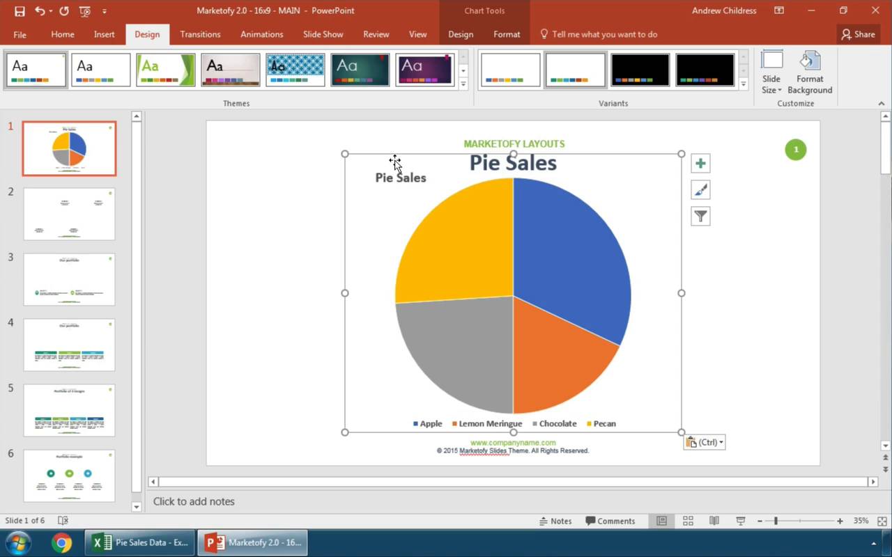
In this video, we used the now-discontinued Marketofy PowerPoint Template from GraphicRiver. When you need an embedded Excel in PPT, turn to the vast Envato Elements library for thousands of custom PowerPoint options. You’ll find template designs for all topics.
How to Embed Excel Charts in PowerPoint
Imagine that we’ve built a great-looking Excel chart. It features plenty of data and a stylish design aesthetic. But Excel isn’t the best tool for sharing with an audience. It’s best to embed Excel in PowerPoint to present with.
Remember: Excel and PowerPoint are both part of the Microsoft Office suite of productivity apps. They work well together. You can finish styling the chart in PowerPoint.
But you might not be done making style changes. Fortunately, you’re in luck.


Throughout this tutorial, you’ll see the SIMPLECO PowerPoint template featured. It’s a robust premium design from Envato Elements. Download it today to follow along.
The tips in this section were written using Windows and Office 365. If you’ve got a different operating system or a different version of the apps, your steps may be slightly different.
Start Embedding Excel Into PowerPoint
Now, let’s get started with the simplest way to make a PowerPoint embedded Excel. The first step is to click on your chart inside of Excel and make sure it’s selected. Then, you can press copy, either by pressing Ctrl + C on your keyboard or pressing the Copy button on Excel’s ribbon.


Now, let’s switch over to the SIMPLECO template, which is open in PowerPoint. Find some space on one of your slides. Then, press either Ctrl + V on your keyboard, or press the Paste button on PowerPoint’s ribbon. Below, you can see that the data and amounts match when you paste.

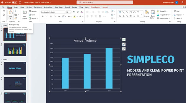

Notice that it brought over the same data from our Excel workbook, but it reformatted the style to match the PPT presentation. These are the default options to take charts from Excel to PowerPoint.
This is the most basic way to place an Excel chart inside your PowerPoint file. But as always, there’s more power hidden behind the scenes in PowerPoint.
Excel to PowerPoint Paste Options Explained
Maybe you want to paste your chart as a picture that the viewer can’t edit. Or maybe you want to link your Excel chart to PowerPoint so that they update data and stay synced.
When you’re taking charts from Excel to PowerPoint, you really have two choices to make:
- How do you want to handle the data — should it be linked to an Excel workbook, or embedded right inside the PowerPoint file?
- Should the style of the chart stay the same, or should it match the rest of your presentation?
These options are all available when you Right-click inside PowerPoint with a chart on your clipboard.


There are actually five ways that you can take data from Excel to PowerPoint, and each of them handles your data a bit differently. For your reference, here are the descriptions of each of the paste options in PowerPoint:
- Use Destination Theme and Embed Workbook
- Keep Source Formatting and Embed Workbook
- Use Destination Theme and Link Data
- Keep Source Formatting and Link Data
- Paste as picture
I think of the major categories as embedding, linking, and pasting as a picture. Let’s learn about each of those categories.
1. Embed Excel Workbook in PowerPoint
The first two icons (1 and 2) allow you to embed data inside the PowerPoint file. This means that PowerPoint stores the data behind the scenes inside the PowerPoint file.
Once you paste the file in and embed the workbook, the data is separated from the Excel file and stored inside the PowerPoint file.
If Excel’s data updates, the PowerPoint chart won’t update automatically.


To update the data inside of an embedded Excel file, you can right-click the chart and choose Edit Data from the menu. This opens an embedded Excel spreadsheet inside the PowerPoint file where you can edit the data in the chart.


Embedding data has many advantages. The charts in your presentation work whether or not you’ve got access to the original Excel file. Embedding does increase the size of your PowerPoint file.
The major downside to embedding data is that it doesn’t stay synced to the Excel file that you’re doing analysis and data review inside of. If you’re going back and forth between the two apps, linking might be a better choice.
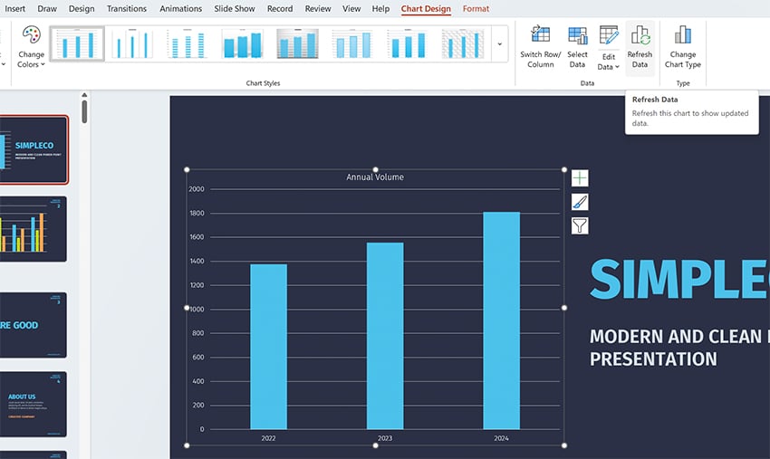
2. Link Excel Data to PowerPoint
Linking data (icons 3 and 4) keeps your PowerPoint and Excel file in sync. If you change the data for the chart in Excel, you can update the pasted chart in PowerPoint to use the latest data.
When PowerPoint and Excel are both open at the same time, this happens automatically for linked data. Make a change in Excel, and the linked PowerPoint chart updates in real time.
If you’re working in Excel and PowerPoint at different times, you’ll want to update your data. Make sure to hit Refresh Data on the Chart Design tab on PowerPoint’s ribbon.


Linking is great to keep the data connected so that you don’t have to keep rebuilding your charts as you move from Excel to PowerPoint.
But linking your data directly to Excel isn’t always the right choice. The downside to using the linked option is two-fold:
- If you send your PowerPoint file to someone and they don’t have access to the Excel file, refreshing data won’t work.
- If others are changing the linked Excel file behind the scenes without your knowledge, you run the risk of updating your presentation with incorrect data.
If you’re still a bit fuzzy about choosing between embedding and linking data from Excel to PowerPoint, check out the official Microsoft help page to see a comparison of the two.
3. Paste Excel Chart as Picture in PowerPoint
The final option to place a chart in PowerPoint is to simply paste the chart you built in Excel as a flattened, non-editable picture.
When you paste a chart as a picture, the styles will appear the same as the Excel version of the chart and no longer be editable within PowerPoint.


This feature is handy when you want to ensure that the data isn’t changed or altered by the recipient. But pasting as a picture causes you to lose any ability to edit or change the chart.
Excel to PowerPoint Paste Formatting Options
Whether you choose to embed or link your data, you can choose how to handle the style of your charts when you move from Excel to PowerPoint. Both «embed» and «link» options have two choices for how to handle styling.
Let’s look at the difference between «Use Destination Theme» and «Keep Source Formatting.» These options don’t change the way we work with data—both options embed your data in the PowerPoint file—but they do change the appearance of the charts.
- Keep Source Formatting. Uses the same chart style used in Excel.
- Use Destination Theme. Matches the style of your chart to the PowerPoint theme.
In the screenshot below, you can see examples of each option. Using Keep Source Formatting kept the chart exactly the same as it appeared in Excel. Use Destination Theme helps your charts blend in with the rest of the presentation.


Once a chart is placed in the PowerPoint file, you can edit and restyle the presentation. Think of this paste option as the starting point.
We’ve learned about embedding Excel into PowerPoint. As you can see, linking the two apps is a seamless process. It helps you keep data and charts up to date to share with your audience. But sharing data can still seem daunting. What are some good rules of thumb? What do you need to do to succeed?
Read on for five of my favorite tips for effectively sharing data in PowerPoint. Embrace these ideas to succeed in 2023:
1. Opt for Colorful Styling
Bland, flat styles never inspired anyone. The trick is to use bright, colorful styles. You’ll enjoy several benefits when you do this. First, you’ll have shareable charts that are creative and engaging. You won’t bore your audience.


Plus, the creative use of color helps add contrast. For example, if you’re sharing charts, you can make each data series a different color. This makes your PowerPoint embedded Excel much easier to read and understand.
2. Animate to Control the Pace and Flow
Data is best shared as part of a narrative flow. In other words, you don’t always want your audience to see it all at once. That’s especially true if you’re providing details along the way. Data without context is “information overload” and can quickly become confusing.
Using animations in PowerPoint is a great way to control the pace and flow of your data slides. You can present Excel-based data in a certain order, rather than all at once.
Learn how with our full tutorial on PowerPoint’s Animation pane, the control center for slide animation:
3. Use Unconventional Charts and Infographics
Often, basic Excel charts and graphs work well for sharing your data. But sometimes, it pays to be creative. Unique infographics and charts help you share information in new and creative ways.


Even PowerPoint’s built-in chart features are robust enough to craft new designs. Next time you’re linking data to Excel, try out a funnel, waterfall, or sunburst chart. These are tailor-made for custom data sharing. You can use them all when you’re embedding Excel into PowerPoint.
4. Expand Beyond Numerical Data
When you think of data, it’s easy to think of numbers. And of course, that’s likely the most common type of data. But you can use charts and graphics to share data that isn’t numerical. Remember: these are tools to share ideas.
For example, you can use a chart to introduce your team and explain your organization’s structure. It’s a good way to illustrate an idea that may be hard to explain with words alone. And of course, you can embed this right from Excel using PPT tables and more.
For a detailed look at org charts in PPT, view our tutorial now:
5. Be Specific with Design
Premium PowerPoint themes from Envato Elements are available for any subject. Many are well-suited for any topic with a few quick edits. But others are specific and intentional with their themes.


For example, you’ll find many PPT templates geared toward a specific industry. This extends to their layouts, themes, and your ability to embed data. Why not choose a custom, themed template for your next project? These templates look amazing, and they deliver design inspiration on every slide.
Keep Learning More About Excel and PowerPoint
Keep in mind that there are different ways to manage your data based upon the paste option you use. On Envato Tuts+, we have a wealth of resources that help you master both apps!
Dig into more helpful Excel and PowerPoint tutorials on Envato Tuts+:
Make Great Presentations (Free eBook Download)


We have the perfect compliment to this tutorial, which will walk you through the complete presentation process. Learn how to write your presentation, design it like a pro, and prepare it to present powerfully.
Download our Book: The Complete Guide to Making Great Presentations. It’s available for free with a subscription to the Tuts+ Business Newsletter.
Now You Know How to Embed Excel in PowerPoint
Keeping your PowerPoint graphs linked to Excel data is handy. Embedded data gives you the flexibility to edit your data right inside the presentation. It comes down to how you want (or don’t want) to keep your data synced between Excel and PowerPoint.
With linked data, you don’t have to recreate and reformat your charts each time the original data changes. This embedded Excel in PPT approach ensures you won’t forget to make an update. Go practice it now with a presentation of your own!
Editor’s Note: This tutorial was first published in July of 2017. It’s been comprehensively updated for accuracy by Andrew Childress.