
Параметрический график функции в Excel
Отдельного типа диаграмм для вывода параметрического представления функции в Excel нет, но это легко сделать следующим образом:
- определить ряд данных для величины t, меняющейся от 0 до 2*π c заданным шагом;
- определить зависимые ряды данных x(t), y(t);
- построить диаграмму типа «Точечная диаграмма» по выделенным рядам x(t), y(t).
Скрин и документ Excel 2007 или выше прилагаются. Функция взята из этой заметки.

Параметрический график в Excel, как построить, скриншот
![]() Скачать этот пример в архиве .zip с документом Excel .xlsx (73 Кб)
Скачать этот пример в архиве .zip с документом Excel .xlsx (73 Кб)
30.10.2022, 04:44 [235 просмотров]
К этой статье пока нет комментариев, Ваш будет первым
Разделы:
Информатика
Тип урока: урок усовершенствования и закрепления знаний.
Вид урока: практическая работа с применением теста.
Цели урока:
1. Образовательные:
- организация самостоятельной работы учащихся проверки знаний программы Microsoft Excel по тесту;
- формирование умений и навыков работать на ПК в программе Microsoft Excel;
2. Воспитательные:
- продолжить работу по развитию внимания, наблюдательности;
3. Развивающие:
- продолжить работу по развитию логического мышления, умение самостоятельно работать по образцу.
Методы и приемы:
- традиционный метод;
- «рефлексивное слушание»;
- постановка конкретных целей;
- обобщение, работа с проблемными вопросами и ситуациями;
- работа с листком–путеводителем;
- работа с автоматизированными средствами обучения (ПК).
Дидактические и наглядные пособия:
- карточки–задания с графиками и формулами параметрических кривых;
- компьютер и программа Excel;
- слайды для демонстрации;
- тест на компьютере и лист–путеводитель (бланк для выставления оценок).
Оборудование:
- компьютеры;
- проектор.
Методические рекомендации для подготовки и проведения данного урока:
- Тщательная разработка дидактического материала.
- Учитывать психические способности учащихся.
Ход урока
- Организационный момент — 2 мин.
Преподаватель приветствует учащихся, знакомит с темой и планом урока.
Сегодня на уроке мы с вами будем стоить параметрические кривые.
Параметрическое представление кривой l на плоскости с координатами x, y – это две функции x=x(t), y=y(t), определенные на одном и том же числовом множестве.
Вы увидите как просто и легко с помощью автоматических средств можно построить самый сложный и простой график функции у = f(x).
Для выполнения всей работы вам будет выдан путеводитель (Приложение №1), где вы будете выставлять себе оценки за выполнение.
В итоге за свою работу вы получите оценки и уверенность в своих знаниях при работе в программе Microsoft Excel. Каждый из вас сможет автоматически стоить математические графики функций. - Мотивация учебной деятельности — 1 мин.
Данный урок поможет вам утвердиться в мысли, каждый из вас сможет автоматически стоить математические графики функций и проверить свои знания алгебры. - Актуализация опорных знаний — 5 мин.
Прежде чем учащиеся приступят к работе преподаватель, продемонстрирую слайды, как правильно нужно построить график сложной функции: «Эпициклоида» (Приложение №3) - Проверка знаний с помощью теста — 8 мин.
- Учащиеся выполняют тест «Проверка знаний работы в программе Microsoft Excel» на компьютере (Приложение №4);
- Преподаватель выставляет оценки за тест в лист-путеводитель по критерию–оценивания (Приложение №1)
- Совершенствование умений и навыков с помощью упражнений — 22 мин.
Учащиеся за компьютером выполняют практическое задание в программе Microsoft Excel по вариантам (Приложение №2):- Заполнение таблицы для расчета данных.
- Расчет значений координат кривой на заданном отрезке.
- Построения графика параметрической кривой, используя, мастер диаграмм в программе Microsoft Excel.
- Подведение итогов — 5 мин.
Преподаватель предлагает учащимся подвести итоги урока, оценить свою работу заполнив оценочный лист (Приложение 1).
Преподаватель благодарит ребят за работу. - Домашнее задание — 2 мин.
Домашнее задание предлагается комбинированное. Традиционно учащимся необходимо повторить материал урока (конспект).
Приложение 4
18.04.2010
A graph consists of a set of vertices and edges. Different types of graphs are bar graphs, line graphs, charts pies, and histograms. In mathematics, the graph is a pictorial representation of data in an organized way. The graph provides us with the relationship between various quantities. Graphs are very much helpful to solve our daily issues. Graphs are used to denote our networks. Graphs are also included in our social networks, such as Facebook, LinkedIn, and Instagram. The graph of a function of three variables is the collection of points (x, y, z, f(x, y, z)) in four space where in the domain of (x, y, z). Plotting three variables in a graph is very easy. Ultimately using graphs, we can visualize data and examine relationships among three variables. To graph three variables, the best choice is clustered bar chart. We can graph three variables using many programs such as Excel, power point etc.
A line graph is a graphical representation of data that changes over a period of time. It consists of a horizontal x-axis and a vertical y-axis. The X-axis consists of the time period, and the y-axis is the specific item. It helps us to analyze whether a specific item is increasing on the y-axis over time. A line graph can be connected using various points in a straight line. It helps us to analyze the two sets of values in which one set of data-dependent on the other value of data. A line graph can be made using excel for 2 or more variables. Excel is a Microsoft spreadsheet that can be used to view, edit and share the files easily and quickly. Using Excel, we can also make calculations and computation capabilities, graphing tools, and a macro programming language called visual basic application. Excel helps us to compare not only two variables using different ways of graphical representations but also we can compare three variables. We have different types of graphs and charts like line graphs, bar graphs, histograms, pie charts, and cartesian graphs.
Steps involved to make a line graph are given below
Step 1: Open the Excel sheet, enter the values of three columns and save the columns with names.

Step 2: Select everything, including headers, and open the insert tab in the navigation menu.

Step 3: Navigate to the charts session and click on line graphs.

Step 4: Choose different colors for each of the lines so that it can be easily identified. We can style the line graph using various themes and styles which are available.
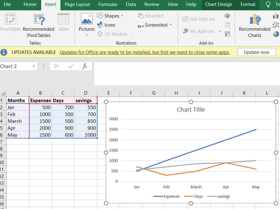

For the below example, a line graph was made in excel using three different variables. The three variables are month, expenses, and days and savings. In the graph, you can see the variations in each expense and day according to the month variable. from January to may there keep on the increase in terms of expenses as shown in the example.

Three variable Bar Graph
A bar graph is an image representation of a group of data in the form of rectangular-horizontal and vertical bars. The length and height of the bars measure the value of a variable. Bar graphs help us to compare different types of data with different groups easily. It gives the relationship between variables using two axis: the x-axis and y-axis. In every graph or chart, the variations can be shown over a period of time.
Properties of bar Graphs
- The distance between each bar should be equal.
- The height and length of bars should correspond to the value of the data.
- The width of the bars also should be the same.
- There should be a common base for all bars.
The steps involved in the making bar graphs are given below
Step 1: Open the Excel sheet and enter the values of 3 variables and save the variables with names.
Step 2: Select everything, including headers, and open the insert tab in the navigation menu.
Step 3: Navigate to the charts session and click on bar graphs.

Step 4: choose different colors for each line so that it can be easily identified. We can style the bar graph using various themes and styles which are available.

There are two types of bar graphs:
- Horizontal Bar Graph
When a group of data is represented in a graph using bars horizontally, those graphs are called horizontal bar graphs. These bars show the measure of the value of the data. The data is represented along the x-axis, so the length of bars denotes the values of variables. Example,
The below bar graph is a horizontal bar graph as the values of variables are along the axis, and the length of bars defines the value of a variable. The variables are Months, expenses, and days. In the graph we can see from January to May there is a increase in the expenses.

- Vertical Bar Graph
When a group of data is represented in a graph using bars vertical, those graphs are called vertical bar graphs. These bars show the measure of the value of the data. The data is represented along the y-axis, so the height of bars denotes the values of variables. Example,
The below bar graph is a vertical bar graph as the values of variables are along the y-axis, and the height of bars defines the value of a variable. The variables are Months, expenses, and days.

We can design various graphs using Excel as it provides a lot of options like 3-D bar graphs and 2-D bar graphs, and also we have pie charts and histograms for comparing different sets of values. Excel offers us a wide range of options to help in computing and calculations. The process of graphing three variables in Excel is explained step by step in this article.