
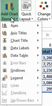
Specific line and bar types are available in 2-D stacked bar and column charts, line charts, pie of pie and bar of pie charts, area charts, and stock charts.
Predefined line and bar types that you can add to a chart
Depending on the chart type that you use, you can add one of the following lines or bars:
-
Series lines These lines connect the data series in 2-D stacked bar and column charts to emphasize the difference in measurement between each data series. Pie of pie and bar of pie charts display series lines by default to connect the main pie chart with the secondary pie or bar chart.

-
Drop lines Available in 2-D and 3-D area and line charts, these lines extend from data points to the horizontal (category) axis to help clarify where one data marker ends and the next data marker starts.
-
High-low lines Available in 2-D line charts and displayed by default in stock charts, high-low lines extend from the highest value to the lowest value in each category.
-
Up-down bars Useful in line charts with multiple data series, up-down bars indicate the difference between data points in the first data series and the last data series. By default, these bars are also added to stock charts, such as Open-High-Low-Close and Volume-Open-High-Low-Close.


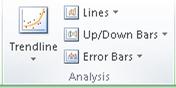
Add predefined lines or bars to a chart
-
Click the 2-D stacked bar, column, line, pie of pie, bar of pie, area, or stock chart to which you want to add lines or bars.
This displays the Chart Tools, adding the Design, Layout, and Format tabs.
-
On the Layout tab, in the Analysis group, do one of the following:
-
Click Lines, and then click the line type that you want.
Note: Different line types are available for different chart types.
-
Click Up/Down Bars, and then click Up/Down Bars.
-
Tip: You can change the format of the series lines, drop lines, high-low lines, or up-down bars that you display in a chart by right-clicking the line or bar, and then clicking Format <line or bar type> .
Remove predefined lines or bars from a chart
-
Click the 2-D stacked bar, column, line, pie of pie, bar of pie, area, or stock chart that displays predefined lines or bars.
This displays the Chart Tools, adding the Design, Layout, and Format tabs.
-
On the Layout tab, in the Analysis group, click Lines or Up/Down Bars, and then click None to remove lines or bars from a chart.
Tip: You can also remove lines or bars immediately after you add them to the chart by clicking Undo on the Quick Access Toolbar or by pressing CTRL+Z.
You can add other lines to any data series in an area, bar, column, line, stock, xy (scatter), or bubble chart that is 2-D and not stacked.
Add other lines
-
This step applies to Word for Mac only: On the View menu, click Print Layout.
-
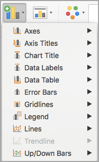
In the chart, select the data series that you want to add a line to, and then click the Chart Design tab.
For example, in a line chart, click one of the lines in the chart, and all the data marker of that data series become selected.
-
Click Add Chart Element, and then click Gridlines.
-
Choose the line option that you want or click More Gridline Options.
Depending on the chart type, some options may not be available.
Remove other lines
-
This step applies to Word for Mac only: On the View menu, click Print Layout.
-
Click the chart with the lines, and then click the Chart Design tab.
-
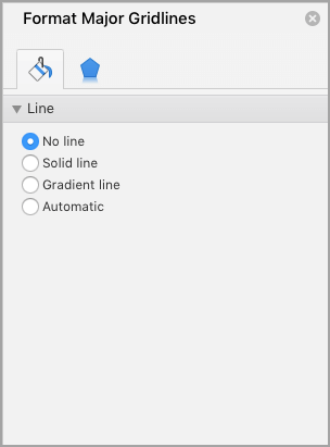
Click Add Chart Element, click Gridlines, and then click More Gridline Options.
-
Select No line.
You can also click the line and press DELETE .
To make the data in a chart/graph easier to read, it helps to add horizontal and/or vertical gridlines.
Gridlines are lines that go horizontally and vertically across your chart plot to show divisions in the chart axes (below is a chart that shows horizontal gridlines).
These gridlines usually align with points on the chart’s axes, so it is easier to trace the value corresponding to a point on the graph.
They are especially helpful when you have large and complicated charts, or when data points on the chart are unlabeled.
Excel lets you display three kinds of gridlines:
- Horizontal gridlines
- Vertical gridlines
- Depth gridlines (for 3-D charts)
Gridlines can also be displayed for both major and minor units.
Those that align with major tick marks on the axes are called major gridlines. Minor gridlines separate the units defined by the major gridlines and as such let you mark the finer details in your chart.
In this tutorial we will show you how to add major and minor gridlines to your chart and how to format them:
- Using the Chart Elements button
- Using the Chart Tools menu
We will also show you how you can hide or remove gridlines from your chart if you need to.
Two Ways to Add and Format Gridlines in Excel
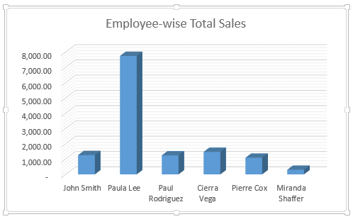
Let’s say you have the following chart:

Notice that without gridlines it’s hard to tell what value each of the bars corresponds to.
So we need to insert some gridlines into the chart to make it easier to read the values the bars represent.
Of course, you have the option to add data labels as well, but in many cases, having too many data labels can make the chart look cluttered. So having gridlines can be useful in such cases
Let us now see two ways to insert major and minor gridlines in Excel.
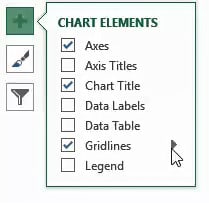
Method 1: Using the Chart Elements Button to Add and Format Gridlines
The Chart Elements button appears to the right of your chart when it is selected.
This button allows you to add, change or remove chart elements like the title, legend, gridlines, and labels.
Here’s what the button looks like:

Adding the Gridlines
To add the gridlines, here are the steps that you need to follow:
- Click anywhere on the chart
- Click on the Chart Elements button (the one with ‘+’ icon).
- A checklist of chart elements should appear now. Make sure that the checkbox next to ‘Gridlines’ is checked.
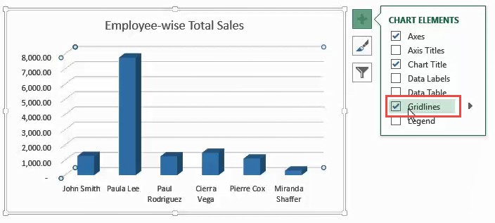
- This will display the major gridlines on your chart.
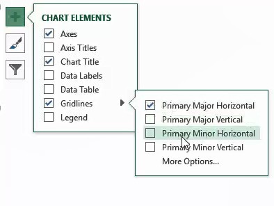
- When you hover over the Gridlines checkbox, you will notice a small arrow to its right, as shown below.
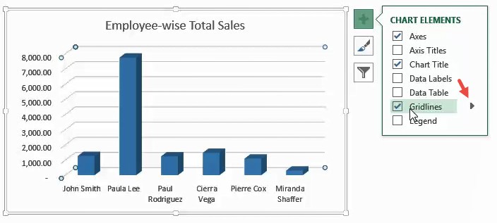
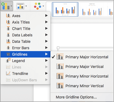
- Click on this arrow to see additional options for the gridlines. These include:
- Primary Major Horizontal – select this if you want to display major horizontal gridlines
- Primary Major Vertical – select this if you want to display major vertical gridlines
- Primary Minor Horizontal – select this if you want to display minor horizontal gridlines
- Primary Minor Vertical – select this if you want to display minor vertical gridlines
- More Options – select this option if you want to format the gridlines.
Select checkboxes next to the gridlines that you want to display on your chart.
Formatting the Gridlines
Select ‘More Options’ if you want to format the gridlines.

This will open a sidebar to the right of the Excel window that lets you format your chart elements. Format your selected gridlines as you see fit.
Once you’re done, you can close the sidebar.
Editing the Gridlines
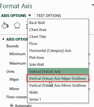
The next time you need to edit the gridlines, double-click on the axis corresponding to the gridlines that you want to change.
For example, if you want to change the horizontal gridlines, double-clock on the x-axis.
In other words, select the axis that is perpendicular to the gridlines that you want to change.

This will open the Format Axis sidebar to the right of the Excel window.

Select the dropdown arrow next to ‘Axis Options’. Select the gridlines option that you want to change. For example, if you want to change the format for the major horizontal gridlines, select the ‘Vertical (Value) Axis Major Gridlines’ option.
Here, you’ll find two tabs:
- Fill & Line : This tab lets you set the outline and fill color/pattern of the selected gridlines.
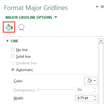
- Effects: This tab lets you set effects like Shadow, Glow and Soft Edges to the selected gridlines.

Use the tabs to change your gridline formats to whatever you need.
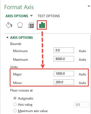
Note: If you want to see or change the number of gridlines displayed on your chart, you can take a look at the Major and Minor input boxes (under the Units category of the Axis Options tab). Try increasing or decreasing these numbers to change the number of gridlines displayed.
Also read: How to Add Axis Titles in Excel?
Method 2: Using the Chart Tools Menu to Insert and Format Gridlines
The Chart Tools ribbon can be seen in the main menu when you click on your chart. This menu consists of two tabs – Design and Format.
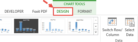
So, a second way to add and format gridlines is to use the Design tab from the Chart Tools. Here’s how:
- Click on your chart.
- You should see the Chart Tools menu appear in the main menu.
- Select the Design tab from the Chart Tools menu.
- Click on ‘Add Chart Element’ (under the ‘Chart Layouts’ group).

- A dropdown menu should appear, with different chart element options.
- Hover over ‘Gridlines’.

- A submenu consisting of different options relating to gridlines should appear. Select the type of gridlines that you want to add. You can add more than one type of gridlines in your chart.

- The gridlines should now appear on your chart.
Note: Notice the vertical axis is categorical and basically has no minor divisions. So even though there is an option to display minor vertical gridlines, they will not show on this chart when selected. Minor divisions don’t make sense for category axes.
Removing Gridlines in Excel
To remove gridlines, follow the steps demonstrated below:
- Click anywhere on the chart.
- Click on the Chart Elements button.

- If you want to remove all the gridlines, then uncheck the box next to ‘Gridlines’.

- If you want to remove a specific set of gridlines, then hover over the Gridlines checkbox.
- Click on the small arrow to its right.
- Uncheck the box next to the gridlines that you want to remove/ hide.
Here’s what the chart would look like with the only minor horizontal gridlines removed:

Another quick way to remove gridlines (or any element in an Excel chart) is to select them and hit the delete button. In the case of gridlines, you will see that all the gridlines have been selected (and hitting the Delete button will only delete the ones that were selected.
In this tutorial, we showed you two ways to add and format gridlines in Excel.
We also showed you how to quickly remove the specific gridlines and what to do if you want to edit the formatting of gridlines s(like color, style, etc.)
We hope this tutorial was useful for you and easy to follow.
Other Excel charting tutorials you may also find useful:
- How to Insert Chart Title in Excel?
- How to Create Bar of Pie Chart in Excel?
- How to Move a Chart to a New Sheet in Excel
- How to Print Gridlines in Excel (3 Easy Ways)
- How to Make Box Plot (Box and Whisker Chart) in Excel?
- How to Add a Trendline in Excel Charts?
- How to Remove Gridlines in Excel (Shortcut + VBA)
- How to Add Border to a Chart in Excel
- How to Add Secondary Axis in Excel Charts?
Excel allows us to simply structure our data.according to the content and purpose of the presentation. When we want to compare actual values versus a target value, we might need to add a line to a bar chart or draw a line on an existing Excel graph.
This step by step tutorial will assist all levels of Excel users in the following:
- How to add a horizontal line in an Excel bar graph?
- How to add a horizontal line in an Excel scatter plot?
- How to add a target line in Excel?
Suppose we have below data and we insert a column chart using the data in B2:C7.
- Select B2:C7
- Click Insert tab, Other Charts, then All Chart Types
- Select Column, then Clustered Column
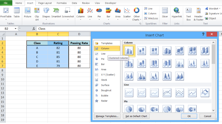 Figure 1. Insert a column chart
A column chart will be created, showing the rating per corresponding class.
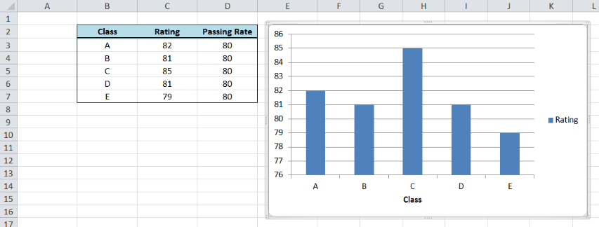 Figure 2. Column chart showing class ratings
How to add a horizontal line in an Excel bar graph?
We want to add a line that represents the target rating of 80 over the bar graph. In order to add a horizontal line in an Excel chart, we follow these steps:
- Right-click anywhere on the existing chart and click Select Data
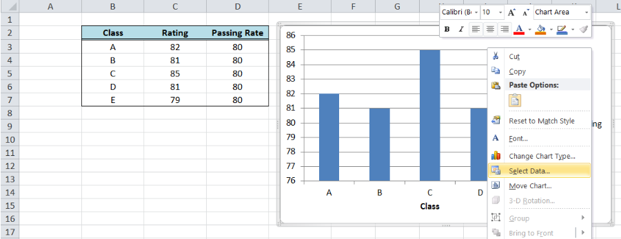 Figure 3. Clicking the Select Data option
- The Select Data Source dialog box will pop-up. Click Add under Legend Entries.
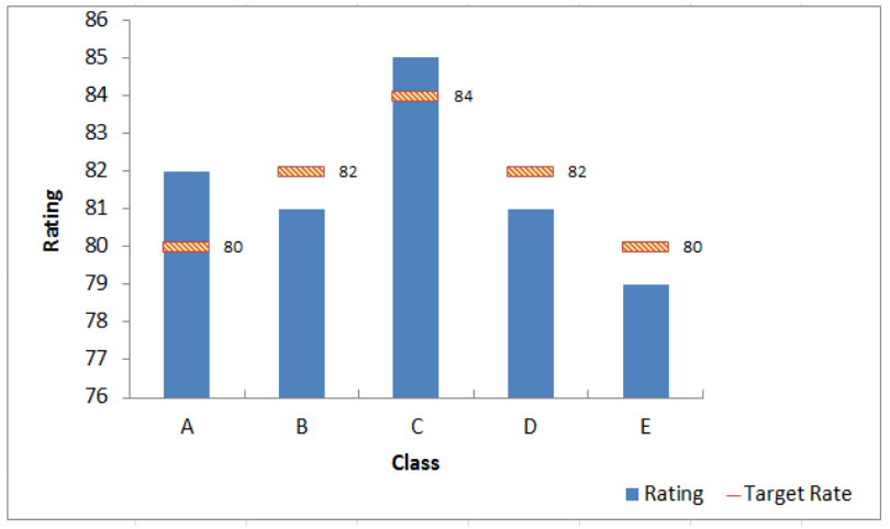 Figure 4. Adding a series data
The Edit Series dialog box will pop-up.
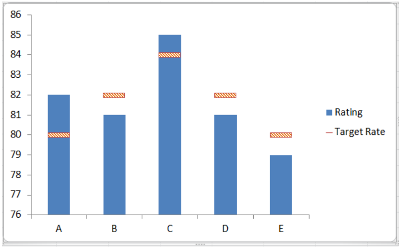 Figure 5. Edit Series preview pane
- In Series name, select cell D2 or “Passing Rate”.
- In Series values, select D3:D7 or input
=column!$D$3:$D$7. Click OK.
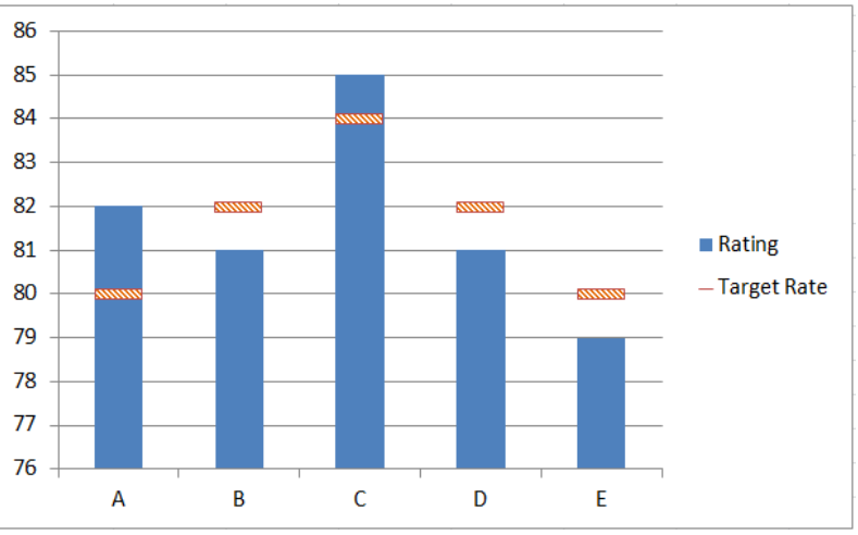 Figure 6. Adding the series name and values
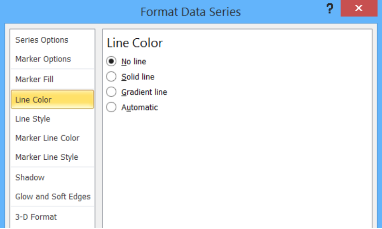 Figure 7. New Series “Passing Rate” added
- Click OK. A second column chart will be displayed beside the first chart.
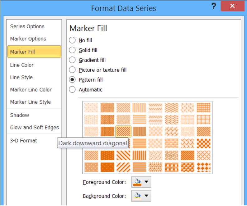 Figure 8. Combination column chart
- Click the second column chart “Passing Rate”, right-click and select “Change Series Chart Type”
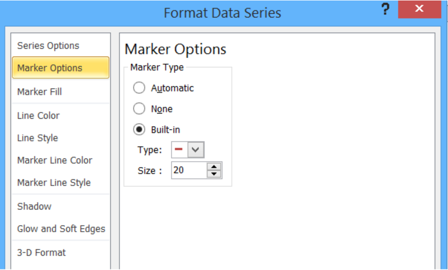 Figure 9. Clicking the Change Series Chart Type
- Select Line and press OK
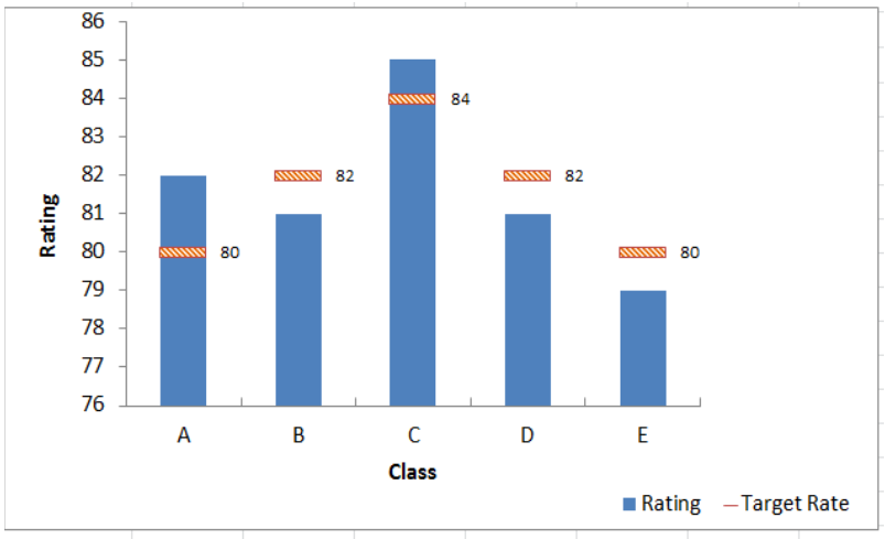 Figure 10. Selecting the Line chart type
The second column chart “Passing Rate” will be changed into a line chart.
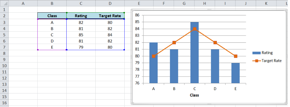 Figure 11. Output: Add a horizontal line to an Excel bar chart
Customize the line graph
Click on the line graph, right-click then select Format Data Series.
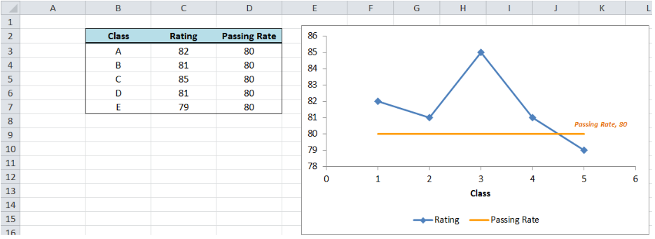 Figure 12. Selecting the Format Data Series
These are some of the ways we can customize the line graph in Excel:
- Change line color
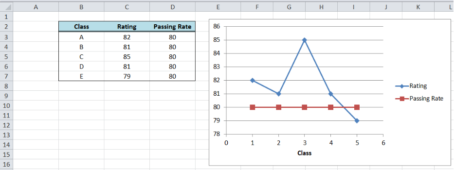 Figure 13. Changing the line color
- Add markers
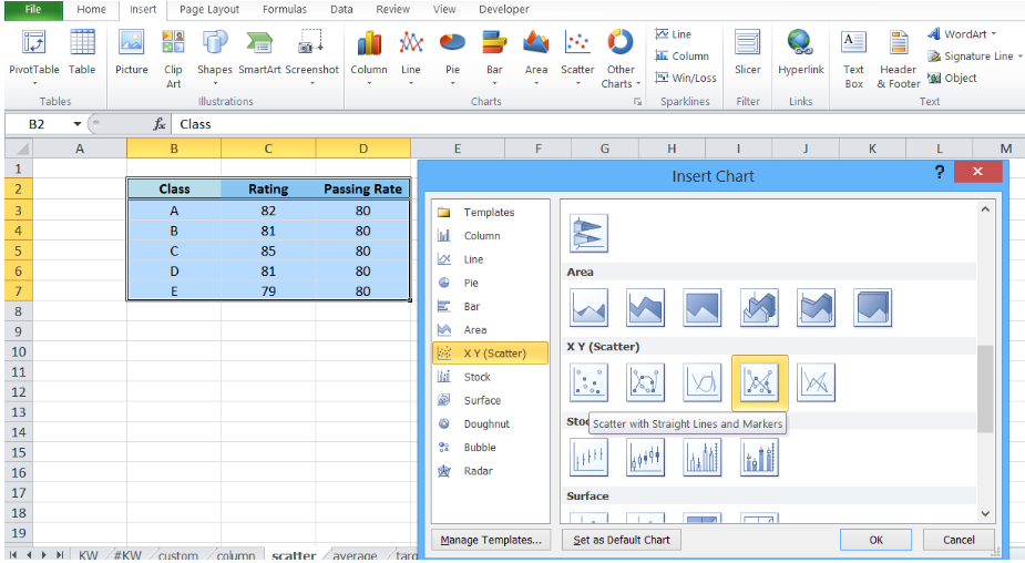 Figure 14. Adding a built-in marker
- Add data label
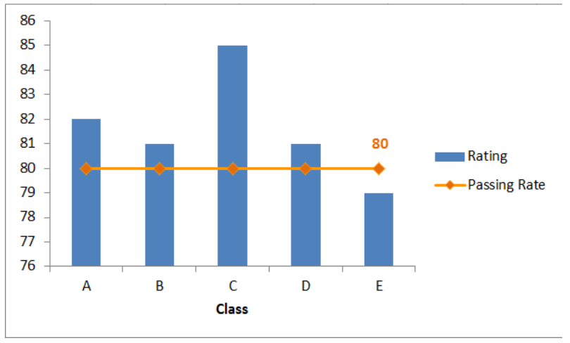 Figure 15. Final output: add a line to a bar chart
How to add a horizontal line in an Excel scatter plot?
We can follow the same procedure discussed above wherein we add a horizontal line to an Excel chart. However, this time let us try a quicker approach where we graph the two data points for Rating and Passing Rate at the same time using an XY Scatter plot.
- Select B2:D7
- Click Insert Chart, and select X Y (Scatter), then Scatter with Straight Lines and Markers.
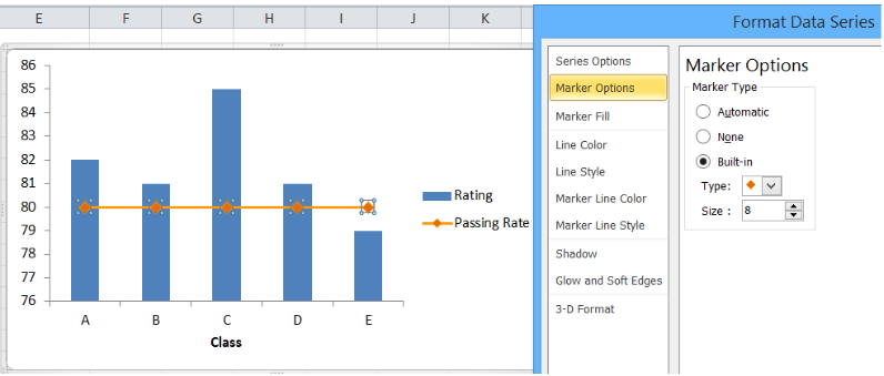 Figure 16. Creating an X Y Scatter Plot
We will be able to combine the two graphs in one chart, where Rating and Passing Rate are both presented in the form of data points connected by lines and markers.
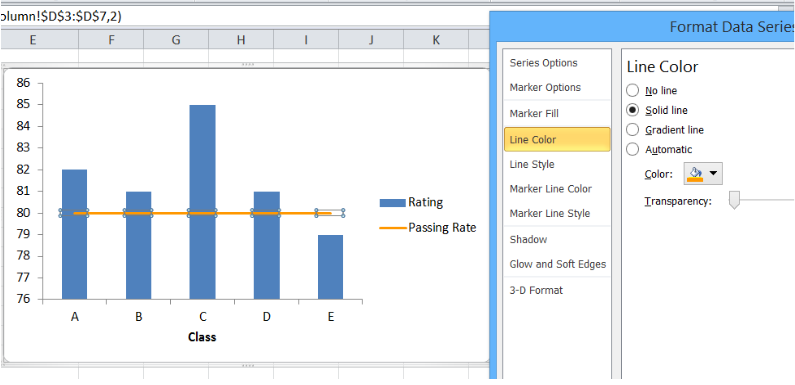 Figure 17. Combination X Y scatter plot
The value for passing rate is constant at 80 and it is presented as a horizontal line. This combination graph makes it easy to compare the rating per class to the passing rate of 80.
We can customize the line graph by changing the line color, removing the markers and adding a data label. We can do any customization we want when we right-click the line graph and select “Format Data Series”.
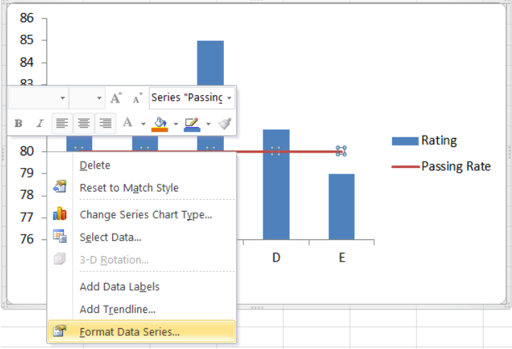 Figure 18. Final output: How to add a horizontal line in an Excel scatter plot
The resulting graph shows that the rating for classes A to D are well above the passing rate of 80.
How to add a target line in Excel?
Target values are not always equal for all data points. Suppose we have different targets for each class as shown below. We follow the same procedure as the above examples in adding a line to a bar chart. The combined line and bar graph will look like this:
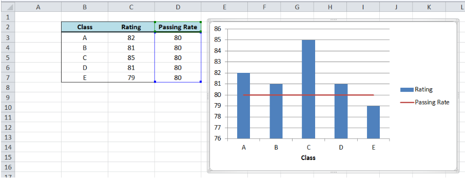 Figure 19. Output: Add line graph to a bar graph
When targets for each class are connected through lines as shown above, the comparison between the actual and target rating is not very clear. There is a more effective way to compare the data that will improve visualization and analysis, like the example below.
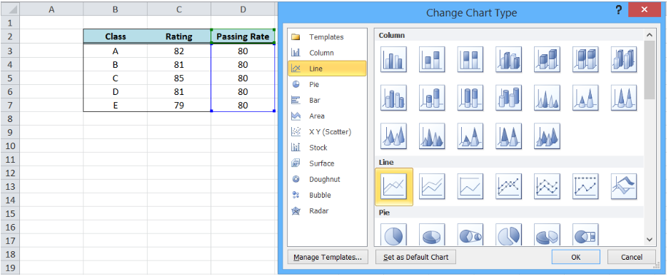 Figure 20. Bar graph with customized target graph
This graph can be done by customizing our target graph through these steps:
- Double click on the Target Rate graph to show the Format Data Series dialog box
- Input the following settings:
- In the Marker Options, select Built-in Marker Type and select the horizontal line or “dash” in the drop-down menu
- Select size 20
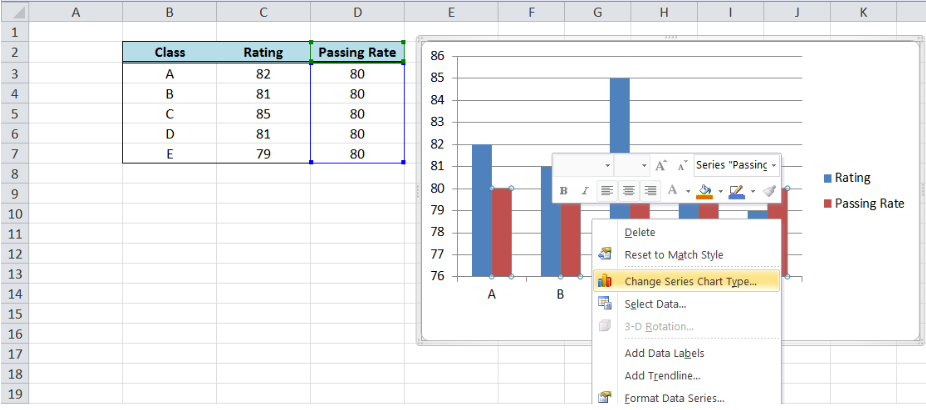 Figure 21. Selecting a built-in marker type and size
-
- Under Marker Fill, select Pattern Fill, “Dark Downward Diagonal”
- Select the Foreground Color Orange, Accent 6, Darker 25%
- Select the Background Color Orange, Accent 6, Lighter 80%
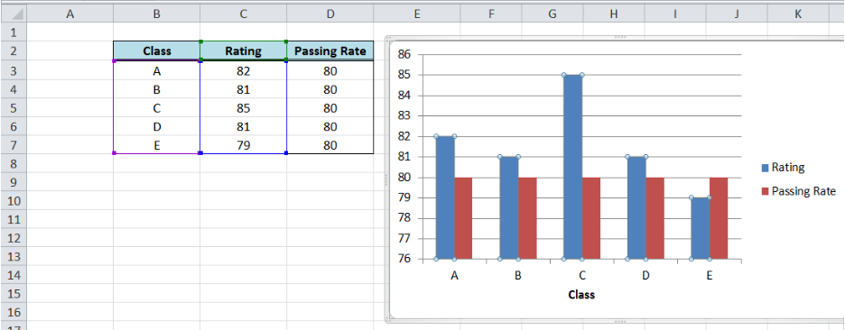 Figure 22. Customizing marker fill settings
-
- Line Color: No Line
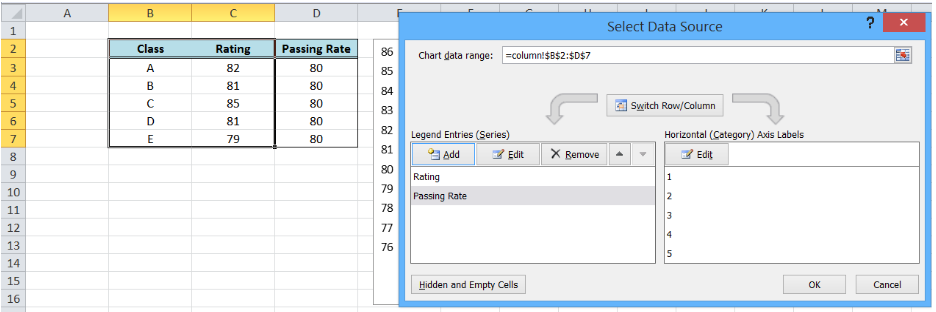 Figure 23. Removing line color for the target graph
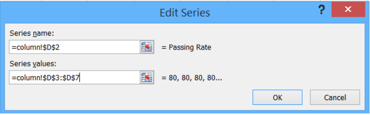 Figure 24. Output graph after initial formatting
- Delete the major gridlines
 Figure 25. Output graph with deleted major gridlines
- Add data labels and axis titles, and move the legend to below the graph
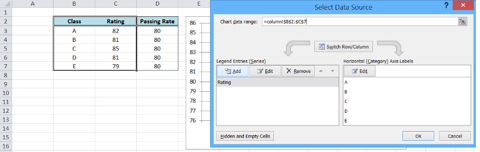 Figure 26. Output: How to add a target line in Excel
Most of the time, the problem you will need to solve will be more complex than a simple application of a formula or function. If you want to save hours of research and frustration, try our live Excelchat service! Our Excel Experts are available 24/7 to answer any Excel question you may have. We guarantee a connection within 30 seconds and a customized solution within 20 minutes.
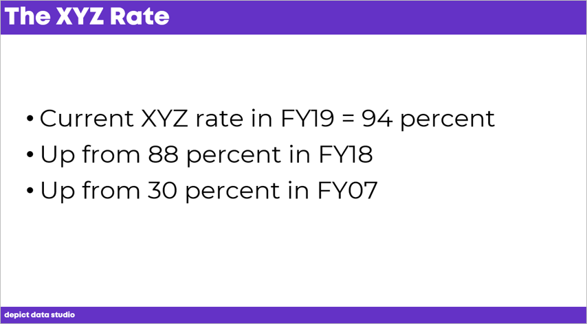
Here’s a common data visualization challenge: Slides with some, but not all, of the chronological data included.
The Challenge
The challenge is twofold:
- First, how do you take your bullet points and transform them into a graph? What type of graph should it be? How should it be formatted? How do you make the graph easy to understand?
- Second, what if your dates don’t go in order? What if you’ve got data for one point in time… and then you skip a big chunk in the middle?
The Excel Solution that Doesn’t Work
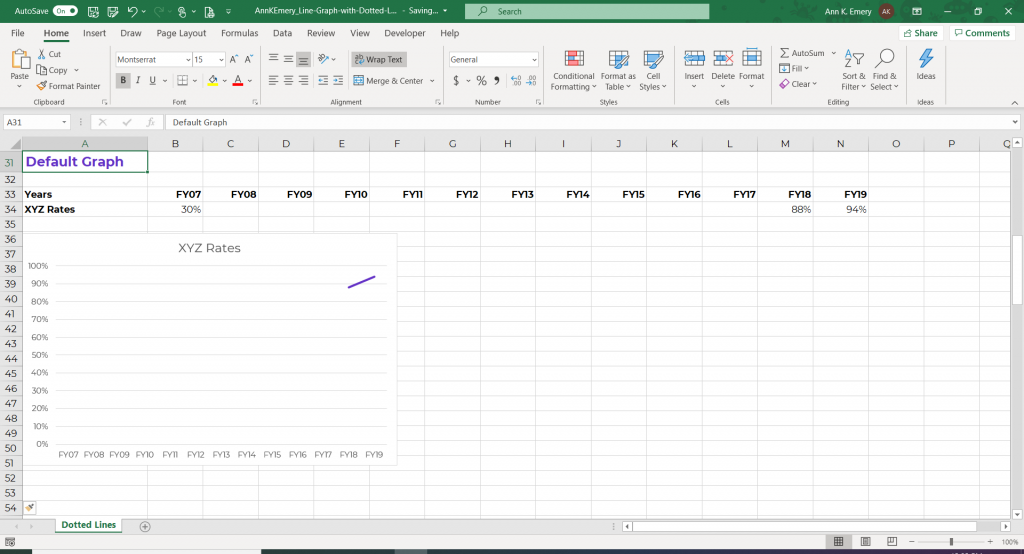
First, I tried filling in my table with the few data points that were available.
Excel doesn’t quite know what to do with that.
Excel didn’t show anything at all for FY07. No dot. Nothing.
And, there’s all this white space between FY07 and FY17, which is obviously not going to work.
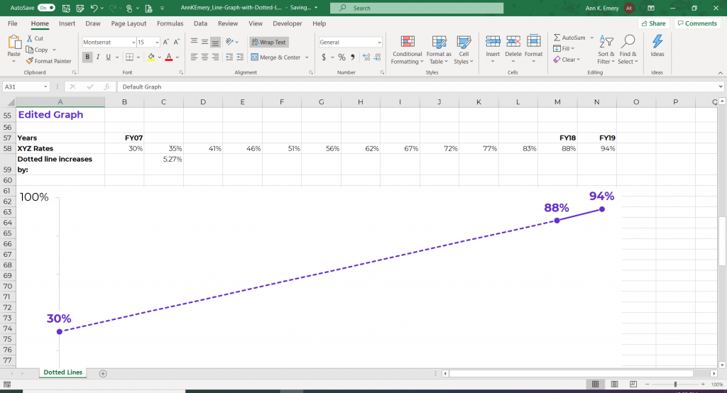
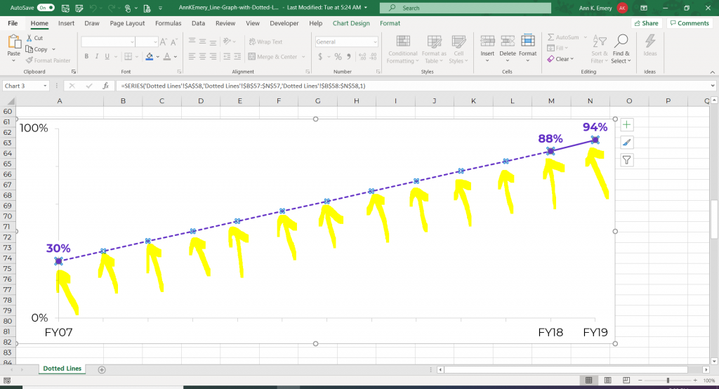
Using Dotted Lines to Show Uncertainty
Here’s the edited version.
We used a dotted line to connect two points on the graph. Dotted lines are great for visualizing estimates or uncertainty.
So how did I do this?
How to Add Placeholder Data to Your Table
You need to fill in some placeholder numbers with estimated values.
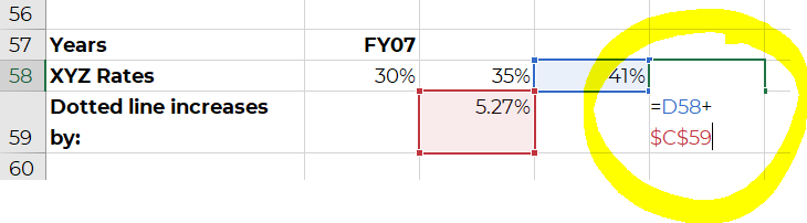
In this example, we’ll make our line increase by 5.27% each year.
How to Calculate a Placeholder Value
To find the placeholder value, I took the FY18 number minus the FY07 number and divided that by 11. Why 11? Because there’s an 11-year gap between FY07 and FY18.

Increase Each Year by the Placeholder Value
Each year increases by 5.27%.
In the first box, it’s 30% plus 5.27%.
The next box is 35% plus 5.27%. And so on.
Selective Labeling Will Focus Your Audience on Your Years of Choice
In the table, you’ll notice that these placeholder values don’t have fiscal years above them.
I don’t want every single year’s label to show up in the graph. I want to focus on the numbers that we do have data for.

How to Change Solid Lines to Dotted Lines in Excel
After setting up your table, you’re going to insert a line graph just like you’ve done a million times before. By default, Excel gives you a solid line.
How do you get the dotted line appearance? This part is really easy!
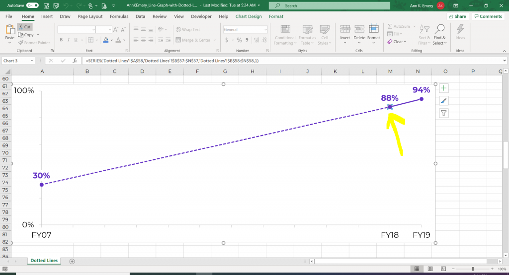
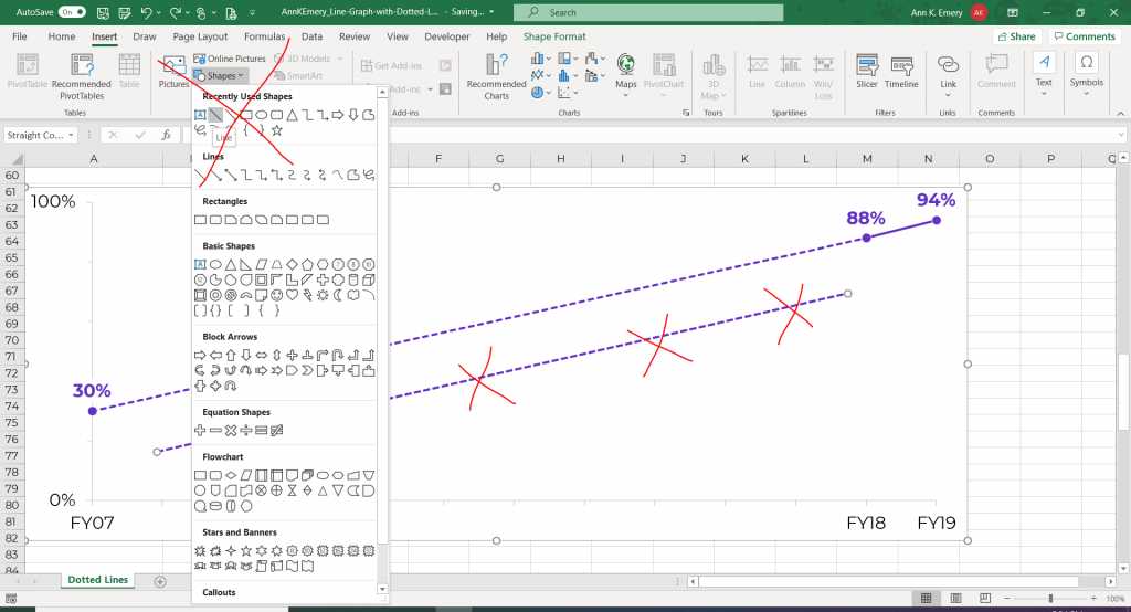
Click Once to Edit the Entire Line
If you click once on the line, you’ll notice that all of the dots are selected.
You can edit the entire line at once, just as you normally do. For example, you can change the line’s color, width, etc.
Click Twice to Edit Pieces of the Line
If you click on one of the dots a second time, then you can edit one smaller segment of the line at a time.
The dot controls the piece of the line just before it. You would click on the dot in this screenshot, for example, to edit just the section of line to the left of it.
Right-click on that dot and select Outline.
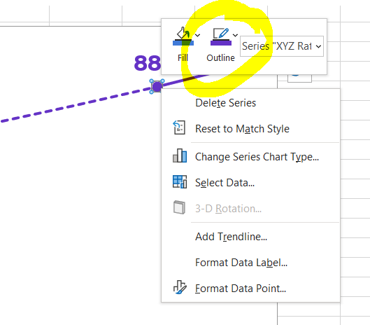
Then, click on Dashes.
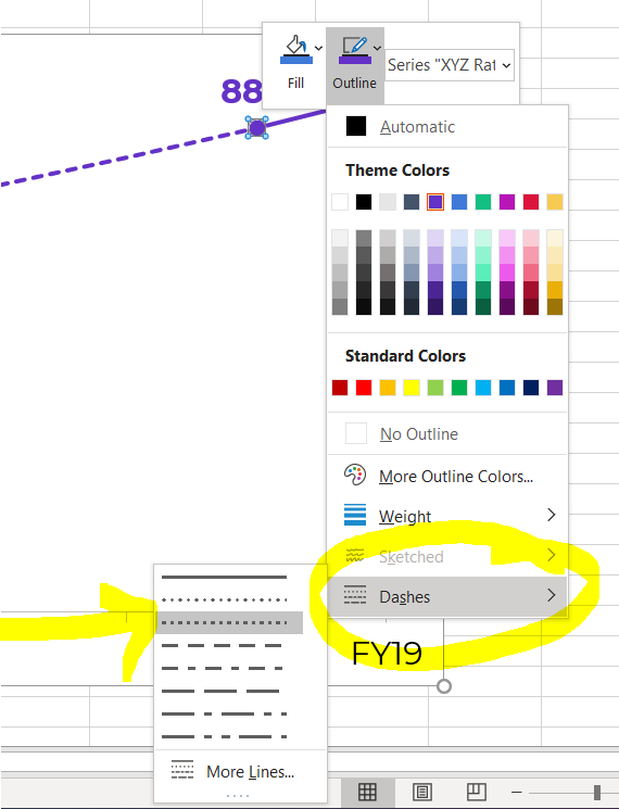
Experiment with a Few Different Dashed Styles
You’ll need to try a few different dashed styles.
Some styles work better for smaller graphs, and some styles work better for larger graphs. It depends on whether your graph is going into a tiny space in a Word report, or into a large slide in a PowerPoint presentation.
For this particular graph, I didn’t change the segments to dashed lines one at a time. That would be way too much work! Since all but one segment would be dashed, I set the entire line to be dashed, and then set one segment to be solid.
Avoid Using Text Boxes and Shapes Whenever Possible
Sometimes people think I’m going to Insert –> Shape and adding some type of dashed line.
While you’d get the same end result… that would be a lot of work.
I don’t want to add text boxes or shapes on my graphs if I can avoid it.
I work on a lot of automation projects, so the more built-in features you can have, the better. Manually creating shapes is clunky and time-consuming.
Bonus! Watch a Tutorial
I’ve always found that watching someone’s mouse click on the screen makes learning a million times easier than following screenshots.
Here’s the video version of this blog post, where you’ll learn exactly which buttons to click on.
Bonus! Download the Excel File
Download the Excel file used in this tutorial and use it however you’d like.
Download the File
Your Turn
Comment below and let me see examples of dotted lines in your projects. I look forward to hearing from you.
More about Ann K. Emery
Ann K. Emery is a sought-after speaker who is determined to get your data out of spreadsheets and into stakeholders’ hands. Each year, she leads more than 100 workshops, webinars, and keynotes for thousands of people around the globe. Her design consultancy also overhauls graphs, publications, and slideshows with the goal of making technical information easier to understand for non-technical audiences.
- Remove From My Forums
-
Question
-
Hi..
I have continuous data in a table that I want to plot as a line chart (secondary column), but the line isn’t plotted when I create the chart.
This happens when I try to plot line chart by itself or as a secondary column. It also happens when I try scatter plot with lines as well.
Please note that my data is continuous (no empty cells). I also tried to check the line options (transparency, color, etc.) that could be making it visually invisible, but even with the appropriate options selected the line doesn’t show.
Any ideas?
-
Moved by
Thursday, October 20, 2016 2:12 AM
-
Moved by
Answers
-
Hi Beshr,
>> This happens when I try to plot line chart by itself or as a secondary column. It also happens when I try scatter plot with lines as well.
By this, do you mean this issue occurred whenever you created a single line chart or added the data to an existing chart as a secondary axis column?
Based on your description, I took the following steps to test in my environment(Windows 10, Excel 2016), but I didn’t run into the same issue:
1. Input several continuous data in both Column A and Column B.
2. Create a line chart with data in Column A.
3. Right-click the chart, click Select Data > Add, select the data in Column B as the serious value, click OK.
4. Right-click the new line in the chart, click Change serious chart type, select the check box of Secondary Axis behind the second serious.Please let me know if I have misunderstood anything.
It would be better if you could provide some screenshots or share a sample file via OneDrive (https://onedrive.live.com).
Please post a link to the uploaded and shared file in a reply here and I am glad to help you.Best Regards,
Yuki Sun-
Proposed as answer by
Yuki SunMicrosoft contingent staff
Wednesday, October 26, 2016 9:56 AM -
Marked as answer by
Steve Fan
Friday, November 4, 2016 5:41 AM
-
Proposed as answer by