
A PivotTable is a powerful tool to calculate, summarize, and analyze data that lets you see comparisons, patterns, and trends in your data. PivotTables work a little bit differently depending on what platform you are using to run Excel.


-
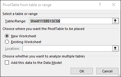
Select the cells you want to create a PivotTable from.
Note: Your data should be organized in columns with a single header row. See the Data format tips and tricks section for more details.
-
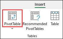
Select Insert > PivotTable.

-
This will create a PivotTable based on an existing table or range.
Note: Selecting Add this data to the Data Model will add the table or range being used for this PivotTable into the workbook’s Data Model. Learn more.
-
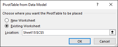
Choose where you want the PivotTable report to be placed. Select New Worksheet to place the PivotTable in a new worksheet or Existing Worksheet and select where you want the new PivotTable to appear.
-
Click OK.
By clicking the down arrow on the button, you can select from other possible sources for your PivotTable. In addition to using an existing table or range, there are three other sources you can select from to populate your PivotTable.
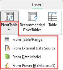
Note: Depending on your organization’s IT settings you might see your organization’s name included in the button. For example, «From Power BI (Microsoft)»
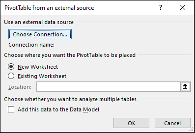
Get from External Data Source
Get from Data Model
Use this option if your workbook contains a Data Model, and you want to create a PivotTable from multiple Tables, enhance the PivotTable with custom measures, or are working with very large datasets.
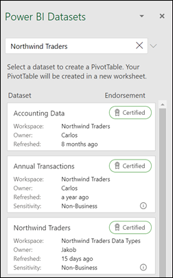
Get from Power BI
Use this option if your organization uses Power BI and you want to discover and connect to endorsed cloud datasets you have access to.
-
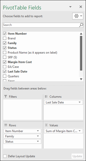
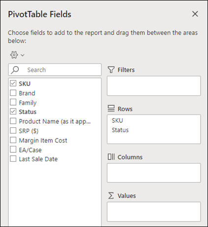
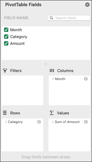
To add a field to your PivotTable, select the field name checkbox in the PivotTables Fields pane.
Note: Selected fields are added to their default areas: non-numeric fields are added to Rows, date and time hierarchies are added to Columns, and numeric fields are added to Values.
-
To move a field from one area to another, drag the field to the target area.
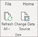
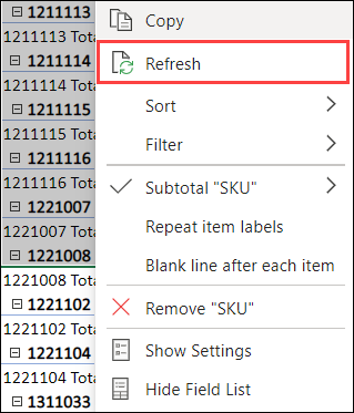
If you add new data to your PivotTable data source, any PivotTables that were built on that data source need to be refreshed. To refresh just one PivotTable you can right-click anywhere in the PivotTable range, then select Refresh. If you have multiple PivotTables, first select any cell in any PivotTable, then on the Ribbon go to PivotTable Analyze > click the arrow under the Refresh button and select Refresh All.
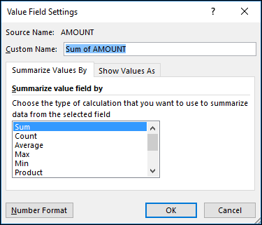
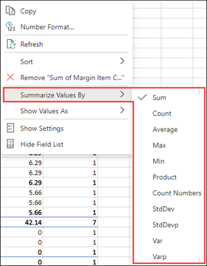
Summarize Values By
By default, PivotTable fields that are placed in the Values area will be displayed as a SUM. If Excel interprets your data as text, it will be displayed as a COUNT. This is why it’s so important to make sure you don’t mix data types for value fields. You can change the default calculation by first clicking on the arrow to the right of the field name, then select the Value Field Settings option.
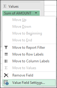
Next, change the calculation in the Summarize Values By section. Note that when you change the calculation method, Excel will automatically append it in the Custom Name section, like «Sum of FieldName», but you can change it. If you click the Number Format button, you can change the number format for the entire field.
Tip: Since the changing the calculation in the Summarize Values By section will change the PivotTable field name, it’s best not to rename your PivotTable fields until you’re done setting up your PivotTable. One trick is to use Find & Replace (Ctrl+H) >Find what > «Sum of«, then Replace with > leave blank to replace everything at once instead of manually retyping.
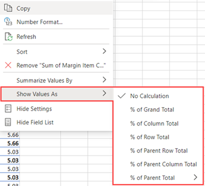
Show Values As
Instead of using a calculation to summarize the data, you can also display it as a percentage of a field. In the following example, we changed our household expense amounts to display as a % of Grand Total instead of the sum of the values.
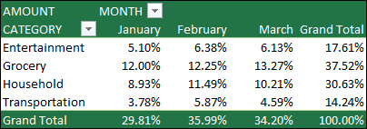
Once you’ve opened the Value Field Setting dialog, you can make your selections from the Show Values As tab.
Display a value as both a calculation and percentage.
Simply drag the item into the Values section twice, then set the Summarize Values By and Show Values As options for each one.
-
Select a table or range of data in your sheet and select Insert > PivotTable to open the Insert PivotTable pane.
-
You can either manually create your own PivotTable or choose a recommended PivotTable to be created for you. Do one of the following:
-
On the Create your own PivotTable card, select either New sheet or Existing sheet to choose the destination of the PivotTable.
-
On a recommended PivotTable, select either New sheet or Existing sheet to choose the destination of the PivotTable.
Note: Recommended PivotTables are only available to Microsoft 365 subscribers.
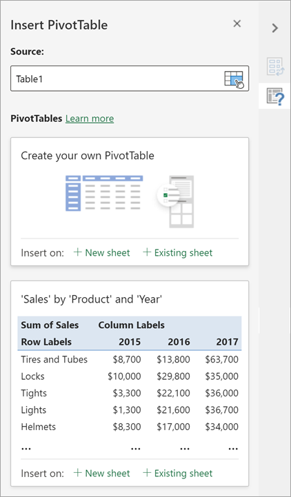
You can change the data sourcefor the PivotTable data as you are creating it.
-
In the Insert PivotTable pane, select the text box under Source. While changing the Source, cards in the pane won’t be available.
-
Make a selection of data on the grid or enter a range in the text box.
-
Press Enter on your keyboard or the button to confirm your selection. The pane will update with new recommended PivotTables based on the new source of data.

Get from Power BI
Use this option if your organization uses Power BI and you want to discover and connect to endorsed cloud datasets you have access to.
In the PivotTable Fields pane, select the check box for any field you want to add to your PivotTable.
By default, non-numeric fields are added to the Rows area, date and time fields are added to the Columns area, and numeric fields are added to the Values area.
You can also manually drag-and-drop any available item into any of the PivotTable fields, or if you no longer want an item in your PivotTable, drag it out from the list or uncheck it.
Summarize Values By
By default, PivotTable fields in the Values area will be displayed as a SUM. If Excel interprets your data as text, it will be displayed as a COUNT. This is why it’s so important to make sure you don’t mix data types for value fields.
Change the default calculation by right clicking on any value in the row and selecting the Summarize Values By option.
Show Values As
Instead of using a calculation to summarize the data, you can also display it as a percentage of a field. In the following example, we changed our household expense amounts to display as a % of Grand Total instead of the sum of the values.
Right click on any value in the column you’d like to show the value for. Select Show Values As in the menu. A list of available values will display.
Make your selection from the list.
To show as a % of Parent Total, hover over that item in the list and select the parent field you want to use as the basis of the calculation.
If you add new data to your PivotTable data source, any PivotTables built on that data source will need to be refreshed. Right-click anywhere in the PivotTable range, then select Refresh.
If you created a PivotTable and decide you no longer want it, select the entire PivotTable range and press Delete. It won’t have any effect on other data or PivotTables or charts around it. If your PivotTable is on a separate sheet which has no other data you want to keep, deleting the sheet is a fast way to remove the PivotTable.
-
Your data should be organized in a tabular format, and not have any blank rows or columns. Ideally, you can use an Excel table like in our example above.
-
Tables are a great PivotTable data source, because rows added to a table are automatically included in the PivotTable when you refresh the data, and any new columns will be included in the PivotTable Fields List. Otherwise, you need to either Change the source data for a PivotTable, or use a dynamic named range formula.
-
Data types in columns should be the same. For example, you shouldn’t mix dates and text in the same column.
-
PivotTables work on a snapshot of your data, called the cache, so your actual data doesn’t get altered in any way.
If you have limited experience with PivotTables, or are not sure how to get started, a Recommended PivotTable is a good choice. When you use this feature, Excel determines a meaningful layout by matching the data with the most suitable areas in the PivotTable. This helps give you a starting point for additional experimentation. After a recommended PivotTable is created, you can explore different orientations and rearrange fields to achieve your specific results. You can also download our interactive Make your first PivotTable tutorial.
-
Click a cell in the source data or table range.
-
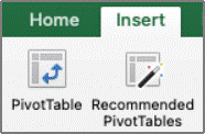
Go to Insert > Recommended PivotTable.
-
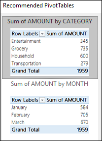
Excel analyzes your data and presents you with several options, like in this example using the household expense data.
-
Select the PivotTable that looks best to you and press OK. Excel will create a PivotTable on a new sheet, and display the PivotTable Fields List

-
Click a cell in the source data or table range.
-
Go to Insert > PivotTable.
-
Excel will display the Create PivotTable dialog with your range or table name selected. In this case, we’re using a table called «tbl_HouseholdExpenses».
-
In the Choose where you want the PivotTable report to be placed section, select New Worksheet, or Existing Worksheet. For Existing Worksheet, select the cell where you want the PivotTable placed.
-
Click OK, and Excel will create a blank PivotTable, and display the PivotTable Fields list.
PivotTable Fields list
In the Field Name area at the top, select the check box for any field you want to add to your PivotTable. By default, non-numeric fields are added to the Row area, date and time fields are added to the Column area, and numeric fields are added to the Values area. You can also manually drag-and-drop any available item into any of the PivotTable fields, or if you no longer want an item in your PivotTable, simply drag it out of the Fields list or uncheck it. Being able to rearrange Field items is one of the PivotTable features that makes it so easy to quickly change its appearance.
PivotTable Fields list
-
Summarize by
By default, PivotTable fields that are placed in the Values area will be displayed as a SUM. If Excel interprets your data as text, it will be displayed as a COUNT. This is why it’s so important to make sure you don’t mix data types for value fields. You can change the default calculation by first clicking on the arrow to the right of the field name, then select the Field Settings option.
Next, change the calculation in the Summarize by section. Note that when you change the calculation method, Excel will automatically append it in the Custom Name section, like «Sum of FieldName», but you can change it. If you click the Number… button, you can change the number format for the entire field.
Tip: Since the changing the calculation in the Summarize by section will change the PivotTable field name, it’s best not to rename your PivotTable fields until you’re done setting up your PivotTable. One trick is to click Replace (on the Edit menu) >Find what > «Sum of«, then Replace with > leave blank to replace everything at once instead of manually retyping.
-
Show data as
Instead of using a calculation to summarize the data, you can also display it as a percentage of a field. In the following example, we changed our household expense amounts to display as a % of Grand Total instead of the sum of the values.
Once you’ve opened the Field Settings dialog, you can make your selections from the Show data as tab.
-
Display a value as both a calculation and percentage.
Simply drag the item into the Values section twice, right-click the value and select Field Settings, then set the Summarize by and Show data as options for each one.
If you add new data to your PivotTable data source, any PivotTables that were built on that data source need to be refreshed. To refresh just one PivotTable you can right-click anywhere in the PivotTable range, then select Refresh. If you have multiple PivotTables, first select any cell in any PivotTable, then on the Ribbon go to PivotTable Analyze > click the arrow under the Refresh button and select Refresh All.
If you created a PivotTable and decide you no longer want it, you can simply select the entire PivotTable range, then press Delete. It won’t have any affect on other data or PivotTables or charts around it. If your PivotTable is on a separate sheet that has no other data you want to keep, deleting that sheet is a fast way to remove the PivotTable.
Data format tips and tricks
-
Use clean, tabular data for best results.
-
Organize your data in columns, not rows.
-
Make sure all columns have headers, with a single row of unique, non-blank labels for each column. Avoid double rows of headers or merged cells.
-
Format your data as an Excel table (select anywhere in your data and then select Insert > Table from the ribbon).
-
If you have complicated or nested data, use Power Query to transform it (for example, to unpivot your data) so it is organized in columns with a single header row.
Need more help?
You can always ask an expert in the Excel Tech Community or get support in the Answers community.
PivotTable Recommendations are a part of the connected experience in Microsoft 365, and analyzes your data with artificial intelligence services. If you choose to opt out of the connected experience in Microsoft 365, your data will not be sent to the artificial intelligence service, and you will not be able to use PivotTable Recommendations. Read the Microsoft privacy statement for more details.
Related articles
Create a PivotChart
Use slicers to filter PivotTable data
Create a PivotTable timeline to filter dates
Create a PivotTable with the Data Model to analyze data in multiple tables
Create a PivotTable connected to Power BI Datasets
Use the Field List to arrange fields in a PivotTable
Change the source data for a PivotTable
Calculate values in a PivotTable
Delete a PivotTable
The problem we all face is that we have mountains of data and need a way to digest it. We’re all looking for a way to make sense out of large sets of data and find out what the data indicates about the situation at hand.
Excel’s PivotTable feature is a drag and drop analysis tool. Point Excel to tables of data in your spreadsheet, and slice your data until you find an answer to your question. Most importantly, it’s an easy-to-use tool right inside of Excel where your data might already live.
The screenshot below shows a great example of PivotTables in action. The original data is shown on the left side, with two different PivotTables used to summarize and analyze the data.


Without PivotTables, you have to write multiple formulas to understand your data. I generated the reports below in under 30 seconds with the help of PivotTables. It’s quick to use and quite powerful. This tutorial will build upon our recent beginners PivotTable tutorial:
The skills that we’ll build in this tutorial will help you advance your PivotTable knowledge and get more comfortable with advanced features.
How to Analyze Data Using PivotTables in Excel (Watch & Learn)
In the screencast below, you’ll watch me walk through several ways to analyze your data with PivotTables. If you’re curious about how you might use them for your own data, give it a watch to learn more about the power of PivotTables.
Ready to walk through these steps on your own? Read on to follow along with my step-by-step instructions for developing your PivotTable analysis skills.
Review: Create Your First PivotTable
Download this: I’ve created a spreadsheet with example data for you to download for free and use as you work through this tutorial. Use this data or your own to practice the skills as we go.
To set this stage for a tutorial, let’s review how to create a PivotTable. In Microsoft Excel, start with a spreadsheet of data you want to digest and summarize.
Highlight all of the columns in your spreadsheet, and then browse to Insert > PivotTable. I always leave all of the settings as default and press OK to create the PivotTable on a new worksheet.


Now, Excel will take you to a new worksheet to build out your PivotTable. On the right side is a report builder which is a drag-and-drop tool to customize your PivotTable.


If you have problems with creating your PivotTable, make sure to double check the following:
- Make sure every column has headers, or titles for the column at the top.
- I typically highlight the entire columns so that my PivotTable will include any new rows that are added to the data later on.
- Each row of the data should be an individual entry, or basically a «record» of its own.
Remember to review the first tutorial, How to Create Your First PivotTable, for additional tips on building your first PivotTable.
Now that we’ve reviewed PivotTables 101, it’s time to move onto more advanced techniques.
Using PivotTable Structures
The key to using PivotTables powerfully is to understand what I call the «report builder.» Let’s dive in head first to learn how this menu works.
Working With PivotTable Fields

In the top half of the PivotTable menu is the Fields menu. Each column in your original data is shown as a field of its own.
We can drag and drop any field into one of the four boxes below: Filters, Columns, Rows, and Values.
The boxes that we drag our fields to will shape how the PivotTable appears. Let’s walk through how each one of them will affect our PivotTable’s presentation.

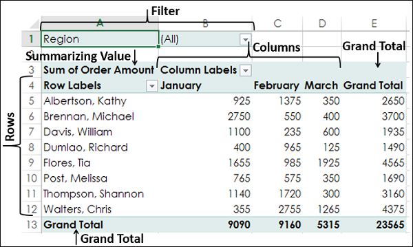
1. Filters
When you drop a field into the Filter box, the PivotTable will add the option to filter for that column. Let’s try an example; here’s the field arrangement I’m using below:

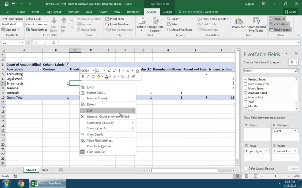
In the screenshot below, I’ve dragged Client into the Filters box. At the very top of the PivotTable is a box that says Client. When I click on the dropdown menu, I can choose which client I want to filter for in the list. I’ll click on a single client, and then click OK.


You can see that the PivotTable is now filtered down for the single client I’ve selected. Also try out checking the Select Multiple Items box to choose more than one option to include.
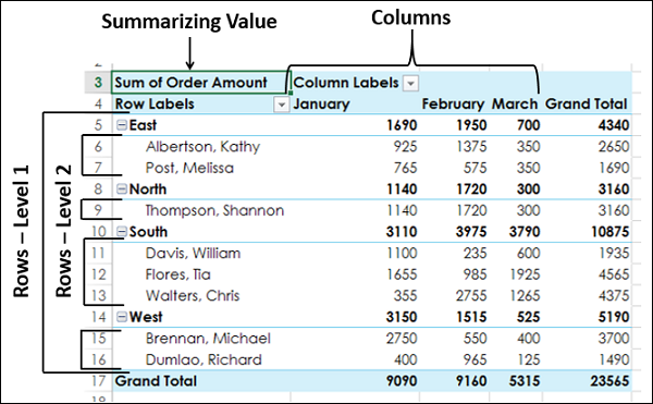
2. Rows
Rows are what appears on the left side of a PivotTable. When you drag a field to the «Rows» box, each of the values from that field will be shown on a row.
In the screenshot below, you can see two different configurations. When I place Client in the Rows box, notice that it puts each of the client names on a row of its own.
In the top screenshot, I’ve put Client in the rows box, and the PivotTable has put each of the client names on a row. The bottom screenshot removes Client as a row, and trades it for the Project type.


Also try out dragging multiple items to the Rows box. You can create basically two layers of division by stacking items as rows.
3. Columns
Dragging a field to the Columns box will create a separate column for each value in your data.
In the example below, I’ve kept the Client field as the rows in my PivotTable. To get more detailed views of my data, I’ve added Project Type in the Columns field to split the type of work I’m doing for each client up.


Using combinations of rows and columns will give you more insight into your data. I like to use Rows for my key field, and then split the data up by column using the Columns field.
4. Values
You can build out a complex set of rows and columns, but PivotTables really take on meaning when you drag a field to the Values box.
The values column works a little differently than the rest of the fields. You can’t drag just any field to the Values box and get good results. This box is reserved for the numerical values in your data, like the a dollar amount or amount of hours spent, for example.
PivotTables let you work with values in a variety of ways. When you drag a field into the Values box, it often defaults to showing a Count of each item. Basically, Excel is counting up each time a row appears, for example, and prints the count of that item in the PivotTable.


What if we don’t want to show a count? Instead, let’s say that we want to show the Sum of the values in a row (for example, adding up all amounts that we’ve billed each client for.)
Simply right click in the PivotTable and chose Summarize Values By > Sum. You’ll notice in the screenshot above that the PivotTable now shows the total for each client.
You can change the way your PivotTable works with values to show a count, average, maximum value, minimum value, or product.
How to Find Meaning in Your Data
So, now we understand how to build PivotTables by dragging and dropping fields into one of the four boxes in the report builder. The question is: how do we use this to understand our data better?
When I’m building a PivotTable, I start off by deciding what I want to know first. If I can picture the end result first, I can think about how to arrange the fields to get the right result.
It often helps me to phrase the outcome as a question. Try building PivotTables that answer the following questions from the example data:
- Which clients did I bill the most in 2016? In 2017?
- What month of 2016 was my most productive?
- Which project type did I bill the highest hourly rate? The lowest hourly rate?
Keeping Your Data Source Updated
Maintaining your PivotTables is essential to meaningful and correct analysis. Before we wrap up, let’s look at two important features to make sure your PivotTables are working correctly.
Let’s say that your data evolves, and additional rows or columns are added to your spreadsheet. We’ll need to update the data that we’re including in the PivotTable.
With the PivotTable selected, browse to the Analyze tab and click on Change Data Source. You can type in a new selection of columns, or click on the arrow to re-select which columns and rows to include your data.


Refreshing Your PivotTable Data
Even if you’ve selected the correct range of data, if you add new records (rows) or change your original data, you’ll need to refresh the PivotTable. Even though PivotTables are dynamic and it’s easy to change the report you’re building, you’ll need to refresh the PivotTable.


To refresh your PivotTable, start off by making sure that your PivotTable is selected. The easiest way is to simply right click within the PivotTable and choose Refresh. You can also find the Analyze tab on the ribbon and click on the Refresh button.
I use PivotTables to keep an eye on my data. I’m constantly feeding it new rows of data as more events happen. Making sure that I periodically refresh the PivotTable will ensure that my data is up to date and accurate.
Recap and Keep Learning More
This tutorial helped you use PivotTables to make sense of your data. These basic analysis tools can help you take a spreadsheet and gain a better understanding of your data.
Check out these tutorials to learn more about Excel and analysis tools:
- How to Create Your First PivotTable in Microsoft Excel is a great way to get started with no prior knowledge.
- Bob Flisser has an excellent tutorial on the analysis potential of the Scenario Manager.
- Understanding your data is a critical part of what’s broadly called «Business Intelligence.» Andrew Blackman explains this in his piece, What Is Business Intelligence?.
How will you use PivotTables to digest your data better? Check in with a comment below to let me know, or feel free to ask a question.
Постановка задачи
В исходных данных имеем две таблицы. Скромную в дизайне, большую по размеру, но удобную в работе таблицу с фактическими значениями продаж, выгруженную из какой-нибудь учетной системы:

И «красивую» таблицу с плановыми помесячными показателями от руководства:

Задача: каким-то образом объединить обе таблицы в одну, чтобы наглядно отобразить выполнение плана по каждому товару, региону, месяцу, кварталу и т.д.
Необходимая оговорка
Можно, конечно, не напрягаться, и решать это дело привычным образом «в лоб». Т.е. с помощью 144 функций СУММЕСЛИМН (SUMIFS) вычислять суммарные продажи по каждому месяцу, товару и городу, а потом с помощью еще 144 формул вручную считать процент выполнения плана.
Потом мысленно взвыть, когда шеф скажет, что хотел видеть динамику по кварталам, а не по месяцам. И лучше в рублях, а не в процентах. И города лучше расположить по столбцам, а месяцы по строчкам. И не ной, у тебя вся ночь впереди, к утру чтоб было готово.
И в нашем примере всего 3 города и 4 товара. А если будет больше?
Давайте-ка лучше мы пойдем другим путем — чуть более сложным, но гораздо более гибким и удобным в перспективе.
Что мы будем делать
Думаю, никто не будет спорить, что самым удобным, гибким и мощным инструментом для анализа данных в Microsoft Excel являются сводные таблицы. Так что, в идеале, надо бы свести решение нашей задачи именно к ним.
Но как объединить в одной сводной две наших исходных таблицы? Плоскую таблицу продаж по дням и трехмерную таблицу плановых значений с детализацией по месяцам? Тут нам помогут 2 мастхэв надстройки для Excel:
- Power Query — встроена в Excel, начиная с 2016-й версии, для более ранних Excel 2010-2013 её можно бесплатно скачать с сайта Microsoft.
- Power Pivot — c 2013 года входит в состав большинства (но не всех, к сожалению) пакетов Microsoft Office. Для Excel 2010 (но не для более новых версий!) бесплатно качается, опять же, с сайта Microsoft.
Поехали, по шагам…
Шаг 1. Добавляем соединительные таблицы-справочники
Связать напрямую наши исходные таблицы факта и плана, к сожалению, никак не получится. Ни Power Pivot, ни, тем более, Excel не поддерживают пока связи «многие-ко-многим» (many-to-many), означающие, что в исходных таблицах могут встречаться дубликаты (а это как раз наш случай — названия товаров и городов встречаются в каждой таблице не по одному разу).
Поэтому нам потребуется создать «костыли» — промежуточные таблицы-справочники с уникальными значениями товаров, городов и дат, которые мы будем использовать для создания связей «один-ко-многим» (one-to-many), которые Power Pivot умеет делать на ура:

Для создания таблицы дат удобно использовать команду Главная — Заполнить — Прогрессия (Home — Fill — Progression):

Шаг 2. Превращаем все таблицы в «умные» и даём им имена
Для загрузки таблиц в Power Pivot они должны быть «умными» (динамическими). Для этого с каждой таблицей проделываем следующее:
- Выделяем любую ячейку таблицы
- Жмем сочетание клавиш Ctrl+T или выбираем Главная — Форматировать как таблицу (Home — Format as Table).
- В открывшемся окне проверяем корректность выделения диапазона (особенно для таблицы плана!) и включена ли галочка Таблица с заголовками (My table has headers) и жмем ОК.
- На вкладке Конструктор (Design) в левом верхнем углу даем таблице осмысленное имя вместо стандартных безликих Таблица1,2,3…
Я назвал наши таблицы, соответственно:
- таблПродажи
- таблТовары
- таблГеография
- таблКалендарь
- таблПлан
Шаг 3. Грузим первые 4 таблицы в Power Pivot
Первые четыре таблицы у нас в правильном виде, поэтому их можно смело загружать их в Модель данных — область памяти, с которой оперирует Power Pivot. Подключаем нашу надстройку через Файл — Параметры — Надстройки — Надстройки COM — Перейти (File — Options — Add-ins — COM Add-ins — Go) и убеждаемся, что на ленте появилась вкладка Power Pivot.
Теперь по очереди для каждой из первых четырёх таблиц, установив в неё активную ячейку, жмём на кнопку Добавить в модель данных (Add to Data Model):

В старых версиях эта кнопка называлась Связанная таблица (Linked table).
В итоге все наши таблички должны загрузиться в открывшееся окно Power Pivot на отдельные вкладки:

Шаг 4. Доводим до ума таблицу План
Прежде, чем загрузить в Модель данных Power Pivot таблицу с плановыми значениями, её нужно сначала подрихтовать: убрать в ней пустые строки и итоги, развернуть в плоскую, заполнить пустые ячейки в первом столбце городами и т.д. Проще и легче всего это проделать с помощью надстройки Power Query.
Сначала загрузим таблицу с планами в редактор запросов Power Query, используя кнопку Из таблицы/диапазона (From Table/Range) на вкладке Данные (Data) или на вкладке Power Query (если у вас старая версия Excel 2010-2013 и вы установили Power Query как отдельную надстройку):

Затем в открывшемся окне Power Query делаем следующее:
1. Удаляем все пустые строки с null через Главная — Удалить строки — Удалить пустые строки (Home — Remove rows — Remove empty rows).
2. Удаляем строки с итогами, сняв соответствующую галочку в фильтре по столбцу Товар.
3. Удаляем ненужный последний столбец ИТОГО, щелкнув по его заголовку правой кнопкой мыши — Удалить (Remove).
4. Заполняем пустые ячейки в первом столбце названиями городов из вышестоящих ячеек, щелкнув по заголовку столбца Город правой и выбрав Заполнить — Вниз (Fill — Down).
5. Разворачиваем 12 столбцов-месяцев в два: название месяца и его значение. Для это выделяем первых два столбца Город и Товар (удерживая клавишу Ctrl), щёлкаем по их заголовку правой и выбираем команду Отменить свёртывание других столбцов (Unpivot Other Columns).
6. Чтобы преобразовать текстовые названия месяцев в нормальную даты — идём на хитрость:
- Добавляем перед датами единички через пробел с помощью команды Преобразование — Формат — Добавить префикс (Transform — Format — Add prefix)
- Аналогично добавляем после дат 2019 через Преобразование — Формат — Добавить суффикс (Transform — Format — Add suffix)
- Теперь, когда текст в этом столбце стал уже гораздо больше похож на дату, конвертируем всё его содержимое в даты, используя выпадающий список типов в шапке столбца:


7. Столбец Атрибут переименовываем в Дата (двойным щелчком по заголовку столбца).
8. Чтобы не путать исходную таблицу плана с преобразованной, изменим имя запроса на таблПлан2 в правой панели Power Query (впоследствии это будет именем таблицы в Power Pivot).
9. Выгружаем готовую таблицу в Модель данных Power Pivot, используя команды Главная — Закрыть и загрузить — Закрыть и загрузить в… (Home — Close&Load — Close&Load to…) и выбираем затем в следующем окне опцию Только создать подключение (Only create connection) плюс, самое главное (!), включаем флажок Добавить эти данные в модель данных (Add this data to Data Model):


После этого наша последняя таблица таблПлан должна загрузиться в окошко Power Pivot.
Шаг 5. Связываем таблицы
Теперь пришло время выполнить одно из самых важных действий — связать все имеющиеся у нас таблицы в единую модель, чтобы впоследствии иметь возможность строить сводную по всей модели, будто это одна таблица.
Для связывания в окне Power Pivot лучше переключиться в режим диаграммы с помощью кнопки Главная — Представление диаграммы (Home — Diagram View) или значком Диаграмма (Diagram) в правом нижнем углу окна. Прямоугольные окошки таблиц можно перетащить за строку заголовка и разложить любым удобным вам образом.
Связь делается очень просто: хватаем мышью столбец в одной из соединительных таблиц (таблТовары, таблГеография, таблКалендарь), тянем и бросаем на соответствующий столбец в таблицах таблПродажи и таблПлан2:

Главный принцип: тянем от таблиц-справочников (Товары, География, Календарь) к таблицам факта и плана. Делаем 6 связей — каждый справочник должен быть связан двумя связями с таблицами плана и продаж. В итоге должна получиться вот такая картина:

Обратите особое внимание на положение единичек и звёздочек на концах связей — это как раз и есть те самые связи «один-ко-многим», где звёздочка обозначает множество вхождений одного и того же элемента, а единичка — уникальность.
Если всё получилось, то сохраняем файл и выдыхаем — дело почти сделано.
Шаг 6. Строим сводную
Теперь на основе созданной модели данных можно построить сводную — для этого в окне Power Pivot выбираем команду Главная — Сводная таблица — Сводная таблица (Home — Pivot table — Pivot table). Мы автоматически вернёмся в Excel, где увидим привычную панель для построения сводной таблицы в правой части экрана, но в ней будут видны уже все таблицы, а не только текущая (как обычно):

Теперь можно знакомым уже образом перетащить мышью нужные нам поля из таблиц в области сводной таблицы.
Главные принципы здесь такие:
- В области строк, столбцов и фильтра можно бросать только поля из таблиц-справочников (таблГеография, таблКалендарь, таблТовары).
- В область значений, где идут вычисления, можно закидывать только поля из таблиц факта и плана (таблПродажи, таблПлан2)
Например, можно накидать так:

Чтобы по столбцам даты шли не с шагом один день, а покрупнее — щёлкаем по любой дате в сводной правой кнопкой мыши и выбираем команду Группировать по (Group by), а затем любой нужный уровень группировки:

В итоге должно получиться что-то уже очень похожее на то, что нам требуется:

Шаг 7. Добавляем меры для вычислений
Меры — это, упрощенно говоря, формулы внутри сводных. На самом деле, когда мы переносим мышью любое поле (например, Выручка) в область значений сводной таблицы, то «под капотом» создается неявная мера — что-то вроде:
Сумма по полю Выручка := SUM(таблПродажи[Выручка])
Но контролировать процесс создания неявных мер мы не можем — Excel сам решает как её назвать, какую именно функцию (SUM или COUNT) использовать и т.д. Поэтому лучше создавать явные меры для сводной самостоятельно — в этом случае мы сможем контролировать все их параметры.
Для этого на вкладке Power Pivot выберем команду Меры — Создать меру (Measure — New measure) и в открывшемся окне задаём:

Здесь:
- Имя таблицы — место для хранения меры (можно выбрать любую таблицу — это не играет роли).
- Название меры — придумываем и вводим любое удобное название (можно на русском).
- Описание — по желанию.
- Формула — вводим формулу, по которой будет вычисляться мера. Можно использовать функции из встроенного в Power Pivot языка DAX (кнопка fx).
- Проверить формулу — чекает вашу формулу на предмет ошибок и выдаёт рекомендации по их исправлению.
- В нижней части окна можно сразу же задать числовой формат для меры, чтобы потом по 100 раз не настраивать его в сводной (как это бывает с обычными неявными мерами).
Повторяем процесс еще два раза:
- Создаем меру с именем Факт с формулой =SUM(‘таблПродажи'[Выручка]) и числовым форматом без копеек и с разделителем.
- Создаём меру Отклонение, которая использует две предыдущих созданных меры по формуле =[Факт]/[План]-1 и процентным форматом
Добавленные меры появятся в правой панели сводной таблицы с характерным значком:

Теперь их можно смело закидывать мышкой в нашу сводную и выполнять план-факт анализ в любых разрезах за считанные секунды:

Обновляется вся созданная красота (модель данных Power Pivot, запрос Power Query и сама сводная) одним движением — на вкладке Данные (Data) с помощью кнопки Обновить все (Refresh All) или сочетания клавиш Ctrl+Alt+F5.
Возможные проблемы и их решения
В процессе реализации вы можете нарваться на несколько типичных «граблей»:
- Появляются странные ошибки в Power Pivot или сама вкладка Power Pivot неожиданно пропадает из Excel — отключите надстройку, перезапустите Excel и подключите её заново (см. Шаг 3). Обычно помогает.
- Не получается создать связь — проверьте, нет ли повторов в справочниках. В столбцах, используемых для связывания не должно быть (в таблицах-справочниках) дубликатов — это жёсткое требование Power Pivot.
- Какие-то странные результаты получаются в сводной — проверьте 1) правильно ли вы настроили связи 2) те ли поля вы используете для сводной (в области строк, столбцов и фильтра могут лежать только поля из справочников).
Если будут ещё какие-то сложности — пишите в комменты.
В любом случае, попробовать стоит — создав единожды такую обновляемую аналитическую систему, можно ещё долго радоваться ей в будущем 
Ссылки по теме
- Что такое Power Query, Power Pivot и Power BI и зачем они пользователю Excel
- Сводная таблица сразу по нескольким диапазонам данных
- Создание базы данных в Excel с помощью Power Pivot
Data analysis on a large set of data is quite often necessary and important. It involves summarizing the data, obtaining the needed values and presenting the results.
Excel provides PivotTable to enable you summarize thousands of data values easily and quickly so as to obtain the required results.
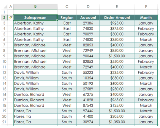
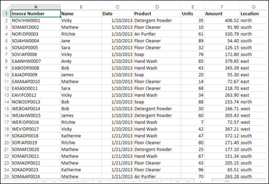
Consider the following table of sales data. From this data, you might have to summarize total sales region wise, month wise, or salesperson wise. The easy way to handle these tasks is to create a PivotTable that you can dynamically modify to summarize the results the way you want.
Creating PivotTable
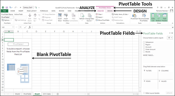
To create PivotTables, ensure the first row has headers.
- Click the table.
- Click the INSERT tab on the Ribbon.
- Click PivotTable in the Tables group. The PivotTable dialog box appears.
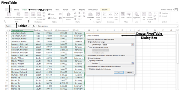
As you can see in the dialog box, you can use either a Table or Range from the current workbook or use an external data source.
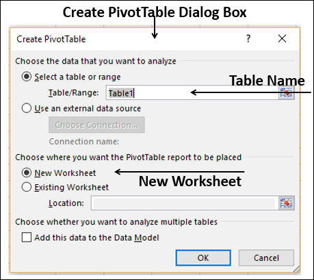
- In the Table / Range Box, type the table name.
- Click New Worksheet to tell Excel where to keep the PivotTable.
- Click OK.
A Blank PivotTable and a PivotTable fields list appear.
Recommended PivotTables
In case you are new to PivotTables or you do not know which fields to select from the data, you can use the Recommended PivotTables that Excel provides.
-
Click the data table.
-
Click the INSERT tab.
-
Click on Recommended PivotTables in the Tables group. The Recommended PivotTables dialog box appears.
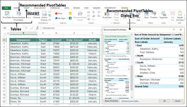
In the recommended PivotTables dialog box, the possible customized PivotTables that suit your data are displayed.
- Click each of the PivotTable options to see the preview on the right side.
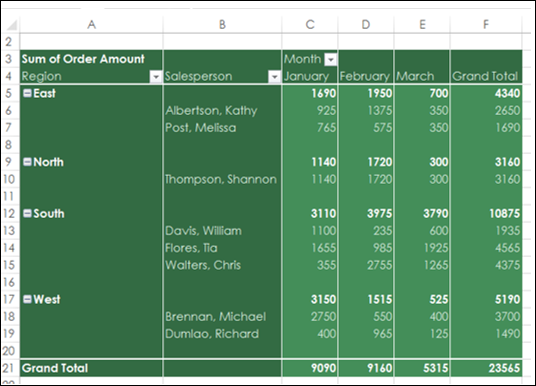
- Click the PivotTable Sum of Order Amount by Salesperson and month.
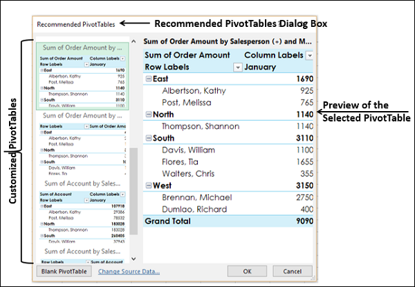
Click OK. The selected PivotTable appears on a new worksheet. You can observe the PivotTable fields that was selected in the PivotTable fields list.
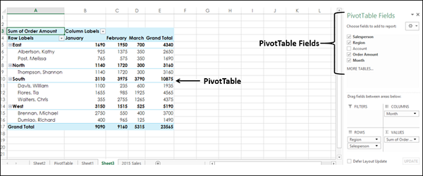
PivotTable Fields
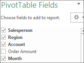
The headers in your data table will appear as the fields in the PivotTable.
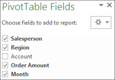
You can select / deselect them to instantly change your PivotTable to display only the information you want and in a way that you want. For example, if you want to display the account information instead of order amount information, deselect Order Amount and select Account.
PivotTable Areas
You can even change the Layout of your PivotTable instantly. You can use the PivotTable Areas to accomplish this.
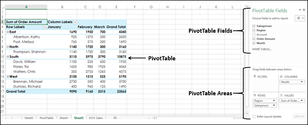
In PivotTable areas, you can choose −
- What fields to display as rows
- What fields to display as columns
- How to summarize your data
- Filters for any of the fields
- When to update your PivotTable Layout
- You can update it instantly as you drag the fields across areas, or
- You can defer the update and get it updated only when you click on UPDATE
An instant update helps you to play around with the different Layouts and pick the one that suits your report requirement.
You can just drag the fields across these areas and observe the PivotTable layout as you do it.
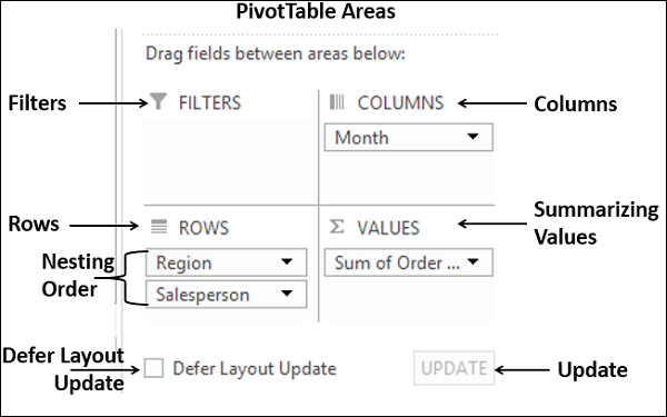
Nesting in the PivotTable
If you have more than one field in any of the areas, then nesting happens in the order you place the fields in that area. You can change the order by dragging the fields and observe how nesting changes. In the above layout options, you can observe that
- Months are in columns.
- Region and salesperson in rows in that order. i.e. salesperson values are nested under region values.
- Summarizing is by Sum of Order Amount.
- No filters are chosen.
The resulting PivotTable is as follows −
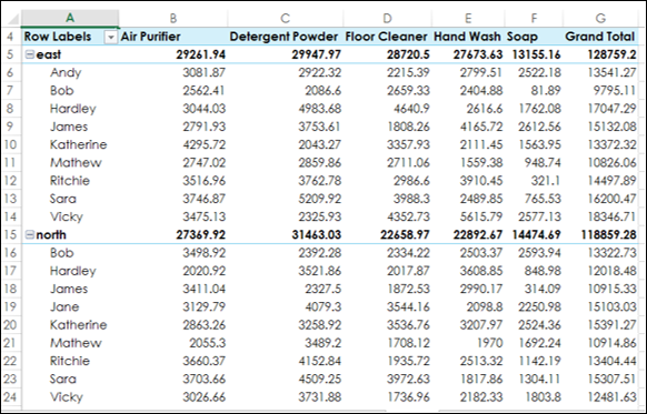
In the PivotTable Areas, in rows, click region and drag it below salesperson such that it looks as follows −
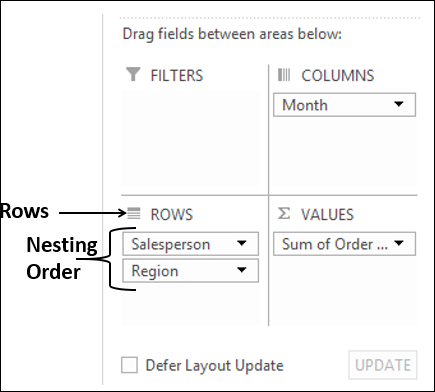
The nesting order changes and the resulting PivotTable is as follows −
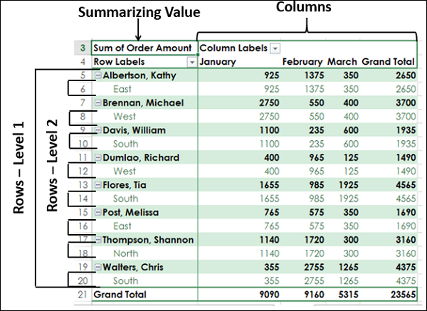
Note − You can clearly observe that the layout with the nesting order – Region and then Salesperson yields a better and compact report than the one with the nesting order – Salesperson and then Region. In case Salesperson represents more than one area and you need to summarize the sales by Salesperson, then the second layout would have been a better option.
Filters
You can assign a Filter to one of the fields so that you can dynamically change the PivotTable based on the values of that field.
Drag Region from Rows to Filters in the PivotTable Areas.
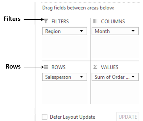
The filter with the label as Region appears above the PivotTable (in case you do not have empty rows above your PivotTable, PivotTable gets pushed down to make space for the Filter.
You can see that −
- Salesperson values appear in rows.
- Month values appear in columns.
- Region Filter appears on the top with default selected as ALL.
- Summarizing value is Sum of Order Amount
- Sum of Order Amount Salesperson-wise appears in the column Grand Total
- Sum of Order Amount Month-wise appears in the row Grand Total
Click the arrow in the box to the right of the filter region. A drop-down list with the values of the field region appears.
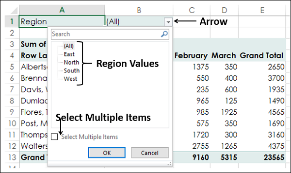
- Check the option Select Multiple Items. Check boxes appear for all the values.
- Select South and West and deselect the other values and click OK.
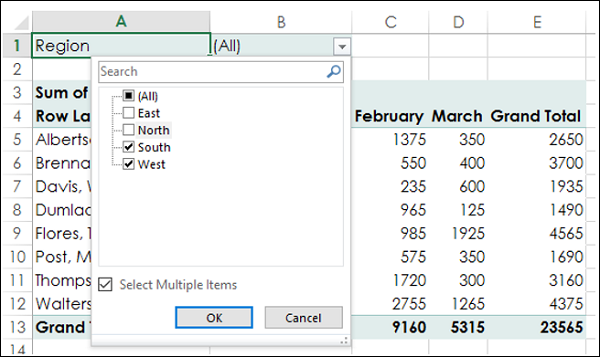
The data pertaining to South and West Regions only will be summarized as shown in the screen shot given below −
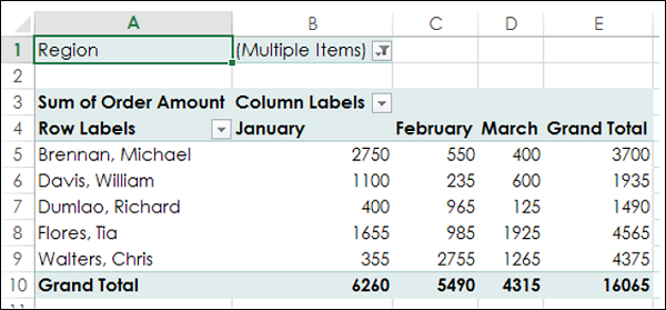
You can see that next to the Filter Region, Multiple Items is displayed, indicating that you have selected more than one item. However, how many items and / or which items are selected is not known from the report that is displayed. In such a case, using Slicers is a better option for filtering.
Slicers
You can use Slicers to have a better clarity on which items the data was filtered.
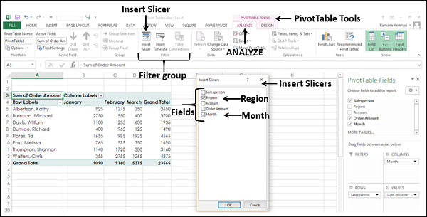
-
Click ANALYZE under PIVOTTABLE TOOLS on the Ribbon.
-
Click Insert Slicer in the Filter group. The Insert Slicers box appears. It contains all the fields from your data.
-
Select the fields Region and month. Click OK.
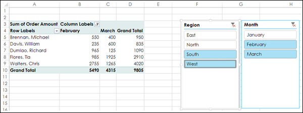
Slicers for each of the selected fields appear with all the values selected by default. Slicer Tools appear on the Ribbon to work on the Slicer settings, look and feel.
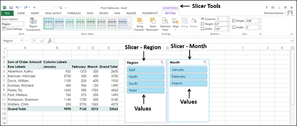
- Select South and West in the Slicer for Region.
- Select February and March in the Slicer for month.
- Keep Ctrl key pressed while selecting multiple values in a Slicer.
Selected items in the Slicers are highlighted. PivotTable with summarized values for the selected items will be displayed.
Summarizing Values by other Calculations
In the examples so far, you have seen summarizing values by Sum. However, you can use other calculations also if necessary.
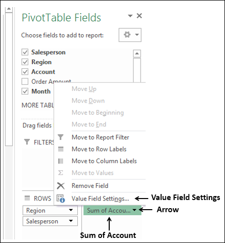
In the PivotTable Fields List
- Select the Field Account.
- Unselect the Field Order Amount.
- Drag the field Account to Summarizing Values area. By default, Sum of Account will be displayed.
- Click the arrow on the right side of the box.
- In the drop-down that appears, click Value Field Settings.
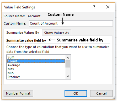
The Value Field Settings box appears. Several types of calculations appear as a list under Summarize value field by −
- Select Count in the list.
- The Custom Name automatically changes to Count of Account. Click OK.
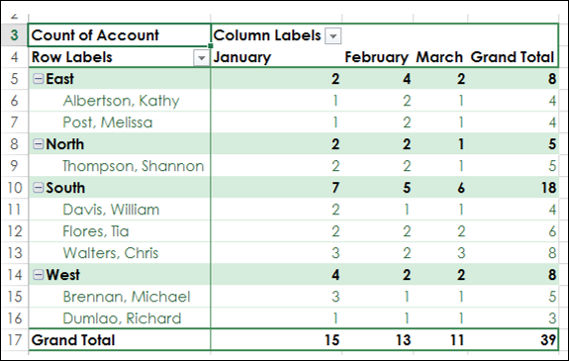
The PivotTable summarizes the Account values by Count.
PivotTable Tools
Follow the steps given below to learn to use the PivotTable Tools.
- Select the PivotTable.
The following PivotTable Tools appear on the Ribbon −
- ANALYZE
- DESIGN
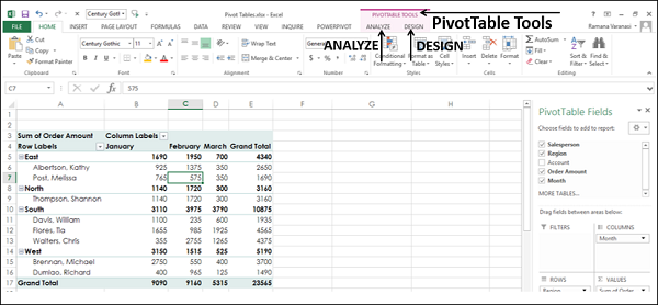
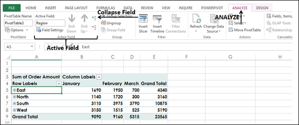
ANALYZE
Some of the ANALYZE Ribbon commands are −
- Set PivotTable Options
- Value Field Settings for the selected Field
- Expand Field
- Collapse Field
- Insert Slicer
- Insert Timeline
- Refresh Data
- Change Data Source
- Move PivotTable
- Solve Order (If there are more calculations)
- PivotChart
DESIGN
Some of the DESIGN Ribbon commands are −
- PivotTable Layout
- Options for Sub Totals
- Options for Grand Totals
- Report Layout Forms
- Options for Blank Rows
- PivotTable Style Options
- PivotTable Styles
Expanding and Collapsing Field
You can either expand or collapse all items of a selected field in two ways −
By selecting the Expand symbol or Collapse symbol to the left of the selected field
- Select the cell containing East in the PivotTable.
- Click on the Collapse symbol to the left of East.
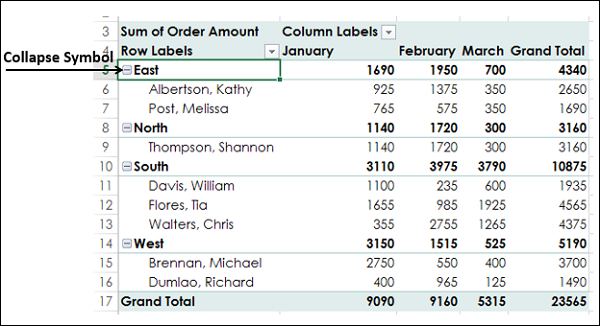
All the items under East will be collapsed. The Collapse symbol  to the left of East changes to the Expand symbol
  .
.
You can observe that only the items below East are collapsed. The rest of the PivotTable items are as they are.
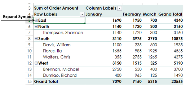
Click the Expand symbol to the left of East. All the items below East will be displayed.
Using ANALYZE on the Ribbon
You can collapse or expand all items in the PivotTable at once with the Expand Field and Collapse Field commands on the Ribbon.
- Click the cell containing East in the PivotTable.
- Click the ANALYZE tab on the Ribbon.
- Click Collapse Field in the Active Field group.
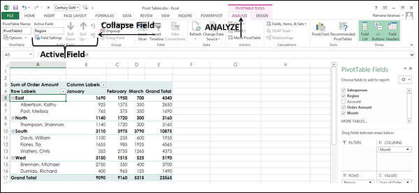
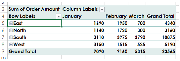
All the items of the field East in the PivotTable will collapse.
Click Expand Field in the Active Field group.
All the items will be displayed.
Report Presentation Styles
You can choose the presentation style for your PivotTable as you would be including it as a report. Select a style that fits into the rest of your presentation or report. However, do not get over bored with the styles because a report that gives an impact in showing the results is always better than a colorful one, which does not highlight the important data points.
- Click East in the PivotTable.
- Click ANALYZE.
- Click Field Settings in Active Field group. The Field Settings dialog box appears.
- Click the Layout & Print tab.
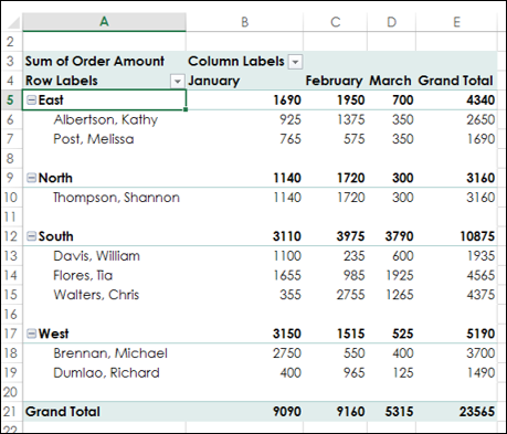
- Check Insert blank line after each item label.
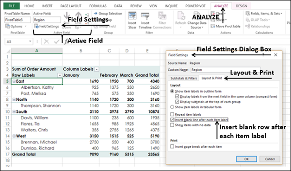
Blank rows will be displayed after each value of the Region field.
You can insert blank rows from the DESIGN tab also.
- Click the DESIGN tab.
- Click Report Layout in Layout group.
- Select Show in Outline Form in the drop-down list.
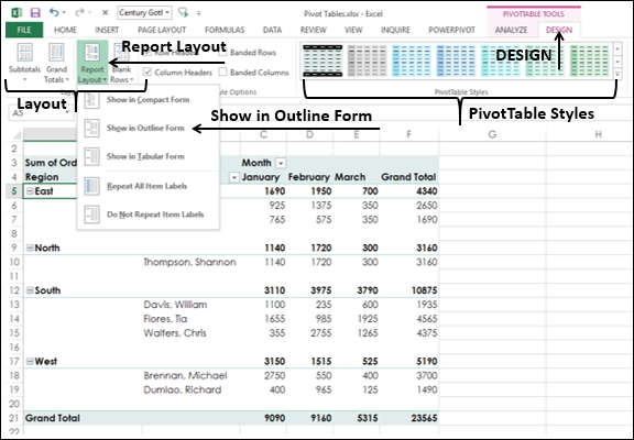
- Hover the mouse over the PivotTable Styles. A preview of the style on which the mouse is placed will appear.
- Select the Style that suits your report.
PivotTable in Outline Form with the selected Style will be displayed.
Timeline in PivotTables
To understand how to use Timeline, consider the following example wherein the sales data of various items is given salesperson wise and location wise. There are total 1891 rows of data.
Create a PivotTable from this Range with −
- Location and Salesperson in Rows in that order
- Product in Columns
- Sum of Amount in Summarizing values
- Click the PivotTable.
- Click INSERT tab.
- Click Timeline in Filters group. The Insert Timelines appears.
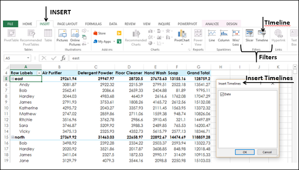
Click Date and click OK. The Timeline dialog box appears and the Timeline Tools appear on the Ribbon.
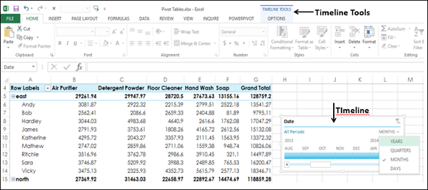
- In Timeline dialog box, select MONTHS.
- From the drop-down list select QUARTERS.
- Click 2014 Q2.
- Keep the Shift key pressed and drag to 2014 Q4.
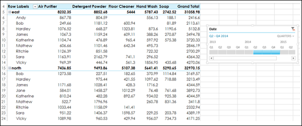
Timeline is selected to Q2 – Q4 2014.
PivotTable is filtered to this Timeline.
Сводная таблица позволяет управлять крупным массивом данных, которые введены в ячейках рабочего листа. Благодаря сводным таблицам вы можете быстро анализировать данные под разными углами зрения и легко изменять их вид.
Это довольно компактная совокупность данных, но вообразите, как бы выглядел подобный список, если в нем представить пару десятков исполнителей проекта и несколько сотен рисков! Было бы весьма непросто даже прочитать такой список, не говоря уже о возможности проанализировать его и сделать на этом основании какие-то выводы.

Рис. 1. Реестр рисков проекта Grant St. Move
Попытаемся с помощью Excel преобразовать такой список в таблицу с обозначениями заголовков строк, которые мы могли бы фильтровать. (Не забывайте, что в вашей таблице не должно быть пустых строк или пустых столбцов, разделяющих данные.) Вы, наверное, помните из других наших материалов, что вам нужно просто выделить диапазон ячеек, которые требуется включить в таблицу, а затем выбрать стиль таблицы. Все остальное сделает за вас Excel.

Рис. 2. Результат преобразования в таблицу выделенного диапазона ячеек
Вместо того чтобы начинать с ввода данных в электронную таблицу (без применения табличного форматирования), вы можете сначала применить к диапазону ячеек требуемый табличный формат, а затем заняться вводом.
Теперь, когда данные представлены в табличном формате, вы можете создать сводную таблицу, не забудьте купить клавиатуру для компьютера. Для начала установите табличный курсор в любой ячейке этой таблицы, затем щелкните на значке PivotTable (Сводная таблица) вкладки Insert (Вставка) и в появившемся меню выберите команду PivotTable (Сводная таблица).
")
Рис. 3. Значок PivotTable расположен в крайней части вкладки Insert (Вставка)
На экране появится диалоговое окно Create Pivot Table (Создание сводной таблицы), показанное на рис. 4. В этом диалоговом окне следует указать программе, на основе каких данных будет построена сводная таблица — рабочего листа текущей рабочей книги или внешних данных (например, SQL Server). Обратите внимание, что в поле Table/Range (Таблица или диапазон) мы оставили заданное по умолчанию значение — Table1 (Таблица1).
")
Рис. 4. Диалоговое окно Create Pivot Table (Создание сводной таблицы)
Щелкните на кнопке ОК. Программа немедленно создаст макет сводной таблицы па новом рабочем листе (рис. 5), в правой части которого расположена панель Pivot Table Field List (Список полей сводной таблицы). Обратите внимание, что в верхней части этой панели перечислены названия всех полей созданной нами таблицы реестра рисков.
")
Рис. 5. Рабочий лист, на котором расположен макет сводной таблицы и панель Pivot Table Field List (Список полей сводной таблицы)
Названия полей, перечисленные на панели Pivot Table Field List, представляют собой названия заголовков столбцов, взятые из нашей таблицы. Области макета сводной таблицы предназначены для различного отображения данных. Их можно представлять как некую трехаспектную палитру. Допустим, нам требуется узнать количество рисков по каждой категории. Например, сколько внешних рисков у нашего проекта? Начните с перетаскивания поля Risk Category (Категория риска), как показано на рис. 6, в область Drop Row Fields Here (Перетащите сюда поля строк). (Местоположение этой области показано на рис. 5).
 в область Drop Row Fields Here (Перетащите сюда поля строк)")
Рис. 6. Результат перетаскивания поля Risk Category (Категория риска) в область Drop Row Fields Here (Перетащите сюда поля строк)
Как видите, название поля Risk Category (Категория риска) появилось в области Row Labels (Названия строк), которая расположена в нижней части панели Pivot Table Field List (Список полей сводной таблицы). Теперь перетащите поле Risk Name (Название риска) в область макета сводной таблицы Drop Data Items Here (Перетащите сюда элементы данных), как показано на рис. 7.
 в область Drop Data /terns Here (Перетащите сюда элементы данных)")
Рис. 7. Результат перетаскивания поля Risk Name (Название риска) в область Drop Data /terns Here (Перетащите сюда элементы данных)
Обратите внимание, что в нижней части созданной нами сводной таблицы программа Excel автоматически добавила строку с заголовком Grand Total (Общий итог), в которой отображено общее количество названий рисков по отдельным категориям. Теперь нетрудно заметить, что, например, категория «Связанные с решением кадровых вопросов» (поле Organizational) содержит два риска, категория «Технические» (поле Technical) — четыре и т.д. В последней строке — Grand Total (Общий итог) — указано общее количество рисков (11) по всем категориям.
Как вы, должно быть, заметили, в области Values (Значения), расположенной в нижней части панели Pivot Table Field List (Список полей сводной таблицы), появился элемент Count of Risk Name (Количество по полю Risk Name), т.е. суммарное количество рисков (см. рис. 7). Существует множество способов отображения, представления и подсчета данных в сводных таблицах Excel. Если хотите увидеть результаты и подсчеты, которые сделает для вас Excel, поэкспериментируйте с перемещением полей из списка панели Pivot Table Field List (Список полей сводной таблицы) в разные области макета сводной таблицы.