
Excel for Microsoft 365 Excel for Microsoft 365 for Mac Excel 2021 Excel 2021 for Mac Excel 2019 Excel 2019 for Mac Excel for iPad Excel for iPhone Excel for Android tablets Excel for Android phones Excel Mobile More…Less
You can use a map chart to compare values and show categories across geographical regions. Use it when you have geographical regions in your data, like countries/regions, states, counties or postal codes.

Download our examples
You can download a workbook with several map chart examples like the ones in this article.
Map charts can display both values and categories, and they each have different ways of displaying color. Values are represented by slight variations of two to three colors. Categories are represented by different colors.
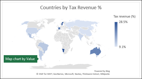
For example, the Countries by Tax Revenue % chart below uses values. The values represent tax revenue in each country with each portrayed using a gradient spectrum of two colors. The color for each region is dictated by where along the spectrum its value falls. By default, the higher the value is, the darker its corresponding color will be.
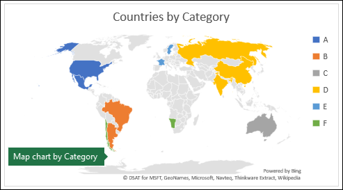
In the following example, Countries by Category, the categories are displayed using a standard legend to show groups or affiliations. Each country is represented by a different color.
Create a Map chart with Data Types
-
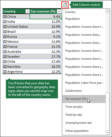
Map charts have gotten even easier with geography data types. Simply input a list of geographic values, such as country, state, county, city, postal code, and so on, then select your list and go to the Data tab > Data Types > Geography. Excel will automatically convert your data to a geography data type, and will include properties relevant to that data that you can display in a map chart. In the following example, we’ve converted a list of countries to geography data types, then selected the Tax revenue (%) field from the Add Column control to use in our map.

-
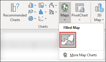
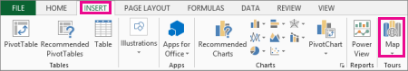
Now it’s time to create a map chart, so select any cell within the data range, then go to the Insert tab > Charts > Maps > Filled Map.
-
If the preview looks good, then press OK. Depending on your data, Excel will insert either a value or category map.
Tip: If your data is set up as an Excel table, and then you add a country to the list, Excel will automatically update it as a geography data type and update the linked map chart. Similarly, if you remove a country, then Excel will also remove it from the chart.
Formatting your Map chart
Once your map chart has been created you can easily adjust its design. Just click on the map, then choose from the Chart Design or Format tabs in the ribbon. You can also double-click the chart to launch the Format Object Task Pane, which will appear on the right-hand side of the Excel window. This will also expose the map chart specific Series options (see below).
Notes:
-
There are several map chart specific Series options, however they are not supported in Android devices or Excel Mobile. If you need some of the map Series options, then you can build your chart in Excel for Windows or Mac and view it on an Android device or Excel Mobile.
-
-
Learn more about Formatting Map Charts.
-
Map projections — Change the map’s projection style. By default, Excel will display the most efficient style.
-
Map area — Change the map’s Zoom level, ranging from a state/province view, all the way to the world view.
-
Map labels — Show geographic names for your countries/regions. Chose to show names based on fit, or show all labels.
Frequently Asked Questions
Question: When I use certain text-based locations, I end up with a blank map and an error, or some of my points map in other countries.
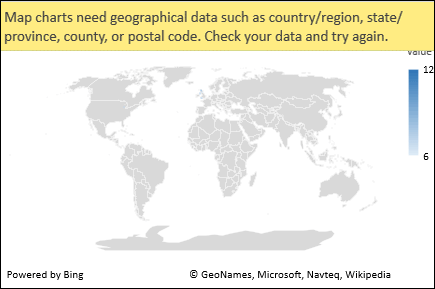
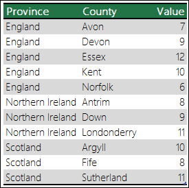
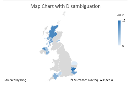
Answer: If you use data where there might be more than one similar location in the world, map charts can’t necessarily tell the difference without more guidance. If possible, add a higher-level detail column to your data. For example, the following locations won’t necessarily map the way you expect since there are many places in the world where these are valid county names:
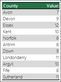
But the data should map correctly if you add another column for higher-level detail, in this case, Province – This is called Disambiguation:
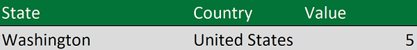
When there are multiple levels of geographic details, you must separate each level into its own cell/column. For example, “Washington, United States” (State, Country) will not successfully generate a map. In this instance, the data will map successfully when placing “Washington” and “United States” into separate columns.

Data that won’t map (State and Country are combined)
Data that will create a map of Washington State
Limitations
-
Map charts can only plot high-level geographic details, so latitude/longitude, and street address mapping isn’t supported. Map charts also support one-dimensional display only, but if you need multi-dimensional detail you can use Excel’s 3D Map feature.
-
Creating new maps, or appending data to existing maps requires an online connection (to connect to the Bing Map service).
-
Existing maps can be viewed without an online connection.
-
There is a known issue where Map Charts which make use of Geography Data Types can sometimes map incorrectly. Please try to include Admin Fields, such as Province or Country when attempting to plot these until the problem is fixed.
Need more help?
You can always ask an expert in the Excel Tech Community or get support in the Answers community.
Need more help?
Want more options?
Explore subscription benefits, browse training courses, learn how to secure your device, and more.
Communities help you ask and answer questions, give feedback, and hear from experts with rich knowledge.
Содержание
- Get started with 3D Maps
- Create your first 3D Map
- Explore sample datasets in 3D Maps
- Create a Map chart in Excel
- Download our examples
- Create a Map chart with Data Types
- Formatting your Map chart
- Frequently Asked Questions
- Limitations
- Need more help?
- Начало работы с Power Map
- Создание первой карты Power Map
- Изучение примеров наборов данных в Power Map
- Get started with Power Map
- Create your first Power Map
- Explore sample datasets in Power Map
Get started with 3D Maps
Note: Power Map, our popular 3-D geospatial visualization add-in for Excel 2013, is now fully integrated into Excel. We’ve also given this feature a more descriptive name, “3D Maps». You’ll find this functionality alongside other visualization features on the Insert tab.
Microsoft 3D Maps for Excel is a three-dimensional (3D) data visualization tool that lets you look at information in new ways. 3D Maps lets you discover insights you might not see in traditional two-dimensional (2D) tables and charts.

With 3D Maps, you can plot geographic and temporal data on a 3D globe or custom map, show it over time, and create visual tours you can share with other people. You’ll want to use 3D Maps to:
Map data Plot more than a million rows of data visually on Microsoft Bing maps in 3D format from an Excel table or Data Model in Excel.
Discover insights Gain new understandings by viewing your data in geographic space and seeing time-stamped data change over time.
Share stories Capture screenshots and build cinematic, guided video tours you can share broadly, engaging audiences like never before. Or export tours to video and share them that way as well.
You’ll find the 3D Map button in the Tours group, on the Insert tab of the Excel ribbon, next to the Charts group.
Create your first 3D Map
When you have Excel data that has geographic properties in table format or in a Data Model—for example, rows and columns that have names of cities, states, counties, zip codes, countries/regions, or longitudes and latitudes—you’re ready to get started. Here’s how:
In Excel, open a workbook that has the table or Data Model data you want to explore in 3D Maps.
For information about using your own data, see Prepare your data for 3D Maps.
If you don’t have data to explore yet, try downloading one of our sample datasets.
Click any cell in the table.
Click Insert > 3D Map.
(Clicking 3D Map for the first time automatically enables 3D Maps.)
3D Maps uses Bing to geocode your data based on its geographic properties. After a few seconds, the globe will appear next to the first screen of the Layer Pane.
In the Layer Pane, verify that fields are mapped correctly and click the drop-down arrow of any incorrectly mapped fields to match them to the right geographic properties.
For example, make sure that Seattle is recognized as a City in the drop-down box.

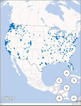
When 3D Maps plots the data, dots appear on the globe.

Explore sample datasets in 3D Maps
Our sample datasets are a great way to try out 3D Maps. Just download one of the following workbooks that already have the necessary geo-spatial entries you need to get started:
Источник
Create a Map chart in Excel
You can use a map chart to compare values and show categories across geographical regions. Use it when you have geographical regions in your data, like countries/regions, states, counties or postal codes.
Note: This feature is available on Windows or Mac if you have Office 2019, or if you have a Microsoft 365 subscription. If you are a Microsoft 365 subscriber, make sure you have the latest version of Office.
Download our examples
Map charts can display both values and categories, and they each have different ways of displaying color. Values are represented by slight variations of two to three colors. Categories are represented by different colors.
For example, the Countries by Tax Revenue % chart below uses values. The values represent tax revenue in each country with each portrayed using a gradient spectrum of two colors. The color for each region is dictated by where along the spectrum its value falls. By default, the higher the value is, the darker its corresponding color will be.
In the following example, Countries by Category, the categories are displayed using a standard legend to show groups or affiliations. Each country is represented by a different color.
Create a Map chart with Data Types
Map charts have gotten even easier with geography data types. Simply input a list of geographic values, such as country, state, county, city, postal code, and so on, then select your list and go to the Data tab > Data Types > Geography. Excel will automatically convert your data to a geography data type, and will include properties relevant to that data that you can display in a map chart. In the following example, we’ve converted a list of countries to geography data types, then selected the Tax revenue (%) field from the Add Column control to use in our map.
Now it’s time to create a map chart, so select any cell within the data range, then go to the Insert tab > Charts > Maps > Filled Map.
 Charts > Maps > select the Filled Map icon.» loading=»lazy»>
If the preview looks good, then press OK. Depending on your data, Excel will insert either a value or category map.
Tip: If your data is set up as an Excel table, and then you add a country to the list, Excel will automatically update it as a geography data type and update the linked map chart. Similarly, if you remove a country, then Excel will also remove it from the chart.
Formatting your Map chart
Once your map chart has been created you can easily adjust its design. Just click on the map, then choose from the Chart Design or Format tabs in the ribbon. You can also double-click the chart to launch the Format Object Task Pane, which will appear on the right-hand side of the Excel window. This will also expose the map chart specific Series options (see below).
There are several map chart specific Series options, however they are not supported in Android devices or Excel Mobile. If you need some of the map Series options, then you can build your chart in Excel for Windows or Mac and view it on an Android device or Excel Mobile.
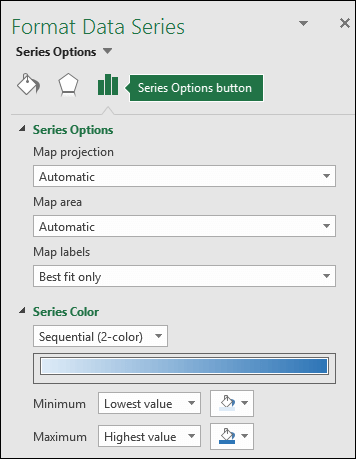
Map projections — Change the map’s projection style. By default, Excel will display the most efficient style.
Map area — Change the map’s Zoom level, ranging from a state/province view, all the way to the world view.
Map labels — Show geographic names for your countries/regions. Chose to show names based on fit, or show all labels.
Frequently Asked Questions
Question: When I use certain text-based locations, I end up with a blank map and an error, or some of my points map in other countries.
Answer: If you use data where there might be more than one similar location in the world, map charts can’t necessarily tell the difference without more guidance. If possible, add a higher-level detail column to your data. For example, the following locations won’t necessarily map the way you expect since there are many places in the world where these are valid county names:
But the data should map correctly if you add another column for higher-level detail, in this case, Province – This is called Disambiguation:
When there are multiple levels of geographic details, you must separate each level into its own cell/column. For example, “Washington, United States” (State, Country) will not successfully generate a map. In this instance, the data will map successfully when placing “Washington” and “United States” into separate columns.
Data that won’t map (State and Country are combined)
Data that will create a map of Washington State
Limitations
Map charts can only plot high-level geographic details, so latitude/longitude, and street address mapping isn’t supported. Map charts also support one-dimensional display only, but if you need multi-dimensional detail you can use Excel’s 3D Map feature.
Creating new maps, or appending data to existing maps requires an online connection (to connect to the Bing Map service).
Existing maps can be viewed without an online connection.
There is a known issue where Map Charts which make use of Geography Data Types can sometimes map incorrectly. Please try to include Admin Fields, such as Province or Country when attempting to plot these until the problem is fixed.
Need more help?
You can always ask an expert in the Excel Tech Community or get support in the Answers community.
Источник
Начало работы с Power Map
Microsoft Power Map для Excel — это инструмент для трехмерной визуализации данных, который позволяет взглянуть на информацию по-новому. Вы можете получить результаты, которые недоступны при использовании традиционных двухмерных таблиц и диаграмм.
В Power Map можно отображать географические и временные данные на глобусе или пользовательской карте, показывать их изменение со временем, создавать наглядные туры и делиться ими с другими людьми. С помощью Power Map можно:
Карта данных Отобразить на картах Bing более миллиона строк данных в объемном формате из таблицы или модели данных Excel.
Обнаружение информации Повысьте понимание, просматривая данные в географическом пространстве и просматривая изменение данных с отметками времени с течением времени.
Делитесь историями Сделайте снимки экрана и создайте кинематографические управляемые видеотуры, которые можно сделать более интересными для широкой аудитории, как никогда раньше. Или экспортировать туры в видео и поделиться ими таким же образом.
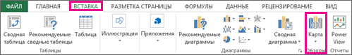
Кнопка Карта находится в группе Туры на вкладке Вставка ленты Excel, как показано на этом рисунке.
Если вы не нашли эту кнопку в своей версии Excel, см. раздел Я не вижу кнопку Power Map в Excel.
Если у вас есть подписка Приложения Microsoft 365 для предприятий, вы можете использовать Power Map Excel в составе средств самостоятельной бизнес-аналитики. При добавлении новых возможностей и внесении усовершенствований в Power Map вы получите их в рамках своего плана подписки.
Чтобы узнать о планах Microsoft 365 подписки, ознакомьтесь с Microsoft 365 профессиональныйplus и сравните все планы Microsoft 365 для бизнеса.
Если вы раньше устанавливали предварительную версию Power Map, у вас будет временно две кнопки Карта на вкладке Вставка: одна в группе Туры и одна в группе Power Map. При нажатии кнопки Карта в группе Туры включается текущая версия Power Map и удаляются все предварительные версии.
Создание первой карты Power Map
Если у вас есть данные Excel с географическими свойствами в табличном формате или в модели данных (такие как строки и столбцы, содержащие названия городов, областей, краев, стран или регионов, почтовые индексы либо значения долготы и широты), вы готовы приступить к работе. Вот как это сделать:
В Excel откройте книгу, которая содержит таблицу или данные модели, которые вы хотите изучить в Power Map.
Сведения о подготовке данных см. в подготовьте данные для Power Map.
Чтобы просмотреть примеры наборов данных, прокрутите страницу вниз до следующего раздела этой статьи.
Щелкните любую ячейку в таблице.
Щелкните Вставить > Карта. При первом нажатии кнопки Карта автоматически включается Power Map.
Power Map Bing используется для геокодирования данных на основе их географических свойств. Через несколько секунд появится глобус рядом с первым экраном области слоев.
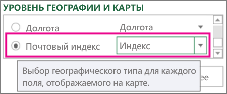
В области слоев проверьте, правильно ли сопоставлены поля, и щелкните стрелку раскрывающегося списка для неправильных полей, чтобы сопоставить их с нужными географическими свойствами.
Например, убедитесь, что почтовый индекс распознается в поле «Индекс».
Когда Power Map отображает данные, на глобусе появляются точки.
Нажмите кнопку Далее для статистической обработки и дальнейшей визуализации данных на карте.
Изучение примеров наборов данных в Power Map
С помощью примеров наборов данных можно ознакомиться с Power Map. Просто скачайте одну из следующих книг, в которые уже есть геопро пространственные записи, необходимые для начала работы. Как в приложениях Dallas Utilities, так и в службе food Inspections в Сиэтле есть данные с отметкой времени, которые позволяют просматривать данные с течением времени.
Источник
Get started with Power Map
Microsoft Power Map for Excel is a three-dimensional (3-D) data visualization tool that lets you look at information in new ways. A power map lets you discover insights you might not see in traditional two-dimensional (2-D) tables and charts.
With Power Map, you can plot geographic and temporal data on a 3-D globe or custom map, show it over time, and create visual tours you can share with other people. You’ll want to use Power Map to:
Map data Plot more than a million rows of data visually on Bing maps in 3-D format from an Excel table or Data Model in Excel.
Discover insights Gain new understandings by viewing your data in geographic space and seeing time-stamped data change over time.
Share stories Capture screenshots and build cinematic, guided video tours you can share broadly, engaging audiences like never before. Or export tours to video and share them that way as well.
You’ll find the Map button in the Tours group on the Insert tab of the Excel ribbon, as shown in this picture.
If you can’t find this button in your version of Excel, go to I don’t see the Power Map button in Excel.
If you have a subscription for Microsoft 365 Apps for enterprise, you have access to Power Map for Excel as part of the self-service business intelligence tools. Whenever any new Power Map features and performance enhancements are released, you’ll get them as part of your subscription plan.
If you previously installed a preview version of Power Map, you’ll temporarily have two Map buttons on the Insert tab: one in the Tours group and one in the Power Map group. Clicking the Map button in the Tours group enables the current version of Power Map and uninstalls any preview versions.
Create your first Power Map
When you have Excel data that has geographic properties in table format or in a Data Model—for example, rows and columns that have names of cities, states, counties, zip codes, countries/regions, or longitudes and latitudes—you’re ready to get started. Here’s how:
In Excel, open a workbook that has the table or Data Model data you want to explore in Power Map.
For information about preparing your data, see Prepare your data for Power Map.
To see some example datasets, scroll down to the next section of this article.
Click any cell in the table.
Click Insert > Map. Clicking Map for the first time automatically enables Power Map.
Power Map uses Bing to geocode your data based on its geographic properties. After a few seconds, the globe will appear next to the first screen of the Layer Pane.
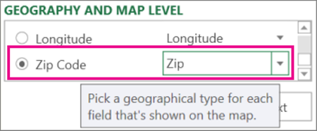
In the Layer Pane, verify that fields are mapped correctly and click the drop-down arrow of any incorrectly mapped fields to match them to the right geographic properties.
For example, make sure that Zip Code is recognized as Zip in the drop-down box.
When Power Map plots the data, dots appear on the globe.
Click Next to start aggregating and further visualizing your data on the map.
Explore sample datasets in Power Map
Our sample datasets are a great way to try out Power Map. Just download one of the following workbooks that already have the necessary geo-spatial entries you need to get started. Both the Dallas Utilities, and Food Inspections in Seattle downloads have time-stamped data, which allow you to view data over time.
Источник
Create a Map chart with Data Types
- Map charts have gotten even easier with geography data types.
- Now it’s time to create a map chart, so select any cell within the data range, then go to the Insert tab > Charts > Maps > Filled Map.
- If the preview looks good, then press OK.
Contents
- 1 How do I map data from one Excel sheet to another?
- 2 How do I map a column in Excel?
- 3 How do I create a map in Excel?
- 4 What does it mean to map in Excel?
- 5 How do I map two sheets in Excel?
- 6 How do I map two columns in Excel?
- 7 How do I map addresses in Excel?
- 8 How is data mapping done?
- 9 How can I create a map?
- 10 How do you make a virtual map?
- 11 How do I create a map in Excel 2010?
- 12 How do I plot points on a map in Excel?
- 13 What is an Xlookup in Excel?
- 14 How does a Vlookup work?
- 15 How do I match data in Excel?
- 16 How do I combine 3 cells in Excel with spaces?
- 17 How do I create a multi column table in Excel?
- 18 How do you map addresses?
- 19 What are the 4 types of map data?
- 20 What is needed for data mapping?
How do I map data from one Excel sheet to another?
Link Spreadsheet Cells with !
Just enter =Names! B3 in any cell, and you’ll get the data from that cell in your new sheet. Or, there’s an easier option. Type = in your cell, then click the other sheet and select the cell you want, and press enter.
How do I map a column in Excel?
Click a cell in the Excel preview column where you want to enter the data and drag it to the field row in the Mapper. If you are downloading data for a field, drag from the Mapper to a column in the Excel preview.
Remap all the fields
- Be sure that the headers are not locked.
- Click Restore Mapping.
- Remap the fields.
How do I create a map in Excel?
To create a map in an Excel workbook, do the following:
- Click the ArcGIS tab on the Excel ribbon to display the ArcGIS tools.
- Click Add Map.
- Sign in to ArcGIS using your ArcGIS credentials or click Continue to proceed as a standard user with basic functionality.
- From the map tools, select Layers .
What does it mean to map in Excel?
What is Excel data mapping?When transferring information into Microsoft Excel from another source, it means matching the data fields from the source with columns in your destination file.
How do I map two sheets in Excel?
How to use Merge Two Tables for Excel
- Start Merge Tables.
- Step 1: Select your main table.
- Step 2: Pick your lookup table.
- Step 3: Select matching columns.
- Step 4: Choose the columns to update in your main table.
- Step 5: Pick the columns to add to your main table.
- Step 6: Choose additional merging options.
How do I map two columns in Excel?
To map multiple fields at a time, select the rows in the Mapper, click a cell in the Excel preview, and then drag to the selected Mapper rows. Studio maps all the selected rows. Click Save and save the file.
Remap all the fields
- Be sure that the headers are not locked.
- Click Restore Mapping.
- Remap the fields.
How do I map addresses in Excel?
Here’s how:
- In Excel, open a workbook that has the table or Data Model data you want to explore in Power Map.
- Click any cell in the table.
- Click Insert > Map.
How is data mapping done?
Data mapping is the process of matching fields from one database to another. It’s the first step to facilitate data migration, data integration, and other data management tasks. Before data can be analyzed for business insights, it must be homogenized in a way that makes it accessible to decision makers.
How can I create a map?
How to Make a Map
- Choose a map template. Choose a map that fits your purpose.
- Label important locations and areas. Use text and graphics (such as push pins, arrows, and other symbols) to label the map with key information.
- Add a compass.
- Include a legend.
How do you make a virtual map?
- 1 Choose an interactive map template. Your first step in creating an interactive map is choosing a template that looks closest to your vision.
- 2 Select a country or region.
- 3 Input your data.
- 4 Color code your interactive map.
- 5 Customize your settings.
- 6 Share your interactive map.
How do I create a map in Excel 2010?
Right click any toolbar and choose Customize, Commands tab. From the Categories list choose Insert and drag the Map button onto the Standard toolbar.
How do I plot points on a map in Excel?
Here’s how you can use those items to create your custom map:
- In Excel, open the workbook that has the X and Y coordinates data for your image.
- Click Insert > Map.
- Click New Tour.
- In Power Map, click Home > New Scene.
- Pick New Custom Map.
- In the Custom Maps Options box, click Browse for the background picture.
What is an Xlookup in Excel?
Use the XLOOKUP function to find things in a table or range by row.With XLOOKUP, you can look in one column for a search term, and return a result from the same row in another column, regardless of which side the return column is on.
How does a Vlookup work?
The VLOOKUP function performs a vertical lookup by searching for a value in the first column of a table and returning the value in the same row in the index_number position.As a worksheet function, the VLOOKUP function can be entered as part of a formula in a cell of a worksheet.
How do I match data in Excel?
Compare Two Columns and Highlight Matches
- Select the entire data set.
- Click the Home tab.
- In the Styles group, click on the ‘Conditional Formatting’ option.
- Hover the cursor on the Highlight Cell Rules option.
- Click on Duplicate Values.
- In the Duplicate Values dialog box, make sure ‘Duplicate’ is selected.
How do I combine 3 cells in Excel with spaces?
Combine data using the CONCAT function
- Select the cell where you want to put the combined data.
- Type =CONCAT(.
- Select the cell you want to combine first. Use commas to separate the cells you are combining and use quotation marks to add spaces, commas, or other text.
- Close the formula with a parenthesis and press Enter.
How do I create a multi column table in Excel?
How to combine two or more columns in Excel
- In Excel, click the “Insert” tab in the top menu bar.
- In the “Create Table” dialog box that pops up, edit the formula so that only the columns and rows that you want to combine are used in the table.
How do you map addresses?
Open a browser, and go to Google Maps (make sure you are signed in).
- From the menu (upper left, looks like parallel lines), select “your places”
- Click on MAPS.
- At the bottom, click on “CREATE MAP”
- In the middle of the box that appears, click on “Import”
- Select the xlsx file from your computer or drag it into the box.
What are the 4 types of map data?
Types of Maps
- General Reference (sometimes called planimetric maps)
- Topographic Maps.
- Thematic.
- Navigation Charts.
- Cadastral Maps and Plans.
What is needed for data mapping?
Manual data mapping requires a heavy lift. It involves connecting data sources and documenting the process using code. Usually, analysts make the map using coding languages like SQL, C++, or Java. Data mappers may use techniques such as Extract, Transform and Load functions (ETLs) to move data between databases.
При визуализации и изучении географических данных вы можете использовать Microsoft 3D Maps в Excel для более значимого проецирования и анализа данных.
Excel включает Microsoft 3D Maps, новый инструмент для построения трехмерных диаграмм с использованием географических данных. Этот инструмент доступен пользователям Excel из версии Microsoft Office 2016. Инструмент Microsoft 3D Maps позволяет вам исследовать геоданные с помощью нового и эффективного подхода.
Использование Microsoft 3D Maps в Excel
Вы можете использовать Microsoft 3D Maps для построения временных или геопространственных данных на картах Bing 3D . Кроме того, вы можете применять темы и пользовательские карты для изменения визуализаций в соответствии с потребностями вашей компании или учреждения.
Ученые и профессионалы в основном используют Microsoft 3D Maps в следующих случаях:
1. Постройте большие географические данные
Вы можете визуализировать миллионы строк данных в ярких моделях 3D-карт Bing. Вы можете легко включать данные в такие карты из модели данных или таблицы Excel .
2. Взгляните на данные с новой точки зрения.
Microsoft 3D Maps отображает ваши данные в географических пространствах, чтобы отразить наиболее значимую аналитику из наборов данных. Вы также можете добавить к своим данным временные метки, чтобы визуализировать, как данные работают с течением времени.
3. Визуализация данных для повествования
Когда вам нужно поделиться или представить большие и сложные данные для массовой аудитории, вы можете использовать параметры видео и аудио в Microsoft 3D Maps.
Как подготовить геопространственные данные для Microsoft 3D Maps
Чтобы создать безупречную и интуитивно понятную трехмерную диаграмму с использованием географических данных в Excel, вам необходимо применить структурные изменения к наборам данных. Для этого сосредоточьтесь на следующих моментах:
A. Реструктуризация данных для инструмента Microsoft 3D Maps
Входные данные для Microsoft 3D Maps должны иметь строки, представляющие отличительные записи. Рекомендуется добавлять текст в заголовки строк или столбцов, чтобы инструмент мог точно отображать географические координаты. Вы можете выбрать весь набор данных, а затем применить любое из следующих действий:
1. Примените форматирование таблицы Excel, нажав Ctrl + T.

2. Добавьте наборы данных в модель данных , выбрав весь набор данных и затем щелкнув Вставить на ленте.
3. Теперь нажмите « Сводная таблица» и установите флажок « Добавить эти данные в модель данных» .

Б. Добавить дату или время
В большинстве случаев вам может потребоваться создать Microsoft 3D Maps для визуализации изменений данных с течением времени. Для этого вам необходимо включить по крайней мере одно поле времени или даты в строку данных.
Вам необходимо отформатировать столбец « Время» или « Дата », выбрав столбец и щелкнув его правой кнопкой мыши . Теперь нажмите Формат ячеек . Выберите дату или время и нажмите ОК .

C. Содержательно учитывайте географические ценности
Для создания 3D-карт в Excel необходимо включить одно или несколько географических значений в строку данных. Следовательно, вы можете добавить в строки любое из следующих значений:
- Регион / Страна.
- Индекс / Почтовый индекс.
- Широта Долгота.
- Провинция / Штат.
Ваши 3D-карты будут более точными, если вы включите различные географические значения. Кроме того, точность 3D-карт также будет зависеть от результатов поиска по 3D-картам Bing.
Как создать 3D-диаграмму с помощью Microsoft 3D Maps в Excel
В этом разделе будут показаны шаги по созданию трехмерных диаграмм путем построения исторических данных об использовании электроэнергии в Далласе, США. Вы можете попробовать свои собственные наборы данных или загрузить любой из трех примеров книг Excel из Microsoft .
1. Откройте книгу Excel, содержащую наборы географических данных, которые вы хотите визуализировать в Microsoft 3D Maps.
2. Теперь щелкните любую из ячеек в наборах данных.
3. Щелкните параметр « Вставить» на ленте, чтобы открыть меню, в котором отображаются такие элементы, как таблицы , диаграммы , спарклайны и т. Д.
4. В крайнем правом углу вы увидите 3D-карту в разделе « Туры » на ленте .
5. Щелкните раскрывающееся меню кнопки 3D-карты , чтобы найти параметр « Открыть 3D-карты» .
Нажмите « Открыть 3D-карты», чтобы в первый раз активировать Microsoft 3D-карты в Excel.

6. Если вы используете примеры наборов данных от Microsoft, вы увидите экран « Запуск 3D-карт» с ранее добавленными турами.

7. На данный момент выберите значок (+) New Tour в нижней части экрана Launch 3D Maps .
8. Откроется трехмерный глобус с геокодированными данными из входных наборов данных. Здесь вы увидите первую панель слоев .

8. Вам необходимо просмотреть панель слоев, чтобы убедиться, что входные наборы данных имеют правильное сопоставление.
9. Вы можете использовать раскрывающееся меню для сопоставления полей с правильными географическими свойствами на панели слоев .

10. Когда наборы данных правильно отображаются на трехмерном глобусе , вы увидите трехмерные полосы или трехмерные точки на карте.

Функция тура инструмента Microsoft 3D Maps может визуализировать взаимосвязь между географическим положением и его данными на основе изменения времени. Эта функция полезна во многих исследованиях, таких как:
- Экологические изменения в округах штата.
- Погода меняется в зависимости от географического положения.
- Использование общественного транспорта вместо личного транспорта.
- Использование электроэнергии или газа в мегаполисе в зависимости от населенного пункта.
В Microsoft 3D Maps вы можете сохранять визуализации в виде туров и сцен. Создав первую трехмерную картографическую диаграмму в любых наборах географических данных, вы можете автоматически добавить к ней тур. Если вы хотите добавить новый тур:
- Закройте существующий экран 3D-глобуса .
- Выделите любую ячейку в форматированных данных.
- Нажмите «Вставить», а затем – « Открыть 3D-карты» . Вы увидите возможность создать новый тур .
Находясь на экране обзора, вы можете изменить несколько элементов диаграммы 3D-карты, щелкнув Параметры слоя . Вы также можете добавить несколько фильтров, чтобы изменить представление данных геокодов.

Вы также можете добавить несколько сцен в тур, а затем последовательно воспроизводить их для аудитории. В параметрах сцены вы можете сделать следующие настройки:
- Продолжительность воспроизведения сцены.
- Добавьте эффекты перехода.
- Добавьте дату начала и окончания.
- Измените скорость сцены.

Excel предоставляет несколько тем для 3D-глобусов в инструменте Microsoft 3D Maps. На ленте над экраном 3D-глобуса нажмите « Темы» , и вы можете выбрать понравившуюся тему из 12 вариантов.

Используйте Microsoft 3D Maps для представления геопространственных данных нового поколения
Следуя этим шагам, вы можете создавать отличные трехмерные карты с помощью инструмента Microsoft 3D Maps, улучшая представление географических данных.
Хотя Microsoft 3D Maps является предпочтительным методом визуализации, вы также можете использовать точечную диаграмму в Excel для визуализации геопространственных данных.
Home > Microsoft Excel > How to Create an Excel Map Chart from Pivot Table Data? 3 Simple Steps
(Note: This tutorial is suitable for Excel 2019, 2021 and Microsoft 365 versions.)
In this guide, let us see how to create an Excel map chart using Pivot Table data to present geographical information.
You’ll learn:
- Map Chart in Excel – An Introduction
- How to Create an Excel Map Chart?
- How to Format an Excel Map Chart?
Map Chart in Excel – An Introduction
Map Charts in Excel display geographical data. We use them when we have data that contains countries, regions, states, counties or zip codes. The data is presented on a map with each region shaded to reflect the value. This produces a very effective and eye-catching result.
Map Charts can easily be created from Excel table data but it’s traditionally been impossible to create them using Pivot Table data.
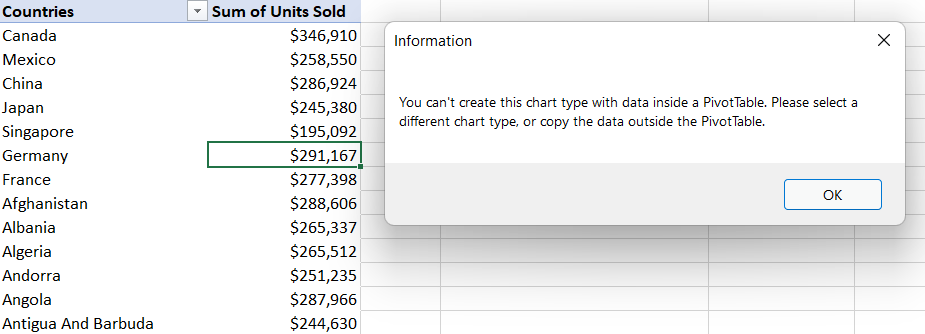
In the screenshot below, we tried to insert a map chart based on the PivotTable data. However, we can see that we are unable to create this type of chart inside a Pivot Table.
It is possible to create a map chart that uses Pivot Table data, we just need to use a simple work-around.
The same workaround needs to be employed if trying to create many of the newer chart types: Sunburst, Treemap, Waterfall, Box and Whisker, Histogram and Funnel charts using PivotTable data.
Related:
How to Create an Excel Heat Map? 5 Simple Steps
How to Custom Sort Excel Data? 2 Easy Steps
Battle of the Excel Lookup Functions: VLOOKUP vs INDEX/MATCH vs XLOOKUP
How to Create an Excel Map Chart?
First, we need to ensure that the data we want to use in the map chart is appropriate. Map charts only work with geographical data so we must have a field that contains countries, regions, zip codes, states etc. in the PivotTable.
If we try to create a map chart directly from our Pivot Table, we will receive a message letting us know we cannot create this chart type using data inside a Pivot Table.

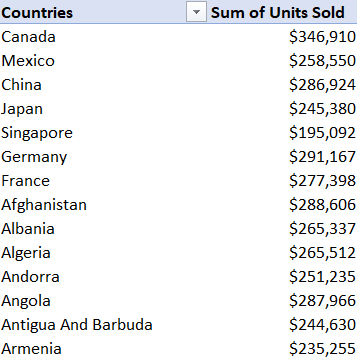
Step 1: Copy the Pivot table data
The solution is to remove the data from Pivot Table first and then create the map chart.
- Click in the PivotTable and press Ctrl+A to select all the data.
- Click in a blank cell somewhere else in the worksheet.
- From the Home tab, in the Clipboard group, click the lower-half of the Paste button.
- Click Paste Values.
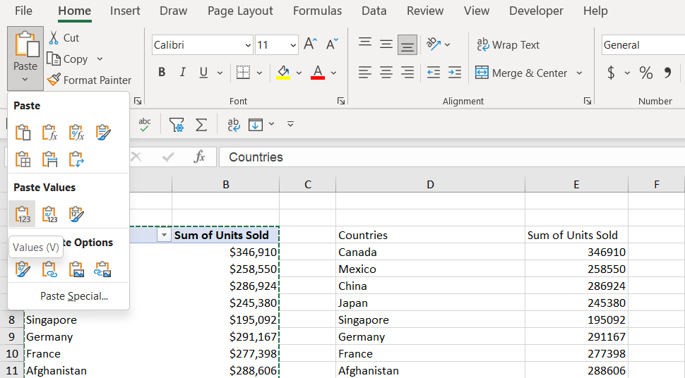
This removes the data from the PivotTable and pastes it as plain text without any formatting. We can use this data to create the map chart.
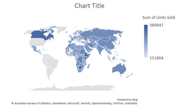
Step 2: Create a cap chart using the copied data
- Click inside the new data.
- From the Insert tab, in the Charts group, click Maps.
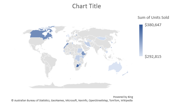
- Select Filled Map.
Each country that’s included in the dataset is represented on the map and shaded according to its value. In this example, the higher the number of units sold, the darker the blue shading.
This looks good; however, we have a problem. If the PivotTable data changes, the map chart will not update as it is not using the PivotTable data to populate the values. We need to modify the chart and point it back to the PivotTable data.
Step 3: Link the map chart to the pivot table
- Click on the chart.
- From the Chart Design tab, in the Data group, click Select Data.
- In the Select Data Source dialog box, click the up arrow next to Chart data range.
- Select the PivotTable data.
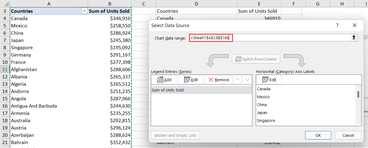
- Click OK.
The map chart is now using the PivotTable data so we can delete the copied data.
- Click inside the copied data and press CTRL+A to select all.
- Press the Delete key.
Try making a change to the PivotTable to make sure the map chart updates. Here, I have applied a Top 10 Filter to the PivotTable to only show the top 50 countries by the sum of units sold.
Suggested Reads:
How to Print Gridlines in Excel?
Start Co-Authoring Excel Workbooks in 6 Easy Steps
How to Insert a Page Break in Excel? (3 Simple Steps)
How to Format an Excel Map Chart?
We can apply formatting to our map chart using the Chart Design and Format ribbons. These are contextual ribbons that only display when we are clicked on the chart.
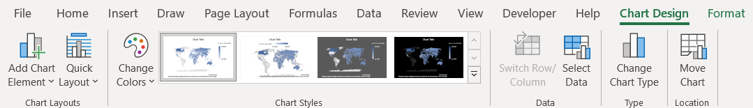
- From the Chart Design tab, in the Chart Styles group, select Style 2.
- From the Chart Design tab, in the Chart Styles group, click Change Colors.
- Choose Colorful Palette 3 from the gallery.

- Click the + next to the chart.
- Hover the mouse over Legend.
- Choose Right from the menu.
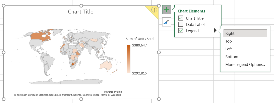
- Double-click on the Chart Title.
- Change the title to ‘Sum of Units Sold by Country’.
More formatting options can be found in the right-click menu.
- Click on the part of the chart to format.
- Right-click and select Format Data Series from the menu.
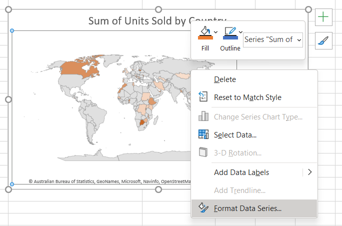
From the Format Data Series pane, we have access to many more formatting options.
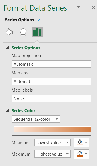
The options we see in this pane change depending on which part of the chart we select, e.g., if we click on the ‘Chart Title’ we will see formatting options related to the title.
Also Read:
Arrow Keys Not Working in Excel – 4 Easy Fixes
How to Record a Macro in Excel? In 6 Easy Steps (For Dummies)
6 Easy Methods to Strikethrough in Excel
Closing Thoughts
In this guide, we saw how to create an Excel map chart using pivot tables. I recommend you practice these steps in a sample worksheet to gain a better understanding.
Visit our free Excel Resources Centre for more high-quality Excel guides.
Want to learn more about Excel? Click here to access our advanced Excel courses with in-depth training modules.
You can train your entire team in Excel and other business software, for a single low monthly fee by clicking here.

Deborah Ashby

Deborah Ashby is a TAP Accredited IT Trainer, specializing in the design, delivery, and facilitation of Microsoft courses both online and in the classroom.She has over 11 years of IT Training Experience and 24 years in the IT Industry. To date, she’s trained over 10,000 people in the UK and overseas at companies such as HMRC, the Metropolitan Police, Parliament, SKY, Microsoft, Kew Gardens, Norton Rose Fulbright LLP.She’s a qualified MOS Master for 2010, 2013, and 2016 editions of Microsoft Office and is COLF and TAP Accredited and a member of The British Learning Institute.