
The best way to learn about Excel 2013 is to start using it. Create a blank workbook and learn the basics of working with columns, cells, and data.
Start using Excel
-
The best way to learn about Excel 2013 is to start using it.
-
You can open an existing workbook, or start with a template. Then, add some data into cells, use the ribbon, use the mini toolbar.
Want more?
What’s new in Excel 2013
Basic tasks in Excel
The best way to learn about Excel 2013 is to start using it.
This is what you see when you start Excel for the first time.
You can open an existing workbook over here or start with a template.
Since this is our first time, let’s keep it simple and select Blank workbook.
The area down here is where you create your worksheet.
And you’ll find all the tools you need to work on it, up here, in this area called the ribbon.
In this area, you’ll find the name box and formula bar.
You’ll see what those do as we go along. Now click somewhere in the work area.
These little rectangles, called cells, each hold one piece of information: some text, a number, or a formula.
Let’s say we want to create a worksheet to track expenses on an expansion project.
Type the first budget item, and press Enter.
There are literally millions of cells in a worksheet, but each one can be identified using this grid system of rows and columns.
For example, the address of this cell is C6; column C, row 6.
The name box shows which cell is selected. You’ll see why addresses are important later. Next, type the other budget items.
This is a breakdown of the work required for the expansion project.
If the text doesn’t fit in the cells, come up here, and hold the mouse over the column border until you see a double-headed arrow.
Then, click and drag the border to widen the column.
Now to make our worksheet more interesting, let’s add rough estimates for each work item in the next column.
To make the numbers look like $ amounts, we’ll add some formatting.
First, select the numbers by clicking the first number and dragging the mouse down the list.
The gray highlighting and green border mean the cells are selected.
Right-click the selection, and the right-click menu opens along with this box up here called the mini-toolbar.
The mini-toolbar changes depending on what you select.
In this case, it contains commands for formatting the cells.
Click the $ sign to format the numbers as $ amounts.
Now it is beginning to look more like a worksheet.
To make it official, let’s add a header row up here, so that anyone who looks at the worksheet will know what the data means in each column.
Next, let’s do something to the data to make it easier to work with.
Select the header and data. Click the top left corner, and drag the mouse to the bottom right.
This time, instead of right-clicking, just hold the mouse over the selection, and a button appears.
Click it and the Quick Analysis lens opens.
This contains a set of tools for helping you analyze your data.
Click TABLES, and then click Table. The data is converted to a table.
You don’t have to do this, but working with data as a table has certain advantages.
For example, you can click these arrows to quickly sort or filter the data.
You also have a lot of commands and options to choose from, up here on the ribbon.
For example, we can add a Total Row to the table or remove the Banded Rows.
While we’re up here, let’s take a closer look at the ribbon.
The commands and options you can work with are organized into these tabs.
Most of the commands, you’ll need are on the HOME tab.
For example, you can come here to format text and numbers, or change a Cell Style.
The INSERT tab has commands for inserting things, like pictures and charts.
We’ll look at some of the other tabs later in the course.
The TABLE TOOLS DESIGN tab is called a contextual tab because it appears only when you are working on the table.
When you select a cell outside the table, the tab goes away.
You’ll also see contextual tabs when you are working with other insertable objects, like Sparklines and Pivot Charts.
Our worksheet is pretty small now, but there’s plenty of room to grow in Excel as your project expands.
However, before we do any more work, let’s save the workbook.
![]()
Download Article
![]()
Download Article
Do you need to create a spreadsheet in Microsoft Excel but have no idea where to begin? You’ve come to the right place! While Excel can be intimidating at first, creating a basic spreadsheet is as simple as entering data into numbered rows and lettered columns. Whether you need to make a spreadsheet for school, work, or just to keep track of your expenses, this wikiHow article will teach you everything you know about editing your first spreadsheet in Microsoft Excel.
-

1
Open Microsoft Excel. You’ll find it in the Start menu (Windows) or in the Applications folder (macOS). The app will open to a screen that allows you to create or select a document.
- If you don’t have a paid version of Microsoft Office, you can use the free online version at https://www.office.com to create a basic spreadsheet. You’ll just need to sign in with your Microsoft account and click Excel in the row of icons.
-
2
Click Blank workbook to create a new workbook. A workbook is the name of the document that contains your spreadsheet(s). This creates a blank spreadsheet called Sheet1, which you’ll see on the tab at the bottom of the sheet.
- When you make more complex spreadsheets, you can add another sheet by clicking + next to the first sheet. Use the bottom tabs to switch between spreadsheets.
Advertisement
-
3
Familiarize yourself with the spreadsheet’s layout. The first thing you’ll notice is that the spreadsheet contains hundreds of rectangular cells organized into vertical columns and horizontal rows. Some important things to note about this layout:
- All rows are labeled with numbers along the side of the spreadsheet, while the columns are labeled with letters along the top.
- Each cell has an address consisting of the column letter followed by the row number. For example, the address of the cell in the first column (A), first row (1) is A1. The address of the cell in column B row 3 is B3.
-
4
Enter some data. Click any cell one time and start typing immediately. When you’re finished with that cell, press the Tab ↹ key to move to the next cell in the row, or the ↵ Enter key to the next cell in the column.
- Notice that as you type into the cell, the content also appears in the bar that runs across the top of the spreadsheet. This bar is called the Formula Bar and is useful for when entering long strings of data and/or formulas.[1]
- To edit a cell that already has data, double-click it to bring back the cursor. Alternatively, you can click the cell once and make your changes in the formula bar.
- To delete the data from one cell, click the cell once, and then press Del. This returns the cell to a blank one without messing up the data in other rows or columns. To delete multiple cell values at once, press Ctrl (PC) or ⌘ Cmd (Mac) as you click each cell you want to delete, and then press Del.
- To add a new blank column between existing columns, right-click the letter above the column after where you’d like the new one to appear, and then click Insert on the context menu.
- To add a new blank row between existing rows, right-click the row number for the row after the desired location, and then click Insert on the menu.
- Notice that as you type into the cell, the content also appears in the bar that runs across the top of the spreadsheet. This bar is called the Formula Bar and is useful for when entering long strings of data and/or formulas.[1]
-
5
Check out the functions available for advanced uses. One of the most useful features of Excel is its ability to look up data and perform calculations based on mathematical formulas. Each formula you create contains an Excel function, which is the «action» you’re performing. Formulas always begin with an equal (=) sign followed by the function name (e.g., =SUM, =LOOKUP, =SIN). After that, the parameters should be entered between a set of parentheses (). Follow these steps to get an idea of the type of functions you can use in Excel:
- Click the Formulas tab at the top of the screen. You’ll notice several icons in the toolbar at the top of the application in the panel labeled «Function Library.» Once you know how the different functions work, you can easily browse the library using those icons.
- Click the Insert Function icon, which also displays an fx. It should be the first icon on the bar. This opens the Insert Function panel, which allows you to search for what you want to do or browse by category.
- Select a category from the «Or select a category» menu. The default category is «Most Recently Used.» For example, to see the math functions, you might select Math & Trig.
- Click any function in the «Select a function» panel to view its syntax, as well as a description of what the function does. For more info on a function, click the Help on this function.
- Click Cancel when you’re done browsing.
- To learn more about entering formulas, see How to Type Formulas in Microsoft Excel.
-
6
Save your file when you’re finished editing. To save the file, click the File menu at the top-left corner, and then select Save As. Depending on your version of Excel, you’ll usually have the option to save the file to your computer or OneDrive.
- Now that you’ve gotten the hang of the basics, check out the «Creating a Home Inventory from Scratch» method to see this information put into practice.


Advertisement
-
1
Open Microsoft Excel. You’ll find it in the Start menu (Windows) or in the Applications folder (macOS). The app will open to a screen that allows you to create or open a workbook.
-
2
Name your columns. Let’s say we’re making a list of items in our home. In addition to listing what the item is, we might want to record which room it’s in and its make/model. We’ll reserve row 1 for column headers so our data is clearly labeled. [2]
.- Click cell A1 and type Item. We’ll list each item in this column.
- Click cell B1 and type Location. This is where we’ll enter which room the item is in.
- Click cell C1 and type Make/Model. We’ll list the item’s model and manufacturer in this column.
-
3
Enter your items on each row. Now that our columns are labeled, entering our data into the rows should be simple. Each item should get its own row, and each bit of information should get its own cell.
- For example, if you’re listening the Apple HD monitor in your office, you may type HD monitor into A2 (in the Item column), Office into B2 (in the Location column), and Apple Cinema 30-inch M9179LL into B3 (the Make/Model column).
- List additional items on the rows below. If you need to delete a cell, just click it once and press Del.
- To remove an entire row or column, right-click the letter or number and select Delete.
- You’ve probably noticed that if you type too much text in a cell it’ll overlap into the next column. You can fix this by resizing the columns to fit the text. Position the cursor on the line between the column letters (above row 1) so the cursor turns into two arrows, and then double-click that line.
-
4
Turn the column headers into drop-down menus. Let’s say you’ve listed hundreds of items throughout your home but only want to view those stored in your office. Click the 1 at the beginning of row 1 to select the whole row, and then do the following:
- Click the Data tab at the top of Excel.
- Click Filter (the funnel icon) in the toolbar. Small arrows now appear on each column header.
- Click the Location drop-down menu (in B1) to open the filter menu.
- Since we just want to see items in the office, check the box next to «Office» and remove the other checkmarks.
- Click OK. Now you’ll only see items the selected room. You can do this with any column and any data type.
- To restore all items, click the menu again and check «Select All» and then OK to restore all items.
-
5
Click the Page Layout tab to customize the spreadsheet. Now that you’ve entered your data, you may want to customize the colors, fonts, and lines. Here are some ideas for doing so:
- Select the cells you want to format. You can select an entire row by clicking its number, or an whole column by clicking its letter. Hold Ctrl (PC) or Cmd (Mac) to select more than one column or row at a time.
- Click Colors in the «Themes» area of the toolbar to view and select color theme.
- Click the Fonts menu to browse for and select a font.
-
6
Save your document. When you’ve reached a good stopping point, you can save the spreadsheet by clicking the File menu at the top-left corner and selecting Save As.


Advertisement
-
1
Open Microsoft Excel. You’ll find it in the Start menu (Windows) or in the Applications folder (macOS). The app will open to a screen that allows you to create or open a workbook.
- This method covers using a built-in Excel template to create a list of your expenses. There are hundreds of templates available for different types of spreadsheets. To see a list of all official templates, visit https://templates.office.com/en-us/templates-for-excel.
-
2
Search for the «Simple Monthly Budget» template. This is a free official Microsoft template that makes it easy to calculate your budget for the month. You can find it by typing Simple Monthly Budget into the search bar at the top and pressing ↵ Enter in most versions.
-
3
Select the Simple Monthly Budget template and click Create. This creates a new spreadsheet from a pre-formatted template.
- You may have to click Download instead.
-
4
Click the Monthly Income tab to enter your income(s). You’ll notice there are three tabs (Summary, Monthly Income, and Monthly Expenses) at the bottom of the workbook. You’ll be clicking the second tab. Let’s say you get income from two companies called wikiHow and Acme:
- Double-click the Income 1 cell to bring up the cursor. Erase the content of the cell and type wikiHow.
- Double-click the Income 2 cell, erase the contents, and type Acme.
- Enter your monthly income from wikiHow into the first cell under the «Amount» header (the one that says «2500» by default). Do the same with your monthly income from «Acme» in the cell just below.
- If you don’t have any other income, you can click the other cells (for «Other» and «$250») and press Del to clear them.
- You can also add more income sources and amounts in the rows below those that already exist.
-
5
Click the Monthly Expenses tab to enter your expenses. It’s the third tab at the bottom of the workbook. Those there are expenses and amounts already filled in, you can double-click any cell to change its value.
- For example, let’s say your rent is $795/month. Double-click the pre-filled amount of «$800,» erase it, and then type 795.
- Let’s say you don’t have any student loan payments to make. You can just click the amount next to «Student Loans» in the «Amount» column ($50) and press Del on your keyboard to clear it. Do the same for all other expenses.
- You can delete an entire row by right-clicking the row number and selecting Delete.
- To insert a new row, right-click the row number below where you want it to appear, and then select Insert.
- Make sure there are no extra amounts that you don’t actually have to pay in the «Amounts» column, as they’ll be automatically factored into your budget.
-
6
Click the Summary tab to visualize your budget. Once you’ve entered your data, the chart on this tab will automatically update to reflect your income vs. your expenses.
- If the info doesn’t calculate automatically, press F9 on the keyboard.
- Any changes you make to the Monthly Income and Monthly Expenses tabs will affect what you see in your Summary.
-
7
Save your document. When you’ve reached a good stopping point, you can save the spreadsheet by clicking the File menu at the top-left corner and selecting Save As.


Advertisement
Add New Question
-
Question
How do I name a spreadsheet?

When you click «Save As,» at the bottom of the page there should be a file name box. Whatever you type into that box will be your spreadsheet’s name.
-
Question
Can I rename the columns, instead of A, B, C, etc.?
You cannot change those labels. Typically, the name of the column is simply written in the first row.
-
Question
How do I make more space to type in the boxes?
As you’re typing, select the cell where you want the text to be and select «Wrap Text» at the top of the page. This will contain all of the text to the same cell, which will grow as you type.
See more answers
Ask a Question
200 characters left
Include your email address to get a message when this question is answered.
Submit
Advertisement
Thanks for submitting a tip for review!
About This Article
Article SummaryX
1. Open Excel.
2. Click New Blank Workbook.
3. Enter column headers into row 1.
4. Enter data on individual rows.
5. Click the Page Layout tab to format the data.
6. Click File > Save As to save the document.
Did this summary help you?
Thanks to all authors for creating a page that has been read 2,886,243 times.
Is this article up to date?
In an article written in 2018, Robert Half, a company specializing in human resources and the financial industry, wrote that 63% of financial firms continue to use Excel in a primary capacity. Granted, that is not 100% and is actually considered to be a decline in usage! But considering the software is a spreadsheet software and not designed solely as financial industry software, 63% is still a significant portion of the industry and helps to illustrate how important Excel is.
Learning how to use Excel doesn’t have to be difficult. Taking it one step at a time will help you move from a novice to an expert (or at least closer to that point) – at your pace.

As a preview of what we are going to cover in this article, think worksheets, basic usable functions and formulas, and navigating a worksheet or workbook. Granted, we will not be covering every possible Excel function but we will cover enough that it gives you an idea of how to approach the others.
Basic Definitions
It really is helpful if we cover a few definitions. More than likely, you have heard these terms (or already know what they are). But we will cover them to be sure and be all set for the rest of the process in learning how to use Excel.
Workbooks vs. Worksheets
Excel documents are called Workbooks and when you first create an Excel document (the workbook), many (not all) Excel versions will automatically include three tabs, each with its own blank worksheet. If your version of Excel doesn’t do that, don’t worry, we will learn how to create them.
The Worksheets are the actual parts where you enter the data. If it is easier to think of it visually, think of the worksheets as those tabs. You can add tabs or delete tabs by right-clicking and choosing the delete option. Those worksheets are the actual spreadsheets with which we work and they are housed in the workbook file.
The Ribbon
The Ribbon spreads across the Excel application like a row of shortcuts, but shortcuts that are represented visually (with text descriptions). This is helpful when you want to do something in short order and especially when you need help determining what you want to do.
There is a different grouping of ribbon buttons depending on which section/group you choose from the top menu options (i.e. Home, Insert, Data, Review, etc.) and the visual options presented will relate to those groupings.
Excel Shortcuts
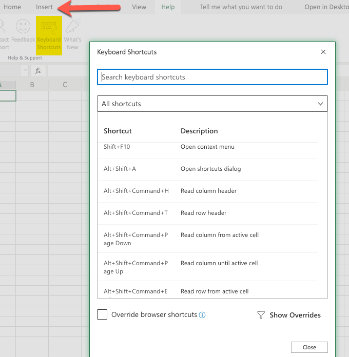
Shortcuts are helpful in navigating the Excel software quickly, so it is helpful (but not absolutely essential) to learn them. Some of them are learned by seeing the shortcuts listed in the menus of the older versions of the Excel application and then trying them out for yourself.
Another way to learn Excel shortcuts is to view a list of them on the website of the Excel developers. Even if your version of Excel doesn’t display the shortcuts, most of them still work.
Formulas vs. Functions
Functions are built-in capabilities of Excel and are used in formulas. For example, if you wanted to insert a formula that calculated the sum of numbers in different cells of a spreadsheet, you could use the function SUM() to do just that.
More on this function (and other functions) a bit further on in this article.
Formula Bar

The formula bar is an area that appears below the Ribbon. It is used for formulas and data. You enter the data in the cell and it will also appear in the formula bar if you have your mouse on that cell.
When we reference the formula bar, we are simply indicating that we should type the formula in that spot while having the appropriate cell selected (which, again, will automatically happen if you select the cell and start typing).
Creating & Formatting a Worksheet Example
There are many things you can do with your Excel Worksheet. We will give you some example steps as we go along in this article so you can try them out for yourself.
The First Workbook
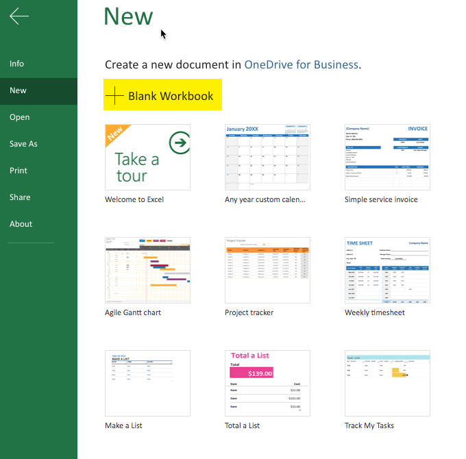
It is helpful to start with a blank Workbook. So, go ahead and select New. This may vary, depending on your version of Excel, but is generally in the File area.
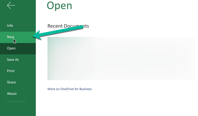
Note: The above image says Open at the top to illustrate that you can get to the New (left-hand side, pointed to with the green arrow) from anywhere. This is a screenshot of the newer Excel.
When you click on New you are more than likely going to get some example templates. The templates themselves may vary between versions of Excel, but you should get some sort of selection.
One way of learning how to use Excel is to play with those templates and see what makes them “tick”. For our article, we are starting with a blank document and playing around with data and formulas, etc.
So go ahead and select the blank document option. The interface will vary, from version to version, but should be similar enough to get the idea. A little later we will also download another sample Excel sheet.
Inserting the Data
There are many different ways to get data into your spreadsheet (a.k.a. worksheet). One way is to simply type what you want where you want it. Choose the particular cell and just start typing.
Another way is to copy data and then paste it into your Spreadsheet. Granted, if you are copying data that is not in a table format it can get a little interesting as to where it lands in your document. But fortunately we can always edit the document and recopy and paste elsewhere, as needed.
You can try the copy/paste method now by selecting a portion of this article, copying it, and then pasting into your blank spreadsheet.
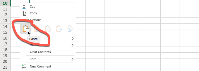
After selecting the portion of the article and copying it, go to your spreadsheet and click on the desired cell where you want to start the paste and do so. The method shown above is using the right-click menu and then selecting “Paste” in the form of the icon.
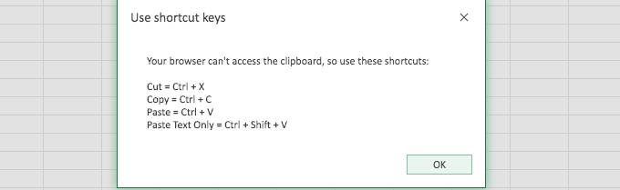
It is possible that you may get an error when using the Excel built-in paste method, even with the other Excel built-in methods as well. Fortunately, the error warning (above) helps to point you in the right direction to get the data you copied into the sheet.
When pasting the data, Excel does a pretty good job of interpreting it. In our example, I copied the first two paragraphs of this section and Excel presented it in two rows. Since there was an actual space between the paragraphs, Excel reproduced that as well (with a blank row). If you are copying a table, Excel does an even better job of reproducing it in the sheet.

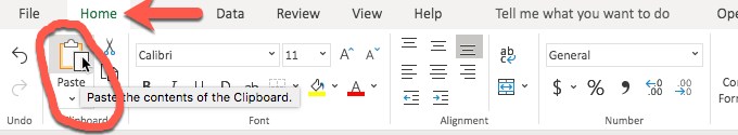
Also, you can use the button in the Ribbon to paste. For visual people, this is really helpful. It is shown in the image below.
Some versions of Excel (especially the older versions) allow you to import data (which works best with similar files or CSV – comma-separated values – files). Some newer versions of Excel do not have that option but you can still open the other file (the one that you want to import), use a select all and then copy and paste it into your Excel spreadsheet.
When import is available, it is generally found under the File menu. In the new version(s) of Excel, you may be rerouted to more of a graphical user interface when you click on File. Simply click the arrow in the top left to return back to your worksheet.
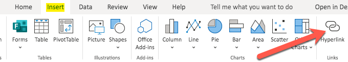
Hyperlinking
Hyperlinking is fairly easy, especially when using the Ribbon. You will find the hyperlink button under the Insert menu in the newer Excel versions. It may also be accessed via a shortcut like command-K.
Formatting Data (Example: Numbers and Dates)
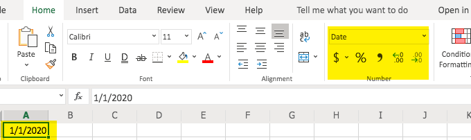
Sometimes it is helpful to format the data. This is especially true with numbers. Why? Sometimes numbers automatically fall into a general format (sort of default) which is more like a text format. But often, we want our numbers to behave as numbers.
The other example would be dates, which we may want to format to ensure that all of our dates appear consistent, like 20200101 or 01/01/20 or whatever format we choose for our date format.
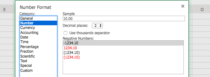
You can access the option to format your data in a couple of different ways, shown in the below images.
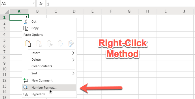
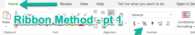
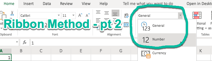
Once you have accessed, say, the Number format, you will have several options. These options appear when you use the right-click method. When you use the Ribbon, your options are right there in the Ribbon. It all depends on which is easier for you.
If you have been using Excel for a while, the right-click method, with the resulting number format dialog box (shown below) may be easier to understand. If you are newer or more visual, the Ribbon method may make more sense (and much quicker to use). Both provide you with number formatting options.
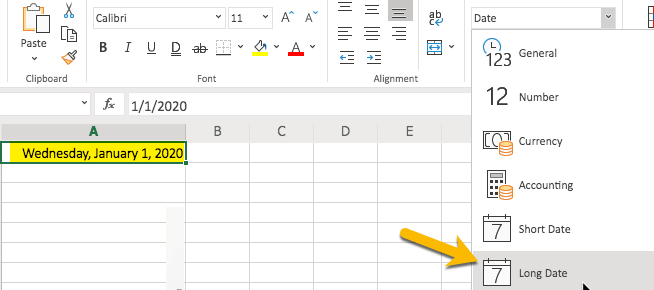
If you type anything that resembles a date, the newer versions of Excel are nice enough to reflect that in the Ribbon as shown in the below image.
From the Ribbon you can select formats for your date. For example, you can choose a short date or a long date. Go ahead and try it and view your results.
Presentation Formatting (Example: Aligning Text)
It is also helpful to understand how to align your data, whether you want it all to line up to the left or to the right (or justified, etc). This too can be accessed via the Ribbon.
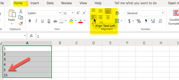
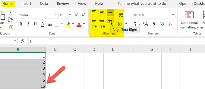
As you can see from the images above, the alignment of the text (i.e. right, left, etc.) is on the second row of the Ribbon option. You can also choose other alignment options (i.e. top, bottom) in the Ribbon.
Also, if you notice, aligning things like numbers may not look right when aligned left (where text looks better) but does look better when aligned right. The alignment is very similar to what you would see in a word processing application.
Columns & Rows
It is helpful to know how to work with, as well as adjust the width and dimensions of, columns and rows. Fortunately, once you get the hang of it, it is fairly easy to do.
There are two parts to adding or deleting rows or columns. The first part is the selection process and the other is the right-click and choosing the insert or delete option.
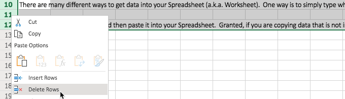
Remember the data we copied from this article and pasted into our blank Excel sheet in the above example? We probably don’t need it anymore so it is a perfect example for the process of deleting rows.
Remember our first step? We need to select the rows. Go ahead and click on the row number (to the left of the top left cell) and drag downward with your mouse to the bottom row that you want to delete. In this case, we are selecting three rows.
Then, the second part of our procedure is to click on Delete Rows and watch Excel delete those rows.

The process for inserting a row is similar but you do not have to select more than one row. Excel will determine where you click is where you want to insert the row.
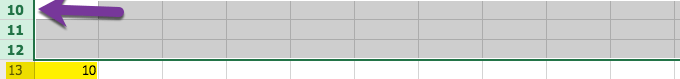
To start the process, click on the row number that you want to be below the new row. This tells Excel to select the entire row for you. From the spot where you are, Excel will insert the row above that. You do so by right-clicking and choosing Insert Rows.
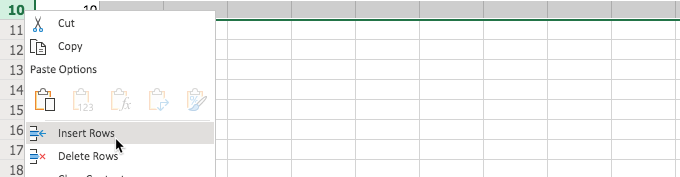
As you can see above, we typed 10 in row 10. Then, after selecting 10 (row 10), right-clicking, and choosing Insert Rows, the number 10 went down one row. It resulted in the 10 now being in row 11.
This demonstrates how the inserted row was placed above the selected row. Go ahead and try it for yourself, so you can see how the insertion process works.
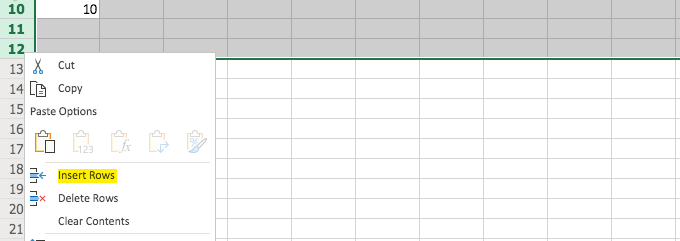
If you need more than one row, you can do so by selecting more than one row and this tells Excel how many you want and that quantity will be inserted above the row number selected.
The following pictures show this in a visual format, including how the 10 went down three rows, the number of rows inserted.
Inserting and deleting columns is basically the same except that you are selecting from the top (columns) instead of the left (rows).
Filters & Duplicates
When we have a lot of data to work with it helps if we have a couple of tricks up our sleeves in order to more easily work with that data.
For example, let’s say you have a bunch of financial data but you only need to look at specific data. One way to do that is to use an Excel “Filter.”
First, let’s find an Excel Worksheet that presents a lot of data so we have something to test this on (without having to type all of the data ourselves). You can download just such a sample from Microsoft. Keep in mind that that is the direct link to the download so the Excel example file should start downloading right away when you click on that link.
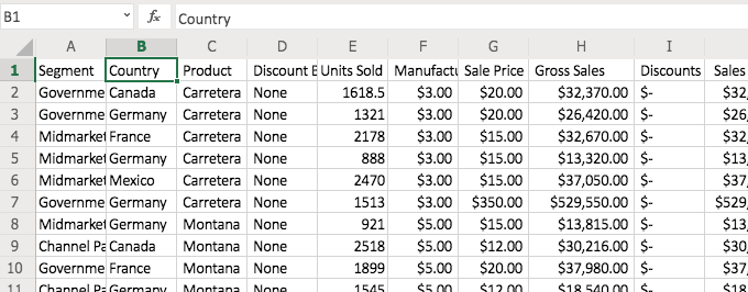
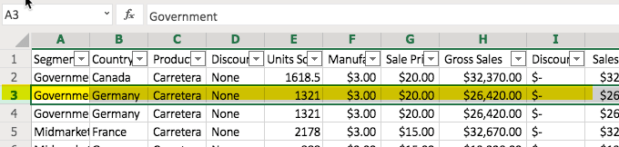
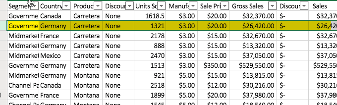
Now that we have the document, let’s look at the volume of data. Quite a bit, isn’t it? Note: the image above will look a bit different from what you have in your sample file and that is normal.
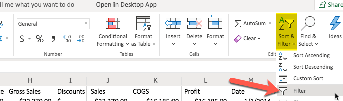
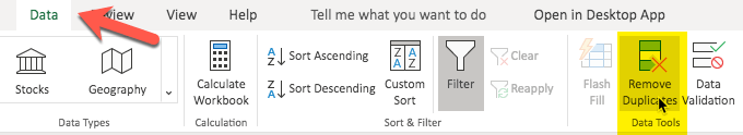
Let’s say you only wanted to see data from Germany. Use the “Filter” option in the Ribbon (under “Home”). It is combined with the “Sort” option towards the right (in the newer Excel versions).
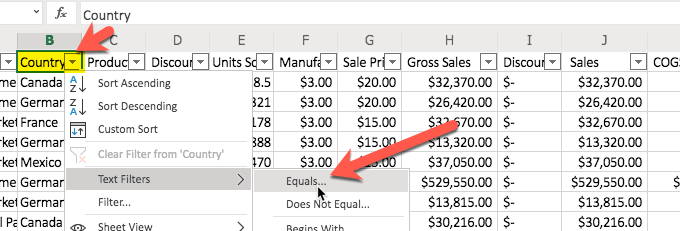
Now, tell Excel what options you want. In this case, we are looking for data on Germany as the selected country.
You will notice that when you select the filter option, little pull-down arrows appear in the columns. When an arrow is selected, you have several options, including the “Text Filters” option that we will be using. You have an option to sort ascending or descending.
It makes sense why Excel combines these in the Ribbon since all of these options appear in the pull-down list. We will be selecting the “Equals…” under the “Text Filters.”
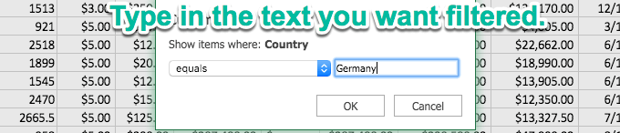
After we select what we want to do (in this case Filter), let’s provide the information/criteria. We would like to see all the data from Germany so that is what we type in the box. Then, click “OK.”
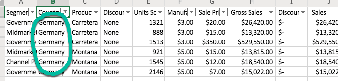
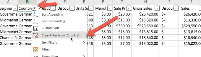
You will notice that now we only see data from Germany. The data has been filtered. The other data is still there. It is just hidden from view. There will come a time when you want to discontinue the filter and see all of the data. Simply return to the pull-down and choose to clear the filter, as shown in the below image.
Sometimes you will have data sets that include duplicate data. It is much easier if you only have singular data. For example, why would you want the exact same financial data record twice (or more) in your Excel Worksheet?
Below is an example of a data set that has some data that is repeated (shown highlighted in yellow).
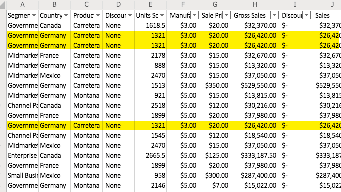
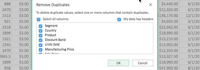
To remove duplicates (or more, as in this case), start by clicking on one of the rows that represents the duplicate data (that contains the data that is repeated). This is shown in the below image.
Now, visit the “Data” tab or section and from there, you can see a button on the Ribbon that says “Remove Duplicates.” Click that.
The first portion of this process presents you with a dialog box similar to what you see in the below image. Don’t let this confuse you. It is simply asking you which column to look at when identifying the duplicate data.
For example, if you had several rows with the same first and last name but basically gibberish in the other columns (like a copy/paste from a website for example) and you only needed unique rows for the first and last name, you would select those columns so that the gibberish that may not be duplicate does not come into consideration in removing the excess data.
In this case, we left the selection as “all columns” because we had duplicated rows manually so we knew that all of the columns were exactly the same in our example. (You can do the same with the Excel example file and test it.)
After you click “OK” on the above dialog box, you will see the result and in this case, three rows were identified as matching and two of them were removed.
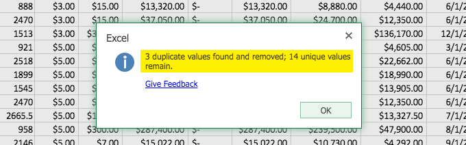
Now, the resulting data (shown below) matches the data we started with before we went through the addition and removal of duplicates.
You have just learned a couple tricks. These are especially helpful when dealing with larger data sets. Go ahead and try some other buttons that you see on the Ribbon and see what they do. You can also duplicate your Excel example file if you want to retain the original form. Rename the file you downloaded and re-download another copy. Or duplicate the file on your computer.
What I did was duplicate the tab with all of the financial data (after copying it into my other example file, the one we started with that was blank) and with the duplicate tab I had two versions to play with at will. You can try this by using the right-click on the tab and choosing “Duplicate.”
Conditional Formatting
This part of the article is included in the section on creating the Workbook because of its display benefits. If it seems a little complicated or you are looking for functions and formulas, skip this section and come back to it at your leisure.
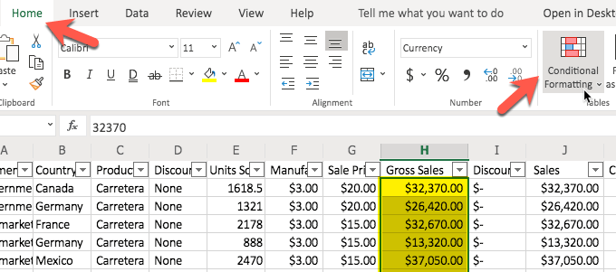
Conditional Formatting is handy if you want to highlight certain data. In this example, we are going to use our Excel Example file (with all of the financial data) and look for the “Gross Sales” that are over $25,000.
In order to do this, we first have to highlight the group of cells that we want evaluated. Now, keep in mind, you do not want to highlight the entire column or row. You only want to highlight just the cells that you want evaluated. Otherwise, the other cells (like headings) will also be evaluated and you would be surprised what Excel does with those headings (as an example).
So, we have our desired cells highlighted and now we click on the “Home” section/group and then “Conditional Formatting.”
When we click on “Conditional Formatting” in the Ribbon, we have some options. In this case we want to highlight the cells that are greater than $25,000 so that is how we make our selection, as shown in the below image.
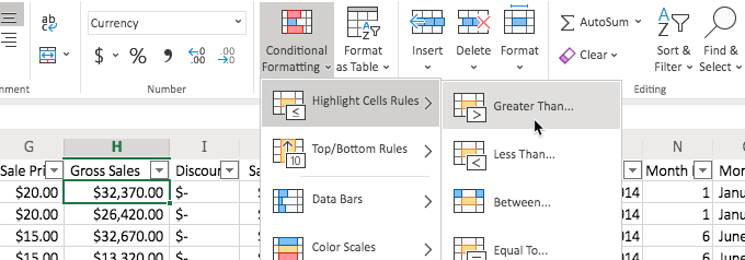
Now we will see a dialog box and we can type the value in the box. We type 25000. You don’t have to worry about commas or anything and in fact, it works better if you just type in the raw number.
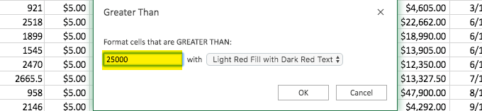
After we click “OK” we will see that the fields are automatically colored according to our choice (to the right) in our “Greater Than” above dialog box. In this case, “Light Red Fill with Dark Red Text). We could have chosen a different display option as well.
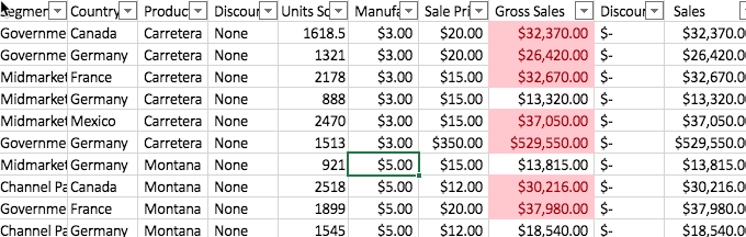
This conditional formatting is a great way to see, at a glance, data that is essential for one project or another. In this case, we could see the “Segments” (as they are referred to in the Excel Example file) that have been able to exceed $25,000 in Gross Sales.
Working With Formulas and Functions
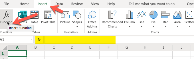
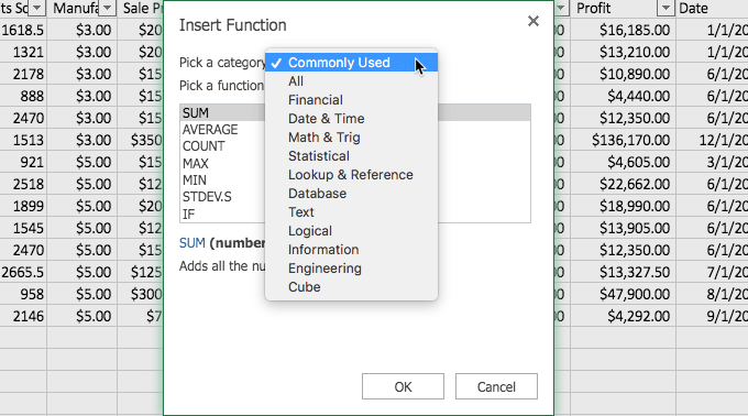
Learning how to use functions in Excel is very helpful. They are the basic guts of the formulas. If you want to see a listing of the functions to get an idea of what is available, click on the “Insert” menu/group and then at the far left, choose “Function/Functions.”
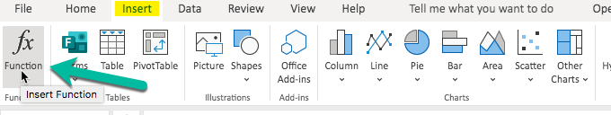
Even though the purpose of this button in the Excel Ribbon is to insert an actual function (which can also be accomplished by typing in the formula bar, starting with an equals sign and then starting to type the desired function), we can also use this to see what is available. You can scroll through the functions to get a sort of idea of what you can use in your formulas.
Granted, it is also very helpful to simply try them out and see what they do. You can select the group that you want to peruse by choosing a category, like “Commonly Used” for a shorter list of functions but a list that is often used (and for which some functions are covered in this article).
We will be using some of these functions in the examples of the formulas we discuss in this article.
The Equals = Sign
The equals sign ( = ) is very important in Excel. It plays an essential role. This is especially true in the cases of formulas. Basically, you don’t have a formula without preceding it with an equals sign. And without the formula, it is simply the data (or text) you have entered in that cell.
So just remember that before you are asking Excel to calculate or automate anything for you, that you type an equals sign ( = ) in the cell.
If you include a $ sign, that tells Excel not to move the formula. Normally, the auto adjustment of formulas (using what is called relative cell references), to changes in the worksheet, is a helpful thing but sometimes you may not want it and with that $ sign, you are able to tell Excel that. You simply insert the $ in front of the letter and number of the cell reference.
So a relative cell reference of D25 becomes $D$25. If this part is confusing, don’t worry about it. You can come back to it (or play with it with an Excel blank workbook).
The Awesome Ampersand >> &
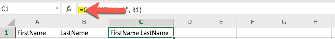
The ampersand ( & ) is a fun little formula “tool,” allowing you to combine cells. For example, let’s say that you have a column for first names and another column for last names and you want to create a column for the full name. You can use the & to do just that.
Let’s try it in an Excel Worksheet. For this example, let’s use a blank sheet so we don’t interrupt any other project. Go ahead and type your first name in A1 and type your last name in B1. Now, to combine them, click your mouse on the C1 cell and type this formula: =A1 & “ “ & B1. Please only use the part in italics and not any of the rest of it (like not using the period).
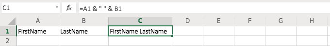
What do you see in C1? You should see your full name complete with a space between your first and last names, as would be normal in typing your full name. The & “ “ & portion of the formula is what produced that space. If you had not included “ “ you would have had your first name and last name without a space between them (go ahead and try it if you want to see the result).
Another similar formula uses CONCAT but we will learn about that a little later. For now, keep in mind what the ampersand ( & ) can do for you as this little tip comes in handy in many situations.
SUM() Function
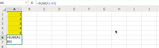
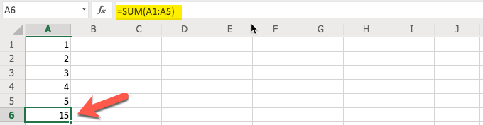
The SUM() function is very handy and it does just what it describes. It adds up the numbers you tell Excel to include and gives you the sum of their values. You can do this in a couple of different ways.
We started by typing in some numbers so we had some data to work with in the use of the function. We simply used 1, 2, 3, 4, 5 and started in A1 and typed in each cell going downward toward A5.
Now, to use the SUM() function, start by clicking in the desired cell, in this case we used A6, and typing =SUM( in the formula bar. In this example, stop when you get to the first “(.” Now, click in A1 (the top-most cell) and drag your mouse to A5 (or the bottom-most cell you want to include) and then return to the formula bar and type the closing “).” Do not include the periods or quotation marks and just the parentheses.
The other way to use this function is to manually type the information in the formula bar. This is especially helpful if you have quite a few numbers and scrolling to grab them is a bit difficult. Start this method the same way that you did for the example above, with “=SUM(.”
Then, type the top-most cell’s cell reference. In this case, that would be A1. Include a colon ( : ) and then type the bottom-most cell’s cell reference. In this case, that would be A5.
AVERAGE() Function
What if you wanted to figure out what the average of a group of numbers was? You can easily do that with the AVERAGE() function. You will notice, in the steps below, that it is basically the same as the SUM() function above but with a different function.
With that in mind, we start by selecting the cell we want to use for the result (in this case A6) and then start typing with an equals sign ( = ) and the word AVERAGE. You will notice that as you begin typing it you are offered suggestions and can click on AVERAGE instead of typing the full word, if you like.
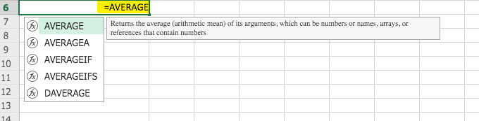
Ensure that you have an opening parenthesis in your formula before we add our cell range. Otherwise, you will receive an error.
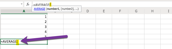
Now that we have “=AVERAGE(“ typed in our A6 cell (or whichever cell you are using for the result) we can select the cell range that we want to use. In this case we are using A1 through A5.
Keep in mind that you can also type it in manually rather than using the mouse to select the range. If you have a large data set typing in the range is probably easier than the scrolling that would be required to select it. But, of course, it is up to you.
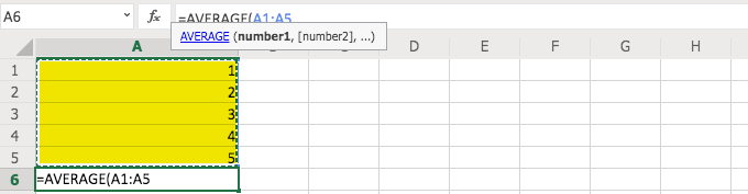
To complete the process simply type in the closing parenthesis “)” and you will receive the average of the five numbers. As you can see, this process is very similar to the SUM() process and other functions. Once you get the hang of one function, the others will be easier.
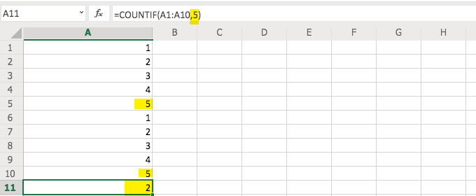
COUNTIF() Function
Let’s say we wanted to count how many times a certain number shows up in a data set. First, let’s prepare our file for this function so that we have something to count. Remove any formula that you may have in A6. Now, either copy A1 through A5 and paste starting in A6 or simply type the same numbers in the cells going downward starting with A6 and the value of 1 and then A7 with 2, etc.
Now, in A11 let’s start our function/formula. In this case, we are going to type “=COUNTIF(.” Then, we will select cells A1 through A10.
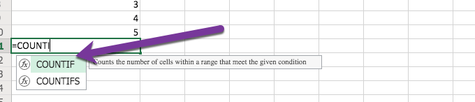
Be sure that you type or select “COUNTIF” and not one of the other COUNT-like functions or we will not get the same result.
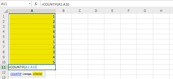
Before we do like we have with our other functions, and type the closing parenthesis “)” we need to answer the question of criteria and type that, after a comma “,” and before the parenthesis “).”
What is defined by the “criteria?” That is where we tell Excel what we want it to count (in this case). We typed a comma and then a “5” and then the closing parenthesis to obtain the count of the number of fives (5) that appear in the list of numbers. That result would be two (2) as there are two occurrences.
CONCAT or CONCANTENATE() Function
Similar to our example using just the ampersand ( & ) in our formula, you can combine cells using the CONCAT() function. Go ahead and try it, using our same example.
Type your first name in A1 and your last name in B1. Then, in C1 type CONCAT(A1, “ “ , B1).
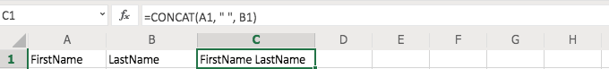
You will see that you get the same result as we did with the ampersand (&). Many people use the ampersand because it is easier and less cumbersome but now you see that you also have another option.
Note: This function may be CONCANTENATE in your version of Excel. Microsoft shortened the function name to just CONCAT and that tends to be easier to type (and remember) in the later versions of the software. Fortunately, if you start typing CONCA in your formula bar (after the equals sign), you will see which version your version of Excel uses and can select it by clicking on it with the mouse..
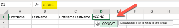
Remember that when you start to type it, to allow your version of Excel to reveal the correct function, to only type “CONCA” (or shorter) and not “CONCAN” (as the start for CONCANTENATE) or you may not see Excel’s suggestion since that is where the two functions start to differ.
Don’t be surprised if you prefer to use the merge method with the ampersand (&) instead of CONCAT(). That is normal.
If/Then Formulas
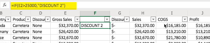
Let’s say we want to use an If/Then Formula to identify Discount (sort of a second discount) amount in a new column in our Example Excel file. In that case, first we start by adding a column and we are adding it after Column F and before Column G (again, in our downloaded example file).
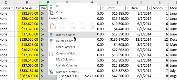
Now, we type in the formula. In this case, we type it in F2 and it is “=IF(E2>25000, “DISCOUNT 2”). This fulfills what the formula is looking for with a test (E2 greater than 25k) and then a result if the number in E2 passes that test (“DISCOUNT 2”).
Now, copy F2 and paste in the cells that follow it in the F column.
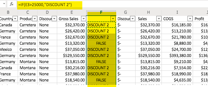
The formula will automatically adjust for each cell (relative cell referencing), with a reference to the appropriate cell. Remember that if you do not want it to automatically adjust, you can precede the cell alpha with a $ sign as well as the number, like A1 is $A$1.
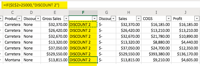
You can see, in the image above, that “DISCOUNT 2” appears in all of the cells in the F2 column. This is because the formula tells it to look at the E2 cell (represented by $E$2) and no relative cells. So, when the formula is copied to the next cell (i.e. F3) it is still looking at the E2 cell because of the dollar signs. So, all of the cells give the same result because they have the same formula referencing the same cell.
Also, if you want a value to show up instead of the word, “FALSE,” simply add a comma and then the word or number that you want to appear (text should be in quotes) at the end of the formula, before the ending parenthesis.
Pro Tip: Use VLOOKUP: Search and find a value in a different cell based on some matching text within the same row.
Managing Your Excel Projects
Fortunately, with the way that Excel documents are designed, you can do quite a bit with your Excel Workbooks. The ability to have different worksheets (tabs) in your document allows you to have related content all in one file. Also, if you feel that you are creating something that may have formulas that work better (or worse) you can copy (right-click option) your Worksheets (tabs) to have various versions of your Worksheet.
You can rename your tabs and use date codes to let you know which versions are the newest (or oldest). This is just one example of how you can use those tabs to your advantage in managing your Excel projects.
Here is an example of renaming your tabs in one of the later versions of Excel. You start by clicking on the tab and you get a result similar to the image here:
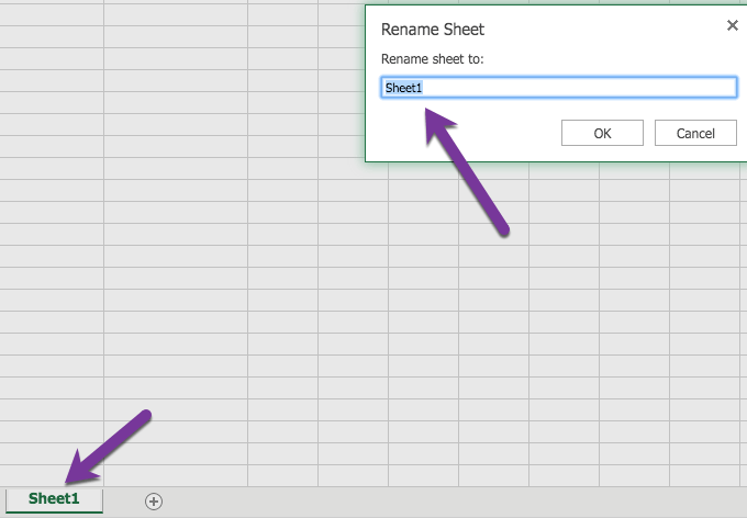
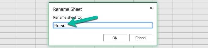
If you do not receive that response, that is ok. You may have an earlier version of Excel but it is somewhat intuitive in the way that it allows you to rename the tabs. You can right-click on the tab and get an option to “rename” in the earlier versions of Excel, as well, and sometimes simply type right in the tab.
Excel provides you with so many opportunities in your journey in learning how to use Excel. Now it is time to go out and use it! Have fun.
How to Create a Spreadsheet in Excel
The world’s most robust pure spreadsheet application, Excel, comes as part of both Microsoft Office and Office 365. There are two main differences between the two offerings: First, Microsoft Office is an on-premise application whereas Office 365 is a cloud-based app suite. Second, Office is a one-time payment, and Office 365 is a monthly subscription. Excel is available for both Mac and PC.
«Spreadsheets keep you organized. Rows and columns, formatting, formulas, filtering. That’s the building blocks of structure and overview.» — Kasper Langmann, Co-founder of Spreadsheeto
Unique Features of Excel
With over 400 functions, Excel is more or less the most comprehensive spreadsheet option when it comes to pure calculations. It also has strong visualization abilities, including conditional formatting, Pivot Tables, SmartArt, graphs, and charts. Home and business users alike can create powerful spreadsheets and reports to track data and inform their decisions.
One powerful Excel feature is Macro, little scripts and recordings you can create to make the program perform different actions automatically. While no other spreadsheet program has this type of feature, it is complex and can pose difficulty for beginners.
Excel also has close tie-ins with Microsoft Access, a database program, which can add power. In general, Excel integrates best with databases and any dataset requiring many calculations per workbook.
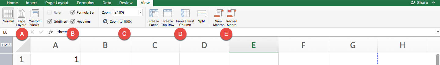
Understanding Your Main Screen
When you first open Excel in Office 365 or a newer version of Microsoft Office, you’ll see a basic screen. Here are the key features in this view:
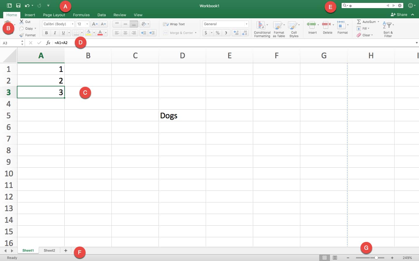
A. Basic App Functions: From left to right along this top green banner you’ll find icons to: reopen the Create a Workbook page; save your work; undo the last action performed and display which actions were recorded; redo a step that’s been undone; select which tools appear below.
B. Ribbon:This grey area is called the Ribbon, and contains tools for entering, manipulating, and visualizing data. There are also tabs that focus on specific features. Home is selected by default; click on the Insert, Page Layout, Formulas, Data, Review, or View tab to reveal a set of tools unique to each tab. We’ll cover this more in the “Navigating the Ribbon” section later on.
C. Spreadsheet Work Area: By default the work area is a grid. Along the top are column headers A through Z (and beyond), and along the left side are numbered row headers. Each rectangle in the spreadsheet is called a cell, and they are each named according to their column letter and row number. For example, the cell selected here is A3.
D. Formula Bar: The Formula Bar displays the information contained within a highlighted single cell or range of cells. If in cell A1 you entered “1” as a value, “1” will appear in the Formula Bar. Plain text that you enter in a cell will also appear in the Formula Bar.
There are cases where what you see in the Formula Bar is different than what’s in the cell. For example, let’s say A1 = 1 and A2 = 2. If you create a formula in A3 that equals A1 + A2, then the A3 cell in your worksheet would show “3,” but the Formula Bar would show “=A1+A2.” This is important when you’re trying to move cells to other parts of your worksheet — remember that the display “value” of a cell isn’t necessarily what the cell contains.
That said, other formulas that reference a cell will take into account the current value of a cell. If A4 = A3 + 1, then it would be equal to 4, because it stacks the formula of A3 (A1 + A2) with A4 = A3 + 1. Formulas can reference other formulas multiple times.
E. Search Bar: Simply type the value you want to find to highlight all cells containing that value. It doesn’t have to be an exact match. For instance, if you searched for “o,” a cell labeled “Dogs” would appear among your search results.
F. Sheet Tabs: This is where the different sheets in your workbook can be found. Each sheet gets its own tab, which you can name yourself. These can be useful to separate out data so that one sheet doesn’t get too overwhelming. For example, you might have an annual budget, where each month is a column, and each row is a type of expense. Instead of keeping every single year you track on one sheet and scrolling horizontally, you can make each tab a different year containing 12 months only.
Note that data from different sheets in the same workbook can be referenced for formulas. For example, if you have two sheets, Sheet1 and Sheet2, you could bring Sheet2 data into Sheet1. If you wanted cell A1 in Sheet1 to equal the A1 in Sheet2, you’d enter this formula into A1: “=Sheet2!A1”. The exclamation mark calls on the previous sheet referenced before locating the data.
G. Viewability Options: The left icon is Normal which shows the worksheet as it appears in the image above, and the right icon is Page Layout, which divides your worksheet into pages resembling how it would look when printed, with the option to add headers. The slider with the “-” and “+” on it is for scale or zoom-level. Drag the slider left or right to zoom in or out.
Navigating the Ribbon
The Home tab is where you manage the formatting and appearance of your sheet, along with some simple formulas you’ll always need.
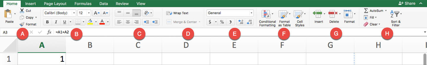
A. Copy and Paste Tools: Use these tools to quickly duplicate data and format styles in the spreadsheet. The Copy tool can either copy a selected cell or group of cells, or copy an area of the spreadsheet that you’ll use as a picture in another document. The Cut tool moves the selection of cells to a new destination rather than duplicating it.
The Paste tool can paste anything in your clipboard into the selected cell, and typically retains everything including the value, formula, and format. However, Excel has a wealth of pasting options: you can access these by clicking the down arrow next to the Paste icon. You can paste what you’ve copied as a picture. You can also paste what you’ve copied as values only, so that instead of duplicating the formula of a copied cell, you duplicate the final value shown in the cell.
The Format paintbrush copies everything related to the formatting of a selected cell. When you select a cell and click Format, you can then highlight a whole range of cells, and each one will take on the formatting of the original cell, without changing their values.
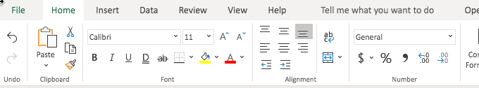
B. Visual Formatting Tools: Many of these tools are similar to those found in Microsoft Word. You can use the formatting tools to change the font, size, and color of typed words, and make them bold, italicized, or underlined. It also has a couple spreadsheet-specific formatting options. You can choose which sides of the cell get additional borders, and their style and thickness. You can also change the highlight color of the entire cell. This is useful for creating visually-appealing borders or differentiating rows or columns on large sheets, or for highlighting a particular cell that you want to accentuate.
C. Position Formatting Tools: Align cell data to the top, bottom, or middle of the cell. There is also an option for angling the values displayed, which can make it easier to read. The bottom row has familiar options for left, center, and right alignment. There are also indent right and left buttons.
D. Multi-cell Formatting Features: This section contains two very important features that solve common problems for new Excel users. The first is Wrap Text. Normally, when you enter text into a cell that extends beyond the size of the cell, it spills into the next cell. For example, if you type “Budgeted Items” into A1, some of the word “Items” spills into B1. Then, if you type into B1, you cover up any characters from A1 that extended into B1. The extra text from cell A1 still exists, but now it is hidden. If you don’t want to widen the cells, click the Wrap Text icon on A1 — this will split “Budgeted Items” into two stacked lines instead of one within A1. This makes the entire row taller to accommodate the content. Now, typing into B1 won’t cover up existing text.
The other tool in this section is Merge and Center. There are instances when you may want to combine several cells and have them act as one long cell. For example, you might want a header for an entire table to be clear and easy to read. Select all the cells you want combined, click Merge, and then type your header and format it. Though the default setting for headers is centered text, simply click the drop-down arrow to select different merging and unmerging options.
E. Numbers-based Format Settings: A drop-down menu has options for number formatting. For example, currency places everything you select into “$0.00” format, and percent turns .5 or ½ into “50%”, date options. These are the basic format options, but you can select More Number Formats from the drop-down menu to get more specialty use cases (different countries’ currencies, or adding the “(xxx)xxx-xxxx” formatting to phone number sequences). Often, you may use these tools on entire columns to make all data in one category behave the same way.
F. Table or Sheet Formatting: Format as Table and Cell Styles allow you to use presets or customize tables (for example, with alternating row colors and highlighted header bars). Select your data range and choose a style to standardize formatting.
Conditional formatting is a bit more complex. Use the drop-down menu to select from a range of options, like inserting helpful visual icons to represent status or completion, or changing the color of different rows. Most important are the conditional rules, which are created with a simple logic. For example, let’s say you have a column with data in A1 through A3, and A4 holds the sum of these three cells. You could place formatting on A4 with a rule that says “if A4 > 0, then highlight A4 green.” Then, you could add another rule that says “if A4 < 0, then highlight A4 red.” Now you have a quick visual reference where green = a positive number and red = a negative number, which will change based on what you enter into A1, A2, and A3.
G. Row and Column Formatting Tools: The Insert drop-down menu puts cells, rows, or columns before or after a selected area on the sheet, and Delete removes them. The Format drop-down lets you change the height of rows and the width of columns. It also has options for hiding and unhiding certain sections.
H. Miscellaneous Tools: Starting at the top left, there’s AutoSum, which allows you to select a swath of cells and place the sum in the cell located right below or directly to the right of the last selected data point. You can use the drop-down to change the function to calculate the average, display the maximum, minimum, or the count of numbers selected.
Use Fill to take a cell’s contents and extend them in any direction for as many cells as you want. If the cell contains a value, Fill will simply copy the value over and over again. If it contains a formula, it will recalculate its relative position for each new cell. If the first cell equals A1+B1, then the next would equal A2+B2, and so on.
The Clear button lets you either clear the value, or just clear cell formatting.
Sort & Filter tools let you choose what to display, and in what order. At the base level, this tool sorts cells containing text from A to Z, and cells containing numbers from lowest to highest. It can also sort by color or icon. Sorting and filtering helps surface only the data you need.
Use the Insert tab to add extra elements to your Excel workbook that go beyond text and colors.
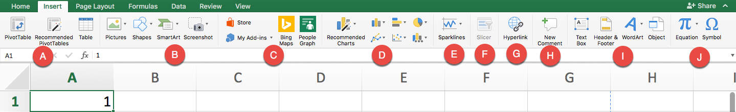
A. These tools control PivotTables, an important Excel function. Think of PivotTables as “reports,” a quick way to view all your data, analyze trends, and draw conclusions. By selecting at least two rows of data and clicking on PivotTable, you can quickly generate a visually-appealing table. Going through this process launches the PivotTable Builder, which helps you select columns to include, sort them, and drag-and-drop them to quickly construct your table. They can include collapsible rows to make reports interactive and uncluttered. There is also a button for Recommended PivotTables, which can help when you don’t know where to start.
Table builds a simple table that includes any number of columns you select. Rather than placing the table elsewhere on the worksheet, it turns the data into a table on the spot, and applies customizable color formatting.
B. This section lets you insert visual elements, like picture files, pre-built shapes, and SmartArt. You can add shapes and resize, recolor, and reposition them to create intuitive data sets and reports. SmartArt objects are prebuilt diagrams that you can insert text and information into. They’re great for representing what the data says in another place on your workbook.
C. These tools are for inserting elements from other Microsoft products, like Bing Maps, pre-built information cards about People (from Microsoft accounts only), and add-ins from their store.
D. Use these tools to create charts and graphs. Most of them work only if you select one or more data sets (numbers only, with words for headers or categories). Charts and graphs function like you’d expect — just select the data you want to visualize, then select your desired type of visual (bar charts, scatter plots, pie charts, or line graphs). Creating one will bring up formatting options where you can change the color, labels, and more.
E. Sparklines are more simplistic graphs that can fit in as little as one cell. You can place them next to data for a small, quick visual representation.
F. Slicers are big lists of buttons that make your data more interactive. You can select a PivotTable you’ve created, and then create a slicer from it — this allows a viewer to click on buttons that correlate to the data they want to filter.
G. This hyperlink tool allows you to make a cell or table into a clickable link. Once a viewer clicks on the affected cell(s), they’ll be taken to whatever website or intranet site you select.
H. Recent versions of Excel allow for better collaboration — insert comments on any cell or range of cells to add more context. You can open or close the comments so the worksheet doesn’t get too cluttered.
I. A Text Box is useful when you’re creating a report and don’t want typed words to behave like cells. It makes it easy to move your text around, rather than cutting and pasting cells (which could potentially mess up the formatting of real data). The next area is for Headers & Footers, which will take you to the page layout view — here you can add headers and footers for the entire page. WordArt, on the other hand, lets you embellish text. Insert Object lets you place entire files (Word documents, PDFs, etc.) into the worksheet.
J. This section lets you insert Equations and Symbols. Use equations to write a math equation with fractions, variables, and more that you can place in your sheet like a Text Box. For instance, this can be helpful for explaining how a portion of a table was calculated in a report. Symbols, on the other hand, can be inserted directly into cells, and include all non-standard characters from most languages, as well as emojis.
The Page Layout tab has everything you need to change the structural parts of your worksheet, especially for purposes of printing or presenting.
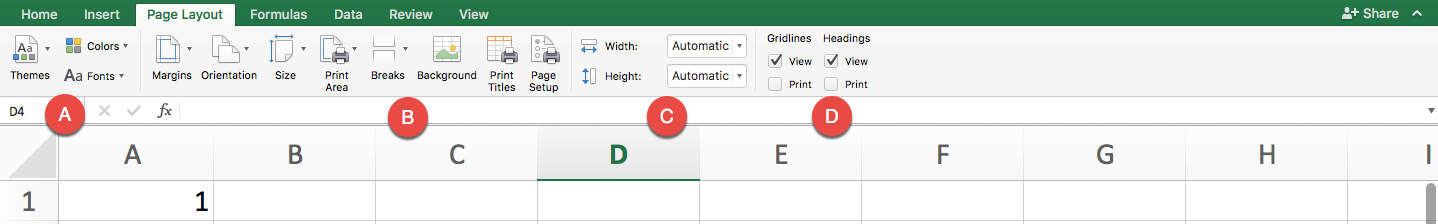
A. Use these buttons to quickly adjust the visual style of your entire sheet. You can regulate the fonts and colors, and use the Themes section to quickly apply it to every table, PivotTable, and SmartArt element for a clean, well-designed sheet.
B. These are print options. You can change the margin for printing, whether you want a vertical or horizontal print alignment, which cells in your sheet you want to print, where you’d like page breaks, and whether it has a background (to place your company name, for example). You can also start giving each page a heading using the Print Titles button, and the order to print each section.
C. This lets you choose how many pages across and how many pages down you’d like to print.
D. This section lets you toggle whether the automatic grids appear for working on the sheet and for printing it, along with the row and column headings (A, B, C, 1, 2, 3, etc).
The Formulas tab stores nearly everything related to Excel’s reputation as “complex.” Because this article is intended for beginners, we won’t cover every function is this section thoroughly.
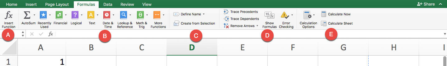
A. The Insert Function button is useful for those who don’t know all the shorthand. This brings up a side Formula Builder section that describes each function, and you can select the one you want to use.
B. These buttons divide all the functions by category.
- AutoSum works the same as it does in the Home tab.
- Recently Used is helpful for bringing up frequently used formulas to save time looking through menus.
- Financial includes everything related to currency, values, depreciation, yield, rate, and more.
- Logical includes conditional functions, like “IF X THEN Y.”
- Text functions help clean, regulate, and analyze plain text cells, such as displaying the character count of a cell (helpful for Twitter posts), combining two different rows via Concatenate, or pulling out numerical values from text entries that aren’t formatted correctly.
- Date & Time functions help make meaning out of time-formatted cells, and include entries like “TODAY,” which enters the current date.
- Lookup & Reference functions help pull information from different parts of your workbook to save you the trouble of looking for them.
- Math & Trig functions are just what they sound like, involving every sort of math discipline you can imagine.
- More Functions includes Statistical and Engineering data.
C. This section contains tagging options. If there’s a range of cells or a table you frequently need to refer to in formulas, you can define its name and tag it here. For example, say you had a column that contained the entire list of products you sell. You could highlight the names in that list and Define Name as “ProductList.” Every time you want to refer to that column in a formula, you can simply type “ProductList” (rather than finding that collection of data again or memorizing their cell positions).
D. This contains error checking tools. With Trace Precedents and Trace Dependents, you can see which cells contain formulas that refer to a given cell and vice versa. Show Formulas reveals the formulas inside all cells, rather than their display values. Error Checking automatically finds broken links and other issues with your spreadsheet.
E. Should you have a large sheet with a massive series of interconnected formulas, tables and cells, you can use this section to trigger calculations, and also to choose which types of data don’t run. A good example is a mortgage or asset depreciation sheet.
The Data tab is for performing more complex data analysis than most beginners will need.
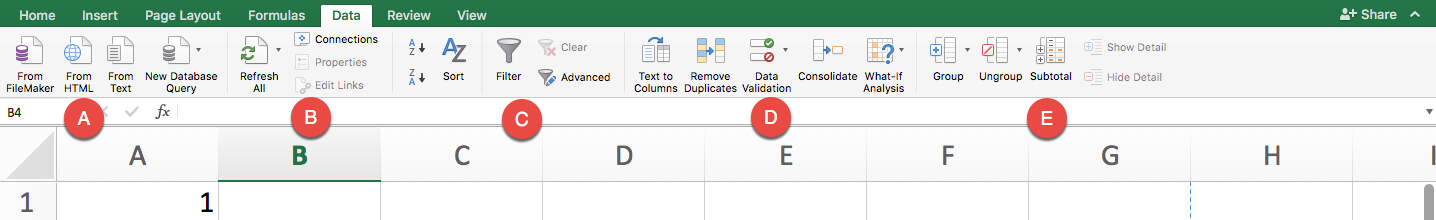
A. These are database import tools, allowing you to import data from any web, file, or server-based database.
B. This section helps you fix database connections, refresh data, and adjust properties.
C. These are Sort and Filter options similar to those for data you have within your sheet, applied to data feeds. They’re especially crucial here as a database is sure to have more data than you can or care to use.
D. These are data manipulation tools. You can take a single long string, like those separated by commas or spaces, and divide them into columns with Text to Columns. You can seek and remove duplicates, consolidate cells, and validate whether data meets certain criteria to assess its accuracy. What-if Analysis helps you fill in gaps with incomplete data using existing data and trends to determine likely outcomes for new scenarios.
E. These tools help you manage how much data you have to deal with at once and group them by whatever criteria you deem necessary. It’s similar to sorting, but you can choose any range of columns or rows and make them collapsible, each with their own label. Use Subtotal to create automatic calculations along a data set by different categories, which is helpful for financial sheets.
The Review tab is part of the Ribbon that helps with sharing and accuracy checks.
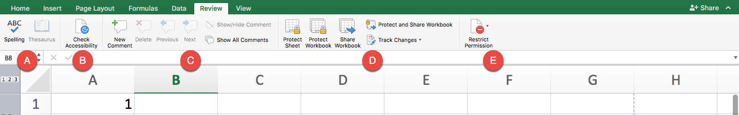
A. These are simple text-based checks (like in Word) that allow you to locate cells with spelling errors, or find more appropriate words via the Thesaurus.
B. Check Accessibility pulls up errors that can make it difficult to access the data in other programs, or just for reading purposes. It might find that your sheet is missing alt text, or that you’re using defaults for sheet names that can make navigation less intuitive.
C. The commenting tools allow collaborators to “talk” to each other within the sheet.
D. Protecting and sharing tools allow you to invite collaborators and restrict access to certain parts of the sheet. You can manually assign different levels of access — for example, you might allow a contractor to edit just the cells related to the hours they worked, but not the cells that calculate their pay. As with Word, sharing a sheet with Tracked Changes means you can see everything that’s been done to the sheet.
E. When you’ve shared a workbook, you can restrict permissions later on using this button and selecting individual contributors.
Use the tools in the View tab to change settings related to what you can see or do.
A. This is your basic view where you can see your default sheet view, how it’ll look when printing, and in custom ways you set yourself.
B. Use these buttons to choose whether you want to see the grids, headings, formula bar, and ruler.
C. This is another way to control zooming in and out of cells.
D. Freeze Pane controls are an important part of making a usable spreadsheet. Using these tools, you can freeze a number of rows and/or columns while you scroll around. For example, if the first row had all your column headings and remained frozen, you’ll always know which column you are looking at as you scroll down.
E. Macros are a way of automating processes in Excel. It is far beyond Excel 101, however.
How to Create a Simple Budget Spreadsheet in Excel
Now that you’ve learned about the tools in Excel, let’s practice making our own spreadsheet from scratch. This guide will cover basics, with a few intermediate techniques to get you more comfortable with spreadsheets.
Step 1: Create a Workbook
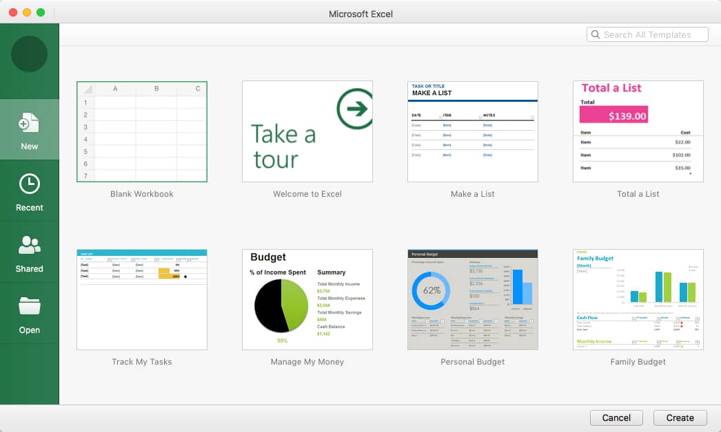
When you open Excel, you’ll be presented with a screen like this. Create a new workbook by clicking the New tab on the sidebar. The Recent tab below that will bring up any workbooks you’ve recently opened. Below that is the Shared tab, which shows workbooks that other Excel users have sent to you directly through the app (we won’t focus on that right now). The final tab is Open, which opens a file browser so you can select an existing workbook.
On the New tab, you can see a number of templates available, which can help you jump straight into making specific types of spreadsheets, like budgets and task lists. In this example, however, we’re going to build a spreadsheet from scratch. Click Blank Workbook on the top left corner, then click Create.
Step 2: Plan Your Needed Data
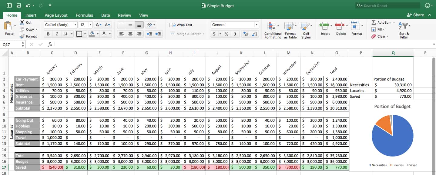
Before you can create any kind of spreadsheet, you need to plan what it’ll include so you can structure and format it accordingly. While it is possible to change the spreadsheet structure later on, the more data you’ve added, the more inconvenient it becomes. Plus, moving around entire rows and columns increases the chances of accidentally changing formulas. In this example, we’re making a monthly budget, so we’ll use a monthly time stamp. As we explored above, we can use other sheets in this workbook to track other time increments, like weeks or years. Of course we want to add all of our different expenses together, but we should also think of categories for comparison. We could have one for necessities, and one for luxuries. We’ll need subtotal rows, along with a comparison of budget to actual spending. At the end, we’ll also want to easily compare the different parts of the budget together.
Now we know the elements we need, and can organize them accordingly.
Step 3: Create Headings
Since we know we want to compare month to month, we should use months as our column headings — horizontally is usually best for time comparison. Since we know we’ll also have categories of spending to label and sublabel, we should leave the A and B columns open, and start at cell C1.
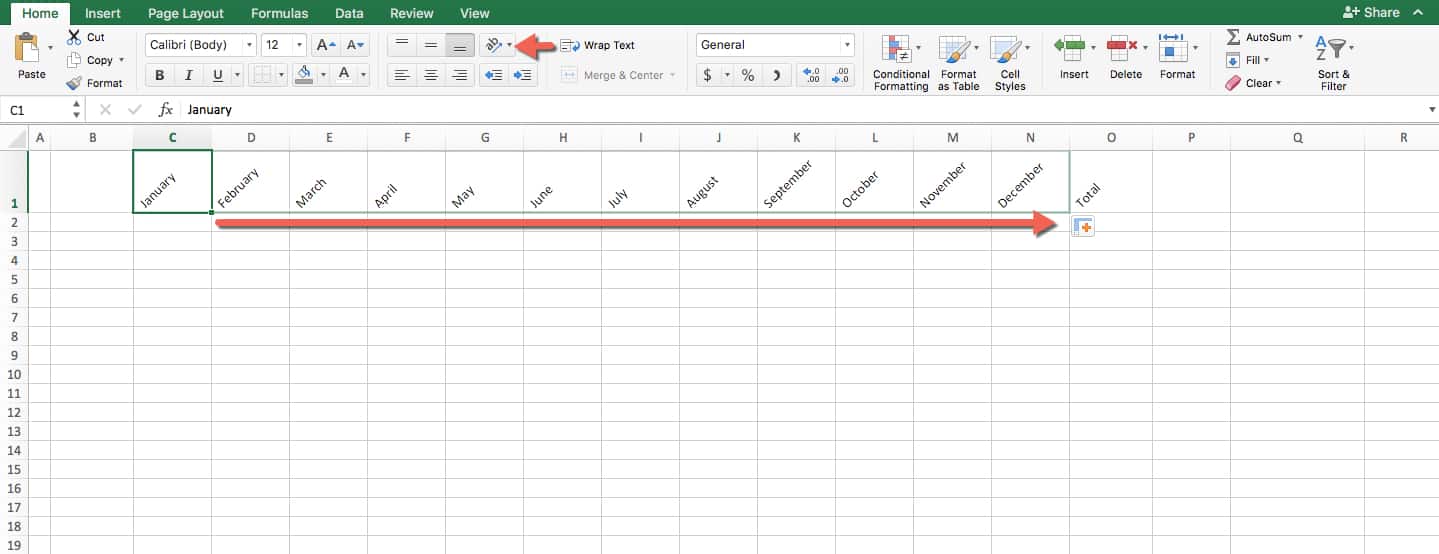
Here’s a useful trick: if you type a number or timestamp with a logical next entry, you can click the lower right corner of that cell and drag in any direction to autofill the rest of the sequence as far as you want. For this example, after typing “January” in C1, you can drag it across to N1 and watch it fill in the rest of the months. To create the diagonal names in the screenshot, navigate to the Home tab and find and click the formatting option with a diagonal rising appearance. This makes the headings stand out without changing the column width. We’ll also need an area on the sheet where we can get row totals for more useful data, so create the heading Total in cell O1.
Step 4: Label the Rows
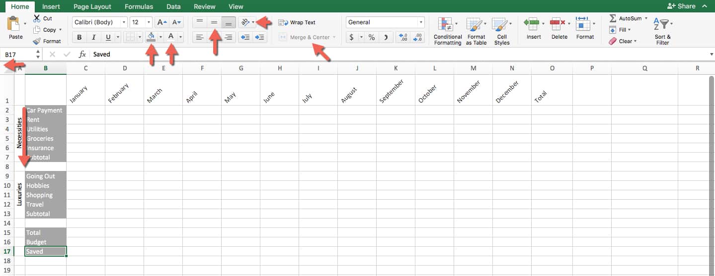
Create three blocks of entries on column B. Name the first block Necessities, which will include everything you see, and end with a subtotal. Name the second block Luxuries and include a few categories; also end with a subtotal. The last block will have our Total, the budget to compare it to, and the difference between the two, which we’ll call Saved (this amount represents the difference between the expected and actual spent). To makes them stand out, use the Paint Bucket tool and select a color (grey in this example).
For column A, we’ll create labels that clearly line up with our grey blocks, and position the writing vertically so it doesn’t take too much space. To make the width of the column smaller, grab the right edge of the A column and drag it to the left. To combine all the cells for our category labels, highlight A2 through A7, and Merge & Center. To get the writing vertical, navigate to the Home tab, find the formatting option and click vertical writing. Finally, choose the height alignment as centered so the vertical text will appear in the middle. Repeat this with cells A9 through A13.
Step 5: Add Boundaries
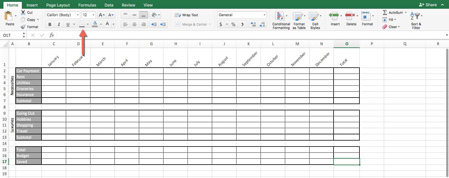
Add boundaries to the spreadsheet using the icon in the above graphic. Select each collection of cells, and don’t adjust the spaces between the grey block groupings. Click All Borders to draw distinct grids. Now, make the outer boundary of each block thicker by selecting the entire area and choosing Thick Box Border. Finally, do the same around the inner row of each box labeled Subtotal, to make these visually distinct. Apply a Thick Box Border to Column O, Total, and leave spaces between each row grouping. All of this improves spreadsheet readability.
Step 6: Create a Results Table
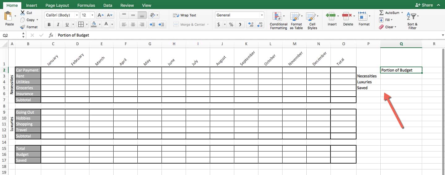
Use the side of your nicely-formatted spreadsheet to create the outlines of a simple table which will contain your main results. This information will assist you in creating a chart, later. Give it an appropriate label, and label its rows for the total from Necessities, the total from Luxuries, and the total Saved for the year.
Step 7: Format and Write Formulas
This is where the spreadsheet gets a lot more powerful. It involves a series of steps:
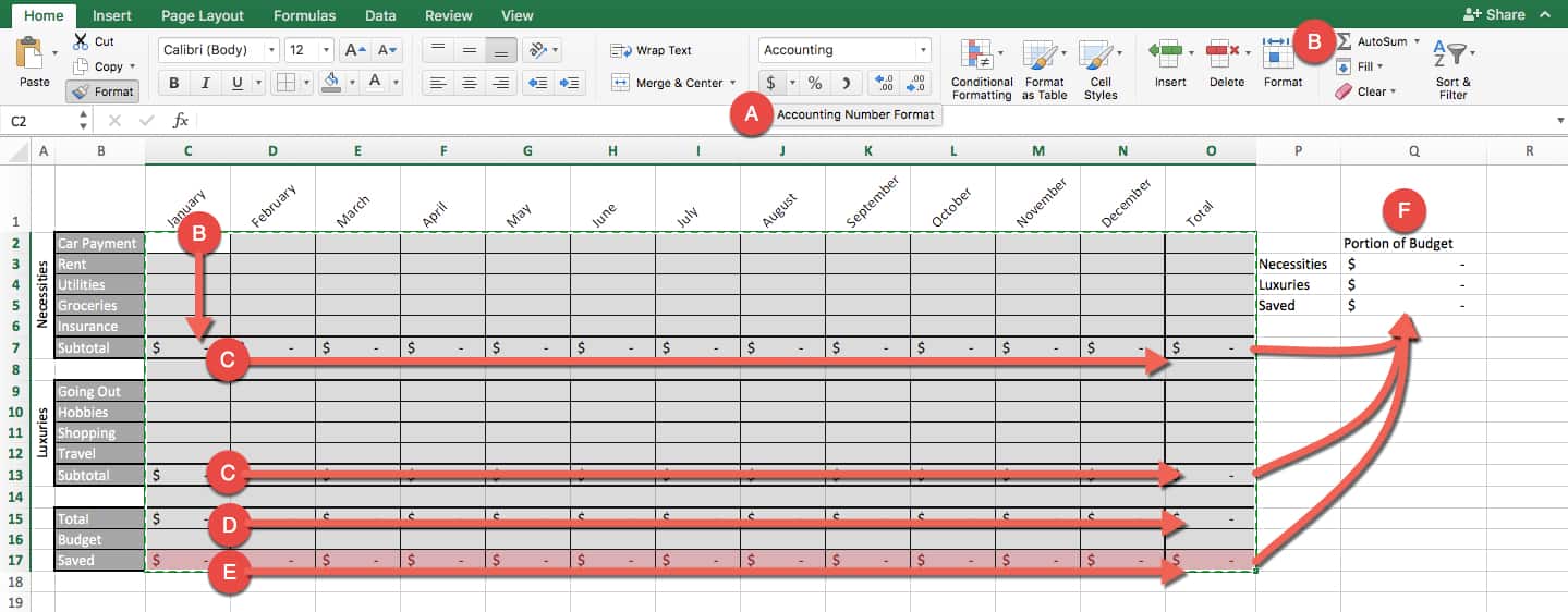
A. First, select every cell that will contain a number, underneath columns C through O, and also in the table for Portion of Budget. Now click the “$” on the keyboard to format the cells with the standard dollar format with two decimals for cents.
B. Select cells C2 through C7 and click AutoSum. This creates a formula that adds everything in this column, and places the sum into C7 (the last selected cell).
C. Use your cursor to grab the bottom right corner of cell C7, and drag it to the right toward column O. This will duplicate your formula down the entire Subtotal row. This means that while C7 = sum of C2 through C6, D7 = sum of D2 through D6, and so on. Repeat the process for Luxuries.
D. For the Total, Budget, and Saved area, the process is a little different. Click cell C15, and enter this formula: =C7+C13. This totals the two subtotals. Like you did with the other formulas, drag and duplicate it across to column O.
F. Click cell C17, and input this formula: =C16-C15. This will make the Saved row equal to the difference between Budget and Total.
E. Finally, add formulas to each empty cell of your Portion of Budget table. Q3=O7, which will bring the yearly subtotal of all Necessities items to the Necessities part of this table. Do the same for the Luxuries table annual subtotal and the Saved annual total.
Step 8: Script Conditional Formatting
Before entering data, there’s one more bit of set up: conditional formatting. To do this, click the drop down arrow on Conditional Formatting and click Manage Rules. Next, click + to add a rule, which takes you to a new popup menu. Click Style: Classic. Then choose Format only cells that contain, and click Cell Value greater than 0. Format this with a standard option, green fill with dark green text. Now you’ll be returned to the Manage Rules section, where you can select which range of cells it applies to. Choose C17 through O17 to have it affect the Saved row only.
Now repeat the steps, but this time Format only cells that contain the Cell Value equal to or less than 0. Use the standard option light red fill with dark red text, and apply it to the same range of cells.
Now you have a conditional format for all the final calculated Saved row entries. If it’s greater than 0, it gets marked green, and if it’s 0 or less, it gets marked red. When your data is entered, you can instantly see which months you saved money in, and which you didn’t.
Step 9: Enter Data and Watch the Calculations

First, enter an assumed budget, and copy it across the Budget row by dragging it from its bottom right corner. In this case, the assumed budget is $3,000.00.
Next, enter your data for each month of last year, totaled from receipts and bank statements, and categorized accordingly. Now for the magic of spreadsheets: as you enter each bit of data, you’ll see your Subtotals, Totals, Saved rows filling in, as well as the Portion of Budget table — all calculating and updating in real-time.
Step 10: Create a Pie Chart
Create a simple visualization. Select the entire Portion of Budget table, and then click the Insert tab on the Ribbon, and choose Pie Chart. Because of how the table is set up, the chart will be titled Portion of Budget, and each dollar amount will appear as a percent of the pie chart with the necessary label. Don’t forget to click Save on the top left of the Excel app.
Now you have an incredibly useful spreadsheet that tells you exactly how well you stuck to your budget each month while also getting a sense of where your money went last year overall. You can copy and use this spreadsheet year after year.
If you want more help getting started creating a budget, check out Top Excel Budget Templates.
Additionally, increase your speed with this complete list of keyboard shortcuts in Microsoft Excel.
How to Create a Spreadsheet in Word
Learn all the basics for making a spreadsheet with Microsoft Word. Word is the world’s most popular word processing application, featuring countless ways to format text-based documents, but also including simple tables and spreadsheets. Like Excel, the app comes as part of Microsoft Office and Office 365, and has versions for both PC and Mac. This tutorial uses the Microsoft Word version available in Office 365.
Unique Features of Word
In fact, Word isn’t really a spreadsheet app, but an app for typing and laying out text documents. It’s far easier to format sentences and paragraphs in Word than in the text boxes available in Excel, let alone inside cells. Because of this, Word can be used to create compelling reports or to insert semi-workable data into a text-heavy document, such as an article.
Word has two modes of spreadsheet creation: creating simple tables in the program itself, or inserting sheets and charts from Excel.
Understanding the Word Interface
Unlike Excel, where everything in the Ribbon is vital to creating a spreadsheet, only a few items are relevant in Word. For starters, almost everything you need is in the Insert tab. Here are the relevant Insert tab tools:
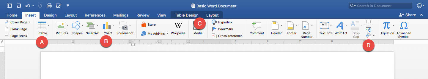
A. Table: Click this button to create basic tables in a few ways. When you click Table, a grid appears that you can hover over and click to choose the number of vertical and horizontal cells you want for your spreadsheet. If you click Insert Table, you get a pop-up window that lets you specify the spreadsheet’s dimensions by typing the number of rows and columns for the table, as well as setting the width of cells. Lastly, you can select Draw Table to drag and create as many cells as you like. Despite how simple it seems, Draw Table isn’t actually the best or easiest way to create a spreadsheet in Word.
B. Chart: A drop-down menu appears when you click this button that has the same types and styles of charts — and even the same interface — as Excel. You’ll see scatter plots, pie charts, line graphs, and more.
C. Table Design and Layout: When you click on any table in your Word document, two additional tabs appear in the center of the Ribbon — Table Design and Layout. Both tabs work only for tables, and contain further Ribbon menus explained below.
D. Object: You can bring Excel elements directly into your Word document. Either insert a Microsoft Excel Chart or a Microsoft Excel Worksheet. Selecting either of these options will open Excel so you can create and edit a fully functional spreadsheet that will then appear as-is in the Word document. These spreadsheets and charts behave like images in Word, so you can move them around and resize them, and even double-click them to open up Excel and update their data.
You can also insert an existing Excel file. To do this, click From File, then navigate to the location of the Excel file and open it. Initially, only the primary sheet appears, but double-click it to allow anyone to access the whole workbook, unless you protect it.
Let’s focus on the Table Design tab. These options are only for tables created within Word, not those imported from Excel.
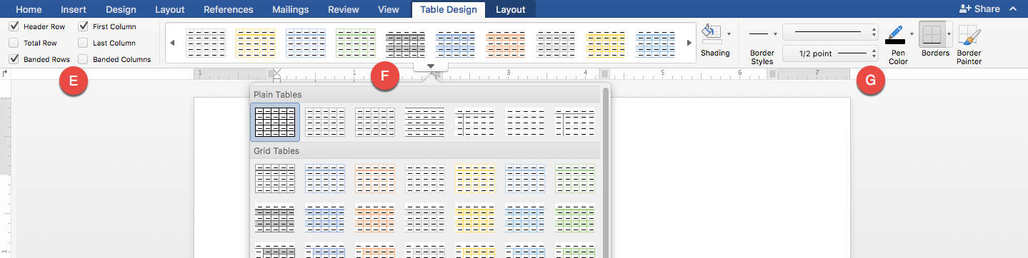
E. Use these toggles to choose certain table layout elements such as column, row, or header color.
F. These are style presents very similar to table styles in Excel, with a wide variety of colors and varieties. Plus, with the Paint Bucket icon, you can customize the shading rather than choosing one from the dropdown menu.
G. These tools let you design the borders of each individual cell, and the entire table. You can choose thickness, color, and type of line (dotted, straight, wavy, etc).
Next, let’s look at the Layout tab. Again, this only works for tables created in Word.
H. Use these tools to select rows, and choose whether or not to show the gridlines. You can also open up the Properties window and edit various elements, table alignment, or how the borders and shading appear.
I. This is another home for the Draw Table and Erase table tools. Use these tools to drag your mouse and draw each cell and erase them, one side at a time.
J. These are tools for deleting rows, columns, or entire tables. You can also do this by highlighting a cell, right-clicking, and selecting to delete these portions.
K. Insert rows or columns wherever you like in your table with these tools. Again, you can also access these tools by highlighting and right-clicking different parts of the table.
L. These tools let you change the organization of your table. You can merge and unmerge cells, like in Excel. This is a helpful feature for creating headers or spacing in your table. You can also split the table between any two rows.
M. Perform Autofit to automatically fit your table into the Word document’s space, or to make all columns the same width.
N. Adjust the height and width of rows and columns numerically, rather than using drag and drop.
O. Use these tools to select multiple rows or columns, and evenly distribute them across the page to make your table look clean and professional.
P. The alignment tools help you specify how to align the contents of each cell (top left, bottom right, center, etc.).
can also choose if you want the text to be horizontal or vertical.
R. Here is where basic spreadsheet functions live, and they aren’t nearly as robust as what you’d find in Excel. Sort works the same way, allowing you to select several rows in a column and use them to alphabetize the table. Convert to Text lets you select any number of cells and put them in text value without a table, separated by commas or spaces. This can be helpful for editing contents in paragraph form later, or importing data into other applications.
Finally, there are the functions. Word tables have 18 core functions that are mostly math with a couple logical IF and THEN functions. Calling cells in formulas is also somewhat more difficult in Word. If you have a single row table, then every cell will be row 1 — A1, B1, C1, etc. However, these aren’t labeled, so you have to count over, or just memorize them. You can also call by position: if you want to know the sum of all cells in a column and put it in the last cell, select the last cell, and make the formula “=SUM (ABOVE).” Likewise, use RIGHT, LEFT, or BELOW to call everything in those directions.
The other relevant item to spreadsheets that can be created in Word is the chart function. In the Insert tab, click the insert Chart button to access this feature. Once you choose a style, it will open Excel so you can edit the chart data. The functionality works exactly the same as in the Excel tutorial above. However, once the chart is in Word, two new tabs in the Ribbon, in place of Table Design and Layout. They become Chart Design and Format.
A. Use these tools to add extra important elements to your chart, either individually with Add Chart Element, or all at once using the helpful presets with Quick Layout.
B. Use these tools to adjust the style of your chart without changing its layout too much. You can adjust colors, drop shadows, background, and more.
C. Manipulate data in the chart with this set of tools. Switch Row/Column lets you change the X-Y-axes of your chart. Select Data takes you back into your Excel session to choose data set you want represented in the chart. Edit Data in Excel allows you to change anything you like about the data in Excel. You can also go into Excel by double-clicking your chart. When you return to Word, click Refresh Data to update your chart to reflect any changes made to the data in Excel.
D. Change Chart Type allows you to switch from a pie chart to a line graph and so on, using the same set of data.
Now look at the Format tab.
E. The selector tool lets you choose which part of the chart you’d like to edit so you don’t accidentally click elsewhere. You can select the Plot Area where the graph is stored, the Chart Area where all the axis labels exist, or any other element.
F. Use this to insert shapes into your chart, just like inserting any other object into Word.
G. Use these tools to color every element on your chart, which can include how you want to fill in lines, the text color, and more.
H. These are all your style options for text in your charts that handle adding WordArt, a fill color, and more.
I. The positioning tools work similarly to positioning other objects in Word. You can make the text wrap around the chart with Wrap Text, and place it behind or in front of any other element on the page.
J. Use these tools to numerically change the height and width of the entire chart. You can also adjust the chart’s height and width by grabbing the corner or side and adjusting it with your mouse.
K. This opens the Format Pane, which has some of the same tools found in the Ribbon, but they are larger and easier for some to access.
How to Import a Spreadsheet and Chart into Word from Excel
Now that you’ve learned about the spreadsheet tools in Word, you can practice a few different ways to import an existing spreadsheet into Word.
Step 1: Create a Word Document
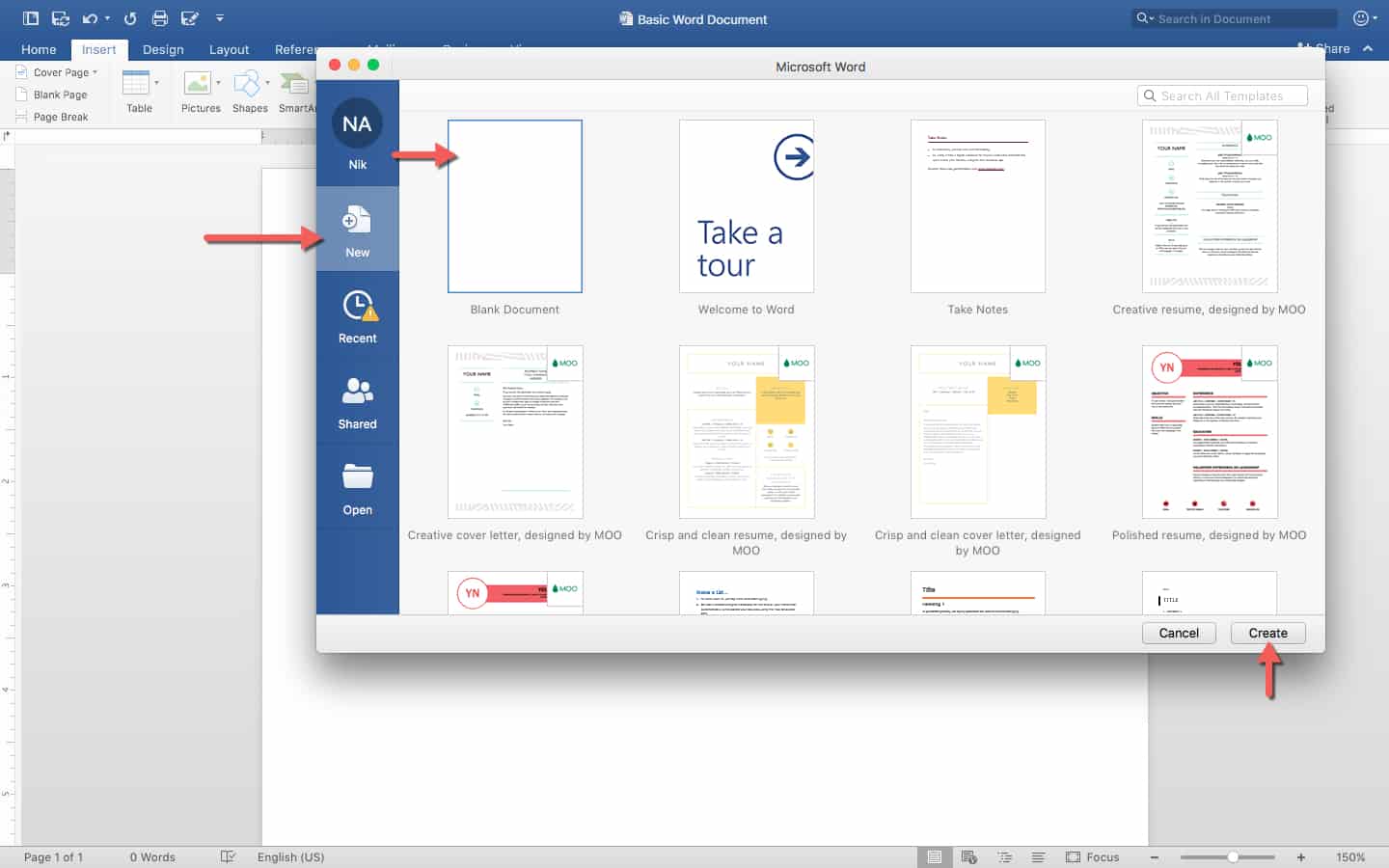
When you open Word, this screen appears. The New tab on the left side lets you create a new document, Recent surfaces recently opened documents, Shared shows documents that other Word users have sent to you, and Open opens a file browser for selecting an existing document.
On the New tab, you can see a number of templates which you can use to jump straight into making different types of documents like resumes, blogs, and research papers. Most don’t relate to spreadsheets at all, so click Blank Document on the top left corner, then click Create.
Step 2: Save Your Document
Once your document is created, save it by clicking the save icon shown above, and select a location to save it. Give it a name relevant to its purpose, so it’s easy to find.
Step 3: Import an Excel Workbook into Your Document
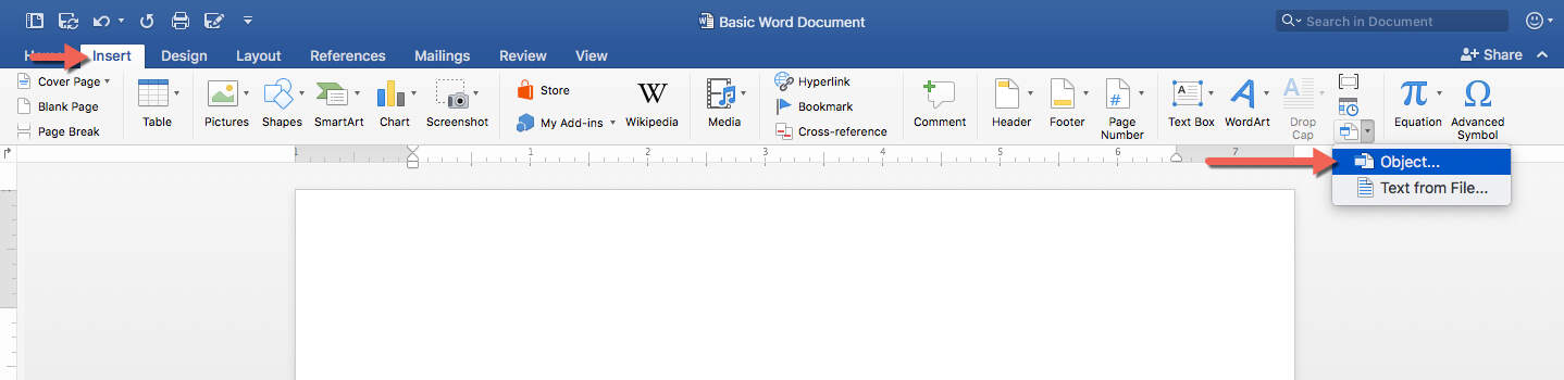
Go to the Insert tab, and click Object.
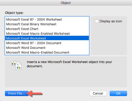
When the Insert Object popup window appears, click Microsoft Excel Worksheet, and then click From File. This opens a file browser window, where you can select the Simple Budget spreadsheet you created earlier, for instance. Open it.
Step 4: Resize Spreadsheet to Fit
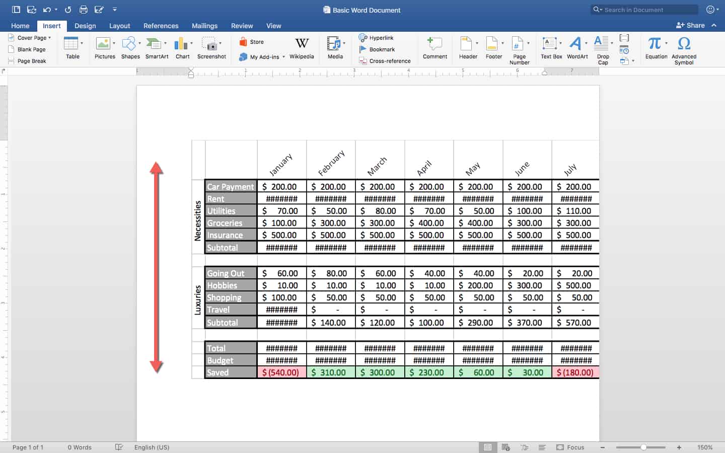
A spreadsheet as large as the one we created is too large for a standard Word document at its normal size. To shrink it, click once on the imported spreadsheet, and hold down the Shift key. While pressing Shift, select a corner of the spreadsheet and drag it towards the center of the object a few times. It’s important to note that spreadsheets behave like a regular picture or object in Word, so you can drag them around and change their size as you like. Feel free to add text below the spreadsheet, as well.
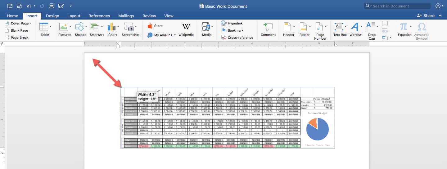
Regardless of the spreadsheet’s size, you cannot interact with the data within Word. However, all of your formulas and formatting will remain intact. You can still work with the rest of the document, typing words and inserting pictures around the spreadsheet.
Step 5: Edit the Data in Excel
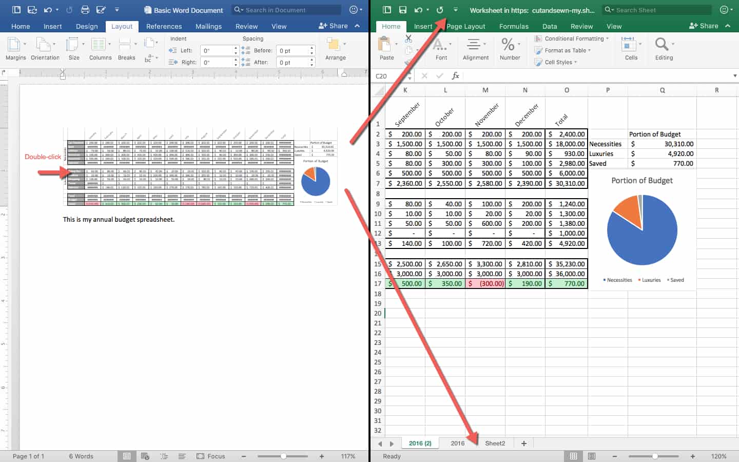
To edit the data, double-click the spreadsheet to open the spreadsheet in a new Excel window. Here, you can edit any data. It updates in real-time, meaning that as soon as you make the change in Excel, the change will be reflected in Word. In this way, you can bring fully-functional spreadsheets straight into Word.
Note: When you double-click on an inserted object like an Excel workbook, you have access to the entire workbook, not just the first sheet which appears as an object in Word. If you are sharing a document like this with someone and don’t want them to access other sheets, make sure to enable Protect Sheet in Excel.
How to Copy an Excel Spreadsheet and Chart Into Word
The newer version of Word lets you simply copy and paste cells and other Excel elements from an Excel workbook into a Word document. Here’s how to do it:
Step 1: Open Your Excel File
Open the Simple Budget workbook that contains your table, chart, and spreadsheet in Excel.
Step 2: Select and Copy a Range of Cells, a Table, or a Chart
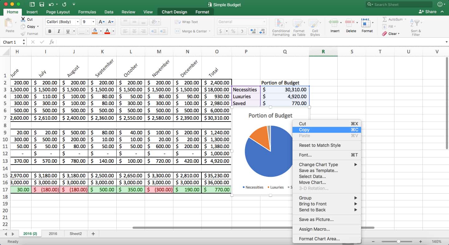
Highlight cells in the budget spreadsheet, then press Ctrl+C to copy the data. Alternatively, you can single-click the Portion of Budget chart, and press Ctrl+C to copy it.
Step 3: Open Your Word Document and Paste the Selected Cells or Chart
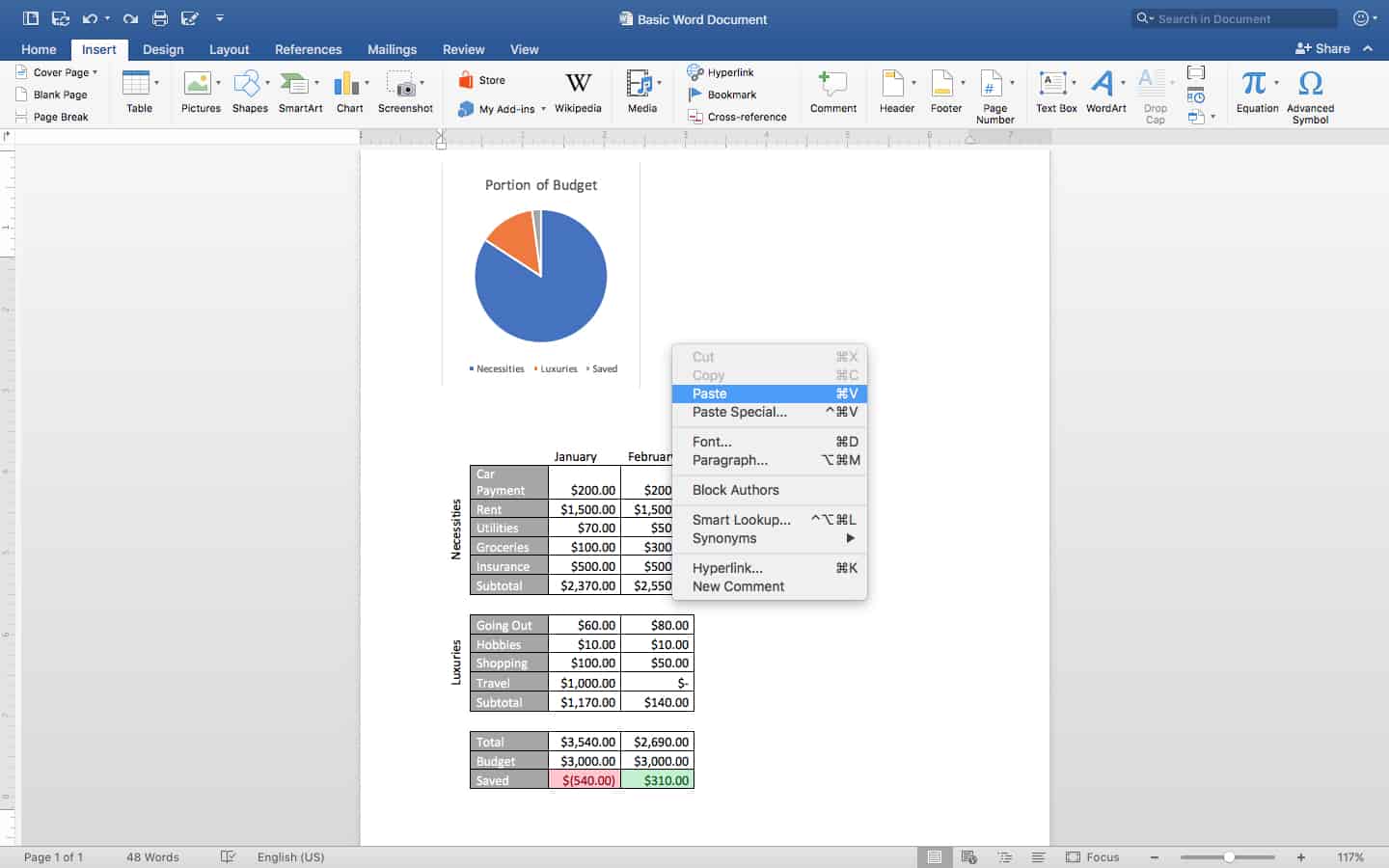
In your Word document, right-click on your mouse and click Paste to paste your chart and your selected Excel worksheet content into your Word document, one at a time. (Note that for this example, we aren’t copying the entire spreadsheet.) You’ll notice that some cell formatting is lost; this is because the data comes into Word and behaves like a table created in Word, rather than as an Excel spreadsheet.
Step 4: Format Your Data
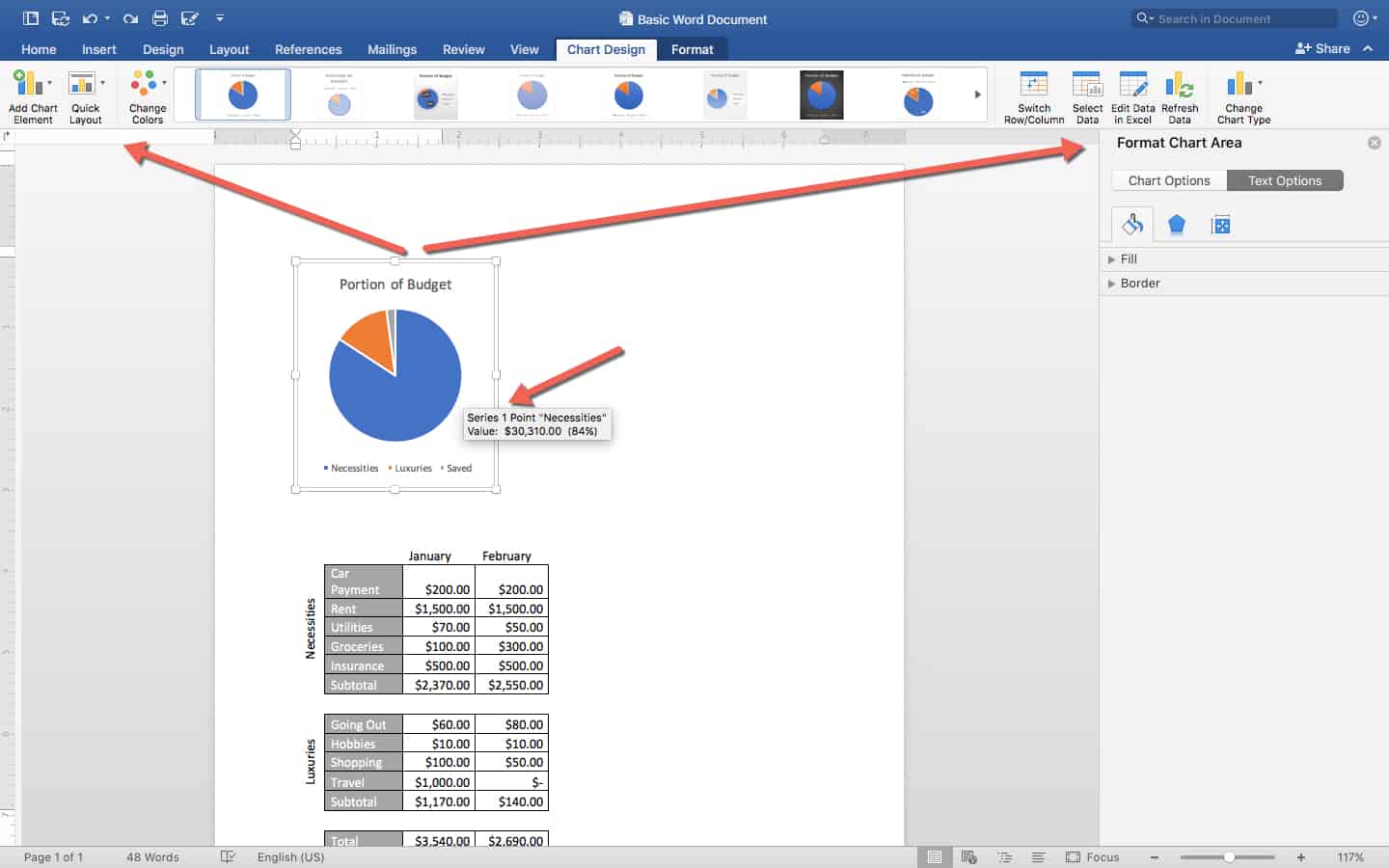
Charts in Word behave a lot like charts in Excel. When you single-click a chart to select it, it opens the Chart Design and Format tabs so you can manipulate information (for example, the design and layout). If you need to change some of the chart’s data, click Edit Data in Excel on the Ribbon. You can also hover over areas of this pie chart to surface additional information such as how many dollars the blue portion represents.
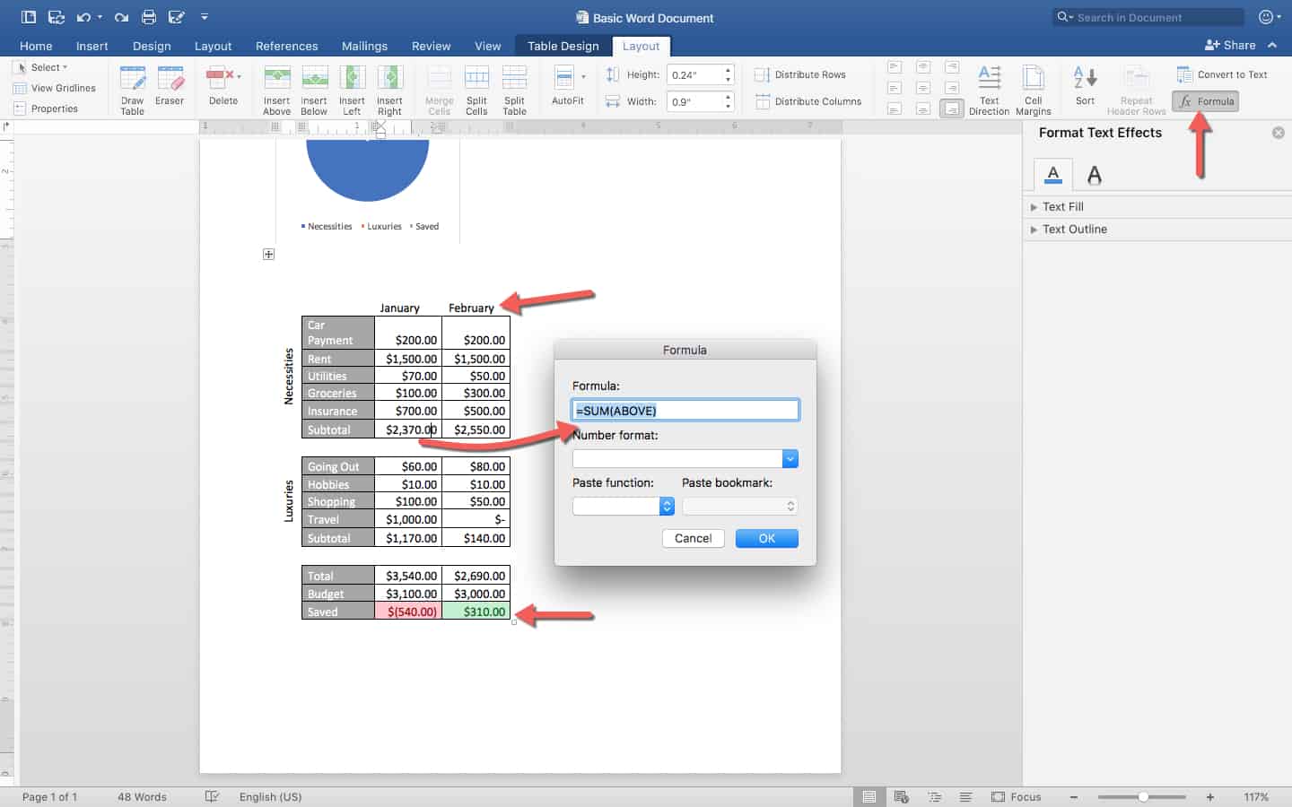
By contrast, spreadsheets and tables don’t behave the same in Word, because Word’s table abilities are much more limited. A lot of the formatting as is kept intact, but you lose almost all the formulas. For example, notice the months in the header are no longer angled 45 degrees upward. If you click on the Formula button while keeping your cursor in any cell, the formula that cell contains should appear. The January subtotal for Necessities claims to have the formula =SUM(ABOVE), meaning this cell is the sum of every cell with numbers above it. However, this isn’t true — editing the cells above won’t update the numbers. You can re-enter this formula, and it will insert the new sum, but it will treat the rest of the text inside this cell as just text, squeezing the new sum in with it.
The conclusion? Copying tables directly from Excel can be a quick way to get a visual table into Word. However, it is not useful if you need to update the data since it doesn’t retain formulas. Charts, however, are fine to copy and paste into Word, as they are still editable in Excel with their full functionality.
How to Create an Excel Spreadsheet and Chart Directly in Word
Step 1: Create and Save a Word Document
Create a Word document in the same way as above, and remember to save it.
Step 2: Insert New Excel Elements
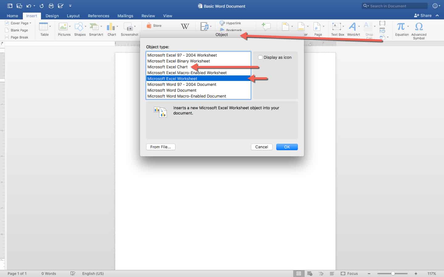
This time, open the Insert tab and go to Insert Object, then click either Microsoft Excel Chart to insert a chart, or Microsoft Excel Worksheet to insert a full worksheet. Click OK. Either option will open Excel.
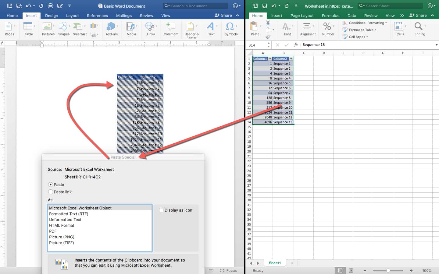
The Microsoft Excel Worksheet will open a blank Excel sheet. You can enter whatever information you want into it, following the same process as you used in the Excel tutorial above. Anything you change in Excel will immediately change in Word, as well, whether it’s spacing of cells, color and border formatting, or the formulas within them. You cannot change anything about the data in Word, and will again have to double-click the object to open Excel to make edits.
If you find you have extraneous cells, you can also double-click to open Excel, select the data you want, then right-click and select Copy. When you go back to Word, right-click and select Paste Special in the Edit menu, then click Microsoft Excel Worksheet Object. Delete the original object.
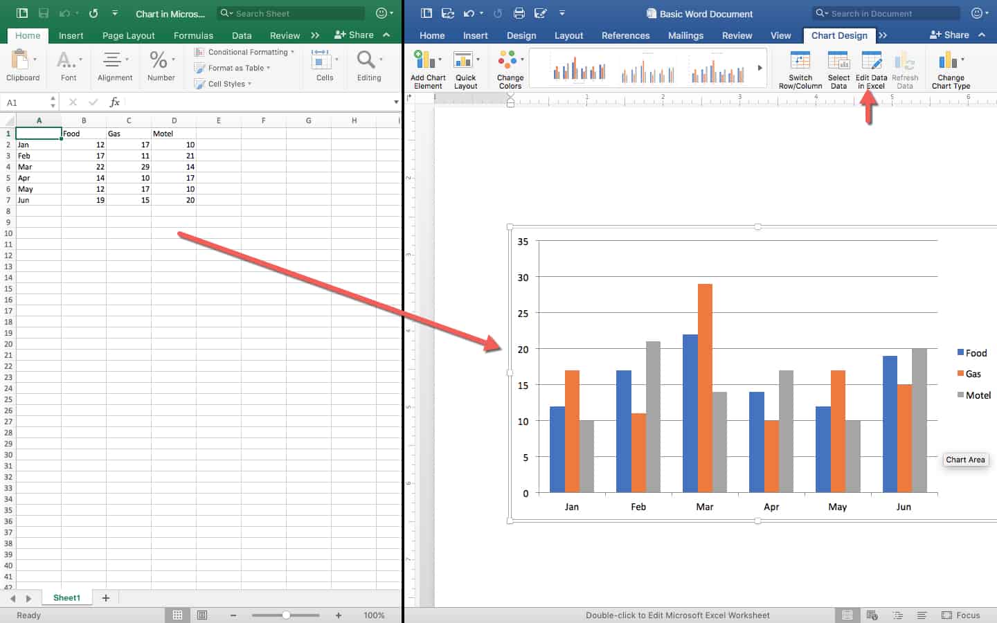
Charts will work as described in the previous section on copying Excel charts. Adding a chart will open an Excel file that has one sheet with the chart, and one with the data. Once you save the chart in your Word document, the data will stay in Excel with only one sheet, and the chart will appear in the Word document. You can change the data in Excel at any time by double-clicking the chart, and changing the styling of the chart in Word.
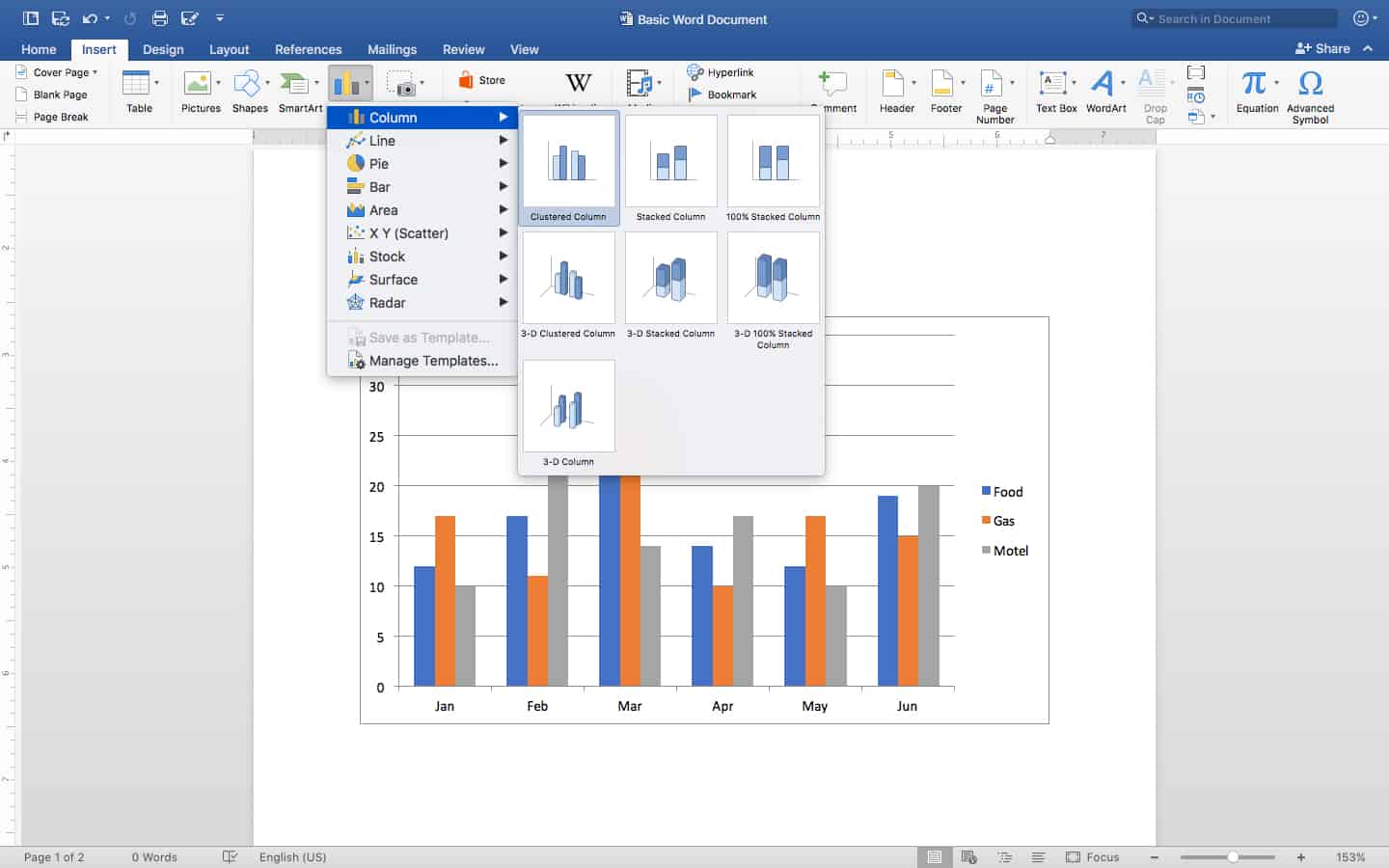
The other way to insert a chart into Word is to click the Insert tab, then click Chart, and select the type of chart and design you want. Then, you will be taken to Excel to enter your data from scratch, which will update your chart in Word.
Step 3: Change Alignment and Text Wrapping
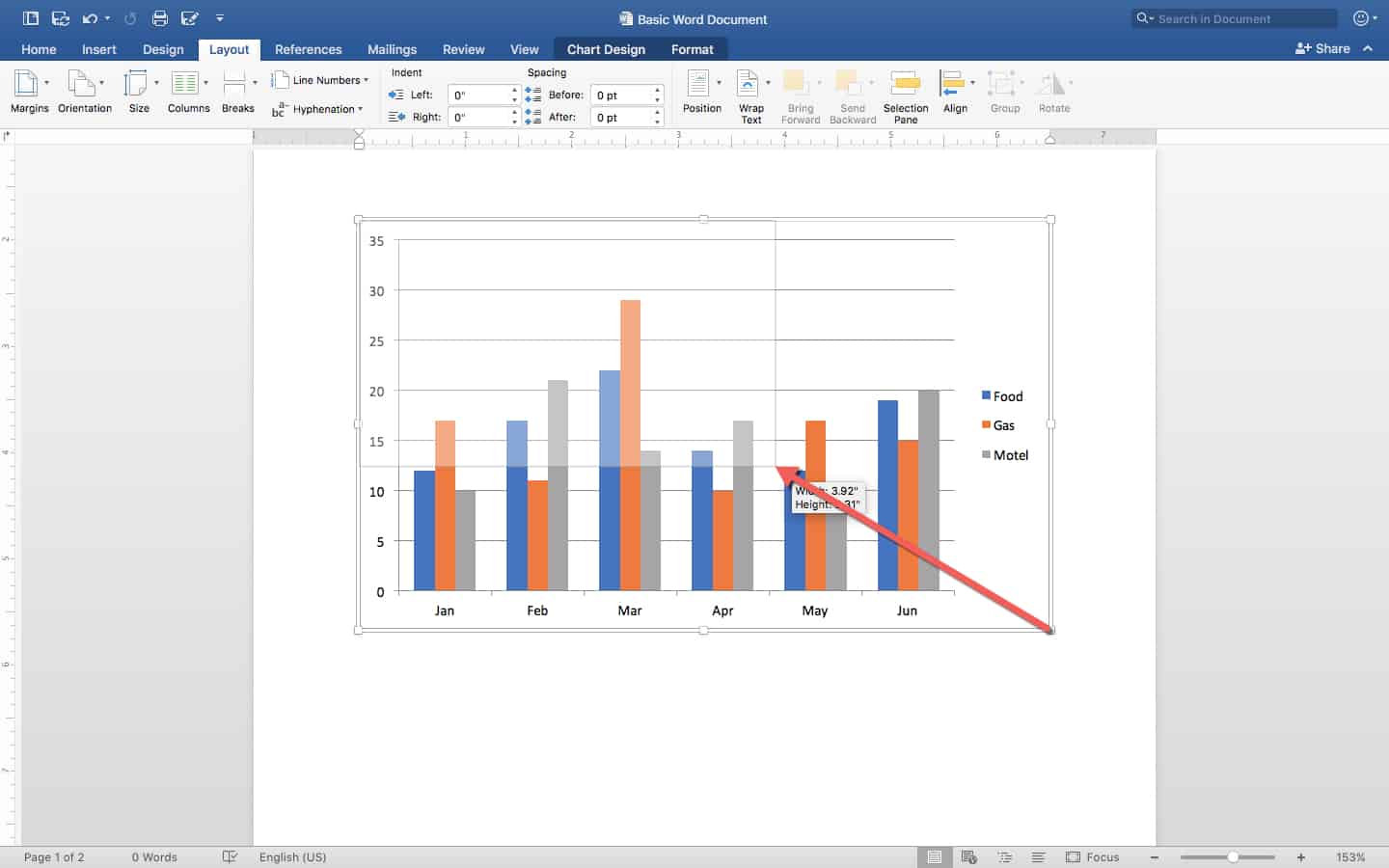
Now you’re going to learn how to adjust these elements in Word to make a working document. First, shrink the size of the chart by clicking the corner of the object and moving it inward. This action creates a more manageable size.
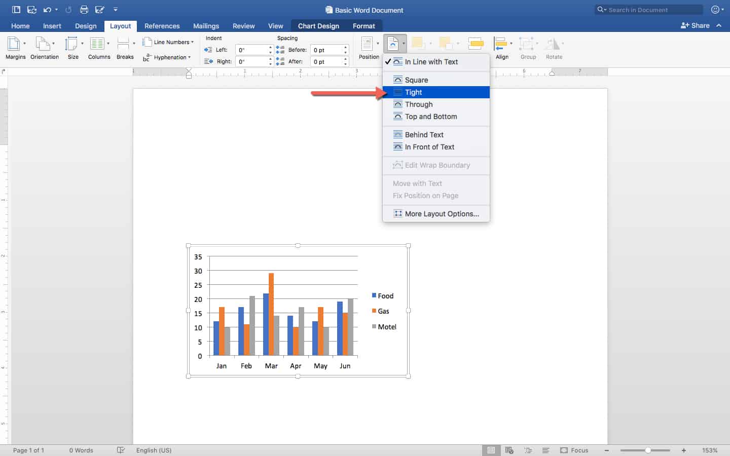
You’ll notice that it’s not very easy to move the chart around the document. Word automatically tries to force alignment on objects so that they don’t slide out of place and confuse users. To move your chart or table more freely, single-click on your table or chart, and click the Layout tab on the Ribbon. Select Wrap Text, and click Tight to drag-and-drop the object anywhere on the page.
When you type words around the inserted chart, they won’t overlap or go behind the object, but instead neatly arrange around it (regardless of where you place it on the page).
How to Create a Pure Word Spreadsheet Table for Simple Scheduling
The final way to create spreadsheets in Word is to create a table from scratch. These tables are generally only capable of simple functions, so we’ll create a weekly schedule.
Step 1: Create and Save Your Word Document
Do this the same way as listed above.
Step 2: Insert a Table
Click the Insert tab, and click Insert Table to see a grid. You can hover over the small squares to create a table of any height and width. Since we’re making a weekly schedule, we’ll do seven columns, and since we’ll have a header with three entries, four rows.
Step 3: Create Headers
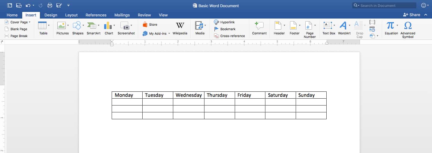
Now we have a blank table with a set amount of cells. The cursor appears in the first cell of top row. Start typing to create column headers. Don’t bother applying any styling yet. Also note that Word tables don’t have any of the Excel features that autofill data like days of the week, so you have to type each day manually.
Step 4: Enter the Data
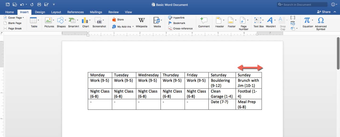
Enter your data for each day, consisting of your necessary tasks and the hours they require. For simplicity’s sake, our table will only include a few values.
Sometimes text might be longer than a cell, causing it to split into two lines. Change the width of the cells with longer content by grabbing the left or right edge of a cell, and dragging it as you see fit.
Step 5: Apply Styles
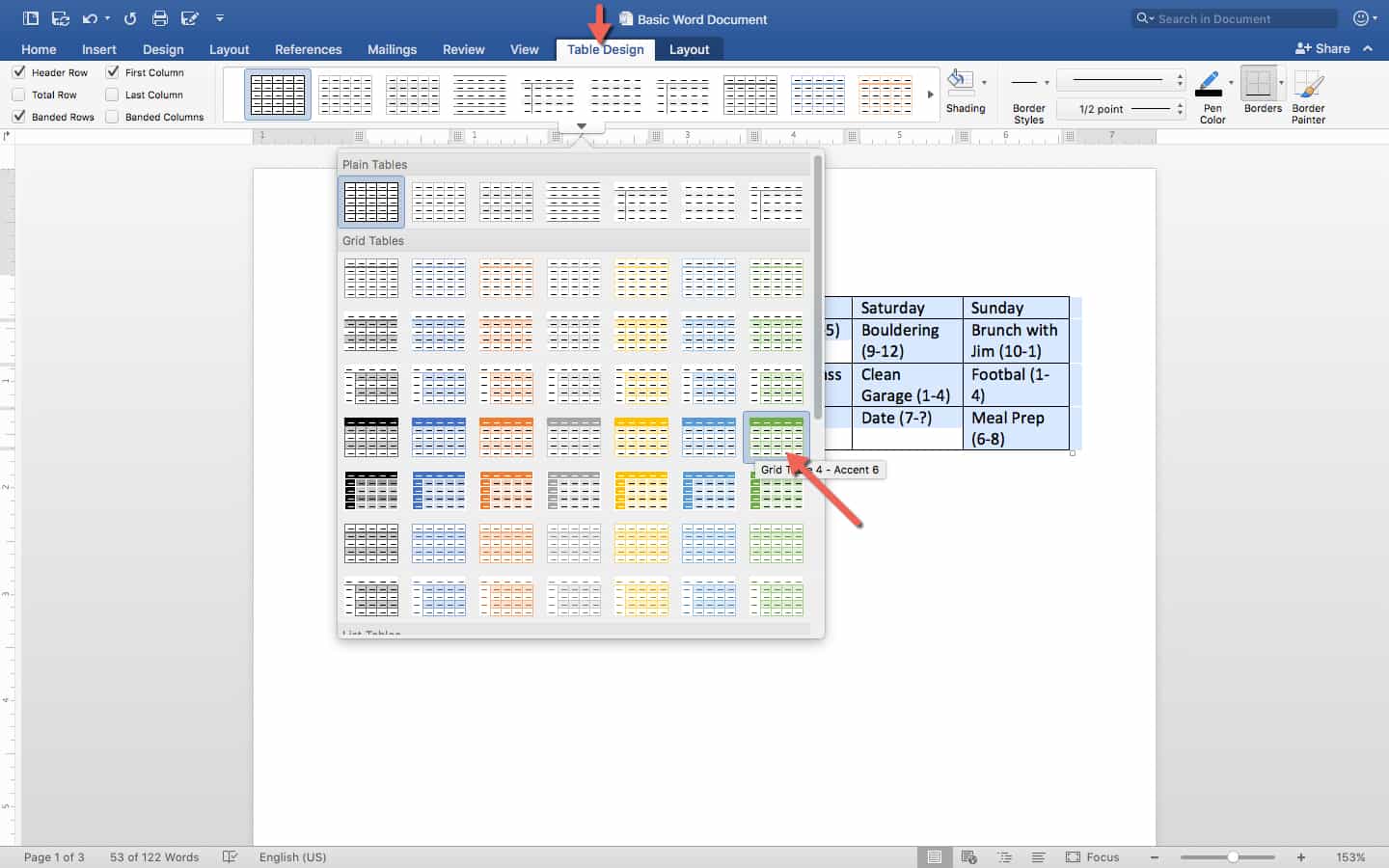
To make the schedule visually appealing, apply quick styling presets to it. Click the Home tab. Select your entire table, then choose a preset you like from the Ribbon. Since you have a heading row, make sure to choose a style that makes it visually distinct.
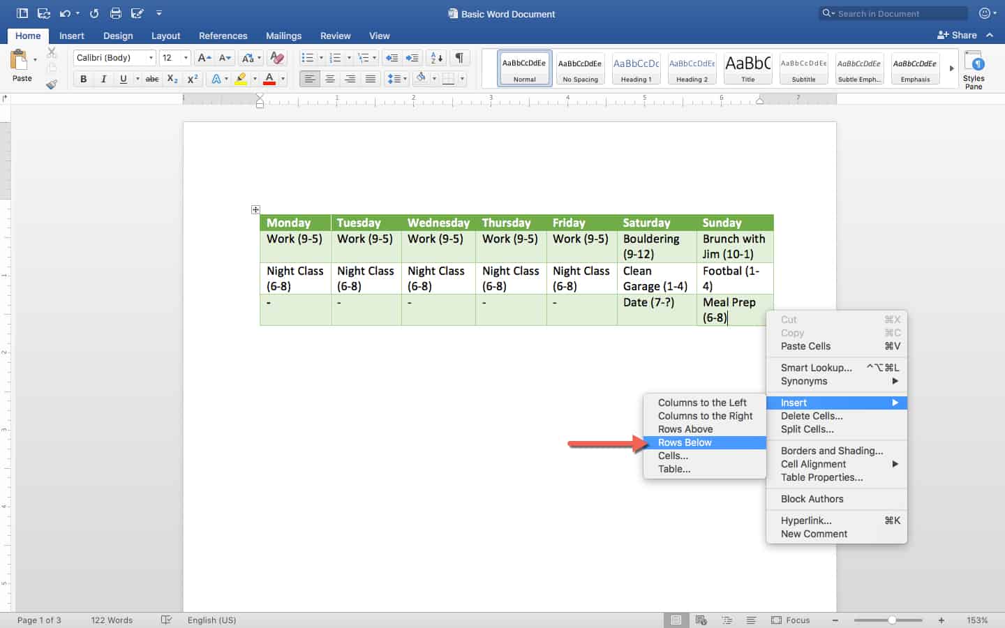
Now you have a simple, nicely-designed table you can use for day to day scheduling. To extend it and add more items to your to-do list, click a row and then right-click on your mouse and choose Insert: Rows Below.
See a complete list of keyboard shortcuts in Microsoft Word.
How to Make a Spreadsheet in Google Sheets
This section will cover all the basics for working with Google Sheets. Google Sheets is a spreadsheet app that lives in the cloud, meaning you never have to download anything, and you can update Sheets from any computer or smartphone. Most notably, it’s free — anyone with a Google/Gmail account can access all of its features.
Unique Features of Google Sheets
Google Sheets is not quite as robust as Excel in terms of functionality. It has fewer formula functions, a less accessible toolset, and you can’t set up any automation macros. What Google Sheets does have, however, is quite good for basic users: real-time collaboration abilities. This means that you can share a Sheet with other Google users, collaborate with them on the same spreadsheet, and see each other’s changes and comments instantly.
Google Sheet’s other unique feature is Explore, which lets you pull up instant insights about data, and also auto-generates charts, tables, and graphs to insert into a document.
Sheets integrates with all other Google products, allowing you to insert Google Forms data automatically. Sheets you create will be saved to your Google Drive account, and you can quickly insert any images you have in Google Photos.
Understanding Your Main Screen
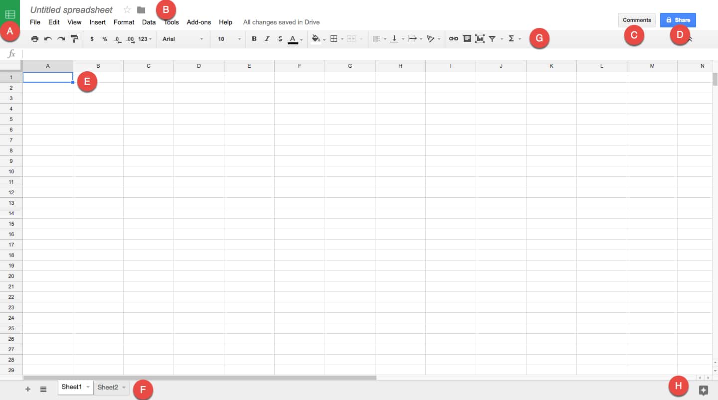
A. This takes you back to the Google Sheets hub page, which contains your most recent Google Sheets and a number of templates.
B. Use this area to name your Sheet. Click Untitled Spreadsheet and type a title for your sheet. Clicking the star lets you “favorite” this sheet so it’s easier to find. Clicking on the folder icon shows you where this file is located in your Google Drive, and allows you to move it.
C. All the icons along this grey section are your main toolbar. They include simple formatting options, alignment options, commenting, filtering, and some function tools. Below these tools is the Formula Bar, which works just like the Excel Formula Bar. You can enter and view different formulas for cells here.
D. The Comments button opens all comments and allows you to leave comments on the current cell or range of selected cells. It also lets you choose notifications settings: get notified every time you make a change made, every time any user makes a change, or never.
E. The Share button is essential to Google Sheet’s value proposition. When you click it, you can enter in the email addresses of everyone you want to receive the Sheet. Start typing the name of someone in your Google Contacts, and Sheets will recognize and autofill it. You can also choose the permission level of people you’re sharing with: either let them view it, let them view and comment, or let them view, comment on, and edit it. You can also lock down more permissions in Advanced Settings.
F. This is your workspace. It functions very similarly to Excel, with columns A-Z and beyond, and rows 1-any number you like. Each cross-section is a cell with a unique address, like A1 highlighted here. This is important for formulas.
G. Use these tabs to access the multiple sheets in one Google Sheets document. The tabs function exactly like Excel’s sheets, but you can color them to easily differentiate.
H. Hovering over this icon surfaces Explore. Clicking on this brings up a righthand pane that generates unique information about any selected group of cells, charts, or tables.
Navigating the Tools in Sheets
Unlike Microsoft products, Google doesn’t have a variable Ribbon of tools, just a series of drop-down menus with similar functions. This section will cover where to find all the spreadsheet tools in Google Sheets.
A. These are some basic functions, including the print tool, undo and redo, and the format paintbrush. Use these tools to take the color/style/attributes/formats of a selected cell and apply them to any other cells you highlight immediately afterwards.
B. Use these text formatting tools to turn number entries into percentages, or standard dollar formats like “$1.00.” Use the quick buttons in this area to add or remove a decimal place.
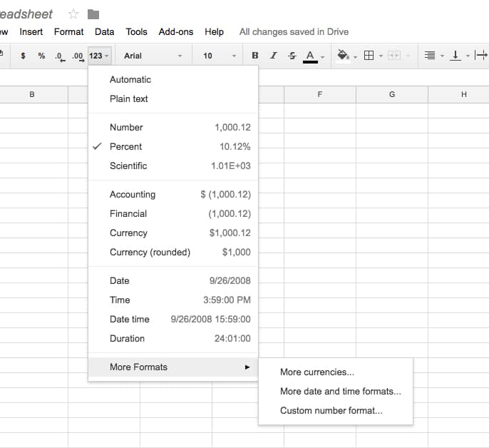
Click the drop down to see more currency, date and time formats, and other options hidden in another menu.
C. This is a standard font selector. Choose any built-in fonts to format the text in any cell.
D. A standard point-size selector for any characters you’re typing into a cell.
E. These are mostly standard style formatting tools for text, like bold, italics, and text color.
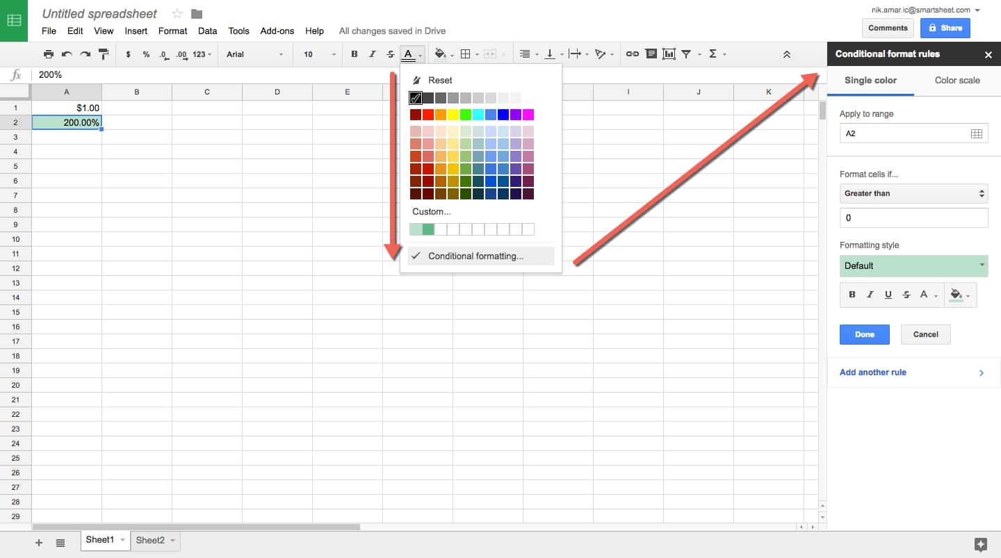
The text color selector is also where you’ll find the “conditional formatting” tools. These tools allow you to choose a range of cells and create if/then conditions to change their formatting (color, font, size, background color, cross-out, and more). You can add numerous rules to a single selection of cells so their format will reflect your chosen status at a glance.
F. This is where cell style formatting options live. You can also access conditional formatting tools in the paint bucket drop-down menu. Use these tools to either select or draw your cell borders, including thickness and style (dotted line, straight line, etc.). The last button here controls merge, and works just like it does in Excel and Word tables.
G. These are alignment tools. You can choose left, right, and center align, as well as top, bottom, and floating alignment in the cell. The third icon is Text Wrap, allowing text to either overflow into the next cell, wrap downwards and increase the height of your cell, or “clip” the text when it starts overflowing. (The text is still there, it’s just hidden.) The final button in this area lets you angle your text differently, like in Excel.
H. These are tools that work for higher-order purposes. The first lets you make a cell or range of cells link to a website or file. The second is your comment options — just highlight a range of cells and click it to comment. Others can reply to your comments, too.
Next is Insert Chart, which brings up a fairly robust popup window with numerous data visualization options. There are more types than found in Excel, but there are fewer styles of each. In addition to line, bar, and pie charts, there are maps that light up based on location data you include, org charts for companies, radar graphs, and Venn diagrams, to name a few.
The next icon is for sorting and filtering, which lets you insert filter menus on top of each column that you can update and change in real time.
The final icon is your primary formula drop-down menu. It only shows a few functions by default — SUM, AVERAGE, COUNT, MIN, MAX. The rest of the functions are hidden in More Functions, which brings up a new page that just has a list of functions. The Formula Bar also has an autocomplete feature: start typing “=” and a couple letters to reveal a list of functions with those letters for you to select and insert into the formula.
All the other tools are hidden in drop-down menus, which are covered below. File and Edit contain basic functions for downloading, sharing, undoing, and redoing. The Edit menu also has Find and Replace, which lets you scan the document for any cells containing your search criteria.
View Menu:
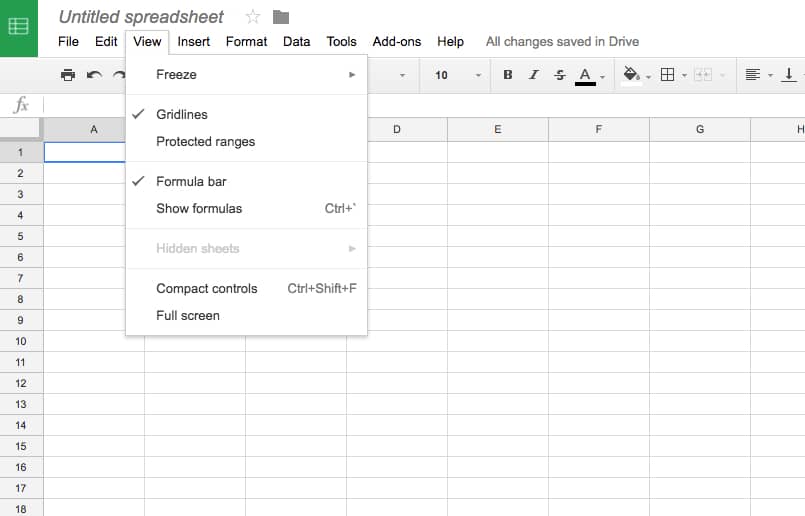
- Freeze: This submenu contains everything you need to freeze panes. You can freeze any number of columns and rows you like, so that necessary information stays put while you scroll around the screen. For example, if your first row has heading names for all the columns, you can see those headings no matter how far you scroll.
- Gridlines: This controls whether or not you see the grids on your worksheet. It might be necessary to remove them when printing, for example.
- Show Formulas: When you enter a formula into a cell, it will display however that formula resolves as a value. For example, if A1=1 and B1=2, and you made C1 have the formula “=A1+B1”, then it would show the value of 3. However, what the cell actually contains is its formula. Show Formulas displays the formula for all cells, rather than their value.
Insert Menu:
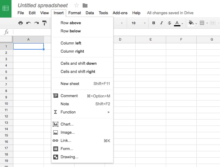
The first few parts of the menu let you insert columns, rows, and cells where you like, or add another sheet to the workbook. You can also add comments, charts, and functions.
- Note: Use notes to explain data and guide users, rather than as comments to be responded to. You can add a note to any cell or range of cells can be given a note.
- Image: Import an image into your Google Sheet from Google Photos, Google Drive, a website, or your computer.
- Form: Insert a Google Form into your sheet. This allows data collected from the form to appear as new rows in the sheet.
- Drawing: Google Drawings is a tool that lets you drag and drop shapes and colors to create simple infographics and diagrams. You can bring them into a sheet straight from that app.
Format Menu:
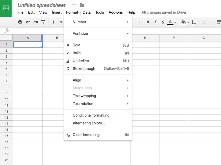
The Format menu consists of redundant tools that are also on the toolbar, but has two additional tools:
- Alternating Colors: A sidebar appears on the right side of the sheet that lets you build tables with alternating colors like in Excel. There are presets, some with a header color that is distinct from the rest, and it also allows you to build custom versions. Simply select your cells and apply it to them.
- Clear Formatting: Highlight cells and press this button to remove all formatting, leaving the cells bare with just their contents and/or values displayed.
Data Menu:
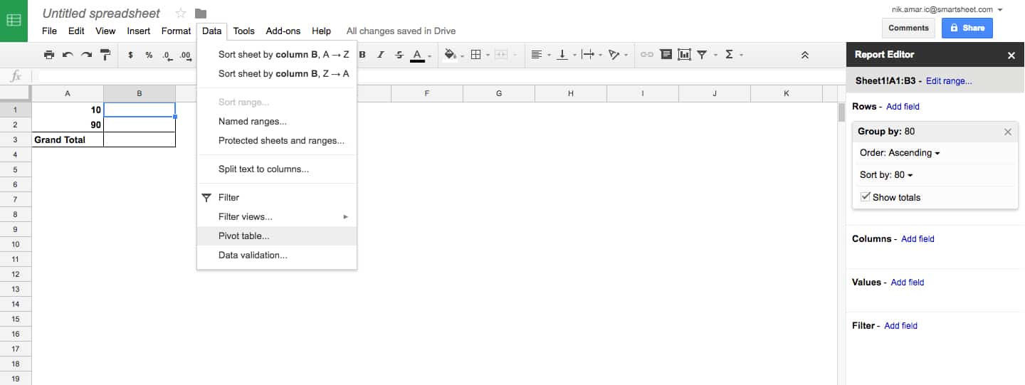
- Sorting: The sorting options are redundant with the sorting tools on the main toolbar. These add ranges that you can sort within.
- Protected Sheets and Ranges: This lets you choose certain cells or sheets that you want to prevent people from editing.
- PivotTable: These PivotTables work like they do in Excel: select a group of data with at least two columns, and create reports. The report editor appears on the side, letting you choose what data you want grouped in rows, columns, and what values and filters to use.
- Data Validation: For more complex sheets, this feature can find errors and missing data for you to correct.
Tools Menu:
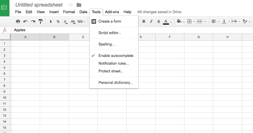
- Create a Form: This launches a Google Form creation window, automatically tied to your Google Sheet. When you embed this into websites or send through an email, all response data will feed into your sheet.
- Script Editor: This allows you to write custom functions and scripts to automate and extend the abilities of Google Sheets. This feature is for advanced users only.
- Enable Autocomplete: A useful setting that allows Google Sheets to use what it learns to fill-in information. It’s recommended to keep this on.
- Protect Sheet: This lets you password protect parts or all of your sheet so that only the right people you’ve shared it with can access it.
- Personal Dictionary: This is every word your Google Account has been told is a correctly-spelled word that doesn’t exist in its main dictionary.
Form Menu:
This menu just has some redundant features about Google Forms.
Add-Ons:
This menu has links to Google Sheets add-on marketplace. These are mostly unofficial extensions that different developers have created to make Google Sheets more useful. They don’t always work properly, and aren’t recommended for elementary users.
How to Create a Product Sales Tracker in Google Sheets
Now that you know about all the tools in Google Sheets, practice making your own spreadsheet from scratch. This guide will cover basics and some of the app’s unique features to quickly produce a great spreadsheet. For this example, we’ll build a more complex spreadsheet than we did in the previous two examples.
Step 1: Create a New Google Sheet
Start by opening Google Sheets. You can search for an existing sheet or open it within your Google or Gmail account, near your icon in the top right corner. The Grid Icon should list the Sheets app. Once you arrive on the main Google Sheets hub page, you’ll be able to see and search for any other spreadsheets you’ve created, and choose templates. Let’s start from scratch and click Blank.
Step 2: Plan Your Data
As with the Excel spreadsheet, you must plan out what data and analysis you need in order to correctly structure your spreadsheet. In this case, we’re making a spreadsheet that can track worldwide sales of different products with different prices and profitability. Since you have multiple products, you’ll need a reference table of pricing, cost, and profit. Then you’ll need a table where you can record every sale, including how many of each product the sale included, and the total profit from those sales. You also need to include calculations that remove different countries’ tax rates from your cost-based profit margin.
To help plan out things like this for your own situation, consider analytical goals. In this case, what information would a company selling products worldwide want to gain from a spreadsheet?
- Which product sold the most units?
- Which country netted the greatest profit?
- Which country had the greatest quantity of items sold?
- What was the total profit from sales worldwide?
Step 3: Create a Reference Table
A. Start by naming your spreadsheet. It’s best to be descriptive and unique, so you can easily search for it later with Google Drive’s search tool.
B. Create names for each column of the reference table. We’ll use Product, Price/Unit, Cost/Unit, and Profit/Unit.
C. The products will be A, B, and C. Add those letters to the cells A2, A3, and AC, respectively. They have variable prices, but all cost the same to produce, so each will have a different profit margin. To create this, click cell D2. Enter “=B2-C2” in the formula bar to calculate the profit of each unit. Then click the bottom right corner of the cell and drag it down to D4 to duplicate the formula for rows 3 and 4. Now you have the profit margin calculation for each product.
D. Finally, to keep it easy to view, apply some styling to the table. Just highlight the whole range of cells, then click the Format menu. From the drop-down, select Alternating Colors, which opens the sidebar menu where you can apply table styles. Select a preset that makes the header distinct. Click the X in the top right corner of the Alternating Colors sidebar to close it.
E. Enter amounts for Price/Unit and Cost/Unit.
Step 4: Create a Sales Tracker Layout
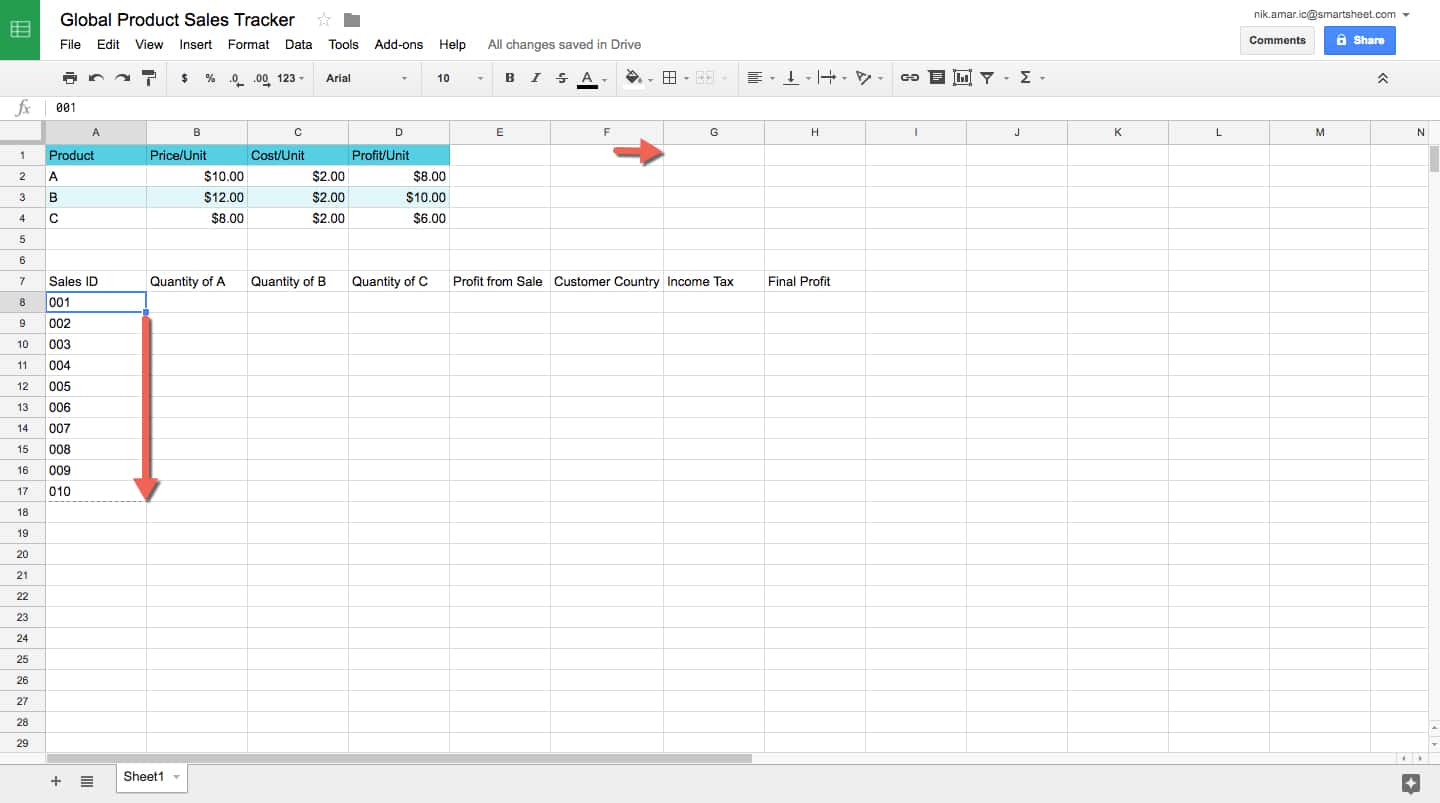
Let’s start laying out the sales tracker table. A company will likely track orders by the order in which they arrive, so click cell A7 and type “Sales ID.” Add order numbers to cells A8 through A17 under the Sales ID header. It’s also important to know how many of each product were sold, so make the next three columns product quantities for A, B, and C. To do this, type “Quantity of A” in cell 7B, “Quantity of B” in cell 7C, “Quantity of C” in cell 7D. Obviously, the company wants to know the profit from this individual sale, so type “Profit from Sale” in cell 7E.
The country of the buyer is also important for our analysis because for a real company that would affect the cost of doing business in the form of taxes, which would also reduce the final profit. You’ll need dedicated columns to track this information, so type “Customer country” in cell 7F, “Income Tax” in cell 7G, and “Final Profit” in cell 7H.
Also note that after entering our column headers, column F wasn’t wide enough for Customer Country, so click on the right vertical line of cell F7 and drag the border to increase that column’s width.
Step 5: Create a Profit Formula
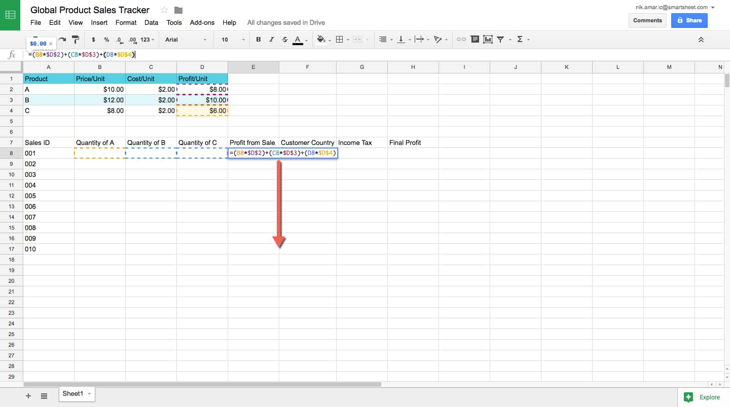
This is one of the more complicated formulas in this article. To calculate the base profit from each sale, we have to multiply each product quantity by that product’s profit margin per unit, and add them all together. Click cell 7E and insert this initial formula: “=(B8*D2)+(C8*D3)+(D8*D4).” We include the parenthesis to maintain the order of operation in the formula. However, there’s a problem.
If you drag that formula down to duplicate it for each sale, it will change the relative location of both the reference cell and its multiplier. For example, dragging it down one cell would result in the formula “=(B9*D3)+(C9*D4)+(D9*D5),” which would mean we’re not taking the same profit margin cells and multiplying them by new quantity levels. To fix this problem, you add “$” to the front of each part of the cell coordinate you want to remain constant. The final result will look like this: “=(B8*$D$2)+(C8*$D$3)+(D8*$D$4).”
Now, when you drag the lower right corner of the cell down through all 10 orders, they will all reference the correct profit margin cells in the reference table. Don’t forget to highlight E8 through E18 and click the $ button on the toolbar. This will place everything into “$0.00” form.
Step 6: Calculate a Final Profit and Column Totals
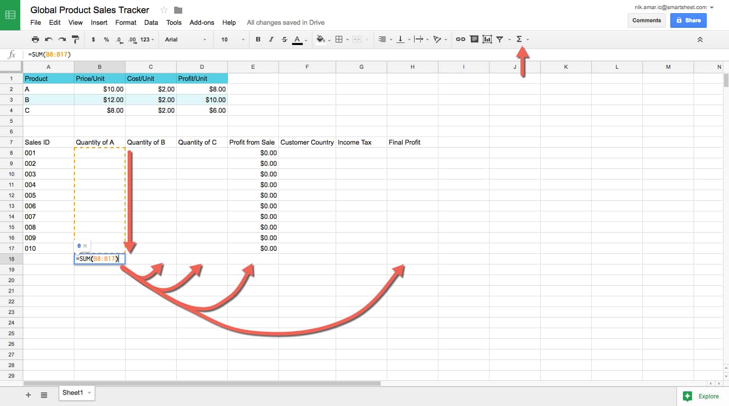
The Final Profit column needs to reflect profit after the customer’s country’s trade taxes. For starters, type “=E8*(1-G8)”. The reason for this is that the Income Tax column will be represented as percentages, where 1 = 100%. Therefore, to subtract the tax rate from the profit, the profit needs to be multiplied by the percentage left over, not the percentage taken out.
Format the Income Tax column by highlighting the cells and clicking the % button on the toolbar. Add the currency format to the Final Profit column by highlighting it’s cells and clicking the $ format button.
Now, use the basic AutoSum formula to place totals counts for each of the quantity columns, for the Profit from Sale column, and the Final Profit column. Highlight B8 through B17, then click the Formula button on the toolbar, and click SUM. The total sum will appear in B18. Now drag this cell’s formula to C18 and D18, then copy and paste it into H18.
Step 7: Add Styling
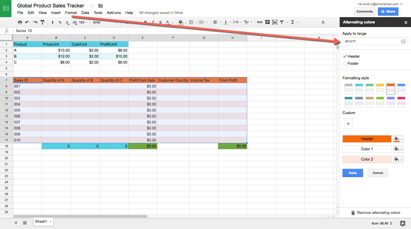
Add styling to your table to help make it more readable. Click and highlight all the cells in the table (excluding the totals). Then click the Format menu and click Alternating Colors in the drop-down menu. Then click a Formatting Style from the sidebar to apply a style to your table. Click the blue Done button.
Next, click and highlight the cells containing totals totals, and click the Fill Color icon on the toolbar and choose a color. Quantity totals might have the same color as the product reference table above. Totals relating to money might be green. Adding color elements to help with quick visual reference is a plus.
Step 8: Enter Data
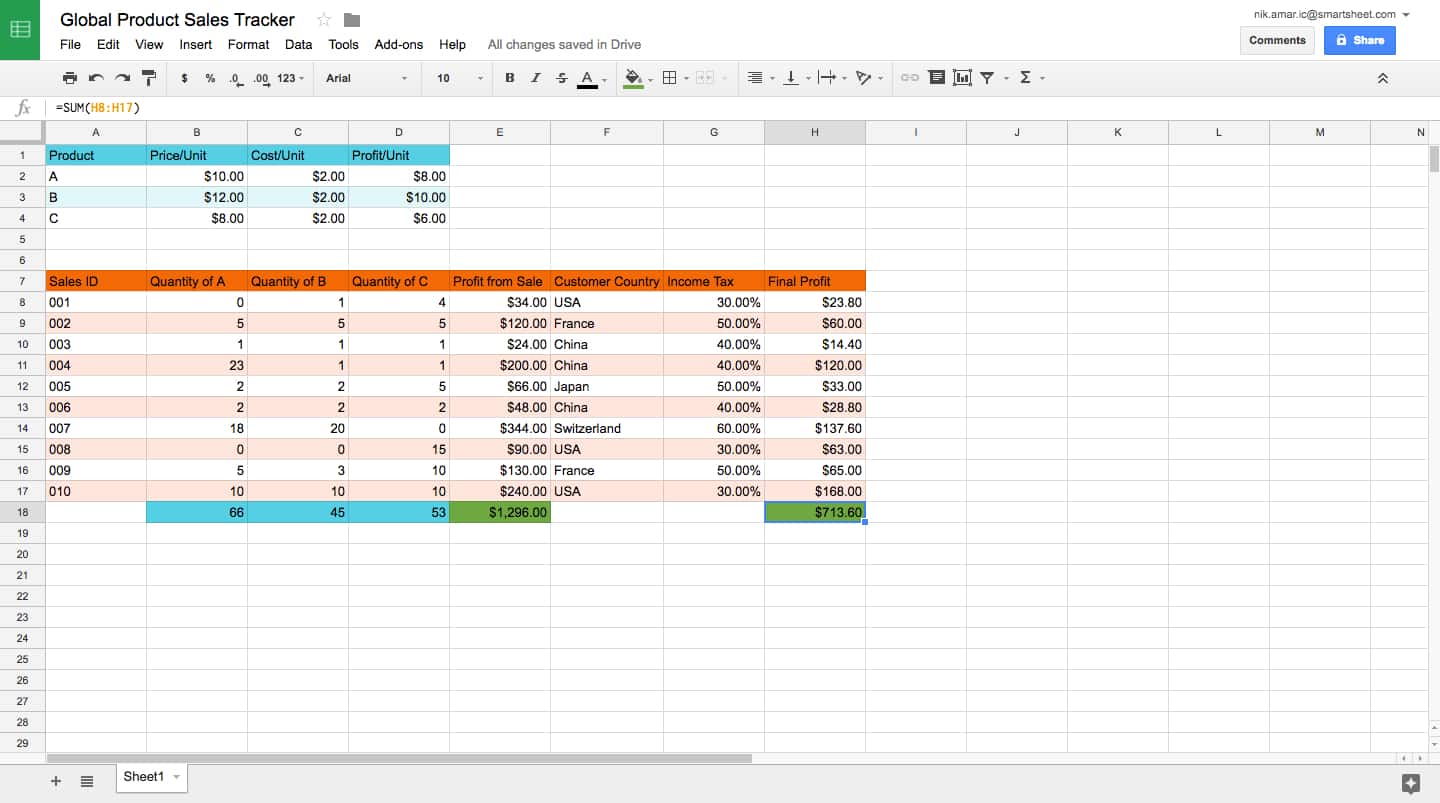
Now enter data for all your table’s quantities sold for every product in every sale, and the buyer’s country. Feel free to use the data in the screenshot above. You’ll notice all the calculations are done automatically.
Step 9: Sort by Country
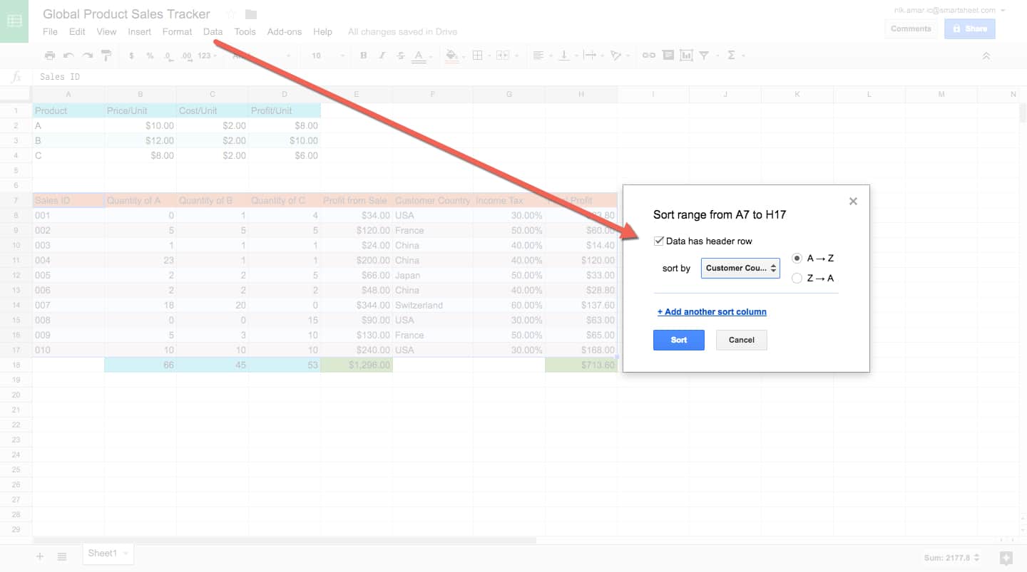
Let’s learn about sorting. To create a table for map data, we have to have totals by country. It’ll be easier to gather this data if we sort it by that criteria. You want to be sure when sorting that you don’t cause any rows to become disassembled — data has to remain together to be useful.
Select A7 through H17 (this is the entire table except the totals). Now open the Data menu, click Sort range, and then tick the Data has header row box. (It won’t rearrange the headers, just everything underneath them.) Then choose the column Customer Country from the sort by menu, going from A to Z. Now your data is arranged by country.
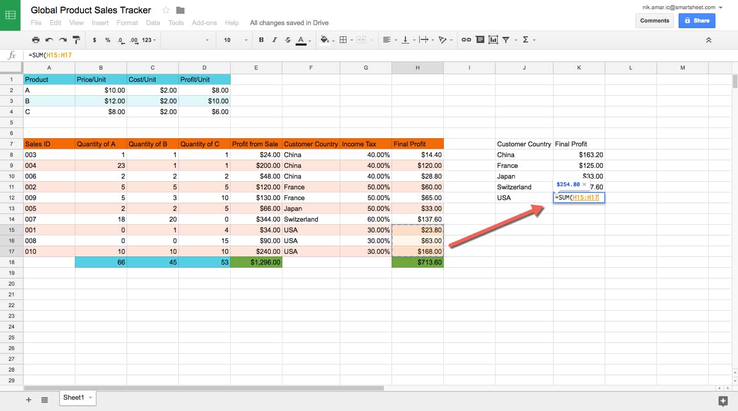
Now use the same steps described above to create a table with just the Customer Country and the Final Profit as headers. Each country only gets one cell, and the Final Profit is the added profit from that country using the formula “=SUM(start cell : end cell).” For the USA, click on cell K12 and type the formula “=SUM(H15:H217).” You’ll need to add each formula manually. You can add styling to it too, if you like.
Step 10: Analyze Data with Explore
Now that you have your data represented to answer all your questions, it’s time to start analyzing them. It’s important to remember that on a real sales sheet, you would likely have 100s of 1000s of sales, not 10, so computer-assisted analysis would be truly beneficial.
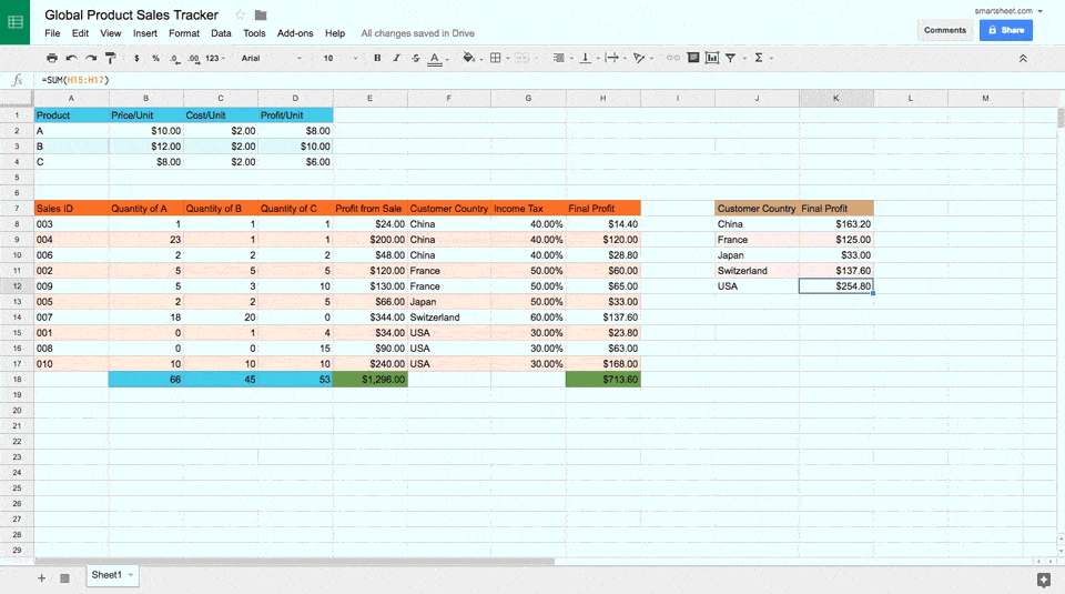
Click the Explore icon in the bottom right corner of your screen to open the Explore sidebar. As you can see from the gif, there are countless ways to analyze the data by selecting one table or another, and exploring the auto-created charts and graphs available. You can also highlight all the cells in a table and click Chart. Now you have a working sales tracker with helpful data analysis ready to go.
Here’s a complete list of keyboard shortcuts in Google Sheets.
How to Make a Spreadsheet in Smartsheet: Step-by-Step Guide
This section will cover all the basics you need to know about working with Smartsheet, a spreadsheet-inspired work and process automation platform that you can use to create powerful, collaborative spreadsheets. It’s a cloud-based application, so you never have to download anything, and it can be updated from any computer or smartphone and stays synced across devices. It is available on any platform with a web browser and you can share spreadsheets with anyone.
Unique Features of Smartsheet
Smartsheet has many, though not all, of the functions that Excel has in a real-time collaborative environment. What makes Smartsheet unique is that spreadsheets, known as Grid View, are only the underlying basis for the app’s capabilities. With Smartsheet you can assign unique properties to each column that affect its behavior in different view-types. For example, if you have a Date column, you can view your data in Calendar View, where each row becomes an item on a calendar. If you give each row a Start Date and End Date column, you can use Gantt View to see where timelines overlap from item to item. If you give your rows a Dropdown List column, you can use Card View to see items as cards that you can drag and drop from one section to another, to denote category or status.
One other major unique feature of Smartsheet is that not everyone needs to purchase the app in order to access it. One paid user can invite internal and external collaborators to a sheet, who can all collaborate on the sheet in real time.
How to Create a Project Tracker Spreadsheet in Smartsheet
You can practice making your own project tracker spreadsheet from scratch in Smartsheet. This guide will cover basics and many of the app’s unique features to quickly produce a powerful, collaborative spreadsheet.
Step 1: Create a New Sheet and Name It
On the homepage of Smartsheet, Click Create and choose Grid to get started.
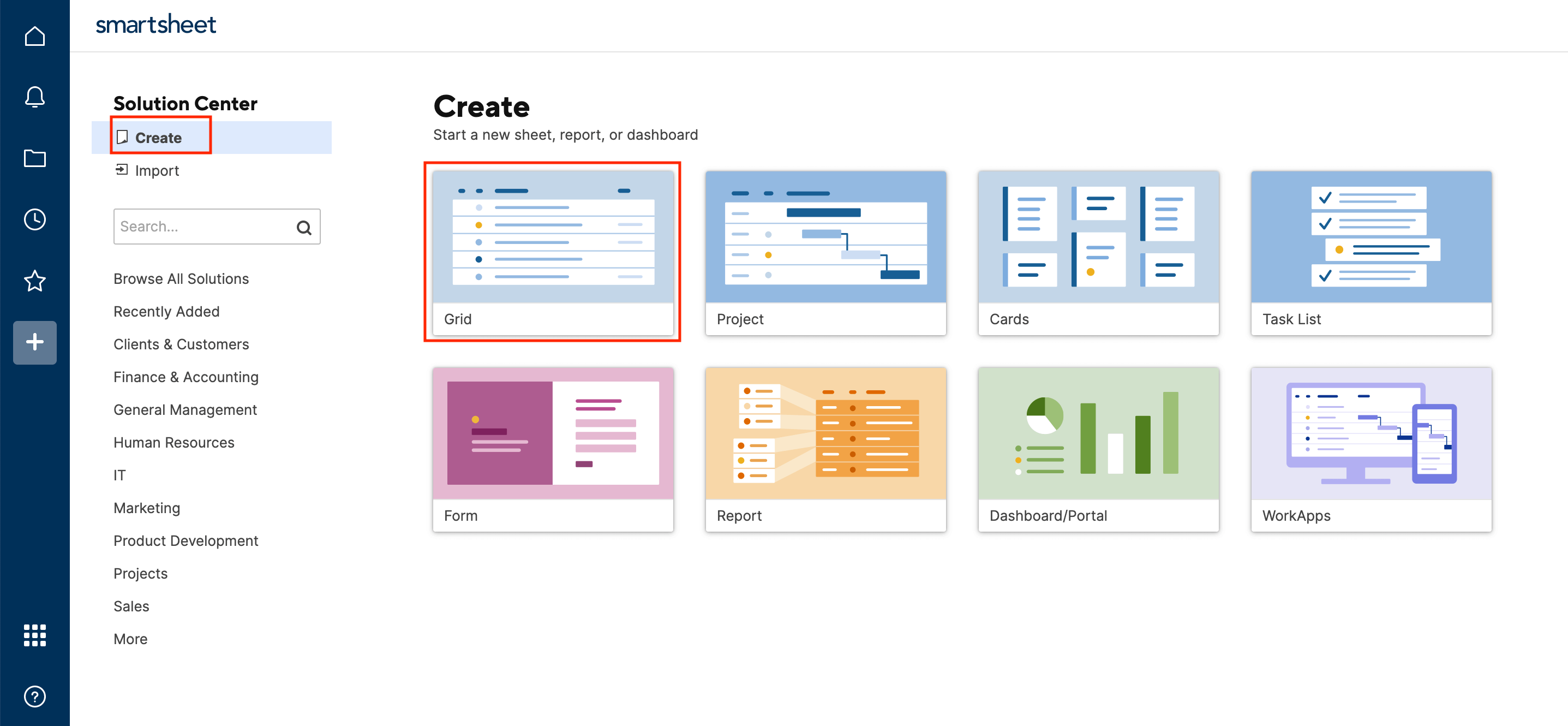
In the popup window, name your sheet “New Project Sheet.”

Step 2: Name Your Primary Column and Enter Data
Start by changing the name of your Primary Column to “Task Name.” Click the cell with the words Primary Column to rename it in the pop-up window that appears on the screen. Click the blue OK button.
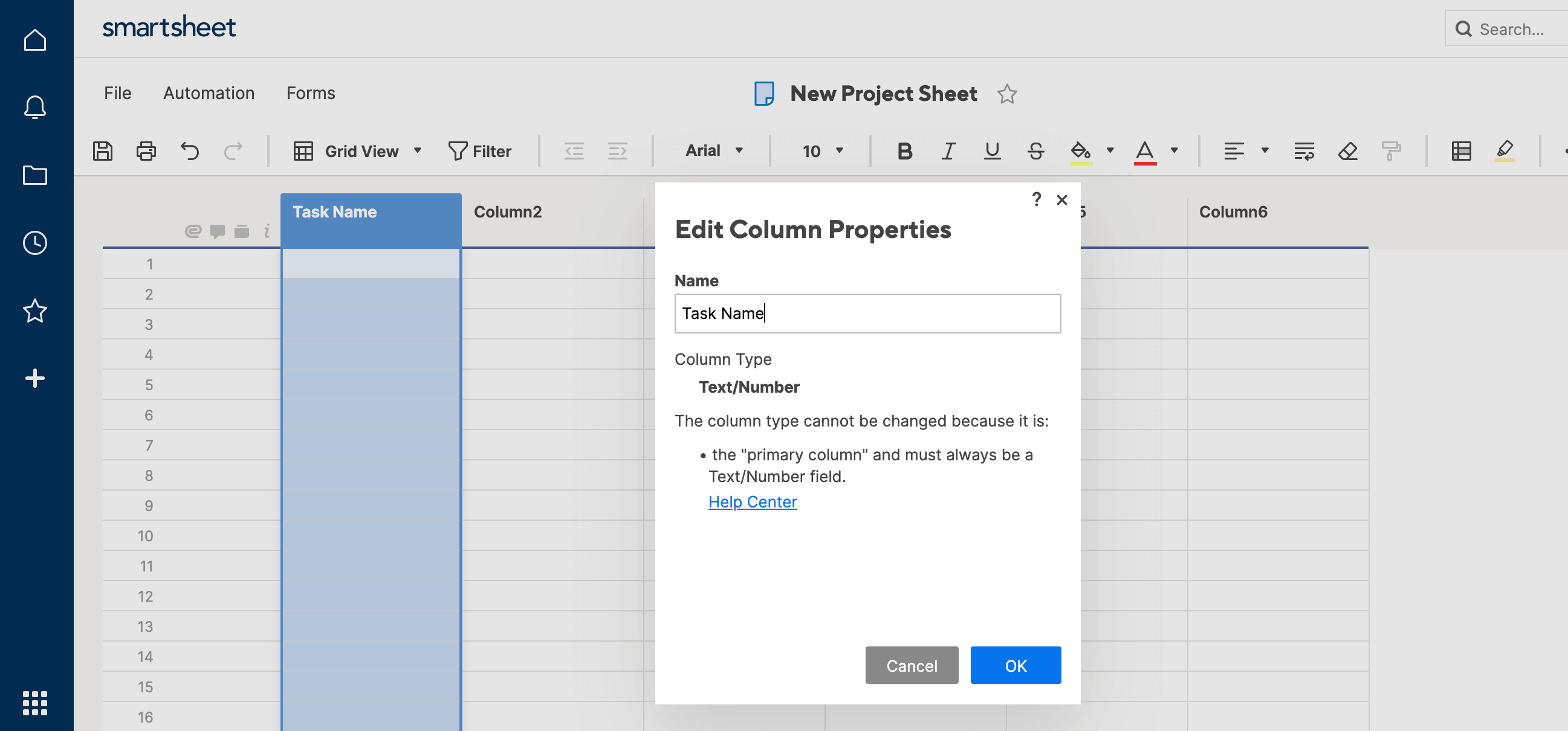
Enter a couple tasks in the column related to whatever you like.

Step 3: Create a Contact List Column
Now change the name of Column2 to “Assigned To.” Click the cell with the words Column2 to rename it in the pop-up window that appears on the screen. Then, click the column property Contact List. Click OK.
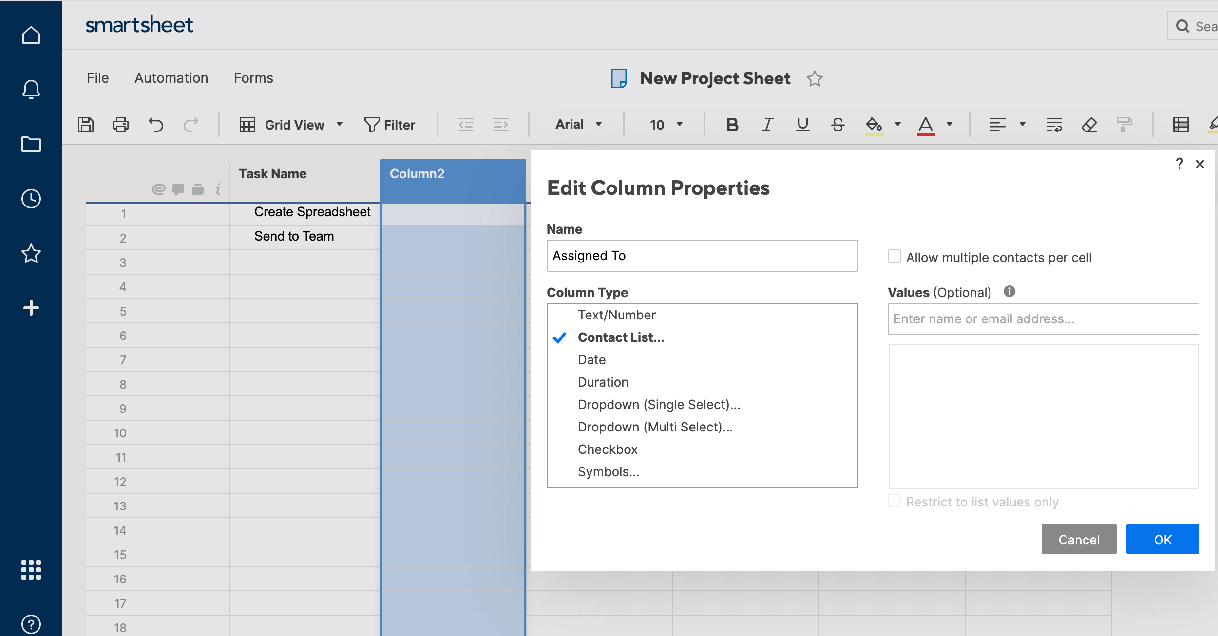
Now you can start typing here in each row of this column, and Smartsheet will autofill names from your contacts to assign tasks to them.
Step 4: Create Start and End Date Columns
Click on the Column3 and Column4 cell to rename them “Start” and “Due,” respectively. Change both their column properties to Date. This will allow you to use both Calendar View and Gantt View, which are useful views when managing large spreadsheets or project data.
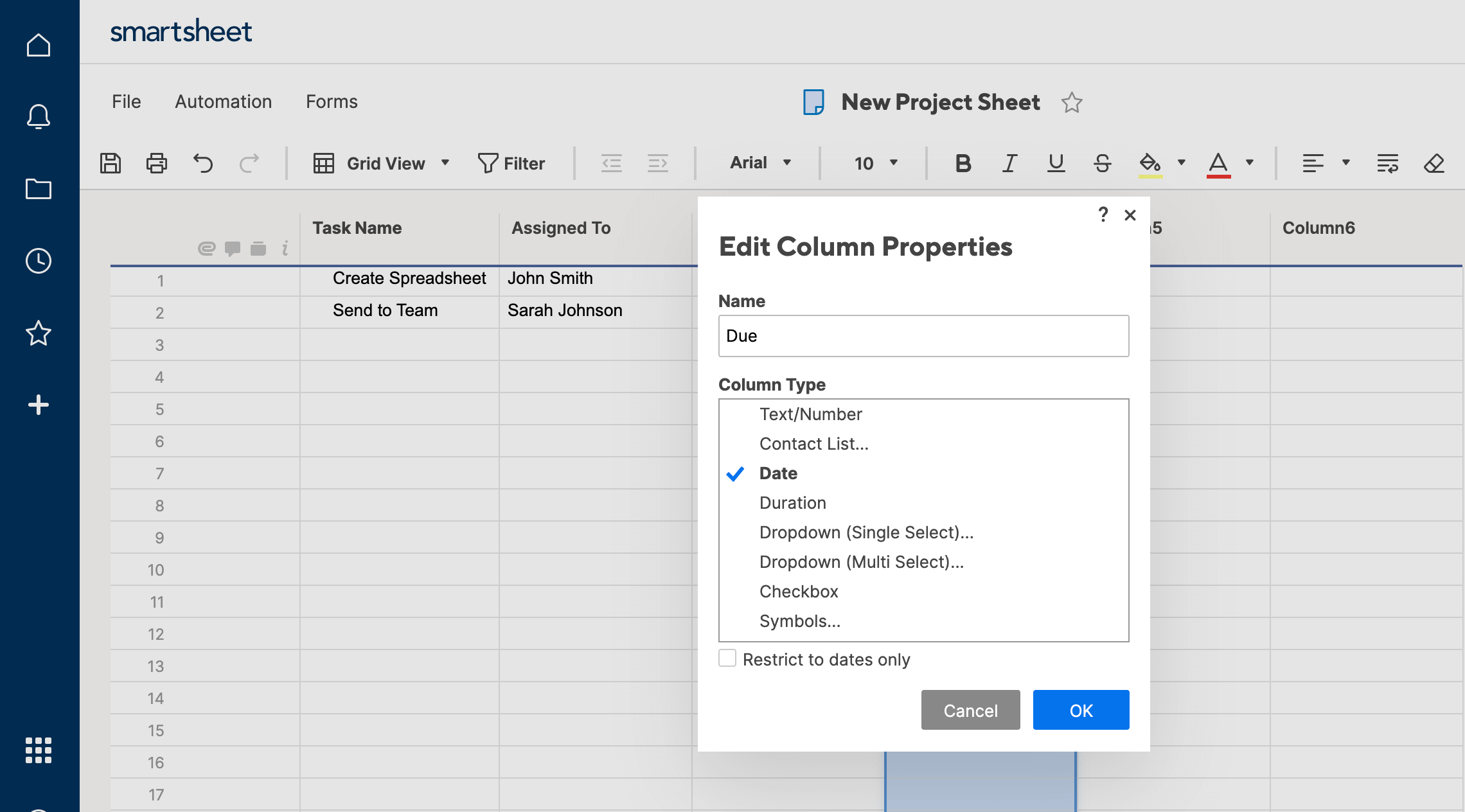
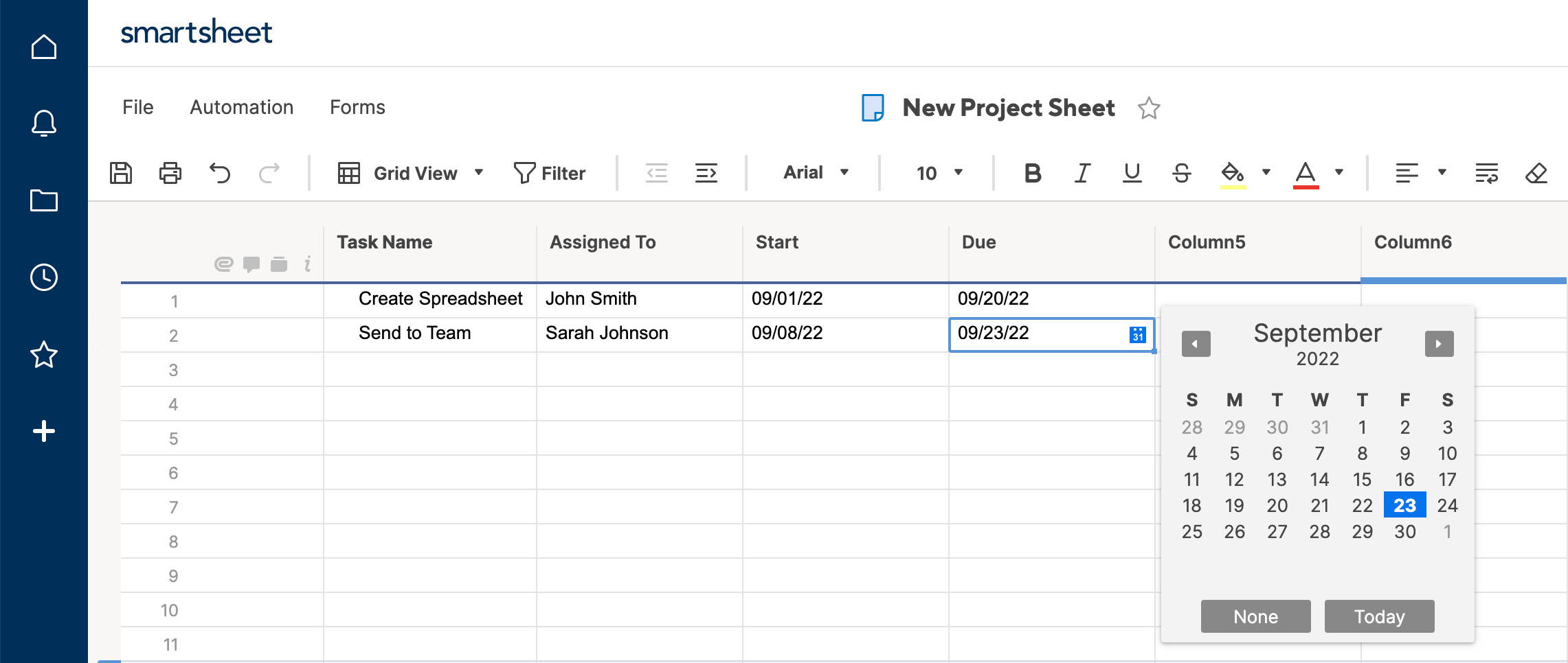
Step 5: Create a Drop Down List Column
Change the name of Column5 to “Stage,” and give it the Dropdown List property. Dropdown List lets you choose a few different options for collaborators to select. It also allows you to use Card View to organize information from grid view by task status (or another criteria of your choosing). You can select either Single Select or Multi-Select options, meaning users can either select only one option, or multiple options, respectively.
For this sheet, select Single Select, and make your status options “Not Started,” “In Progress,” “In Review,” and “Complete.”
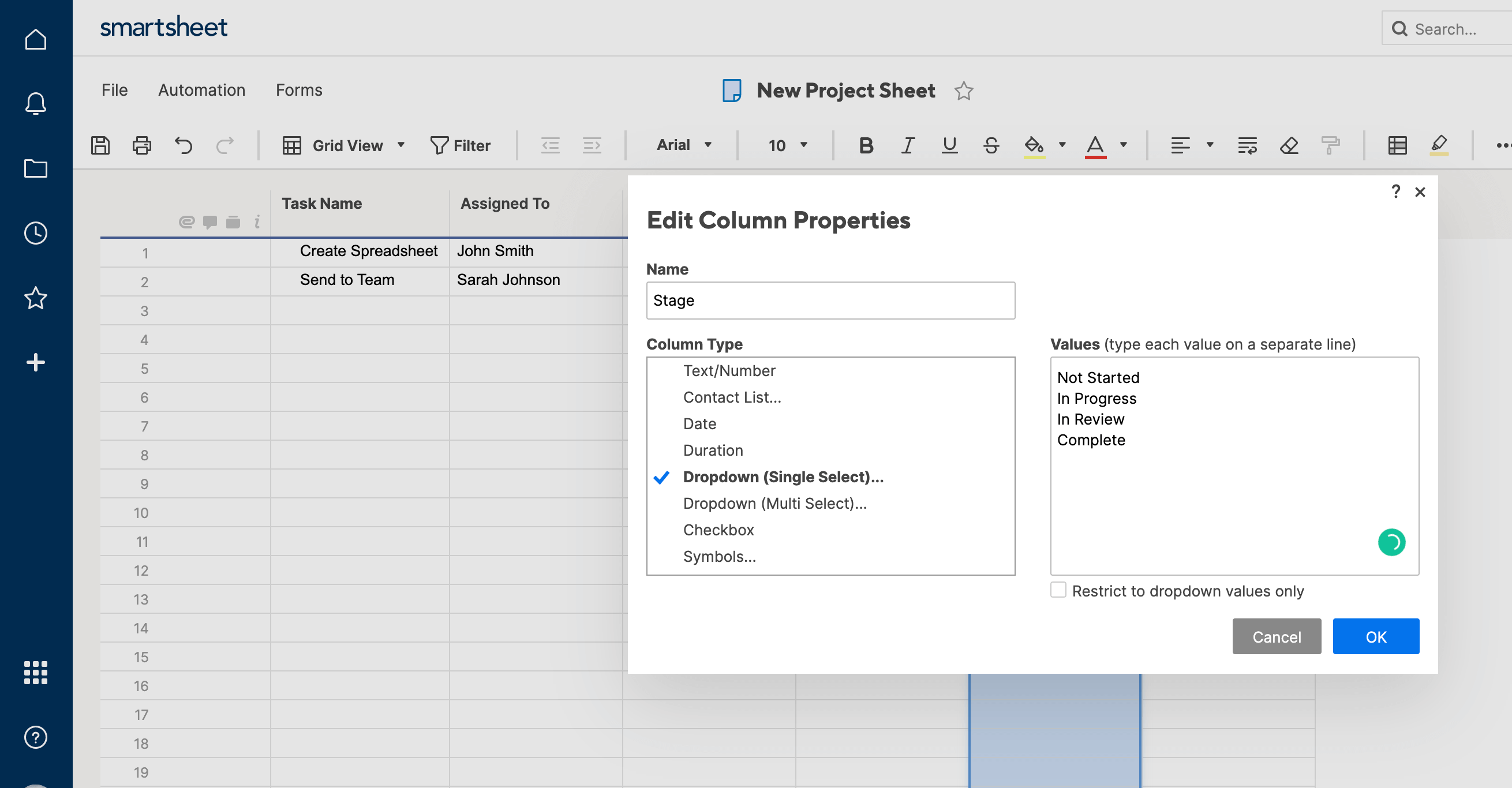
Step 6: Create a Symbols Column
Change the name of Column6 to “Status,” and give it the Symbols column property. This is like a dropdown list, but uses different symbols to represent information about your row, at a glance. In this case, use the RYG balls, which are colored either Red, Yellow, or Green. Red means “late,” yellow means “almost late,” and green means “on time.”
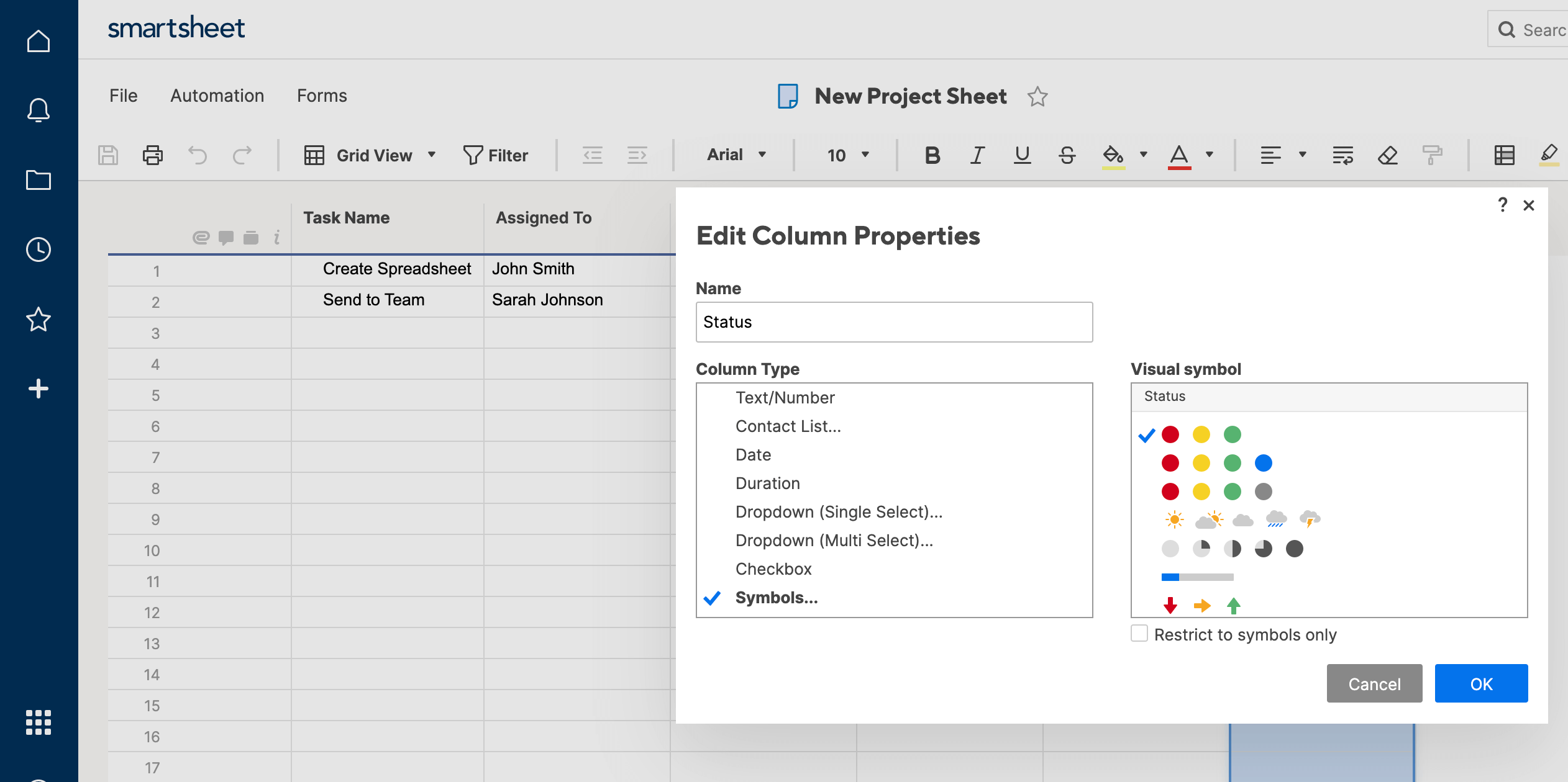
Step 7: Look at Gantt View
Now you have a working project management sheet that’s easy to collaborate on and view multiple ways. Once you enter dates for each task in the Start and Due columns, select Gantt View from the top navigation bar, and to see how your tasks overlap based on start and end dates.
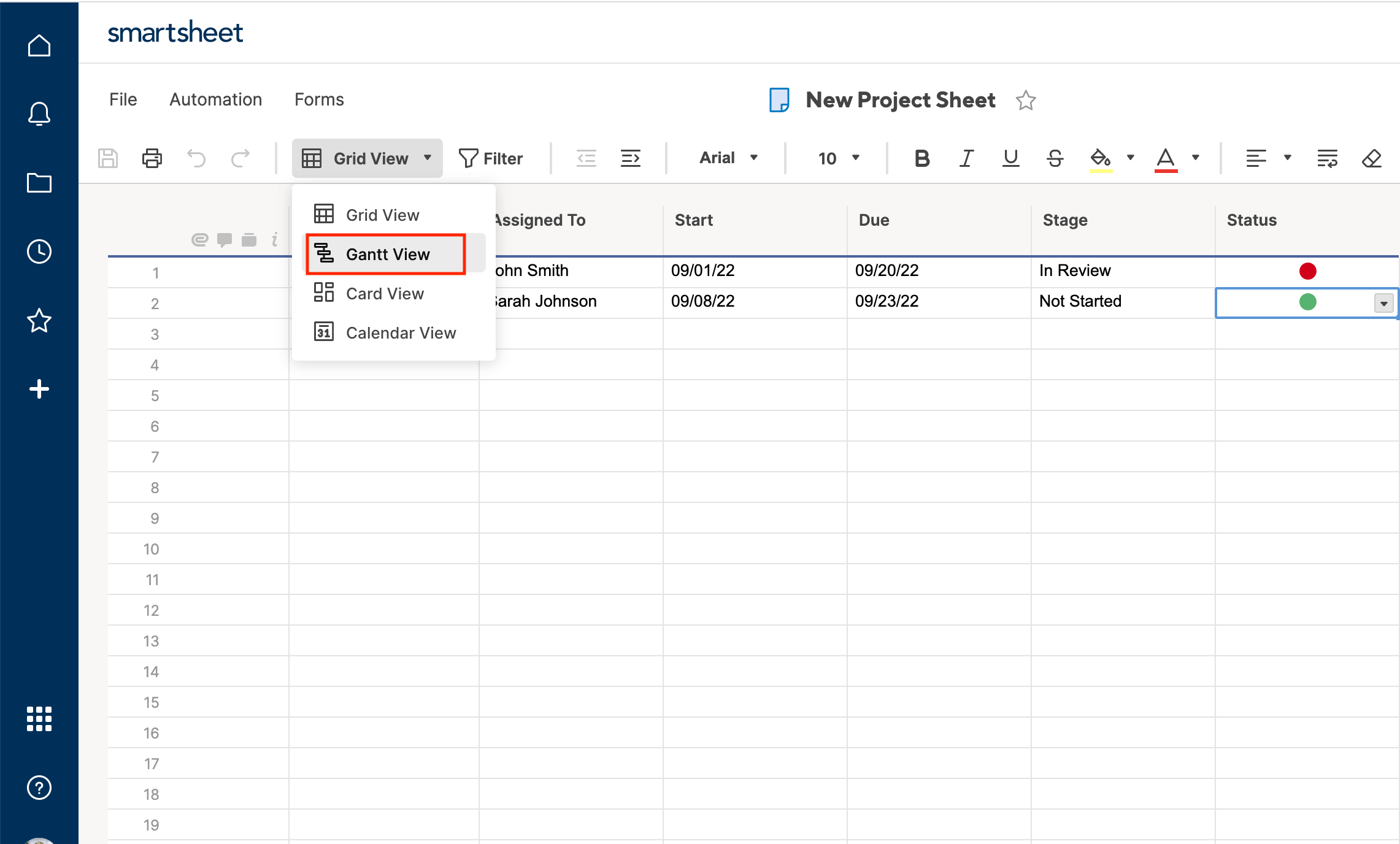
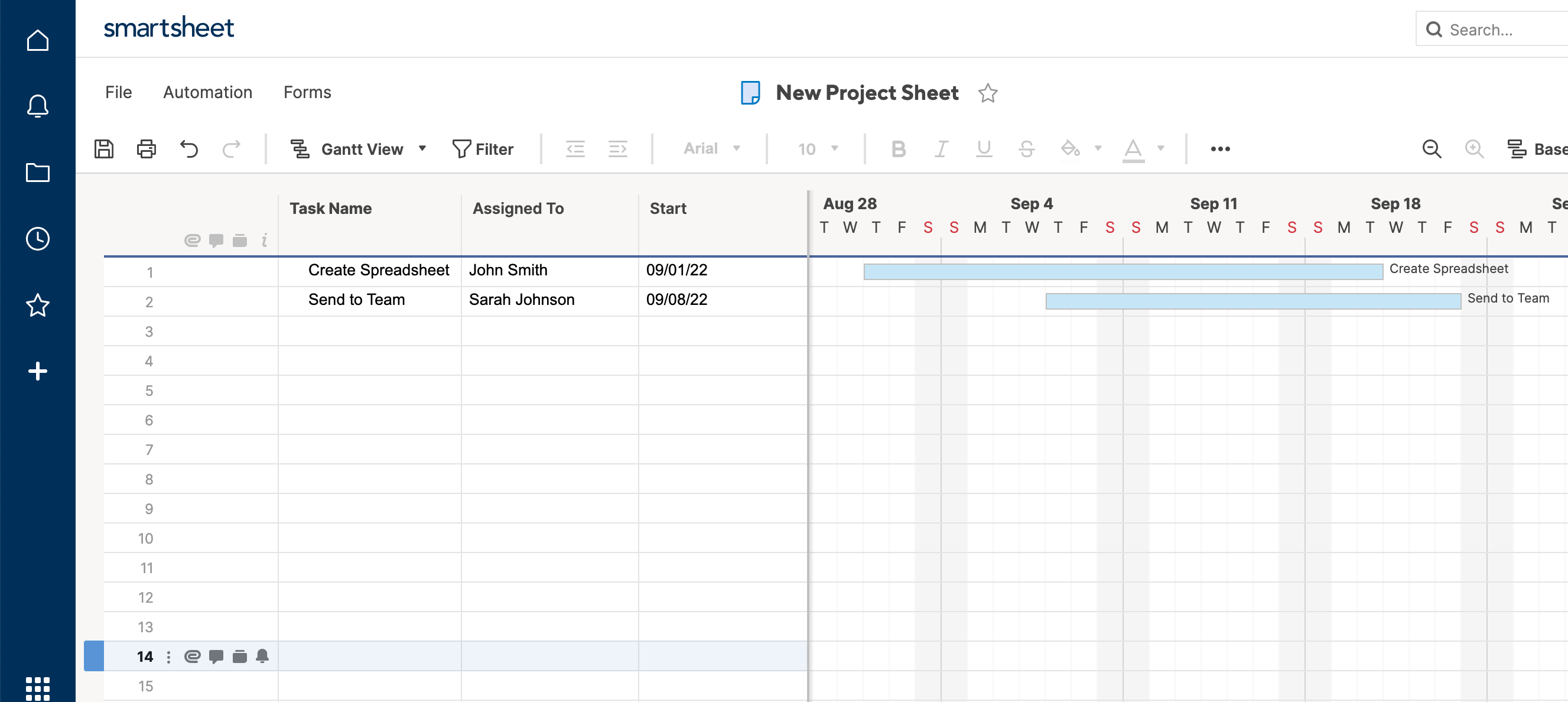
Step 8: Look at Card View
With Card View, you can view all of your task rows by Stage, because Stage is a criteria in your Dropdown List. This is a quick visual way to see how many tasks are outstanding, and where work is getting stuck. When you change from Not Started to In Progress, you can just click the card, and drag it over to the next column. When you go back to Grid View, the status change will be reflected there, too.
Step 9: Look at Calendar View
When you go to Calendar View with multiple date columns, it asks how you want to handle them. Click Display Date Ranges Using and set Start as the start date, and Due as the end date. Now you can view the stretch of time you’re supposed to work on each task.
Just like that, you have a basic, flexible project management sheet ready to go. There’s a lot more you can do with Smartsheet, including adding traditional formulas, but this example demonstrates many of its unique features.
Spreadsheet Use Cases and Templates
Now you know how to build a spreadsheet from scratch in Excel, Word, Google Sheets, and Smartsheet. However, all of these programs also have pre-built, use case-specific templates that will save you time. Here are a few popular templates for each of these programs, so you can start organizing and calculating anything you want.
Budget Templates
- Monthly Budget for Google Sheets
- Expense Report for Google Sheets
- Balance Sheet for Smartsheet
Scheduling Templates
- Calendar Template in Google Sheets
- Weekly Schedule in Microsoft Excel
- To Do List in Microsoft Excel
Work and Employee Management Templates
- Employee Timesheet in Microsoft Excel
- Work Schedule Template in Smartsheet
- Project Management Template in Smartsheet
These are just a sampling of the many personal, industry-specific, or project-specific templates that these programs have to offer.
Create a More Powerful, Collaborative Spreadsheet in Smartsheet
Empower your people to go above and beyond with a flexible platform designed to match the needs of your team — and adapt as those needs change.
The Smartsheet platform makes it easy to plan, capture, manage, and report on work from anywhere, helping your team be more effective and get more done. Report on key metrics and get real-time visibility into work as it happens with roll-up reports, dashboards, and automated workflows built to keep your team connected and informed.
When teams have clarity into the work getting done, there’s no telling how much more they can accomplish in the same amount of time. Try Smartsheet for free, today.
Excel is the most powerful tool to manage and analyze various types of Data. This Microsoft Excel tutorial for beginners covers in-depth lessons for Excel learning and how to use various Excel formulas, tables and charts for managing small to large scale business process. This Excel for beginners course will help you learn Excel basics.
What should I know?
Nothing! This Free Excel training course assumes you are a beginner to Excel.
Microsoft Excel Syllabus
Introduction
| 👉 Lesson 1 | Introduction to Microsoft Excel 101 — Notes About MS Excel |
| 👉 Lesson 2 | Excel Basic Formulas — Add, Subtract, Multiply & Divide in Excel |
| 👉 Lesson 3 | Excel Data Validation — Filters & Grouping in Excel |
| 👉 Lesson 4 | Excel Formulas & Functions — Learn with Basic Examples |
| 👉 Lesson 5 | Logical Functions in Excel — IF, AND, OR, Nested IF & NOT |
| 👉 Lesson 6 | How to Create Charts in Excel — Types & Examples |
| 👉 Lesson 7 | How to make Budget in Excel — Personal Finance Tutorial |
Advance Stuff
| 👉 Lesson 1 | How to Import XML Data into Excel — Learn with Example |
| 👉 Lesson 2 | How to Import CSV Data into Excel — Learn with Example |
| 👉 Lesson 3 | How to Import SQL Database Data into Excel — Learn with Example |
| 👉 Lesson 4 | How to Create Pivot Table in Excel — Beginners Tutorial |
| 👉 Lesson 5 | Advanced Excel Charts & Graphs — Learn with Template |
| 👉 Lesson 6 | Microsoft Office 365 Cloud — Benefits of MS Excel Cloud |
| 👉 Lesson 7 | CSV vs Excel — What is the Difference? |
| 👉 Lesson 8 | Excel VLOOKUP Tutorial for Beginners — Learn with Examples |
| 👉 Lesson 9 | Excel ISBLANK Function — Learn with Example |
| 👉 Lesson 10 | Sparklines in Excel — What is, How to Use, Types & Examples |
| 👉 Lesson 11 | SUMIF function in Excel — Learn with EXAMPLE |
| 👉 Lesson 12 | Microsoft Excel Interview Questions — Top 40 MS Excel Interview Q & A |
| 👉 Lesson 13 | Top Excel Formulas — Top 10 Excel Formulas Asked in an Interview |
| 👉 Lesson 14 | Best Excel Course — 15 Best Excel Course & Classes Online |
| 👉 Lesson 15 | BEST Excel Alternatives — 20 BEST Free Excel Alternatives Software |
| 👉 Lesson 16 | BEST Excel Books — 15 BEST Excel Books |
| 👉 Lesson 17 | Best Microsoft Courses — 13 Best Free Microsoft Courses & Certification |
| 👉 Lesson 18 | BEST Online Data Entry Courses — 6 BEST Online Data Entry Courses & Training Certificates |
| 👉 Lesson 19 | Excel Tutorial PDF — Download Excel Tutorial for Beginners PDF |
Macros & VBA in Excel
| 👉 Lesson 1 | Macro Tutorial — How to Write Macros in Excel |
| 👉 Lesson 2 | VBA in Excel — What is Visual Basic for Applications, How to Use |
| 👉 Lesson 3 | VBA Variables — Data Types & Constants in VBA |
| 👉 Lesson 4 | Excel VBA Arrays — What is, How to Use & Types of Arrays |
| 👉 Lesson 5 | VBA Controls — VBA Form Control & ActiveX Controls in Excel |
| 👉 Lesson 6 | VBA Arithmetic Operators — Multiplication, Division & Addition |
| 👉 Lesson 7 | VBA String Operators — VBA String Manipulation Functions |
| 👉 Lesson 8 | VBA Comparison Operators — Not equal, Less than or Equal to |
| 👉 Lesson 9 | VBA Logical Operators — AND, OR, NOT, IF NOT in Excel |
| 👉 Lesson 10 | Excel VBA Subroutine — How to Call Sub in VBA with Example |
| 👉 Lesson 11 | Excel VBA Function Tutorial — Return, Call, Examples |
| 👉 Lesson 12 | Excel VBA Range Object — Range Property in VBA |