

Logos are essentially symbols or designs
that portray an organization’s brand. While there are a variety of different
types of logos that businesses can choose from, some might wonder if a logo
that consists of just words can be enough to represent your brand.
Can a logo be just words? While there are many ways to design a logo,
a logo can be just words. A logo that
only consists of words is called a “wordmark” logotype and utilizes typography
and font to create a brand’s visual identity through text.
While a logo can be just words, a logo that consists of only words will not necessarily look as simple as you might imagine. There are still many ways to make a wordmark logo stand out. The remainder of this article will discuss this further below.
» MORE: The Power Of Symmetry: 13 Lessons From Famous Logos
Can a Logo Consist of Only Words?
While there are many kinds of logos, a
logo can absolutely consist of only words. A logo designed out of only words is
called a wordmark logo, and it can be a great choice when it comes to branding
your business. In fact, more logos than you might realize, consist of only
words.
Logos are used to associate your brand with a small image or emblem. Good logos should be simple, scalable, versatile, and relevant (Paper Street). You can meet these requirements by designing a logo consisting of just words.
Just because words on a page appear
uniform and dull does not mean that with a little creativity, you can create a
unique, smart logo design that consists of just letters. While it is possible
that a logo can be too simple or boring to represent your brand, there are
still many ways to take mere words and turn them into an icon.
Many successful brands like Volvo, eBay,
and Coca-Cola use wordmark logos, but their logos are so effective that we tend
to see them as images. So do not think a logo cannot successfully portray your
brand just because it consists of only words.
There are many ways to customize a wordmark logo in order to make a brand stand out. Below is a more in-depth look at the wordmark logotype.
» MORE: These Are The Best 67 Fonts To Use For A Logo
Why a Logo Can Consist of Only Words
While there are many kinds of logos and
tons of great examples of effective logos out in the world, many of them
consist exclusively of words. A wordmark logo is a logo that consists of only
words. Using color, typeface, and shapes, you can create a wordmark logo that
is still visually memorable.
While you might be tempted to think a wordmark logo is as simple as choosing a font and typing, “good wordmarks are carefully crafted to have a visual rhythm throughout the word, balancing white space, line weights, and the way the letters interact with each other” (Jessica Jones Design).
While it is possible for a logo to be too simple, there are many ways you can alter the appearance of the words in your wordmark logo to make it a memorable representation of your brand. Understanding what kind of variations you can add to a wordmark logo can keep you away from an oversimplified design.
» MORE: The Ultimate List of The Best Online Design Makers
Logos Often Confused with Wordmark Logos
While the difference between a wordmark
logo and a pictorial mark logo, a logo that features a pictorial symbol as
opposed to words, is rather straight forward, there are a few logotypes that
are closely related to the wordmark logo but are considered different
logotypes.
Lettermarks Are Not Wordmarks
A lettermark logo is a logotype that
utilizes monograms, initials, abbreviations, or acronyms as their design. They
are different from wordmark logos because they do not utilize whole words. An
example of a lettermark logo is H&M.
Combination Marks Are Not Wordmarks
Combination mark logos feature a mix of characteristics of the pictorial mark logotype, lettermark logotype, and wordmark logotype rather than strictly adhering to one of these categories. An example of this logotype is the Airbnb logo. (Source: Jessica Jones Design)
» MORE: Should Logos Have Taglines?
Can a Logo Be too Simple?
Recently there has been some debate over whether some logos for big companies are too simple. Most logos that people argue are too simple are wordmark logos that consist of a generic-looking or commonly used font and uniform sizing and color.
The reason why these logos are too simple is not that they consist only of words but because the viewer feels like they have seen it before. Good logos make viewers uniquely associate their product with an icon. While it is possible that a logo can be too simple, some people prefer a simpler, more elegant design for a clean, fresh looking logo.
The point of a logo is not to be a
stunning piece of art but to make it easier for consumers to identify your
brand. You should not be afraid that just because a logo consists of only
words, its design is unmemorable and bland. You can change the appearance of
words to create something that stands out in people’s minds.
There are many ways to customize wordmark logos in order to make them look interesting and, therefore, more memorable. You can use color, shape, font styles and sizes, or even create your own font for your wordmark logo. A wordmark logo can be memorable and unique to your brand’s aesthetic.
» MORE: A Guide to Choosing the Best Colors for Your Logo
Are Wordmark Logos Right for You?
Want to know if wordmark logos are right
for you? Read on for some of the benefits of the wordmark logotype, as well as
what kind of companies go for this method of branding in order to determine if it
is the right move for your logo designing journey!
Benefits of a Wordmark Logo
Using a wordmark logo has some advantages
to your brand’s image in comparison to its pictorial mark and lettermark
counterparts. Here are a few reasons why your brand might benefit the most from
a wordmark logotype:
- It can turn your brand
name into an icon. Wordmark logos can make new brands
easier to remember. - Many pictorial logos look
less than spectacular. Nailing a pictorial
symbol that conveys your brand’s message is much harder than designing a
wordmark logo and can often look confusing or unrelated to the brand it
represents. - Wordmark logos can cost
less than pictorial logos. Designers often charge
more for pictorial logos than wordmark logos because they require more effort
and skill to create. Wordmark logos can be a budget-friendly option for your
business.
Who Should Choose a Wordmark Logo?
The advantages of wordmark logotypes align
with certain organizations in particular. Organizations where the company
offers something that is hard to visualize often go for this kind of logo. For
instance, some companies that use the wordmark logotype often are:
- Businesses that offer a
wide variety of goods and services. These businesses
often have a harder time summarizing their brand in one graphic image. - Businesses that offer
professional services. These businesses, like
law offices, tend not to have many logo-friendly graphics associated with their
purpose. - Software and tech
companies. It tends to be difficult to represent
tech-related work as a simple graphic image. - Businesses in rapidly
changing fields. Businesses in rapidly changing
fields, like beauty and fashion, tend to go for a wordmark logotype because
they tend to look less dated than a graphic.
(Source: Branding Compass)
Keep in mind that there are some
circumstances when more visual options might be more appealing to consumers.
For instance, businesses with long names might not be able to come up with
logos that look clean and easily recognizable, so a visual might instead be a
more accurate summation of a brand.
If it is still hard for you to decide if a wordmark logo can represent your brand, think about what brands are recognizable to you and how their logos represent them. Look at samples for inspiration and to see what route similar businesses take in their logo design endeavors.
Ways to Customize a Wordmark Logo
While wordmark logos might seem plain at
first, wordmark logos allow for much more variety in your design than you might
realize. You have probably seen many types of wordmark logos throughout your
life without even realizing that they’re just letters.
Wordmark logos often utilize different
font styles to portray different tones or to represent a defining
characteristic of a brand. Logo designers think about how consumers interpret
brands based on font variations. By understanding a bit about how each wordmark
logo variation is interpreted, you can begin to think about which ones are
relevant to your brand.
Below are a few variations of the wordmark
logotype and a brief description of what kinds of brands they tend to
represent.
Find the Right Font for the Job
You can use size, shape, line, weight, and
boldness in the graphic design of your lettering to represent your brand’s
message. If you want your brand to portray authority, for instance, you might
want to choose the simple, straight forward appearance of a clean, bold, font.
Be careful not to pick a commonly seen typeface or one that is already used in many brands, like Verdana or Times New Roman, as they tend to have a generic appearance even if slightly altered. There are many ways to work with typefaces to make a visual impact on your audience, so do not be afraid to look for inspiration online.
Another option to avoid is a typeface that
another brand personally customizes for its logo. The Disney and Coca-Cola logo
both use custom typography in their logos. You do not want to make your
potential customers think of another brand when they look at your logo, do you?
If you really want to go the extra mile, you can even develop a custom typeface.
Serif Wordmarks
Serif logos are wordmark logos that use
serif lettering. Serifs are the lines at the ends of the letter strokes, giving
the text a more traditional appeal. An example of a serif logo is Tiffany and
Co.
Serif typefaces tend to lend themselves
better to traditional, classic, or academic brands, while curvy lettering or
cursive can vary greatly in appearance and can emphasize a variety of tones
from whimsical to refined, depending on how it is designed.
Sans Serif Wordmarks
Sans serif logos are exactly what they
sound like: logos that use types of lettering that does not have serifs. Sans
serif logos have a modern, clean look. An example of a sans serif logo is
Mobil.
Script Wordmarks
Script wordmarks use fonts that appear
more like calligraphy or cursive. The letters in this logo are going to usually
be connected and can vary in how they look. Some look elegant, whereas others
look more old-school and retro. The Coca-Cola logo is an example of a script
wordmark.
Handwriting Wordmarks
Handwriting wordmarks are a kind of script
wordmark where the lettering appears to be more handwritten. Because of the
unique nature of a person’s handwriting, brands who are well known for their
founder will often use this kind of logo. An example of this watermark is the
Disney logo.
Add Personality to Letterforms
Creating focal points in your wordmark
image can be difficult to come up with at first, but there are many ways you
can incorporate points of interest in your wordmark logo. Common focal points
usually include variations in:
- Shape: Just because wordmark logos consist of just letters does not mean it cannot reference a graphic through shape. Brands like Subway and FedEx incorporate elements of their brand into the actual shapes of their logos’ letters.
- Colors: Humans psychologically associate colors with emotions. Artists and designers use this to their advantage when they want to convey something. Colors are a great way to enhance the tone in a wordmark design Brands like Flickr, and PayPal use accent colors to make one part of their design stand out.
- Strokes: Brands like Krispy Kreme and HP use unique letter strokes in their logo designs. The lines that a letter consists of are called “strokes” A stroke that extends above or below a letter is called a “tail.” Utilize tails to accentuate the lettering in your logo.
Good logo designs just made from great
ideas coming together but through editing. While there are many ways to
personalize the letterforms in your logo, having too many competing elements in
one design can make your logo appear busy. Sometimes editing the ideas
incorporated into your logo can be just as effective as adding another element
to it.
Some ways you can tell if there are too
many elements in your logo design are if the lettering connects or overlaps in
ways that unintentionally add a focal point to your design or if there are too
many competing colors in your design. As a rule of thumb, you should not have
more than one or two focal points in a logo.
While it is good to try to make your
design have a consistent look and theme throughout the logo, if you keep coming
up with ideas that appear cluttered, do not take that as a bad sign. It is
always better to have to edit a design with too many ideas than to have a hard
time getting a design together at all.
Size and Layout of the Lettering in Wordmark Logos
There are many ways to organize the
lettering in your wordmark to put a unique spin on your logo design. While your
first instinct when experimenting with lettering in your logo is to make them appear
as uniform as the words in sentences and books, you can actually add many
variations to lettering while still being able to recognize a word.
Take this as a chance to explore creative
layouts. For instance, you can play with the spelling and capitalization of the
words in your logo. Varying spelling and capitalization is a great way to take
ownership of a word.
Even though Apple’s logo is a picture, you
know a product is related to apple the second you see a lowercase “i” tacked on
to the beginning of any word that begins with a capital letter. Wordmark style
branding can strike an image in the mind of a consumer when done well.
You can also change the appearance of your wordmark logo by trying different letter arrangements or even overlapping the letters to create a unique symbol. Do not be afraid to make letters vary in size or spacing. There are so many ways you can add a creative kick to your logo’s layout and make your wordmark logo resonate with viewers. (Source: Logo Maker)
» MORE: 41 Hidden Messages In Famous Logos
Conclusion
Logos do not have to be graphics in order to be visually intriguing. A wordmark logo can grab people’s attention just as much as a logo that relies on pictures. Wordmark logos are just as customizable as other logotypes and can be a great way to brand yourself or your business.
For all other design needs, we highly recommend trying Placeit. It offers a large library of templates for every design project.

Location
MDesign Media 13575 58th Street North Suite 250 Clearwater, FL 33760
Links
- Home
- Logo Design Portfolio
- Logo Design Quote
- Client Reviews
- Contact
Contact Us
813.495.7070
logo@mdesignonline.com
 Logos Quiz Level 3 Answers:
Part 1 Part 2 Part 3 Part 4
Find All Logos Quiz Answers here.
Please scroll down to see hints for each logo.
Logos Quiz (released by AticoD) is an Apple ipod / ipad / iphone game application, that requires participants to take a look at incomplete a variety of trademark logos and guess the trademarks’ names. This app is comprised of a total of nine levels – 34 business logo in the starting level and 76 in all of the rest of the levels in the game. For every two responses given correctly, you will earn to receive a single hint from this game. Every business logo has 3 hints that can be uncovered that will point you to the correct responses. I spent several days on collecting the hints of all business logos of all levels, just so I could post them on this site for all our visitors’ sake (i.e. for when someone happens to type a hint into google wanting to identify the associated brand’s name). Please scroll down the page on each solutions post if you want to read the hints. Because this game is case-insensitive, you can completely ignore the case of each letter when you are typing in the response. Logos Quiz will also pay no mind to any punctuation the brand names, therefore you won’t need to type them in either.
I decided to make multiple posts for every level, with an individual pic for every post, to make posts load faster for you. If you find the solutions helpful at all, please take the time to think about sharing this page in facebook and/or twitter, and/or giving this page a google +1. Thanks for stopping by and enjoy your iphone / ipod / ipad!
 FUJITSU Hints: Japanese multinational computer hardware and IT services company Established in 1935, under the name Fuji Tsushinki Seizo Has one word. F _ _ _ _ _ U |
 HBO Hints: American premium cable television network, owned by Time Warner Has one word. H _ _ Home Box Office |
 CHUPA CHUPS Hints: The name of the brand comes from the Spanish verb chupar, meaning “to suck” A lollipop company founded by the Catalan Enric Bernat in 1958 “bonbon with a stick” |
 SPEEDO Hints: Made its Olympic debut at the Los Angeles Olympic Games Name comes from the slogan “Speed on in your Speedos” created in 1928 Manufacturer and distributor of swimwear and swim-related accessories |
 GUINNESS Hints: Has one word. G _ _ _ _ _ _ S It is a brewery founded in 1759 in Dublin, Ireland by Arthur Guinness Their draught beer, is one of the most successful beer worldwide |
 NESTLE Hints: Founded in September 1867, in Vevey, by Henri Nestle The largest food and nutrition company in the world Has one word. N _ _ _ _ E |
 BAIDU Hints: Chinese web services company headquartered in the baidu Campus in Beijing Has 5 letters. B _ _ _ U Literal meaning is hundreds of times, represents persistent search for the ideal |
 VIRGIN Hints: The core business areas are travel, entertainment and lifestyle Has one word. V _ _ _ _ N British venture capital conglomerate organisation founded by Richard Branson |
 WARNER BROTHERS Hints: Has two words. W _ _ _ _ _ _ B _ _ _ _ _ _ _ Founded by Warner brothers: Harry, Albert, Sam and Jack American producer of film and television entertainment |
 TACO BELL Hints: American chain of fast-feed restaurants based in Irvine, California Founded by Glen BELL who first opened a hot dog stand called Bell’s Drive-in It specializes in Mexican-style food (TACOs, burritos, quesadillas, nachos) |
 DUNKIN DONUTS Hints: International doughnut and coffee retailer founded in 1950 in Massachusetts Has two words. D _ _ _ _ N D _ _ _ _ S The company has more than 9,700 restaurants in 31 countries worldwide |
 CHAMPION Hints: Is an American clothing company, specialized in sportswear Has one word. C _ _ _ _ _ _ N The slogan is: “How You Play” |
 OPEL Hints: Is a German automobile company founded in 1862 Kadett, Astra, Calibra, Vectra, Omega, Corsa Wir leben Autos |
 FIRESTONE Hints: Is an American tire and Rubber company Has one word. F _ _ _ _ _ _ _ E Was founded by Harvey Firestone in 1900 |
 NASCAR Hints: Business venture that governs multiple auto racing sports events National Association for Stock Car Auto Racing Has one word. N _ _ _ _ R |
 OMEGA Hints: James Bond has worn it in films since 1995 O _ _ _ A watch was the choice of NASA and the first watch on the Moon in 1969 Swiss luxury watchmaker based in Biel/Bienne, Switzerland |
 CNN Hints: U.S. cable news channel founded in 1980 by Ted Turner Has three letters. C _ _ Was the first channel to provide 24-hour television news coverage |
 GARMIN Hints: Develops consumer, aviation, and marine technologies for the GPS Parent company of a group of companies founded by GARy Burrel and MIN Kao Has 6 letters. G _ _ _ _ N |
 POST IT Hints: Invented by 3M’s Art Fry, using an adhesive developed by, Spencer Silver Piece of stationery with a re-adherable strip of adhesive on the back Designed for temporarily attaching notes to documents and other surfaces |
 DAEWOO Hints: Cars manufacturer Has one word. D _ _ _ _ O Korean for “Great Universe” |
Level 3: Part 1 Part 2 Part 3 Part 4
Find All Logos Quiz Answers here.
Incoming search terms:
- american premium cable television network
- spanish motion picture production company
- spanish motion picture production company logo
- spanish motion picture production company logo quiz
- Designed for temporarily attaching notes to documents
- american premium cable network
- swiss luxury watchmaker logo quiz
- bonbon with a stick
- 1759 draught
- american premium cable tv network
- swiss luxury watchmaker logo
- american premium cable television network logos
- american premium cable television
- fuji logo quiz
- logo quiz nivel 10
- American premium television network
- american premium cable television network logo quiz
- bonbon with a stick logo quiz
- american premium cable television service
- designed for temporarily attaching notes to documents and other surfaces
- american premium cable television network owned by time warner
- american cable television network
- verb logo quiz
- Premium cable television network
- spanish motion picture company
- spanish motion picture production company logo quiz answer
- american premium cable
- draught 1759 logo quiz
- american premium cable television network logo
- spanish motion picture production company logos quiz
- spanish motion picture company logo
- Verb logo
- logo quiz level 3 answers
- logo quiz nivel 3
- 1759 draught logo quiz
- an american premium cable television network
- designed for temporarily attaching notes
- watchmaker logos
- draught logo quiz
- fuji seizo
- american it company logo quiz
- coffee producers i y
- logos quiz nivel 8
- sigle logo quiz
- logo quiz nivel 9
- how you play slogan
- american cable television network logo
- 1759 draught logo
- has one word g logo quiz
- logo quiz 3
- a spanish motion picture production company
- coffee producers logo
- established in 1935 under the name fuji tsushinki seizo
- logos quiz nivel 2
- logo spanish motion picture production company
- american cable premium television network
- swiss luxury sports watchmaker logos
- logo quiz reponse level 1
- coffee producers logo quiz
- american premium tv network
- logo quiz nivel 7
- logo quiz verb
- american premium cable company
- coffee producers i y logo quiz
- american premium television cable network
- bonbon with a stick logo
- logo quiz spanish motion picture production company
- american premium cable tv network logos
- american clothing company logos
- temporarily attaching notes to documents
- bonbon on a stick
- Logo quiz part 3
- california logo QUIZ
- G logo quiz
- logo quiz nivel 1
- american premium cable television network owned by time warner logo
- 1935 fuji tsushinki seizo
- NN 1759 logo
- premium cable tv network
- 1759 logo
- swiss logo quiz
- american premium cable service
- spanish motion picture production company logos
- draught 1759 logo
- american premium tv
- spanish motion picture production company logo *im**
- design for attached notes
- slogan how you play
- picture quiz logos
- piece of stationary with a re adherable strip
- fuji tsushinki
- american premium cable television service logo
- spanish motion picture company logo quiz
- coffee logo quiz
- designed for temporarily attaching
- american premium cable tv
- designed for temporarily attaching notes to documents and other surfaces logo
- established in 1935 under the name fuji tsushinki
- the logo quiz answers
- the logo game level 3
- spanish motion picture
- logo quiz solution level 12
- logos quiz respuestas nivel 7
- spanish motion picture production logo quiz
- logos quiz level 3 answers
- has one word u—-o
- resposta logo quiz level 3
- pic of american logos
- spanish motion picture production company logo quiz level 3
- nn 1759
- logos quiz by aticod answers level 3
- logos quiz 3
- american cable network
- logo quiz solution apple
- respuestas logo quiz nivel 3
- respuestas logo quiz nivel 1
- american premium television network logos
- premium american cable network
- lollipop company founded by the catalan enric bernat
- american clothing company
- Solution logo quiz level 10
- spanish motion pictures production company
- company logos and images
- logo quiz spanish motion picture company
- How you play
- logo 1759 draught
- designed for attaching notes to documents
- what is the american premium cable television network
- american premium cable tv network owned by time warner
- japanese multinational computer
- words logo with names
- https://www itouchapps net/logos-quiz-answers-level-3-part-3/
- an american clothing company specialized in sportswear
- ESTP1759
- 1759 logo quiz
- 2 word logos
- how you play slogan clothing company
- thumbtdm
- beverage equipment company in usa loc:CA
- level 1 quiz logo game
- logo quiz answers level 27 computers
- american global cable television network
- american premium cable network logo
- logo quiz answers one by one image
- Japan logo quiz name and picture
When you’re designing a logo for your business, you’re probably focusing on fonts, symbols, colors (a.k.a. the exciting stuff). But what about your layout?
A logo’s layout is more of an “in-the-background” part of your design, but that doesn’t mean you should underestimate it.
Think about if the Ikea logo didn’t include a yellow oval, or if Nike’s famed swoosh was positioned above the company name instead of below in the original design. The way you arrange a logo’s design elements plays a huge role in how good it looks and how it will appear at different sizes.
When deciding between logo layouts, there are a few factors to keep in mind:
- The length of your company name: If your company name is short, you’re in luck — you have more logo layout types to choose from! If your name is longer or has multiple words, you may be more limited in the layouts that look good. Why? Because it’s harder to keep long text on one line or contain it within a shape while keeping a design scalable.
- If your design has a symbol (or monogram): Including a symbol in your logo design brings more logo layout options into play because of where the symbol will be positioned — to the left of your company name? On top? If you have a text-only (wordmark) logo, your layout options will be different for obvious reasons.
- If your design has a slogan: A slogan is great because it tells people what you do. But it also runs the risk of crowding a logo design, especially if it’s on the longer side. If you want to include a slogan, consider your layout more carefully and how it will fit with your other design elements.
For simplicity’s sake, let’s focus on the two most common types of logos — combination logos (symbol + text) and wordmark logos (text only) and the layouts to consider for each.
1. Logo symbol to the left of text
A left-aligned symbol is one of the most common logo layouts (and logo templates) you’ll see, in part because it follows the Western-world tradition of reading left to right. It’s clean, simple, and works well whether you have a slogan or not.
In this layout, the size of your symbol matters — it should (roughly) match the height and weight of your font, with enough room around it to breathe.
![]()
Proceed with caution if…
Your company name is on the longer side. A left-aligned symbol runs the risk of making your logo too long horizontally, which can make it tricky to fit into smaller spaces (e.g. a social profile). A solution to this is stacking the text and keeping it left-aligned, as seen in the above examples, or moving the symbol on top of the text to free up space.
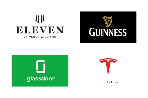
2. Logo symbol on top of text
Putting a symbol above a company name is another popular layout choice. The stacked arrangement makes for a more compact design and lets the symbol shine because it’s on a different line than the company name. This type of logo also lends itself well to stacked text and slogans.
If your company name is super short, it might make sense to keep the text the same width (or almost the same width) as your symbol. But there are plenty of cases where the company name spans wider than the symbol, as seen below — and that works, too!
Proceed with caution if…
Your symbol is tall. As seen in the above examples, this layout works well with symbols that span horizontally or are relatively even in width and height. The Tesla and Glassdoor logos are an exception to this, and it works because the symbols are simple and easy to view at smaller sizes.
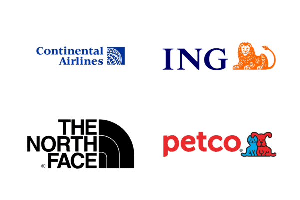
3. Logo symbol to the right of text
This logo layout is not as common as the first two shown, in part because it strays away from the conventions of a left-aligned symbol and puts more prominence on the text. This design is worth testing if you want to try something different — but beware that it could look unbalanced or less “natural” than other arrangements.
With a right-aligned symbol, it’s best to right-align text if you’re stacking it on multiple lines or including a slogan, as seen in the Continental Airlines and The North Face examples.
Proceed with caution if…
Your company name is long or your symbol is tall. In either of these cases, you’ll want to make sure you’re fitting the symbol and text into your logo design in a way that doesn’t look busy or disproportionate.
4. Logo symbol below text
Placing a symbol below your text can look awkward depending on the symbol shape and size. For that reason, this isn’t a common logo layout, but it still might be one you want to consider.
In logos that do use this arrangement, the symbol often acts as an underline, with a long, horizontal shape — these logos are prime examples of this.
Proceed with caution if…
Your symbol isn’t horizontal or underline-like. There are exceptions to this, but unless your symbol looks “natural” underneath your wordmark, this can be a tricky layout to pull off.
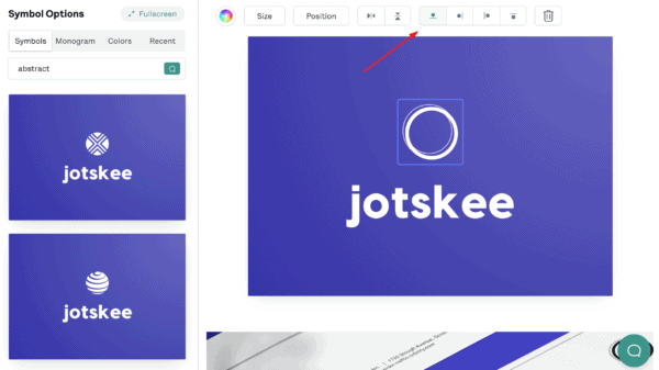
Tip: It’s easy to change your symbol’s position in the My Free Logo Maker editor! Go to the Symbol section and find the icon buttons to change where your symbol appears in relation to your company name: on top, to the left, to the right, or below.
5. Logo symbol between words
If your company name has two words (or one word that can be broken into two), a symbol can act as a nice divider. It often takes some tweaking to get this layout right, but it’s worth a shot if you’re looking for something creative and unique.
For this arrangement to work, the symbol has to be relatively simple and compact (not too tall or wide) — though there are, of course, exceptions (see Ralph Lauren). In this layout, the spacing is usually tighter between the symbol and the text to keep the logo compact.
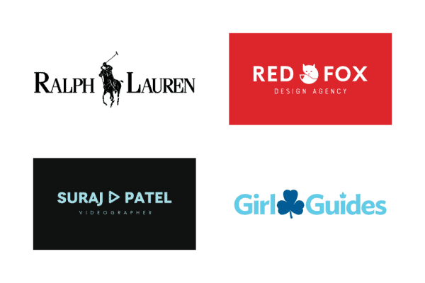
Proceed with caution if…
The two words in your company name aren’t similar in length. This arrangement looks best if the symbol is in the middle of your text, so if your company name is something like “Kid Wonderful,” or “Sandblastica Inc,” the symbol won’t land in the center of your design.
p.s. If you have another layout in mind — a symbol replacing a letter — see the next layout idea for details.
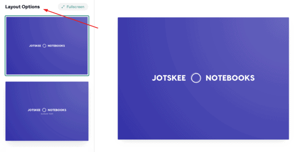
Tip: If your logo has two words, you can see layout options where your symbol is placed between the two words in My Free Logo Maker. To find this layout option, go to the Layout section in the left menu and scroll down until you see this variation. Select the design to save or edit it.
Note: You can’t manually insert a symbol between two words in your logo.
6. Logo symbol to replace a letter/letters
Here’s a layout that can be really cool when it works: a symbol that replaces a letter (or letters) in your company name. This design trick can work really well, but it can also take trial and patience to get it right.
If you’re opting for a symbol-as-letter layout, a simple symbol that matches the relative weight of your font is best; otherwise, you risk confusing people or having them not be able to read your company name correctly. (Hint: O’s and I’s are usually the easiest letters to turn into a symbol!).
Proceed with caution if…
Your company name doesn’t have any easy-to-replace letters, or you can’t think of a symbol that’s representative of your business that fits the design. In other words, don’t force it — if you can’t get it right, move on!
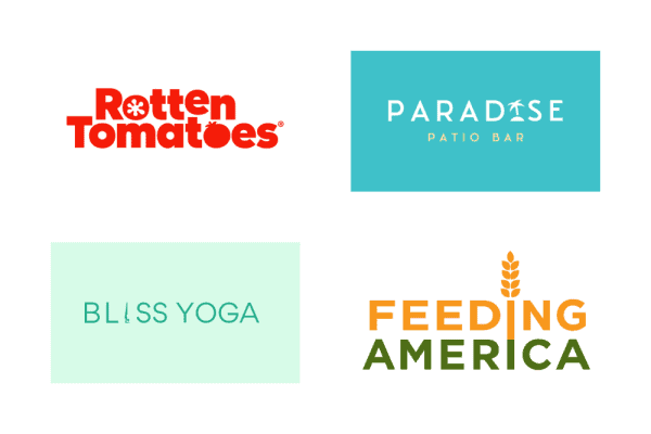
7. Single straight line
The simplest option for a text-only logo is a straight horizontal line of text. There’s a reason this style of logo is so popular, especially for brands with apps or physical products: it’s super easy to adapt! And it scales well, meaning it looks great on all sorts of applications.
The risk, of course, is that your logo will look boring if it’s too simple. That’s why you’ll want to choose a bold font you love, a hit of color, or a unique character (like the g in Logitech).
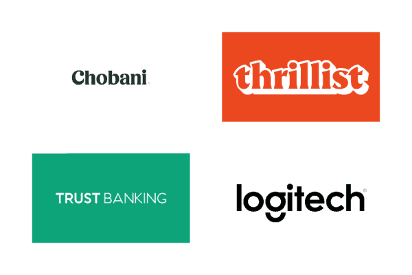
Proceed with caution if…
Your company name is long. As seen in the Trust Banking example, this can (and does!) work. But the longer your name is, the more horizontal stretch your logo will have — and that can make it hard to fit into smaller spaces like social media profiles.
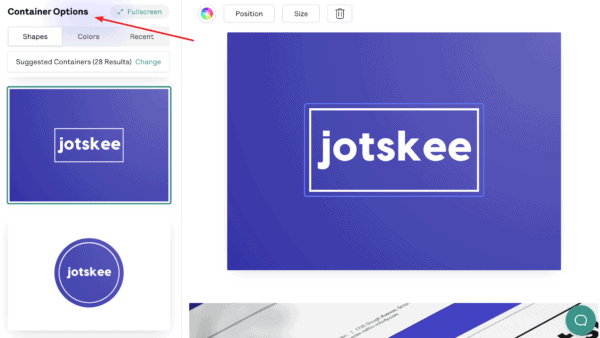
8. Wordmark in a solid shape
Another way to design an all-text logo is to put it in a solid shape or container. Adding this design element spruces up a wordmark and works well for shorter company names or initials. It can also act as a “stamp” on products like a clothing tag or label.
Be careful of the shape you choose — circles are great for shorter company names, while squares and rectangles are better for stacked text. Custom shapes (like the cloud in Salesforce) usually require a designer’s touch.
Proceed with caution if…
Your company name is long or you have a slogan. If this is the case, you may have to stack the text to fit it into a shape, or put your slogan below the shape — and that doesn’t always look good in this type of logo design.
9. Wordmark in an outline shape/container
If a solid shape isn’t your thing, you can also put your wordmark in an outline shape or container (or put your text between two lines, as seen in the Blackbird Bakery example below). This layout lets your background color show through (if you have one).
The same rules apply for this logo layout as with a filled container — short name are better, and a slogan *can* work, but it might make it harder to get a clean design.
Tip: Want to put your logo in a shape? To try out this layout in My Free Logo Maker, go to Container in the left menu of the logo editor to see different shape options. You can also change container types (filled or outline) and colors from here.
10. Simple stacked text
Stacked text is popular in combination logos, as seen in some examples above (e.g. The North Face). But this layout also works well for wordmark logos, as it can add visual interest and rein in long company names to fit a smaller space.
Stacking text takes a careful eye, as you’ll want the top and bottom rows of text to be evenly aligned and relatively similar in length.
Proceed with caution if…
Your company name is short! Breaking up one word onto two lines is possible, but it can make it harder for people to read or understand your company name at first glance. If you have a logo where the first and second words are vastly different lengths, be prepared for tweaking and resizing text to get things right.
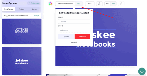
Tip: To try out a stacked-text layout in My Free Logo Maker, click the company name on the logo you’re working on. In the menu above your logo, your company name will appear in a text box. Click Stack beside the text box, then type the text you want on the second line and click Update.
And there you have it — 10 logo layouts to consider for your design. Take the length of your company name into account when trying out different layout ideas, and if you’re using a symbol, try putting it in different spots to see what looks best.
When you have a design or two you like, test it at different sizes (zoom in and out!) to ensure that it’s adaptable.
Jump into My Free Logo Maker to start playing around with layouts, or get more logo ideas by checking out our color pages.
«Logotype» redirects here. For the racehorse, see Logotype (horse).
This article is about the graphic mark or emblem. For other uses, see Logo (disambiguation).

A logo (abbreviation of logotype;[1] from Ancient Greek λόγος (lógos) ‘word, speech’, and τύπος (túpos) ‘mark, imprint’) is a graphic mark, emblem, or symbol used to aid and promote public identification and recognition. It may be of an abstract or figurative design or to include the text of the name that it represents as in a wordmark.
In the days of hot metal typesetting, a logotype was one word cast as a single piece of type (e.g. «The» in ATF Garamond), as opposed to a ligature, which is two or more letters joined, but not forming a word.[2] By extension, the term was also used for a uniquely set and arranged typeface or colophon. At the level of mass communication and in common usage, a company’s logo is today often synonymous with its trademark or brand.[3]
Etymology
Douglas Harper’s Online Etymology Dictionary states that the term ‘logo’ used in 1937 «probably a shortening of logogram».[4]
History
Numerous inventions and techniques have contributed to the contemporary logo, including cylinder seals (c. 2300 BCE), coins (c. 600 BCE),[5][6] trans-cultural diffusion of logographic languages, coats of arms,[7] watermarks,[8] silver hallmarks, and the development of printing technology.
As the industrial revolution converted western societies from agrarian to industrial in the 18th and 19th centuries, photography and lithography contributed to the boom of an advertising industry that integrated typography and imagery together on the page.[9] Simultaneously, typography itself was undergoing a revolution of form and expression that expanded beyond the modest, serif typefaces used in books, to bold, ornamental typefaces used on broadsheet posters.[10]
The arts were expanding in purpose—from expression and decoration of an artistic, storytelling nature, to a differentiation of brands and products that the growing middle classes were consuming. Consultancies and trades-groups in the commercial arts were growing and organizing; by 1890, the US had 700 lithographic printing firms employing more than 8,000 people.[11] Artistic credit tended to be assigned to the lithographic company, as opposed to the individual artists who usually performed less important jobs.
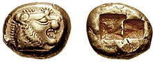
A coin from early 6th century BC Lydia bearing the head of a roaring lion with sun rays
Innovators in the visual arts and lithographic process—such as French printing firm Rouchon in the 1840s, Joseph Morse of New York in the 1850s, Frederick Walker of England in the 1870s, and Jules Chéret of France in the 1870s—developed an illustrative style that went beyond tonal, representational art to figurative imagery with sections of bright, flat colors.[11] Playful children’s books, authoritative newspapers, and conversational periodicals developed their own visual and editorial styles for unique, expanding audiences. As printing costs decreased, literacy rates increased, and visual styles changed, the Victorian decorative arts led to an expansion of typographic styles and methods of representing businesses.[12]
![]()
The first logo to be trademarked was the Bass red triangle in 1876
The Arts and Crafts Movement of late-19th century, partially in response to the excesses of Victorian typography, aimed to restore an honest sense of craftsmanship to the mass-produced goods of the era.[13] A renewal of interest in craftsmanship and quality also provided the artists and companies with a greater interest in credit, leading to the creation of unique logos and marks.
By the 1950s, Modernism had shed its roots as an avant-garde artistic movement in Europe to become an international, commercialized movement with adherents in the United States and elsewhere. The visual simplicity and conceptual clarity that were the hallmarks of Modernism as an artistic movement formed a powerful toolset for a new generation of graphic designers whose logos embodied Ludwig Mies van der Rohe’s dictum, «Less is more.» Modernist-inspired logos proved successful in the era of mass visual communication ushered in by television, improvements in printing technology, and digital innovations.
Contemporary logos

The current era of logo design began in the 1870s[citation needed] with the first abstract logo, the Bass red triangle. As of 2014, many corporations, products, brands, services, agencies, and other entities use an ideogram (sign, icon) or an emblem (symbol) or a combination of sign and emblem as a logo. As a result, only a few of the thousands of ideograms in circulation are recognizable without a name. An effective logo may consist of both an ideogram and the company name (logotype) to emphasize the name over the graphic, and employ a unique design via the use of letters, colors, and additional graphic elements.

The Coca-Cola logo is identifiable in other writing-systems, here written in Cyrillic.
Ideograms and symbols may be more effective than written names (logotypes), especially for logos translated into many alphabets in increasingly globalized markets. For instance, a name written in Arabic script might have little resonance in most European markets. By contrast, ideograms keep the general proprietary nature of a product in both markets. In non-profit areas, the Red Cross (varied as the Red Crescent in Muslim countries and as the Red Star of David in Israel) exemplifies a well-known emblem that does not need an accompanying name. The red cross and red crescent are among the best-recognized symbols in the world. National Red Cross and Red Crescent Societies and their Federation as well as the International Committee of the Red Cross include these symbols in their logos.
Branding can aim to facilitate cross-language marketing.[14] Consumers and potential consumers can identify the Coca-Cola name written in different alphabets because of the standard color and «ribbon wave» design of its logo. The text was written in Spencerian Script, which was a popular writing style when the Coca-Cola Logo was being designed.[15]
Logo design
Since a logo is the visual entity signifying an organization, logo design is an important area of graphic design. A logo is the central element of a complex identification system that must be functionally extended to all communications of an organization. Therefore, the design of logos and their incorporation in a visual identity system is one of the most difficult and important areas of graphic design. Logos fall into three classifications (which can be combined). Ideographs, such as Chase Bank, are completely abstract forms; pictographs are iconic, representational designs; logotypes (or wordmarks) depict the name or company initials. These elements can be combined in a set position and relative size in a logo lock-up, so named because elements are «locked» together and should not be broken apart or resized individually.[16] Because logos are meant to represent companies’ brands or corporate identities and foster their immediate customer recognition, it is counterproductive to frequently redesign logos.
The logo design profession has substantially increased in numbers over the years since the rise of the Modernist movement in the United States in the 1950s.[17] Three designers are widely[18] considered the pioneers of that movement and of logo and corporate identity design: The first is Chermayeff & Geismar,[19] which is the firm responsible for many iconic logos, such as Chase Bank (1964), Mobil Oil (1965), PBS (1984), NBC (1986), National Geographic (2003), and others. Due to the simplicity and boldness of their designs, many of their earlier logos are still in use today. The firm recently designed logos for the Library of Congress and the fashion brand Armani Exchange. Another pioneer of corporate identity design is Paul Rand,[20] who was one of the originators of the Swiss Style of graphic design. He designed many posters and corporate identities, including the famous logos for IBM, UPS, and ABC. The third pioneer of corporate identity design is Saul Bass.[21] Bass was responsible for several recognizable logos in North America, including both the Bell Telephone logo (1969) and successor AT&T Corporation globe (1983). Other well-known designs were Continental Airlines (1968), Dixie (1969), and United Way (1972). Later, he would produce logos for a number of Japanese companies as well.
An important development in the documentation of logo design is the study of French trademarks by historian Edith Amiot and philosopher Jean Louis Azizollah.[22]
Logo color
Color is a key element in logo design and plays an important and potentially vital role in brand differentiation. Colors can have immense consequences on our moods. They are remarkably dominant to the point that they can psychologically manipulate perspectives, emotions, and reactions.[23] The importance of color in this context is due to the mechanics of human visual perception wherein color and contrast play critical roles in visual detail detection. In addition, we tend to acquire various color connotations and color associations through social and cultural conditioning, and these play a role in how we decipher and evaluate logo color. While color is considered important to brand recognition and logo design, it shouldn’t conflict with logo functionality, and it needs to be remembered that color connotations and associations are not consistent across all social and cultural groups. For example, in the United States, red, white, and blue are often used in logos for companies that want to project patriotic feelings but other countries will have different sets of colors that evoke national pride.
Choosing an organisation’s logo’s color is an important decision because of its long term implications and its role in creating differentiation among competitors’ logos. A methodology for identifying potential logo colors within an industry sector is color mapping, whereby existing logo colors are systematically identified, mapped, and evaluated (O’Connor, 2011).[24]
Logo design process
Designing a good logo often requires involvement from a marketing team teaming with the graphic design studio. Before a logo is designed, there must be a clear definition of the concept and values of the brand as well as understanding of the consumer or target group. Broad steps in the logo design process include research, conceptualization, investigation of alternative candidates, refinement of a chosen design, testing across products, and finally adoption and production of the chosen mark.
Dynamic logos

Nunc est bibendum (now is the time to drink), 1898 Michelin poster.
![]()
![]()
The MTV logo. It has been modified to include images within the black areas from time to time.
In 1898, the French tire manufacturer Michelin introduced the Michelin Man, a cartoon figure presented in many different contexts, such as eating, drinking, and playing sports. By the early 21st century, large corporations such as MTV, Nickelodeon, Google, Morton Salt, and Saks Fifth Avenue had adopted dynamic logos that change over time from setting to setting.[25]
Internet-compatible logos
A company that uses logotypes (wordmarks) may desire a logo that matches the firm’s Internet address. For short logotypes consisting of two or three characters, multiple companies are found to employ the same letters. A «CA» logo, for example, is used by the French bank Credit Agricole, the Dutch clothing retailer C&A, and the US software corporation CA Technologies, but only one can have the Internet domain name CA.com.
In today’s digital interface adaptive world, a logo will be formatted and re-formatted from large monitors to small handheld devices. With the constant size change and re-formatting, logo designers are shifting to a more bold and simple approach, with heavy lines and shapes, and solid colors. This reduces the confusion when mingled with other logos in tight spaces and when scaled between media. Social networks like Twitter, Facebook, LinkedIn, and Google+ use such logos.

Design protection
Logos and their design may be protected by copyright, via various intellectual property organisations worldwide which make available application procedures to register a design to give it protection at law. For example, in the UK, the Intellectual Property Office (United Kingdom)[26] govern registered designs, patents, and trademarks. Ordinarily, the trademark registration will not ‘make claim’ to colors used, meaning it is the visual design that will be protected, even if it is reproduced in a variety of other colors or backgrounds.
In some countries, especially civil law countries, the threshold of originality required for copyright protection can be quite high, so a logo that contains simple geometric shapes or text might not be eligible for copyright protection although it can be protected as a trademark.
Sports
For many teams, a logo or «crest» is an important way to recognize a team’s history and can intimidate opponents.
For certain teams, the logo and color scheme are synonymous with the team’s players. For example, Manchester United, the Toronto Maple Leafs, or New York Yankees all have a recognizable logo that can be identified by any fan of the respective sport.
See also
![]()
Wikimedia Commons has media related to Logos.
- Graphic design
- Heraldry
- Icon
- Logogram
- Monogram, a motif made by overlapping or combining two or more letters or other graphemes to form one symbol
- Seal (emblem)
- Slogan
- Sound trademark
References
- ^ «logo». Lexico UK English Dictionary. Oxford University Press. Archived from the original on 2019-12-18.
- ^ Fyffe, Charles. Basic Copyfitting, Studio Vista, London, 1969, SBN 289797055, p.54.
- ^ Wheeler, Alina. Designing Brand Identity © 2006 John Wiley & Sons, Inc. (page 4) ISBN 978-0-471-74684-3
- ^ logo- Online Etymology Dictionary
- ^ Herodotus. Histories, I, 94.
- ^ A. Ramage, «Golden Sardis,» King Croesus’ Gold: Excavations at Sardis and the History of Gold Refining, edited by A. Ramage and P. Craddock, Harvard University Press, Cambridge, 2000, p. 18.
- ^ C. A. Stothard, Monumental Effigies of Great
Britain (1817) pl. 2, illus. in Wagner, Anthony, Richmond Herald, Heraldry in England (Penguin, 1946), pl. I. - ^ Meggs 1998, p. 58.
- ^ Meggs 1998, pp. 138–159.
- ^ Meggs 1998, pp. 126–134.
- ^ a b Meggs 1998, p. 148–155.
- ^ Meggs 1998, pp. 159–161.
- ^ Meggs 1998, pp. 162–167.
- ^ «TICoRD’13: Global Product Development». Springer. Springers. Retrieved 26 November 2016.[permanent dead link]
- ^ «The Coca-Cola logo story». Coca-Cola Official Website. The Coca-Cola Company. Archived from the original on 28 January 2016. Retrieved 28 January 2016.
- ^ «What is the difference between a logotype, logomark, and logo lockup?». DesignTLC.com. Design TLC. August 1, 2020. Retrieved June 22, 2021.
- ^ Meggs 1998, p. 363.
- ^ Meggs 1998, pp. 369–374.
- ^ Meggs 1998, pp. 373–374.
- ^ Meggs 1998, p. 369.
- ^ Meggs 1998, p. 375.
- ^ Les Marques Francaises 1824–1974
- ^ Fugate, Jennifer Marie Binzak; Franco, Courtny L. (2019). «What Color is Your Anger? Assessing Color-Emotion Pairings in English Speakers». Frontiers in Psychology. 10: 206. doi:10.3389/fpsyg.2019.00206. PMC 6399154. PMID 30863330.
- ^ Zena O’Connor (2011). «Logo Colour and Differentiation: A New Application of Environmental Colour Mapping». Color Research and Application. 36 (1): 55–60. doi:10.1002/col.20594.
- ^ Rawsthorn, Alice (2007-02-11). «The new corporate logo: Dynamic and changeable are all the rage». International Herald Tribune. Retrieved 2008-05-21.
- ^ «Intellectual Property Office (United Kingdom)». UK Patent Office.
Sources
- Meggs, Philip B. (1998). A History of Graphic Design (Third ed.). John Wiley & Sons. ISBN 978-0-471-29198-5.
External links
![]()
Look up logo in Wiktionary, the free dictionary.
- Official website of the Northern Army Preservation Society (a gallery of noted Canadian corporate logos)