
Specific line and bar types are available in 2-D stacked bar and column charts, line charts, pie of pie and bar of pie charts, area charts, and stock charts.
Predefined line and bar types that you can add to a chart
Depending on the chart type that you use, you can add one of the following lines or bars:
-
Series lines These lines connect the data series in 2-D stacked bar and column charts to emphasize the difference in measurement between each data series. Pie of pie and bar of pie charts display series lines by default to connect the main pie chart with the secondary pie or bar chart.

-
Drop lines Available in 2-D and 3-D area and line charts, these lines extend from data points to the horizontal (category) axis to help clarify where one data marker ends and the next data marker starts.
-
High-low lines Available in 2-D line charts and displayed by default in stock charts, high-low lines extend from the highest value to the lowest value in each category.
-
Up-down bars Useful in line charts with multiple data series, up-down bars indicate the difference between data points in the first data series and the last data series. By default, these bars are also added to stock charts, such as Open-High-Low-Close and Volume-Open-High-Low-Close.


Add predefined lines or bars to a chart
-
Click the 2-D stacked bar, column, line, pie of pie, bar of pie, area, or stock chart to which you want to add lines or bars.
This displays the Chart Tools, adding the Design, Layout, and Format tabs.
-
On the Layout tab, in the Analysis group, do one of the following:
-
Click Lines, and then click the line type that you want.
Note: Different line types are available for different chart types.
-
Click Up/Down Bars, and then click Up/Down Bars.
-
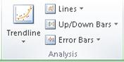
Tip: You can change the format of the series lines, drop lines, high-low lines, or up-down bars that you display in a chart by right-clicking the line or bar, and then clicking Format <line or bar type> .
Remove predefined lines or bars from a chart
-
Click the 2-D stacked bar, column, line, pie of pie, bar of pie, area, or stock chart that displays predefined lines or bars.
This displays the Chart Tools, adding the Design, Layout, and Format tabs.
-
On the Layout tab, in the Analysis group, click Lines or Up/Down Bars, and then click None to remove lines or bars from a chart.
Tip: You can also remove lines or bars immediately after you add them to the chart by clicking Undo on the Quick Access Toolbar or by pressing CTRL+Z.
You can add other lines to any data series in an area, bar, column, line, stock, xy (scatter), or bubble chart that is 2-D and not stacked.
Add other lines
-
This step applies to Word for Mac only: On the View menu, click Print Layout.
-
In the chart, select the data series that you want to add a line to, and then click the Chart Design tab.
For example, in a line chart, click one of the lines in the chart, and all the data marker of that data series become selected.
-
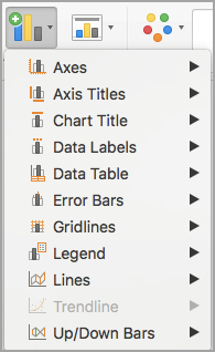
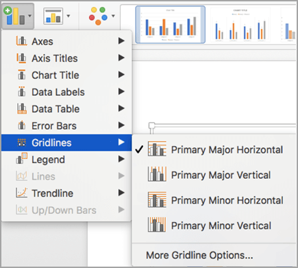
Click Add Chart Element, and then click Gridlines.
-
Choose the line option that you want or click More Gridline Options.
Depending on the chart type, some options may not be available.
Remove other lines
-
This step applies to Word for Mac only: On the View menu, click Print Layout.
-
Click the chart with the lines, and then click the Chart Design tab.
-
Click Add Chart Element, click Gridlines, and then click More Gridline Options.
-
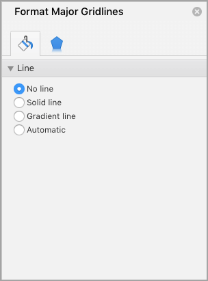
Select No line.
You can also click the line and press DELETE .
Excel allows us to simply structure our data.according to the content and purpose of the presentation. When we want to compare actual values versus a target value, we might need to add a line to a bar chart or draw a line on an existing Excel graph.
This step by step tutorial will assist all levels of Excel users in the following:
- How to add a horizontal line in an Excel bar graph?
- How to add a horizontal line in an Excel scatter plot?
- How to add a target line in Excel?
Suppose we have below data and we insert a column chart using the data in B2:C7.
- Select B2:C7
- Click Insert tab, Other Charts, then All Chart Types
- Select Column, then Clustered Column
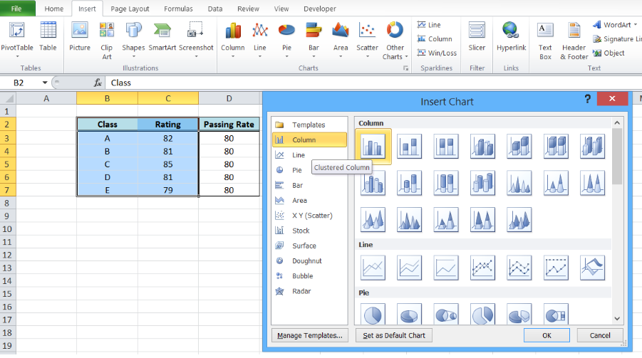 Figure 1. Insert a column chart
A column chart will be created, showing the rating per corresponding class.
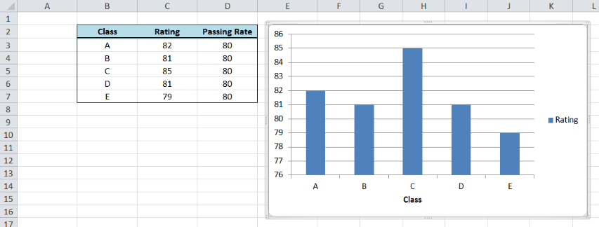 Figure 2. Column chart showing class ratings
How to add a horizontal line in an Excel bar graph?
We want to add a line that represents the target rating of 80 over the bar graph. In order to add a horizontal line in an Excel chart, we follow these steps:
- Right-click anywhere on the existing chart and click Select Data
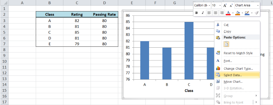 Figure 3. Clicking the Select Data option
- The Select Data Source dialog box will pop-up. Click Add under Legend Entries.
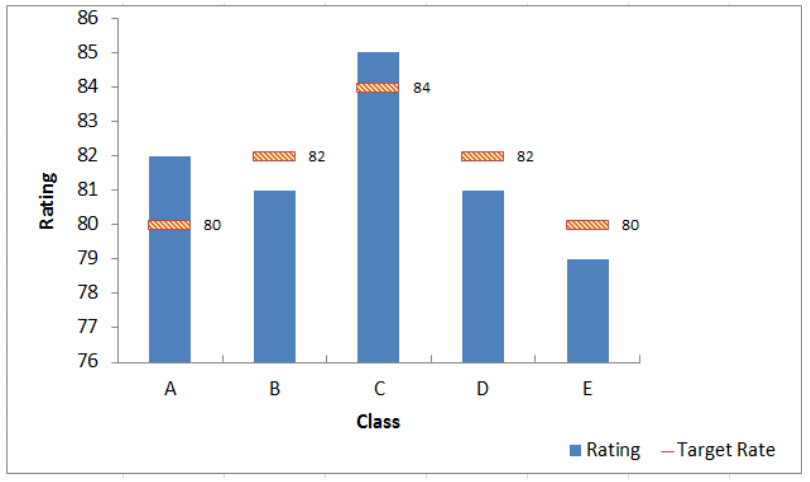 Figure 4. Adding a series data
The Edit Series dialog box will pop-up.
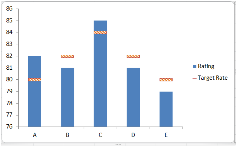 Figure 5. Edit Series preview pane
- In Series name, select cell D2 or “Passing Rate”.
- In Series values, select D3:D7 or input
=column!$D$3:$D$7. Click OK.
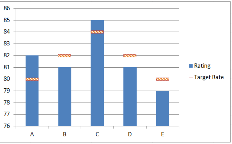 Figure 6. Adding the series name and values
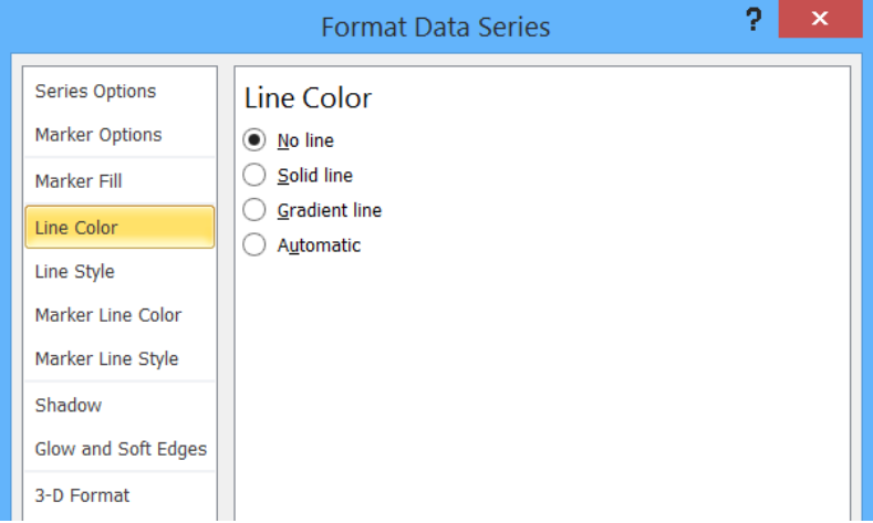 Figure 7. New Series “Passing Rate” added
- Click OK. A second column chart will be displayed beside the first chart.
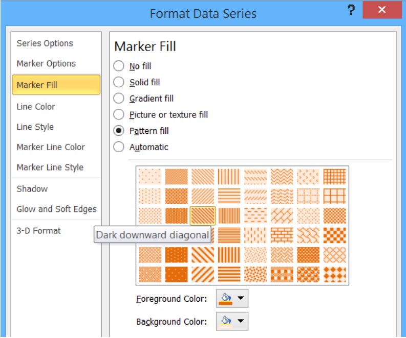 Figure 8. Combination column chart
- Click the second column chart “Passing Rate”, right-click and select “Change Series Chart Type”
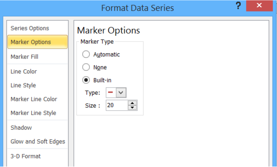 Figure 9. Clicking the Change Series Chart Type
- Select Line and press OK
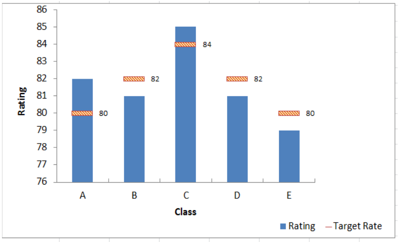 Figure 10. Selecting the Line chart type
The second column chart “Passing Rate” will be changed into a line chart.
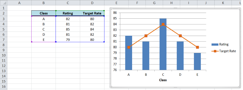 Figure 11. Output: Add a horizontal line to an Excel bar chart
Customize the line graph
Click on the line graph, right-click then select Format Data Series.
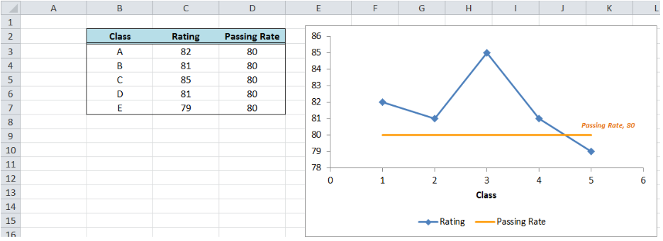 Figure 12. Selecting the Format Data Series
These are some of the ways we can customize the line graph in Excel:
- Change line color
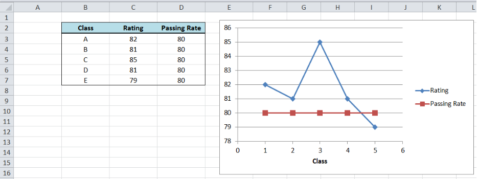 Figure 13. Changing the line color
- Add markers
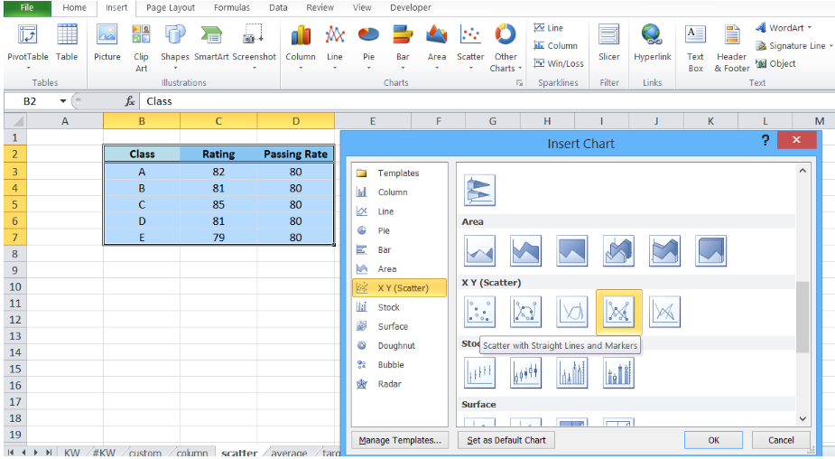 Figure 14. Adding a built-in marker
- Add data label
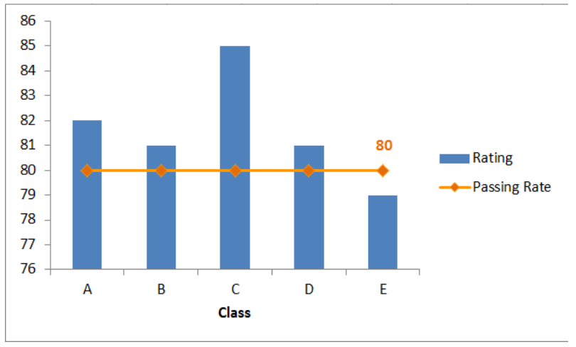 Figure 15. Final output: add a line to a bar chart
How to add a horizontal line in an Excel scatter plot?
We can follow the same procedure discussed above wherein we add a horizontal line to an Excel chart. However, this time let us try a quicker approach where we graph the two data points for Rating and Passing Rate at the same time using an XY Scatter plot.
- Select B2:D7
- Click Insert Chart, and select X Y (Scatter), then Scatter with Straight Lines and Markers.
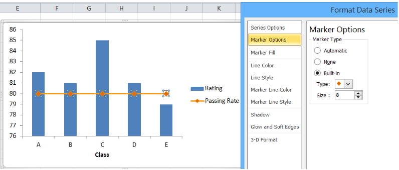 Figure 16. Creating an X Y Scatter Plot
We will be able to combine the two graphs in one chart, where Rating and Passing Rate are both presented in the form of data points connected by lines and markers.
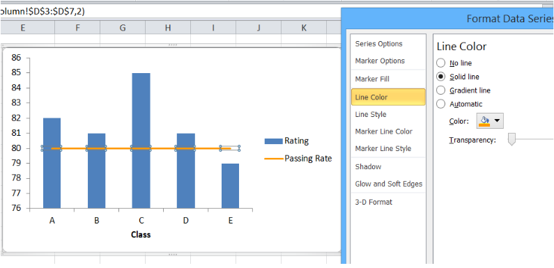 Figure 17. Combination X Y scatter plot
The value for passing rate is constant at 80 and it is presented as a horizontal line. This combination graph makes it easy to compare the rating per class to the passing rate of 80.
We can customize the line graph by changing the line color, removing the markers and adding a data label. We can do any customization we want when we right-click the line graph and select “Format Data Series”.
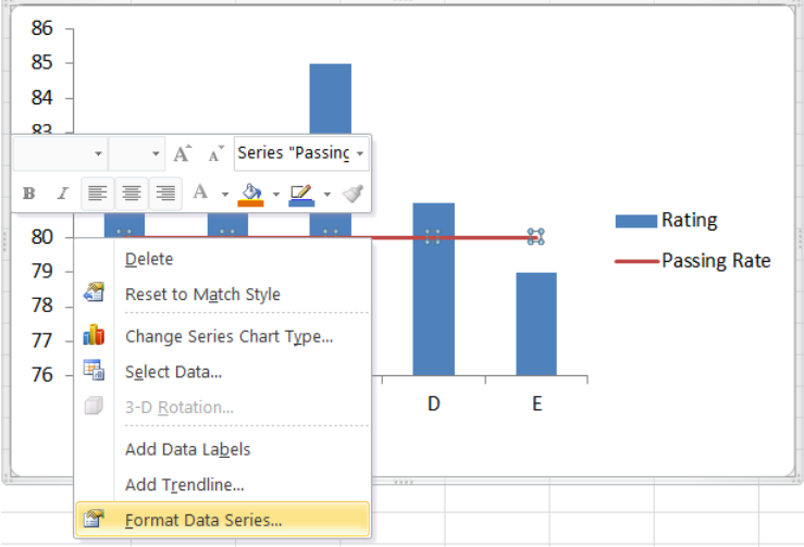 Figure 18. Final output: How to add a horizontal line in an Excel scatter plot
The resulting graph shows that the rating for classes A to D are well above the passing rate of 80.
How to add a target line in Excel?
Target values are not always equal for all data points. Suppose we have different targets for each class as shown below. We follow the same procedure as the above examples in adding a line to a bar chart. The combined line and bar graph will look like this:
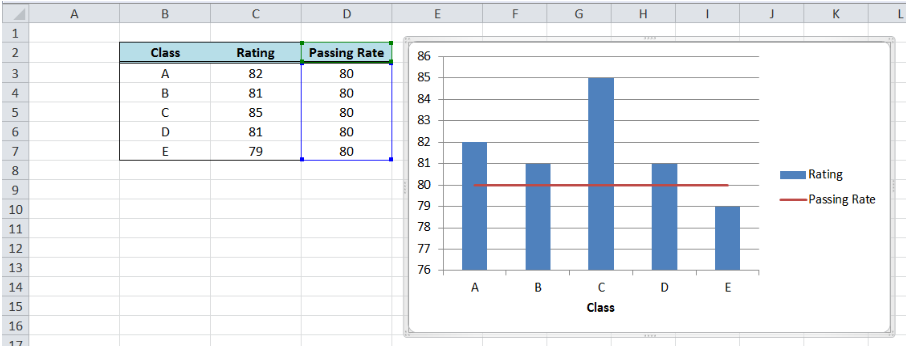 Figure 19. Output: Add line graph to a bar graph
When targets for each class are connected through lines as shown above, the comparison between the actual and target rating is not very clear. There is a more effective way to compare the data that will improve visualization and analysis, like the example below.
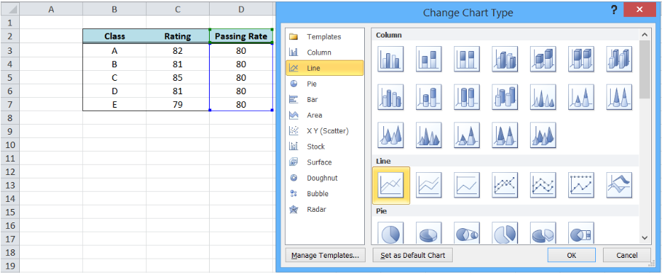 Figure 20. Bar graph with customized target graph
This graph can be done by customizing our target graph through these steps:
- Double click on the Target Rate graph to show the Format Data Series dialog box
- Input the following settings:
- In the Marker Options, select Built-in Marker Type and select the horizontal line or “dash” in the drop-down menu
- Select size 20
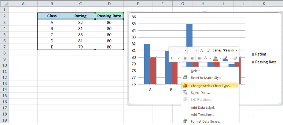 Figure 21. Selecting a built-in marker type and size
-
- Under Marker Fill, select Pattern Fill, “Dark Downward Diagonal”
- Select the Foreground Color Orange, Accent 6, Darker 25%
- Select the Background Color Orange, Accent 6, Lighter 80%
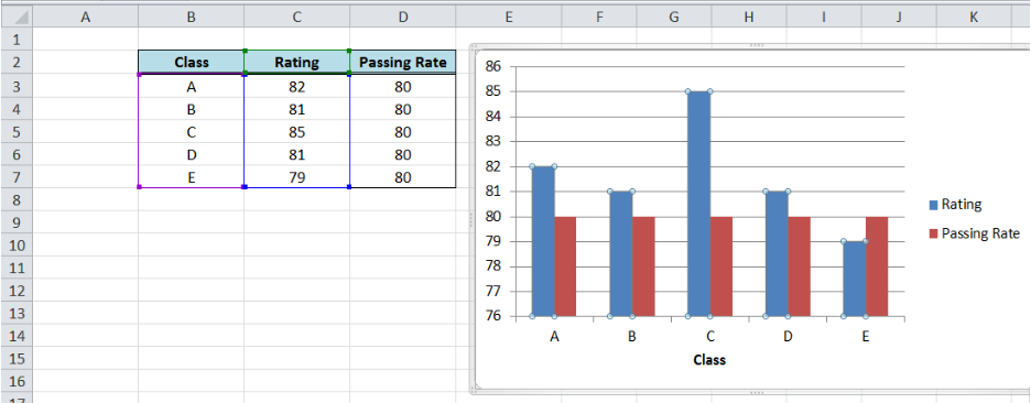 Figure 22. Customizing marker fill settings
-
- Line Color: No Line
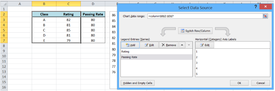 Figure 23. Removing line color for the target graph
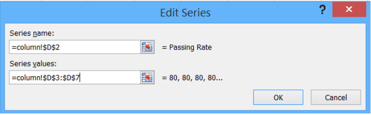 Figure 24. Output graph after initial formatting
- Delete the major gridlines
 Figure 25. Output graph with deleted major gridlines
- Add data labels and axis titles, and move the legend to below the graph
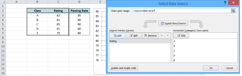 Figure 26. Output: How to add a target line in Excel
Most of the time, the problem you will need to solve will be more complex than a simple application of a formula or function. If you want to save hours of research and frustration, try our live Excelchat service! Our Excel Experts are available 24/7 to answer any Excel question you may have. We guarantee a connection within 30 seconds and a customized solution within 20 minutes.
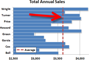 Excel’s built-in chart types are great for quickly visualizing your data. The horizontal bar chart is a great example of an easy to use graph type. Sometimes, though, it can be useful to call attention to a particular value or performance level, like an average or a min/max threshhold. In that case, you’ll want to add a vertical line across the horizontal bars at a specific value. This quick tutorial will walk through a quick way to add a vertical line to the horizontal bar chart type in Excel. As an example, we’ll use annual sales performance with an average value line.
Building a Basic Horizontal Bar Chart
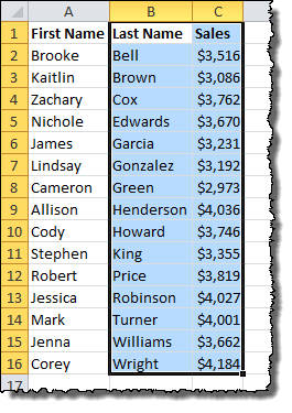
First off, let’s examine the data set. We have a clean list of sales data for a set of employees…

Let’s build a horizontal bar chart for the data. Select the Last Name and Sales columns.
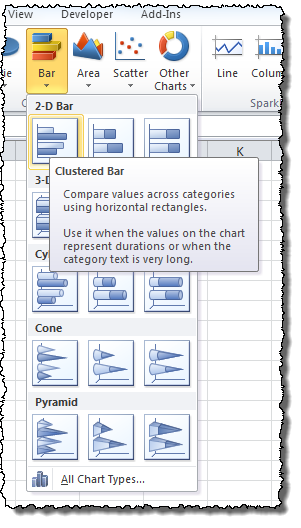
On the Insert menu tab under Charts, choose the Bar icon and select the Clustered Bar chart type.
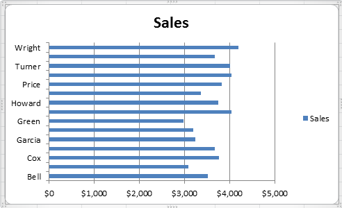
Without any more effort, here is what Excel produces for our data:
Get the latest Excel tips and tricks by joining the newsletter!
 Andrew Roberts has been solving business problems with Microsoft Excel for over a decade. Excel Tactics is dedicated to helping you master it.
Join the newsletter to stay on top of the latest articles. Sign up and you’ll get a free guide with 10 time-saving keyboard shortcuts!
Other posts in this series…
Purpose
To add a reference line such as an average or benchmark to a horizontal bar chart.
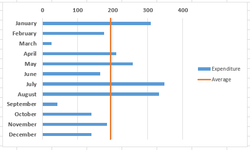
This is similar to how to add a reference line to a vertical bar chart in Excel, but with a few more steps.

Video – see full step by step description below the video
- Add the data for the average line to the chart
- Change the average line series chart type to ‘Scatter with Straight Lines’
- Amend the secondary vertical axis if the line doesn’t match the chart height, and switch off the secondary axes.
Method – example, add an average line (see video above)
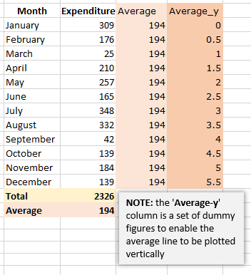
- Calculate the average and add the values to the column next to your chart values. The average values will later be used as the ‘x’ values for your line.
- Add a set of ‘dummy’ values in the next column
(‘Average_y’ in the example on the right) – these will be used later as the ‘y’ values for your line, and enable the line to be drawn vertically. - Click on the chart to select it, and from the Design tab, click on the ‘Select Data‘ icon.
- In the left hand pane (Legend Entries (Series)), click on the Add icon, and in the popup window, select the column header of your helper column, for the series name, and the column of values for the series values.
- The bars for the average values will be added to the chart.
- Click on one of the bars for the average values, and right-click. Select ‘Change series chart type‘.
- From the Chart type dropdown next to the Average series name, select ‘Scatter with straight lines‘. The average values will now be displayed as a short horizontal line.
- Right-click on the line – you will now edit the data values to make the line display as a vertical line across the chart.
- Select the ‘Average’ dataset, and in the pop-up you’ll see there are fields for series name, x values and y values. Add the (real) average values into the x field, and the (dummy) ‘Average_y’ values into the y field.
- Click OK and the average line will now be vertical across the chart.
- One more step though may be needed! Excel may add a bit of extra length to the secondary y axis, so your average line isn’t quite matching the height of the chart. If so, you can just edit the minimum and maximum values of the axis to match the dummy values that you have set in the ‘Average_y’ column.
- Remember to remove the secondary vertical and horizontal axes – click on the plus icon next to the chart, and deselect the secondary axis items.
Содержание
- Create pie, bar, and line charts
- Want more?
- Bar-Line (XY) Combination Chart in Excel
- Combination Charts in Excel
- Bar-XY Combination Chart
- Line Chart
- Bar Chart in Excel
- Excel Bar Chart
- Examples to Create Various Types of Bar Charts in Excel
- Example #1 – Stacked Bar Chart
- Example #2 – Clustered Bar Chart
- Example #3 – 3D Bar Chart
- Uses of Bar Chart
- Things to Remember
- Recommended Articles
Create pie, bar, and line charts

In this video, see how to create pie, bar, and line charts, depending on what type of data you start with.
Want more?
We created a clustered column chart in the previous video.
In this video, we are going to create pie, bar, and line charts.
Each type of chart highlights data differently.
And some charts can’t be used with some types of data.
We’ll go over this shortly.
To create a pie chart, select the cells you want to chart.
Click Quick Analysis and click CHARTS.
Excel displays recommended options based on the data in the cells you select, so the options won’t always be the same.
I’ll show you how to create a chart that isn’t a Quick Analysis option, shortly.
Click the Pie option, and your chart is created.
You can chart only one data series with a pie chart.
In this example, those are the Sales figures in cells B2 through B5.
I am going to move and resize the chart, so it displays without having to scroll, which will also make it easier to customize (something we’ll look at in the next video.)
I click the chart; hold down the left mouse button, and drag to move it.
I scroll down a little, click the bottom right-hand corner of the chart, and drag it up and to the left to make it smaller.
Different data displays better in different types of charts.
If you try to graph too much data in a pie chart it looks like this, not very useful.
Now, I am creating a bar chart using the same data we used to create the pie chart.
Charting the same data different ways can provide you with a different perspective that may help you discover different insights in the data.
We are creating some of the more common chart types, but there are many more options.
To create charts that aren’t Quick Analysis options, select the cells you want to chart, click the INSERT tab.
In the Charts group, we have a lot of options.
Click Recommended Charts to see the charts that will work best with the data you have selected; click All Charts for even more options.
These are all of the different types of charts you can create.
As I mentioned earlier, a pie chart is not a recommended option for the data we selected, because it can only display one data series.
We could make a Pie chart, but it would only show the first data series, the Average Precipitation for New York, and not the second data series, the Average Precipitation for Seattle.
Instead, let’s make a Line with Markers chart.
Click Line, click Line with Marker, point to an option and you get a preview of the chart.
Click OK, and we have created our line chart.
Источник
Bar-Line (XY) Combination Chart in Excel
Friday, February 19, 2016 by Jon Peltier 18 Comments
Combination charts combine data using more than one chart type, for example columns and a line. Building a combination chart in Excel is usually pretty easy. But if one series type is horizontal bars, then combining this with another type can be tricky. I’m here to help with Bar-Line, or rather, Bar-XY combination charts in Excel.
Combination Charts in Excel
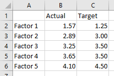
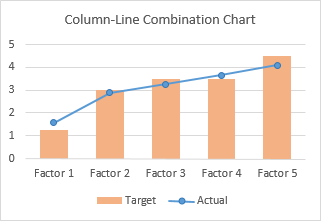
I’ll illustrate a simple combination chart with this simple data. The chart will use the first column for horizontal axis category labels, the second column for actual values plotted using lines with markers, and the third column using columns (vertical bars).
We start by selecting the data and inserting a column chart.
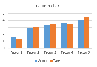
We finish by right clicking on the “Actual” data, choosing Change Series Chart Type from the pop-up menu, and selecting the new chart type we want. I’ve also used a lighter shade of orange for the columns, to make the markers stand out better.
Let’s do the same for a bar chart. Select the data, insert a bar chart.
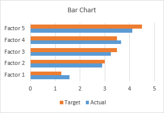
Okay, the category labels are along the vertical axis, but we’ll continue by changing the Actual data to a line chart series. That didn’t work out at all. The markers are not positioned vertically along the centers of the horizontal bars, nor horizontally where the data lies in the Actual column of the worksheet.
In the chart below I’ve shown all axis scales and axis titles to illustrate the problem. When we converted the Actual series to a line type, Excel assigned it to the secondary axis, and we have no ability to reassign it to the primary axis. The primary axes used for the bar chart are not aligned with the secondary axes used for the line chart: the X axis for the bars is vertical and the X axis for the line is horizontal; the Y axis for the bars is horizontal and the Y axis for the line is vertical.
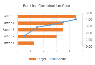
We can’t use a line chart at all. If we want to line up the markers horizontally with their proper position along the lengths of the bars, we need to use the Actual data as the X values of an XY series. We will need to generate some additional data for the Y values of the XY series.
Bar-XY Combination Chart
We will not try to make a Bar-Line combination chart, because the Line chart type does not position the markers where we want them. We will make a Bar-XY chart type, using an XY chart type (a/k/a Scatter chart type) to position markers.
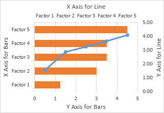
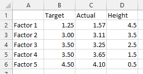
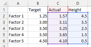
Here is the new data needed for our Bar-XY combination chart. The factor labels and Target values will be used by the Bar chart series, and the Actual values and Heights for the XY series. Don’t worry about the Height values: I’ll show how they are derived in a moment. The nice thing is that we can use dummy values now and type in the proper values later and the chart will update.
Select the first two columns of the data and insert a bar chart.
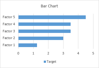
Since we probably want the categories listed in the same order as in the worksheet, let’s select the vertical axis (which in a bar chart is the X axis) and press Ctrl+1, the shortcut that opens the Format dialog or task pane for the selected object in Excel. Check the box for Categories in Reverse Order and also select Horizontal Axis Crosses at Maximum Category to move it next to Factor 5.
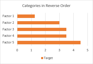
I’ve also recolored the bars orange, because blue markers show up better against light orange than orange markers against light blue.
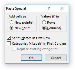
Now copy the last two columns (Actual and Height), select the chart, and on the Home tab of the ribbon, click the Paste dropdown arrow, choose the options in this dialog (add cells as new series, values in columns, series names in first row, categories in first column), and click OK.
The data is added as another set of bars, which I’ve colored blue, but we’ll change that in a second.
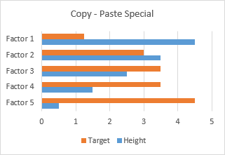
Right-click on the added series, select Change Series Chart Type from the pop-up menu, and select XY with markers and lines.
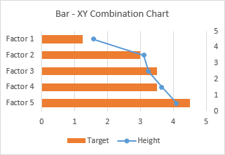
We see that the horizontal positions of the markers is just what we want to show.
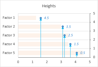
Now we can see where the values in the Heights column comes from. The right hand vertical axis is used for the Y values of the XY series. Looking at the positions of the horizontal bars and the markers in their correct positions, we can see that the Factor 1 bar is centered on Y=4.5, the Factor 2 bar is centered on 3.5, etc. If you hadn’t guessed this at the beginning, type these values into your data range, and let the chart update.
A few minor changes and we’ll be done. First, change the name of the XY series from Heights to Actual. The easiest way is to click on the series, then look at the highlighted ranges in the chart. The X values (C2:C6) are highlighted purple, the Y values (D2:D6) are highlighted blue, and the series name (cell D1) is highlighted red (highlight colors in Excel 2010 and earlier are different, but the concept is the same). Click on the red border of cell D2, and drag the highlighting rectangle to cover cell C2 to change the series name.
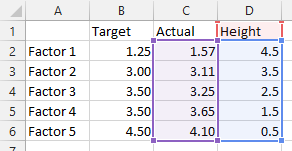
Click on the red border of cell D2, and drag the highlighting rectangle to cover cell C2 to change the series name.
Then, use a lighter shade of orange for the bars, so the blue markers stand out. Finally, hide the right-hand vertical axis: format it so it has no labels and no line color.
And there’s our completed Bar-XY Combination Chart.
Источник
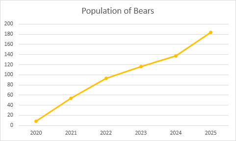
Line Chart
Line charts are used to display trends over time. Use a line chart if you have text labels, dates or a few numeric labels on the horizontal axis. Use a scatter plot (XY chart) to show scientific XY data.
To create a line chart, execute the following steps.
1. Select the range A1:D7.
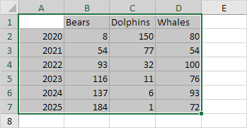
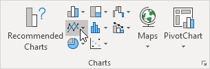
2. On the Insert tab, in the Charts group, click the Line symbol.
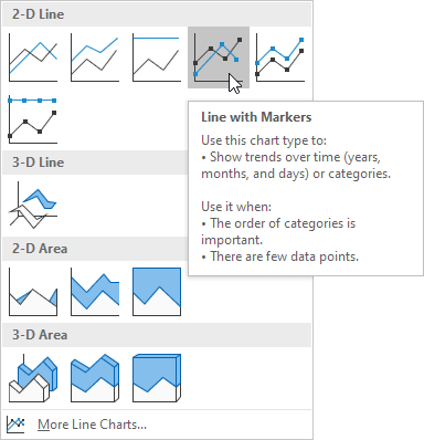
3. Click Line with Markers.
Note: only if you have numeric labels, empty cell A1 before you create the line chart. By doing this, Excel does not recognize the numbers in column A as a data series and automatically places these numbers on the horizontal (category) axis. After creating the chart, you can enter the text Year into cell A1 if you like.
Let’s customize this line chart.
To change the data range included in the chart, execute the following steps.
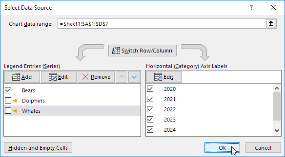
4. Select the line chart.
5. On the Chart Design tab, in the Data group, click Select Data.
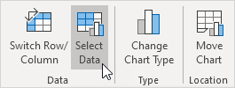
6. Uncheck Dolphins and Whales and click OK.
To change the color of the line and the markers, execute the following steps.
7. Right click the line and click Format Data Series.
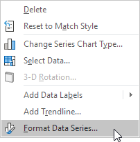
The Format Data Series pane appears.
8. Click the paint bucket icon and change the line color.
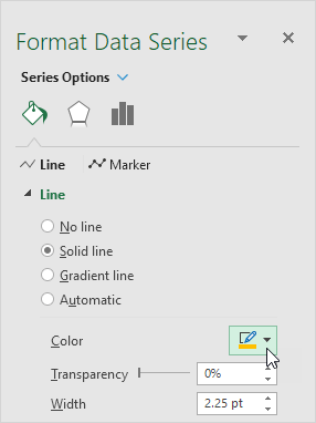
9. Click Marker and change the fill color and border color of the markers.
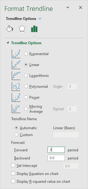
To add a trendline, execute the following steps.
10. Select the line chart.
11. Click the + button on the right side of the chart, click the arrow next to Trendline and then click More Options.
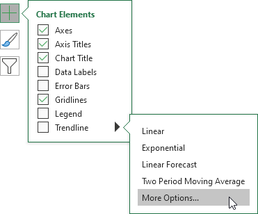
The Format Trendline pane appears.
12. Choose a Trend/Regression type. Click Linear.
13. Specify the number of periods to include in the forecast. Type 2 in the Forward box.
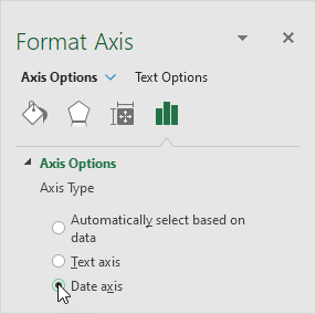
To change the axis type to Date axis, execute the following steps.
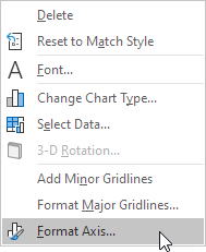
14. Right click the horizontal axis, and then click Format Axis.
The Format Axis pane appears.
15. Click Date axis.
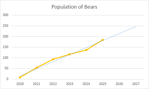
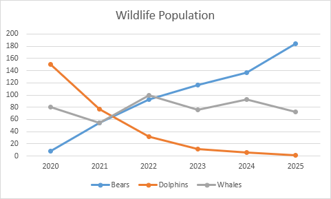
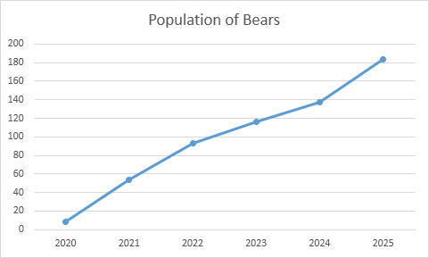
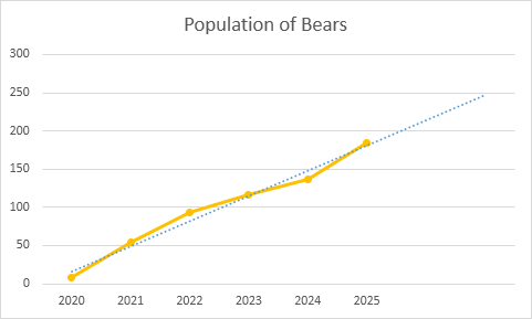
Conclusion: the trendline predicts a population of approximately 250 bears in 2024.
Источник
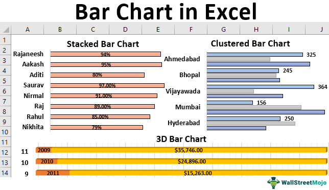
Bar Chart in Excel


Excel Bar Chart
Bar charts in Excel are useful in representing the single data on the horizontal bar. They represent the values in horizontal bars. Categories are displayed on the Y-axis in these charts, and values are shown on the X-axis. To create or make a bar chart, a user needs at least two variables, i.e., independent and dependent variables.
For example, we can turn any Excel data into a stacked bar graph that can display comparisons between categories of data, ranking, part-to-whole, deviation, or distribution. It compares parts of a whole with the ability to break down. We can also use the clustered bar chart to represent more than one data series in clustered horizontal columns when the data is complex and difficult to understand. In addition, we can also use a 3D bar chart to provide the chart’s title and define labels and values to make the chart more understandable.
Independent Variable: This does not change concerning any other variable.
Dependent Variable: This change concerns the independent variable.
Mainly there are three types of bar charts in Excel.
- Stacked Bar Chart: It is also referred the segmented chart. It represents all the dependent variables by stacking them together and on top of other variables.
- Clustered Bar Chart: This chart groups all the dependent variables to display in a graph format. A clustered chart with two dependent variables is the double graph.
- 3D Bar Chart: This chart represents all the dependent variables in 3D representation.
Table of contents
You are free to use this image on your website, templates, etc., Please provide us with an attribution link How to Provide Attribution? Article Link to be Hyperlinked
For eg:
Source: Bar Chart in Excel (wallstreetmojo.com)
Examples to Create Various Types of Bar Charts in Excel
Example #1 – Stacked Bar Chart
This example illustrates how to create a stacked bar graph in simple steps.
- First, we must enter the data into the Excel sheets in the table format, as shown in the figure.
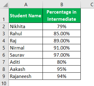
Then, select the entire table by clicking and dragging or placing the cursor anywhere in the table and press CTRL+A to select the whole table.
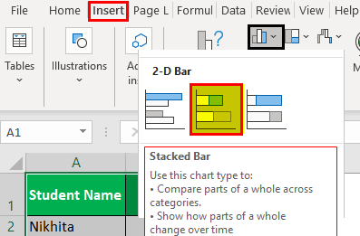
Next, we will go to the “Insert” tab and move the cursor to the insert bar chart option.

Under the 2D bar chart, we select the stacked bar chart, as shown in the figure below.
We may see the stacked bar chart as shown below.
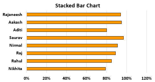
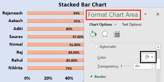
We will add “Data Labels” to the data series in the plotted area.
We will click on the chart area to select the data series.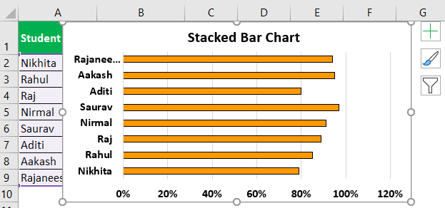
Now, as shown in the screenshot, we will right-click on the data series and choose the add data labels to add the data label option.

We can move the bar chart to the desired place in the worksheet. Then, we can click on the edge and drag it with the mouse.

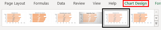
We can change the design of the bar chart utilizing the various options available, including changing color, changing the chart type, and moving the chart from one sheet to another sheet.
We get the following stacked bar chart.

We can use the “Format Chart Area” to change color, transparency, dash type, cap type, and join type.
Example #2 – Clustered Bar Chart
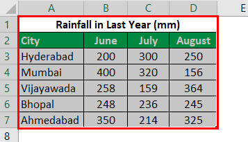
- Step 1: As shown in the figure, we must enter the data into the Excel sheets in the Excel table formatExcel Table FormatExcel comes with a number of table styles that you may quickly apply to a table format. In Excel, you can design and use a new custom table style of your choice.read more , as shown in the figure.
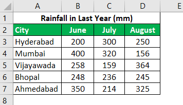
- Step 2: We must select the entire table by clicking and dragging or placing the cursor anywhere and pressing “CTRL+A” to choose the whole table.
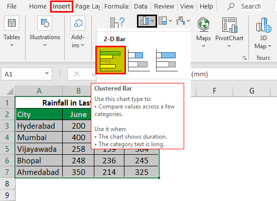
- Step 3: We will go to the “Insert” tab and move the cursor to the insert bar chart option. Then, under the “2D Bar Chart,” select the clustered bar chart shown in the figure below.
- Step 4: Next, we will add a suitable title to the chart, as shown in the figure.
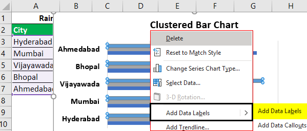
- Step 5: Now, we will right-click on the data series and choose the add data labels to add the data label option, as shown in the screenshot.
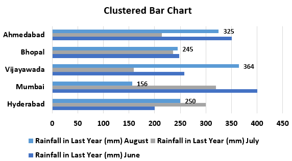
The data is added to the plotted chart, as shown in the figure.
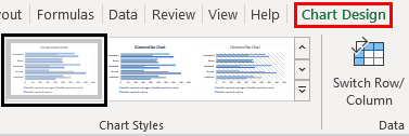
- Step 6:We will now apply to format to change the charts’ design using the chart’s “Design” and “Format” tabs, as shown in the figure.
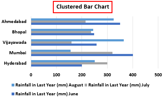
As a result, we can get the following chart.
We can also change the chart’s layout using the “Quick Layout” feature.

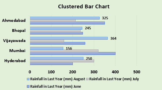
Therefore, we will get the following clustered bar chart.
Example #3 – 3D Bar Chart
This example illustrates creating a 3D bar chart in Excel in simple steps.
- Step 1: First, we must enter the data into the Excel sheets in the table format, as shown in the figure.

- Step 2: We will now select the whole table by clicking and dragging or placing the cursor anywhere and pressing “CTRL+A” to choose the table completely.
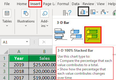
- Step 3: Next, we will go to the “Insert” tab and move the cursor to the insert bar chart option. Under the “3D Bar Chart,” select the 100% stacked bar chart, as shown in the figure below.
- Step 4: Now will add a suitable title to the chart, as shown in the figure.

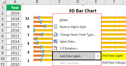
- Step 5: We will now right-click on the data series and choose “Add Data Labels” to add the data label option, as shown in the screenshot.
The data is added to the plotted chart, as shown in the figure.
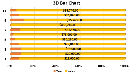
Using the format chart area, we will apply the required formatting and design. As a result, we will get the following 3D bar chart.

Uses of Bar Chart
The bar chart in Excel is used for different purposes, including:
- Easier planning and making decisions based on the data analyzed.
- Determination of business decline or growth in a short time from the past data.
- Visual representation of the data and improved abilities in the communication of complex data.
- Comparing the different categories of data to enhance the proper understanding.
- Finally, summarize the data in the graphical format produced in the tables.
Things to Remember
- A bar chart is only useful for small sets of data.
- The bar chart ignores the data if it contains non-numerical values.
- It is hard to use the bar charts if data is not arranged properly in the Excel sheet.
- Bar charts and column charts have a lot of similarities except for the visual representation of the bars in horizontal and vertical format. These can be interchanged with each other.
Recommended Articles
This article is a guide to Bar Chart in Excel. We discuss how to create different types of bar chart in Excel (stacked, clustered, and 3D), along with examples. You can have a look at other articles on Excel functions: –
Источник
Author: Oscar Cronquist Article last updated on February 19, 2019
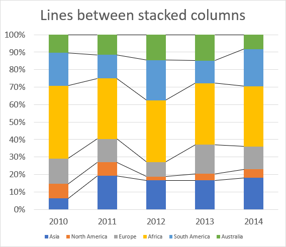
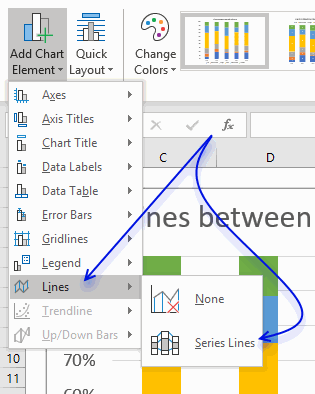
The image above shows lines between each colored column, here is how to add them automatically to your chart.
- Select chart.

- Go to tab «Design» on the ribbon.
- Press with left mouse button on «Add Chart Element» button.

- Press with left mouse button on «Lines».
- Press with left mouse button on «Series Lines».

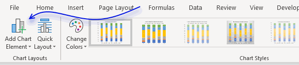
Lines are now visible between the columns.
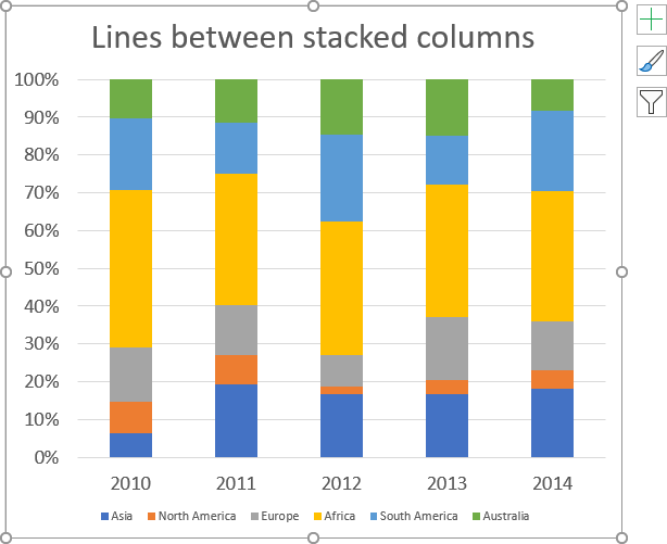
How to change line thickness
- Press with mouse once on one line between columns to select them all.
- Go to tab «Format» on the ribbon.
- Press with mouse on arrow to display all Shape Styles.

- Select a line thickness and color.

- Hovering over a line and the chart shows a preview in real time.
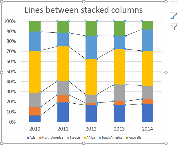
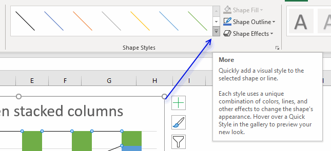
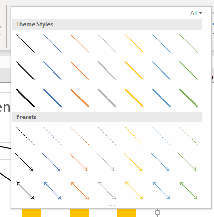
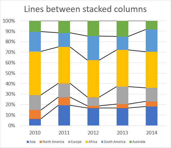
Chart basics category
How to create a dynamic chart
Question: How do I create a chart that dynamically adds the values, as i type them on the worksheet? Answer: […]
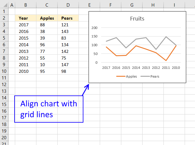
How to align chart with cell grid
This trick is so simple and also an incredible time-saver if you want to build beautiful worksheets or dashboards where […]
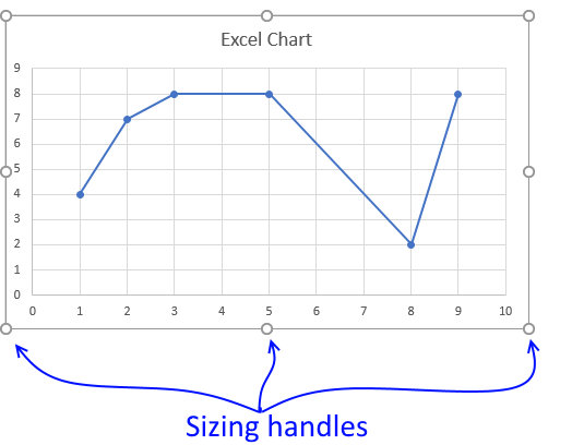
Four ways to resize a chart
To be able to resize a chart you must first select it, you do that by press with left mouse button […]
Group chart categories
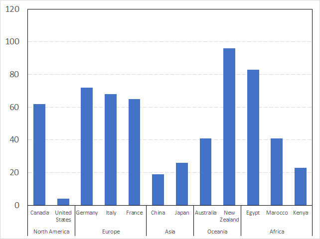
The image above shows you categories (countries) grouped into regions making this chart a lot cleaner and easier to read. How […]
Charts category
More than 1300 Excel formulas
Excel categories
Latest updated articles.
More than 300 Excel functions with detailed information including syntax, arguments, return values, and examples for most of the functions used in Excel formulas.
More than 1300 formulas organized in subcategories.
Excel Tables simplifies your work with data, adding or removing data, filtering, totals, sorting, enhance readability using cell formatting, cell references, formulas, and more.
Allows you to filter data based on selected value , a given text, or other criteria. It also lets you filter existing data or move filtered values to a new location.
Lets you control what a user can type into a cell. It allows you to specifiy conditions and show a custom message if entered data is not valid.
Lets the user work more efficiently by showing a list that the user can select a value from. This lets you control what is shown in the list and is faster than typing into a cell.
Lets you name one or more cells, this makes it easier to find cells using the Name box, read and understand formulas containing names instead of cell references.
The Excel Solver is a free add-in that uses objective cells, constraints based on formulas on a worksheet to perform what-if analysis and other decision problems like permutations and combinations.
An Excel feature that lets you visualize data in a graph.
Format cells or cell values based a condition or criteria, there a multiple built-in Conditional Formatting tools you can use or use a custom-made conditional formatting formula.
Lets you quickly summarize vast amounts of data in a very user-friendly way. This powerful Excel feature lets you then analyze, organize and categorize important data efficiently.
VBA stands for Visual Basic for Applications and is a computer programming language developed by Microsoft, it allows you to automate time-consuming tasks and create custom functions.
A program or subroutine built in VBA that anyone can create. Use the macro-recorder to quickly create your own VBA macros.
UDF stands for User Defined Functions and is custom built functions anyone can create.
A list of all published articles.
There are a few creative ways to add a vertical line to your chart bouncing around the internet. If you have landed on this article, I assume you are looking for an automated solution so you don’t have to manually drag the line(s) you drew on your spreadsheet every month.
Well, you have come to the right place!
In this article, you will learn the best way to add a dynamic vertical line to your bar or line chart. This technique is fairly easy to implement but took a lot of creative thinking to develop (I definitely did not create this technique but it’s been well known among Excel chartists for decades).
In this article, we’ll cover 3 topics:
-
Embedding Vertical Line Shapes Into A Chart (Simple Method)
-
Creating A Dynamic Vertical Line In Your Chart (Advanced Method)
-
Adding Text Labels Above Your Vertical Line
I do have an example Excel file available to download near the end of this article in case you get stuck on a particular step.
Embedding A Vertical Line Shape Into A Chart
This first method is the quick and dirty way to get a vertical line into your chart. I only recommend this method if this is a single-use chart and you will not have to be moving the vertical line around in the future. You’ll learn a more dynamic methodology in the next section of this article.
Create Your Line
First, you will need to draw a line shape on your spreadsheet. You can do this by navigating to the Insert tab and opening the Shapes menu button.
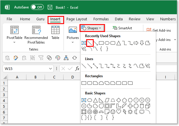
Select the line button and your cursor should change to be in Draw Mode.
Hold down your SHIFT key on the keyboard and click where you want your line to begin and drag downward to add length to your line.
If your line looks a little slanted, you can ensure the width of the line = 0 to force it to be zero (in the Shape Format tab). If you want to change the length of your line, you can hold the SHIFT key down while you adjust to ensure it remains perfectly vertical.
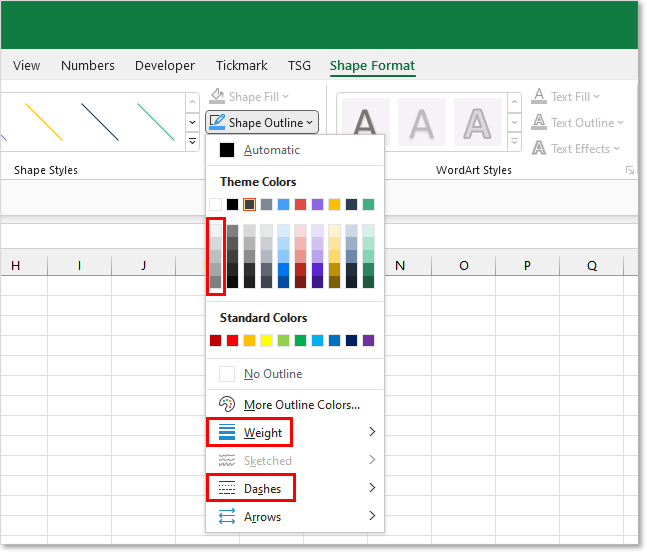
Format Your Line
You’ll likely want to modify the formatting of your line from the default look. There are many formatting options available to you in the Shape Format tab. This contextual Ribbon tab appears when you have the line shape selected.
For chart lines, I typically modify the following line properties:
-
Line Weight: 2.25 — 3.00 pts
-
Dashes: Rounded Dots
-
Shape Outline Color: Medium/Light Grey
Embed Your Line Into The Chart
Now that you have your vertical line looking the way your want, it’s time to add it to your chart.
Many people will just reposition the line on top of the chart and call it a day. This is really poor practice since the line will not reposition if you happen to move or resize your chart. You will also have to remember to select both the chart and the line objects before copying, to capture the entire chart graphic.
You really should embed the vertical line inside your chart so it becomes part of the chart object. This can be done by:
-
Copy the vertical line shape (CTRL + C)
-
Select the Chart Object
-
Paste (Ctrl + V)
Copy/Paste the Vertical Line into the Chart itself to embed it
Reposition Your Line
After you paste the line into your selected Chart object, you should see the line appear inside the chart. You can then proceed to reposition the line with your mouse. Unfortunately, you cannot use the arrow keys on your keyboard to reposition a shape or textbox embedded in a chart object.
For vertical lines, I recommend making the line start on the X-axis and end at the very top of the Plot Area. The Plot Area is the box that gets outlined in your Chart when you click on the white space between your bars.
To update the position of the vertical line in the future, you just need to remember to move the line inside the chart. We’ll discuss a more advanced technique in the next section which will allow you to automate moving the line across your chart.
Creating A Dynamic Vertical Line In Your Chart
If you are looking for a more automated/long-term solution for incorporating a vertical line into your chart, this is going to be the solution for you.
The technique we’ll be using incorporates a single-pointed Scatter Plot (x,y) in combination with your current chart. The single point charted on the Scatter Plot will control the location of the vertical line.
We will then turn on vertical Error Bars (margin of error indicators), repurposing them to visually display a vertical line on the chart.
Now if that explanation went way over your head, don’t worry! I will walk you through each step and show you it’s really not that difficult to set this up.
Chart Starting Point
I’m going to assume you already have your chart created and you are looking to add the vertical line to the pre-existing chart. With this assumption in mind, I’ll forgo walking you through how to create a chart in Excel.
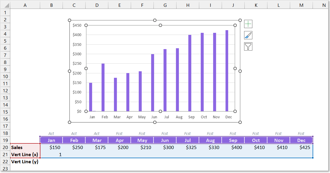
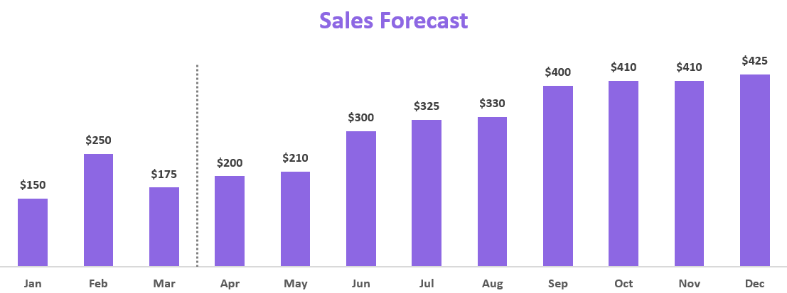
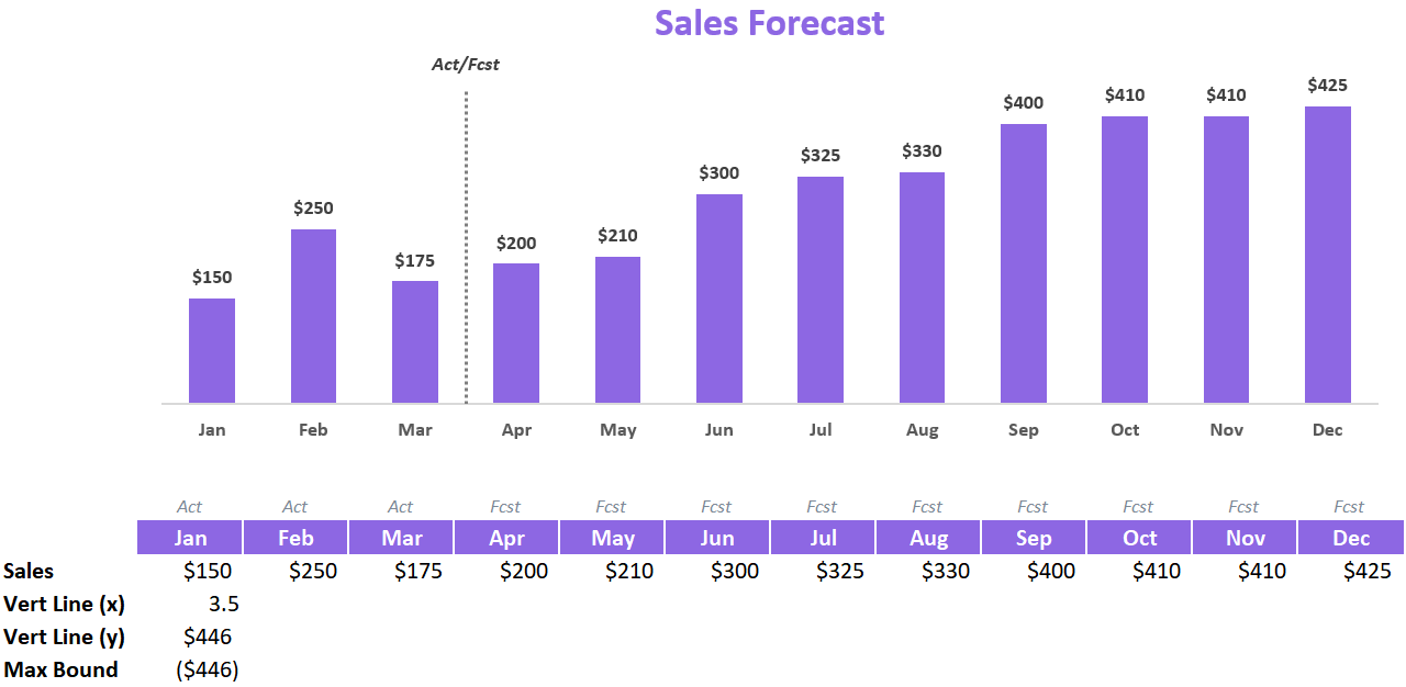
For this example, we’ll use the below chart to start with and we will work to insert a vertical line to separate the Actual months from the Forecast months.

Create A Combo Chart
The vertical line will need to be plotted using a Scatter Plot chart. Chances are you are working with either a Bar Chart or a Line Chart, so we will need to turn your chart into a Combo Chart. Combo Charts can accommodate different charting types within a single Chart object.
Before you can set up a Combo Chart, your chart will need to have an additional chart series that we can plot to. You can add an additional row of temporary data to your chart data and ensure a new chart series is connected to it (through the Select Chart Data dialog box).
Once your chart has the additional chart series added, select the entire chart and navigate to the Chart Design tab in the Excel Ribbon.
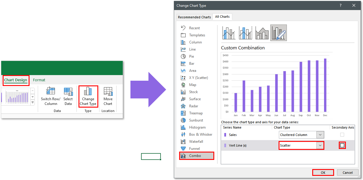
Select the Change Chart Type button to launch the Change Chart Type dialog box. Once the dialog box appears, click on the Combo menu item in the left-side pane.
Look for the series you set up to chart the vertical line and ensure its Chart Type designation is changed to Scatter. Also, make sure the Secondary Axis checkbox remains unchecked.
Once you have made your changes, you can click the OK button to finish converting your chart to a Combo Chart.
Create the Scatter Plot Series
Once you have added Scatter Plot capabilities to your chart, you can then begin to set up your x and y coordinates for your vertical line.
Right-click on your chart and go to Select Data.
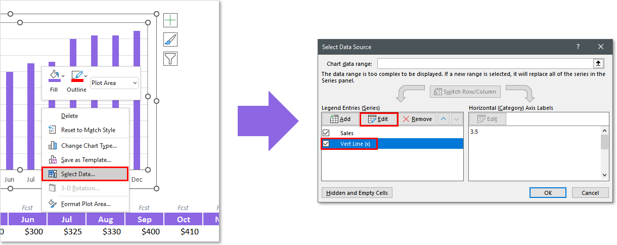
Ensure the Series Name you designated as a Scatter Plot series is selected and click the Edit button.
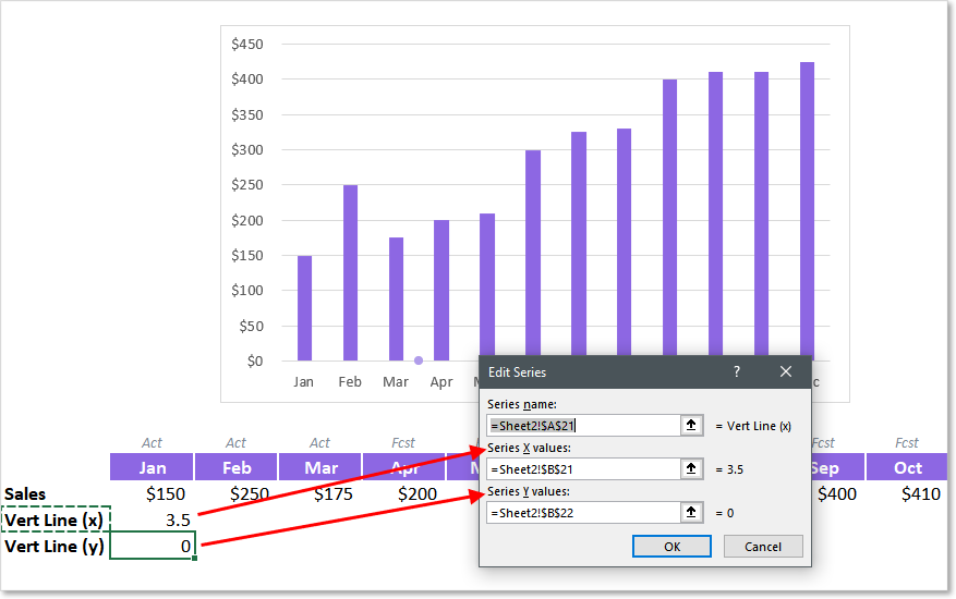
You can then begin to link your X and Y coordinates for your series. In this case, you will want the Y value = 0 and your X value to be halfway between the two bars you wish the vertical line to reside. In this example, since our first forecast month is April, the X value will equal 3.5.
You can hardcode your Y value to zero if you’d like (no cell reference) or link it up to a cell reference to visually show the full coordinates in the spreadsheet.
Adding Vertical Error Bars
So how do we turn a single dot on a Scatter Plot into a vertical bar with no dot? Now is time for the creative part!
What we will be adding to the plotted dot is an Error Bar. What is an Error Bar you might be thinking? It is used in statistics to indicate the margin of error for a given value. This allows someone to chart a value but show the audience that the value might be within a range of numbers that are either greater or less than that value.
We can use this margin indicator line to our advantage and setup up the spreadsheet to allow us to draw a vertical line right on the chart. To add an Error Bar you will need to follow the below steps.
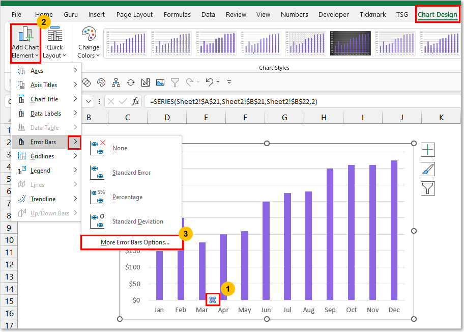
-
Select the Scatter Plot series
-
Navigate to the Chart Design Ribbon tab
-
Open the Add Chart Element menu
-
Open the Error Bars menu
-
Select More Error Bars Options…
The Format Error Bars Pane should appear on the right-hand side of your Excel application window.
Open the Error Bar Options drop-down menu and ensure the Y Error Bars for your Series is selected.
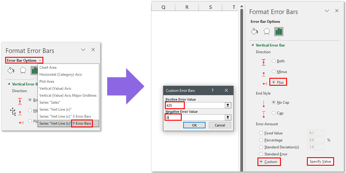
Change the Direction = Plus and End Style = No Cap.
For the Error Amount, choose Custom and click the Specify Value button. This will open a dialog box where you will need to designate a Positive and Negative value for your Error margin. Since our plotline is already at zero, we only want our margin to be positive. For this reason, you can set the Negative value to 0.
The positive value will determine the length of your line. You will typically want this to be equal to or greater than the largest value in your bar/line chart.
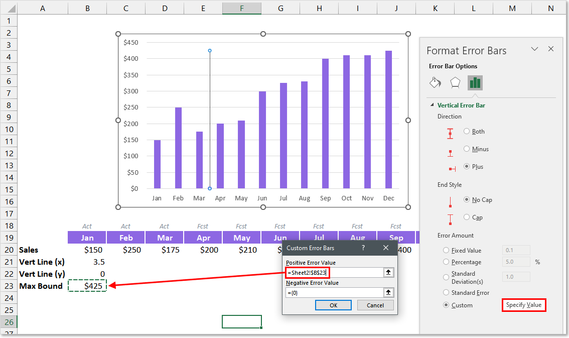
For an even more dynamic solution, I recommend setting up a cell that reads the values from your chart and determines the maximum value. In this example, the cell used has the formula:
=MAX(B20:M20)
If you want to ensure your line ends a little bit higher than your max value, you can add a percentage increase to your formula. Typically adding 5% does the trick for me. This will change your formula to look something like this:
=MAX(B20:M20) * 105%
After you have set up your Custom Error Bar, you should see the line plotted on your chart.

Formatting The Vertical Line
Once your vertical line is created, the last step will be to format your line to your desired look. Here are the format settings I will typically use:
-
Line Weight: 1.5 pts
-
Dashes: Rounded Dots
-
Shape Outline Color: Medium/Light Grey
-
Marker Fill Color: None
-
Marker Border Color: None
After some further format changes to the chart itself, you can have a very professional-looking chart with a vertical line plot directly inside it.
Automating The Vertical Line’s Movement
You may choose to manually update the vertical lines’ X Value every time, but you may also be able to utilize a formula to handle the movement for you.
Let’s look at the article example. The vertical line represents the separation of Actual vs. Forecast Sales results.
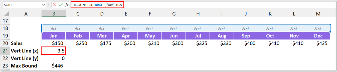
Looking at the data table, we can incorporate a simple COUNTIFS function to count how many months are designated as “Actuals”. This way, as the year progresses, the vertical line in the chart will move along as more and more months become “Actuals”.
Depending on your situation, you may be able to come up with a similar sort of formula to automate your vertical line movement as time progresses.
Adding Text Labels Above Your Vertical Line
Now let’s say you want to add a label to your vertical line to give your audience clarity on what it is defining. We can tweak the setup of the vertical line to incorporate the use of a data label.
In order to position a data label at the top of the vertical line, we’ll need to move our plotted dot to the very top of the line.
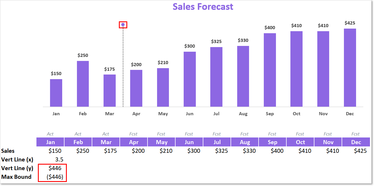
To do this, you simply need to turn your Max Bound value negative and ensure your Y value has a formula equating to a positive version of your Max Bound value (just multiply by -1).
This will move your plotted dot up to the top and carry your line length down southbound (negative) to end at zero.
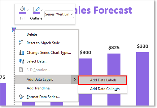
After you’ve re-jiggered your vertical line setup, you can then proceed to add a data label. Simply select your plotted dot and right-click on it. Then open the Add Data Labels menu and click Add Data Labels.
You should then see a data label appear next to your vertical line.

Next, you’ll likely want to reposition your data label to be directly over your vertical line. To do this, select and right-click on your data label. Click the Format Data Point menu option and the Format Data Label pane should open up.
In the Label Position section of the Label Options, select Above.
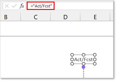
Finally, you’ll want to customize the text that is stored in the label. After selecting the Data Label, you can write a text formula (similar to the screenshot above) or you can link the Data Label to a spreadsheet cell with your desired text value.
The final result should look something like this:
Download Examples In Excel
If you would like to instantly download an Excel file I put together with exact chart examples used in this article along with a few other examples, feel free to click the below download button. No strings attached 
I Hope This Helped!
Hopefully, I was able to explain how you can add a vertical line to your Excel Charts. If you have any questions about this technique or suggestions on how to improve it, please let me know in the comments section below.
About The Author
Hey there! I’m Chris and I run TheSpreadsheetGuru website in my spare time. By day, I’m actually a finance professional who relies on Microsoft Excel quite heavily in the corporate world. I love taking the things I learn in the “real world” and sharing them with everyone here on this site so that you too can become a spreadsheet guru at your company.
Through my years in the corporate world, I’ve been able to pick up on opportunities to make working with Excel better and have built a variety of Excel add-ins, from inserting tickmark symbols to automating copy/pasting from Excel to PowerPoint. If you’d like to keep up to date with the latest Excel news and directly get emailed the most meaningful Excel tips I’ve learned over the years, you can sign up for my free newsletters. I hope I was able to provide you some value today and hope to see you back here soon! — Chris