
Specific line and bar types are available in 2-D stacked bar and column charts, line charts, pie of pie and bar of pie charts, area charts, and stock charts.
Predefined line and bar types that you can add to a chart
Depending on the chart type that you use, you can add one of the following lines or bars:
-
Series lines These lines connect the data series in 2-D stacked bar and column charts to emphasize the difference in measurement between each data series. Pie of pie and bar of pie charts display series lines by default to connect the main pie chart with the secondary pie or bar chart.

-
Drop lines Available in 2-D and 3-D area and line charts, these lines extend from data points to the horizontal (category) axis to help clarify where one data marker ends and the next data marker starts.
-
High-low lines Available in 2-D line charts and displayed by default in stock charts, high-low lines extend from the highest value to the lowest value in each category.
-
Up-down bars Useful in line charts with multiple data series, up-down bars indicate the difference between data points in the first data series and the last data series. By default, these bars are also added to stock charts, such as Open-High-Low-Close and Volume-Open-High-Low-Close.
Add predefined lines or bars to a chart
-
Click the 2-D stacked bar, column, line, pie of pie, bar of pie, area, or stock chart to which you want to add lines or bars.
This displays the Chart Tools, adding the Design, Layout, and Format tabs.
-
On the Layout tab, in the Analysis group, do one of the following:
-
Click Lines, and then click the line type that you want.
Note: Different line types are available for different chart types.
-
Click Up/Down Bars, and then click Up/Down Bars.
-
Tip: You can change the format of the series lines, drop lines, high-low lines, or up-down bars that you display in a chart by right-clicking the line or bar, and then clicking Format <line or bar type> .
Remove predefined lines or bars from a chart
-
Click the 2-D stacked bar, column, line, pie of pie, bar of pie, area, or stock chart that displays predefined lines or bars.
This displays the Chart Tools, adding the Design, Layout, and Format tabs.
-
On the Layout tab, in the Analysis group, click Lines or Up/Down Bars, and then click None to remove lines or bars from a chart.
Tip: You can also remove lines or bars immediately after you add them to the chart by clicking Undo on the Quick Access Toolbar or by pressing CTRL+Z.
You can add other lines to any data series in an area, bar, column, line, stock, xy (scatter), or bubble chart that is 2-D and not stacked.
Add other lines
-
This step applies to Word for Mac only: On the View menu, click Print Layout.
-
In the chart, select the data series that you want to add a line to, and then click the Chart Design tab.
For example, in a line chart, click one of the lines in the chart, and all the data marker of that data series become selected.
-
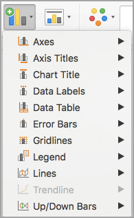
Click Add Chart Element, and then click Gridlines.
-
Choose the line option that you want or click More Gridline Options.
Depending on the chart type, some options may not be available.
Remove other lines
-
This step applies to Word for Mac only: On the View menu, click Print Layout.
-
Click the chart with the lines, and then click the Chart Design tab.
-
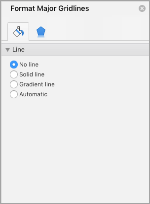
Click Add Chart Element, click Gridlines, and then click More Gridline Options.
-
Select No line.
You can also click the line and press DELETE .
Friday, February 19, 2016
Peltier Technical Services, Inc., Copyright © 2023, All rights reserved.
Combination charts combine data using more than one chart type, for example columns and a line. Building a combination chart in Excel is usually pretty easy. But if one series type is horizontal bars, then combining this with another type can be tricky. I’m here to help with Bar-Line, or rather, Bar-XY combination charts in Excel.
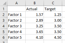
I’ll illustrate a simple combination chart with this simple data. The chart will use the first column for horizontal axis category labels, the second column for actual values plotted using lines with markers, and the third column using columns (vertical bars).
We start by selecting the data and inserting a column chart.
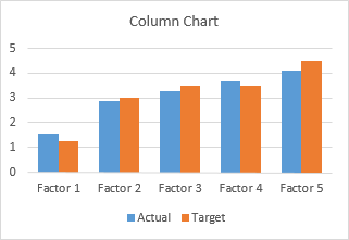
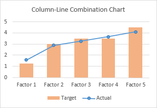
We finish by right clicking on the “Actual” data, choosing Change Series Chart Type from the pop-up menu, and selecting the new chart type we want. I’ve also used a lighter shade of orange for the columns, to make the markers stand out better.
Let’s do the same for a bar chart. Select the data, insert a bar chart.
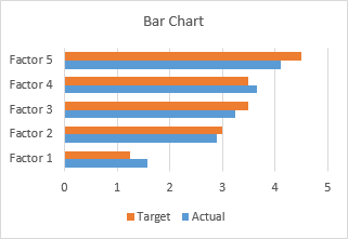
Okay, the category labels are along the vertical axis, but we’ll continue by changing the Actual data to a line chart series. That didn’t work out at all. The markers are not positioned vertically along the centers of the horizontal bars, nor horizontally where the data lies in the Actual column of the worksheet.
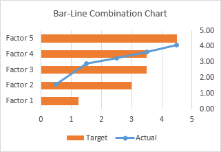
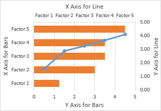
In the chart below I’ve shown all axis scales and axis titles to illustrate the problem. When we converted the Actual series to a line type, Excel assigned it to the secondary axis, and we have no ability to reassign it to the primary axis. The primary axes used for the bar chart are not aligned with the secondary axes used for the line chart: the X axis for the bars is vertical and the X axis for the line is horizontal; the Y axis for the bars is horizontal and the Y axis for the line is vertical.
We can’t use a line chart at all. If we want to line up the markers horizontally with their proper position along the lengths of the bars, we need to use the Actual data as the X values of an XY series. We will need to generate some additional data for the Y values of the XY series.
Bar-XY Combination Chart
We will not try to make a Bar-Line combination chart, because the Line chart type does not position the markers where we want them. We will make a Bar-XY chart type, using an XY chart type (a/k/a Scatter chart type) to position markers.
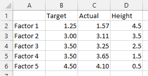
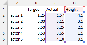
Here is the new data needed for our Bar-XY combination chart. The factor labels and Target values will be used by the Bar chart series, and the Actual values and Heights for the XY series. Don’t worry about the Height values: I’ll show how they are derived in a moment. The nice thing is that we can use dummy values now and type in the proper values later and the chart will update.
Select the first two columns of the data and insert a bar chart.
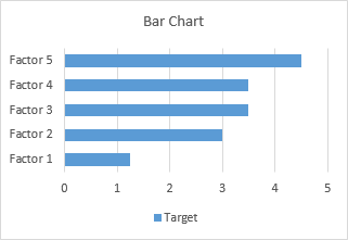
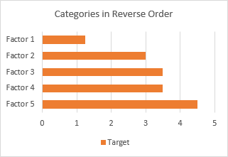
Since we probably want the categories listed in the same order as in the worksheet, let’s select the vertical axis (which in a bar chart is the X axis) and press Ctrl+1, the shortcut that opens the Format dialog or task pane for the selected object in Excel. Check the box for Categories in Reverse Order and also select Horizontal Axis Crosses at Maximum Category to move it next to Factor 5.
I’ve also recolored the bars orange, because blue markers show up better against light orange than orange markers against light blue.
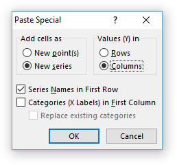
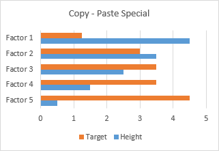
Now copy the last two columns (Actual and Height), select the chart, and on the Home tab of the ribbon, click the Paste dropdown arrow, choose the options in this dialog (add cells as new series, values in columns, series names in first row, categories in first column), and click OK.
The data is added as another set of bars, which I’ve colored blue, but we’ll change that in a second.
Right-click on the added series, select Change Series Chart Type from the pop-up menu, and select XY with markers and lines.
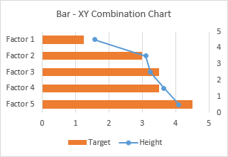
We see that the horizontal positions of the markers is just what we want to show.
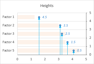
Now we can see where the values in the Heights column comes from. The right hand vertical axis is used for the Y values of the XY series. Looking at the positions of the horizontal bars and the markers in their correct positions, we can see that the Factor 1 bar is centered on Y=4.5, the Factor 2 bar is centered on 3.5, etc. If you hadn’t guessed this at the beginning, type these values into your data range, and let the chart update.
A few minor changes and we’ll be done. First, change the name of the XY series from Heights to Actual. The easiest way is to click on the series, then look at the highlighted ranges in the chart. The X values (C2:C6) are highlighted purple, the Y values (D2:D6) are highlighted blue, and the series name (cell D1) is highlighted red (highlight colors in Excel 2010 and earlier are different, but the concept is the same). Click on the red border of cell D2, and drag the highlighting rectangle to cover cell C2 to change the series name.
Click on the red border of cell D2, and drag the highlighting rectangle to cover cell C2 to change the series name.
Then, use a lighter shade of orange for the bars, so the blue markers stand out. Finally, hide the right-hand vertical axis: format it so it has no labels and no line color.
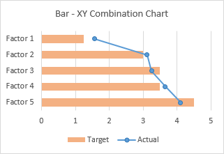
And there’s our completed Bar-XY Combination Chart.
More Combination Chart Articles on the Peltier Tech Blog
- Clustered Column and Line Combination Chart
- Precision Positioning of XY Data Points
- Add a Horizontal Line to an Excel Chart
- Horizontal Line Behind Columns in an Excel Chart
- Salary Chart: Plot Markers on Floating Bars
- Fill Under or Between Series in an Excel XY Chart
- Fill Under a Plotted Line: The Standard Normal Curve
- Excel Chart With Colored Quadrant Background
Содержание
- Bar-Line (XY) Combination Chart in Excel
- Combination Charts in Excel
- Bar-XY Combination Chart
- Create pie, bar, and line charts
- Want more?
- Add or remove series lines, drop lines, high-low lines, or up-down bars in a chart
- Predefined line and bar types that you can add to a chart
- Add predefined lines or bars to a chart
- Remove predefined lines or bars from a chart
- Add other lines
- Remove other lines
Bar-Line (XY) Combination Chart in Excel
Friday, February 19, 2016 by Jon Peltier 18 Comments
Combination charts combine data using more than one chart type, for example columns and a line. Building a combination chart in Excel is usually pretty easy. But if one series type is horizontal bars, then combining this with another type can be tricky. I’m here to help with Bar-Line, or rather, Bar-XY combination charts in Excel.
Combination Charts in Excel
I’ll illustrate a simple combination chart with this simple data. The chart will use the first column for horizontal axis category labels, the second column for actual values plotted using lines with markers, and the third column using columns (vertical bars).
We start by selecting the data and inserting a column chart.
We finish by right clicking on the “Actual” data, choosing Change Series Chart Type from the pop-up menu, and selecting the new chart type we want. I’ve also used a lighter shade of orange for the columns, to make the markers stand out better.
Let’s do the same for a bar chart. Select the data, insert a bar chart.
Okay, the category labels are along the vertical axis, but we’ll continue by changing the Actual data to a line chart series. That didn’t work out at all. The markers are not positioned vertically along the centers of the horizontal bars, nor horizontally where the data lies in the Actual column of the worksheet.
In the chart below I’ve shown all axis scales and axis titles to illustrate the problem. When we converted the Actual series to a line type, Excel assigned it to the secondary axis, and we have no ability to reassign it to the primary axis. The primary axes used for the bar chart are not aligned with the secondary axes used for the line chart: the X axis for the bars is vertical and the X axis for the line is horizontal; the Y axis for the bars is horizontal and the Y axis for the line is vertical.
We can’t use a line chart at all. If we want to line up the markers horizontally with their proper position along the lengths of the bars, we need to use the Actual data as the X values of an XY series. We will need to generate some additional data for the Y values of the XY series.
Bar-XY Combination Chart
We will not try to make a Bar-Line combination chart, because the Line chart type does not position the markers where we want them. We will make a Bar-XY chart type, using an XY chart type (a/k/a Scatter chart type) to position markers.
Here is the new data needed for our Bar-XY combination chart. The factor labels and Target values will be used by the Bar chart series, and the Actual values and Heights for the XY series. Don’t worry about the Height values: I’ll show how they are derived in a moment. The nice thing is that we can use dummy values now and type in the proper values later and the chart will update.
Select the first two columns of the data and insert a bar chart.
Since we probably want the categories listed in the same order as in the worksheet, let’s select the vertical axis (which in a bar chart is the X axis) and press Ctrl+1, the shortcut that opens the Format dialog or task pane for the selected object in Excel. Check the box for Categories in Reverse Order and also select Horizontal Axis Crosses at Maximum Category to move it next to Factor 5.
I’ve also recolored the bars orange, because blue markers show up better against light orange than orange markers against light blue.
Now copy the last two columns (Actual and Height), select the chart, and on the Home tab of the ribbon, click the Paste dropdown arrow, choose the options in this dialog (add cells as new series, values in columns, series names in first row, categories in first column), and click OK.
The data is added as another set of bars, which I’ve colored blue, but we’ll change that in a second.
Right-click on the added series, select Change Series Chart Type from the pop-up menu, and select XY with markers and lines.
We see that the horizontal positions of the markers is just what we want to show.
Now we can see where the values in the Heights column comes from. The right hand vertical axis is used for the Y values of the XY series. Looking at the positions of the horizontal bars and the markers in their correct positions, we can see that the Factor 1 bar is centered on Y=4.5, the Factor 2 bar is centered on 3.5, etc. If you hadn’t guessed this at the beginning, type these values into your data range, and let the chart update.
A few minor changes and we’ll be done. First, change the name of the XY series from Heights to Actual. The easiest way is to click on the series, then look at the highlighted ranges in the chart. The X values (C2:C6) are highlighted purple, the Y values (D2:D6) are highlighted blue, and the series name (cell D1) is highlighted red (highlight colors in Excel 2010 and earlier are different, but the concept is the same). Click on the red border of cell D2, and drag the highlighting rectangle to cover cell C2 to change the series name.
Click on the red border of cell D2, and drag the highlighting rectangle to cover cell C2 to change the series name.
Then, use a lighter shade of orange for the bars, so the blue markers stand out. Finally, hide the right-hand vertical axis: format it so it has no labels and no line color.
And there’s our completed Bar-XY Combination Chart.
Источник
Create pie, bar, and line charts

In this video, see how to create pie, bar, and line charts, depending on what type of data you start with.
Want more?
We created a clustered column chart in the previous video.
In this video, we are going to create pie, bar, and line charts.
Each type of chart highlights data differently.
And some charts can’t be used with some types of data.
We’ll go over this shortly.
To create a pie chart, select the cells you want to chart.
Click Quick Analysis and click CHARTS.
Excel displays recommended options based on the data in the cells you select, so the options won’t always be the same.
I’ll show you how to create a chart that isn’t a Quick Analysis option, shortly.
Click the Pie option, and your chart is created.
You can chart only one data series with a pie chart.
In this example, those are the Sales figures in cells B2 through B5.
I am going to move and resize the chart, so it displays without having to scroll, which will also make it easier to customize (something we’ll look at in the next video.)
I click the chart; hold down the left mouse button, and drag to move it.
I scroll down a little, click the bottom right-hand corner of the chart, and drag it up and to the left to make it smaller.
Different data displays better in different types of charts.
If you try to graph too much data in a pie chart it looks like this, not very useful.
Now, I am creating a bar chart using the same data we used to create the pie chart.
Charting the same data different ways can provide you with a different perspective that may help you discover different insights in the data.
We are creating some of the more common chart types, but there are many more options.
To create charts that aren’t Quick Analysis options, select the cells you want to chart, click the INSERT tab.
In the Charts group, we have a lot of options.
Click Recommended Charts to see the charts that will work best with the data you have selected; click All Charts for even more options.
These are all of the different types of charts you can create.
As I mentioned earlier, a pie chart is not a recommended option for the data we selected, because it can only display one data series.
We could make a Pie chart, but it would only show the first data series, the Average Precipitation for New York, and not the second data series, the Average Precipitation for Seattle.
Instead, let’s make a Line with Markers chart.
Click Line, click Line with Marker, point to an option and you get a preview of the chart.
Click OK, and we have created our line chart.
Источник
Add or remove series lines, drop lines, high-low lines, or up-down bars in a chart
You can add predefined lines or bars to charts in several apps for Office. By adding lines, including series lines, drop lines, high-low lines, and up-down bars, to specific chart can help you analyze the data that is displayed. If you no longer want to display the lines or bars, you can remove them.
New to formatting charts in Excel? Click here for a free 5 minute video training on how to format your charts.
Specific line and bar types are available in 2-D stacked bar and column charts, line charts, pie of pie and bar of pie charts, area charts, and stock charts.
Predefined line and bar types that you can add to a chart
Depending on the chart type that you use, you can add one of the following lines or bars:
Series lines These lines connect the data series in 2-D stacked bar and column charts to emphasize the difference in measurement between each data series. Pie of pie and bar of pie charts display series lines by default to connect the main pie chart with the secondary pie or bar chart. 
Drop lines Available in 2-D and 3-D area and line charts, these lines extend from data points to the horizontal (category) axis to help clarify where one data marker ends and the next data marker starts. 
High-low lines Available in 2-D line charts and displayed by default in stock charts, high-low lines extend from the highest value to the lowest value in each category. 
Up-down bars Useful in line charts with multiple data series, up-down bars indicate the difference between data points in the first data series and the last data series. By default, these bars are also added to stock charts, such as Open-High-Low-Close and Volume-Open-High-Low-Close. 
Add predefined lines or bars to a chart
Click the 2-D stacked bar, column, line, pie of pie, bar of pie, area, or stock chart to which you want to add lines or bars.
This displays the Chart Tools, adding the Design, Layout, and Format tabs.
On the Layout tab, in the Analysis group, do one of the following:
Click Lines, and then click the line type that you want.
Note: Different line types are available for different chart types.
Click Up/Down Bars, and then click Up/Down Bars. 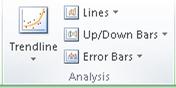
Tip: You can change the format of the series lines, drop lines, high-low lines, or up-down bars that you display in a chart by right-clicking the line or bar, and then clicking Format .
Remove predefined lines or bars from a chart
Click the 2-D stacked bar, column, line, pie of pie, bar of pie, area, or stock chart that displays predefined lines or bars.
This displays the Chart Tools, adding the Design, Layout, and Format tabs.
On the Layout tab, in the Analysis group, click Lines or Up/Down Bars, and then click None to remove lines or bars from a chart.
Tip: You can also remove lines or bars immediately after you add them to the chart by clicking Undo on the Quick Access Toolbar or by pressing CTRL+Z.
You can add other lines to any data series in an area, bar, column, line, stock, xy (scatter), or bubble chart that is 2-D and not stacked.
Add other lines
This step applies to Word for Mac only: On the View menu, click Print Layout.
In the chart, select the data series that you want to add a line to, and then click the Chart Design tab.
For example, in a line chart, click one of the lines in the chart, and all the data marker of that data series become selected.
Click Add Chart Element, and then click Gridlines.
Choose the line option that you want or click More Gridline Options.
Depending on the chart type, some options may not be available.
Remove other lines
This step applies to Word for Mac only: On the View menu, click Print Layout.
Click the chart with the lines, and then click the Chart Design tab.
Click Add Chart Element, click Gridlines, and then click More Gridline Options.
You can also click the line and press DELETE .
Источник
One helpful tip in improving dashboard presentation is by creating combination charts. Excel allows us to combine different chart types in one chart. This article assists all levels of Excel users on how to create a bar and line chart.
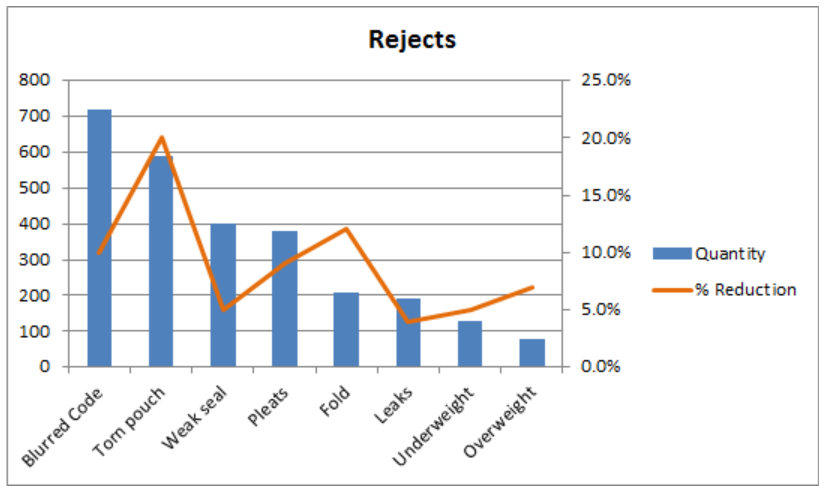 Figure 1. Final result: Bar and Line Graph
Bar Chart with Line
There are two main steps in creating a bar and line graph in Excel. First, we insert two bar graphs. Next, we change the chart type of one graph into a line graph.
Insert bar graphs
- Select the cells we want to graph
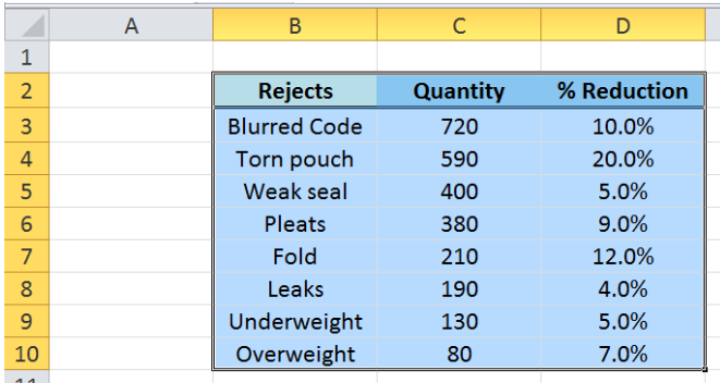 Figure 2. Selecting the cells to graph
- Click Insert tab > Column button > Clustered Column
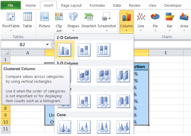 Figure 3. Clustered Column in Insert Tab
Two column charts or vertical bar charts will be created, one each for Quantity and %Reduction.
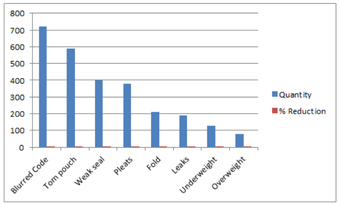 Figure 4. Vertical Bar Graph
Change bar graph to line graph
We want to present %Reduction as a line graph.
- We right-click on the series “% Reduction” and select Change Series Chart Type
 Figure 5. Change Series Chart Type in Menu Options
- The Change Chart Type dialog box will appear. Select Line > Line with Markers
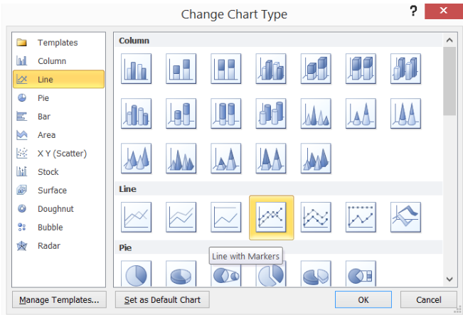 Figure 6. Line with Markers Chart Type
The %Reduction bar graph is now presented as a line graph. However, since the values are less than one, the line graph values are too close to the horizontal axis to be visually significant.
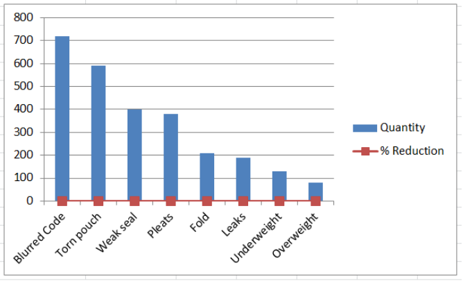 Figure 7. Bar Chart with Line
Display line graph scale on secondary axis
The work-around is to plot the line graph on a secondary axis.
- Right-click the line graph and select Format Data Series.
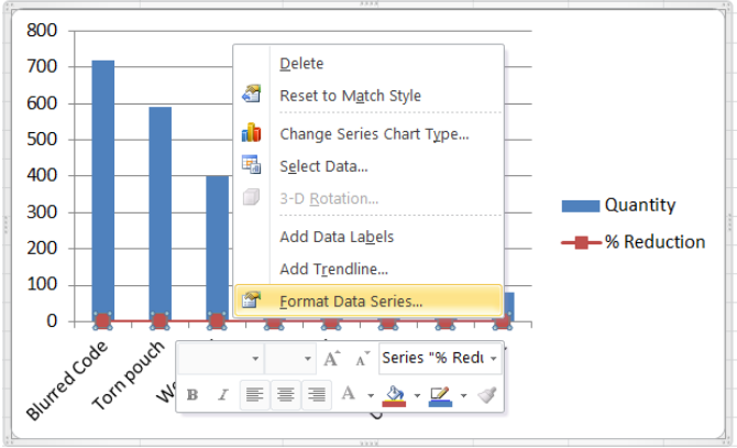 Figure 8. Format Data Series Option
- The Format Data Series dialog box will pop-up. Tick Secondary Axis in Series Options.
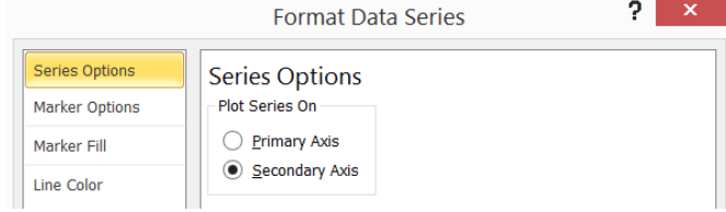 Figure 9. Secondary Axis in Series Options
We now have a combination bar and line graph.
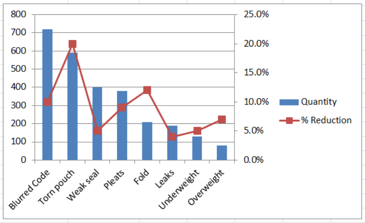 Figure 10. Bar and Line Graph with Secondary Axis
Next let us clean up our bar and line graph by doing the following:
- In Format Data Series, choose Marker Options > Marker Type > None
- Marker Color > Solid Line > Orange
- Delete the gridlines
- Add a chart title in Layout tab > Chart Title > Above Chart, then type “Rejects”
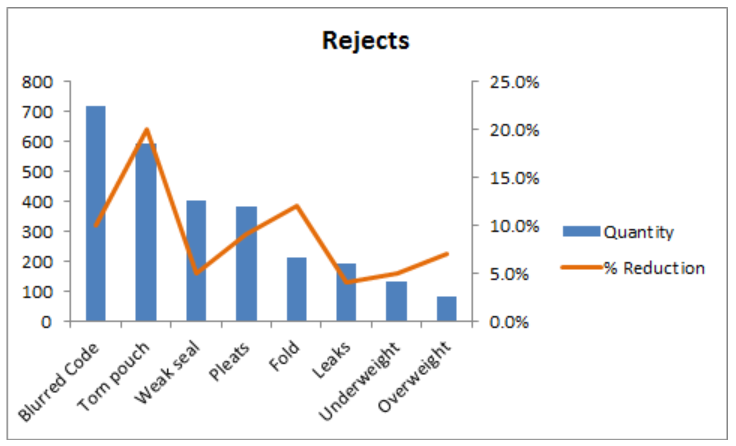 Figure 11. Output: Bar Chart with Line
Instant Connection to an Excel Expert
Most of the time, the problem you will need to solve will be more complex than a simple application of a formula or function. If you want to save hours of research and frustration, try our live Excelchat service! Our Excel Experts are available 24/7 to answer any Excel question you may have. We guarantee a connection within 30 seconds and a customized solution within 20 minutes.
To visualize numeric figures, the charts and graphs are best. And like any analytical tool, excel provides several kinds of charts for different kinds of data.
how many chart types does excel offer?
In excel 2016, there are more than 14 categories of charts that contain several chart types. If we apply a permutation combination than it would more than 100 chart type.
Of course, we will not talk about them all, but we will get introduced to some of the most useful chart types of excel. In this article, we will learn when to use these several chart types in excel.
All charts are found on the ribbon. In Insert? Charts? All Charts
These charts types are:
- Column Chart
- Bar Chart
- Line Chart
- Area Chart
- Pie Chart
- Donut Chart
- Radar Chart
- XY Scatter Chart
- Histogram Chart
- Combo Charts
- Some Special Charts
Without further delay, let’s get started.
Excel Column Chart
The column chart is the most commonly used chart type in any tool. The column charts are best used for comparing two or more data points at once. These data points are shown as verticle columns on the x-axis and the height of the column represents the magnitude of the datapoint.
There 3 types of Column Chart in Excel.
1. Clustered Column Chart
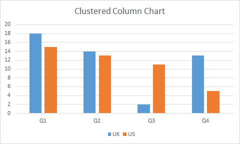
When To Use Excel Clustered Column Chart?
Use it when the within-group comparison is more crucial than in total.
The clustered column chart is used to compare two data points or series within a group.
It is best to use when you have multiple series of data in multiple groups and you want to compare them within the groups.
In the above graph, we can compare Q1’s data in the UK and the US.
The groups Q1, Q2, Q3, and Q4 can also be compared. Although, it may not be clear that much with human eyes.
2. Stacked Column Chart
The stacked column charts are best used to compare two or more groups as well as comparing series within groups.
In a stacked chart, one series’s magnitude is stacked on the other series’s magnitude, giving us the whole magnitude of a group as a column.
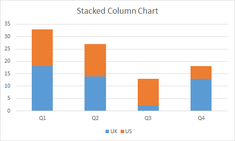
When To Use Excel Stacked Column Chart?
Use a stacked column chart when the total is more crucial than the part.
The stacked column chart is useful when you want to compare multiple groups as well as series within the groups.
In the above-stacked column chart, we can directly compare Q1, Q2, Q3, and Q4. and if we want to compare UK and US withing groups, we can do that too.
3. 100% Stacked Column Chart
The 100% stacked is used to represent part to whole data. The series of values are shown as a percentage of total in a column.

When to use the 100% Stacked Column Chart?
The 100% stacked column graph is best when you want to see how much someone (something/s) contributed to the whole result in the group.
You can also compare the percentage contribution among groups.
You can’t use it to compare the total of groups of course since the total is 100% for each group.
You can be really creative with column charts. Here is the link to one such chart.
Creative Column Chart that Includes Totals.
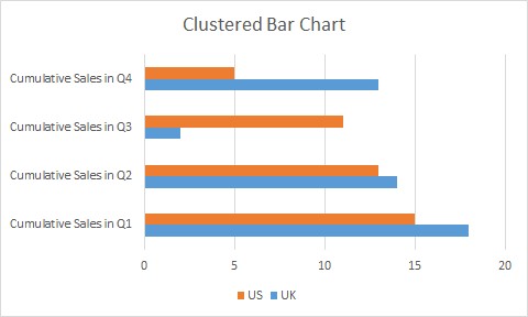
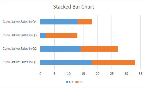
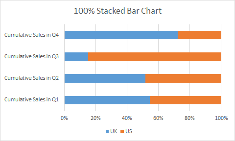
Excel Bar Chart
Excel bar chart is very similar to the excel column chart. The only difference is of column orientation. In the bar chart columns are horizontally oriented.
The bar chart or graph has three variations same as a column chart.
Clustered Bar Chart
Stacked Bar Chart
100% Stacked Bar Chart
Column Chart Vs Bar Chart
The question arises, why to use a bar chart if there is no difference in column chart and bar chart apart from orientation.
The bar chart is mostly used when the labels are long and important. If you have long descriptive labels as in the above images, the column chart will not be useful. It will be hard to read.
Another reason is to look and feel. Every chart has its look and feel, so does the bar chart. The bar chart gives the feel of forwarding progress while the column chart gives vertical progress.
You can read this article to get creative ideas with bar and other chart types.
4 Creative Target Vs Achievement Charts in Excel
Excel Line Chart
The line charts are often used to see trends over time. It can also be used to compare two or more groups.
Each data point is connected with a line (straight or smooth) that gives us the look of the trend. The y-axis represents the magnitude, where x-represents time interval (most of the time).
The data points can have markers (called line chart with markers) or not.
In excel, there are three main variations of the line chart, the same as a bar or column chart.
1. Excel Line Chart
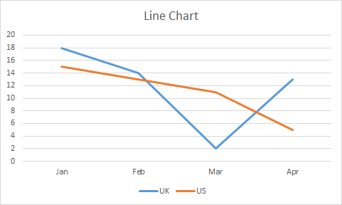
In a simple line chart, each data point is represented as points on the y-axis in the given time. These points are connected with a line, giving a visual feel of trends. In two or more variables, their lines overlap each other.
When to use a line chart in Excel?
When you want to just see trends over time, use a line chart. It is also best used to see competition between two labels.
In the above image, we can see where the UK has downfall and where it has beaten the US.
In financial dashboards, it is common to use line charts.
With two many variables line chart gets confusing.
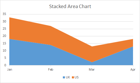
2. Stacked Line Chart
Stacked Line Chart is used when two series aren’t competing but working cumulatively. The first series starts from 0 on the y-axis and ends at N point. The next series starts from N on the y-axis.
Since the points are cumulative, a stacked line chart never intersects with each other.
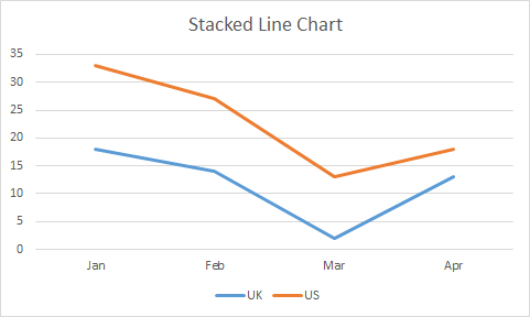
When to use a stacked line chart?
Use a stacked line chart, when different series are working cumulatively.
In the above image, we are not comparing the US and UK but we are analyzing the cumulative effect of both of them.
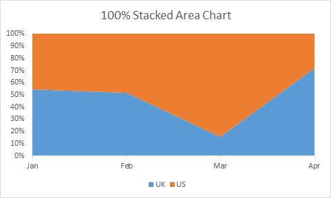
3. 100% Stacked Line Graph
This line chart is used to show part of the whole effect of two or more series. The lines represent the percentage of the data points. In a two-line chart, If a point represents 10% then the rest is 90% show by the upper line. The uppermost line is always a straight line since it will complete it to 100%.
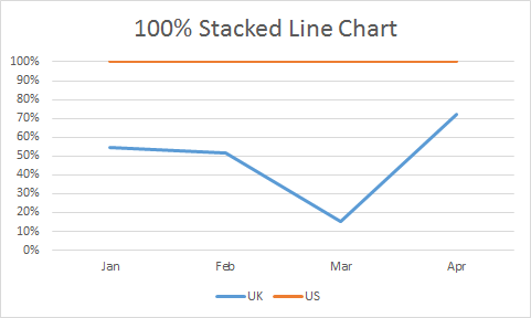
When to use a 100% Stacked Line Chart?
Use a 100% stacked line chart when you want to see trends as part to whole.
With too many series it may get confusing. Use when you have a limited number of series.
There some 4 more line chart types. Three of ’em just are above chart but with markers on a data point. The fourth is a 3D-line chart. We will learn about the 3D line chart in later articles.
Excel Area Chart
Excel Area Chart or Graph, is a variation of a line chart. In the area chart, the area below a series is filled with a color. If it has two or more series than the upper series overlaps below series.
It also has the same 3 variations as a Line chart.
1. Excel Area Chart
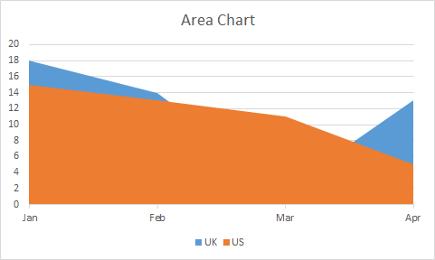
This chart type is best used when you want to see if the last attempting group has overshadowed the first attempting group. For example, in a match, if the UK team scored some points in different months. The US scored some points. Now if we want to check where US has won the match, we can use this chart.
2. Excel Stacked Area Chart
Just like other stacked charts, a stacked area chart is used when we want to see cumulative results as well as individual efforts on the chart.
When to use a stacked area chart?
A stacked area chart is best used when we want to see how much of a given area we have covered cumulatively.
Most of the daylight graphs are made using a stacked area chart. You can check it out here.
3. Excel 100% Stacked Area Chart
The 100% stacked area chart is used for showing part of whole coverage, just like other 100% stacked charts. The data is converted into a percentage of total and then the chart is filled with that percentage.
When to use a 100% Stacked Area Chart?
Of course, we will use a 100% stacked area graph when we want to see the percentage of contribution by different groups in a total.
For all 100% stacked charts, it is must to have at least two series. Otherwise, the chart will look just straight colored column, bar, line or an area.
Excel Pie Chart
A pie chart looks like a pie. Dah!.
In all the above charts, we have seen one version for part of the whole chart. But Pie Chart/Graph is the best and most used chart for showing part of the whole data. It is a circular disc cut into different proportions. Each proportion representing the composition of the disk.
Almost everyone is familiar with Pie chart. In news, entertainment and daily office work, we are used to see this chart. Almost every industry uses it. The reason being simplicity and readability.
There are three types of Pie chart. Pie, Pie of Pie and Bar of Pie. There’s one special pie type called Donut chart. We go through that too. We will skip the 3D Pie chart.
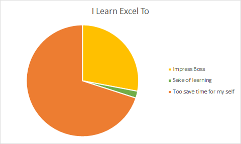
Simple Pie Chart
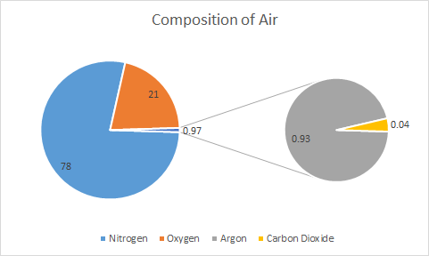
The simple pie chart is used to show the composition of a whole using different categories. In schools, we have seen the composition of air in the pie chart similar to this.
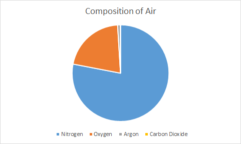
Anyone can easily see that most of the air is nitrogen. Similarly, if we have limited categories (not more than 7) than a pie chart is best to show such kind of data.
When to use Pie Chart in Excel?
Use a pie chart when you need to show composition or part to whole data. It is best used to show the percentage of the total.
The pie chart can only have one series. For multiple series, we use donut chart.
Pie of Pie Chart
In the above chart, you can’t see the pie of Carbon Dioxide because of it too small. In that case, we use Pie of Pie chart.
The Pie of Pie Chart takes out the smaller group of data and shows them into a different pie. This new pie is connected to main pie piece using two lines.
When to use Pie of Pie Chart?
When you have too small pie parts that cannot be seen on the main pie, use Pie of Pie Chart. On main pie, we see a combined piece for those smaller parts of pie.
In above example, we can see that Argon and Carbon Dioxide is too small to show on same pie. We used pie of pie chart to make a different pie chart that shows only these compositions. In main pie it is 0.97 and this 0.97 is further explored in different pie chart.
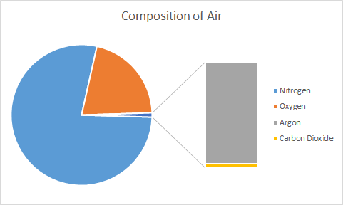
Bar of Pie Chart
It is same as Pie of Pie Chart. The only difference is, instead of a circular pie, it shows smaller part in bar/column connected to main pie.
So, we are done with pie chart. Just remember one thing, we can’t show multiple series on pie chart. For multiple series, we have Donut Chart.
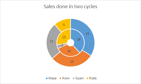
Excel Donut Chart
The Donut chart is another variation of pie chart with a whole in center, whose size can be maintained.
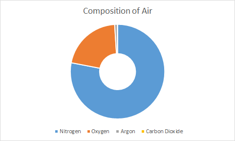
The pie chart has a limitation to show only one series at time. Donut chart does not have that limitation. You can show multiple series in donut chart as circles. But you have to be really careful. It gets confusing sometimes.
Using pie chart and donut chart you can create really creative charts. Here’s one famous speedometer chart tutorial.
Excel Radar/Spider Chart
A radar chart, also known as spider web diagram, is useful when you want to show coverage in different fields by an entity. Like in PUBG game, a players performance is shown on Radar Chart.
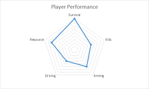
It is easy to visually analyse how good a player was in the game in different fields. The HR department often use this kind of chart to track represent employee performance.
In spider chart, each corner represents an aptitude/competency/etc. The dots/lines/area represents the score or magnitude. Each cycle of lines are markers on y-axis.
It is just like line chart with only y-axis.
You can use radar chart to compare two or more series.
There are 3 types of radar chart in excel but there is no significant difference among them. These are Radar, Radar with Markers and Filled Radar.
To compare two players/entities we can have this kind of spider web diagram.
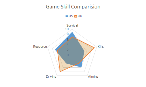
When to use to use radar chart in Excel?
Use radar chart when you want showcase skills or anything in comparison to a central value. When you want to show the spread of something, the radar chart can be used. It is good when you don’t have necessary x-axis.
The radar chart with multiple with too many series gets confusing. Use radar chart when you don’t have more than 5 series.
At first glance, an individual may not understand it. You may need to explain the radar chart you used.
XY Scatter Chart
The XY scatter chart is used to show relationship between two variables. It is also called correlation diagram or chart between two variables.
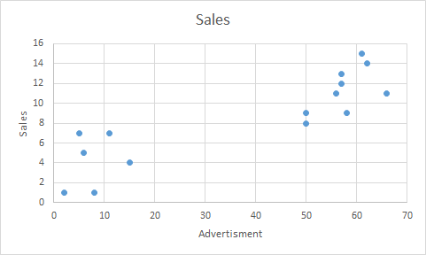
In above chart, we can see that as we increase the advertisement sales to get up.
We can also add trend line and correlation equation of the line to graph in excel.
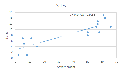
You can see the use of scatter chart in Regressions Analysis in excel.
When to use XY-Scatter Chart?
Use XY scatter chart when you want to show relationship between two variables. They are best used for showing effect of one factor on other in some study. These chart are essential part of analytics.
The Bubble Chart
The bubble chart is a variation of xy scatter chart. In bubble chart, a third dimension is added using color and size of bubble.
Different colors represents different series and size of bubble represents the magnitude.
When to use Excel Bubble Chart?
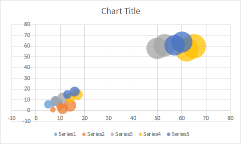
When you have to show relationship between two variables on xy plot along with magnitude.
Be careful before using bubble chart. If not formatted well, it can deliver incorrect information. Sometimes bigg bubbles over shadow the small bubbles. If you want it to happen, then it idle, else use simple xy scatter chart instead of Bubble Chart.
Excel Histogram Chart
The histogram is chart that shows the frequency of something in a range of values.
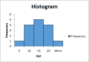
Most of the times columns/bars are used to create the histogram chart but they are not bar chart.
In histogram chart, height of a column represents the frequency of variable in range or bin. Higher the height of column higher the frequency.
The area covered by histogram is also very important. The width of column represents the bin (range).
Learn how to create Histogram chart in Excel.
When to use Histogram Chart?
The histogram chart is widely used in analytical projects to represent area covered by different ranges. Use it when you want visualise the frequency of different groups of data.
In above image, we have shown the frequency of age groups. Most of the people are of 10-20 years. 10-15 years of people are 5.
Excel Combo Charts
The combination of multiple chart types are called combo chart. In excel we can combine only two chart types.
When one type of chart is not enough to visualise the information then we use combination of excel charts. Like column chart with line chart, Pie chart with donut chart etc.
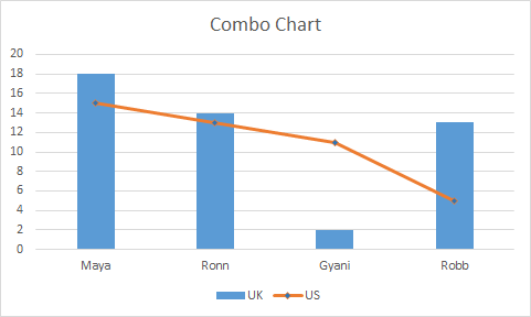
The combo chart are easy to read and attention drawer. It can easily show relation between two series independently.
The Speedometer chart is created using combination of pie chart and donut chart.
Some Special Excel Charts
Excel provides some special chart types.
Treemap Chart
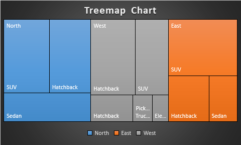
This is a hierarchical chart that is used to visualise hierarchical data. The treemap chart is uses colored boxes to represent difference branches/categories.
The number of boxes represents categories and the size of boxes represents the magnitude or value.
Here I have created a separate article to illustrate the use of treemap chart in excel. Do read it.
Sunburst Chart
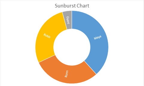
This is also a hierarchical chart type. The sun burst chart looks like a donut chart, but it has some other properties. Since it is an special chart, I have prepared a different article on this.
Excel Box & Whisker Chart
The box and whisker chart is analytical graph that shows a five number analysis using median. It is an complex chart type used in analytics and hence we have a separate article on Excel Box and whisker chart.
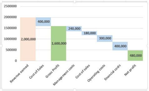
Excel Waterfall Chart
Waterfall charts are charts build on a logic that the start value of the next bar starts from the end value of the previous bars of the chart. The Waterfall chart is widely used for project management and financial tracking. Excel provides some built in waterfall diagram to use but I rather use my custom build waterfall chart. If you want to learn how to build the waterfall chart in excel, follow this link.
So yeah guys, these are some main excel chart types that we use in excel. In this article, I have just have introduced them to you. We learned how and when to use these chart. For each of these chart I have separate articles. You can click on the headings to get to those articles. In those articles, I have explained how to use them with examples and scenarios. We covered the benefits and drawbacks of chart types too.
Related Articles:
Pareto Chart and Analysis
Waterfall Chart
Excel Sparklines: The Tiny Charts in Cell
Speedometer (Gauge) Chart in Excel 2016
Creative Column Chart that Includes Totals
4 Creative Target Vs Achievement Charts in Excel
Popular Articles:
The VLOOKUP Function in Excel
COUNTIF in Excel 2016
How to Use SUMIF Function in Excel
I have a habit of creating charts in Excel that include both a bar chart and line chart together. They mystify people as there is no option in Excel do do such a thing. Oh, but indeed there is. Follow along my dear friends and I’ll show you.
First of all, create a bar chart as you normally would. A column for labels, a column for the first set of numbers, and a column for the second set of numbers.
Now the tricky part.
Click inside the chart on one set of data. You’ll see here that I clicked on the blue bars. All the blue bars have the little circles on the corners to indicate that I have indeed selected all of them.
 Now, in the top excel menu, click the option that let’s you choose the design of your charts. In this case, it’s simply called design.
At the very left of my menu, there’s now an option that says change chart type. Click!
This opens up all the chart types and I’m going to click on the line chart. Now click OK.
And you’re done! You should now have a chart with both lines and bars in it.
 This same process will work for any number of bars or lines. You could create a chart with one set of bars and 14 lines, or 3 sets of bars and 1 line. In the end, all that matters is that the chart is readable and doesn’t misrepresent the results.
Enjoy!
Other posts
- What does plus or minus 3% 19 times out of 20 mean?
- Short answer lists inflate endorsement rates
- The forgotten side of segmentation
- Your survey questions are all wrong
After you input your data and select the cell range, you’re ready to choose the chart type. In this example, we’ll create a clustered column chart from the data we used in the previous section.
Step 1: Select Chart Type
Once your data is highlighted in the Workbook, click the Insert tab on the top banner. About halfway across the toolbar is a section with several chart options. Excel provides Recommended Charts based on popularity, but you can click any of the dropdown menus to select a different template.

Step 2: Create Your Chart
- From the Insert tab, click the column chart icon and select Clustered Column.

- Excel will automatically create a clustered chart column from your selected data. The chart will appear in the center of your workbook.
- To name your chart, double click the Chart Title text in the chart and type a title. We’ll call this chart “Product Profit 2013 — 2017.”

We’ll use this chart for the rest of the walkthrough. You can download this same chart to follow along.
Download Sample Column Chart Template
There are two tabs on the toolbar that you will use to make adjustments to your chart: Chart Design and Format. Excel automatically applies design, layout, and format presets to charts and graphs, but you can add customization by exploring the tabs. Next, we’ll walk you through all the available adjustments in Chart Design.

Step 3: Add Chart Elements
Adding chart elements to your chart or graph will enhance it by clarifying data or providing additional context. You can select a chart element by clicking on the Add Chart Element dropdown menu in the top left-hand corner (beneath the Home tab).

To Display or Hide Axes:
- Select Axes. Excel will automatically pull the column and row headers from your selected cell range to display both horizontal and vertical axes on your chart (Under Axes, there is a check mark next to Primary Horizontal and Primary Vertical.)

- Uncheck these options to remove the display axis on your chart. In this example, clicking Primary Horizontal will remove the year labels on the horizontal axis of your chart.

- Click More Axis Options… from the Axes dropdown menu to open a window with additional formatting and text options such as adding tick marks, labels, or numbers, or to change text color and size.


To Add Axis Titles:
- Click Add Chart Element and click Axis Titles from the dropdown menu. Excel will not automatically add axis titles to your chart; therefore, both Primary Horizontal and Primary Vertical will be unchecked.
- To create axis titles, click Primary Horizontal or Primary Vertical and a text box will appear on the chart. We clicked both in this example. Type your axis titles. In this example, the we added the titles “Year” (horizontal) and “Profit” (vertical).


To Remove or Move Chart Title:
- Click Add Chart Element and click Chart Title. You will see four options: None, Above Chart, Centered Overlay, and More Title Options.

- Click None to remove chart title.
- Click Above Chart to place the title above the chart. If you create a chart title, Excel will automatically place it above the chart.
- Click Centered Overlay to place the title within the gridlines of the chart. Be careful with this option: you don’t want the title to cover any of your data or clutter your graph (as in the example below).


To Add Data Labels:
- Click Add Chart Element and click Data Labels. There are six options for data labels: None (default), Center, Inside End, Inside Base, Outside End, and More Data Label Title Options.

- The four placement options will add specific labels to each data point measured in your chart. Click the option you want. This customization can be helpful if you have a small amount of precise data, or if you have a lot of extra space in your chart. For a clustered column chart, however, adding data labels will likely look too cluttered. For example, here is what selecting Center data labels looks like:


To Add a Data Table:
- Click Add Chart Element and click Data Table. There are three pre-formatted options along with an extended menu that can be found by clicking More Data Table Options:


Note: If you choose to include a data table, you’ll probably want to make your chart larger to accommodate the table. Simply click the corner of your chart and use drag-and-drop to resize your chart.
To Add Error Bars:
- Click Add Chart Element and click Error Bars. In addition to More Error Bars Options, there are four options: None (default), Standard Error, 5% (Percentage), and Standard Deviation. Adding error bars provide a visual representation of the potential error in the shown data, based on different standard equations for isolating error.

- For example, when we click Standard Error from the options we get a chart that looks like the image below.


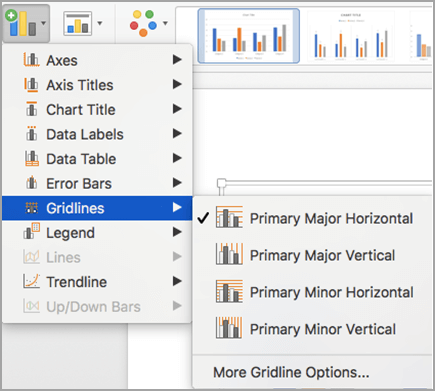
To Add Gridlines:
- Click Add Chart Element and click Gridlines. In addition to More Grid Line Options, there are four options: Primary Major Horizontal, Primary Major Vertical, Primary Minor Horizontal, and Primary Minor Vertical. For a column chart, Excel will add Primary Major Horizontal gridlines by default.

- You can select as many different gridlines as you want by clicking the options. For example, here is what our chart looks like when we click all four gridline options.

To Add a Legend:
- Click Add Chart Element and click Legend. In addition to More Legend Options, there are five options for legend placement: None, Right, Top, Left, and Bottom.

- Legend placement will depend on the style and format of your chart. Check the option that looks best on your chart. Here is our chart when we click the Right legend placement.


To Add Lines: Lines are not available for clustered column charts. However, in other chart types where you only compare two variables, you can add lines (e.g. target, average, reference, etc.) to your chart by checking the appropriate option.
To Add a Trendline:
- Click Add Chart Element and click Trendline. In addition to More Trendline Options, there are five options: None (default), Linear, Exponential, Linear Forecast, and Moving Average. Check the appropriate option for your data set. In this example, we will click Linear.

- Because we are comparing five different products over time, Excel creates a trendline for each individual product. To create a linear trendline for Product A, click Product A and click the blue OK button.

- The chart will now display a dotted trendline to represent the linear progression of Product A. Note that Excel has also added Linear (Product A) to the legend.

- To display the trendline equation on your chart, double click the trendline. A Format Trendline window will open on the right side of your screen. Click the box next to Display equation on chart at the bottom of the window. The equation now appears on your chart.


Note: You can create separate trendlines for as many variables in your chart as you like. For example, here is our chart with trendlines for Product A and Product C.

To Add Up/Down Bars: Up/Down Bars are not available for a column chart, but you can use them in a line chart to show increases and decreases among data points.
Step 4: Adjust Quick Layout
- The second dropdown menu on the toolbar is Quick Layout, which allows you to quickly change the layout of elements in your chart (titles, legend, clusters etc.).

- There are 11 quick layout options. Hover your cursor over the different options for an explanation and click the one you want to apply.


Step 5: Change Colors
The next dropdown menu in the toolbar is Change Colors. Click the icon and choose the color palette that fits your needs (these needs could be aesthetic, or to match your brand’s colors and style).

Step 6: Change Style
For cluster column charts, there are 14 chart styles available. Excel will default to Style 1, but you can select any of the other styles to change the chart appearance. Use the arrow on the right of the image bar to view other options.

Step 7: Switch Row/Column
- Click the Switch Row/Column on the toolbar to flip the axes. Note: It is not always intuitive to flip axes for every chart, for example, if you have more than two variables.


In this example, switching the row and column swaps the product and year (profit remains on the y-axis). The chart is now clustered by product (not year), and the color-coded legend refers to the year (not product). To avoid confusion here, click on the legend and change the titles from Series to Years.

Step 8: Select Data
- Click the Select Data icon on the toolbar to change the range of your data.
- A window will open. Type the cell range you want and click the OK button. The chart will automatically update to reflect this new data range.


Step 9: Change Chart Type
- Click the Change Chart Type dropdown menu.

- Here you can change your chart type to any of the nine chart categories that Excel offers. Of course, make sure that your data is appropriate for the chart type you choose.

-
You can also save your chart as a template by clicking Save as Template…
- A dialogue box will open where you can name your template. Excel will automatically create a folder for your templates for easy organization. Click the blue Save button.


Step 10: Move Chart
- Click the Move Chart icon on the far right of the toolbar.
- A dialogue box appears where you can choose where to place your chart. You can either create a new sheet with this chart (New sheet) or place this chart as an object in another sheet (Object in). Click the blue OK button.


Step 11: Change Formatting
- The Format tab allows you to change formatting of all elements and text in the chart, including colors, size, shape, fill, and alignment, and the ability to insert shapes. Click the Format tab and use the shortcuts available to create a chart that reflects your organization’s brand (colors, images, etc.).

- Click the dropdown menu on the top left side of the toolbar and click the chart element you are editing.


Step 12: Delete a Chart
To delete a chart, simply click on it and click the Delete key on your keyboard.