What is Line Graphs / Chart in Excel?
A line chart in Excel is created to display trend graphs from time to time. In simple words, a line graph is used to show changes over time to time. By creating a line chart in Excel, we can represent the most typical data.
In Excel, charts and graphs represent data in graphical format. There are so many types of charts in excelExcel offers a variety of chart types based on your requirements. Column Charts, Line Charts, Pie Charts, Bar Charts, Area Charts, Scatter Charts, Stock Chart, and Radar Charts are the different types of charts.read more. The line chart in Excel is the most popular and used.
Table of contents
- What is Line Graphs / Chart in Excel?
- Types of Line Charts / Graphs in Excel
- #1 – 2D Line Graph in Excel
- Stacked Line Graph in Excel
- 100% Stacked Line Graph in Excel
- Line with Markers in Excel
- Stacked Line with Markers
- 100% Stacked Line with Markers
- #2 – 3D Line Graph in Excel
- How to Make a Line Graph in Excel?
- Line Chart in Excel Example #1
- Line Chart in Excel Example #2
- Relevance and Uses of Line Graph in Excel
- Customize Line Chart in Excel
- Things to Remember
- Recommended Articles
- Types of Line Charts / Graphs in Excel
Types of Line Charts / Graphs in Excel
There are different categories of line charts that we can create in Excel.
- 2D Line Charts
- 3D Line Charts
These types of Line graphs in Excel are still divided into different graphs.
You can download this Line Chart Excel Template here – Line Chart Excel Template
#1 – 2D Line Graph in Excel
The 2D line graph in Excel is basic. We can take this graph for a single data set. Below is the image for that.
These are again divided as follows:
Stacked Line Graph in Excel
This stacked line chart in Excel shows how it will change the data over time.
We can show this in the below diagram.
In the graph, all the 4 data sets are represented using 4 line charts in one graph using two axes.
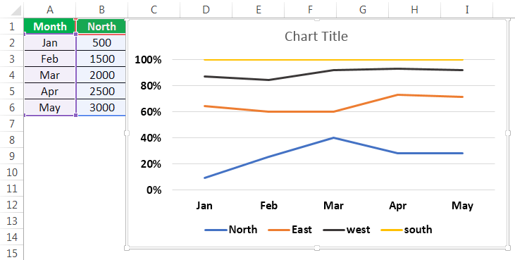
100% Stacked Line Graph in Excel
This graph is similar to the stacked line graph in Excel. The only difference is that this Y-axis shows % values rather than normal values. Also, this graph contains a top line. It is the 100% line. It will run across the top of the chart.
We can show this in the below figure.
Line with Markers in Excel
This type of line graph in Excel will contain pointers at each data point. So, we can use this to represent data for every important point.

The point marks represent the data points where they are present. When hovering the mouse on the point, the values corresponding to that data point are known.
Stacked Line with Markers

100% Stacked Line with Markers

#2 – 3D Line Graph in Excel
This line graph in excel is shown in 3D format.
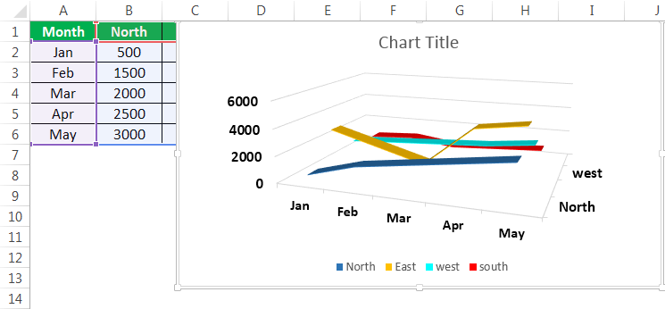
The below line graph is the 3D line graph. All the lines are represented in 3D format.
All these graphs are types of line charts in Excel. The representation is different from chart to chart. As per the requirement, you can create the line chart in Excel.
How to Make a Line Graph in Excel?
Below are examples to create a Line chartThe line chart is a graphical representation of data that contains a series of data points with a line. read more in Excel.
Line Chart in Excel Example #1
We can use the line graph in multiple data sets also. Here is an example of creating a line chart in Excel.
In the above graph, we have multiple datasets to represent that data. Also, we have used a line graph.

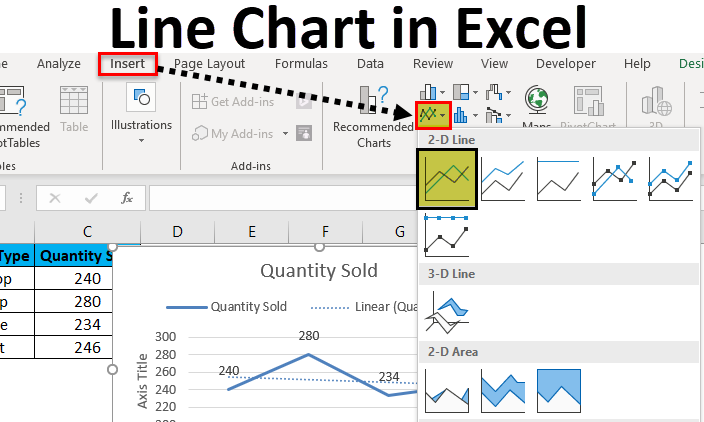
Select all the data and go to the “Insert” tab. Next, select the “Line” graph from “Charts.” It will display the required chart.

Then, the line chart in Excel created looks like as given below:
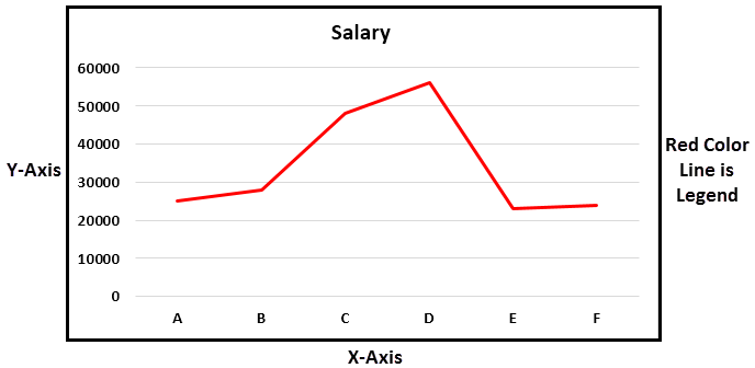
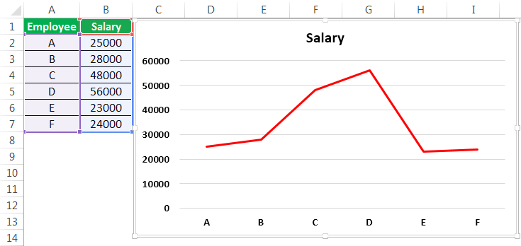
Line Chart in Excel Example #2
There are two columns in the table: Employee and Salary. Those two columns are represented in a line chart using a basic line chart in Excel. The employee names are taken on X-axis, and salary is taken on Y-axis. From those columns, that data is represented in Pictorial form using a line graph.
- Go to the “Insert” menu -> “Charts” Tab -> Select “Line” charts symbol. We can select the customized line chart as per the requirement.

- Then, the chart may look like as given below.


It is the basic process of using a line graph in our representation.
To represent a line graph in Excel, we need two necessary components. They are the horizontal axis and vertical axis.
The horizontal axis is called X-axis, and the vertical axis is called Y-axis.
There is one more component called “legend.” It is the line in which the graph is represented.
One more component is “plot area.” It is the area where it will plot the graph. Hence, it is called the plot area.
We can represent the above explanation in the below diagram.
The X-axis and Y-axis are used to represent the scale of the graph. Next, the legend is the blue line in which the graph is represented. It is more useful when the graph contains more than one line to define. Next is the plot area. It is the area where we can plot the graph.
In the line graph, if there are multiple datasets to represent the data, and if the axes are different for all the columns, we can change the scale of the axes and represent the data.
From this line graph, we can easily represent timeline graphs. If the data contains years of data related to time, it can be presented better than other graphs. We can also represent a line graph with points for easy understanding.
For example, sales of a company during a period, salary of an employee over a period, etc.
Relevance and Uses of Line Graph in Excel
We can use the line graph for:
- Single dataset.
The data having a single data set can be represented in Excel using a line graph over a period. It can be illustrated with an example.
- Multiple Datasets
We can also represent the line graph for multiple datasets.

The different data set is represented using another color legend. In the above example, revenue is represented by a blue line. We can represent customer purchase % by using an orange color line, Sales by grey line, and the last one profit% by using a yellow line.
We can customize the graph after inserting the line graph, such as formatting grid lines, changing the chart title to a user-defined name, and changing the axis’s scales. It can be done by right click on the chart.
Formatting the grid lines: Gridlines can be removed or changed as per our requirement by using an option called formatting grid lines. It can be done by,
Right-click on Chart-> Format Gridlines.

We can select the types of gridlines as per the requirement or remove the grid lines completely.
The three options on the top right side of the graph are the graph options to customize them.

The “+” symbol will have the checkboxes of what options to select in the graph to exist.
The “paint” symbol is used to select the style of the chart to be used and the color of the line.
The “filter” symbol indicates what we should represent as part of the data on the graph.
Customize Line Chart in Excel
These are some default customizations made to a line chart in Excel.
#1 – Changing the Line Chart Title:

We can change the chart title as per the user requirement for better understanding or the same as the table’s name for a better experience. For example, we can show that as below.

We should place the cursor in the “Chart Title” area, and we can write a user-defined name in place of the chart title.
#2 – Changing the Color of Legend
The color of the legend can also be changed, as shown in the below screenshot.

#3 – Changing the Scale of the Axis
The scale of the axis can be changed if there is a requirement. For example, If there are more datasets with different scales, we can change the scale of the axis.
A given process can do this.
Right-click on any of the lines. Now, select “Format Data Series.” It will show a window on the right side and select the secondary axisThe secondary axis is the other axis that is used to denote different data sets that cannot be displayed on a single axis. The primary axis, for example, depicts time, whereas the secondary axis displays production.read more. Now, click “OK,” as shown in the below figure.

#4 – Formatting the Gridlines
We can format Gridline in excelGridlines are little lines made of dots to divide cells from each other in a worksheet. The gridlines have slight faint invisibility; you can find it in the page layout tab. This option has a checkbox; for activating the gridlines, you can tick on it and untick if you wish to deactivate gridlines.read more. In addition, they can be changed or removed completely. We can do this as per the requirement.
We can show this in the below figure.

After right-clicking on the gridlines, select “Format Gridlines” from the options, and then it will open a dialog box. In that, we can choose the type of gridlines as per choice.

#5 – Changing the Chart Styles and Color
We can change the chart’s color and style by using the “+” button on the top right corner. For example, we can show this in the below figure.

Things to Remember
- We can format a line graph with points in the graph where there is a data point and can also be formatted as per the user requirement.
- We can also change the color of the line as per the requirement.
- While creating a line chart in Excel, the very important point is that we cannot use these line graphs for categorical data.
Recommended Articles
This article is a guide to Line Graphs and Charts in Excel. We discuss creating a line chart/graph in Excel, practical examples, and a downloadable Excel template. You may also learn more about Excel from the following articles: –
- Examples of 3D Maps in Excel3D map is a new feature provided by Excel in its latest versions of 2016. It introduces map elements in the Excel graph axis in three dimensions. It is an extremely useful tool provided by Excel, like an actual functional mapread more
- How to Create a 3D Plot in Excel?3D plots is also known as surface plots in excel which is used to represent three dimensional data. To represent a three dimensional plot, three dimensional range of data which can be used from the insert tab in excel.read more
- Dynamic Charts in Excel
- Stacked Chart in ExcelIn stacked charts data series are stacked over one another for a particular axes, in stacked column chart the series are stacked vertically while in bar the series are stacked horizontally.read more
In this video, see how to create pie, bar, and line charts, depending on what type of data you start with.
Want more?
Copy an Excel chart to another Office program
Create a chart from start to finish
We created a clustered column chart in the previous video.
In this video, we are going to create pie, bar, and line charts.
Each type of chart highlights data differently.
And some charts can’t be used with some types of data.
We’ll go over this shortly.
To create a pie chart, select the cells you want to chart.
Click Quick Analysis and click CHARTS.
Excel displays recommended options based on the data in the cells you select, so the options won’t always be the same.
I’ll show you how to create a chart that isn’t a Quick Analysis option, shortly.
Click the Pie option, and your chart is created.
You can chart only one data series with a pie chart.
In this example, those are the Sales figures in cells B2 through B5.
I am going to move and resize the chart, so it displays without having to scroll, which will also make it easier to customize (something we’ll look at in the next video.)
I click the chart; hold down the left mouse button, and drag to move it.
I scroll down a little, click the bottom right-hand corner of the chart, and drag it up and to the left to make it smaller.
Different data displays better in different types of charts.
If you try to graph too much data in a pie chart it looks like this, not very useful.
Now, I am creating a bar chart using the same data we used to create the pie chart.
Charting the same data different ways can provide you with a different perspective that may help you discover different insights in the data.
We are creating some of the more common chart types, but there are many more options.
To create charts that aren’t Quick Analysis options, select the cells you want to chart, click the INSERT tab.
In the Charts group, we have a lot of options.
Click Recommended Charts to see the charts that will work best with the data you have selected; click All Charts for even more options.
These are all of the different types of charts you can create.
As I mentioned earlier, a pie chart is not a recommended option for the data we selected, because it can only display one data series.
We could make a Pie chart, but it would only show the first data series, the Average Precipitation for New York, and not the second data series, the Average Precipitation for Seattle.
Instead, let’s make a Line with Markers chart.
Click Line, click Line with Marker, point to an option and you get a preview of the chart.
Click OK, and we have created our line chart.
Up next, Customize charts.
Excel Line Chart (Tables of Contents)
- Line Chart in Excel
- How to Create a Line Chart in Excel?
Line Chart in Excel
Line Chart is a graph that shows a series of point trends connected by the straight line in excel. Line Chart is the graphical presentation format in excel. By Line Chart, we can plot the graph to see the trend, growth of any product, etc.
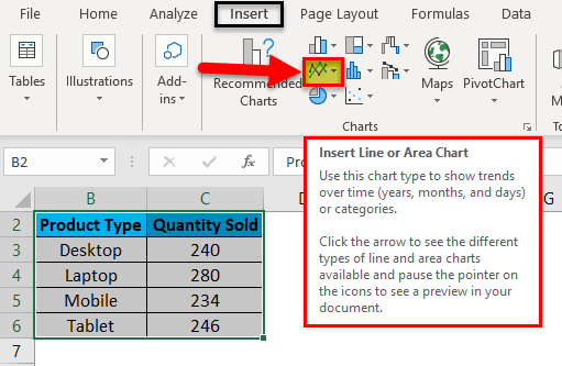
Line Chart can be accessed from the Insert menu under the Chart section in excel.
How to Create a Line Chart in Excel?
It is very simple and easy to create. Let us now see how to create a Line Chart in Excel with the help of some examples.
You can download this Line Chart Excel Template here – Line Chart Excel Template
Example #1
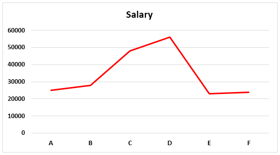
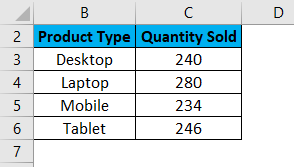
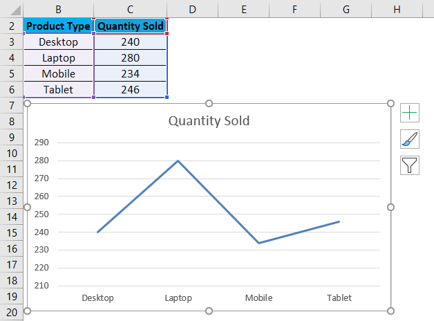
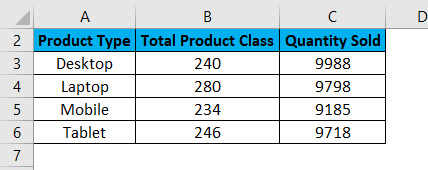
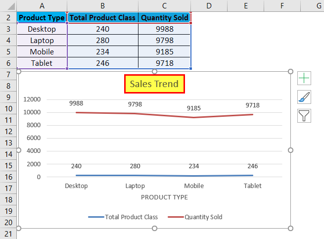
Here we have sales data of some products sold in a random month. Product Type is mentioned in column B, and their sales data are shown in subsequent column C, as shown in the below screenshot.
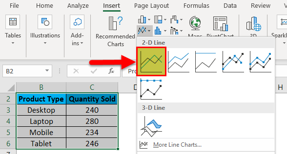
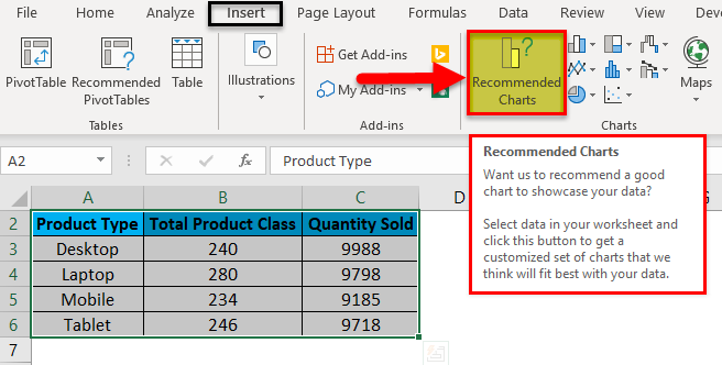
Let’s create a line chart in the above-shown data. For this, first, select the data table and then go to the Insert menu; under Charts, select Insert Line Chart as shown below.
Once we click on the Insert Line Chart icon as shown in the above screenshot, we will get the drop-down menu of different line chart menu available under it. As we can see below, it has 2D, 3D and more line charts. For learning, choose the first basic line chart as shown in the below screenshot.
Once we click on the basic Line chart as shown in the above screenshot, we will get the line chart of Quantity sold, drawn as below.
As we can see, there are some more options available at the right top corner of the Excel Line Chart, by which we can do some more modifications. Let’s see all the available options one by one.
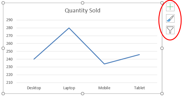
First, click on a cross sign to see more options.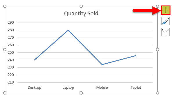
Once we do that, we will get Chart Elements, as shown below. Here, we have already checked some of the elements for an explanation.
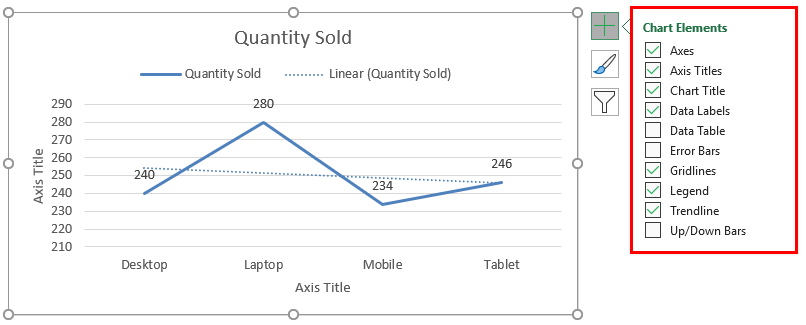
- Axes: These are numbers shown in Y-axis. It represents the range under which data may fall in.
- Axis Title: Axis Title as it is mentioned beside Axes and bottom of product types in the line chart. We can choose/write any text in this title box. It represents the data type.
- Chart Title: Chart title is the heading of the whole Chart. Here, it is mentioned as “Quantity Sold.”
- Data Labels: These are the datum points in the graph, where the line chart points are pointed. Connecting data labels creates line charts in excel. Here, these are 240, 280, 234, and 246.
- Data Table: Data Table is the table that has data used in creating a line chart.
- Error Bars: This shows the kind of error and amount of error the data has. These are Standard Error, Standard Deviation, and Percentage mainly.
- Gridlines: Horizontal thin lines shown in the above chart are Gridlines. Primary Minor Vertical/Horizontal, Primary Major Vertical/Horizontal is the types of gridlines.
- Legends: Different color lines, different types of the line present different data. These are call Legends.
- Trendline: This shows the data trend. Here it is shown by a dotted line.
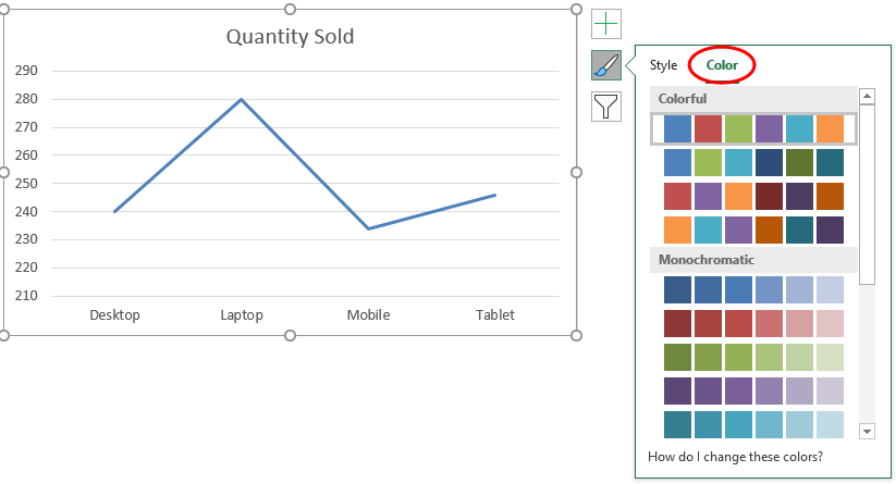
Now, let’s see the Chart Style, which has the icon as shown in the below screenshot. Once we click on it, we will get different styles listed and supported for that selected data and the Line Chart. These styles may change if we choose some other chart type.
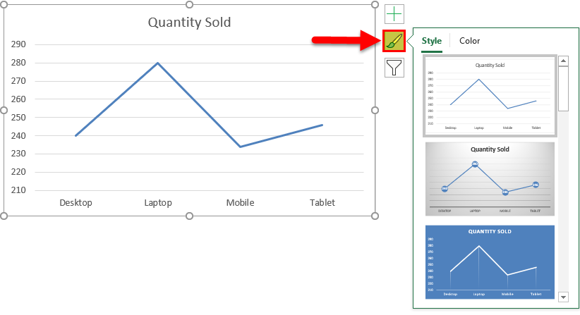
If we click on the Color tab circled in the below screenshot, we will see the different color patterns used to have more one-line data to show. This makes the chart more attractive.
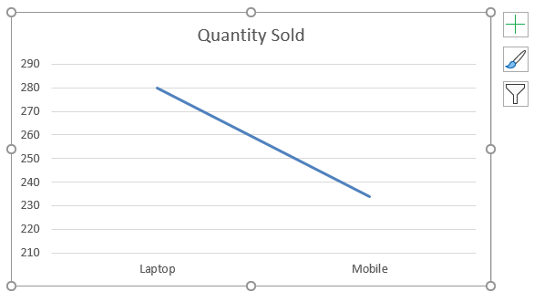
Then we have Chart Filters. This is used to filter the data in the chart itself. We can choose one or more categories to get the data trend. As we can select in below, we have chosen laptops and Mobile in the product to get the data trend.
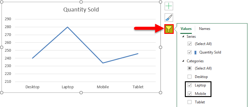
And the same is getting reflected in Line Chart as well.
Example #2
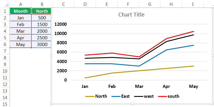
Let’s see one more example of the Line Charts. Now consider the two data sets of a table as shown below.
First, select the data table and go to the Insert menu and click on Recommended Charts as shown below. This is another method of creating Line Charts in excel.
Once we click on it, we will get the possible charts that the present selected data can make. If the recommended chart does not have the Line Chart, click the All Charts tab below.
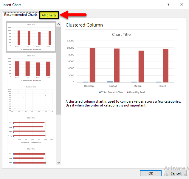
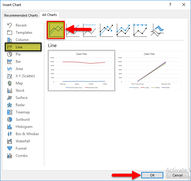
Now, from the All Chart tab, select Line Chart. Here also, we will get the possible type of line chart that may be created by the current data set in excel. Select one type and click on OK, as shown below.
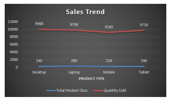
After that, we will get the Line Chart as shown below, which we name as Sales Trend.
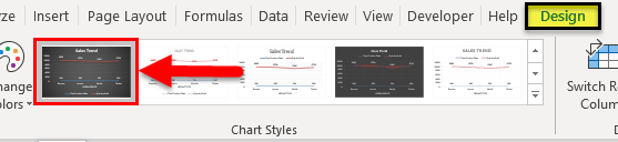
We can decorate the data as discussed in the first example. Also, there is more way of selecting different designs and styles. For this, select the chart first. After selection, Design and Format menu tab becomes active, as shown below. From those, select the Design menu and select under that select and suitable style of chart. Here, we have selected a black color slide to have a classier look.
Pros of Line Chart in Excel
- It gives a great trend projection.
- We can see the error percentage as well, by which the accuracy of data can be determined.
Cons of Line Chart in Excel
- It can be used only for trend projection, pulse data projections only.
Things to Remember about Line Chart in Excel
- Line Chart with a combination of Column Chart gives the best view in excel.
- Always enable the data labels so that the counts can be seen easily. This helps in the presentation a lot.
Recommended Articles
This has been a guide to Line Chart in Excel. Here we discuss how to create a Line Chart in Excel along with excel examples and a downloadable excel template. You may also look at these suggested articles –
- Excel Bubble Chart
- Interactive Chart in Excel
- Pie Chart in Excel
- Line Break in Excel
Содержание
- Принцип создания линейчатой диаграммы
- Изменение фигуры трехмерной линейчатой диаграммы
- Изменение расстояния между линиями диаграммы
- Изменение расположения осей
- Вопросы и ответы

Принцип создания линейчатой диаграммы
Линейчатая диаграмма в Excel применяется для отображения совершенно разных информативных данных, касающихся выбранной таблицы. Из-за этого возникает потребность не только создать ее, но и настроить под свои задачи. Сперва следует разобраться с выбором линейной диаграммы, а уже потом перейти к изменению ее параметров.
- Выделите необходимую часть таблицы или ее целиком, зажав левую кнопку мыши.
- Перейдите на вкладку «Вставка».
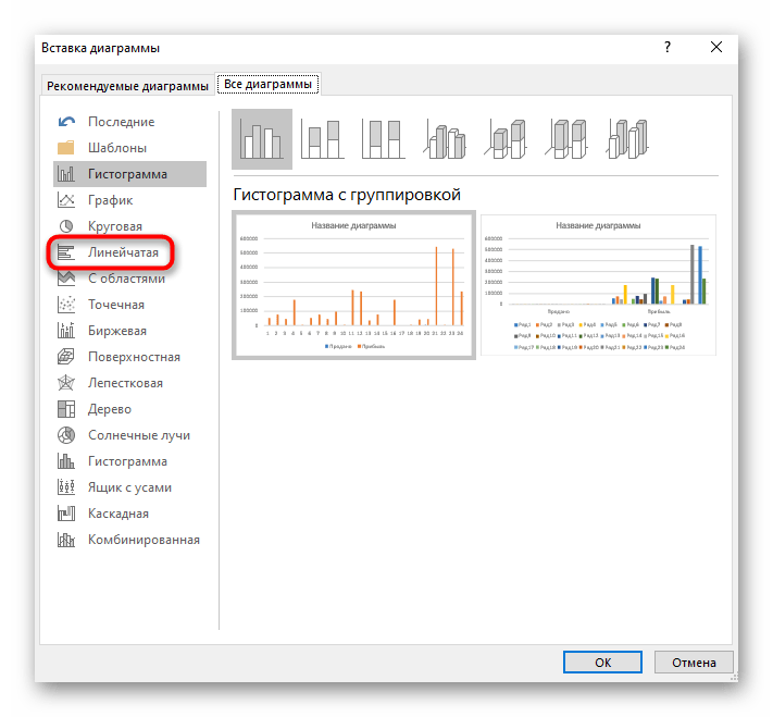
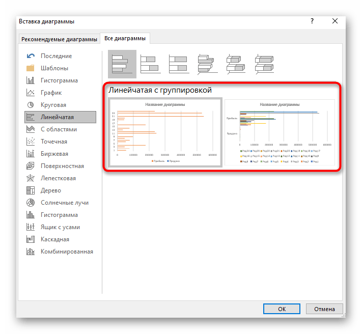
- В блоке с диаграммами разверните выпадающее меню «Гистограмма», где находятся три стандартных шаблона линейных графиков и есть кнопка для перехода в меню с другими гистограммами.
- Если нажать по последней, откроется новое окно «Вставка диаграммы», где из сортированного списка выберите пункт «Линейчатая».
- Рассмотрим все присутствующие диаграммы, чтобы выбрать ту, которая подойдет для отображения рабочих данных. Вариант с группировкой удачен, когда нужно сравнить значения в разных категориях.
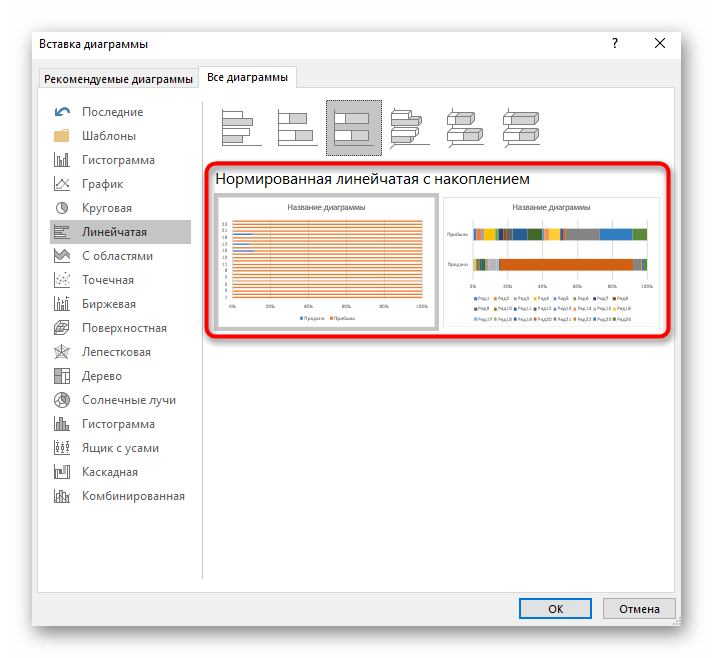
- Второй тип — линейчатая с накоплением, позволит визуально отобразить пропорции каждого элемента к одному целому.
- Такой же тип диаграммы, но только с приставкой «Нормированная» отличается от предыдущей лишь единицами представления данных. Здесь они показываются в процентном соотношении, а не пропорционально.
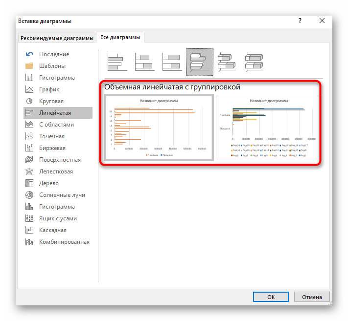
- Следующие три типа линейчатых диаграмм — трехмерные. Первая создает точно такую же группировку, о которой шла речь выше.
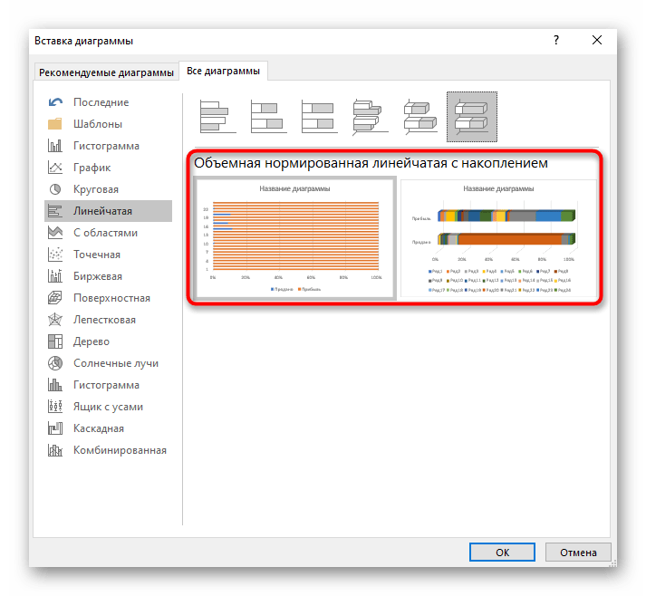
- Накопительная объемная диаграмма дает возможность просмотреть пропорциональное соотношение в одном целом.
- Нормированная объемная так же, как и двухмерная, выводит данные в процентах.
- Выберите одну из предложенных линейчатых диаграмм, посмотрите ее представление и нажмите на Enter для добавления в таблицу. Зажмите график левой кнопкой мыши, чтобы переместить его в удобное положение.


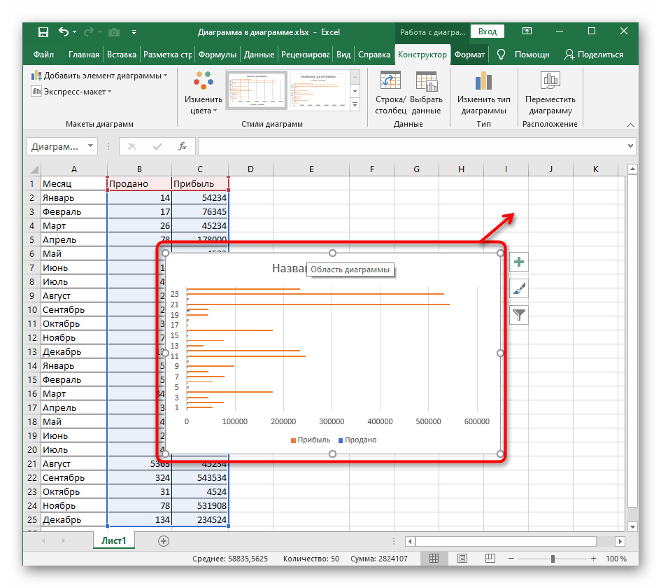
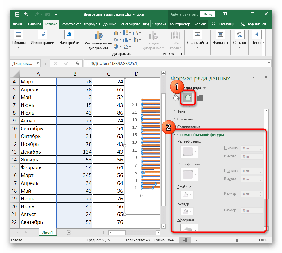
Изменение фигуры трехмерной линейчатой диаграммы
Трехмерные линейчатые диаграммы тоже пользуются популярностью, поскольку выглядят красиво и позволяют профессионально продемонстрировать сравнение данных при презентации проекта. Стандартные функции Excel умеют менять тип фигуры ряда с данными, уходя от классического варианта. Дальше можно настроить формат фигуры, придав ему индивидуальное оформление.
- Изменять фигуру линейчатой диаграммы можно тогда, когда она изначально была создана в трехмерном формате, поэтому сделайте это сейчас, если график еще не добавлен в таблицу.
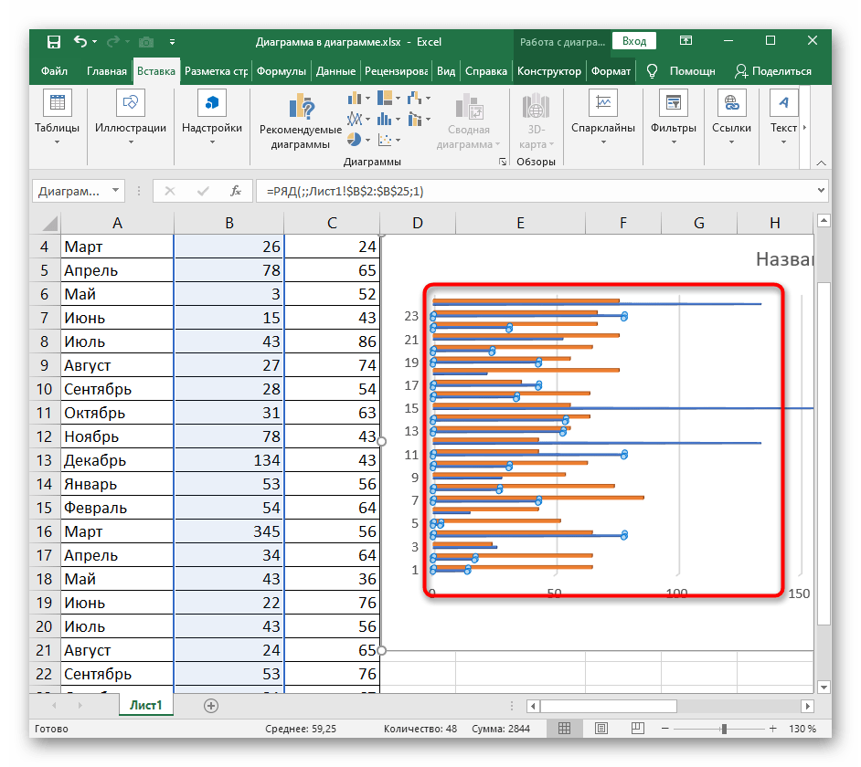
- Нажмите ЛКМ по рядам данных диаграммы и немного проведите вверх, чтобы выделить все значения.
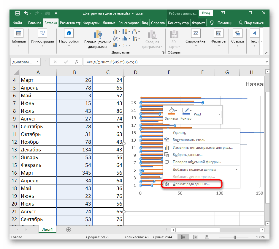
- Сделайте клик правой кнопкой мыши и через контекстное меню перейдите к разделу «Формат ряда данных».
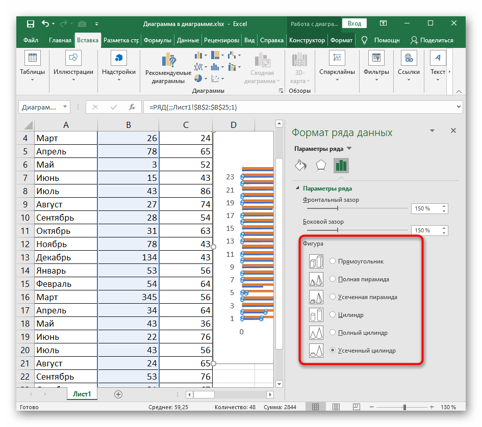
- Справа откроется небольшое окно, отвечающее за настройку параметров трехмерного ряда. В блоке «Фигура» отметьте маркером подходящую фигуру для замены стандартной и посмотрите на результат в таблице.
- Сразу же после этого откройте раздел посередине, отвечающий за редактирование формата объемной фигуры. Задайте ей рельеф, контур и присвойте текстуру при надобности. Не забывайте следить за изменениями в диаграмме и отменять их, если что-то не нравится.


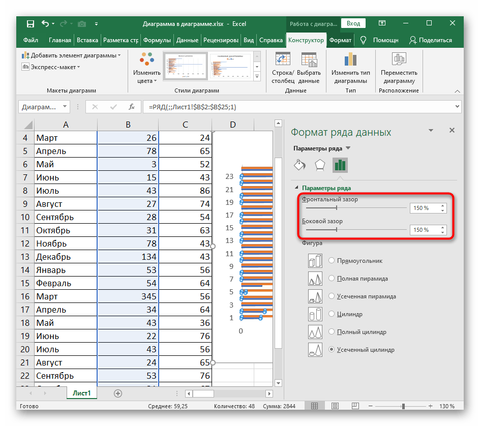
Изменение расстояния между линиями диаграммы
В этом же меню работы с диаграммой ряда есть отдельная настройка, открывающаяся через выпадающий раздел «Параметры ряда». Она отвечает за увеличение или уменьшение зазора между рядами как с фронтальной стороны, так и сбоку. Выбирайте оптимальное расстояние, передвигая эти ползунки. Если вдруг настройка вас не устраивает, верните значения по умолчанию (150%).
Изменение расположения осей
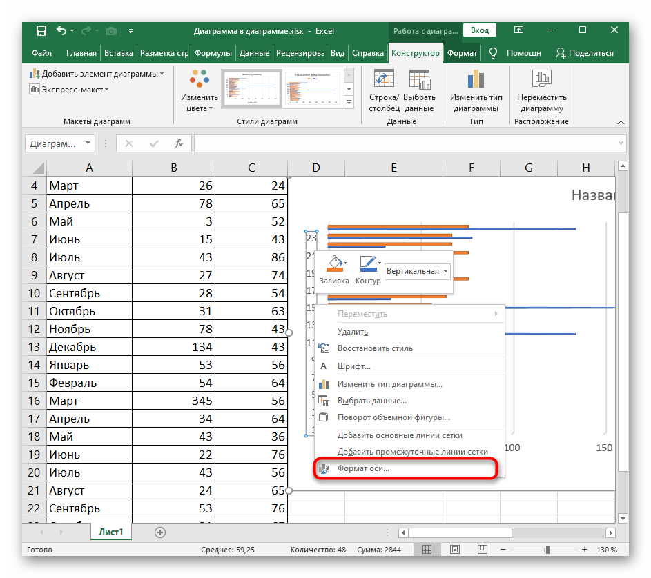
Последняя настройка, которая окажется полезной при работе с линейчатой диаграммой, — изменение расположения осей. Она поворачивает оси на 90 градусов, делая отображение графика вертикальным. Обычно, когда нужно организовать подобный вид, пользователи выбирают другой тип диаграмм, однако иногда можно просто изменить настройку текущей.
- Нажмите по оси правой кнопкой мыши.
- Появится контекстное меню, через которое откройте окно «Формат оси».
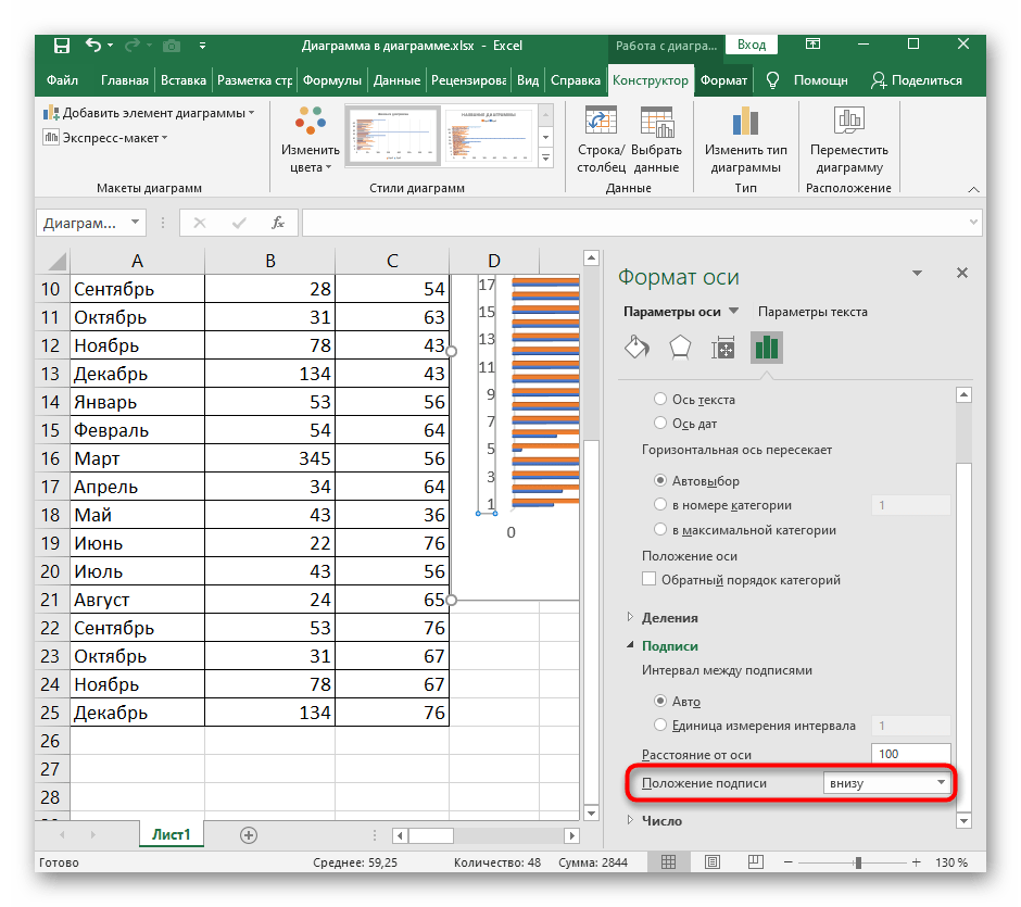
- В нем перейдите к последней вкладке с параметрами.
- Разверните раздел «Подписи».
- Через выпадающее меню «Положение подписи» выберите желаемое расположение, например внизу или сверху, а после проверьте результат.


Еще статьи по данной теме:
Помогла ли Вам статья?

This Excel tutorial explains how to create a basic line chart in Excel 2016 (with screenshots and step-by-step instructions).
What is a Line Chart?
A line chart is a graph that shows a series of data points connected by straight lines.
It is a graphical object used to represent the data in your Excel spreadsheet.
You can use a line chart when:
- You want to show a trend over time (such as days, months or years). In this case, the time values would be your categories.
- The order of your categories (ie: time values) is important.
![]() Subscribe
Subscribe
If you want to follow along with this tutorial, download the example spreadsheet.
Download Example
Steps to Create a Line Chart
To create a line chart in Excel 2016, you will need to do the following steps:
-
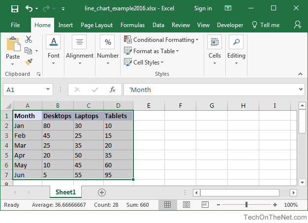
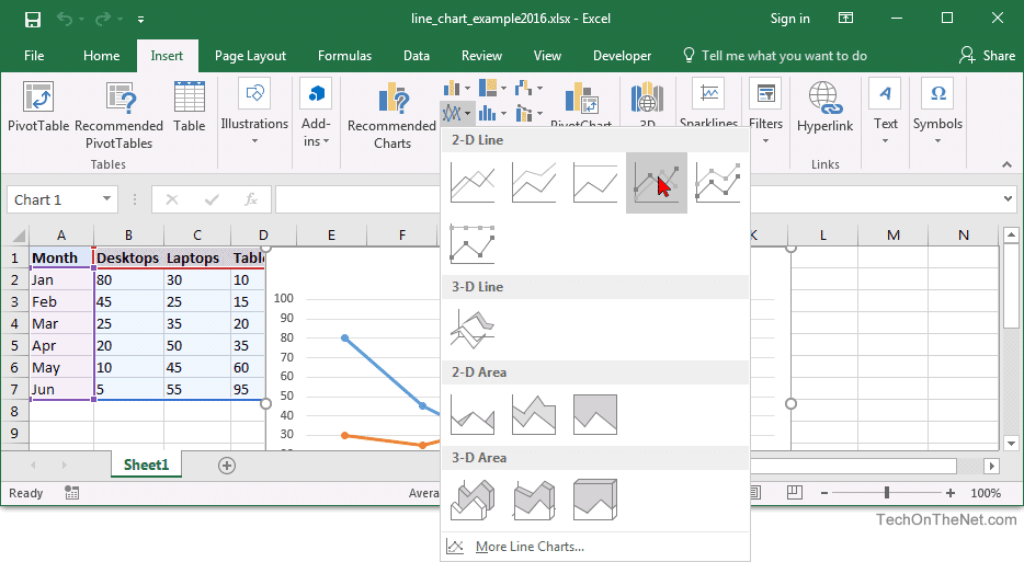
Highlight the data that you would like to use for the line chart. In this example, we have selected the range A1:D7.

-
Select the Insert tab in the toolbar at the top of the screen. Click on the Line Chart button
 in the Charts group and then select a chart from the drop down menu. In this example, we have selected the fourth line chart (called Line with Markers) in the 2-D Line section.
TIP: As you hover over each choice in the drop down menu, it will show you a preview of your data in the highlighted chart format.

-
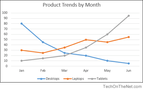
Now you will see the line chart appear in your spreadsheet showing the trend for 3 products (ie: Desktops, Laptops and Tablets). The blue series of data points represents the trend for Desktops, the orange series of data points represents Laptops and the gray series of data points represents Tablets.
The axis values for each product are displayed on the left side of the graph.

-
Finally, let’s update the title for the line chart.
To change the title, click on «Chart Title» at the top of the graph object. You should see the title become editable. Enter the text that you would like to see as the title. In this tutorial, we have entered «Product Trends by Month» as the title for the line chart.
Congratulations, you have finished creating your first line chart in Excel 2016!
Learn other Chart Types