
An Area Chart in Excel is a line chart where the data of various series are separated lines and are present in different colors. It shows the impact and changes in various data series over time. Unfortunately, there is no inbuilt chart for the Area Chart in Excel. So instead, we make this chart using the line chart.
For example, you have three products, and you require to know their sales in the past years and which product and how much they have contributed to the overall sales. Here, the Area Chart can help you to determine them in a more pronounced way. In such cases, the Area Charts compare magnitudes between the series and show the relationship of parts to the whole. Moreover, it can help you when you have multiple series of data and want to display the overall contribution of each data set.
Selecting charts to show the graphical representations is too difficult if many choices exist. Choosing the correct chart type is very important to achieve the results or the aim. It requires lots of experience and effort to select the right chart.
An Area Chart is a chart like a line chart with one difference. For example, the area below the line is filled with color, making it different. An Area Chart in Excel showcases the data, which depicts the time-series relationship.
Table of contents
- Area Chart in Excel
- Uses of Area Chart
- How to Create an Area Chart in Excel?
- Example #1
- Example #2 – Stacked Area
- Example #3 – 100% Stacked Area
- Variants of the Excel Area Chart
- Pros
- Cons
- Points to Remember
- Area Chart in Excel Video
- Recommended Articles
Uses of Area Chart
- It is useful when we have different time-series data and need to showcase the relation of each set to the complete data.
- There are two axis – X and Y, where information is plotted in an Area Chart. It is primarily used when the trend needs to be shown with magnitude rather than individual data values.
- The series with fewer values generally hides behind the series with high values. This chart in Excel is of 3 types in both 2-D and 3-D format: Area Chart, Stacked Chart, and 100% Stacked Chart. If we want to display a series of different data, 3-D is advisable.
How to Create an Area Chart in Excel?
The Area Chart is very simple and easy to use. Let us understand the working of the Excel area chart with some examples.
You can download this Area Chart Excel Template here – Area Chart Excel Template
Example #1
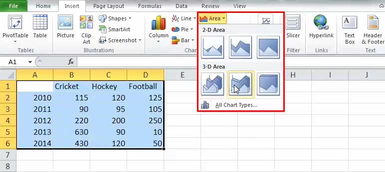
We have to select one of the graphs shown in the drop-down list. Refer to the below image:
Below are steps for creating an Area Chart in Excel: –
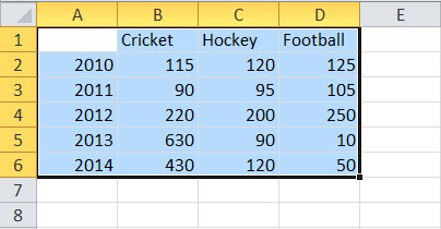
- Select the whole data or range for which we have to make the chart:

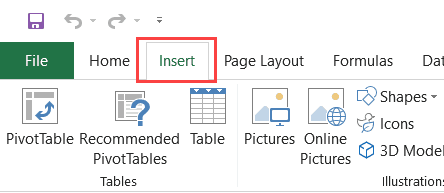
- Then, go to the “Insert” tab and select “Area Chart” like below:

- We have to select one of the graphs shown in the drop-down list. Refer to the below image:

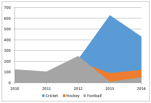
- The excel chart will get populated as shown below:

So, these are the necessary steps that we have to follow to create an Area Chart in Excel.

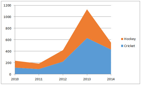
Example #2 – Stacked Area
It is the same as the above one; we have to click on the 2-D stacked area like below:

The above selection creates the below chart:
Here, we can see the relation between the data and the year, the time relationship. The overall trend of the games concerning the year.
Example #3 – 100% Stacked Area
There is the only difference is that all the values show 100% on Y-axis like below:
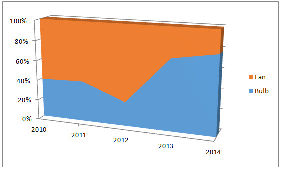
It helps in establishing a better representation of Product linesProduct Line refers to the collection of related products that are marketed under a single brand, which may be the flagship brand for the concerned company. Typically, companies extend their product offerings by adding new variants to the existing products with the expectation that the existing consumers will buy products from the brands that they are already purchasing.read more.
The only change in the creating a 100% stacked area is to select the last option in 2-D or 3-D like below:

Below is the result:
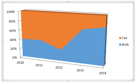
We can analyze the trends of changes in product bulbs and fan consumption over the years.
Hence, we have seen the above example of the three types of area charts in Excel, which helps us understand more clearly.
It does not show the value-wise in the representation. It shows the trends.
Variants of the Excel Area Chart
One can illustrate this chart in two ways:
- Data plots that overlap each other
- Data plots stacked on top of each other
Pros
- Comparison of the trend: After looking Area Chart in Excel, it gives us a clear understanding of the trend followed by each product.
- Comparison between small no. of the category: The stacked area is easier to understand than the overlapped. Though it surely takes more effort to read than it takes for a chart with two classes.
- Comparison between trends and not the values: The overlapped data is also readable and helpful by giving the colors and the appropriate values.
Cons
- Understanding: For deducing the values or data of the plot, one should read it concerning the previous plot from which we have to compare. Everyone is not used to it.
- Difficult to analyze: Sometimes, it is challenging to read the data and study to achieve the desired results.
Points to Remember
- The user must have the basic knowledge of the chart to understand the area chart.
- One should compare the data with each other concerning time.
- Basic understanding of the analyzing chart.
Area Chart in Excel Video
Recommended Articles
This article is a guide to Area Chart in Excel. Here, we discuss its uses and how to create Area Chart in Excel, Excel examples, and downloadable Excel templates. You may also look at these useful functions in Excel: –
- Chart Templates in Excel | Examples
- Types of Charts in Excel
- Panel Chart in Excel
- Bullet Chart in Excel
- How to Create a Formula in Excel?
Excel for Microsoft 365 Excel for Microsoft 365 for Mac Excel 2021 Excel 2021 for Mac Excel 2019 Excel 2019 for Mac Excel 2016 Excel 2016 for Mac Excel 2013 Excel 2010 More…Less
Scatter charts and line charts look very similar, especially when a scatter chart is displayed with connecting lines. However, the way each of these chart types plots data along the horizontal axis (also known as the x-axis) and the vertical axis (also known as the y-axis) is very different.
Before you choose either of these chart types, you might want to learn more about the differences and find out when it’s better to use a scatter chart instead of a line chart, or the other way around.
The main difference between scatter and line charts is the way they plot data on the horizontal axis. For example, when you use the following worksheet data to create a scatter chart and a line chart, you can see that the data is distributed differently.
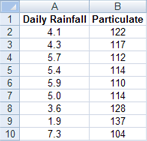
In a scatter chart, the daily rainfall values from column A are displayed as x values on the horizontal (x) axis, and the particulate values from column B are displayed as values on the vertical (y) axis. Often referred to as an xy chart, a scatter chart never displays categories on the horizontal axis.

A scatter chart always has two value axes to show one set of numerical data along a horizontal (value) axis and another set of numerical values along a vertical (value) axis. The chart displays points at the intersection of an x and y numerical value, combining these values into single data points. These data points may be distributed evenly or unevenly across the horizontal axis, depending on the data.
The first data point to appear in the scatter chart represents both a y value of 137 (particulate) and an x value of 1.9 (daily rainfall). These numbers represent the values in cell A9 and B9 on the worksheet.
In a line chart, however, the same daily rainfall and particulate values are displayed as two separate data points, which are evenly distributed along the horizontal axis. This is because a line chart only has one value axis (the vertical axis). The horizontal axis of a line chart only shows evenly spaced groupings (categories) of data. Because categories were not provided in the data, they were automatically generated, for example, 1, 2, 3, and so on.
This is a good example of when not to use a line chart.

A line chart distributes category data evenly along a horizontal (category) axis , and distributes all numerical value data along a vertical (value) axis.
The particulate y value of 137 (cell B9) and the daily rainfall x value of 1.9 (cell A9) are displayed as separate data points in the line chart. Neither of these data points is the first data point displayed in the chart — instead, the first data point for each data series refers to the values in the first data row on the worksheet (cell A2 and B2).
Axis type and scaling differences
Because the horizontal axis of a scatter chart is always a value axis, it can display numeric values or date values (such as days or hours) that are represented as numerical values. To display the numeric values along the horizontal axis with greater flexibility, you can change the scaling options on this axis the same way that you can change the scaling options of a vertical axis.
Because the horizontal axis of a line chart is a category axis, it can be only a text axis or a date axis. A text axis displays text only (non-numerical data or numerical categories that are not values) at evenly spaced intervals. A date axis displays dates in chronological order at specific intervals or base units, such as the number of days, months, or years, even if the dates on the worksheet are not in order or in the same base units.
The scaling options of a category axis are limited compared with the scaling options of a value axis. The available scaling options also depend on the type of axis that you use.
Scatter charts are commonly used for displaying and comparing numeric values, such as scientific, statistical, and engineering data. These charts are useful to show the relationships among the numeric values in several data series, and they can plot two groups of numbers as one series of xy coordinates.
Line charts can display continuous data over time, set against a common scale, and are therefore ideal for showing trends in data at equal intervals or over time. In a line chart, category data is distributed evenly along the horizontal axis, and all value data is distributed evenly along the vertical axis. As a general rule, use a line chart if your data has non-numeric x values — for numeric x values, it is usually better to use a scatter chart.
Consider using a scatter chart instead of a line chart if you want to:
-
Change the scale of the horizontal axis Because the horizontal axis of a scatter chart is a value axis, more scaling options are available.
-
Use a logarithmic scale on the horizontal axis You can turn the horizontal axis into a logarithmic scale.
-
Display worksheet data that includes pairs or grouped sets of values In a scatter chart, you can adjust the independent scales of the axes to reveal more information about the grouped values.
-
Show patterns in large sets of data Scatter charts are useful for illustrating the patterns in the data, for example by showing linear or non-linear trends, clusters, and outliers.
-
Compare large numbers of data points without regard to time The more data that you include in a scatter chart, the better the comparisons that you can make.
Consider using a line chart instead of a scatter chart if you want to:
-
Use text labels along the horizontal axis These text labels can represent evenly spaced values such as months, quarters, or fiscal years.
-
Use a small number of numerical labels along the horizontal axis If you use a few, evenly spaced numerical labels that represent a time interval, such as years, you can use a line chart.
-
Use a time scale along the horizontal axis If you want to display dates in chronological order at specific intervals or base units, such as the number of days, months, or years, even if the dates on the worksheet are not in order or in the same base units, use a line chart.
Note: The following procedure applies to Office 2013 and newer versions. Office 2010 steps?
Create a scatter chart

So, how did we create this scatter chart? The following procedure will help you create a scatter chart with similar results. For this chart, we used the example worksheet data. You can copy this data to your worksheet, or you can use your own data.
-
Copy the example worksheet data into a blank worksheet, or open the worksheet that contains the data you want to plot in a scatter chart.
1
2
3
4
5
6
7
8
9
10
11
A
B
Daily Rainfall
Particulate
4.1
122
4.3
117
5.7
112
5.4
114
5.9
110
5.0
114
3.6
128
1.9
137
7.3
104
-
Select the data you want to plot in the scatter chart.
-
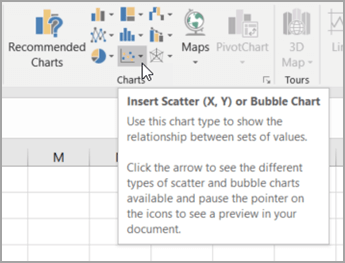
Click the Insert tab, and then click Insert Scatter (X, Y) or Bubble Chart.

-
Click Scatter.
Tip: You can rest the mouse on any chart type to see its name.
-
Click the chart area of the chart to display the Design and Format tabs.
-
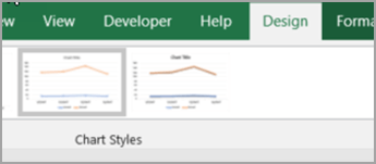
Click the Design tab, and then click the chart style you want to use.
-
Click the chart title and type the text you want.
-
To change the font size of the chart title, right-click the title, click Font, and then enter the size that you want in the Size box. Click OK.
-
Click the chart area of the chart.
-
On the Design tab, click Add Chart Element > Axis Titles, and then do the following:
-
To add a horizontal axis title, click Primary Horizontal.
-
To add a vertical axis title, click Primary Vertical.
-
Click each title, type the text that you want, and then press Enter.
-
For more title formatting options, on the Format tab, in the Chart Elements box, select the title from the list, and then click Format Selection. A Format Title pane will appear. Click Size & Properties
, and then you can choose Vertical alignment, Text direction, or Custom angle.
-
-
Click the plot area of the chart, or on the Format tab, in the Chart Elements box, select Plot Area from the list of chart elements.
-
On the Format tab, in the Shape Styles group, click the More button
, and then click the effect that you want to use. -
Click the chart area of the chart, or on the Format tab, in the Chart Elements box, select Chart Area from the list of chart elements.
-
On the Format tab, in the Shape Styles group, click the More button
, and then click the effect that you want to use. -
If you want to use theme colors that are different from the default theme that is applied to your workbook, do the following:
-
On the Page Layout tab, in the Themes group, click Themes.
-
Under Office, click the theme that you want to use.
-
 , and then you can choose Vertical alignment, Text direction, or Custom angle.
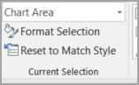
 , and then click the effect that you want to use.
Create a line chart

So, how did we create this line chart? The following procedure will help you create a line chart with similar results. For this chart, we used the example worksheet data. You can copy this data to your worksheet, or you can use your own data.
-
Copy the example worksheet data into a blank worksheet, or open the worksheet that contains the data that you want to plot into a line chart.
1
2
3
4
5
6
7
8
9
10
11
A
B
C
Date
Daily Rainfall
Particulate
1/1/07
4.1
122
1/2/07
4.3
117
1/3/07
5.7
112
1/4/07
5.4
114
1/5/07
5.9
110
1/6/07
5.0
114
1/7/07
3.6
128
1/8/07
1.9
137
1/9/07
7.3
104
-
Select the data that you want to plot in the line chart.
-
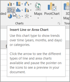
Click the Insert tab, and then click Insert Line or Area Chart.
-
Click Line with Markers.
-
Click the chart area of the chart to display the Design and Format tabs.
-
Click the Design tab, and then click the chart style you want to use.
-
Click the chart title and type the text you want.
-
To change the font size of the chart title, right-click the title, click Font, and then enter the size that you want in the Size box. Click OK.
-
Click the chart area of the chart.
-
On the chart, click the legend, or add it from a list of chart elements (on the Design tab, click Add Chart Element > Legend, and then select a location for the legend).
-
To plot one of the data series along a secondary vertical axis, click the data series, or select it from a list of chart elements (on the Format tab, in the Current Selection group, click Chart Elements).
-
On the Format tab, in the Current Selection group, click Format Selection. The Format Data Series task pane appears.
-
Under Series Options, select Secondary Axis, and then click Close.
-
On the Design tab, in the Chart Layouts group, click Add Chart Element, and then do the following:
-
To add a primary vertical axis title, click Axis Title >Primary Vertical. and then on the Format Axis Title pane, click Size & Properties
to configure the type of vertical axis title that you want. -
To add a secondary vertical axis title, click Axis Title > Secondary Vertical, and then on the Format Axis Title pane, click Size & Properties
to configure the type of vertical axis title that you want. -
Click each title, type the text that you want, and then press Enter
-
-
Click the plot area of the chart, or select it from a list of chart elements (Format tab, Current Selection group, Chart Elements box).
-
On the Format tab, in the Shape Styles group, click the More button
, and then click the effect that you want to use.
-
Click the chart area of the chart.
-
On the Format tab, in the Shape Styles group, click the More button
, and then click the effect that you want to use. -
If you want to use theme colors that are different from the default theme that is applied to your workbook, do the following:
-
On the Page Layout tab, in the Themes group, click Themes.
-
Under Office, click the theme that you want to use.
-
Create a scatter or line chart in Office 2010
So, how did we create this scatter chart? The following procedure will help you create a scatter chart with similar results. For this chart, we used the example worksheet data. You can copy this data to your worksheet, or you can use your own data.
-
Copy the example worksheet data into a blank worksheet, or open the worksheet that contains the data that you want to plot into a scatter chart.
1
2
3
4
5
6
7
8
9
10
11
A
B
Daily Rainfall
Particulate
4.1
122
4.3
117
5.7
112
5.4
114
5.9
110
5.0
114
3.6
128
1.9
137
7.3
104
-
Select the data that you want to plot in the scatter chart.
-
On the Insert tab, in the Charts group, click Scatter.
-
Click Scatter with only Markers.
Tip: You can rest the mouse on any chart type to see its name.
-
Click the chart area of the chart.
This displays the Chart Tools, adding the Design, Layout, and Format tabs.
-
On the Design tab, in the Chart Styles group, click the chart style that you want to use.
For our scatter chart, we used Style 26.
-
On the Layout tab, click Chart Title and then select a location for the title from the drop-down list.
We chose Above Chart.
-
Click the chart title, and then type the text that you want.
For our scatter chart, we typed Particulate Levels in Rainfall.
-
To reduce the size of the chart title, right-click the title, and then enter the size that you want in the Font Size box on the shortcut menu.
For our scatter chart, we used 14.
-
Click the chart area of the chart.
-
On the Layout tab, in the Labels group, click Axis Titles, and then do the following:
-
To add a horizontal axis title, click Primary Horizontal Axis Title, and then click Title Below Axis.
-
To add a vertical axis title, click Primary Vertical Axis Title, and then click the type of vertical axis title that you want.
For our scatter chart, we used Rotated Title.
-
Click each title, type the text that you want, and then press Enter.
For our scatter chart, we typed Daily Rainfall in the horizontal axis title, and Particulate level in the vertical axis title.
-
-
Click the plot area of the chart, or select Plot Area from a list of chart elements (Layout tab, Current Selection group, Chart Elements box).
-
On the Format tab, in the Shape Styles group, click the More button
, and then click the effect that you want to use.For our scatter chart, we used the Subtle Effect — Accent 3.
-
Click the chart area of the chart.
-
On the Format tab, in the Shape Styles group, click the More button
, and then click the effect that you want to use.For our scatter chart, we used the Subtle Effect — Accent 1.
-
If you want to use theme colors that are different from the default theme that is applied to your workbook, do the following:
-
On the Page Layout tab, in the Themes group, click Themes.
-
Under Built-in, click the theme that you want to use.
For our line chart, we used the Office theme.
-

So, how did we create this line chart? The following procedure will help you create a line chart with similar results. For this chart, we used the example worksheet data. You can copy this data to your worksheet, or you can use your own data.
-
Copy the example worksheet data into a blank worksheet, or open the worksheet that contains the data that you want to plot into a line chart.
1
2
3
4
5
6
7
8
9
10
11
A
B
C
Date
Daily Rainfall
Particulate
1/1/07
4.1
122
1/2/07
4.3
117
1/3/07
5.7
112
1/4/07
5.4
114
1/5/07
5.9
110
1/6/07
5.0
114
1/7/07
3.6
128
1/8/07
1.9
137
1/9/07
7.3
104
-
Select the data that you want to plot in the line chart.
-
On the Insert tab, in the Charts group, click Line.
-
Click Line with Markers.
-
Click the chart area of the chart.
This displays the Chart Tools, adding the Design, Layout, and Format tabs.
-
On the Design tab, in the Chart Styles group, click the chart style that you want to use.
For our line chart, we used Style 2.
-
On the Layout tab, in the Labels group, click Chart Title, and then click Above Chart.
-
Click the chart title, and then type the text that you want.
For our line chart, we typed Particulate Levels in Rainfall.
-
To reduce the size of the chart title, right-click the title, and then enter the size that you want in the Size box on the shortcut menu.
For our line chart, we used 14.
-
On the chart, click the legend, or select it from a list of chart elements (Layout tab, Current Selection group, Chart Elements box).
-
On the Layout tab, in the Labels group, click Legend, and then click the position that you want.
For our line chart, we used Show Legend at Top.
-
To plot one of the data series along a secondary vertical axis, click the data series for Rainfall, or select it from a list of chart elements (Layout tab, Current Selection group, Chart Elements box).
-
On the Layout tab, in the Current Selection group, click Format Selection.
-
Under Series Options, select Secondary Axis, and then click Close.
-
On the Layout tab, in the Labels group, click Axis Titles, and then do the following:
-
To add a primary vertical axis title, click Primary Vertical Axis Title, and then click the type of vertical axis title that you want.
For our line chart, we used Rotated Title.
-
To add a secondary vertical axis title, click Secondary Vertical Axis Title, and then click the type of vertical axis title that you want.
For our line chart, we used Rotated Title.
-
Click each title, type the text that you want, and then press ENTER.
For our line chart, we typed Particulate level in the primary vertical axis title, and Daily Rainfall in the secondary vertical axis title.
-
-
Click the plot area of the chart, or select it from a list of chart elements (Layout tab, Current Selection group, Chart Elements box).
-
On the Format tab, in the Shape Styles group, click the More button
, and then click the effect that you want to use.For our line chart, we used the Subtle Effect — Dark 1.
-
Click the chart area of the chart.
-
On the Format tab, in the Shape Styles group, click the More button
, and then click the effect that you want to use.For our line chart, we used the Subtle Effect — Accent 3.
-
If you want to use theme colors that are different from the default theme that is applied to your workbook, do the following:
-
On the Page Layout tab, in the Themes group, click Themes.
-
Under Built-in, click the theme that you want to use.
For our line chart, we used the Office theme.
-
Create a scatter chart
-
Select the data you want to plot in the chart.
-
Click the Insert tab, and then click X Y Scatter, and under Scatter, pick a chart.
-
With the chart selected, click the Chart Design tab to do any of the following:
-
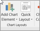
Click Add Chart Element to modify details like the title, labels, and the legend.
-
Click Quick Layout to choose from predefined sets of chart elements.
-
Click one of the previews in the style gallery to change the layout or style.
-
Click Switch Row/Column or Select Data to change the data view.
-
-
With the chart selected, click the Design tab to optionally change the shape fill, outline, or effects of chart elements.
Create a line chart
-
Select the data you want to plot in the chart.
-
Click the Insert tab, and then click Line, and pick an option from the available line chart styles .
-
With the chart selected, click the Chart Design tab to do any of the following:
-
Click Add Chart Element to modify details like the title, labels, and the legend.
-
Click Quick Layout to choose from predefined sets of chart elements.
-
Click one of the previews in the style gallery to change the layout or style.
-
Click Switch Row/Column or Select Data to change the data view.
-
-
With the chart selected, click the Design tab to optionally change the shape fill, outline, or effects of chart elements.
See Also
Save a custom chart as a template
Need more help?
Want more options?
Explore subscription benefits, browse training courses, learn how to secure your device, and more.
Communities help you ask and answer questions, give feedback, and hear from experts with rich knowledge.
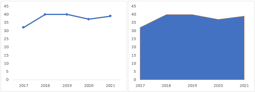
An area chart is a line chart with the areas below the lines filled with colors. Use a stacked area chart to display the contribution of each value to a total over time.
To create an area chart, execute the following steps.
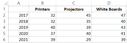
1. Select the range A1:D7.

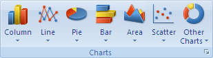
2. On the Insert tab, in the Charts group, click the Line symbol.

3. Click Area.

Result. In this example, some areas overlap.

Below you can find the corresponding line chart to clearly see this.

4. Change the chart’s subtype to Stacked Area (the one next to Area).
Result:

Note: only if you have numeric labels, empty cell A1 before you create the area chart. By doing this, Excel does not recognize the numbers in column A as a data series and automatically places these numbers on the horizontal (category) axis. After creating the chart, you can enter the text Year into cell A1 if you like.
An area chart is similar to a line chart with one difference – the area below the line is filled with a color.
Both – a line chart and an area chart – show a trend over time.
In case you’re only interested in showing the trend, using a line chart is a better choice (especially if the charts are to be printed).
For example, in the below case, you can use a line chart (instead of an area chart)
Area charts are useful when you have multiple time series data and you also want to show the contribution of each data set to the whole.
For example, suppose I have three product lines of Printers (A, B, and C).
And I want to see how the sales have been in the past few years as well as which printer line has contributed how much to the overall sales, using an area chart is a better option.
In the above chart, we can see that Printer B (represented by the orange color) has the maximum contribution to the overall sales.
While it’s the same data, using an area chart, in this case, makes the overall contribution stands out.
Now let’s see how to create an area chart in Excel and some examples where area charts can be useful.
There are three in-built types of area charts available in Excel:
- Area Chart
- Stacked Area Chart
- 100% Stacked Area Chart
Let’s see how to create each of these and in which scenario which one should be used.
Creating an Area Chart
This is just like a line chart with colors.
The problem with this type of chart is that there is always an overlap in the colors plotted on the chart.
For example, if you have a dataset as shown below:
If you use this data to create an area chart, you may end up getting a chart as shown below (where we have plotted three types of data, but you only see one color).
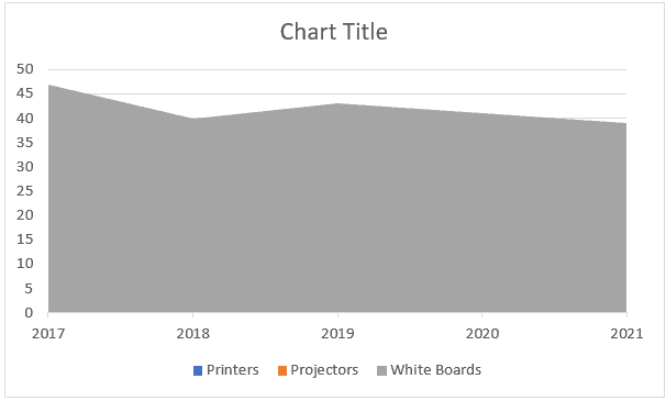
The above chart has data for Printers, Projectors, and White Boards, but only the data for White Boards is visible as it more than the rest two categories.
In such a case, a stacked area chart or a 100% stacked area chart is more suited (covered later in this tutorial).
The regular 2-D area chart is better suited for cases where you have two types of the dataset (an overall data set and a subset).
For example, suppose you have a dataset as shown below (where I have shown the Overall sales of the company and the Printer sales):
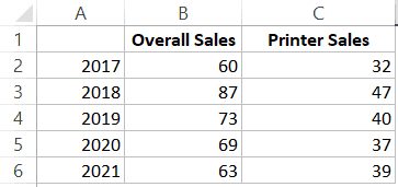
I can use this data to create a regular area chart as there would no complete overlapping of colors (as one data series is a subset of another).
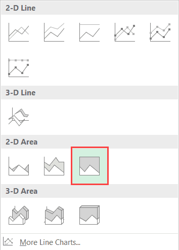
Here are the steps to create an area chart in Excel:
- Select the entire dataset (A1:D6)
- Click the Insert tab.

- In the Chart group, click on the ‘Insert Line or Area Chart’ icon.

- In the 2-D Area category, click on Area.

This will give you an area chart as shown below:
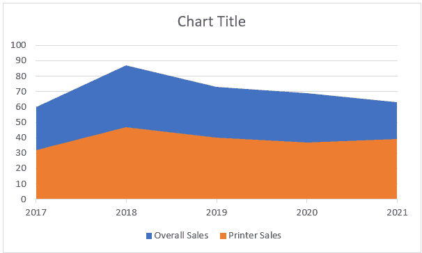
In this case, this chart is useful as shows the ‘Printer’ sales as well as the overall sales of the company.
At the same time, it also visually shows the printer sales as a proportion of the overall sales.
Note: There is an order plotting the colors in this chart. Note that the orange color (for printer sales) is over the blue color (overall sales). This happens as the in our dataset, the printer sales are on the column which is on the right of the overall sales column. If you change the order of columns, the order of colors would also change.
Creating a Stacked Area Chart
In most of the cases, you will be using a stacked area chart.
Suppose you have the dataset below, which shows the sales of three different items (in thousands):
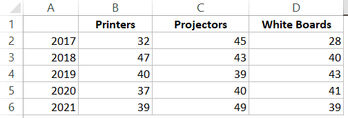
Here are the steps to create an Area chart in Excel with this data:
- Select the entire dataset (A1:D6)
- Click the Insert tab.
- In the Chart group, click on the ‘Insert Line or Area Chart’ icon.
- In the 2-D Area category, click on Stacked Area.
This will give you the stacked area chart as shown below:
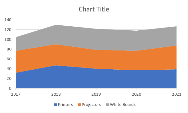
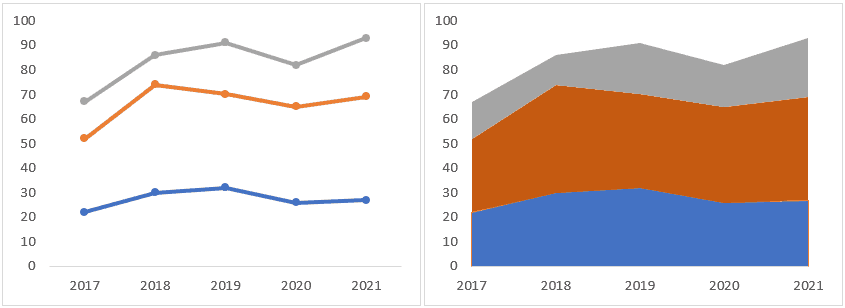
In the above chart, you get the following insights:
- The overall value for any given year (for example, 1o5 in 2017 and 130 in 2018).
- The overall trend as well as the product wise trend.
- A visual representation of the proportion of each product sales to the overall sales. For example, you can visually see and deduce that the sales if projectors contributed the most to the overall sales and the White Boards contributed the least.
Creating a 100% Stacked Area Chart
This chart type is just like a stacked area chart with one difference – all the values on the Y-axis amount to 100%.
Something as shown below:
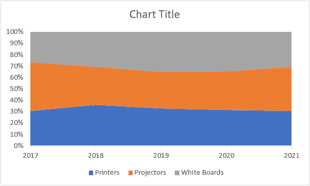
This helps you get a better representation of individual product lines, but it doesn’t give you the trend in the overall sales (as the overall sales for each year would always be 100%).
Here are the steps to create a 100% Stacked Area chart in Excel:
- Select the entire dataset (A1:D6)
- Click the Insert tab.
- In the Chart group, click on the ‘Insert Line or Area Chart’ icon.
- In the 2-D Area category, click on 100% Stacked Area.
In the above chart, you get the following insights:
- The overall trend in the proportion of each product line. For example, we can see that printers’ contribution to overall sales increased in 2018 but then declined in 2019.
- The percentage contribution of each product line to the overall sales. For example, you can visually deduce that projectors contributed ~40% of the overall sales of the company in 2017.
Note: This chart gives you a trend in the proportion of the contribution of overall sales, and NOT the trend of their absolute value. For example, if the proportion of Printer sales in 2018 went up, it doesn’t necessarily mean that the Printer sales went up. It just means that it’s contribution increased. So if the printer sales decline by 10% and all other product line sales decline by 30%, the overall contribution of printer sales automatically goes up (despite a decline in its own sales).
You May Also Like the Following Excel Chart Tutorials:
- How to Create a Thermometer Chart in Excel.
- How to Create a Timeline / Milestone Chart in Excel.
- Creating a Pareto Chart in Excel (Static & Dynamic)
- How to Make a Bell Curve in Excel.
- Excel Sparklines – A Complete Guide with Examples.
- Combination Charts in Excel.
- Creating a Pie Chart in Excel
- Excel Histogram Chart.
- Step Chart in Excel
- Calculate Area Under Curve in an Excel
An area chart is based on a line chart, with the area between the line and the x-axis colored to illustrate volume. In this post, we’ll explore how to create a standard area chart, as well as a stacked area chart, in Excel.
Don’t forget though, you can easily create an area chart for free using Displayr’s free area chart maker!
Setting up the data for the area chart
The easiest way to create an area chart in Excel is to first set up your data as a table. The first column should contain the labels and the second column contain the values. To create a stacked area chart where the values are split into sub-groups, create a column for each of the sub-groups. In this example, we’ll use a data set which shows annual building permits by region for single unit homes in the US from 2001 through 2016. The following data set shows total permits issued (in thousands) for each region by year. The first column contains the y-axis label (year) with a column for each region. The values in the table represent the number of permits.

Creating your area chart
To create an area chart using the above data, highlight the data range (cells A1:B28 in the example above) and select Insert > Charts, select the Line Chart group drop-down menu and then select the second 2-D Area chart option.

The following area chart is created from the selected data. You can modify the properties of the area chart by first selecting the area chart and then going to the Chart options that appear at the top of the menu tool bar. From here you can modify the design and format properties of the chart. In this example, I’ve added a chart title and changed the legend and axis font size.

To create the above chart, we started with the data and then turned this into an area chart. In Excel, you can also first create the chart object and then provide the data to populate the chart. To do this, first select the area chart from the Insert > Charts menu to select one of the area chart options. This will create an empty area chart object on the sheet. Next, select Chart Tools > Design > Select Data. This opens the Select Data Source dialogue box. Note that the chart object must be selected for the Chart Tools menu to appear.

For Chart data range, select B1:E28 from the example data above. In the Horizontal (Category) Axis Labels section, click the Edit button and select cells A2:A28 and click OK. Excel will create the same chart that was created above. Again, you can modify the chart design and formatting using the Chart Tools menu described above.

Ready to move beyond Excel? There are other ways to create visualizations that offer more advanced options and flexibility. Learn how to create your area chart in Displayr instead!