
Friday, February 19, 2016
Peltier Technical Services, Inc., Copyright © 2023, All rights reserved.
Combination charts combine data using more than one chart type, for example columns and a line. Building a combination chart in Excel is usually pretty easy. But if one series type is horizontal bars, then combining this with another type can be tricky. I’m here to help with Bar-Line, or rather, Bar-XY combination charts in Excel.
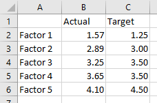
I’ll illustrate a simple combination chart with this simple data. The chart will use the first column for horizontal axis category labels, the second column for actual values plotted using lines with markers, and the third column using columns (vertical bars).
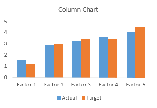
We start by selecting the data and inserting a column chart.
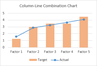
We finish by right clicking on the “Actual” data, choosing Change Series Chart Type from the pop-up menu, and selecting the new chart type we want. I’ve also used a lighter shade of orange for the columns, to make the markers stand out better.
Let’s do the same for a bar chart. Select the data, insert a bar chart.
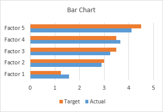
Okay, the category labels are along the vertical axis, but we’ll continue by changing the Actual data to a line chart series. That didn’t work out at all. The markers are not positioned vertically along the centers of the horizontal bars, nor horizontally where the data lies in the Actual column of the worksheet.
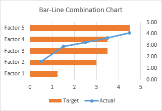
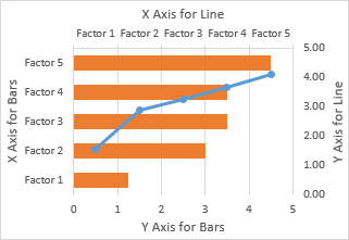
In the chart below I’ve shown all axis scales and axis titles to illustrate the problem. When we converted the Actual series to a line type, Excel assigned it to the secondary axis, and we have no ability to reassign it to the primary axis. The primary axes used for the bar chart are not aligned with the secondary axes used for the line chart: the X axis for the bars is vertical and the X axis for the line is horizontal; the Y axis for the bars is horizontal and the Y axis for the line is vertical.
We can’t use a line chart at all. If we want to line up the markers horizontally with their proper position along the lengths of the bars, we need to use the Actual data as the X values of an XY series. We will need to generate some additional data for the Y values of the XY series.
Bar-XY Combination Chart
We will not try to make a Bar-Line combination chart, because the Line chart type does not position the markers where we want them. We will make a Bar-XY chart type, using an XY chart type (a/k/a Scatter chart type) to position markers.
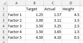
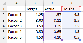
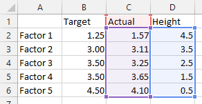
Here is the new data needed for our Bar-XY combination chart. The factor labels and Target values will be used by the Bar chart series, and the Actual values and Heights for the XY series. Don’t worry about the Height values: I’ll show how they are derived in a moment. The nice thing is that we can use dummy values now and type in the proper values later and the chart will update.
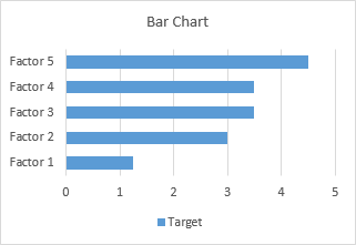
Select the first two columns of the data and insert a bar chart.
Since we probably want the categories listed in the same order as in the worksheet, let’s select the vertical axis (which in a bar chart is the X axis) and press Ctrl+1, the shortcut that opens the Format dialog or task pane for the selected object in Excel. Check the box for Categories in Reverse Order and also select Horizontal Axis Crosses at Maximum Category to move it next to Factor 5.
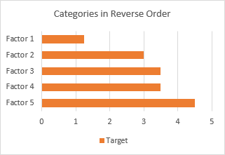
I’ve also recolored the bars orange, because blue markers show up better against light orange than orange markers against light blue.
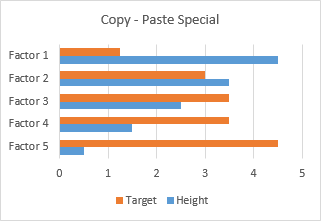
Now copy the last two columns (Actual and Height), select the chart, and on the Home tab of the ribbon, click the Paste dropdown arrow, choose the options in this dialog (add cells as new series, values in columns, series names in first row, categories in first column), and click OK.
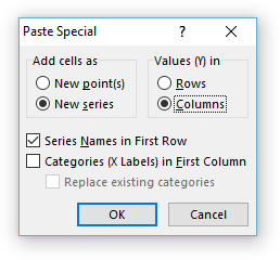
The data is added as another set of bars, which I’ve colored blue, but we’ll change that in a second.
Right-click on the added series, select Change Series Chart Type from the pop-up menu, and select XY with markers and lines.
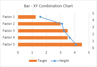
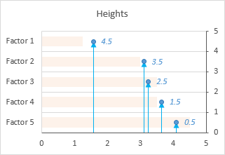
We see that the horizontal positions of the markers is just what we want to show.
Now we can see where the values in the Heights column comes from. The right hand vertical axis is used for the Y values of the XY series. Looking at the positions of the horizontal bars and the markers in their correct positions, we can see that the Factor 1 bar is centered on Y=4.5, the Factor 2 bar is centered on 3.5, etc. If you hadn’t guessed this at the beginning, type these values into your data range, and let the chart update.
A few minor changes and we’ll be done. First, change the name of the XY series from Heights to Actual. The easiest way is to click on the series, then look at the highlighted ranges in the chart. The X values (C2:C6) are highlighted purple, the Y values (D2:D6) are highlighted blue, and the series name (cell D1) is highlighted red (highlight colors in Excel 2010 and earlier are different, but the concept is the same). Click on the red border of cell D2, and drag the highlighting rectangle to cover cell C2 to change the series name.
Click on the red border of cell D2, and drag the highlighting rectangle to cover cell C2 to change the series name.
Then, use a lighter shade of orange for the bars, so the blue markers stand out. Finally, hide the right-hand vertical axis: format it so it has no labels and no line color.
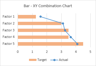
And there’s our completed Bar-XY Combination Chart.
More Combination Chart Articles on the Peltier Tech Blog
- Clustered Column and Line Combination Chart
- Precision Positioning of XY Data Points
- Add a Horizontal Line to an Excel Chart
- Horizontal Line Behind Columns in an Excel Chart
- Salary Chart: Plot Markers on Floating Bars
- Fill Under or Between Series in an Excel XY Chart
- Fill Under a Plotted Line: The Standard Normal Curve
- Excel Chart With Colored Quadrant Background
In this video, see how to create pie, bar, and line charts, depending on what type of data you start with.
Want more?
Copy an Excel chart to another Office program
Create a chart from start to finish
We created a clustered column chart in the previous video.
In this video, we are going to create pie, bar, and line charts.
Each type of chart highlights data differently.
And some charts can’t be used with some types of data.
We’ll go over this shortly.
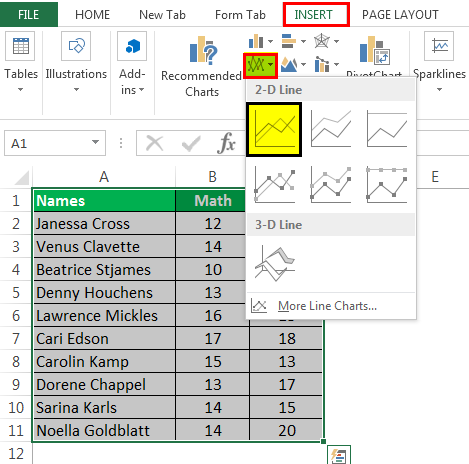
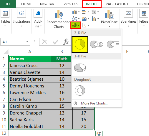
To create a pie chart, select the cells you want to chart.
Click Quick Analysis and click CHARTS.
Excel displays recommended options based on the data in the cells you select, so the options won’t always be the same.
I’ll show you how to create a chart that isn’t a Quick Analysis option, shortly.
Click the Pie option, and your chart is created.
You can chart only one data series with a pie chart.
In this example, those are the Sales figures in cells B2 through B5.
I am going to move and resize the chart, so it displays without having to scroll, which will also make it easier to customize (something we’ll look at in the next video.)
I click the chart; hold down the left mouse button, and drag to move it.
I scroll down a little, click the bottom right-hand corner of the chart, and drag it up and to the left to make it smaller.
Different data displays better in different types of charts.
If you try to graph too much data in a pie chart it looks like this, not very useful.
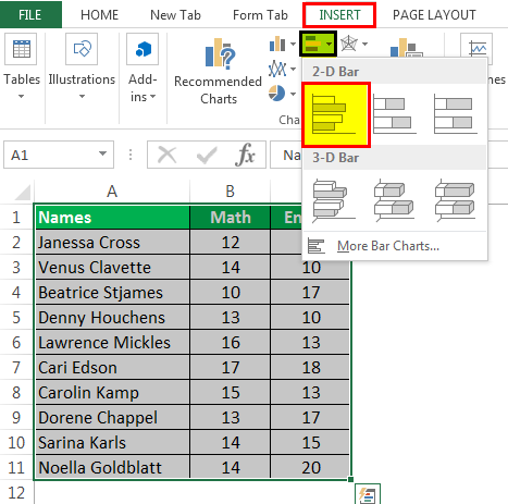
Now, I am creating a bar chart using the same data we used to create the pie chart.
Charting the same data different ways can provide you with a different perspective that may help you discover different insights in the data.
We are creating some of the more common chart types, but there are many more options.
To create charts that aren’t Quick Analysis options, select the cells you want to chart, click the INSERT tab.
In the Charts group, we have a lot of options.
Click Recommended Charts to see the charts that will work best with the data you have selected; click All Charts for even more options.
These are all of the different types of charts you can create.
As I mentioned earlier, a pie chart is not a recommended option for the data we selected, because it can only display one data series.
We could make a Pie chart, but it would only show the first data series, the Average Precipitation for New York, and not the second data series, the Average Precipitation for Seattle.
Instead, let’s make a Line with Markers chart.
Click Line, click Line with Marker, point to an option and you get a preview of the chart.
Click OK, and we have created our line chart.
Up next, Customize charts.
One helpful tip in improving dashboard presentation is by creating combination charts. Excel allows us to combine different chart types in one chart. This article assists all levels of Excel users on how to create a bar and line chart.
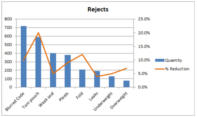 Figure 1. Final result: Bar and Line Graph
Bar Chart with Line
There are two main steps in creating a bar and line graph in Excel. First, we insert two bar graphs. Next, we change the chart type of one graph into a line graph.
Insert bar graphs
- Select the cells we want to graph
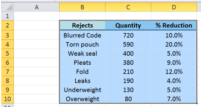 Figure 2. Selecting the cells to graph
- Click Insert tab > Column button > Clustered Column
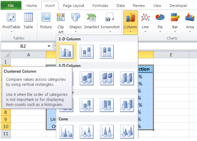 Figure 3. Clustered Column in Insert Tab
Two column charts or vertical bar charts will be created, one each for Quantity and %Reduction.
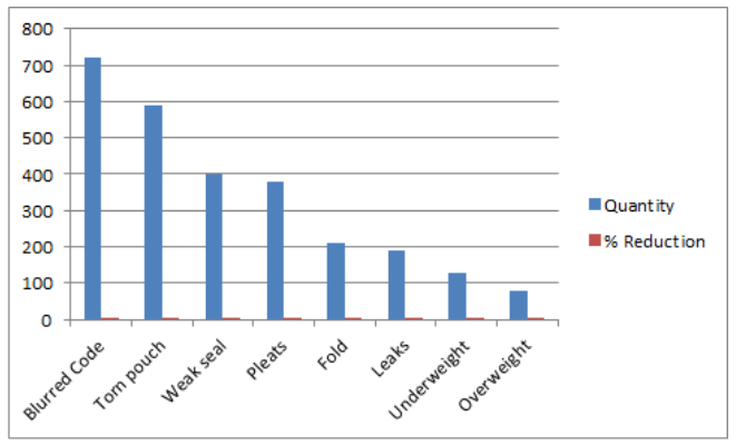 Figure 4. Vertical Bar Graph
Change bar graph to line graph
We want to present %Reduction as a line graph.
- We right-click on the series “% Reduction” and select Change Series Chart Type
 Figure 5. Change Series Chart Type in Menu Options
- The Change Chart Type dialog box will appear. Select Line > Line with Markers
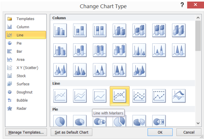 Figure 6. Line with Markers Chart Type
The %Reduction bar graph is now presented as a line graph. However, since the values are less than one, the line graph values are too close to the horizontal axis to be visually significant.
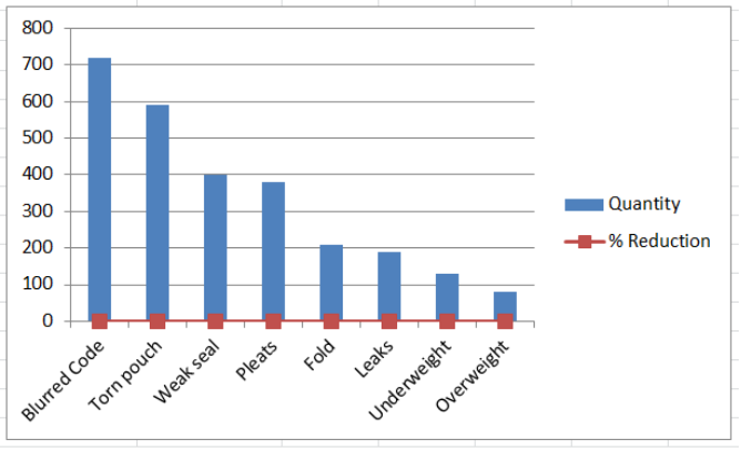 Figure 7. Bar Chart with Line
Display line graph scale on secondary axis
The work-around is to plot the line graph on a secondary axis.
- Right-click the line graph and select Format Data Series.
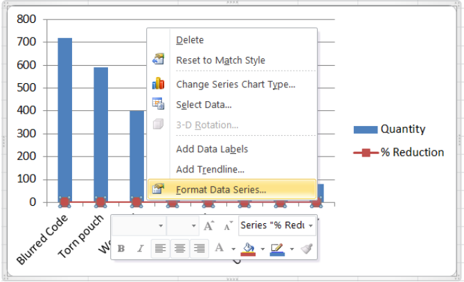 Figure 8. Format Data Series Option
- The Format Data Series dialog box will pop-up. Tick Secondary Axis in Series Options.
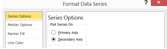 Figure 9. Secondary Axis in Series Options
We now have a combination bar and line graph.
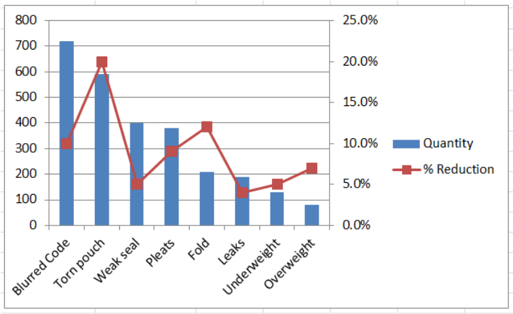 Figure 10. Bar and Line Graph with Secondary Axis
Next let us clean up our bar and line graph by doing the following:
- In Format Data Series, choose Marker Options > Marker Type > None
- Marker Color > Solid Line > Orange
- Delete the gridlines
- Add a chart title in Layout tab > Chart Title > Above Chart, then type “Rejects”
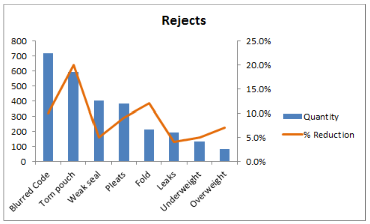 Figure 11. Output: Bar Chart with Line
Instant Connection to an Excel Expert
Most of the time, the problem you will need to solve will be more complex than a simple application of a formula or function. If you want to save hours of research and frustration, try our live Excelchat service! Our Excel Experts are available 24/7 to answer any Excel question you may have. We guarantee a connection within 30 seconds and a customized solution within 20 minutes.
List of Top 8 Types of Charts in MS Excel
- Column Charts in Excel
- Line Chart in Excel
- Pie Chart in Excel
- Bar Chart in ExcelBar charts in excel are helpful in the representation of the single data on the horizontal bar, with categories displayed on the Y-axis and values on the X-axis. To create a bar chart, we need at least two independent and dependent variables.read more
- Area Chart in ExcelThe area chart in Excel is a line chart that shows the impact and changes in various data series over time by separating them with lines and presenting them in different colors. The line chart is used to create this graph.read more
- Scatter Chart in Excel
- Stock Chart in ExcelStock chart in excel is also known as high low close chart in excel because it used to represent the conditions of data in markets such as stocks, the data is the changes in the prices of the stocks, we can insert it from insert tab and also there are actually four types of stock charts, high low close is the most used one as it has three series of price high end and low, we can use up to six series of prices in stock charts.read more
- Radar Chart in Excel
Let us discuss each of them in detail: –
Table of contents
- List of Top 8 Types of Charts in MS Excel
- Chart #1 – Column Chart
- Chart #2 – Line Chart
- Chart #3 – Pie Chart
- Chart #4 – Bar Chart
- Chart #5 – Area Chart
- Chart #6 – Scatter Chart
- Chart #7 – Stock Chart
- Chart #8 – Radar Chart
- Things to Remember
- Recommended Articles
You can download this Types of Charts Excel Template here – Types of Charts Excel Template
Chart #1 – Column Chart
In this type of chart, the data is plotted in columns. Therefore, it is called a column chartColumn chart is used to represent data in vertical columns. The height of the column represents the value for the specific data series in a chart, the column chart represents the comparison in the form of column from left to right.read more.
A column chart is a bar-shaped chart that has a bar placed on the X-axis. This type of chart in Excel is called a column chart because the bars are placed on the columns. Such charts are very useful in case we want to make a comparison.
Below are the steps for preparing a column chart in Excel:
- First, select the data and the “Insert” tab, then select the “Column” chart.

- Then, the column chart looks like as given below:

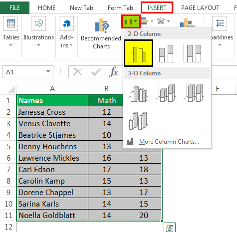
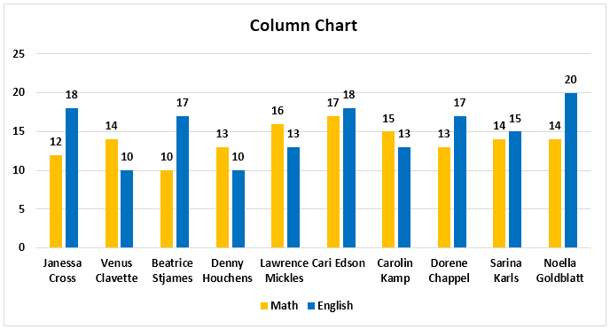
Chart #2 – Line Chart
Line charts are used if we need to show the trend in data. They are more likely used in analysis rather than showing data visually.
In this chart, a line represents the data movement from one point to another.
- Select the data and “Insert” tab, then select the “Line” chart.
- Then, the line chart looks like as given below:

Chart #3 – Pie Chart
A pie chart is a circle-shaped chart capable of representing only one series of data. A pie chart has various variants that are 3-D charts and doughnut charts.
A circle-shaped chart divides itself into various portions to show the quantitative value.
- Select the data, go to the “Insert” tab, and select the “Pie” chart.
- Then, the pie chart looks like as given below:
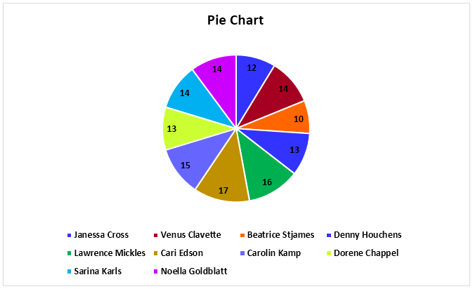
Chart #4 – Bar Chart
In the bar chart, the data is plotted on the Y-axis. That is why this is called a bar chart. Compared to the column chart, these charts use the Y-axis as the primary axis.
This chart is plotted in rows. That is why this is called a row chart.
- Select the data, go to the “Insert” tab, and then select the “Bar” chart.
- Then, the bar chart looks like as given below:

Chart #5 – Area Chart
The area chart and the line charts are the same, but the difference that makes a line chart an area chart is that the space between the axis and the plotted value is colored and is not blank.
Using the stacked area chart, this becomes difficult to understand the data as space is colored with the same color for the magnitude that is the same for various datasets.
- Select the data, go to the “Insert” tab, and select the “Area” chart.
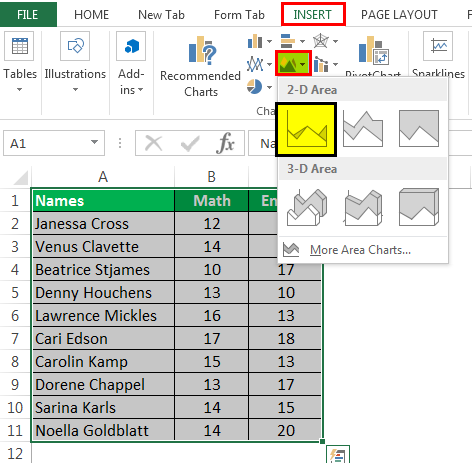
- Then, the area chart looks like as given below:
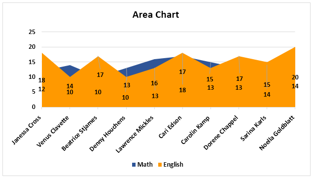
Chart #6 – Scatter Chart
The scatter chart in excelScatter plot in excel is a two dimensional type of chart to represent data, it has various names such XY chart or Scatter diagram in excel, in this chart we have two sets of data on X and Y axis who are co-related to each other, this chart is mostly used in co-relation studies and regression studies of data.read more plots the data on the coordinates.
- Select the Data and go to Insert Tab, then select the Scatter Chart.
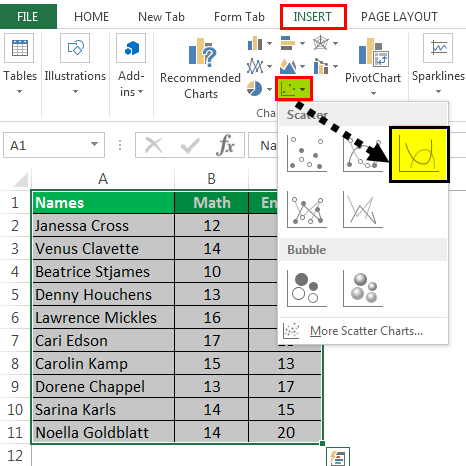
- Then, the scatter chart looks like as given below:
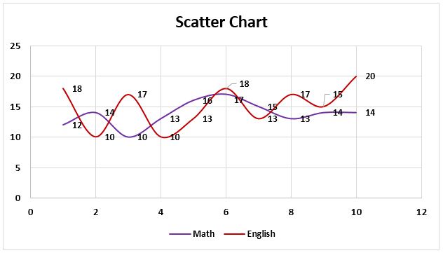
Chart #7 – Stock Chart
Such charts are used in stock exchangesStock exchange refers to a market that facilitates the buying and selling of listed securities such as public company stocks, exchange-traded funds, debt instruments, options, etc., as per the standard regulations and guidelines—for instance, NYSE and NASDAQ.read more or to represent the change in the price of shares.
- Select the data, go to the “Insert” tab, and then select the “Stock” chart.
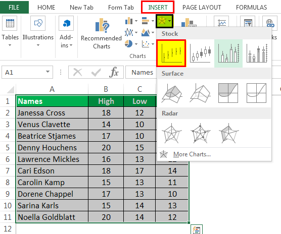
- Then, the stock chart looks like as given below:
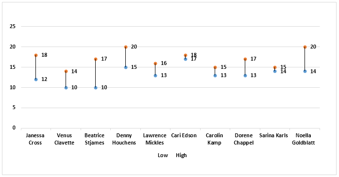
Chart #8 – Radar Chart
The radar chartRadar chart in excel is also known as the spider chart in excel or Web or polar chart in excel, it is used to demonstrate data in two dimensional for two or more than two data series, the axes start on the same point in radar chart, this chart is used to do comparison between more than one or two variables, there are three different types of radar charts available to use in excel.read more is similar to the spider web, often called a web chat.
- Select the data and go to “Insert Tab.” Then, under the “Stock” chart, select the “Radar” chart.
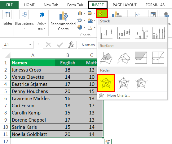
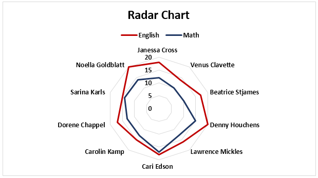
- Then, the radar chart looks like as given below:
Things to Remember
- If we copy a chart from one location to another, the data source will remain the same. However, it means that if we make any changes to the data set, both the charts will change, the primary and the copied.
- For the stock chart, there must be at least two data sets.
- We can only use a pie chart to represent one series of data. They cannot handle two data series.
- To keep the chart easy to understand, we should restrict the data series to two or three. Else, the chart will not be understandable.
- We must add data labels if we have decimals values to represent. If we do not add them, then we cannot understand the chart with accurate precision.
Recommended Articles
This article is a guide to Types of Charts in Excel. Here, we discuss the top 8 types of graphs in Excel, including column charts, line charts, scatter charts, radar charts, etc., along with practical examples and a downloadable Excel template. You may learn more about Excel from the following articles: –
- Create Grouped Bar Chart in ExcelGrouped Bar Chart is a Bar Chart type that blends & compares various categories of 2 or more data sets. It is also known as Multi-Series Bar Chart & helps in the efficient interpretation of differences. read more
- Chart Wizard in ExcelThe Chart Wizard in Excel is a type of wizard that walks users through the process of inserting a chart into an Excel spreadsheet in a step-by-step manner.read more
- How to make Graphs/Charts in Excel?In Excel, a graph or chart lets us visualize information we’ve gathered from our data. It allows us to visualize data in easy-to-understand pictorial ways. The following components are required to create charts or graphs in Excel: 1 — Numerical Data, 2 — Data Headings, and 3 — Data in Proper Order.read more
- Doughnut Excel ChartA doughnut chart is a type of excel chart whose visualization is similar to pie chart. The categories in this chart are parts that, when combined, represent the whole data in the chart. A doughnut chart can only be made using data in rows or columns.read more

There are vizzes labeled “easy in Excel, hard in Tableau”. Side-by-side (grouped) bar chart is one of them. Grouped bars and lines combo graph is just a couple of clicks away when in Excel. On the contrary, substantial efforts are required to build it in Tableau. The side-by-side bar chart is just like the stacked bar chart except we’ve un-stacked them and put the bars side by side along the horizontal axis. This is an extension of the Blended axes chart. Let us follow the steps in the following recipe to quickly create a Side by Side Bar chart. I was checking #Workoutwednesday challenge the other night and came across the following challenge.
Now as per above challenge we need to create “Side by side bar chart combined with the line chart”. Order Quantity for the East and West regions should display as side-by-side bars and Sales amount for the East and West regions should be displayed as lines. Many of you are thinking that this can be easily achieved by using the Dual Axis. If you tried, you would have come to know that you will end up creating Stacked Bar chart in one axis and Line Chart in another axis. Dont forget to check Jonathan Drummey http://drawingwithnumbers.artisart.org/bars-and-lines post which describes a generic approach for solving this type of problem.
Method 1 : Using Custom SQL
To achieve the side by side bar chart along with the Line chart, I will be using Custom SQL.You can use custom SQL to union your data across tables, recast
fields to perform cross-database joins, restructure or reduce the size
of your data for analysis, etc.
Note: For Excel and text file data sources, this
option is available only in workbooks that were created before Tableau
Desktop 8.2 or when using Tableau Desktop on Windows with the legacy connection.
To connect to Excel or text files using the legacy connection, connect
to the file, and in the Open dialog box, click the Open drop-down menu,
and then select Open with Legacy Connection.

SELECT
[Orders$].[Region] AS [Region],
[Orders$].[Order Date] AS [Order Date],
[Orders$].[Quantity] AS [MeasureValue],
‘Quantity – East’ AS  MeasureName,
‘Bar’ AS MarkType
FROM [Orders$]
Where [Orders$].[Region]= “East”

UNION

SELECT
[Orders$].[Region] AS [Region],
[Orders$].[Order Date] AS [Order Date],
[Orders$].[Quantity] AS [MeasureValue],
‘Quantity – West’ AS  MeasureName,
‘Bar’ AS MarkType
 FROM [Orders$]
Where [Orders$].[Region]= “West”

UNION

SELECT
[Orders$].[Region] AS [Region],
[Orders$].[Order Date] AS [Order Date],
[Orders$].[Sales] AS [MeasureValue],
‘Sales’ AS  MeasureName,
‘Line’ AS MarkType
FROM [Orders$]
Where [Orders$].[Region]= “East”

UNION

SELECT
[Orders$].[Region] AS [Region],
[Orders$].[Order Date] AS [Order Date],
[Orders$].[Sales] AS [MeasureValue],
‘Sales’ AS  MeasureName,
‘Line’ AS MarkType
FROM [Orders$]
Where [Orders$].[Region]= “West”
Create some basic calculation
Let’s create two calculated fields which gives us “Quantity” for Bar chart and “Sales”for Line chart.
[Bar Chart]
IF ([MarkType])=’BAR’ THEN [MeasureValue] END
[Line Chart]
IF ([MarkType])=’Line’ THEN [MeasureValue] END
Now we have Pivot field ( MeasureName and MeasureValue), Sales and Quantity. We need to create a Date Field (Date axis) labeling to display the months.
[Date Axis]
IF ([MarkType]) = “Bar” THEN
(CASE [MeasureName]
WHEN “Quantity – East” THEN DATETRUNC(‘month’,[Order Date])
WHEN “Quantity – West” THEN DATETRUNC(‘month’,[Order Date])+9
END)
ELSE
( DATETRUNC(‘month’,[Order Date]))
END
Note :
a) +9 will add an extra space between the two bar chart
b) In other words, it will add 9 days in the existing date which gives us enough space to add 2nd Bar
Once our calculated field is ready, just drag “Date Axis” on column Shelf, “Bar Chart” and “Line Chart” on Row shelf, “MeasureName” on the color shelf.

We can develop side by side bar chart combined with Line chart without even using Custom SQL.Special thanks to Jeffrey Shaffer , Andy Kriebel and Naveen Bandala for providing me the alternate solution.
Method 2: New order Date Calculation
Jeffrey Shaffer suggested an alternate way of creating an “order date placement” calculated Field which automatically aligned the bar in a side by side fashion.
[order date placement]
CASE [Region]
WHEN ‘North’ THEN DATETRUNC(‘month’,[Order Date])+ 0
WHEN ‘South’ THEN DATETRUNC(‘month’,[Order Date])+ 1
WHEN ‘East’ THEN DATETRUNC(‘month’,[Order Date])+ 2
WHEN ‘West’ THEN DATETRUNC(‘month’,[Order Date])+ 10
END

Method 3: Simple Hack
Coach Andy created another calculated Field which not only aligned the side by side bar accurately but also keeps the month’s Label at the Center of the Bar chart.
Note : Make Sure your Stack Marks are off ( Go to Analysis –> Stack Marks –>Off)
[Region Placement]
IF [Region]=’East’ THEN -10
ELSEIF [Region]=’West’ THEN 10
END
Drag this Calculated field on the Size Shelf and change the aggregation from default to Median.Please refer the highlighted mark of the below image.

Method 4: Using Index() Function
Naveen has suggested another way to achieve the same result by using Index() function. Dont forget to check his awesome website http://www.tabvizanalytics.com/ which has so many Tableau Tips and Tricks.
[Date Position]
IF INDEX() = 1
THEN ATTR(DATETRUNC(‘month’,[Order Date]))
ELSEIF INDEX() = 2
THEN ATTR(DATETRUNC(‘month’,[Order Date])+10)
END
Note *:
1) Make sure Month(order date) should be in detail shelf and Region on Color marks.
2) Index() should be computed against Months and region.

Method 5: Using Fixed Bar Size option
Yuri Fal has created this awesome trick which I found on tableau community forum
1.Create a Bar Size feeder Calculation on tableau which adjust based on your Date Granularity
IF
MIN(DATETRUNC('day',[Order Date])) = MAX(DATETRUNC('day',[Order Date]))
 THEN    0.2
 ELSEIF MIN(DATETRUNC('week',[Order Date])) = MAX(DATETRUNC('week',[Order Date]))
 THEN    1.0
 ELSEIF MIN(DATETRUNC('month',[Order Date])) = MAX(DATETRUNC('month',[Order Date]))
 THEN    7.0
 ELSEIF MIN(DATETRUNC('quarter',[Order Date])) = MAX(DATETRUNC('quarter',[Order Date]))
 THEN   28.0
 ELSEIF MIN(DATETRUNC('year',[Order Date])) = MAX(DATETRUNC('year',[Order Date]))
 THEN   91.0
 END
2. Add the order Date on column shelf and change it to months or simply write an adhoc calc (DATETRUNC(‘month’, [Order Date]))
3. Set Stack Marks to OFF ( Go to Analysis –> Stack Marks –>Off)
4. Create another calculation which helps in aligning the Bar.
[Bar Size]
CASE INDEX()
WHEN 1 THEN – [Bar Size Feeder]
WHEN 2 THEN [Bar Size Feeder]
END
5. Drag “Bar Size” on Size Marks card and compute against Region

Hope you enjoyed it. You can find other Workoutwednesday challenge by clicking the below link
Tableau #Workoutwednesday Challenge
As always, I welcome feedback and constructive criticism. I can be reached on Twitter @rajvivan.If you enjoyed this blog , I’d love for you to hit the share button so others might stumble upon it. Please hit the subscribe button as well if you’d like to be added to my once-weekly email list, and don’t forget to follow Vizartpandey on Instagram!
Join our list
Subscribe to our mailing list and get interesting stuff and updates to your email inbox.
Thank you for subscribing.
Something went wrong.
We respect your privacy and take protecting it seriously
Ad