
Excel for Microsoft 365 Excel for Microsoft 365 for Mac Excel for the web Excel 2021 Excel 2019 Excel 2016 More…Less
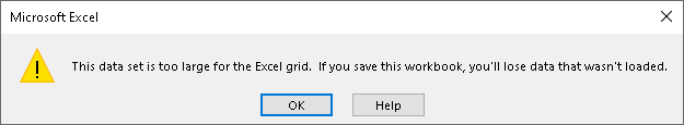
If you’ve opened a file with a large data set in Excel, such as a delimited text (.txt) or comma separated (.csv) file, you might have seen the warning message, «This data set is too large for the Excel grid. If you save this workbook, you’ll lose data that wasn’t loaded.» This means the dataset exceeds the number of rows or columns that’s available in Excel, so some data wasn’t loaded.
It’s important to take extra precautions to avoid losing any data:
-
Open the file in Excel for PC using Get Data— If you have the Excel app for PC, you can use Power Query to load the complete data set and analyze it with PivotTables.
-
Don’t save the file in Excel — If you save over the original file, you’ll lose any data that wasn’t loaded. Remember that this is also an incomplete data set.
-
Save a truncated copy — If you need to save the file, go to File > Save a Copy. Then enter a different name that’s clear that this is a truncated copy of the original file.
How to open a data set that exceeds Excel’s grid limits
Using Excel for PC means you can import the file using Get Data to load all the data. While the data still won’t display more than the number of rows and columns in Excel, the complete data set is there and you can analyze it without losing data.
-
Open a blank workbook in Excel.
-
Go to the Data tab > From Text/CSV > find the file and select Import. In the preview dialog box, select Load To… > PivotTable Report.
-
Once loaded, Use the Field List to arrange fields in a PivotTable. The PivotTable will work with your entire data set to summarize your data.
-
You can also Sort data in a PivotTable or Filter data in a PivotTable.
More about the limits of Excel file formats
When using Excel, it’s important to note which file format you’re using. The .xls file format has a limit of 65,536 rows in each sheet, while the .xlsx file format has a limit of 1,048,576 rows per sheet. For more info, see File formats that are supported in Excel and Excel specifications and limits.
To help prevent reaching an Excel limit, make sure you’re using the .xlsx format instead of the .xls format to take advantage of the much larger limit. If you know your data set exceeds the .xlsx limit, use alternative workarounds to open and view all data.
Tip: Be sure to cross-check that all data was imported when you open a data set in Excel. You can check the number of rows or columns in the source file and then confirm it matches in Excel. Do this by selecting an entire row or column and viewing the count in the status bar at the bottom of Excel.
Related articles
Save a workbook to text or CSV
Import or export text (.txt or .csv) files
Import data from external data sources (Power Query)
Need more help?
Want more options?
Explore subscription benefits, browse training courses, learn how to secure your device, and more.
Communities help you ask and answer questions, give feedback, and hear from experts with rich knowledge.
Содержание
MS Excel
27 сентября, 2017
Евгений Довженко о том, как можно эффективно работать даже с огромными массивами данных.

Любой сотрудник компании, работающий в отделе продаж, финансов, маркетинга, логистики, сталкивается с необходимостью работать с данными, анализировать их.

Excel — незаменимый помощник для достижения этих целей. Мы импортируем информацию, «подтягиваем» ее, систематизируем. На ее основе строим диаграммы, сводные таблицы, планируем, прогнозируем.
Однако в Excel до недавнего времени было 2 важных ограничения:

Мы не могли разместить на рабочем листе Excel более миллиона строк (а наши данные о продажах за 2 года занимают, например, 10 млн строк).

Мы знали, как создать и настроить интерактивные и обновляемые отчеты, но это отнимало много времени.
Единственный инструмент в Excel — сводные таблицы — позволял быстро обрабатывать наши данные.
С другой стороны, есть категория пользователей, которые работают со сложными BI-системами. Это системы бизнес-аналитики (business intelligence), которые дают возможность быстро визуализировать, «крутить» данные и извлекать из них ценную информацию (data mining). Однако внедрение и поддержка таких систем требует значительного участия IT-специалистов и больших финансовых вложений.
До Excel 2010 было четкое разделение на анализ малого и большого объема данных: Excel с одной стороны и сложные BI-системы — с другой.
Начиная с версии 2010, в Excel добавили инструменты, в названиях которых присутствует слово power: Power Query, Power Pivot и Power View. Они позволили сгладить грань между пользователями Excel и комплексных BI-систем.
Power Query
Чтобы работать с данными, к ним нужно подключиться, отобрать, преобразовать или, другими словами, привести их к нужному виду.
Для этого и необходим Power Query. До версии Excel 2013 включительно этот инструмент был в виде надстройки, которую можно было установить бесплатно с сайта Microsoft.
В версии 2016 это уже встроенный в программу инструментарий, находящийся на вкладке «Данные» (Data) в разделе «Скачать и преобразовать» (Get and Transform).
Перечень источников информации, к которым можно подключаться — огромный: от баз данных (их в последней версии 10) до Facebook и Google таблиц (рис. 1).
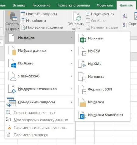
Рис 1. Выбор источника данных в Power Query
Вот некоторые возможности Power Query по подготовке и преобразованию данных:

отбор строк и столбцов, создание пользовательских (вычисляемых) столбцов

преобразование данных с помощью числовых, текстовых функций, функций даты и времени

транспонирование таблицы, разворачивание по столбцам (Pivot) и наоборот — сворачивание данных, организованных по столбцам, в построчный вид (Unpivot)

объединение нескольких таблиц: как вниз — одну под другую, так и связывание по общей колонке (единому ключу)
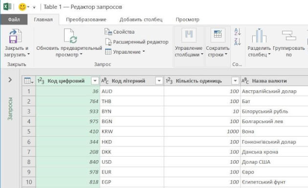
Рис 2. Окно редактора Power Query
Ну и конечно, после выгрузки подготовленных данных в Excel они будут автоматически обновляться, если в источнике данных появятся новые строки.
Пример
Компания в своей аналитике использует текущие курсы трех валют, которые ежедневно обновляются на сайте Национального банка.
Таблица на сайте непригодна для прямого использования (рисунок 2-1):

все валюты не нужны

в колонке «Курс» в качестве разделителя целой и дробной частей используется точка (в наших региональных настройках — запятая)

в колонке «Курс» отображается показатель за разное количество единиц валюты: за 100, за 1000 и т. д. (указано в отдельной колонке «Количество единиц»)
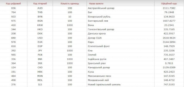
Рис. 2-1. Так выглядит таблица с курсами валют на сайте Нацбанка.
С помощью Power Query мы подключаемся к таблице текущих курсов валют на сайте НБУ и в этом редакторе готовим запрос на извлечение данных:

В колонке «Курс» меняем точку на запятую (инструмент «Замена значений»).

Создаем вычисляемый столбец, в котором курсы валют в колонке «Курс» делятся на количество единиц валюты из колонки «Количество единиц».

Удаляем лишние столбцы и оставляем только строки валют, с которыми работаем.

Выгружаем полученную таблицу на рабочий лист Excel.
Результат показан на рисунке 2-2.
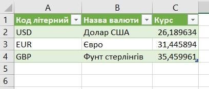
Рис. 2-2. Так выглядит результирующая таблица в нашем Excel файле.
Курсы валют на сайте Нацбанка меняются каждый день. Но при обновлении данных в документе Excel наш, один раз подготовленный, запрос пройдет через все шаги, и результирующая таблица всегда будет в нужном виде, но уже с актуальными курсами.
Power Pivot
У вас данные находятся в разрозненных источниках? Некоторые таблицы содержат больше 1 млн строк? Вам нужно все это объединить в одну модель данных и анализировать с помощью, например, сводной таблицы Excel? Здесь понадобится Power Pivot — надстройка Excel, которая по умолчанию включена в версии Pro Plus и выше (начиная с версии 2010).
В Power Pivot вы можете добавлять данные из разных источников, связывать таблицы между собой (рисунок 3). Таблицы при этом не обязательно должны находиться на рабочих листах Excel. Вместо этого они по-прежнему будут храниться в файле Excel, но просматривать их можно в окне Power Pivot (рис. 4). Поэтому нет ограничения на количество строк — в вашем файле Excel могут находиться таблицы и в сотни миллионов строк.
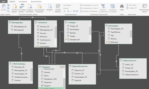
Рис. 3. Окно Power Pivot в представлении диаграммы
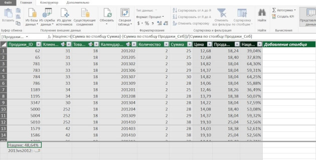
Рис. 4. Окно Power Pivot в представлении данных
Вот некоторые возможности Power Pivot, помимо описанных выше:

добавлять вычисляемые столбцы и поля (меры), в том числе основанные на расчетах из нескольких таблиц

создавать и мониторить в сводной таблице ключевые показатели эффективности (KPI)

создавать иерархические структуры (например, по географическому признаку — регион, область, город, район)
И обрабатывать все это с помощью сводной таблицы Excel, построенной на модели данных.
Пример. У предприятия в базе данных (или отдельных файлах Excel) в 5 таблицах хранится информация о продажах, клиентах, товаре и его классификации, менеджерах по продажам и закупочных ценах продукции. Необходимо провести анализ по объемам продаж и маржинальности по менеджерам.
С помощью Power Pivot:

добавляем все 5 таблиц в модель данных

связываем таблицы по общим ключам (столбцам)

в таблице «Продажи» создаем вычисляемый столбец «Продажи в закупочных ценах», умножив количество штук из таблицы «Продажи» на закупочную цену из таблицы «Цена закупки»

создаем вычисляемое поле (меру) «Маржа»

с помощью инструмента «Ключевые показатели эффективности» устанавливаем цель по маржинальности и настраиваем визуализацию — как выполнение цели будет визуализироваться в сводной таблице
Теперь можно «крутить» эти данные в сводной таблице или в отчете Power View (следующий инструмент) и анализировать маржинальность по товарам, менеджерам, регионам, клиентам.
Power View
Иногда сводная таблица — не лучший вариант визуализации данных. В таком случае можно создавать отчеты Power View. Как и Power Pivot, Power View — это надстройка Excel, которая по умолчанию включена в версии Pro Plus и выше (начиная с версии 2010).
В отличие от сводной таблицы, в отчет Power View можно добавлять диаграммы и другие визуальные объекты. Здесь нет такого количества настроек, как в диаграммах Excel. Но в том то и сила инструмента — мы не тратим время на настройку, а быстро создаем отчет, визуализирующий данные в определенном разрезе.
Вот некоторые возможности Power View:

— быстро добавлять в отчет таблицы, диаграммы (без необходимости настройки)

организовывать срезы и фильтры

уходить на разные уровни детализации данных

добавлять карты и располагать на них данные

создавать анимированные диаграммы
Пример отчета Power View — на рисунке 5.
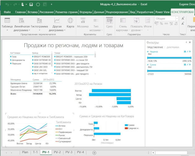
Рис. 5. Пример отчета Power View
Даже самые внушительные массивы данных можно систематизировать и визуализировать — главное не ограничиваться поверхностными возможностями Excel, а брать из его функций все возможное.


Хотите получать дайджест статей?
Одно письмо с лучшими материалами за неделю. Подписывайтесь, чтобы ничего не упустить.
Спасибо за подписку!
Курс по теме:
«Advanced Excel»
Программы
Ведет
Никита
Свидло
![]()
16 мая
13 июня

![]()
Download Article
![]()
Download Article
These instructions will show you how to approximate integrals for large data sets in Microsoft Excel. This can be particularly useful when analyzing data from machinery or equipment that takes a large number of measurements—for example, in this instruction set, data from a tensile testing machine is used. This guide can be applied to any type of measurement data that can be integrated.
-

1
Understand the basics of the trapezoid rule. This is how the integral will be approximated. Imagine the stress-strain curve above, but separated into hundreds of trapezoidal sections. Each section’s area will be added to find the area under the curve.
-
2
Load the data into Excel. You can do this by double-clicking on the .xls or .xlsx file that is exported by the machine.
Advertisement
-
3
Convert the measurements into a usable form, if needed. For this particular data set, it means converting the tensile machine measurements from «Travel» to «Strain», and «Load» to «Stress», respectively. This step may require different calculations or may not be needed at all, depending on the data from your machine.


Advertisement
-
1
Determine which columns will represent the width and height of the trapezoid. Once again, this will be determined by the nature of your data. For this set, «Strain» corresponds to the width and «Stress» corresponds to the height.
-
2
Click on a blank column and label it «Width». This new column will be used to store the width of each trapezoid.
-
3
Select the empty cell below «Width» and type «=ABS(«. Type it exactly as shown, and do not stop typing in the cell yet. Note that the «typing» cursor is still flashing.
-
4
Click on the second measurement corresponding to the width, then press the - key.
-
5
Click on the first measurement in the same column, and type in the closing parenthesis, and press ↵ Enter. The cell should now have a number in it.
-
6
Select the newly created cell and move the mouse cursor to the bottom right corner of the cell directly below, until a cross appears.
- Once it appears, left click, hold, and drag the cursor down.
-
Stop at the cell directly above the last measurement. Numbers should populate all the selected cells after.
- Once it appears, left click, hold, and drag the cursor down.
-
7
Click on a blank column and label it «Height» directly next to the «Width» column.
-
8
Select the column underneath the «Height» label, and type «=0.5*(«. Once again, do not exit the cell just yet.
-
9
Click the first measurement in the column corresponding to the height, then press the + key.
-
10
Click on the second measurement in the same column, and type the closing parenthesis, and press ↵ Enter. The cell should have a number in it.
-
11
Click on the newly created cell. Repeat the same procedure you did before to apply the formula to all the cells in the same column.
- Once again, stop at the cell before the last measurement. Numbers should appear in all the selected cells.
- Once again, stop at the cell before the last measurement. Numbers should appear in all the selected cells.


Advertisement
-
1
Click on a blank column and label it «Area» next to the «Height» column. This will store the area for each trapezoid.
-
2
Click on the cell directly underneath «Area», and type «=». Once again, do not exit the cell.
-
3
Click on the first cell in the «Width» column, and type an asterisk (*) directly after.
-
4
Click on the first cell in the «Height» column, and press ↵ Enter. A number should now appear in the cell.
-
5
Click on the newly created cell. Repeat the procedure you applied before again to apply the formula to all the cells in the same column.
- Once again, stop at the cell before the last measurement. Numbers should appear in the selected cells after this step.
-
6
Click on a blank column and label it «Integral» next to the «Area» column.
-
7
Click on the cell below «Integral», and type in «=SUM(«, and do not exit the cell.
-
8
Click on the first cell under «Area», hold, and drag downwards until all the cells in the «Area» column are selected, then press ↵ Enter. A number under «Integral» should appear, and will be the answer.


Advertisement
Ask a Question
200 characters left
Include your email address to get a message when this question is answered.
Submit
Advertisement
Thanks for submitting a tip for review!
-
If no numbers or an error appears in the cell, double-check to make sure the correct cells have been selected.
-
Make sure you put proper units on the integration answer.
-
Keep in mind that this is an approximation, and will be more accurate if there are more trapezoids (more measurements).
Advertisement
Things You’ll Need
- Microsoft Excel (any version)
- .XLS or .XLSX file containing data
About This Article
Thanks to all authors for creating a page that has been read 77,556 times.
Is this article up to date?
Ever wanted to use Excel to examine big data sets? This tutorial will show you how to analyze over 300,000 items at one time. And what better topic than baby names? Want to see how popular your name was in 1910? You can do that. Want to find the perfect name for your baby? Here’s your chance to do it with data.
There are professional data analysts out there who tackle “big data” with complex software, but it’s possible to do a surprising amount of analysis with Microsoft Excel. In this case, we’re using baby names from California based on the United States Social Security Baby Names Database. In this tutorial, you’ll not only learn how to manipulate big data in Excel, you’ll learn some critical thinking skills to uncover some of the flaws within databases. As you’ll see, the Social Security database, which goes back to 1880, has some weird and wonderful anomalies that we’ll discuss.
This tutorial is for people familiar with Excel: those who know how to write, copy and paste formulas and make charts. If you rarely venture away from a handful of menu items, you’ll learn how to use built-in Excel features such as filters and pivot tables and the extremely handy VLOOKUP formula. This tutorial focuses on what’s called “exploratory analysis”, and will clarify the steps to take when you first confront a huge chunk of data, and you don’t know in advance what to expect from it. We’ll also show you how to use these tools to find the flaws in your data set, so you can make appropriate inferences. If you want to improve your Excel chops with some big data exploration, you’re in the right place.
Note: This tutorial uses Excel 2013. If you’re using a different version, you may notice some slight differences as you go through the steps.
Download the state-specific data from http://www.ssa.gov/oact/babynames/limits.html. You’ll find a file named namesbystate.zip in your download folder. Extract the California file: CA.TXT. (In Windows, you can just drag the file out of the archive.)
Launch Microsoft Excel, and open CA.TXT. If you don’t see the file in your dialogue box, you may have to choose Show All Files in the dropdown box next to the file name box.
In the Text Import dialogue box, choose Delimited, then Next, then Comma, then Finish. This tells Excel to treat commas as column separators. Save your file as an Excel Workbook file called CA Baby Names.xlsx. Your workbook should look similar to this:
Note: the number of rows in various parts of this tutorial are based on the Social Security Baby Names file going until the end of 2013. Depending on when you are doing this tutorial, the files may have been updated with data from later years, so the number of rows may be larger. Keep this in mind if the last row specified in this tutorial is slightly less than what you see on the screen.
Select the first column, A, and delete it; all of your data in this file is from California, you don’t need to waste computer resources on that information. Insert a new row above Row 1, and type column headers: Sex, Year, Name and Births. Your workbook should now look like this:
Filters are a powerful tool to drill down into subsets of your data. Press Ctrl-A or Cmd-A on Mac (from now on, I’ll just write Ctrl) to select all your data, then in the Home Tab select Sort & Filter, and Filter. Your data column headers now have triangles to the right of each cell, with dropdown boxes. Let’s say you wanted to look up only the first name ‘Aaliah’. Click the triangle to filter the Name column, click the Select Allcheckbox to deselect everything, then click the checkbox next to ‘Aaliah’. You should see the following:
Sanity Checks
When doing data analysis, it’s essential to take a step back every now and then and ask, “do these results make sense?” This is especially important when you are changing the values of cells in an Excel Spreadsheet; if you make a mistake and change your data, it can be difficult to track down the error later.
But sanity checks can also be used to check the state of the data as it came to you. Use the filter to select only the name ‘Jennifer’, and have a look at the results. The following things should stand out:
- On your way down the list, there were quite a few names that were almost, but not quite, spelled ‘Jennifer’, like ‘Jennfier’ and ‘Jenniffer’. Some of these are alternate spellings given by parents who want an unusual name, but it’s possible some are typing errors by the clerks who recorded the data. There’s no way to determine which are errors and which are intentional, but you should bear these possibilities in mind. Datasets are rarely perfect, and this is especially true the larger they get.
- There are quite a few boys named ‘Jennifer’ in this data. Again, it’s possible some adventurous parents gave boys a traditionally female name, but if you look through names of medium popularity or better, you’ll find a small percentage is always of the other sex. This odd consistency makes it probable that a good proportion of these are also due to errors in the dataset. If you wanted to just consider the girls named ‘Jennifer’, you could filter the Sex column.
Summarize with Pivot Tables
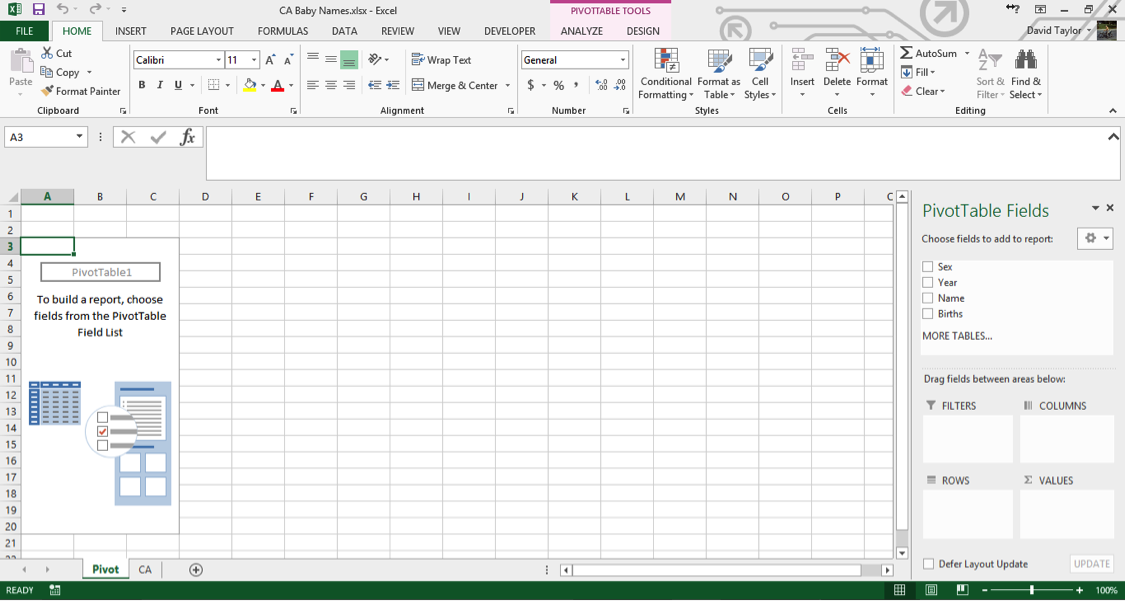
The Pivot Tables feature is a powerful tool that allows you to manipulate and explore the data. Here, we’ll use it to find out how many names and births are in the database for each year. First, select columns A through D, so they are highlighted. Then click the Insert Tab’s leftmost button, PivotTable. In the dialogue box that appears, make sure the Table/Range radio button is selected and the accompanying text box reads CA!$A:$D (if you selected columns A through D correctly earlier, this should be the default. If not, type it in exactly as written. The CA is the name of your data worksheet, taken from the CA.TXT filename you started with).
In the bottom of the dialogue box, make sure the New Worksheet radio button is highlighted, then click OK. A new worksheet appears, named Sheet1 – right click on the Sheet Tab and rename it something like‘Pivot’, since it’s a good habit to always have descriptive sheet names instead of uninformative default ones. Your screen should look like this:
If you’ve never used an Excel pivot table before, it takes some getting used to, but it’s not too complicated, and it’s well worth the effort. Once you’ve followed the instructions here, we recommend playing around with pivot tables to get to know them better.
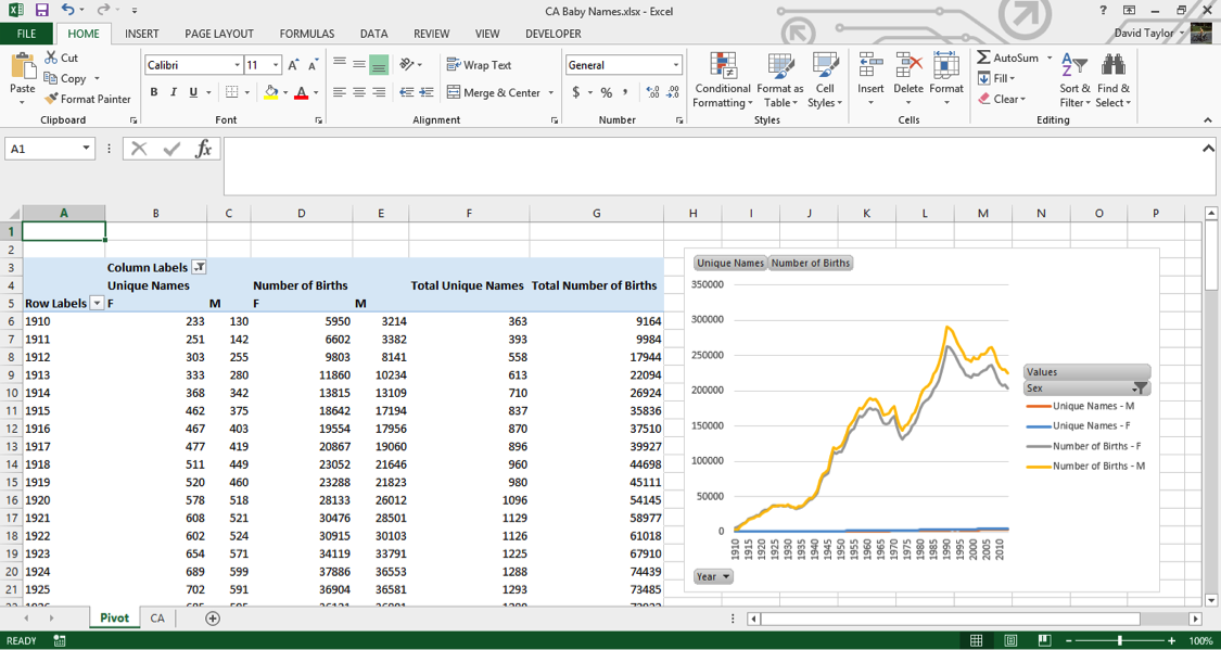
In the menu on the right, click the checkbox next to the Year field. Year now automatically appears in theROWS box on the bottom left of that menu, which is exactly what you want. Now click the Births checkbox, and drag the Births that appears in ROWS to the right into VALUES.
Your screen will now look like this:
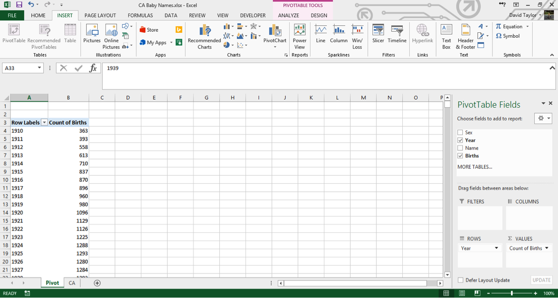
A few things should be noted here: the title of the rightmost column, Count of Births, is a little unclear. In data analysis, ‘count’ always means the number of rows in a category, regardless of the value in the cells in that row. So what you are seeing here is: for each year in the database, the number of unique male names plus the number of unique female names. You can see that as time progresses from 1910 to 1927, there are more names per year. Does this mean parents are picking more diverse names for their children? Maybe – that’s what you want to find out with further analysis.
Clarity and explicitness are important. Whenever you create a computer document, you should do so with the philosophy that if you open it again six months from now, you will immediately understand what you’re looking at. With that in mind, click on the cell where it says Count of Births and change it to Unique Names.
Bear in mind, when you’re working with pivot tables, the menu on the right will disappear anytime you don’t have a cell of the pivot table to the left selected. If that happens, just select a cell in the table, and you’re good to go.
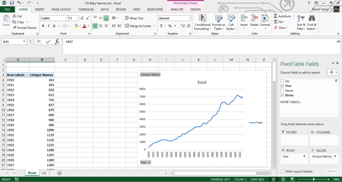
Add a PivotChart
When it comes to quickly understanding data, nothing beats a chart. (Most people call charts “graphs”, but technically a graph is a complicated network visualization that looks nothing like what you’d expect, so Excel properly calls them charts.) Our visual senses are powerful, and are able to immediately understand patterns and trends when they are abstracted into the form of bars and lines.
Make sure your pivot table is selected, then in the Insert Tab, click PivotChart. In the next dialogue box, the default is a bar chart; this will work, but it will be easier on the eyes if you select a line chart, then click OK. You may find it easier if you resize the chart so that the bottom x-axis shows intervals of five and ten years, since we tend to think of years in terms of decades. Your screen should look like this:
Again, we’re seeing an increase in the number of unique male names and unique female names per year. But what if you want to know the number of births themselves? With Excel’s pivot table, that’s easy to do. You could modify your single column, but it is usually more informative to add a new column so you can compare, contrast and calculate.
In the right-hand menu, under Choose fields to add to report, drag the bold checkboxed Births down to theVALUES box in the lower right. You now have two columns, Unique Names and Count of Births (Excel has given this column the same default name it did before). Click the downward-facing black triangle to the right of Count of Births in the VALUES box, and select Value Field Settings from the context menu (the menu that pops up when you right-click). In the resulting dialogue box, change the highlighted Count to Sum.
Your new column’s header name is wrong, so click in its cell and type Number of Births (just “Births” would have been fine, but Excel won’t let you give a pivot chart column the same name as one of the columns it’s based on). A new line has been added to your pivot chart, but because the number of births is so much greater than the number of names, it’s compressed down to near the x-axis. The solution for this is to put it on a secondary y-axis. Click on the compressed series so it’s selected. Right-click and choose Format Data Series from the context menu. Then, choose the Secondary Axis radio button, and click the X in the top right of the Format Data Series panel to dismiss it. Now you should see this:
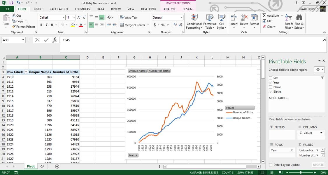
If you see something different, don’t panic. Go back and follow the steps closely, using this screen as a guide to what you should see.Let’s study the shapes of the Unique Names line (in blue in the figure above) and the Number of Births line (in orange above). They both have a generally increasing direction, as you would expect, and often move in tandem (especially from 1910 to 1935 and 1975 to 2000). The number of births increases rapidly during the Baby Boom starting around 1940, peaks around 1960, and peaks again around 1990 and 2005.
Another Sanity Check
Whenever possible, it’s a good idea to get a second opinion about data: you weren’t involved in its collection or curation, so you can’t vouch for its accuracy. Just because a government department publishes a dataset, doesn’t mean you should trust everything in it 100%. (Please believe me, I speak from experience!)
In this case, it’s easy to double-check. Googling the terms ‘California birth rate’ leads us to the California Department of Public Health, and documents such as this one —http://www.cdph.ca.gov/data/statistics/Documents/VSC-2005-0201.pdf — which show the same trends (after 1960, anyway, where the CDPH data starts) as in the Baby Names data. However, it appears that the overall number of births is greater in the CDPH records than in the dataset we’re working on. For example, in 1990, the Baby Names data shows about 550,000 births, while the CDPH shows 611,666.
That’s why it’s a good idea to know your dataset, and read up about how it was collected and what it contains (or what it leaves out). The background information given by the Social Security Administration about this dataset at http://www.ssa.gov/oact/babynames/background.html andhttp://www.ssa.gov/oact/babynames/limits.html points out that any names with fewer than five births is left out, to protect the privacy of the names’ holders. So it’s plausible that the 60,000 missing births split among people who shared their name with fewer than five other people.
Explore your data and uncover insights
The pivot table and chart we’ve created are based on all of the data. However, there’s a natural and obvious division within the topic of baby names: male and female names. For one thing, more boys are born than girls (about 4% to 8% more, due to biological and environmental factors). Also, there are different social pressures on parents when naming boys and girls; we’ll see evidence of this soon.
Luckily, with pivot tables, it’s easy to separate out the sexes. Just drag the Sex field name next to the checkbox in the upper right down to the COLUMNS box. Click the filter icon at the right of the new cell named Column Labels at the top of the pivot chart. Make sure F and M are selected, but (blank) is not – there are no blank values for Sex in this dataset, which you could easily verify by looking at the column totals with (blank) selected.
Where you had two columns before, now you have six: Unique Names and Number of Births for females, males and both together. Here is what you should see:
(Note: I clicked in a non-pivot table cell and moved the chart over so everything fits on one screen.)
Unfortunately, your pivot chart has lost its secondary axis. You could go back and reassign both Number of Birth lines to the secondary axis, but here is where it’s a good idea to stop using pivot tables and copy everything into a regular Excel spreadsheet. Why? Pivot tables are powerful, but they’re not flexible. You can add calculated columns, but it’s needlessly complicated. Pivot charts are even more limited: they will always show all the data in a pivot table. For example, if you wanted to limit the chart to only female names, or only totals, we’d have to change the pivot table itself.
So highlight columns A through G and copy them. Then, create a new worksheet, and right-click in cell A1, and select Paste as Values (or just press the ‘V’ key). Resize the columns so all the text fits, and rename the sheet Diversity (since that’s what we’ll be looking at). ‘Diversity’, by the way, is simply the average number of names per birth. Its maximum possible value is 1, which would only happen if every baby born had a different name.
You should see this:
We’re not interested in the totals anymore, so go ahead and delete columns F and G (this will give us more screen real estate). Replace them with Diversity in F4, F in F5 and M in G5, and in cell F6 type the formula=B6/D6. Copy this cell, then select cells F6:G109 and paste. At the bottom of your spreadsheet, in Row 110, there are totals. You should delete these, because they’re potentially confusing, and it doesn’t make sense to add together this kind of data for all years.
Now you’re ready to add a chart. Select cells A5:A109, press Ctrl/Cmd, and select cells F5:G109 (the female and male diversity ratios, plus the column headers, F and M). Then in the Insert Tab select the scatter chart with straight lines, as shown here:
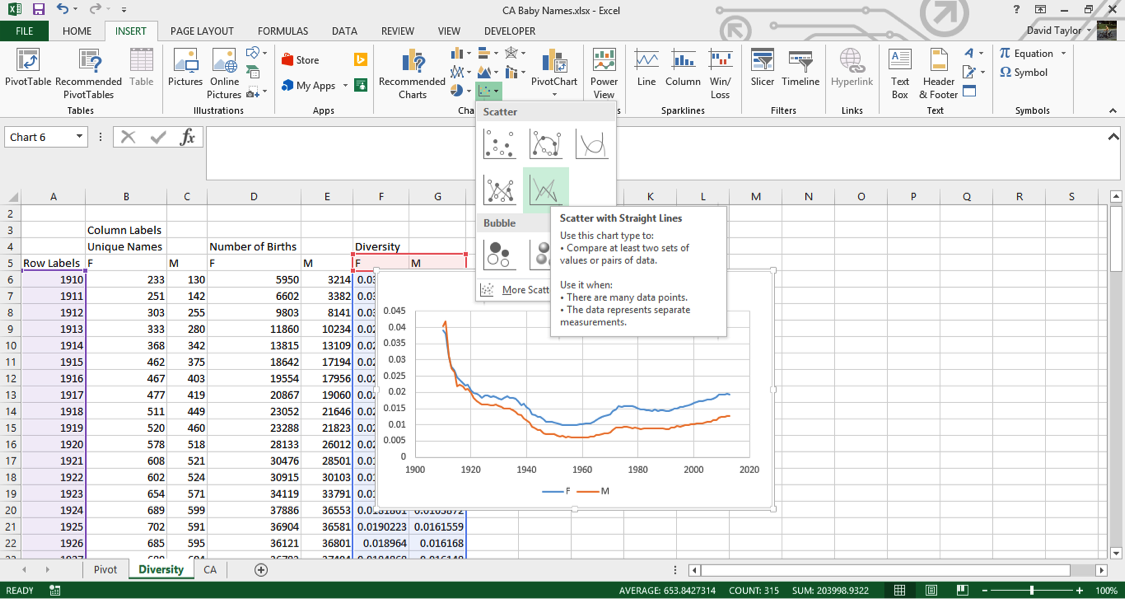
You should always label the axes of charts, so with the chart selected, use the DESIGN tab and add these features. (In Excel 2013, click on the Add Chart Element button at the left; the procedure is slightly different for other version of Excel). Name the x-axis Years and the y-axis Names per birth and, while you’re at it, change the chart title to Diversity.Ignore the first half of the graph for now: let’s look at 1960 to present. As one would expect from anecdotal experience, there is more diversity in names now than there was fifty years ago. In addition, female names are more diverse than male names. Perhaps parents want their girls to stand out more? It’s interesting that the changes in diversity tracks pretty closely between the sexes. This suggests that the difference is due to something intrinsic to the difference between girls’ and boys’ names, not momentary trends. Perhaps the explanation is simple: there is more diversity in girls’ names because there are more spelling variations in girls’ names, like ‘Ann’ and ‘Anne’ and ‘Anna’.
The train of thought outlined above illustrates the kind of mindset needed in exploratory data analysis. Insights come from looking beneath the surface and the obvious interpretation, by questioning everything (including the data itself!), and by considering all possibilities.
With that in mind, take a look at the graph from 1910 to 1960. The maximum amount of name diversity happens in the first years of the data. Does this seem plausible to you? Were parents giving their kids wild and unique names during World War I at twice the rate as today?
If there’s something that doesn’t make intuitive sense in the data, it’s time for a sanity check. A good strategy is to check something else that, if the data is accurate, should be true. Human sex ratio at birth was mentioned above: it should always be between 103 and 108 boys born per 100 girls born. That seems like a good place to start.
Determine Important Ratios
You can just add more columns to the Diversity spreadsheet. Move the chart out of the way to make room.
Call the new group of columns Sex Ratio, and write three column labels in cells H5:J5 — Actual, Minimum and Maximum. Type the formula =100*E6/D6 into cell H6, and the numbers 103 and 108 in cells I6 and J6, respectively. Copy the contents of H6:J6 and paste into cells H7:J109.
Now to make the chart. Select cells A5:A109 (which contain the years), hold down Ctrl/Cmd and select your new data in H5:J109. In the Insert tab, insert a scatter chart with lines as you did above. Add a title and axis labels. You should reformat the y-axis, so that you can visualize the data more clearly. (Usually you want the y-axis to go all the way to zero, but in this case the y-axis can’t possibly go down to zero (if there were no boys born, the human race would die out, right?) Select the numbers on the y axis, right-click and choose Format Axis from the context menu, in the resulting dialogue box type 50 in Minimum and 120 inMaximum and click OK.
Here is what you should see:
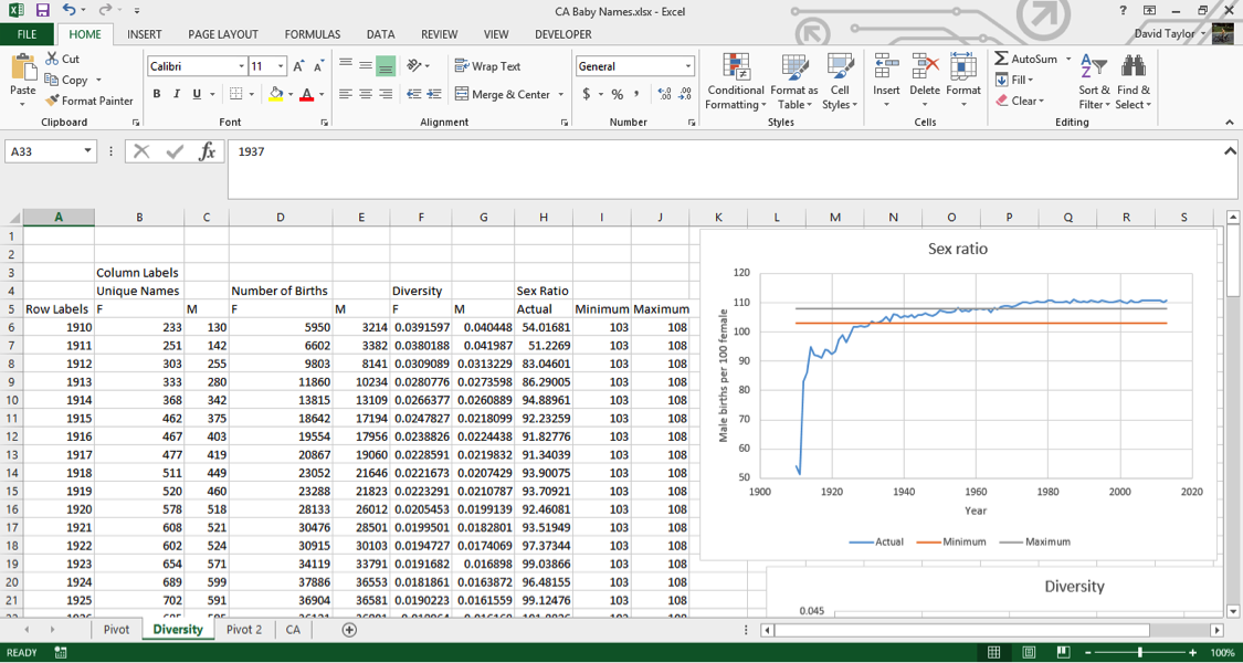
As you can clearly see, this data does not display the accepted sex ratios for humans. In fact, in the first few years it’s way, way off. In the 1910s, there are only half as many boys as girls being born.The reason for this is quite simple, and unfortunate. If you look at the landing page for this dataset athttp://www.ssa.gov/oact/babynames/, you can see the U.S. Social Security Administration calls it a baby names dataset, and even has graphics of babies, but the fact is, many of these names are not of babies: they’re names of adults, and not even a representative sample of adult Americans.
If you look at the Wikipedia entry for History of Social Security in the United States at https://en.wikipedia.org/wiki/History_of_Social_Security_in_the_United_States, you’ll see that Social Security only started in 1937. Yet your data goes back to 1910, and for some other states it goes back as far as 1880. How can that be? Well, those with a 1910 birth year were at least 27 years old when they applied for Social Security. They applied, at the earliest, in 1937, and gave their birth year. This means people who died before the age of 27 are automatically excluded from the data (and infant and childhood mortality was far higher in the 1910s than it is today.) Also, Social Security was not a universal program then as it is today. Only those on a list of accepted occupations could join, which in practice, meant middle-class white people, so there is a social and ethnic bias to the dataset before the rules were relaxed in the 1950s.
Why are there more women than men in the early years? Because women live longer than men. They had less chance of dying before they could apply for Social Security, and outlived their husbands which meant they needed to apply in their own name in order to receive their husbands’ benefits.
It’s worth pointing out that it was unusual for Americans to give babies a Social Security number at all before 1986. That’s the year the IRS started requiring them to claim a child as a tax deduction. Before that time, it was usual for people to apply for a Social Security number when they filed their own first tax return, usually in their late teens.
Finally, why is the sex ratio in the dataset above normal values starting around 1970? This one is easier to figure out, because it’s something you saw in the Diversity graph. There are more girls’ names than boys’ names, and the dataset leaves out names belonging to fewer than five people for privacy reasons. That means that more girls’ names than boys’ names are excluded from the dataset, so the ratio of boys to girls is a little higher.
Does this mean this dataset is useless? Absolutely not. All datasets have strengths and weaknesses. The important thing is knowing what they are, so you don’t draw unwarranted conclusions. (For example, you would probably hesitate to declare the top boys’ names of 1910, but you’d have a lot more confidence in 2000.) With that in mind, let’s do some more common analyses of the data, and at the end, you’ll be able to see what it means for a ‘baby names’ dataset to actually contain adults names.
Graph individual data points and trends
When you have data that is naturally divided into subcategories (in this case, years), it’s a good idea to calculate some statistics just in terms of that subset. For example, if you wanted to calculate the #1 names overall, it would be difficult to do that for the entire dataset, because there are more births in the 2000s than in the 1910s, so in practice the result would be the “#1 name overall, but mostly nowadays.”
It makes a lot more sense to compare, for each row, the percentages of births of that name and sex that year to all births of that sex that year, and rank them. (For example, this will allow you to determine the popularity of the name ‘Evelyn’ relative to ‘Margaret’—and every other name.) Here’s how you do it.
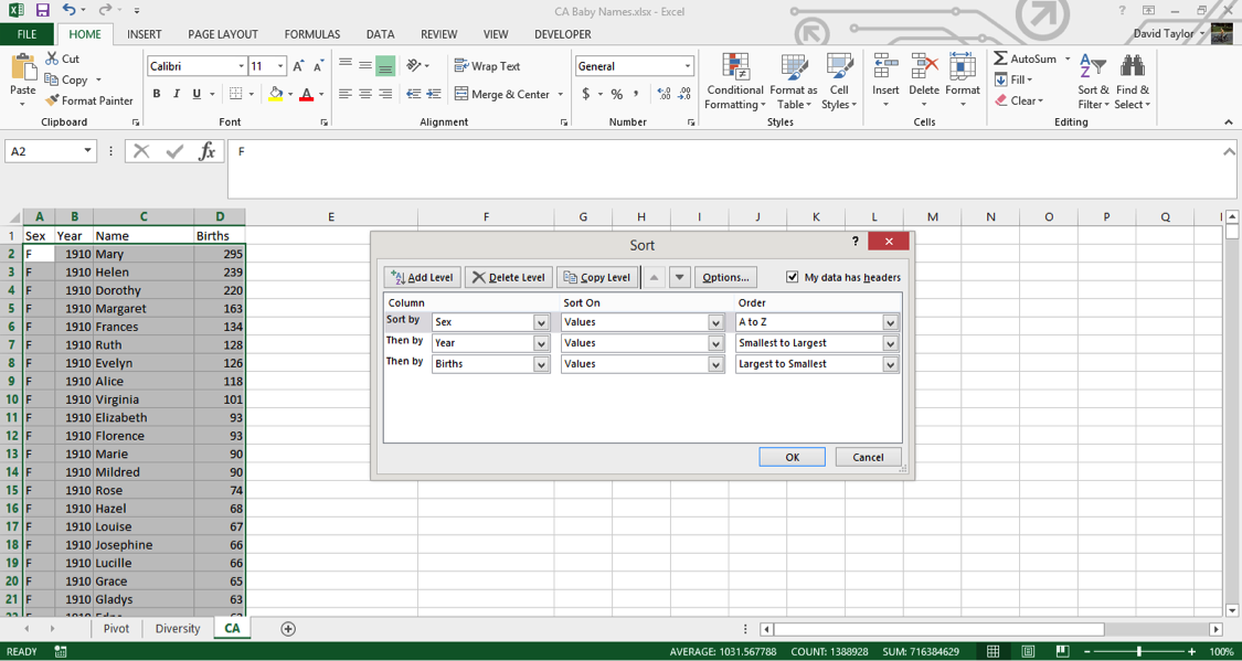
Go back to your CA worksheet. The data, as downloaded, should already be sorted the way you need it, but you should never take such things for granted. Select columns A:D, in the Home tab click the Sort & Filterbutton on the right, choose Custom Sort and use the Insert button to have three rows of criteria. Make these criteria Sex A-Z, Year Smallest to Largest and Births Largest to Smallest as shown in the following figure, then click OK:
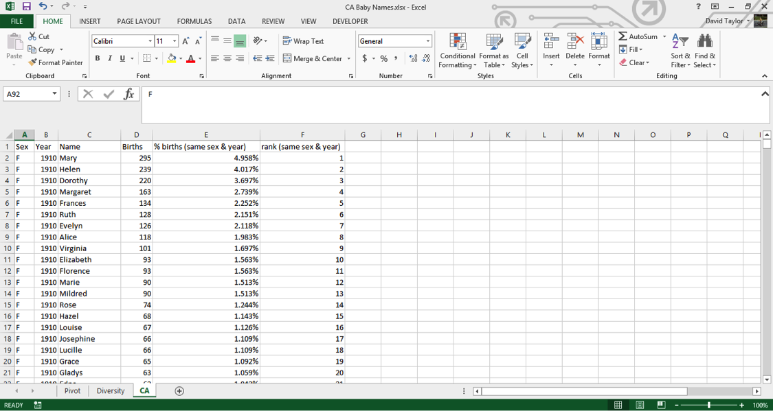
Now you can add your new columns. Type new headers in E1 and F1: % of Births (same sex & year) and Rank (same sex & year), respectively. These column names might strike you as a little long, but it’s best to err on the side of clarity. If someone else has to look at and interpret your work, or even if you have to return to it weeks or months later, it’s best that everything can be understood as easily as possible.
For your % of Births column, the concept is easy: divide the number of births in that row, e.g. 295 for Mary in 1910, by the total number of births of that sex and year, e.g. female births in 1910. Where can you find that information? In the pivot table you made at the beginning of the tutorial. YES!
Take a look at that pivot table. The information you need to access is in Columns D to E is. Luckily Excel has a few different functions you can use to look up data in other worksheets; the easiest is the VLOOKUP function.
Go back to the CA worksheet and type the following into cell E2:=D2/VLOOKUP(B2,Pivot!$A$6:$E$109,IF(A2=”F”,4,5),FALSE)
If you’re not familiar with the VLOOKUP function, here’s a breakdown of all of the arguments:
- D2: that’s the number of births for Mary in 1910, which you’ll divide by all female 1910 births.
- B2: that’s the year you want to look up, in this case 1910.
- Pivot!$A$6:$E$109 tells the function to look in the range of the Pivot spreadsheet with the years in the leftmost column and the total births, female and male, in the two rightmost columns. This is what will be matched with the value in B2. The dollar signs are important. They tell Excel not to move the lookup range down as you copy the formula down.
- IF(A2=”F”,4,5) tells the function what column to look in for the results. If your row is a female name, it will look in Column 4, otherwise Column 5.
- FALSE tells the function to return an error if it can’t find the year in the Pivot worksheet. This shouldn’t happen, but it’s good to be explicit here, so that if something goes wrong, you’ll know about it!
You should see the value 0.049579…. Copy this cell and paste it into every cell of Column E below it. It might take your computer a second or two (or three or four…), depending on how powerful it is, to calculate all of these values (there are over 300,000 of them, after all). To avoid having to wait for recalculations in the future, select all of Column E, copy it, and Paste as Values. This is safe to do because you can be confident the underlying values being calculated will not change in the future.
One of the good features in Excel is that it can display percentages without changing the underlying value. In other words, you don’t need to multiply your results by 100, and then divide by 100, if you want to use them in a calculation. Select Column E and use the Number Group on the Home tab to change the formatting to percentage with three decimal places.
Now is a good time for a sanity check. In any blank cell, type the following: =SUMIFS(E:E,A:A,”F”,B:B,1910). This tells the function to add together the values in Column E only for those rows where Column Acontains F and Column B contains 1910. The result should be 1, i.e. 100%. If you replace F with M and/or 1910 with any year in the dataset, the value should always be 1. Now that the integrity of your data has been verified, you can delete that cell.
Now you can add the values in the ranks column. There are ways to use Excel functions to calculate ranks of subsets, but they’re complicated and slow. Since you’ll be pasting as values later anyway, why not do it the quick and easy way? All that is required for this method is that the data be properly sorted, and you did that earlier.
In cell F2, type the following: =IF(B2<>B1,1,F1+1). This tells Excel to start counting ranks when there is a change from row to row in the Year Column B. (If there is a change in the Sex Column A, there will also be a change in the Year column because of the way you sorted the worksheet earlier.) Excel will give the most common name a rank of 1 because earlier you sorted the worksheet so that births are in descending order. Wherever there isn’t a change in the Year column, Excel increments the rank, i.e. 1, 2, 3, 4, …
Copy F2 to the whole range of Column F, then copy the whole column and Paste as Values. Finally, your worksheet should look like this:
Visualize your data
Now that you have these calculated columns, you can use filters as you did above to find the top names in each year. Select Columns A:F, and in the HOME tab, under Sort & Filter, choose Filter.
Now click the filter icon in cell F1 and select only the names of rank one (i.e. the #1 names of each sex of each year). You can see that Mary dominates until the 1930s. Then Mary, Barbara and Linda alternate until Linda wins out for 10 years. Lisa, Jennifer, Jessica and Emily have solid runs later on, then Isabella and Sophia are the top name for three years each. Among the boys, John, Robert, David, Michael and Daniel give way to Jacob for the last few years.
If you look at the percentage column, you can see that the #1 name takes up a smaller and smaller part of all the names as the years go by. This is further evidence of the increasing diversity of names over time, and unlike the diversity measure you calculated before, nothing unexpected happens in the early part of the dataset.
Now you can use the filter tool to visualize individual names. The first thing to do is sort the names; this extra step will make it possible to make charts of the results. Be warned, with over 300,000 rows, this could take a few minutes depending on the power of your computer, but it only has to be done once. Click on the filter icon in the Names column header, and choose Sort A to Z.
Once the sort is completed, use the filters to choose ‘F’ for sex and ‘Heather’ for name, then use theCtrl/Cmd key to select the year and percent values in Columns B and E, respectively. Insert a chart, and you should see the following:
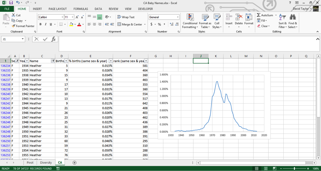
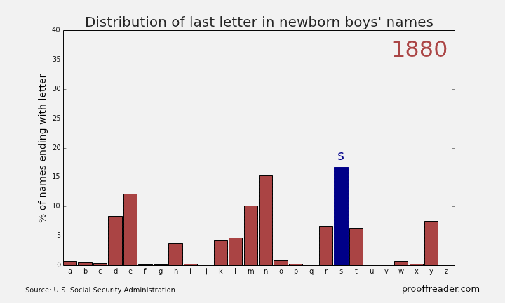
If you explore these names, you’ll see this sort of pattern more often with girls’ names than boys’ names: a quick rise from obscurity to popularity, then as the name becomes too trendy, a descent to obscurity again. The closest parallel you can see with boys’ names is a more general pattern, those of names ending in ‘n’. Look up names like Mason, Ethan and Jayden, you’ll see them all rise from obscurity to prominence in the 2000s, and many of them are just starting to dip again as of 2013. Below is the simple representation for the Distribution of last letter in Newborn boys names.
Remember what was written above about much of this dataset being adult names instead of baby names, because babies only routinely had Social Security numbers starting in 1986? You can see this in the data too. For example, a baby would be much more likely to have the name “Peter” on his official documents than the nickname “Pete”. But if, when a young man or older filled out a tax return or applied for Social Security, he would be more likely to use the name he went by in day-to-day life, which might be a nickname he’d been called since he was a boy. You can filter the sex for M and the names for ‘Pete’ and ‘Peter’, and either make two charts or put the series on the same chart. Putting two series from the same column on one chart involves using the Select Data chart context menu item, which is beyond the scope of this tutorial, but it’s not that difficult. Have a look at the result:
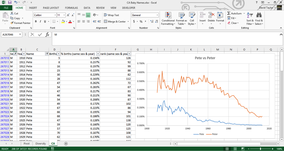
In the beginning of the dataset, ‘Pete’ is about half as popular as ‘Peter’. Starting at almost exactly 1937 when Social Security numbers were introduced, ‘Pete’ starts a decline in popularity while ‘Peter’ stays relatively constant – this indicates that people are starting to put their birth names on Social Security applications. The decline of ‘Pete’ bottoms out at almost exactly 1986, when it became commonplace for babies to have Social Security numbers.
Hopefully, you found this tutorial enjoyable and interesting. The important lessons to take away from this are that you can manipulate large datasets in Microsoft Excel, and datasets often aren’t exactly what they seem!
Source: https://www.udemy.com/advanced-microsoft-excel-2013-online-excel-course/#exceltutorial
- Подробности
- Создано 13 Июль 2011
| Содержание |
|---|
| Описание примеров |
| Применение метода |
| Суммирование по одному ключевому полю |
| Суммирование по нескольким критериям |
| Поиск по одному критерию |
| Поиск по нескольким критериям |
| Выборка по одному критерию |
| Выборка вариантов |
| Заключение |
Одним из самых популярных методов использования электронных таблиц является обработка данных, полученных из учетных систем. Современные базы данных, используемые учетными системами в качестве хранилища информации, способны накапливать и обрабатывать в собственных структурах десятки, а иногда сотни тысяч информационных записей в день. Средства анализа в системах управления базами данных реализуются либо на программном уровне, либо через специальные интерфейсы и языки запросов. Электронные таблицы позволяют эффективно обработать данные без знания языков программирования и других технических средств.
Методы переноса данных в Excel могут быть различны:
- Копирование-вставка результатов запросов
- Использование стандартных процедур импорта (например, Microsoft Query) для формирования данных на рабочих листах
- Использование программных средств для доступа к базам данных с последующим переносом информации в диапазоны ячеек
- Непосредственный доступ к данным без копирования информации на рабочие листы
- Подключение к OLAP-кубам
Данные, полученные из учетных систем, обычно характеризуются большим объемом – количество строк может составлять десятки тысяч, количество столбцов при этом часто невелико, так как языки запросов к базам данным сами имеют ограничение на одновременно выводимое количество полей.
Обработка этих данных в Excel может вестись различными методами. Выделим основные способы работы:
- Обработка данных стандартными средствами интерфейса Excel
- Анализ данных при помощи сводных таблиц и диаграмм
- Консолидация данных при помощи формул рабочего листа
- Выборка данных и заполнение шаблонов для получения отчета
- Программная обработка данных
Правильность выбора способа работы с данными зависит от конкретной задачи. У каждого метода есть свои преимущества и недостатки.
В данной статье будут рассмотрены способы консолидации и выборки данных при помощи стандартных формул Excel.
Описание примеров
Примеры к статье построены на основе демонстрационной базы данных, которую можно скачать с сайта Microsoft
http://www.microsoft.com/download/en/details.aspx?displaylang=en&id=19704
Выгруженный из этой базы данных набор записей сформирован при помощи Microsoft Query.
Данные не несут специальной смысловой нагрузки и используются только в качества произвольного набора записей, имеющих несколько ключевых полей.

Файл nwdata_sums.xls используется для версий Excel 2000-2003
Файл nwdata_sums.xlsx имеет некоторые отличия и используется для версий Excel 2007-2010.
Первый лист data содержит исходные данные, остальные – примеры различных формул для обработки информации.
Ячейки, окрашенные в серый цвет, содержат служебные формулы. Ячейки желтого цвета содержат ключевые значения, которые могут быть изменены.
Применение метода
Очевидно, самым простым и удобным методом обработки больших объемов данных с точки зрения пользователя являются сводные таблицы. Этот интерфейс специально создавался для подобного рода задач, способен работать с различными источниками данных, поддерживает интерфейсные методы фильтрации, группировки, сортировки, а также автоматической агрегации данных различными способами.
Проблема при консолидации данных при помощи сводных таблиц появляются, если предполагается дальнейшая работа с этими агрегированными данными. Например, сравнить или дополнить данные из двух разных сводных таблиц (как вариант: объемы продаж и прайс листы). В таком случае обычно прибегают к методу копирования значений из сводных таблиц в промежуточные диапазоны с дальнейшим применением формул поиска (VLOOKUP/HLOOKUP). Очевидно, что проблема возникает при обновлении исходных данных (например, при добавлении новых строк) – требуется заново копировать результаты консолидации из сводной таблицы. Другим, с нашей точки зрения, не совсем корректным методом решения является применение функций поиска непосредственно к диапазонам, которые занимают сводные таблицы. Это может привести к неверному поиску при обновлении не только данных, но и внешнего вида сводной таблицы.
Еще один классический пример непригодности применения сводной таблицы – это требование формирования отчета в заранее предопределенном виде («начальство требует в такой форме и никак иначе»). Возможностей настройки сводной таблицы зачастую недостаточно для предоставления произвольной формы. В данном случае пользователи также обычно используют копирование результатов агрегирования в качестве значений.
Самым правильным методом обработки данных в приведенных случаях, с нашей точки зрения, является применение функций рабочего листа для консолидации данных. Этот метод требует иногда больших затрат времени на создание формул, но зато в дальнейшем при изменении исходных данных отчеты будут обновляться автоматически. Файлы примеров показывают различные варианты применения функция рабочего листа для обработки данных.
Суммирование по одному ключевому полю
Таблицы с формулами на листе SUM показывают вариант решения задачи консолидации данных по одному ключевому значению.

Две верхние таблицы на листе демонстрируют возможности стандартной функции SUMIF, которая как раз и предназначена для суммирования с проверкой одного критерия.
SUM!B5
=SUMIF(data!$H:$H;A5;data!$M:$M)
SUM!B11
=SUMIF(data!$Z:$Z;A11;data!$M:$M)
Нижние таблицы показывают возможности другой редко используемой функции DSUM
SUM!B19
=DSUM(data!$A$1:$AJ$2156;"Quantity";D18:D19)
Первый параметр определяет рабочий диапазон данных. Причем верхняя строка диапазона должна содержать заголовки полей. Второй параметр указывает наименование поля (столбца) для суммирования. Третий параметр ссылается на диапазон условий суммирования. Этот диапазон должен состоять как минимум из двух строк, верхняя строка – поле критерия, вторая и последующие — условия.
В другом варианте указания условий именем поля в этом диапазоне можно пренебречь, задав его прямо в тексте условия:
SUM!B28
=DSUM(data!$A$1:$AJ$2156;"Quantity";D27:D28)
SUM!D28
Здесь data!Z2 означает ссылку на текущую строку данных, а не на конкретную ячейку, так как используется относительная ссылка. К сожалению, нельзя указать в третьем параметры ссылку на одну ячейку – строка заголовка полей все равно требуется, хотя и может быть пустой.
В принципе, функции типа DSUM являются устаревшим методом работы с данными, в подавляющем большинстве случаев лучше использовать SUMIF, SUMPRODUCT или формулы обработки массивов. Но иногда их применение может дать хороший результат, например, при совместном использовании с интерфейсной возможностью «расширенный фильтр» – в обоих случаях используется одинаковое описание условий через дополнительные диапазоны.
Суммирование по нескольким критериям
Таблицы с формулами на листе SUM2 показывают вариант суммирования по нескольким критериям.

Первый вариант решения использует дополнительно подготовленный столбец обработанных исходных данных. В реальных задачах логичнее добавлять такой столбец с формулами непосредственно на лист данных.
SUM!D5
=SUMIF(A:A;B5 & ";" & C5;data!M:M)
Операция «&» используется для соединения строк. Можно также вместо этого оператора использовать функцию CONCATENATE. Промежуточный символ «;» (или любой другой служебный символ) необходим для обеспечения уникальности сцепленных строковых значений.
Пример: Есть, если два поля с перечнем слов. Пары слов «СТОЛ»-«ОСЬ» и «СТО»-«ЛОСЬ» дают одинаковый ключ «СТОЛОСЬ». Что соответственно даст неверный результат при консолидации данных. При использовании служебного символа комбинации ключей будут уникальны «СТОЛ;ОСЬ» и «СТО;ЛОСЬ», что обеспечит корректность вычислений.
Использовать подобную методику создания уникального ключа можно не только для строковых, но и для числовых целочисленных полей.
Второй пример – это популярный вариант использования функции SUMPRODUCT с проверкой условий в виде логического выражения:
SUM!D13
=SUMPRODUCT((data!$H$2:$H$3000=B13)*(data!$Z$2:$Z$3000=C13)*data!$M$2:$M$3000)
Обрабатываются все ячейки диапазона (data!$M$2:$M$3000), но для тех ячеек, где условия не выполняются, в суммирование попадает нулевое значение (логическая константа FALSE приводится к числу «0»). Такое использование этой функции близко по смыслу к формулам обработки массива, но не требует ввода через Ctrl+Shift+Enter.
Третий пример аналогичен, описанному использованию функций DSUM для листа SUM, но в нем для диапазона условий использовано несколько полей.
SUM!D21
=DSUM(data!$A$1:$AJ$2156;"Quantity";F20:G21)
Четвертый пример – это использование функций обработки массивов.
SUM!D32
{=SUM(IF(data!$H$2:$H$3000=B32;IF(data!$Z$2:$Z$3000=C32;data!$M$2:$M$3000)))}
Обработка массивов является самым гибким вариантом проверки условий. Но имеет очень сложную запись, трудно воспринимается пользователем и работает медленнее стандартных функций.
Пятый пример содержится только в файле формата Excel 2007 (xlsx). Он показывает возможности новой стандартной функции
SUMIFS
SUM!D40
=SUMIFS(data!$M$2:$M$3000;data!$H$2:$H$3000;B40;data!$Z$2:$Z$3000;C40)
Поиск по одному критерию
Таблицы с формулами на листе SEARCH предназначены для поиска по ключевому полю с выборкой другого поля в качестве результата.

Первый вариант – это использование популярной функции VLOOKUP.
SEARCH!B5
=VLOOKUP(A5;data!$H$1:$M$3000;6;0)
Во втором вариант использовать VLOOKUP нельзя, так как результирующее поле находится слева от искомого. В данном случае используется сочетание функций MATCH+OFFSET.
SEARCH!C13
=MATCH(A13;data!$Z$1:$Z$3000;0)
SEARCH!B13
=OFFSET(data!$M$1;C13-1;0)
Первая функция ищет нужную строку, вторая возвращает нужное значение через вычисляемую адресацию.
Поиск по нескольким критериям
Таблицы с формулами на листе SEARCH2 предназначены для поиска по нескольким ключевым полям.

В первом варианте используется техника использования служебного столбца, описанная в примере к листу SUM2:
SEARCH2!Е5
=VLOOKUP(C5 & ";" & D5;$A$1:$B$3000;2;0)
Второй вариант работы сложнее. Используется обработка массива, который образуется при помощи функций вычисляемой адресации:
SEARCH2!Е 12
{=OFFSET(data!$M$1;MATCH(C13 & ";" & D13; data!$H$1:$H$3000 & ";" & data!$Z$1:$Z$3000;0)-1;0)}
Четвертый и пятый параметр в функции OFFSET используется для образования массива и определяет его размерность в строках и столбцах.
Выборка по одному критерию
Таблица на листе SELECT показывает вариант фильтрации данных через формулы.

Предварительно определяется количество строк в выборке:
SELECT!С4
=COUNTIF(data!$H:$H;$A$5)
Служебный столбец содержит формулы для определения номеров строк для фильтра. Первая строка ищется через простую функцию:
SELECT!С5
=MATCH($A$5;data!$H$1:$H$3000;0)
Вторая и последующие строки ищутся в вычисляемом диапазоне с отступом от предыдущей найденной строки:
SELECT!С6
=MATCH($A$5;OFFSET(data!$H$1;C5;0; ROWS(data!$H$1:$H$3000)-C5;1);0)+C5
Результат выдается через функцию вычисляемой адресации:
SELECT!B6
=IF(ISNA(C6);"";OFFSET(data!$M$1;C6-1;0))
Вместо функции проверки наличия ошибки ISNA можно сравнивать текущую строку с максимальным количеством, так как это сделано в столбце A.
Для организации выборок при помощи формул необходимо знать максимально возможное количество строк в фильтре, чтобы создать в них формулы.
Выборка вариантов
Самый сложный вариант выборки по ключевому полю представлен на листе SELECT2. Формулы сами определяют все доступные ключевые значения второго критерия.

Первый служебный столбец содержит сцепленные строки ключевых полей. Второй столбец проверяет соответствие первому ключу и оставляет значение второго ключевого поля:
SELECT2!B2
=IF(LEFT(A2;LEN($D$5)) & ";" = $D$5 & ";"; data!Z2;"")
Третий служебный столбец проверяет значение второго ключа на уникальность:
SELECT2!C2
=IF(B2="";0;IF(ISNA(MATCH(B2;B$1:B1;0));COUNTIF(C$1:C1;">0")+1;0))
Результирующий столбец второго ключа ProductName ищет уникальные значения в служебном столбце C:
SELECT2!E5
=IF(ISNA(MATCH(ROWS($5:5);$C$1:$C$3000;0));"";OFFSET($B$1;MATCH(ROWS($5:5);$C$1:$C$3000;0)-1;0))
Столбец Quantity просто суммирует данные по двум критериям, используя технику, описанную на листе SUM2.
SELECT2!F5
=IF(E5="";"";SUMPRODUCT((data!$H$2:$H$3000=D5)*(data!$Z$2:$Z$3000=E5)*data!$M$2:$M$3000))
Заключение
Использование функций рабочего листа для консолидации и выборки данных является эффективным методом построения отчетов с обновляемым источником исходных данных. Недостатками этого метода являются повышенные требования к пользователю в части создания сложных формул, а также низкая производительность в сравнении, например, со сводными таблицами. Последний недостаток зависит от объема исходных данных, сложности формул консолидации и технических возможностей компьютера. В критических случаях рекомендуется использовать ручной режим пересчета формул рабочей книги Excel.
Смотри также
» Работа с ненормализированными данными
В приложении к статье файл с простой задачей суммирования диапазона по различным условиям. Как ни странно, подобные задачи…
» Простые формулы
В приложенном файле несколько примеров использования простых функций Excel нестандартным способом.
» Обработка больших объемов данных. Часть 3. Сводные таблицы
Третья статья, посвященная обработке больших объемов данных с помощью Excel, описывает преимущества использования сводных таблиц….
» Обработка больших объемов данных. Часть 2. Интерфейс
В статье систематизируются простые приемы обработки больших объемов данных при помощи стандартных методов интерфейса Excel. Информация…
» Суммирование несвязанных диапазонов
При обработке больших таблиц иногда возникает потребность получить итоговые значения на основе данных, расположенных в диапазонах…
-
Excel Howtos, Interview Questions, Power Pivot, Power Query
-
Last updated on September 17, 2019

Chandoo

As part of our Excel Interview Questions series, today let’s look at another interesting challenge. How-to handle more than million rows in Excel?
You may know that Excel has a physical limit of 1 million rows (well, its 1,048,576 rows). But that doesn’t mean you can’t analyze more than a million rows in Excel.
The trick is to use Data Model.
Excel data model can hold any amount of data
Introduced in Excel 2013, Excel Data Model allows you to store and analyze data without having to look at it all the time. Think of Data Model as a black box where you can store data and Excel can quickly provide answers to you.
Because Data Model is held in your computer memory rather than spreadsheet cells, it doesn’t have one million row limitation. You can store any volume of data in the model. The speed and performance of this just depends on your computer processor and memory.
How-to load large data sets in to Model?
Let’s say you have a large data-set that you want to load in to Excel.
If you don’t have something handy, here is a list of 18 million random numbers, split into 6 columns, 3 million rows.
Step 1 – Connect to your data thru Power Query
Go to Data ribbon and click on “Get Data”. Point to the source where your data is (CSV file / SQL Query / SSAS Cube etc.)

Step 2 – Load data to Data Model
In Power Query Editor, do any transformations if needed. Once you are ready to load, click on “Close & Load To..” button.

Tell Power Query that you want to make a connection, but load data to model.

Now, your data model is buzzing with more than million cells.
Step 3 – Analyze the data with Pivot Tables
Go and insert a pivot table (Insert > Pivot Table)
Excel automatically picks Workbook Data Model. You can now see all the fields in your data and analyze by calculating totals / averages etc.
You can also build measures (thru Power Pivot, another powerful feature of Excel) too.
How to view & manage the data model
Once you have a data model setup, you can use,
- Data > Queries & Connections: to view and adjust connection settings
- Relationships: to set up and manage relationships between multiple tables in your data model
- Manage Data Model: to manage the data model using Power Pivot

Alternative answer – Can I not use Excel…
Of course, Excel is not built for analyzing such large volumes of data. So, if possible, you should try to analyze such data with tools like Power BI [What is Power BI?] This gives you more flexibility, processing power and options.
Watch the answer & demo of Excel Data Model
I made a video explaining the interview question, answer and a quick demo of Excel data model with 2 million rows. Check it out below or on my YouTube Channel.
Resources to learn about Excel Data Model
- How to set up data model and connect multiple tables
- A quick but detailed introduction to Power Query
- Create measures in Excel Pivot Tables – Quick example
- Create data model in Excel – Support.Office.com
- How to use Data Model in Excel – Excelgorilla.com
How do you analyze large volumes of data in Excel?
What about you? Do you use the data model option to analyze large volumes of data? What other methods do you rely on? Please post your tips & ideas in the comments section.
Share this tip with your colleagues

Get FREE Excel + Power BI Tips
Simple, fun and useful emails, once per week.
Learn & be awesome.
-
13 Comments -
Ask a question or say something… -
Tagged under
data model, excel interview questions, power pivot, power query, videos
-
Category:
Excel Howtos, Interview Questions, Power Pivot, Power Query

Welcome to Chandoo.org
Thank you so much for visiting. My aim is to make you awesome in Excel & Power BI. I do this by sharing videos, tips, examples and downloads on this website. There are more than 1,000 pages with all things Excel, Power BI, Dashboards & VBA here. Go ahead and spend few minutes to be AWESOME.
Read my story • FREE Excel tips book


Excel School made me great at work.
5/5

From simple to complex, there is a formula for every occasion. Check out the list now.

Calendars, invoices, trackers and much more. All free, fun and fantastic.

Power Query, Data model, DAX, Filters, Slicers, Conditional formats and beautiful charts. It’s all here.

Still on fence about Power BI? In this getting started guide, learn what is Power BI, how to get it and how to create your first report from scratch.
Related Tips
13 Responses to “How can you analyze 1mn+ rows data – Excel Interview Question – 02”
-
Thanks for your time to give us!
-
 Leon Nguyen says:
 How can i make Vlookup work for 1 million rows and not freeze up my computer? I have 2 sets of data full of customer account numbers and i want to do Vlookup to match them up. Thank you.
-
blahblahblacksheep says:
At that point, I would just import both spreadsheets into an Access database, and run a query that connects them based on a common field/ID (eg: account_ID). Excel cells are all variants, so they take up a lot of memory. But, in Access, you can specify the data type of each field (text, int, decimal, etc). Then identify primary keys on each table (eg: account_ID). Just create a quick Access database, import the spreadsheets, make a query, connect them, and drag-n-drop the fields you want for the query output. Excel is good for pivot tables and such on pre-aggregated data. When you’re trying to do massive data merges (like VLOOKUP on million rows), it’s time to shift the data into a data-oriented solution which can spit out an aggregate data query which you can then export to excel and do the rest of your analysis on. You might be able to leverage the data model he suggested. Put both spreadsheets into the Data Model as data sources, then see if you can open up a drag-n-drop data model screen to hook them together via Primary & Foreign key values (again, Account_ID or such). Another way is to run the VLOOKUP, wait for it to finish, then copy the column that had values filled in and paste-as values. If you have to do multiple columns of VLOOKUP, just do them one-at-a-time, and then copy/paste-as values. This means your spreadsheet won’t be agile (IE: won’t update if you change the source data of the VLOOKUP). But, if you’re just trying to merge data sets quick-n-dirty style, it can be done. Trying to run multiple VLOOKUPS on a million record data set at the same time will kill your computer. So, just do them one-at-a-time and paste-as values.
-
Matthew says:
This is of course what we all did when the limit was 50K. Seriously, Excel is for Granny’s grocery list. There are better ways to do this. I will allow it is better than text file processing, but really.
-
-
-
Myles says:
«well, its 1,048,576 rows»
it’s -
Steve says:
The international standard abbreviation for Million is capital M. NOT mn. You shouldn’t make up your own terms. It takes away from any sense we have that you know what you are talking about. BTW, lower case m is milli or 1/1000. Lower case n is nano or 1/10^-9, or one billionth.
-
Thanks for the detail Steve.
-
Andrew says:
1mn is million in some financial cases and some countries
1MM is million in some industries
1kk is also million in some countries.That you dont know about this could take away any sense anyone has that you know what you are talking about, or leave the impression that you are looking to be rude.
I am also pretty sure you understood it to be 1 million and you were not opening the article expecting it to show you 1 nanometer in rows in excel.
-
-
Veronica says:
You are the best
-
RUPAM says:
CAN I USE THIS IN COMPARING INPUT FILE DATA AND TABLE DATA TO CONFIRM THE DATA CORRECTION?
-
Allan says:
Rupam
If you send me details I will show you how I would tackle COMPARING INPUT FILE DATA AND TABLE DATA
Allan
-
-
allan brayshaw says:
‘Introduction
‘An alternative approach to Excel handling large volumes of data is to use Collections to consolidate the data before making it
‘available for Excel to process. This technique is simple to code and much faster to run than asking Excel to process large volumes of data.
‘Consider a large dataset containing 5 years files of Date/customer account number/customer name/many address lines/phone number/transaction value
‘and where customers will generate many transactions per day.
‘Let’s assume the business requirement is to provide a report of total transaction value per customer by year/month.
‘Rather than placing these records in an Excel worksheet, use VB to read the 5 yearly files and consolidate the information in a memory
‘collection by year/month rather than year/month/day.
‘With, say, 300,000 rows and 10 columns of data, Excel has 3 million cells to process.
‘These 300,000 records could be consolidated into a maximum of 60,000 records:- 5 years x 12 months x 1,000 customers each with a total transaction value.
‘at the same time any rows or columns not contributing to the report can be excluded. (10 columns reduced to 4 in this example)
‘In this example, consolidation reduces the data to 60,000 rows and 4 columns (i.e. 240,000 cells).
‘Therefore Excel data volumes reduce to 240,000 cells irrespective of data volume processed.
‘Using a memory Collection to consolidate the data results in Excel having far less data to process and less data means less time to process.
‘and the Excel 1 million row limit would not apply to the input data unless the consolidated data exceeds this limit — very unlikely.
‘The code below assumes the data is already held in an Excel worksheet but this could easily be converted to reading from one or more files.
‘The earliest record I can find of me using the Collection Class was 2008 (I was working as a Performance engineer at BT when the Excel row limit was 64k
‘and I had 1.2 million 999 calls to analyse) but there is also a Dictionary class which I hear has benefits over the Collections class.
‘I have never used this class but see details https://www.experts-exchange.com/articles/3391/Using-the-Dictionary-Class-in-VBA.html
‘Setup a demo as follows:
»»»»»»»»»»»»»»»»»»»»»»»»»»»»»»»»»»»»»»»»»»»»»»»»»»»»»»»»»»»»»»»»
‘Copy/Paste the following text into an Excel code Module in an empty .xlsm Workbook and rename 2 sheets Data and Consolidation
‘Insert a new Class Module — Class1
‘Cut/Paste the following 34 rows of text to create a Class1 definition record of only those data fields required for analysis
»»»»»»»»»»»»»»»»»»»»»»»»»»»»»»»»»»»»»»»»»»»»»»»»»»»»»»»»»»»»»»»»
‘Option Explicit
‘Private pYYMM As String
‘Private pAccountNumber As String
‘Private pCustomerName As String
‘Private pTotalValue As Single
‘
‘Property Let YYMM(xx As String) ‘YYMM
‘ pYYMM = xx
‘End Property
‘Property Get YYMM() As String
‘ YYMM = pYYMM
‘End Property
‘Property Let AccountNumber(xx As String) ‘AccountNumber
‘ pAccountNumber = xx
‘End Property
‘Property Get AccountNumber() As String
‘ AccountNumber = pAccountNumber
‘End Property
‘Property Let CustomerName(xx As String) ‘CustomerName
‘ pCustomerName = xx
‘End Property
‘Property Get CustomerName() As String
‘ CustomerName = pCustomerName
‘End Property
‘Property Let TotalValue(xx As Single) ‘TotalValue
‘ pTotalValue = xx
‘End Property
‘Property Get TotalValue() As Single
‘ TotalValue = pTotalValue
‘End Property
»»»»»»»»»»»»»»»»»»»»»»»»»
»’Cut/Paste up to here and remove the first ‘ comment on each row after pasting into Class1»»»»»»»»»»»»»»»»»»»»»»»»»»»»»»»»»»»»»»»»»»»»»»»»»»»»»»»»’
‘Code module content
Option Explicit
Dim NewRecord As New Class1 ‘record area (definition of new Class1 record)
Dim Class1Collection As New Collection ‘A collection of keyed records held in memory
Dim Class1Key As String ‘Collection Key must be a String
Dim WalkRecord As Class1
»»»»»»»»»»»»»»»»»»»»»»»»»»»»»»»»»»»»»»»»»»»»»»»»»»»»
‘This code creates the text key used to access each Class1 record in memory by year, month and account number:-
»»»»»»»»»»»»»»»»»»»»»»»»»»»»»»»»»»»»»»»»»»»»»»»»»»»»
Dim Rw As Long
Dim StartTime As Date
Sub Consolidate()
StartTime = Now()
Sheets(«Data»).Select
For Rw = 2 To Range(«A1»).CurrentRegion.Rows.Count
Class1Key = Format(Range(«A» & Rw).Value, «yymm») & Range(«B» & Rw).Value ‘Key = yymm & AccountNumber
»»»»»»»»»»»»»»»»
‘This code populates the Class1 record:-
»»»»»»»»»»»»»»»»
NewRecord.YYMM = Format(Range(«A» & Rw).Value, «yymm») ‘YYMM
NewRecord.AccountNumber = Range(«B» & Rw).Value ‘AccountNumber
NewRecord.CustomerName = Range(«C» & Rw).Value ‘CustomerName
NewRecord.TotalValue = Range(«J» & Rw).Value ‘TotalValue
»»»»»»»»»»»»»»»»»»»»»»»»»»»»»»»»»»»»»»»»»»»»»»»»»»»
‘This code writes the Class record into memory and, if an identical key already exists, accumulate TotalValue:-
»»»»»»»»»»»»»»»»»»»»»»»»»»»»»»»»»»»»»»»»»»»»»»»»»»»’
On Error Resume Next
Call Class1Collection.Add(NewRecord, Class1Key)
Select Case Err.Number
Case Is = 0
On Error GoTo 0
‘******** NEW RECORD INSERTED OK HERE *********
Case Is = 457
On Error GoTo 0
‘******** CONSOLIDATE DUPLICATE KEY CASES HERE ************
Class1Collection(Class1Key).TotalValue = Class1Collection(Class1Key).TotalValue + NewRecord.TotalValue
Case Else
‘******** UNEXPECTED ERROR *****************
Err.Raise Err.Number
Stop
End Select
Set NewRecord = Nothing
Next Rw
»»»»»»»»»»»»»»»»»»»»»»»»»»»»»»»»»»»»»»»»»»»»»»»’
‘ When all the records have been processed, This code writes Collection entries to a WorkSheet:-
»»»»»»»»»»»»»»»»»»»»»»»»»»»»»»»»»»»»»»»»»»»»»»»’
Sheets(«Consolidation»).Select
Range(«A1:D1»).Value = Array(«Date», «account number», «customer name», «total value»)
Rw = 2
For Each WalkRecord In Class1Collection ‘walk collection and write rows
Cells(Rw, 1) = «20» & Left(WalkRecord.YYMM, 2) & «/» & Right(WalkRecord.YYMM, 2)
Cells(Rw, 2) = WalkRecord.AccountNumber
Cells(Rw, 3) = WalkRecord.CustomerName
Cells(Rw, 4) = WalkRecord.TotalValue
Rw = Rw + 1
Next WalkRecord
Columns(«A:A»).NumberFormat = «dd/mm/yyyy;@»
Columns(«D:D»).NumberFormat = «#,##0.00»
Columns(«A:D»).HorizontalAlignment = xlCenter
Columns(«A:D»).EntireColumn.AutoFit
Set Class1Collection = Nothing
»»»»»»»»»»»»»»»»»»»»»»»»»»»»»»»»»»»»’
‘This code sorts the Consolidated records into AccountNumber within YY/MM
»»»»»»»»»»»»»»»»»»»»»»»»»»»»»»»»»»»»’
Rw = Range(«A1»).CurrentRegion.Rows.Count
ActiveWorkbook.Worksheets(«Consolidation»).Sort.SortFields.Clear
ActiveWorkbook.Worksheets(«Consolidation»).Sort.SortFields.Add Key _
:=Range(«A2:A» & Rw), SortOn:=xlSortOnValues, Order:=xlAscending, DataOption:=xlSortNormal
ActiveWorkbook.Worksheets(«Consolidation»).Sort.SortFields.Add Key _
:=Range(«B2:B» & Rw), SortOn:=xlSortOnValues, Order:=xlAscending, DataOption:=xlSortNormal
With ActiveWorkbook.Worksheets(«Consolidation»).Sort
.SetRange Range(«A1:D» & Rw)
.Header = xlYes
.MatchCase = False
.Orientation = xlTopToBottom
.SortMethod = xlPinYin
.Apply
End With
Range(«A2»).Select
MsgBox («Runtime » & Format(Now() — StartTime, «hh:mm:ss»)) ‘300k records takes 1 min 46 seconds on my ancient HP laptop
End Sub
»»»»»»»»»»»»»»»»»»»»»»»»»»»»»»»»»»»»»»»»»»»»»»»»»»»»»»»»»»»»»»»’
‘Now run macro Generate to create 300k test rows, followed by macro Consolidate to demonstrate consolidation by data collection.
‘In my experience the improvement in Excel run time is so spectacular that no further action is required
‘but further run time improvements could result from avoiding calling the Format function twice every row,
‘or holding CustomerName in another collection and accessing during the Walk process, or using the Dictionary class?
‘Note that is advisable to run macro ClearSheets before saving your WorkBook.
‘Also the Record constant can be manually adjust up to a maximum of 1048575 if required
»»»»»»»»»»»»»»»»»»»»»»»»»»»»»»»»»»»»»»»»»»»»»»»»»»»»»»»»»»»»»»»’
Sub Generate() ‘Generates test data in Sheet Data
Const StartDate As Date = 42370 ’01/01/2016
Const FinishDate As Date = 44196 ’31/12/2020
Const Records As Long = 300000 ‘number of records to generate — max 1048575
Const Customers As Integer = 1000 ‘number of Customers
Const StartValue As Integer = 5 ‘£5
Const FinishValue As Integer = 100 ‘£100
StartTime = Now()
Sheets(«Data»).Select
Range(«A1:J1»).Value = Array(«Date», «account number», «customer name», «address 1», «address 2», «address 3», «address 4», «address 5», «phone number», «tx value»)
For Rw = 2 To Records + 1
Cells(Rw, 1) = WorksheetFunction.RandBetween(StartDate, FinishDate) ‘Date
Cells(Rw, 2) = WorksheetFunction.RandBetween(1, Customers) ‘Customer number
Range(Cells(Rw, 3), Cells(Rw, 9)) = Array(«Customer » & Cells(Rw, 2), «Not required», «Not required», «Not required», «Not required», «Not required», «Not required»)
Cells(Rw, 10) = WorksheetFunction.RandBetween(StartValue, FinishValue) ‘Value
Next Rw
Columns(«A:A»).NumberFormat = «dd/mm/yyyy;@»
Columns(«J:J»).NumberFormat = «#,##0.00»
Columns(«A:J»).HorizontalAlignment = xlCenter
Columns(«A:J»).EntireColumn.AutoFit
Range(«A2»).Select
MsgBox («Runtime » & Format(Now() — StartTime, «hh:mm:ss»)) ‘300k records takes 1 min 50 seconds on my ancient HP laptop
End Sub
Sub ClearSheets() ‘delete all data before saving
Sheets(«Data»).Select
Range(«A1»).CurrentRegion.Delete Shift:=xlUp
Range(«A2»).Select
Sheets(«Consolidation»).Select
Range(«A1»).CurrentRegion.Delete Shift:=xlUp
Range(«A2»).Select
End Sub
»»»»»»»»»»»»»»»»»»»»»»»»»»»»»»»»»»»»»»»»»»»»»»»»»»»»»»»»»»»»»»»»»»»»’
‘Finally, a data collection can comprise of values and keys without requiring a Class record.
‘Such a collection can be used to identify data duplicates (e.g. value/key=row number/cellcontent) or hold a lookup table (e.g. value/key=name/account)
‘Most applications process far more data than they report therefore using collections benefits most data sets irrespective of volume.
»»»»»»»»»»»»»»»»»»»»»»»»»»»»»»»»»»»»»»»»»»»»»»»»»»»»»»»»»»»»»»»»»»»»»»»»»»»»»»»»»»»»»»»»»»»»»»»»»»»»»»»»»»»»»’
»Example of generating subtotals by writing additional records into the collection
»»»»»»»»»»»»»»»»»»»»»»»»»»»»»»»»»»»»»»»»»’
‘Sub ConsolidateWithSubtotals()
‘Dim SubTotalRecord As New Class1 ‘subtotals
‘ StartTime = Now()
‘ Sheets(«Data»).Select
‘ For Rw = 2 To Range(«A1»).CurrentRegion.Rows.Count
‘ Class1Key = Format(Range(«A» & Rw).Value, «yymm») & Range(«B» & Rw).Value ‘Key = yymm & AccountNumber
»»»»»»»»»»»»»»»»’
»Next populate the Class1 record:-
»»»»»»»»»»»»»»»»’
‘ NewRecord.YYMM = Format(Range(«A» & Rw).Value, «yymm») ‘YYMM
‘ NewRecord.AccountNumber = Range(«B» & Rw).Value ‘AccountNumber
‘ NewRecord.CustomerName = Range(«C» & Rw).Value ‘CustomerName
‘ NewRecord.TotalValue = Range(«J» & Rw).Value ‘TotalValue
»»»»»»»»»»»»»»»»»»»»»»»»»»»»»»»»»»»»»»»»»»»»»»»»»»»’
»Next write the Class record into memory and, if an identical key already exists, accumulate TotalValue:-
»»»»»»»»»»»»»»»»»»»»»»»»»»»»»»»»»»»»»»»»»»»»»»»»»»»»
‘ On Error Resume Next
‘ Call Class1Collection.Add(NewRecord, Class1Key)
‘ Select Case Err.Number
‘ Case Is = 0
‘ On Error GoTo 0
‘ ‘******** NEW RECORD INSERTED OK HERE *********
‘ Case Is = 457
‘ On Error GoTo 0
‘ ‘******** CONSOLIDATE DUPLICATE KEY CASES HERE ************
‘ Class1Collection(Class1Key).TotalValue = Class1Collection(Class1Key).TotalValue + NewRecord.TotalValue
‘ Case Else
‘ ‘******** UNEXPECTED ERROR *****************
‘ Err.Raise Err.Number
‘ Stop
‘ End Select
‘ Set NewRecord = Nothing
»»»»»»»»»»»’
»accumulate subtotals
»»»»»»»»»»»’
‘ Class1Key = Format(Range(«A» & Rw).Value, «yymm») ‘Key = yymm
‘ SubTotalRecord.YYMM = Format(Range(«A» & Rw).Value, «yymm») ‘YYMM
‘ SubTotalRecord.AccountNumber = «Subtotal»
‘ SubTotalRecord.CustomerName = «»
‘ SubTotalRecord.TotalValue = Range(«J» & Rw).Value ‘TotalValue
‘ On Error Resume Next
‘ Call Class1Collection.Add(SubTotalRecord, Class1Key)
‘ Select Case Err.Number
‘ Case Is = 0
‘ On Error GoTo 0
‘ ‘******** NEW RECORD INSERTED OK HERE *********
‘ Case Is = 457
‘ On Error GoTo 0
‘ ‘******** CONSOLIDATE DUPLICATE KEY CASES HERE ************
‘ Class1Collection(Class1Key).TotalValue = Class1Collection(Class1Key).TotalValue + SubTotalRecord.TotalValue
‘ Case Else
‘ ‘******** UNEXPECTED ERROR *****************
‘ Err.Raise Err.Number
‘ Stop
‘ End Select
‘ Set SubTotalRecord = Nothing
‘ Next Rw
»»»»»»»»»»»»»»»»»»»»»»»»»»»»»»»»»»»»»»»»»
» When all the records have been processed, write Collection entries to a WorkSheet:-
»»»»»»»»»»»»»»»»»»»»»»»»»»»»»»»»»»»»»»»»»
‘ Sheets(«Consolidation»).Select
‘ Range(«A1:D1»).Value = Array(«Date», «account number», «customer name», «total value»)
‘ Rw = 2
‘ For Each WalkRecord In Class1Collection ‘walk collection and write rows
‘ If WalkRecord.AccountNumber = «Subtotal» Then
‘ Cells(Rw, 1) = «20» & Left(WalkRecord.YYMM, 2) & «/» & Right(WalkRecord.YYMM, 2)
‘ Cells(Rw, 2) = «Subtotal 20» & Left(WalkRecord.YYMM, 2) & «/» & Right(WalkRecord.YYMM, 2)
‘ Cells(Rw, 3) = WalkRecord.CustomerName
‘ Cells(Rw, 4) = WalkRecord.TotalValue
‘ Else
‘ Cells(Rw, 1) = «20» & Left(WalkRecord.YYMM, 2) & «/» & Right(WalkRecord.YYMM, 2)
‘ Cells(Rw, 2) = WalkRecord.AccountNumber
‘ Cells(Rw, 3) = WalkRecord.CustomerName
‘ Cells(Rw, 4) = WalkRecord.TotalValue
‘ End If
‘ Rw = Rw + 1
‘ Next WalkRecord
‘ Set Class1Collection = Nothing
»
‘ Rw = Range(«A1»).CurrentRegion.Rows.Count
‘ ActiveWorkbook.Worksheets(«Consolidation»).Sort.SortFields.Clear
‘ ActiveWorkbook.Worksheets(«Consolidation»).Sort.SortFields.Add Key _
‘ :=Range(«A2:A» & Rw), SortOn:=xlSortOnValues, Order:=xlAscending, DataOption:=xlSortNormal
‘ ActiveWorkbook.Worksheets(«Consolidation»).Sort.SortFields.Add Key _
‘ :=Range(«B2:B» & Rw), SortOn:=xlSortOnValues, Order:=xlAscending, DataOption:=xlSortNormal
‘ With ActiveWorkbook.Worksheets(«Consolidation»).Sort
‘ .SetRange Range(«A1:D» & Rw)
‘ .Header = xlYes
‘ .MatchCase = False
‘ .Orientation = xlTopToBottom
‘ .SortMethod = xlPinYin
‘ .Apply
‘ End With
‘ Range(«A2»).Select
‘ MsgBox («Runtime » & Format(Now() — StartTime, «hh:mm:ss»)) ‘300k records takes 1 min 46 seconds on my ancient HP laptop
‘End Sub
Leave a Reply
Today we discuss how to handle big data with Excel. This article is for marketers such as brand builders, marketing officers, business analysts and the like, who want to be hands-on with data, even when it is a lot of data.
Why bother dealing with big data?
If you are not the hammer you are the nail. We, the marketers, should defend our role of strategic decision-makers by staying in control of the data analysis function that we are losing to the new generation of software coders and data managers. This requires us to improve our ability to deal with large datasets, which may have several benefits. Perhaps the most appealing one from a career standpoint is to reaffirm our value in the new world of highly-engineered, relentlessly growing and often inflexible IT systems, filled with lots of data someone thinks could be very useful if only appropriately analyzed.
To this extent many IT departments are employing Data Architects, Big Data Managers, Data Visualizers and Data Squeezers. These programmers, specializing in different kinds of software, are in some cases already bypassing collaboration with the marketers and going straight into the development of applications used for business analytics purposes. These guys are the new competitors to the business leader role, and I wonder how long it will take until they begin making the strategic decisions too. We should not let this happen, unless we like being the nail!
Hands-on big data with Excel
MS Excel is a much loved application, someone says by some 750 million users. But it does not seem to be the appropriate application for the analysis of large datasets. In fact, Excel limits the number of rows in a spreadsheet to about one million; this may seem a lot, but rows of big data come in the millions, billions and even more. At this point Excel would appear to be of little help with big data analysis, but this is not true. Read on.
Consider you have a large dataset, such as 20 million rows from visitors to your website, or 200 million rows of tweets, or 2 billion rows of daily option prices. Suppose also you want to investigate this data to search for associations, clusters, trends, differences or anything else that might be of interest to you. How can you analyze this huge mass of data without using cryptic, expensive software managed by expert users only?
Well, you do not necessarily have to – you can use data samples instead. It is the same concept behind common population survey. to investigate the preferences of adult males living in the USA, you do not ask 120 million persons; a random sample can do it. The same concept applies to data records too, and in both cases there are at least three legitimate questions to ask:
- How many records do we need in order to have a sample we can make accurate estimates with?
- How do we extract random records from the main dataset?
- Are samples from big datasets reliable at all?
How large is a reliable sample of records?
For our example we will use a database holding 200,184,345 records containing data from the purchase orders of one product line of a given company during 12 months.
There are several different sampling techniques. In broad terms they divide into two types: random and non-random sampling. Non-random techniques are used only when it is not possible to obtain a random sample. And the simple random sampling technique is appropriate to approximate the probability of something happening in the larger population, as in our example.
A sample of 66,327 randomly selected records can approximate the underlying characteristics of the dataset it comes from at the 99% confidence interval and 0.5% error level. This sample size is definitely manageable in Excel.
 Image 1: Random sample sizes produced with the bernoullian formula
according to population size, confidence interval and error level.
SEE ALSO: Easy and accurate random sample size design calculation
The confidence level tells us that if we extract 100 random samples of 66,327 records each from the same population, 99 samples may be assumed to reproduce the underlying characteristics of the dataset they come from. The 0.5% error level says the values we obtain should be read in the plus or minus 0.5% interval, for instance after transforming the records in contingency tables.
How to extract random samples of records
Sampling statistics is the solution. We used the tool Sample Manager of MM4XL software to quantify and extract the samples used for this document. If you do not have MM4XL, you can generate random record numbers as follows:
- Enter in Excel 66,327 times the formula =RAND()*[Dataset size]
- Transform the formulas in values
- Round the numbers to no decimals
- Make sure there are no duplicates [2]
- Sort the range and you get a list of numbers as shown in the following image
Extract these record numbers from the main dataset: This is your sample of random records. The number 3,076 in cell A22 shown above means that record number 3,076 of the main dataset is included in the sample. To reduce the risk of extracting records biased by the lack of randomness, before extracting the records of the sample, it is a good habit to sort the main list, for instance alphabetically by the person’s first name or by any other variable that is not directly related to the values of the variable(s) object of the study.
If we are ready to accept the approximation imposed by a sample, we can enjoy the freedom of being hands-on with our data again. In fact, although 66,327 records can be managed fairly well in Excel, we still have a sample large enough to uncover tiny areas of interest.
Large sample sizes enable us to manage very large datasets in Excel, an environment most of us are familiar with. But what is the reliability of such samples in real life?
Are samples extracted from big data with Excel reliable at all?
The key question is: Can a random sample reproduce accurately enough the underlying characteristics of the population it is extracted from? To find some evidence we:
- Measured several characteristics of our whole dataset, the underlying population.
- Then we extracted random samples from the main dataset and we measured the same characteristics as for the whole dataset.
- Finally we ran several confirmatory tests comparing the measurements conducted on both samples and main dataset.
The image below shows the fields of our records. They can be read as follows: Record number 1 (row 2) is a purchase order from North America, received on September 2007, concerning one single item priced USD 13,159 and sold for USD 11,800.
The next image shows the measures computed on the single variables. The Average and Median value were computed for the fields “Volume”, “Sales” and “Discounted Sales” (see range D1:G3). Counts and Count Frequencies were found for the variables “Continent” (see range I1:K4) and “Month” (see range M1:O13). For instance, 1.865 in cell E2 stands for the average number of items in one purchase order. USD 5,841 in G2 stands for the average selling price of one sold item. In K2, 20.815% is the share of items (products) sold to Asia and, in O2, 8.556% is the share of items sold during January 2008. We will test whether random samples can approximate the average values and the percent frequencies shown in the following image.
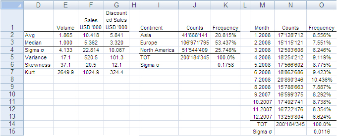
In accordance with the ASTM manual[1], we drew 20 randomly selected samples of 66,327 records each from the population of 200,184,345 records. For each sample we computed the same values shown in the image above and to each value we applied a Z-test to identify any anomalous values in the samples. The Z-tests were run for both continuous and discrete variables.
All-in-one, continuous metrics
The next table shows test results for the variables “Volume”, “Sales” and “Discounted Sales”. Cell B1, for instance, tells us on average one purchase order (a record) of the main dataset accounts for a sales “Volume” equal to 1.865 items with an “Average Sales” value of USD 10’418 and an “Average Discounted Sales” value of USD 5’841. For sample values departing severely from the control values in row 2 the probability is high that a Z-test at the 99% probability level captures the anomaly.
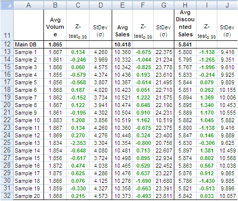
According to the “Z-Test” columns of the image above, no one single sample reports average values different from the averages of the main dataset. For instance, the “Average Volume” of Sample 3 and that of the main dataset differ only by 0.001 units per purchase order, or a difference of about 0.5%. The other two variables show a similar scenario. This means that Sample 3 produced quite accurate values at the global level (all records counted in one single metric).
Categorical metrics
We tested the variable “Continent”, which splits into three categories: Asia, Europe and North America. Columns B:D of the following table show the share of orders coming from each continent. The data in row 15 refer to the main dataset. In this case too, the difference between main dataset and samples is quite small, and the Z-Test (columns E:G) shows no evidence of bias, with the exception of slight deviations in Europe for sample 5, 8, 9, and 18-20.
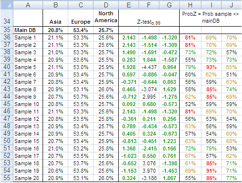
The “Probability” values in column H:J measure the likelihood a sample value is different from the same value of the main dataset. For instance, 21.1% in B36 is smaller than 20.8% in B35. However, because the former comes from a sample, we need to verify from a statistical point of view the probability the difference between the two values is caused by a bias in the sampling method. The 95% is a common level of acceptance when dealing with this kind of issue. With small sample sizes (30), the 90% probability threshold can still be used, although this implies higher risk of erroneously considering two values equal when in fact they are different. For the sake of test reliability we worked with the 99% probability threshold. In H36 we read the probability B36 is different from B35 equals 81%, the very beginning of the area where anomalous differences can be found. Only the share of Sample 5 and 19 for Europe is above 90%. All other values lie well away from a worrying position.
This also means that the share of purchase orders incoming from the three continents reproduced with random samples do not show evidence of dramatic differences outside the expected boundaries. This can also be intuitively confirmed simply by looking at the average sample values in the range B36:D55 of the above image; they do not differ dramatically from the population values in the range B35:D35.
Finally, we tested the variable “Month”, which splits into 12 categories and therefore could generate weaker Z-Test results due to the shrinking size of the sample by category. Columns B:M in the following table show the probability that the sampled number of purchase orders by month differs from the same value from the main dataset. No one sampled value is different from the correspondent value from the main dataset with a probability larger than 75% and only a small number of values have a probability larger than 70%.
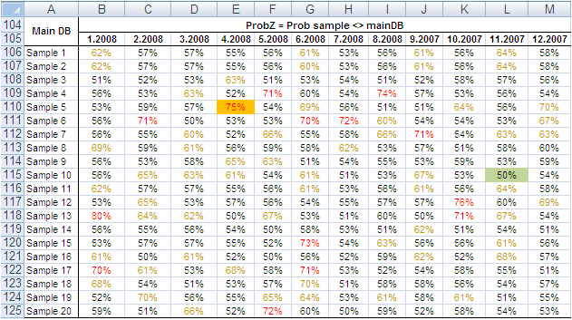
The results of the tests conducted on all samples did not find severe anomalies that would discourage the application of the method described in this paper. The analysis of big datasets by means of random samples produces reliable results.
Can the reliability of this Experiment have happened by chance?
So far, the random samples have performed well in reproducing the underlying characteristics of the dataset they come from. To verify whether this could have happened by chance, we repeated the test using two non-random samples: the first time taking the very first 66,327 records of the main dataset and the second time taking the very last 66,327 records.
The results in short: out of 42 tests conducted with both discrete and categorical variables from the two non-random samples, only three had green Z-Test values. That is, these three sample values were not judged different from the same value from the main dataset. The remaining 39 values, however, lay in a deep red region, meaning they produced an unreliable representation of the main data.
These test results too support the validity of the approach by means of random samples, and confirm that the results of our experiment are not by chance. Therefore, the analysis of large datasets by means of random samples is a legitimate and viable option.
Closing
This is a great time for fact-and-data driven marketers: There is a large and growing demand for analytics, but there are not enough data scientists available to meet it yet. Statistics and software coding are the two areas we should deepen our knowledge of. At that stage a new generation of marketers will be born, and we look forward to their contribution to the relentless evolving world of brand building. Software tools like MM4XL can help us along the way because they are written for business people rather than statisticians. Such tools should become a key component of our toolbox for generating insights from data and making better business decisions.
Enjoy the analysis of big data with Excel and read my future articles for fact-and-data driven business decision-makers.
Thank you for reading my post. If you liked this post then please click Share to make it visible to your network. If you would like to read my future posts click Follow and feel free to also connect with me via LinkedIn.
I’d appreciate if you would post this article to your social network.
You might also be interested in my book Mapping Markets for Strategic Purposes.
[1] Manual on the Presentation of Data and Control Chart Analysis, 7th edition. ASTM International, E11.10 Subcommittee on Sampling and Data Analysis.
[2] My sincere thanks to Darwin Hanson, who caught a couple of issues: (1) RND is a VBA function, and I meant of course the spreadsheet function RAND; and (2) you must double-check the random numbers and get rid of duplicates.


![]()
![]()