
Data labels make a chart easier to understand because they show details about a data series or its individual data points. For example, in the pie chart below, without the data labels it would be difficult to tell that coffee was 38% of total sales. Depending on what you want to highlight on a chart, you can add labels to one series, all the series (the whole chart), or one data point.

Note: The following procedures apply to Office 2013 and newer versions. Looking for Office 2010 steps?
Add data labels to a chart
-
Click the data series or chart. To label one data point, after clicking the series, click that data point.
-
In the upper right corner, next to the chart, click Add Chart Element
 > Data Labels.
 -
To change the location, click the arrow, and choose an option.
-
If you want to show your data label inside a text bubble shape, click Data Callout.
 > Data Labels.

To make data labels easier to read, you can move them inside the data points or even outside of the chart. To move a data label, drag it to the location you want.
If you decide the labels make your chart look too cluttered, you can remove any or all of them by clicking the data labels and then pressing Delete.
Tip: If the text inside the data labels is too hard to read, resize the data labels by clicking them, and then dragging them to the size you want.
Change the look of the data labels
-
Right-click the data series or data label to display more data for, and then click Format Data Labels.
-
Click Label Options and under Label Contains, pick the options you want.

Use cell values as data labels
You can use cell values as data labels for your chart.
-
Right-click the data series or data label to display more data for, and then click Format Data Labels.
-
Click Label Options and under Label Contains, select the Values From Cells checkbox.
-
When the Data Label Range dialog box appears, go back to the spreadsheet and select the range for which you want the cell values to display as data labels. When you do that, the selected range will appear in the Data Label Range dialog box. Then click OK.
The cell values will now display as data labels in your chart.

Change the text displayed in the data labels
-
Click the data label with the text to change and then click it again, so that it’s the only data label selected.
-
Select the existing text and then type the replacement text.
-
Click anywhere outside the data label.
Tip: If you want to add a comment about your chart or have only one data label, you can use a textbox.
Remove data labels from a chart
-
Click the chart from which you want to remove data labels.
This displays the Chart Tools, adding the Design, and Format tabs.
-
Do one of the following:
-
On the Design tab, in the Chart Layouts group, click Add Chart Element, choose Data Labels, and then click None.
-
Click a data label one time to select all data labels in a data series or two times to select just one data label that you want to delete, and then press DELETE.
-
Right-click a data label, and then click Delete.
Note: This removes all data labels from a data series.
-
-
You can also remove data labels immediately after you add them by clicking Undo
on the Quick Access Toolbar, or by pressing CTRL+Z.
 on the Quick Access Toolbar, or by pressing CTRL+Z.
Add or remove data labels in a chart in Office 2010
-
On a chart, do one of the following:
-
To add a data label to all data points of all data series, click the chart area.
-
To add a data label to all data points of a data series, click one time to select the data series that you want to label.
-
To add a data label to a single data point in a data series, click the data series that contains the data point that you want to label, and then click the data point again.
This displays the Chart Tools, adding the Design, Layout, and Format tabs.
-
-
On the Layout tab, in the Labels group, click Data Labels, and then click the display option that you want.
Depending on the chart type that you used, different data label options will be available.

-
On a chart, do one of the following:
-
To display additional label entries for all data points of a series, click a data label one time to select all data labels of the data series.
-
To display additional label entries for a single data point, click the data label in the data point that you want to change, and then click the data label again.
This displays the Chart Tools, adding the Design, Layout, and Format tabs.
-
-
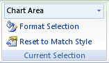
On the Format tab, in the Current Selection group, click Format Selection.
You can also right-click the selected label or labels on the chart, and then click Format Data Label or Format Data Labels.
-
Click Label Options if it’s not selected, and then under Label Contains, select the check box for the label entries that you want to add.
The label options that are available depend on the chart type of your chart. For example, in a pie chart, data labels can contain percentages and leader lines.
-
To change the separator between the data label entries, select the separator that you want to use or type a custom separator in the Separator box.
-
To adjust the label position to better present the additional text, select the option that you want under Label Position.
If you have entered custom label text but want to display the data label entries that are linked to worksheet values again, you can click Reset Label Text.
-
On a chart, click the data label in the data point that you want to change, and then click the data label again to select just that label.
-
Click inside the data label box to start edit mode.
-
Do one of the following:
-
To enter new text, drag to select the text that you want to change, and then type the text that you want.
-
To link a data label to text or values on the worksheet, drag to select the text that you want to change, and then do the following:
-
On the worksheet, click in the formula bar, and then type an equal sign (=).
-
Select the worksheet cell that contains the data or text that you want to display in your chart.
You can also type the reference to the worksheet cell in the formula bar. Include an equal sign, the sheet name, followed by an exclamation point; for example, =Sheet1!F2
-
Press ENTER.
Tip: You can use either method to enter percentages — manually if you know what they are, or by linking to percentages on the worksheet. Percentages are not calculated in the chart, but you can calculate percentages on the worksheet by using the equation amount / total = percentage. For example, if you calculate 10 / 100 = 0.1, and then format 0.1 as a percentage, the number will be correctly displayed as 10%. For more information about how to calculate percentages, see Calculate percentages.
-
-
The size of the data label box adjusts to the size of the text. You cannot resize the data label box, and the text may become truncated if it does not fit in the maximum size. To accommodate more text, you may want to use a text box instead. For more information, see Add a text box to a chart.
You can change the position of a single data label by dragging it. You can also place data labels in a standard position relative to their data markers. Depending on the chart type, you can choose from a variety of positioning options.
-
On a chart, do one of the following:
-
To reposition all data labels for a whole data series, click a data label one time to select the data series.
-
To reposition a specific data label, click that data label two times to select it.
This displays the Chart Tools, adding the Design, Layout, and Format tabs.
-
-
On the Layout tab, in the Labels group, click Data Labels, and then click the option that you want.
For additional data label options, click More Data Label Options, click Label Options if it’s not selected, and then select the options that you want.
-
Click the chart from which you want to remove data labels.
This displays the Chart Tools, adding the Design, Layout, and Format tabs.
-
Do one of the following:
-
On the Layout tab, in the Labels group, click Data Labels, and then click None.
-
Click a data label one time to select all data labels in a data series or two times to select just one data label that you want to delete, and then press DELETE.
-
Right-click a data label, and then click Delete.
Note: This removes all data labels from a data series.
-
-
You can also remove data labels immediately after you add them by clicking Undo
on the Quick Access Toolbar, or by pressing CTRL+Z.
Data labels make a chart easier to understand because they show details about a data series or its individual data points. For example, in the pie chart below, without the data labels it would be difficult to tell that coffee was 38% of total sales. Depending on what you want to highlight on a chart, you can add labels to one series, all the series (the whole chart), or one data point.
Add data labels
You can add data labels to show the data point values from the Excel sheet in the chart.
-
This step applies to Word for Mac only: On the View menu, click Print Layout.
-
Click the chart, and then click the Chart Design tab.
-
Click Add Chart Element and select Data Labels, and then select a location for the data label option.
Note: The options will differ depending on your chart type.
-
If you want to show your data label inside a text bubble shape, click Data Callout.
To make data labels easier to read, you can move them inside the data points or even outside of the chart. To move a data label, drag it to the location you want.
Note: If the text inside the data labels is too hard to read, resize the data labels by clicking them, and then dragging them to the size you want.
Click More Data Label Options to change the look of the data labels.
Change the look of your data labels
-
Right-click on any data label and select Format Data Labels.
-
Click Label Options and under Label Contains, pick the options you want.
Change the text displayed in the data labels
-
Click the data label with the text to change and then click it again, so that it’s the only data label selected.
-
Select the existing text and then type the replacement text.
-
Click anywhere outside the data label.
Tip: If you want to add a comment about your chart or have only one data label, you can use a textbox.
Remove data labels
If you decide the labels make your chart look too cluttered, you can remove any or all of them by clicking the data labels and then pressing Delete.
Note: This removes all data labels from a data series.
Use cell values as data labels
You can use cell values as data labels for your chart.
-
Right-click the data series or data label to display more data for, and then click Format Data Labels.
-
Click Label Options and under Label Contains, select the Values From Cells checkbox.
-
When the Data Label Range dialog box appears, go back to the spreadsheet and select the range for which you want the cell values to display as data labels. When you do that, the selected range will appear in the Data Label Range dialog box. Then click OK.
The cell values will now display as data labels in your chart.
Return to Charts Home
In this tutorial, we’ll add and move data labels to graphs in Excel and Google Sheets.
Adding and Moving Data Labels in Excel
Starting with the Data
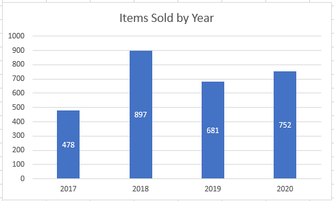
In this example, we’ll start a table and a bar graph. We’ll show how to add label tables and position them where you would like on the graph.

Adding Data Labels
- Click on the graph
- Select + Sign in the top right of the graph
- Check Data Labels

Change Position of Data Labels
Click on the arrow next to Data Labels to change the position of where the labels are in relation to the bar chart

Final Graph with Data Labels
After moving the data labels to the Center in this example, the graph is able to give more information about each of the X Axis Series.
Adding and Moving Data Labels in Google Sheets
Starting with your Data
We’ll start with the same dataset that we went over in Excel to review how to add and move data labels to charts.
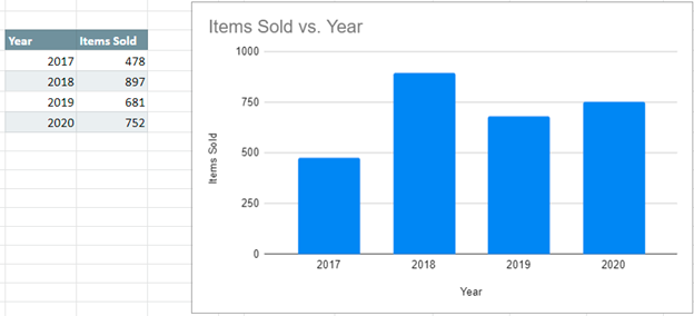
Add and Move Data Labels in Google Sheets
- Double Click Chart
- Select Customize under Chart Editor
- Select Series

4. Check Data Labels
5. Select which Position to move the data labels in comparison to the bars.

Final Graph with Google Sheets
After moving the dataset to the center, you can see the final graph has the data labels where we want.

Transcript
In this video, we’ll cover the basics of data labels.
Data labels are used to display source data in a chart directly.
They normally come from the source data, but they can include other values as well, as we’ll see in in a moment.
Generally, the easiest way to show data labels to use the chart elements menu. When you check the box, you’ll see data labels appear in the chart.
If you have more than one data series, you can select a series first, then turn on data labels for that series only.
You can even select a single bar, and show just one data label.
In a bar or column chart, data labels will first appear outside the bar end.
You’ll also find options for center, inside end, and inside base.
There’s also a feature called «data callouts» which wraps data labels in a shape.
When first enabled, data labels will show only values, but the Label Options area in the format task pane offers many other settings.
You can set data labels to show the category name, the series name, and even values from cells.
In this case for example, I can display comments from column E using the «value from cells» option.
Leader lines simply connect a data label back to a chart element when it’s moved. You can turn them off if you want.
You can also combine values in data labels and use a custom separator.
Be aware that if you turn data labels off and on, you’ll lose any changes you’ve made.
Like other chart elements, data labels inherit number formatting from the worksheet.
However, you can set your own number format in the Number area.
For example, in this case, I could use a number format with zero decimal places to shorten the display.
Purpose — to add a data label to just ONE POINT on a chart in Excel
There are situations where you want to annotate a chart line or bar with just one data label, rather than having all the data points on the line or bars labelled.

Method — add one data label to a chart line
Steps shown in the video above:
- Click on the chart line to add the data point to.
- All the data points will be highlighted.
- Click again on the single point that you want to add a data label to.
- Right-click and select ‘Add data label‘
- This is the key step! Right-click again on the data point itself (not the label) and select ‘Format data label‘.
- You can now configure the label as required — select the content of the label (e.g. series name, category name, value, leader line), the position (right, left, above, below) in the Format Data Label pane/dialog box.
- To format the font, color and size of the label, now right-click on the label and select ‘Font‘.
Note: in step 5. above, if you right-click on the label rather than the data point, the option is to ‘Format data labelS‘ – i.e. plural. When you then start choosing options in the ‘Format Data Label‘ pane, labels will be added to all the data points.
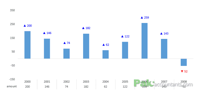
Is it possible to have colored data labels like red for negatives and blue or green for positive values inside excel chart? This question was asked by some when I posted Variance Analysis in Excel – Making better Budget Vs Actual charts as this shows the use of custom data labels that includes upward and downward arrows with positive and negative values right on the chart for easy understanding. This is what we are after in this tutorial:
But having the positive and negative values in data labels colored as well, that was quite interesting. At that time I really was without answer as I tried few things but didn’t really get it done. So I suggested the old-fashioned way of having each data label “hard colored” (which I will explain in this article) but that was not the solution.
But I went back again on it and tried on a new sample data and there I not made it work the way it should have worked before but also found why it didn’t work the first time. So I will share the whole experience I have been through with the wrong-lazy approach and right-awesome approach!
Color Changing Data labels in Excel Charts – How To
1 Pre 2013 Workaround
Before Office 2013, I don’t know of any easy way either to insert symbols in data labels or get them conditionally colored to show negative and positive values in different colors. And above that getting the symbols and colors were two separate jobs.
The workaround for symbols, though long, is quite good as with that approach the data labels also update if the underlying data updates but not completely dynamic as it does not incorporate if additional data is added which makes it laborious. In the world of Excel it is known as custom data labels and I have discussed this approach in my some of my charting tutorials including Variance analysis chart.
The workaround for colored data labels however was a bit lame. May be there is a way via VB wizardry but I am still unaware of it. The reason why it is lame is that does not dynamic and doesn’t change with the change in data. Simple.
But as majority still use Excel 2003, 2007 and 2010 so these approaches can still help.
1.1 Custom data labels with symbols
The basic idea behind custom label is to connect each data label to certain cell in the Excel worksheet and so whatever goes in that cell will appear on the chart as data label. So once a data label is connected to a cell, we apply custom number formatting on the cell and the results will show up on chart also. Following steps help you understand the required:
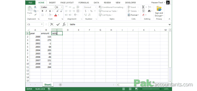
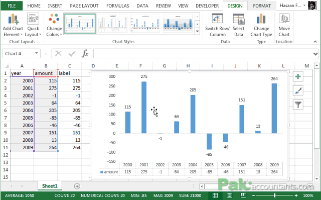
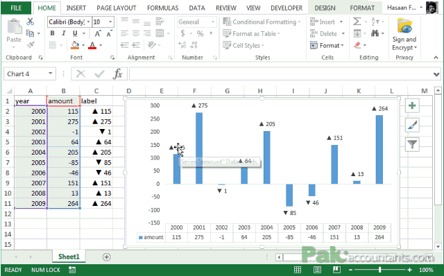
Step 1: Setup chart and have data labels turned on on your chart. I have the data in column A and B with years and amounts respectively. I got a third column with Label as a heading and get the same values as in Amount column. You can use Amount column as well but to make but for understanding I am going with one additional column.
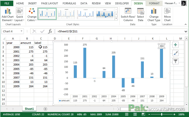
Step 2: Left click on any data label and it will select all of them or at least all the data labels of that series. Left click again and this time only the data label you clicked will be selected.
Step 3: Click inside the formula bar, Hit “=” button on keyboard and then click on the cell you want to link or type the address of that cell. In my case it is cell C2.Hit Enter key. Now the cell is connected to that data label. Repeat this process until all the cells are connected to each data label.
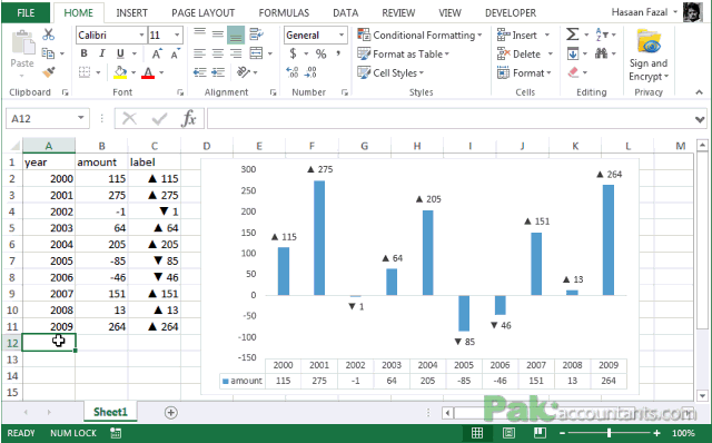
Step 4: Select the data in column C and hit Ctrl+1 to invoke format cell dialogue box. From left click custom and have your cursor in the type field and follow these steps:
- Press and Hold ALT key on the keyboard and on the Numpad hit 3 and 0 keys. Let go the ALT key and you will see that upward arrow is inserted. Hit 0 key. Then colon ; key. This completes the argument for positive value.
- Press and Hold ALT key on the keyboard and on the Numpad hit 3 and 1 keys. Let go the ALT key and you will see the downward arrow is inserted. Hit 0 key and then ; key. This completes the argument for negative value.
- Click OK button to close the format cell box.
The chart will show the upward and downward arrow instantly.
1.1.1 Problems
Problem as I said in the beginning is that though the data labels I connected will update if data changes, but if I throw additional rows to the chart, the new data labels needs to be connected too and that makes it quite cumbersome.
In my case I am using a helper column for data labels. So I not only have to update my helper column to include more rows but also connect each additional data label to newly added cells.
Have a look at the last 2 data labels once the new data is added and chart is updated:
1.2 Colored Data labels
Now coming to the second part i.e. coloring the data labels. What we are after is to color negatives in red essentially and positives in any color like blue or green or simply leave them black. So what is the way? To be honest there is no right way to do it. Only workaround to my knowledge. I am repeating my knowledge as there might be something better which I don’t know yet. If someone knows then please step forward and DO share as it will help thousands if not millions!
The way I know is to simply click the data label once and clicking it again will select the particular data label which you can then format with desired color. And of course you will have to do it for each data label separately.
Tiring right? And above that it is “hard” coloring the labels. So if the data changes and instead of positives you have negatives, the color won’t change for you and it will definitely be a mess!
2 Post 2013 – Awesomeness begins!
What if I tell you that in Excel 2013 you can get all the solutions of having symbols and even getting colors in ONE go and that without any pitfalls of not being dynamic? Absolutely possible! Follow along:
Step 1: Have any cell selected outside the range hit Ctrl+1. Click custom from the left side and have your cursor in the type field and follow these steps:
- Type [Blue] and then Press and Hold ALT key and hit 3 and 0 key on the Numpad. Let go the ALT key and punch 0 and then colon.
- Type [Red] and then press and Hold ALT key and hit 3 and 1 key on the Numpad. Let go the ALT key and punch 0
- Select the whole code and hit copy! We are going to paste this code in specific field in a bit. So try not to copy anything after this step. If you do so. You can always come back here to copy it again.
- Click OK button to close the dialogue box AND also to save the code you just entered.
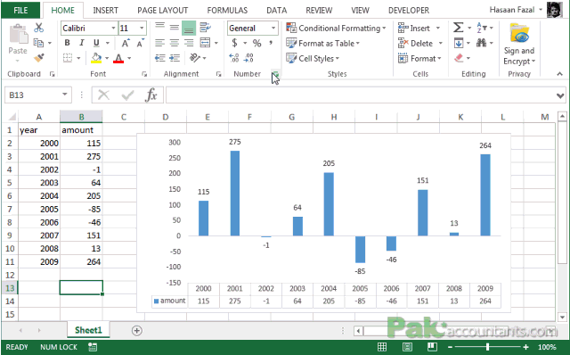
Step 2: Setup chart on the basis of two columns A and B. No need of third column anymore.
Step 3: Turn data labels on if they are not already by going to Chart elements option in design tab under chart tools.
Step 4: Click on data labels and it will select the whole series. Don’t click again as we need to apply settings on the whole series and not just one data label.
Step 4: Go to Label options > Number. From category drop down select Custom.
Step 5: Have your cursor in the format code field and hit Ctrl+V and it will paste the code we copied in Step 1.
BANG!!!! BANG!!!! Yeah banged twice as we not only got the symbols but also the colors in one go!
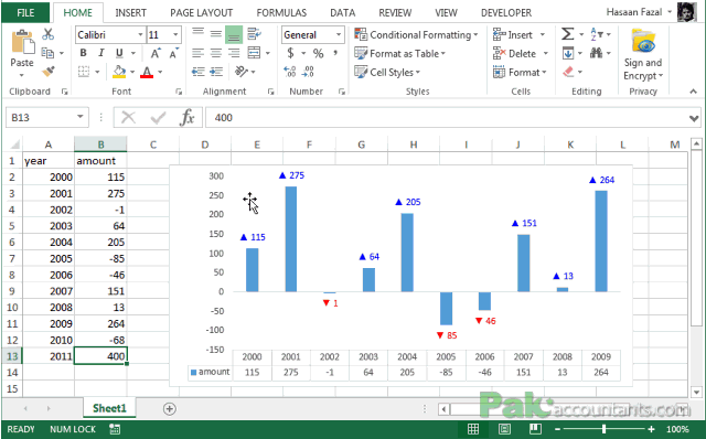
But hold on magic isn’t over yet! Now if you add additional data and update the chart, the data labels will update automatically and so you don’t need to worry about the recoloring or connecting cells etc. so BANG again for the third time 🙂
Have a look at the last two additional data items added to the chart and the data labels get updated accordingly:
2.1 Caution
When I was asked this question I had 2013 version of Excel already installed. And I tried the settings I mentioned above in post 2013 scenario. But it didn’t worked at that time and I thought it is not possible and color and symbols cannot be inserted. But both had their own issues.
To apply custom format on data labels inside charts via custom number formatting, the data labels must be based on values. You have several options like series name, value from cells, category name. But it has to be values otherwise colors won’t appear.
Symbols issue is quite beyond me. When I try to insert symbol via chart options hitting ALT key invokes Excel’s shortcut functionality. I tried to do the same even with detached bar but still I wasn’t able to get ALT work for me to insert symbols right in the chart options. That is I had to copy the code from format cell window as the first step.
Data Labels make an Excel chart easier to understand because they show details about a data series or its individual data points.
Depending on what you want to highlight on a chart, you can add labels to one series, all the series (the whole chart), or one data point.
In our example below, I add a Data Label to a column chart and then I format the data label using CTRL+1.
I then select to custom format the numbers so it shows the values as thousands by adding a comma , after each zero and then showing the work k by adding “k”
Example Custom Number Format: [$$-1004]#,##0,”k”;-[$$-1004]#,##0,”k”

DOWNLOAD WORKBOOK
HELPFUL RESOURCE:

About The Author
John Michaloudis
John Michaloudis is the Founder & Chief Inspirational Officer of MyExcelOnline!
It’s time to ditch the legend. You know – the legend, the key, the thing to the right of the graph that tells the reader what each piece of your graph means. We don’t need it. Legends are actually hard for many people to work with because they put a burden on the reader to seek and match up each line with its legend entry. It’s better if we just label the lines directly.
So (and this is the super fun part) click on the legend and delete it. Just hit your delete key. Smile. It feels good.

Oh but did you notice how your graph resized when you deleted the legend? We need room there for our labels so click inside the middle of the graph, in the white area (called the Plot Area) so that it is activated. You’ll see square handles at the corners and along the sides. Drag the side handle to the left to make room.

Now we have a space to add the labels. There are two ways to do this.
Way #1
Click on one line and you’ll see how every data point shows up. If we add a label to every data points, our readers are going to mount a recall election. So carefully click again on just the last point on the right.
Now right-click on that last point and select Add Data Label.
THIS IS WHEN YOU BE CAREFUL. If it says “Labels” as in plural it is going to add a label to every point on your line. You must not have selected the last point carefully enough. Try again and make sure it says “Label” singular.
If it pops in your value instead of the name of your series, right-click on it again and select Format Data Label (WATCH FOR THE PLURAL/SINGULAR BUSINESS HERE). In the dialogue box that opens, check Series and uncheck Value. Boom.

Way #2
Insert a text box at the end of the line and type the label name. You know how to insert a text box, right? Of course you do! You just probably never did so inside Excel. But it works! Insert>Textbox then draw the textbox in the graph and type away.

Did you forget the name of your line? Hover on it and Excel will tell you. The nice thing about the textboxes is that you can change the label to say whatever you want.

Both methods have definite pros and cons so it’s good to know how to do both. Whichever way you pick, your audience is going to be grateful that you’ve saved them from the mental gymnastics of a typical legend.
This process scores full points on the “Data are labeled directly” item on our Data Visualization Checklist.