
There are a lot of formatting options for data labels. You can use leader lines to connect the labels, change the shape of the label, and resize a data label. And they’re all done in the Format Data Labels task pane. To get there, after adding your data labels, select the data label to format, and then click Chart Elements  > Data Labels > More Options.
To go to the appropriate area, click one of the four icons (Fill & Line, Effects, Size & Properties (Layout & Properties in Outlook or Word), or Label Options) shown here.

Tip: Make sure that only one data label is selected, and then to quickly apply custom data label formatting to the other data points in the series, click Label Options >Data Label Series > Clone Current Label.
Here are step-by-step instructions for the some of the most popular things you can do. If you want to know more about titles in data labels, see Edit titles or data labels in a chart.
A line that connects a data label and its associated data point is called a leader line—helpful when you’ve placed a data label away from a data point. To add a leader line to your chart, click the label and drag it after you see the four headed arrow. If you move the data label, the leader line automatically adjusts and follows it. In earlier versions, only pie charts had this functionality—now all chart types with data labels have this.

-
Click the connecting lines you want to change.
-
Click Fill & Line > Line, and then make the changes that you want.

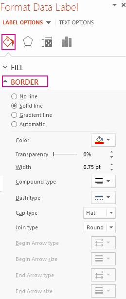
There are many things you can do to change the look of the data label like changing the border color of the data label for emphasis.
-
Click the data labels whose border you want to change. Click twice to change the border for just one data label.
-
Click Fill & Line > Border, and then make the changes you want.
Tip: You can really make your label pop by adding an effect. Click Effects and then pick the effect you want. Just be careful not to go overboard adding effects.
You can make your data label just about any shape to personalize your chart.
-
Right-click the data label you want to change, and then click Change Data Label Shapes.
-
Pick the shape you want.
Click the data label and drag it to the size you want.
Tip: You can set other size (Excel and PowerPoint) and alignment options in Size & Properties (Layout & Properties in Outlook or Word). Double-click the data label and then click Size & Properties.

You can add a built-in chart field, such as the series or category name, to the data label. But much more powerful is adding a cell reference with explanatory text or a calculated value.

-
Click the data label, right click it, and then click Insert Data Label Field.
If you have selected the entire data series, you won’t see this command. Make sure that you have selected just one data label.
-
Click the field you want to add to the data label.
-
To link the data label to a cell reference, click [Cell] Choose Cell and then enter a cell reference.
Tip: To switch from custom text back to the pre-built data labels, click Reset Label Text under Label Options.
-
To format data labels, select your chart, and then in the Chart Design tab, click Add Chart Element > Data Labels > More Data Label Options.
-
Click Label Options and under Label Contains, pick the options you want. To make data labels easier to read, you can move them inside the data points or even outside of the chart.

Содержание
- Change axis labels in a chart
- Change the text of the labels
- Change the format of text and numbers in labels
- Edit titles or data labels in a chart
- What do you want to do?
- Edit the contents of a title or data label on the chart
- Edit the contents of a title or data label that is linked to data on the worksheet
- Reestablish the link between a title or data label and a worksheet cell
- Reestablish the link for a chart or axis title
- Reestablish the link for a data label
- Reset label text
- Reestablish a link to data on the worksheet
- Change the position of data labels
- Change the format of data labels in a chart
Change axis labels in a chart
In a chart you create, axis labels are shown below the horizontal (category, or «X») axis, next to the vertical (value, or «Y») axis, and next to the depth axis (in a 3-D chart). Your chart uses text from its source data for these axis labels.
Don’t confuse the horizontal axis labels—Qtr 1, Qtr 2, Qtr 3, and Qtr 4, as shown below, with the legend labels below them—East Asia Sales 2009 and East Asia Sales 2010.

Change the text of the labels
Click each cell in the worksheet that contains the label text you want to change.
Type the text you want in each cell, and press Enter.

As you change the text in the cells, the labels in the chart are updated.
To keep the text in the source data on the worksheet the way it is, and just create custom labels, you can enter new label text that’s independent of the worksheet data:
Right-click the category labels you want to change, and click Select Data.

In the Horizontal (Category) Axis Labels box, click Edit.
In the Axis label range box, enter the labels you want to use, separated by commas.

For example, type Quarter 1 ,Quarter 2,Quarter 3,Quarter 4.
Change the format of text and numbers in labels
To change the format of text in category axis labels:
Right-click the category axis labels you want to format, and click Font.
On the Font tab, choose the formatting options you want.
On the Character Spacing tab, choose the spacing options you want.
To change the format of numbers on the value axis:
Right-click the value axis labels you want to format.
Click Format Axis.
In the Format Axis pane, click Number.
Tip: If you don’t see the Number section in the pane, make sure you’ve selected a value axis (it’s usually the vertical axis on the left).

Choose the number format options you want.

If the number format you choose uses decimal places, you can specify them in the Decimal places box.
To keep numbers linked to the worksheet cells, check the Linked to source box.
Note: Before you format numbers as percentages, make sure that the numbers shown on the chart have been calculated as percentages in the worksheet, or are shown in decimal format like 0.1. To calculate percentages on the worksheet, divide the amount by the total. For example, if you enter =10/100 and format the result 0.1 as a percentage, the number is correctly shown as 10%.
Tip: An axis label is different from an axis title, which you can add to describe what’s shown on the axis. Axis titles are not automatically shown in a chart. To add them, see Add or remove titles in a chart.
Источник
Edit titles or data labels in a chart
If your chart contains chart titles (ie. the name of the chart) or axis titles (the titles shown on the x, y or z axis of a chart) and data labels (which provide further detail on a particular data point on the chart), you can edit those titles and labels.
You can also edit titles and labels that are independent of your worksheet data, do so directly on the chart and use rich-text formatting to make them look better.
Note that you can edit titles and data labels that are linked to worksheet data in the corresponding worksheet cells. If, for example, you change the title in a cell from «Yearly Revenue» to «Annual Revenue» — that change will automatically appear in the titles and data labels on the chart. You won’t, however, be able to use rich-text formatting when you make a change from within a cell.
When you edit a linked title or data label on the chart (instead of within a cell), that title or data label will no longer be linked to the corresponding worksheet cell, and the changes that you make are not displayed in the worksheet itself (although you will see them on the chart). However, you can reestablish links between titles or data labels and worksheet cells.
After you finish editing the text, you can move the data labels to different positions as needed.
Note: To make any of the changes described below, a chart must already have titles or data labels. To learn to add them, see Add or remove titles in a chart and Add or remove data labels in a chart.
What do you want to do?
Edit the contents of a title or data label on the chart
On a chart, do one of the following:
To edit the contents of a title, click the chart or axis title that you want to change.
To edit the contents of a data label, click two times on the data label that you want to change.
The first click selects the data labels for the whole data series, and the second click selects the individual data label.
Click again to place the title or data label in editing mode, drag to select the text that you want to change, type the new text or value.
To insert a line break, click to place the cursor where you want to break the line, and then press ENTER.
When you are finished editing, click outside of the text box where you have made your text changes.
To format the text in the title or data label box, do the following:
Click in the title box, and then select the text that you want to format.
Right-click inside the text box and then click the formatting options that you want.
You can also use the formatting buttons on the Ribbon ( Home tab, Font group). To format the whole title, you can right-click it, click Format Chart Title, and then select the formatting options that you want.
Note: The size of the title or data label box adjusts to the size of the text. You cannot resize the title or data label box, and the text may become truncated if it does not fit in the maximum size. To accommodate more text, you may want to use a text box instead. For more information, see Add a text box to a chart.
Edit the contents of a title or data label that is linked to data on the worksheet
In the worksheet, click the cell that contains the title or data label text that you want to change.
Edit the existing contents, or type the new text or value, and then press ENTER.
The changes you made automatically appear on the chart.
Reestablish the link between a title or data label and a worksheet cell
Links between titles or data labels and corresponding worksheet cells are broken when you edit their contents in the chart. To automatically update titles or data labels with changes that you make on the worksheet, you must reestablish the link between the titles or data labels and the corresponding worksheet cells. For data labels, you can reestablish a link one data series at a time, or for all data series at the same time.
In PivotChart reports, the following procedures reestablish links between data labels and source data (not worksheet cells).
Reestablish the link for a chart or axis title
On a chart, click the chart or axis title that you want to link to a corresponding worksheet cell.
On the worksheet, click in the formula bar, and then type an equal sign (=).
Select the worksheet cell that contains the data or text that you want to display in your chart.
You can also type the reference to the worksheet cell in the formula bar. Include an equal sign, the sheet name, followed by an exclamation point; for example, =Sheet1!F2
Reestablish the link for a data label
When you customize the contents of a data label on the chart, it is no longer linked to data on the worksheet. You can reestablish the link by resetting the label text for all labels in a data series, or you can type a reference to the cell that contains the data that you want to link to for each data point at a time.
Reset label text
On a chart, click one time or two times on the data label that you want to link to a corresponding worksheet cell.
The first click selects the data labels for the whole data series, and the second click selects the individual data label.
Right-click the data label, and then click Format Data Label or Format Data Labels.
Click Label Options if it’s not selected, and then select the Reset Label Text check box.
Reestablish a link to data on the worksheet
On a chart, click the label that you want to link to a corresponding worksheet cell.
On the worksheet, click in the formula bar, and then type an equal sign (=).
Select the worksheet cell that contains the data or text that you want to display in your chart.
You can also type the reference to the worksheet cell in the formula bar. Include an equal sign, the sheet name, followed by an exclamation point; for example, =Sheet1!F2
Change the position of data labels
You can change the position of a single data label by dragging it. You can also place data labels in a standard position relative to their data markers. Depending on the chart type, you can choose from a variety of positioning options.
On a chart, do one of the following:
To reposition all data labels for an entire data series, click a data label once to select the data series.
To reposition a specific data label, click that data label twice to select it.
This displays the Chart Tools, adding the Design, Layout, and Format tabs.
On the Layout tab, in the Labels group, click Data Labels, and then click the option that you want.

For additional data label options, click More Data Label Options, click Label Options if it’s not selected, and then select the options that you want.
Источник
Change the format of data labels in a chart
Data labels make a chart easier to understand because they show details about a data series or its individual data points. For example, in the pie chart below, without the data labels it would be difficult to tell that coffee was 38% of total sales. You can format the labels to show specific labels elements like, the percentages, series name, or category name.

There are a lot of formatting options for data labels. You can use leader lines to connect the labels, change the shape of the label, and resize a data label. And they’re all done in the Format Data Labels task pane. To get there, after adding your data labels, select the data label to format, and then click Chart Elements > Data Labels > More Options.
To go to the appropriate area, click one of the four icons ( Fill & Line, Effects, Size & Properties ( Layout & Properties in Outlook or Word), or Label Options) shown here.
Tip: Make sure that only one data label is selected, and then to quickly apply custom data label formatting to the other data points in the series, click Label Options > Data Label Series > Clone Current Label.
Here are step-by-step instructions for the some of the most popular things you can do. If you want to know more about titles in data labels, see Edit titles or data labels in a chart.
A line that connects a data label and its associated data point is called a leader line—helpful when you’ve placed a data label away from a data point. To add a leader line to your chart, click the label and drag it after you see the four headed arrow. If you move the data label, the leader line automatically adjusts and follows it. In earlier versions, only pie charts had this functionality—now all chart types with data labels have this.
Click the connecting lines you want to change.
Click Fill & Line > Line, and then make the changes that you want.

There are many things you can do to change the look of the data label like changing the border color of the data label for emphasis.
Click the data labels whose border you want to change. Click twice to change the border for just one data label.
Click Fill & Line > Border, and then make the changes you want.
Tip: You can really make your label pop by adding an effect. Click Effects and then pick the effect you want. Just be careful not to go overboard adding effects.

You can make your data label just about any shape to personalize your chart.
Right-click the data label you want to change, and then click Change Data Label Shapes.

Pick the shape you want.
Click the data label and drag it to the size you want.
Tip: You can set other size (Excel and PowerPoint) and alignment options in Size & Properties ( Layout & Properties in Outlook or Word). Double-click the data label and then click Size & Properties.
You can add a built-in chart field, such as the series or category name, to the data label. But much more powerful is adding a cell reference with explanatory text or a calculated value.
Click the data label, right click it, and then click Insert Data Label Field.
If you have selected the entire data series, you won’t see this command. Make sure that you have selected just one data label.

Click the field you want to add to the data label.

To link the data label to a cell reference, click [Cell] Choose Cell and then enter a cell reference.
Tip: To switch from custom text back to the pre-built data labels, click Reset Label Text under Label Options.
To format data labels, select your chart, and then in the Chart Design tab, click Add Chart Element > Data Labels > More Data Label Options.

Click Label Options and under Label Contains, pick the options you want. To make data labels easier to read, you can move them inside the data points or even outside of the chart.
Источник
how to do it in Excel: adding data labels
Today’s post is a tactical one for folks creating visuals in Excel: how to embed labels for your data series in your graphs, instead of relying on default Excel legends.
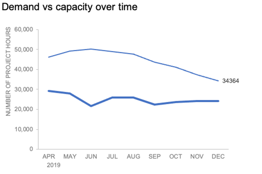
To illustrate, let’s look at an example from storytelling with data: Let’s Practice!. The graph below shows demand and capacity (in project hours) over time.

There are a few different techniques we could use to create labels that look like this.
Option 1: The “brute force” technique
The data labels for the two lines are not, technically, “data labels” at all. A text box was added to this graph, and then the numbers and category labels were simply typed in manually. This is what we affectionately refer to as “brute-forcing” your tool to make it look the way you want it to, regardless of its defaults. Remember: your audience only sees the end result of your work, even if the behind-the-scenes steps aren’t exactly elegant.

One benefit of this approach is that I have greater control over the formatting: size, position, and color of the labels. I can easily make them appear how I want them to appear by simply adjusting the formatting, which is much easier to do with a text box than with a genuine data label. The downside is that this method may not scale easily with many graphs, or those that will be frequently updated with new data—as the data changes, the text labels won’t move with them.
Option 2: Embedding labels directly
Let’s look now at an alternative approach: embedding the labels directly. You can download the corresponding Excel file to follow along with these steps:
Right-click on a point and choose Add Data Label. You can choose any point to add a label—I’m strategically choosing the endpoint because that’s where a label would best align with my design.

Excel defaults to labeling the numeric value, as shown below.
Now let’s adjust the formatting. Click the label (not the data point, but the label itself) twice, so that these white boxes appear around it:
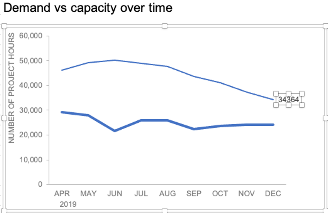
Right-click and choose Format Data Label:
In the Label Options menu that appears, you can choose to add or remove fields by checking (or unchecking) the corresponding box under Label Contains. To add the word “Demand”, I’ll check the Series Name box.

The label appeared in all-caps (“DEMAND”) because it’s referencing the underlying data—I could adjust the header in Column M to “Demand” if I didn’t want the entire word capitalized (this is a stylistic choice).

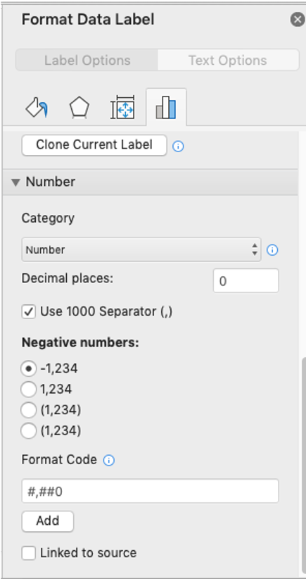
To adjust the number formatting, navigate back to the Format Data Label menu and scroll to the Number section at the bottom. I’ll choose Number in the Category drop-down and change Decimal places to 0 (side note: checking the Linked to source box is a good option if you want the labels to reformat when the formatting of the underlying source data changes).
My resulting visual looks like this:

From here, I can manually adjust the label alignment by highlighting the graph and making the Plot area smaller so that the label doesn’t overlap the line:
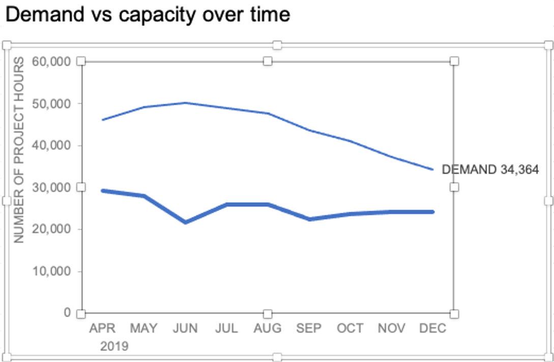
I’ll repeat the same steps to add the Capacity label:

The final thing I’ll do is clean up the formatting of those labels—move the numbers in front of the words, change the number format to be rounded to the thousands place, switch the colors of the labels to match the lines they refer to, and make the font for “24K Capacity” bold.

This post was inspired by a recent conversation during our bi-weekly office hour sessions. Do you ever need quick input on a graph or slide, or wish you could pick the SWD team’s brain on a project? Subscribe to premium membership for personalized support and get your questions answered. Our team has enjoyed getting to know many of you during these fun and interactive sessions!
Try the Excel Course for Free!

Format Data Labels in Excel: Overview
You can format data labels in Excel if you choose to add data labels to a chart. To format data labels in Excel, choose the set of data labels to format. To do this, click the “Format” tab within the “Chart Tools” contextual tab in the Ribbon. Then select the data labels to format from the “Chart Elements” drop-down in the “Current Selection” button group. Then click the “Format Selection” button that appears below the drop-down menu in the same area.
Alternatively, you can right-click the desired set of data labels to format within the chart. Then select the “Format Data Labels…” command from the pop-up menu that appears to format data labels in Excel. Using either method then displays the “Format Data Labels” task pane at the right side of the screen.

Format Data Labels in Excel- Instructions: A picture of the “Format Data Labels” task pane in Excel.
This task pane is where you format data labels in Excel. In the “Label Options” category, which is shown by default, you set the values and positioning of the data labels. You can also choose other formatting categories to display within the task pane. To do this, click the options to set, like the “Label Options” or “Text Options” choice. Then click the desired category icon to edit. The formatting options for the category then appear in collapsible and expandable lists at the bottom of the task pane.
Click the titles of each category list to expand and collapse the options within that category. Set any options you want within the task pane to immediately apply them to the chart. Then click the “X” in the upper-right corner of the task pane to close it.
Format Data Labels in Excel: Instructions
- To format data labels in Excel, choose the set of data labels to format.
- One way to do this is to click the “Format” tab within the “Chart Tools” contextual tab in the Ribbon.
- Then select the data labels to format from the “Current Selection” button group.
- Then click the “Format Selection” button that appears below the drop-down menu in the same area.
- Alternatively, right-click the desired set of data labels to format within the actual chart.
- Then select the “Format Data Labels…” command from the pop-up menu that appears to format data labels in Excel.
- Using either method then displays the “Format Data Labels” task pane at the right side of the screen.
- Set the values and positioning of the data labels in the “Label Options” category, which is shown by default.
- To choose other formatting categories to show in the task pane, click the desired options to set.
- Then click the desired category icon to edit.
- The formatting options for the category appear in collapsible and expandable lists at the bottom of the task pane.
- Click the titles of each category list to expand and collapse the display of the options in that category.
- To immediately apply changes to the chart, set any options you want within the task pane.
- Then click the “X” in the upper-right corner of the task pane to close it.
Format Data Labels in Excel: Video Lesson
The following video lesson, titled “Formatting Data Labels,” shows you how to format data labels in Excel. This video lesson is from our complete Excel tutorial, titled “Mastering Excel Made Easy v.2019 and 365.”
Tagged under:
change, chart, charts, class, course, data label, data labels, excel, excel 2013, Excel 2016, Excel 2019, format, Format Data Labels in Excel, formatting, help, how-to, instructions, learn, lesson, Microsoft Office 2019, Microsoft Office 365, Office 2019, office 365, overview, task pane, teach, training, tutorial, video
Элемент управления пользовательской формы Label, применяемый в VBA Excel для отображения надписей, меток, информационного текста. Свойства Label, примеры кода.
UserForm.Label – это элемент управления пользовательской формы, предназначенный для отображения на ней поясняющих надписей к другим элементам управления, меток, заметок, вывода дополнительной текстовой информации.
Элемент управления Label, как и другие элементы управления, реагирует на нажатия мышью, то есть его можно использовать для запуска подпрограмм, изменения собственных свойств, свойств пользовательской формы и других элементов управления.
Свойства элемента Метка
| Свойство | Описание |
|---|---|
| AutoSize | Автоподбор размера надписи. True – размер автоматически подстраивается под длину набираемой строки. False – размер элемента управления определяется свойствами Width и Height. |
| Caption | Текст надписи (заголовок). |
| ControlTipText | Текст всплывающей подсказки при наведении курсора на метку. |
| Enabled | Возможность взаимодействия пользователя с элементом управления Label. True – взаимодействие включено, False – отключено (цвет текста становится серым). |
| Font | Шрифт, начертание и размер текста надписи. |
| Height | Высота элемента управления. |
| Left | Расстояние от левого края внутренней границы пользовательской формы до левого края элемента управления. |
| Picture | Добавление изображения вместо текста метки или дополнительно к нему. |
| PicturePosition | Выравнивание изображения и текста в поле надписи. |
| TabIndex | Определяет позицию элемента управления в очереди на получение фокуса при табуляции, вызываемой нажатием клавиш «Tab», «Enter». Отсчет начинается с 0. |
| TextAlign* | Выравнивание текста надписи: 1 (fmTextAlignLeft) – по левому краю, 2 (fmTextAlignCenter) – по центру, 3 (fmTextAlignRight) – по правому краю. |
| Top | Расстояние от верхнего края внутренней границы пользовательской формы до верхнего края элемента управления. |
| Visible | Видимость элемента управления Label. True – элемент отображается на пользовательской форме, False – скрыт. |
| Width | Ширина элемента управления. |
| WordWrap | Перенос текста надписи на новую строку при достижении ее границы. True – перенос включен, False – перенос выключен. |
* При загруженной в надпись картинке свойство TextAlign не работает, следует использовать свойство PicturePosition.
Свойство по умолчанию для элемента Label – Caption, основное событие – Click.
В таблице перечислены только основные, часто используемые свойства надписи. Все доступные свойства отображены в окне Properties элемента управления Label.
Примеры кода VBA с Label
Пример 1
Загрузка элемента управления Label на пользовательскую форму с параметрами, заданными в коде VBA Excel:
|
1 2 3 4 5 6 7 8 9 10 11 12 13 14 15 16 17 18 19 20 21 22 |
Private Sub UserForm_Initialize() ‘Устанавливаем значения свойств ‘пользовательской формы With Me .Width = 200 .Height = 110 .Caption = «Пользовательская форма» End With ‘Устанавливаем значения свойств ‘метки (надписи) Label1 With Label1 .Caption = «Добрый доктор Айболит!» _ & vbNewLine & «Он под деревом сидит.» .Width = 150 .Height = 40 .Left = 20 .Top = 20 .Font.Size = 12 .BorderStyle = fmBorderStyleSingle .BackColor = vbYellow End With End Sub |
Добавьте на пользовательскую форму элемент управления Label1, а в модуль формы представленный выше код VBA. При запуске формы или процедуры UserForm_Initialize() откроется следующее окно:

Пример 2
Изменение цвета элемента управления Label при нажатии на нем любой (правой, левой) кнопки мыши, и возвращение первоначального цвета при отпускании кнопки:
|
‘Событие перед щелчком кнопки мыши при нажатии Sub Label1_MouseDown(ByVal Button As Integer, _ ByVal Shift As Integer, ByVal X As Single, _ ByVal Y As Single) Label1.BackColor = vbBlue End Sub ‘Событие перед щелчком кнопки мыши при отпускании Sub Label1_MouseUp(ByVal Button As Integer, _ ByVal Shift As Integer, ByVal X As Single, _ ByVal Y As Single) Label1.BackColor = Me.BackColor End Sub |
При нажатии кнопки мыши над меткой, ее цвет станет синим. При отпускании кнопки – цвет станет таким же, как цвет формы.
Для наглядной демонстрации второго примера вы можете добавить эти две процедуры к коду первого примера или создать новую пользовательскую форму с элементом управления Label1 и добавить процедуры в ее модуль.
We can create or print a mailing list by using Microsoft Excel to keep it organized. In this tutorial, we will learn how to use a mail merge in making labels from Excel data, set up a Word document, create custom labels and print labels easily.
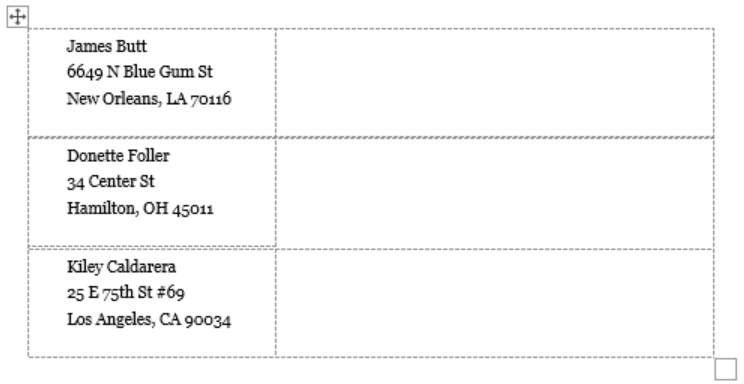 Figure 1 – How to Create Mailing Labels in Excel
Step 1 – Prepare Address list for making labels in Excel
- First, we will enter the headings for our list in the manner as seen below.
First Name
Last Name
Street Address
City
State
ZIP Code
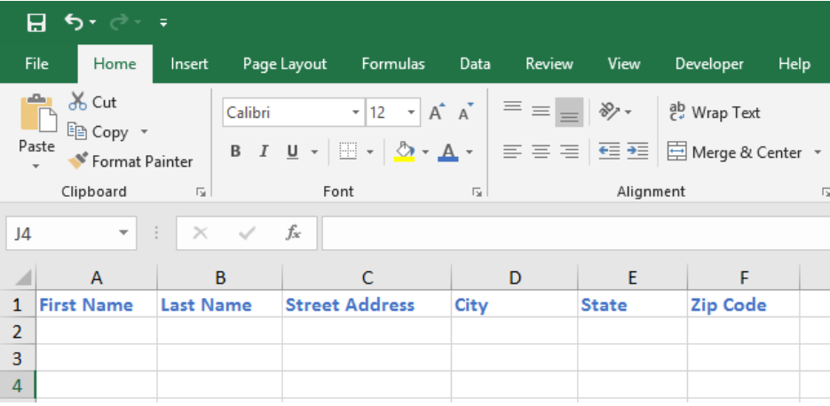 Figure 2 – Headers for mail merge
Tip: Rather than create a single name column, split into small pieces for title, first name, middle name, last name.
- Next, we will fill in our data (Format the Zip Code column to enter numbers as text)
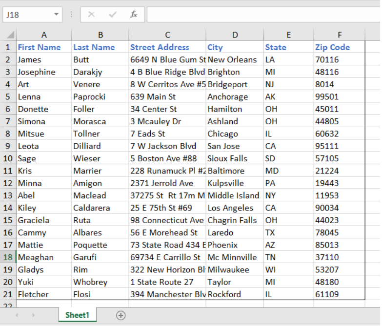 Figure 3 – Create labels from excel spreadsheet
- We will select the address list including column headers and go to Formulas. In the Defined names group, we click on Define name.
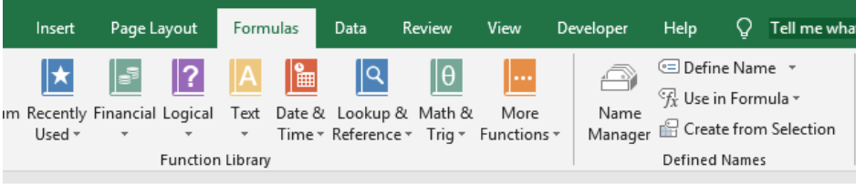 Figure 4 – Define Name for mailing labels from excel
- We will type in a name for our address list in the Name box.
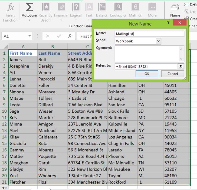 Figure 5 – Name address list for labelling in excel
- Once we are done, we will save our Excel worksheet.
Step 2 – Set up the Mail Merge document in Word
- We will open a blank Word document in Ms Word 2007, 2010, 2013 or 2016
 Figure 6 – Blank word document to convert excel to word labels
- We will go to the Mailings tab, select Start Mail Merge and click on Step by Step Mail Merge Wizard.
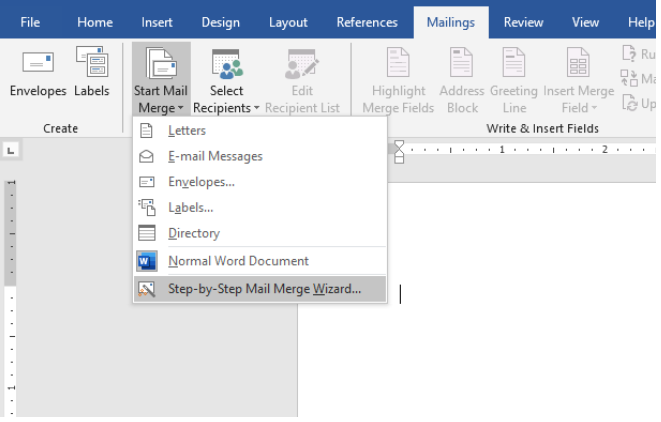 Figure 7 – How to make labels from excel
- We will now see the Mail Merge pane at the right of our screen.
 Figure 8 – Mail Merge pane for making mailing labels
- We will select Labels and click on Next: Starting document link
- We will select Change document layout because we want to create a new sheet of mailing labels (we can also click start from existing documents or use the current document if we wish to add to an existing list of labels).
- Next, we will click on Label options.
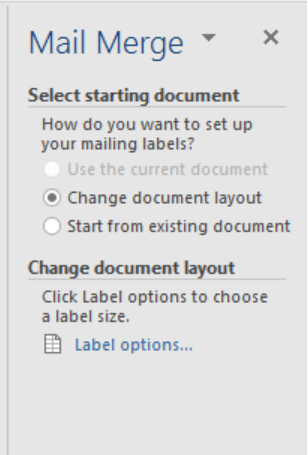 Figure 9 – Excel to labels for Mail Merge
- In the label options dialog, we will select the needed options including;
- Printer information
- Choose supplier of label sheets under label information
- Enter product number listed on the package of label sheets
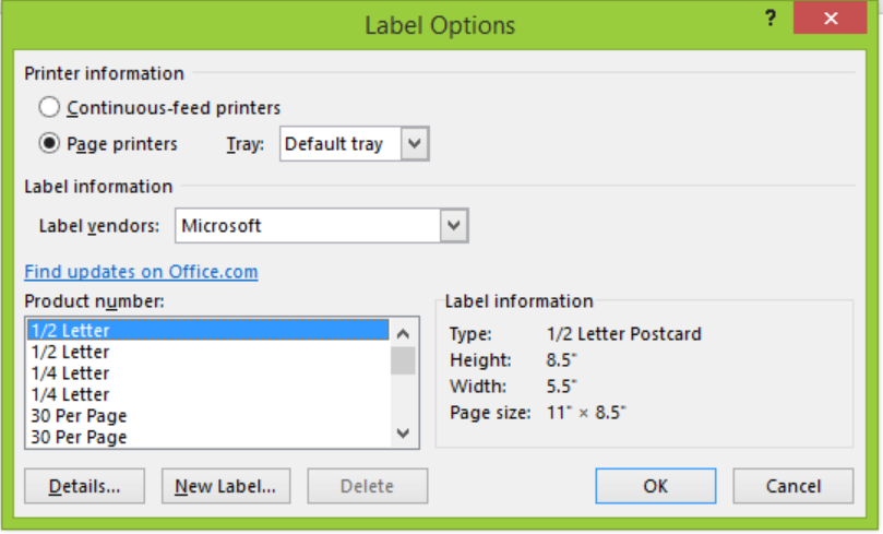 Figure 10 – Adjust size of labels for converting excel to word labels
- Next, we will click Details and format labels as desired.
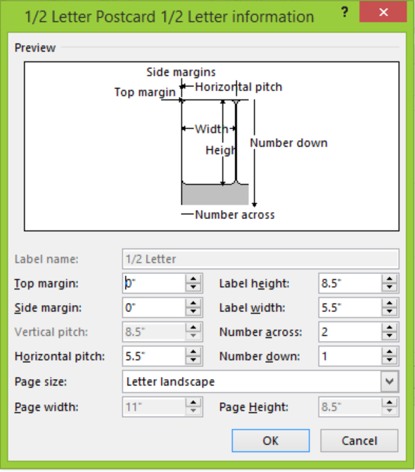 Figure 11- Format size of labels to create labels in excel
- We will click OK to go back to the Labels options dialog box. We will click OK to go back to the Mail Merge window and then click Next:Select recipients
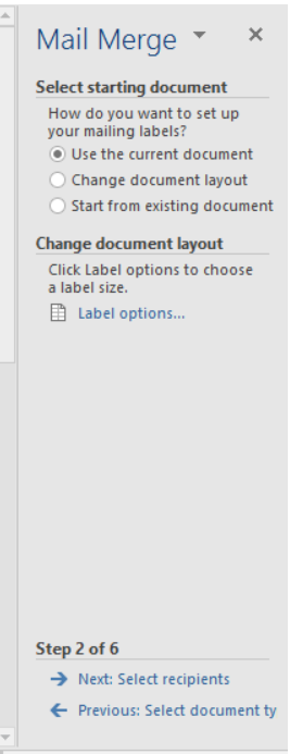 Figure 12 – How to make mailing labels
Step 3 – Connect Worksheet to the Labels
- We will go to Select recipients and choose use an existing list
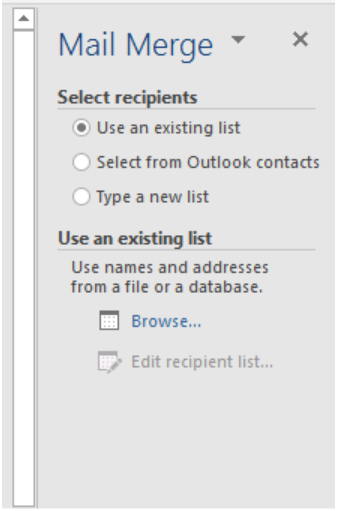 Figure 13 – How to create labels from excel
- Next, we will click the Browse button and locate our excel worksheet
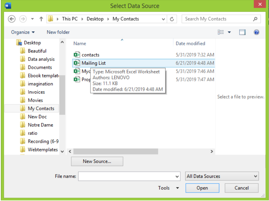 Figure 14 – How to create address labels
- We will select the Defined name for our Address list mark “first row of data contains column headers” and click OK.
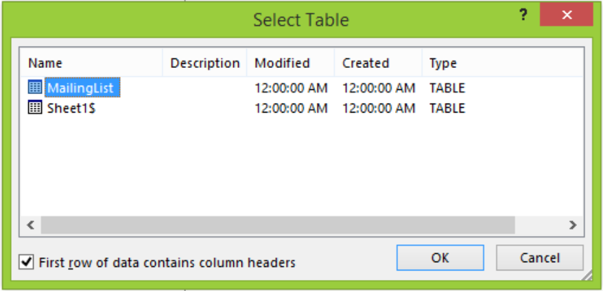 Figure 15 – Create Address labels from excel
Step 4 – Add Recipients for Mail Merge
- In the Mail Merge Recipients Window, we will clear the checkbox next to the names for the recipients we don’t want in our labels. Here, we can filter recipient list to remove blanks or sort according to a specific category such as region.
- After checking the list, we will click OK.
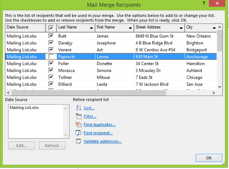 Figure 16 – How to create labels from excel
- In the Mail Merge pane, we will click Next: Arrange your labels.
 Figure 17 – Arrange Address labels from Excel
Step 5- Arrange layout of Address labels.
- In the Mail Merge pane, we will click on Address block
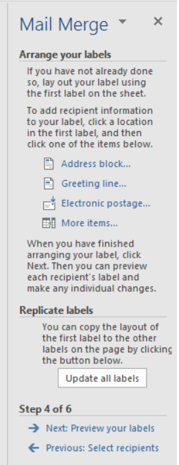 Figure 18 – Excel Spreadsheets to labels
- In the Insert Address block dialog window, we will click on desired options and check the result under the preview section before selecting OK.
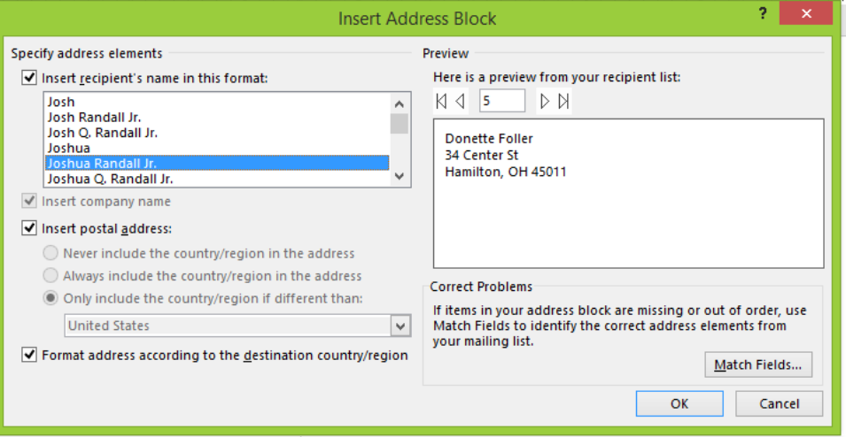 Figure 19 – Create labels from excel spreadsheet
- After we are done, we will click OK and in the Mail Merge pane click Next:Preview your labels.
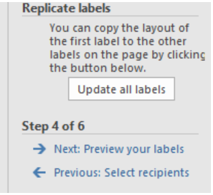 Figure 20 – Preview labels to Create address labels from excel spreadsheet
Step 6 – Preview mailing labels
- We will click right or left arrows in the Mail merge pane to see how the mailing labels will look.
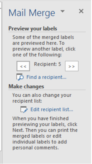 Figure 21 – Preview labels for making mailing labels from excel
- As we click the arrows, we will find the preview in our Word document
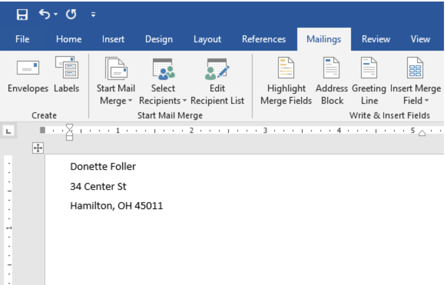 Figure 22 – Preview pane for mailing labels
- If we want to change the font type, color or size, we will highlight the preview, go to the Home Tab and change as desired
 Figure 23 – Format Address labels
- Once we are satisfied, we will click Next:Complete the merge
Step 7: Print labels
- We will click on Print in the Mail Merge pane
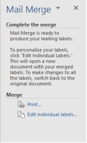 Figure 24 – Print labels from excel
- We will decide whether to print all or select particular labels.
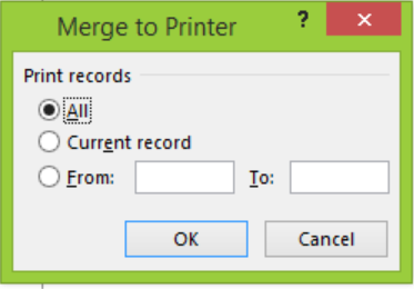 Figure 25 – How to print labels from excel
Step 8: Save labels for later use
We can save labels so we can use them in the future. For this function, we have two options.
A. We can click on the Save button and save the word document in the normal way. The Mail Merge document will be saved and connected to the Excel Source file in an “as-is” format. Using this format means that all future additions to our Excel file will quickly reflect in the Mail Merge.
B. If we do this, when next we open the document, MS Word will ask where we want to merge from Excel data file. We will click Yes to merge labels from Excel to Word.
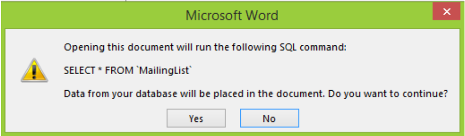 Figure 26 – Print labels from excel
(If we click No, Word will break the connection between document and Excel data file.)
C. Alternatively, we can save merged labels as usual text. When we use this format, Excel will save our labels as a normal word document without linking to the Excel source file. To do this, in the Mail Merge pane, we will click on Edit Individual labels.
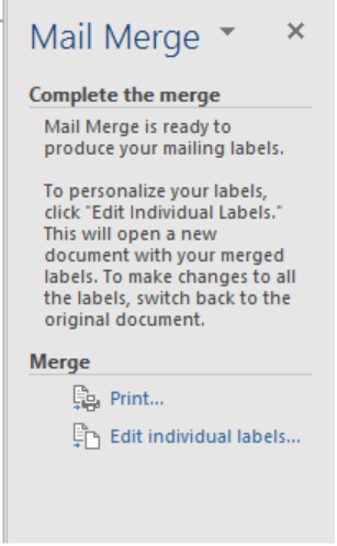 Figure 27 – Print labels from excel
a. In the Merge to New Document dialog box, we will specify the labels we want to merge and click OK.
 Figure 28 – Mail Merge saving as text
b. Then save document as the usual Word document.
Instant Connection to an Excel Expert
Most of the time, the problem you will need to solve will be more complex than a simple application of a formula or function. If you want to save hours of research and frustration, try our live Excelchat service! Our Excel Experts are available 24/7 to answer any Excel question you may have. We guarantee a connection within 30 seconds and a customized solution within 20 minutes.

Have you ever created an Excel chart where the labels stretch out to infinity or are incomplete so you can’t read them? I’ve got a couple of tricks for you, which I’ll lay out here and in this short video on my YouTube channel.

Wrapping Labels
It’s easy to get your labels to wrap onto multiple lines so they fit and are readable. Let’s say you have a simple data set of the population of large cities in the United States. Instead of having them stick out to the left of the chart, you’d like to wrap them on two lines, with the city above and the state below.
Simply place your cursor in the formula bar where you want to add the break and press the ALT+ENTER keys. Hit ENTER again, and you’ll see the text wrap on two lines. You now have the text arranged the way you like it in the spreadsheet and in the graph.


Aligning Labels
In this simple example, notice how the labels are centered for each city, which doesn’t look terrific—the alignment for San Antonio, for example, looks off. Ideally, we could just hit the text alignment buttons in the Home tab and be done, but for some reason, Excel doesn’t allow that.
Well, here’s a little trick:
- Copy your graph
- Open PowerPoint and Paste the graph. Don’t worry about the slide size or anything, just paste it in.
- Select the axis you want to format and select the Format option in the Paragraph menu.
- In the ensuing menu, select the Right option in the Alignment drop-down menu. Now, ideally, we’d be able to align the text to the left and everything would be nicely aligned along the left edge, but it aligns to the left within each label, so it doesn’t look great, as you can see in the first image below.


- Now, copy the graph and paste back into Excel. The data will come along with it. And that’s it.
Now you have well-aligned labels in your chart. If you’d like to see these steps in a video, check out my YouTube channel or watch the video below.
One of the useful tricks to attain the attention of the audience and improve the effect of presenting your data is to use axis label formatting customized for the specific value ranges:


The conditional formatting includes:
- Color formatting — Excel displays characters in the specified color — black, blue, cyan, green, magenta, red, white , or yellow ,
- Custom criteria for each number format section.
See more about custom formatting.
There are some differences in customizing axes in Excel:
- You can apply conditional formatting:
- For the vertical (Value) axis labels in scatter, line, column, and area charts,
- For the horizontal (Category) axis labels in a scatter and bar chart.
- You can’t apply conditional formatting — Excel ignores the custom conditional formatting for such axes:
- For the horizontal (Category) axis labels in line, column, and area charts,
- For the vertical (Value) axis labels in a bar chart.
So, the standard conditional formatting can be applied for both axes just for scatter plots. For other charts, see below the workaround for applying conditional formatting for axis labels.
Apply standard conditional formatting for axes
To change the format of the label on the Excel for Microsoft 365 chart axis (horizontal or vertical, depending on the chart type), do the following:
1. Right-click on the axis and choose Format Axis… in the popup menu:

2. On the Format Axis task pane, in the Number group, select Custom category and then change the field Format Code and click the Add button:

- If you need a unique representation for positive, negative, and zero values, just write multiple formats, separating each with a semicolon (or a comma, see how to change the semicolon to a comma or vice versa):
{positive value}; {negative value}; {zero}; {text value}
- If you write two formats, the first applies to positive and zero values, and the second applies to negative values.
- If you write three formats, the first applies to positive values, the second to negative values, and the third to zero.
- If you write four formats, they apply to positive, negative, zero, and text values, respectively.
[Blue]#,###;[Red]#,###;[Green]~0;
- If you want to create a custom condition based on values below or equal to some point (for example, -60) and greater than it, you could type the following condition codes:
[Cyan][<=-60];[Magenta][>-60]

See also How to hide points on the chart axis.
Workaround for conditional formatting

To apply formatting for the vertical (Value) axis for the bar chart or horizontal (Category) axis for other types of charts, where Excel ignore the standard conditional formatting, do the following:
1. Create new data for the axis labels
The main purpose of the new data series is to substitute the axis labels with custom values with different formatting. So, the new data series values should be displayed instead of the axis labels.
For example, to highlight the horizontal (Category) axis labels for all negative values, add two data series — for positive and for negative values:

2. Add a new data series to the chart
2.1. Do one of the following:
- On the Chart Design tab, in the Data group, choose Select Data:

- Right-click on the chart area and choose Select Data… in the popup menu:


2.2. In the Select Data Source dialog box:
- Under Legend Entries (Series), click the Add button:

- In the Edit Series dialog box, in the Series values field, type the constant values equal to the minimal visible value in the axis as many times as labels you need to add:
= {-80, -80, -80, -80, -80, -80}:


2.3. Repeat previous steps to add the second additional data series for negative values.
After closing the Select Data Source dialog box, Excel rebuilds the chart:

3. Hide the horizontal axis labels
3.1. Right-click on the horizontal axis and choose Format Axis… in the popup menu:
3.2. On the Format Axis pane:
If necessary, return the correct labels:
- On the Axis Options tab, in the Axis Options group, in the Bounds section, type the correct Minimum and Maximum values.
Hide the axis labels:
Do one of the following:
- On the Text Options tab, in the Text Fill & Outline group:
- In the Text Fill section, select No fill,
- In the Text Outline section, select No line:

- On the Axis Options tab, in the Axis Options group, in the Labels section, from the Label Position list, select None:


4. Add the new data series labels
4.1. Select the data series (see more about how to select chart elements), then do one of the following:
- Click on the Chart Elements button, select the Data Labels list:
- For the horizontal axis, choose Below (or Outside End),
- For the vertical axis, choose Left:

- On the Chart Design tab, in the Chart Layouts group, click the Add Chart Element button:

From the Add Chart Elements list, choose Data Labels, then select the place for the labels. For example, Below:


4.2. Right-click on the added data series labels and choose Format Data Labels… in the popup menu:

4.3. On the Format Data Labels pane, on the Label Options tab, in the Label Options section, under Label Contains:
- Select the Value From Cells checkbox, then choose data labels in the Select Data Label Range dialog box:

- Unselect all other checkboxes.

5. Repeat steps
Repeat step 4 for the second data series — add the data labels for the negative values and format them
6. Customize the data labels as you prefer
7. Hide the unneeded data series
7.1. Right-click on the data series you want to hide and choose Format Data Series… in the popup menu:

7.2. On the Format Data Series pane, in the Fill & Line group:
- In the Fill section, select No fill,
- In the Border section, select No line:

Apply another formatting as desired.
See also this tip in French:
Mise en forme conditionnelle des axes du graphique.
|
valeria_J Пользователь Сообщений: 43 |
Друзья, в очередной раз обращаюсь к Вам за помощью. В файле при выполнении макроса (ctrl+q), появляется форма и отображает значение ячейки «A1». Так вот проблема в том, что никак не получается настроить формат отображаемого значения. В идеале, хотелось бы числовой формат с 2 знаками после запятой, разделителем тысяч и отрицательные значения красным цветом. Буду благодарна за любую помощь. |
|
VDM Пользователь Сообщений: 779 |
Частичное решение вопроса, с разделением тысяч пока не придумал |

|
VDM Пользователь Сообщений: 779 |
По идее Caption нужно не округлять, а форматировать, пока не нашёл как подступиться… |
|
Label1=Format([a1],»Fixed») С цветом — засада. |
|
|
Label1.Caption=Format([a1],»Fixed») Caption, конечно |
|
|
Вот так получилось пока: |
|
|
GIG_ant  Пользователь Сообщений: 3102 |
Еще вариант: Private Sub UserForm_Initialize() см файл |
|
VDM Пользователь Сообщений: 779 |
Всё оказалось просто и изящно, как всегда |
|
Прошу прощения, что поднимаю тему, так как ее можно уже закрывать, но не успела поблагодарить ребят за решение моей проблемы (была в командировке). Спасибо всем огромное за участие в вопросе и его решении, как обычно нерешаемый для меня вопрос оказался легким для вас Использовала варианты Пытливого и GIG_ant’а для различных вариантов форматирования. Ребята, спасибо всем. Всех с наступающим Новым Годом!!!!!!!!!!!!!!!! |
|
|
Guest Гость |
#10 20.12.2011 00:32:03 valeria_j |