
KPI Dashboard Excel templates are the graphical representations to track the key data points for maximizing the performance of the business. KPI dashboard templates are available in tabular, pie chart and graph formats for better visualization. Best KPI dashboard templates hold good control in increasing the productivity of an organization. Because these dashboards include all the phenomenal elements which are essential for the upliftment of the business.
Out of multiple KPI Excel templates available in the market, we have chosen the best KPI dashboard templates which definitely increase the productivity. We have picked one KPI template for each section of the business that was recommended by the industry experts.
Here is the list of 21 amazing KPI templates in Excel you have been waiting for:
In this Page
- 1. Executive Dashboard Template
- 2. Business Dashboard Template
- 3. Financial Dashboard Template
- 4. Sales Management Dashboard Template
- 5. Lead Generation Dashboard Template
- 6. Marketing Dashboard Template
- 7. Social Media Dashboard Template
- 8. Digital Marketing Dashboard Template
- 9. Email Marketing Dashboard Template
- 10. Project Management Dashboard Template
- 11. Development Operations (DevOps) Dashboard Template
- 12. Product Metrics Dashboard Template
- 13. Supply Chain Dashboard Template
- 14. Customer Service/Call Center Dashboard Template
- 15. Web Analytics Dashboard Template
- 16. SEO Dashboard Template
- 17. Retail Analysis Dashboard Template
- 18. E-commerce Dashboard Template
- 19. HR Dashboard Template
- 20. Productivity Dashboard Template
- 21. Insurance Claims Dashboard Template
1. Executive Dashboard Template
Executive dashboard template describes us about the complete blend of high priority resources and their performance. It provides the measure of success at an executive level for the better functionality of an organization.
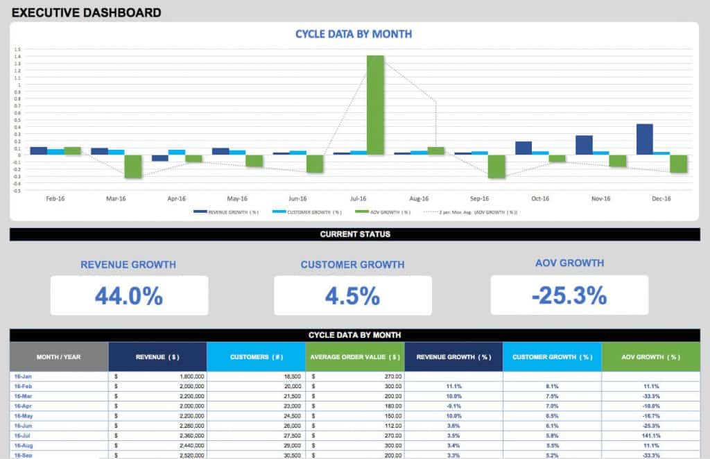
Key Highlights
- Monthly data (for the complete year).
- Monthly revenue.
- Growth in revenue.
- Total number of customers.
- Increase in customers.
- AOV (Average Order Value).
- Progress in AOV.
Click here to download the Executive KPI dashboard template in Excel format.
2. Business Dashboard Template
Business dashboard template depicts the overall growth of the business over a tenure, generally in the span of quarters and then cumulative at the end of a year. The goals and actuals of each and every important aspect of business are drafted in this Excel template. The dashboard template displayed here can be very handy. In fact, you can customize it more effectively based on your need.
Key Highlights
- Monthly budget goals.
- Monthly budget actuals.
- Annual budget goals.
- Annual budget actuals.
- Monthly revenue goals.
- Monthly revenue actuals.
- Annual revenue goals.
- Annual revenue actuals.
- Gross profit margin.
- Net profit margin.
- Monthly debt to equity ratio.
- Annual debt to equity ratio.
Click here to download the Business KPI dashboard Excel template.
3. Financial Dashboard Template
Financial dashboard template is jotted down with all the key financial metrics related to the business are converted into graphs and pie charts and jotted down into the Excel template. This helps in analyzing where the funds are distributed and which product or service is generating more revenue for the business.
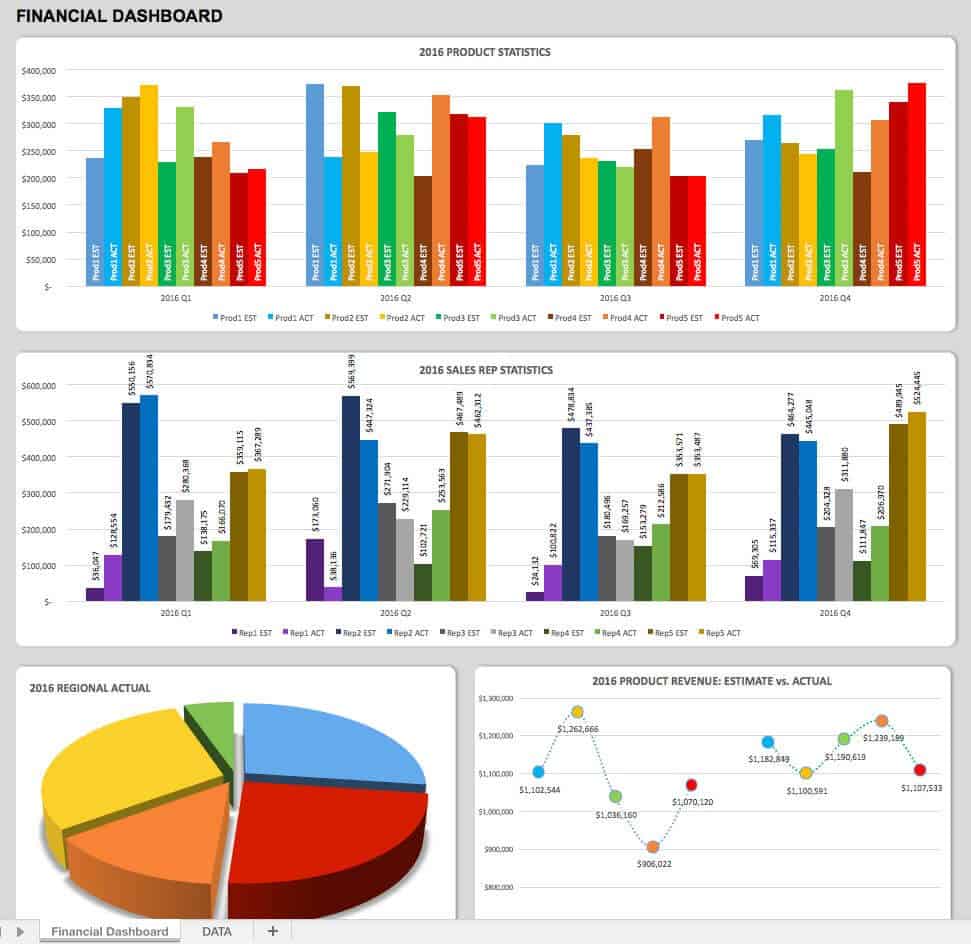
Key Highlights
- Product revenue estimated/quarter.
- Product revenue actual/quarter.
- Annual product revenue estimated.
- Annual product revenue actual.
- Regional revenue.
Click here to download sample Financial KPI dashboard Excel template for free.
4. Sales Management Dashboard Template
Sales management dashboard template is used to analyze the sales of each and every product across the globe. It is very easy to draw conclusions from the template provided here for download. From the conclusions drawn, you can drive your resources in a more effective and efficient way.
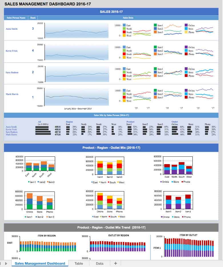
Key Highlights
- Referral sales tracking.
- Region sales data.
- Item wise sales distribution.
- Mode of sales happened [Outlet].
- Item vs Region.
- Outlet vs Region.
- Item vs Outlet.
Click here to download sample sales management KPI dashboard Excel template for free.
5. Lead Generation Dashboard Template
Lead generation dashboard templates can have a better picture of total leads generated and how much percentage of the leads are converted to sales. The follow-up input and its response from each lead are taken into account in developing this dashboard thereby making it more productive.
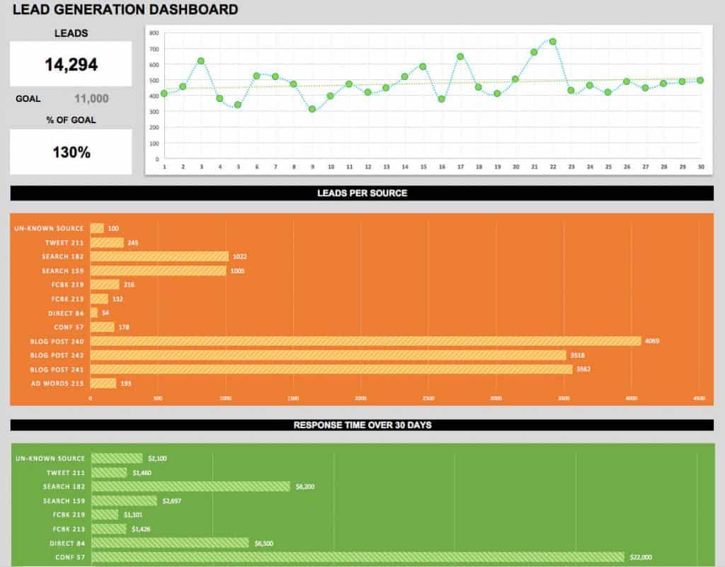
Key Highlights
- Leads generated.
- Percentage of goal reached.
- Leads per source.
- Untargeted leads.
- Response time (30 days).
Click here to download the Lead generation KPI dashboard Excel template.
6. Marketing Dashboard Template
Marketing dashboard template helps you in creating value to the product, getting leads, achieving goals and establishing a brand. Understanding the market and creating plans and strategies which lead to the development of the sales in the market are taken into account in developing a best KPI dashboard for marketing needs. Configure it to your needs and make the best use of this marketing template.
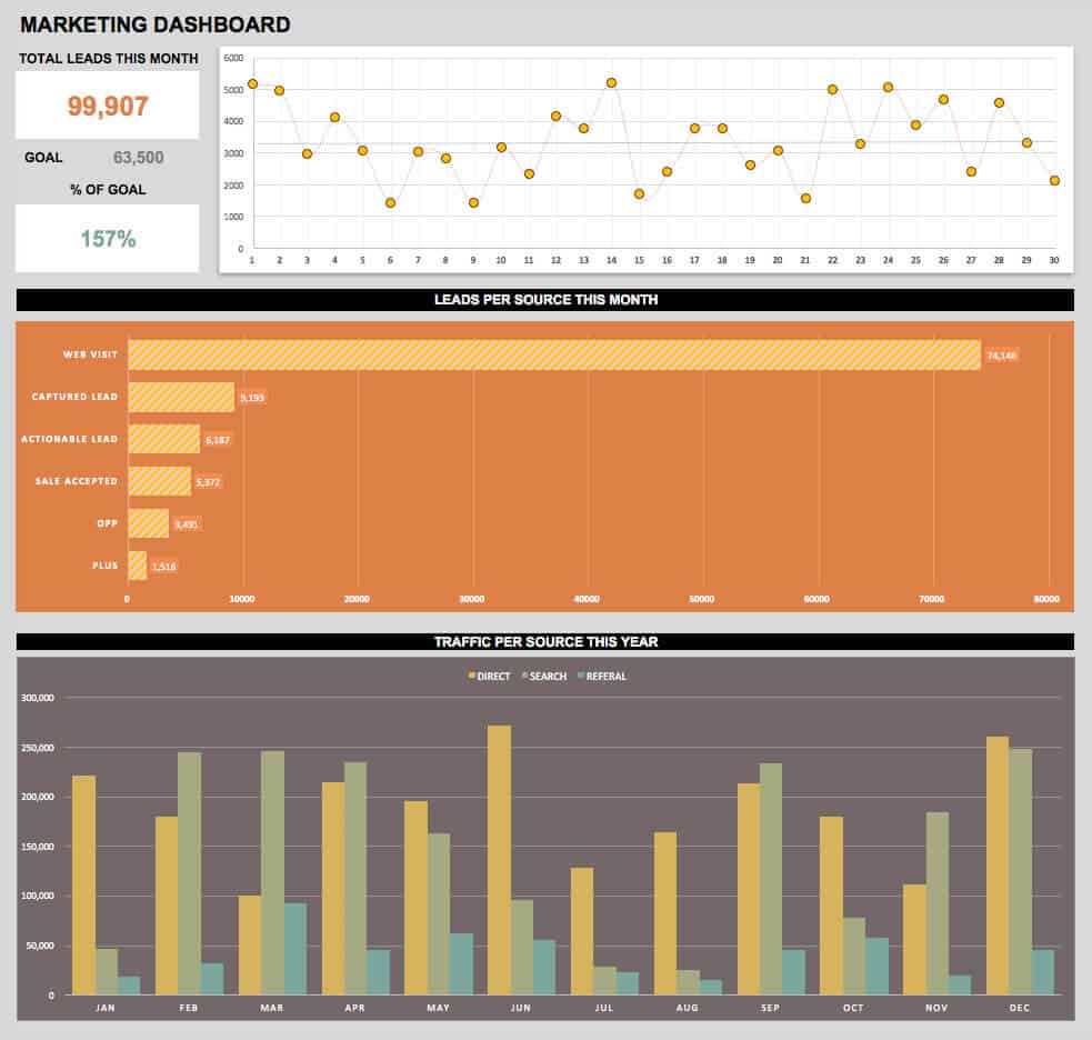
Key Highlights
- Leads per source/month.
- Leads per day/month.
- Percentage of goals achieved.
- Traffic per source/month.
- Annual traffic per source.
Click here to download Sample Marketing KPI dashboard Excel template.
Social media dashboard template helps you in tracking all kinds of audience engagement on social media. This includes various social networking sites like Facebook, Google Plus, Linkedin, YouTube, etc. This dashboard blends all outlet engagement in the spotlight for easy tracking.
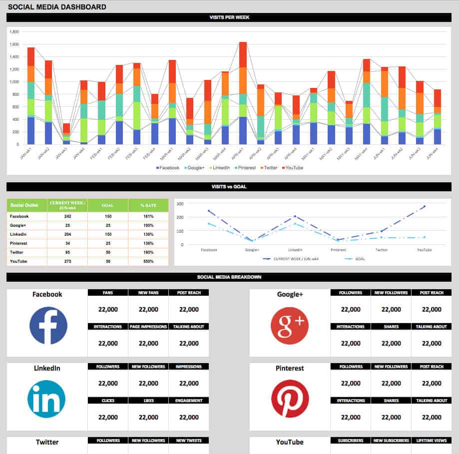
Key Highlights
- Total visits per week.
- Total visits for a year.
- Visits vs Goals.
- Facebook fans, post reach, interactions, page impressions and talking about.
- Google plus followers, post reach, interactions, shares and talking about.
- Linkedin followers, impressions, clicks, likes and engagement.
- Pinterest followers, post reach, interactions, shares and talking about.
- Twitter followers, tweets, retweets, mentions and favorites.
- YouTube subscribers, lifetime views, monthly views, likes, and comments.
Click here to download sample Social media KPI dashboard Excel template for free.
8. Digital Marketing Dashboard Template
Digital marketing dashboard template is one of the evolving and authoritative mode of marketing for startups as well as industry experts. One who has professional digital marketing skills can reach more customers through organic search. Still, startups find their way into digital marketing through paid search across all digital platforms. All these digital marketing metrics can be viewed and analyzed on a single digital marketing dashboard provided here.
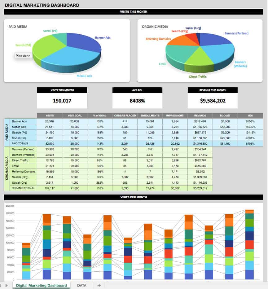
Key Highlights
- Paid Media.
- Organic Media.
- Views generated/month.
- ROI (Return On Investment).
- Revenue/month.
- Annual views generated.
- Average ROI.
- Various types of Organic Reach.
- Various types of Paid Reach.
Click here to download sample Digital Marketing KPI dashboard Excel template for free.
9. Email Marketing Dashboard Template
Email marketing dashboard template includes tracking of leads, creating multiple campaigns and some other key metrics. The template provided here will help you to keep track of all your subscribers and their active/passive engagements etc.
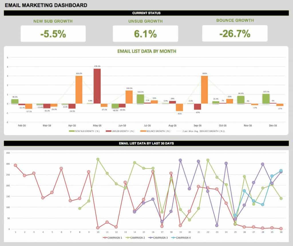
Key Highlights
- New subscribers.
- New subscribers growth.
- Unsubscribers.
- Unsubscribers growth.
- Bounce rate.
- Bounce rate growth.
- Email data for all campaigns.
Click here to download sample email marketing KPI dashboard Excel template.
10. Project Management Dashboard Template
Project management dashboard template helps you in meeting project-oriented goals with quantifiable project management metrics like financial status, risk mitigation, deadlines, etc. The template provides here include all the key performance indicators required for project management. Hope you do not need any revisions for the Excel template provided here.
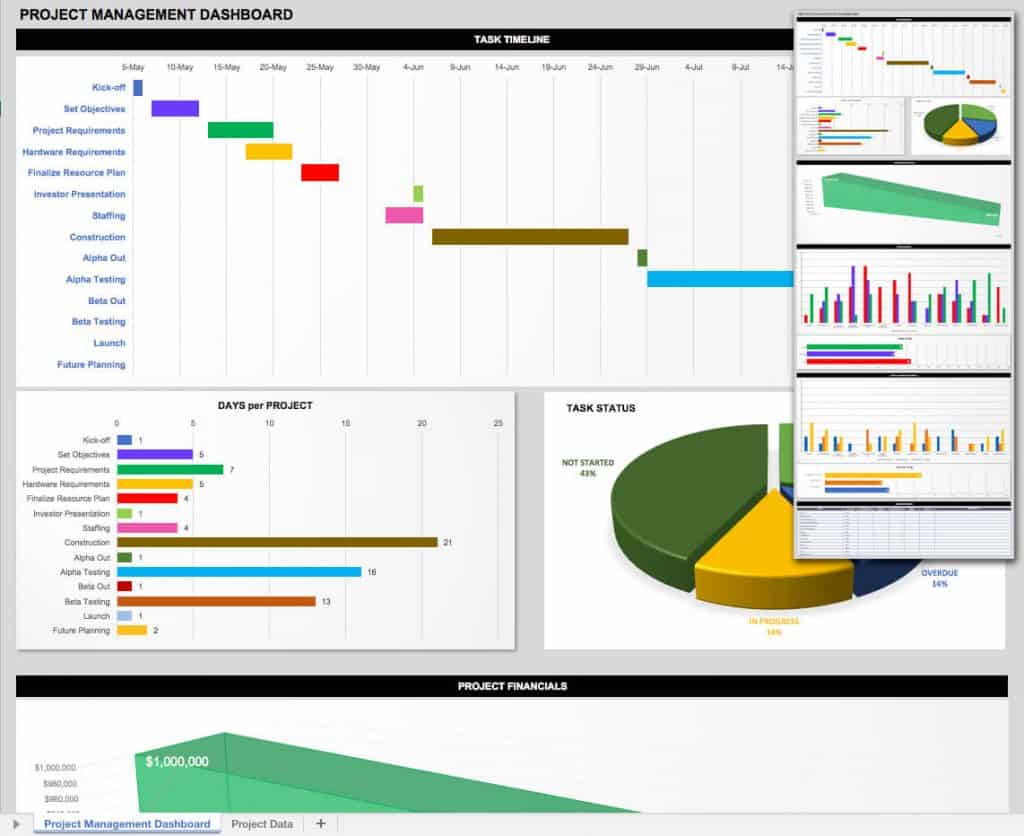
Key Highlights
- Exit from Project.
- Project objectives.
- Requirements of project.
- Infrastructure requirements.
- Planning of resources.
- Staffing.
- Alpha out.
- Alpha testing.
- Beta out.
- Beta testing.
- Launch of product.
- Future enhancements.
- Days per project.
- Task status.
- Project financials.
Click here to download the project management KPI dashboard Excel template.
11. Development Operations (DevOps) Dashboard Template
DevOps dashboard template is a must for any organization since it is one of the emerging technologies in the current IT industry. Any application or website development involves an agile team working on the operations like development, testing, alpha and beta releases, etc. keeping track of DevOps metrics is highly recommended and hence we are providing a dashboard template for free.
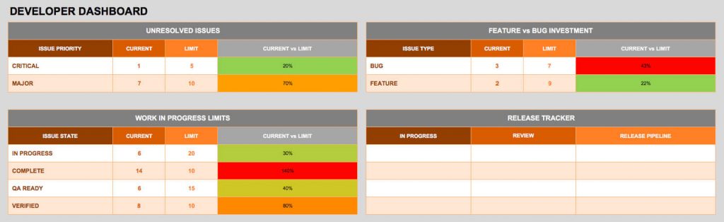
Key Highlights
- Unresolved Issues.
- Resolved Issues.
- WIP (Work In Progress) Limits.
- Feature Investment.
- Bug Investment.
- Feature vs Bug Investment.
- Release Tracker.
Click here to download sample DevOps KPI dashboard Excel template for free.
12. Product Metrics Dashboard Template
Product metrics dashboard template includes key metrics like product revenue for each and every item, revenue breakdown and performance of the product. The dashboard template provided here covers all the above and can be customizable as always.
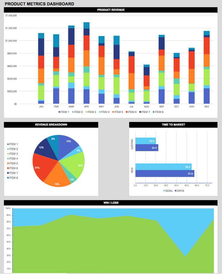
Key Highlights
- Product revenue/month.
- Annual product revenue.
- Revenue breakdown across items.
- Time to market.
- Win/Loss.
Click here to download sample product metrics KPI dashboard Excel template for free.
13. Supply Chain Dashboard Template
Supply chain dashboard template helps for the effective management of the flow of goods and services, raw materials required and inventory. In short, it is providing a suitable product at the right time on the spot. The sample download template provided here includes all the KPIs required to view on the dashboard.
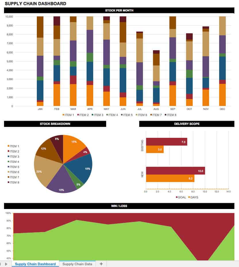
Key Highlights
- Stock/month.
- Annual Stock.
- Individual Stock breakdown.
- Delivery scope of existing products.
- Delivery scope of the new products.
- Win/Loss.
Click here to download sample supply chain KPI dashboard Excel template for free.
14. Customer Service/Call Center Dashboard Template
Customer service/call center dashboard helps in analyzing the real-time business metrics and it boosts the results for sure if one can act on the drawbacks effectively. One of the best services which keep track of live interaction between customer and business is the call center, hence in need of KPI dashboard template. Customer satisfaction is of high priority in customer service.
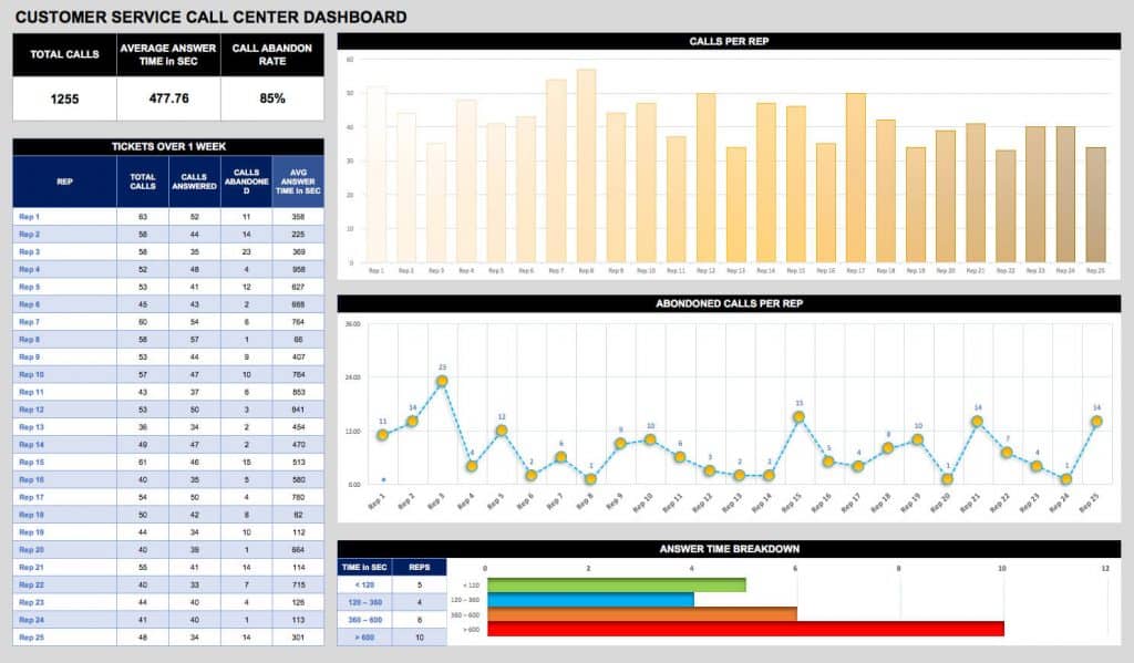
Key Highlights
- Total Calls.
- Average response time.
- Call abandon rate.
- Calls per rep.
- Abandoned calls per rep.
- Answer time breakdown.
Click here to download sample customer service/call center KPI dashboard Excel template for free.
15. Web Analytics Dashboard Template
Web analytics dashboard template helps in robust analysis of the key performance indicators. Giants like Google has their own web analytics tool for easy tracking of blog views, bounce rates, time spent on each page, etc. But you need a blend of all search engine reports to keep track of everything, hence try the template provided below.
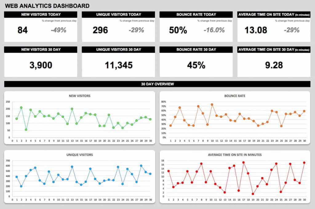
Key Highlights
- Total Visitors/month.
- Unique Visitors/month.
- Returning Visitors/month.
- Bounce rate.
- Average time on site.
- Total visitors/day.
- Unique visitors/day.
- Returning visitors/day.
Click here to download sample web analytics KPI dashboard Excel template for free.
16. SEO Dashboard Template
SEO dashboard template speaks about the key metrics involved in Search Engine Optimization (SEO). It is the technology which is updating its requirements very frequently. If your web page needs to perform well on search engines, it must comply with all those requirements. You need to keep an eye on your competitors to outsmart them. Never begin with an intention you can outrank high authority sites in a month or so, it always takes time. Be patient is the best policy when it comes to SEO.
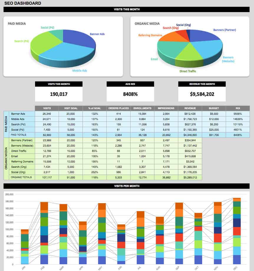
Key Highlights
- Paid Search results.
- Organic search results.
- Referring Domains.
- Email traffic.
- Campaign Ads.
- Visits/month.
- Annual Visits.
Click here to download SEO KPI Excel template.
17. Retail Analysis Dashboard Template
Retail analysis dashboard template helps in analyzing the performance of three key pillars – product, customer, and salesperson for the success of the business. Tracking the retail business every week, every month, every quarter, and every year brings out the best suggestions for the future.
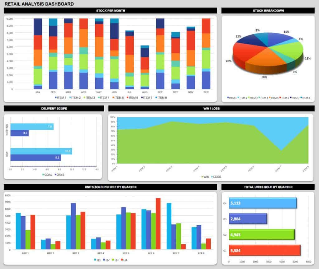
Key Highlights
- Stock breakdown.
- Stock/month.
- Existing delivery scope.
- New delivery scope.
- Win/Loss.
- Quarterly units sold/rep.
- Annual units sold/rep.
- Total units sold/quarter.
- Annual units sold.
Click here t0 download sample retail analysis KPI dashboard Excel Template for free.
18. E-commerce Dashboard Template
E-commerce dashboard template deals with sellings of various product online. With the advancement in technology, shopping is no longer limited to offline. E-commerce has paved a way for online shopping. Sooner or later all the products will make their entry into the e-commerce field. This is just a digital way of selling products hence the dashboard will be a mixture of SEO KPIs and Sales KPIs.
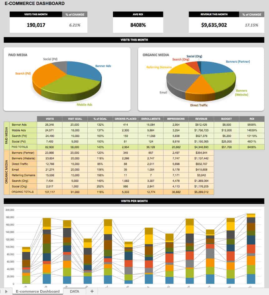
Key Highlights
- Visits/month.
- ROI.
- Revenue/month.
- Paid search.
- Organic search.
- Various ad results.
Click here to download sample E-commerce KPI dashboard Excel template for free.
19. HR Dashboard Template
HR dashboard template helps in managing Human Resources for the smooth functioning of any organization. Recruitment of new employees, taking care of them, and employee satisfaction are some of the KPIs for achieving better results. Employees are the huge assets to the organization, as long as they are satisfied the organization has extended support from them.
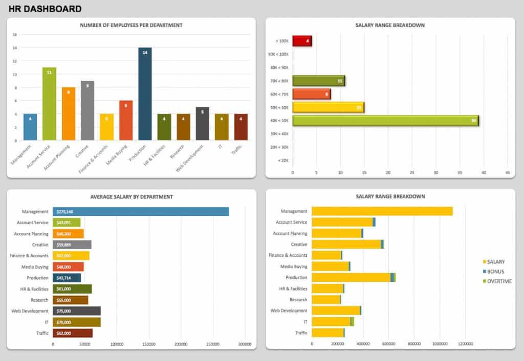
Key Highlights
- Employees per department.
- Salary breakdown.
- Average salary by the department.
- Bonus.
- Overtime.
Click here to download HR KPI dashboard Excel template for free.
20. Productivity Dashboard Template
Productivity dashboard template helps in measuring is the KPIs to portray whether an organization is running up to the mark or not. The productivity of an individual affects the productivity of the team, which in turn impacts the productivity of a vertical and finally, it has a huge impact at an organizational level. Hence productivity dashboard should be able to depict everything at the highest level of accuracy.
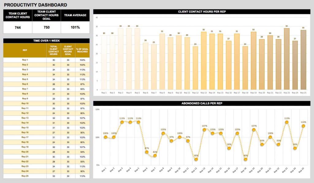
Key Highlights
- Expected client contact hours.
- Actual client contact hours.
- Client contact hours per rep.
- Abandoned calls per rep.
- Average hours.
Click here to download sample productivity KPI dashboard Excel template for free.
21. Insurance Claims Dashboard Template
Insurance claims dashboard template which provides you complete details about various types of insurance claims is inevitable. Any organization have to safeguard their employees and should be able to contribute to providing a better lifestyle. It is again a financial burden to the organization, but they should never neglect this.
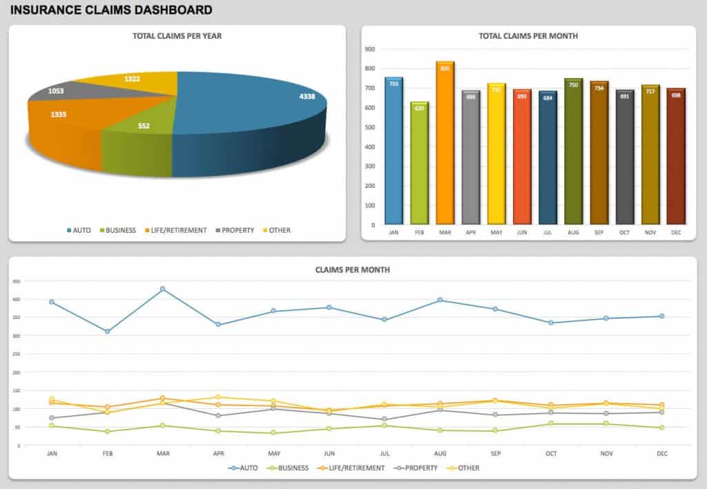
Key Highlights
- Automobile insurance claims.
- Business insurance claims.
- Life insurance claims.
- Property insurance claims.
- Other insurance claims.
- Total claims/month.
- Total claims/year.
Click here to download insurance claims KPI dashboard Excel template for free.
Final thoughts on KPI templates
All best KPI dashboard Excel templates listed here will meet the needs of any organization ranging from a low-level organization (startups) to high-level organization (well established).
Hope you find the most important KPI dashboard Excel templates which you want to download. If you are searching for any other KPI template which you didn’t find here, please let us know through the comments section. Appreciate our efforts by sharing this article on social media and let others know the importance of KPI.

- →
- →
Дашборд в Эксель с примерами: что это такое и как все сделать правильно
Успех бизнеса напрямую зависит от тщательного и своевременного контроля ключевых показателей. Для отслеживания метрик компании идеально подходят дашборды. Как приборная панель автомобиля, они позволяют увидеть самые важные результаты в одном месте. Появляется возможность следить за операционной деятельностью, находить в ней проблемные зоны и получать инсайты на основе реальных измерений. Главное, нет необходимости устанавливать дополнительные программы: в этой статье — инструкция для «чайников», как сделать дашборд в Excel.

Вся нужная информация на такой интерактивной панели подана в виде графиков и диаграмм: это помогает легко воспринимать ее и быстро получать ответы на главные вопросы бизнеса с помощью объективных показателей.
В качестве целей этого инструмента можно выделить следующие:
• объединение информации из разных источников;
• создание единой структурированной системы метрик;
• интерактивное представление результатов.
Кроме того, он позволяет более подробно изучить показатели без погружения в дебри аналитических выгрузок и не требует специальных навыков и знаний от своих пользователей. То есть, если сказать простыми словами, дашборд – это (в Эксель в том числе) продвинутый вариант отчета, который содержит ключевые данные в понятном и наглядном виде.
Как это помогает бизнесу
Создание дашборда требует определенных усилий и времени. Но они с лихвой окупаются, потому что у такого формата подачи данных есть неоспоримые достоинства.
• Пользователь получает целостную картину сразу по всем значимым показателям.
• Информацию легко и удобно анализировать — она представлена в сводном виде в одном окне. Множество таблиц просто не нужно.
• Грамотная визуализация не только упрощает восприятие, но и повышает уровень доверия к данным.
• Интерактивная панель позволяет посмотреть на данные в разных разрезах и получить бизнес-инсайты, незаметные в простом отчете.
• Обсуждение показателей внутри компании становится более конструктивным, потому что отчетность понятна и наглядна для всех.
Удобный мониторинг изменений в режиме онлайн — еще одно важное достоинство интерактивных сводок для любой компании. Своевременное создание дашборда в Эксель позволит, например, вовремя заметить падение продаж по сравнению с прошлым месяцем и оперативно принять меры. Или увидеть, по каким проектам план не выполняется, какие менеджеры лучше справляются с определенным этапом в ведении сделок и так далее. Все это становится реальным благодаря сжатию большого объема информации до одной страницы.
интерактив на базе сводных таблиц в Excel
грамотная визуализация любых данных
наглядные отчеты для вашего руководства
Интерактивные отчеты, которые понравятся директору
Кому этот инструмент нужен в работе
Такие аналитические панели полезны для всех деловых людей, стремящихся повысить «производственную» эффективность, которую можно измерить конкретными показателями.
Виды дашбордов в Эксель различаются по своим целям и аудитории: что это значит? Часто они нужны руководителям компаний и направлений, и каждый хочет увидеть то, что важно для него.
Идеальная картина предполагает систему сквозных дашбордов. Ее можно представить как пирамиду данных: от нижнего операционного уровня (продано единиц товара, потрачено рублей) до верхнего стратегического (выполнение бизнес-плана, отраслевых KPI, прибыль, расходы). Активными пользователями информационных панелей также считаются сотрудники следующих подразделений.
Отдел маркетинга
Эти специалисты должны измерять и анализировать реакцию аудитории на продукт. Например, оценивать эффективность рекламной кампании. Сотрудники, которые разобрались, что такое и как сделать интерактивные дашборды в Excel, оперативно обрабатывают результаты онлайн-анкетирования клиентов. Видя показатели по наиболее интересующим сегментам, специалисты понимают, как должен развиваться бренд и на какую аудиторию ориентироваться.
На дашборде с отчетом по маркетингу можно видеть, например, следующее:
• общий объем расходов;
• динамика и структура расходов;
• соотношение с бюджетом на рекламу;
• эффективность каналов продвижения.
Отдел продаж
Аналогично коллегам из маркетинга, эти сотрудники контролируют выполнение своих KPI. Благодаря дашбордам продажникам удается проверять статистику по ключевым показателям. Диаграммы-воронки позволяют отслеживать протекание сделок, а фактоиды и гистограммы — наблюдать за работой каждого менеджера в отдельности.
Собранные на одном экране графики помогут определить, какие показатели можно повысить быстрее всего. А если помнить про дашборды, что это такое сочетание данных в Экселе, которое можно изменять в любое время, инструмент полностью подходит для оперативной корректировки в случае необходимости.
Типичные метрики для анализа:
• общий объем продаж и выполнение плана в динамике;
• структура продаж, лидирующие и отстающие продукты;
• лучшие и худшие сотрудники;
• средние показатели (чек, объем продаж на менеджера).
Решение задач бизнеса с помощью аналитики
Кейсы и лайфхаки от практика
Excel, Power BI, PowerPoint
Обучение на реальных бизнес-задачах
Курсы по визуализации и аналитике данных
Руководители
Бегло просматривая дашборд каждым утром, глава компании или отдела держит руку на пульсе своего подразделения. Он не просто контролирует самые важные метрики, но и сразу видит, когда в организации что-то идет не так. В случае необходимости руководитель может принять решение на основе достоверных данных, поступающих в режиме реального времени.
Содержание дашборда руководителя зависит от направления деятельности компании, но некоторые типичные метрики можно обозначить так:
• выполнение бизнес-плана;
• показатели прибыли и расходов;
• эффективность инвестиций в новые проекты;
• удовлетворенность клиентов;
• текучесть персонала;
• специфические отраслевые показатели.
Кто может построить дашборд
Чаще всего это делают бизнес-аналитики, потому что очень важно обеспечить корректную исходную информацию для разработки. Но научиться могут и другие специалисты. Например, среди студентов курса «Обработка данных» много менеджеров среднего звена из компаний с разными направлениями деятельности.
Построить интерактивную сводку может любой желающий, если он будет следовать определенному алгоритму. В этой статье рассмотрим, как создать дашборд в Excel с нуля: примеры, которые мы приведем, вы сможете адаптировать под свои задачи. По мере развития навыков визуализации данных каждый новый интерактивный отчет будет даваться проще и интереснее.
Чем больше показателей, тем сложнее анализ
В любой компании и даже в отдельных подразделениях существует множество регулярных и разовых отчетов, например:
• по регистрации корреспонденции;
• по продаже товаров или услуг;
• по жалобам и обращениям
• по финансам;
• по производственным процессам (выработка, простои оборудования и прочее);
• по персоналу (подбор, увольнения, несчастные случаи на производстве и так далее);
• по мониторингу рынка;
• отчет по расходам.
Когда нужно подвести итоги периода, защитить проект или проанализировать текущие показатели, часто начинаются проблемы. Как из множества отчетов выделить KPI? Как определить их динамику и вовремя заметить сложившуюся тенденцию? А если данные отличаются по формату и методике расчета, ситуация становится критической.
Сотрудники организаций выгружают данные из CRM-систем или собирают их руками (если не повезет), делают из них отчеты. При этом многие из них даже не знают, что могут самостоятельно
освоить создание дашбордов в Excel
шаг за шагом за несколько дней.
Чем инфографика отличается от дашборда
Часто СМИ в своих публикациях используют красочные стилизованные диаграммы и графики, иллюстрирующие содержание материалов. Это усиливает аналитическую составляющую статей и добавляет им веса.
Инфографика — статичная (преимущественно) информация, которая служит именно иллюстрацией и разнообразит текст в восприятии читателей. А важное свойство дашборда — как раз интерактивность, гибкость, возможность внесения изменений. Работа с ним не ограничивается «прочтением» диаграмм и графиков, а подразумевает дальнейшее взаимодействие.
• Инфографика — про форму.
• Дашборды — про содержание.
Но разница не только в наличии интерактивных элементов (например, срезов): она есть и в объеме информации, и в задачах. Впрочем, умение обращаться с инфографикой может помочь создавать дашборд в Эксель — пример нестандартного подхода к визуализации данных в этом деле точно не будет лишним.
Темы для отображения: от показателей бизнеса до политических историй
Информационные панели имеют широкий спектр применения: от финансовой отчетности до визуализации результатов исследований и опросов. Всё зависит от целей и задач их заказчиков.
Разработчики программного обеспечения для создания профессиональных дашбордов (Tableau, Microsoft) создают целые галереи наиболее интересных, актуальных и красивых работ на разные тематики, например:
• достижения спортсменов и статистика по видам спорта;
• культурные и социальные события;
• вопросы безопасности и экологии;
• рейтинги кинофильмов и статистика популярных стриминговых платформ;
• медицина и здравоохранение.
Сейчас дашборды активно используются коммерческими предприятиями, государственными компаниями и учреждениями, научными и исследовательскими институтами, благотворительными организациями и фондами.
В общем, если у вас есть данные по любой теме, и их нужно визуализировать и проанализировать, вы можете это сделать. Наша пошаговая инструкция о том, как создать дашборд в Экселе, покажет скрытые возможности этого инструмента.
Однако важны не сами графики, а то, как они помогают достигнуть поставленной цели. Если вы умеете формулировать вопросы или предлагаете корректные гипотезы, которые подтверждаются с помощью измерений, то дашборд — это ваш союзник. В бизнесе отсутствие интерактивной сводки с результатами работы уже можно считать поводом для ее построения.
Как построить дашборд
Разработка интерактивной информационной панели предполагает поэтапную обработку данных. На каждом шаге можно решать разные задачи и выступать в новой для себя роли. Например, на начальном этапе важно проявить свои аналитические способности и установить ключевые для выбранной области показатели. В финале пригодится хороший глазомер и чувство стиля, чтобы итоговый продукт был не только информативным, но и «цеплял» своей картинкой.
Схематично построение дашбордов в Excel можно разбить на несколько этапов:
• определение целей дашборда;
• сбор первичных данных;
• создание сводных таблиц и диаграмм;
• сборка дашборда, настройка интерактивных срезов.
Это творческий процесс, требует нестандартного взгляда и мышления. Визуализация данных заставляет по-другому посмотреть на имеющуюся информацию и привести к неочевидным выводам (инсайтам). Довольно увлекательное путешествие в мир аналитики.
Переходим к процессу проектирования. Разобравшись в предлагаемом алгоритме построения, вы поймете, что финальная версия дашборда — это только вершина айсберга. Пришло время узнать, что лежит в его основании.
Создаем дашборд в Excel по шагам
Продажи – двигатель и ключевой источник прибыли многих компаний. Поэтому представим, что делаем дашборд для руководителя соответствующего отдела. В качестве «подопытного» образца выступает выгрузка данных по продажам строительной компании (все названия и фамилии вымышленные, совпадения случайны).
Все этапы работы разделим на шаги:
• постановка целей и создание макета;
• работа с данными;
• создание сводных таблиц;
• выбор диаграмм и их перенос на лист с отчетом;
• добавление срезов для интерактивности;
• настройка условного форматирования (если нужно);
• Profit!
На примере разберем пошагово механизм создания и сборки интерактивной информационной панели, тем более что с тем, что такое дашборд в Excel и как построить его самостоятельно, мы уже немного разобрались.
Определяем цели, выбираем макет
Чтобы по ходу использования изменений было меньше, на старте стоит сформулировать задачи для интерактивной панели. Мы будем собирать ее для руководителя продаж строительной компании, определим такой список целей:
• получить наглядные данные о выполнении плана;
• увидеть показатели продаж в динамике;
• узнать, какие проекты наиболее прибыльные;
• выяснить, какие объекты недвижимости лучше продаются;
• оценить успешность работы менеджеров.
Определив, что мы хотим увидеть в дашборде, приступаем к разработке макета. Это можно сделать просто рисунком от руки на листе бумаге. Чем проще, тем лучше, так как на данном этапе важнее содержание, а не оформление.
Структура дашборда, который помог бы нам получить ответы на эти вопросы, схематично может выглядеть так:

Вверху — карточки с ключевыми показателями эффективности (KPI), в центре и внизу — диаграммы и таблицы, слева — срезы, которые оживят данные, сделают dashboard Excel интерактивным.
Собираем данные
В выгрузке должна быть информация, которая ответит на ключевые вопросы конечного пользователя, подсветит возможные проблемы и взаимосвязи. Дашборд на основе такой выгрузки покажет, например:
• наиболее прибыльные проекты;
• успешных и отстающих менеджеров;
• какие типы недвижимости продаются лучше;
• кто из сотрудников не справляется;
• где и почему не выполняется план продаж.

В данном случае выгрузка содержит следующий набор данных:
• названия проектов;
• фамилии менеджеров по продажам;
• периоды совершения сделок;
• виды объектов недвижимости;
• фактические и плановые данные по продажам;
• фактические и плановые данные по оплатам;
• число фактических сделок;
• сроки сделок от начала и до конца.
Дополнительно сразу рассчитано выполнение плана по продажам и оплатам: фактические показатели разделить на плановые.
Важный момент. При подготовке данные должны быть приведены в так называемый «плоский» вид: информация — в отдельных строках, а в столбцах — только однородные данные. Иначе будет сложно собрать даже простую сводную таблицу, не что дашборд. Подробнее о популярных «косяках» в этом процессе можно прочитать в моей
статье про топ-8 проблем с данными
.
Формулы и функции, которые упростят жизнь
Грамотная работа с моделью данных
Обработка данных в несколько кликов
Навыки для простой и быстрой работы с данными
Основы DAX и Power Query в Excel
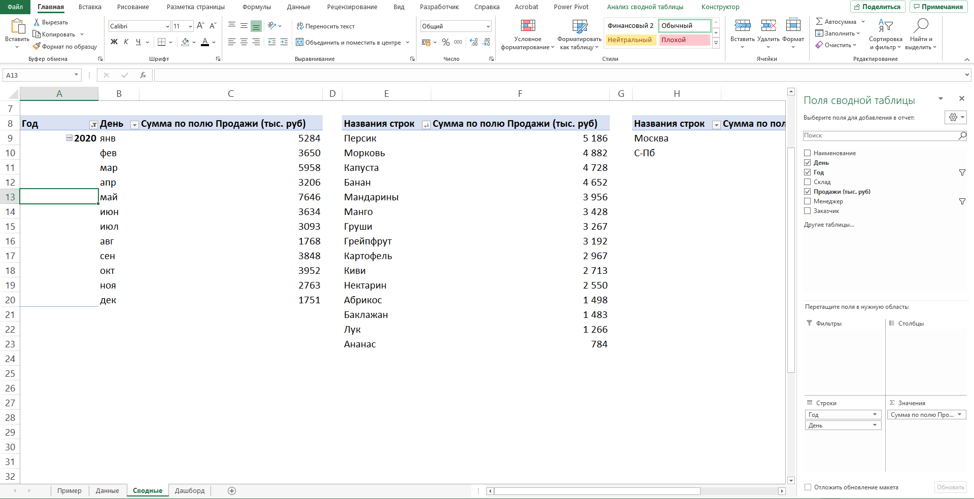
Строим сводные таблицы
Перед тем как сделать дашборд в Экселе, на основе имеющейся выгрузки построим несколько сводных таблиц по продажам. Для этого ставим курсор на любую ячейку и переходим к пункту меню «Вставка» → «Сводная таблица». В появившемся окне выбираем «Новый лист».

Лист со сводными таблицами для удобства можно так и назвать — «Таблицы». Вкладку Excel с исходными данными обозначим как «Данные» и сразу сделаем еще один лист «Отчет» для будущего дашборда.

На листе «Таблицы» создаем сводную таблицу. Она формируется на основе данных, которые мы выберем из предложенного списка и расположения в соответствующих областях.
В первую таблицу включим данные о фактических продажах и показатель выполнения плана в процентах (рассчитан делением фактических значений продаж в рублях на плановые). Это поможет нам получить график выполнения плана продаж в динамике.
Важный нюанс: при подсчете показателей по периодам Excel автоматически добавляет кварталы. Так как мы будем смотреть данные помесячно, они нам не понадобятся. Поэтому в сводной таблице в графе «Кварталы» нужно убрать галочку.

Еще один лайфхак, который упростит работу. В разделе «Параметры сводной таблицы» (вызывается правой кнопкой мыши), следует убрать галочку в поле «Автоматически изменить ширину столбцов при обновлении». Это позволит зафиксировать ширину сводной таблицы и упростить создание следующих сводных таблиц, на базе которых мы будем добавлять новые визуальные элементы.
Отдельная сводная таблица понадобится для каждого графика или диаграммы, а также для настройки карточек KPI, которые мы расположим в верхней части дашборда.
На картинках ниже — как будут выглядеть данные для визуализации конкретных метрик: продажи по проектам, по типам недвижимости, показатели эффективности сотрудников и информация для карточек KPI.
Для визуализации с информацией по продажам в разрезе проектов
Для графика с данными о продажах по типам недвижимости
Для отчета по эффективности работы менеджеров
Для карточек с ключевыми показателями (KPI)
Этот навык стоит освоить «от и до»: сложностей в нем нет, и инструкция поможет разобраться. Если же что-то не получается, лучше пройти краткий
курс по созданию дашбордов в Excel
, потому что это — необходимая база. Буквально за 5 дней вы научитесь без ошибок совершать нужные действия, просто следуя инструкциям в видео.
Создаем диаграммы на основе сводных таблиц
Переходим к визуализации. Для каждого «сводника» нужна своя диаграмма, но делать ее для отчета по менеджерам и карточкам KPI мы не будем. Отчет по менеджерам можно будет просто скопировать и преобразить с помощью функций условного форматирования. Для KPI сделаем отдельные карточки, которые расположим вверху дашборда.
На этом этапе особой красоты не требуется (потом займемся), достаточно корректно выбрать тип диаграммы: это делаем через пункт меню «Конструктор» → «Изменить тип диаграммы». В появившемся окне выбираем нужное. На первой и второй картинках — комбинированные диаграммы, на третьей — линейчатая.
Комбинированная диаграмма для визуализации плана-факта продаж
Комбинированная диаграмма для сравнения числа сделок и поступивших оплат
Линейчатая диаграмма для сравнения продаж по типам помещений
Добавляем карточки ключевых показателей (KPI)
Начинаем сборку дашборда! Для этого в Excel-файле мы уже заготовили вкладку «Отчет».
Карточки KPI располагаются в верхней части дашборда и быстро информируют о главных показателях. Чтобы их создать, переходим в пункт меню «Вставка» → «Иллюстрации» → «Фигуры» → «Прямоугольник».
Название добавляем с помощью пункта «Надпись» в меню. Дополнительные показатели (например, чтобы сравнивать KPI с плановым значением) можно добавить аналогичным способом — это те же карточки, только внутри более крупных.

Переносим диаграммы на отдельный лист
Все их нужно переместить на созданный для этого лист «Отчет» — располагаем согласно макету и наводим красоту:
• скрыть кнопки;
• переместить легенды наверх;
• убрать линии на графиках и контуры.
Это освободит место, поможет легко считывать легенды диаграмм и добавит стиля нашему будущему интерактивному отчету.
Создание дашборда в Эксель предполагает четкое и понятное обозначение визуализаций: каждой диаграмме нужно добавить соответствующее название. Желательно краткое и информативное, чтобы пользователь не тратил время на осознание того, что он видит.
Для этого в Excel есть готовый набор шрифтов, находятся они в пункте меню «Главная» → «Стили ячеек».
Для названия нашего отчета выберем «Заголовок 1», для названия диаграмм — «Заголовок 2»: разный размер шрифта поможет выделить структуру текста и данных.

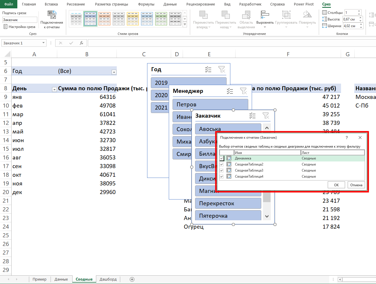
Добавляем срезы на сводных таблицах
Дашборд должен быть интерактивным! Поэтому на листе Excel, где расположена наша таблица, выбираем пункт меню «Вставка» → «Срез».
Отмечаем галочками те данные, которые помогут взглянуть на показатели под разным углом зрения. В нашем случае важно видеть значения по проектам, по периодам, по объектам недвижимости, по менеджерам.

Переносим срезы на лист с отчетом
Это просто: «Вырезать» → «Вставить» на лист с отчетом → расположить так, как задумано в макете.

Важный нюанс: чтобы срезы работали корректно, нужно для каждого из них проверить и настроить подключение к сводным таблицам через пункт меню «Подключение к отчетам».

Добавляем условное форматирование
Это потребуется делать не всегда и не всем, но в нашем случае нужно. Остался последний штрих: копируем на лист «Отчет» сводную таблицу по менеджерам и преображаем ее с помощью пункта «Условное форматирование» в меню (вкладка «Главная»), где доступны разнообразные значки и гистограммы.
Это сделает обычную сводную таблицу полезным информационным ресурсом, который не просто показывает данные по эффективности менеджеров, но и «подсвечивает» тех, кто не выполняет план. Это помогает считать смысл мгновенно.
Пользуемся интерактивным дашбордом в Excel
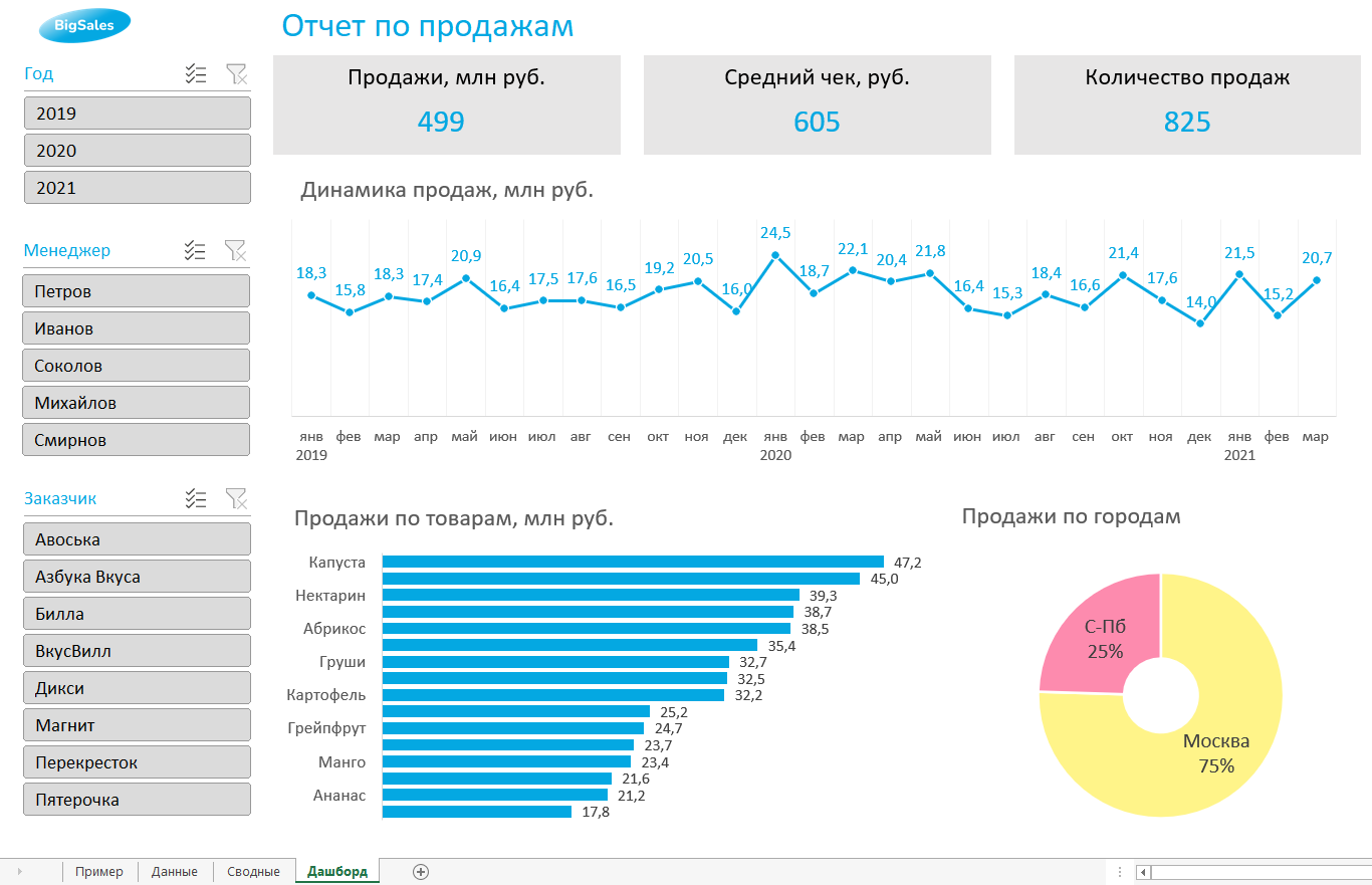
Результат всех пройденных шагов — на картинке ниже. В одном окне мы видим все важные данные, а при необходимости можем фильтровать их и просмотреть детализацию. Например, выбрав проект «Пальмира» в срезах слева, мы получим данные именно по нему: можно сравнивать с другими, видеть, как обстоят дела по всем показателям и так далее.

Конечно, это лишь один вариант того, как можно представить данные в виде интерактивного отчета. Многое зависит от конечного пользователя, его предпочтений, набора имеющейся информации, компетенции и вовлеченности авторов дашборда.
Подведем итоги
Надеемся, вы получили понятную инструкцию про создание дашбордов в Excel шаг за шагом, а шаблоны, которые можно сделать по нашему примеру, помогут ее повторить. Теперь вы знаете, что интерактивный дашборд можно разработать и создать без дорогих профессиональных программ и в отсутствие специальных познаний.
Вам понравилась статья?

![]()
Подпишись на рассылку и получи в подарок «Каталог лучших отраслевых дашбордов»!
Хочешь получать актуальные статьи о визуализации данных?


A KPI dashboard is one of the most powerful data visualization tools to show progress toward business objectives and opportunities for strategic growth. But creating a dashboard in Excel comes with a set of productivity and usage challenges. It’s a time-consuming task!
In our step-by-step Excel Dashboard guide, we learned how to build a standard dashboard from the ground up. We’re back with practical steps to take it to the next level! This guide will cover:
- How to manage your time better throughout the Excel dashboard build process
- Which high-level metrics to include in your Excel dashboards for specific audiences
- Free Excel dashboard templates to get started
- An alternative to Excel for mobile data visualization
Ready when you are! 🏁
How to Create a KPI Dashboard in Excel (Free Templates & Examples)
4 Steps to Building an Excel KPI Dashboard
An Excel KPI dashboard is a collection of various graphs and charts organized in a spreadsheet. It represents the most critical key performance indicators to a specific audience.
Busy teams are looking for powerful project dashboards to accurately measure projects, trends, and financial metrics in one place. This high-level visibility into the operations and growth of the business is critical to driving immediate actions.
Let’s put on our strategic thinking caps and dive into best practices to 10X your Excel dashboard preparation and build! 📊
Step 1: Ask the right questions to define the right type of KPI dashboard
You will save so much time during the process by making the proper preparations. So before you start any work in Excel, ask these critical questions to your dashboard audience:
What is the purpose of the KPI dashboard?
What version of Excel do they use?
Excel has improved its interface over the years, but some features are not carried over, or they might be moved to different places on the menu bar. This will affect the accessibility—and more importantly, the functionality—of the Excel dashboard.
What specific key metrics linked to business goals must be included?
KPIs will be different depending on your audience and their business function. Remember, too much information will cause clutter and confusion! For a list of KPIs broken down by teams, check out ClickUp’s KPI Examples guide!
Where will the KPI dashboard be displayed?
The design and composition of the Excel dashboard will be highly influenced by where it lives. For example, if it’s presented on a mounted TV screen in the office, you’ll have to resize the charts accordingly, so it’s readable from afar.
Will this be monitored daily/weekly/monthly/quarterly/yearly?
If the Excel dashboard needs to be updated frequently, you might want to consider an intuitive tool that will update in real-time. The likelihood of human error increases when you have to go back in and rework data on your Excel dashboard.
Step 2: Break down expectations for data collection
We often don’t consider how time-consuming collecting information becomes until we open a broken file format. And just like that, an extra two hours are dedicated to correcting this one file. Share with your sources how the data should be formatted and saved, so you’re not making any guesses!
Step 3: Audit and organize the raw data
Now it’s time to get your data into Excel! Open a new Excel workbook and create three separate tabs:
- Raw data tab to host the information you’ve collected from your sources
- Calculations tab to build and organize your Pivot charts
- Dashboard tab to share and present the final KPI dashboard
Next, roll up your sleeves and go through the raw data to fix errors, eliminate duplicates, remove non-printable characters, fix text columns, and clean extra spaces.
Tip: Avoid a looming tech headache by sorting the data from the highest to the lowest range so you can work through this process efficiently.
Step 4: Choose the graphs to best represent your key performance indicators
Here is a breakdown of the most common charts used in KPI dashboards:
| Chart Type | Chart Description | Use This Chart When… |
|---|---|---|
| Column chart | Displays the horizontal (category) axis and values along the vertical (value axis) | You want to illustrate comparisons between items |
| Pie chart | Shows the item sizes in one data series. The data points in a pie chart are shown as a percentage of the whole pie | There is only one set of data series with more than two categories, and no values are negative. |
| Line chart | Organizes the categories along the vertical axis and values along the horizontal axis | You want to show how the data developed over a short period of time |
| Bar chart | Illustrates comparisons among individual items | Values are durations (estimates vs actual) |
| Area chart | Plots change over time and draws attention to the total value across a trend | You want to show how the data developed over a long period of time |
If you want a preview of what the data will look like in chart form, use the Recommended charts tool from the Insert tab. Excel will analyze the data and display different charts with your plotted data.

Tip: Before you roll out the Excel dashboard to the entire group, ask a few team members to give you actionable feedback for improvements. The two primary goals of this step are to confirm if the KPI dashboard clearly summarizes the KPIs and if there are any follow-up questions to take into consideration for the next iteration.
Related Resources:
- How to Create a Project Timeline in Excel
- Project Management KPIs
- How to Make a Calendar in Excel
- How to create Gantt charts in Excel
- How to create a Kanban board in Excel
- How to create a burndown chart in Excel
- How to create a flowchart in Excel
- How to Create an Org Chart in Excel
- How to Make a Graph in Excel
- How to Make a database in Excel
- How to Show a Work Breakdown Structure in Excel
Free Excel KPI Dashboard Templates & Examples
If you’re looking for dashboard templates to jumpstart your process, download these from Geek Dashboard or use them as inspiration!
1. Marketing Dashboard Template
2. Executive Dashboard Template
3. Sales Management Dashboard Template
4. HR Dashboard KPI Template
Limitations of Building KPI Dashboards in Excel
The reality is, not everyone uses Excel. It’s a blocker in the collaboration process, and manually building individual Excel charts is a daunting task that should have the opposite effect. Data becomes outdated quickly in static spreadsheets, and the lack of integrations makes Excel a standalone app. This is a huge sign Excel dashboards are not the most effective solution for business intelligence. And others feel the same way.
In a McKinsey Global Survey, results showed high-performing companies are much more likely than their peers to have deployed a modern data architecture. So what should companies do to outperform their competitors? McKinsey says this:
- Make data available
- Treat data as a product with real return on investment
- Take an agile approach to data transformation
Build a New Standard of Reporting With ClickUp
If you think about it, KPI dashboards in Excel have more to do with translating data from multiple sources than actually taking action from those insights. This is where we need to be cautious because busy work can be mistaken for productivity.
Making the attention shift is easy to do—with the right software. A productivity platform like ClickUp includes all the tools and integrations you’ll need to use data and charts for different audiences.
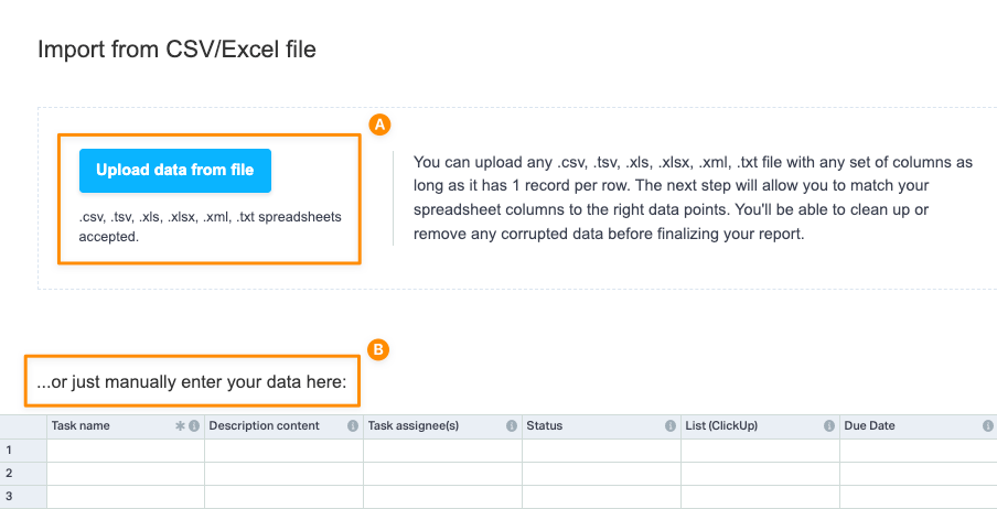
Try it for yourself! Import your work from almost anywhere with ClickUp’s flexible and powerful Excel & CSV import feature.
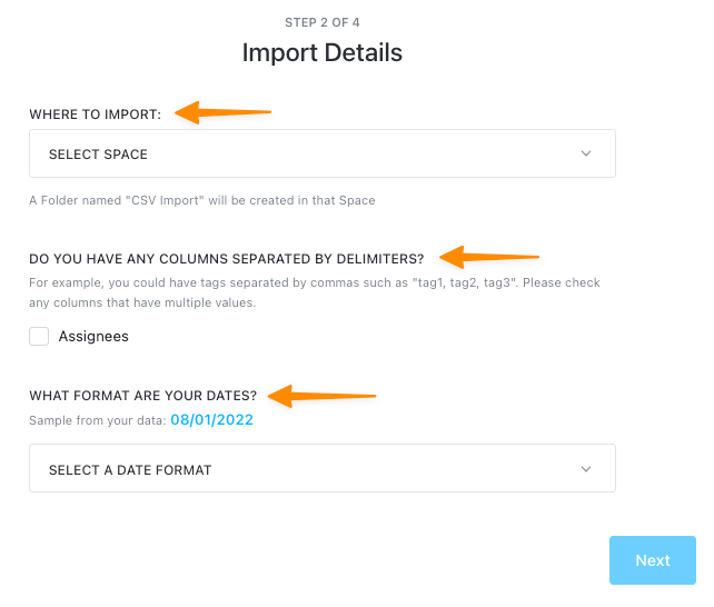
How to Import a Data File Into ClickUp
We have an on-hand file for you to download if you want to follow along! 📁
Step 1: Choose the Excel & CSV option from your Workspace settings to upload a file or manually enter your data
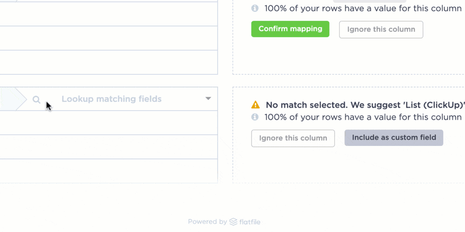
Step 2: Double-check your data looks good in the preview window and map your data to ClickUp fields
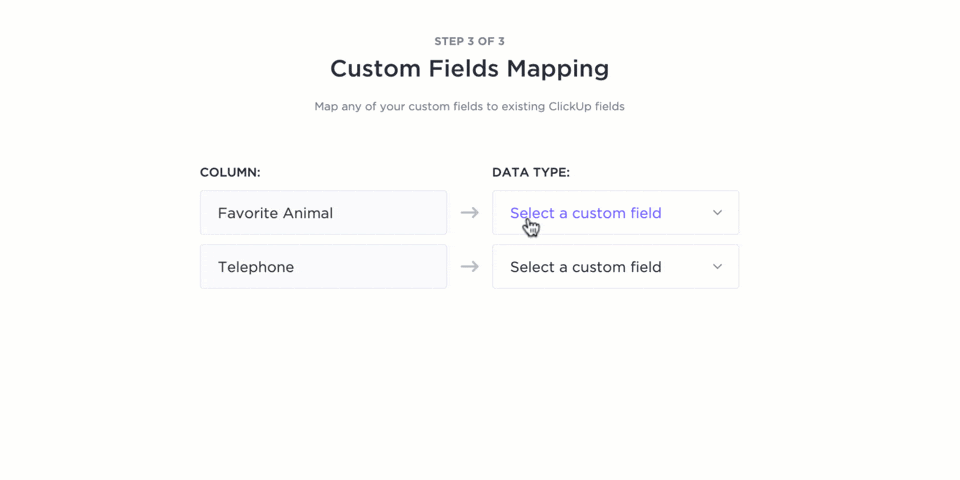
Step 3: Submit the reviewed file for importing
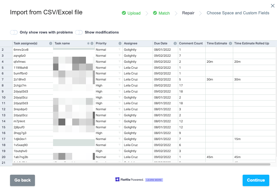
Step 4: Select the Workspace location to import into and finalize the last details
Step 5: Customize your columns by choosing a Custom field to map your data in the best view
Step 6: Check the progress of your Excel file importing into ClickUp
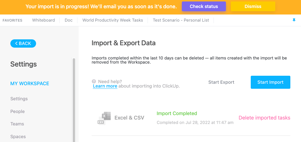
There you go! Your data is sharable, safe, and secure with ClickUp. 🔒
Creating KPI Dashboards is just as fast and efficient—without the tech headache! You have the option to use a Dashboard template in ClickUp or start from scratch.
Dashboards in ClickUp are collaboration-friendly, so you can connect with your teams, stakeholders, and external partners directly from the Dashboard using customizable widgets—the building blocks of Dashboards. Beyond the common charts, ClickUp offers specialized widgets for time tracking, rich text blocks, conversations, and embedding options.
We hope this guide has taken some weight off of your shoulders about KPI dashboards! Still have questions? We are here for you 24/7 with live support, on-demand webinars, and online learning to help you take charge of your data! 📈
Case Study: How ClickUp Dashboards Help Teams
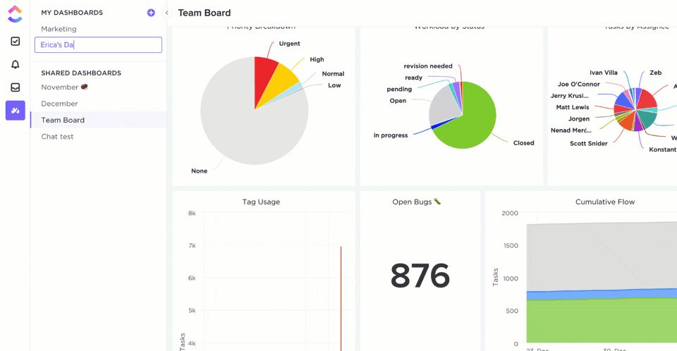
ClickUp Dashboards are designed to bring all of your most important metrics into one place. Check out this case study from Wake Forest University to see how they improved reporting and alignment with ClickUp Dashboards:

Whatever you need to measure, ClickUp Dashboards are the perfect way to get a real-time overview of your team’s performance.
Create a KPI Dashboard in Excel
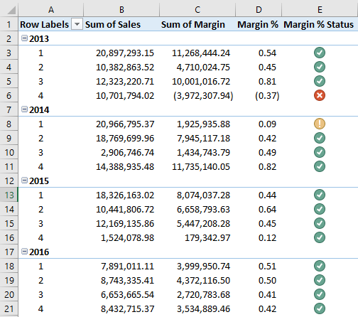
You go to any organization; it is important to analyze based on their Key Performance Indicators (KPI). A separate dedicated team will be responsible for investigating and showing the results with visual effects. This article will show you how to create a KPI dashboard of individual sales employees in Excel. So, download the workbook to create a KPI dashboard in Excel with us.
Different companies have different KPI dashboards. For this article, we are taking into consideration the sales-driven organization. Its core revenue generation department is its sales team in a sales-driven organization. To just how the company is performing, it is important to look at the performance of each individual in the department.
Table of contents
- Create a KPI Dashboard in Excel
- How to Create a KPI Dashboard in Excel?
- Recommended Articles
How to Create a KPI Dashboard in Excel?
Below is the example of creating a KPI Dashboard in excelThe dashboard in excel is an enhanced visualization tool that provides an overview of the crucial metrics and data points of a business. By converting raw data into meaningful information, a dashboard eases the process of decision-making and data analysis.read more.
You can download this KPI Dashboard Excel Template here – KPI Dashboard Excel Template
The steps to create a KPI dashboard in Excel are as follows:
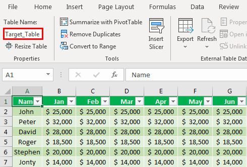
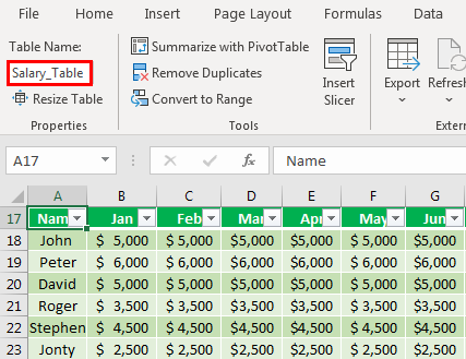
- First, we need to create a “Target_Table” for each employee across 12 months.

In the above table for each individual, we have created a target for each month. We have applied table format in excel and named it Target_Table.
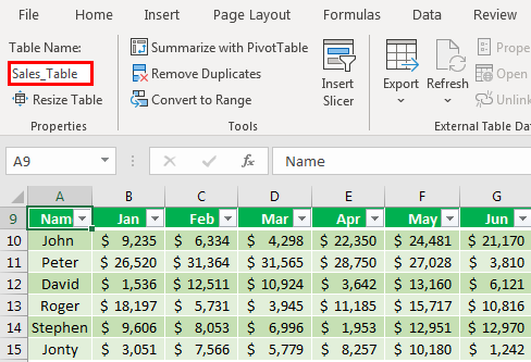
- Similarly, we must create one more table called Sales_Table, which shows actual sales.

- Similarly, we must create two more tables to arrive at the salary and incentive numbers.

Above is the table of individual salaries. So now, create a table for Incentives.

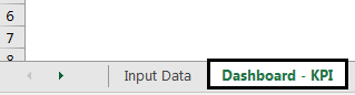
We are done with all the data inputs required to show in the dashboard. Next, we must create one more sheet and name it Dashboard – KPI.

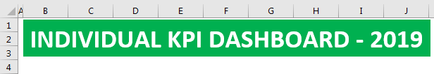
- Create the heading “Individual KPI Dashboard- 2019” in Excel.

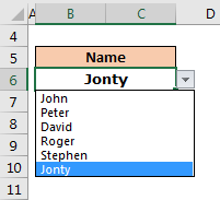
- Now, create employee names and build a drop-down list in Excel of employees.

- Create a month-wise table to show Target, Actual, Variance, and Average Sale. And also to display Salary and Incentive Paid.

We have divided the data to be shown for the first six months and the later six months. So that is why we have added H1 total and H2 total rows.
H1 consists of the first six months total, and H2 consists of the second six months total. So, the whole is a combination of H1 + H2.
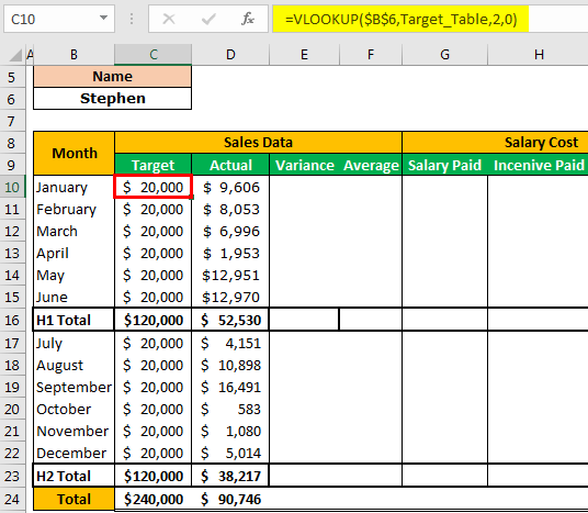
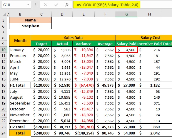
- For Target and Actual, we must apply VLOOKUP from the Input Data sheet and arrive at numbers based on the name selection from the drop-down list.
To find Actual sales data, select Sales_Table in place of Target_Table in the VLOOKUP formula.

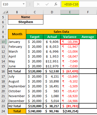
To find the variance, subtract actual sales data from target sales data.

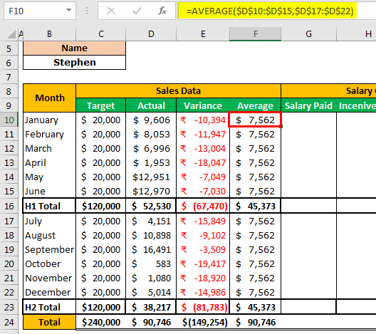
To get an average of sales data, apply the below formula.

Similarly, we must do the same for the Salary Paid and Incentive Paid columns.

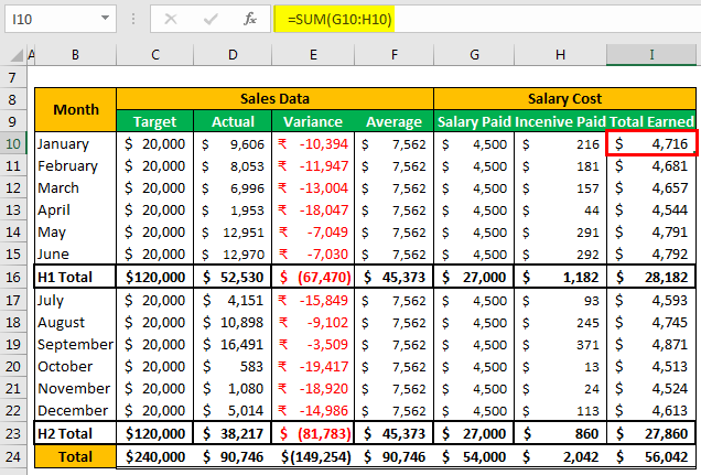
Then, find the Total Earned by adding Salary Paid and Incentive Paid.

Now, based on the selection we make from the drop-down list of the name, VLOOKUP fetches the Target, Actual, Salary Paid, and Incentive Paid data from the respective table which we have earlier in the article.
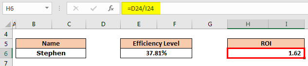
- We need to create a cell for the Efficiency Level. Then, we need to divide the achieved amount by the target amount to arrive at the efficiency level.

- Now, arrive at the return on investment result. But, first, we must divide the Actual amount by the Total Earned amount.

- Now, a graphical representation of the data we have comes at. Below is the graph we have applied. We can create a chart based on the liking.


We have applied a line graphLine Graphs/Charts in Excels are visuals to track trends or show changes over a given period & they are pretty helpful for forecasting data. They may include 1 line for a single data set or multiple lines to compare different data sets. read more for “Target,” “Actual,” and “Average” numbers in the above chart. Therefore, this graph will represent the “Average” achieved and “Target” achieved against the “Target” numbers.
We have applied a Clustered Column chart in excelIn Excel, a clustered column chart depicts data in a series of vertical columns. Though these charts are simple to create, analyzing them becomes increasingly difficult as the number of categories increases from single to multiple. read more.
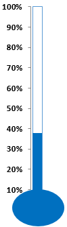
After all this, we need to insert a simple efficiency chart. Finally, we have applied the efficiency chart, and we can start using this KPI dashboard by downloading the Excel workbook from the link provided.
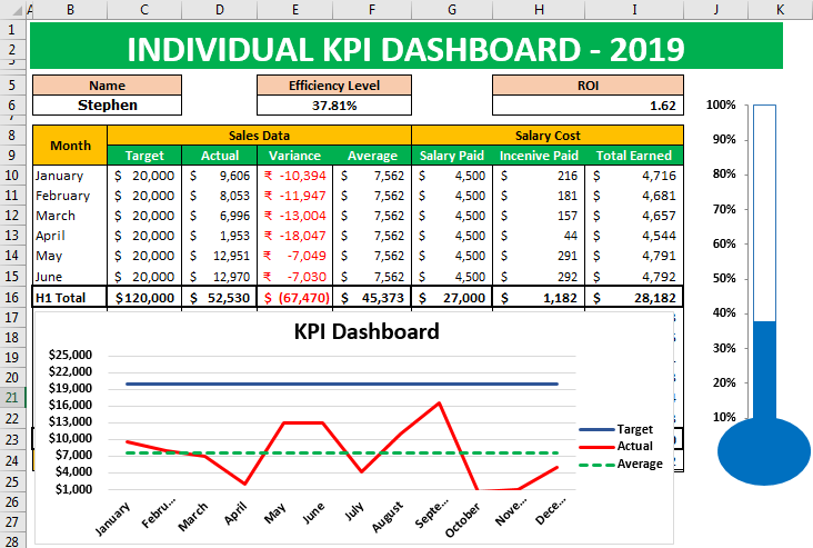
Based on the selection we make from the drop-down list, numbers will turn up accordingly, and graphs will show the differences.
Based on the requirement, we can increase the number of employees and fill the target data, actual data, and salary and incentive data accordingly.
Recommended Articles
This article is a guide to KPI Dashboard in Excel. We discuss creating a KPI dashboard in Excel, practical examples, and a downloadable Excel template. You may also learn more about Excel from the following articles: –
- Excel Dot Plots
- Edit Drop-Down List in Excel
- Consolidate Data in Excel
В бизнесе сложно добиться системного роста, если регулярно не отслеживать ключевые показатели, которые влияют на прибыльность компании. Для этого лучше всего подходят дашборды, в которых данные представлены в понятном виде, что существенно облегчает принятие решений.
Пошагово рассмотрим, как построить дашборд по продажам в Excel. Статья будет полезна всем, кто начинает знакомство с этим мощным инструментом аналитики данных.
Дашборд ― динамический отчёт, который состоит из структурированного набора данных и их визуализации на основе диаграмм, графиков и таблиц.
Основные задачи дашборда:
- представить набор данных максимально наглядным и понятным;
- держать под контролем ключевые бизнес―показатели;
- находить взаимосвязи, выявлять негативные и положительные тенденции, находить слабые места в организации рабочих процессов;
- давать оперативную сводку в режиме реального времени.
Построение дашбордов ― такой же hard skill, как владение формулами в Excel. По статистике, пользователь Excel среднего уровня может освоить этот навык за 20 часов обучения и практики.
Для специалистов, которые работают с отчётами, навык построения дашбордов стал необходимостью, а не дополнительным преимуществом.
Чаще всего созданием дашборда занимается аналитик — он обрабатывает огромные массивы данных, оформляет их в красивый и понятный дашборд и передаёт заказчику задачи. Это могут быть руководители, менеджеры по продажам, HR-специалисты, бухгалтеры, маркетологи.
Менеджерам по продажам дашборд помогает управлять продажами. HR-специалистам ― отслеживать основные метрики, связанные с трудовыми ресурсами. Для бухгалтера будет полезен дашборд о движении средств, который отражает финансовое состояние организации. Маркетологи анализируют рекламные кампании и оценивают их эффективность. Руководителю дашборд позволит быстро оценивать состояние ключевых показателей и принимать управленческие решения.
Существует большое количество сервисов для бизнес―аналитики, такие как Tableau, Power BI, Qlik, DataLens, Google Data Studio. Самым доступным можно назвать Excel.
Главное и самое интересное в дашборде ― интерактивность.
Настроить интерактивность можно с помощью следующих приёмов:
- срезы и временные шкалы в сводных таблицах ― эти инструменты упрощают фильтрацию данных и позволяют управлять дашбордом: например, можно более детально посмотреть данные по конкретному менеджеру или заказчику за определённый период времени или в разрезе каналов продаж.
- выпадающие списки, формулы и условное форматирование — использование таких приёмов удобно, когда много разных таблиц и построить сводные таблицы невозможно;
- спарклайны, мини-диаграммы в ячейках, тепловые карты в аналитических таблицах — такой способ чаще всего подходит для тактических целей специалистов или аналитиков, а не для стратегических целей руководителя.
Для этого выбираем наиболее популярный способ с помощью сводных таблиц.
Советуем проделать все шаги вместе с нами. Как говорит гуру мотивации Наполеон Хилл, «мастерство приходит только с практикой и не может появиться лишь в ходе чтения инструкций». Файл с данными для тренировки можно скачать здесь.
Построение любого дашборда начинается со сбора данных. На этом этапе важно привести таблицы в плоский вид, чтобы в дальнейшем на их основе создавать сводные таблицы для дашборда.
Плоская таблица (flat table) ― двумерный массив данных, состоящий из столбцов и строк. Столбцы ― это информационные атрибуты таблицы, строки ― отдельные записи, состоящие из множества атрибутов.
Пример плоской таблицы:
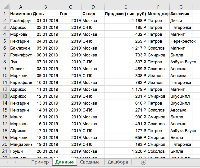
В примере выше атрибуты — это «Наименование», «День», «Год», «Склад», «Продажи (тыс. руб)», «Менеджер», «Заказчик». Они вынесены в заголовок таблицы.
Эта таблица послужит основой для построения нашего дашборда по продажам.
Если известно, для чего и для кого предназначен дашборд, легче понять, какие показатели должны выводиться на экран. Это могут быть любые количественные показатели, важные для организации: прибыль, продажи, численность сотрудников, количество заявок, фонд оплаты труда.
Также необходимо определиться с макетом — структурой — дашборда. Для начала достаточно будет прикинуть её на листе формата А4.
Пример универсальной структуры, которая подойдёт под любые задачи:
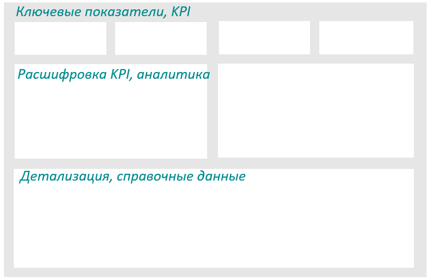
Количество информационных блоков может быть разным: это зависит от того, сколько метрик надо отразить на дашборде. Главное — соблюдать выравнивание по сетке.
Порядок и симметрия в расположении информационных блоков помогают восприятию и внушают больше доверия.
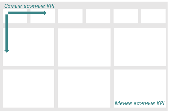
Помимо симметрии важно учитывать и логику расположения информационных блоков. Это связано с нашим восприятием: мы привыкли читать слева направо, поэтому наиболее важные метрики необходимо располагать слева направо и сверху и вниз, менее важные ― справа внизу:
— на основе таблицы с данными, приведённой выше в качестве примера плоской таблицы.
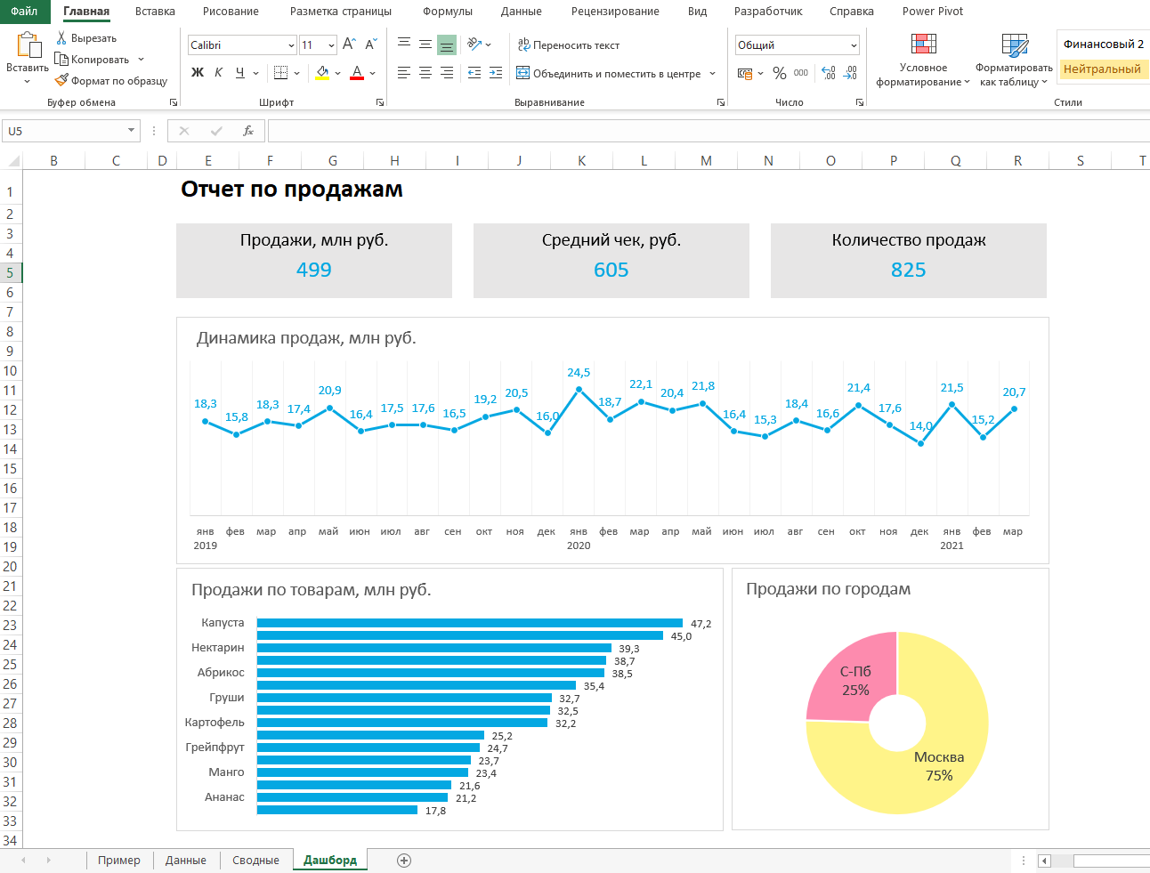
Таблицы будут показывать продажи по месяцам, по товарам и по складу.
Должно получиться вот так:
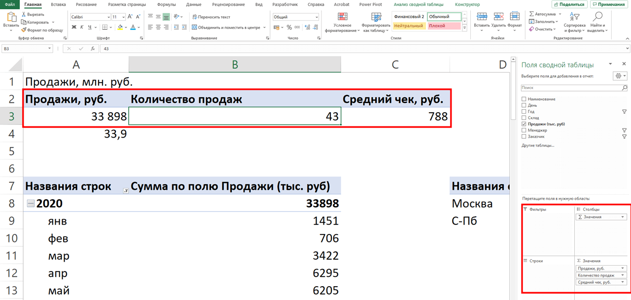
Также построим таблицу для ключевых показателей «Продажи», «Средний чек», «Количество продаж»:
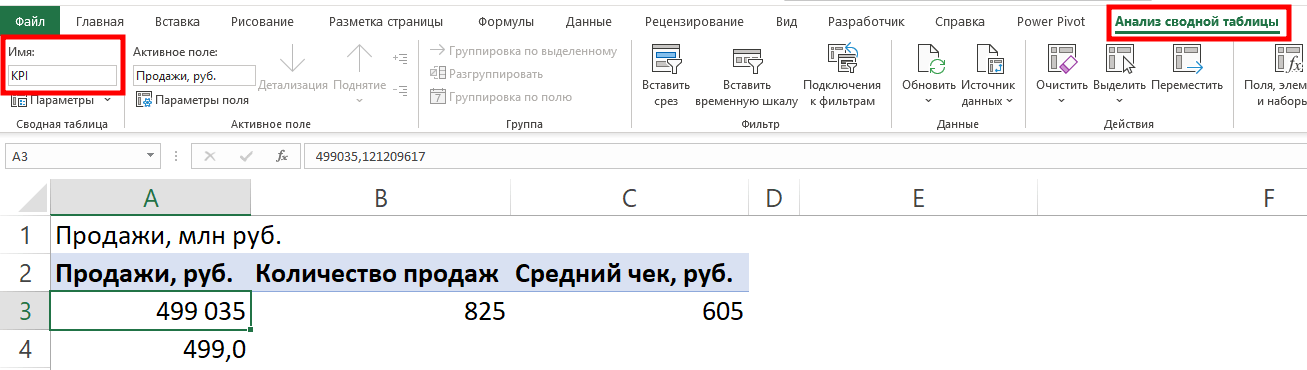
Чтобы в дальнейшем было проще ориентироваться при подключении срезов, присвоим сводным таблицам понятное имя. Для этого перейдём на ленте в раздел Анализ сводной таблицы → Сводные таблицы → в поле Имя укажем название таблицы.
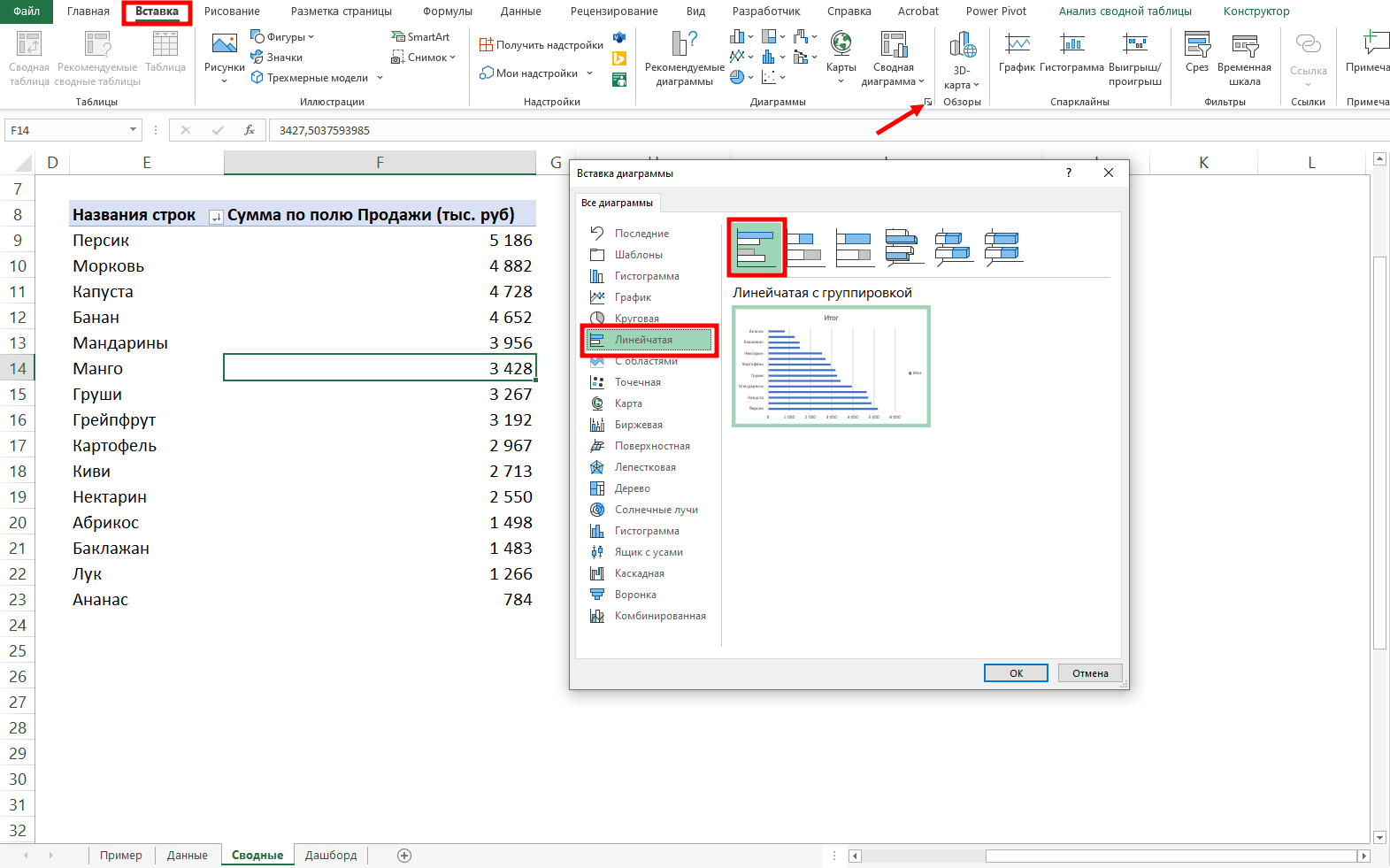
В нашем дашборде будем использовать три типа диаграмм:
- график с маркерами для отражения динамики продаж;
- линейчатую диаграмму для отражения структуры продаж по товарам;
- кольцевую — для отражения структуры продаж по складам.
Выделим диапазон таблицы, перейдём на ленте в раздел Вставка → Диаграммы → Вставка диаграммы → Выберем нужный тип диаграммы → ОК:
Отредактируем диаграммы: добавим названия и подписи данных, скроем кнопки полей, изменим цвет диаграмм, уменьшим боковой зазор, уберём лишние элементы — линии сетки, легенду, нули после запятой у подписей данных. Поменяем порядок категорий на линейчатой диаграмме.
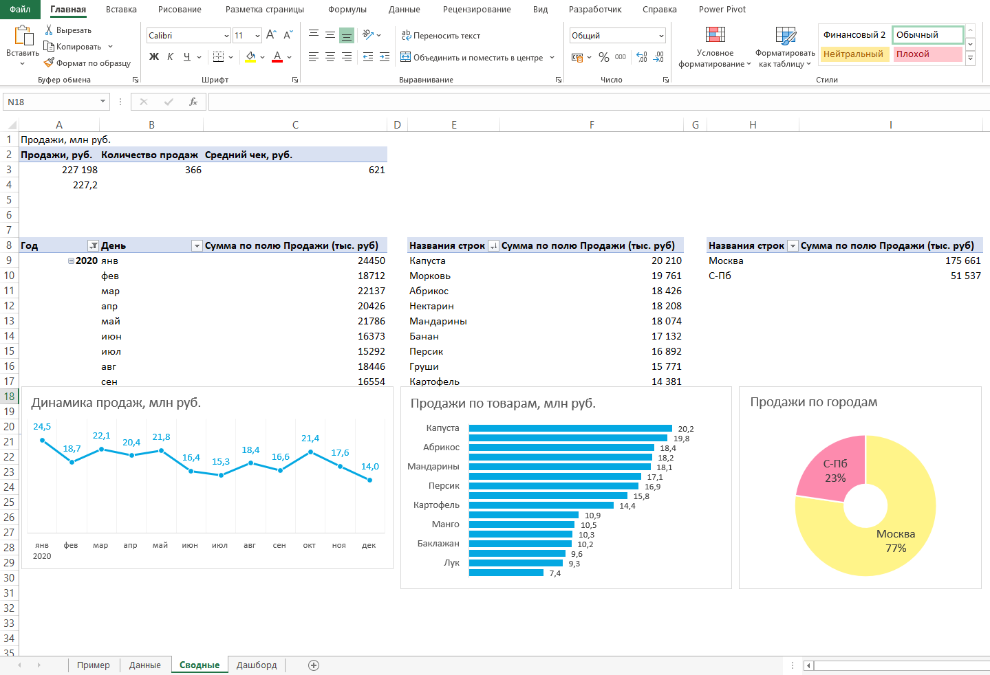
… и распределим их согласно выбранному на втором шаге макету:
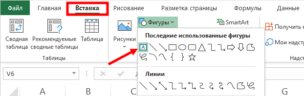
После размещения диаграмм необходимо вставить поля с ключевыми показателями: перейдём на ленте в раздел Вставка ⟶ Фигуры и вставим 3 текстбокса:
Далее сделаем заливку и подпишем каждый блок:
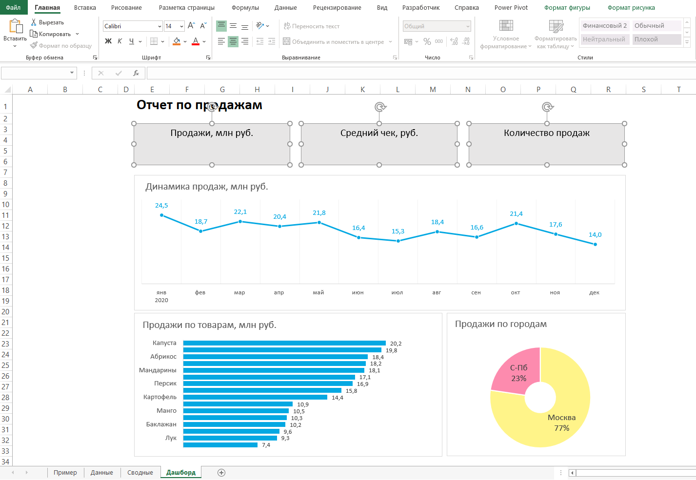
Значения ключевых показателей из сводных таблиц вставим также через текстбоксы — разместим их посередине текстбоксов с названиями KPI. Но прежде в нашем примере сократим значение «Продажи» до миллионов при помощи такого приёма: в сводной таблице рядом с ячейкой со значением поставим формулу с делением этого значения
на 1 000:
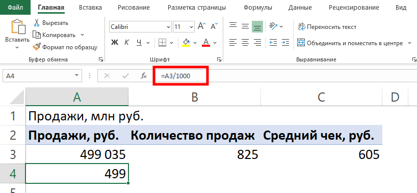
… и сошлёмся уже на эту ячейку:

То же самое проделаем с другими значениями: выделим текстбокс и сошлёмся через поле «Вставить функцию» на короткое значение в сводной таблице:
- Попробуете себя в роли аналитика в крупной ритейл-компании и поможете принять взвешенные решения об открытии новых точек продаж
- Научитесь основам работы с инструментами визуализации данных и решите 4 реальных задачи бизнеса
- 4 задачи — 4 инструмента: DataLens, Excel, Power BI,
Tableau
Срез ― это графический элемент в виде кнопки для представления интерактивного фильтра таблиц и диаграмм. При нажатии на эти кнопки дашборд будет перестраиваться в зависимости от выбранного фильтра.
Эта функция доступна в версиях Excel после 2010 года. Если нет возможности сделать срезы, можно воспользоваться выпадающим списком.
Для создания срезов выделяем любую ячейку сводной таблицы, переходим на ленте в раздел Анализ сводной таблицы ⟶ Вставить срез ⟶ поставим галочки в поля «Год», «Менеджер», «Заказчик», чтобы в дальнейшем можно было фильтровать данные по этим категориям.
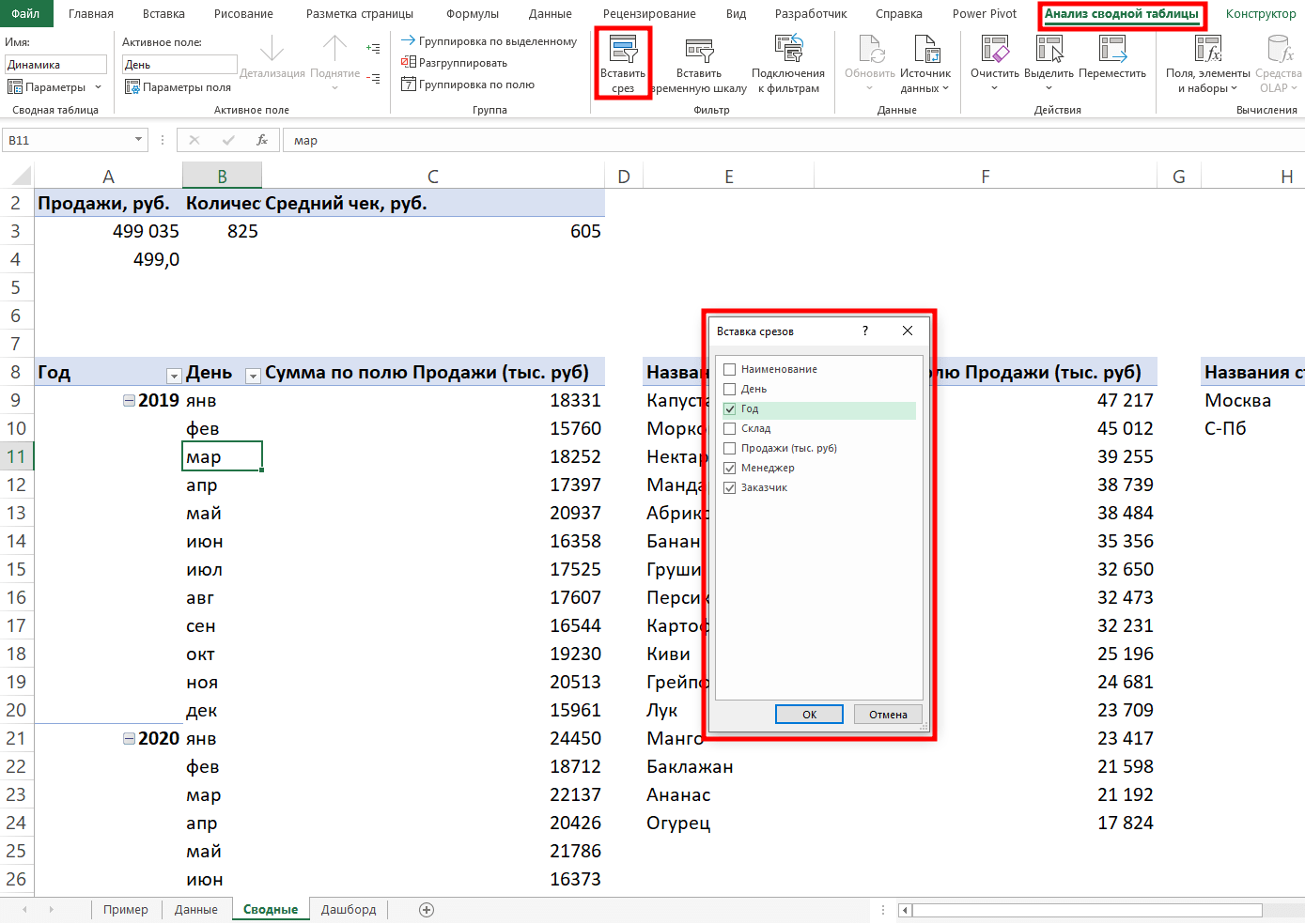
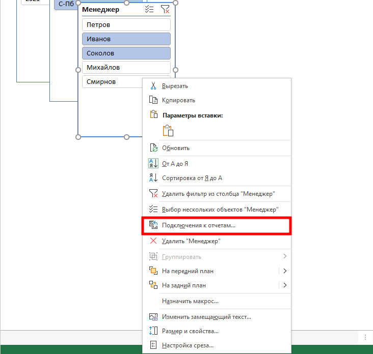
Если срез не работает и при нажатии на кнопки фильтра данные не меняются, подключаем его к нужным сводным таблицам: выделяем срез, кликаем правой кнопкой мыши, выбираем в меню Подключение к отчётам и ставим галочки на требуемых таблицах.
Повторяем эти действия с каждым срезом.
— и располагаем их слева согласно выбранной структуре.
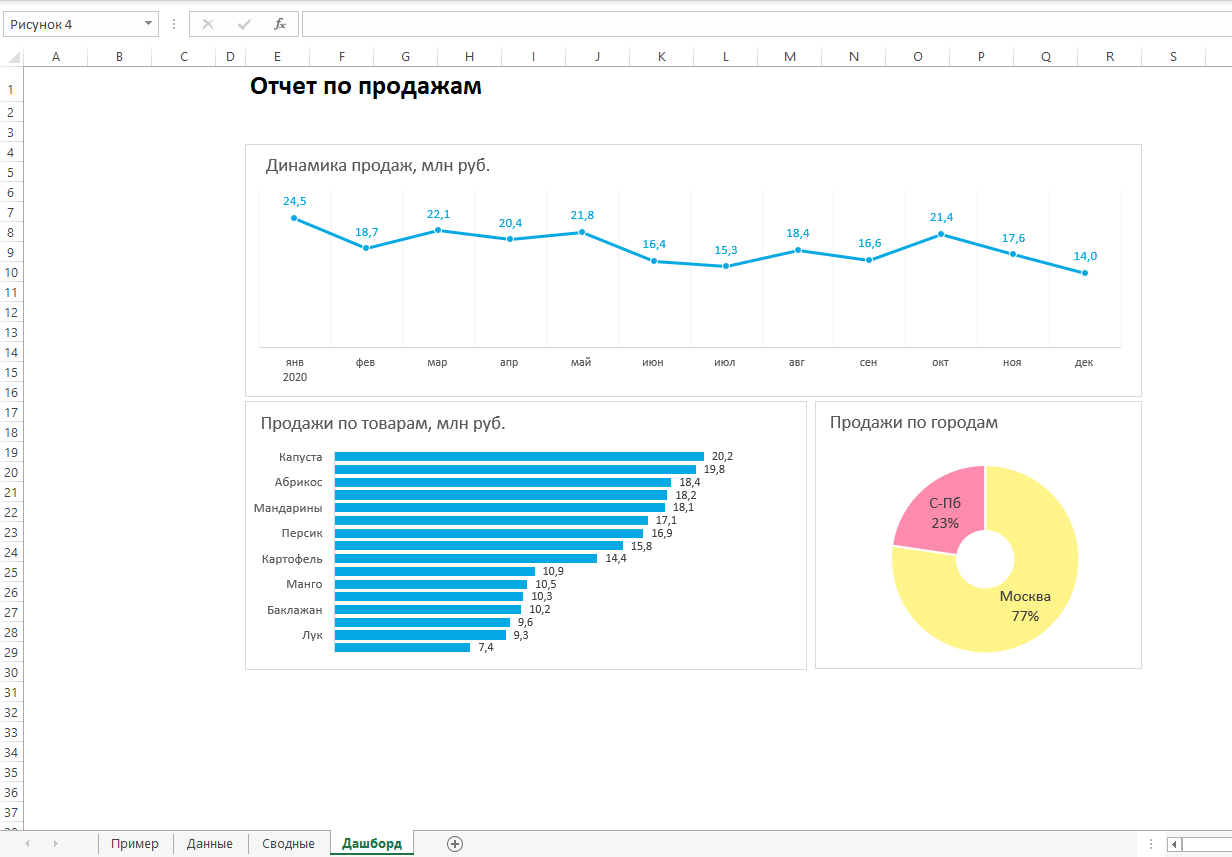
Дашборд готов. Осталось оформить его в едином стиле, подобрать цветовую палитру в корпоративных цветах, выровнять блоки по сетке — и показать коллегам, как пользоваться.
Итак, вот так выглядит наш дашборд для руководителя отдела продаж:
Мы построили самый простой дашборд. Если углубиться в эту тему, то можно использовать сложные диаграммы, настраивать пользовательские форматы срезов, экспериментировать с макетом, вставлять картинки и логотип.
Немного практики — и дашборд может выглядеть так:
Не стоит бояться неизвестного — нужно просто начать делать, чтобы понять, что сложные вещи на самом деле не такие и сложные.
Принцип «от простого к сложному» — самый верный. Когда строят интерактивный дашборд впервые, многие испытывают искреннее восхищение. При нажатии на срезы дашборд перестраивается — очень похоже на магию. Желаем тоже испытать эти ощущения!
Мнение автора и редакции может не совпадать. Хотите написать колонку для Нетологии? Читайте наши условия публикации. Чтобы быть в курсе всех новостей и читать новые статьи, присоединяйтесь к Телеграм-каналу Нетологии.
Watch Video – Creating KPI Dashboard in Excel – Part 1/3
Learn the exact steps I take to create World Class Dashboards in Excel. Join the Excel Dashboard Course.
A Key Performance Indicators (KPI) dashboard is one of the most used dashboards in business.
Its primary objective is to show the performance of key KPIs and provide a comparative view of other KPIs or companies.
In this tutorial, I will show you how to create a KPI dashboard in Excel.
This is an improved version of a dashboard that I created last year in my previous job role as a financial/data analyst.
I have broken down this Excel KPI Dashboard tutorial into three parts:
- KPI Dashboard in Excel – Part 1: Dynamic Scatter Chart.
- KPI Dashboard in Excel – Part 2: Dynamic Interpretation.
- KPI Dashboard in Excel – Part 3: Dynamic Data Extraction + Bullet Chart.
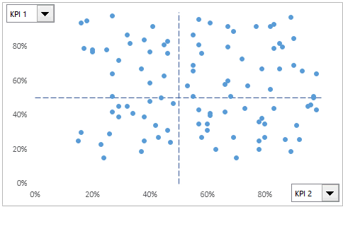
Objective: We have the KPI data of 100 companies, and the objective is to create a dashboard that would help in identifying key accounts based on the performance. Apart from a comparative view, it should also enable the user to drill down on individual companies.
Let me first show you how the final KPI dashboard looks like:
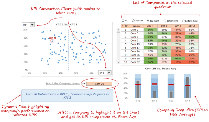
In this Key Performance Indicator (KPI) dashboard, a user can select the KPIs that he/she needs to compare. It would instantly update the scatter chart with a spread of all the 100 companies across the four quadrants. It is a great way to segment companies based on performance.
At the top-right (of the dashboard), a user has the option-buttons to select a quadrant and get a list of all the companies in that quadrant.
Below it, there is a bullet chart that shows the KPIs Vs. Peer Average comparison for the selected company.
I have broken down this dashboard creation process into 3 parts. In today’s article, I will show you how to create a dynamic scatter chart.
Click here to download the example file
KPI Dashboard in Excel – Dynamic Scatter Chart
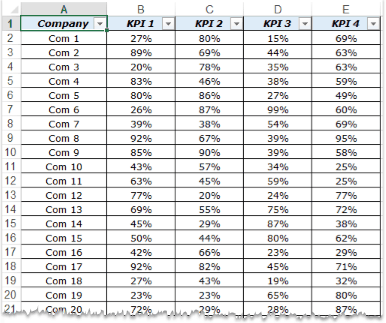
I have the KPI data for 100 companies. For the purpose of this dashboard, let’s call these companies Com 1, Com 2, and so on.. and the KPIs are KPI 1, KPI 2, KPI 3, and KPI 4. The data looks as shown below:
- The dashboard comprises 3 worksheets – ‘Data’, ‘Calculation’, and ‘Dashboard’.
- It is almost always a good idea to convert raw data into an Excel Table. In this case, I have named this table KPIData.
- In the Dashboard sheet, insert 2 ActiveX Combo Box. The input to these Combo Box would be the name of the KPIs (KPI 1, KPI 2…) and each Combo Box is linked to a cell in the Calculation sheet.

- We now need to create a dataset for the chart (this data resides in the Calculation worksheet). Since the chart updates when the drop-down selection is changed, the data needs to be dependent on the selection. We can do this using a combination of INDEX and ROWS formula. Here it is:
- X Axis: =INDEX(KPIData,ROWS($A$15:A15),$B$8+1)
- Y Axis: =INDEX(KPIData,ROWS($A$15:B15),$B$9+1)

- Now this data is fed into a scatter chart. Since the data is dependent on the Combo Box drop downs, as soon as the drop-down selection is changed, the chart instantly updates.


Download the Example File

This simple dynamic scatter chart is really helpful when you want to down-select a handful of companies based on their KPI performance.
In the next article of this series, I will show you how to spot a company in this chart, and how to get the dynamic interpretation of the chart (in the text box below the chart).
Let me know what you think? Leave your thoughts in the comments section.
Stay Tuned… More awesome excel stuff coming your way in the next article (KPI Dashboard in Excel – Part 2) 🙂
Other Excel Dashboard Tutorials:
- Excel Dashboards – Examples, Best Practices & Resources.
- Game of Thrones Dashboard in Excel.
- Excel Dashboard: Premier League Season 2014-15 visualized.
- KPI Dashboard by Chandoo – A 6 Part Series.
You May Also Like the Following Excel Tutorials:
- How to Create a Drop-down in Excel.
- Adding and Using Checkboxes in Excel.
- Adding and Using Radio Buttons in Excel.
- Creating Heat Maps in Excel.
Excel KPI Dashboard (Table of Contents)
- Introduction to KPI Dashboard in Excel
- How to Create KPI Dashboard in Excel?
Introduction to KPI Dashboard in Excel
Key Performance Indicator, a.k.a. KPI dashboard, is one of the versatile dashboards which can be used every now and then as per business requirements. It is most of the time a graphical representation of different business processes that have progressed along with some already set (predefined) measures for the goal achievement. The KPI dashboard provides the nicest view of KPI’s and their comparison over other KPI’s. Those are nothing but the visual measures, which allows you to quickly check whether the current business values are going as expected or not that too in the easiest way (just looking at the graph) without checking a bunch of data. In this article, we are going to see some KPI dashboards and how to make such from scratch.
How to Create KPI Dashboard in Excel?
Let’s understand how to create the KPI Dashboard in Excel with some examples.
You can download this KPI Dashboard Excel Template here – KPI Dashboard Excel Template
Example #1 – KPI Dashboard in Excel using PowerPivot
PowerPivot is not new to excel users. You can develop many fancy reports using this tool from excel without taking any help from IT people. Moreover, KPI is a new addition to PowerPivot, which allows you to check the performance in a jiffy though you have millions of rows. We will see in this example how to create a simple KPI using PowerPivot.
First thing first, you have to enable Power Pivot in your excel.
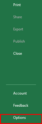
Step 1: Open an Excel file. Click on the File tab on the uppermost ribbon. Go to Options.
Step 2: Under Options > Click on Add-ins. You’ll be able to see the screen as shown below.
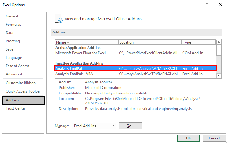
Step 3: Select COM Add-ins under the Manage section dropdown and click on the Go button.
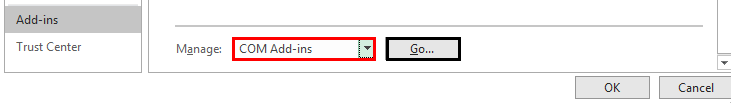
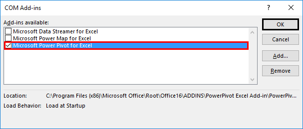
Step 4: As soon as you hit the Go button, the COM Add-ins dialog box will pop up. Select Microsoft Power Pivot for Excel from the list of add-ins and click OK.
After enabling this PowerPivot add-in, you should be able to see the PowerPivot option tab on the topmost panel ribbon in your excel.
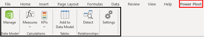
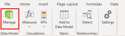
Step 5: Now, the actual work begins. Under the PowerPivot tab in your excel file, click on Manage.
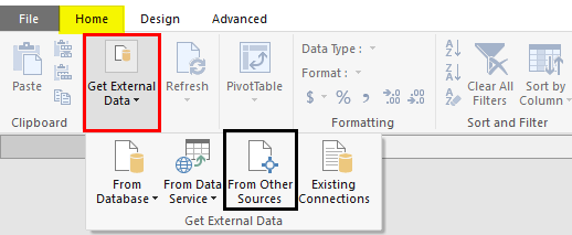
Step 6: It should open a new tab named Power Pivot for Excel. There are different ways to import data under PowerPivot. You can click the Database tab if you want to add data from SQL Server, Access. However, if you have an excel file or text file or some data files other than SQL and Access, please click on From Other Sources tab.
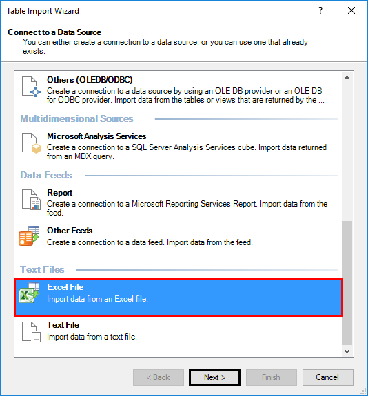
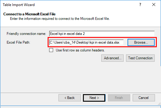
Step 7: Once you click on the “From Other Sources” tab, a new window named Table Import Wizard will pop up. There you can see a lot of options from where you can import the data to PowerPivot. Select the Excel file, then click on the Next button to proceed further.
Step 8: Browse the path on where your excel data file is stored and click the Next button to finish the Import.
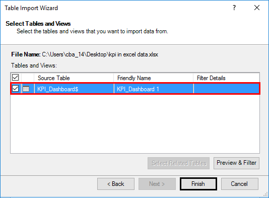
Step 9: Click on the Finish button once the data table is loaded into PowerPivot.
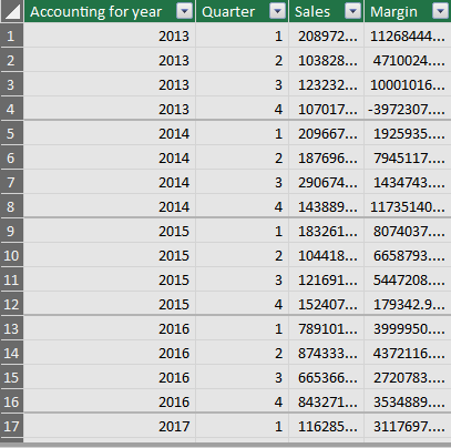
Step 10: After a successful import, you will be able to see the data as below.
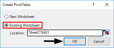
Step 11: Now, in order to create a KPI report, we need to slice and dice our data under the pivot table. Click on the Pivot Table tab under PowerPivot. Once you click it, a new window named Create PivotTable will appear in which you have to select the data from PowerPivot, and it asks you whether you want a pivot table under a new sheet or on the same sheet. I will prefer to go with the same sheet and then will provide the range on which the pivot table should be added. Click OK once done.
Step 12: Select the data under rows, columns, and values, as shown below.
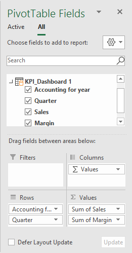
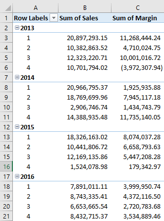
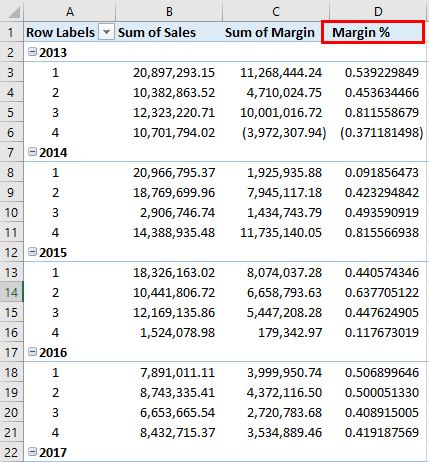
Here we have selected data in the following order:
Rows: Accounting Date Year & Quarter
Values: Sum of Sales & Margin
Step 13: Now, we are going to add a calculated column in the pivot. Select Measures under excel sheet. Click on New Measures.
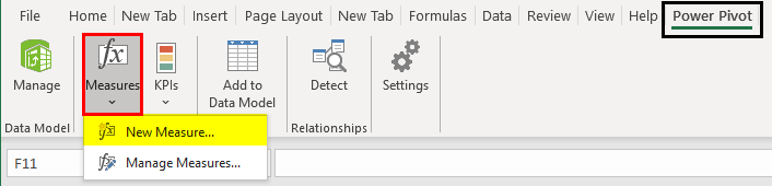
A new window called Measure will pop up. It will allow you to formulate a measure and add it under your pivot table created.
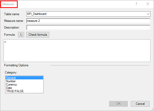
Step 14: Under ” Measure name:”, add a name for your measure (For, e.g. Margin%). If you want to add a description for the same, you can add it there as well under the Description section. Under the Formula section, add the formula =[Sum of Margin]/[Sum of Sales] as shown below. It will calculate the Margin% for you. See the screenshot below.
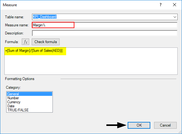
Here, we have created a new calculated column named Margin%, which can be formulated as the ratio of two columns, Sum of Margin and Sum of Sales. Once you are done with this step, click on the OK button, and you will be able to see a new calculated column named Margin% under the pivot table.
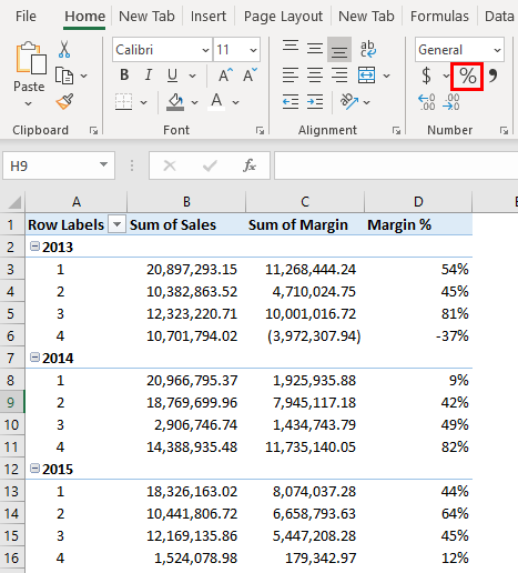
Step 15: Select the entire column, Margin %, and convert it to % using number formatting.
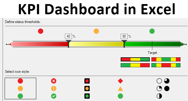
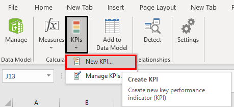
Step 16: Now our data is ready for KPI’s to be added. Click on the KPIs tab as shown in the figure. Select the New KPI option.
A KPI window will pop up, as shown below. It has some by default values, which we are going to change.
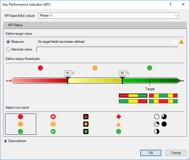
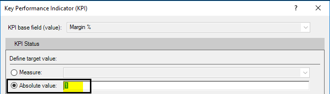
Step 17: In this window, define an Absolute Value for the target as 1. We are doing this because we don’t have any other target values/measures defined as separately to have a comparison with actual values of Margin %.
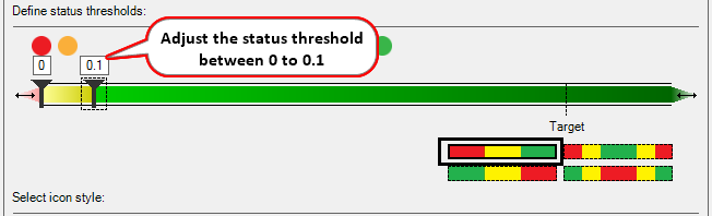
Step 18: In this step, define the Status Threshold value. It is defined in decimal format. Like 40% will be given as 0.40. Change the Status Threshold values as shown in the screenshot below.
Step 19: Now, we can select icon style as well (These are the KPI Icons). I will opt out of the second style. As shown below.
![]()
Step 20: Click on the OK button once you are done with setting the KPI parameters and customization.
![]()
Tada, your KPI Dashboard is ready and will be looking as shown in the screenshot below.
Things to Remember About KPI Dashboard in Excel
- You always need to assign data to PowerPivot so that it can be used for the creation of the KPI Dashboard.
- Every time, you need to add a pivot once the data is imported into PowerPivot so that it can be used for KPI Dashboard creation.
Recommended Articles
This is a guide to KPI Dashboard in Excel. Here we discuss How to create KPI Dashboard in Excel along with practical examples and a downloadable excel template. You can also go through our other suggested articles –
- Radar Chart in Excel
- Marimekko Chart Excel
- Dashboard in Excel
- PowerPivot in Excel
Excel is like the McDonalds of the corporate world. That’s to say, every corporate professional knows what it is, how to use it, and probably has some strong opinions.
So, it makes sense that many are creating simple Excel KPI dashboards in addition to all those spreadsheets.
To get the inside scoop, we talked to 9 companies in B2B Services or Products, and 12 companies in B2C Services or Products to find out what kinds of dashboards they are creating and how satisfied they are with the results.

In this post, we’re sharing our findings along with how to create a kpi dashboard in Excel, as well as 7 examples.
- Business Dashboard
- Lead Generation Dashboard
- Marketing Dashboard
- Sales Management Dashboard
- Project Management Dashboard
- Social Media Dashboard
- SEO Dashboard
- Turn Your Excel Spreadsheets into Beautiful, Custom Dashboards in Databox
Let’s dive in!

1. Business Dashboard
According to the respondents we surveyed, a business dashboard is the most valuable one. That’s because you can use it to see your most important company KPIs in one place.

“Our strategic Excel dashboard is essential to our business,” says Isaiah Henry of Seabreeze Management Company. “We view it every day to stay on top of our goals and objectives. The KPIs outlined in our strategic dashboard dictate our overall strategy. If something isn’t performing well, we know we need to change course. We can look at our fiscal performance on a monthly, quarterly, and yearly basis, as well as our MRR growth rate, and our overall earnings. It highlights both our weaknesses and opportunities where we can make a difference if we tweak our strategy.
Chris Walker of Legiit adds, As a CEO of a successful business, I have extensive knowledge of using an Excel KPI dashboard to further improve your business. I prefer to use the different templates of Excel, as they allow me to include the growth, revenue, number of orders, and many other indicators.
Here is just one example of what your business dashboard can look like. This dashboard is very important for a business as it shows the traffic driven towards your website from different social media platforms and it tracks new customers and the conversion rate of customers. Other companies should consider using this dashboard as it will allow them to reach their monthly targets in revenue or order numbers. The dashboard is easily set up and provides insight into your customers; interactions with your website, therefore, helping you implement suitable marketing strategies and tactics.

For example, if you have a SaaS or subscription business, you can use this Stripe MRR + Churn Dashboard to monitor monthly recurring revenue (MRR) and churn in real time. You can visualize all of your most important metrics and KPIs in Databox from any data source and spreadsheet, including Excel.
2. Lead Generation Dashboard
A lead generation dashboard, such as this HubSpot Marketing Lead Generation Dashboard, allows you to measure the quality and quantity of leads generated by your marketing team.

This is just one example of what your lead generation dashboard can look like. In Databox, your dashboard is 100% customizable, so you can pull in data from Excel, Google Sheets, HubSpot, Salesforce, Drip, etc.
For example, Matt Miller of Embroker says, “Our business is heavily focused on networking, and because of this focus, we need to manage our contacts and sales funnels, which is why our lead generation Excel KPI dashboard is essential. Getting a lead is much more than initial introductions, it is maintaining the relationship through a series of stages that can be measured on their way to conversion.
Therefore, our Excel KPI dashboard track leads generated, leads per source, non-target leads, and percentage of lead advancement, to give us an accurate reading of where we stand with each contact, and how much further down the funnel we need them to go. Having this data is by far, our most valuable resource, and keeps our business from operating blindly.”
Kenzo Kishita of Blades Power agrees, “For my business, the Excel dashboard that I chose is a lead generation dashboard. The most important KPI to track is the number of leads generated by our company. We have included metrics such as the number of website visitors, how many were from organic search results, how many were from paid advertising, and how many were from social media. This particular dashboard is important because it helps us see where people are finding our website and what keywords they are using to find us. It also allows us to see what types of advertisements are most effective in generating new leads for our company.”
PRO TIP: Need Help Building a Custom Dashboard?
Not sure which metrics to track or dashboards to build? Have old reports you want to recreate in Databox? Share your dashboard needs with one of Databox’s product experts and we’ll build you a customized dashboard for free.
Here is an example of what your dashboard can look like… (just imagine your data populating here)

And here’s another one…

We get it. You may not have the time to build out the perfect dashboard before your next meeting.
Luckily, we do.
Connect with someone on our team, share the metrics or areas that you need to track, and we’ll build your dashboards for you in just 24 hours.
Learn more about our free dashboard setup here, reach out for assistance via email or chat, or book a call.
3. Marketing Dashboard
A marketing dashboard, like this Monthly Marketing Performance dashboard template, allows you to monitor all of your key marketing KPIs in one place.

“The most important marketing dashboard for your business is the one that provides the most relevant and actionable data,” says Lewis Banks of LegalDrop. “This data can help you make informed decisions about your marketing campaigns, track your progress, and optimize your strategies.
The right marketing dashboard will give you the insights you need to improve your marketing ROI and grow your business.
Some of the most important metrics to include on your marketing dashboard are:
- Number of leads generated
- Cost per lead
- Conversion rate
- Revenue generated
- ROI
- CPA”
Wes Marsh of Aqfer says, “As the marketing director, our marketing dashboard is critical for our success – both in managing up and down the organization. Having our KPIs succinctly presented for our C-Suite help them to see the positive impacts we’re having on the rest of the company. This also gives us a standard set of metrics for objectivity and accountability.
We track a handful of metrics, but the most important ones are total leads created by source, average lead cycle length, event results, and campaign metrics such as CPL and spend.
One very helpful component of our dashboards is the comparisons to previous periods (M/M and Q/Q) as these help us evaluate our trends over time, and with the right formulas in place, we can simply paste in new data and constantly have up to date information.
Finally, we also track our content and PR efforts, however evaluating these metrics is far more qualitative than quantitative. I would recommend any marketer to ensure they have a data dashboard to showcase their results, regardless of their level of seniority. Not only does it build good habits, but it helps you better communicate with other members of your team outside the marketing org who may not always understand the various nuances of marketing.”
Rajat Chauhan of Ace Infoway adds, “We were using an Excel dashboard within our marketing teams to make them align with the tasks and KPIs. This helped us with task distribution especially when teams were working remotely in different locations and helped us keep a track of activities, resources, and priorities. However, I would suggest using a single dashboard tool within your marketing and sales teams so that you can keep track of it and both the teams can align in parallel. It will help you nurture your prospect or user journey and turn them into your customers by taking better decisions when it matters the most.”
PRO TIP: With Databox, your marketing dashboard is 100% customizable, so you can pull in source data for things like traffic from different channels, visits to leads conversion rate, email subscribers, etc.
4. Sales Management Dashboard
With a sales management dashboard, you can get a pulse on the health of your sales pipeline at any given time, as seen in this sales manager KPIs dashboard template.

“This dashboard can help you make important choices whether you run a small business or sell products on the internet; in either case, you’ll benefit from using it,” says Dean Lee of Sealions. “It monitors key parameters of your company, such as sales and earnings, keeping you abreast of developments at all times. This dashboard offers a very straightforward perspective of your company, despite the fact that it is packed with a lot of useful information.”
David Reid of VEM Group adds, “Ever since the pandemic, we have operated more online than offline networks. Hence, to track how well we are doing with online sales, we are using the online sales tracking option in the dashboard. We have blent Excel with Microsoft to achieve the results. One can view the metrics like profits, sales count, cost per lead, goal completion rate, MRR, marketing ROI, sales, and financial dashboards are some of the metrics that I include here to make it more meaningful. Because all of these metrics play a very crucial role when it comes to managing the activities of a firm.”
5. Project Management Dashboard
When you have a large team, a project management dashboard, like this Jira software dashboard template, makes it easy to manage your team’s efficiency and task completion rate.

However, you don’t have to use Jira to reap the benefits of this dashboard. You can also plug in data from Excel, Google Sheets, Asana, and 100s of other sources.
For example, David Lee of Neutypechic says, “A Project Management Dashboard has proved most valuable for my business so far. This particular KPI dashboard is the most important for my business because it organizes all data using charts and graphs. This allows me to visualize all profits and losses that each project brings. It highlights a project’s overall performance and progress and allows me to monitor tasks accordingly.
As a result, improving collaboration, effectively managing workload and prioritizing tasks and keeping track of key metrics. Some of these metrics include gross profit margin, ROI, and customer satisfaction and retention, to name a few. These metrics allow me to see how well my company is performing. So, I can develop targeted strategies to improve in areas where we lack.
As a result, I am able to lead my team towards successfully completing projects and producing high-quality work. Other companies should consider adopting this dashboard because it allows them to monitor their team’s performance and see whether they’re on track to meet the project deadline. As a result, companies can rack up their productivity rates and improve their efficiency.”
6. Social Media Dashboard
A social media dashboard, like this inbound social media performance dashboard template, is an excellent way to track how effective your social media marketing efforts are. This allows you to bring in data from every relevant source and monitor follower growth, referral traffic from different social media channels, engagement rates, and more.

“Our social media dashboard is one of the most significant Excel dashboards that we’re using right now,” says Jessica Kats of Soxy. “This is because our marketing relies heavily on our social media presence. Most of our marketing campaigns are based on our social media channels, and so our social media dashboard has become the most important dashboard.
The metrics we’ve included in this dashboard are: Impressions, Follower Count, Reach, Share of Voice, Click-Through Rate & Conversion. Other businesses should also adopt this dashboard because it is a clear indicator of the results of their digital marketing efforts. Such a dashboard can help them assess their strategies and make adjustments to improve them in real-time.”
Werner Jorgensen of Heatxperts agrees, “The social media dashboard is one of the best investments for our business since we heavily rely on online statistics for our business. It helps us get on board with customers and we can also interact with them throughout a purchasing cycle. The advantage this gives us over competitors is too good to ignore. These metrics are included to make the investment more meaningful: Customer Lifetime Value, Average Sales Cycle, & Sales Forecasting.”
7. SEO Dashboard
“We’re a new business, and SEO is fundamental to our organic growth,” says Marc Bromhall of Surf’s Up Magazine. “The SEO metrics we use are:
- Visits
- Bounce rate
- Time on site
- Page view per session
- Keyword density”

Daniel Foley of Scooter.guide adds, “An SEO dashboard is the most important for my businesses because it provides me with a comprehensive analysis of my firm’s SEO efforts. The dashboard contains many dynamic widgets that show me which metrics I’m ranking high on and which ones I need to improve to take my SEO game to the next level.
Some metrics I include in it are as follows:
- Keyword rank tracking
- Organic traffic
- Backlinks
- Web conversions
Other companies should consider adopting this dashboard because it will provide them with a bird’s-eye view of their SEO efforts and show them where to start in terms of improving their overall SEO profile.”
However, the best SEO dashboards, like this SEMrush organic keywords dashboard template, pull in data from many different sources, including SEMrush, Google Analytics, Excel, and more. So, you can get a view of how organic search impacts all sales and marketing efforts in your business.
Turn Your Excel Spreadsheets into Beautiful, Custom Dashboards in Databox
If you are tired of building and looking at boring Excel spreadsheets, you should consider using dashboard software like Databox. It is 100% customizable, so you can pull in and display data from hundreds of sources including Excel.
Not to mention, there are dozens upon dozens of ready-made templates that you can use as-is or customize. So, you don’t have to build a dashboard from scratch. Once your dashboard is built, it auto-updates.
Ready to build your Excel KPIs dashboards? Get started with a 15-day Excel trial.
-
Charts and Graphs, Cool Infographics & Data Visualizations
-
Last updated on August 25, 2011

Chandoo
Any Tom, Dick and Sally can make things complex. It takes guts and clarity to simplify things. That is why I was pleasantly surprised to see this dashboard prepared by Michigan State. You can see it below:
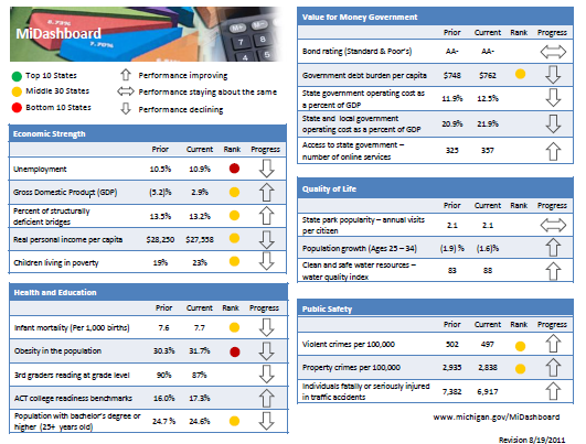
Linda, one of My Excel School students shared this dashboard link with me and asked if I can show how to construct something like this. Here is my version of the dashboard.
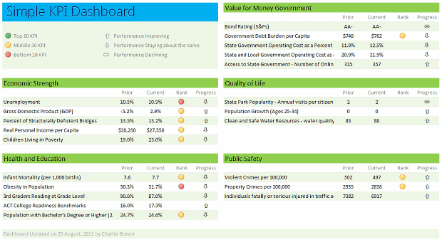
[Click here for larger version]
There are 2 parts in construction of a dashboard like this.
- Defining the vision, layout & metrics that you want.
- Creating the dashboard in Excel (or any other tool)
While it does not seem so, it is the Step 1 that takes a lot of time and hard-work.
Step 1: Defining the dashboard metrics, layout & vision
This is the most time consuming part of any dashboard. There is no one way to do this step. So I am going list a set of guidelines for you to follow.
- Speak with your audience & define what they want: For any dashboard, you will have some audience. So speak with them, understand what their information needs are. List down everything they want to know. Some parameters you want to consider are,
- Metrics / KPI they are interested
- Frequency of the need (weekly, monthly or yearly etc.)
- Granularity of the information (example: person level, department level, company level)
- Type of the need (information, analytical, mission critical etc.)
- Understand the sources of data: Another tricky part of a dashboard development is to get right data. In corporate environments, your data sources may be spread across and follow their own formats. So you need to plan ahead for all these differences, otherwise, you will end up doing lots of extra work.
- Prioritize the information: Once you have listed down various metrics, KPIs, information pieces to be used in the dashboard, list them down in the order of priority. Metrics or KPIs that are most important and indicate the overall health of the system (or project, initiative or company) should be on top.
- Remove ruthlessly: Now comes the tricky part. You must remove items, metrics and information that is low on value from the end dashboard. This is where your persuasion, negotiation skills come in handy.
- Make a rough sketch of the dashboard: Even before you make something in Excel, just make a rough sketch using pen and paper (or MS Paint or PowerPoint). This way, you can validate the design with end users and get buy-in early. (related: use excel for screen prototyping)
There are more ideas and tactics you can follow. But if you follow the above guidelines, then 80% of your work is done.
Step 2: Designing Excel Dashboard
This step becomes easier once you have clarity of vision and listed down what you want (and what you dont want). And if you find this difficult, there is always help.
In this, let us learn how to construct the particular dashboard you see above.
- Arrange the data: For a simple dashboard like this, you can arrange the data in this fashion.

- Create Dashboard Layout and Load data: Once the data is in-place, create a blank layout. You can follow any template. I liked the Michigan State Dashboard template and created something like that.
Once the layout is ready, link to the source data (using Copy & Paste as links).

- Use Conditional Formatting & Formulas to Display Icons: Once the data is loaded, next step is to show icons. This can be done easily with Conditional Formatting and simple formulas. (tip: display alerts in dashboards using conditional formatting)
- Format: Now format everything so it looks awesome.


That is all. You are done!
Download Simple KPI Dashboard Workbook
Click here to download the workbook & play with it.
Special thanks to Michigan State website for the inspiration & Linda for sharing the link.
Do you like this dashboard?
I really liked the simplicity of this dashboard. The Michigan state government folks have done fine job of listing down the metrics and carefully capturing them and presenting the outlook in a crisp fashion.
What about you? Do you like the ideas shared in this article? How would you approach a dashboard project? Please share your tips & ideas using comments.
Want to Learn Dashboards? Go thru these resources:
If you want to learn dashboards, then you have come to the right place. Click thru below links to access a ton of information, ideas & material.
- KPI Dashboards in Excel – 6 part tutorial
- Project Management Dashboard in Excel
- Sales Dashboards in Excel
- More on Dashboards
- Join our Excel School Dashboards Program
Share this tip with your colleagues

Get FREE Excel + Power BI Tips
Simple, fun and useful emails, once per week.
Learn & be awesome.
-
21 Comments -
Ask a question or say something… -
Tagged under
charting principles, conditional formatting icon sets, dashboards, downloads, kpi dashboards, Learn Excel, Microsoft Excel Conditional Formatting, Microsoft Excel Formulas, templates
-
Category:
Charts and Graphs, Cool Infographics & Data Visualizations

Welcome to Chandoo.org
Thank you so much for visiting. My aim is to make you awesome in Excel & Power BI. I do this by sharing videos, tips, examples and downloads on this website. There are more than 1,000 pages with all things Excel, Power BI, Dashboards & VBA here. Go ahead and spend few minutes to be AWESOME.
Read my story • FREE Excel tips book


Excel School made me great at work.
5/5

From simple to complex, there is a formula for every occasion. Check out the list now.

Calendars, invoices, trackers and much more. All free, fun and fantastic.

Power Query, Data model, DAX, Filters, Slicers, Conditional formats and beautiful charts. It’s all here.

Still on fence about Power BI? In this getting started guide, learn what is Power BI, how to get it and how to create your first report from scratch.
Related Tips
21 Responses to “Simple KPI Dashboard using Excel”
-
 st0ny says:
 I think the arrow icons for ‘Performance Staying about the same’ and ‘Performance Declining’ are mixed up.
-
bill says:
i think that it would be so easy to build in additional information to allow someone to make sense of the numbers… and that in the rebuilt Excel dashboard you should have. for example, the 24.7 to 24.6 change is that real or just statistical vagary? Why does it get a down arrow, why not unchanged arrow? Under quality of life, population growth of the indicated age demographic… what triggeres up/down arrow designation — change between periods or the fact that both are negative? maybe it would be good to have less of this demographic group. the «rank» makes no sense at all… why is it applied to some but not all measures? what does rank mean? what are the time periods?
-
Prem Sivakanthan says:
A good dashboard is about telling a story. It is about accurately communicating what has happened, and maybe even provide a reason for why. A dashboard should prompt more questions than it answers, it should have enough detail to provoke discussion, yet not too much to put people off. A tall ask I here you say? Definately doable, and Chandoo my man, I think this is a really good example of a simple, yet effective dashboard. I have always been a fan of KISS (Keep It Super Simple) and this applies every so much to the world of dashboards. Like you say, it is imperative to understand what you’re audience expects and wants to see, and that means talking to them! Mind you, we have just learnt about the range.speak method in VBA classes, so maybe I can talk to my dashboard recepients via VBA….!!!!
-
Dave says:
Interesting use, thanks for sharing.
Can you explain how to enter the special symbols in the formula bar for the following
Cell J7=IFERROR(IF($H7*E7>$H7*D7,»ñ»,IF($H7*E7=$H7*D7,»ó»,»ò»)),»ó»)
-
Vicki says:
Dave — The special characters can be created using the Character Map in Windows or by learning the keyboard shortcuts (displayed in the corner of the Character Map). Alt+0241 is the keyboard code for an «ñ».
-
@Dave… I just inserted these symbols in to a cell, then selected the cell contents (F2, select all) and copied them. Then I went to the formula cell and pasted them and moved around.
@Vicki.. good tip on ALT code 🙂
@Bill.. They do have detailed views of each of these sections on the Michigan State website (here: http://www.michigan.gov/midashboard ). We can easily implement such drill-down functionality in this dashboard and redirect viewers to other sheet tabs.
-
harshad adesara says:
realy enjokyed
-
EXCELINNC says:
Whenever I am given what seems to be an impossible task in Excel, the first thing I do is go to Chandoo.org. Again! and Again, you have provided just what I needed! You are so right that this template is beautifully «Simple».
Since the requirement for our Executive Staff is by Group Location, I added a Drop Down List Validation Box with VLOOKUPs to view the data by Group. It was easy to also add Conditional Formatting to the Progress Indicators.
I can’t thank you and the originator of this Dashboard enough for sharing and helping me to continue to build my Excel Skills.
-
William says:
Can you explain where the Rank & Metric Typr derived from?
-
EXCELINNC says:
I made some tweaks to automate the Rank Calculation to display R-A-G for Red, Amber & Green based on two Helper Columns with the Metric Thresholds…and a Unique Key Field for a VLOOKUP…
1 — Insert a Column to the right of Rank and call it Calc
2 — Insert two «Helper» Columns after the Change Column with the % Values for Amber and Green
3 — For a metric where the Metric Type is -1 insert this formula in the Calc Column:
Where a higher % indicates lower performance…
=IF(E5>K5,»R»,IF(OR(E5<=L5),»G»,»A»))4 — For a metric where the Metric Type is 1 insert this formula in the Calc Column:
Where a lower % indicates lower performance…
=IF(E12=L12),»G»,»A»))5 — In the Rank Column, changed the formula to simplify the R-A-G:
=IF(F4=»»,»»,IF(F4=»R»,3,IF(F4=»A»,2,1)))6 — Manually change the Metric Type to a -1 or 1, per your KPIs.
7 — Link the values in the new Calc Column to the Rank (=G5). For some reason the Rank (R-A-G) Stoplights would not work based on the from the formula, but worked when linked.
This is how the inserted and Helper columns line up:
Unique Key,Group,Metric,Prior,Current,Rank,Calc,Metric Type,Rank,Change,Amber%,Green%The new Dashboard already has a new name «KeyPIR». (Key Performance Indicators Review)
-
Lucile says:
Hello,
Where could have find the template for The new Dashboard already has a new name “KeyPIR”. (Key Performance Indicators Review) ?
Thank you
LucileReply
-
-
Jaron says:
Hi Chandoo,
For some reason when I download via the link it advises it is not in excel format — is it possible to get the example workbook emailed directly?
Thanks.
-
Zuber says:
Hi really nice work.
but correct me if I am wrong here. is Prior and Current flipped?
because if I have 10% in Prior and 50% in Current then it is showing down arrow instead of up.
even the arrow indication showing wrong down says Performance Staying about the same
and left right arrow saysPerformance Declining
-
UK_Steve says:
Zuber — you need to understand the measure to know whether up is good or bad. Personal Income going up is good, crime rate going up is bad. The arrows are an indicator of good and bad or as the column heading says «Progress».
-
What is Metrics Type 1 and -1. Could anybody explain me what they are
-
Lucile says:
Hello,
Where could have find the template for The new Dashboard already has a new name “KeyPIR”. (Key Performance Indicators Review) ?
Thank you
Lucile -
Dale Speight says:
Hi,
I am looking to automate an existing dashboard with a data feed from an oracle database. What is the best practice for this.
I’m using Excel 2016
and Oracle 10gMany Thanks
Dale -
Relislim Smith says:
This article is simply amazing. I love your ideas on weight loss. typically it just takes some effort and the right diet schedule/ know how. i’d be interested in link to your article from my FB page as i think it will serve my audience well. I would not be alble to induce my purpose across as well as you most definitely did here. Thanks again.
-
Manish Sharma says:
Hi Team,
I am looking for a score card dashboard for my team with various KPIs mapped and also the process wise performance.
I have 20 processes divided amongst 10 team members.
Want to prepare a team member / process wise KPI achievement vision.
This will priomarily be for quality related KPIs like, CQ achievement, C-SAT Achievement, Team attrition, initiatives taken, performance etc
Kindly suggest -
jawwad says:
kindly share the copy of this excel file.
thanks,
Jawwad. -
I too am looking for a score card dashboard for a small team to map 5 KPIs and also performance.