
17 авг. 2022 г.
читать 2 мин
Логистическая регрессия — это статистический метод, который мы используем для подбора модели регрессии, когда переменная отклика является бинарной. Чтобы оценить, насколько хорошо модель логистической регрессии соответствует набору данных, мы можем взглянуть на следующие две метрики:
- Чувствительность: вероятность того, что модель предсказывает положительный результат для наблюдения, когда результат действительно положительный. Это также называется «истинно положительным показателем».
- Специфичность: вероятность того, что модель предсказывает отрицательный результат для наблюдения, когда результат действительно отрицательный. Это также называется «истинной отрицательной ставкой».
Один из способов визуализировать эти две метрики — создать кривую ROC , которая означает кривую «рабочей характеристики приемника». Это график, отображающий чувствительность и специфичность модели логистической регрессии.
В следующем пошаговом примере показано, как создать и интерпретировать кривую ROC в Excel.
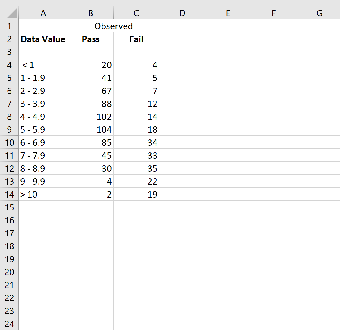
Шаг 1: введите данные
Во-первых, давайте введем некоторые необработанные данные:
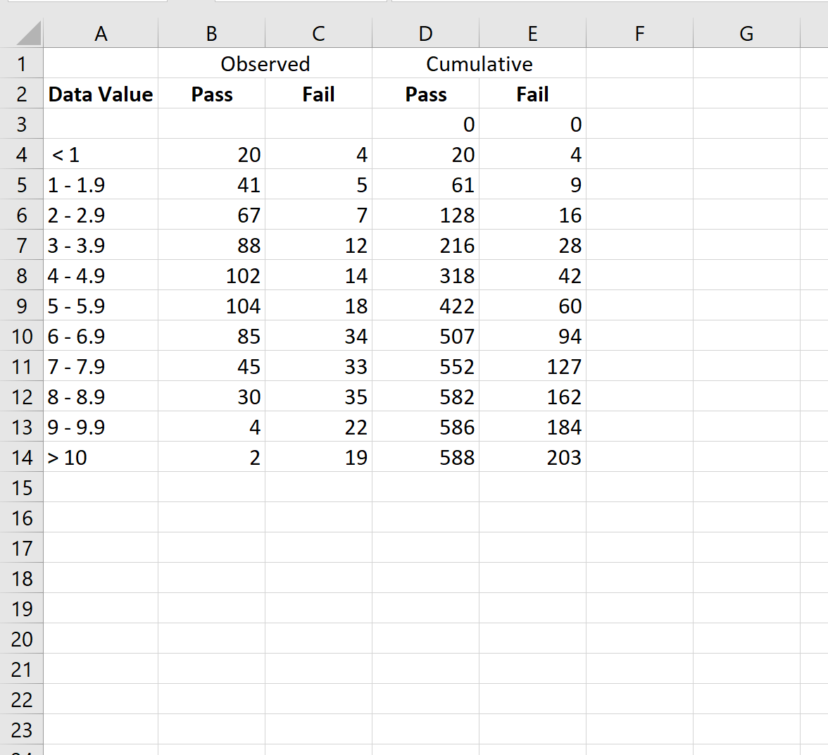
Шаг 2: Рассчитайте совокупные данные
Далее воспользуемся следующей формулой для расчета совокупных значений для категорий Pass и Fail:
- Совокупные значения прохождения: =СУММ($B$3:B3)
- Совокупные значения ошибок: =СУММ($C$3:C3)
Затем мы скопируем и вставим эти формулы в каждую ячейку столбца D и столбца E:
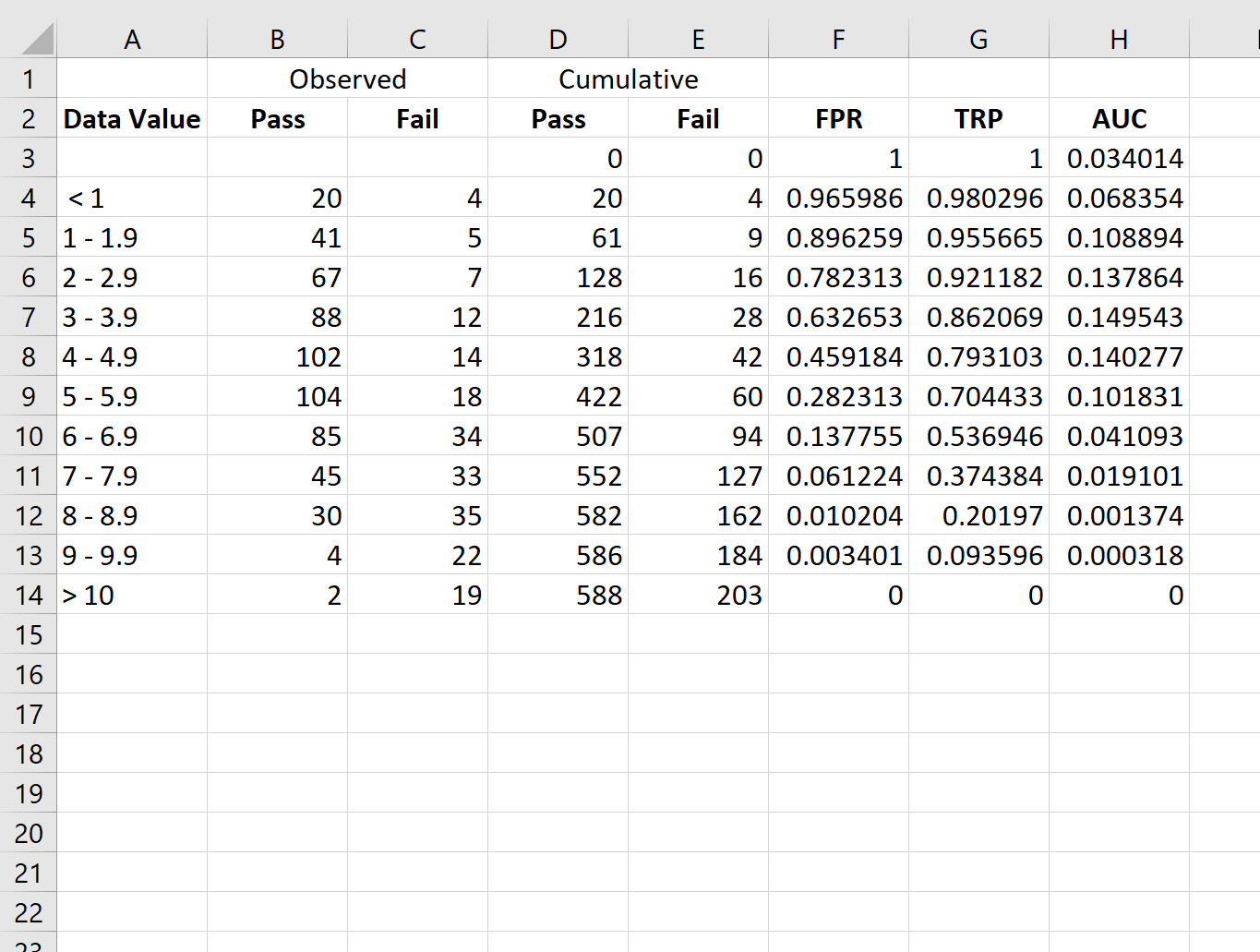
Шаг 3: Рассчитайте процент ложноположительных результатов и показатель истинно положительных результатов
Далее мы рассчитаем частоту ложноположительных результатов (FPR), частоту истинных положительных результатов (TPR) и площадь под кривой AUC, используя следующие формулы:
- FPR: =1-D3/$D$14
- TPR: =1-E3/$E$14
- ППК: =(F3-F4)*G3
Затем мы скопируем и вставим эти формулы в каждую ячейку в столбцах F, G и H:
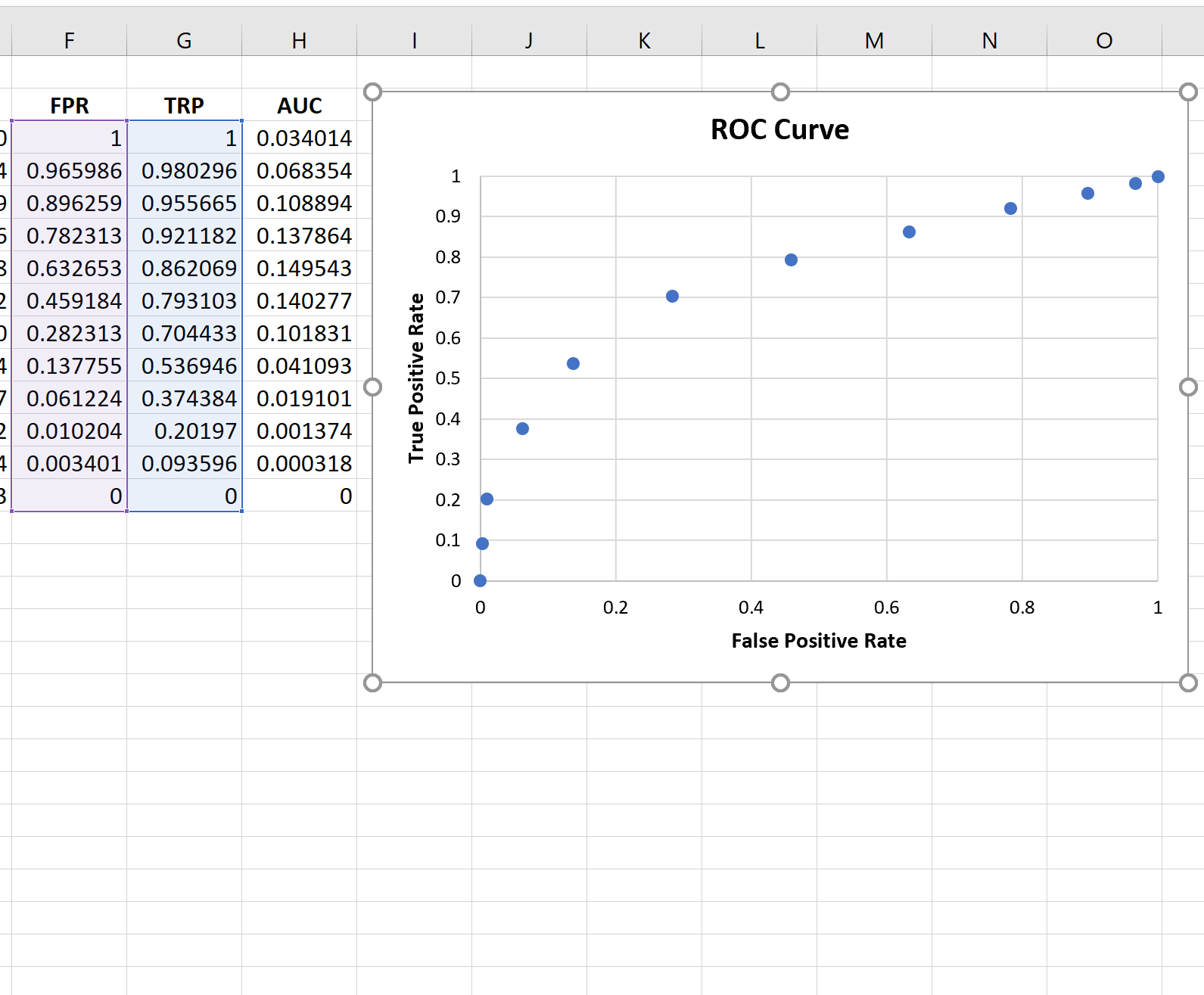
Шаг 4: Создайте кривую ROC
Чтобы создать кривую ROC, мы выделим каждое значение в диапазоне F3:G14 .
Затем мы щелкнем вкладку « Вставка » на верхней ленте, а затем щелкнем « Вставить разброс (X, Y)», чтобы создать следующий график:
Шаг 5: Рассчитайте AUC
Чем больше кривая охватывает верхний левый угол графика, тем лучше модель классифицирует данные по категориям.
Как видно из графика выше, эта модель логистической регрессии неплохо справляется с классификацией данных по категориям.
Чтобы дать количественную оценку, мы можем рассчитать AUC (площадь под кривой), которая говорит нам, какая часть графика расположена под кривой.
Чем ближе AUC к 1, тем лучше модель. Модель со значением AUC, равным 0,5, ничем не лучше модели со случайными классификациями.
Чтобы рассчитать AUC кривой, мы можем просто взять сумму всех значений в столбце H:
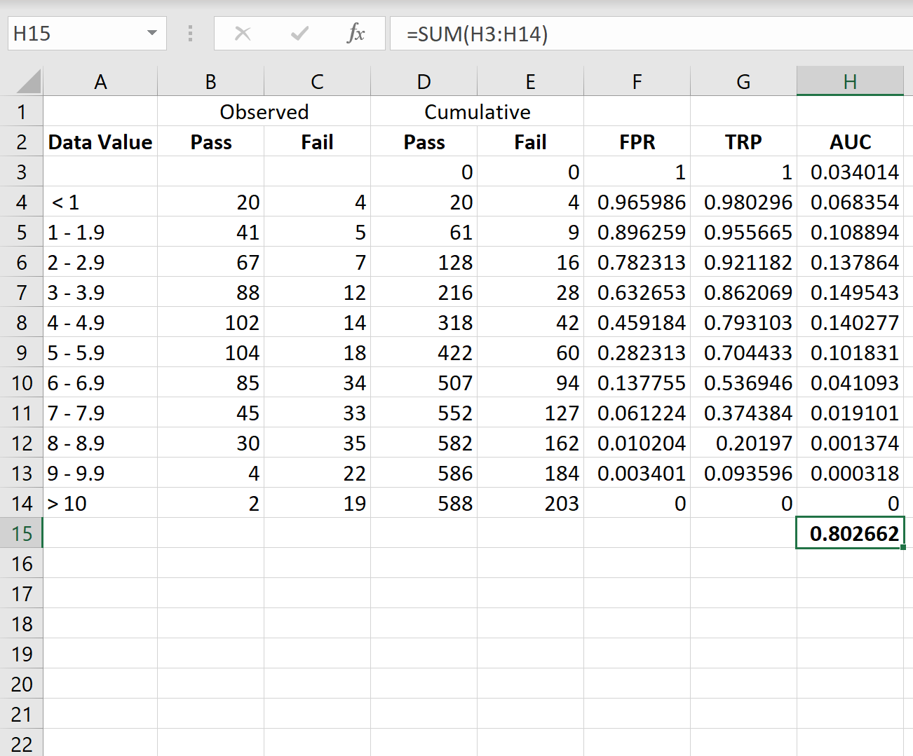
AUC оказывается равным 0,802662.Это значение довольно высокое, что указывает на то, что модель хорошо классифицирует данные по категориям «пройдено» и «не пройдено».
Дополнительные ресурсы
В следующих руководствах объясняется, как создавать другие распространенные графики в Excel:
Как построить CDF в Excel
Как создать кривую выживания в Excel
Как создать статистическую контрольную диаграмму процесса в Excel
Logistic Regression is a statistical method that we use to fit a regression model when the response variable is binary. To assess how well a logistic regression model fits a dataset, we can look at the following two metrics:
- Sensitivity: The probability that the model predicts a positive outcome for an observation when indeed the outcome is positive. This is also called the “true positive rate.”
- Specificity: The probability that the model predicts a negative outcome for an observation when indeed the outcome is negative. This is also called the “true negative rate.”
One way to visualize these two metrics is by creating a ROC curve, which stands for “receiver operating characteristic” curve. This is a plot that displays the sensitivity and specificity of a logistic regression model.
The following step-by-step example shows how to create and interpret a ROC curve in Excel.
Step 1: Enter the Data
First, let’s enter some raw data:

Step 2: Calculate the Cumulative Data
Next, let’s use the following formula to calculate the cumulative values for the Pass and Fail categories:
- Cumulative Pass values: =SUM($B$3:B3)
- Cumulative Fail values: =SUM($C$3:C3)
We’ll then copy and paste these formulas down to every cell in column D and column E:

Step 3: Calculate False Positive Rate & True Positive Rate
Next, we’ll calculate the false positive rate (FPR), true positive rate (TPR), and the area under the curve AUC) using the following formulas:
- FPR: =1-D3/$D$14
- TPR: =1-E3/$E$14
- AUC: =(F3-F4)*G3
We’ll then copy and paste these formulas down to every cell in columns F, G, and H:

Step 4: Create the ROC Curve
To create the ROC curve, we’ll highlight every value in the range F3:G14.
Then we’ll click the Insert tab along the top ribbon and then click Insert Scatter(X, Y) to create the following plot:

Step 5: Calculate the AUC
The more that the curve hugs the top left corner of the plot, the better the model does at classifying the data into categories.
As we can see from the plot above, this logistic regression model does a pretty good job of classifying the data into categories.
To quantify this, we can calculate the AUC (area under the curve) which tells us how much of the plot is located under the curve.
The closer AUC is to 1, the better the model. A model with an AUC equal to 0.5 is no better than a model that makes random classifications.
To calculate the AUC of the curve, we can simply take the sum of all of the values in column H:

The AUC turns out to be 0.802662. This value is fairly high, which indicates that the model does a good job of classifying the data into ‘Pass’ and ‘Fail’ categories.
Additional Resources
The following tutorials explain how to create other common plots in Excel:
How to Plot a CDF in Excel
How to Create a Survival Curve in Excel
How to Create a Statistical Process Control Chart in Excel
Модель классификации пытается отнести каждый экземпляр к определенному классу, и результатом модели классификации обычно является реальное значение, такое как логистическая регрессия, где результатом является реальное значение от 0 до 1. Вот как определить порог (пороговое значение), чтобы результат модели был больше этого значения, отнесен к одной категории, меньше этого значения, отнесен к другой категории.
Рассмотрим дихотомическую задачу, которая состоит в том, чтобы классифицировать экземпляры на положительные или отрицательные. Для дихотомической задачи существует четыре ситуации. Если экземпляр является положительным классом и также прогнозируется как положительный класс, он является истинно положительным.Если экземпляр является отрицательным классом и прогнозируется как положительный класс, он называется ложноположительным. Соответственно, если экземпляр является отрицательным классом и прогнозируется как отрицательный класс, он называется истинно положительным, а положительный класс прогнозируется как отрицательный класс, что является ложноотрицательным.
Таблица непредвиденных обстоятельств показана в следующей таблице, 1 представляет положительную категорию, а 0 — отрицательную категорию.
|
прогноз |
||||
|
1 |
0 |
общий |
||
|
действительный |
1 |
True Positive(TP) |
False Negative(FN) |
Actual Positive(TP+FN) |
|
0 |
False Positive(FP) |
True Negative(TN) |
Actual Negative(FP+TN) |
|
|
общий |
Predicted Positive(TP+FP) |
Predicted Negative(FN+TN) |
TP+FP+FN+TN |
Введите два новых термина из таблицы непредвиденных обстоятельств. Один из них — истинно положительная ставка (TPR), Формула расчета:TPR=TP / (TP + FN), который характеризует соотношение выявленных классификатором положительных примеров ко всем положительным примерам. Другой — отрицательный положительный результат (ложноположительный показатель, FPR), формула расчета:FPR= FP / (FP + TN),Рассчитывается доля всех отрицательных случаев, когда классификатор ошибочно полагает, что положительная категория составляет все отрицательные случаи. Существует также истинно отрицательная ставка (True Negative Rate, TNR), также известная как специфичность, формула расчета TNR =TN / (FP + TN) = 1 − FPR。
В модели с двумя категориями для полученных непрерывных результатов предполагается, что был определен порог, например 0,6. Экземпляры, превышающие это значение, классифицируются как положительные, а экземпляры, меньшие этого значения, классифицируются как отрицательные. Если порог снижен до 0,5, конечно, можно выявить больше положительных случаев, то есть отношение выявленных положительных примеров ко всем положительным примерам увеличивается, то есть TPR, но в то же время больше отрицательных примеров Считается Подавать положительный пример, то есть увеличивать FPR. Чтобы наглядно представить это изменение, здесь представлен ROC.
Рабочие характеристики приемника, переведенные как «кривая рабочих характеристик приемника», сбивают с толку. Кривая представляет собой комбинацию двух переменных, специфичности 1 и чувствительности, так как специфичность 1 = FPR, то есть отрицательная положительная оценка класса. Чувствительность — это истинная оценка класса, а истинно положительная оценка отражает степень охвата положительного класса. Эта комбинация основана на соотношении специфичности 1 и чувствительности, т. Е. Затрат и выгод.
Следующая таблица является результатом логистической регрессии. Разделите полученное действительное значение на 10 частей с одинаковым числом от большого к малому.
|
Percentile |
Количество экземпляров |
Количество положительных случаев |
1-Специфика(%) |
Чувствительность(%) |
|
10 |
6180 |
4879 |
2.73 |
34.64 |
|
20 |
6180 |
2804 |
9.80 |
54.55 |
|
30 |
6180 |
2165 |
18.22 |
69.92 |
|
40 |
6180 |
1506 |
28.01 |
80.62 |
|
50 |
6180 |
987 |
38.90 |
87.62 |
|
60 |
6180 |
529 |
50.74 |
91.38 |
|
70 |
6180 |
365 |
62.93 |
93.97 |
|
80 |
6180 |
294 |
75.26 |
96.06 |
|
90 |
6180 |
297 |
87.59 |
98.17 |
|
100 |
6177 |
258 |
100.00 |
100.00 |
Количество положительных примеров — это фактическое количество положительных классов в этой части. Другими словами, результаты, полученные с помощью логистической регрессии, расположены в порядке убывания.Если предыдущие 10% значений используются в качестве порогового значения, первые 10% экземпляров классифицируются в положительную категорию 6180. Среди них правильное число — 4879, что составляет 4879/14084 * 100% = 34,64% всех положительных классов, что является чувствительностью; кроме того, есть 6180-4879 = 1301 отрицательный экземпляр, который ошибочно классифицируется как положительный класс, с учетом всех отрицательных случаев Класс 1301/47713 * 100% = 2,73%, что соответствует 1-специфичности. Возьмите эти два набора значений как значение x и значение y соответственно и создайте диаграмму разброса в Excel. Кривая ROC выглядит следующим образом:

Диагональная линия отражает результат случайного выбора, а эта диагональная линия служит контрольной линией. Как выбрать порог? Это включает в себя AUC (площадь под кривой ROC, площадь под кривой ROC).
Перепечатано по адресу: https://www.cnblogs.com/zgw21cn/archive/2009/02/14/1390683.html
The Receiver Operating Characteristic (ROC) Curve is a plot of values of the False Positive Rate (FPR) versus the True Positive Rate (TPR) for a specified cutoff value.
Example
Example 1: Create the ROC curve for Example 1 of Classification Table.
We begin by creating the ROC table as shown on the left side of Figure 1 from the input data in range A5:C17.

Figure 1 – ROC Table and Curve
First, we create the cumulative values for Failure and Success (columns D and E) and then the values of FPR and TPR for each row (columns F and G). E.g. the entries for row 9 are calculated via the following formulas:
| Cell | Meaning | Formula |
| D9 | Failure Cumulative | =D8+B9 |
| E9 | Success Cumulative | =E8+C9 |
| F9 | FPR | =1-D9/D$17 |
| G9 | TPR | =1-E9/E$17 |
| H9 | AUC | =(F9-F10)*G9 |
Figure 2 – Selected formulas from Figure 1
The ROC curve can then be created by highlighting the range F7:G17 and selecting Insert > Charts|Scatter and adding the chart and axes titles (as described in Excel Charts). The result is shown on the right side of Figure 1. The actual ROC curve is a step function with the points shown in the figure.
Observation
The higher the ROC curve (i.e. the closer to the line y = 1) the better the fit. In fact, the area under the curve (AUC) can be used for this purpose. The closer AUC is to 1 (the maximum value) the better the fit. Values close to .5 show that the model’s ability to discriminate between success and failure is due to chance.
For Example 1, the AUC is simply the sum of the areas of each of the rectangles in the step function. The formula for calculating the area for the rectangle corresponding to row 9 (i.e. the formula in cell H9) is shown in Figure 2. The formula for calculating the AUC (cell H18) is =SUM(H7:H17). The calculated value of .889515 shows a pretty good fit.
References
Hanley J. A., McNeil B. J. (1982) The meaning and use of the area under a receiver operating characteristic (ROC) curve
http://dx.doi.org/10.1148/radiology.143.1.7063747
Hintze, J. L. (2008) ROC Curves. NCSS
https://www.ncss.com/wp-content/themes/ncss/pdf/Procedures/NCSS/ROC_Curves-Old_Version.pdf
Hintze, J. L. (2022) One ROC curve and cutoff analysis. NCSS
https://www.ncss.com/wp-content/themes/ncss/pdf/Procedures/NCSS/One_ROC_Curve_and_Cutoff_Analysis.pdf
IBM (2011) ROC algorithms IBM SPSS Statistics 20 Algorithms
http://www.sussex.ac.uk/its/pdfs/SPSS_Algorithms_20.pdf
This tutorial will show you how to draw and interpret a ROC curve in Excel using the XLSTAT statistical software.
What are ROC curves?
ROC curves were first developed during World War II to develop effective means of detecting Japanese aircrafts. It was then applied more generally to signal detection and medicine where it is now widely used.
The problem is as follows: we study a phenomenon, often binary (for example, the presence or absence of a disease) and we want to develop a test to detect effectively the occurrence of a precise event (for example, the presence of the disease).
If the test is quantitative (possibly ordinal), for example, a concentration of a molecule, we will try to determine from what concentration can a patient be considered as ill. The ROC curves and indices calculated here will help us make the best decision.
Dataset to generate a ROC curve
The data correspond to a medical experiment during which 50 patients, among which 20 are sick, are submitted to a screening test where the concentration of a viral molecule is being measured.
Setting up of a ROC curve
Once XLSTAT has been started, select the Survival analysis / ROC Curves command.

When you click on the button, a dialog box appears. Select the data that correspond to the event data and enter the code that is associated to positive cases.
Then select the data that correspond to the diagnostic test that we are evaluating and specify what type of rule should be used to identify the threshold value below or above which the test should be considered positive.
We choose here to consider that the test is positive if the concentration is greater than or equal to a value to be determined.

In the Options tab, you can specify the method for calculating the confidence intervals.
XLSTAT is the software offering the widest choice. The defaults are those most recommended.
In this tab, you can also assign a cost to the various cases. We wish to strongly penalize diagnostic errors and more particularly the case where the sick patients are not detected.

In the Charts tab, we choose to display a decision plot based on costs.

When you click OK, the computations are done and the results are displayed.
interpretation of a ROC curve
The first table displays the descriptive statistics for the test variable, here the concentration, followed by the statistics for the event variable, here the disease. The prevalence observed on the sample is equal to 0.4.

The ROC is then displayed. To each small square corresponds an observation.

The «ROC Analysis» that follows, displays for each possible threshold value, the value of the various performance indices. For example, if we decide to declare a patient sick when the concentration is greater than or equal to 0.98, the sensitivity is 0.95, the specificity of 0,733 and the cost is 61. For more details on the various indices, you can check the tutorial on sensitivity and specificity analysis.

A graph constructed using this table is then displayed. He can see the evolution of counting TP (true positives), TN (true negative), FP (false positives) and FN (false negatives) depending on the chosen threshold value.

The decision plot allows to choose the threshold value that minimizes the cost. To see what is the minimum threshold value on the chart, just leave your mouse over the corresponding point. This value corresponds to a concentration of 0.98, as we had identified earlier in the table analysis ROC.

The last series of results allows the study the area under the curve (AUC). The AUC and its confidence interval are calculated. The test that compares the AUC to 0.5 allows to check if the diagnostic test is more powerful than just a random rule. In our case, the test is very powerful and the AUC is significantly different from 0.5.

The comparison of the AUC is also a way to compare different diagnostic tests. XLSTAT can compare as many tests as you like.
Was this article useful?
- Yes
- No