This tutorial will help you set up and interpret a k-means Clustering in Excel using the XLSTAT software.
Not sure if this is the right clustering tool you need? Check out this guide.
Dataset for k-means clustering
Our data is from the US Census Bureau and describes the changes in the population of 51 states between 2000 and 2001. The initial dataset has been transformed to rates per 1000 inhabitants, with the data for 2001 being used as the focus for the analysis.
Goal of this tutorial
Our aim is to create homogeneous clusters of states based on the demographic data we have available. This dataset is also used in the Principal Component Analysis (PCA) tutorial and in the Hierarchical Ascendant Classification (HAC) tutorial.
Note: If you try to re-run the same analysis as described below on the same data, as the k-means method starts from randomly selected clusters, you will most probably obtain different results from those listed hereunder, unless you fix the seed of the random numbers to the same value as the one used here (4414218). To fix the seed, go to the XLSTAT Options, Advanced tab, then check the fix the seed option.
Setting up a k-means clustering in XLSTAT
Once XLSTAT is activated, click on Analyzing data / k-means clustering as shown below:
Once you have clicked on the button, the k-means clustering dialog box appears. Select the data on the Excel sheet.
Note: There are several ways of selecting data with XLSTAT — for further information, please check the tutorial on selecting data.
In this example, the data start from the first row, so it is quicker and easier to use the column selection mode. This explains why the letters corresponding to the columns are displayed in the selection boxes.
In the General tab, select the following quantitative variables that allows clustering — NET DOMESTIC MIG.
-
FEDERAL/CIVILIAN MOVE FROM ABROAD
-
NET INT. MIGRATION
-
PERIOD BIRTHS
-
PERIOD DEATHS
-
< 65 POP. EST.
The TOTAL POPULATION variable was not selected, as we are interested mainly in the demographic dynamics. The last column (> 65 POP. EST.) was not selected because it is fully correlated with the column preceding it.
Since the name of each variable is present at the top of the table, we must check the Variable labels checkbox.
We set the number of groups to create to 4.
The selected criterion is the Determinant(W) as it allows you to remove the scale effects of the variables. The Euclidean distance is chosen as the dissimilarity index because it is the most classic one to use for a k-means clustering.
Finally, the observation labels are selected (STATE column) because the name of the state is specified for each observation.

In the Options tab we increased the number of repetitions to 10 in order to increase the quality and the stability of the results.

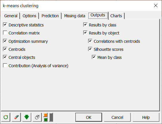
Finally, in the Outputs tab, we can choose to display one or several output tables.
Interpreting a k-means clustering
After the basic descriptive statistics of the selected variables and the optimization summary, the first result displayed is the inertia decomposition table.
The inertia decomposition table for the best solution among the repetitions is displayed. (Note: Total inertia = Between-classes inertia + Within-class inertia).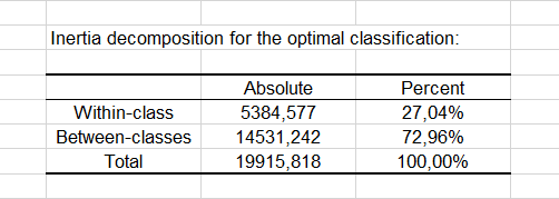
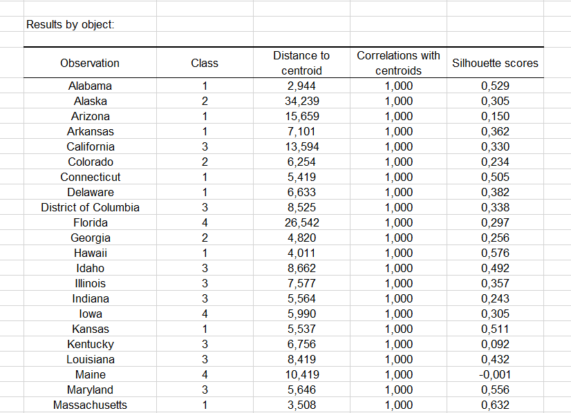
After a series of tables that include the class centroids, the distance between the class centroids, the central objects (here, the state that is the closest to the class centroid), a table shows the states that have been classified into each cluster.

Then a table with the group ID for each state is displayed. A sample is shown below. The cluster IDs can be merged with the initial table for further analyses (discriminant analysis for example.).
The Correlations with centroids and Silhouette scores options are activated, then the associated columns are displayed in the same table:
A graph representing silhouette scores allows you to visually study the goodness of the clustering. If the score is close to 1, the observation lies well in its class. On the contrary, if the score is close to -1, the observation is assigned to the wrong class.
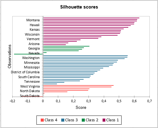
Mean silhouette scores by class allow you to compare classes and tell which one is the most uniform according to this score.
Class 1 has the highest silhouette scores. Meanwhile, Class 2 has a score close to 0, which means 4 is not the best number of classes for this data. In the tutorial on Agglomerative Hierarchical Clustering (AHC), we see that the States would better be clustered into three groups.
This video shows you how to group samples with the k-means clustering.
Was this article useful?
- Yes
- No
Basic Algorithm
The objective of this algorithm is to partition a data set S consisting of n-tuples of real numbers into k clusters C1, …, Ck in an efficient way. For each cluster Cj, one element cj is chosen from that cluster called a centroid.
Definition 1: The basic k-means clustering algorithm is defined as follows:
- Step 1: Choose the number of clusters k
- Step 2: Make an initial selection of k centroids
- Step 3: Assign each data element to its nearest centroid (in this way k clusters are formed one for each centroid, where each cluster consists of all the data elements assigned to that centroid)
- Step 4: For each cluster make a new selection of its centroid
- Step 5: Go back to step 3, repeating the process until the centroids don’t change (or some other convergence criterion is met)
There are various choices available for each step in the process.
An alternative version of the algorithm is as follows:
- Step 1: Choose the number of clusters k
- Step 2: Make an initial assignment of the data elements to the k clusters
- Step 3: For each cluster select its centroid
- Step 4: Based on centroids make a new assignment of data elements to the k clusters
- Step 5: Go back to step 3, repeating the process until the centroids don’t change (or some other convergence criterion is met)
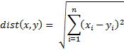
Distance
There are a number of ways to define the distance between two n-tuples in the data set S, but we will focus on the Euclidean measure, namely, if x = (x1, …, xn) and y = (y1, …, yn) then the distance between x and y is defined by
Since minimizing the distance is equivalent to minimizing the square of the distance, we will instead look at dist2(x, y) = (dist(x, y))2. If there are k clusters C1, …, Ck with corresponding centroids c1, …, ck, then for each data element x in S, step 3 of the k-means algorithm consists of finding the value j which minimizes dist2(x, cj); i.e.
![]()
If we don’t require that the centroids belong to the data set S, then we typically define the new centroid cj for cluster Cj in step 4 to be the mean of all the elements in that cluster, i.e.
![]()
where mj is the number of data elements in Cj.
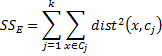
If we think of the distance squared between any data element in S and its nearest centroid as an error value (between a data element and its prototype) then across the system we are trying to minimize
Initial Choice
There is no guarantee that we will find centroids c1, …, ck that minimize SSE and a lot depends on our initial choices for the centroids in step 2.
Property 1: The best choice for the centroids c1, …, ck are the n-tuples which are the means of the C1, …, Ck,. By best choice, we mean the choice that minimizes SSE.
Click here for a proof of this property (using calculus).
Example
Example 1: Apply the second version of the k-means clustering algorithm to the data in range B3:C13 of Figure 1 with k = 2.
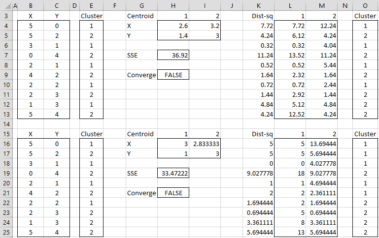
Figure 1 – K-means cluster analysis (part 1)
The data consists of 10 data elements which can be viewed as two-dimensional points (see Figure 3 for a graphical representation). Since there are two clusters, we start by assigning the first element to cluster 1, the second to cluster 2, the third to cluster 1, etc. (step 2), as shown in range E3:E13.
We now set the centroids of each cluster to be the mean of all the elements in that cluster. The centroid of the first cluster is (2.6, 1.4) where the X value (in cell H4) is calculated by the formula =AVERAGEIF(E4:E13,1,B4:B13) and the Y value (in cell H5) is calculated by the worksheet formula =AVERAGEIF(E4:E13,1,C4:C13). The centroid for the second cluster (3.2, 3.0) is calculated in a similar way.
We next calculate the squared distance of each of the ten data elements to each centroid. E.g. the squared distance of the first data element to the first centroid is 7.72 (cell L4) as calculated by =(B4-H4)^2+(C4-H5)^2 or equivalently =SUMXMY2($B4:$C4,H$4:H$5). Since the squared distance to the second cluster is 12.24 (cell M4) is higher we see that the first data element is closer to cluster 1 and so we keep that point in cluster 1 (cell O4). Here cell K4 contains the formula =MIN(L4:M4) and cell O4 contains the formula =IF(L4<=M4,1,2).
Convergence
We proceed in this way to determine a new assignment of clusters to each of the 10 data elements as described in range O4:O13. The value of SSE for this assignment is 36.92 (cell H7). Since the original cluster assignment (range E4:E13) is different from the new cluster assignment, the algorithm has not yet converged and so we continue. We simply copy the latest cluster assignment into the range E16:E25 and repeat the same steps.
After four steps we get convergence, as shown in Figure 2 (range E40:E49 contains the same values as O40:O49). The final assignment of data elements to clusters is shown in range E40:E49. We also see that SSE = 22.083 and note that each step in the algorithm has reduced the value of SSE.
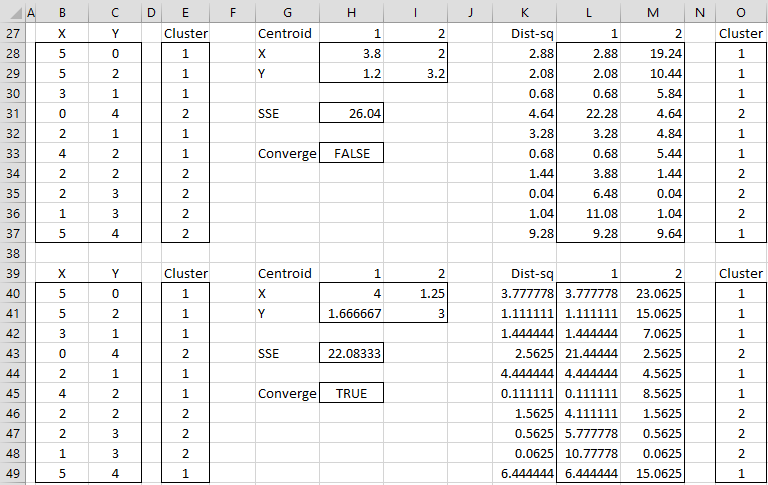
Figure 2 – K-means cluster analysis (part 2)
Graph of Assignments
Figure 3 graphically shows the assignment of data elements to the two clusters. This chart is created by highlighting the range B40:C49 and selecting Insert > Charts|Scatter.
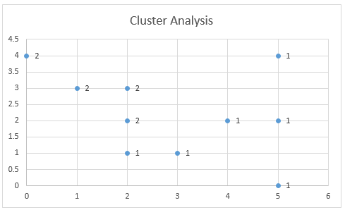
Figure 3 – Cluster Assignment
You can add the labels (1 and 2) to the points on the chart shown in Figure 3 as follows. First, right-click on any of the points in the chart. Next, click on the Y Value option in the dialog box that appears as shown in Figure 4.
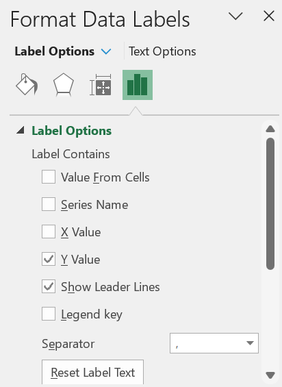
Figure 4 – Adding labels containing cluster assignment
Examples Workbook
Click here to download the Excel workbook with the examples described on this webpage.
References
PennState (2015) K-Mean procedure. STAT 505: Applied Multivariate Statistical Analysis
https://online.stat.psu.edu/stat505/lesson/14/14.8
Wilks, D. (2011) Cluster analysis
http://www.yorku.ca/ptryfos/f1500.pdf
Wikipedia (2015) K-means clustering
https://en.wikipedia.org/wiki/K-means_clustering
In this post I wanted to present a very popular clustering algorithm used in machine learning. The k-means algorithm is an unsupervised algorithm that allocates unlabeled data into a preselected number of K clusters. A stylized example is presented below to help with the exposition. Lets say we have 256 observations which are plotted below.

Our task it to assign each observation into one of three clusters. What we can do is to randomly generate 3 cluster centroids.

We can then proceed in an iterative fashion by assigning each observation to one of the centroid based on some distance measure. So if an observation has the least distance to the centroid k1 then it will be assigned to that centroid. Most common distance measure is called the Euclidean distance. This is a measure of the straight line that joins two points. More on this distance measure here https://en.wikipedia.org/wiki/Euclidean_distance.
The formula for a Euclidean distance between point Q =(q1,q2,q3,…qn) and point P=(p1,p2,p3,…pn) is given as:

We can implement this measure in VBA with the below function that takes two arrays and the length of the arrays as input to compute the distance.

In our example we have two features for each observation. Starting with the first we have x1=-.24513 and x2=5.740192

Using the first observation we can calculate the distance to each of the centroids. For the first centroid we have sqrt((-.24513-3)^2+(5.740192-3)^2) = 4.25. We can then calculate the distance to the second centroid as sqrt((-.24513-6)^2+(5.740192-2)^2) = 7.28. And finally the distance to the third centroid is sqrt((-.24513-8)^2+(5.740192-5)^2) = 8.28. Now, since the minimum distance is between this object and the first centroid, we will assign that object to the first centroid cluster.
After repeating this process for all of the 256 objects we have all the objects assigned to one of three clusters. I plot them below with different colours along with each centroid.

We can loop through all of our objects and calculate the closest centroid in VBA using below VBA function that returns an array that is the same length as our object array with each entry being between 1 to K.

At this point we move on to the next step of the iterative process and recalculate the centroids for each cluster. That is, we group our data by the cluster that they have been assigned to and then take the average for each feature of that cluster and make the value of each centroid.
In our example we get below results.

In VBA we can accomplish this with the below function:

We can again calculate the distance between each object and the new centroids and reassign each object to a cluster based on Euclidean distance. I have plotted the results below:

Notice that the centroids have moved and the reassignment looks to improve the homogeneity of the cluster. We can repeat this process until a maximum number of iterations have completed or until none of the objects are switching a cluster.
Below are a few more iterations of the algorithm so you can see the dynamics of the cluster assignment and centroid means.
As you can see that after only 5 iterations the clusters look sensible. I want to remind you that we only specified the number of clusters we are looking for and the algorithm found the clusters for us. This is an example of an unsupervised machine learning algorithm.
Notice how simple the final loop of the algorithm is. After loading in the data and building the above functions, we simply loop through the calculations a preset number of times with the code below:

The centroids are returned to L20 range. In our example after 10 loops we have

We can check our work with R’s NbClust package.

For another example of k-means clustering we can use this approach to cluster countries based on analyst forecast of some macro variables. For example we can compile a list of countries and consider bloomberg consensus forecasts for GDP growth, inflation, CB policy rate, unemployment rate, current account balance as a ratio of GDP, and budget deficit. Let’s say we wish to cluster these courtiers into four clusters for further analysis and we wish to discard conventional clusters used in the markets such as geographical, development status, or other marketing based conventions (BRIC being an example).

At this point I should highlight what is probably already obvious, we need to standardize the data. When features have different scale our distance measure will be dominated by the relatively large features. Therefore each cluster will be based on that dominant feature instead of all features being weighed equally. Here, for each feature, we can simply subtract the minimum from each observation and divide by the range (max-min) of its values to standardize. Below is our processed table:

The other important point is that instead of using arbitrary random starting points for each class we should select 4 random objects for the starting centroids. After running the k-means algo we end up with below clusters.

After we have the clusters the hard work begins. We can check what yields, curve spreads, FX forwards, implied vol in FX and rates are within clusters and how they compare with other clusters. Any outliers can then be further analysed to check for potential trades.
A final note of caution. The k-means algorithm is sensitive to starting values we chose for each centroid. Also, the a priori choice of k determines the final result. It is worthwhile to run the algorithm multiple times to check how sensitive the results are to the starting values. Many implementations of k-means run the algorithm multiple times and select the clustering based on some metric such as total dispersion in the data (ie, sum of squared distances between each object and its centroid).
In this post I just wanted to introduce the k-means algorithm and show how easy it is to implement it. All the modeling can be done in a day. Building a model for yourself can bring a lot of insight into how the algorithm works. For serious applications one should stick to better implementations such as R. This type of analysis can be done with just a few lines of code:

If you’ve been following along and want to know the complete VBA implementation, below I show you the main k-means procedure that calls the user defined functions mentioned above. I also present the main worksheet and I believe you can figure out where the data is read from and where the output is printed from the code.
The worksheet that calls the macro is below. The user needs to point to where the data is, where you wish for the output to be printed, the maximum number of iterations and the initial centroid values.

The macro button calls below macro:

Some Useful Resources:
1) Wikipedia entry is a great place to start https://en.wikipedia.org/wiki/K-means_clustering
k-means
K-means is an algorithm for cluster analysis (clustering). It is the process of partitioning a set of data into related groups / clusters.
K-means clustering is useful for Data Mining and Business Intelligence.
Here is k-means in plain English:
https://rayli.net/blog/data/top-10-data-mining-algorithms-in-plain-english/#2_k-means
This script is based on the work of bquanttrading. His blog on market modelling and market analytics:
https://asmquantmacro.com
What does it do
k-means will classify each record in your data, placing it into a group (cluster). You do not need to specify the properties of each group, k-means will decide for the groups. However, usually we need to provide the number of groups that we want in the output.
The records in the same cluster are similar to each other. Records in different clusters are dissimilar.
Each row of your Excel data, should be a record/observation with one or more features. Each column is a feature in the observation.
As an example, here is a data set with the height and weight of 25,000 children in Hong Kong : http://socr.ucla.edu/docs/resources/SOCR_Data/SOCR_Data_Dinov_020108_HeightsWeights.html
Each row in the data represents a person. Each column is a feature of the person.
Currently the script works only with numerical data.
How does it work
- Enter your data in a new Excel worksheet
- Enter the name of the worksheet in cell C4, and the range of the data at C5
- Enter the worksheet for the output to be placed, at C6 (you can use the one where your data is)
- Enter the cell where the output will be updated at C7
- Number of groups in your data at C8
- Click the button to start
- Check the Result
If you do not know the number of clusters/groups contained in your data, try different values for example 1 up to 10.
Execute the script several times and observe the GAP figure.
At the point where GAP reaches its maximum value, it indicates that the number of clusters is efficient for this data set.
As an example, changing the number of clusters and calculating with the IRIS data set, GAP will maximize when we have 3 clusters.
The original paper that describes the GAP calculation: https://web.stanford.edu/~hastie/Papers/gap.pdf
The results
The result is a number assigned on each record, that indicates the group/cluster the record belongs to.
The Result sheet contains information on the clusters, along with the cluster centers.
Performance
When the «Distance» value is minimized, it indicates the output accuracy is higher.
Execute the algorithm several times to find the best results.
The script will stop execution when the clusters are normalized or when the maximum iterations are reached (whichever comes first). You can increase the number of iterations for better results.
Unfortunately Excel VBA runs on a single thread, therefore it does not take full advantage of your current CPU’s
Why is this different?
The script calculates the initial centroids using k-means++ algorithm. You do not have to provide the initial centroids.
It also provides an indication of the number of groups contained in the data, using the GAP calculation.
More info
This is implementing David Arthur and Sergei Vassilvitski k-means++ algorithm, which chooses the initial centroids.
https://theory.stanford.edu/~sergei/papers/kMeansPP-soda.pdf
The example dataset provided in kmeans.xlsx is IRIS from UC Irvine Machine Learning Repository: https://archive.ics.uci.edu/ml/datasets.html
Tutorial Time: 20 Minutes
K Means Clustering is a way of finding K groups in your data. This tutorial will walk you a simple example of clustering by hand / in excel (to make the calculations a little bit faster).
Customer Segmentation K Means Example
A very common task is to segment your customer set in to distinct groups. You’re hoping that you find a set of customers that behave similarly and thus can be given tailored marketing pieces. Using K Means, we can do just that.
Download Data: CSV | Excel with Possible Solution
Data Exploration: 20 customers. 4 products + customer ID. Binary where 1 = purchased. 0 = no purchase.
- 9 / 20 (45%) have purchased product A
- 9 / 20 (45%) purchased product B
- 8 / 20 (40%) purchased product C
- 11/ 20 (55%) purchased product D
We could also calculate the probability of each product being bought with another given product (e.g. 44% of the time a customer will by both Product A and B). While a good step to understanding your data, as a toy example it’s not necessary for this analysis. Since the data is binary, K Means will do something like this for us.
Applying K Means: Based on the definition of K Means, we’re going to pick a random K points and then iteratively assign all other points to one of the K clusters by looking for the smallest distance. Based on advice from Andrew Ng’s Machine Learning course (Coursera), I like to use K actual data points to make sure you don’t end up in some empty space in your data.
In this case, let’s use K = 3 and see if we can find three interesting clusters. The Excel file linked above has a walkthrough
I chose customer number 4, 19, and 20 randomly. To start off we’ll calculate the distance of each customer from these three starting centroids.
We’ll use Euclidean Distance to measure how far apart these customers are from the centroids.
We’ll start with C# 1 and determine which cluster it belongs to
| Cluster | ProductA | ProductB | ProductC | ProductD |
|---|---|---|---|---|
| 1 | 1 | 1 | 0 | 1 |
| 2 | 0 | 1 | 1 | 1 |
| 3 | 0 | 1 | 0 | 1 |
Iteration # 1
C# 1 has the values 0, 0, 1, 1. Now we’ll calculate the Euclidean distance by doing SQRT[(Cluster.ProductA-Customer.ProductA)^2+(Cluster.ProductB-Customer.ProductB)^2+(Cluster.ProductC-Customer.ProductC)^2+(Cluster.ProductD-Customer.ProductD)^2]
- Cluster 1: SQRT[ (1-0)^2+(1-0)^2+(0-1)^2+(1-1)^2] =SQRT(1+1+1+0) = ~1.73
- Cluster 2: SQRT[ (0-0)^2+(1-0)^2+(1-1)^2+(1-1)^2] =SQRT(0+1+0+0) = 1
- Cluster 3: SQRT[ (0-0)^2+(1-0)^2+(0-1)^2+(1-1)^2] = SQRT(0+1+1+0) = ~1.41
For the first iteration, Customer # 1 belongs to Cluster 2 since its distance to the centroid is smallest.
C# 7 has the values 1, 0, 1, 1. We’ll calculate which cluster this customer belongs to as well.
- Cluster 1: SQRT[ (1-1)^2+(1-0)^2+(0-1)^2+(1-1)^2] =SQRT(0+1+1+0) = ~1.41
- Cluster 2: SQRT[ (0-1)^2+(1-0)^2+(1-1)^2+(1-1)^2] =SQRT(1+1+0+0) = ~1.41
- Cluster 3: SQRT[ (0-1)^2+(1-0)^2+(0-1)^2+(1-1)^2] = SQRT(1+1+1+0) = ~1.73
In this case, Cluster 1 and Cluster 2 are tied so I’m going to arbitrarily decide it belongs to cluster 1. Sometimes you just need to break a tie and I like to break it by taking the earliest cluster.
Let’s pretend you did this for each of the 20 customers (resulting in 60 distance calculations). With the same tie breaking method I used (Cluster 1 beats 2 and 3, Cluster 2 beats 3) you should get these results for the first iteration.
| Cust# | Cluster ID | Cust# | Cluster ID |
|---|---|---|---|
| 1 | 2 | 11 | 2 |
| 2 | 3 | 12 | 1 |
| 3 | 1 | 13 | 1* |
| 4 | 1 | 14 | 3 |
| 5 | 1 | 15 | 3 |
| 6 | 2 | 16 | 2 |
| 7 | 1* | 17 | 1 |
| 8 | 1 | 18 | 3 |
| 9 | 1 | 19 | 2 |
| 10 | 2 | 20 | 3 |
Customers 7 and 13 resulted in a tie and Cluster 1 was chosen arbitrarily.
Using these new cluster assignments, we have to move the centroid to the new center of the points assigned to that cluster.
You should get the following for your new centroids after this first iteration.
| Cluster | ProductA | ProductB | ProductC | ProductD |
|---|---|---|---|---|
| 1 | 1 | 0.444 | 0.222 | 0.2222 |
| 2 | 0 | 0.167 | 1 | 0.833 |
| 3 | 0 | 0.8 | 0 | 0.8 |
Using these new centers, you’ll reassign each customer to the clusters.
Iteration # 2
C# 1 has the values 0, 0, 1, 1. C# 1 belonged to cluster 1 during the first iteration. Using the new centroids, here are the distance calculations.
- Cluster 1: SQRT[ (1-0)^2+(0.444-0)^2+(0.222-1)^2+(0.222-1)^2] =~1.55
- Cluster 2: SQRT[ (0-0)^2+(0.167-0)^2+(1-1)^2+(0.833-1)^2] = ~0.24
- Cluster 3: SQRT[ (0-0)^2+(0.8-0)^2+(0-1)^2+(0.8-1)^2] = ~1.30
For the second iteration, C# 1 still belongs to cluster 1
C# 7 has the values 1, 0, 1, 1. Previous iteration C# 7 belonged to cluster 1.
- Cluster 1: SQRT[ (1-1)^2+(0.444-0)^2+(0.222-1)^2+(0.222-1)^2] =~1.19
- Cluster 2: SQRT[ (0-1)^2+(0.167-0)^2+(1-1)^2+(0.833-1)^2] = ~1.03
- Cluster 3: SQRT[ (0-1)^2+(0.8-0)^2+(0-1)^2+(0.8-1)^2] = ~1.64
For the second iteration, C# 7 now belongs to cluster 2. This is the only customer to change its cluster assignment during this iteration. However, since there is at least one change, we must iterate until the cluster assignments are stabel OR we reach some maximum number of iterations.
You should get the following for your new centroids after this second iteration.
| Cluster | ProductA | ProductB | ProductC | ProductD |
|---|---|---|---|---|
| 1 | 1.000 | 0.500 | 0.125 | 0.125 |
| 2 | 0.143 | 0.143 | 1.000 | 0.857 |
| 3 | 0.000 | 0.800 | 0.000 | 0.800 |
Iteration # 3
C# 1 has the values 0, 0, 1, 1. C# 1 belonged to cluster 1 during the second iteration. Using the new centroids, here are the distance calculations.
- Cluster 1: SQRT[ (1-0)^2+(0.5-0)^2+(0.125-1)^2+(0.125-1)^2] =~1.67
- Cluster 2: SQRT[ (0.143-0)^2+(0.143-0)^2+(1-1)^2+(0.857-1)^2] = ~0.25
- Cluster 3: SQRT[ (0-0)^2+(0.8-0)^2+(0-1)^2+(0.8-1)^2] = ~1.30
For the third iteration, C# 1 still belongs to cluster 1
C# 7 has the values 1, 0, 1, 1. Previous iteration C# 7 belonged to cluster 2.
- Cluster 1: SQRT[ (1-1)^2+(0.5-0)^2+(0.125-1)^2+(0.125-1)^2] =~1.33
- Cluster 2: SQRT[ (0.143-1)^2+(0.143-0)^2+(1-1)^2+(0.857-1)^2] = ~0.88
- Cluster 3: SQRT[ (0-1)^2+(0.8-0)^2+(0-1)^2+(0.8-1)^2] = ~1.64
Repeat this for every customer for iteration 3 and you’ll find that the cluster assignments are stable (i.e. no customer changes clusters).
The final centroids are:
| Cluster | ProductA | ProductB | ProductC | ProductD |
|---|---|---|---|---|
| 1 | 1.000 | 0.500 | 0.125 | 0.125 |
| 2 | 0.143 | 0.143 | 1.000 | 0.857 |
| 3 | 0.000 | 0.800 | 0.000 | 0.800 |
You now have done K Means clustering by hand!
Going Further
There’s more to K Means than just running it once and accepting the results.
- You should try different values of K. You may think 3 is the right number but maybe not.
- You should evaluate the clustering. Examine how close are the data points to the centroid and how far apart are the centroids to each other.
- You should run K Means multiple times. Since K Means is dependent on where your initial centroids are placed, you should try randomly selecting points a dozen to a hundred times to see if you’re getting similar results (both cluster centers, distance of points to center, and distance between each centroid).
- Are you sure K Means is the right way? K Means is known to be sensitive to outliers.
K Means is a common but useful tool in your analytical toolbelt. However, you’d never want to do this all by hand. Take a look at using R for K Means or using SciPy / SciKitLearn for K Means.
This is a step by step guide on how to run k-means cluster analysis on an Excel spreadsheet from start to finish. Please note that there is an Excel template that automatically runs cluster analysis available for free download on this website. But if you want to know how to run a k-means clustering on Excel yourself, then this article is for you.
In addition to this article, I also have a video walk-through of how to run cluster analysis in Excel.
Step One – Start with your data set
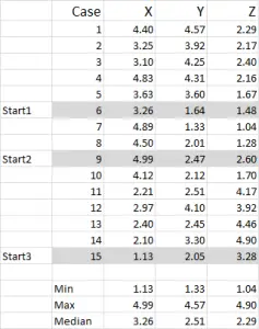
For this example I am using 15 cases (or respondents), where we have the data for three variables – generically labeled X, Y and Z.
You should notice that the data is scaled 1-5 in this example. Your data can be in any form except for a nominal data scale (please see article of what data to use).
NOTE: I prefer to use scaled data – but it is not mandatory. The reason for this is to “contain” any outliers. Say, for example, I am using income data (a demographic measure) – most of the data might be around $40,000 to $100,000, but I have one person with an income of $5m. It’s just easier for me to classify that person in the “over $250,000” income bracket and scale income 1-9 – but that’s up to you depending upon the data you are working with.
You can see from this example set that three start positions have been highlighted – we will discuss those in Step Three below.
Step Two – If just two variables, use a scatter graph on Excel
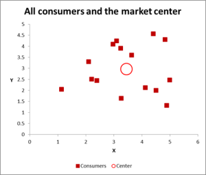
In this cluster analysis example we are using three variables – but if you have just two variables to cluster, then a scatter chart is an excellent way to start. And, at times, you can cluster the data via visual means.
As you can see in this scatter graph, each individual case (what I’m calling a consumer for this example) has been mapped, along with the average (mean) for all cases (the red circle).
Depending upon how you view the data/graph – there appears to be a number of clusters. In this case, you could identify three or four relatively distinct clusters – as shown in this next chart.
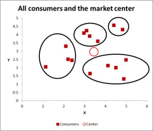
With this next graph, I have visibly identified probable cluster and circled them. As I have suggested, a good approach when there are only two variables to consider – but is this case we have three variables (and you could have more), so this visual approach will only work for basic data sets – so now let’s look at how to do the Excel calculation for k-means clustering.
Step Three – Calculate the distance from each data point to the center of a cluster
For this walk-through example, let’s assume that we want to identify three segments/clusters only. Yes, there are four clusters evident in the diagram above, but that only looks at two of the variables. Please note that you can use this Excel approach to identify as many clusters as you like – just follow the same concept as explained below.
For k-means clustering you typically pick some random cases (starting points or seeds) to get the analysis started.
In this example – as I’m wanting to create three clusters, then I will need three starting points. For these start points I have selected cases 6, 9 and 15 – but any random points could also be suitable.
The reason I selected these cases is because – when looking at variable X only – case 6 was the median, case 9 was the maximum and case 15 was the minimum. This suggests that these three cases are somewhat different to each other, so good starting points as they are spread out.
Please refer to the article on why cluster analysis sometimes generates different results.
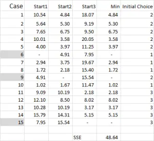
Referring to the table output – this is our first calculation in Excel and it generates our “initial choice” of clusters. Start 1 is the data for case 6, start 2 is case 9 and start 3 is case 15. You should note that the intersection of each of these gives a 0 (-) in the table.
How does the calculation work?
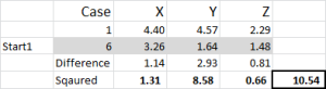
Let’s look at the first number in the table – case 1, start 1 = 10.54.
Remember that we have arbitrarily designated Case 6 to be our random start point for Cluster 1. We want to calculate the distance and we use the sum of squares method – as shown here. We calculate the difference between each of the three data points in the set, and then square the differences, and then sum them.
We can do it “mechanically” as shown here – but Excel has a built-in formula to use: SUMXMY2 – this is far more efficient to use.
Referring back to Figure 4, we then find the minimum distance for each case from each of the three start points – this tells us which cluster (1, 2 or 3) that the case is closest to – which is shown in the ‘initial choice column’.
Step Four – Calculate the mean (average) of each cluster set
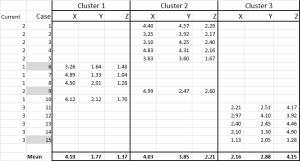
We have now allocated each case to its initial cluster – and we can lay that out using an IF statement in a table (as shown in Figure 6).
At the bottom of the table, we have the mean (average) of each of these cases. N0w – instead of relying on just one “representative” data point – we have a set of cases representing each.
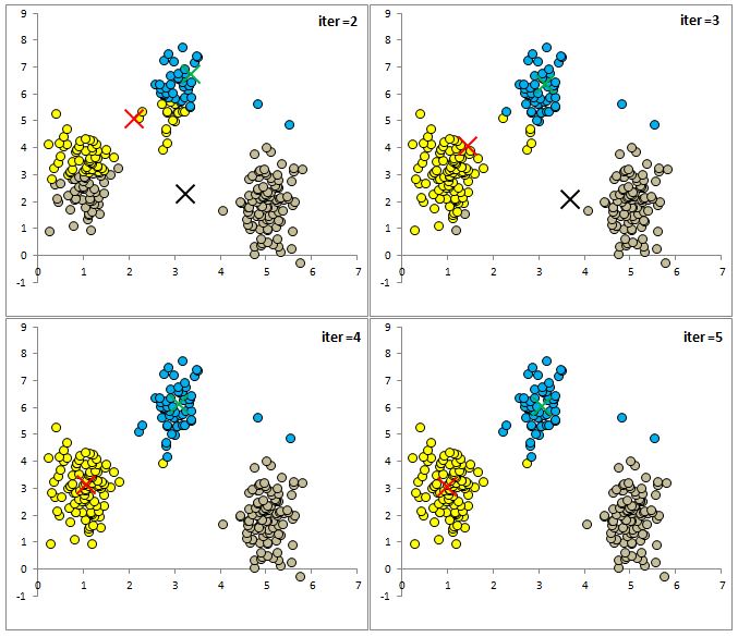
Step Five – Repeat Step 3 – the Distance from the revised mean
The cluster analysis process now becomes a matter of repeating Steps 4 and 5 (iterations) until the clusters stabilize.
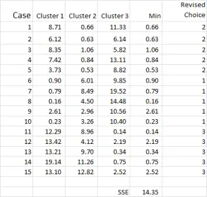
Each time we use the revised mean for each cluster. Therefore, Figure 7 shows our second iteration – but this time we are using the means generated at the bottom of Figure 6 (instead of the start points from Figure 1).
You can now see that there has been a slight change in cluster application, with case 9 – one of our starting points – being reallocated.
You can also see sum of squared error (SSE) calculated at the bottom – which is the sum of each of the minimum distances. Our goal is to now repeat Steps 4 and 5 until the SSE only shows minimal improvement and/or the cluster allocation changes are minor on each iteration.
Final Step – Graph and Summarize the Clusters
After running multiple iterations, we now have the output to graph and summarize the data.
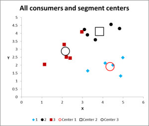
Here is the output graph for this cluster analysis Excel example.
As you can see, there are three distinct clusters shown, along with the centroids (average) of each cluster – the larger symbols.
We can also present this data in a table form if required, as we have worked it out in Excel.
Please have a look at the case in Cluster 3 – the small red square right next to the black dot in the top middle of the graph. That case sits there because of the influence of the third variable, which is not shown on this two variable chart.
For more information
- Please contact me via email
- Or download and use the free Excel template and play around with some data
- And note that there is lots of information on cluster analysis on this website
Related Information
How to allocate new customers to existing segments
The UNISTAT statistics add-in extends Excel with K-Means Cluster Analysis capabilities.
For further information visit UNISTAT User’s Guide section 8.1.3. K-Means Cluster Analysis.
Here we provide a sample output from the UNISTAT Excel statistics add-in for data analysis.
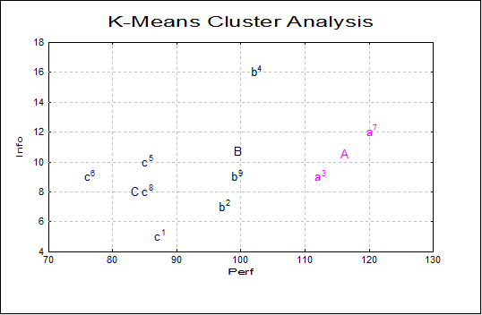
K-Means Cluster Analysis
Variables Selected: Perf, Info, Verbexp, Age
Cluster Table
| Cluster | Seed | Cases | Percentage | SSQ |
|---|---|---|---|---|
| 1 | 2 | 2 | 22.22% | 109.2200 |
| 2 | 5 | 3 | 33.33% | 220.3800 |
| 3 | 8 | 4 | 44.44% | 140.7875 |
Cluster Membership
| Observation | Cluster |
|---|---|
| 1 | 3 |
| 2 | 2 |
| 3 | 1 |
| 4 | 2 |
| 5 | 3 |
| 6 | 3 |
| 7 | 1 |
| 8 | 3 |
| 9 | 2 |
Final Cluster Centres
| Seed | Perf | Info | Verbexp | Age |
|---|---|---|---|---|
| 2 | 116.0000 | 10.5000 | 36.0000 | 7.8000 |
| 5 | 99.3333 | 10.6667 | 36.0000 | 7.8333 |
| 8 | 83.2500 | 8.0000 | 32.2500 | 6.6250 |