
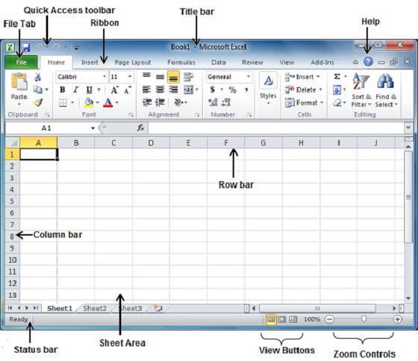
In this lesson, I will explore the basic parts of Microsoft Excel Window. Below is a screenshot of the startup window of the Microsoft Excel application. In this window, you can see a simple layout and icons of different commands of the Microsoft Excel 2019 window.
- Quick Access Toolbar
- File Tab
- Title Bar
- Control Buttons
- Menu Bar
- Ribbon/Toolbar
- Dialog Box Launcher
- Name Box
- Formula Bar
- Scroll Bars
- Spreadsheet Area
- Leaf Bar
- Column Bar
- Row Bar
- Cells
- Status Bar
- View Buttons
- Zoom Control

Quick Access Toolbar:
You will see this toolbar on the left-upper corner of the screen. Its purpose is to display the most frequently used commands of Excel. You can customize this toolbar based on your choice of commands.
File Tab:
In Excel 2007, it was an “Office” button. This menu does the file-related operations, i.e. create new excel documents, open an existing file, save, save as, print file, etc.
Title Bar:
The header or title bar of the spreadsheet is located at the top of the window. It presents the name of the active document.
Control buttons:
They are those symbols in the upper-right of the window that allows you to modify the labels, minimize, maximize, share and close the sheet.
Menu bar:
Under the diskette or save icon or the Excel icon (this will depend on the version of the program); labels or bars that allow modifying the sheet are displayed. These are the menu bar, and consist of a File, Insert, Page Layout, Formulas, Data, Review, View, Help, and a Search Bar with a light bulb icon. These menus have subcategories that simplify the distribution of information and analysis of calculations.
Ribbon/Toolbar:
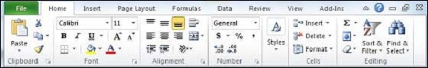
There are a series of elements that are part of each menu bar. On the selection of any menu, a series of command options/icons will display on a ribbon. For example, if you press the “Home” tab, you will see cut, copy, paste, bold, italic, underline, etc commands. Similarly, if you click on the “Insert” tab, you will see tables, illustrations, additional, recommended graphics, graphics, and maps, among others. On the other hand, if we press the option “Formulas”. Insert functions, auto sum, recently used, finances, logic, text, date and time, etc.
Toolbar/Ribbon is a group of organized commands in three sections.
- Tabs: They are the top section of the Ribbon and contain groups of related commands. Home, Insert, Page Layout, Formula, Data, etc, are examples of ribbon tabs.
- Groups: They organize related commands; the name of each group appears below the Ribbon. For example, a group of commands related to fonts or a group of commands related to alignment, etc.
- Commands: They appear within each group as mentioned above.
Dialog Box Launcher:
This is a very small down arrow located in the lower-right corner of a command group on the Ribbon. By clicking this arrow explore more options about the concerned group.
Name box:
Show the location of the active cell, row, or column. You can make more than one selection.
Formula bar:
It is a bar that allows you to observe, insert or edit the information/formula entered in the active cell.
Scrollbars:
Those are the tools that allow you to mobilize both the vertical and horizontal view of the document. They can be activated by clicking on the internal bar of your platform, or on the arrows, you have on the sides. In addition to that, you can use the mouse wheel to automatically scroll up or down; or use the directional keys.
Spreadsheet Area:
It is the working area where you enter your data. It constitutes the entire spreadsheet with its rows, cells, columns, and built-in information. By means of shortcuts, we can carry out the activities of the toolbar or formulas of arithmetic operations (add, subtract, multiply, etc.). The blinking vertical bar called “cursor” is the insertion point. It indicates the insertion location of the typing.
Leaf Bar:
At the bottom, a text that says sheet 1 is displayed. This sheet bar explains the spreadsheet that is currently being worked on. Through this, we can alternate several sheets at our convenience or add a new one.
Columns Bar:
Columns are a series of boxes vertically organized in the entire sheet. It columns bar is located below the formula bar. The columns are listed with letters of the alphabet. Start with the letter A to Z, and then after Z, it will continue as AA, AB, and so on. The maximum limit of columns is 16,384.
Rows Bar:
It is that left part of the sheet where a sequence of numbers is expressed. Start with number one (1) and as we move the cursor down, more rows will be added. The maximum number of rows goes to 1,048,576.
Cells:
Cells are those parallelepipeds that divide the spreadsheet into several segments that allow rows to be separated from columns. The first cell of a spreadsheet is represented by the initial letter of the alphabet and the number one (A1).
Status Bar:
This bar is located at the bottom of the window and shows very important information. It also shows when something is wrong, or the document is ready to be delivered or printed.
This displays the quick calculations of the selected digits, like sum, average, count, maximum, minimum, etc.
You can configure the status bar by right-clicking on the status bar. You can insert or remove any command from the provided list.
View Buttons:
It is a group of three buttons arranged at the left of the Zoom control, close to the right-bottom of the screen. Through this, you can see three different types of excel sheet views.
- Normal view: This displays the Excel page in normal view.
- Page Layout view: This displays the exact view of Excel’s page as it will be printed.
- Page Break view: This shows the page break preview before printing.
Zoom Control:
Zoom control is located in the lower-right area of the Excel window. It allows you to ZOOM-IN or ZOOM-OUT a particular area of the spreadsheet. It is represented by magnifying icons with the symbols of maximizing (+) or minimizing (-). In the most modern versions, it consists of a segment with the icons of more, and less and an element that separates both options; which allows you to manipulate them by clicking on any of these.
On the other hand, it also explains how many times the document has been moved away or approached in percentages (%). The version of Microsoft Excel 2019, it allows you to zoom out by 10% and zoom up to 400%.
Back to Microsoft Excel Tutorial
Excel for Microsoft 365 Excel for Microsoft 365 for Mac More…Less
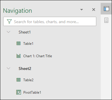
The Navigation pane in Excel is an easy way to understand a workbook’s layout, see what elements exist within the workbook, and navigate directly to those elements. Whether you’re a new user getting familiar with Excel, or an experienced user trying to navigate a large workbook, the Navigation pane can help.
Find and access elements such as tables, charts, PivotTables, and images within your workbook. Once you’ve opened the Navigation pane, it displays on the right side of the Excel window.
The Navigation pane also makes it easier for those with visual impairments to access all parts of the workbook. It can improve how tools such as screen readers interpret your workbook.
Open the Navigation pane
In an open workbook, select View > Navigation.
The Navigation pane will open on the right side of the window.
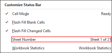
The Navigation pane can also be opened from the status bar at the bottom of the screen. Right-click on the status bar and select Sheet Number. This will add a sheet count in the status bar.
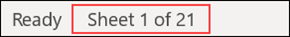
Select the sheet count in the status bar and select the sheet you want to see. Focus will shift to that sheet and the Navigation pane will open.
Explore the elements
When the Navigation pane opens, you’ll see a list of elements such as tables, named ranges, and other elements from this sheet. Each sheet within the workbook will be in its own section. Select a section to expand and display its contents.
Each section will show any tables, charts, PivotTables, and images located on the sheet. Selecting an element will move the focus to that element on the sheet.
If the element is on another sheet within the workbook, the focus will switch to the correct sheet and element.
Make changes
Some elements can be modified directly from the Navigation Pane. Right-click on the element name to open a menu of options. Which options are available will depend on the element type.
Charts and images can be renamed, deleted, or hidden from the Navigation pane. PivotTables can only be renamed. There are no additional options for PivotTables in the Navigation pane.
Note: There are no right-click options for tables.
Need more help?
Want more options?
Explore subscription benefits, browse training courses, learn how to secure your device, and more.
Communities help you ask and answer questions, give feedback, and hear from experts with rich knowledge.
After downloading the Excel 2010 we will see the window (draw 1.1), that similar to the 2007 interface. It differs significantly from the older versions of 2003 and older. From this we can conclude – users of the 2007 version do not have to retrain much and get used to the new interface.
If you are just starting your first acquaintance with the program, you should not worry about what were its old versions: they are much inferior in terms of functionality and speed of the program.
The main window of the program
In the Excel window, a wide band with the tool buttons that are located on each tab is first of all thrown into the eye. In the interface of this version, the panel accounts for a large part of the program window. This often interferes with the viewing of large price lists. But the 2010 version allows by one mouse click to make a drop-down menu in Excel, which is very convenient.
The drawing 1. 1. This is the window after the program is downloaded:
The drawing 1. 2:
The toolbar is minimized.
Managing of the toolbar and bookmarks
The practical task 1. 1.
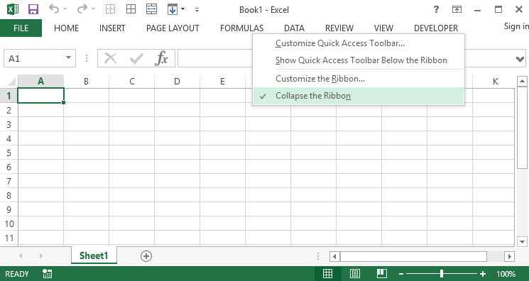
After downloading the program, take a closer look at the elements displayed in drawings 1. 1 and 1. 3. and try to make it so that the toolbar disappears into Excel, and then reappears again.
Exercise 1:
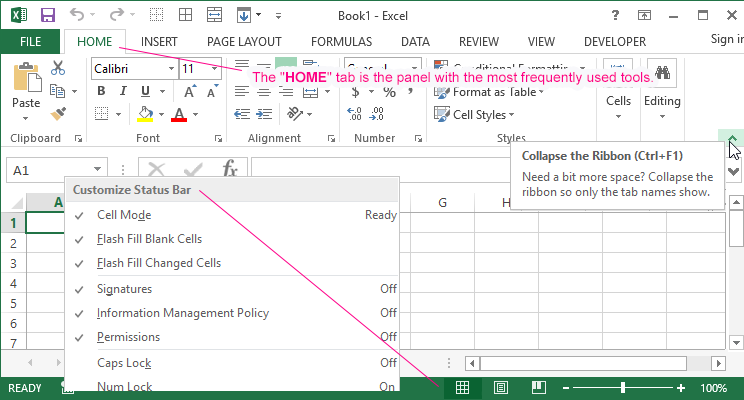
- Click the button as in the drawing 1. 1 to mineralize the tool bar (or press the keyboard shortcut CTRL + F1). This allows you to collapse the wide panel, as shown in the drawing 1. 2.
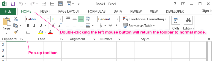
- Click on any tab, for example, «Home», as shown in the drawing 1. 2. For a while, all the bookmark tools will be available, covering the top of the page as in the drawing 1. 3.
Drawing 1. 3: - Click anywhere outside of the panel, for example, on the sheet or the title of the window, to collapse the panel again.
Exercise 2:
Double-click on any tab to make a pop-up menu in Excel.
Exercise 3:
Call the context menu by right-clicking on the bookmark name and selecting the «Collapse ribbon» option. In this way, you fix the main taskbar in Excel and switch between the tool display modes.
As you can see, at first glance the interface version of 2010 is not much different from the 2007 version. But it has its own convenient and at first sight not noticeable advantages. In the process of active work with the program it is worthwhile to use by the various useful features to make the work comfortable.
The purpose of this lesson is to familiarize the user with the appearance of the program window, and also get acquainted with the basic tools and manage ones for comfortable work.
The following basic window appears when you start the excel application. Let us now understand the various important parts of this window.
File Tab
The File tab replaces the Office button from Excel 2007. You can click it to check the Backstage view, where you come when you need to open or save files, create new sheets, print a sheet, and do other file-related operations.
Quick Access Toolbar
You will find this toolbar just above the File tab and its purpose is to provide a convenient resting place for the Excel’s most frequently used commands. You can customize this toolbar based on your comfort.
Ribbon
Ribbon contains commands organized in three components −
-
Tabs − They appear across the top of the Ribbon and contain groups of related commands. Home, Insert, Page Layout are the examples of ribbon tabs.
-
Groups − They organize related commands; each group name appears below the group on the Ribbon. For example, group of commands related to fonts or group of commands related to alignment etc.
-
Commands − Commands appear within each group as mentioned above.
Title Bar
This lies in the middle and at the top of the window. Title bar shows the program and the sheet titles.
Help
The Help Icon can be used to get excel related help anytime you like. This provides nice tutorial on various subjects related to excel.
Zoom Control
Zoom control lets you zoom in for a closer look at your text. The zoom control consists of a slider that you can slide left or right to zoom in or out. The + buttons can be clicked to increase or decrease the zoom factor.
View Buttons
The group of three buttons located to the left of the Zoom control, near the bottom of the screen, lets you switch among excel’s various sheet views.
-
Normal Layout view − This displays the page in normal view.
-
Page Layout view − This displays pages exactly as they will appear when printed. This gives a full screen look of the document.
-
Page Break view − This shows a preview of where pages will break when printed.
Sheet Area
The area where you enter data. The flashing vertical bar is called the insertion point and it represents the location where text will appear when you type.
Row Bar
Rows are numbered from 1 onwards and keeps on increasing as you keep entering data. Maximum limit is 1,048,576 rows.
Column Bar
Columns are numbered from A onwards and keeps on increasing as you keep entering data. After Z, it will start the series of AA, AB and so on. Maximum limit is 16,384 columns.
Status Bar
This displays the current status of the active cell in the worksheet. A cell can be in either of the fours states (a) Ready mode which indicates that the worksheet is ready to accept user inpu (b) Edit mode indicates that cell is editing mode, if it is not activated the you can activate editing mode by double-clicking on a cell (c) A cell enters into Enter mode when a user types data into a cell (d) Point mode triggers when a formula is being entered using a cell reference by mouse pointing or the arrow keys on the keyboard.
Dialog Box Launcher
This appears as a very small arrow in the lower-right corner of many groups on the Ribbon. Clicking this button opens a dialog box or task pane that provides more options about the group.
Home > Microsoft Excel > Create an Excel Dashboard in 5 Minutes – The Best Guide
This Excel Dashboard tutorial is suitable for users of Excel 2013/2016/2019 and Microsoft 365.
Objective
Create a simple interactive Excel dashboard to display critical metrics in 5 minutes.
This Guide Covers:
Table Of Contents
- Objective
- Excel Dashboards Explained
- VIDEO TUTORIAL – EXCEL DASHBOARD
- Create an Excel Dashboard in 8 Simple Steps
- FAQs
- Creating an Excel Dashboard – Let’s Wrap up
Excel Dashboards Explained
Have you ever wondered how all those dynamic dashboards with eye-catching graphs and pie-charts that turn heads and receive applause from your co-workers are created?
Did you scramble all over the internet just to find that one article that clearly explains how to create Excel dashboards without wasting your time with unwanted information?
Look no further! You have come to the right place.
What we have here is a short and to the point guide on how to implement interactive dashboards in Excel in just 5 minutes.
Still, wondering? Read on…
An interactive Excel dashboard is a data management tool that harnesses the power of Excel data analysis tools such as Pivot Tables and Pivot Charts to track, analyze, monitor, and display key business metrics. In an interactive Excel dashboard, data becomes visually meaningful, and with tools such as slicers, users can interact with the data enabling them to derive important insights and make data-driven well-informed business decisions.
Related:
Dashboards In Excel Using Pivot Tables, Pivot Charts And Slicers
Excel Templates For More Efficient Project Management
Easily Make a Bullet Chart in Excel—1 Bonus Video Included
Excel dashboards can be simple or complex, and there is no right or wrong way to design an Excel dashboard. Get creative and tell the story of your data!
Creating Excel dashboards can be quite challenging at first, especially for new users.
Don’t worry, we’re here to help.
In this post, we will show you how to easily create an Excel dashboard, using Pivot Charts in just 5 minutes. To do this, we will be making certain assumptions; you are familiar with Excel, and you are familiar with creating Pivot Tables and Pivot Charts.
VIDEO TUTORIAL – EXCEL DASHBOARD
Create an Excel Dashboard in 8 Simple Steps
This is our step by step approach to easily create Excel Dashboards. Try them out in your dashboard template or workbook to gain familiarity.
- Start with a Clean Dataset
- Format data as a Table
- Create the first Pivot table and Pivot Charts
- Create Multiple Pivot table and Pivot Charts for other variables
- Assemble the Excel dashboard
- Add Slicers & Timelines
- Connect Slicers to data
- Update the Excel Dashboard
Let’s jump right into these steps and see how things are done in more detail.
Start with a Clean Dataset
You must start with a clean dataset before analyzing it with a Pivot Table or Pivot Chart. If your dataset is imported, you may get errors and inconsistencies that need fixing before you start. Click here to see the Top Ten Ways to Clean Data in Excel.
Format as a Table
If you plan on updating or adding more information to your dataset, you need to put your data in an Excel table before analyzing it. Tables can auto-expand and accommodate any new data. You can then ensure Pivot Tables, and Pivot Charts created, update with just one click.
- CTRL+A to select the entire dataset
- CTRL+T to create a table
- Select My table has headers
- Click OK
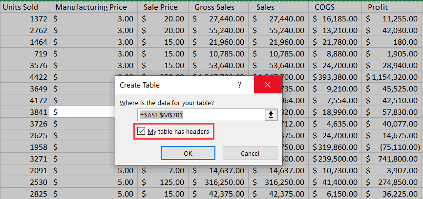
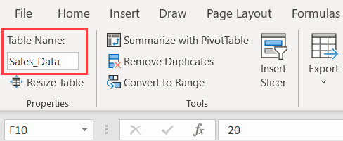
- Give the table a meaningful name, ensuring that there are no spaces in the table name.
Create the first Pivot Table and Pivot Chart
It is time to create the first Pivot Table and Pivot Chart for the dashboard.
- From the Table Design tab, click Summarize with Pivot Table
- Check that the PivotTable uses the correct source data, in this case, the table name, and select the option to create the Pivot Table on a New Worksheet.
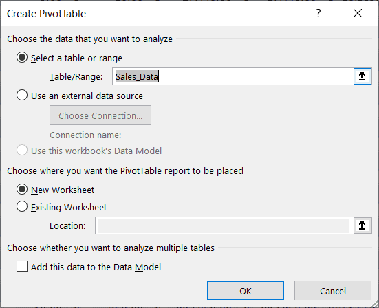
- Arrange the Pivot Table fields as required.
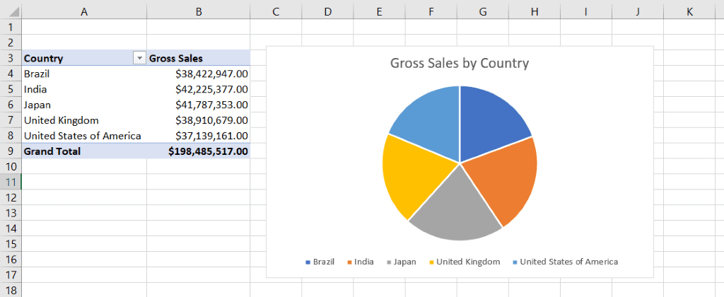
In this example, I want to see the Total Gross Sales for all Countries.

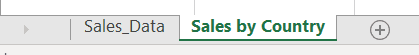
- Name the worksheet tab so it is easy to identify.
- Click in the Pivot Table and create a Pivot Chart on the same worksheet
In this example, I have created a Pie Chart. I have also added a chart title, moved the legend to the bottom, and all field buttons are hidden.
Also Read:
Getting Started With 3d Maps In Excel
Microsoft Teams Tutorial – Getting Started.
Pivot Table In Excel, How Do You Create One?
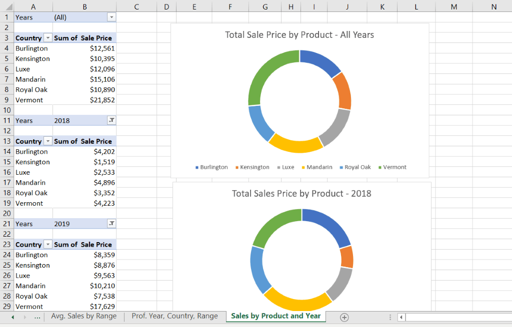
Create multiple Pivot Tables and Pivot Charts
We have one Pivot Chart ready to place on our Excel dashboard. We need to create more to display those vital key metrics. You can create additional Pivot Tables quickly by copying the current worksheet.
- Hold down the CTRL key.
- Click on the current worksheet and drag it to the right to make a copy.
- Delete the Pie Chart.
- Re-arrange the Pivot Table fields to display the next key metric.
- Rename the worksheet tab to make it easy to identify.
- Repeat this process of creating new worksheets, Pivot Tables, and Pivot Charts until you have all the key metrics you want to display on the Excel dashboard.
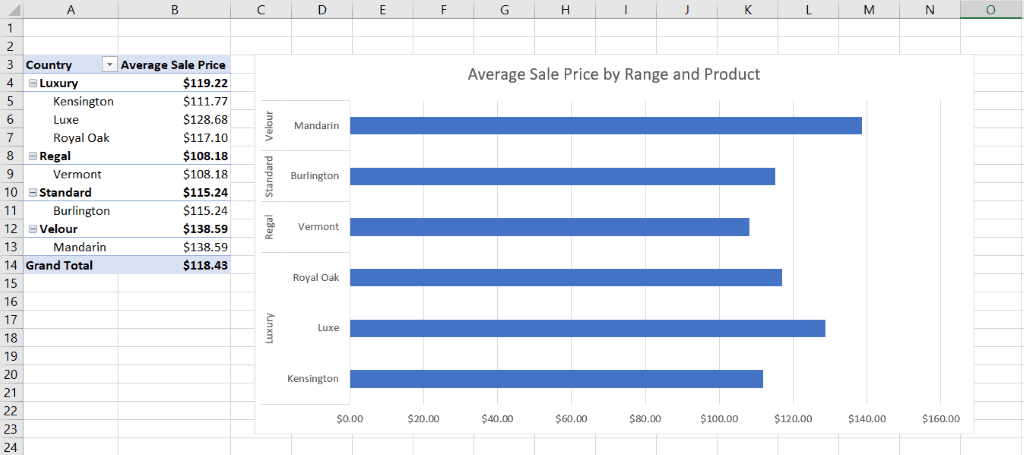
In the example below, I have created three Pivot Tables and three doughnut charts on the same worksheet to display the total sale price by-product for 2018, 2019, and both years.
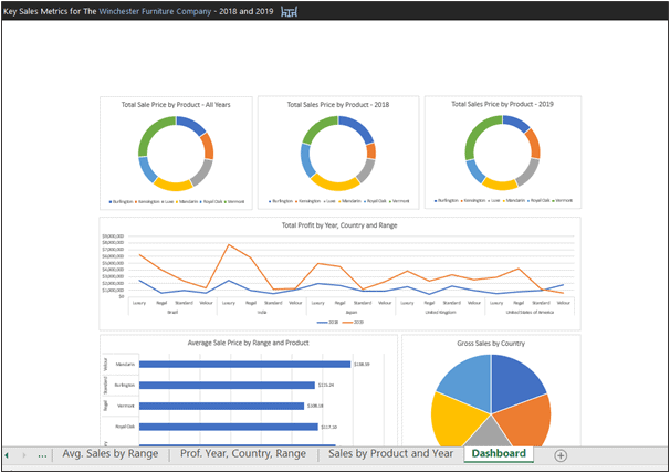
Assembling the Excel Dashboard
After you have created all the Pivot Tables and Pivot Charts, you can now assemble the Excel dashboard.
- Create a new worksheet and name its ‘Dashboard’.
You can design an Excel dashboard however you please. If you are struggling for inspiration, Pinterest is a good source for ideas relating to Interactive Dashboard Design.
- Copy the Pivot Charts from the other worksheets, and Paste them on to the dashboard.
- Arrange them so they look neat.
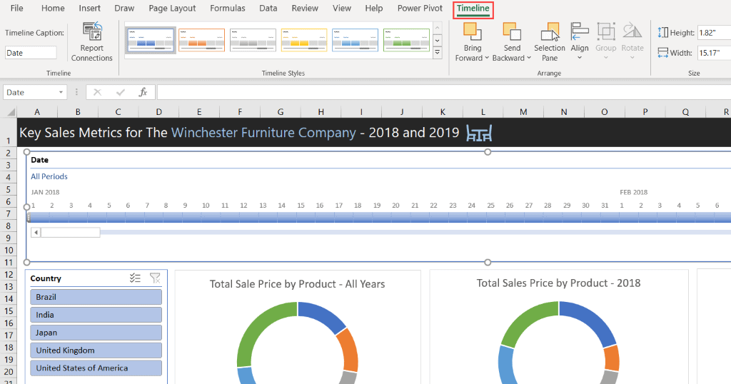
Adding Slicers and Timelines
You can add filters in the form of Slicers and Timelines to a dashboard in Excel. These help users interact with the Excel dashboard and view it in different ways. You can add one or more slicers to a dashboard to filter the data.
Adding Slicers
- Click on any one of the Pivot Charts
- From the PivotTable Analyze tab, in the Filter group, select Insert Slicer
- Select the fields you want to filter by
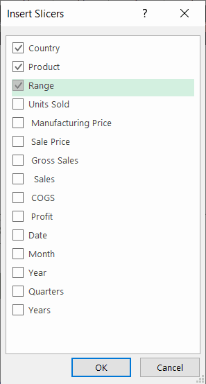
- Position the slicers on the dashboard
- You can utilize the Slicer tab to format the slicers
Adding Timelines
A Timeline is a slicer specifically for date fields. Therefore, it is essential to format your date columns in your dataset in the date format.
- Click on any one of the Pivot Charts.
- From the PivotTable Analyze tab, in the Filter group, select Insert Timeline.
- Select the date field you want to filter by.
- Position the Timeline on the Excel dashboard.
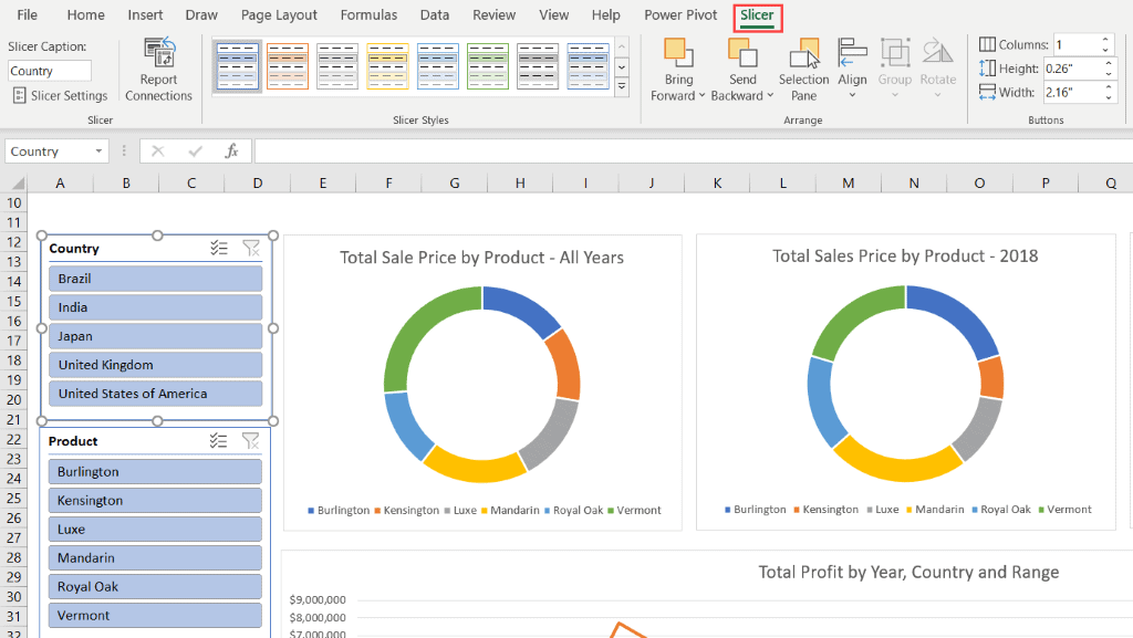
Connecting Slicers
To insert a slicer or a timeline, you must select a Pivot Chart. However, this means that the slicer only connects to that Pivot Chart. To control all the Pivot Charts, you will need to join the slicer to everything on the Excel dashboard.
- Right-click on the Slicer.
- Select Report Connections.
- Select all the Pivot Charts to connect the slicer to.
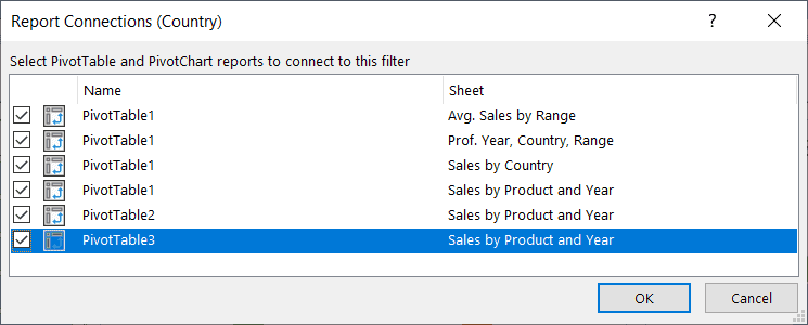
- Repeat this process for all Slicers.
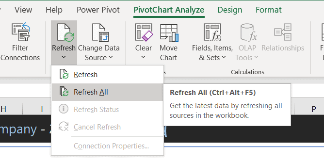
Updating the Excel Dashboard
Datasets rarely remain static. They are continually updated with new data. The process of updating everything on the Excel dashboard to include the new data is simple if you put your dataset into a table before creating the Pivot Tables.
- Add the new data into the dataset
- On the dashboard, click on a Pivot Chart
- From the PivotChart Analyze tab, in the Data group, click Refresh All
Latest Posts
FAQs
How do I share an Interactive Excel Dashboard?
You can share the workbook that contains the Interactive Excel Dashboard by clicking on the share button on the top right-hand corner of the Excel window. You can then either send them the workbook directly or just share a link to it.
Are Pivot Charts updated automatically in Excel?
Yes, pivot charts are updated automatically in Excel whenever the original data is altered. You can still refresh them just to make sure.
Creating an Excel Dashboard – Let’s Wrap up
That is how you create a basic Excel Dashboard in 5 minutes! Of course, dashboards in Excel can get extremely complex and include more than just Pivot Charts, so it is worth doing your research. We can dive deep into more applications and shortcuts for interactive Excel Dashboards later. (sematext) But for now, let’s master creating Excel dashboards quickly. The most important point here is PRACTICE, PRACTICE and PRACTICE!
For more information on creating interactive Excel dashboards, please check out the following links:
Excelfind – Ultimate Excel Dashboard | Basic Interactive Dashboard
EDUCBA – 10 Useful Steps to Create Interactive Excel Dashboards
You might also like these free tutorials from Simon Sez IT
- Creating a Dynamic Pivot Chart Title Using Splicers
- Designing Better Spreadsheets in Excel
- Pivot Charts in Excel
For more high-quality and informative guides on Excel check out the full range of Excel courses from Simon Sez IT.
Deborah Ashby

Deborah Ashby is a TAP Accredited IT Trainer, specializing in the design, delivery, and facilitation of Microsoft courses both online and in the classroom.She has over 11 years of IT Training Experience and 24 years in the IT Industry. To date, she’s trained over 10,000 people in the UK and overseas at companies such as HMRC, the Metropolitan Police, Parliament, SKY, Microsoft, Kew Gardens, Norton Rose Fulbright LLP.She’s a qualified MOS Master for 2010, 2013, and 2016 editions of Microsoft Office and is COLF and TAP Accredited and a member of The British Learning Institute.