
A PivotTable is a powerful tool to calculate, summarize, and analyze data that lets you see comparisons, patterns, and trends in your data. PivotTables work a little bit differently depending on what platform you are using to run Excel.


-
Select the cells you want to create a PivotTable from.
Note: Your data should be organized in columns with a single header row. See the Data format tips and tricks section for more details.
-
Select Insert > PivotTable.

-
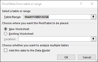
This will create a PivotTable based on an existing table or range.
Note: Selecting Add this data to the Data Model will add the table or range being used for this PivotTable into the workbook’s Data Model. Learn more.
-
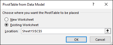
Choose where you want the PivotTable report to be placed. Select New Worksheet to place the PivotTable in a new worksheet or Existing Worksheet and select where you want the new PivotTable to appear.
-
Click OK.
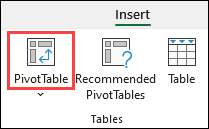
By clicking the down arrow on the button, you can select from other possible sources for your PivotTable. In addition to using an existing table or range, there are three other sources you can select from to populate your PivotTable.
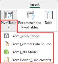
Note: Depending on your organization’s IT settings you might see your organization’s name included in the button. For example, «From Power BI (Microsoft)»
Get from External Data Source
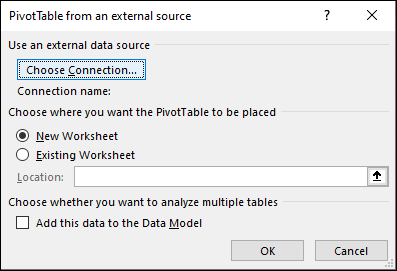
Get from Data Model
Use this option if your workbook contains a Data Model, and you want to create a PivotTable from multiple Tables, enhance the PivotTable with custom measures, or are working with very large datasets.
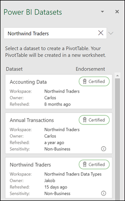
Get from Power BI
Use this option if your organization uses Power BI and you want to discover and connect to endorsed cloud datasets you have access to.
-
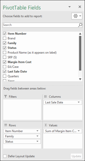
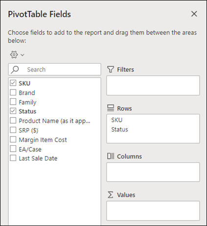
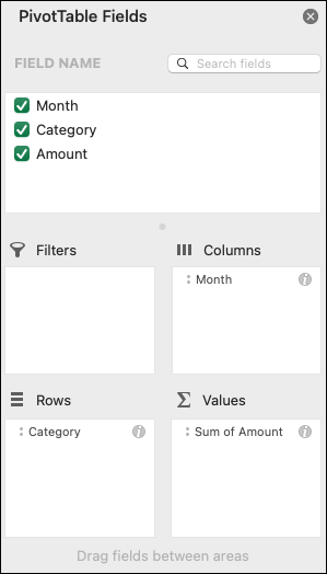
To add a field to your PivotTable, select the field name checkbox in the PivotTables Fields pane.
Note: Selected fields are added to their default areas: non-numeric fields are added to Rows, date and time hierarchies are added to Columns, and numeric fields are added to Values.
-
To move a field from one area to another, drag the field to the target area.
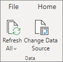
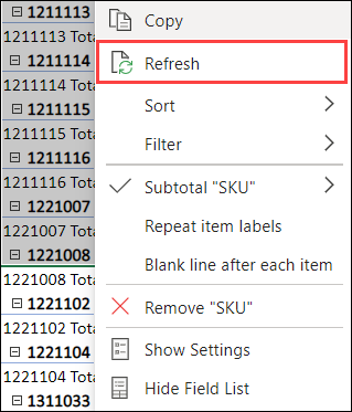
If you add new data to your PivotTable data source, any PivotTables that were built on that data source need to be refreshed. To refresh just one PivotTable you can right-click anywhere in the PivotTable range, then select Refresh. If you have multiple PivotTables, first select any cell in any PivotTable, then on the Ribbon go to PivotTable Analyze > click the arrow under the Refresh button and select Refresh All.
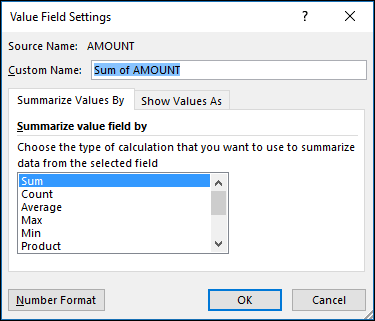
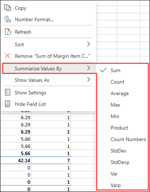
Summarize Values By
By default, PivotTable fields that are placed in the Values area will be displayed as a SUM. If Excel interprets your data as text, it will be displayed as a COUNT. This is why it’s so important to make sure you don’t mix data types for value fields. You can change the default calculation by first clicking on the arrow to the right of the field name, then select the Value Field Settings option.
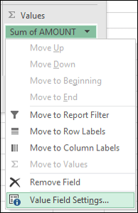
Next, change the calculation in the Summarize Values By section. Note that when you change the calculation method, Excel will automatically append it in the Custom Name section, like «Sum of FieldName», but you can change it. If you click the Number Format button, you can change the number format for the entire field.
Tip: Since the changing the calculation in the Summarize Values By section will change the PivotTable field name, it’s best not to rename your PivotTable fields until you’re done setting up your PivotTable. One trick is to use Find & Replace (Ctrl+H) >Find what > «Sum of«, then Replace with > leave blank to replace everything at once instead of manually retyping.
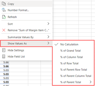
Show Values As
Instead of using a calculation to summarize the data, you can also display it as a percentage of a field. In the following example, we changed our household expense amounts to display as a % of Grand Total instead of the sum of the values.
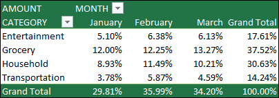
Once you’ve opened the Value Field Setting dialog, you can make your selections from the Show Values As tab.
Display a value as both a calculation and percentage.
Simply drag the item into the Values section twice, then set the Summarize Values By and Show Values As options for each one.
-
Select a table or range of data in your sheet and select Insert > PivotTable to open the Insert PivotTable pane.
-
You can either manually create your own PivotTable or choose a recommended PivotTable to be created for you. Do one of the following:
-
On the Create your own PivotTable card, select either New sheet or Existing sheet to choose the destination of the PivotTable.
-
On a recommended PivotTable, select either New sheet or Existing sheet to choose the destination of the PivotTable.
Note: Recommended PivotTables are only available to Microsoft 365 subscribers.
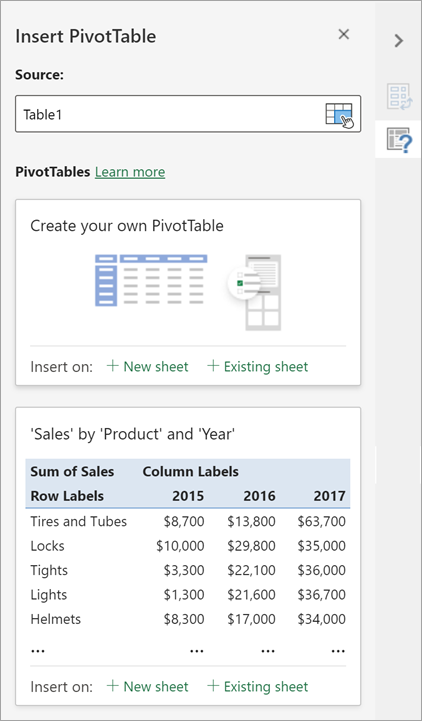
You can change the data sourcefor the PivotTable data as you are creating it.
-
In the Insert PivotTable pane, select the text box under Source. While changing the Source, cards in the pane won’t be available.
-
Make a selection of data on the grid or enter a range in the text box.
-
Press Enter on your keyboard or the button to confirm your selection. The pane will update with new recommended PivotTables based on the new source of data.

Get from Power BI
Use this option if your organization uses Power BI and you want to discover and connect to endorsed cloud datasets you have access to.
In the PivotTable Fields pane, select the check box for any field you want to add to your PivotTable.
By default, non-numeric fields are added to the Rows area, date and time fields are added to the Columns area, and numeric fields are added to the Values area.
You can also manually drag-and-drop any available item into any of the PivotTable fields, or if you no longer want an item in your PivotTable, drag it out from the list or uncheck it.
Summarize Values By
By default, PivotTable fields in the Values area will be displayed as a SUM. If Excel interprets your data as text, it will be displayed as a COUNT. This is why it’s so important to make sure you don’t mix data types for value fields.
Change the default calculation by right clicking on any value in the row and selecting the Summarize Values By option.
Show Values As
Instead of using a calculation to summarize the data, you can also display it as a percentage of a field. In the following example, we changed our household expense amounts to display as a % of Grand Total instead of the sum of the values.
Right click on any value in the column you’d like to show the value for. Select Show Values As in the menu. A list of available values will display.
Make your selection from the list.
To show as a % of Parent Total, hover over that item in the list and select the parent field you want to use as the basis of the calculation.
If you add new data to your PivotTable data source, any PivotTables built on that data source will need to be refreshed. Right-click anywhere in the PivotTable range, then select Refresh.
If you created a PivotTable and decide you no longer want it, select the entire PivotTable range and press Delete. It won’t have any effect on other data or PivotTables or charts around it. If your PivotTable is on a separate sheet which has no other data you want to keep, deleting the sheet is a fast way to remove the PivotTable.
-
Your data should be organized in a tabular format, and not have any blank rows or columns. Ideally, you can use an Excel table like in our example above.
-
Tables are a great PivotTable data source, because rows added to a table are automatically included in the PivotTable when you refresh the data, and any new columns will be included in the PivotTable Fields List. Otherwise, you need to either Change the source data for a PivotTable, or use a dynamic named range formula.
-
Data types in columns should be the same. For example, you shouldn’t mix dates and text in the same column.
-
PivotTables work on a snapshot of your data, called the cache, so your actual data doesn’t get altered in any way.
If you have limited experience with PivotTables, or are not sure how to get started, a Recommended PivotTable is a good choice. When you use this feature, Excel determines a meaningful layout by matching the data with the most suitable areas in the PivotTable. This helps give you a starting point for additional experimentation. After a recommended PivotTable is created, you can explore different orientations and rearrange fields to achieve your specific results. You can also download our interactive Make your first PivotTable tutorial.
-
Click a cell in the source data or table range.
-
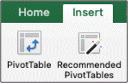
Go to Insert > Recommended PivotTable.
-
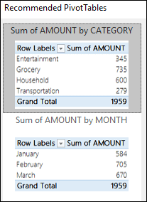
Excel analyzes your data and presents you with several options, like in this example using the household expense data.
-
Select the PivotTable that looks best to you and press OK. Excel will create a PivotTable on a new sheet, and display the PivotTable Fields List

-
Click a cell in the source data or table range.
-
Go to Insert > PivotTable.
-
Excel will display the Create PivotTable dialog with your range or table name selected. In this case, we’re using a table called «tbl_HouseholdExpenses».
-
In the Choose where you want the PivotTable report to be placed section, select New Worksheet, or Existing Worksheet. For Existing Worksheet, select the cell where you want the PivotTable placed.
-
Click OK, and Excel will create a blank PivotTable, and display the PivotTable Fields list.
PivotTable Fields list
In the Field Name area at the top, select the check box for any field you want to add to your PivotTable. By default, non-numeric fields are added to the Row area, date and time fields are added to the Column area, and numeric fields are added to the Values area. You can also manually drag-and-drop any available item into any of the PivotTable fields, or if you no longer want an item in your PivotTable, simply drag it out of the Fields list or uncheck it. Being able to rearrange Field items is one of the PivotTable features that makes it so easy to quickly change its appearance.
PivotTable Fields list
-
Summarize by
By default, PivotTable fields that are placed in the Values area will be displayed as a SUM. If Excel interprets your data as text, it will be displayed as a COUNT. This is why it’s so important to make sure you don’t mix data types for value fields. You can change the default calculation by first clicking on the arrow to the right of the field name, then select the Field Settings option.
Next, change the calculation in the Summarize by section. Note that when you change the calculation method, Excel will automatically append it in the Custom Name section, like «Sum of FieldName», but you can change it. If you click the Number… button, you can change the number format for the entire field.
Tip: Since the changing the calculation in the Summarize by section will change the PivotTable field name, it’s best not to rename your PivotTable fields until you’re done setting up your PivotTable. One trick is to click Replace (on the Edit menu) >Find what > «Sum of«, then Replace with > leave blank to replace everything at once instead of manually retyping.
-
Show data as
Instead of using a calculation to summarize the data, you can also display it as a percentage of a field. In the following example, we changed our household expense amounts to display as a % of Grand Total instead of the sum of the values.
Once you’ve opened the Field Settings dialog, you can make your selections from the Show data as tab.
-
Display a value as both a calculation and percentage.
Simply drag the item into the Values section twice, right-click the value and select Field Settings, then set the Summarize by and Show data as options for each one.
If you add new data to your PivotTable data source, any PivotTables that were built on that data source need to be refreshed. To refresh just one PivotTable you can right-click anywhere in the PivotTable range, then select Refresh. If you have multiple PivotTables, first select any cell in any PivotTable, then on the Ribbon go to PivotTable Analyze > click the arrow under the Refresh button and select Refresh All.
If you created a PivotTable and decide you no longer want it, you can simply select the entire PivotTable range, then press Delete. It won’t have any affect on other data or PivotTables or charts around it. If your PivotTable is on a separate sheet that has no other data you want to keep, deleting that sheet is a fast way to remove the PivotTable.
Data format tips and tricks
-
Use clean, tabular data for best results.
-
Organize your data in columns, not rows.
-
Make sure all columns have headers, with a single row of unique, non-blank labels for each column. Avoid double rows of headers or merged cells.
-
Format your data as an Excel table (select anywhere in your data and then select Insert > Table from the ribbon).
-
If you have complicated or nested data, use Power Query to transform it (for example, to unpivot your data) so it is organized in columns with a single header row.
Need more help?
You can always ask an expert in the Excel Tech Community or get support in the Answers community.
PivotTable Recommendations are a part of the connected experience in Microsoft 365, and analyzes your data with artificial intelligence services. If you choose to opt out of the connected experience in Microsoft 365, your data will not be sent to the artificial intelligence service, and you will not be able to use PivotTable Recommendations. Read the Microsoft privacy statement for more details.
Related articles
Create a PivotChart
Use slicers to filter PivotTable data
Create a PivotTable timeline to filter dates
Create a PivotTable with the Data Model to analyze data in multiple tables
Create a PivotTable connected to Power BI Datasets
Use the Field List to arrange fields in a PivotTable
Change the source data for a PivotTable
Calculate values in a PivotTable
Delete a PivotTable
![]()
Download Article
Step-by-step tutorial for making and editing a pivot table in Excel
![]()
Download Article
- Building the Pivot Table
- Configuring the Pivot Table
- Using the Pivot Table
- Video
- Expert Q&A
- Tips
- Warnings
|
|
|
|
|
|
Trying to make a new pivot table in Microsoft Excel? The process is quick and easy using Excel’s built-in tools. Pivot tables are a great way to create an interactive table for data analysis and reporting. Excel allows you to drag and drop the variables you need in your table to immediately rearrange it. This wikiHow guide will show you how to create pivot tables in Microsoft Excel.
Things You Should Know
- Go to the Insert tab and click «PivotTable» to create a new pivot table.
- Use the PivotTable Fields pane to arrange your variables by row, column, and value.
- Click the drop-down arrow next to fields in the pivot table to sort and filter.
-
1
Open the Excel file where you want to create the pivot table. A pivot table allows you to create tabular reports of data in a spreadsheet. You can also perform calculations without having to input formulas.
- You can also create a pivot table in Excel using an outside data source, such as an Access database.
-
2
Highlight the cells you want to make into a pivot table. Note that the original spreadsheet data will be preserved. Skip this step if you’re going to make the pivot table using an external source of data.
- Make sure your data is formatted correctly. To create a pivot table, you’ll need a dataset that is organized in columns. It should have a single header row.
- Optionally, formatting your original data as a table using Insert > Table will help make sure the formatting is correct.
Advertisement
-
3
Go to the Insert tab and click PivotTable. This will open a new window for creating the pivot table.
- If you are using Excel 2003 or earlier, click the Data menu and select PivotTable and PivotChart Report.
- If you’re using an external source of data, click the drop-down arrow under PivotTable and select From External Data Source. Then click Choose Connection in the new window.
-
4
Select the location for your pivot table and click OK. This will place the new pivot table in the selected location. By default, Excel will place the table on a new worksheet, allowing you to switch back and forth by clicking the tabs at the bottom of the window. You can also choose to place the pivot table on the same sheet as the data, which allows you to pick the cell where you want it to be placed.
- You can later delete the pivot table without losing its data if needed.


Advertisement
-
1
Click the checkbox next to fields you want in the PivotTables Fields pane. This adds the field to your pivot table. Note that fields are what Excel calls the variables in your dataset, based on the headers in the header row.[1]
- Clicking the checkboxes automatically adds the field to a section of the pivot table. Non-numeric fields are placed in the rows section, dates are placed in the columns section, and numeric fields are placed in the values section.
- You can rearrange the fields by dragging them to a different section.
-
2
Add or move a row field. Drag a field from the field list on the right onto the «Row» section of the pivot table pane to add the field to your table.
- For example, your company sells two products: tables and chairs. You have a spreadsheet with the number (Sales) of each product (Product Type) sold in your five stores (Store).
- Drag the Store field from the field list into the Row Fields section of the pivot table. Your list of stores will appear, each as its own row.
-
3
Add a value field. Drag a field from the field list on the right onto the «Values» section of the pivot table pane to add the field to your table. The values will be calculated and organized based on the rows and columns you select.
- Continuing our example: Click and drag the Sales field into the Value Fields section of the pivot table. You will see your table display the sales information for each of your stores.
-
4
Add or move a column field. Drag a field from the field list on the right onto the «Column» section of the pivot table pane to add the column field to your table. This is used to separate your data by different categories or dates.
- Continuing our example, you could move Product Type to the columns section to see the product sales data for each store.
-
5
Add multiple fields to a section. Pivot tables allow you to add multiple fields to each section, displaying more information on the table or further subdividing the data.
- Using the above example, say you make several types of tables and several types of chairs. Your data notes whether the item is a table or chair (Product Type), but also the exact model of the table or chair sold (Model).
- Drag the Model field onto the Column Fields section. The columns will now display the breakdown of sales per model and overall type. You can change the order that these labels are displayed by clicking the arrow button next to the field in the boxes in the lower-right corner of the window. Select Move Up or Move Down to change the order.
-
6
Change the way data is displayed. You can change the way values are displayed by following these steps:
- Click the arrow icon next to a value in the Values box.
- Select Value Field Settings to change the way the values are calculated.
- For example, you could display the average value instead of a sum.
- You can add the same field to the Value box multiple times to take advantage of this. In the above example, the sales total for each store is displayed. By adding the Sales field again, you can change the value settings to show the second Sales as a percentage of total sales.
-
7
Learn some of the ways that values can be manipulated. When changing the ways values are calculated, you have several options to choose from depending on your needs.
- Sum — This is the default for value fields. Excel will total all of the values in the selected field.
- Count — This will count the number of cells that contain data in the selected field.
- Average — This will take the average of all of the values in the selected field.
-
8
Click the drop-down arrow next to a field to add a filter and sort data. Note that this is next to the field header in the pivot table, not in the pivot table editor pane. Adding a filter allows you to display only certain data given the criteria you select. Sorting the data changes the order that it appears in the pivot table.


Advertisement
-
1
Update your pivot table. Your pivot table will automatically update as you modify the data in the spreadsheet. This can be great for monitoring your spreadsheets and tracking changes.
- You can also manually update the pivot table by clicking Refresh in the PivotTable Analyze tab.
-
2
Change your pivot table around. Pivot tables are easy to edit using the editing pane. Try dragging different fields to different locations to come up with a pivot table that meets your exact needs.
- This is where the pivot table gets its name. Moving the data to different locations is known as «pivoting» as you are changing the direction that the data is displayed.
-
3
Create a pivot chart. You can use a pivot chart to show dynamic visual reports. Your Pivot Chart can be created directly from your completed pivot table.
- Click PivotChart in the «Tools» section of the PivotTable Analyze tab to make a pivot chart.


Advertisement
Add New Question
-
Question
I have created pivot tables in Excel 2020. I have selected in Design Totals to show Column and row totals but row totals will not show. Any advice please?

Kyle Smith is a wikiHow Technology Writer, learning and sharing information about the latest technology. He has presented his research at multiple engineering conferences and is the writer and editor of hundreds of online electronics repair guides. Kyle received a BS in Industrial Engineering from Cal Poly, San Luis Obispo.
wikiHow Technology Writer
Expert Answer
You can try using the PivotTable Options menu to resolve this issue. Go to the PivotTable Analyze tab > click the drop-down arrow under the PivotTable button > click Options > go to the Totals & Filters tab > check the box next to «Show grand totals for rows.»
-
Question
How do I change a name in a field/column in an existing pivot table without changing the field before/after the field requiring the update?
Kyle Smith is a wikiHow Technology Writer, learning and sharing information about the latest technology. He has presented his research at multiple engineering conferences and is the writer and editor of hundreds of online electronics repair guides. Kyle received a BS in Industrial Engineering from Cal Poly, San Luis Obispo.
wikiHow Technology Writer
Expert Answer
You can change a field name by right-clicking a value of the field in the pivot table > select Field Settings > and enter a new name in the «Custom Name» section.
-
Question
Why doesn’t my pivot table show the changes I made to the base file?
There could be couple of reasons: the base file could be missing from original location, or you did not save the changes properly in the base file. Also, remember to save your pivot table before you can expect to see any changes reflected.

See more answers
Ask a Question
200 characters left
Include your email address to get a message when this question is answered.
Submit
Advertisement
wikiHow Video: How to Create Pivot Tables in Excel
-
If you use the Import Data command from the Data menu, you have more options on how to import data ranging from Office Database connections, Excel files, Access databases, Text files, ODBC DSNs, webpages, OLAP and XML/XSL. You can then use your data as you would an Excel list.
-
If you are using an AutoFilter (Under «Data», «Filter»), disable this when creating the pivot table. It is okay to re-enable it after you have created the pivot table.
-
In addition to pivot tables, another powerful tool in Excel is the Solver function.
Thanks for submitting a tip for review!
Advertisement
-
If you are using data in an existing spreadsheet, make sure that the range that you select has a unique column name at the top of each column of data.
Advertisement
References
About This Article
Article SummaryX
A pivot table is an interactive table that lets you group and summarize data in a concise, tabular format. To create a pivot table, click the Insert tab, and then click the PivotTable icon on the toolbar. You can enter your data range manually, or quickly select it by dragging the mouse cursor across all cells in the range, including the labeled column headers. Or, if the data is in an external database, select Use an external data source, and then choose that database and range. Your new pivot table will be placed on the active worksheet by default, but you can change the sheet name and range under «»Existing Worksheet»» to put it elsewhere, or select New Worksheet to place it on its own brand new sheet. Click OK to place your pivot table on the selected sheet.
You’ll use the Pivot Table Fields bar on the right to lay out your table in columns and rows. Drag fields to the Columns and Rows areas, and then drag fields that represent values to the Values area. Adding fields to the Filters area lets you filter your table by the type of data in that field. You can add multiple data fields to any of these sections, and move things around until they look the way you’d like. Once you’ve created your table, you can click the PivotTable Analyze tab to view and manage more settings, or the Design tab to customize its color and style.
Did this summary help you?
Thanks to all authors for creating a page that has been read 2,133,227 times.
Reader Success Stories
-

«What helped me most with my questions were the sequential steps and explanations on what to do and how to do it. …» more
Is this article up to date?
If you are reading this tutorial, there is a big chance you have heard of (or even used) the Excel Pivot Table. It’s one of the most powerful features in Excel (no kidding).
The best part about using a Pivot Table is that even if you don’t know anything in Excel, you can still do pretty awesome things with it with a very basic understanding of it.
Let’s get started.
Click here to download the sample data and follow along.
What is a Pivot Table and Why Should You Care?
A Pivot Table is a tool in Microsoft Excel that allows you to quickly summarize huge datasets (with a few clicks).
Even if you’re absolutely new to the world of Excel, you can easily use a Pivot Table. It’s as easy as dragging and dropping rows/columns headers to create reports.
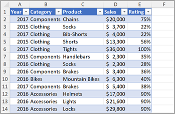
Suppose you have a dataset as shown below:
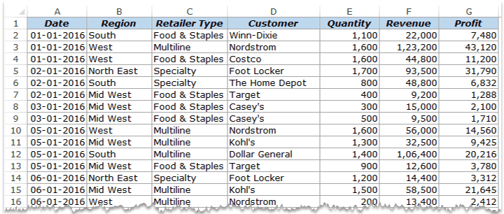
This is sales data that consists of ~1000 rows.
It has the sales data by region, retailer type, and customer.
Now your boss may want to know a few things from this data:
- What were the total sales in the South region in 2016?
- What are the top five retailers by sales?
- How did The Home Depot’s performance compare against other retailers in the South?
You can go ahead and use Excel functions to give you the answers to these questions, but what if suddenly your boss comes up with a list of five more questions.
You’ll have to go back to the data and create new formulas every time there is a change.
This is where Excel Pivot Tables comes in really handy.
Within seconds, a Pivot Table will answer all these questions (as you’ll learn below).
But the real benefit is that it can accommodate your finicky data-driven boss by answering his questions immediately.
It’s so simple, you may as well take a few minutes and show your boss how to do it himself.
Hopefully, now you have an idea of why Pivot Tables are so awesome. Let’s go ahead and create a Pivot Table using the data set (shown above).
Inserting a Pivot Table in Excel
Here are the steps to create a pivot table using the data shown above:
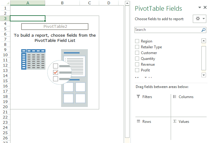
As soon as you click OK, a new worksheet is created with the Pivot Table in it.
While the Pivot Table has been created, you’d see no data in it. All you’d see is the Pivot Table name and a single line instruction on the left, and Pivot Table Fields on the right.
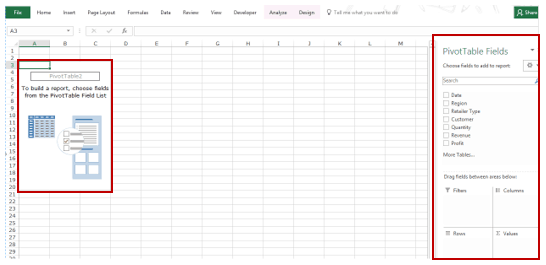
Now before we jump into analyzing data using this Pivot Table, let’s understand what are the nuts and bolts that make an Excel Pivot Table.
Also read: 10 Excel Pivot Table Keyboard Shortcuts
The Nuts & Bolts of an Excel Pivot Table
To use a Pivot Table efficiently, it’s important to know the components that create a pivot table.
In this section, you’ll learn about:
- Pivot Cache
- Values Area
- Rows Area
- Columns Area
- Filters Area
Pivot Cache
As soon as you create a Pivot Table using the data, something happens in the backend. Excel takes a snapshot of the data and stores it in its memory. This snapshot is called the Pivot Cache.
When you create different views using a Pivot Table, Excel does not go back to the data source, rather it uses the Pivot Cache to quickly analyze the data and give you the summary/results.
The reason a pivot cache gets generated is to optimize the pivot table functioning. Even when you have thousands of rows of data, a pivot table is super fast in summarizing the data. You can drag and drop items in the rows/columns/values/filters boxes and it will instantly update the results.
Note: One downside of pivot cache is that it increases the size of your workbook. Since it’s a replica of the source data, when you create a pivot table, a copy of that data gets stored in the Pivot Cache.
Read More: What is Pivot Cache and How to Best Use It.
Values Area
The Values Area is what holds the calculations/values.
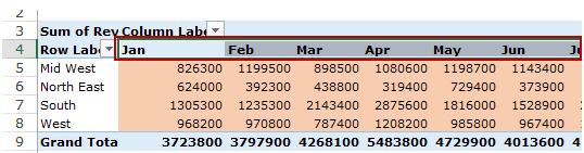
Based on the data set shown at the beginning of the tutorial, if you quickly want to calculate total sales by region in each month, you can get a pivot table as shown below (we’ll see how to create this later in the tutorial).
The area highlighted in orange is the Values Area.
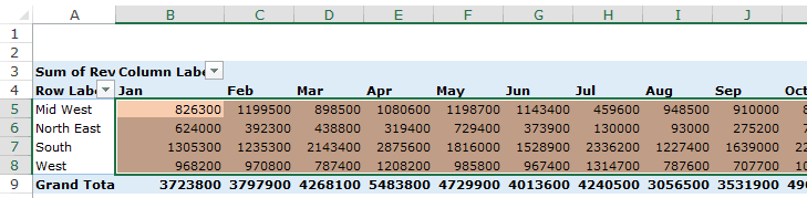
In this example, it has the total sales in each month for the four regions.
Rows Area
The headings to the left of the Values area makes the Rows area.
In the example below, the Rows area contains the regions (highlighted in red):
Columns Area
The headings at the top of the Values area makes the Columns area.
In the example below, Columns area contains the months (highlighted in red):
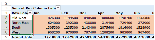
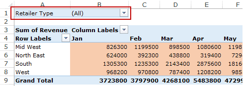
Filters Area
Filters area is an optional filter that you can use to further drill down in the data set.
For example, if you only want to see the sales for Multiline retailers, you can select that option from the drop down (highlighted in the image below), and the Pivot Table would update with the data for Multiline retailers only.
Analyzing Data Using the Pivot Table
Now, let’s try and answer the questions by using the Pivot Table we have created.
Click here to download the sample data and follow along.
To analyze data using a Pivot Table, you need to decide how you want the data summary to look in the final result. For example, you may want all the regions in the left and the total sales right next to it. Once you have this clarity in mind, you can simply drag and drop the relevant fields in the Pivot Table.
In the Pivot Tabe Fields section, you have the fields and the areas (as highlighted below):
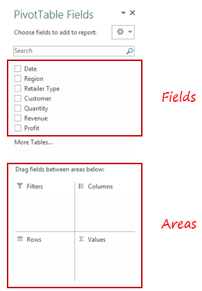
The Fields are created based on the backend data used for the Pivot Table. The Areas section is where you place the fields, and according to where a field goes, your data is updated in the Pivot Table.
It’s a simple drag and drop mechanism, where you can simply drag a field and put it in one of the four areas. As soon as you do this, it will appear in the Pivot Table in the worksheet.
Now let’s try and answer the questions your manager had using this Pivot Table.
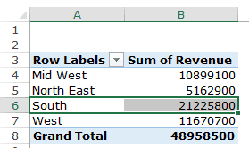
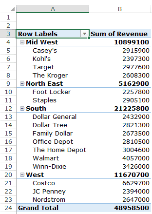
Q1: What were the total sales in the South region?
Drag the Region field in the Rows area and the Revenue field in the Values area. It would automatically update the Pivot Table in the worksheet.
Note that as soon as you drop the Revenue field in the Values area, it becomes Sum of Revenue. By default, Excel sums all the values for a given region and shows the total. If you want, you can change this to Count, Average, or other statistics metrics. In this case, the sum is what we needed.
The answer to this question would be 21225800.
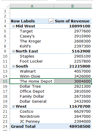
Q2 What are the top five retailers by sales?
Drag the Customer field in the Row area and Revenue field in the values area. In case, there are any other fields in the area section and you want to remove it, simply select it and drag it out of it.
You’ll get a Pivot Table as shown below:
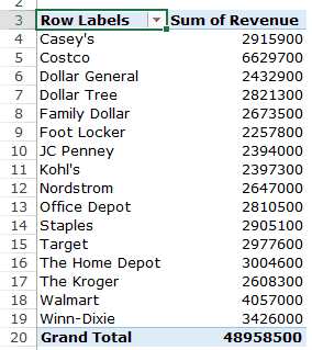
Note that by default, the items (in this case the customers) are sorted in an alphabetical order.
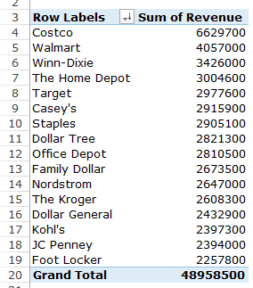
To get the top five retailers, you can simply sort this list and use the top five customer names. To do this:
This will give you a sorted list based on total sales.
Q3: How did The Home Depot’s performance compare against other retailers in the South?
You can do a lot of analysis for this question, but here let’s just try and compare the sales.
Drag the Region Field in the Rows area. Now drag the Customer field in the Rows area below the Region field. When you do this, Excel would understand that you want to categorize your data first by region and then by customers within the regions. You’ll have something as shown below:
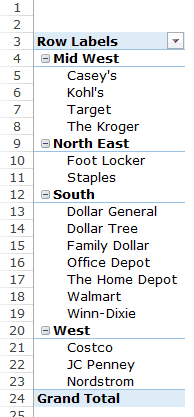
Now drag the Revenue field in the Values area and you’ll have the sales for each customer (as well as the overall region).
You can sort the retailers based on the sales figures by following the below steps:
- Right-click on a cell that has the sales value for any retailer.
- Go to Sort –> Sort Largest to Smallest.
This would instantly sort all the retailers by the sales value.
Now you can quickly scan through the South region and identify that The Home Depot sales were 3004600 and it did better than four retailers in the South region.
Now there are more than one ways to skin the cat. You can also put the Region in the Filter area and then only select the South Region.
Click here to download the sample data.
I hope this tutorial gives you a basic overview of Excel Pivot Tables and helps you in getting started with it.
Here are some more Pivot Table Tutorials you may like:
- Preparing Source Data For Pivot Table.
- How to Apply Conditional Formatting in a Pivot Table in Excel.
- How to Group Dates in Pivot Tables in Excel.
- How to Group Numbers in Pivot Table in Excel.
- How to Filter Data in a Pivot Table in Excel.
- Using Slicers in Excel Pivot Table.
- How to Replace Blank Cells with Zeros in Excel Pivot Tables.
- How to Add and Use an Excel Pivot Table Calculated Fields.
- How to Refresh Pivot Table in Excel.
The pivot table is one of Microsoft Excel’s most powerful — and intimidating — functions. Pivot tables can help you summarize and make sense of large data sets. However, they also have a reputation for being complicated.

The good news is that learning how to create a pivot table in Excel is much easier than you may believe.
We’re going to walk you through the process of creating a pivot table and show you just how simple it is. First, though, let’s take a step back and make sure you understand exactly what a pivot table is, and why you might need to use one.
What is a pivot table?
What are pivot tables used for?
How to Create a Pivot Table
Pivot Table Examples
![Download 10 Excel Templates for Marketers [Free Kit]](https://no-cache.hubspot.com/cta/default/53/9ff7a4fe-5293-496c-acca-566bc6e73f42.png)
What is a pivot table?
A pivot table is a summary of your data, packaged in a chart that lets you report on and explore trends based on your information. Pivot tables are particularly useful if you have long rows or columns that hold values you need to track the sums of and easily compare to one another.
In other words, pivot tables extract meaning from that seemingly endless jumble of numbers on your screen. And more specifically, it lets you group your data in different ways so you can draw helpful conclusions more easily.
The «pivot» part of a pivot table stems from the fact that you can rotate (or pivot) the data in the table to view it from a different perspective. To be clear, you’re not adding to, subtracting from, or otherwise changing your data when you make a pivot. Instead, you’re simply reorganizing the data so you can reveal useful information.
What are pivot tables used for?
If you’re still feeling a bit confused about what pivot tables actually do, don’t worry. This is one of those technologies that are much easier to understand once you’ve seen it in action.
The purpose of pivot tables is to offer user-friendly ways to quickly summarize large amounts of data. They can be used to better understand, display, and analyze numerical data in detail.
With this information, you can help identify and answer unanticipated questions surrounding the data.
Here are seven hypothetical scenarios where a pivot table could be helpful.
1. Comparing Sales Totals of Different Products
Let’s say you have a worksheet that contains monthly sales data for three different products — product 1, product 2, and product 3. You want to figure out which of the three has been generating the most revenue.
One way would be to look through the worksheet and manually add the corresponding sales figure to a running total every time product 1 appears. The same process can then be done for product 2, and product 3 until you have totals for all of them. Piece of cake, right?
Imagine, now, that your monthly sales worksheet has thousands upon thousands of rows. Manually sorting through each necessary piece of data could literally take a lifetime.
With pivot tables, you can automatically aggregate all of the sales figures for product 1, product 2, and product 3 — and calculate their respective sums — in less than a minute.
 Image source
2. Showing Product Sales as Percentages of Total Sales
Pivot tables inherently show the totals of each row or column when created. That’s not the only figure you can automatically produce, however.
Let’s say you entered quarterly sales numbers for three separate products into an Excel sheet and turned this data into a pivot table. The pivot table automatically gives you three totals at the bottom of each column — having added up each product’s quarterly sales.
But what if you wanted to find the percentage these product sales contributed to all company sales, rather than just those products’ sales totals?
With a pivot table, instead of just the column total, you can configure each column to give you the column’s percentage of all three column totals.
Let’s say three products totaled $200,000 in sales. The first product made $45,000, you can edit a pivot table to instead say this product contributed 22.5% of all company sales.
To show product sales as percentages of total sales in a pivot table, simply right-click the cell carrying a sales total and select Show Values As > % of Grand Total.
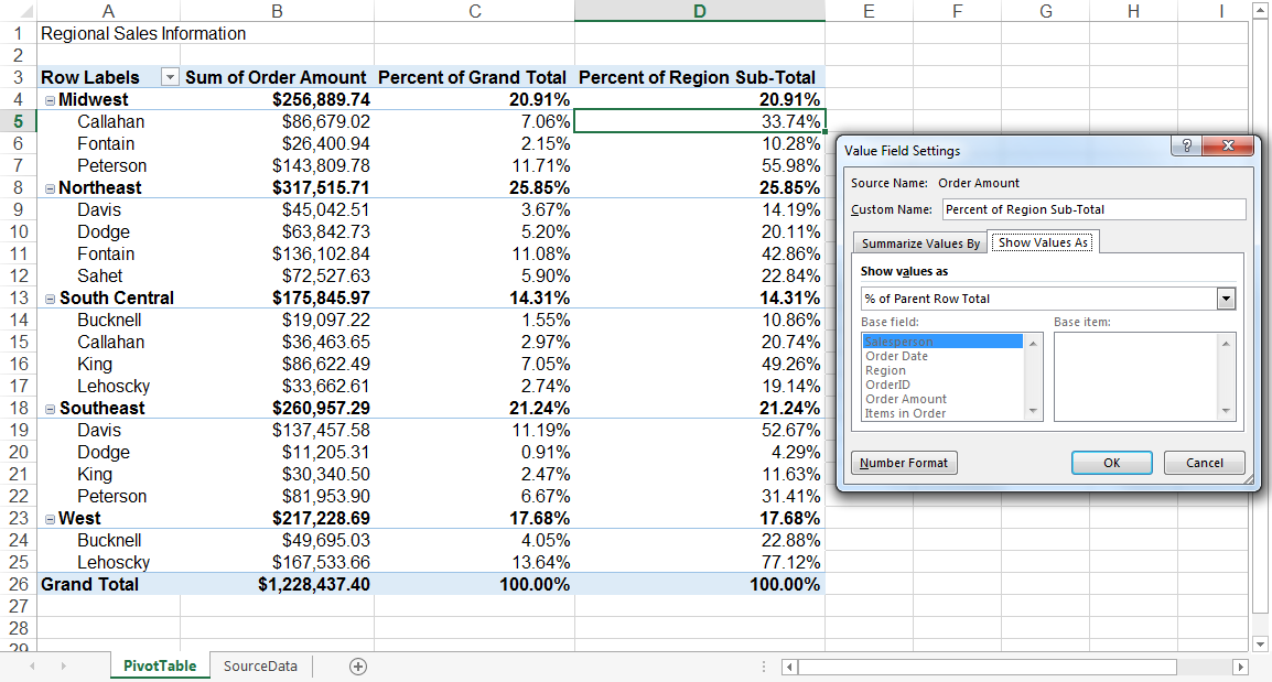 Image source
3. Combining Duplicate Data
In this scenario, you’ve just completed a blog redesign and had to update many URLs. Unfortunately, your blog reporting software didn’t handle the change well and split the «view» metrics for single posts between two different URLs.
In your spreadsheet, you now have two separate instances of each individual blog post. To get accurate data, you need to combine the view totals for each of these duplicates.
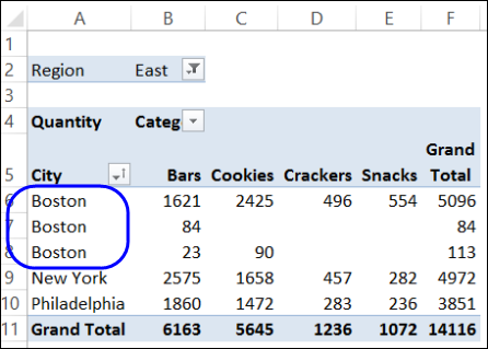 Image source
Instead of having to manually search for and combine all the metrics from the duplicates, you can summarize your data (via pivot table) by blog post title.
Voilà, the view metrics from those duplicate posts will be aggregated automatically.
 Image source
4. Getting an Employee Headcount for Separate Departments
Pivot tables are helpful for automatically calculating things that you can’t easily find in a basic Excel table. One of those things is counting rows that all have something in common.
For instance, let’s say you have a list of employees in an Excel sheet. Next to the employees’ names are the respective departments they belong to. You can create a pivot table from this data that shows you each department’s name and the number of employees that belong to those departments.
The pivot table’s automated functions effectively eliminate your task of sorting the Excel sheet by department name and counting each row manually.
5. Adding Default Values to Empty Cells
Not every dataset you enter into Excel will populate every cell. If you’re waiting for new data to come in, you might have lots of empty cells that look confusing or need further explanation.
That’s where pivot tables come in.
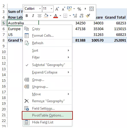 Image source
You can easily customize a pivot table to fill empty cells with a default value, such as $0, or TBD (for «to be determined»). For large data tables, being able to tag these cells quickly is a valuable feature when many people are reviewing the same sheet.
To automatically format the empty cells of your pivot table, right-click your table and click PivotTable Options.
In the window that appears, check the box labeled Empty Cells As and enter what you’d like displayed when a cell has no other value.
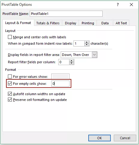 Image source
- Enter your data into a range of rows and columns.
- Sort your data by a specific attribute.
- Highlight your cells to create your pivot table.
- Drag and drop a field into the «Row Labels» area.
- Drag and drop a field into the «Values» area.
- Fine-tune your calculations.
Now that you have a better sense of what pivot tables can be used for, let’s get into the nitty-gritty of how to actually create one.
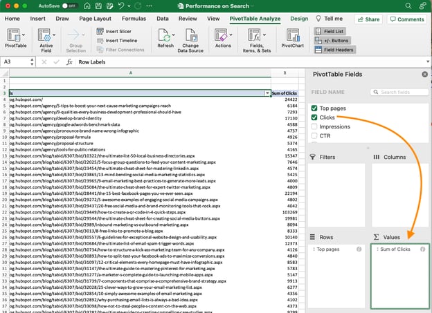
Step 1. Enter your data into a range of rows and columns.
Every pivot table in Excel starts with a basic Excel table, where all your data is housed. To create this table, simply enter your values into a specific set of rows and columns. Use the topmost row or the topmost column to categorize your values by what they represent.
For example, to create an Excel table of blog post performance data, you might have:
- A column listing each «Top Pages.»
- A column listing each URL’s «Clicks.»
- A column listing each post’s «Impressions.»
We’ll be using that example in the steps that follow.
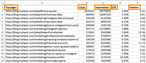
Step 2. Sort your data by a specific attribute.
Once you’ve entered all your data into your Excel sheet, you’ll want to sort your data by attribute. This will make your information easier to manage once it becomes a pivot table.
To sort your data, click the Data tab in the top navigation bar and select the Sort icon underneath it. In the window that appears, you can sort your data by any column you want and in any order.
For example, to sort your Excel sheet by «Views to Date,» select this column title under Column and then select whether you want to order your posts from smallest to largest, or from largest to smallest.
Select OK on the bottom-right of the Sort window.
Now, you’ve successfully reordered each row of your Excel sheet by the number of views each blog post has received.
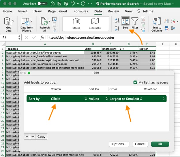
Step 3. Highlight your cells to create your pivot table.
Once you’ve entered and sorted your data, highlight the cells you’d like to summarize in a pivot table. Click Insert along the top navigation, and select the PivotTable icon.
You can also click anywhere in your worksheet, select «PivotTable,» and manually enter the range of cells you’d like included in the PivotTable.
This opens an options box. Here you can select whether or not to launch this pivot table in a new worksheet or keep it in the existing worksheet, in addition to setting your cell range.
If you open a new sheet, you can navigate to and away from it at the bottom of your Excel workbook. Once you’ve chosen, click OK.
Alternatively, you can highlight your cells, select Recommended PivotTables to the right of the PivotTable icon, and open a pivot table with pre-set suggestions for how to organize each row and column.
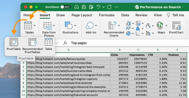
Note: If using an earlier version of Excel, «PivotTables» may be under Tables or Data along the top navigation, rather than «Insert.» In Google Sheets, you can create pivot tables from the Data dropdown along the top navigation.
Step 4. Drag and drop a field into the «Row Labels» area.
After you’ve completed Step 3, Excel will create a blank pivot table for you.
Your next step is to drag and drop a field — labeled according to the names of the columns in your spreadsheet — into the Row Labels area. This will determine what unique identifier the pivot table will organize your data by.
For example, let’s say you want to organize a bunch of blogging data by post title. To do that, you’d simply click and drag the “Top pages” field to the «Row Labels» area.
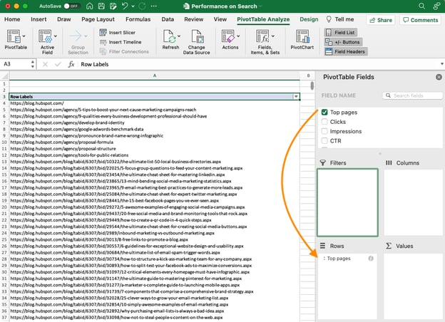
Note: Your pivot table may look different depending on which version of Excel you’re working with. However, the general principles remain the same.
Step 5. Drag and drop a field into the «Values» area.
Once you’ve established how you’re going to organize your data, your next step is to add in some values by dragging a field into the Values area.
Sticking with the blogging data example, let’s say you want to summarize blog post views by title. To do this, you’d simply drag the «Views» field into the Values area.
Step 6. Fine-tune your calculations.
The sum of a particular value will be calculated by default, but you can easily change this to something like average, maximum, or minimum depending on what you want to calculate.
On a Mac, you can do this by clicking on the small i next to a value in the «Values» area, selecting the option you want, and clicking «OK.» Once you’ve made your selection, your pivot table will be updated accordingly.
If you’re using a PC, you’ll need to click on the small upside-down triangle next to your value and select Value Field Settings to access the menu.
When you’ve categorized your data to your liking, save your work and use it as you please.
Pivot Table Examples
From managing money to keeping tabs on your marketing effort, pivot tables can help you keep track of important data. The possibilities are endless!
See three pivot table examples below to keep you inspired.
1. Creating a PTO Summary and Tracker
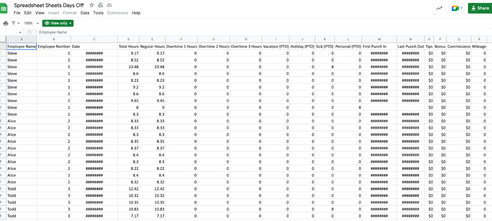 Image source
If you’re in HR, running a business, or leading a small team, managing employees’ vacations is essential. This pivot allows you to seamlessly track this data.
All you need to do is import your employee’s identification data along with the following data:
- Sick time.
- Hours of PTO.
- Company holidays.
- Overtime hours.
- Employee’s regular number of hours.
From there, you can sort your pivot table by any of these categories.
2. Building a Budget
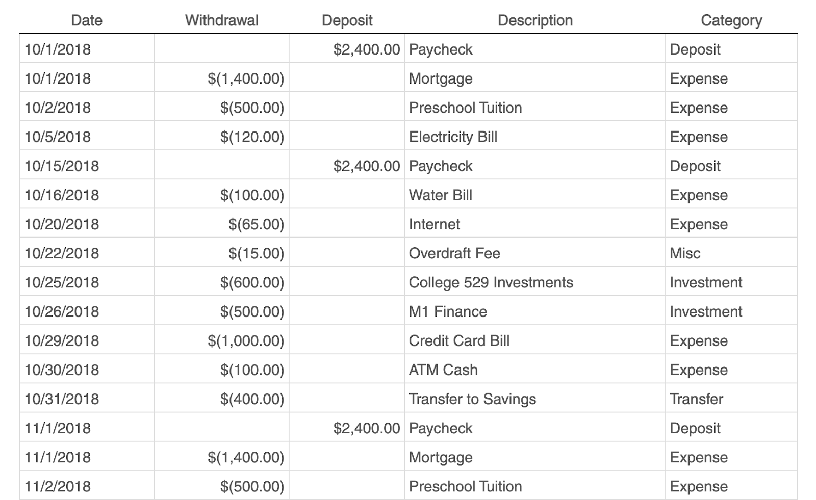 Image source
Whether you’re running a project or just managing your own money, pivot tables are an excellent tool for tracking spend.
The simplest budget just requires the following categories:
- Date of transaction
- Withdrawal/Expenses
- Deposit/Income
- Description
- Any overarching categories (like paid ads or contractor fees)
With this information, you can see your biggest expenses and brainstorm ways to save.
3. Tracking Your Campaign Performance
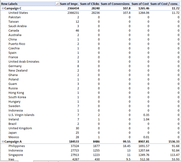 Image source
Pivot tables can help your team assess the performance of your marketing campaigns.
In this example, campaign performance is split by region. You can easily which country had the highest conversions during different campaigns.
This can help you identify tactics that perform well in each region and where advertisements need to be changed.
Digging Deeper With Pivot Tables
You’ve now learned the basics of pivot table creation in Excel. With this understanding, you can figure out what you need from your pivot table and find the solutions you’re looking for.
For example, you may notice that the data in your pivot table isn’t sorted the way you’d like. If this is the case, Excel’s Sort function can help you out. Alternatively, you may need to incorporate data from another source into your reporting, in which case the VLOOKUP function could come in handy.
Editor’s note: This post was originally published in December 2018 and has been updated for comprehensiveness.

Users create PivotTables for analyzing, summarizing and presenting large amounts of data. This Excel tool allows them to filter and group information, as well as display it in different aspects (prepare a report).
PivotTable data source includes a table with several dozens and hundreds of rows, several tables in one workbook, several files. Let’s revise the order of PivotTable creation: «INSERT» – «Tables» – «PivotTables».
In this article, we’ll learn how to work with PivotTables in Excel.
How to make a pivot table from multiple files
The first step is transferring the information to Excel and transforming it into Excel tables. If our data is in Word, we transfer it to Excel and make a table according to all Excel rules (we give headings to columns, remove empty rows, etc.).
Further work on creating a PivotTable from several files will depend on the type of data. If you work with the same-type data (there are several tables, but the headers are the same), the PivotTable Builder will help you.
We simply create a consolidated report (a PivotTable report) based on data in several ranges of consolidation.
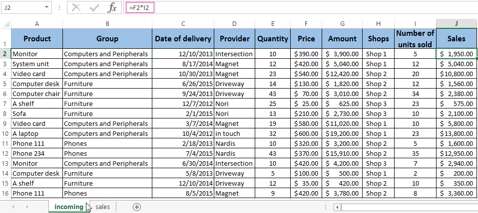
It is much more difficult to make a PivotTable on the basis of source tables that have different structure. For example:
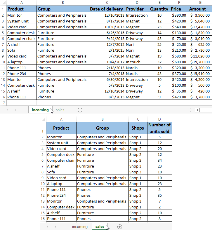
The first table “incoming” represents the receipt of goods. The second “sales” one demonstrates the number of units sold in different stores. We need to combine these two tables in one report to illustrate residues, sales, revenue, etc.
The PivotTable Wizard generates an error with these initial parameters, since one of the main consolidation conditions (the same column names) is violated.
But the two headings in these tables are identical. Therefore, we can combine the data, and then create a summary report.
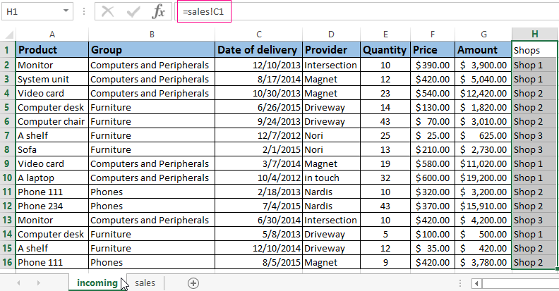
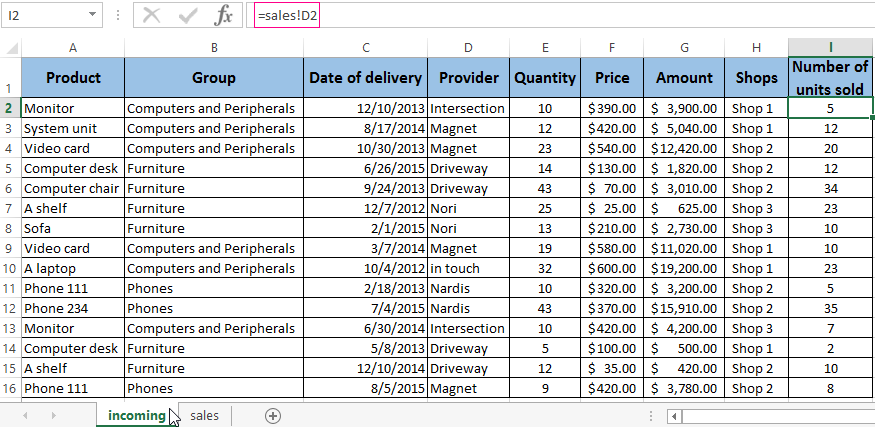
- Place the cursor to the target cell (where the table will be moved). Write = — pass to a sheet with the transferred data — select the first cell of a column that is copied. Press Enter. «Multiply» the formula by pulling it down behind the lower right corner of the cell.
- We transfer other data by the same principle. As a result, we get one PivotTable from two tables.
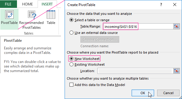
- Now create a PivotTable report. INSERT – PivotTables — specify the range and location — OK.
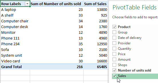
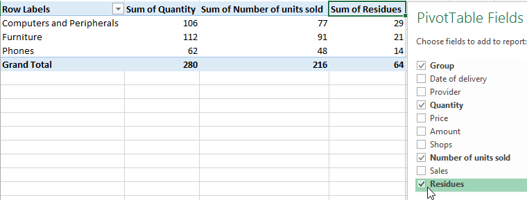
Summary report blank with Fields that can be displayed is opened. Let’s show, for example, the quantity of the goods sold.
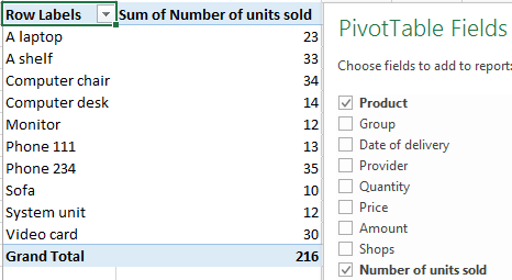
You can output different parameters for analysis and move fields. But the work with PivotTables in Excel does not end there: capabilities of this tool are wide.
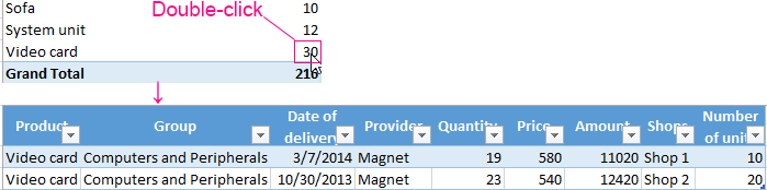
Detailing of information in pivot tables
From the report (see above) we can observe that there are 30 video cards sold IN TOTAL. To find out what data was used to get this value, double-click on the number “30”. Get a detailed report:
How to update the data in an Excel PivotTable?
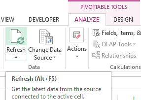
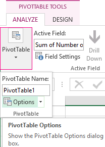
If you change any parameter in the source table or add a new record, this information will not be displayed in the PivotTable report. This situation does not suit us. We choose “PIVOTTABLE TOOL” — “ANALYZE” — “Refresh” (ALT+F5). The cursor must be in any cell in the master report.
Data update:
Or, right-click – refresh.
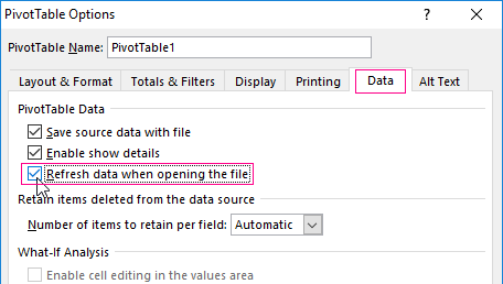
To configure the automatic update of the PivotTable when changing the data, we do the following:
- The cursor is positioned anywhere in the report. “PIVOTTABLES TOOL” – “ANALYZE” – “PivotTable” – “Options”.
- In the opened dialog – Data – Refresh data when opening the file – OK.
Change of the structure of the report
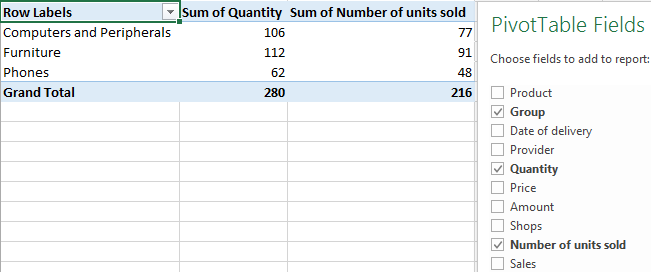
Add new fields to the PivotTable:
- Insert the «Sales» column on the sheet with source data. Here we will reflect what revenue the store will receive from the sale of the goods. Let’s use the formula — the price (F2) * the number of units sold(I2).
- Go to the sheet with the report. “PIVOTTABLE TOOL” – “ANALYZE” – “Change Data Source”. Expand the range of information that should enter into the summary table.
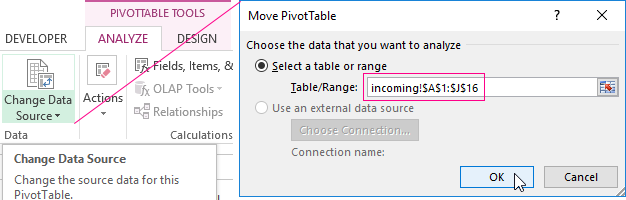
If we added columns inside the source table, it was enough to update the PivotTable.
After the range was changed, the «Sales» field appeared in the summary
How to add a calculated field to the PivotTable?
Sometimes, data in the summary table isn’t enough for the user. Changing the initial information does not make sense. In such situations, it is better to add a calculated field.
This is a virtual column created as a result of calculations. It can display average values, percentages, discrepancies, that is the results of different formulas. The data of the calculated field interacts with the data of the PivotTable.
Instructions for adding a calculated field:
- Determine what functions the digital column will perform. Define the data in the PivotTable on which the calculated field should refer to. Suppose you need balances for groups of goods.
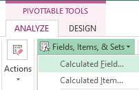
- “PIVOTTABLE TOOL” – “ANALYZE”–“Fields, Items and Sets”–“Calculated Field”.
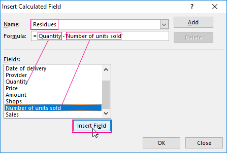
- Enter the name of the field in the opened menu. Put the cursor in the «Formula» line. The «Calculated Field» tool doesn’t respond to ranges. Therefore, it is pointless to select cells in the PivotTable. Choose the categories that are needed in the calculation from the proposed list. Then click «Insert Field». Complement the formula with the required arithmetic operations.
- Click OK. The Residues appeared.
Grouping data in a consolidated report
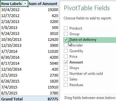
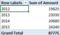
For example, we calculate expenses on goods in different years: how much money was spent in 2012, 2013, 2014 and 2015? The grouping by date in the Excel PivotTable is performed as follows. For example, let’s make a simple summary by date of delivery and price.
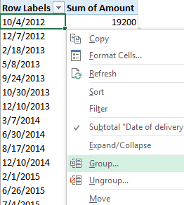
Right-click on any date. Select the «Group» command.
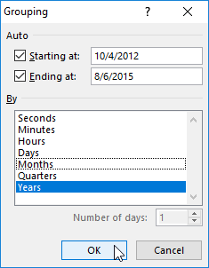
Specify the grouping parameters in the opened dialog. The start and end date of the range are displayed automatically. Choose the «Years» step value.
You’ll receive the amount of orders by years.
Download working example
By the same scheme, you can group the data in the PivotTable by other parameters.