
Note: These steps apply to Office 2013 and newer versions. Looking for Office 2010 steps?
Add a trendline

-
Select a chart.
-
Select the + to the top right of the chart.
-
Select Trendline.
Note: Excel displays the Trendline option only if you select a chart that has more than one data series without selecting a data series.
-
In the Add Trendline dialog box, select any data series options you want, and click OK.
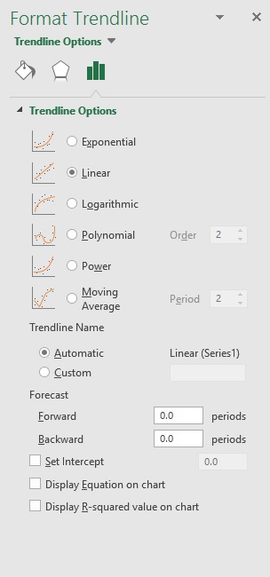
Format a trendline
-
Click anywhere in the chart.
-
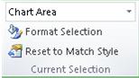
On the Format tab, in the Current Selection group, select the trendline option in the dropdown list.
-
Click Format Selection.
-
In the Format Trendline pane, select a Trendline Option to choose the trendline you want for your chart. Formatting a trendline is a statistical way to measure data:

-
Set a value in the Forward and Backward fields to project your data into the future.
Add a moving average line
You can format your trendline to a moving average line.
-
Click anywhere in the chart.
-
On the Format tab, in the Current Selection group, select the trendline option in the dropdown list.
-
Click Format Selection.
-
In the Format Trendline pane, under Trendline Options, select Moving Average. Specify the points if necessary.
Note: The number of points in a moving average trendline equals the total number of points in the series less the number that you specify for the period.
Add a trend or moving average line to a chart in Office 2010
-
On an unstacked, 2-D, area, bar, column, line, stock, xy (scatter), or bubble chart, click the data series to which you want to add a trendline or moving average, or do the following to select the data series from a list of chart elements:
-
Click anywhere in the chart.
This displays the Chart Tools, adding the Design, Layout, and Format tabs.
-
On the Format tab, in the Current Selection group, click the arrow next to the Chart Elements box, and then click the chart element that you want.
-
-
Note: If you select a chart that has more than one data series without selecting a data series, Excel displays the Add Trendline dialog box. In the list box, click the data series that you want, and then click OK.
-
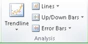
On the Layout tab, in the Analysis group, click Trendline.
-
Do one of the following:
-
Click a predefined trendline option that you want to use.
Note: This applies a trendline without enabling you to select specific options.
-
Click More Trendline Options, and then in the Trendline Options category, under Trend/Regression Type, click the type of trendline that you want to use.
Use this type
To create
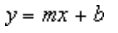
Linear
A linear trendline by using the following equation to calculate the least squares fit for a line:
where m is the slope and b is the intercept.
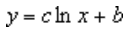
Logarithmic
A logarithmic trendline by using the following equation to calculate the least squares fit through points:
where c and b are constants, and ln is the natural logarithm function.
Polynomial
A polynomial or curvilinear trendline by using the following equation to calculate the least squares fit through points:
where b and
are constants.Power
A power trendline by using the following equation to calculate the least squares fit through points:
where c and b are constants.
Note: This option is not available when your data includes negative or zero values.
Exponential
An exponential trendline by using the following equation to calculate the least squares fit through points:
where c and b are constants, and e is the base of the natural logarithm.
Note: This option is not available when your data includes negative or zero values.
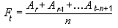
Moving average
A moving average trendline by using the following equation:
Note: The number of points in a moving average trendline equals the total number of points in the series less the number that you specify for the period.
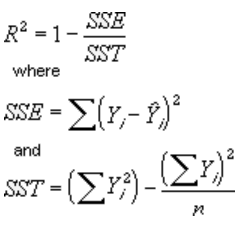
R-squared value
A trendline that displays an R-squared value on a chart by using the following equation:
This trendline option is available on the Options tab of the Add Trendline or Format Trendline dialog box.
Note: The R-squared value that you can display with a trendline is not an adjusted R-squared value. For logarithmic, power, and exponential trendlines, Excel uses a transformed regression model.
-
If you select Polynomial, type the highest power for the independent variable in the Order box.
-
If you select Moving Average, type the number of periods that you want to use to calculate the moving average in the Period box.
-
If you add a moving average to an xy (scatter) chart, the moving average is based on the order of the x values plotted in the chart. To get the result that you want, you might have to sort the x values before you add a moving average.
-
If you add a trendline to a line, column, area, or bar chart, the trendline is calculated based on the assumption that the x values are 1, 2, 3, 4, 5, 6, etc.. This assumption is made whether the x-values are numeric or text. To base a trendline on numeric x values, you should use an xy (scatter) chart.
-
Excel automatically assigns a name to the trendline, but you can change it. In the Format Trendline dialog box, in the Trendline Options category, under Trendline Name, click Custom, and then type a name in the Custom box.
-
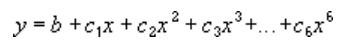
 are constants.

Tips:
-
You can also create a moving average, which smoothes out fluctuations in data and shows the pattern or trend more clearly.
-
If you change a chart or data series so that it can no longer support the associated trendline — for example, by changing the chart type to a 3-D chart or by changing the view of a PivotChart report or associated PivotTable report — the trendline no longer appears on the chart.
-
For line data without a chart, you can use AutoFill or one of the statistical functions, such as GROWTH() or TREND(), to create data for best-fit linear or exponential lines.
-
On an unstacked, 2-D, area, bar, column, line, stock, xy (scatter), or bubble chart, click the trendline that you want to change, or do the following to select it from a list of chart elements.
-
Click anywhere in the chart.
This displays the Chart Tools, adding the Design, Layout, and Format tabs.
-
On the Format tab, in the Current Selection group, click the arrow next to the Chart Elements box, and then click the chart element that you want.
-
-
On the Layout tab, in the Analysis group, click Trendline, and then click More Trendline Options.
-
To change the color, style, or shadow options of the trendline, click the Line Color, Line Style, or Shadow category, and then select the options that you want.
-
On an unstacked, 2-D, area, bar, column, line, stock, xy (scatter), or bubble chart, click the trendline that you want to change, or do the following to select it from a list of chart elements.
-
Click anywhere in the chart.
This displays the Chart Tools, adding the Design, Layout, and Format tabs.
-
On the Format tab, in the Current Selection group, click the arrow next to the Chart Elements box, and then click the chart element that you want.
-
-
On the Layout tab, in the Analysis group, click Trendline, and then click More Trendline Options.
-
To specify the number of periods that you want to include in a forecast, under Forecast, click a number in the Forward periods or Backward periods box.
-
On an unstacked, 2-D, area, bar, column, line, stock, xy (scatter), or bubble chart, click the trendline that you want to change, or do the following to select it from a list of chart elements.
-
Click anywhere in the chart.
This displays the Chart Tools, adding the Design, Layout, and Format tabs.
-
On the Format tab, in the Current Selection group, click the arrow next to the Chart Elements box, and then click the chart element that you want.
-
-
On the Layout tab, in the Analysis group, click Trendline, and then click More Trendline Options.
-
Select the Set Intercept = check box, and then in the Set Intercept = box, type the value to specify the point on the vertical (value) axis where the trendline crosses the axis.
Note: You can do this only when you use an exponential, linear, or polynomial trendline.
-
On an unstacked, 2-D, area, bar, column, line, stock, xy (scatter), or bubble chart, click the trendline that you want to change, or do the following to select it from a list of chart elements.
-
Click anywhere in the chart.
This displays the Chart Tools, adding the Design, Layout, and Format tabs.
-
On the Format tab, in the Current Selection group, click the arrow next to the Chart Elements box, and then click the chart element that you want.
-
-
On the Layout tab, in the Analysis group, click Trendline, and then click More Trendline Options.
-
To display the trendline equation on the chart, select the Display Equation on chart check box.
Note: You cannot display trendline equations for a moving average.
Tip: The trendline equation is rounded to make it more readable. However, you can change the number of digits for a selected trendline label in the Decimal places box on the Number tab of the Format Trendline Label dialog box. (Format tab, Current Selection group, Format Selection button).
-
On an unstacked, 2-D, area, bar, column, line, stock, xy (scatter), or bubble chart, click the trendline for which you want to display the R-squared value, or do the following to select the trendline from a list of chart elements:
-
Click anywhere in the chart.
This displays the Chart Tools, adding the Design, Layout, and Format tabs.
-
On the Format tab, in the Current Selection group, click the arrow next to the Chart Elements box, and then click the chart element that you want.
-
-
On the Layout tab, in the Analysis group, click Trendline, and then click More Trendline Options.
-
On the Trendline Options tab, select Display R-squared value on chart.
Note: You cannot display an R-squared value for a moving average.
-
On an unstacked, 2-D, area, bar, column, line, stock, xy (scatter), or bubble chart, click the trendline that you want to remove, or do the following to select the trendline from a list of chart elements:
-
Click anywhere in the chart.
This displays the Chart Tools, adding the Design, Layout, and Format tabs.
-
On the Format tab, in the Current Selection group, click the arrow next to the Chart Elements box, and then click the chart element that you want.
-
-
Do one of the following:
-
On the Layout tab, in the Analysis group, click Trendline, and then click None.
-
Press DELETE.
-
Tip: You can also remove a trendline immediately after you add it to the chart by clicking Undo  on the Quick Access Toolbar, or by pressing CTRL+Z.
The TREND function in Excel is a statistical function that computes the linear trend line based on the given linear data set. It calculates the predictive values of Y for given array values of X and uses the least square method based on the given two data series. The TREND function in Excel returns numbers in a linear trend matching known data points. That is, the existing data on which the trend in Excel predicts the values of Y dependent on values of X needs to be linear.
Table of contents
- Trend Function in Excel
- What is the least square method?
- Syntax
- How to Use TREND Function in Excel?
- Example #1
- Example #2 – Predicting the Sales Growth
- Things to Remember
- TREND Function in Excel Video
- Recommended Articles
What is the least square method?
It is a technique used in the regression analysisRegression analysis depicts how dependent variables will change when one or more independent variables change due to factors, and it is used to analyze the relationship between dependent and independent variables. Y = a + bX + E is the formula.read more that finds the line of best fitThe line of best fit is a mathematical concept that correlates points scattered across a graph.read more (is a line through a scatter graph of data points that foremost indicates the relationship between those points) for a given dataset, which helps to visualize the relationship between the data points.
Syntax
Below is the TREND formula in Excel.
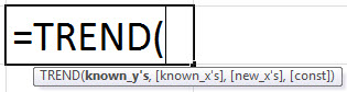
Arguments
For the given linear equation, y = m*x + c
Known_y’s: It is a required argument representing the set of y-values we already have as existing data in a dataset that follows the y = mx + c.
Known_x’s: It is an optional argument representing a set of x-values that should be of equal length to the set of known_y’s. If this argument is omitted, the set of known_x’s takes the value (1, 2, 3 … so on).
New_x’s: It is also an optional argument. These are the numeric values that represent the new_x’s value. If the new_x’s argument is omitted, it is set to be equal to the known_x’s.
Const: It is an optional argument specifying whether the constant value c equals 0. If const is TRUE or omitted, c is calculated normally. If false, c is taken as 0 (zero), and the values of m are adjusted so that y = mx.
How to Use TREND Function in Excel?
The TREND function in Excel is very simple and easy to use. Let us understand the working of the TREND function by some examples.
You can download this TREND Function Excel Template here – TREND Function Excel Template
Example #1
Suppose we have data for test scores with their GPA in this example. Now using this given data, we need to predict the GPA. We have the existing data in columns A and B. The current GPA values corresponding to scores are Y’s known values. The existing values of the score are the known values of X. We have given some values for X values as a score, and we need to predict the Y values, that is, the GPA, based on the existing values.
Existing Values:
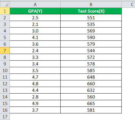
Given Values and Values of Y to be predicted:
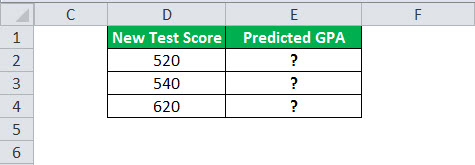
To predict the values of the GPA for given test scores in cells D2, D3, and D4, we will use the TREND function in Excel.
The TREND formula in Excel will take the existing values of known X and Y. We will pass the new values of X to calculate the values of Y in cells E2, E3, and E4.
The TREND formula in Excel will be:
=TREND($A$2:$A$16,$B$2:$B$16,D2)
We fixed the range for known X and Y values and passed the new value of X as a reference value. Then, applying the same TREND formula in Excel to other cells, we have:
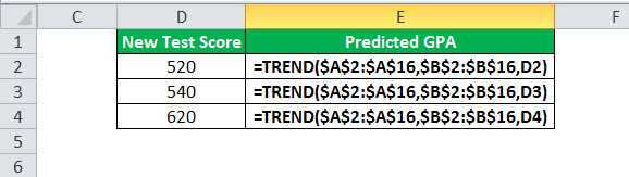
Output:
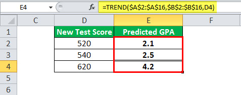
So, using the TREND function in Excel above, we predicted the three Y values for the new test scores.
Example #2 – Predicting the Sales Growth
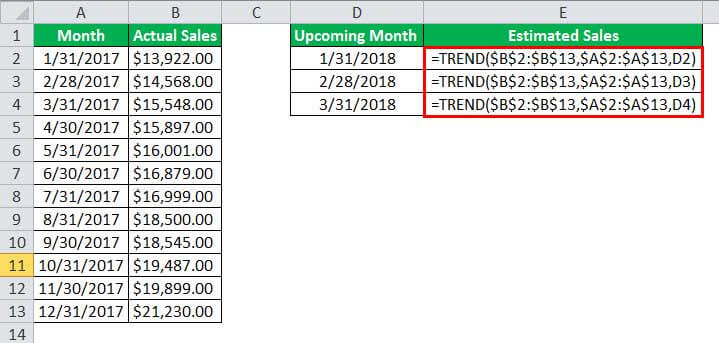
So in this example, we have existing sales data of a company for 2017 that increases linearly from Jan 2017 to Dec 2017. So, we need to figure out the sales for the given upcoming months. That is, we need to predict the sales values based on the predictive values for last year’s data.
The existing data contains the dates in column A and the sales revenue in column B. Next, we need to calculate the estimated sales value for the next 5 months. Historical data is given below:

We will use the TREND function in Excel to predict the sales for the upcoming months in the next year since the sales value is increasing linearly. Therefore, the given known values of Y are the sales revenue. The known values of X are the end dates of the month, and the new values of X are the dates for the next three months, 01/31/2018, 02/28/2018, and 03/31/2018. Finally, we need to compute the estimated sales values based on historical data in A1:B13.
The TREND formula in Excel will take the existing values of known X and Y. We will pass the new values of X to calculate the values of Y in cells E2, E3, and E4.
The TREND formula in Excel will be:
=TREND($B$2:$B$13,$A$2:$A$13,D2)
We fixed the range for known X and Y values and passed the new value of X as a reference value. Applying the same TREND formula in Excel to other cells we have,
Output:
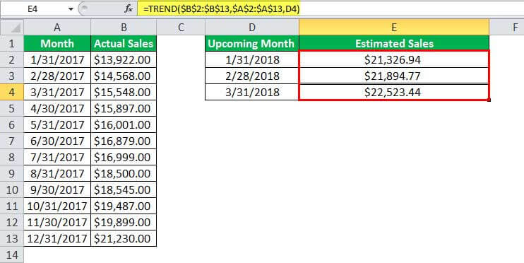
So, using the TREND function above, we have predicted the estimated sales values for the upcoming months in cells D2, D3, and D4.
Things to Remember
- The existing historical data that contains the known values of X and Y needs to be linear. For the given values of X, the value of Y should fit the linear curve y=m*x + c. Otherwise, the output or the predicted values may be inaccurate.
- The TREND function in Excel generates #VALUE! Error when the given known values of X or Y are non-numeric, or the value of new X is non-numeric, and when the const argument is not a Boolean value (that is TRUE or FALSE).
- The TREND function in Excel generates #REF! Because error known values of X and Y are of different lengths.
TREND Function in Excel Video
Recommended Articles
This article has been a guide to TREND Function in Excel. Here, we discuss the TREND formula in Excel and how to use the TREND function in Excel, along with Excel examples and downloadable Excel templates. You may also look at these useful functions in Excel: –
- Inserting Date in ExcelIn excel, every valid date will be stored as a form of the number. One important thing to be aware in excel is that we have got a cut-off date which is “31-Dec-1899”. Every date we insert in excel will be counted from “01-Jan-1900 (including this date)” and will be stored as a number.read more
- Formula of Sales Revenue
- Top Best Differences Regression vs. ANOVABoth the Regression and ANOVA are the statistical models which are used in order to predict the continuous outcome but in case of the regression, continuous outcome is predicted on basis of the one or more than one continuous predictor variables whereas in case of ANOVA continuous outcome is predicted on basis of the one or more than one categorical predictor variables.read more
- Convert Excel Columns to RowsThere are two ways to convert columns to rows: 1) using the Excel Ribbon Method. 2) The Mouse Method.read more
- VLOOKUP WildcardWildcard Characters are used with the VLOOKUP function to avail the lookup value by only using the partial match. It helps make VLOOKUP more powerful & avoids the #N/A Error. read more
Trendline is applied for illustrating price change trends. The element of technical analysis is a geometrical representation of the mean values of the analyzed indicator.
Here’s how to add a trendline to a chart in Excel.
Adding a trendline to a chart
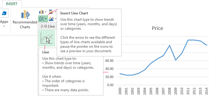
For example, let’s take average oil prices since 2000 from open sources. Type the analysis data in the spreadsheet:

- Create a chart based on the spreadsheet. Select the range A1:P2 and click on the «Insert»-«Charts»-«Insert Line Chart»-«Line». Choose a simple graph out of the offered chart types. The horizontal direction represents year, and the vertical one shows price.
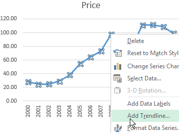
- Right-click the chart itself. Click «Add Trendline».
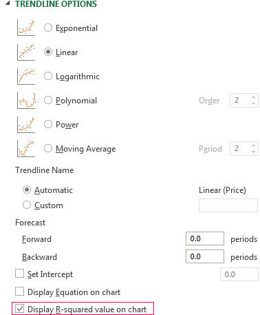
- The window for setting line parameters opens. Select the line type and enter R-squared value (the approximation accuracy value) in the chart.
- A skew line appears on the chart.
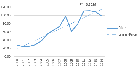
Trendline in Excel is an approximating function chart. It is used for making predictions based on statistical data. To this end, we need to extend the line and determine its values.
If R2 = 1, the approximation error is zero. In our example, the choice of the linear approximation has given a low accuracy and poor result. The prediction will be inaccurate.
Note: that a trendline can not be added to the following types of charts and graphs:
- radar;
- circular;
- surface;
- doughnut;
- stereogram;
- stacked.
Equation of trendline in Excel
In the example above the linear approximation has been chosen only for illustrating the algorithm. The R-squared value demonstrates that the choice has not been successful.
It is necessary to choose the type of representation that will best illustrates the trend of changes in the data entered by the user. Let’s examine the options.
Linear approximation
Its geometric representation is a straight line. Hence, linear approximation is used to illustrate the indicator which increases or decreases at a constant rate.
Let’s consider the conditional number of contracts concluded by a manager for 10 months:
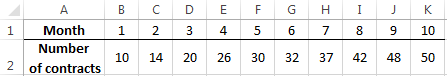
Based on the Excel spreadsheet data make a scatter chart (it will help illustrate a linear type):
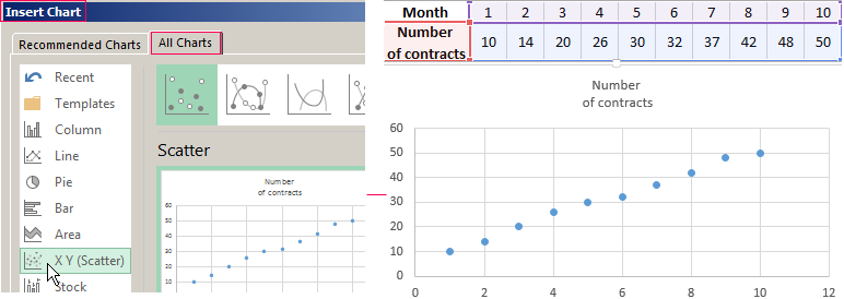
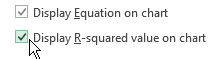
Highlight the chart, select «Add Trendline». In the settings, select the linear type. Add the R-squared value and the equation of a trendline (simply tick the box at the bottom of the «Options» window).
We get the result:
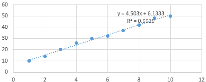
Note that in the linear approximation type data points are located very close to the line. This type uses the following equation:
y = 4,503x + 6,1333
- where 4,503 – slope indicator;
- 6,1333 — offset;
- y — sequence of values,
- x — period number.
The straight line on the graph shows a steady increase in the quality of the manager’s job. The R-squared value is equal to 0.9929, indicating a good agreement between the calculated straight line and the source data. Forecasts must be accurate.
To predict the number of concluded contracts, for example, in period 11, it is necessary to put number 11 instead of x in the equation. After calculating, we find out that in period 11 the manager will conclude 55-56 contracts.
The exponential trendline
This type is useful if the input values change with increasing speed. Exponential approximation is not applied if there are zero or negative characteristics.
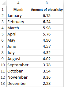
Let’s create an exponential trendline in Excel. Take for example the conditional values of electric power supply in X region:
Make the chart «Line with Markers». Add the exponential line.
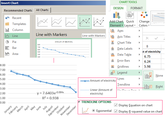
The equation is as follows:
y = 7,6403е^-0,084x
where:
- 7.6403 and -0.084 – constants;
- e – base of natural logarithm.
The indicator of R-squared value is 0.938, which means that the curve corresponds to the data, the error is minimal, and the forecasts will be accurate.
Logarithmic trendline and sales forecast
It is used for the following indicator changes: first, rapid growth or decrease, then — relative stability. The optimized curve adapts well to this value «behavior». The logarithmic trend is suitable for forecasting sales of a new product that has just entered the market.
The initial task of the manufacturer is to expand the customer base. When the goods have their buyer, it will be necessary to hold and serve him.
Make a chart and add a logarithmic trend line for a conditional product sales forecast:
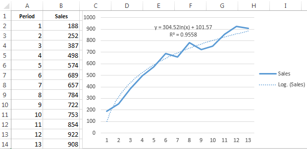
R2 is close in value to 1 (0.9558), indicating the minimum error of approximation. Let’s forecast sales volume for further periods. To do this, put period number instead of x in the equation.
For example:

To calculate forecast figures we use the formula: =304.52*LN(A18)+101.57, where A18 is period number.
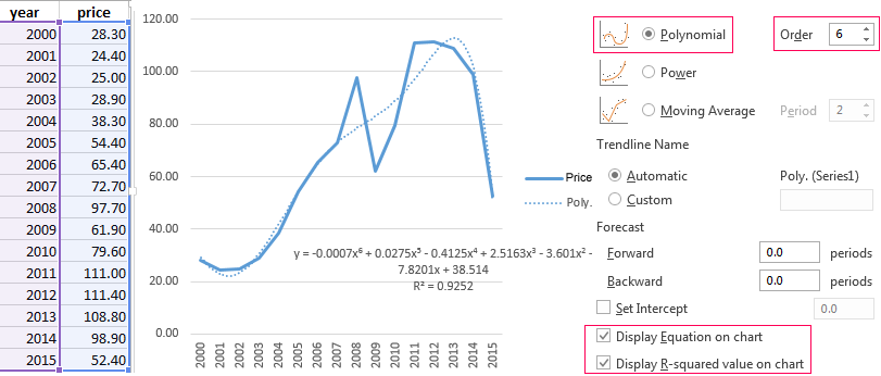
Polynomial trendline in Excel
This curve features alternate increase and decrease. The degree (by the number of minimum and maximum values) is determined for polynomials. For example, one extreme (minimum and maximum) is the second degree, two extremes make the third degree, three extremes – the fourth one.
A polynomial trend in Excel is used for the analysis of a large data set of unstable value. Let’s look at the example of the first set of values (oil prices).
Table of oil price dynamics by years:
| Year | 2000 | 2001 | 2002 | 2003 | 2004 | 2005 | 2006 | 2007 | 2008 | 2009 | 2010 | 2011 | 2012 | 2013 | 2014 | 2015 |
| Price per barrel | 28.30 | 24.40 | 25.00 | 28.90 | 38.30 | 54.40 | 65.40 | 72.70 | 97.70 | 61.90 | 79.60 | 111.00 | 111.40 | 108.80 | 98.90 | 52.40 |
Download examples of graphs with a trendline
To get this R-squared value (0.9252), we had to put the sixth degree.
However, this trend allows for making more or less accurate predictions.
Содержание
- Линия тренда в Excel
- Построение графика
- Создание линии тренда
- Настройка линии тренда
- Прогнозирование
- Вопросы и ответы

Одной из важных составляющих любого анализа является определение основной тенденции событий. Имея эти данные можно составить прогноз дальнейшего развития ситуации. Особенно наглядно это видно на примере линии тренда на графике. Давайте выясним, как в программе Microsoft Excel её можно построить.
Приложение Эксель предоставляет возможность построение линии тренда при помощи графика. При этом, исходные данные для его формирования берутся из заранее подготовленной таблицы.
Построение графика
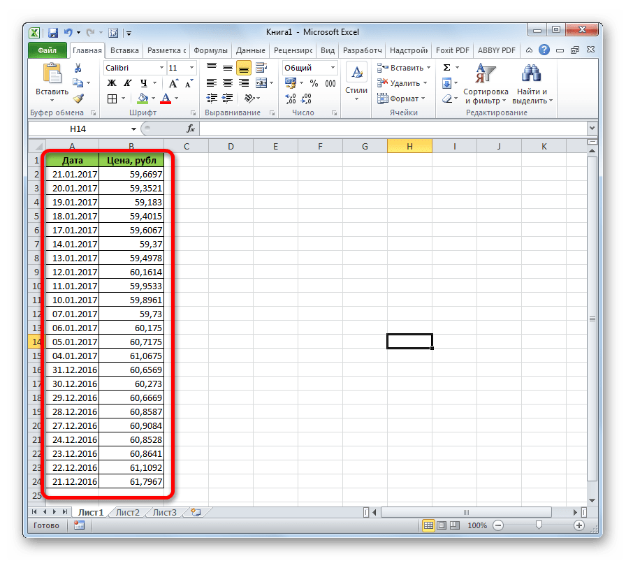
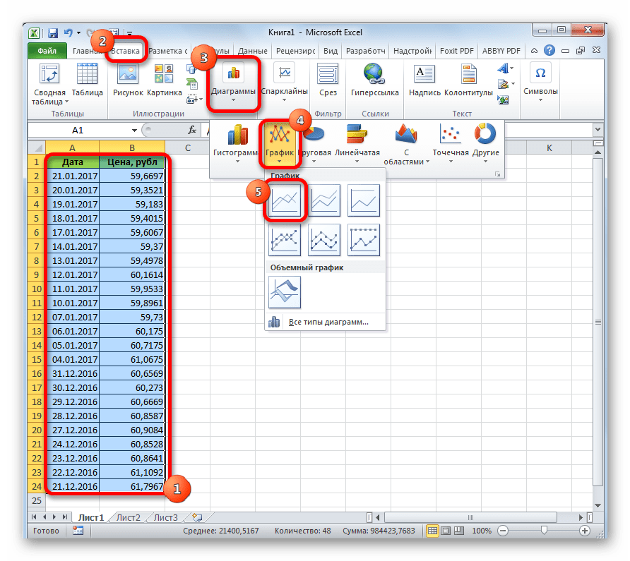
Для того, чтобы построить график, нужно иметь готовую таблицу, на основании которой он будет формироваться. В качестве примера возьмем данные о стоимости доллара в рублях за определенный период времени.
- Строим таблицу, где в одном столбике будут располагаться временные отрезки (в нашем случае даты), а в другом – величина, динамика которой будет отображаться в графике.
- Выделяем данную таблицу. Переходим во вкладку «Вставка». Там на ленте в блоке инструментов «Диаграммы» кликаем по кнопке «График». Из представленного списка выбираем самый первый вариант.
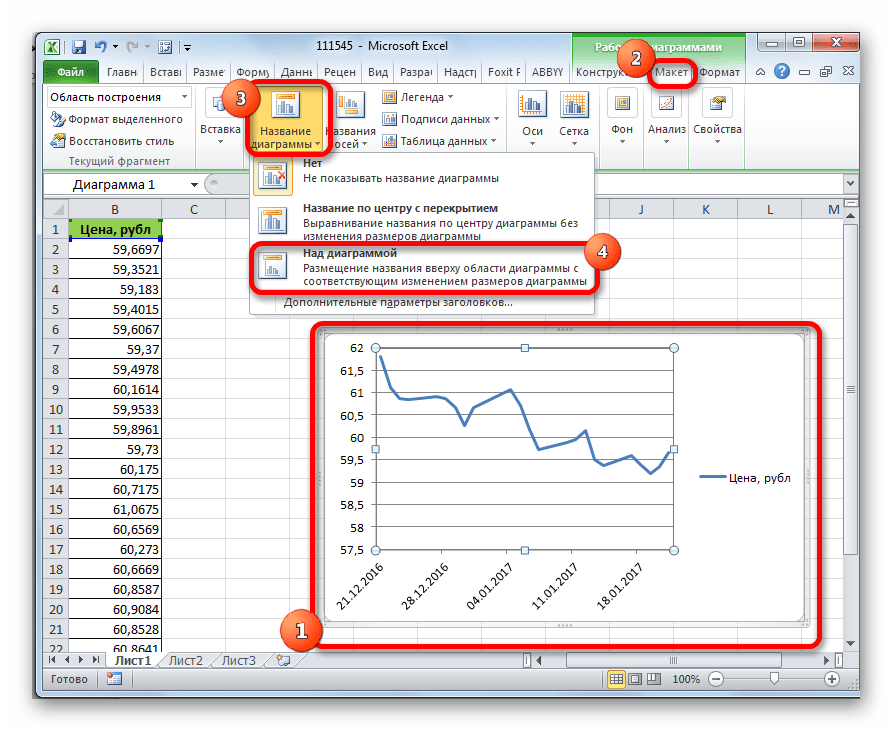
- После этого график будет построен, но его нужно ещё доработать. Делаем заголовок графика. Для этого кликаем по нему. В появившейся группе вкладок «Работа с диаграммами» переходим во вкладку «Макет». В ней кликаем по кнопке «Название диаграммы». В открывшемся списке выбираем пункт «Над диаграммой».
- В появившееся поле над графиком вписываем то название, которое считаем подходящим.
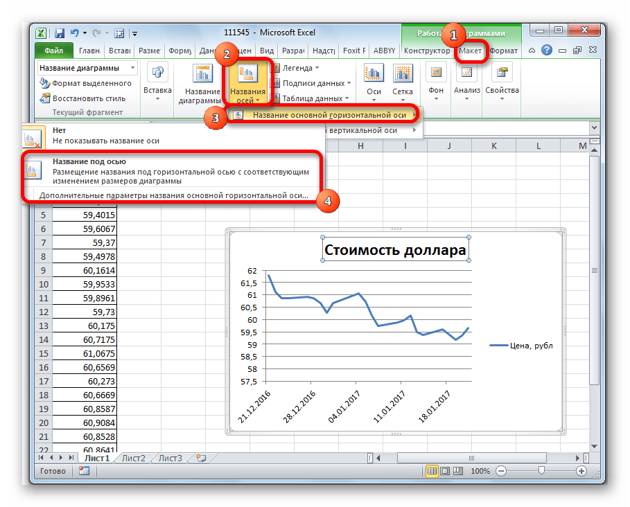
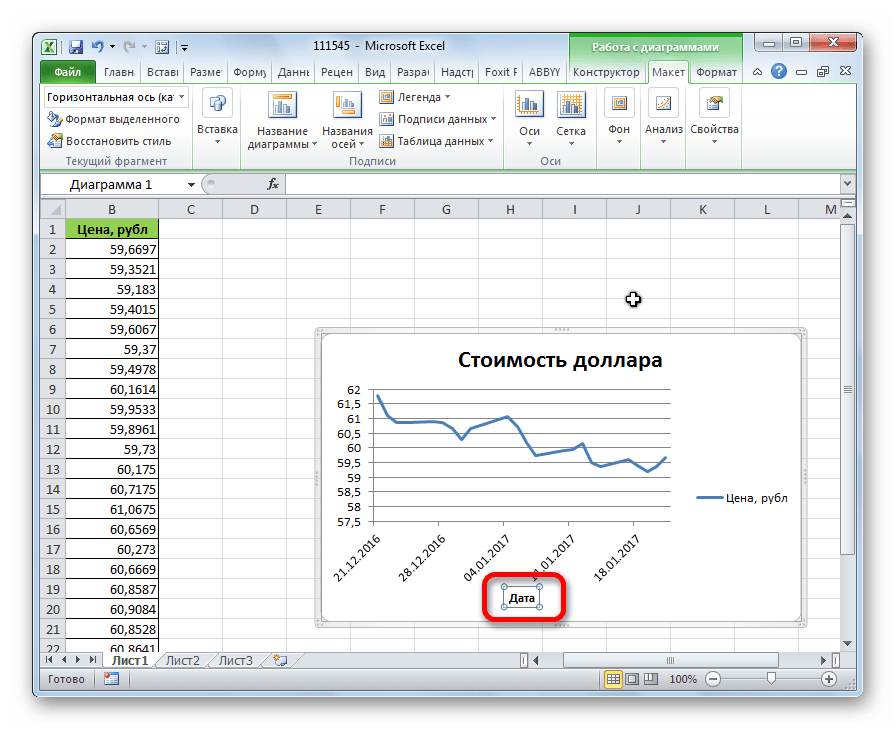
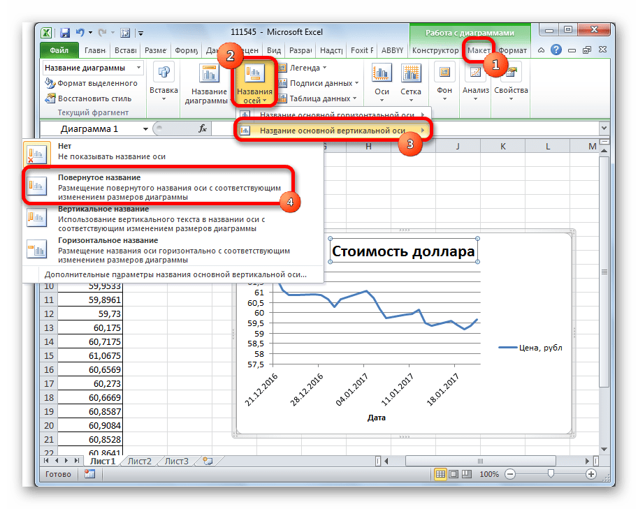
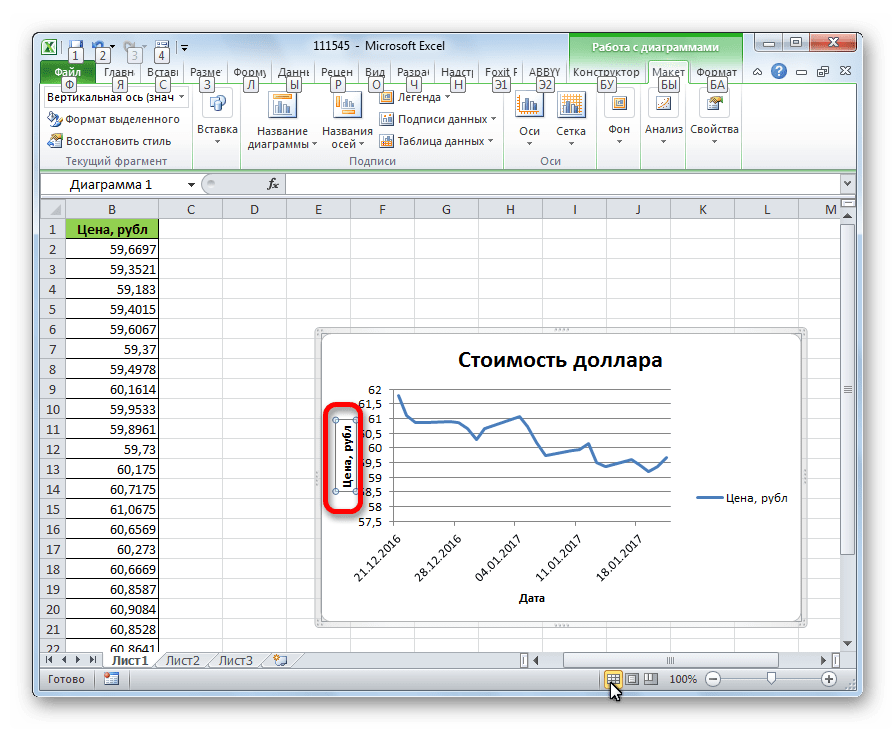
- Затем подписываем оси. В той же вкладке «Макет» кликаем по кнопке на ленте «Названия осей». Последовательно переходим по пунктам «Название основной горизонтальной оси» и «Название под осью».
- В появившемся поле вписываем название горизонтальной оси, согласно контексту расположенных на ней данных.
- Для того, чтобы присвоить наименование вертикальной оси также используем вкладку «Макет». Кликаем по кнопке «Название осей». Последовательно перемещаемся по пунктам всплывающего меню «Название основной вертикальной оси» и «Повернутое название». Именно такой тип расположения наименования оси будет наиболее удобен для нашего вида диаграмм.
- В появившемся поле наименования вертикальной оси вписываем нужное название.

Урок: Как сделать график в Excel
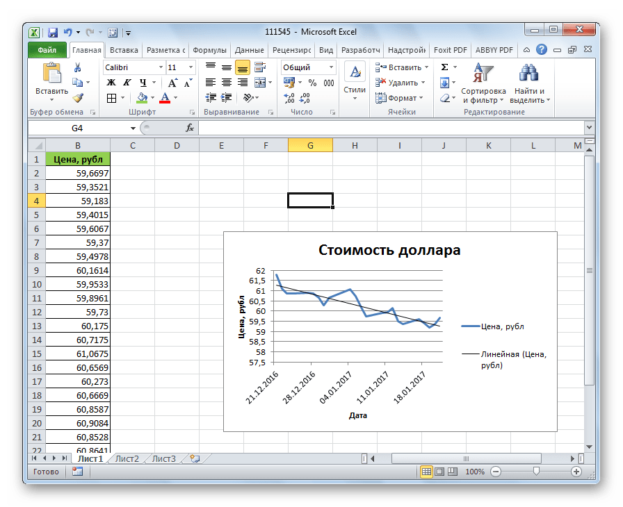
Создание линии тренда
Теперь нужно непосредственно добавить линию тренда.
- Находясь во вкладке «Макет» кликаем по кнопке «Линия тренда», которая расположена в блоке инструментов «Анализ». Из открывшегося списка выбираем пункт «Экспоненциальное приближение» или «Линейное приближение».
- После этого, линия тренда добавляется на график. По умолчанию она имеет черный цвет.


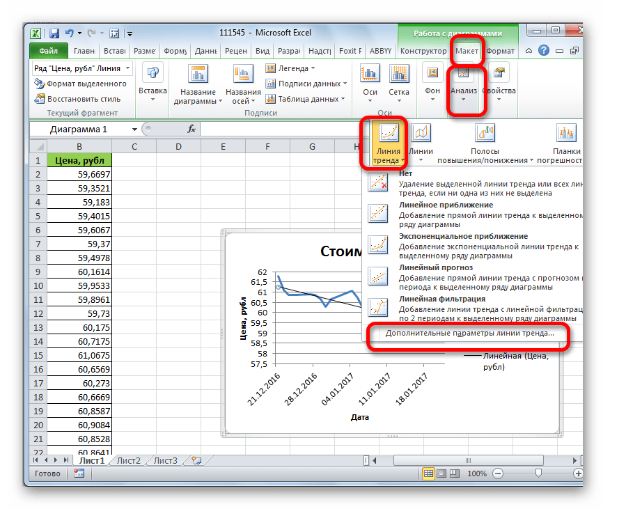
Настройка линии тренда
Имеется возможность дополнительной настройки линии.
- Последовательно переходим во вкладке «Макет» по пунктам меню «Анализ», «Линия тренда» и «Дополнительные параметры линии тренда…».
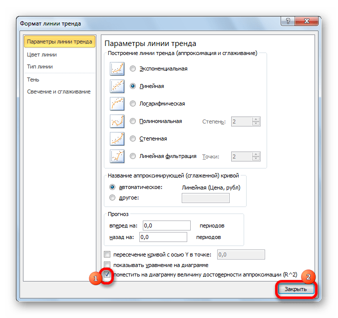
- Открывается окно параметров, можно произвести различные настройки. Например, можно выполнить изменение типа сглаживания и аппроксимации, выбрав один из шести пунктов:
- Полиномиальная;
- Линейная;
- Степенная;
- Логарифмическая;
- Экспоненциальная;
- Линейная фильтрация.
Для того, чтобы определить достоверность нашей модели, устанавливаем галочку около пункта «Поместить на диаграмму величину достоверности аппроксимации». Чтобы посмотреть результат, жмем на кнопку «Закрыть».

Если данный показатель равен 1, то модель максимально достоверна. Чем дальше уровень от единицы, тем меньше достоверность.
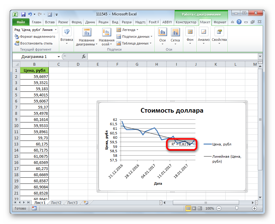
Если вас не удовлетворяет уровень достоверности, то можете вернуться опять в параметры и сменить тип сглаживания и аппроксимации. Затем, сформировать коэффициент заново.
Прогнозирование
Главной задачей линии тренда является возможность составить по ней прогноз дальнейшего развития событий.
- Опять переходим в параметры. В блоке настроек «Прогноз» в соответствующих полях указываем насколько периодов вперед или назад нужно продолжить линию тренда для прогнозирования. Жмем на кнопку «Закрыть».
- Опять переходим к графику. В нем видно, что линия удлинена. Теперь по ней можно определить, какой приблизительный показатель прогнозируется на определенную дату при сохранении текущей тенденции.

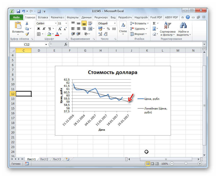
Как видим, в Эксель не составляет труда построить линию тренда. Программа предоставляет инструменты, чтобы её можно было настроить для максимально корректного отображения показателей. На основании графика можно сделать прогноз на конкретный временной период.
Еще статьи по данной теме:
Помогла ли Вам статья?
![]()
Download Article
![]()
Download Article
This wikiHow teaches you how to create a projection of a graph’s data in Microsoft Excel. You can do this on both Windows and Mac computers.
-
1
Open your Excel workbook. Double-click the Excel workbook document in which your data is stored.
- If you don’t have the data that you want to analyze in a spreadsheet yet, you’ll instead open Excel and click Blank workbook to open a new workbook. You can then enter your data and create a graph from it.
-
2
Select your graph. Click the graph to which you want to assign a trendline.
- If you haven’t yet created a graph from your data, create one before continuing.
Advertisement
-
3
Click +. It’s a green button next to the upper-right corner of the graph. A drop-down menu will appear.
-
4
Click the arrow to the right of the «Trendline» box. You may need to hover your mouse over the far-right side of the «Trendline» box to prompt this arrow to appear. Clicking it brings up a second menu.
-
5
Select a trendline option. Depending on your preferences, click one of the following options
- Linear
- Exponential
- Linear Forecast
- Two Period Moving Average
- You can also click More Options… to bring up an advanced options panel after selecting data to analyze.
-
6
Select data to analyze. Click a data series name (e.g., Series 1) in the pop-up window. If you named your data already, you’ll click the data’s name instead.
-
7
Click OK. It’s at the bottom of the pop-up window. Doing so adds a trendline to your graph.
- If you clicked More Options… earlier, you’ll have the option of naming your trendline or changing the trendline’s persuasion on the right side of the window.
-
8
Save your work. Press Ctrl+S to save your changes. If you’ve never saved this document before, you’ll be prompted to select a save location and file name.


Advertisement
-
1
Open your Excel workbook. Double-click the Excel workbook document in which your data is stored.
- If you don’t have the data that you want to analyze in your spreadsheet, you’ll instead open Excel to create a new workbook. You can then enter your data and create a graph from it.
-
2
Select the data in your graph. Click the series of data that you want to analyze to select it.
- If you haven’t yet created a graph from your data, create one before continuing.
-
3
Click the Chart Design tab. It’s at the top of the Excel window.[1]
-
4
Click Add Chart Element. This option is on the far-left side of the Chart Design toolbar. Clicking it prompts a drop-down menu.
-
5
Select Trendline. It’s at the bottom of the drop-down menu. A pop-out menu will appear.
-
6
Select a trendline option. Depending on your preferences, click one of the following options in the pop-out menu:[2]
- Linear
- Exponential
- Linear Forecast
- Moving Average
- You can also click More Trendline Options to bring up a window with advanced options (e.g., trendline name).
-
7
Save your changes. Press ⌘ Command+Save, or click File and then click Save. If you’ve never saved this document before, you’ll be prompted to select a save location and file name.


Advertisement
Add New Question
-
Question
How do I choose where the data goes in Excel?

Just click a section of the grid, then put whatever you need to in the box. You can also extend boxes by dragging them.
Ask a Question
200 characters left
Include your email address to get a message when this question is answered.
Submit
Advertisement
Video
-
Depending on your graph’s data, you may have additional trendline options (e.g., Polynomial).
Thanks for submitting a tip for review!
Advertisement
-
Make sure that you have sufficient data to predict a trend. It’s almost impossible to analyze a «trend» in only two or three points of data.
Advertisement
About This Article
Thanks to all authors for creating a page that has been read 749,922 times.