
37
37 people found this article helpful
How to Create a Report in Excel
Using charts, graphs, and pivot tables makes it easy
Updated on September 25, 2022
What to Know
- Create a report using charts: Select Insert > Recommended Charts, then choose the one you want to add to the report sheet.
- Create a report with pivot tables: Select Insert > PivotTable. Select the data range you want to analyze in the Table/Range field.
- Print: Go to File > Print, change the orientation to Landscape, scaling to Fit All Columns on One Page, and select Print Entire Workbook.
This article explains how to create a report in Microsoft Excel using key skills like creating basic charts and tables, creating pivot tables, and printing the report. The information in this article applies to Excel 2019, Excel 2016, Excel 2013, Excel 2010, and Excel for Mac.
Creating Basic Charts and Tables for an Excel Report
Creating reports usually means collecting information and presenting it all in a single sheet that serves as the report sheet for all of the information. These report sheets should be formatted in a way that’s easy to print as well.
One of the most common tools people use in Excel to create reports is the chart and table tools. To create a chart in an Excel report sheet:
-
Select Insert from the menu, and in the charts group, select the type of chart you want to add to the report sheet.
-
In the Chart Design menu, in the Data group, select Select Data.
-
Select the sheet with the data and select all cells containing the data you want to chart (include headers).
-
The chart will update in your report sheet with the data. The headers will be used to populate the labels in the two axis.
-
Repeat the above steps to create new charts and graphs that appropriately represent the data you want to show in your report. When you need to create a new report, you can just paste the new data into the data sheets, and the charts and graphs update automatically.
There are different ways to lay out a report using Excel. You can include graphs and charts on the same page as tabular (numeric) data, or you can create multiple sheets so visual reporting is on one sheet, tabular data is on another sheet, and so on.
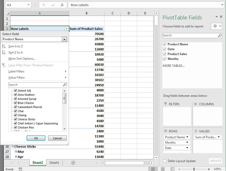
Using PivotTables to Generate a Report From an Excel Spreadsheet
Pivot tables are another powerful tool for creating reports in Excel. Pivot tables help with digging more deeply into data.
-
Select the sheet with the data you want to analyze. Select Insert > PivotTable.
-
In the Create PivotTable dialogue, in the Table/Range field, select the range of data you want to analyze. In the Location field, select the first cell of the worksheet where you want the analysis to go. Select OK to finish.
-
This will launch the pivot table creation process in the new sheet. In the PivotTable Fields area, the first field you select will be the reference field.
In this example, this pivot table will show website traffic information by month. So, first, you’d select Month.
-
Next, drag the data fields you want to show data for into the values area of the PivotTable fields pane. You’ll see the data imported from the source sheet into your pivot table.
-
The pivot table collates all of the data for multiple items by adding them (by default). In this example, you can see which months had the most page views. If you want a different analysis, just select the drop-down arrow next to the item in the Values pane, then select Value Field Settings.
-
In the Value Field Settings dialog box, change the calculation type to whichever you prefer.
-
This will update the data in the pivot table accordingly. Using this approach, you can perform any analysis you like on source data, and create pivot charts that display the information in your report in the way you need.
How to Print Your Excel Report
You can generate a printed report from all the sheets you created, but first you need to add page headers.
-
Select Insert > Text > Header & Footer.
-
Type the title for the report page, then format it to use larger than normal text. Repeat this process for each report sheet you plan to print.
-
Next, hide the sheets you don’t want included in the report. To do this, right-click the sheet tab and select Hide.
-
To print your report, select File > Print. Change orientation to Landscape, and scaling to Fit All Columns on One Page.
-
Select Print Entire Workbook. Now when you print your report, only the report sheets you created will print as individual pages.
You can either print your report out on paper, or print it as a PDF and send it out as an email attachment.
FAQ
-
How do I create an expense report in Excel?
Open an Excel spreadsheet, turn off gridlines, and enter your basic expense report information, such as a title, time period, and employee name. Add data columns for Date and Description, and then add columns for expense specifics, such as Hotel, Meals, and Phone. Enter your information and create an Excel table.
-
How do I create a scenario summary report in Excel?
To use Excel’s scenario manager function, select the cells with the information you’re exploring, and then go to the ribbon and select Data. Select What-If Analysis > Scenario Manager. In the Scenario Manager dialog box, select Add. Name the scenario and change your data to see various outcomes.
-
How do I export a Salesforce report to Excel?
In Salesforce, go to Reports and find the report you want to export. Select Export and choose an export view (Formatted Report or Details Only). Formatted Report will export in .xlsx format, while Details Only gives you other choices. Select Export when ready.
Thanks for letting us know!
Get the Latest Tech News Delivered Every Day
Subscribe
![]()
Download Article
![]()
Download Article
This wikiHow teaches you how to automate the reporting of data in Microsoft Excel. For external data, this wikiHow will teach you how to query and create reports from any external data source (MySQL, Postgres, Oracle, etc) from within your worksheet using Excel plugins that link your worksheet to external data sources.
For data already stored in an Excel worksheet, we will use macros to build reports and export them in a variety of file types with the press of one key. Luckily, Excel comes with a built-in step recorder which means you will not have to code the macros yourself.
-

1
If the data you need to report on is already stored, updated, and maintained in Excel, you can automate reporting workflows using Macros. Macros are a built in function that allow you to automate complex and repetitive tasks.
-
2
Open Excel. Double-click (or click if you’re on a Mac) the Excel app icon, which resembles a white «X» on a green background, then click Blank Workbook on the templates page.
- On a Mac, you may have to click File and then click New Blank Workbook in the resulting drop-down menu.
- If you already have an Excel report that you want to automate, you’ll instead double-click the report’s file to open it in Excel.
Advertisement
-
3
Enter your spreadsheet’s data if necessary. If you haven’t added the column labels and numbers for which you want to automate results, do so before proceeding.
-
4
Enable the Developer tab. By default, the Developer tab doesn’t show up at the top of the Excel window. You can enable it by doing the following depending on your operating system:
-
Windows — Click File, click Options, click Customize Ribbon on the left side of the window, check the «Developer» box in the lower-right side of the window (you may first have to scroll down), and click OK.[1]
-
Mac — Click Excel, click Preferences…, click Ribbon & Toolbar, check the «Developer» box in the «Main Tabs» list, and click Save.[2]
-
Windows — Click File, click Options, click Customize Ribbon on the left side of the window, check the «Developer» box in the lower-right side of the window (you may first have to scroll down), and click OK.[1]
-
5
Click Developer. This tab should now be at the top of the Excel window. Doing so brings up a toolbar at the top of the Excel window.
-
6
Click Record Macro. It’s in the toolbar. A pop-up window will appear.
-
7
Enter a name for the macro. In the «Macro name» text box, type in the name for your macro. This will help you identify the macro later.
- For example, if you’re creating a macro that will make a chart out of your available data, you might name it «Chart1» or similar.
-
8
Create a shortcut key combination for the macro. Press the ⇧ Shift key along with another key (e.g., the T key) to create the keyboard shortcut. This is what you’ll use to run your macro later.
- On a Mac, the shortcut key combination will end up being ⌥ Option+⌘ Command and your key (e.g., ⌥ Option+⌘ Command+T).
-
9
Store the macro in the current Excel document. Click the «Store macro in» drop-down box, then click This Workbook to ensure that the macro will be available for anyone who opens the workbook.
- You’ll have to save the Excel file in a special format for the macro to be saved.
-
10
Click OK. It’s at the bottom of the window. Doing so will save your macro settings and place you in record mode. Any steps you take from now until you stop the recording will be recorded.
-
11
Perform the steps that you want to automate. Excel will track every click, keystroke, and formatting option you enter and add them to the macro’s list.
- For example, to select data and create a chart out of it, you would highlight your data, click Insert at the top of the Excel window, click a chart type, click the chart format that you want to use, and edit the chart as needed.
- If you wanted to use the macro to add values from cells A1 through A12, you would click an empty cell, type in =SUM(A1:A12), and press ↵ Enter.
-
12
Click Stop Recording. It’s in the Developer tab’s toolbar. This will stop your recording and save any steps you took during the recording as an individual macro.
-
13
Save your Excel sheet as a macro-enabled file. Click File, click Save As, and change the file format to xlsm instead of xls. You can then enter a file name, select a file location, and click Save.
- If you don’t do this, the macro won’t be saved as part of the spreadsheet, meaning that other people on different computers won’t be able to use your macro if you send the workbook to them.
-
14
Run your macro. Press the key combination which you created as part of the macro to do so. You should see your spreadsheet automate according to your macro’s steps.
- You can also run a macro by clicking Macros in the Developer tab, selecting your macro’s name, and clicking Run.


Advertisement
-
1
Download Kloudio’s Excel plugin from Microsoft AppSource. This will allow you to create a persistent connection between an external database or data source and your workbook. This plugin also works with Google Sheets.
-
2
Create a connection between your worksheet and your external data source by clicking the + button on the Kloudio portal. Type in the details of your database (database type, credentials) and select any security/encryption options if working with confidential or company data.
-
3
Once you’ve created a connection between your worksheet and your database, you will be able to query and build reports from external data without leaving Excel. Create your custom reports from the Kloudio portal and then select them from the drop-down menu in Excel. You can then apply any additional filters and choose the frequency that the report will refresh (so you can have your sales spreadsheet update automatically every week, day, or even hour.)
-
4
In addition, you can also input data into your connected worksheet and have the data update your external data source. Create an upload template from the Kloudio portal and you will be able to manually or automatically upload changes in your spreadsheet to your external data source.


Advertisement
Ask a Question
200 characters left
Include your email address to get a message when this question is answered.
Submit
Advertisement
Video
-
Only download Excel plugins from Microsoft AppSource, unless you trust the third party provider.
-
Macros can be used for anything from simple tasks (e.g., adding values or creating a chart) to complex ones (e.g., calculating your cell’s values, creating a chart from the results, labeling the chart, and printing the result).
-
When opening a spreadsheet with your macro included, you may have to click Enable Content in a yellow banner at the top of the window before you can use the macro.
Thanks for submitting a tip for review!
Advertisement
-
Macros can be used maliciously (e.g., to delete files on your computer). Don’t run macros from untrustworthy sources.
-
Macros will implement literally every step you make while recording. Make sure that you don’t accidentally enter the incorrect value, open a program you don’t want to use, or delete a file.
Advertisement
About This Article
Article SummaryX
1. Enable the Developer tab.
2. Click the Developer tab.
3. Click Record Macro.
4. Create a shortcut key.
5. Store the content in the current workbook.
6. Click OK.
7. Perform the steps you want to automate.
8. Click Stop Recording.
9. Use the shortcut key to run the same steps.
Did this summary help you?
Thanks to all authors for creating a page that has been read 543,765 times.
Is this article up to date?
Maintenance Alert: Saturday, April 15th, 7:00pm-9:00pm CT. During this time, the shopping cart and information requests will be unavailable.
Categories: Basic Excel
Excel is a powerful reporting tool, providing options for both basic and advanced users. One of the easiest ways to create a report in Excel is by using the PivotTable feature, which allows you to sort, group, and summarize your data simply by dragging and dropping fields.
First, Organize Your Data
Record your data in rows and columns. For example, data for a report on sales by territory and product might look like this:
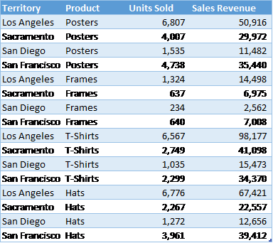
A PivotTable report works best when the source data have:
1. One record in each row;
2. One column for each category for sorting and grouping (such as “Territory” and “Product” in the example above; and
3. One column for each metric (such as “Units Sold” and “Sales Revenue” above). Recording some sales revenue in a different column complicates the task of adding up all of the sales revenue.
Create the PivotTable
Next, create the PivotTable report:
1. Highlight your data table.
2. From the Insert ribbon, click the PivotTable button.
3. On the far right, select fields that you would like on the left-hand side of the report and drag them to the Rows box.
4. Also on the far right, select fields that you would like to appear across the top of the report and drag them to the Columns box.
5. Select the data that you would like to summarize and drag it to the Values box.
6. For each item under Values, specify how to aggregate the data—with a sum, average, or some other function. This is a great time-saving step!
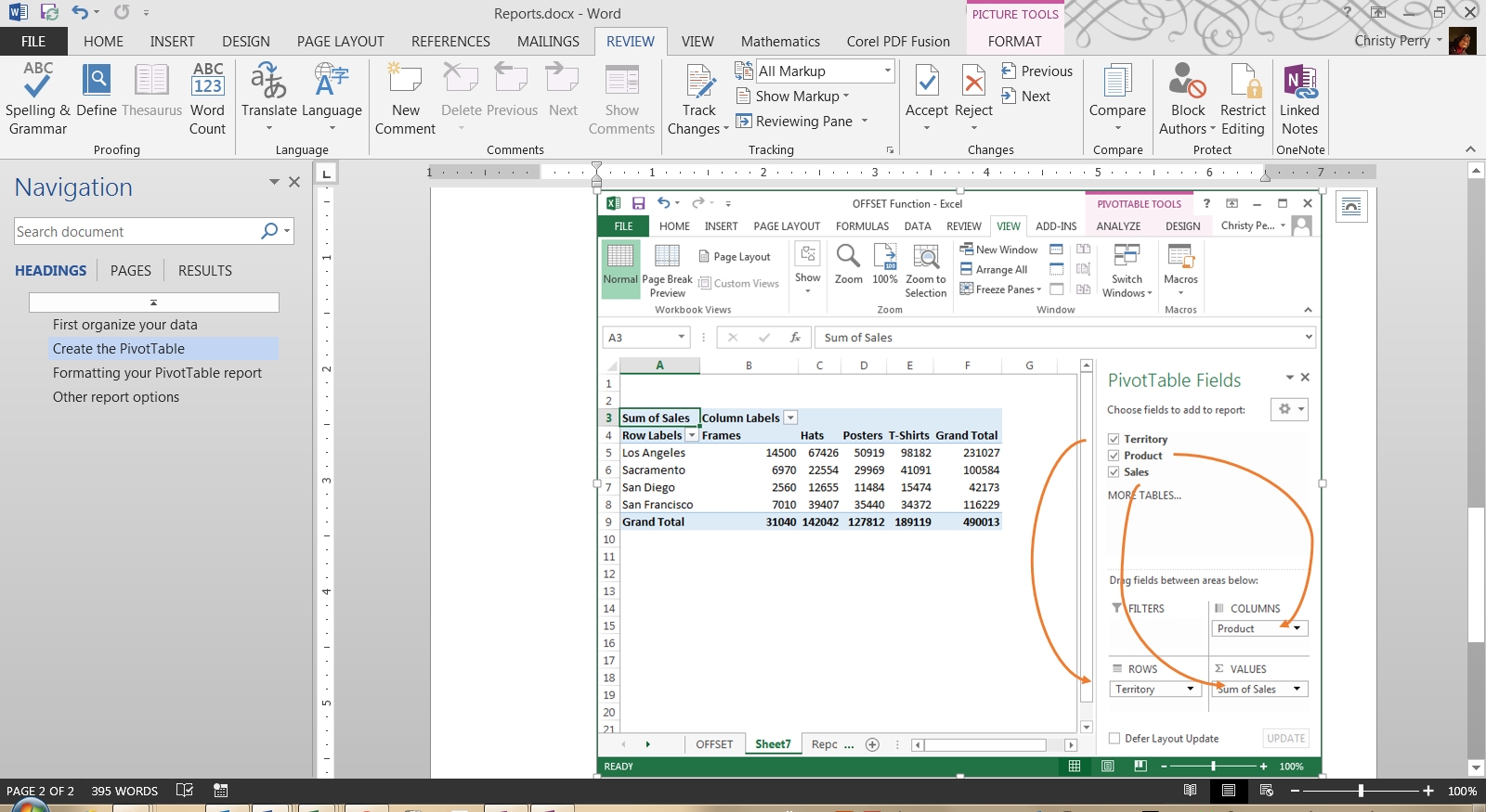
With each change, you’ll see your PivotTable report take shape. If you decide you don’t like the layout, just drag the fields to other positions.
Formatting Your PivotTable Report
From the PivotTable Design ribbon, choose a style for your report based on your theme’s color schemes with options for header rows, header columns, totals, and subtotals. From the Home ribbon, set the number format for your data, or right-click your data, choose Value Field Settings, and click Number Format.
Other Report Options
Do you want even more flexibility in your reports? Do you ever need to, say, connect to data in an external database or create charts based on your reports? All of these options are available with PivotTables!
Or, if you need more flexibility than PivotTables provide, you can:
1. Create a freeform report by adding totals and subtotals directly to your source data,
2. Use the Group and Subtotal options on the new Outline section of the Data ribbon, or
3. If you’re using Excel 2013, use the new Quick Analysis button.
No matter which option you choose, Excel is one of the most flexible reporting tools available today!
PRYOR+ 7-DAYS OF FREE TRAINING
Courses in Customer Service, Excel, HR, Leadership,
OSHA and more. No credit card. No commitment. Individuals and teams.
Contents
- 1 Can Excel generate reports?
- 2 How do I generate individual reports in Excel?
- 3 Can a Word document pull data from Excel?
- 4 How do I extract data from Excel?
- 5 What are the 5 functions in Excel?
- 6 What are the two types of data extraction?
- 7 What is the process of data extraction?
- 8 What is data extraction example?
- 9 How do you pull data?
- 10 What are the 5 methods of collecting data?
- 11 Is Web scraping legal?
- 12 Can you go to jail for looking at a website?
- 13 Is it legal to scrape Google?
- 14 Is Web scraping Legal 2021?
- 15 What is the best web scraping tool?
- 16 Can you web scrape Amazon?
- 17 What is Web scraping?
Can Excel generate reports?
Excel is a powerful reporting tool, providing options for both basic and advanced users. One of the easiest ways to create a report in Excel is by using the PivotTable feature, which allows you to sort, group, and summarize your data simply by dragging and dropping fields.
How do I generate individual reports in Excel?
Select any cell in the data set, click the Insert tab, and then click PivotTable in the Tables group. If you’re still using Excel 2003, choose PivotTable and PivotChart Report from the Data menu to launch a wizard that will walk you through the process.
Can a Word document pull data from Excel?
If you need to use any of this information in your business’ Word documents, there are different methods you can use to extract it from an existing worksheet. You can copy and paste objects to link or embed data from a worksheet or you can merge data from an Excel table into a Word form.
In order to extract data from Excel columns, you can use some combination of the VLOOKUP, MATCH, and INDEX functions. The VLOOKUP function is perhaps best equipped for data extraction, allowing you to look up and retrieve data from a specific column.
What are the 5 functions in Excel?
To help you get started, here are 5 important Excel functions you should learn today.
- The SUM Function. The sum function is the most used function when it comes to computing data on Excel.
- The Text Function.
- The VLOOKUP Function.
- The AVERAGE Function.
- The CONCATENATE Function.
Types of Data Extraction Tools
In terms of Extraction Methods, there are two options – Logical and Physical. Logical Extraction also has two options – Full Extraction and Incremental Extraction. All data is extracted directly from the source system at once.
Data extraction is the process of obtaining data from a database or SaaS platform so that it can be replicated to a destination — such as a data warehouse — designed to support online analytical processing (OLAP). Data extraction is the first step in a data ingestion process called ETL — extract, transform, and load.
Data extraction defined
It’s common to transform the data as a part of this process. For example, you might want to perform calculations on the data — such as aggregating sales data — and store those results in the data warehouse.
How do you pull data?
Web scraping is a way to get data from a website by sending a query to the requested page, then combing through the HTML for specific items and organizing the data. If you don’t have an engineer on hand, Import.io provides a no-coding, point and click web data extraction platform that makes it easy to get web data.
What are the 5 methods of collecting data?
Here are the top six data collection methods:
- Interviews.
- Questionnaires and surveys.
- Observations.
- Documents and records.
- Focus groups.
- Oral histories.
Is Web scraping legal?
So is it legal or illegal? Web scraping and crawling aren’t illegal by themselves. After all, you could scrape or crawl your own website, without a hitch. Big companies use web scrapers for their own gain but also don’t want others to use bots against them.
Can you go to jail for looking at a website?
That can be construed as a copyright violation if you own the website, and you could face fines ranging up to $150,000 and possible time in jail. Also, be sure to avoid the “Deep Web,” or what’s often called the Internet’s “criminal underbelly.” That’s where the most questionable materials can be found.
Is it legal to scrape Google?
Google does not take legal action against scraping, likely for self-protective reasons. Google is testing the User-Agent (Browser type) of HTTP requests and serves a different page depending on the User-Agent. Google is automatically rejecting User-Agents that seem to originate from a possible automated bot.
Is Web scraping Legal 2021?
These bots take control away from a website’s owner. So the big question is: Is web scraping legal or illegal? Web scraping and crawling aren’t illegal by themselves, provided you follow compliance.
What is the best web scraping tool?
Top 8 Web Scraping Tools
- ParseHub.
- Scrapy.
- OctoParse.
- Scraper API.
- Mozenda.
- Webhose.io.
- Content Grabber.
- Common Crawl.
Can you web scrape Amazon?
You have to research on the Amazon developer forums, but data scraping is indeed against the rules. Amazon Web Services has an API (application program interface) for data querying. You must request access to the service.
What is Web scraping?
Web scraping is the process of using bots to extract content and data from a website. Unlike screen scraping, which only copies pixels displayed onscreen, web scraping extracts underlying HTML code and, with it, data stored in a database. The scraper can then replicate entire website content elsewhere.


In Excel 2016, users will find that they have numerous ways of organizing and visualizing their records. Making use of these options will allow you to put tables and charts together to create reports worthy of praise.
- Basic chart and table creation
- How to create PivotTables
- How to create a Dashboard
- Timelines and Slicers
Basic chart and table creation
Before you can impress your team with an in-depth report, you need to learn how to generate charts, tables, and other visual elements. Here are a few types to get you started.
How to create a basic forecast report
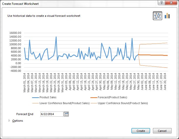
- Load a workbook into Excel
- Select the top-left cell in the source data
- Click on Data tab in the navigation ribbon
- Click on Forecast Sheet under the Forecast section to display the Create Forecast Worksheet dialog box
- Choose between a line graph or bar graph
- Choose Forecast end date
- Click Options for customization
- Select Forecast start date
Forecast reports are useful for calculating projections for sales, growth or revenue.
How to create hierarchal charts
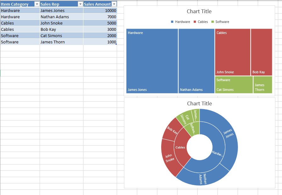
- Select a cell inside of the data table
- Click on Insert in the ribbon
- Click Insert Hierarchy Chart under the Charts group
- Select between TreeMap or Sunburst chart
- Click on the + (plus) sign to add or remove chart elements such as title, data labels, and legend
- Click on the right arrow for each element to customize the appearance or behavior
The Charts group itself is an effective way to find the chart that best suits your data. In fact, Excel 2016 has a Recommended Charts option, which allows you to scroll through shortlisted charts or through all available charts.
How to create PivotTables
A PivotTables enable users to sort through and reorganize data in columns and rows in order to find the most effective view. It’s especially useful when you are working with vast amounts of data.
How to create a recommended P{ivotTable
- Select a cell within the table range or source data
- Navigate to the Tables section in the Insert ribbon tab
- Select Recommended PivotTable
- Browse through the presented types of PivotTables
- Click on the PivotTable you want
- Click OK to generate
- Select Seasonality options
- Modify timeline and value ranges
- Select to fill any missing points by zeros or by interpolation
- Select criteria to aggregate duplicates by
- Select Create to finish
How to create your own PivotTable
- Click on a cell within the source data or table range
- Click on the Insert tab in the navigation ribbon
- Select PivotTable in the Tables section to generate the Create PivotTable dialog box
- Decide on the data source in the Choose the data that you want to analyze section, in case you don’t want to use the selected source
- Select New or Existing Worksheet under the Choose where you want the PivotTable to be placed section
- Click Add this data to the Data Model to incorporate additional data sources in the PivotTable
- Click on fields to include in the report in the PivotTable Fields
- Click and drag fields to reside in either Filters, Columns, Rows, and Values
Once you have decided on the layout and contents of your PivotTable fields, you can use it as the foundation for other Pivot Tables.
How to create a Dashboard
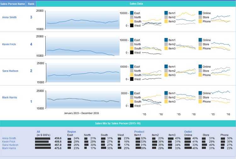
Once you have become comfortable enough to generate charts and tables using your provided data, it’s time to begin piecing the story together in a dashboard. The Dashboard is your chance to showcase your data in an attractive, informative and insightful hub view. It provides a top-level view of the data, allowing your audience to quickly see data and trends in order to view results and make decisions. This reporting tool is highly adaptable and can be used to report a plethora of results regardless of your line of business.
How to prepare your PivotTables for the Dashboard
- Select the original PivotTable that wish to use as your master or reference table
- Right-click on the selection
- Choose Copy
- Select another cell on your worksheet
- Right-click on the selected cell
- Choose Paste to duplicate
- Repeat steps No. 4 to No. 6 as needed
- Click on PivotTable Tools for each table
- Click Analyze
- Insert a name in the PivotTable Name box to identify the function of each table
How to generate PivotCharts from PivotTables
- Select the original PivotTable
- Click on PivotTable Tools
- Select Analyze
- Select PivotChart
- Choose the type of chart that you need
- Choose formatting options in the PivotChart Tools tab
- Click on Analyze under PivotChart Tools
- Enter a name in the Chart Name box
- Apply steps No. 1 to No. 8 as needed for all PivotTables in use
Timelines and Slicers
With your multiple PivotCharts and PivotTables created, you’ll need to be able to find specific information that supports the details you wish to share in the dashboard. Slicers and Timelines provide a way to filter through the data with ease. Timelines allow you to filter by time to locate a specific period. Slicers are essentially click-to-filter options for PivotTables. Not only do they apply a filter, they also indicate the filter currently in use.
How to add a Slicer
- From a PivotTable click on PivotTable Tools
- Select Analyze
- Select Filter
- Select Insert Slicer
- Select the items to be used as slicers
- Click Ok
- Select a Slicer
- Click on Slicer Tools
- Select Options
- Select Report Connections
- Choose the PivotTables that connect to the chosen Slicer
How to add a Timeline
- Click on a PivotTable
- Select Analyze
- Select Filter
- Select Insert Timeline
- Click on the items to use in the Timeline
- Click on the Timeline
- Select Tools
- Select Options
- Select Report Connections
- Select PivotTables to link the Timeline to
With each resulting chart, you can choose to copy and paste it on your dashboard. You can then decide how the dashboard should appear, what will tell the best story for your report.
This results in a dynamic dashboard that allows recipients to look over your presented data while allowing them to sort through the data to give them customization options pertinent to them. If you are creating a Dashboard to be used on a regular basis, you only need to update the source data to recreate the report with new information.
Wrapping Up
There isn’t one report to rule them all, but Excel has the tools to help you make the report you need. How often do you have to create reports in Excel? Which one are you most proud of? Let us know in the comments. And be sure to visit our Office 101 help hub for more related articles!
- Microsoft Office 101: Help, how-tos and tutorials
All the latest news, reviews, and guides for Windows and Xbox diehards.