
Taxes are better calculated on the basis of information from the tables. And for the presentation of the company’s achievements it is better to use charts and diagrams.
The graphs are well suited for analyzing of relative data. For example, the forecast of sales growth dynamics or the assessment of the overall trend of growth in the capacity of the enterprise.
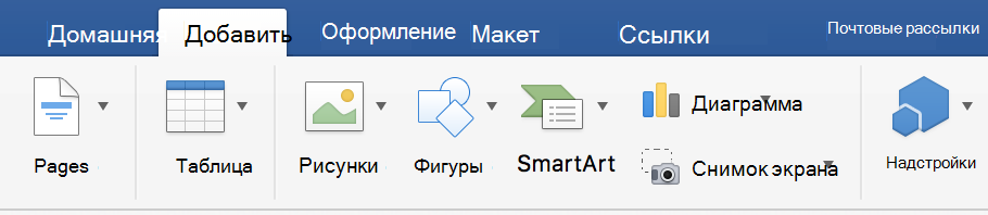
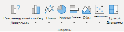
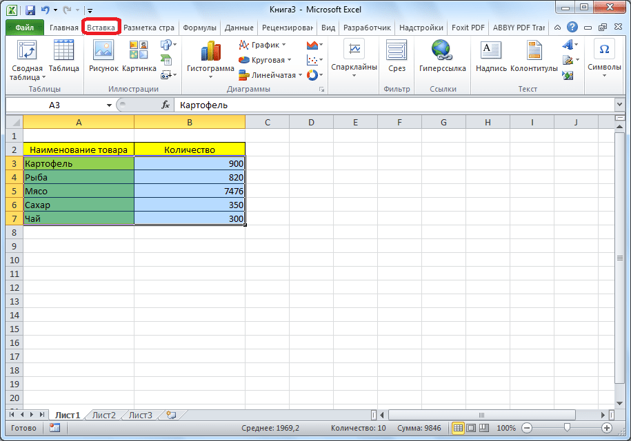
How to build a chart in Excel?
The fastest way to build a chart in Excel – is to create graphs by template:
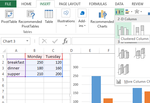
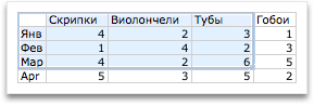
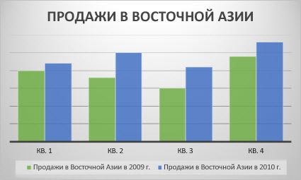
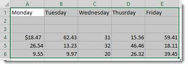
- The range of the cells A1:C4. You need to fill it with values as shown in the figure:
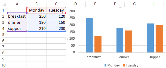
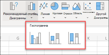
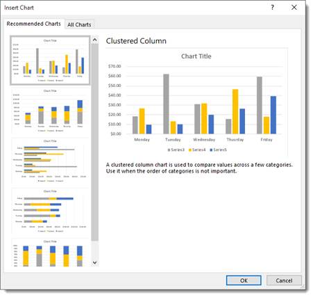
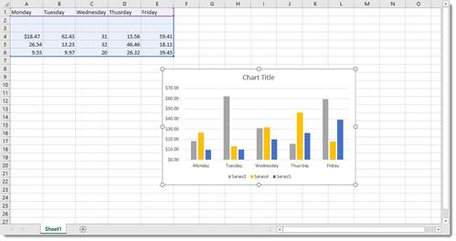
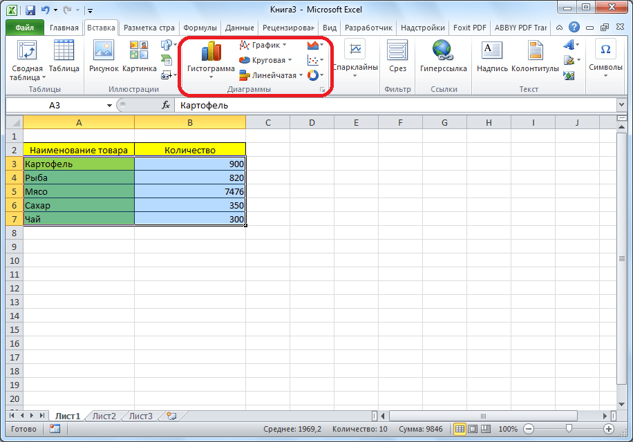
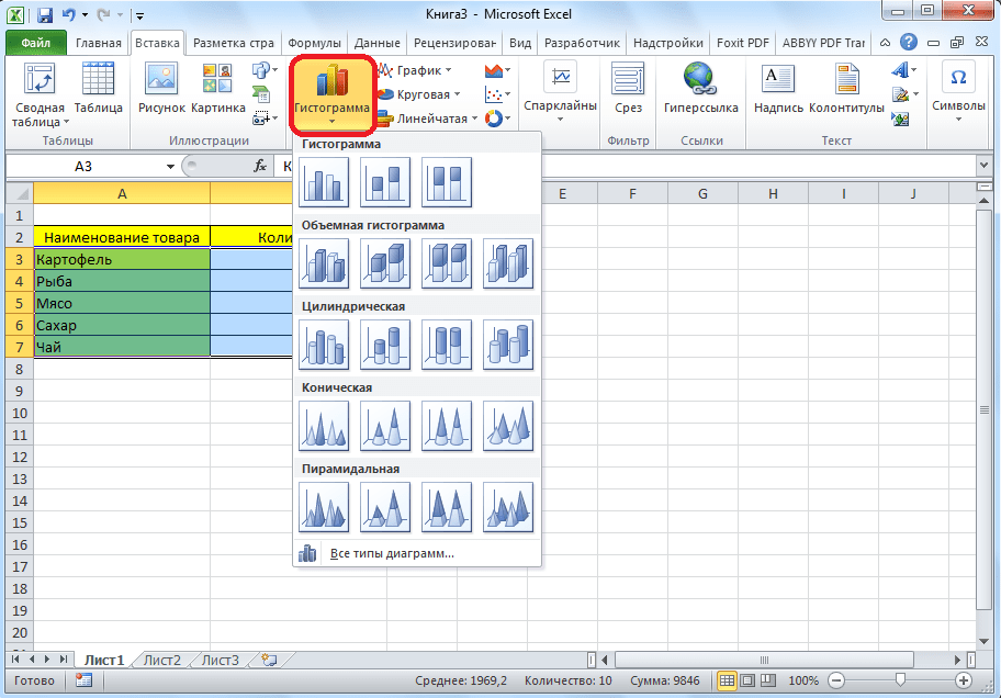
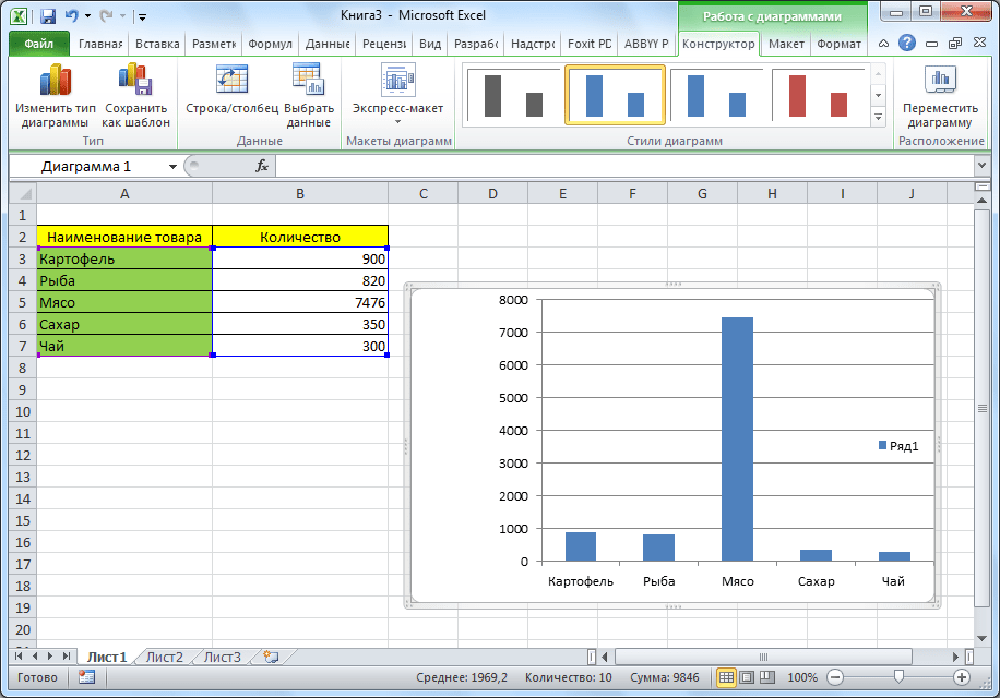
- Select the range A1:C4 and choose the tool on the «INSERT» tab – «Insert Column Chart» – «Clustered Column».
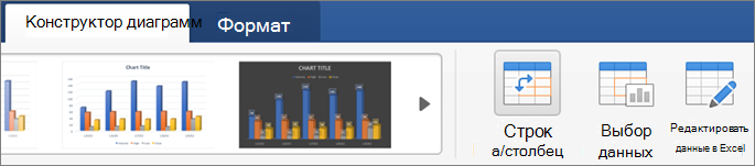
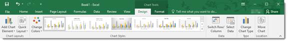
- Click on the graph to activate it and call the additional menu «CHART TOOLS». There are also three tool tabs available: «DESIGN» and «FORMAT».
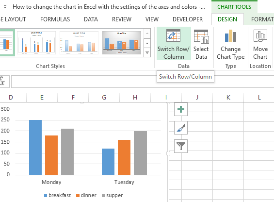
- To change the axes in the graph, select to the «Constructor» tab, and on it the «Switch Row/Column» tool. Thus, you change the values in the graph: rows per columns.
- Click on any cell to deselect the chart and thus to deactivate its setting mode.
Now you can work in the normal mode.
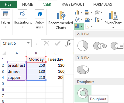
How to build a chart on the table in Excel?
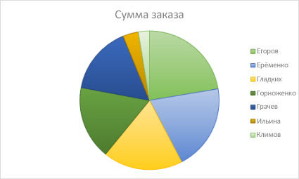
Now we are constructing the diagram according to the data of the Excel table, which must be signed with the title:
- Select the A1:B4 range in the source table.
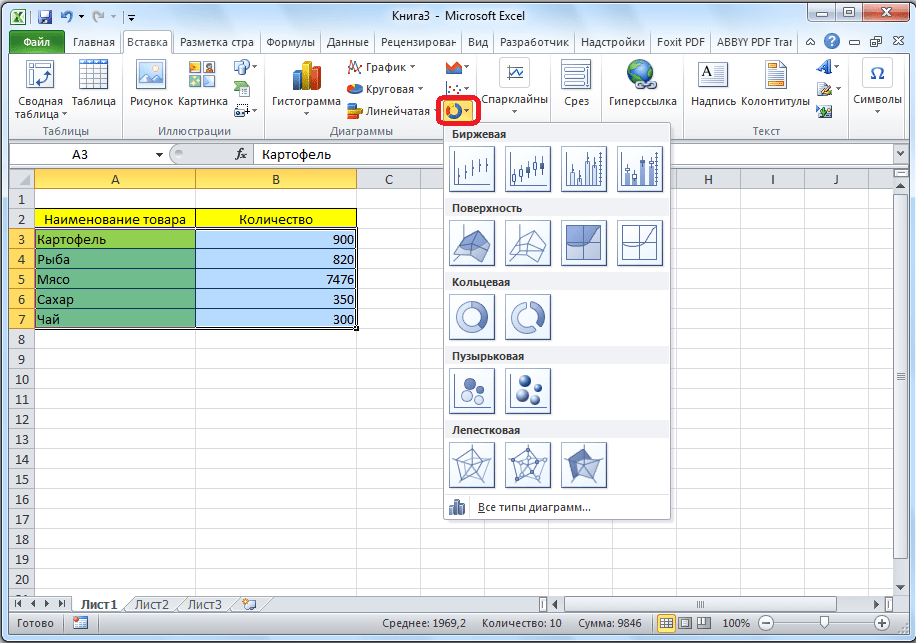
- Select «INSERT» – «Insert Pie or Doughnut». From the group of different chart types, select the «Doughnut».
- Sign the title of your chart. To do this, make a double-click on the title with the left mouse button and enter the text as shown in the picture:
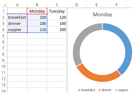
After you sign a new title, click on any cell to deactivate the chart settings and go to normal mode.
Diagrams and charts in Excel
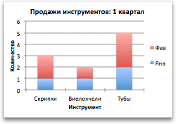
How not to create a table, its data will be less readable than the graphical representation in diagrams and charts. For example, pay attention to the picture:
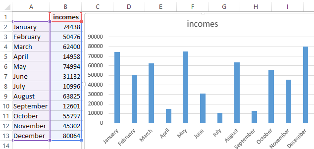
According to the table, you do not immediately to notice in what month the company’s revenues were the highest, and in what the smallest ones. You can, of course, use the «Sorting» tool, but then the general idea of the seasonality of the firm’s activity is lost.
Pay attention to the chart, which is built according to the same table. Here you do not have to blame your eyes to notice the months with the smallest and the largest indicator of the company’s profitability. And the general presentation of the schedule allows you to track the seasonality of activity of sales, which bring more or less profit in certain periods of the year. The data recorded in the table, is perfectly suitable for detailed calculations and calculations. But the charts and the diagrams provide us with its indisputable advantages:
- improve to the readability of data;
- simplify the general orientation of large amounts of the data;
- allow you to create high-quality presentations of reports.
Диаграммы позволяют наглядно представить данные, чтобы произвести наибольшее впечатление на аудиторию. Узнайте, как создать диаграмму и добавить линию тренда. Вы можете начать документ с рекомендуемой диаграммы или выбрать один из наших шаблонов предварительно созданных диаграмм.

Создание диаграммы
-
Выберите данные для диаграммы.
-
На вкладке Вставка нажмите кнопку Рекомендуемые диаграммы.
-
На вкладке Рекомендуемые диаграммы выберите диаграмму для предварительного просмотра.
Примечание: Можно выделить нужные данные для диаграммы и нажать клавиши ALT+F1, чтобы сразу создать диаграмму, однако результат может оказаться не самым лучшим. Если подходящая диаграмма не отображается, перейдите на вкладку Все диаграммы, чтобы просмотреть все типы диаграмм.
-
Выберите диаграмму.
-
Нажмите кнопку ОК.
Добавление линии тренда
-
Выберите диаграмму.
-
На вкладке Конструктор нажмите кнопку Добавить элемент диаграммы.
-
Выберите пункт Линия тренда, а затем укажите тип линии тренда: Линейная, Экспоненциальная, Линейный прогноз или Скользящее среднее.
Примечание: Часть содержимого этого раздела может быть неприменима к некоторым языкам.
Диаграммы отображают данные в графическом формате, который может помочь вам и вашей аудитории визуализировать связи между данными. При создании диаграммы доступно множество типов диаграмм (например, гистограмма с накоплением или трехмерная разрезанная круговая диаграмма). После создания диаграммы ее можно настроить, применив экспресс-макеты или стили.
Диаграмма содержит несколько элементов, таких как заголовок, подписи осей, условные обозначения и линии сетки. Вы можете скрыть или показать эти элементы, а также изменить их расположение и форматирование.
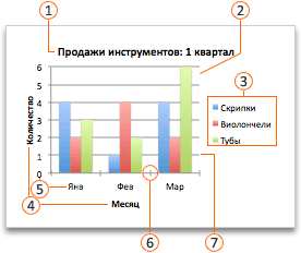
 Название диаграммы
 Область построения
 Условные обозначения
 Названия осей
 Подписи оси
 Деления
 Линии сетки
Диаграмму можно создать в Excel, Word и PowerPoint. Однако данные диаграммы вводятся и сохраняются на листе Excel. При вставке диаграммы в Word или PowerPoint открывается новый лист в Excel. При сохранении документа Word или презентации PowerPoint с диаграммой данные Excel для этой диаграммы автоматически сохраняются в документе Word или презентации PowerPoint.
Примечание: Коллекция книг Excel заменяет прежний мастер диаграмм. По умолчанию коллекция книг Excel открывается при запуске Excel. В коллекции можно просматривать шаблоны и создавать на их основе новые книги. Если коллекция книг Excel не отображается, в меню Файл выберите пункт Создать на основе шаблона.
-
В меню Вид выберите пункт Разметка страницы.
-
На вкладке Вставка щелкните стрелку рядом с кнопкой Диаграмма.

-
Выберите тип диаграммы и дважды щелкните нужную диаграмму.
При вставке диаграммы в приложение Word или PowerPoint открывается лист Excel с таблицей образцов данных.
-
В приложении Excel замените образец данных данными, которые нужно отобразить на диаграмме. Если эти данные уже содержатся в другой таблице, их можно скопировать оттуда и вставить вместо образца данных. Рекомендации по упорядочиванию данных в соответствии с типом диаграммы см. в таблице ниже.
Тип диаграммы
Расположение данных
Диаграмма с областями, линейчатая диаграмма, гистограмма, кольцевая диаграмма, график, лепестковая диаграмма или поверхностная диаграмма
Данные расположены в столбцах или строках, как в следующих примерах:
Последовательность 1
Последовательность 2
Категория А
10
12
Категория Б
11
14
Категория В
9
15
или
Категория А
Категория Б
Последовательность 1
10
11
Последовательность 2
12
14
Пузырьковая диаграмма
Данные расположены в столбцах, причем значения x — в первом столбце, а соответствующие значения y и размеры пузырьков — в смежных столбцах, как в следующих примерах:
Значения X
Значение Y 1
Размер 1
0,7
2,7
4
1,8
3,2
5
2,6
0,08
6
Круговая диаграмма
Один столбец или строка данных и один столбец или строка меток данных, как в следующих примерах:
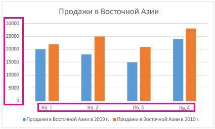
Продажи
Кв. 1
25
Кв. 2
30
Кв. 3
45
или
Кв. 1
Кв. 2
Кв. 3
Продажи
25
30
45
Биржевая диаграмма
Данные расположены по столбцам или строкам в указанном ниже порядке с использованием названий или дат в качестве подписей, как в следующих примерах:
Открыть
Максимум
Минимум
Закрыть
1/5/02
44
55
11
25
1/6/02
25
57
12
38
или
1/5/02
1/6/02
Открыть
44
25
Максимум
55
57
Минимум
11
12
Закрыть
25
38
X Y (точечная) диаграмма
Данные расположены по столбцам, причем значения x — в первом столбце, а соответствующие значения y — в смежных столбцах, как в следующих примерах:
Значения X
Значение Y 1
0,7
2,7
1,8
3,2
2,6
0,08
или
Значения X
0,7
1,8
2,6
Значение Y 1
2,7
3,2
0,08
-
Чтобы изменить число строк и столбцов, включенных в диаграмму, наведите указатель мыши на нижний правый угол выбранных данных, а затем перетащите угол, чтобы выбрать дополнительные данные. В приведенном ниже примере таблица расширяется, чтобы включить дополнительные категории и последовательности данных.
-
Чтобы увидеть результаты изменений, вернитесь в приложение Word или PowerPoint.
Примечание: При закрытии документа Word или презентации PowerPoint с диаграммой таблица данных Excel для этой диаграммы закроется автоматически.
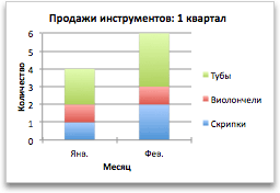
После создания диаграммы можно изменить способ отображения строк и столбцов таблицы в диаграмме. Например, в первой версии диаграммы строки данных таблицы могут отображаться по вертикальной оси (значение), а столбцы — по горизонтальной оси (категория). В следующем примере диаграмма акцентирует продажи по инструментам.
Однако если требуется сконцентрировать внимание на продажах по месяцам, можно изменить способ построения диаграммы.
-
В меню Вид выберите пункт Разметка страницы.
-
Щелкните диаграмму.
-
Откройте вкладку Конструктор и нажмите кнопку Строка/столбец.
Если команда «Строка/столбец» недоступна
Элемент Строка/столбец доступен только при открытой таблице данных диаграммы Excel и только для определенных типов диаграмм. Вы также можете изменить данные, щелкнув диаграмму, а затем отредактировать лист в Excel.
-
В меню Вид выберите пункт Разметка страницы.
-
Щелкните диаграмму.
-
Откройте вкладку Конструктор и нажмите кнопку Экспресс-макет.
-
Выберите нужную разметку.
Чтобы сразу же отменить примененный экспресс-макет, нажмите клавиши
+ Z.
 + Z.
+ Z.Стили диаграмм — это набор дополняющих цветов и эффектов, которые можно применить к диаграмме. При выборе стиля диаграммы изменения влияют на всю диаграмму.
-
В меню Вид выберите пункт Разметка страницы.
-
Щелкните диаграмму.
-
Откройте вкладку Конструктор и выберите нужный стиль.
Чтобы просмотреть другие стили, наведите курсор на интересующий вас элемент и щелкните
.Чтобы сразу же отменить примененный стиль, нажмите клавиши
+Z.
 .
.-
В меню Вид выберите пункт Разметка страницы.
-
Щелкните диаграмму и откройте вкладку Конструктор.
-
Нажмите кнопку Добавить элемент диаграммы.
-
Выберите пункт Название диаграммы, чтобы задать параметры форматирования названия, а затем вернитесь к диаграмме, чтобы ввести название в поле Название диаграммы.
См. также
Обновление данных в существующей диаграмме
Типы диаграмм
Создание диаграммы
Вы можете создать диаграмму для данных в Excel в Интернете. В зависимости от данных можно создать гистограмму, линию, круговую диаграмму, линейчатую диаграмму, область, точечную или радиолокационную диаграмму.
-
Щелкните в любом месте данных, для которых требуется создать диаграмму.
Чтобы отобразить определенные данные на диаграмме, можно также выбрать данные.
-
Выберите «> диаграммы> и нужный тип диаграммы.
-
В открываемом меню выберите нужный вариант. Наведите указатель мыши на диаграмму, чтобы узнать больше о ней.
Совет: Ваш выбор не применяется, пока вы не выбираете параметр в меню команд «Диаграммы». Рассмотрите возможность просмотра нескольких типов диаграмм: при указании элементов меню рядом с ними отображаются сводки, которые помогут вам решить эту задачу.
-
Чтобы изменить диаграмму (заголовки, условные обозначения, метки данных), выберите вкладку «Диаграмма», а затем выберите » Формат».
-
В области диаграммы при необходимости измените параметр. Вы можете настроить параметры для заголовка диаграммы, условных обозначений, названий осей, заголовков рядов и т. д.
Типы диаграмм
Рекомендуется просмотреть данные и решить, какой тип диаграммы лучше всего подходит. Доступные типы перечислены ниже.
Данные в столбцах или строках листа можно представить в виде гистограммы. В гистограмме категории обычно отображаются по горизонтальной оси, а значения — по вертикальной оси, как показано на этой диаграмме:
Типы гистограмм
-
Кластеризованный столбецНа гистограмме с группировкой значения выводятся в виде плоских столбцов. Используйте этот тип диаграммы при наличии категорий, представляющих:
-
диапазоны значений (например, количество элементов);
-
специфические шкалы (например, шкала Ликерта с масками, такими как «Полностью согласен», «Согласен», «Не знаю», «Не согласен», «Полностью не согласен»);
-
неупорядоченные имена (например, названия элементов, географические названия или имена людей).
-
-
Столбец с стеками Гистограмма с накоплением представляет значения в виде плоских столбцов с накоплением. Используйте этот тип диаграммы, когда есть несколько ряд данных и нужно подчеркнуть итоговое значение.
-
Столбец с стеком на 100 %Нормированная гистограмма представляет значения в виде плоских нормированных столбцов с накоплением для представления 100 %. Используйте этот тип диаграммы, когда есть несколько рядов данных и нужно подчеркнуть их вклад в итоговое значение, особенно если итоговое значение одинаково для всех категорий.
Данные, расположенные в столбцах или строках листа, можно представить в виде графика. На графиках данные категорий равномерно распределяются вдоль горизонтальной оси, а все значения равномерно распределяются вдоль вертикальной оси. Графики позволяют отображать непрерывное изменение данных с течением времени на оси с равномерным распределением и идеально подходят для представления тенденций изменения данных с равными интервалами, такими как месяцы, кварталы или финансовые годы.
Типы графиков
-
Линии и линии с маркерамиГрафики с маркерами, отмечающими отдельные значения данных, или без маркеров можно использовать для отображения динамики изменения данных с течением времени или по категориям данных, разделенным равными интервалами, особенно когда точек данных много и порядок их представления существенен. Если категорий данных много или значения являются приблизительными, используйте график без маркеров.
-
Линия с стеками и линия с маркерамиГрафики с накоплением, отображаемые как с маркерами для конкретных значений данных, так и без них, могут отображать динамику изменения вклада каждого значения с течением времени или по категориям данных, разделенным равными интервалами.
-
100 % линий с стеками и 100 % стеками с маркерамиНормированные графики с накоплением с маркерами, отмечающими отдельные значения данных, или без маркеров могут отображать динамику вклада каждой величины в процентах с течением времени или по категориям данных, разделенным равными интервалами. Если категорий данных много или значения являются приблизительными, используйте нормированный график с накоплением без маркеров.
Примечания:
-
Графики лучше всего подходят для вывода нескольких рядов данных— если нужно отобразить только один ряд данных, вместо графика рекомендуется использовать точечную диаграмму.
-
На графиках с накоплением данные суммируются, что может быть нежелательно. Увидеть накопление на графике бывает непросто, поэтому иногда вместо него стоит воспользоваться графиком другого вида либо диаграммой с областями с накоплением.
-
Данные в одном столбце или строке листа можно представить в виде круговой диаграммы. Круговая диаграмма отображает размер элементов одного ряд данных относительно суммы элементов. точки данных на круговой диаграмме выводятся как проценты от всего круга.
Круговую диаграмму рекомендуется использовать, если:
-
нужно отобразить только один ряд данных;
-
все значения ваших данных неотрицательны;
-
почти все значения данных больше нуля;
-
имеется не более семи категорий, каждой из которых соответствуют части общего круга.
Данные, расположенные только в столбцах или строках листа, можно представить в виде кольцевой диаграммы. Как и круговая диаграмма, кольцевая диаграмма отображает отношение частей к целому, но может содержать несколько ряд данных.
Совет: Восприятие кольцевых диаграмм затруднено. Вместо них можно использовать линейчатые диаграммы с накоплением или гистограммы с накоплением.
Данные в столбцах или строках листа можно представить в виде линейчатой диаграммы. Линейчатые диаграммы используют для сравнения отдельных элементов. В диаграммах этого типа категории обычно располагаются по вертикальной оси, а величины — по горизонтальной.
Линейчатые диаграммы рекомендуется использовать, если:
-
метки осей имеют большую длину;
-
выводимые значения представляют собой длительности.
Типы линейчатых диаграмм
-
КластерныйНа линейчатой диаграмме с группировкой значения выводятся в виде плоских столбцов.
-
Линейчатая диаграмма с стекамиЛинейчатая диаграмма с накоплением показывает вклад отдельных величин в общую сумму в виде плоских столбцов.
-
Стека на 100 %Этот тип диаграмм позволяет сравнить по категориям процентный вклад каждой величины в общую сумму.
Данные в столбцах или строках листа можно представить в виде диаграммы с областями. Диаграммы с областями могут использоваться для отображения изменений величин с течением времени и привлечения внимания к итоговому значению в соответствии с тенденцией. Отображая сумму значений рядов, такая диаграмма также наглядно показывает вклад каждого ряда.
Типы диаграмм с областями
-
ОбластиДиаграммы с областями отображают изменение величин с течением времени или по категориям. Обычно вместо диаграмм с областями без накопления рекомендуется использовать графики, так как данные одного ряда могут быть скрыты за данными другого ряда.
-
Область с накоплениемДиаграммы с областями с накоплением показывают изменения вклада каждой величины с течением времени или по категориям в двухмерном виде.
-
На 100 % с накоплением диаграммы с областями с накоплением показывают тенденцию процентного участия каждого значения с течением времени или других данных категории.
Данные в столбцах и строках листа можно представить в виде точечной диаграммы. Поместите данные по оси X в одну строку или столбец, а соответствующие данные по оси Y — в соседние строки или столбцы.
Точечная диаграмма имеет две оси значений: горизонтальную (X) и вертикальную (Y). На точечной диаграмме значения «x» и «y» объединяются в одну точку данных и выводятся через неравные интервалы или кластеры. Точечные диаграммы обычно используются для отображения и сравнения числовых значений, например научных, статистических или технических данных.
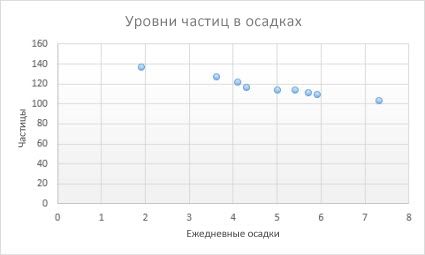
Точечные диаграммы рекомендуется использовать, если:
-
требуется изменять масштаб горизонтальной оси;
-
требуется использовать для горизонтальной оси логарифмическую шкалу;
-
значения расположены на горизонтальной оси неравномерно;
-
на горизонтальной оси имеется множество точек данных;
-
требуется настраивать независимые шкалы точечной диаграммы для отображения дополнительных сведений о данных, содержащих пары сгруппированных полей со значениями;
-
требуется отображать не различия между точками данных, а аналогии в больших наборах данных;
-
требуется сравнивать множество точек данных без учета времени; чем больше данных будет использовано для построения точечной диаграммы, тем точнее будет сравнение.
Типы точечных диаграмм
-
РазбросДиаграмма этого типа позволяет отображать точки данных без соединительных линий для сравнения пар значений.
-
Точечная с плавными линиями и маркерами и точечная с плавными линиямиНа этой диаграмме точки данных соединены сглаживающими линиями. Такие линии могут отображаться с маркерами или без них. Сглаживающую кривую без маркеров следует использовать, если точек данных достаточно много.
-
Точечная с прямыми линиями и маркерами и точечная с прямыми линиямиНа этой диаграмме показаны линии прямого соединения между точками данных. Прямые линии могут отображаться с маркерами или без них.
Данные в столбцах или строках листа можно представить в виде лепестковой диаграммы. Лепестковая диаграмма позволяет сравнить агрегированные значения нескольких ряд данных.
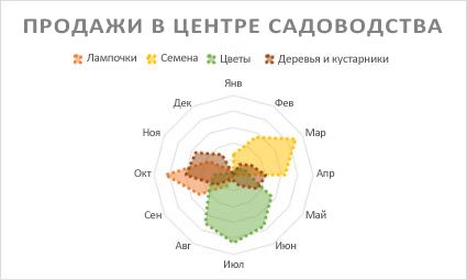
Типы лепестковых диаграмм
-
Радиолокационные и радиолокационные диаграммы с маркерами с маркерами для отдельных точек данных или без них отображают изменения значений относительно центральной точки.
-
Заполненный лепесткНа лепестковой диаграмме с областями области, заполненные рядами данных, выделены цветом.
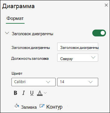
Добавление или изменение заголовка диаграммы
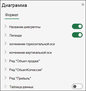
Вы можете добавить или изменить заголовок диаграммы, настроить ее внешний вид и включить ее в диаграмму.
-
Щелкните в любом месте диаграммы, чтобы отобразить на ленте вкладку Диаграмма.
-
Нажмите Формат, чтобы открыть параметры форматирования диаграммы.
-
На панели » Диаграмма» разверните раздел «Заголовок диаграммы«.
-
Добавьте или измените заголовок диаграммы в соответствии со своими потребностями.
-
Используйте переключатель, чтобы скрыть заголовок, если вы не хотите, чтобы на диаграмме отображались заголовки.
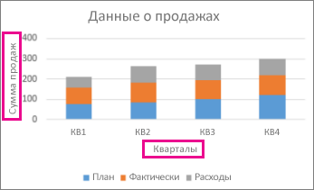
Добавление названий осей для улучшения удобочитаемости диаграммы
Добавление заголовков к горизонтальным и вертикальным осям на диаграммах с осями упрощает их чтение. Названия осей нельзя добавлять к диаграммам без осей, таким как круговые и кольцевые диаграммы.
Как и заголовки диаграмм, названия осей помогают пользователям, просматривая диаграмму, понять, что такое данные.
-
Щелкните в любом месте диаграммы, чтобы отобразить на ленте вкладку Диаграмма.
-
Нажмите Формат, чтобы открыть параметры форматирования диаграммы.
-
На панели диаграммы разверните раздел «Горизонтальная ось » или » Вертикальная ось».
-
Добавьте или измените параметры горизонтальной оси или вертикальной оси в соответствии со своими потребностями.
-
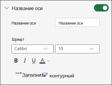
Разверните заголовок оси.
-
Измените заголовок оси и форматирование.
-
Используйте переключатель, чтобы отобразить или скрыть заголовок.
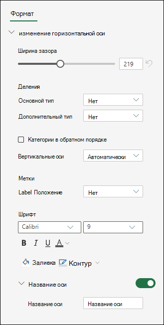
Изменение меток оси
Метки оси отображаются под горизонтальной осью и рядом с вертикальной осью. Диаграмма использует текст в исходных данных для этих меток оси.
Чтобы изменить текст меток категорий на горизонтальной или вертикальной оси:
-
Щелкните ячейку с текстом метки, который вы хотите изменить.
-
Введите нужный текст и нажмите клавишу ВВОД.
Метки осей на диаграмме автоматически обновляются новым текстом.
Совет: Метки осей отличаются от заголовков осей, которые можно добавить для описания того, что отображается на осях. Названия осей не отображаются на диаграмме автоматически.
Удаление меток оси
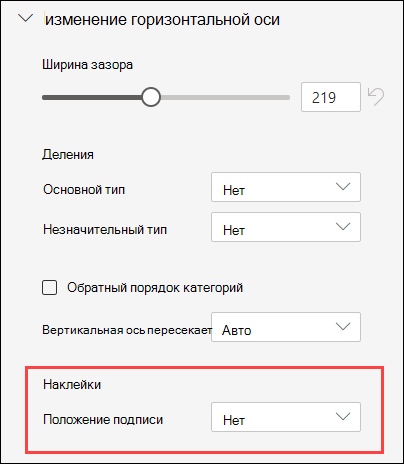
Чтобы удалить метки на горизонтальной или вертикальной оси:
-
Щелкните в любом месте диаграммы, чтобы отобразить на ленте вкладку Диаграмма.
-
Нажмите Формат, чтобы открыть параметры форматирования диаграммы.
-
На панели диаграммы разверните раздел «Горизонтальная ось » или » Вертикальная ось».
-
В раскрывающемся списке «Положение метки» выберите«Нет «, чтобы метки не отображались на диаграмме.
Дополнительные сведения
Вы всегда можете задать вопрос специалисту Excel Tech Community или попросить помощи в сообществе Answers community.
Creating and Editing Beautiful Charts and Diagrams in Excel 2019

The greatest benefit of Excel 2019 compared to other Microsoft Office software is its ability to quickly generate charts, graphs and diagrams. After you enter data into your spreadsheet, adding a chart to your worksheet is as simple as clicking a few buttons, formatting the chart, and clicking the save button. You have several options for the type of chart that you want to add to your spreadsheet, and you can even add effects and 3D elements.
Set Up Your Data
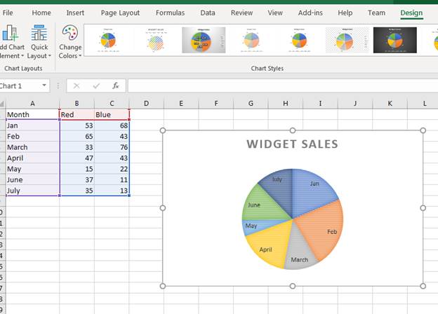
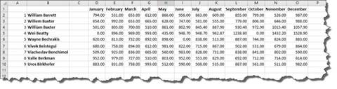
Before you can create a chart, you need some data stored in a spreadsheet. This can be test data or data from a previous spreadsheet. For this article’s examples, we’ll use a chart of products sold. The scenario is an ecommerce store that sells red and blue widgets. The following spreadsheet shows the sample data setup:
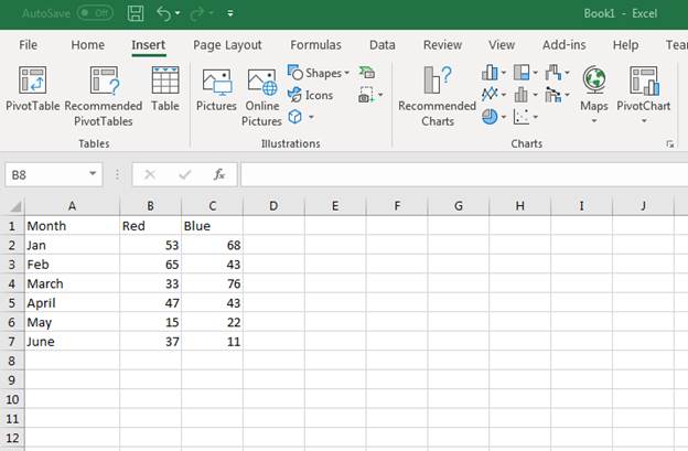
(Sample data for a new chart)
Notice that the «A» column is used for the first six months of the year. Column «B» has the number of sales for Red widgets by month. Column «C» has the number of Blue widgets sold by month. Suppose we want to see a graph to visually represent the number of sales each month. This can be done by inserting an Excel 2019 chart into the spreadsheet that contains the data.
Inserting a Standard Chart
Any chart or diagram that you want to make can be found in the «Insert» tab on Excel.
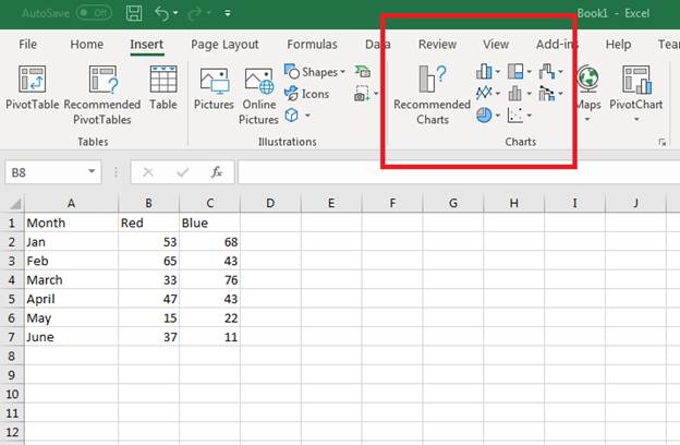
(Location of chart buttons)
Each type of chart is shown using an icon on the button. With Excel, you can make bar, line, pie, scatter, hierarchy and several others. You might be wondering which type of chart is the best for your data, and Excel has a new «Recommended Charts» function that makes a suggestion for you based on the data stored.
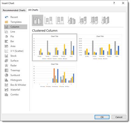
When you select the data for your chart, make sure that you select the row and column header cells. Excel will use these headers for the labels inserted into your chart’s image. Select cells A1 to C7 to select all data. Next, click the «Recommended Charts» button. A new window displays showing a list of recommended charts for the data selected.
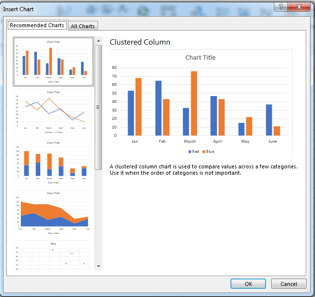
(Recommended chart window)
The recommendations Excel displays use column and row headers, and then add data to show you a visual representation of the chart that you’re about to insert into the spreadsheet. In the image above, Excel shows you several charts to choose from. For this example, a clustered column chart (the first option in the image above) is chosen. Excel automatically draws the chart and inserts it into the spreadsheet.
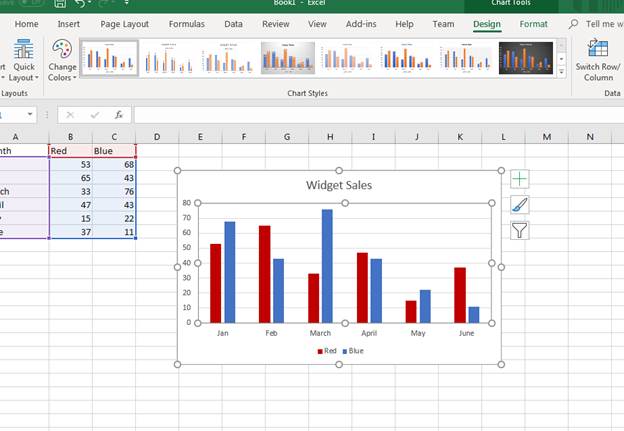
(Inserted clustered column chart)
A clustered chart makes a comparison of sales for each widget based on the months of the year. For instance, in January 53 red widgets were sold and 68 blue widgets were sold. The red widget sales numbers are shown in blue, and the blue widget sales are shown in yellow.
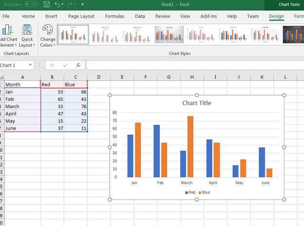
It doesn’t make sense to display red widgets in blue, so we want to change the colors used in the bar graphs. Excel provides formatting option for charts where you can change labels, colors and even change the chart type on the fly.
To change a bar’s color, click it in the chart. A window on the right displays a list of formatting and effects that you can add to the selected component in the chart.
(Bar chart effects and color options)
You’ll see in the format window that you have several options. The paint bucket icons is the «Fill» button that lets you change colors and the type of pattern displayed in the selected bar (in this scenario it’s the blue bars). Click the paint bucket icon, and then click the drop down next to the «Color» label.
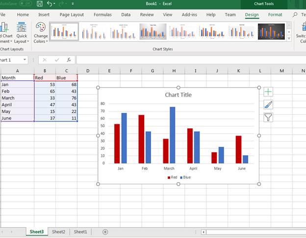
With the red widget sales bar shown as red, the orange bar should be a new color. We can change the blue sales bar to blue, and then the bar chart is more intuitive. After you change colors and formatting in a chart, Excel automatically changes any labels associated with a chart component.
(New chart colors updated in a sales chart)
To the left of the chart, you can see the data highlighted letting you know what Excel is using in the chart. Purple is the bar labels and the blue highlighted data is used to populate bar values. The red highlighted cells are the color labels at the bottom of the chart.
Since the spreadsheet chart has no title, Excel doesn’t know what value to give the chart title component. The default chart title is labeled «Chart Title.» You can change the chart title component by double clicking the text box. Type a new chart name for the title. In this example, the chart title was changed to «Widget Sales.»
(Title change in a sales chart)
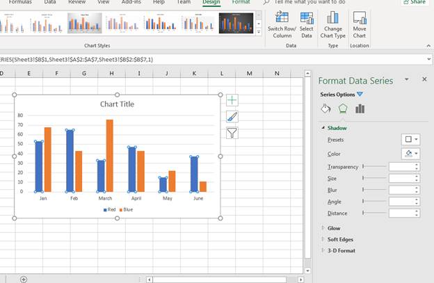
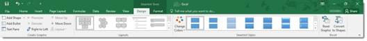
Changing a Chart’s Design
The «Format» tab displayed as an option for each image that you added to a spreadsheet. When you add a chart to a spreadsheet, the «Design» tab displays as an option. You can change several elements of a chart including the type of chart that displays in the «Design» tab. The tab is displayed by default when you first create a chart, but you need to select the tab after you’ve finished adding effects.
You have several options in the «Design» tab.
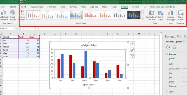
(Design tab options for a chart)
The «Chart Styles» section is where you can change the type of bar chart. Click any one of these bar chart types to change the way it displays in Excel. The downside of using this option is that Excel reverts color and effect changes back to the default. After you change the bar chart type, you again need to redo color changes and any special effects such as shadows, glow effects and 3D formatting.
You can also change the entire chart type and switch to a new one using the «Change Chart Type» button. This button is in the «Type» section to the right of the «Chart Styles» section. Click this button and a new «Change Chart Type» window displays.
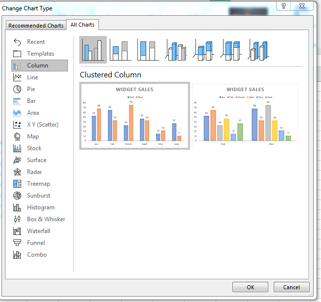
(Change Chart Type options)
Since we only used the recommended chart type function, the complete list of chart type options wasn’t initially displayed during the first chart creation. When you have a full list of chart types, you can see that Excel has several types that you can choose from. Excel orders chart types by the most commonly used, so the first few are what you’ll likely use in your own spreadsheets.
In this example, we’ll switch the chart type to a pie chart. Click the «Pie» option in the left panel. You can then choose a sub-type at the top of the window. In the image above, notice that there are several bar types. You can choose sub-types in any chart selection to make your charts visually appealing.
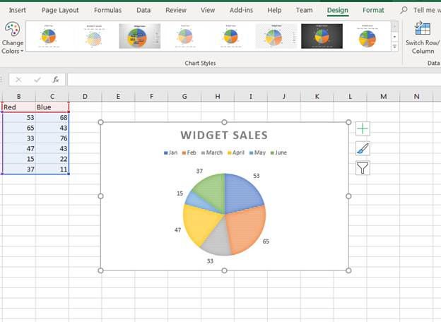
(A bar chart changed to a pie chart)
With a chart changed to a new type, you can still have access to the «Design» tab to make more revisions. Notice that the pie chart also changes to the default colors created by Excel. You can click any part of the pie chart to change its effects just like you did with the bar chart and the formatting window opens.
If you want to change the sub-type for a chart, you can use the «Quick Layout» button that displays a dropdown of options.
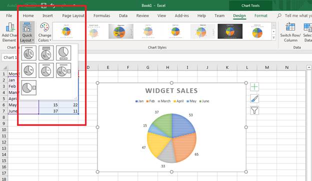
(Quick Layout options to change the chart sub-type)
The dropdown displays the sub-type options that display data in different ways for a pie chart. For instance, you can show the values within the colored areas versus the default layout that shows values outside of the colored sections. You can show a percentage indicated by the icon that shows a percent section in the icon. This feature of Excel 2019 makes it much faster and easier when choosing a new sub-type for your charts.
Click one of the options in the dropdown to change the bar chart to a different layout. Notice that the right of the chart image has several buttons. You can use these to quickly change the way a chart displays visually to users. With Excel, you have several options to pick and choose the way your charts and graphs display. You can match colors to brands or change them based on the data being used. These options along with the ease of how you can create charts is what makes Excel a great option for creating spreadsheets.
Changing Chart Data
As you continue to develop your spreadsheet, you might add more data to your chart. For instance, you might add another month to your chart. It could be August and now you want data shown from the month of July. You can change data in a chart using the «Select Data» option.
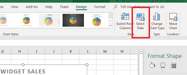
(Select Data button)
By clicking the «Select Data» button, a window opens that asks for new data. We’ve added a new row with data that reflects the number of sales in July. We now want to add this data to the pie chart.
Click the «Select Data» button and a new window opens.
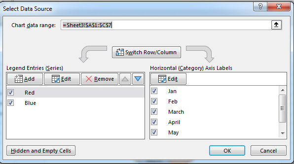
(The «Select Data» window provides options to change data used in a chart)
Notice that you can switch columns and rows. This option is beneficial when you need to change the way a chart uses data when it doesn’t translate well during chart propagation. The arrow button next to the «Chart data range» text box opens a new window that lets you choose a new range of cells for chart values. Use this to select the newly added July row stored in the spreadsheet data.
Press «Enter» when you are done with your selection, and then click «OK» to add the new range to your pie chart. Excel automatically updates the graph and displays the new results.
(Updated chart data)
Use Excel’s chart options to create graphs that represent your data in a visual format. Excel has several chart options, so any diagram or layout that you think best represents your information is available. After you create a chart, you don’t have to stick to the data chosen. You can choose new data and update it continuously as you add more information to your spreadsheet.
Remember that any changes that you don’t like can be immediately changed using the «Undo» button in the quickbar at the top of your Excel window.
Chart Recommendations
In prior versions of Excel, you had the Chart Wizard to help you create charts. That was a great tool and a great help, but Excel offers you something even better: Recommended Charts tool. This is under the Insert tab on the Ribbon in the Charts group (as pictured above).
To create a chart this way, first select the data that you want to put into a chart. Include labels and data.
When you click on the Recommended Charts button, a dialogue box opens like the one pictured below.
Based on your data, Excel recommends a chart for you to use.
On the left side of this dialogue box is all the chart recommendations.
On the right is a preview of what the chart will look like with your data.
Choose the chart that you want to use, then click OK.
The chart is embedded in your worksheet for you:
You’ll also notice that the Chart Tools Format tab opens in the Ribbon:
The tools shown above will help you customize your charts
Types of Charts
To the right of the Recommended Charts button on the ribbon, you’ll see this:
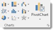
You can use these buttons and their dropdown menus to create these types and styles of charts. We’re going to go from left to right, starting at the top left, and cover all the buttons above.
Insert Column or Bar Chart. This is the first button, located in the top left corner. With this, you can preview data as a 2-D or 3-D vertical column chart or as a 2-D or 3-D horizontal bar chart.
Insert Hierarchy Chart. Use this chart to compare a part to a whole or to show the hierarchy of several columns or categories.
Insert Waterfall or Stock Chart. The waterfall chart is used to show how a starting value is affected by a series of positive and negative values, while the stock chart is used to show the trend of a stock’s value over time.
Insert Line or Area Chart. This lets you preview data as a 2-D or 3-D line or area chart.
Insert Statistic Chart. Use these charts to show a statistical analysis of your data. Chart types include Histogram, Pareto, and Box and Whisker charts.
Insert Combo Chart. These charts are best when you have mixed data or want to emphasize different types of information. You can preview your data as a 2-D combo clustered column and line chart – or clustered column and stacked area chart.
Insert Pie or Doughnut Chart. You can preview data as a 2-D or 3-D pie or 2-D doughnut chart.
Insert Scatter (X,Y) or Bubble Chart. Preview data as a 2-D scatter or bubble chart.
Insert Surface, or Radar Chart. With this, you can preview data as a 2-D stock chart that uses typical stock symbols, a 2-D or 3-D surface chart, or even a 3-D radar chart.
More Chart Types
Excel brings with it some new chart types to help you better illustrate data that you include in your worksheets.
These chart types include:
- Treemap. A treemap chart displays hierarchically structured data. The data appears as rectangles that contain other rectangles. A set of rectangles on the save level in the hierarchy equal a column or an expression. Individual rectangles on the same level equal a category in a column. For example, a rectangle that represents a state may contain other rectangles that represent cities in that state.
- Waterfall. As explained by Microsoft, «Waterfall charts are ideal for showing how you have arrived at a net value, by breaking down the cumulative effect of positive and negative contributions. This is very helpful for many different scenarios, from visualizing financial statements to navigating data about population, births and deaths».
- Pareto. A Pareto chart contains both bars and a line graph. Individual values are represented by bars. The cumulative total is represented by the line.
- Histogram. A histogram chart displays numerical data in bins. The bins are represented by bars. It’s used for continuous data.
- Box and Whisker. A Box and Whisker chart, as explained by Microsoft, is «A box and whisker chart shows distribution of data into quartiles, highlighting the mean and outliers. The boxes may have lines extending vertically called ‘whiskers’. These lines indicate variability outside the upper and lower quartiles, and any point outside those lines or whiskers is considered an outlier.»
- Sunburst. A sunburst chart is a pie chart that shows relational datasets. The inner rings of the chart relate to the outer rings. It’s a hierarchal chart with the inner rings at the top of the hierarchy.
Creating Charts Using the Ribbon
By using the chart options we discussed in the last section, we can quickly and easily create a chart, then embed it into our worksheet.
Let’s insert a bar chart into our worksheet below.
Start out by selecting the data you want to use in the chart.
Now click the Insert Column or Bar Chart button on the Ribbon.
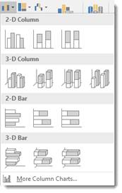
Choose the bar chart you want to use, or click More Column Charts.
If you click More Column Charts, this is what you’ll see:
On the right side of the window, you will see a list of different chart types. Click Bar.
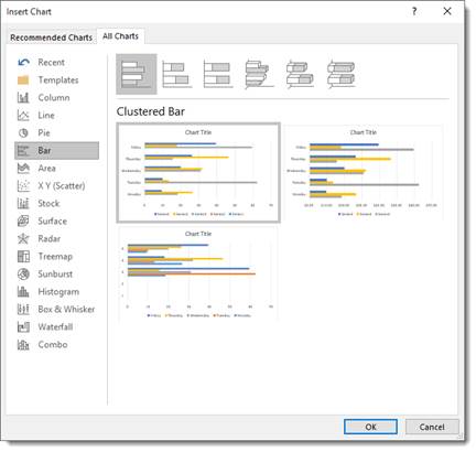
At the top, you’ll see bar charts illustrated in gray. These are different styles of bar charts. You can click on any of the styles and see a preview of your data in that style of chart (in color) in the box below.
Select the type of chart you want, then click OK.
Excel embeds the chart in your worksheet for you:
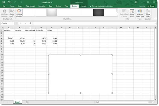
Creating a Chart from Scratch
So far in this article, we’ve taught you how to create charts by selecting your data first. However, you don’t have to do it that way (although it’s the easiest). In other words, you can start to create your chart without selecting data first.
Let’s learn how.
Click the Insert Column or Bar Chart button on the Ribbon again. However, this time, don’t select any data before you do it.
Select the type of bar chart that you want to use.
You’ll see a blank area on your worksheet where your chart will be embedded, and you’ll also notice the Chart Design and the Chart Format tabs open on the Ribbon.
Click the Select Data button under the Design tab.
The Select Data Source dialog window will open.
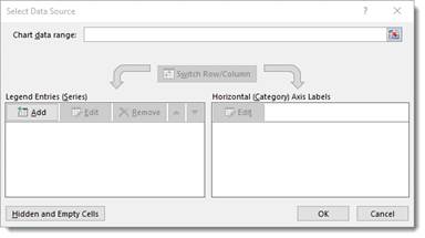
The data range refers to the number of cells you’d like to use. For instance, «=Sheet1!$A$1:$G$8» refers to cells A1 through G8 on worksheet one.
It’s actually much easier to select the data range by dragging your mouse over it. To do that, click the Data Range button  next to the text box.
You’ll see another box that looks like this:
This window is simply asking you to define the data range, and you can do it easily by clicking on a cell, holding the mouse button, and dragging it over all of the cells you’d like to add. MS Excel automatically enters the selected cell coordinates into the data range window. When you are finished, you can either click the button on the right  or push Enter.
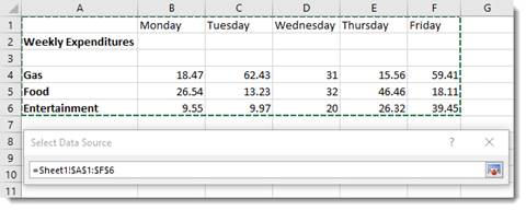
When you hit Enter, the chart appears in your worksheet:
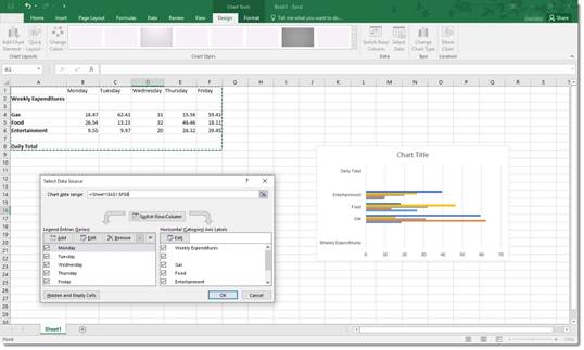
Now you can use the Select Data Source dialogue box to add legend entries – or edit and remove them.
You can also edit your axis labels.
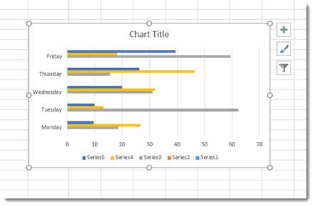
Note that your axis labels were your row labels. These appear as colors representing each day of the week.
Your legend entries were your column labels. These appear on the left, vertically.
Your data appears as the bars.
If you want, you can switch rows and columns so that the days of the week appear on the left and your axis labels become legend entries.
Uncheck any entries that you don’t want to appear in the chart.
Click OK when you’re finished.
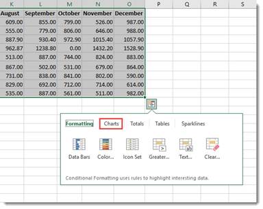
Creating Charts Using the Quick Analysis Tool
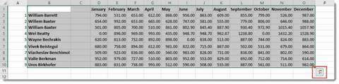
To use the Quick Analysis tool for creating charts, select that data that you want to include in chart. Click on the Quick Analysis tool button at the bottom right of the selected data (circled in red below):
Click Charts (circled in red):
Select the type of chart you want.
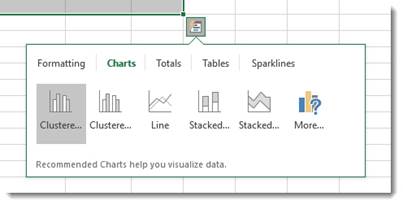
We’re going to choose a clustered chart.
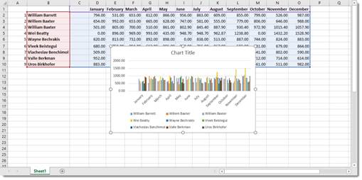
The chart is embedded in your spreadsheet:
Modifying and Moving a Chart
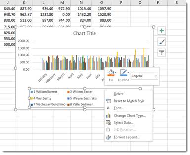
There are a number of ways to modify a chart after it’s made.
You can right click on the plot area as we’ve done below.
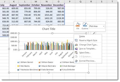
From the menu, you can delete the chart, reset, change the chart type, save the chart as a template, or select data to include in the chart. You can also format the chart area.
You can also click on the chart’s title to change or format it.
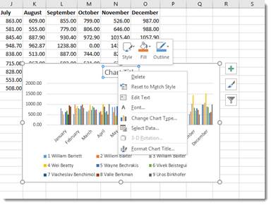
You can also right click on the legend or any other aspect of the chart to move it around and make changes. We’re going to talk about modifying chart elements in another section.
If you want to move a chart, simply click and drag any of its bounding box borders:
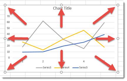
You can use the handles on the bounding box (the little circles indicated by the arrows above) to resize your chart. Drag it in to make it smaller, out to make it larger.
Chart Sheets
If you want a chart to appear on its own sheet in the workbook, simply click somewhere in the plot of the chart or select the data in your spreadsheet. Hit F11 on your keyboard.
The chart is moved to its own sheet as a clustered column chart.
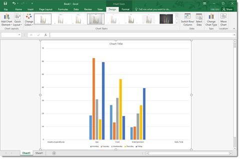
Note that the sheet is named Chart1 by default. You can change that name the same way that you change any other worksheet name.
The Design Tab and Customizing Charts
The tools on the Design tab help you to customize your charts so that you achieve the look, feel, and purpose that you want.
The Design tab is pictured below. You can mouse over any tools to learn their names.

We’re going to cover all the aspects of the Design tab, starting with groups and breaking them down into tools.
Chart Layouts is the first group on the left. It contains the Add Chart Element tool and the Quick Layout tool. The Add Chart Element tool allows you to modify some elements, such as titles, data labels, legend, etc. The Quick Layout tool allows you to select a new layout for your chart.
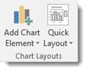
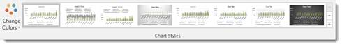
Chart Styles gives you different styles of charts to choose from. You can also change the colors used in your charts using the Change Colors tool.
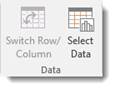
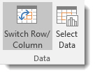
The Data group allows you to reverse rows and columns in your chart. We also talked about doing this earlier. It also gives you the Select Data tool, which we used in a prior section.
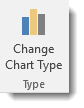
The Type group contains Change Chart Type. You can change the type of chart by using this tool.
The Location group has the Move Chart tool that allows you to move the chart to a different place within your worksheet – or to another worksheet.
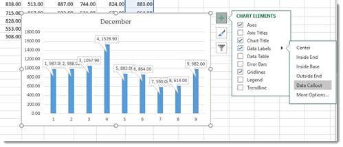
Customizing Chart Elements with the Chart Elements Button
The Chart Elements button appears as a plus sign whenever your chart is selected.
In the snapshot below, you can see it to the right of our chart.
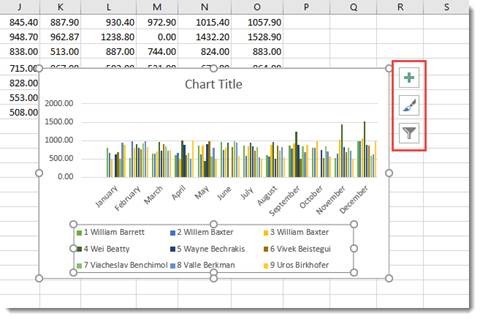
When you click it, you’ll see a list of chart elements that you can add to your chart.
The elements that are in your chart have checkmarks beside them. You can uncheck them to remove the elements. To add an element, simply put a checkmark in the box beside it.
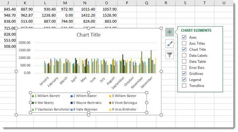
If you want to remove or add just a part of an element, or specify its layout as with Data Labels, you’ll use the Chart Elements continuation menu.
Here’s how to do this.
Start by putting a checkmark beside Data Labels (as an example).
You’ll see an arrow appear to the right of the word Data Labels (indicated in red below.)
Click the arrow and you’ll see the continuation menu.
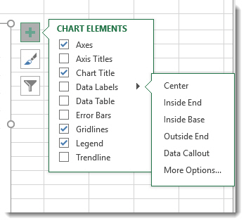
Select a layout option.
We’re going to choose Data Callout.
Formatting a Chart
To format a chart, you can double click in the plot area or the chart area. If you double click in the chart area, it opens the Format Chart Area pane on the right side of your window. If you double click in the plot area, it opens the Format Plot area on the right side of your screen, as shown below.
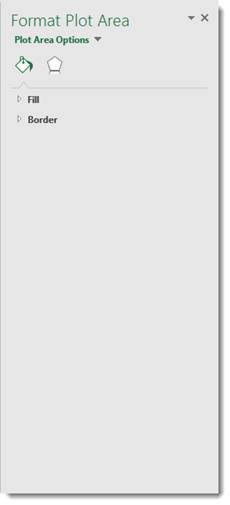
At the top of the pane, are the options.

Fill & Line looks like a bucket pouring green paint and allows you to format the fill and lines of your chart.
The Effects button is the one on the right, which allows you to add special effects to your chart to customize the look.
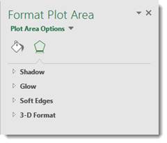
Take time to play around with the different formatting options for your charts. It’s a lot of fun to do, and you will discover interesting combinations of effects that will produce charts you’ll love.
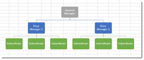
Organizational Charts or Diagrams with SmartArt
While an ordinary chart simply represents data, diagrams and organizational charts explain the causal relationship between elements. The following organizational chart, for instance, explains the relationship between managers and subordinates.
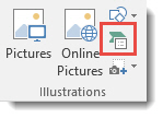
The simplest way to create an organizational chart is to click the Insert tab, then SmartArt. The SmartArt icon has been scaled down in Excel 2019, so we’ve circled it in red below.
The SmartArt dialogue box appears:
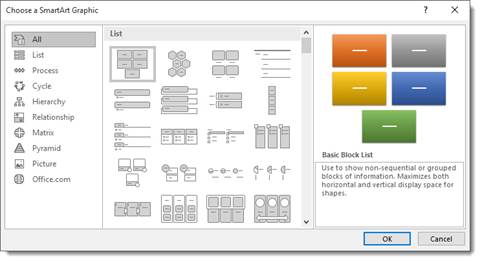
Choose the type of organizational chart or diagram you want on the left. You can choose a style from the middle section called List.
Once you choose your chart or diagram, click OK.
It appears in your spreadsheet:
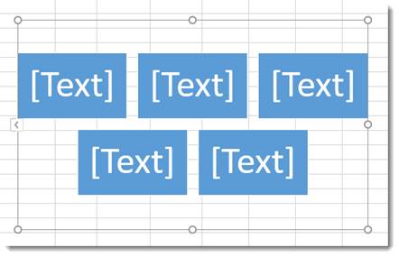
Click on the areas marked text to add your own.
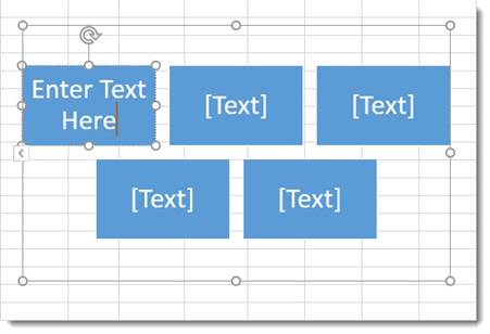
In the Ribbon, the SmartArt Design and Format tabs appear.
You can use these tools to change the layout, apply a style, change the colors, and other formatting elements.
View Animation in Charts
One of the debated new features in Excel 2019 is the animation added to charts.
Here’s how the animation works.
After you create a chart, then change the data for the chart in the spreadsheet, you can watch your chart and see it change too – in full animation.
In other words, if you have a bar chart, and you change the data so that a bar will be shorter, you can watch the bar slowly become shorter right after you change the data.
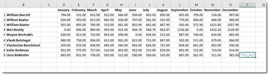
Sparklines
A sparkline is simply a small chart that’s aligned with a row of your data. It typically shows trend information.
Let’s learn how to add one in the spreadsheet below:
To insert a sparkline, go to the Ribbon, click the Insert tab, then the Sparklines group.
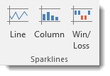
Choose the type of sparkline you want to add.
We’re going to choose Line.
You’ll see this dialogue box.
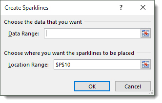
Select the cells in your spreadsheet that you want to use for your sparkline. Just drag your mouse to select the cells.
Next, enter the absolute reference for the cell where you want the sparkline to appear.
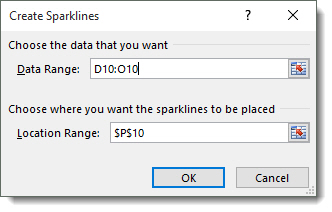
Click OK.
The sparkline now appears in the location you specified.
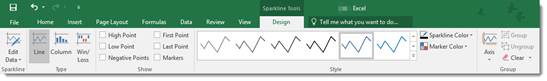
You can also format your sparkline using the Sparkline Tools Design tab that opens in the Ribbon.
Содержание
- Построение диаграммы в Excel
- Вариант 1: Построение диаграммы по таблице
- Работа с диаграммами
- Вариант 2: Отображение диаграммы в процентах
- Вариант 3: Построение диаграммы Парето
- Вопросы и ответы

Microsoft Excel дает возможность не только удобно работать с числовыми данными, но и предоставляет инструменты для построения диаграмм на основе вводимых параметров. Их визуальное отображение может быть совершенно разным и зависит от решения пользователя. Давайте разберемся, как с помощью этой программы нарисовать различные типы диаграмм.
Построение диаграммы в Excel
Поскольку через Эксель можно гибко обрабатывать числовые данные и другую информацию, инструмент построения диаграмм здесь также работает в разных направлениях. В этом редакторе есть как стандартные виды диаграмм, опирающиеся на стандартные данные, так и возможность создать объект для демонстрации процентных соотношений или даже наглядно отображающий закон Парето. Далее мы поговорим о разных методах создания этих объектов.
Вариант 1: Построение диаграммы по таблице
Построение различных видов диаграмм практически ничем не отличается, только на определенном этапе нужно выбрать соответствующий тип визуализации.
- Перед тем как приступить к созданию любой диаграммы, необходимо построить таблицу с данными, на основе которой она будет строиться. Затем переходим на вкладку «Вставка» и выделяем область таблицы, которая будет выражена в диаграмме.
- На ленте на вкладе «Вставка» выбираем один из шести основных типов:
- Гистограмма;
- График;
- Круговая;
- Линейчатая;
- С областями;
- Точечная.
- Кроме того, нажав на кнопку «Другие», можно остановиться и на одном из менее распространенных типов: биржевой, поверхности, кольцевой, пузырьковой, лепестковой.
- После этого, кликая по любому из типов диаграмм, появляется возможность выбрать конкретный подвид. Например, для гистограммы или столбчатой диаграммы такими подвидами будут следующие элементы: обычная гистограмма, объемная, цилиндрическая, коническая, пирамидальная.
- После выбора конкретного подвида автоматически формируется диаграмма. Например, обычная гистограмма будет выглядеть, как показано на скриншоте ниже:
- Диаграмма в виде графика будет следующей:
- Вариант с областями примет такой вид:
Работа с диаграммами
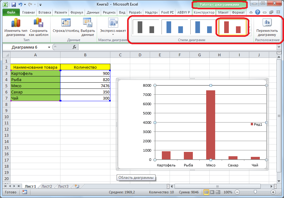
После того как объект был создан, в новой вкладке «Работа с диаграммами» становятся доступными дополнительные инструменты для редактирования и изменения.
- Доступно изменение типа, стиля и многих других параметров.
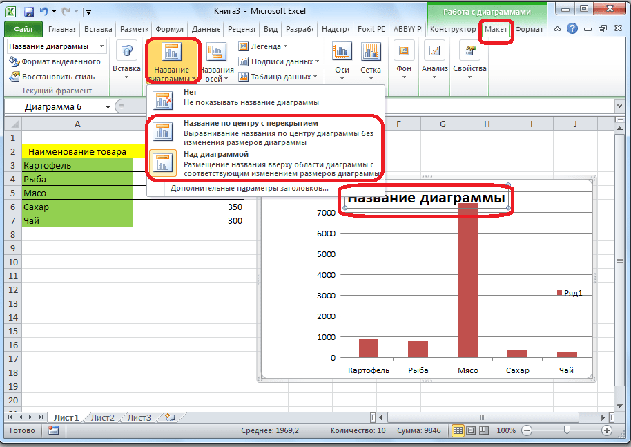
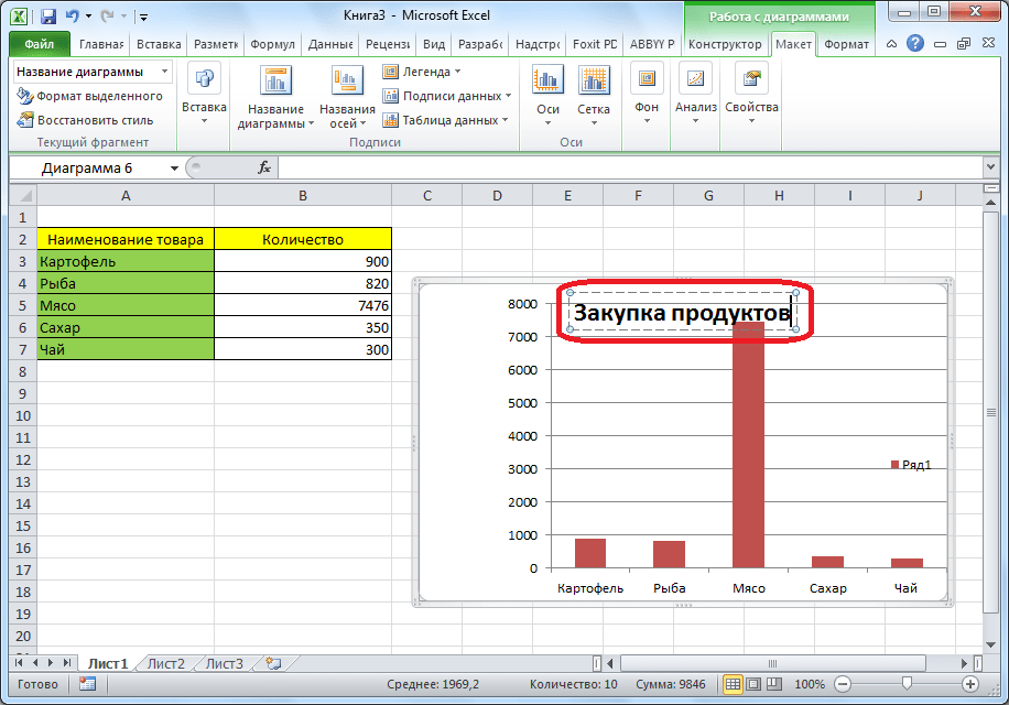
- Вкладка «Работа с диаграммами» имеет три дополнительные вложенные вкладки: «Конструктор», «Макет» и «Формат», используя которые, вы сможете подстроить ее отображение так, как это будет необходимо. Например, чтобы назвать диаграмму, открываем вкладку «Макет» и выбираем один из вариантов расположения наименования: по центру или сверху.
- После того как это было сделано, появляется стандартная надпись «Название диаграммы». Изменяем её на любую надпись, подходящую по контексту данной таблице.
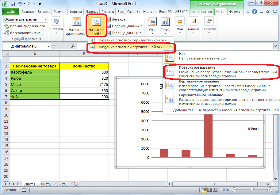
- Название осей диаграммы подписываются точно по такому же принципу, но для этого надо нажать кнопку «Названия осей».
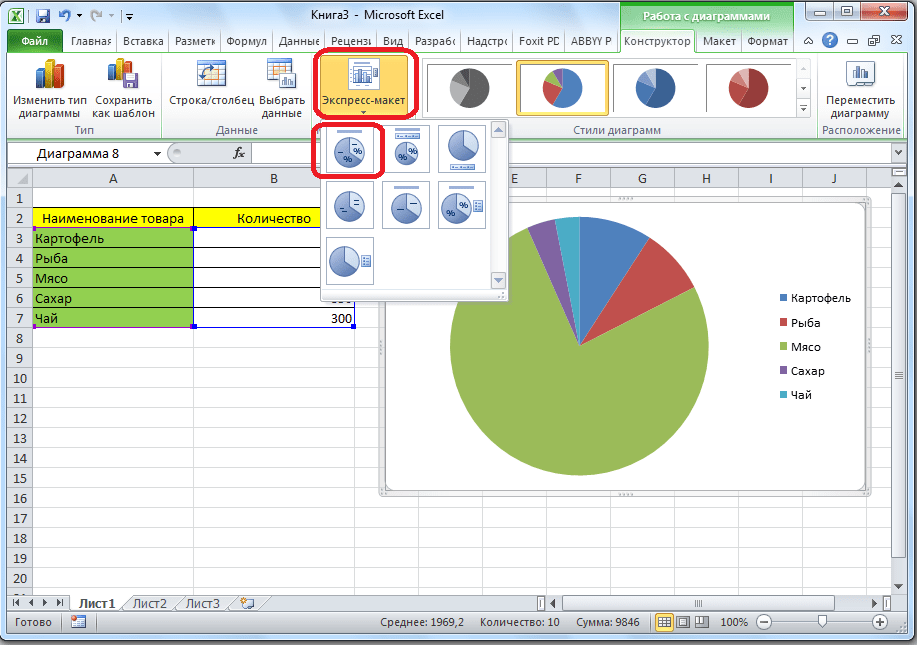
Вариант 2: Отображение диаграммы в процентах
Чтобы отобразить процентное соотношение различных показателей, лучше всего построить круговую диаграмму.

- Аналогично тому, как мы делали выше, строим таблицу, а затем выделяем диапазон данных. Далее переходим на вкладку «Вставка», на ленте указываем круговую диаграмму и в появившемся списке кликаем на любой тип.
- Программа самостоятельно переводит нас в одну из вкладок для работы с этим объектом – «Конструктор». Выбираем среди макетов в ленте любой, в котором присутствует символ процентов.
- Круговая диаграмма с отображением данных в процентах готова.

Вариант 3: Построение диаграммы Парето
Согласно теории Вильфредо Парето, 20% наиболее эффективных действий приносят 80% от общего результата. Соответственно, оставшиеся 80% от общей совокупности действий, которые являются малоэффективными, приносят только 20% результата. Построение диаграммы Парето как раз призвано вычислить наиболее эффективные действия, которые дают максимальную отдачу. Сделаем это при помощи Microsoft Excel.
- Наиболее удобно строить данный объект в виде гистограммы, о которой мы уже говорили выше.
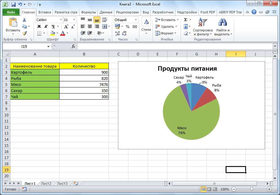
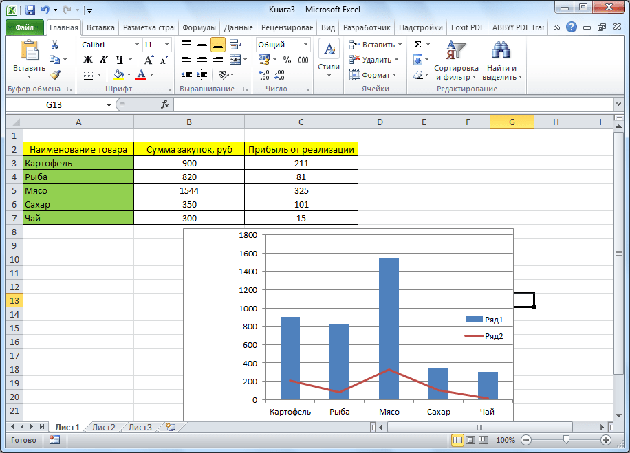
- Приведем пример: в таблице представлен список продуктов питания. В одной колонке вписана закупочная стоимость всего объема конкретного вида продукции на оптовом складе, а во второй – прибыль от ее реализации. Нам предстоит определить, какие товары дают наибольшую «отдачу» при продаже.
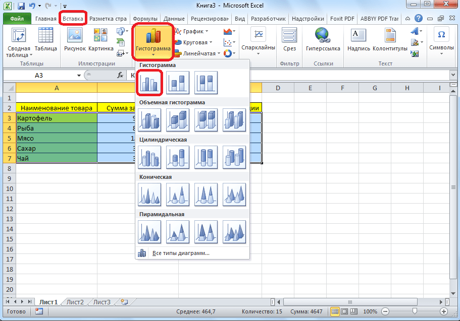
Прежде всего строим обычную гистограмму: заходим на вкладку «Вставка», выделяем всю область значений таблицы, жмем кнопку «Гистограмма» и выбираем нужный тип.
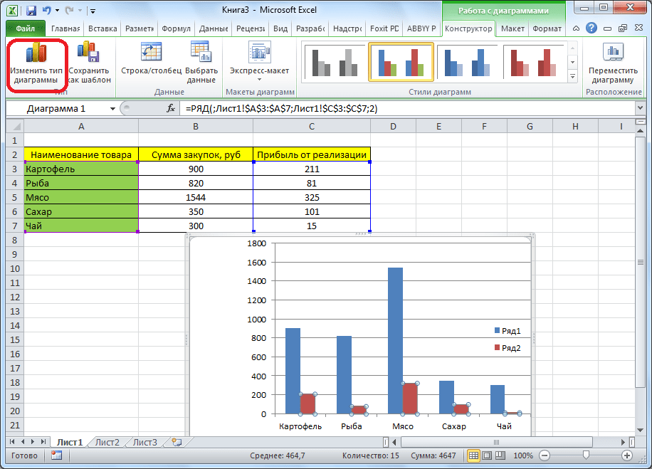
- Как видим, вследствие осуществленных действий образовалась диаграмма с двумя видами столбцов: синим и красным. Теперь нам следует преобразовать красные столбцы в график — выделяем эти столбцы курсором и на вкладке «Конструктор» кликаем по кнопке «Изменить тип диаграммы».
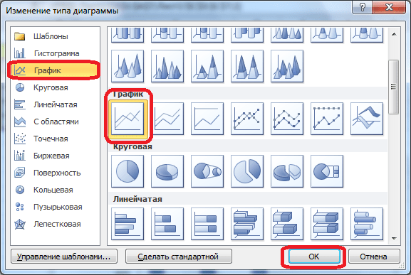
- Открывается окно изменения типа. Переходим в раздел «График» и указываем подходящий для наших целей тип.
- Итак, диаграмма Парето построена. Сейчас можно редактировать ее элементы (название объекта и осей, стили, и т.д.) так же, как это было описано на примере столбчатой диаграммы.
Как видим, Excel представляет множество функций для построения и редактирования различных типов диаграмм — пользователю остается определиться, какой именно ее тип и формат необходим для визуального восприятия.
Еще статьи по данной теме:
Помогла ли Вам статья?
Microsoft Excel is a spreadsheet software program generally used to organize and format large amounts of data, but it also packs a diverse shapes gallery to make flowcharts!
A SmartArt graphic is the go-to illustration to create any diagram in Excel. However, you need a more compelling flowchart for collaboration and communication.
In this guide, we’ll walk through the function of flowcharts, how to create a flowchart in Excel, and two Excel alternatives to make your flowcharts come to life. (Spoiler: the two alternatives are in the same software!)
What is a flowchart?
A flowchart is a diagram made of shapes connected by arrows to visualize a workflow, process, or any decision-making procedure. Flowcharts are for everyone because unlike text-heavy documents, they condense information so the audience can digest the information faster.
Flowcharts turn ideas into thought-out actions to solve problems and ultimately, increase productivity because things run smoothly. Think about any event you’ve encountered at some point at your organization, for example. It could be new hire onboarding, requesting PTO, or organizing a project kickoff meeting. These events have a process in place so everyone consistently takes the right steps towards success. Flowcharts help the person creating these processes visualize the scope, sequence, stages, and stakeholders involved.
Basic shapes used in flowcharts
It’s not necessary to be well-versed in flowchart programming. All you need to know are the basic building blocks to make your flowchart easy to understand. The four main flowchart shapes we’ll use for this tutorial are:
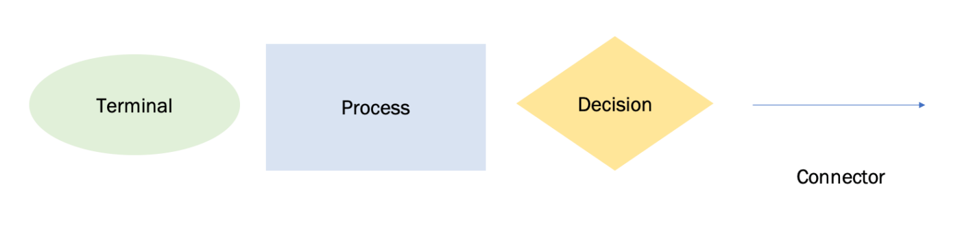
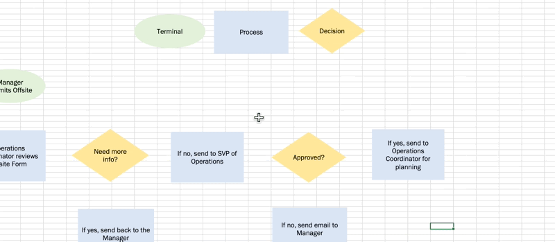
| Symbol | Function | How to Add |
|---|---|---|
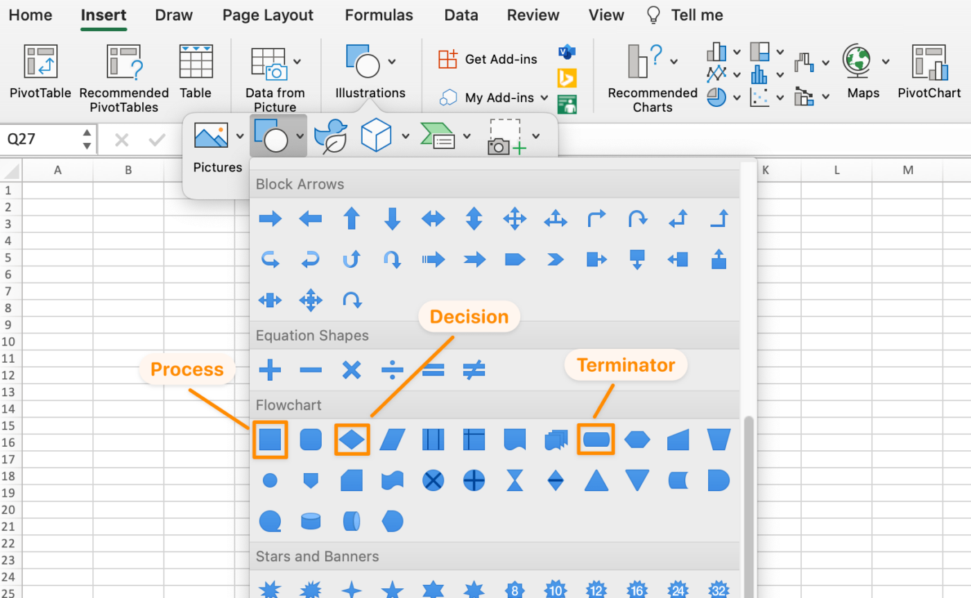
| Oval | Terminal: the start point and end point of a flowchart | Insert tab > Illustration > Shapes > Flowchart > Terminator |
| Rectangle | Process: represents a single step in the procedure | Insert tab > Illustration > Shapes > Flowchart > Process |
| Diamond | Decision: represents a decision action | Insert tab > Illustration > Shapes > Flowchart > Decision |
| Arrow | Arrow: connects shapes to show the relationship | Insert tab > Illustration > Shapes > Flowchart > Arrow |
Ready to create a flowchart of your own? Choose one of your ideas or tasks and follow along with our step-by-step guide to create this flowchart! ⬇️
How to create a flowchart in Excel with custom shapes
Note: In this tutorial, we use Microsoft Excel for Mac Version 16.60. The steps and features may look different if you’re on another version.
Excel is a large application with hundreds of functions. The two most important functions to use and speed up your flowchart build are: copy and paste. So rather than adding shapes one by one to your spreadsheet, we’ll format the shapes first. Then you can copy and paste the shapes into your flowchart process. Here we go!
Related: Learn how to create a flowchart in Google Docs.
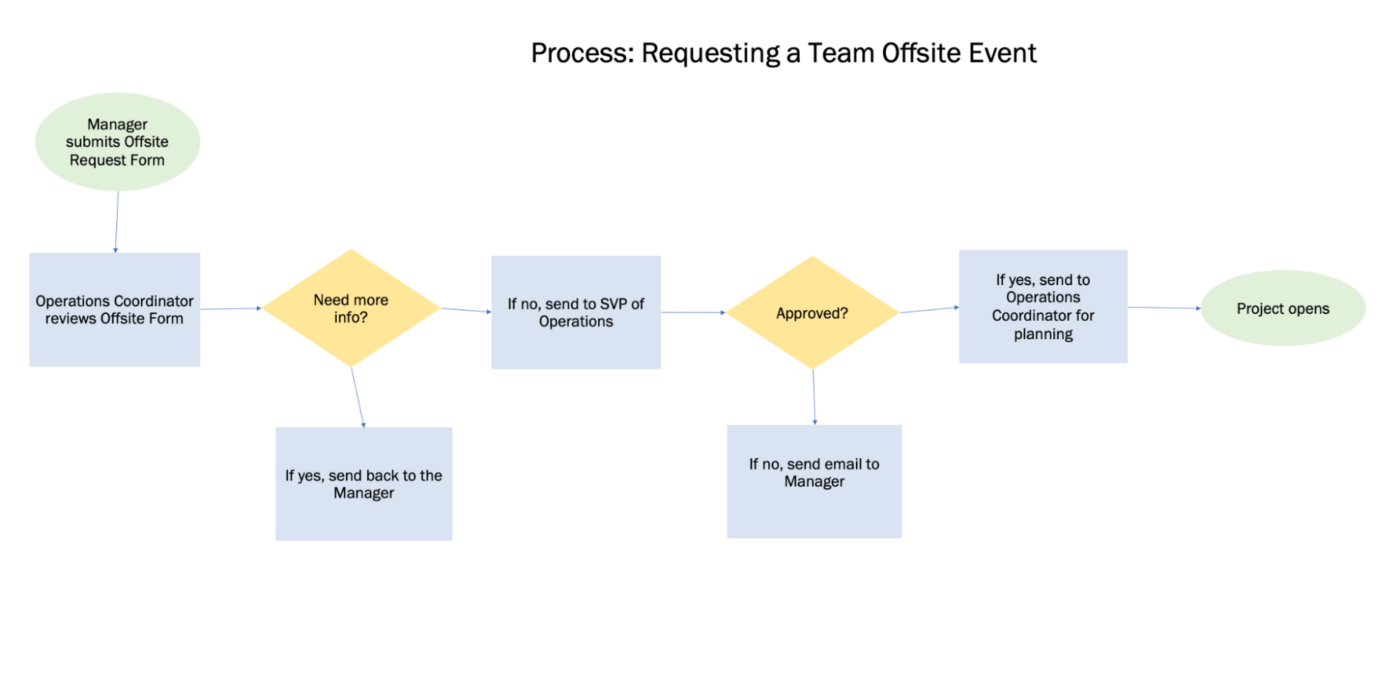
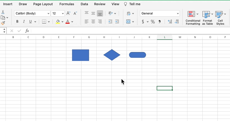
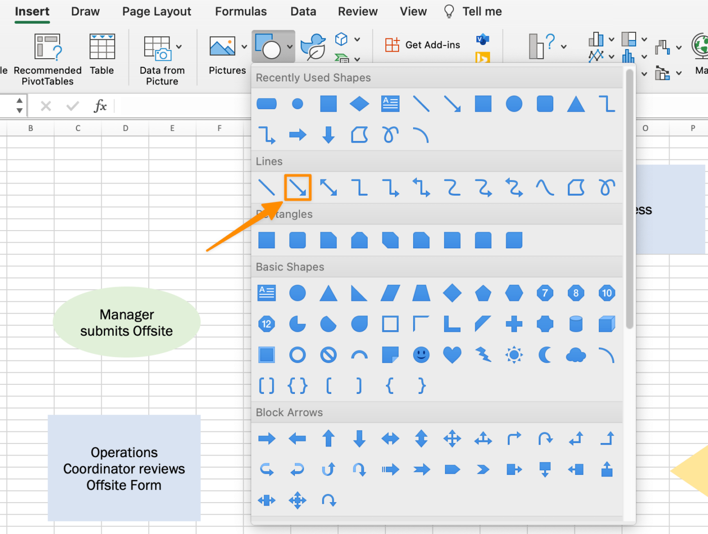
1. Add the terminator, process, and decision flowchart shapes
Go to the Insert tab > Illustration > Shapes > Flowchart > select a shape > click at the top of the spreadsheet to add.
2. Adjust the flowchart shape sizes
We want to add text inside the shapes, so let’s make them bigger. Select one of the shapes > press Command + A on your keyboard to select all shapes > hold Shift > go to a shape’s corner and drag to expand all three flowchart shapes.
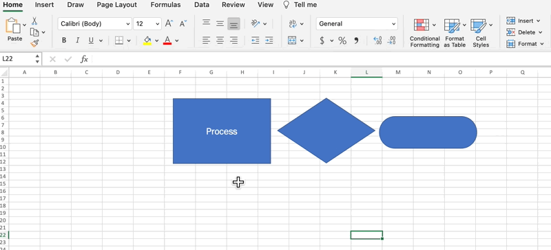
3. Customize each flowchart shape
We’ll use the copy and paste function to customize the shapes, but there’s a handy Format icon to help us with this!
- Double click inside the Process shape to reveal a cursor, label the shape Process, and center the text
- Change the font name and font size to your preference
- Select the Process shape > click the Format icon under the Home tab > click on the other shapes to paste the format
- Label the diamond shape Decision and the oval shape Terminator
Next, select background and font colors for each shape. Click on a shape > go to the Shape Format tab > Shape Fill and Text Fill
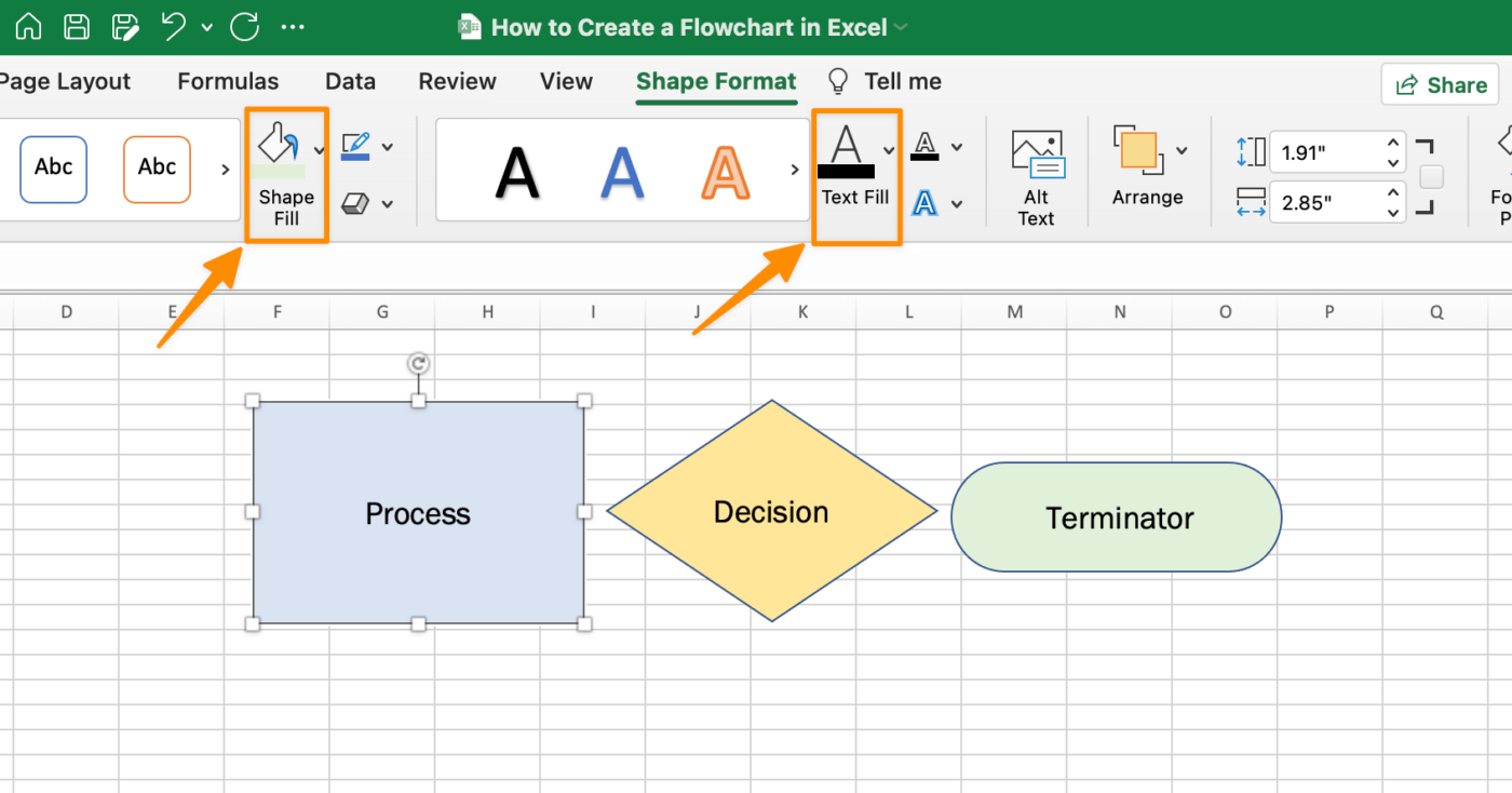
Pro Tip: To remove the shape outline for a cleaner look, select all shapes > Shape Format tab > Shape Outline > No Outline
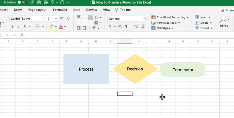
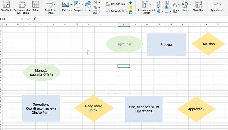
4. Begin adding your flowchart steps
With your fully customized (and consistent) shapes, copy and paste the Excel flowchart shape to map out your steps!
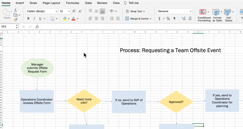
5. Add the connectors to show each shape relationship
Go the Insert tab > Shapes > Lines > Arrow.
Use the green circles as a guide to draw the arrows and connect the shapes.
6. Add a title to your flowchart
Delete the shapes at the top of your spreadsheet and add a title.
Tip: For a cleaner look, remove the gridlines in your Excel flowchart. Go to the Page Layout tab > uncheck the View box under Gridlines
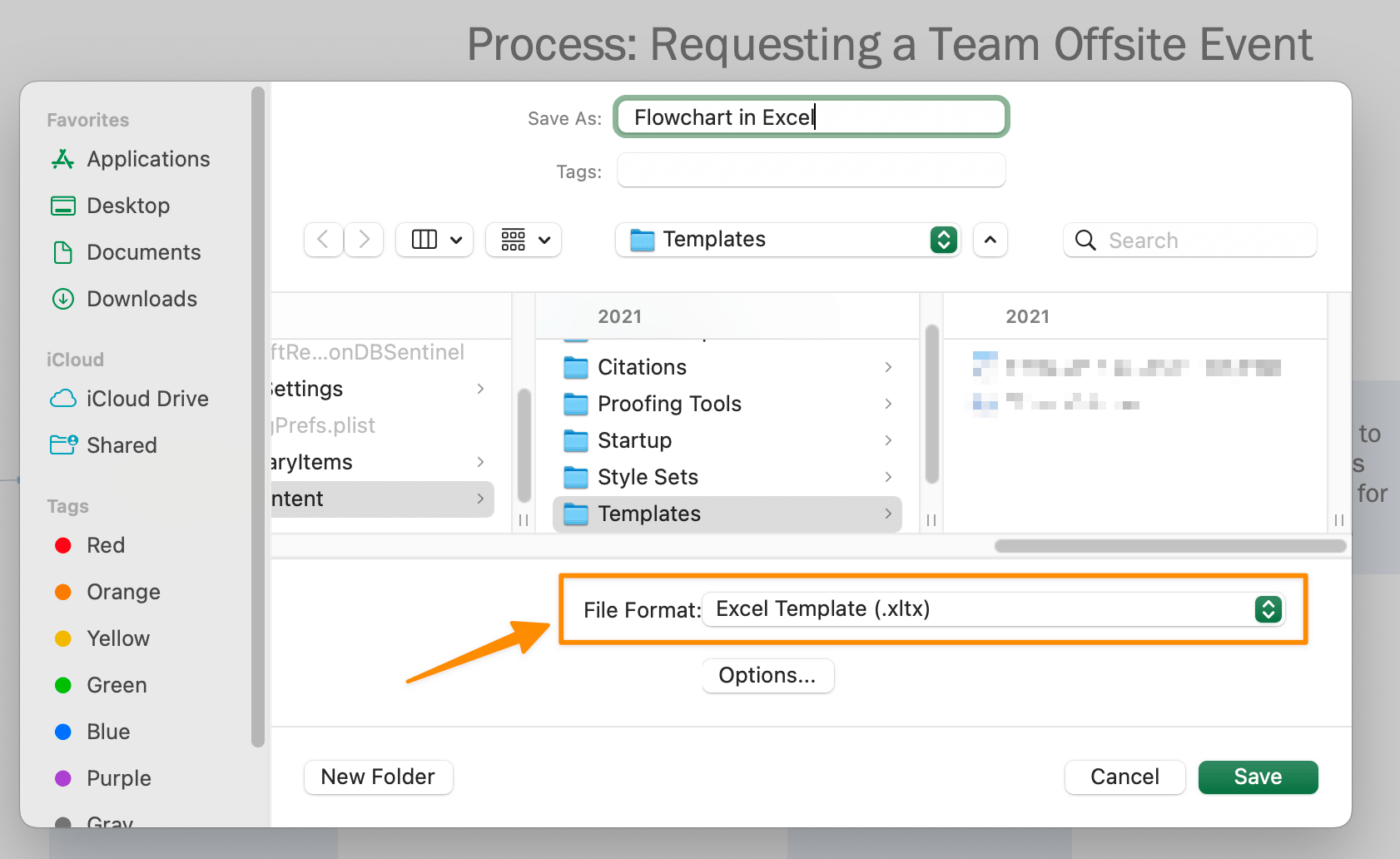
8. Save your Excel flowchart as a template
Go to File > Save as Template. Name your template and click Save. (Double check the File Format is set as Excel Template.)
There you have it! You now know how to make a flowchart in Excel! We have other Microsoft Office resources and recommendations if you’re looking for other alternatives to improve your planning needs. ⬇️
- How to Create a Timesheet in Excel
- How to Create a To Do List in Excel
- How to Create a Mind Map in Excel
- How to Make a Schedule in Excel
- How to Create a Form in Excel
- How to Make a Dashboard in Excel
- How to Make an Org Chart in Excel
- How to Make a Graph in Excel
Limitations of Excel flowcharts
While it’s handy to know how to create flowcharts in a popular tool like Microsoft Excel, spreadsheets are not collaboration-friendly. People who are less familiar with Excel navigation will have a harder experience and longer learning curve to complete work.
As we all know (and experience), projects change daily. So while you’re busy manually creating flowcharts in Excel, the data, people, and circumstances might change, and you’ll have to start over. However, that’s not ideal for creative brainstorming workshops!
This inevitable situation is why it’s essential to use an intuitive software tool to remove the manual work and update in real-time. With ClickUp, a powerful Microsoft Excel alternative, you won’t need to create multiple versions of flowchart templates!
Design flowcharts in ClickUp instantly
ClickUp is an all-in-one productivity platform where teams come together to plan, organize, and collaborate on work using tasks, Docs, Mind Maps, Goals, Whiteboards, and more! Easily customized with just a few clicks, ClickUp lets teams of all types and sizes deliver work more effectively, boosting productivity to new heights.
Flowcharts in ClickUp do what Excel spreadsheets cannot: turn processes into actionable tasks.
Flowcharts aren’t made to be built and stored somewhere in a shared drive. They’re meant to be a usable solution or workflow. With ClickUp, tasks are created directly from the flowchart so everyone is aware of roles, tasks, and deadlines!
Related: Show dependencies in Excel!
Mind Maps in ClickUp
Mind Maps in ClickUp are perfect to offload a stream of consciousness or planned information. With Mind Maps, you won’t have to stress over the formatting details of each shape or step. You’ll have more brainpower saved for the actual work.
It’s easy to create a Mind Map in ClickUp and get started on your projects, ideas, and even existing tasks for the ultimate visual outline. To kick things off, download the Mind Map template with two different types of mind maps:
- Task Mode Mind Map: map out your ideas and turn them into trackable ClickUp tasks
- Blank Mode Mind Map: create free-form diagrams to organize your ideas
Whiteboards in ClickUp
Earlier we mentioned Excel spreadsheets are not ideal for creative brainstorming workshops. So, what’s the alternative? Whiteboards in ClickUp!
Similar to Mind Maps, the Whiteboards feature offers more functionalities like freehand drawing, rich text formatting, images, and web links to create more context while you’re planning. Whiteboards are the fastest way to collaborate with your team and bridge the gap between brainstorming and getting work done.

A blank canvas and blinking cursor might be intimidating if you’re new to visual collaboration tools. Whiteboards in ClickUp also come with templates to jumpstart your brainstorming sessions! For a step-by-step walkthrough with Whiteboards, check out the video below! ⬇️
Create memorable flowcharts in ClickUp
Spreadsheets serve the purpose of storing data. However, you need intuitive software to keep track of your evolving tasks and projects. The collaboration and customization features in the ClickUp platform are all you need in one place.
Take Mind Maps or Whiteboards for a spin for free today and bring your best ideas to life!
Contents
- 1 How do you make a diagram in Excel?
- 2 Can I draw a diagram in Excel?
- 3 How do I plot an XY graph in Excel?
- 4 How do you create a curve graph in Excel?
- 5 How do you make a ternary plot?
- 6 Can you draw freehand in Excel?
- 7 How do you draw shapes in Excel?
- 8 How do I create a curved trendline in Excel?
- 9 What is Binodal curve in ternary phase diagram?
- 10 What is plait point in phase diagram?
- 11 What is miscibility gap in phase diagram?
- 12 What is tie line in ternary phase diagrams?
- 13 How do triangular graphs work?
- 14 What is pseudo ternary phase diagram?
- 15 How do I turn on draw tab in Excel?
- 16 How do I enable the action pen in Excel?
Create a chart
- Select the data for which you want to create a chart.
- Click INSERT > Recommended Charts.
- On the Recommended Charts tab, scroll through the list of charts that Excel recommends for your data, and click any chart to see how your data will look.
- When you find the chart you like, click it > OK.
Can I draw a diagram in Excel?
Excel makes it easy to add diagrams to your worksheets to illustrate what’s going on in a problem using shapes. To add a shape, go to the Insert tab and choose Shapes:To change the color of a shape, click it, then go to the Drawing Tools Format tab.
How do I plot an XY graph in Excel?
Select the data you want to plot in the chart. Click the Insert tab, and then click X Y Scatter, and under Scatter, pick a chart. With the chart selected, click the Chart Design tab to do any of the following: Click Add Chart Element to modify details like the title, labels, and the legend.
How do you create a curve graph in Excel?
Select and highlight the range A1:F2 and then click Insert > Line or Area Chart > Line. The line graph is inserted with straight lines corresponding to each data point. To edit this to a curved line, right-click the data series and then select the “Format Data Series” button from the pop-up menu.
How do you make a ternary plot?
Reading Ternary Diagrams
- Locate the 1 (or 100%) point on the axis.
- Draw a line parallel to the base that is opposite the 100% point through the point you wish to read.
- Follow the parallel line to the axis.
- Repeat these steps for the remaining axes.
Can you draw freehand in Excel?
Figure 1: The Scribble tool can be found in two places on the Shapes menu. At this point you can use your mouse to draw freehand on the screen.When a freehand object is selected, Excel will display a Drawing Tools Format menu within the menu interface known as the Ribbon.
How do you draw shapes in Excel?
Add a shape in Excel, Outlook, Word, or PowerPoint
- On the Insert tab, click Shapes.
- Click the shape you want, click anywhere in the workspace, and then drag to place the shape. To create a perfect square or circle (or constrain the dimensions of other shapes), press and hold Shift while you drag.
How do I create a curved trendline in Excel?
Add best fit line/curve and formula in Excel 2007 and 2010
- Select the original experiment data in Excel, and then click the Scatter > Scatter on the Insert tab.
- Select the new added scatter chart, and then click the Trendline > More Trendline Options on the Layout tab.
What is Binodal curve in ternary phase diagram?
To differentiate within the two-phase region and single-phase region in the ternary diagram, pressure and temperature must be fixed.The binodal curve is the boundary between the 2-phase condition and the single-phase condition. Inside the binodal curve or phase envelope, the two-phase condition prevails.
What is plait point in phase diagram?
The Plait Point P, is the intersection of the raffinate-phase and extract-phase boundary curves. At this point, the equilibrium phases become coincident and no separation can be made at that point.
What is miscibility gap in phase diagram?
A miscibility gap is a region in a phase diagram for a mixture of components where the mixture exists as two or more phases – any region of composition of mixtures where the constituents are not completely miscible.Thermodynamically, miscibility gaps indicate a maximum (e.g. of Gibbs energy) in the composition range.
What is tie line in ternary phase diagrams?
The edges of the three-phase region are tie lines for the associated two-phase (2Φ) regions; thus, there is a two-phase region adjacent to each of the sides of the three-phase triangle. Three-phase regions can exist in several phase diagrams applied in the design of EOR processes.
How do triangular graphs work?
Triangular graphs are graphs with three axis instead of two, taking the form of an equilateral triangle. The important features are that each axis is divided into 100, representing percentage. From each axis lines are drawn at an angle of 60 degrees to carry the values across the graph.
What is pseudo ternary phase diagram?
A pseudoternary phase diagram is a tool that optimizes the three components of any typical emulsion, i.e., water, oil, and surfactant, to obtain the concentration range of these components, which form a stable emulsion. The three components of a system are plotted on the three corners of the triangle.
How do I turn on draw tab in Excel?
Adding the Draw tab to the Ribbon
- Right-click the Ribbon and select Customize the Ribbon.
- Check the box next to Draw, then click OK.
- The Draw tab will now be available in the Ribbon.
How do I enable the action pen in Excel?
Locate the Action Pen on the right side of the toolbox (next to the other Drawing Tools), select it, and start using intelligent ink. To emphasize certain parts of your data, select the down arrow to the right of the Highlighter, and select Snap To Cells. Then draw across the cells to color the cell fill.
Building charts and graphs are one of the best ways to visualize data in a clear and comprehensible way.

However, it’s no surprise that some people get a little intimidated by the prospect of poking around in Microsoft Excel.

I thought I’d share a helpful video tutorial as well as some step-by-step instructions for anyone out there who cringes at the thought of organizing a spreadsheet full of data into a chart that actually, you know, means something. But before diving in, we should go over the different types of charts you can create in the software.
Types of Charts in Excel
You can make more than just bar or line charts in Microsoft Excel, and when you understand the uses for each, you can draw more insightful information for your or your team’s projects.
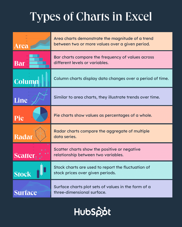
|
Type of Chart |
Use |
|
Area |
Area charts demonstrate the magnitude of a trend between two or more values over a given period. |
|
Bar |
Bar charts compare the frequency of values across different levels or variables. |
|
Column |
Column charts display data changes or a period of time. |
|
Line |
Similar to bar charts, they illustrate trends over time. |
|
Pie |
Pie charts show values as percentages of a whole. |
|
Radar |
Radar charts compare the aggregate of multiple data series. |
|
Scatter |
Scatter charts show the positive or negative relationship between two variables. |
|
Stock |
Stock charts are used to report the fluctuation of stock prices over given periods. |
|
Surface |
Surface charts plot sets of values in the form of a three-dimensional surface. |
The steps you need to build a chart or graph in Excel are simple, and here’s a quick walkthrough on how to make them.
Keep in mind there are many different versions of Excel, so what you see in the video above might not always match up exactly with what you’ll see in your version. In the video, I used Excel 2021 version 16.49 for Mac OS X.
To get the most updated instructions, I encourage you to follow the written instructions below (or download them as PDFs). Most of the buttons and functions you’ll see and read are very similar across all versions of Excel.
Download Demo Data | Download Instructions (Mac) | Download Instructions (PC)
- Enter your data into Excel.
- Choose one of nine graph and chart options to make.
- Highlight your data and click ‘Insert’ your desired graph.
- Switch the data on each axis, if necessary.
- Adjust your data’s layout and colors.
- Change the size of your chart’s legend and axis labels.
- Change the Y-axis measurement options, if desired.
- Reorder your data, if desired.
- Title your graph.
- Export your graph or chart.
Featured Resource: Free Excel Graph Templates
.png)
Why start from scratch? Use these free Excel Graph Generators. just input your data and adjust as needed for a beautiful data visualization.
1. Enter your data into Excel.
First, you need to input your data into Excel. You might have exported the data from elsewhere, like a piece of marketing software or a survey tool. Or maybe you’re inputting it manually.
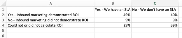
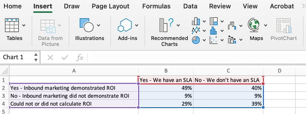
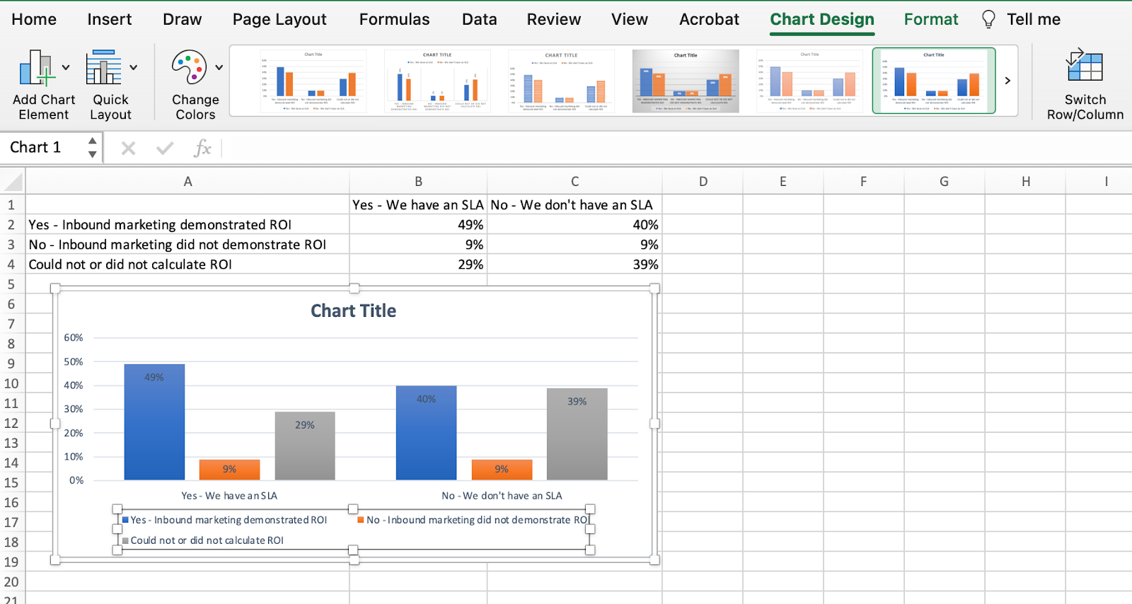
In the example below, in Column A, I have a list of responses to the question, “Did inbound marketing demonstrate ROI?”, and in Columns B, C, and D, I have the responses to the question, “Does your company have a formal sales-marketing agreement?” For example, Column C, Row 2 illustrates that 49% of people with a service level agreement (SLA) also say that inbound marketing demonstrated ROI.
2. Choose from the graph and chart options.
In Excel, your options for charts and graphs include column (or bar) graphs, line graphs, pie graphs, scatter plots, and more. See how Excel identifies each one in the top navigation bar, as depicted below:
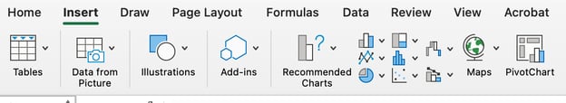
To find the chart and graph options, select Insert.
(For help figuring out which type of chart/graph is best for visualizing your data, check out our free ebook, How to Use Data Visualization to Win Over Your Audience.)
3. Highlight your data and insert your desired graph into the spreadsheet.
In this example, a bar graph presents the data visually. To make a bar graph, highlight the data and include the titles of the X and Y-axis. Then, go to the Insert tab and click the column icon in the charts section. Choose the graph you wish from the dropdown window that appears.
I picked the first two dimensional column option because I prefer the flat bar graphic over the three dimensional look. See the resulting bar graph below.

4. Switch the data on each axis, if necessary.
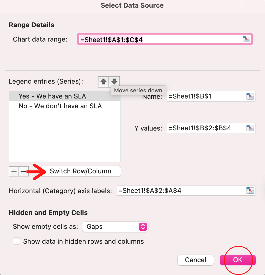
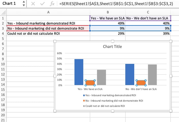
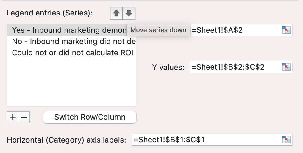
If you want to switch what appears on the X and Y axis, right-click on the bar graph, click Select Data, and click Switch Row/Column. This will rearrange which axes carry which pieces of data in the list shown below. When finished, click OK at the bottom.
The resulting graph would look like this:
5. Adjust your data’s layout and colors.
To change the labeling layout and legend, click on the bar graph, then click the Chart Design tab. Here, you can choose which layout you prefer for the chart title, axis titles, and legend. In my example below, I clicked on the option that displayed softer bar colors and legends below the chart.
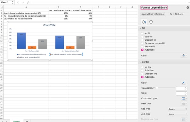
To further format the legend, click on it to reveal the Format Legend Entry sidebar, as shown below. Here, you can change the fill color of the legend, which will change the color of the columns themselves. To format other parts of your chart, click on them individually to reveal a corresponding Format window.
6. Change the size of your chart’s legend and axis labels.
When you first make a graph in Excel, the size of your axis and legend labels might be small, depending on the graph or chart you choose (bar, pie, line, etc.) Once you’ve created your chart, you’ll want to beef up those labels so they’re legible.
To increase the size of your graph’s labels, click on them individually and, instead of revealing a new Format window, click back into the Home tab in the top navigation bar of Excel. Then, use the font type and size dropdown fields to expand or shrink your chart’s legend and axis labels to your liking.

7. Change the Y-axis measurement options if desired.
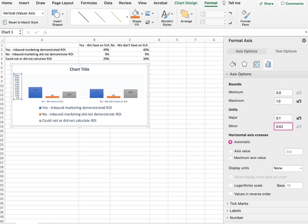
To change the type of measurement shown on the Y axis, click on the Y-axis percentages in your chart to reveal the Format Axis window. Here, you can decide if you want to display units located on the Axis Options tab, or if you want to change whether the Y-axis shows percentages to two decimal places or no decimal places.
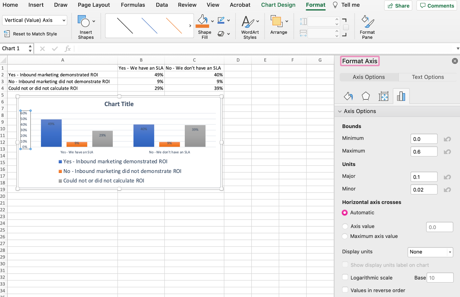
Because my graph automatically sets the Y axis’s maximum percentage to 60%, you might want to change it manually to 100% to represent my data on a universal scale. To do so, you can select the Maximum option — two fields down under Bounds in the Format Axis window — and change the value from 0.6 to one.
The resulting graph will look like the one below (In this example, the font size of the Y-axis has been increased via the Home tab so that you can see the difference):
8. Reorder your data, if desired.
To sort the data so the respondents’ answers appear in reverse order, right-click on your graph and click Select Data to reveal the same options window you called up in Step 3 above. This time, arrow up and down to reverse the order of your data on the chart.
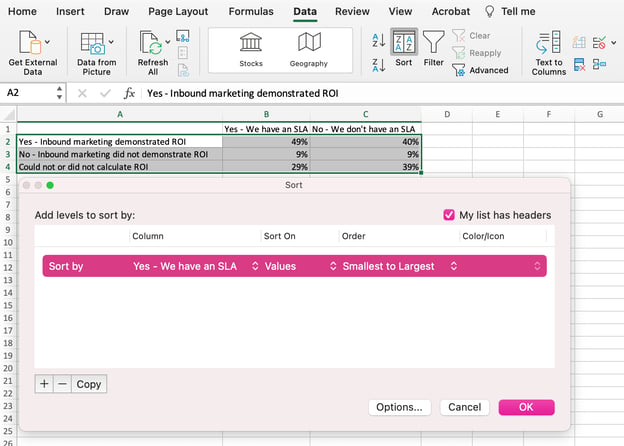
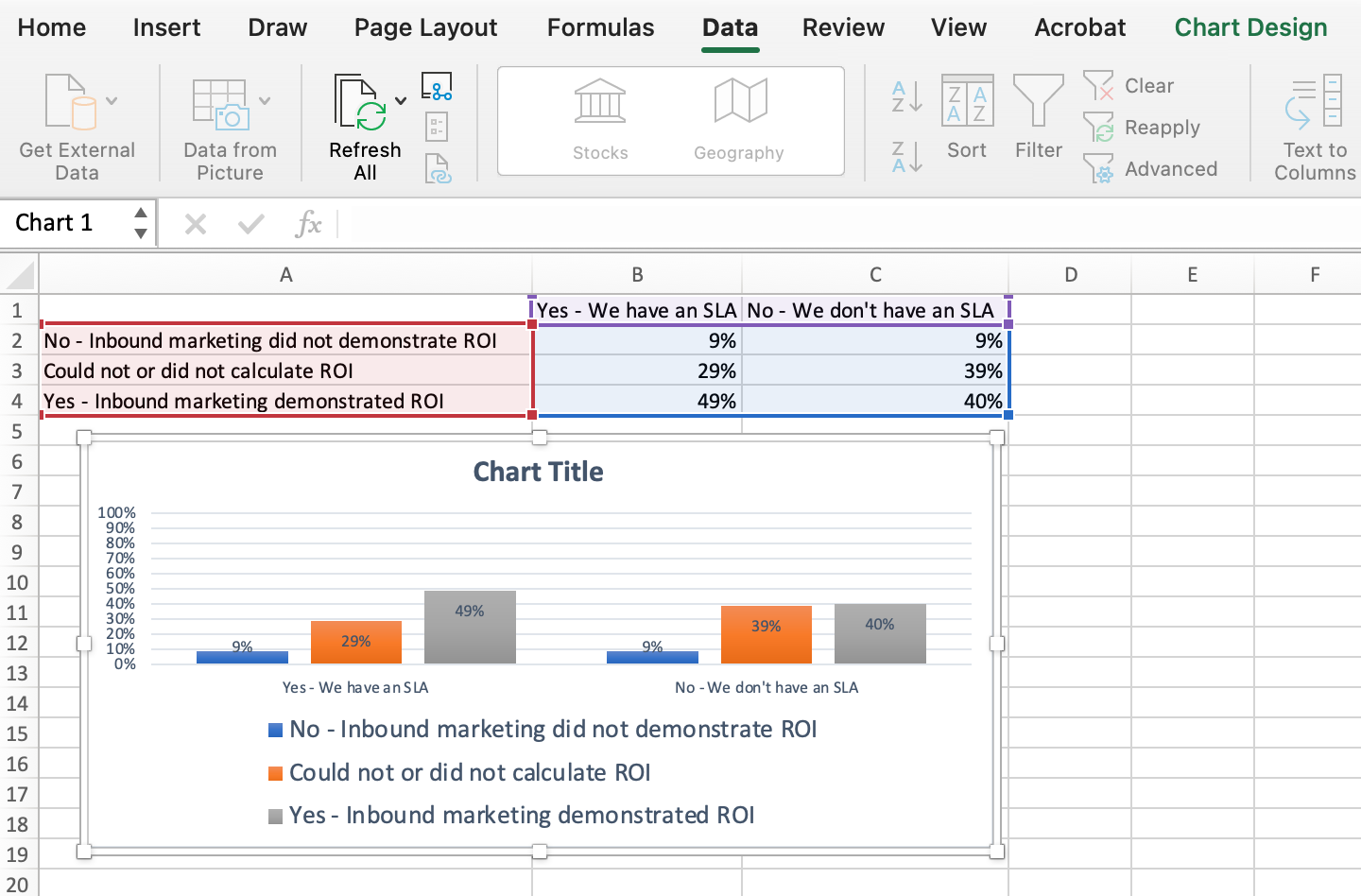
If you have more than two lines of data to adjust, you can also rearrange them in ascending or descending order. To do this, highlight all of your data in the cells above your chart, click Data and select Sort, as shown below. Depending on your preference, you can choose to sort based on smallest to largest, or vice versa.
The resulting graph would look like this:
9. Title your graph.
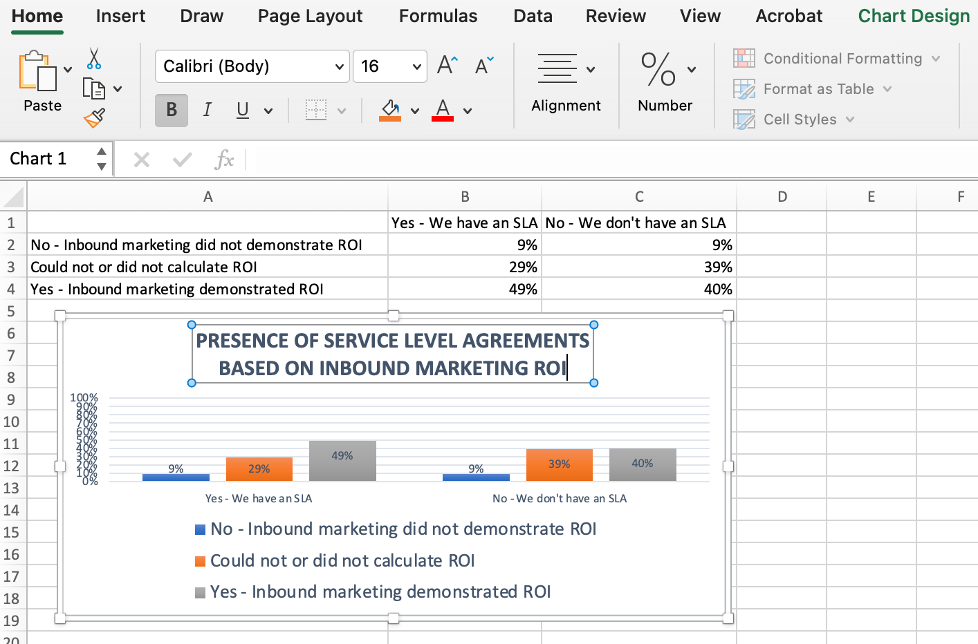
Now comes the fun and easy part: naming your graph. By now, you might have already figured out how to do this. Here’s a simple clarifier.
Right after making your chart, the title that appears will likely be «Chart Title,» or something similar depending on the version of Excel you’re using. To change this label, click on «Chart Title» to reveal a typing cursor. You can then freely customize your chart’s title.
When you have a title you like, click Home on the top navigation bar, and use the font formatting options to give your title the emphasis it deserves. See these options and my final graph below:
10. Export your graph or chart.
Once your chart or graph is exactly the way you want it, you can save it as an image without screenshotting it in the spreadsheet. This method will give you a clean image of your chart that can be inserted into a PowerPoint presentation, Canva document, or any other visual template.
To save your Excel graph as a photo, right-click on the graph and select Save as Picture.
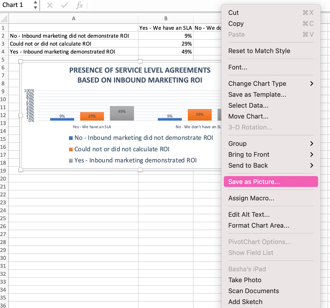
In the dialogue box, name the photo of your graph, choose where to save it on your computer, and choose the file type you’d like to save it as. In this example, it’s saved as a JPEG to a desktop folder. Finally, click Save.
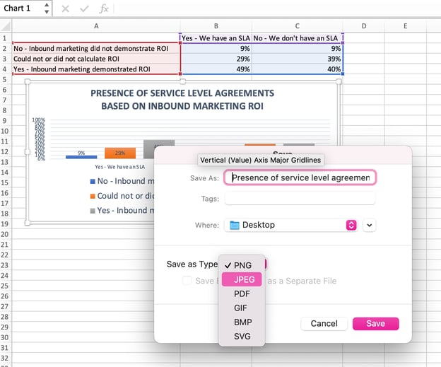
You’ll have a clear photo of your graph or chart that you can add to any visual design.

Visualize Data Like A Pro
That was pretty easy, right? With this step-by-step tutorial, you’ll be able to quickly create charts and graphs that visualize the most complicated data. Try using this same tutorial with different graph types like a pie chart or line graph to see what format tells the story of your data best.
Editor’s note: This post was originally published in June 2018 and has been updated for comprehensiveness.

(Note: This guide on how to create a Venn diagram in Excel is suitable for all Excel versions including Office 365)
We all know how graphical presentation helps in better interpretation of data. Especially when a large amount of data is present with intricate details, pictorial representations greatly improve the readability of information.
The Venn diagram is one such very important way of data presentation.
In this guide, I will show you what a Venn diagram is, why we use them, and how to create a Venn diagram in Excel using 2 easy methods.
You’ll Learn:
- What Is a Venn diagram?
- How to Create a Venn Diagram in Excel?
- By Using SmartArt
- Move the Diagram
- Add Text
- Add a Shape
- Additional Elements
- By Using Shapes
- Move/Resize the Shape
- Add Text
- Customize
- By Using SmartArt

Watch our video on how to create a Venn diagram in Excel
Related Reads:
How to Make a Pie Chart in Excel? A Step by Step Guide
How to Make a Pareto Chart Excel Dashboard? 4 Easy Steps
How to Create a Step Chart in Excel?
What Is a Venn diagram?
The concept of the Venn diagram is not new to us. We have learned them from our high school.
The Venn diagram consists of two or more circles. Each circle represents one type of data. To represent the similarities in the data, the circles can overlap either partially or completely.
This type of representation is mostly used to represent the similarities and differences between one or a group of data.
How to Create a Venn Diagram in Excel?
Creating a Venn diagram in Excel is pretty much similar to creating and customizing other graphs and charts.
Imagine: You run a cafe. To analyze the demand and supply, you want to take a survey from the visitors. People are given 3 choices and are asked to choose their favorite beverage: milk, tea, or coffee. They can even choose either both or all three of them.

I will show you how to create a Venn diagram in Excel in 2 simple ways.
By Using SmartArt
By using SmartArt, you can easily create a Venn diagram in Excel. Just select a suitable template, change the text, and add additional customization based on your preferences.
To create a SmartArt Venn diagram, navigate to Insert. Under Illustrations, from the dropdown click on SmartArt.

This opens up a Choose a SmartArt Graphic dialog box which shows the different templates to create a SmartArt graphic.

Click on Relationship. Scroll down and click on the Venn diagram you want to select.

Clicking on the choice of your Venn diagram shows up the description for the selected graphic. Click OK.

This populates the basic layout of the Venn diagram in the middle of the Excel sheet.

Now, let us see how to customize and format the Venn diagram based on your needs.
Move the Diagram
The circles usually populate the center of the chart. In some cases, this might be a little inconvenient to present other data. You can move the whole chart or individual circles depending on your preferences.
To move the whole chart, click anywhere near the circle. This shows anchor points all around the circle. Now, hover your mouse pointer anywhere on the borderline. This changes the mouse pointer to a four-sided pointer. Click and drag to move the chart.
If you want to resize the chart, place your mouse pointer on the anchor points. This changes the mouse pointer to a two-sided pointer. Click and drag to resize the chart.

Likewise, you can move each circle and resize them. Click on the circle. Use the borderline to move the circle and use the anchor points to resize the circles.

Add Text
The basic Venn diagram that populates the center of the sheet only contains [Text]. This pertains to the header of the individual circles of the Venn diagram.
You can change the headers of the individual circles by clicking on them and typing the relevant text. In most cases, Excel automatically adjusts the font size of the text to the size of the chart. You can also double-click on the text to change the font style, text, color, and alignment.

If there are more Venn elements, you can click on the arrow button to the left of the chart or click on the Text Pane under SmartArt Design to open the header pane. This way, you can change the headers of all the elements in one go.

Once you have added the headers, there will also be a necessity to add text inside the circles and in between the overlapping spaces.
You can add text inside the circles using bullets. Select the circle you want to add bullets. Navigate to SmartArt Design, under Create Graphic, and click on Add Bullet. This adds bullet points to the selected circle.

One drawback is that you cannot add text to the overlapping spaces using bullet points.
To do that, navigate to Insert. Under Illustrations, click the dropdown from Shapes and select the Text Box.

This gives you the liberty to enter any text anywhere you want. Left-click and drag the cursor to create a text box in your preferred place. Enter your text.

Though the text is added, you can see the text box is populating oddly. To remove that, right-click on the text box and click on Format Shape. This opens a Format Shape pane on the right side of the Excel sheet.

Under Shape Options, select No Fill in both Fill and Line dropdowns.

This removes the background of the text box. Now, you can go to the Text Options and customize the text to your preference.
Add a Shape
The basic Venn diagram only consists of three circles to represent three parameters. However, in some cases, there might be a need for more than three circles to represent data. In such cases, you can add shape to the existing Venn diagram.
Navigate to SmartArt Design. Under Create Graphic, click on Add Shape.

This adds another shape to the original Venn diagram to represent the data.

In case you feel like there is no need for an additional shape, you can always delete them. Just select the shape you want to delete and click on the Delete key.

This deleted the additional shape and the chart returned to its original format.
Additional Elements
You can use the SmartArt Design and Format option in the main menu to add additional customizations.
In some cases, the usual three circles partially overlapping Venn diagram might be an ideal choice to represent the data. Navigate to SmartArt Design and change the layout of the chart to any preferred Venn diagram.

You can also change the look of the Venn diagram from the SmartArt Styles option. You can also choose your preferred color of the chart from the Change Colors dropdown.

Suggested Reads:
How to Make an Excel Bullet Chart – 2 Easy Examples
Pivot Charts in Excel Tutorial
How to Insert Bullet Points in Excel? 5 Easy Methods
By Using Shapes
This is a less common way to create Venn diagrams. However, this method lets you customize the Venn diagram in your favored way.
To create a Venn diagram using Shapes, navigate to Insert. Under Illustrations, from the Shapes dropdown, select Oval.

This lets you draw any shape in any dimension depending on your preference.
To create a basic three-circle Venn diagram, click, drag the mouse pointer, and draw three circles.

Initially, the circles would be opaque and show no resemblance to a Venn diagram. To change them, we need to reduce their opacity.
Select all the three circles by holding Ctrl. Right-click on the circles and click on Format Object.

This opens up a Format Shape pane on the right side of the screen. In Shape Options, under Fill, increase or decrease the transparency of the Solid fill.

This gives us the required Venn Diagram.
Move/Resize the Shape
You can move or resize the shape by clicking and dragging on the anchor points. If the mouse pointer turns to a four-way pointer, you can move the shape. If the mouse pointer is a two-way pointer, you can resize the shapes.
Add Text
You can add text to the shapes by selecting the text box from the shapes. We have already seen how to add text using Text Box from the SmartArt method.
Customize
You can change the style, color, and layout of the shapes and text using the Shape Format option.

You can also group the elements, move, align, and resize them using the Arrange and Resize options in the Shape Format menu.
Also Read:
How to Convert Text to Numbers in Excel? 5 Easy Methods
How to Move Rows in Excel? 5 Easy Methods
How to Use the ROUND Function in Excel?
Frequently Asked Questions
What is a Venn diagram template?
A Venn diagram template is an outline of the Venn diagram that you can use to build your own diagram. You can use the template to create Venn diagrams for other data.
How to create a Venn diagram in Excel?
You can create a Venn diagram in two ways in Excel. You can either use the SmartArt design, choose a template and edit them, or you can use Shapes to create a manual Venn diagram and customize them from scratch.
How to create non-proportional Venn diagrams in Excel?
When using the SmartArt, you can select the template and then resize the Venn circles. When creating a Venn diagram using shapes, you can straight away draw the shapes to suit your purpose.
Closing Thoughts
Venn diagrams provide a very feasible way to depict information with overlapping or similar data. Creating the Venn diagram and customizing them based on your requirement and preferences helps you present the data in a neat and organized way.
In this article, we saw what a Venn diagram is and how to create a Venn diagram in Excel in 2 easy ways. You can either use the template from SmartArt or use the Shapes to draw and create your own Venn diagram.
If you need more high-quality Excel guides, please check out our free Excel resources center. Simon Sez IT has been teaching Excel for over ten years. For a low, monthly fee you can get access to 130+ IT training courses. Click here for advanced Excel courses with in-depth training modules.
Simon Calder

Chris “Simon” Calder was working as a Project Manager in IT for one of Los Angeles’ most prestigious cultural institutions, LACMA.He taught himself to use Microsoft Project from a giant textbook and hated every moment of it. Online learning was in its infancy then, but he spotted an opportunity and made an online MS Project course — the rest, as they say, is history!