
Present your data in a Gantt chart in Excel
Excel for Microsoft 365 Excel for Microsoft 365 for Mac Excel 2021 Excel 2021 for Mac Excel 2019 Excel 2019 for Mac Excel 2016 Excel 2016 for Mac Excel 2013 Excel 2010 Excel 2007 More…Less
A Gantt chart helps you schedule your project tasks and then helps you track your progress.
Need to show status for a simple project schedule with a Gantt chart? Though Excel doesn’t have a predefined Gantt chart type, you can create one using this free template: Gantt project planner template for Excel
Need to show status for a simple project schedule with a Gantt chart? Though Excel doesn’t have a predefined Gantt chart type, you can simulate one by customizing a stacked bar chart to show the start and finish dates of tasks, like this:

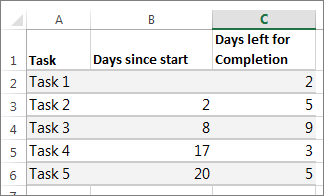
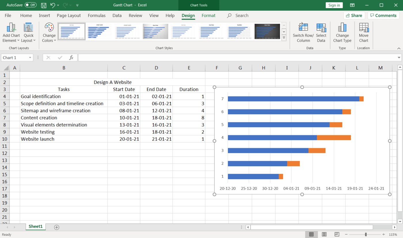
To create a Gantt chart like the one in our example that shows task progress in days:
-
Select the data you want to chart. In our example, that’s A1:C6

If your data’s in a continuous range of cells, select any cell in that range to include all the data in that range.
If your data isn’t in a continuous range, select the cells while holding down the COMMAND key.
Tip: If you don’t want to include specific rows or columns of data you can hide them on the worksheet. Find out more about selecting data for your chart.
-
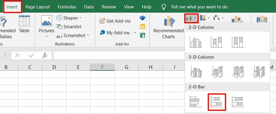
Click Insert > Insert Bar Chart > Stacked Bar chart.
-
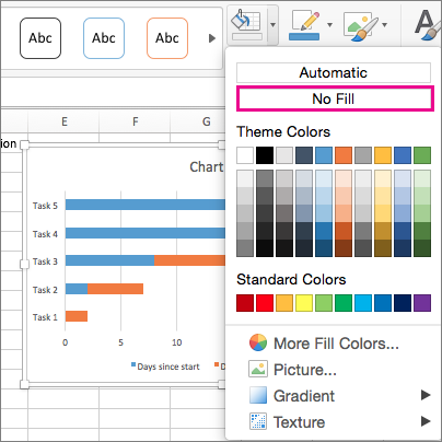
Next, we’ll format the stacked bar chart to appear like a Gantt chart. In the chart, click the first data series (the Start part of the bar in blue) and then on the Format tab, select Shape Fill > No Fill.
-
If you don’t need the legend or chart title, click it and press DELETE.
-
Let’s also reverse the task order so that it starts with Task1. Hold the CONTROL key, and select the vertical axis (Tasks). Select Format Axis, and under Axis Position, choose Categories in reverse order.

Customize your chart
You can customize the Gantt type chart we created by adding gridlines, labels, changing the bar color, and more.
-
To add elements to the chart, click the chart area, and on the Chart Design tab, select Add Chart Element.
-
To select a layout, click Quick Layout.
-
To fine-tune the design, tab through the design options and select one.
-
To change the colors for the chart, click Change Colors.
-
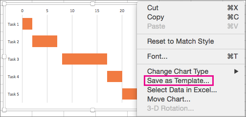
To reuse your customized Gantt chart, save it as a template. Hold CONTROL and click in the chart, and then select Save as Template.


Did you know?
Microsoft 365 subscription offers premium Gantt chart templates designed to help you track project tasks with visual reminders and color-coded categories. If you don’t have a Microsoft 365 subscription or the latest Office version, you can try it now:

See Also
Create a chart from start to finish
Save a chart as a template
Need more help?
You hardly meet someone who never heard about Microsoft Office and Microsoft Excel in particular. This office suite includes a variety of useful apps for convenient day-to-day work. Thousands of people use it every day with different aims be it something for your office needs or at home.
Excel is very popular software presented in a spreadsheet form. The full list of its features is really long so one can do many operations in it: calculate, create pivot tables, charts, sparklines, etc. Probably, you will be surprised, but users do not even realize the full-featured power of Microsoft Excel.
For example, you can use it in project management with the help of Gantt charts that you can create right inside of it. Have you ever heard about it? If no, you will find this article useful as here we present a step-by-step tutorial on how to make a Gantt chart in Excel. You can also use an Excel template like Gantt chart Excel to create a Gantt chart.
How to make a Gantt chart in Excel:
- Create your task table
- Create your Gantt chart using a stacked bar
- Add start dates and duration of your tasks
- Insert your tasks
- Format your chart
What is a Gantt chart in Excel?
A Gantt chart in Excel is like any other Gantt chart in other tools.
For example, you can create a Gantt chart in MS Project, the popular, yet hard-to-learn tool. Or you can even try unexpected for this case solutions and make a Gantt chart in PowerPoint or, surprisingly, in Word.
However, it is much better to use special software and create Gantt charts in GanttPRO, for example.
But what is a Gantt chart?
This chart that was devised by Henry Gantt to show a project schedule has common features with no difference what software you use.
A Gantt chart consists of lines expanded along a timeline. Those lines are tasks. So, anyone who decides to use a Gantt chart for project management has duties and timeframes visualized in front of them. Such a principle is implemented in standard Gantt chart software, Excel is no exception here.
How to make a Gantt chart in Excel
If you set your mind on creating your chart in Microsoft product, here is step-by-step instruction how to do it in Excel 2010. Actually, there is no big difference between Excel 2010, Excel 2013 or Excel 2016.
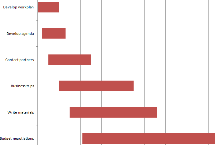
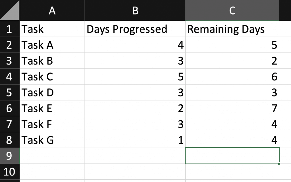
1. Create your task table
Here we put down all information that is necessary for a project – tasks, their start/end dates and duration of each responsibility expressed in days.
Here what I have for the project connected with event planning.
2. Create your Gantt chart using a stacked bar
Then you need to do the following:
a. Click on any blank cell
b. Go up and choose Insert tab
c. Click on bar chart icon. In the menu that drops down choose a stacked bar.
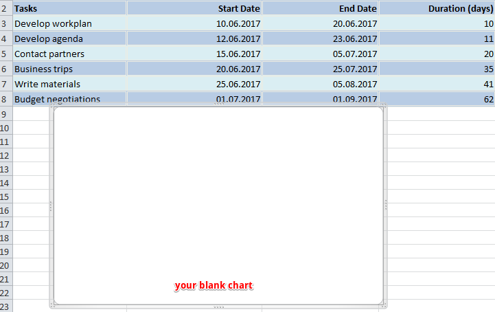
d. Thus you inserted a blank window where you will create your Gantt chart.
3. Add start dates and duration of your tasks
Then we need to do a few clicks in order to transfer the data from the table into our Gantt chart.
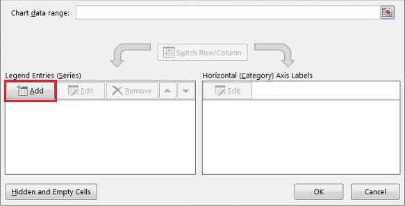
a. Right-click on any empty space in your blank chart. From the menu choose Select Data. You will see a new window.
b. Go in there a little bit down and to the left where you will find Legend Entries (Series) line. Under it there is an Add button. Click on it to open a new window.
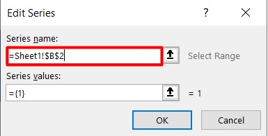
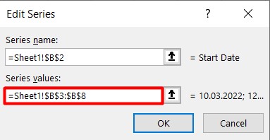
c. There are two fields, and all of them we need to fill in. Click on Series Name and after it on the column header with the phrase Start date in your table. Thus we will move this phrase into the chart.
![]()
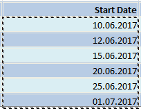
Let’s proceed to the second field where dates should be entered. Click on the icon to the right of it. A new small window will appear. Choose the cell with your first date (in my case it is 10.06.2017) and drag your mouse down to the last one. Thus you will highlight all dates. Make sure you include them only.
Then click again on that small icon on the right of the field. Your dates will be entered into the field in that window. Click OK. Now all your start dates are included in your chart.
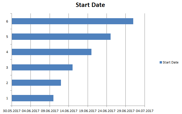
Here is what you are supposed to see after all those steps.
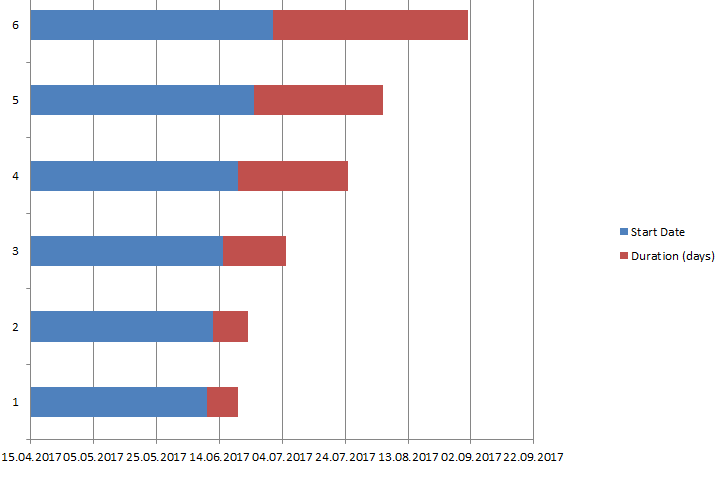
The same procedure is used to add the duration of each assignment in your Gantt chart.
To put it shortly:
a. Click on Add button under Legend Entries (Series) line.
b. Fill in two fields exactly in the same way as we did it above.
Your Gantt chart in Excel should look something like this.
4. Insert your tasks
a. Here we again deal with the menu Select Data. For this push the right button of the mouse on any of the blue bars. Then we will see the already familiar window. But this time we need the right part of it – Horizontal (Category) Axis Labels Under it click on Edit.
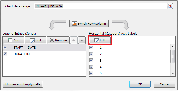
b. A new small window will appear. Do not close it. Click on the first task name (in my case it is develop workplan) and drag your mouse down to the last task. Click OK. Now your Gantt chart maker in Excel includes all assignments names instead of numbers.
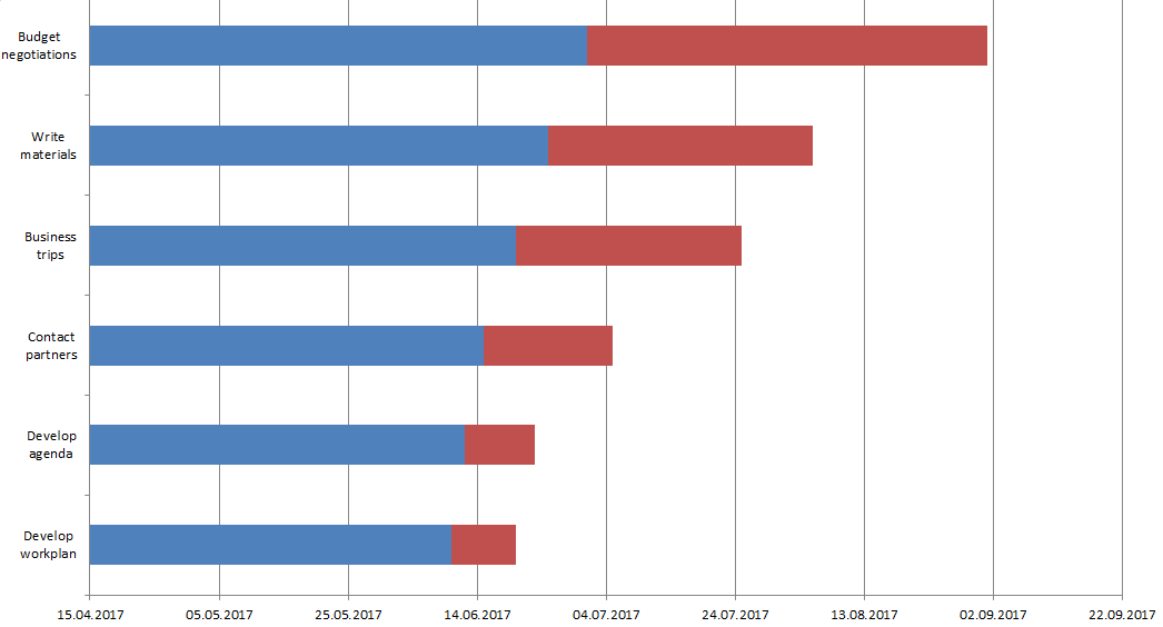
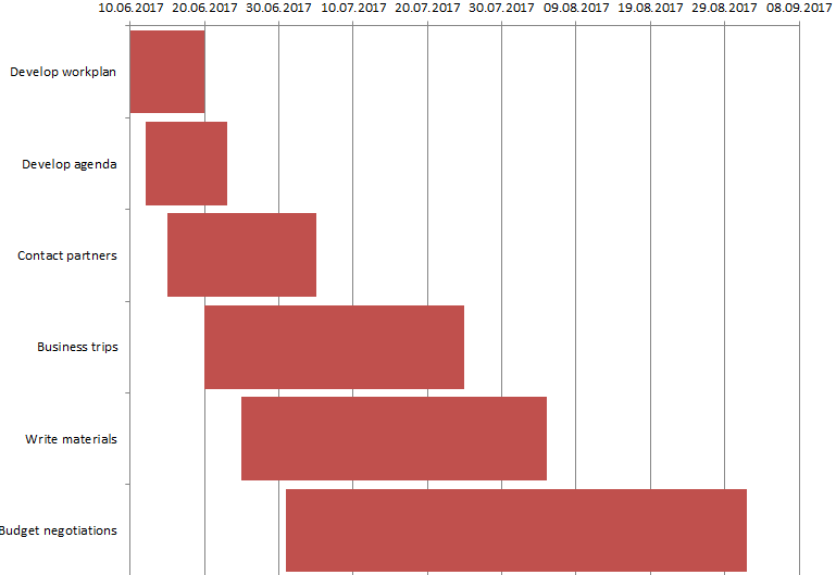
Here it is! Our Gantt chart in Excel is almost ready. We need to do a few more actions in order to give it greater look.
5. Format your chart
Personally, I do not find such a look convenient and easy to understand. So let’s make a few more steps and format it.
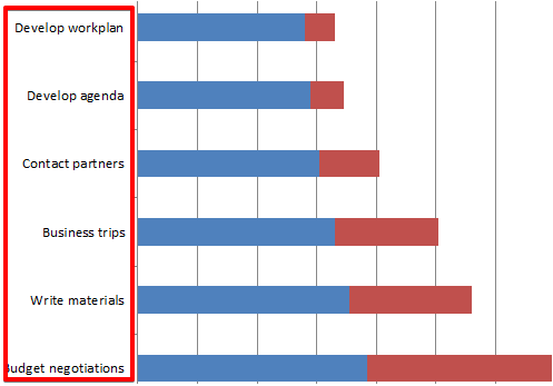
a. If you don’t like the legend on the right and want to have more space, simply delete it. This is very simple – right click on it and choose Delete.
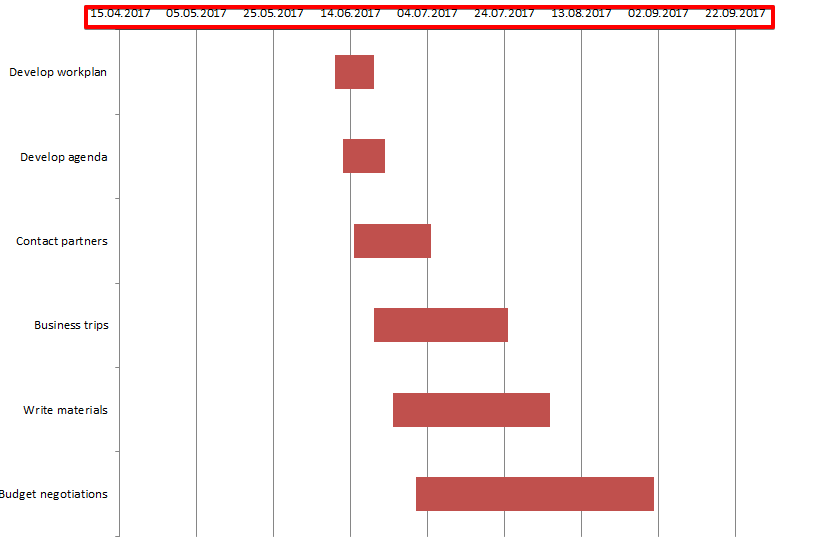
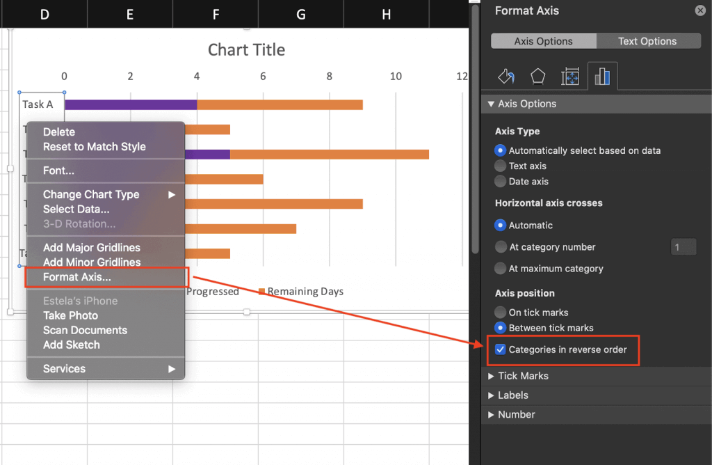
b. You are attentive, aren’t you? The chart has a reverse order – the first task is at the bottom while the last one is at the top. Let’s fix it.
Click on any of your tasks on the left. This action allows you to select all of them. Then push the right button of your mouse and choose Format Axis. Check the box in Categories in reverse order line and close it. Now your Gantt chart has the right order.
c. Let’s hide blue lines as we don’t need them in our Gantt chart. Select any of those lines what automatically select all of them. Right-click and choose Format data series. Choose Fill – No Fill; Border Color – No Line.
Here what we’ve got.

d. We don’t need this white empty space either and will move our tasks durations close to the tasks themselves.
Let’s go back to our tasks table and right-click on the first task date. Choose Format Cells – General. Here we see the number. In my case, it is 42896. Remember it or better put it down – we will need it in our next steps. Then press Cancel.
Choose dates that are above the bars in our Gantt plan. Right click on it and choose Format Axis.
In Axis Options change Minimum bound from Auto into Fixed and enter the number we recorded in the above point. Here what we’ve got now.
e. We may also change the distance between our tasks. For this, we need to right-click on any of our tasks, choose Format Data Series and change Gap width to something close to 0%. I made it 10%.
Here is the final Gantt chart that I have at the end of my work.
How to use a Gantt chart in Excel
You can use your Excel Gantt chart for project management or for personal needs like preparation for an exam, house building, etc. It is multipurpose, and everything depends on your actual requirements.
The thing is that this Gantt chart in Excel is not so convenient to work with and not serviceable. You have assignments and dates in front of you, but this is almost all. To add a new responsibility or to change duration, one needs to make all those steps again.
If you do not like reading and find these instructions rather hard to follow, here is the video with the same steps. Watch it and create your first Gantt chart.
What is a better way out?
Try GanttPRO Gantt chart software. It has not complicated Excel-like instructions how to work with it. Instead, it offers a wide range of useful features like dependencies between tasks, their assignment to team members, resource management, critical path, milestones, and many others.
Moreover, you can import or export your Gantt chart in or from Excel. Learn how to do it from this video.
Try the tool on your own and become an experienced user in a few minutes.
Also, there is one more convenient option to create charts in the software that you are familiar with – Google Sheets. For example, you can use a template to create a Gantt chart in Google Sheets.
What is your opinion of the Gantt chart in Excel? Do you find this chart useful for you? Share your experience with us 🙂
Step-by-Step Gantt Chart Tutorial for Making a Gantt Chart in Excel
Gantt Chart Excel is everyone’s new favorite project management software with the ability to create Gantt Charts in minutes.
We all love Microsoft Excel and we use it almost every day for everything – from a simple calculator to tracking massive projects.
There’s just one thing that Excel is not good at and that is creating Gantt charts. In fact a lot of users on the internet search for “How to Create a Gantt Chart in Excel?”.
For this reason, we created Gantt Excel, an automated excel template that allows you to create professional-looking Gantt Charts all within Microsoft Excel.
Create Gantt Charts in Excel 2007, 2010, 2013, 2016 & 2019
Also works on all excel versions supported by Office 365/ Microsoft 365
How to Create a Gantt Chart in Excel?
- Download the Gantt Chart Excel Template
- Click on Add Gantt Chart button
- Click Add Tasks button to add tasks
- Set Parent & Child Tasks
- Add Task Dependencies
- Setup Gantt Timeline
Detailed steps are listed below. We also have a detailed YouTube instructional video.
How to Make a Gantt Chart in Excel
-
Open the Gantt Chart Template
Download the Gantt Chart Excel template if you haven’t done so already. Open the template.
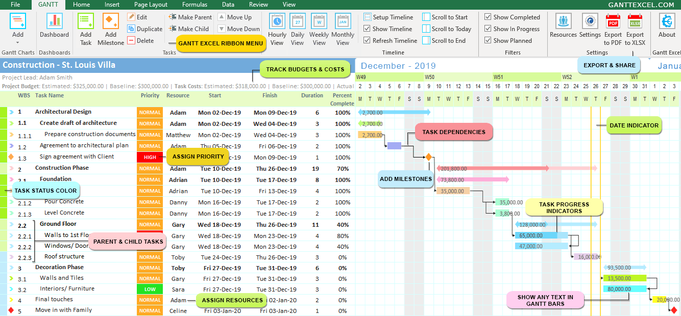
The Gantt Menu tab in the excel ribbon will instantly load (see image below).

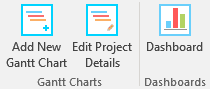
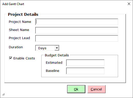
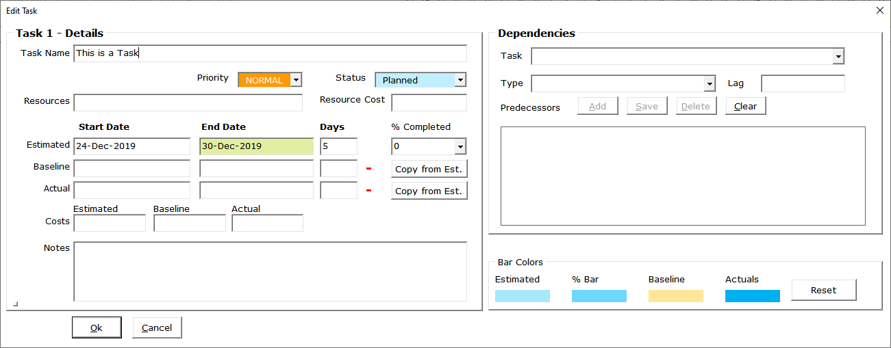
- Create a New Gantt ChartClick on the Add New Gantt Chart button to bring up the Project Details window.

Enter the Project Name, Worksheet Name, Project Lead and the Estimated/ Baseline Budget for the Project.
You can also use Gantt Excel to track project budget and task costs.
Click the Ok button when done.
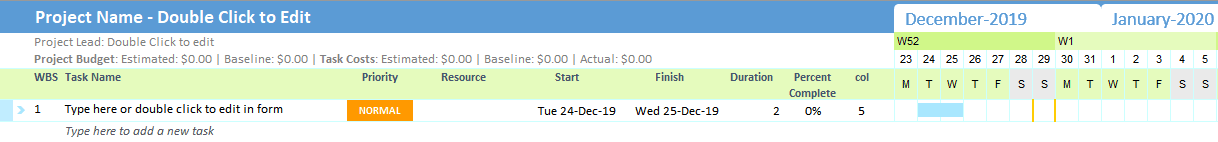
A brand new gantt chart with the gantt timeline is created for you. By default, a task is added with the start date set to today.

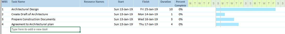
- Add Tasks
Gantt charts don’t give useful information unless they include all of the tasks/ milestones needed for a project to be completed.
So, to start, list all of the activities as tasks. There are three ways to add tasks in Gantt Chart ExcelMethod 1: Type directly in the excel grid. If you type a task where it says “Type here to add a new task“, it will automatically create a new task with default start and end dates and the timeline will instantly update.
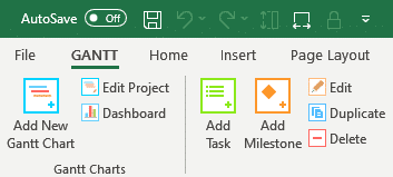
Method 2: Click the Add Task button on the Gantt tab

The task details form will open up where you can enter all the task details including task resource, estimated, baseline, actual – start and end dates. You can also keep track of costs including estimated, baseline and actual costs, therefore making it an excellent budget and costs planner.
Task notes can also be captured to include a short description of the task to clarify its purpose or scope and to provide additional info to everyone involved.
Click the Ok button when done. The newly added task will show up in the excel grid with all the details.
Go ahead and add a few tasks as in the example below and set the start and finish dates.

Importantly, note that the Work Break Structure (WBS) is automatically calculated and set for you.
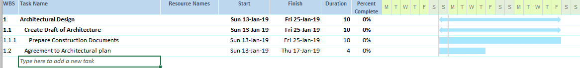
- Set Parent and Child TasksIf a task is relatively large and requires several users with different skills to manage, break the task into subtasks and create parent-child relationships.
To set parent-child relationships, select a task that you want to convert to a child task and click on the Make Child button.

Shortcut – Alt + Right arrow key
To create a parent task from a child task click on the Make Parent button.

Shortcut – Alt + Left arrow key
As a result, when you group child tasks together under a parent, values such as dates, costs etc. aggregate and roll up to the parent task.
This is how the tasks look when I set a few tasks as child tasks.
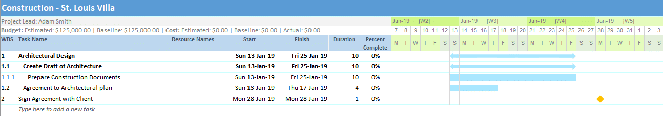
- Add MilestonesMilestones help your team stay on track and to more accurately determine whether or not your project is on schedule.
To add a milestone click on the Add Milestone button on the Gantt Menu.

This will bring up the Add Milestone details window. Enter the milestone details and click the Ok button when done.
To illustrate, see the example below. The milestone and a diamond-shaped symbol show up in the timeline.
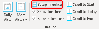
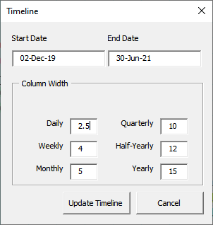
- Setup TimelineClick on the Setup Timeline button in the Gantt Menu.

Set the Start and End Date of the timeline and click the Update Timeline button.

Gantt Excel will instantly recreate the calendar timeline with the selected dates.
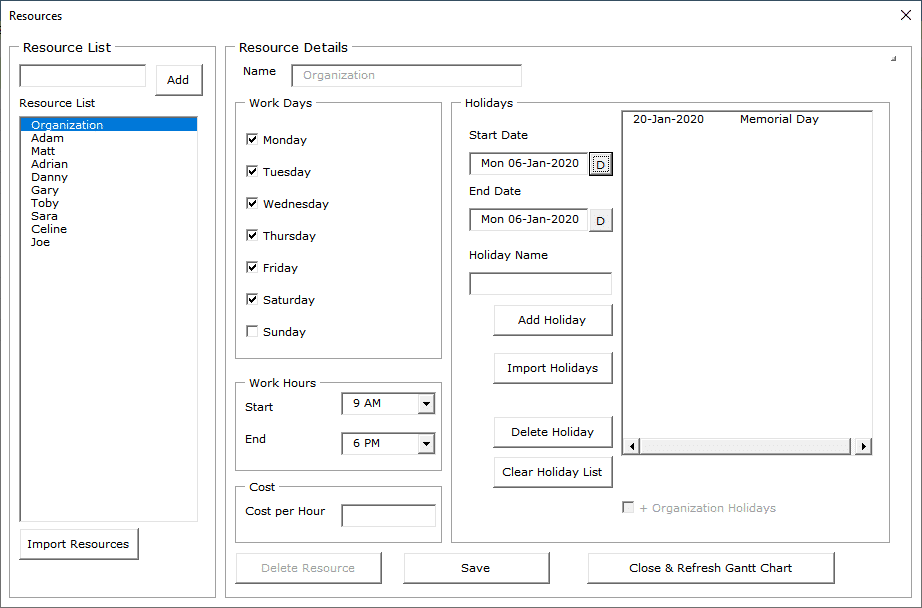
- Setup Gantt Chart ResourcesClick on the Resources button in the Gantt Menu.
You can create as many resources and assign them to the tasks. You can also add Holidays and Non-working days in the Resource window. The Holidays and Non-working days will be considered while calculating end dates.

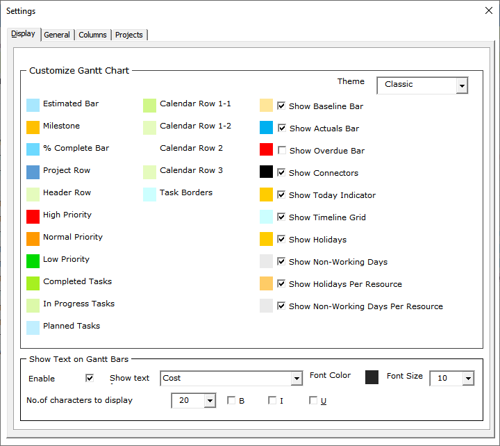
- Gantt Chart Excel SettingsEqually important, is to set up the Gantt chart correctly. Let’s look at all the settings screens and go through them one by one.
Click on the Settings icon in the Gantt Menu.
Display Settings
By default, the Display tab opens up first. Here you can set the general theme colors including the different timeline bar and milestone colors.
You can also choose to show additional timeline bars for baseline, actual dates and the overdue bar for all overdue tasks.
Lastly, one of the most sought out features is to show text within the Gantt Bars. You can check the Enable Text Display option and select any text from any column to show within the Gantt bars.

This is how it looks when the Show Text in Gantt Bars is enabled. We think it is one of the finest features of Gantt Chart Excel.
General Settings
Switch over to the General tab to setup cost and date calculations, currency symbol, and the Date format.
Additionally, you can define how the Percentage complete is calculated for the tasks. You can use the Manual or Automatic mode for entry and use Simple or Weighted calculation for the Parent task roll-up calculation.
Columns Settings
Finally, we have the columns tab where you can hide or unhide existing columns. You can also insert up to ten custom columns or delete them if required.


You can watch this video tutorial on «How to Create a Gantt Chart in Excel»
GANTT CHART EXCEL – THE SMART WAY TO PLAN
In Conclusion, the beauty of Gantt Chart Excel is we have seven calendar views to choose from namely Hourly, Daily, Weekly, Monthly, Quarterly, Half-Yearly and Yearly View.
From here you can easily customize the Gantt chart by changing timeline colors, and adding various details like percent complete, costs etc… As shown below, with some tweaks you can create a timeline that’s sure to impress.
Gantt Charts Made Super Easy
Manage your Project Timeline, Tasks and Workload like a Pro.
This video series runs through the process of creating a Gantt Chart in Excel from scratch. It starts with a basic Gantt chart and then builds more and more features, teaching intermediate and advanced Excel skills in the process.
Learn Eye-Opening Excel Techniques
The purpose of these videos is to teach intermediate-to-advanced Excel techniques by showing the creation of a useful tool. The purpose isn’t to replace the Pro version, or to suggest that Excel is the best way to create a Gantt chart. However, I’m guessing that you’ll get a LOT more out of this video series than you paid for!
If you like this series, please support Vertex42 by liking the videos, commenting, subscribing to the channel, and of course purchasing the Pro version 😀. Thank you!
Remember, if you don’t want to make a Gantt chart in Excel from scratch, you can just download a Free Gantt Chart or purchase Gantt Chart Template Pro.
Download the Files: The files I created in these videos can be downloaded as bonus files when you purchase Gantt Chart Template Pro.
PART 1 — Making the Simple Gantt Chart From Scratch
This video demonstrates how I created the Simple Gantt Chart using conditional formatting to make a scrolling timeline. You’ll also learn how to show the progress of each task.
How to Make a Gantt Chart in Excel

How to Make a Gantt Chart in Excel:
- 0:20 Start with a List of Tasks and Dates
- 0:44 Set up the Timeline Labels
- 2:20 Add Initial Formatting to Style the Gantt Chart
- 4:05 Add the Bars of the Gantt Chart via Conditional Formatting
- 5:10 Make the Timeline more Dynamic
- 6:28 Add a Scroll Bar Form Control
- 7:20 Highlight Today’s Date using Conditional Formatting
- 7:51 Add Columns for ‘Assigned To’ and Progress (% Complete)
- 9:07 Show Progress in the Gantt Chart by Shading a Portion of the Bars
- 11:31 Define Print Settings
Part 2 — Working with Workdays
This video shows how to use the WORKDAY, NETWORKDAYS, WORKDAY.INTL, and NETWORKDAYS.INTL functions to handle projects where there is no work being done on weekends or holidays. You’ll learn how to create conditional formatting rules to highlight weekends and holidays, and of course a lot of other neat tricks.
Working with Workdays (Make a Gantt Chart in Excel — Part 2)

Part 3 — Dynamic Display Options
This video shows various methods of changing the display, starting with narrowing the columns, extending the number of columns, and printing on multiple pages. Then, you’ll see how to create a stacked bar chart to view the entire project schedule in a single chart. The second part of the video shows how to modify the formulas and conditional formatting rules to change the display to daily, weekly, monthly and quarterly.
Dynamic Display Options (Make a Gantt Chart in Excel — Part 3)

Part 4 — Color Coding
This video shows how to modify the color of the bars in the gantt chart by choosing a color from a new Color column, color coding based on the Lead name, and highlighting overdue tasks. You’ll see the creation of another relative named range, the use of the INDEX function to return a column from a table, a checkbox to turn the highlighting on and off, and how to avoid splitting CF rules when you copy and paste.
Color Coding (Make a Gantt Chart in Excel — Part 4)

Part 5 — TBD
Stay Tuned! I haven’t decided what this one will be about yet. It might be to show an example of resource planning. Subscribe to the Vertex42 Channel and turn on notifications (click on the bell).
Meanwhile, to see an example of summing number of workers per day, you can download the Daily Construction Schedule Template.
We don’t know if you’ve already noticed, but time is never on your side when there are tons of deadlines and due dates. 😠
It feels like somebody just woke up and decided that an hour will pass by as quickly as a minute.
*Gasp*
However, with some proper planning and a Gantt chart, you can prevent this from ever happening.
Want to learn how to make a Gantt chart in Excel?
In this article, we’ll show you how to make a Gantt chart in Excel, highlight a few templates, and explore its drawbacks. We’ll also highlight an efficient, alternative tool to make better Gantt charts.
Let’s get started.
What Is A Gantt Chart?
A Gantt chart is like a bar graph you use to visualize your project schedule over time. It’s your ideal companion for solid project planning and helps you generate an accurate timeline.
What does it highlight?
It helps a project manager visualize:
- Milestones
- Scheduled tasks
- The start date and end date of each task
- Overlapping tasks
- Dependencies
- Your project’s roadmap
- Project progress
Want to know more about this chart? Take a look at what a Gantt chart is and how to use it and explore different examples of Gantt charts.
Unfortunately, many people find Gantt charts intimidating when they’re actually super simple to use.
Not just for project managers and stakeholders but the entire project team.
And the easiest way to conquer this fear is to make a simple Gantt chart yourself.
Note: you can also make a Gantt chart in Microsoft PowerPoint and Word.
How To Create A Gantt Chart In Excel?
One of the most common ways to get used to Gantt charts is to create Gantt charts in Excel.
Follow the steps to create a Gantt chart in Microsoft Excel that can visually represent your project plan.
1. Create a table for your project data
Open a new Excel file and add your project data to it.
Since a Gantt chart is a kind of timeline, the details you’ll add to your Excel spreadsheet must include:
- Task names (Or a task description)
- Start date
- End date
- Task duration (End date minus start date)
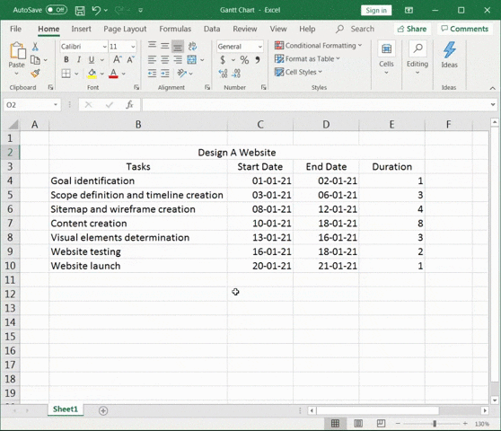
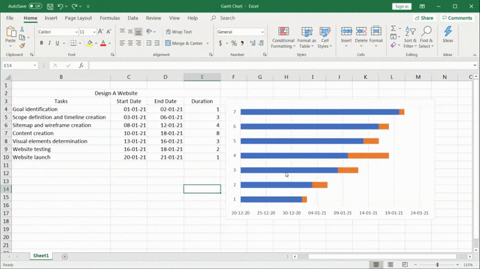
For this Gantt chart example, our project is to design a website.
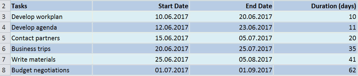
So the project data table will look something like this:

2. Add an Excel bar chart
To make a Gantt chart, add a stacked bar chart. This will be the foundation of your Gantt chart.
Stay on the same worksheet and click on any empty cell.
Then go to the Excel ribbon and select the Insert tab.
Spot the drop-down in the bar chart section and select Stacked Bar chart type.
A blank box will appear.
For more detail, read our guide on making a graph in Excel!
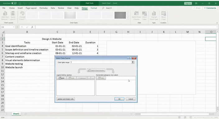
3. Add data to the bar chart
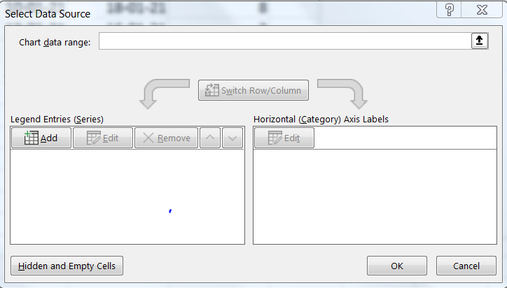
To add data to the bar chart, right-click on the chart area and then click on Select Data from the context menu. The Select Data Source dialogue box looks like this.
First, you add the start dates.
Click Add under the Legend Entries (Series).
The Edit Series pop up will appear.
- Click on Series name and then select the ‘Start Date’ cell
- Click on Series values and then select the full range of start dates
- Click OK
Similarly, add the durations too in the Legend Entries (Series).
- Click on Series name and then select the ‘Duration’ cell
- Click on Series values and then select the full range of duration
- Click on OK
Your stacked bar Excel chart should look something like this.
The last thing to do now is to add the tasks to the vertical axis. To do so, you must edit the horizontal axis.
Open the Select Data Source dialogue box again and click on Edit under Horizontal (Category) Axis Labels.
Then, select the full range of tasks and click OK.
4. Format the chart
Your data is now on the stacked bar chart in blue and orange.
Great!
The next step is to make it look like a proper Gantt chart by formatting it.
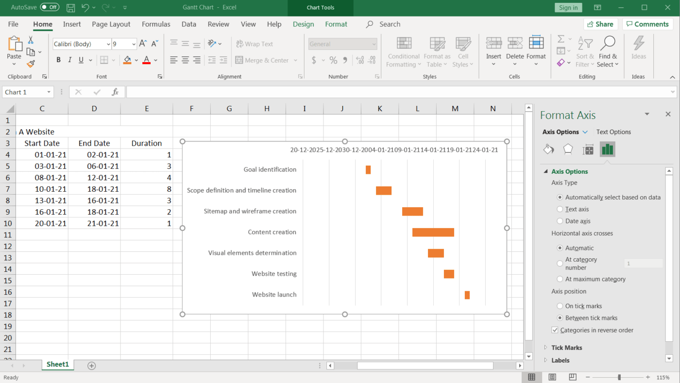
On the blue section of the bar you need to right-click. Then click on Format Data Series.
You should now see the formatting options on the right of your screen.
Find the Fill option and select No fill.
See how it’s starting to look a lot like a Gantt chart?! 🙌
But it’s still not quite right.
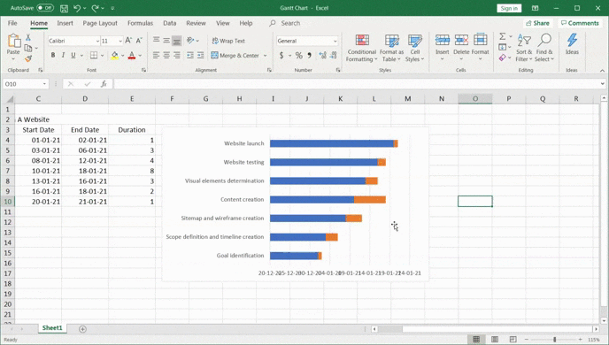
You need to reverse your project task order and bring ‘Goal identification’ to the top and ‘Website launch’ to the bottom.
How?
Right-click on the vertical axis to open the Format Axis pane.
Then under Axis Options, check off ✔️ categorize in reverse order.
This should rearrange your project tasks correctly.
You’ll notice even the date markers moved from the bottom to the top, making it look even more like a Gantt chart!
Finally, you can design your Gantt chart according to your preferences. Just right-click on the Gantt bars and select Format Data Series to get all kinds of options.
Fill in color, make it 3D, add shadows…anything you want.
This is it.
Your Excel Gantt chart is ready for use!
But guess what?
You can skip the whole process of making a Gantt chart in Microsoft Excel with templates.
3 Excel Gantt Chart Templates
An Excel template can help you skip all these steps and get you started with project tracking immediately!
However, finding an Excel Gantt chart template isn’t always easy.
So just pick a template option from this list.
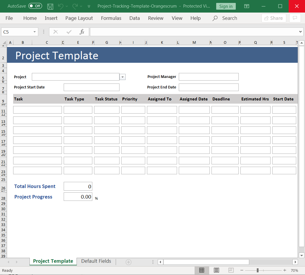
1. Excel project tracking template
Use this is a Gantt chart Excel template to track the different tasks based on their status, priority, time estimates, etc.
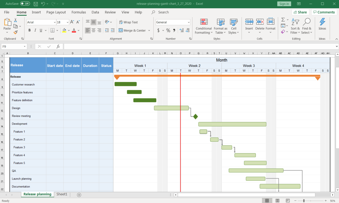
2. Release planning Gantt chart template
Need help with your release planning?
This Gantt chart Excel template should do the job.
3. Workforce tracking Gantt chart template
Gantt charts can also help you manage your team’s workload, distribute it more evenly, and generally improve team coordination.
This Gantt chart Excel template should serve all these purposes.
Need help with Excel project Management? Take a look at our Excel project management guide.
3 Drawbacks Of An Excel Gantt Chart
A spreadsheet is no one’s first love. 💔
And making Gantt charts on it?
Frankly, you don’t want to even try.
Here are some drawbacks that will explain why creating an Excel Gantt chart is not an ideal option.
1. No workflow capabilities
A Gantt chart is supposed to make project management effortless and your workflow clear. Excel can’t help you with both.
Sadly, most Excel data has no functionality beyond listing pieces of data.
On an Excel Gantt chart:
- Task dependency management isn’t next-to-impossible
- There’s no way to track progress percentage without using crazy Excel formulas
- Resource management involves simply mentioning assignees in an Excel sheet
You see the trend, right?
2. The interface isn’t user-friendly
Let’s face it. Excel looks B-O-R-I-N-G.
All you see are microscopic cells. And when you create a Gantt chart on it, you get a boring looking Gantt chart. 🤷
Basically, Excel needs a makeover.
And that isn’t happening any time soon.
3. Isn’t intuitive
In an Excel Gantt chart, you have to manually feed in data to make changes in the chart.
That’s annoying because other apps out there let you simply reorder your project timeline and task dependencies with a simple drag and drop.
But here’s the good news, you don’t have to use Excel for your Gantt charts.
You can check out these Excel alternatives, or use ClickUp, the highest-rated productivity tool in the world!
Bonus: Learn how to create a Gantt chart in Google Docs!
Related Resources More:
- How to Create a Project Timeline in Excel
- How to Make a Calendar in Excel
- How to create a database in Excel
- How to create a Kanban board in Excel
- How to create a burndown chart in Excel
- How to create a flowchart in Excel
- How to Create an Org Chart in Excel
- How to Make a Graph in Excel
- How to Make a KPI Dashboard in Excel
- How to Make a Gantt Chart in PowerPoint
Create Effortless Gantt Charts On ClickUp
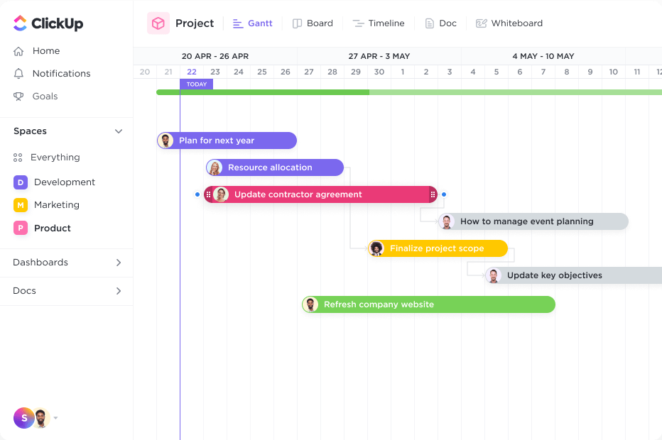
ClickUp is the Gantt chart software of your dreams.
Just try the Gantt Chart view. It’s a simple and flexible view that you can use to:
- Manage task Dependencies
- Schedule Tasks
- Manage deadlines
- Detect bottlenecks
And…and ClickUp’s Gantt chart Template looks quite pretty.
See for yourself!
So how do you add ClickUp’s Gantt Chart View?
- Click + in any List, Space, or Folder
- Choose Gantt and then name it
There you go, you’re Gantt chart is ready for use.
But wait, there’s more to our Gantt chart.
Use it to calculate the critical path and the dynamic progress percentage with a simple hovering action.
How are they different? Take a quick look at our Gantt chart Vs. Timeline article.
Excel Can’t Chart!
Microsoft Excel is impressive when it comes to data entry, conditional formatting, accounting, etc.
But as a Gantt chart?
It’s not nearly as effective.
Instead, why not just go for a dedicated Gantt chart software like ClickUp!
It’s THE ultimate project management software that you can use to create Gantt charts that don’t need you to be an expert at it.
You can even create tasks, track progress, manage resources, create documents and spreadsheets, etc., right here on ClickUp.
Get ClickUp for free today and watch the project progress hit 100%, faster than ever.

The Gantt chart has been a favorite among teams and project managers because of its capability to visualize projects. A Gantt chart in Excel can also outline the responsibilities of each team member.
But creating Gantt charts in Excel can be a daunting task and time-consuming. This guide will show you how to create a Gantt chart using Excel.
Creating Gantt charts can be easier with the Venngage Gantt chart maker and customizable templates.
Click to jump ahead:
- Gantt chart defined
- How to create a Gantt chart in Excel?
- Disadvantages of making a Gantt chart in Excel
- How to make a Gantt chart in Excel using Venngage
- Advantages of using Venngage to create a Gantt chart in Excel
- 6 Excel Gantt chart templates from Venngage
- Gantt chart excel FAQs
Gantt chart defined
A Gantt chart is a type of diagram that is widely used in project management. It is also known as an activity on a timeline.
Gantt charts display key project details such as project tasks, start date, and end date, working days, and task duration. It consists of bars showing each activity (represented by a horizontal block) along the time scale (shown in columns).
Here’s an example of a Gantt chart from Venngage.

Whether you’re in the medical field or conducting research, a Gantt chart template can help you plan your research project. Visualize smaller tasks so you complete them and achieve a successful project outcome.
Return to Table of Contents
How to create a Gantt chart in Excel?
If you don’t have a template to work with. You can create a Gantt chart in Excel. Here are the steps.
- Input the data that you want to be converted into a Gantt chart. It can be a list of project tasks with the corresponding schedule or duration. See the example below:
- Select and highlight the data you want to convert into a Gantt chart
- Go to the Insert menu tab then select the Bar Chart Icon. Select the Stacked Bar Chart.
- Customize your chart. Select the first data set on the chart. Go to the Format Data Series window, then click on the Shape Fill icon to choose your preferred color. You can also add gridlines, axis labels, duration data, and change color palettes according to your preference. Do the same for the other data sets until you’ve customized your Gantt chart.
- To reverse the task list, right-click on the vertical axis and select Format Axis. Tick the box for Categories in reverse order.
- Save your Gantt chart.
For more complex projects, creating a Gantt chart in the same worksheet in Excel can be more complicated and limiting. In such cases, it’s advisable to create a new Excel sheet altogether for each different phase of your project.
Return to Table of Contents
Disadvantages of making a Gantt chart in Excel
While creating a Gantt chart in Excel is possible, there are some disadvantages users need to be aware of.
Time-consuming. A major disadvantage of using Excel is the amount of time it requires. Setting up a Gantt chart in Excel can take up a lot of time, especially for more complicated projects. Creating the below template as an Excel Gantt chart could take hours.

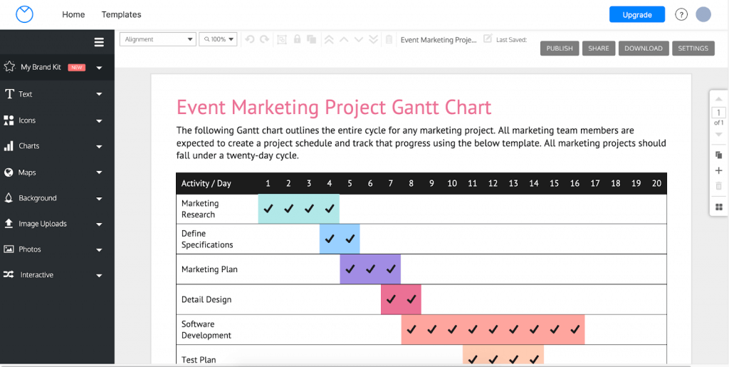
If you’re working on events, parties, or social gatherings, this simple Gantt chart makes it easier to track publicity schedules and marketing tasks.
Confusing. The learning curve for creating a Microsoft Excel Gantt chart can be quite high. For more complex projects, an elaborate task list can leave one feeling more overwhelmed with the required tasks, thus affecting your team’s work schedule. If you’re not familiar with Excel, this is an even bigger problem because you won’t get the work done if you’re busy figuring out how to navigate the project schedule.
Lack of detail. A proper Gantt chart is meant to be detailed and provide an overview of the project and key tasks to be completed. Since there is no Gantt chart Excel template to use, you will need to build a stacked bar chart from scratch, which can’t visualize that much information.
Lack of flexibility. When creating a Gantt chart in Excel, you are limited to the number of rows, columns, and tasks bars available. If your project requires more activity levels or categories, the only option available is to create multiple Gantt charts.
Return to Table of Contents
How to make a Gantt chart in Excel using Venngage
If the technicalities of creating a Gantt chart in Excel are too overwhelming for you, then it’s time to try Venngage. Using a Gantt chart software like the Venngage Gantt Chart Maker is one way to make the process easier for you.
The Venngage Gantt Chart Maker lets you create visually appealing web and mobile-friendly charts in no time. It is a cloud-based software that enables you to quickly make beautiful visualizations from your existing data.
Here is how you can create your Gantt chart using Venngage’s chart templates:
- Sign up for a free Venngage account. You can do so by using your email address, Facebook, or Google account.
- Choose from the wide range of Venngage Gantt chart templates. You can also search for a template of your choice if you’re looking to create one for a specific kind of project.
- Click on the template that you want to use to start building your Gantt chart. Once you’ve selected a template, your graph will load in the Venngage Editor.
You can then start editing it by clicking on the elements in the diagram. Or add elements from the left panel.
- Edit the template by adding in your project information. This includes the chart title, start date, end date for tasks, as well as legend entries.
As you populate the chart with project details, the Gantt chart template will automatically be updated. You can also upload a Google Sheet, CSV, or Excel XLSX file instead of manually adding your data.
- Customize your Gantt chart by adding icons or changing the color palette and the fonts.
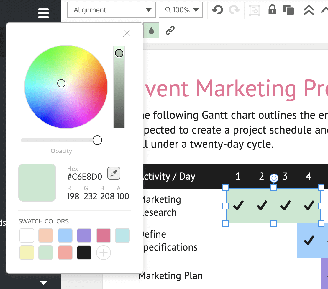
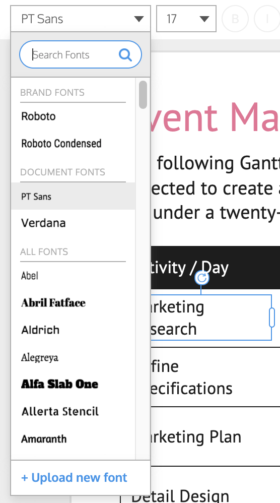
Make the Gantt chart your own by adding relevant icons. You can also change the color palette of your Gantt chart by clicking on the color wheel icon in the left panel and adjusting it accordingly. Similarly, you can change the fonts for your titles and labels by clicking on them and selecting a new font.
- Share your completed Gantt chart with your team with just one click. With a business plan, you can download the Gantt chart as a PNG, PNG HD, PDF, Interactive PDF, and Powerpoint presentation.

With Venngage’s Gantt chart maker, you can easily create a visual representation of an entire project in minutes.
Related: 11 Types of Charts and How Businesses Use Them
Return to Table of Contents
Advantages of using Venngage to create a Gantt chart in Excel
Venngage provides an easy way to create and design Gantt charts for free. Sign up for a Venngage account for free and immediately start creating your diagrams.
For multi-taskers, Venngage premium and business plans offer the flexibility of juggling more tasks simultaneously. Both plans also offer a wider range of Gantt chart templates that you can choose from for project management.
Here are a few more advantages Venngage has over Excel Gantt charts.
All-inclusive. Venngage’s Gantt chart templates are all-inclusive, meaning that you don’t have to download additional software to use them. All you need is a web browser and an internet connection.
Templates designed by experts. You can choose from a wide range of templates and themes that help you create the best diagrams for your project, like this Gantt chart example.

With a Venngage business account, you can export this template as a PowerPoint presentation or as a PDF that you can share in meetings.
No design skills needed. To create Gantt charts using Excel might take a lot of effort on your part as it requires expert-level knowledge in computer programming. On the other hand, creating a Gantt chart in Venngage is a simple process that can be done quickly by anyone, even without design experience.
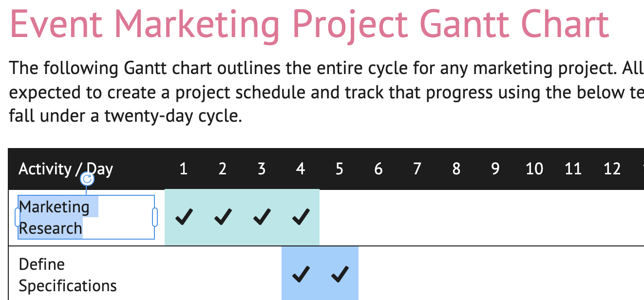
Easy customization. With the Venngage editor, you can easily customize each chart element of your Gantt charts, such as the task-bar size, color, start dates, and end date. With the My Brand Kit feature, you can import your branding colors, logos, and fonts with a single click, like in this simple Gantt chart example.

Automation. Venngage can automatically fill the start date or end date for your tasks according to their durations or working days. You can also set your own custom start or end date for each task.
Accessible on any device. Excel limits your access to your diagrams unless you have a laptop with you all the time. With Venngage, you can access your Gantt chart from anywhere and at any time on any device.
Shareable. Share your customized Gantt chart with colleagues or on social media sites with a private link.
Return to Table of Contents
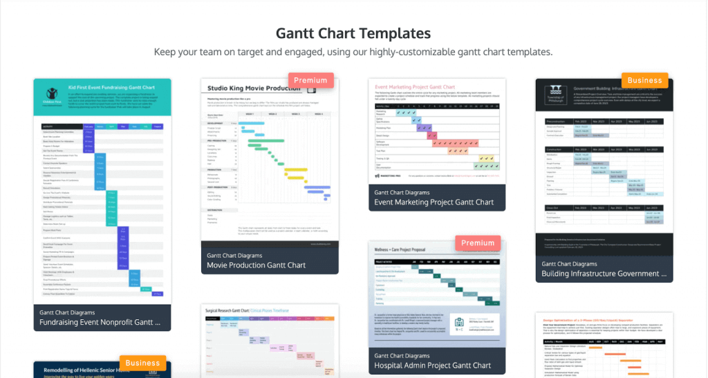
6 Excel Gantt chart templates from Venngage
Venngage has an extensive list of pre-made Gantt chart templates that you can use for making Gantt charts.
1. Bright corporate weekly project Gantt chart template

Divide your tasks on a weekly basis by editing the colors and the text in this template. That makes it easier to see how your projects are doing from one week to the next.
2. Detailed project Gantt chart template

Communicate with your team effectively and provide a detailed task list for your team with this Gantt chart example! This template works well for teams that develop projects in phases.
3. Fundraising event nonprofit Gantt chart template
If you’re an event planner raising funds for a nonprofit or simply hosting a small party, this example is a good way to make sure that you’ve secured all your suppliers and have everything ready for your event.

4. Simple housing nonprofit Gantt chart template

Use a fresh and sleek template like this template to view tasks at a glance without feeling overwhelmed. The modern font and bright color palette will help give you that extra push to get the work done.
5. Corporate weekly project Gantt chart template

Communicate your message effectively and help your team work more efficiently with this template. The simple design is a great way to keep your team on track with weekly projects and deadlines.
6. Daily client project status Gantt chart template

If you’re working with multiple clients, this is the Gantt chart for you. Keep track of your client’s progress with this template so you have a day-to-day record of all projects.
Return to Table of Contents
Gantt chart excel FAQs
Does Excel have a Gantt chart template?
At the moment, there’s no specific Excel Gantt chart template available on Microsoft Office. If you want to make a Gantt chart, you will need to design it from scratch with a project table and task bars.
With Venngage, all of these elements are already done for you. All you have to do is choose a template and enter your task information. Using Venngage is a great way for you to work smarter and more efficiently.
How can you design a Gantt chart for free?
You can create a Gantt chart for free with the Venngage Basic Plan that includes up to 3 active projects and online sharing. Access advanced features such as real-time collaboration, downloads, business templates, then you can upgrade to a business plan.
How can you create a Gantt chart in Google Sheets?
At the moment, there is no fast and efficient way. A Google Sheets add-on is currently in development.
When is the best time to use a Gantt chart?
A Gantt chart is perfect if you want to create a schedule for your project or task. It can also be used as an agenda where you can input important dates, events, and milestones that are related to the overall timeline of whatever you’re working on.
Return to Table of Contents
Use a Venngage template to create Gantt charts
A Gantt chart is very useful if you want to get organized and ensure that projects run smoothly. An effective Gantt chart is one that allows you to create a schedule for your project or task and keep track of important dates, events, and deadlines.
Since using Excel can be time-consuming, the wide range of Gantt chart templates on Venngage is a better option. With these templates, you can make a Gantt chart easily and focus on what’s important: getting the work done!

Jory MacKay
Jory is a writer, content strategist and award-winning editor of the Unsplash Book. He contributes to Inc., Fast Company, Quartz, and more.
July 18, 2018 · 7 min read
🎁 Bonus Material: Gantt Chart Excel Template

At the core of project management is a simple idea: Know what you want to build, the steps you need to take to get there, and how long each one will take to complete.
Sounds easy enough right? But as any seasoned project manager will tell you, it rarely stays that way. All of a sudden deadlines change, scope creeps up, resources change, or your team gets split to work on different projects. To stay on track no matter what happens you need a way to quickly see what needs to be done, track progress, and see what’s coming up behind the next curve.
Gantt charts are one of the most powerful tools for seeing your path from 0–100% and identifying where issues might creep up. With a Gantt Chart, you get a quick, intuitive view of each task according to its time commitment and dependencies (i.e. what needs to get done before you can do that task).
Like most aspects of project management, Gantt Charts are simple in concept, but slightly more complicated in execution.
In this guide, we’ll run you through everything you need to know about how (and when) to use Gantt Charts, best practices for making them, and show you a step-by-step guide of how to create your own using Microsoft Excel and other more powerful project management tools.
We recommend you download the template first and follow along as we run through the guide.
Why (and when to) use a Gantt Chart
A Gantt Chart is a visual representation of tasks over time that is incredibly useful for planning projects of almost any size and complexity. With a Gantt Chart you can quickly see:
- The project’s start and finish dates
- Each individual project task and who is responsible for them
- When tasks start and finish and how long they should take
- How tasks group together, overlap and depend on each other
- The project’s progress and whether you’re keeping up with the schedule
In other words, a Gantt Chart can be used by anyone who is running or just wants to keep track of a project. While originally written out on paper, most modern project management tools like Planio offer Gantt Charts as an option for viewing your tasks.

Not only are Gantt Charts great for keeping track of your tasks. But seeing everything in a visual manner like this has some other major benefits.
First, a Gantt Chart promotes detailed planning. Simply listing your tasks forces you to break them down into the smallest pieces to see their dependencies (the basis of task management!) Also, by including start and finish dates, it forces you to imagine the project all the way to completion, rather than get stuck in the messy middle.
Next, Gantt Charts show potential risks and resource overload. With timelines clearly planned, you can quickly see where expectations might be high and you’ll need more resources (either time, people, or money).
Lastly, Gantt Charts are easy to read, which makes them great tools for improving project communication. Everyone understands a basic bar chart, which helps bring added clarity and motivation for hitting deadlines.
When you see a Gantt Chart, it will be broken down into two halves:
- On the left side: is each individual task with related information about what’s expected, who’s responsible, and what (if any) dependencies they have.
- On the right side: is a visual representation of those tasks across a calendar, which lets you see how long everything should take, the sequence of tasks, and their progress.

As you can probably tell, the power of the Gantt Chart is in its flexibility. They can be used for everything from developing an app, to redesigning a website, to remodelling your house.
Gantt Chart vs. Agile, Scrum, and Kanban
While Gantt Charts are great for keeping track of most projects, they make the most sense if you’re using traditional project management methods.
Where agile project management relies on working in sprints and constantly iterating projects based on user feedback, traditional project management is built around larger milestones—a grouping of tasks—that are completed in sequence.
Before you dive into making your own Gantt Chart, make sure that it aligns with the way you build projects.
A step-by-step guide how to create a Gantt Chart in Excel
The great thing about Gantt Charts is just how simple of a concept they are. In fact, they’ve been around for over 100 years, with the earliest versions being created by Henry Gantt between 1910–1915.
Back then, however, Gantt Charts were drawn on paper. Meaning whenever a detail changed they’d have to recreate the entire chart. Today, we have the flexibility to create and adjust Gantt Charts quickly and easily with tools as commonplace as Microsoft Excel.
Building a Gantt Chart in Excel can be a bit of an arduous process, however. So rather than start from scratch, we’ve put together a free Gantt Chart Excel template you can download, customize, and even import into other project management tools.
If you haven’t already, download our free Gantt Chart Excel template and follow along.
Step 1: Name your project
Gantt Charts are all about clarity. So your first step should be to name both the project workbook and the chart itself.
Click once on the chart. In the top toolbar select Chart Design > Add Chart Element > Chart Title and select Above Chart.

Use something simple, yet specific like Website redesign or App V2.0. And remember to also include your name in the Project Title section at the top of the workbook alongside your company name and the team lead who will be responsible for any questions about the Gantt Chart.
Step 2: Add your tasks
The table beside your Gantt Chart is where you’ll list your tasks and any information about them. Start by simply giving them names. You want to go granular here as each task should represent a piece of work that is clearly defined and do-able in the given time frame.
Just click on each cell in the table and rename it. The names will automatically update on the chart itself.

Step 3: Update task start and end dates (and additional information)
The power of a Gantt Chart comes once you can see each task’s proposed timeline and how they stack up.
Click on each task and update the Start and End date. The duration will automatically be calculated to tell you how long you’ve scheduled for the task.
You might notice that your chart gets a bit weird once you start changing dates around. There’s a simple process for fixing this:
- Hover over the first task’s Start Date. Right click and select Format Cells. Use the side navigation to select General. Write down the number you see (for me, it’s
43125) and then hit Cancel. - Now, hover over the dates in the top axis of your Gantt Chart. Right click and select Format Axis.
- Select the bar chart if you’re not already there and then replace the Minimum Bounds with the number you wrote down.
- You can adjust the Maximum Bound to get rid of white space on the right of your Gantt Chart. Just play around and see what works.


As you can see, we’ve included a few extra data points to our Excel Gantt Chart table: Assigned to, % done, Priority, Description, and Sprint/Milestone. Include as much information here as you can for clarity. These tables can also be automatically imported into Planio if you’d rather have more flexibility over your Gantt Chart and project management.
Step 4: Add milestones and color-code tasks
It makes sense to break up your tasks by Milestones—a collection of tasks that represent some piece of your project being completed. This could be finishing coding a feature or redesigning a landing page—anything that marks the end of a chunk of work.
In our Excel Gantt Chart, we’re using both labelling in the table and color coding to see our Milestones. Here’s how to update both:
For the Milestone description: Click once on the cell associated to the task. Type in the name of the Milestone. Next, go into the top toolbar and click on the Paint Bucket Tool. Select a color that will represent that Milestone. Repeat for each task in the Milestone.

For the Gantt Chart: Now you want to change the colors on your Gantt Chart tasks to be the same as your descriptions. Click once on any bar in the Gantt Chart to select all of them and then right click on just the bar you want to change and select Format Data Point. From there, make sure your fill is set to Solid Fill, and then select the paint bucket and use the same color as in the table.

Step 5: Add more tasks and finalize your Excel Gantt Chart
The Gantt Chart Excel template we’ve provided you with has space for 17 tasks. But if your project is more complex, you can quickly and easily add more rows to your table and auto-update your chart:
- Select the last filled row in your table by clicking on the number beside the task’s name.
- Using the top toolbar select Insert > Rows. A new row will be automatically added underneath the selected one with all the appropriate formulas. Repeat as necessary.


Once your Gantt Chart is completed with all of the tasks, you can make some final edits to customize it in Excel. Change fonts. Play around with the date ranges to make the Gantt Chart clear and straightforward. Then, print or share with your team.
Import your excel Gantt Chart to Planio for more flexibility and control
Building a Gantt Chart using our Excel template is easy. But it’s not necessarily the best way to see your project if you’re going to be updating it regularly and adding in additional information. Instead, using a dedicated project management tool is a much easier and more powerful way to create, update, and use Gantt Charts.
In Planio, you can take what you’ve already built in Excel and transfer it into a Planio project in just 2 steps.
- First, prepare your CSV file: A CSV file is simply the table you created for your tasks in Excel. You can save most Excel sheets as CSV files by clicking File > Save As… and then selecting Comma Separated Values as the format from the drop-down menu. We’ve set up our Gantt Chart Excel template using headers recognized by Planio, which means you don’t need to edit or adjust anything.
- Next, import your project CSV into Planio: Open your Planio project (or start a new one) and then use the side navigation bar to select Issues > Import. Select the CSV file you just saved. Finally, you have to map the values from the CSV files to issues in Planio (if you haven’t changed any headers in your Excel file, this shouldn’t be an issue). Then, simply click Import. If you have any issues, check out this support article.
Project management is all about clarity. Gantt Charts give you that.

No matter what tool you use to build your Gantt Chart, the goal should always be clarity. Adding unnecessary complexity is a recipe for disaster and it’s your role as a project manager or team lead to walk the line between keeping your project organized and not overwhelming your team with details.
Gantt Charts are a great way to do this, giving you a simple, visual way to see your tasks, timeline, and how it’s all going to play out. Grab our free Gantt Chart Excel Template and try it out for yourself!
Gantt Chart is the most commonly used chart in project management. The more general definition of the Gantt chart is that it helps to keep track of the activities against time. Anything plotted against time can be represented in the form of a Gantt chart. For example, a team manager has given different tasks to their team members. Now keeping track of every task manually is a very difficult process but this can be easily achieved by the Gantt charts. With the help of Excel functions and Charts, we can automate the Gantt chart and so the progress of a project.
Number representation of Date in Excel
Before learning the Gantt chart in excel, you need to know how to format date in Number format in excel. For example, 3/13/2022 is in the date format and when converted to Number the value will be 44633.00. The use of the Number representation of Date might not seem very useful now, but when we will create a Gantt chart then the use of it will be very clear. Following are the steps:
Step 1: Given a Date in cell C4. We can see that the format of the cell is a date.

Step 2: Go to Home Tab, and select the drop-down menu in the Numbers section. Select the Number data type.

Step 3: You can see the value of date 3/13/2022 in number is 44633.00.

Creating an Automatic Gantt Chart in Excel
Creating an automatic Gantt chart using simple horizontal bar charts. For example, Rohan wants to keep track of the Geeks for Geeks courses he is studying. Given a data set of Geeks for Geeks courses, its start time, and the number of days required to complete a particular course. Create a Gantt chart for it. The chart would be an automatic Gantt chart which changes with a change in the value of Start-Date and Days to Complete.

Step 1: Go to Insert Tab, and in the charts section, click on the bar chart.

Step 2: An empty chart is created.

Step 3: Right Click inside the blank chart. A drop-down appears. Click on Format Chart Area.

Step 4: Select Data Source dialogue box appears now click on Add button.

Step 5: An Edit Series dialogue box appears.

Step 6: In the Series name column. Select cell C5.

Step 7: In the Series Values column. Select the range C6:C12. Click Ok.

Step 8: Start-Date got added. Again click on Add button to add Days to Complete.

Step 9: The Edit Series dialogue box appears. In the Series name column. Select cell D5.

Step 10: In the Series Values column. Select the range D6:D12. Click Ok.

Step 11: Now click on Edit Button to add Geeks for Geeks Courses.

Step 12: An Axis Labels dialogue box appears. Select the range B6:B12. Click Ok.

Step 13: The Select Data Source dialogue box reappears. Click Ok.

Step 14: A basic bar chart is created. Now we can figure out there are three problems to converting a bar chart to a Gantt chart.
- The courses appear in reverse order. The Excel Course should be at the top and the Git and Github should be at the bottom.
- The Blue Bar Lines should not be there in the Gantt chart.
- The earliest date in the given data set is 15-Jan. So the graph should start from 15-Jan but it is starting from 10-Dec. So, you need to remove all the redundant dates.
Solving all the problems one-by-one.

Step 15: Right-click inside the Y-axis i.e. inside the courses section. A drop-down appears and clicks on Format Chart Area.

Step 16: A Format-Axis dialogue box appears. In the Text Options, check the box Categories in reverse order. Now, all the courses will be reversed.

Step 17: The Labels got reversed.

Step 18: Right Click on the Blue bar charts. A drop-down appears. Click on Format Data Series.


Step 19: Format Data Series dialogue box appears. Go to Fill and Line, inside the fill section. Click on No Fill. All the blue bars will disappear.

Step 20: The only work left is to remove the redundant dates from the chart.

Step 21: The topic studied at the start of the article i.e. Number representation of Date in Excel will significantly help you to remove the additional dates in the Gantt chart. In the given data set, you can see that the earliest date is 15-Jan. Now, you need to know what is the numerical value for 15-Jan. The value for 15-Jan in excel is 44576.00. Remember this number.

Step 22: Now, inside the date section of the chart, right-click on it. Click on Format Axis.

Step 23: Format Axis dialogue box appears. In the Text Options section, click on the minimum value. Replace 44540.00 with 44576.00.

Step 24: An automatic Gantt chart is created. This chart is a dynamic chart that could adjust itself with a change in values in the data set.
