
Excel for Microsoft 365 Word for Microsoft 365 PowerPoint for Microsoft 365 Excel 2021 Word 2021 PowerPoint 2021 Excel 2019 Word 2019 PowerPoint 2019 Excel 2016 Word 2016 PowerPoint 2016 Excel 2013 Word 2013 PowerPoint 2013 Excel 2010 Word 2010 PowerPoint 2010 Excel 2007 Word 2007 PowerPoint 2007 More…Less
Pie charts are a popular way to show how much individual amounts—such as quarterly sales figures—contribute to a total amount—such as annual sales.
Pick your program
(Or, skip down to learn more about pie charts.)
-
Excel
-
PowerPoint
-
Word
-
Data for pie charts
-
Other types of pie charts
Note: The screen shots for this article were taken in Office 2016. If you’re using an earlier Office version your experience might be slightly different, but the steps will be the same.
Excel
-
In your spreadsheet, select the data to use for your pie chart.
For more information about how pie chart data should be arranged, see Data for pie charts.
-
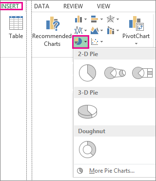
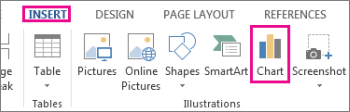
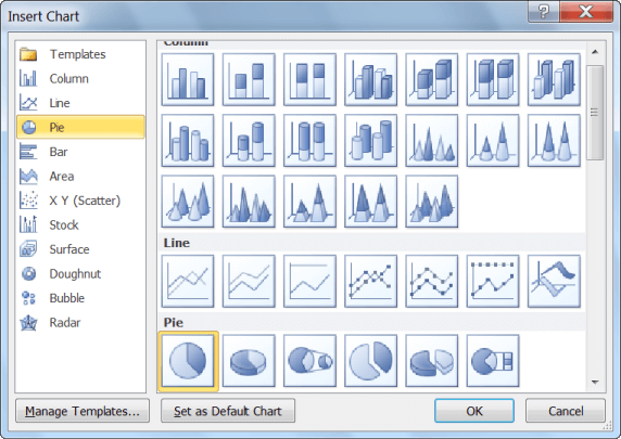
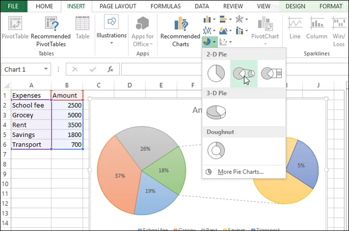
Click Insert > Insert Pie or Doughnut Chart, and then pick the chart you want.

-
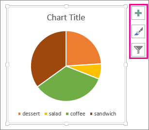
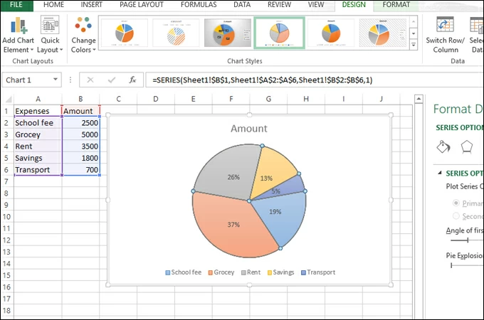
Click the chart and then click the icons next to the chart to add finishing touches:
-
To show, hide, or format things like axis titles or data labels, click Chart Elements
. -
To quickly change the color or style of the chart, use the Chart Styles
. -
To show or hide data in your chart click Chart Filters
.
-
 .
. .
. .
.
PowerPoint
-
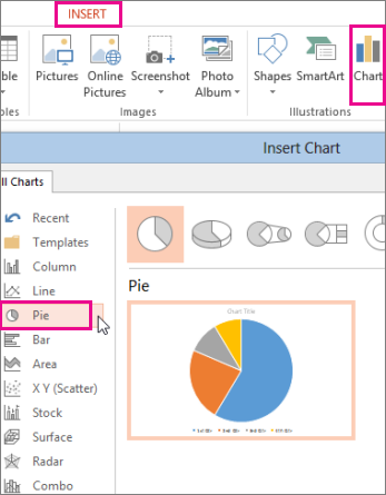
Click Insert > Chart > Pie, and then pick the pie chart you want to add to your slide.
Note: If your screen size is reduced, the Chart button may appear smaller:
-
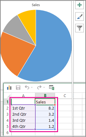
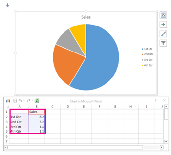
In the spreadsheet that appears, replace the placeholder data with your own information.
For more information about how to arrange pie chart data, see Data for pie charts.
-
When you’ve finished, close the spreadsheet.
-
Click the chart and then click the icons next to the chart to add finishing touches:
-
To show, hide, or format things like axis titles or data labels, click Chart Elements
. -
To quickly change the color or style of the chart, use the Chart Styles
. -
To show or hide data in your chart click Chart Filters
.
-

Word
-
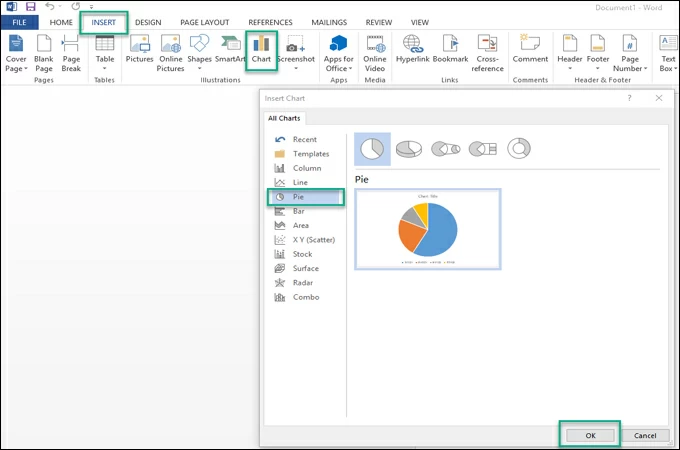
Click Insert > Chart.
Note: If your screen size is reduced, the Chart button may appear smaller:
-
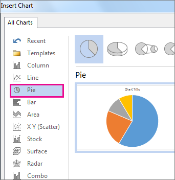
Click Pie and then double-click the pie chart you want.
-
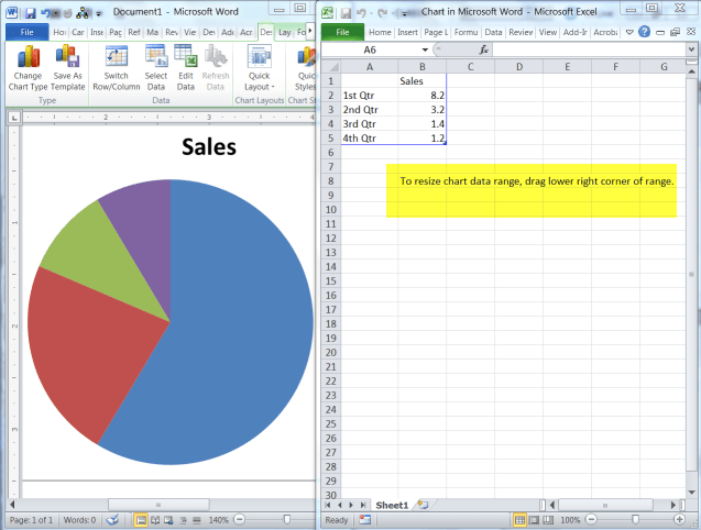
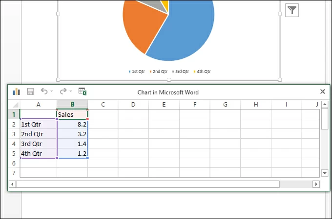
In the spreadsheet that appears, replace the placeholder data with your own information.
For more information about how pie chart data should be arranged, see Data for pie charts.
-
When you’ve finished, close the spreadsheet.
-
Click the chart and then click the icons next to the chart to add finishing touches:
-
To show, hide, or format things like axis titles or data labels, click Chart Elements
. -
To quickly change the color or style of the chart, use the Chart Styles
. -
To show or hide data in your chart click Chart Filters
. -
To arrange the chart and text in your document, click the Layout Options button
.
-
 .
.Data for pie charts
Pie charts can convert one column or row of spreadsheet data into a pie chart. Each slice of pie (data point) shows the size or percentage of that slice relative to the whole pie.

Pie charts work best when:
-
You have only one data series.
-
None of the data values are zero or less than zero.
-
You have no more than seven categories, because more than seven slices can make a chart hard to read.
Other types of pie charts
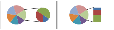
In addition to 3-D pie charts, you can create a pie of pie or bar of pie chart. These charts show smaller values pulled out into a secondary pie or stacked bar chart, which makes them easier to distinguish. To switch to one of these pie charts, click the chart, and then on the Chart Tools Design tab, click Change Chart Type. When the Change Chart Type gallery opens, pick the one you want.
See Also
Select data for a chart in Excel
Create a chart in Excel
Add a chart to your document in Word
Add a chart to your PowerPoint presentation
Available chart types in Office
Need more help?
Want more options?
Explore subscription benefits, browse training courses, learn how to secure your device, and more.
Communities help you ask and answer questions, give feedback, and hear from experts with rich knowledge.
Word
- Click Insert > Chart.
- Click Pie and then double-click the pie chart you want.
- In the spreadsheet that appears, replace the placeholder data with your own information.
- When you’ve finished, close the spreadsheet.
- Click the chart and then click the icons next to the chart to add finishing touches:
Contents
- 1 How do you make a pie chart in Word with percentage?
- 2 Why can’t I make a pie chart on word?
- 3 How do you work out the percentage of a pie chart?
- 4 How do you show percentages and values in a pie chart?
- 5 How do I create a chart in Word without Excel?
- 6 How do I create a chart in Word?
- 7 How do I make a pie chart in Word 2020?
- 8 What is pie chart with Example?
- 9 How do you make a pie chart on a laptop?
- 10 How do I create a WPS pie chart in Word?
- 11 How do I move a pie chart from Excel to Word?
- 12 How do you format a pie chart in Excel?
- 13 How do I create a pie chart with percentages in Excel?
- 14 How do I show numbers in a pie chart in Excel?
- 15 How do I make a bar chart in Word?
- 16 What is chart in MS Word?
- 17 How do you make a pie chart in Word Mobile?
- 18 How do I create a pie chart with multiple data in Excel?
- 19 How do you create a chart?
- 20 How do I move a chart in Word?
How do you make a pie chart in Word with percentage?
To display percentage values as labels on a pie chart
- Add a pie chart to your report.
- On the design surface, right-click on the pie and select Show Data Labels.
- On the design surface, right-click on the labels and select Series Label Properties.
- Type #PERCENT for the Label data option.
Why can’t I make a pie chart on word?
You might also be experiencing this issue because of add-ins or software that is interfering with Office programs. To check if this is the case, we recommend that you perform a clean startup (safe mode) to your computer and then start Word to see if you can insert a pie chart.
How do you work out the percentage of a pie chart?
How to calculate the percentage of data in the pie chart? Measure the angle of each slice of the pie chart and divide by 360 degrees. Now multiply the value by 100. The percentage of particular data will be calculated.
How do you show percentages and values in a pie chart?
To display both value and percentage on your pie chart, follow these steps:
- Go to Visualizer > Chart Library.
- Select the chart you want to edit, and click on Settings.
- Under Pie Settings section, you’ll find an option: Slice Text option.
- Click on The quantitative value and percentage of the slice option.
How do I create a chart in Word without Excel?
Add a pie chart to a Word document without opening Excel
- Click the Insert tab and then click the Chart option in the Illustrations group.
- In the Insert Chart dialog, choose Pie in the left pane.
- Choose one of the pie charts to the right (we’ll use the first).
How do I create a chart in Word?
To create a simple chart from scratch in Word, click Insert > Chart and pick the chart you want.
- Click Insert > Chart.
- Click the chart type and then double-click the chart you want.
- In the spreadsheet that appears, replace the default data with your own information.
- When you’ve finished, close the spreadsheet.
How do I make a pie chart in Word 2020?
Word
- Click Insert > Chart.
- Click Pie and then double-click the pie chart you want.
- In the spreadsheet that appears, replace the placeholder data with your own information.
- When you’ve finished, close the spreadsheet.
- Click the chart and then click the icons next to the chart to add finishing touches:
What is pie chart with Example?
Pie charts are used in data handling and are circular charts divided up into segments which each represent a value. Pie charts are divided into sections (or ‘slices’) to represent values of different sizes. For example, in this pie chart, the circle represents a whole class.
How do you make a pie chart on a laptop?
To draw a pie chart:
- Select the data, including the labels.
- From the ‘Insert’ menu, pick ‘Chart . . .’.
- In the dialogue box that appears, click ‘Pie Chart’.
- Click ‘OK’ or ‘Finish’. You should see a beautiful pie chart.
How do I create a WPS pie chart in Word?
How to Create a Pie Chart in WPS Spreadsheets
- Once the data range is highlighted, go to the Insert tab on the menu bar and click the pie chart icon.
- Your data will be automatically turned into a pie chart.
- To open more customization options, hover your mouse over Chart Title and click the arrow icon.
How do I move a pie chart from Excel to Word?
In Excel, select the chart, and then press Ctrl+C or go to Home > Copy. In your Word document, click or tap where you want the chart to appear, and press Ctrl+V or go to Home > Paste. Note: The chart is linked to the original Excel spreadsheet. If data in the spreadsheet changes, the chart updates automatically.
How do you format a pie chart in Excel?
To create a pie chart, highlight the data in cells A3 to B6 and follow these directions:
- On the ribbon, go to the Insert tab.
- Select Insert Pie Chart to display the available pie chart types.
- Hover over a chart type to read a description of the chart and to preview the pie chart.
- Choose a chart type.
How do I create a pie chart with percentages in Excel?
Right click any slice on your chart, and select Format Data Labels… in the context menu. On the Format Data Labels pane, select either the Value or Percentage box, or both as in the following example. Percentages will be calculated by Excel automatically with the entire pie representing 100%.
How do I show numbers in a pie chart in Excel?
Please do as follows to create a pie chart and show percentage in the pie slices.
- Select the data you will create a pie chart based on, click Insert > Insert Pie or Doughnut Chart > Pie.
- Then a pie chart is created.
- Now the corresponding values are displayed in the pie slices.
How do I make a bar chart in Word?
The following guide provides step by step instructions for how to create a bar chart in Microsoft Word. Open Microsoft Word, go to the “insert” tab on the ribbon, and select the “chart” icon. Once the “chart” wizard window has opened, select “column” and then select “clustered bar type.” Then select “OK.”
What is chart in MS Word?
A chart is a tool you can use to communicate data graphically. Including a chart in your document can allow your reader to see the meaning behind the numbers, and it can make showing comparisons and trends easier.
How do you make a pie chart in Word Mobile?
Insert a chart in PowerPoint or Word on a mobile device
- Open Excel, and select the workbook in which your chart is located.
- Tap anywhere on the chart to select it, then tap Copy.
- Switch to application and go to the slide or document where you want to insert your chart.
- Tap on the slide or document and tap Paste.
How do I create a pie chart with multiple data in Excel?
Click on the first chart and then hold the Ctrl key as you click on each of the other charts to select them all. Click Format > Group > Group. All pie charts are now combined as one figure. They will move and resize as one image.
How do you create a chart?
Create a chart
- Select the data for which you want to create a chart.
- Click INSERT > Recommended Charts.
- On the Recommended Charts tab, scroll through the list of charts that Excel recommends for your data, and click any chart to see how your data will look.
- When you find the chart you like, click it > OK.
How do I move a chart in Word?
Click anywhere in the chart. Under Chart Tools, on the Design tab, in the Location group, click Move Chart.
Bar and pie charts are some of the most important graphical representations in data analysis, statistics, mathematics, and its related fields of study. A pie chart is a circle which is partitioned into different sectors with each sector representing a specific category while a bar chart is a bar that is also partitioned into different sectors with each of them representing a specific category.
Microsoft Word is also one of the most popular word processing software in the world. Every two (2) years, a new version of the software is released for people to try out and the most recent version of the software is Microsoft Word 2021.

Microsoft Word is one of the most used word processing software in the world, and bar and pie chart are also very necessary, then there is the need for it to be featured in MS Word. For all the previous versions of MS Word, bar and pie chart were featured in them, and the MS Word 2021 happens to be no different.
Persons with MS Word can make bar and pie charts and format them to suit their preferences. In this article, I am going to show you how to make pie and bar charts in Microsoft Word 2021 in a few steps.
How To Make Pie Chart in Microsoft Word 2021
To begin with, make sure you have Microsoft Word 2021 installed and running on your computer
- Open a new Word document
- Click on the Insert tab
- Click on the Chart icon next to Screenshot
- Select Pie from the list of charts displayed
- Choose from the different types of Pie charts available (pie, 3-D pie, pie of pie, doughnut) and click OK afterward
- A spreadsheet will appear on the screen. Replace the data and the with your own information you want to create the pie chart with.
- Close the spreadsheet once you are done entering your data
- Click on the chart and then click on the icons next to it to add your final finishing touches. You can show, hide, or format things like axis titles or data labels under Chart Elements. Also, you can change the colour or style of the chart by using Chart Styles. There are several other finishing touches you can add to your pie chart.
- Once you are done adding your finishing touches, you can save your document to prevent you from losing the pie chart.
How To Make Bar Chart in Microsoft Word 2021
To begin with, make sure you have Microsoft Word 2021 installed and running on your computer
- Open a new Word document
- Click on the Insert tab
- Click on the Chart icon next to Screenshot
- Select Bar from the list of charts displayed
- Choose from the different types of Bar charts available (clustered bar, stacked bar, 100% stacked bar, 3-D clustered bar, 3-D stacked bar, or 3-D 100% stacked bar) and click OK afterward
- A spreadsheet will appear on the screen. Replace the data with your own information you want to create the bar chart with.
- Close the spreadsheet once you are done entering your data
- Click on the chart and then click on the icons next to it to add your final finishing touches. You can show, hide, or format things like axis titles or data labels under Chart Elements. Also, you can change the colour or style of the chart by using Chart Styles. There are several other finishing touches you can add to your bar chart.
- Once you are done adding your finishing touches, you can save your document to prevent you from losing the bar chart.
Conclusion
Unlike some of the other charts in Microsoft Word 2021, bar and pie charts are really easy to create and can also be easily explained. With just a mere glance through it, someone can be able to tell what the data means and what each category represents without consulting the person who created the document.
Bar and pie charts can be used in the workplace during a presentation and report writing. For example, a bar or pie chart can be used to represent the number of people who visited your company’s website and made purchases and those who did not together with their sex and demographics.
Apart from that, persons in the field of mathematical sciences, this article will be very useful and so, if you know anyone in that field of study, please share with him or her as you might be helping him/her at their point of need.
How do I make a line graph in Word 2021?
You have to follow the same steps like creating the bar and pie chart. But instead of pie or bar, you have to select line under the chart menu.
What is a chart in MS Word?
A chart is a tool that can be used to explained to data graphically. There are several types of charts in MS Word 2021.
What do you use to create a chart?
In MS Word, we use the Chart Wizard to create a chart. It can be found in the Insert tab.
![]()
![]()
When you mention a pie chart, most folks immediately think of Excel, not Word! But guess what – you can add a pie chart to your Word 2010 document without ever launching Excel!
Follow the steps below to learn how:
- Open the document in which you would like to add pie chart or create a new document.
- On the Insert tab of your Ribbon, in the Illustrations group, click the Chart option.
- In the Insert Chart dialog, select Pie in the left-hand pane.
- Select one of the pie charts to right.
- Click OK and Word will launch an Excel worksheet with sample data.
- Insert new labels and value in the Excel worksheet and you will see the data update simultaneously.
- Be sure that you resize your data range as instructed.
- When you are finished entering your labels and values, close the Excel worksheet. If you like, you can save it, but it is not necessary.
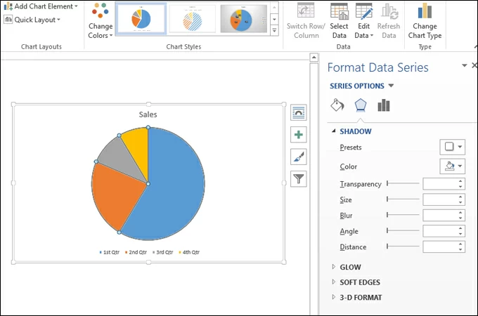
With your chart in Word, you are able to format it. You have choices, such as removing the border or changing the style of shading the background. If you right-click your chart’s background you can select Format Chart Area from the shortcut menu that is displayed.
If you would like to format your series, simply right-click your chart and select Format Data Series.
I think you will agree that is is a lot simpler than you first thought!

Pie chart deals with statistical data usually drawn with a circle that is divided into slices called segments. These segments display a contribution of each category. Moreover, pie chart is best to use you have only one set of data to compare. Also, using a pie chart really works well if you want to show categorical data to see room for improvement within a business, show profit, exposure, etc. Here in this post, we’ll show you how quick it is to create pie chart online, in Word or Excel.
Practical Ways to Create Pie Chart
- Microsoft Word
- Microsoft Excel
- GitMind
Microsoft Word
Microsoft Word allows gives you the ability to create several charts in just a few simple clicks. Aside from pie charts, this enables you to make line charts, bar graphs, and area charts. In addition, you can customize the appearance of the chart. This includes changing the color, font, or apply 3d effects to your chart. Apart from that, you can use this tool whether you are offline or online to make different types of charts. That said, the following are the steps on how to make a pie chart in Word.
- First, launch the Microsoft Word on your computer and then go to the “Insert” tab and select “Chart.” Now, choose “Pie” from the categories section on the left side and click “OK.”
- Next, choose among the type of pie chart you want to create. Once done, an excel spreadsheet will then appear. Start adding and editing your data in the chart dialog box.
- To customize, simply double click on the chart, and a set of options will appear on the right panel. Here you can edit the fill of the segments, apply shadows, glow, 3d-format and save it to your PC.
Microsoft Excel
Another yet worth considering tool to create pie chart in Microsoft Excel. Just like Word, this lets you produce various kinds of charts and effectively choose the right illustration for the data you want to represent. Aside from that, you can also import external data into Excel if you need to retrieve overwhelming data volume. This is a convenient way to create charts since all you have to do is to input data and Excel will automatically do the work for you. On the other hand, here’s exactly how to make a pie chart in Excel.
- Open a new worksheet on Excel. Import the external data or manually add the necessary data like categories, values, and other details for the pie chart.
- Select the area on the worksheet where you input the value and go to the “Insert” tab. Click the “Chart” icon choose from 2-D, Pie, 2-D Pie of doughnut suitable for the pie chart you want to make.
- You can further edit it by double-clicking on each segment. You will be directed to the “Chart Tools” where you can format the chart and add elements such as axis, data labels, trendline, or change the color of the pie chart. Once satisfied, save the chart.
GitMind
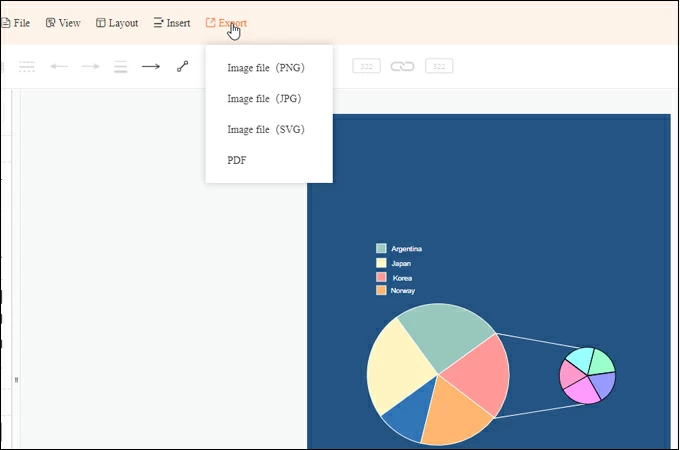
If the above solutions do not suffice your needs, this next tool to create pie chart online is probably for you. With GitMind, you can create charts online using just a browser and even use it on your mobile device to create mindmaps. Furthermore, the program comes with a variety of template choices to choose from according to your requirements. After creating and editing the chart, you can export it as a PDF, JPG, PNG, or SVG file. If you want to learn how to create pie chart using this tool, follow the steps below.
- Access GitMind using your browser and click the “Get Started” button from the main page. From the templates page, click on the “New Flowchart” button.

- From the shapes section, open the “Basic” folder and select the pie symbol. You can resize the slice of pie and adjust the scale, and the angle accordingly.
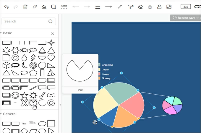
- If you want, you can add text and place it inside the pie slice, and create a legend from the text and shapes available. Lastly, modify the color, font text, and other properties and export the file to an image or PDF file.
Or you can also create a pie chart using its desktop version that you can get from the button below.
DOWNLOAD
Conclusion
Pie chart is one of the most common visual tools to represent statistical information with the colorful and easy-to-understand organization of data. Hence, this is popular among businesses and mass media. The good thing is you can create a pie chart without the need for any special tool. There are online or readily available tools on your PC that can help you get this job done.
![]()
Posted by: Norlyn Opinaldo on April 29, 2021 to Tips and Resources. Last updated on June 17, 2022
You can use Word, the text editor that comes with the Microsoft Office software suite, in your small business to create complex documents and insert pie charts that visually represent your data. You can configure any one of these pie charts and use a different color for each section. Using colored pie charts in your documents enables you, your employees and your clients to quickly understand complex Excel data.
-
Launch Microsoft Office Word and open or create a document.
-
Click «Insert» at the top of the Word window.
-
Click the «Chart» icon in the Illustrations group at the top. The Insert Chart window pops up.
-
Click «Pie» in the left navigation menu.
-
Select one of the pie chart types in the right pane and click «OK» to insert it into the Word document.
-
Fill the Excel spreadsheet that opens with the data you want to represent in your pie chart and switch back to the Word 2010 window.
-
Click a slice of the pie chart to select it.
-
Click the «Format» tab at the top of the Word window.
-
Click «Shape Fill» in the Shape Styles group at the top and a color palette appears.
-
Click the color you want to set for that specific slice and the color is applied immediately. Set colors for all the slices in your pie chart this way.
-
Press «Ctrl-S» to save the Word document.
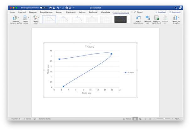
How to make a Cartesian chart in Word

To achieve a Cartesian graph, in Microsoft Word you must use the option Scatter plot (XY). In a nutshell, it is a graph that displays, within a Cartesian space, the way in which the two variables (X and Y) interact with each other, plotting data points on the horizontal and vertical axis. To make it inside your Word document, you will also need it Microsoft Excel, through which you can enter the data relating to the variables (a fundamental step also in all the other types of graphs that I will show you). However, you can find everything explained in detail in the next few lines.
PC
make an XY chart on WordFirst, open the application on yours PC Windows or your Mac and choose whether to create a new document or to modify an existing one.
Once you have opened the file of your interest, click on the point in the document where you want to place the chart, select the tab Inserisci (top) and press the button Graphic. In the new window that opened, select the option Dispersion (XY) from the present list and choose whether to use the template a points, the lines (Curves with indicators, Curves, Lines with indicators, Correct) or bubbles (with the possibility of 3D bubbles).
Once you have found the chart that best suits your needs, click on the button OK, to insert it and start making it. At this point, the selected chart will appear in the document. In addition to this, a files in Excel connected to it, in which to report the values of variables X and Y.
Therefore, in the Excel document, modify the default values with the numbers you wish to use and, in the Word document, the X and Y variables will also be automatically modified, showing the relative position of the points (or lines / bubbles, in based on the chosen chart).
Once you have finished editing the data, close the Excel file (you can reopen and edit it at any time by clicking on the Change datathe Edit data in Excel a Mac) and customize your chart by choosing from the different options made available by the desktop version of Word, under the heading Graphic structure (a menu that you can open by clicking on the tab of the same name).
Now you can, by clicking on the icon Add graphic element, to insert further axes, assign him gods titles and data labels, or, for example, give a title to the graph, adding error bars or a legend.
By clicking on the icon Quick layout, instead, you can choose a layout already set among those available: in this way, without having to add anything manually, you can quickly decide which elements of the chart to show.
To change the graphic styleinstead, you can click on the icon Change colors and choose the color set which you prefer among the options Monochrome e Polychromatic. Finally, you can change it Style clicking on the previews of the available ones or passing the mouse cursor over them to view the final result (without, however, setting it).
Instead, clicking on the icon Swap rows and columns, you can invert the data of the axes, moving the data present on the X axis into the Y axis and vice versa. Again, by pressing on the icon Select datainstead, you can change theinterval. Finally, if your need is to change the chart type, reporting the same data in a different type (for example in a pie chart), you can click on the icon Change chart type and select another type of chart from those available.
Pressing on the tab SizeInstead, you can make further changes by selecting a specific graphic element to format and adding some Form, (being able to modify also the styles), of the Stili WordArt or Alternative text to identify the various objects. Also, through the features Location e Wrap text, you can change the location of the chart, while you can change the size of the chart selecting the desired centimeters of height and width.
To further modify your work, on PC, you can also use the keyboard shortcuts placed next to the graph, to its right. By pressing the button Layout options, you can change its location while clicking on the buttons Graphic Elements, you can insert additional elements, on Graphic styles you can change the style and colors and, finally, on Graphic filters, you can change the visible data and names.
Smartphones and tablets
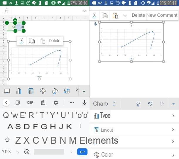
Use theapp in Word for mobile devices available for Android e iOS / iPadOS (which I told you about in detail in this guide)? So, as I mentioned earlier, it is not possible to insert graphics directly into the document.
You can, however, make a chart in the Excel for Android or iOS / iPadOS (perhaps following the instructions I gave you in my guide on how to create a Cartesian chart in Excel) and copy it into your Word document.
Once done, then tap on chart in the Excel sheet and select the icon Copy (the one represented by two overlapping sheets) from the menu that opened, then open a new tab of your device, start the app Word and open the document where you want to insert it.
Once this is done, click on the icon pencil, in order to make the changes, and subsequently, in the point of the sheet where you want the graph to be pasted, tap on the icon Paste (the folder with a sheet next to it).
At this point, the graph will appear in the document and you can edit it using the keyboard shortcuts or by pressing on menu Home and selecting the tab Graphic among those extras (or, again, by tapping on the graph and waiting for the Graph menu opens by itself). Alternatively, if you use a tablet, click directly on the tab Graphic (in alto to destra).
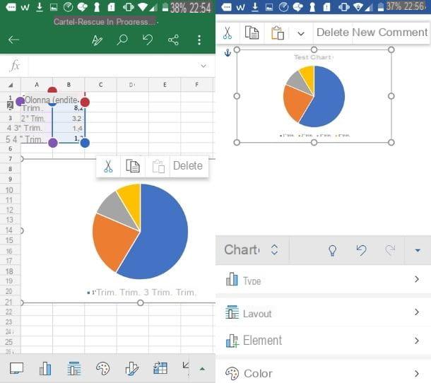
Now, in any case, you can make the changes related to the layout, to Elements, Color and at the Style, by clicking on the relative icons and choosing from the various available settings. You can also change its collocation (using functions Wrap text e Arrange) On dimensions and add a alternative text (always pressing on the relative options in the menu), in the same way as I described above. Easy, right?
How to make a pie chart in Word
The chart that best fits your project is a cake, also called areogramma, which represents the data in the form of «wedges»? If your answer is yes and, therefore, you are wondering how to make a chart in Word using this pattern, follow the instructions below.
PC
If your need is to insert a pie chart inside your Word document, all you have to do is open the document in question, select the point where to insert the chart (by clicking on it), and press on the tab Inserisci. After that, click on the option Graphic and, from the list that has opened, press on the item Cake.
At this point, choose the pie chart mode you prefer among Cake, 3D cake, Cake pie o Cake bars (recommended if you have more than 7 categories of data to insert in the chart) e Ring. Once selected, click the button OK, to insert it into the document.
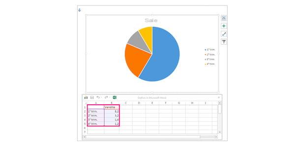
You can then go to work on the dataset within the document Microsoft Excel opened, needed to create the chart. To do this, in the first row of the columns of the Excel sheet (Column A e Column B), enter the data labels, then in the Column A indicates the categories of data of which you are in possession, while in the Column B enter the percentages related to this data.
In this way, by modifying the data in the Excel sheet, you can view them represented in the pie chart, which will automatically divide according to the percentages you have indicated in the various rows of column B. Once done, close the Excel sheet by clicking on the ‘icon X or on red dot (if you are using a Mac).
At this point, you can proceed with adding graphic elements to make the pie chart even more complete with information and with the change the layout and style, to customize it, using the same keys and the same features that I indicated earlier.
Smartphones and tablets
If the only means you have available are the Excel and Word mobile app, to insert a pie chart into your document you must first create it in Excel. To do this, I advise you to carefully read my guide on how to make a pie chart in Excel, in order to make it fast and in the best possible way.
Once created, tap on it and, from the opened menu, press the icon Copy (the one represented by two overlapping sheets). Then, open a new tab, tap on theapp in Word present on your device and choose whether to open a document from those already present or whether to paste the chart into a new document.
Now, within the chosen document, press the icon of pencil (to be able to make changes), select the point where to insert the graph, tap on it and first on the button Paste (the folder with a sheet next to it). This way, the chart will be pasted into the sheet.
At this point, you just have to modify it to make it even more functional and rich in details, in order to improve its reading and understanding. To perform these actions, you can follow the instructions I gave you previously.
How to make a line chart in Word
Your need is to make a line chart in Word, to represent the flow of your data on a time scale, its trend and trends? Then, even in this case, there is no problem. You can easily do it by following the instructions in the next paragraphs.
PC
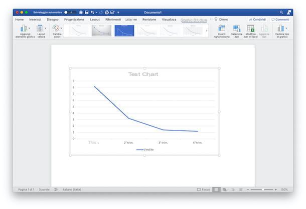
For served of the line graph and use it in your Word document, first select the place in the document where you want to insert it, then click on it. Then press on the tab Inserisciclick on your button Graphic and select, from the new window that has opened, the option Tiers.
At this point, you have to choose the type of line graph that best represents your data among those in the list: you can choose from the graphs in 2D (Lines, Stacked Lines, 100% Stacked Lines, Lines with Markers, Stacked Lines with Markers, and 100% Stacked Lines with Markers) or between charts with Linee in 3D, 2D area (Area, Stacked Area, 100% Stacked Area) e 3D area (3D Area, 3D Stacked Area, and 3D Stacked Area 100%). After selecting the type of chart of your choice, click on the button OK, to insert it into your document.
Once this is done, the graph will appear in the selected point and a new Excel document will open connected to it, in which to modify the dataset contain sample defaults.
Now, then, on the opened Excel page, enter the first row of Columns A and B (and later, if necessary) le Labels of your data. After that, under the Column A, reports the Categories to use. Under the Column Binstead, it reports i give you own. Automatically, as the data in Excel changes, the graph contained in the Word document will also change.
To add more lines, you can use the Column C and subsequent ones, by entering further data and using the same measurement scale decided previously (remembering, moreover, to insert the label relating to the type of data in the first line). When you have finished entering the data, close the Excel sheet by clicking on the button with the X on Windows or on red dot, its MacOS.
Once this is done, all you have to do is improve the representation of the graph using the appropriate menu Graphic Structure or using i keyboard shortcuts (available in the version for PC Windows): therefore modifies the graphic elements inserting more, the layout and style, as I showed you in the chapter dedicated to the creation of the Cartesian graph and that’s it. Easy right?
Smartphones and tablets
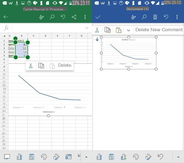
If you use a smartphone or tablet, you can follow the same procedures that I indicated in the previous chapters, going to create the graph inside theExcel app and gluing it, subsequently, in Word document where you need it to be present.
To do so, open theExcel app and follow the tips I gave you in this guide, relating to the creation of a line chart in Excel. Once created, tap ongraphic image and press the icon Copy, to copy it to the clipboard.
Now, you can open theapp in Word present in yours Home screen, by tapping on it, and choose the document and the point in which to insert the graph (by pressing, first, the icon of pencil to be able to modify it). Once done, tap on the selected point and, from the opened menu, press the icon Paste, to paste the graph image.
Now, following the advice I gave you earlier, you can modify your line chart by choosing to act on layout, the style, the elements, colore and all other editable and improvable elements.
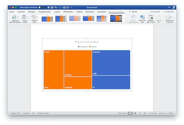
How to make a tree chart in Word
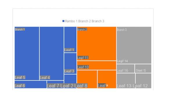
Il tree chart, on the other hand, it is a particular type of graph that allows you to view the data in a hierarchical manner, using colored rectangles. In essence, it is a useful graph in the case of representations of large amounts of data and specific proportions within the hierarchy to be represented. To make it happen, you can follow the procedures described in the next lines.
PC
make a tree chart and insert it into a Word document, select the point where you want to view it, by clicking on it; then press the tab Inserisci, scegli l’opzione Graphic and, from the opened window, select the item from the list Tree then press the button to finish OK. A Macinstead, follow the path Insert> Chart> Hierarchical> Tree.
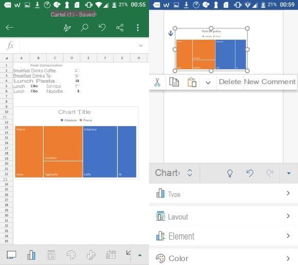
Once done, the graph will be shown in the document and the connected Excel file will also open, to be used to edit the dataset to be displayed in the graph.
To do this, you can change the default setting by inserting the main categories within the Column A (i.e. the branches) and the subcategories in the Columns B and C (stems and leaves, proceeding hierarchically); finally, you can edit the Column D, inserting the data you have (or adding more in the following columns as well, if necessary).
To explain better, here is the Excel file used for the realization of the example chart «Food consumption».
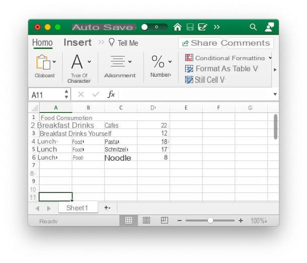
As you can see, in the Column A, starting from the second line, there are the main categories, that is i branches (Branch 1: Breakfast, Branch 2: Lunch). In the Column B, on the other hand, there are stems, that is the first sub-category useful for the purposes of graphic representation (Stem 1: Drinks, Stem 2: Food). In the Column Cinstead, the leaves, that is, thelast subcategory to be evaluated (Leaf 1: Coffee, Leaf 2: Tea, Leaf 3: Pasta, etc). Finally, in the Column D, the amount to be represented within the tree chart, relating to the various leaves.
Once you have edited the Excel file, you can close it by clicking on the icon X (or on the red dot, if you are using a Mac), and proceed by modifying the elements of the chart as I showed you earlier, using the tabs Graph structure e Size.
Smartphones and tablets
Do you want to make a tree chart using the Word and Excel apps on your mobile devices? So first, you need to boot Excel and open a new document.
After that you have to recreate a table similar to the one I showed you in the previous chapter, inserting in the Column A the branches of the graph (i.e. the main categories), in the Column B the stems and in the Column C leaves. Finally, in the Column D, the data to be displayed in the graph, relating to the leaves.
Once done, select the table you just made, tap on the icon triangle (oi three horizontal dots a iPhone), tap on menu Home and select the item from among those present Inserisci. After that, tap on the option Graphic and choose the voice from among those available Tree and select the chart preview. At this point the graph will appear on the Excel page.
To insert it into your Word document, now, tap on it and press the icon Copy. Once done, open a new tab, launch Word and select the document in which you want to insert the tree chart (using the icon of pencil to be able to modify it).
Subsequently, tap on the point in the document where to insert the graph and, from the opened menu, press the icon Paste, to paste the graph. At this point, by pressing on it, the menu will open Graphic, to modify it following the instructions I gave you previously. Easier than I thought, right?
How to make a chart in Word