
-

1
Open Microsoft Excel. Double-click the Excel program icon, which resembles a white «X» on a green folder. Excel will open to its home page.
- If you already have an Excel spreadsheet with data input, instead double-click the spreadsheet and skip the next two steps.
-
2
Click Blank Workbook. It’s on the Excel home page. Doing so will open a new spreadsheet for your data.
- On a Mac, Excel may just open to a blank workbook automatically depending on your settings. If so, skip this step.
Advertisement
-
3
Enter your data. A line graph requires two axes in order to function. Enter your data into two columns. For ease of use, set your X-axis data (time) in the left column and your recorded observations in the right column.
- For example, tracking your budget over the year would have the date in the left column and an expense in the right.
-
4
Select your data. Click and drag your mouse from the top-left cell in the data group to the bottom-right cell in the data group. This will highlight all of your data.
- Make sure you include column headers if you have them.
-
5
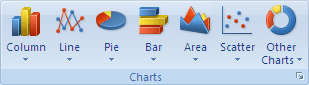
Click the Insert tab. It’s on the left side of the green ribbon that’s at the top of the Excel window. This will open the Insert toolbar below the green ribbon.
-
6
Click the «Line Graph» icon. It’s the box with several lines drawn on it in the Charts group of options. A drop-down menu will appear.
-
7
Select a graph style. Hover your mouse cursor over a line graph template in the drop-down menu to see what it will look like with your data. You should see a graph window pop up in the middle of your Excel window.
-
8
Click a graph style. Once you decide on a template, clicking it will create your line graph in the middle of the Excel window.


Advertisement
-
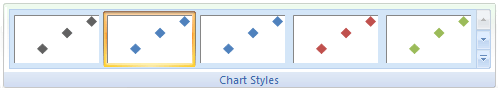
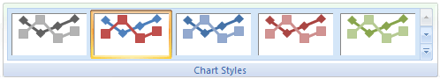
1
Customize your graph’s design. Once you create your graph, the Design toolbar will open. You can change your graph’s design and appearance by clicking one of the variations in the «Chart Styles» section of the toolbar.
- If this toolbar doesn’t open, click your graph and then click the Design tab in the green ribbon.
-
2
Move your line graph. Click and drag the white space near the top of the line graph to move it.
- You can also move specific sections of the line graph (e.g., the title) by clicking and dragging them around within the line graph’s window.
-
3
Resize the graph. Click and drag one of the circles on one of the edges or corners of the graph window in or out to shrink or enlarge your graph.
-
4
Change the graph’s title. Double-click the title of the graph, then select the «Chart Title» text and type in your graph’s name. Clicking anywhere off of the graph’s name box will save the text.
- You can do this for your graph’s axes’ labels as well.


Advertisement
Add New Question
-
Question
How do I name the y and X axis in the graph?

1. Click on the graph. 2. Select ‘Chart Elements’ on the side, which is the plus icon. 3. Tick the ‘Axis Titles’ box. Some text boxes should appear on the x and y axis.
-
Question
If multiple lines are present in my chart, how can I view one at a time?
One method is to hide the relevant rows or columns that you do not wish to show on the graph. Hidden rows and columns are not displayed.
-
Question
Why do my years show up as numbers?
Because A,B,C,D,E, and F, mean this: (A:2000->B:2001->C:2002->D:2003->E:2004->F:2005.)
See more answers
Ask a Question
200 characters left
Include your email address to get a message when this question is answered.
Submit
Advertisement
-
You can add data to your graph by entering it in a new column, selecting and copying it, and then pasting it into the graph window.
Thanks for submitting a tip for review!
Advertisement
-
Some graphs are geared toward specific sets of data (e.g., percentages or money). Make sure your selected template doesn’t have a theme before creating your graph.
Advertisement
About This Article
Article SummaryX
1. Open a new Excel document.
2. Enter your graph’s data.
3. Select the data.
4. Click the green Insert tab.
5. Click the «Line Graph» icon.
6. Click a line graph template.
Did this summary help you?
Thanks to all authors for creating a page that has been read 1,493,503 times.
Is this article up to date?
Excel for Microsoft 365 Excel for Microsoft 365 for Mac Excel 2021 Excel 2021 for Mac Excel 2019 Excel 2019 for Mac Excel 2016 Excel 2016 for Mac Excel 2013 Excel 2010 More…Less
Scatter charts and line charts look very similar, especially when a scatter chart is displayed with connecting lines. However, the way each of these chart types plots data along the horizontal axis (also known as the x-axis) and the vertical axis (also known as the y-axis) is very different.
Before you choose either of these chart types, you might want to learn more about the differences and find out when it’s better to use a scatter chart instead of a line chart, or the other way around.
The main difference between scatter and line charts is the way they plot data on the horizontal axis. For example, when you use the following worksheet data to create a scatter chart and a line chart, you can see that the data is distributed differently.
In a scatter chart, the daily rainfall values from column A are displayed as x values on the horizontal (x) axis, and the particulate values from column B are displayed as values on the vertical (y) axis. Often referred to as an xy chart, a scatter chart never displays categories on the horizontal axis.

A scatter chart always has two value axes to show one set of numerical data along a horizontal (value) axis and another set of numerical values along a vertical (value) axis. The chart displays points at the intersection of an x and y numerical value, combining these values into single data points. These data points may be distributed evenly or unevenly across the horizontal axis, depending on the data.
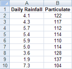
The first data point to appear in the scatter chart represents both a y value of 137 (particulate) and an x value of 1.9 (daily rainfall). These numbers represent the values in cell A9 and B9 on the worksheet.
In a line chart, however, the same daily rainfall and particulate values are displayed as two separate data points, which are evenly distributed along the horizontal axis. This is because a line chart only has one value axis (the vertical axis). The horizontal axis of a line chart only shows evenly spaced groupings (categories) of data. Because categories were not provided in the data, they were automatically generated, for example, 1, 2, 3, and so on.
This is a good example of when not to use a line chart.

A line chart distributes category data evenly along a horizontal (category) axis , and distributes all numerical value data along a vertical (value) axis.
The particulate y value of 137 (cell B9) and the daily rainfall x value of 1.9 (cell A9) are displayed as separate data points in the line chart. Neither of these data points is the first data point displayed in the chart — instead, the first data point for each data series refers to the values in the first data row on the worksheet (cell A2 and B2).
Axis type and scaling differences
Because the horizontal axis of a scatter chart is always a value axis, it can display numeric values or date values (such as days or hours) that are represented as numerical values. To display the numeric values along the horizontal axis with greater flexibility, you can change the scaling options on this axis the same way that you can change the scaling options of a vertical axis.
Because the horizontal axis of a line chart is a category axis, it can be only a text axis or a date axis. A text axis displays text only (non-numerical data or numerical categories that are not values) at evenly spaced intervals. A date axis displays dates in chronological order at specific intervals or base units, such as the number of days, months, or years, even if the dates on the worksheet are not in order or in the same base units.
The scaling options of a category axis are limited compared with the scaling options of a value axis. The available scaling options also depend on the type of axis that you use.
Scatter charts are commonly used for displaying and comparing numeric values, such as scientific, statistical, and engineering data. These charts are useful to show the relationships among the numeric values in several data series, and they can plot two groups of numbers as one series of xy coordinates.
Line charts can display continuous data over time, set against a common scale, and are therefore ideal for showing trends in data at equal intervals or over time. In a line chart, category data is distributed evenly along the horizontal axis, and all value data is distributed evenly along the vertical axis. As a general rule, use a line chart if your data has non-numeric x values — for numeric x values, it is usually better to use a scatter chart.
Consider using a scatter chart instead of a line chart if you want to:
-
Change the scale of the horizontal axis Because the horizontal axis of a scatter chart is a value axis, more scaling options are available.
-
Use a logarithmic scale on the horizontal axis You can turn the horizontal axis into a logarithmic scale.
-
Display worksheet data that includes pairs or grouped sets of values In a scatter chart, you can adjust the independent scales of the axes to reveal more information about the grouped values.
-
Show patterns in large sets of data Scatter charts are useful for illustrating the patterns in the data, for example by showing linear or non-linear trends, clusters, and outliers.
-
Compare large numbers of data points without regard to time The more data that you include in a scatter chart, the better the comparisons that you can make.
Consider using a line chart instead of a scatter chart if you want to:
-
Use text labels along the horizontal axis These text labels can represent evenly spaced values such as months, quarters, or fiscal years.
-
Use a small number of numerical labels along the horizontal axis If you use a few, evenly spaced numerical labels that represent a time interval, such as years, you can use a line chart.
-
Use a time scale along the horizontal axis If you want to display dates in chronological order at specific intervals or base units, such as the number of days, months, or years, even if the dates on the worksheet are not in order or in the same base units, use a line chart.
Note: The following procedure applies to Office 2013 and newer versions. Office 2010 steps?
Create a scatter chart

So, how did we create this scatter chart? The following procedure will help you create a scatter chart with similar results. For this chart, we used the example worksheet data. You can copy this data to your worksheet, or you can use your own data.
-
Copy the example worksheet data into a blank worksheet, or open the worksheet that contains the data you want to plot in a scatter chart.
1
2
3
4
5
6
7
8
9
10
11
A
B
Daily Rainfall
Particulate
4.1
122
4.3
117
5.7
112
5.4
114
5.9
110
5.0
114
3.6
128
1.9
137
7.3
104
-
Select the data you want to plot in the scatter chart.
-
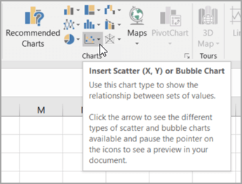
Click the Insert tab, and then click Insert Scatter (X, Y) or Bubble Chart.
-
Click Scatter.
Tip: You can rest the mouse on any chart type to see its name.
-
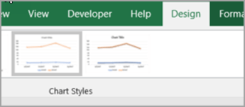
Click the chart area of the chart to display the Design and Format tabs.
-
Click the Design tab, and then click the chart style you want to use.
-
Click the chart title and type the text you want.
-
To change the font size of the chart title, right-click the title, click Font, and then enter the size that you want in the Size box. Click OK.
-
Click the chart area of the chart.
-
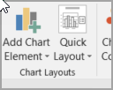
On the Design tab, click Add Chart Element > Axis Titles, and then do the following:
-
To add a horizontal axis title, click Primary Horizontal.
-
To add a vertical axis title, click Primary Vertical.
-
Click each title, type the text that you want, and then press Enter.
-
For more title formatting options, on the Format tab, in the Chart Elements box, select the title from the list, and then click Format Selection. A Format Title pane will appear. Click Size & Properties
, and then you can choose Vertical alignment, Text direction, or Custom angle.
-
-
Click the plot area of the chart, or on the Format tab, in the Chart Elements box, select Plot Area from the list of chart elements.
-
On the Format tab, in the Shape Styles group, click the More button
, and then click the effect that you want to use. -
Click the chart area of the chart, or on the Format tab, in the Chart Elements box, select Chart Area from the list of chart elements.
-
On the Format tab, in the Shape Styles group, click the More button
, and then click the effect that you want to use. -
If you want to use theme colors that are different from the default theme that is applied to your workbook, do the following:
-
On the Page Layout tab, in the Themes group, click Themes.
-
Under Office, click the theme that you want to use.
-
 , and then you can choose Vertical alignment, Text direction, or Custom angle.
 , and then click the effect that you want to use.
Create a line chart

So, how did we create this line chart? The following procedure will help you create a line chart with similar results. For this chart, we used the example worksheet data. You can copy this data to your worksheet, or you can use your own data.
-
Copy the example worksheet data into a blank worksheet, or open the worksheet that contains the data that you want to plot into a line chart.
1
2
3
4
5
6
7
8
9
10
11
A
B
C
Date
Daily Rainfall
Particulate
1/1/07
4.1
122
1/2/07
4.3
117
1/3/07
5.7
112
1/4/07
5.4
114
1/5/07
5.9
110
1/6/07
5.0
114
1/7/07
3.6
128
1/8/07
1.9
137
1/9/07
7.3
104
-
Select the data that you want to plot in the line chart.
-
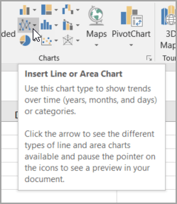
Click the Insert tab, and then click Insert Line or Area Chart.
-
Click Line with Markers.
-
Click the chart area of the chart to display the Design and Format tabs.
-
Click the Design tab, and then click the chart style you want to use.
-
Click the chart title and type the text you want.
-
To change the font size of the chart title, right-click the title, click Font, and then enter the size that you want in the Size box. Click OK.
-
Click the chart area of the chart.
-
On the chart, click the legend, or add it from a list of chart elements (on the Design tab, click Add Chart Element > Legend, and then select a location for the legend).
-
To plot one of the data series along a secondary vertical axis, click the data series, or select it from a list of chart elements (on the Format tab, in the Current Selection group, click Chart Elements).
-
On the Format tab, in the Current Selection group, click Format Selection. The Format Data Series task pane appears.
-
Under Series Options, select Secondary Axis, and then click Close.
-
On the Design tab, in the Chart Layouts group, click Add Chart Element, and then do the following:
-
To add a primary vertical axis title, click Axis Title >Primary Vertical. and then on the Format Axis Title pane, click Size & Properties
to configure the type of vertical axis title that you want. -
To add a secondary vertical axis title, click Axis Title > Secondary Vertical, and then on the Format Axis Title pane, click Size & Properties
to configure the type of vertical axis title that you want. -
Click each title, type the text that you want, and then press Enter
-
-
Click the plot area of the chart, or select it from a list of chart elements (Format tab, Current Selection group, Chart Elements box).
-
On the Format tab, in the Shape Styles group, click the More button
, and then click the effect that you want to use.
-
Click the chart area of the chart.
-
On the Format tab, in the Shape Styles group, click the More button
, and then click the effect that you want to use. -
If you want to use theme colors that are different from the default theme that is applied to your workbook, do the following:
-
On the Page Layout tab, in the Themes group, click Themes.
-
Under Office, click the theme that you want to use.
-
Create a scatter or line chart in Office 2010
So, how did we create this scatter chart? The following procedure will help you create a scatter chart with similar results. For this chart, we used the example worksheet data. You can copy this data to your worksheet, or you can use your own data.
-
Copy the example worksheet data into a blank worksheet, or open the worksheet that contains the data that you want to plot into a scatter chart.
1
2
3
4
5
6
7
8
9
10
11
A
B
Daily Rainfall
Particulate
4.1
122
4.3
117
5.7
112
5.4
114
5.9
110
5.0
114
3.6
128
1.9
137
7.3
104
-
Select the data that you want to plot in the scatter chart.
-
On the Insert tab, in the Charts group, click Scatter.
-
Click Scatter with only Markers.
Tip: You can rest the mouse on any chart type to see its name.
-
Click the chart area of the chart.
This displays the Chart Tools, adding the Design, Layout, and Format tabs.
-
On the Design tab, in the Chart Styles group, click the chart style that you want to use.
For our scatter chart, we used Style 26.
-
On the Layout tab, click Chart Title and then select a location for the title from the drop-down list.
We chose Above Chart.
-
Click the chart title, and then type the text that you want.
For our scatter chart, we typed Particulate Levels in Rainfall.
-
To reduce the size of the chart title, right-click the title, and then enter the size that you want in the Font Size box on the shortcut menu.
For our scatter chart, we used 14.
-
Click the chart area of the chart.
-
On the Layout tab, in the Labels group, click Axis Titles, and then do the following:
-
To add a horizontal axis title, click Primary Horizontal Axis Title, and then click Title Below Axis.
-
To add a vertical axis title, click Primary Vertical Axis Title, and then click the type of vertical axis title that you want.
For our scatter chart, we used Rotated Title.
-
Click each title, type the text that you want, and then press Enter.
For our scatter chart, we typed Daily Rainfall in the horizontal axis title, and Particulate level in the vertical axis title.
-
-
Click the plot area of the chart, or select Plot Area from a list of chart elements (Layout tab, Current Selection group, Chart Elements box).
-
On the Format tab, in the Shape Styles group, click the More button
, and then click the effect that you want to use.For our scatter chart, we used the Subtle Effect — Accent 3.
-
Click the chart area of the chart.
-
On the Format tab, in the Shape Styles group, click the More button
, and then click the effect that you want to use.For our scatter chart, we used the Subtle Effect — Accent 1.
-
If you want to use theme colors that are different from the default theme that is applied to your workbook, do the following:
-
On the Page Layout tab, in the Themes group, click Themes.
-
Under Built-in, click the theme that you want to use.
For our line chart, we used the Office theme.
-

So, how did we create this line chart? The following procedure will help you create a line chart with similar results. For this chart, we used the example worksheet data. You can copy this data to your worksheet, or you can use your own data.
-
Copy the example worksheet data into a blank worksheet, or open the worksheet that contains the data that you want to plot into a line chart.
1
2
3
4
5
6
7
8
9
10
11
A
B
C
Date
Daily Rainfall
Particulate
1/1/07
4.1
122
1/2/07
4.3
117
1/3/07
5.7
112
1/4/07
5.4
114
1/5/07
5.9
110
1/6/07
5.0
114
1/7/07
3.6
128
1/8/07
1.9
137
1/9/07
7.3
104
-
Select the data that you want to plot in the line chart.
-
On the Insert tab, in the Charts group, click Line.
-
Click Line with Markers.
-
Click the chart area of the chart.
This displays the Chart Tools, adding the Design, Layout, and Format tabs.
-
On the Design tab, in the Chart Styles group, click the chart style that you want to use.
For our line chart, we used Style 2.
-
On the Layout tab, in the Labels group, click Chart Title, and then click Above Chart.
-
Click the chart title, and then type the text that you want.
For our line chart, we typed Particulate Levels in Rainfall.
-
To reduce the size of the chart title, right-click the title, and then enter the size that you want in the Size box on the shortcut menu.
For our line chart, we used 14.
-
On the chart, click the legend, or select it from a list of chart elements (Layout tab, Current Selection group, Chart Elements box).
-
On the Layout tab, in the Labels group, click Legend, and then click the position that you want.
For our line chart, we used Show Legend at Top.
-
To plot one of the data series along a secondary vertical axis, click the data series for Rainfall, or select it from a list of chart elements (Layout tab, Current Selection group, Chart Elements box).
-
On the Layout tab, in the Current Selection group, click Format Selection.
-
Under Series Options, select Secondary Axis, and then click Close.
-
On the Layout tab, in the Labels group, click Axis Titles, and then do the following:
-
To add a primary vertical axis title, click Primary Vertical Axis Title, and then click the type of vertical axis title that you want.
For our line chart, we used Rotated Title.
-
To add a secondary vertical axis title, click Secondary Vertical Axis Title, and then click the type of vertical axis title that you want.
For our line chart, we used Rotated Title.
-
Click each title, type the text that you want, and then press ENTER.
For our line chart, we typed Particulate level in the primary vertical axis title, and Daily Rainfall in the secondary vertical axis title.
-
-
Click the plot area of the chart, or select it from a list of chart elements (Layout tab, Current Selection group, Chart Elements box).
-
On the Format tab, in the Shape Styles group, click the More button
, and then click the effect that you want to use.For our line chart, we used the Subtle Effect — Dark 1.
-
Click the chart area of the chart.
-
On the Format tab, in the Shape Styles group, click the More button
, and then click the effect that you want to use.For our line chart, we used the Subtle Effect — Accent 3.
-
If you want to use theme colors that are different from the default theme that is applied to your workbook, do the following:
-
On the Page Layout tab, in the Themes group, click Themes.
-
Under Built-in, click the theme that you want to use.
For our line chart, we used the Office theme.
-
Create a scatter chart
-
Select the data you want to plot in the chart.
-
Click the Insert tab, and then click X Y Scatter, and under Scatter, pick a chart.
-
With the chart selected, click the Chart Design tab to do any of the following:
-
Click Add Chart Element to modify details like the title, labels, and the legend.
-
Click Quick Layout to choose from predefined sets of chart elements.
-
Click one of the previews in the style gallery to change the layout or style.
-
Click Switch Row/Column or Select Data to change the data view.
-
-
With the chart selected, click the Design tab to optionally change the shape fill, outline, or effects of chart elements.
Create a line chart
-
Select the data you want to plot in the chart.
-
Click the Insert tab, and then click Line, and pick an option from the available line chart styles .
-
With the chart selected, click the Chart Design tab to do any of the following:
-
Click Add Chart Element to modify details like the title, labels, and the legend.
-
Click Quick Layout to choose from predefined sets of chart elements.
-
Click one of the previews in the style gallery to change the layout or style.
-
Click Switch Row/Column or Select Data to change the data view.
-
-
With the chart selected, click the Design tab to optionally change the shape fill, outline, or effects of chart elements.
See Also
Save a custom chart as a template
Need more help?
In the following tutorial, we’ll show you how to create a single line graph in Excel 2011 for Mac. When the steps differ for other versions of Excel, they will be called out after each step.
Creating a single line graph in Excel is a straightforward process. Excel offers a number of different variations of the line graph.
-
Line: If there is more than one data series, each is plotted individually.
-
Stacked Line: This option requires more than one data set. Each additional set is added to the first, so the top line is the total of the ones below it. Therefore, the lines will never cross.
-
100% Stacked Line: This graph is similar to a stacked line graph, but the Y axis depicts percentages rather than an absolute values. The top line will always appear straight across the top of the graph and a period’s total will be 100 percent.
-
Marked Line Graph: The marked versions of each 2-D graph add indicators at each data point.
-
3D Line: Similar to the basic line graph, but represented in a 3D format.

Step-by-Step Instructions to Build a Line Graph in Excel
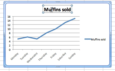
Once you collect the data you want to chart, the first step is to enter it into Excel. The first column will be the time segments (hour, day, month, etc.), and the second will be the data collected (muffins sold, etc.).
Highlight both columns of data and click Charts > Line > and make your selection. We chose Line for this example, since we are only working with one data set.
Excel creates the line graph and displays it in your worksheet.
Other Versions of Excel: Click the Insert tab > Line Chart > Line. In 2016 versions, hover your cursor over the options to display a sample image of the graph.
Customizing a Line Graph
To change parts of the graph, right-click on the part and then click Format. The following options are available for most of the graph elements. Changes specific to each element are discussed below:
-
Font: Change the text color, style, and font.
-
Fill: Add a background color or pattern.
-
Shadow, Glow & Soft Edges and 3-D Format: Make an object stand out.
Line Graph Titles
If Excel doesn’t automatically create a title, select the graph, then click Chart > Chart Layout > Chart Title.
Other Versions of Excel: Click the Chart Tools tab > Layout > Chart Title, and click your option.
To change the text of title, just click on it and type.
To change the appearance of the title, right-click on it, then click Format Chart Title….
The Line option adds a border around the text. See the beginning of this section for the other options.
Other Versions of Excel: Click the Page Layout tab > Chart Title, and click your option.
Using Legends in Line Graphs
To change the legend, right-click on it and click Format Legend….
Click the Placement option to move the location in relation to the plot area.
Axes
To change the scale of an axis, right-click on one and click Format Axis… > Scale.
Entering values into the Minimum and Maximum boxes will change the top and bottom values of the vertical axis.
You can add more lines to the plot area to show more granularity. Right-click an axis (the new lines will appear perpendicular to the axis selected), and click Add Minor Gridlines or Add Major Gridlines (if available).
Other versions of Excel: Click the Chart Tools tab, click Layout, and choose the option. Depending on your version, you can also click Add Chart Element in ribbon on the Chart Design tab.
To adjust the spacing between gridlines, right-click and then click Format Major Gridlines or Format Minor Gridlines.
Other Versions of Excel: Click the Insert tab > Line Chart > Line. In 2016 versions, hover your cursor over the options to display a sample of how the graph will appear.
Changing The Line
To change the appearance of the graph’s line, right-click on the line, click Format Data Series… > Line. If you want to change the color of the line, select from the Color selection box.
Moving the Line Graph
If you need to relocate the graph to a different place on the same worksheet, click on a blank area in the chart and drag the graph.
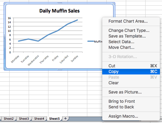
To move the line graph to another worksheet, right-click the graph, click Move…, and then choose an existing worksheet or create a new one.
To add the graph to another program such as Microsoft Word or PowerPoint, right-click on the chart and click Cut or Copy, then paste it into the desired program.
Over the past years, one of the things we’ve learned is that Microsoft Excel is like a Hallmark movie.
Some of us can’t get enough of them and others just can’t stand it. 💔😬
Regardless of your preference, if you’re a manager or business owner, you’ll probably have to rely on Excel for business insights.
Tools like Microsoft Excel graphs are helpful for data analysis and tracking.
And wayyy better than endless spreadsheets that can easily trigger a migraine.
Then why not turn your boring Excel spreadsheet into something interesting?
In this article, we’ll learn what an Excel graph is, how to make a graph in Excel, and its drawbacks. We’ll also suggest an alternative to create effortless graphs.
Let’s graph away!
What are Graphs & Charts in Microsoft Excel?
Graphs in Excel are graphical representations of variations in values of data points over a given period.
In other words, it’s a diagram that represents changes in comparison to one or more variables.
Too technical? 👀
Take a look at the image for clarity:

Wondering if graphs and charts in Excel are the same?
Graphs are mostly numerical representations of data as it shows how one variable is affecting or changing another.
On the other hand, charts are visual representations where variables may or may not be associated. They’re also considered more aesthetically pleasing than graphs. For example, a pie chart. 🥧
However, if you’re wondering how to make a chart in Excel, it isn’t very different from making a graph.
But for now, let’s focus on the main plot: graphs!✨
Steps To Make a Graph in Excel
The first (and obvious step) is to open a new Excel file or a blank Excel worksheet.
Done?
Then let’s learn how to create a graph in Excel.
⭐️ Step 1: fill the Excel sheet with data
Start by populating your Excel spreadsheet with the data you need.
You may import this data from different software, insert it manually, or copy and paste it.
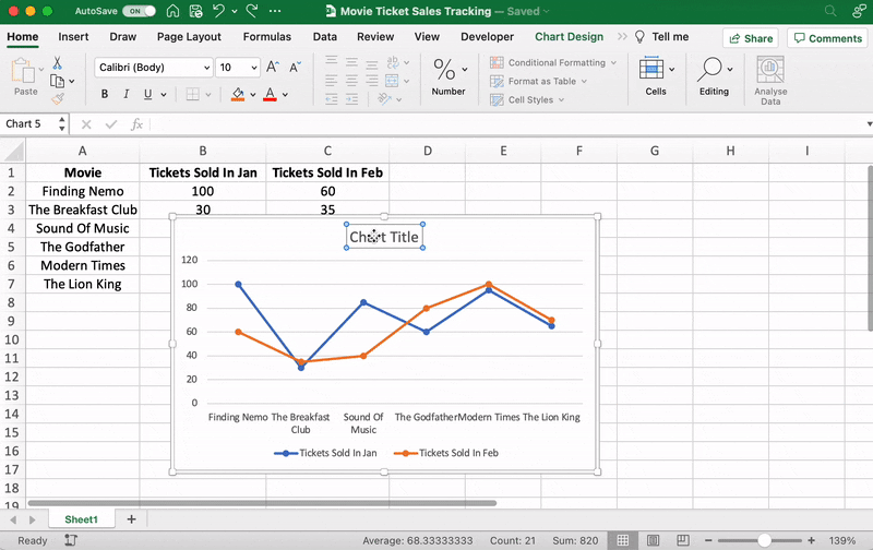
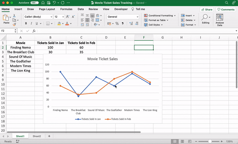
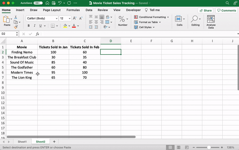
For our example, let’s say you’re an owner of a movie theater in a small town, and you often screen older movies. You probably want to track the sales of your tickets to see which movie is a hit so you can screen it frequently.
Let’s do that by comparing the ticket sales in January and February.
Here’s what your data might look like:

Column A contains the movie names.
Column B contains tickets sold in January.
And column C contains tickets sold in February.
You can bold headings and center align your text for better readability.
Done? Okay, get ready to pick a graph.
⭐️ Step 2: determine the Excel graph type you want
The type of graph you pick will depend on the data you have and the number of different parameters you want to track.
You’ll find the different graph types under the Excel Insert tab, in the Excel Ribbon, arranged close to one another like this:

Note: The Excel Ribbon is where you can find the Home, Insert, and Draw tabs.
Here are some of the different Excel graph or chart type options you can choose from:
- Line graph
- Column graph or bar graph
- Pie graph or chart
- Combo chart
- Area chart
- Scatter plot chart
➡️ Fun fact: Excel can help you decide the graph or chart type with the Recommended Charts (formerly known as Chart Wizard) option.
If you want to take notes of trends (increase or decrease) over time, then a line graph is perfect.
But for a long time frame and more data, a bar graph is the best option.
We’ll use these two graphs for the purpose of this Excel tutorial.
How To Create a Line Graph in Excel – 3 Steps
A line graph in Excel typically has two axes (horizontal and vertical) to function.
You need to enter the data in two columns.
Lucky for us, we’ve already done this when creating the ticket sales data table.
⭐️ Step 1: select data to turn into a line graph
Click and drag from the top-left cell (A1) in your ticket sales data to the bottom-right cell (C7) to select. Don’t forget to include column headers.
This will highlight all the data you want to display in your line graph.

⭐️ Step 2: insert line graph
Now that you’ve selected your data, it’s time to add the line graph.
Look for the line graph icon under the Insert tab.

With the data selected, go to Insert > Line. Click on the icon, and a dropdown menu will appear to select the type of line chart you want.
For this example, we’ll choose the fourth 2-D line graph (Line with Markers).
Excel will add your line graph representing your selected data series.

You’ll then notice the names of the movies appear on the horizontal axis and the number of tickets sold on the vertical axis.
⭐️ Step 3: customize your line graph
After adding the line graph, you’ll notice a new tab called Chart Design on your Excel Ribbon.
Select the Design tab to make the line graph your own by choosing the chart style you prefer.

You can also change the graph’s title.
Select the Chart Title > double click to name > type in the name you wish to call it. To save it, simply click anywhere outside the graph’s title box or chart area.
We’ll name our graph “Movie Ticket Sales.”
Anything else you need to tweak?
If you spot anything, now is the time to make those edits!
For example, here you can see The Godfather and Modern Times are smooshed together.
Let’s give them some space.
How?
Just drag any corner of the graph until it’s how you desire.

These are just some examples. You can customize every chart element if you like including the Axis Labels (the color of the lines that represent each data point, etc.)
Just double click on any chart element to open a sidebar for formatting like this:
That’s it! You’ve successfully created a line graph in Excel!
Now, let’s learn how to make a bar graph. 📊
3 Steps To Create a Bar Graph in Excel
Any Excel graph or Excel chart begins with a populated sheet.
We’ve already done this, so copy and paste the movie ticket sales data to a new sheet tab in the same Excel workbook.
⭐️ Step 1: select data to turn into a bar graph
Like step 1 for the line graph, you need to select the data you wish to turn into a bar graph.
Drag from cell A1 to C7 to highlight the data.
⭐️ Step 2: insert bar graph
Highlight your data, go to the Insert tab, and click on the Column chart or graph icon. A dropdown menu should appear.
Select Clustered Bar under the 2-D bar options.
Note: you can choose a different type of bar chart option like a 3D clustered column or 2D stacked bar, etc.
As soon as you click on the bar graph option, it’ll be added to your Excel sheet.

⭐️ Step 3: customize your Excel bar graph
Now, you can go to the Chart Design tab in the Excel Ribbon to personalize it.
Click on the Design tab to apply a bar style you prefer from the many options.

You know the next step! Change the bar graph’s title.
Select the Excel Chart Title > double click on the title box > type in “Movie Ticket Sales.”
Then click anywhere on the excel sheet to save it.

Note: you can also add other graph elements such as Axis Title, Data Label, Data Table, etc., with the Add Chart Element option. You’ll find it under the Chart Design tab.
And that’s a wrap. 🎬
You’ve successfully created a bar graph in Excel!
Well, that was fun.
But the question is, do you have the time for graphs in your busy work schedule?
And that’s just the teaser when it comes to Excel graph drawbacks.
Read on to watch the full movie. 👀
Bonus: Check out these Excel Alternatives!
Create Effortless Graphs With ClickUp
If ClickUp were a Hallmark movie, graphs and this project management tool would be the perfect match.
A forever kind-of-love. ❤️
Whether you want to create graphs to monitor time, projects, people, ticket sales… you name it because we can do it all within a few clicks.
All without the drawbacks of using Excel!
Excel can be:
- Time-consuming and manual
- Complex and pricey
- Error-prone
The best part?
Most of those functions are automated without manual data entry. Phew.
1. Line Chart Widgets
The Line Chart Widget is a Custom Widget on our Dashboard. Use this ClickUp production to visualize literally anything in the form of a line graph.
It can be tracking profits, total daily sales, or how many movies you’ve watched in a month.
Like we said, a-n-y-t-h-i-n-g!

Visualize any set of values as a line graph with the Line Chart Widget on ClickUp’s Dashboard!
And that’s not it. You can visualize your data in many different ways too.
Just use any of these Custom Widgets:
- Calculations
- Bar charts
- Battery chart
- Pie chart
- And more

Present your data visually as a pie chart with Custome Widgets in ClickUp!
2. Gantt Chart view
Just like it’s difficult to love just one movie genre, we totally get that graphs alone don’t work.
And that’s why we have charts too!
Specifically, ClickUp’s Gantt chart, an interactive chart with live updates and progress tracking that can help you:
- Plan projects
- Assign tasks and assignees
- Schedule a timeline
- Manage dependencies
- And more

Drawing a relationship from one task to a future task in ClickUp’s Gantt Chart view!
3. Table view
If you’re a fan of the Excel grids, ClickUp has your back.
Starring… ClickUp Table view!
This view lets you visualize your tasks in the spreadsheet style.
It’s super fast and allows easy navigation between fields, bulk edits, and data export.
➡️ Fun fact: you can quickly copy and paste your table’s data into other programs, like MS Excel. Just click and drag to highlight the cells you want to copy.
Highlight data from your table in ClickUp to copy and paste into other programs!
And that was just the trailer for you. 📽️
Here are some more powerful ClickUp features in store for:
- Send and receive emails right from your project management tool with Email in ClickUp
- Work even when the wifi acts up with Offline Mode
- Work how you like with multiple ClickUp Views, including Calendar, Mind Maps, Chat, etc.
- Reduce your workload with ClickUp Automations
- Track time spent on tasks with ClickUp’s Native Time Tracker
- Share Table view or Dashboards with clients and external users using Public Sharing and Permissions
- View all graphs and charts on the go with ClickUp mobile apps
Now Showing: ClickUp 🎥🍿
You can surely make tons of graphs in Excel.
No doubt there.
But does that make it a smart choice?
I mean, if you have to Google how to make a graph in Excel, maybe that’s your red flag. 🚩
Tools are supposed to make your life easier.
Take ClickUp, for instance.
Our project management tool can be your graph maker, chart creator, spreadsheet builder, time tracker, workload manager…
It’s a hallmark for a quality tool that can be your all-in-one solution.
Get your ClickUp ticket for free today and enjoy watching your graphs come to life in minutes!
Related readings:
- How to create Gantt charts in Excel
- How to create a Kanban board in Excel
- How to create a burndown chart in Excel
- How to create a flowchart in Excel
- How to show dependencies in Excel
- How to create a KPI dashboard in Excel
- How to create a dashboard in Excel
- How to create a database in Excel
- How to make a work breakdown structure in Excel
How to Make and Format a Line Graph in Excel
When you just need a line, there are simple tips to use
Updated on February 11, 2021
What to Know
- Highlight the data you want to chart. Go to Insert > Charts and select a line chart, such as Line With Markers. Click Chart Title to add a title.
- To change the graph’s colors, click the title to select the graph, then click Format > Shape Fill. Choose a color, gradient, or texture.
- To fade out the gridlines, go to Format > Format Selection. Click a horizontal gridline, then change the transparency to 75%.
This article explains how to add a line graph to a Microsoft Excel sheet or workbook to create a visual representation of the data, which may reveal trends and changes that might otherwise go unnoticed. Instructions cover Excel 2019, 2016, 2013, 2010, and Excel for Microsoft 365.
Make a Basic Line Graph
The steps below add a simple, unformatted graph that displays only the lines representing the selected series of data, a default chart title, a legend, and axes values to the current worksheet.
-
Enter the data in cells A1 to C6.
-
Highlight the data, including row and column headings.
-
Click on the Insert tab of the ribbon.
-
In the Charts section of the ribbon, click on the Insert Line Chart icon to open the drop-down list of available chart and graph types.
-
Hover your mouse pointer over a chart type to read a description.
-
Click 2D line.
-
The chart will appear on your spreadsheet. Click and hold to move the chart to the right, away from the data table.
Add the Chart Title
When you insert a chart, its default title is «Chart Title.» It doesn’t carry over the title from your table, but you can easily edit the chart title.
-
Click once on the default chart title to select it. A box should appear around the words Chart Title.
-
Click a second time to put Excel in edit mode, which places the cursor inside the title box.
-
Delete the default text using the Delete or Backspace keys on the keyboard.
-
Enter the chart title into the title box.
Change the Chart’s Colors
You can change the chart’s colors including the background color, text color, and graph lines.
-
Click next to the chart title to select the entire graph.
-
Click the Format tab of the ribbon.
-
Click the Shape Fill option to open the Fill Colors drop-down panel. Choose a color, texture, gradient, or texture to fill the background.
-
Stay on the Format tab and click the Text Fill option to open the Text Colors drop-down list. Choose the color you want to use. All the text in the title, x- and y-axes, and legend should change.
-
You can change the color for each line in the graph individually.
-
Click once on a line to select it.
-
Small highlights should appear along the length of the line. On the Format tab click the Format Selection option to open the Formatting task pane.
-
Then click the Fill icon (the paint can) in the task pane to open the Line options list.
-
Scroll down to color and click the down arrow next to it to open the Line Colors drop-down list.
-
Click on the color you want to use for the line. Repeat for the other lines, if desired.
Fade out the Gridlines
Finally, you can also change the formatting of the gridlines that run horizontally across the graph.
The line graph includes these gridlines by default to make it easier to read the values for specific points on the data lines.
They do not, however, need to be quite so prominently displayed. One easy way to tone them down is to adjust their transparency using the Formatting Task pane.
By default, their transparency level is 0%, but by increasing that, the gridlines will fade into the background where they belong.
-
Click on the Format Selection option on the Format tab of the ribbon to open the Formatting Task pane.
-
In the graph, click once on one of the horizontal gridlines running through the middle of the graph. There should then be blue dots at the end of each gridline.
-
In the pane change the transparency level to 75% – the gridlines on the graph should fade significantly.
Avoid Clicking on the Wrong Part of the Chart
There are many different parts to a chart in Excel – such as the chart title and labels, the plot area that contains the lines representing the selected data, the horizontal and vertical axes, and the horizontal gridlines.
All of these parts are considered separate objects by the program so that you can format them separately. You tell Excel which part of the graph you want to format by clicking on it with the mouse pointer to select it.
If your graph doesn’t look like those pictured in this article, it is likely that you did not have the right part of the chart selected when you applied the formatting option.
The most common mistake is clicking on the plot area in the center of the graph when the intention is to select the entire chart.
The easiest way to select the entire graph is to click in the top left or right corner away from the chart title.
If you make a mistake, it can be quickly corrected using Excel’s undo feature. Then, click the correct part of the chart and try again.
Thanks for letting us know!
Get the Latest Tech News Delivered Every Day
Subscribe