
Excel for Microsoft 365 Excel 2021 Excel 2019 Excel 2016 Excel 2013 More…Less
A dashboard is a visual representation of key metrics that allow you to quickly view and analyze your data in one place. Dashboards not only provide consolidated data views, but a self-service business intelligence opportunity, where users are able to filter the data to display just what’s important to them. In the past, Excel reporting often required you to generate multiple reports for different people or departments depending on their needs.
Overview
In this topic, we’ll discuss how to use multiple PivotTables, PivotCharts and PivotTable tools to create a dynamic dashboard. Then we’ll give users the ability to quickly filter the data the way they want with Slicers and a Timeline, which allow your PivotTables and charts to automatically expand and contract to display only the information that users want to see. In addition, you can quickly refresh your dashboard when you add or update data. This makes it very handy because you only need to create the dashboard report once.
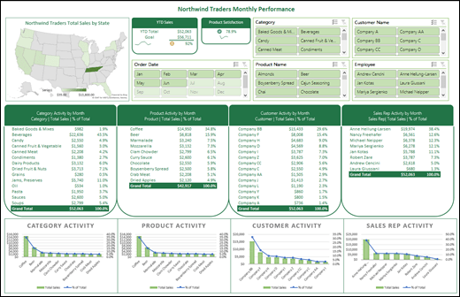
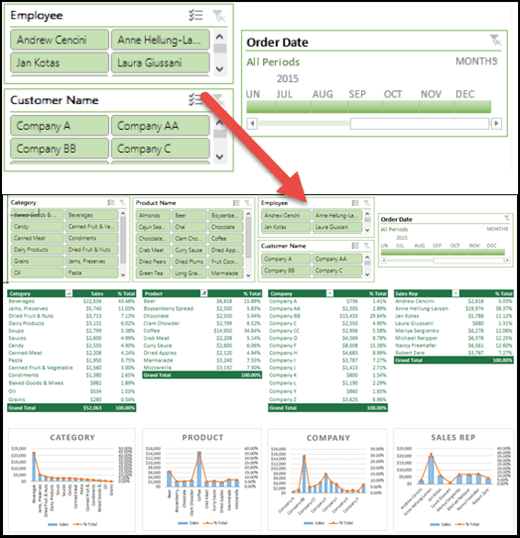
For this example, we’re going to create four PivotTables and charts from a single data source.
Once your dashboard is created, we’ll show you how to share it with people by creating a Microsoft Group. We also have an interactive Excel workbook that you can download and follow these steps on your own.
Download the Excel Dashboard tutorial workbook.
Get your data
-
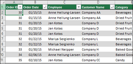
You can copy and paste data directly into Excel, or you can set up a query from a data source. For this topic, we used the Sales Analysis query from the Northwind Traders template for Microsoft Access. If you want to use it, you can open Access and go to File > New > Search for «Northwind» and create the template database. Once you’ve done that you’ll be able to access any of the queries included in the template. We’ve already put this data into the Excel workbook for you, so there’s no need to worry if you don’t have Access.
-
Verify your data is structured properly, with no missing rows or columns. Each row should represent an individual record or item. For help with setting up a query, or if your data needs to be manipulated, see Get & Transform in Excel.

-
If it’s not already, format your data as an Excel Table. When you import from Access, the data will automatically be imported to a table.
Create PivotTables
-
Select any cell within your data range, and go to Insert > PivotTable > New Worksheet. See Create a PivotTable to analyze worksheet data for more details.
-
Add the PivotTable fields that you want, then format as desired. This PivotTable will be the basis for others, so you should spend some time making any necessary adjustments to style, report layout and general formatting now so you don’t have to do it multiple times. For more details, see: Design the layout and format of a PivotTable.
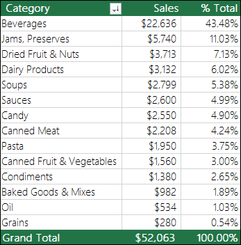
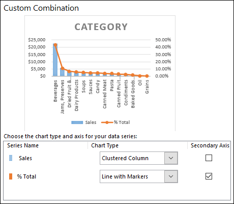
In this case, we created a top-level summary of sales by product category, and sorted by the Sales field in descending order.
See Sort data in a PivotTable or PivotChart for more details.
-
Once you’ve created your master PivotTable, select it, then copy and paste it as many times as necessary to empty areas in the worksheet. For our example, these PivotTables can change rows, but not columns so we placed them on the same row with a blank column in between each one. However, you might find that you need to place your PivotTables beneath each other if they can expand columns.
Important: PivotTables can’t overlap one another, so make sure that your design will allow enough space between them to allow for them to expand and contract as values are filtered, added or removed.
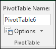
At this point you might want to give your PivotTables meaningful names, so you know what they do. Otherwise, Excel will name them PivotTable1, PivotTable2 and so on. You can select each one, then go to PivotTable Tools > Analyze > enter a new name in the PivotTable Name box. This will be important when it comes time to connect your PivotTables to Slicers and Timeline controls.
Create PivotCharts
-
Click anywhere in the first PivotTable and go to PivotTable Tools > Analyze > PivotChart > select a chart type. We chose a Combo chart with Sales as a Clustered Column chart, and % Total as a Line chart plotted on the Secondary axis.
-
Select the chart, then size and format as desired from the PivotChart Tools tab. For more details see our series on Formatting charts.
-
Repeat for each of the remaining PivotTables.
-
Now is a good time to rename your PivotCharts too. Go to PivotChart Tools > Analyze > enter a new name in the Chart Name box.
Add Slicers and a Timeline
Slicers and Timelines allow you to quickly filter your PivotTables and PivotCharts, so you can see just the information that’s meaningful to you.
-
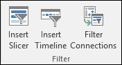
Select any PivotTable and go to PivotTable Tools > Analyze > Filter > Insert Slicer, then check each item you want to use for a slicer. For this dashboard, we selected Category, Product Name, Employee and Customer Name. When you click OK, the slicers will be added to the middle of the screen, stacked on top of each other, so you’ll need to arrange and resize them as necessary.
-
Slicer Options – If you click on any slicer, you can go to Slicer Tools > Options and select various options, like Style and how many columns are displayed. You can align multiple slicers by selecting them with Ctrl+Left-click, then use the Align tools on the Slicer Tools tab.
-
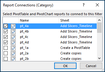
Slicer Connections — Slicers will only be connected to the PivotTable you used to create them, so you need to select each Slicer then go to Slicer Tools > Options > Report Connections and check which PivotTables you want connected to each. Slicers and Timelines can control PivotTables on any worksheet, even if the worksheet is hidden.
-
Add a Timeline – Select any PivotTable and go to PivotTable Tools > Analyze > Filter > Insert Timeline, then check each item you want to use. For this dashboard, we selected Order Date.
-
Timeline Options – Click on the Timeline, and go to Timeline Tools > Options and select options like Style, Header and Caption. Select the Report Connections option to link the timeline to the PivotTables of your choice.
Learn more about Slicers and Timeline controls.
Next steps
Your dashboard is now functionally complete, but you probably still need to arrange it the way you want and make final adjustments. For instance, you might want to add a report title, or a background. For our dashboard, we added shapes around the PivotTables and turned off Headings and Gridlines from the View tab.
Make sure to test each of your slicers and timelines to make sure that your PivotTables and PivotCharts behave appropriately. You may find situations where certain selections cause issues if one PivotTable wants to adjust and overlap another, which it can’t do and will display an error message. These issues should be corrected before you distribute your dashboard.
Once you’re done setting up your dashboard, you can click the “Share a Dashboard” tab at the top of this topic to learn how to distribute it.
Congratulations on creating your dashboard! In this step we’ll show you how to set up a Microsoft Group to share your dashboard. What we’re going to do is pin your dashboard to the top of your group’s document library in SharePoint, so your users can easily access it at any time.
Store your dashboard in the group
If you haven’t already saved your dashboard workbook in the group you’ll want to move it there. If it’s already in the group’s files library then you can skip this step.
-
Go to your group in either Outlook 2016 or Outlook on the web.
-
Click Files in the ribbon to access the group’s document library.
-
Click the Upload button on the ribbon and upload your dashboard workbook to the document library.
Add it to your group’s SharePoint Online team site
-
If you accessed the document library from Outlook 2016, click Home on the navigation pane on the left. If you accessed the document library from Outlook on the web, click More > Site from the right end of the ribbon.
-
Click Documents from the navigation pane at the left.
-
Find your dashboard workbook and click the selection circle just to the left of its name.
-
When you have the dashboard workbook selected, choose Pin to top on the ribbon.
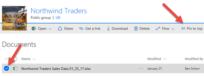
Now whenever your users come to the Documents page of your SharePoint Online team site your dashboard worksheet will be right there at the top. They can click on it and easily access the current version of the dashboard.
Tip: Your users can also access your group document library, including your dashboard workbook, via the Outlook Groups mobile app.
See also
-
What is SharePoint?
-
Learn about Microsoft 365 groups
Got questions we didn’t answer here?
Visit the Microsoft Answers Community.
We’re listening!
This article was last reviewed by Ben and Chris on March 16th, 2017 as a result of your feedback. If you found it helpful, and especially if you didn’t, please use the feedback controls below and leave us some constructive feedback, so we can continue to make it better. Thanks!
Need more help?
Want more options?
Explore subscription benefits, browse training courses, learn how to secure your device, and more.
Communities help you ask and answer questions, give feedback, and hear from experts with rich knowledge.
В бизнесе сложно добиться системного роста, если регулярно не отслеживать ключевые показатели, которые влияют на прибыльность компании. Для этого лучше всего подходят дашборды, в которых данные представлены в понятном виде, что существенно облегчает принятие решений.
Пошагово рассмотрим, как построить дашборд по продажам в Excel. Статья будет полезна всем, кто начинает знакомство с этим мощным инструментом аналитики данных.
Дашборд ― динамический отчёт, который состоит из структурированного набора данных и их визуализации на основе диаграмм, графиков и таблиц.
Основные задачи дашборда:
- представить набор данных максимально наглядным и понятным;
- держать под контролем ключевые бизнес―показатели;
- находить взаимосвязи, выявлять негативные и положительные тенденции, находить слабые места в организации рабочих процессов;
- давать оперативную сводку в режиме реального времени.
Построение дашбордов ― такой же hard skill, как владение формулами в Excel. По статистике, пользователь Excel среднего уровня может освоить этот навык за 20 часов обучения и практики.
Для специалистов, которые работают с отчётами, навык построения дашбордов стал необходимостью, а не дополнительным преимуществом.
Чаще всего созданием дашборда занимается аналитик — он обрабатывает огромные массивы данных, оформляет их в красивый и понятный дашборд и передаёт заказчику задачи. Это могут быть руководители, менеджеры по продажам, HR-специалисты, бухгалтеры, маркетологи.
Менеджерам по продажам дашборд помогает управлять продажами. HR-специалистам ― отслеживать основные метрики, связанные с трудовыми ресурсами. Для бухгалтера будет полезен дашборд о движении средств, который отражает финансовое состояние организации. Маркетологи анализируют рекламные кампании и оценивают их эффективность. Руководителю дашборд позволит быстро оценивать состояние ключевых показателей и принимать управленческие решения.
Существует большое количество сервисов для бизнес―аналитики, такие как Tableau, Power BI, Qlik, DataLens, Google Data Studio. Самым доступным можно назвать Excel.
Главное и самое интересное в дашборде ― интерактивность.
Настроить интерактивность можно с помощью следующих приёмов:
- срезы и временные шкалы в сводных таблицах ― эти инструменты упрощают фильтрацию данных и позволяют управлять дашбордом: например, можно более детально посмотреть данные по конкретному менеджеру или заказчику за определённый период времени или в разрезе каналов продаж.
- выпадающие списки, формулы и условное форматирование — использование таких приёмов удобно, когда много разных таблиц и построить сводные таблицы невозможно;
- спарклайны, мини-диаграммы в ячейках, тепловые карты в аналитических таблицах — такой способ чаще всего подходит для тактических целей специалистов или аналитиков, а не для стратегических целей руководителя.
Для этого выбираем наиболее популярный способ с помощью сводных таблиц.
Советуем проделать все шаги вместе с нами. Как говорит гуру мотивации Наполеон Хилл, «мастерство приходит только с практикой и не может появиться лишь в ходе чтения инструкций». Файл с данными для тренировки можно скачать здесь.
Построение любого дашборда начинается со сбора данных. На этом этапе важно привести таблицы в плоский вид, чтобы в дальнейшем на их основе создавать сводные таблицы для дашборда.
Плоская таблица (flat table) ― двумерный массив данных, состоящий из столбцов и строк. Столбцы ― это информационные атрибуты таблицы, строки ― отдельные записи, состоящие из множества атрибутов.
Пример плоской таблицы:
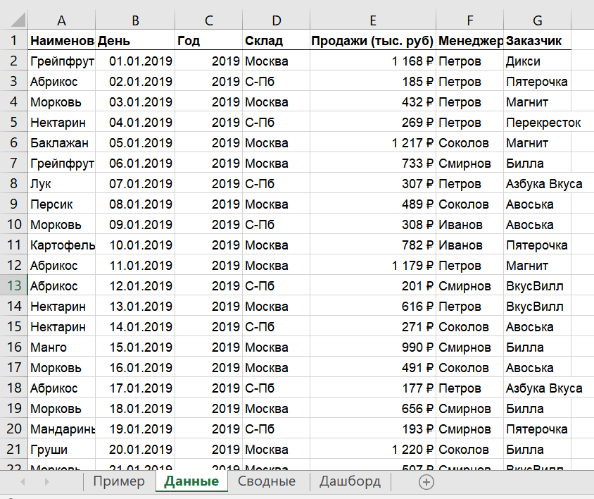
В примере выше атрибуты — это «Наименование», «День», «Год», «Склад», «Продажи (тыс. руб)», «Менеджер», «Заказчик». Они вынесены в заголовок таблицы.
Эта таблица послужит основой для построения нашего дашборда по продажам.
Если известно, для чего и для кого предназначен дашборд, легче понять, какие показатели должны выводиться на экран. Это могут быть любые количественные показатели, важные для организации: прибыль, продажи, численность сотрудников, количество заявок, фонд оплаты труда.
Также необходимо определиться с макетом — структурой — дашборда. Для начала достаточно будет прикинуть её на листе формата А4.
Пример универсальной структуры, которая подойдёт под любые задачи:
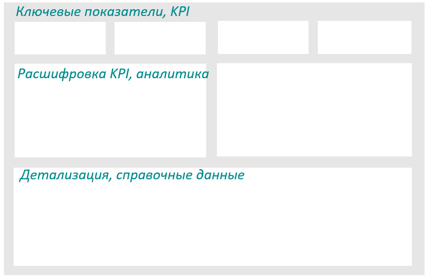
Количество информационных блоков может быть разным: это зависит от того, сколько метрик надо отразить на дашборде. Главное — соблюдать выравнивание по сетке.
Порядок и симметрия в расположении информационных блоков помогают восприятию и внушают больше доверия.
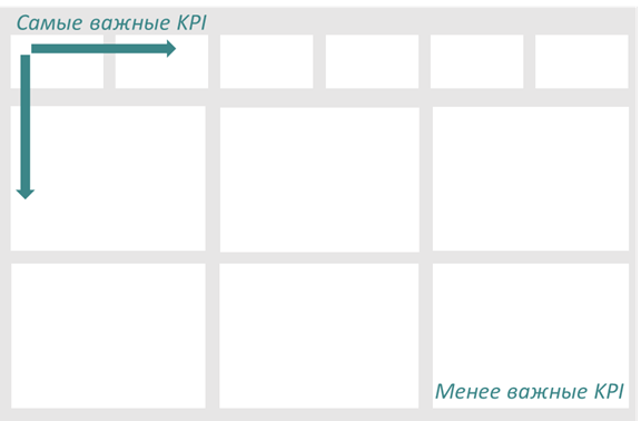
Помимо симметрии важно учитывать и логику расположения информационных блоков. Это связано с нашим восприятием: мы привыкли читать слева направо, поэтому наиболее важные метрики необходимо располагать слева направо и сверху и вниз, менее важные ― справа внизу:
— на основе таблицы с данными, приведённой выше в качестве примера плоской таблицы.
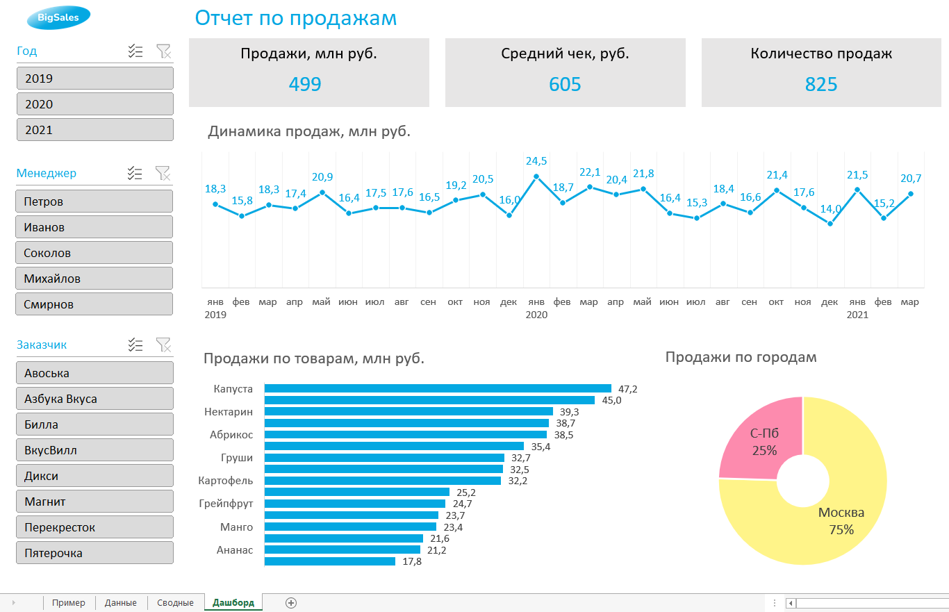
Таблицы будут показывать продажи по месяцам, по товарам и по складу.
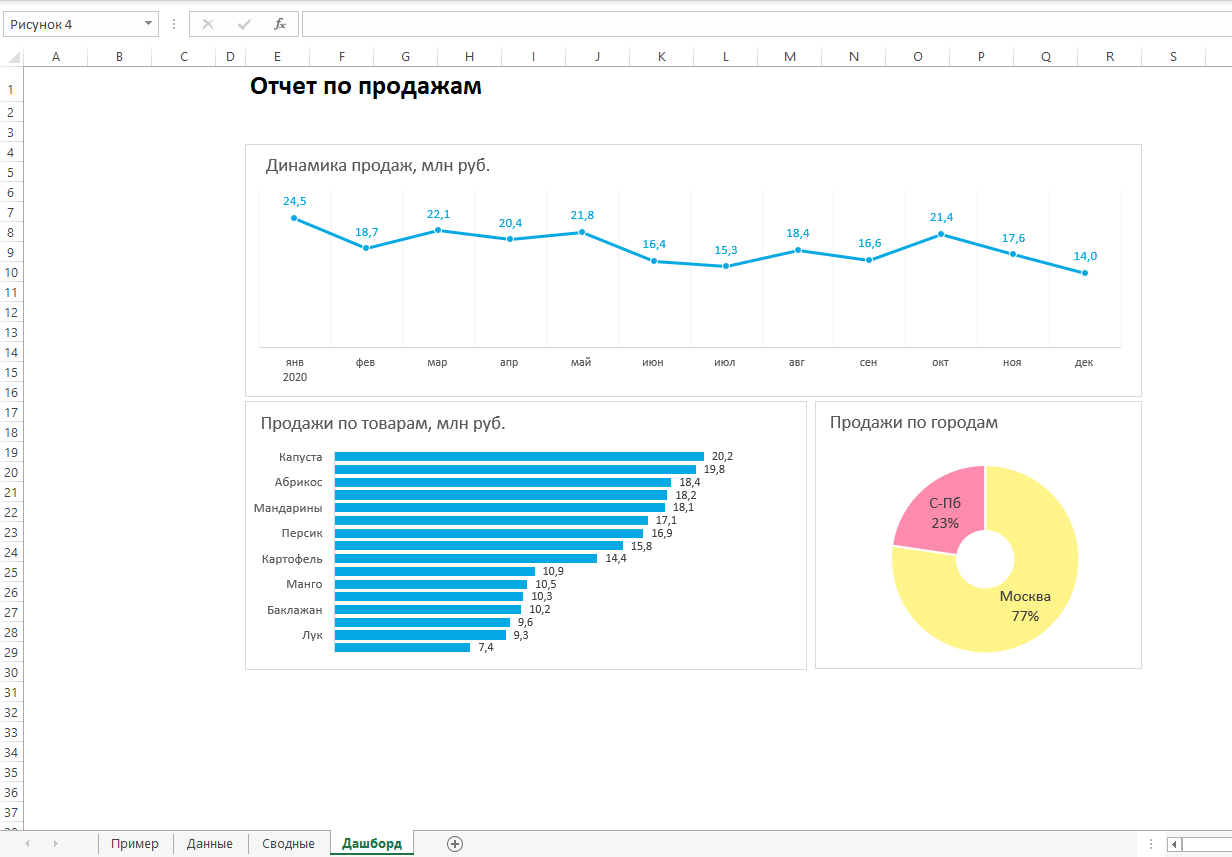
Должно получиться вот так:
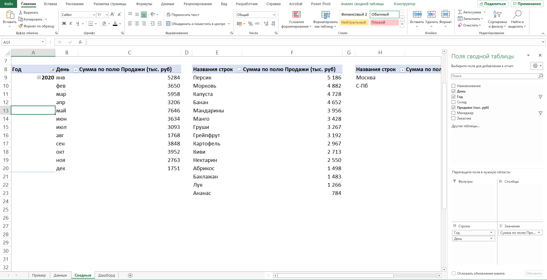
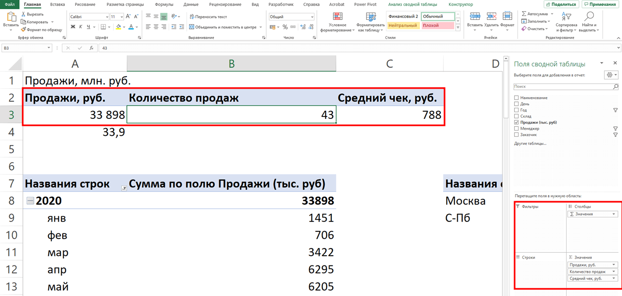
Также построим таблицу для ключевых показателей «Продажи», «Средний чек», «Количество продаж»:
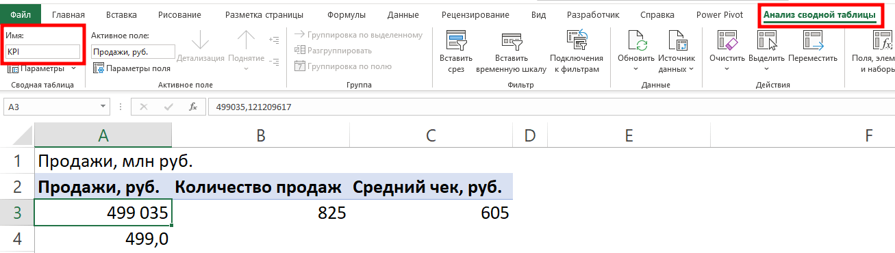
Чтобы в дальнейшем было проще ориентироваться при подключении срезов, присвоим сводным таблицам понятное имя. Для этого перейдём на ленте в раздел Анализ сводной таблицы → Сводные таблицы → в поле Имя укажем название таблицы.
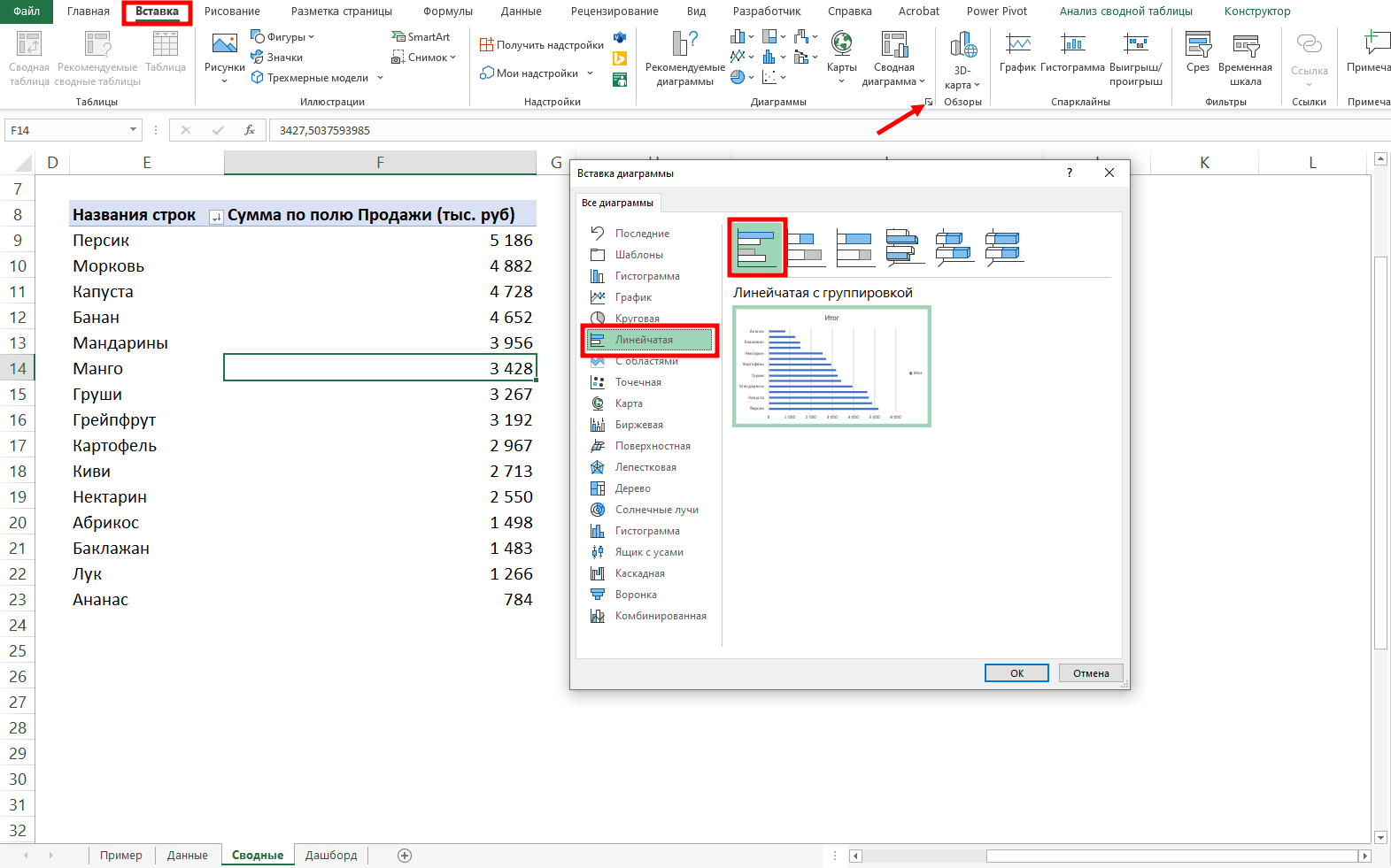
В нашем дашборде будем использовать три типа диаграмм:
- график с маркерами для отражения динамики продаж;
- линейчатую диаграмму для отражения структуры продаж по товарам;
- кольцевую — для отражения структуры продаж по складам.
Выделим диапазон таблицы, перейдём на ленте в раздел Вставка → Диаграммы → Вставка диаграммы → Выберем нужный тип диаграммы → ОК:
Отредактируем диаграммы: добавим названия и подписи данных, скроем кнопки полей, изменим цвет диаграмм, уменьшим боковой зазор, уберём лишние элементы — линии сетки, легенду, нули после запятой у подписей данных. Поменяем порядок категорий на линейчатой диаграмме.
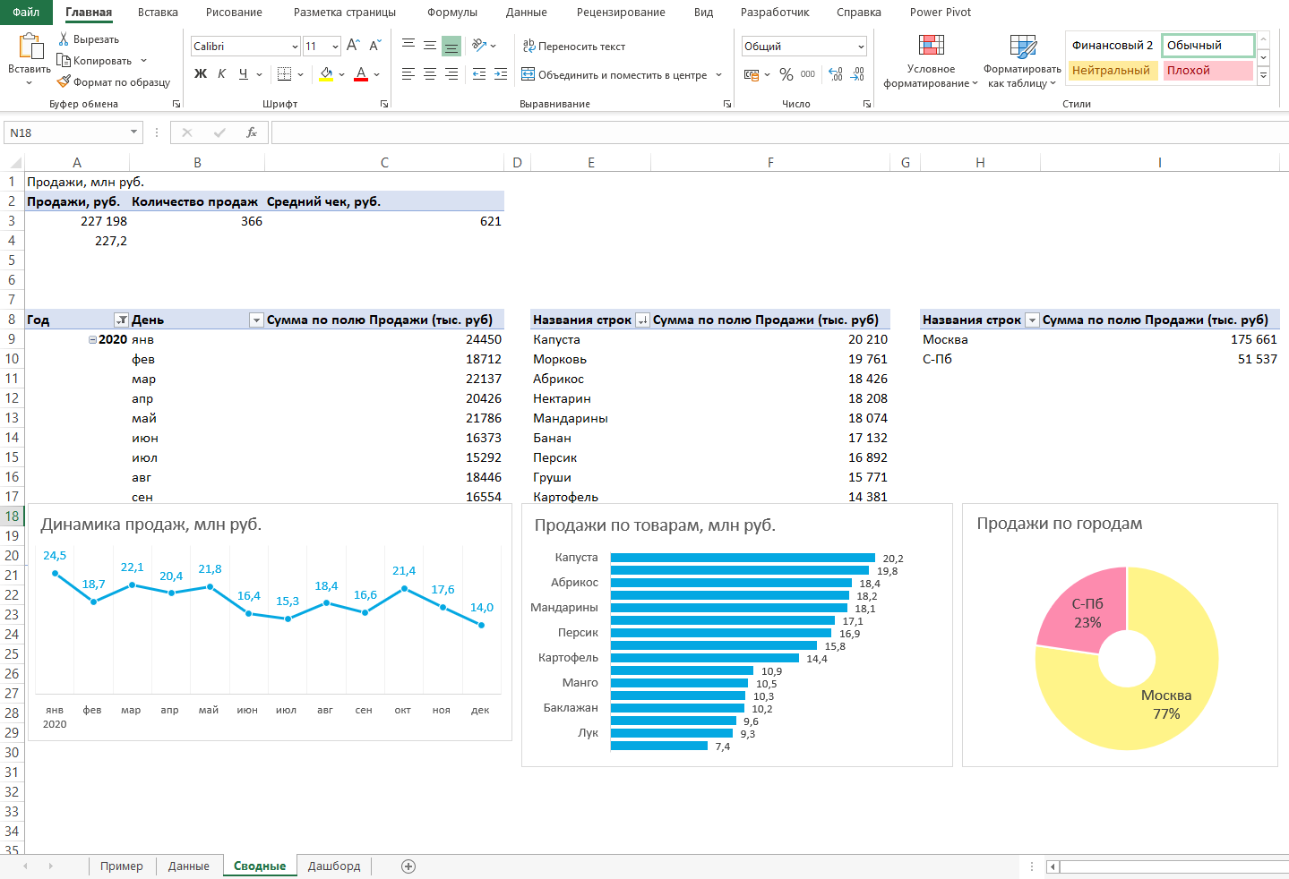
… и распределим их согласно выбранному на втором шаге макету:
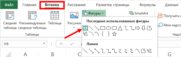
После размещения диаграмм необходимо вставить поля с ключевыми показателями: перейдём на ленте в раздел Вставка ⟶ Фигуры и вставим 3 текстбокса:
Далее сделаем заливку и подпишем каждый блок:
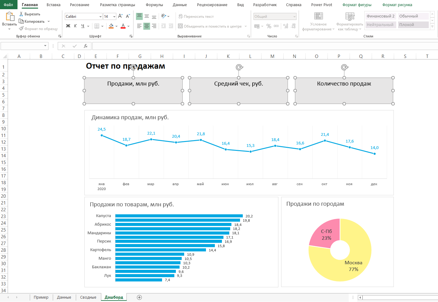
Значения ключевых показателей из сводных таблиц вставим также через текстбоксы — разместим их посередине текстбоксов с названиями KPI. Но прежде в нашем примере сократим значение «Продажи» до миллионов при помощи такого приёма: в сводной таблице рядом с ячейкой со значением поставим формулу с делением этого значения
на 1 000:
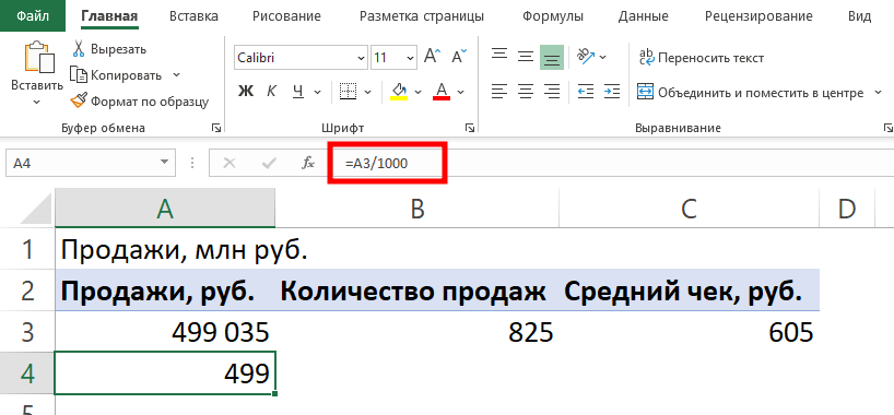
… и сошлёмся уже на эту ячейку:

То же самое проделаем с другими значениями: выделим текстбокс и сошлёмся через поле «Вставить функцию» на короткое значение в сводной таблице:
- Попробуете себя в роли аналитика в крупной ритейл-компании и поможете принять взвешенные решения об открытии новых точек продаж
- Научитесь основам работы с инструментами визуализации данных и решите 4 реальных задачи бизнеса
- 4 задачи — 4 инструмента: DataLens, Excel, Power BI,
Tableau
Срез ― это графический элемент в виде кнопки для представления интерактивного фильтра таблиц и диаграмм. При нажатии на эти кнопки дашборд будет перестраиваться в зависимости от выбранного фильтра.
Эта функция доступна в версиях Excel после 2010 года. Если нет возможности сделать срезы, можно воспользоваться выпадающим списком.
Для создания срезов выделяем любую ячейку сводной таблицы, переходим на ленте в раздел Анализ сводной таблицы ⟶ Вставить срез ⟶ поставим галочки в поля «Год», «Менеджер», «Заказчик», чтобы в дальнейшем можно было фильтровать данные по этим категориям.
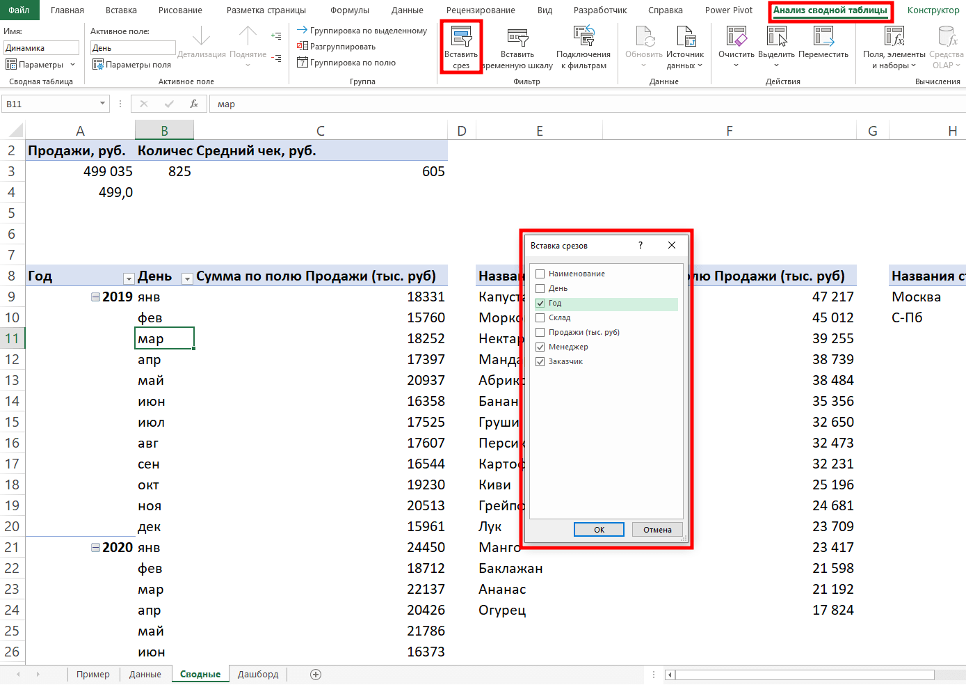
Если срез не работает и при нажатии на кнопки фильтра данные не меняются, подключаем его к нужным сводным таблицам: выделяем срез, кликаем правой кнопкой мыши, выбираем в меню Подключение к отчётам и ставим галочки на требуемых таблицах.
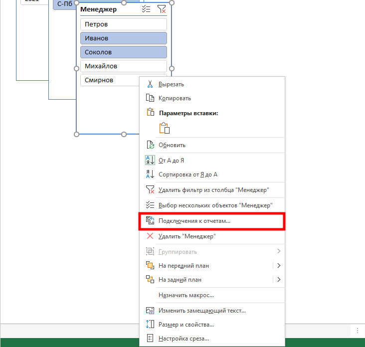
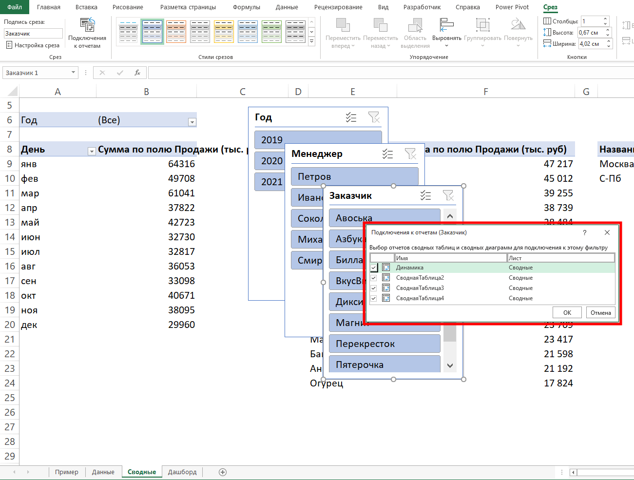
Повторяем эти действия с каждым срезом.
— и располагаем их слева согласно выбранной структуре.
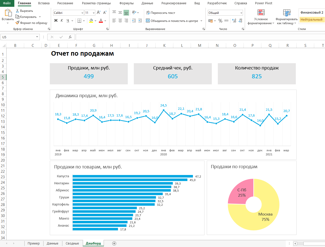
Дашборд готов. Осталось оформить его в едином стиле, подобрать цветовую палитру в корпоративных цветах, выровнять блоки по сетке — и показать коллегам, как пользоваться.
Итак, вот так выглядит наш дашборд для руководителя отдела продаж:
Мы построили самый простой дашборд. Если углубиться в эту тему, то можно использовать сложные диаграммы, настраивать пользовательские форматы срезов, экспериментировать с макетом, вставлять картинки и логотип.
Немного практики — и дашборд может выглядеть так:
Не стоит бояться неизвестного — нужно просто начать делать, чтобы понять, что сложные вещи на самом деле не такие и сложные.
Принцип «от простого к сложному» — самый верный. Когда строят интерактивный дашборд впервые, многие испытывают искреннее восхищение. При нажатии на срезы дашборд перестраивается — очень похоже на магию. Желаем тоже испытать эти ощущения!
Мнение автора и редакции может не совпадать. Хотите написать колонку для Нетологии? Читайте наши условия публикации. Чтобы быть в курсе всех новостей и читать новые статьи, присоединяйтесь к Телеграм-каналу Нетологии.
Excel dashboard is a useful decision-making tool that contains graphs, charts, tables, and other visually enhanced features using KPIs. In addition, dashboards provide interactive form controls, dynamic charts, and widgets to summarize data and show key performance indicators in real-time.
Today’s tutorial is an in-depth guide: we are happy if you read on. But if you are in a hurry, download our templates. You will learn how to create a dashboard in Excel from the ground up. In addition, you’ll get Excel Dashboard tools and a complete dashboard framework.
Above all, it’s time to learn how to build a dynamic, interactive Excel Dashboard step by step.
Table of contents:
- What is an Excel dashboard? Differences from Reports
- Before building an Excel Dashboard: Questions and Guidelines
- How to create an Excel Dashboard
- Create a layout for your dashboard
- Get your Data into Excel
- Clean raw data
- Use an Excel Table and filter the data
- Analyze, Organize, Validate and Audit your Data
- Choose the right chart type for your Excel dashboard
- Select Data and build your chart
- Create a Dashboard Scorecard
- Best practices for creating visually effective Excel Dashboards
- Excel Dashboards Do’s and Don’ts
- Excel Dashboard Examples
What is an Excel Dashboard? Differences from Reports
It is time to clear up the differences between dashboards and reports.
- The report can be a more pages layout of the task that makes it necessary. In summary, the report comprised background data. Above all, a report is a text or table-based tool. It supports the work of employees within an organization or a company. It seldom contains visual parts. Usually, you share them by regular scheduling (daily, weekly, or monthly).
- Dashboards are the opposite of reports. Its main goal is to display the key performance indicators on one page crucial for making important decisions. It does not show details by default, but you use the drill-down method sometimes. All dashboards should answer a question.
The ideal case is when you have a dashboard showing only the essentials. Reports are yours if you want to get into the details and look behind the scenes. We can decide now on an Excel dashboard while the report supplies the background information.
The biggest mistake you can make is to use reports and dashboards as synonyms of each other! No, they are not at all alike.
Which one should I choose? If you want to know where the data comes from, you can find out from the reports. The correctly chosen KPI is easily decidable whether things are on the right course.
We recommend creating and publishing them in pairs if you want to utilize both. Then, whoever wants to see the essence looks at the dashboard, and if one wants to know the source of the data, they can read through the longer reports.
Here is our solution to create advanced charts and widgets. Learn more about the add-in.
Before building an Excel Dashboard: Questions and Guidelines
Before you take a deep dive, wait a moment! Spend time on the planning and researching phase.
Let’s see a few questions to ask yourself before you start building your dashboard.

What is the purpose of using an Excel dashboard?
A dashboard summarizes business events in an easy-to-understand format, and visuals provide real-time results. In addition, it helps us to aggregate and extract the collected values using KPIs. So you will see what you are doing right and where you need to improve.
What are the types of dashboards?
The operational dashboard shows you what is happening now. Strategic dashboards track KPIs. With the help of analytical dashboards, we can quickly identify trends.
How many KPIs does an Excel dashboard have?
Focus on business goals and use less than 10 KPIs. Show KPIs only that represent values. It’s not the place for less useful metrics; get rid of them.
What is the dashboard used for?
A co-worker, a manager, or a stakeholder has different information needs. The result must be helpful for all levels. Let us think this through carefully.
Before creating a dashboard in Excel, keep in mind your main objective.
This tutorial will help you create an Excel dashboard to track HR activities. Your goal is to show the monthly data on your main charts. Then, build a scorecard to compare the selected and past months.
The core of every Excel dashboard is a one-page layout. Why? Keep it in mind: a CEO doesn’t always interested in the details.
#1. Create a layout for your Excel Dashboard
Create a proper draft! You can use paper and pencil, but we prefer Microsoft Excel to create mockups. We have used simple, grouped shapes.
Tip: Let us review the effect of the Excel Dashboard UI mockup. In the figure below, we are showing a layout. First, select the type of grid dashboard layout that you will use. Then pick a color scheme and font type and assign it to the report. Finally, make a wireframe that contains the following style, color codes, and font types. You can prevent most issues using structured data and data tables. Read more about palettes and color combinations.
How can you create a logical workbook structure? What is this mean? Open an Excel workbook and create three sheets.
The parts of the workbook structure: Mostly, you use three worksheets for an Excel dashboard.
- Data: you can store the raw data tables here
- Dashboard Tab: the main dashboard Worksheet
- Calculation: make the calculations on this Worksheet
Your wireframe and structure are ready. Let’s start creating a dashboard in Excel!
#2. Get your data into Excel
To create an Excel Dashboard, you need to choose data sources. If the data is present in Excel, you are lucky and can jump to the next step. If not, you have to use external data sources.
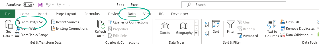
Go to the Data tab and pick one of the import options. It’s easy to import data into an Excel workbook. In the example, you are using a CSV file to create the initial dataset for our dashboard.
#3. Clean Raw Data
Our raw data is in Excel. Now you can start the data cleansing process. There are many tricks to clean and consolidate data.
- Sort data to see extremes and peaks
- Remove duplicates to avoid errors
- Change the text to lower, upper or proper case
- Remove leading and trailing spaces
How do we remove leading and trailing spaces from raw data? First, go to the Formula bar and apply the TRIM function. Now copy the formula down. Finally, use data cleansing add-ins to avoid issues and clean your data faster and easier.
Tip: Apply simple sorting in Excel to find errors! Using sorted data, you’ll find the peaks in a range (highest and lowest). Right-click on the first cell and select the ‘Sort Largest to Smallest’ option from the context menu.
#4. Use an Excel Table and Filter Data
You don’t have cleaned input in this phase, but you already have data on a worksheet. What will be the next step?
First, you must check if the required information is in a tabular format. The tabular format means that every data point lives in one cell, for example, the city’s name, address, or phone number. If it is in a tabular format, you should convert it into an Excel table and select the data range.
Choose a table or use the insert table shortcut, Ctrl + T, on the Insert Tab.
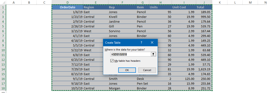
In this case, we don’t have headers. Excel will automatically insert headers into the first row. If you need more data, you can only expand the table and not lose the formulas.
#5. Analyze, Organize, Validate and Audit your Data
You took you through the method that converts raw data into a structure capable of creating a dashboard.
Ask yourself:
- Do you have to display all the data at once?
- Is it necessary to remove some data?
You can use Excel formulas and various methods to help us move forward. However, it would help if you had creativity rather than knowing all the formulas to make a useful dashboard.
So you’ll use these functions and tools to build the Excel Dashboard in Excel: XLOOKUP, IF, SUMIF, COUNTIF, ROW, NAME MANAGER.
Excel grants great auditing tools to help you find and fix Workbook or Worksheet issues.
Use Microsoft Excel Inquiry to visualize which cells in your Worksheet contribute to a formula error. This step should cut down the time spent on the usual validation procedures.
So, before we start creating a chart, you have to validate the data.
If you want to analyze your data quickly, use the Quick Analysis Tool.
#6. Choose the right chart type for your Excel dashboard
Now you have an organized, cleaned, and error-free data set, it’s time to choose the proper chart.
Data is useless without the ability to visualize it. Strike a balance between great looking Excel Dashboard and its function. First, you can choose what graphs are best for different goals.
- Compare Values: Their characteristic is that they merely show high or low values. Recommended types for charting are a Column, Mekko, Bar, Line, Panel Chart, and Bullet chart. Don’t forget to check how the radial bar chart work.
- Composition: How can you display different sales results in different regions? Pie, Stacked Bar, Mekko, Stacked Column, Area, and Waterfall are the most fitting charts. We prefer geographical maps also.
- Analyzing Trends: To analyze the result of a data set in a given period, use the following charts: Line, Dual-Axis Line, and Column charts. Check this example if you want to create a quick forecast in Excel.
- Show the differences between budget and actual values: use variance charts.
- Performance measurement: Use gauge charts to see how far you are from reaching a goal. It displays a single value.
- Sparklines are tiny graphs in a worksheet cell visually representing your data set. Use sparklines to show trends in a series of values. Another helpful thing: you can highlight maximum and minimum values easily. So, the most significant impact of sparklines: you can position the chart near its data source.
- Dynamic charts are essential if we want to create interactive charts to refresh the chart based on the user’s choice.
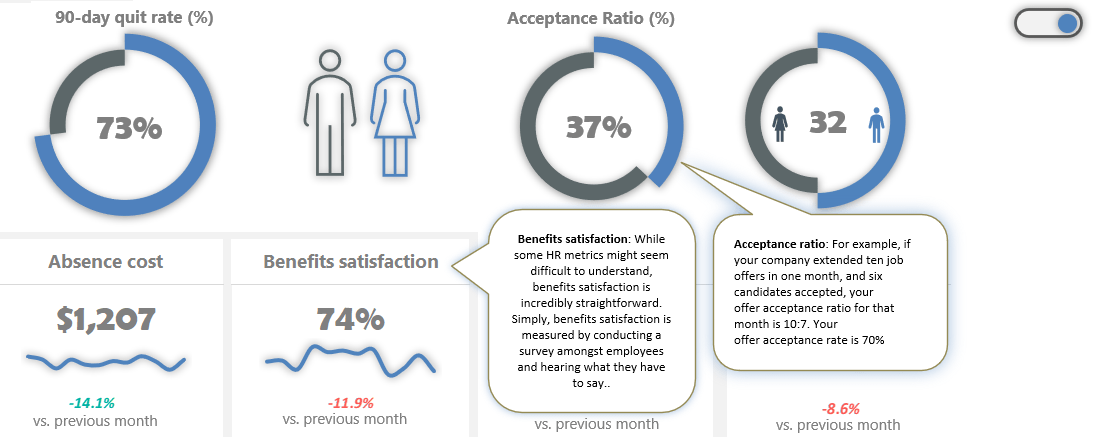
Your goal is to show the % of job seekers who accepted a job offer each month on a chart. In this tutorial, you’ll use custom combination charts using doughnut charts – progress circle charts – for displaying key performance indicators.
Tip: Just a few words about the pie charts. Pie charts are the most overused graphs in Excel. It’s one of the worst ways to present data. In other words, if you want to create a better dashboard, get rid of the pie charts!
#7. Select the data and build your chart
We have cleaned and grouped data in this phase and just picked the chart or graph for the data. It’s time to select the data! As you learned, the combo chart requires two doughnut charts and a simple formula.
Select the ‘Calculation‘ tab (which contains filtered data and calculated fields). Highlight the range of what you want to display. In the example, you use two values to show the Acceptance Ratio.
The actual value comes from the Data tab. After that, then calculate the reminder value using this simple formula. In this case, 75%. Next, select the ‘Calculation’ tab. Cell E23 will show the actual value. The second cell, E24, contains a simple formula and displays the remainder value as 100%.
Make sure that the value in the source cell is in percentage format! Okay, now we select the ‘Actual Value’ and ‘Reminder Value’ data. Next, open the ‘Insert Chart’ dialog to create a custom combo chart to preview and choose different chart types. Furthermore, you can move the data series to the secondary axis.
Select the inserted chart and press Control + C to duplicate the chart.
#8. Improve your charts
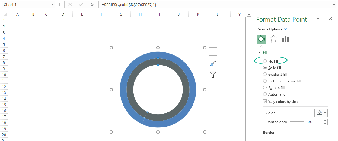
Now you have a chart that’s fit your data. It looks great, but you can improve your Excel dashboard to the next level! First, clean up the chart to remove the background, title, and borders from the chart area. Next, select the reminder value section of the outer ring.

Right-click, then choose Format Data Point. Use the ‘No fill’ option. Let’s see the inner ring, select the actual value section, and apply the ‘No fill’ option. Adjust the doughnut hole size if you want. Insert a Text Box and remove the background and border.
Link the actual value to the text box.
To do that, select Text Box. Next, go to the formula bar and press “=.” Next, select the actual value and click enter. Once the Text Box is linked with the actual value, format the text box.
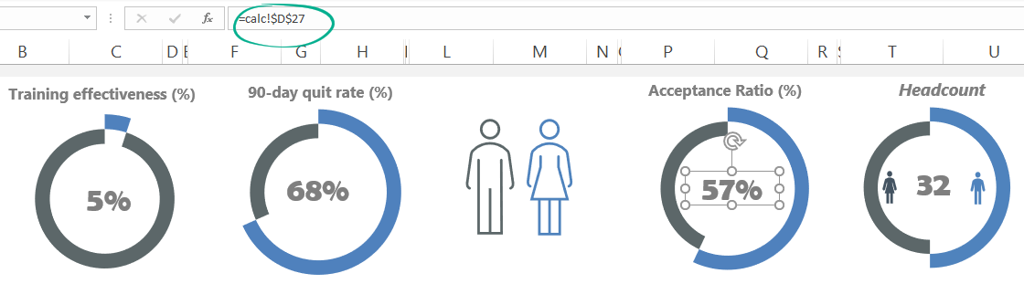
Repeat the process for the other data! For example, a typical Excel dashboard contains various charts to display data. Next, repeat the chart insertion and data validation steps for other essential metrics, like the quit rate.
Keep your source data in the Data tab and do not remove or hide it. If further calculations are necessary, use the Calculation Worksheet. If you want to replace the source data, use the Calculation sheet, not the Data Worksheet.
Tip: If you are uncertain about which charts are good for you, don’t hesitate to choose ‘Recommended Charts.‘ In this case, you will get a custom set that Excel thinks will fit best with your data.
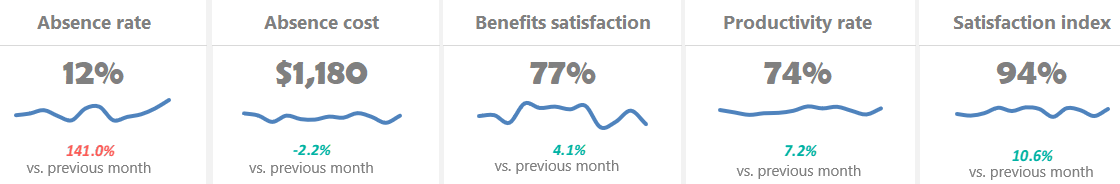
#9. Create a Dashboard Scorecard
Your Excel dashboard is almost ready. You need only a few components to create a scorecard:
- Label,
- Actual value,
- Annual trendline,
- Variance (between the selected and the last month)
Because you need a little bit more space, merge the cells. Select the cells to place the components and click on the ‘merge cells’ button. Now, link the label name from the ‘Data’ sheet. If you change the name of the value on the ‘Data’ sheet, the widget label will reflect it. Now link the data from the ‘Data’ sheet to a ‘Dashboard’ sheet.
Go to the formula tab, enter an equal sign, and select the ‘Data’ sheet value. Next, use yearly Data on the ‘Data’ sheet and insert a line chart to create a trendline. To highlight the variance, use a little trick. Go to the ‘Calculation’ sheet and create a helper table.
Create three new conditional formatting rules.
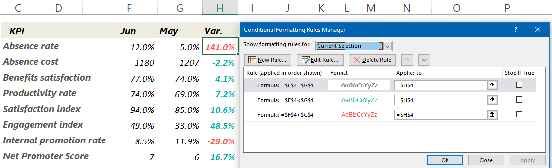
Select the cell which contains variance and copy it. Then, navigate to the ‘Dashboard’ sheet and apply the ‘Paste Special’ option. Next, choose the ‘Paste as linked Picture’ option. Working with linked pictures is easy.
Check the steps in the picture below:

We want to add dynamic text to the main sheet to indicate the changes in key metrics. You link a text to the object inserted into the main Excel dashboard. Then, if you change the value on the source sheet, the target cell will show the refreshed value. What a nice feature! You can apply this trick to textboxes or charts, like sparklines.
Best practices for creating visually effective Excel Dashboards
- A drop-down list is a space-saving solution of great value when you create one-page dashboards. You can use data validation to control the type of data or the values that users type into a cell. To build the list of options is to type them on a worksheet. You can do this method on the sheet with the drop-down menus or a different worksheet.
- Conditional formatting is the right choice to highlight cells based on any condition or rule. But, of course, you can use other methods besides colors. For example, you can achieve splendid results using icons, bars, shapes, color scales, indicators, and ratings.
- Named ranges: You can call selected cells with any given name. First, highlight a range that contains data. Then, in the name box, write the chosen name: ‘sales.’ From this point, you can save time working with cells or ranges.
- Use a scroll bar to save space on your Excel dashboard.
- Data Validation: Restrict what users can write in a single cell. Just imagine that ten users in 10 Excel workbooks write phone numbers. If you do not restrict the format of the phone numbers with the help of data validation when summing up the spreadsheets, there might be mistakes.
- Data Entry using userform and VBA: A manual data input data always carry errors. Instead, use the userform and write a short macro for it. You can create a user-friendly form that is easy to customize. Active report parts like form controls or pivot table slicers suggest playing with the chart.
- Excel Pivot Tables are the most potent weapon in Excel when working with large data sets. It is easy to use with only a few clicks; we can summarize data and drill it into any chosen structure down.
Improve your Excel Dashboard
Here are two great tips for dashboard designers: To create interactive screen tips, visit our guide! Then, by clicking on the toggle button, you can show or hide the text.
Discover how to create a ribbon navigation menu for your Excel dashboard:
A simple interactive settings menu lets you interact with your Worksheets using buttons or icons.
Frequently Asked Questions about Dashboards
- May I use a multi-page Excel dashboard? Yes, in this case, you should create easy navigation. Insert shape-based buttons and links to keep the structure.
- What kind of data connections shall you use? In the planning phase, you must know what tool you’ll use to import data into the dashboard. If you work in Excel, the solution is the Power Query and Power Bl. These tools are great for handling millions of rows in a blink of an eye. However, you can use the ODBC link or SQL DB.
- Are there compatibility issues within the company? IT pros must ensure that everyone uses the same version of Excel. If you build this into the planning phase, you can avoid problems later.
- In what format do you publish the dashboard? Do you send flat Excel tables to the users, or maybe you put the result on SharePoint? Perhaps you need to embed some charts into a PowerPoint slide? You have to review access issues also. Accessibility levels are different for a manager and the owner.
- How often does your Excel dashboard need to be updated? Should you make decisions based on real-time information? Is it enough in the regular daily, weekly, monthly, quarterly, or yearly breakdown? Outline a dashboard structure!
Excel Dashboards Do’s and Don’ts
First, take a look at some of the best practices! Then, there are several ways to boost your Excel dashboard.
You need to know the user’s requirements. Under these conditions, these conditions will only be the dashboard useful.

- How are things going?
- How will you explain to your boss the causes of increased profit?
A well-structured dashboard will give answers to these questions and much more! In addition, it can decrease the timeframe and the costs of development.
- Once you’ve defined the purpose, it’s important to identify which metrics to include. Focus on the metrics which directly align with key business goals and consider the level of detail most appropriate for your audience. This is critical; you may not get it right the first time, so keep it in mind as you build your dashboard.
- Start with users, not the data; try to understand end-users goals. If you can realize this, you will create a most useful dashboard. What is this all mean in practice? Try to understand the user’s scope. Build an Excel dashboard that is not in constant need of updates. So you can cut development costs.
- Don’t flood the user with unwanted information. Instead, you should seek that the dashboard is useful for them. Then, create custom views, filter data, and display the relevant information.
- Provide an overview and allow users to check the details. A well-planned dashboard should be like a quality newspaper. The front page provides a clear overview of the key information and leading news. However, if one wants to look at the data in detail must know where to navigate.
- Use visualization and create a clean dashboard. Charting prospects are endless. That’s where data visualization comes into play.
- Improve Dashboard UI and UX: Build a menu and control your Excel dashboard from the ribbon. Add tooltips to improve user experience.
- Use grids and consistent color schemes.
To-do list if you are using large data tables:
- Freeze Top Row: Keep the first row of the table visible while you scroll down! Use the Freeze Panes feature to keep the information on top — like table headers with column names.
- Enable Horizontal Scroll: Use this function if you have large data sets and have the main data in the first column. Go to the View Tab and choose the ‘Freeze first column.’
- Apply row styles: Frequently, we lose focus when browsing large tables. Use table-style formatting to keep our eyes on the main content.
- Use the GROUP and UNGROUP functions to drill down into details.
Common Pitfalls with Excel Dashboards
Now let’s see the most common mistakes.
- Using too many colors: I don’t tell you often enough about the importance of colors. Do you know the game “Where is Waldo?” It’s an excellent game for kids! But please don’t follow this method to create a stunning dashboard. Try to minimize the number of applied colors and use flat color schemes. Keep the visual content as simple as possible.
- You are cluttering the screen with a useless design: Hey, what do you want to see? A clean dashboard or a traffic jam? Get rid of borders and frames!
- You are using pie charts. Remember that nothing stands out when all charts are in the spotlight. All of the data displayed on a dashboard is important, but not all data are equally important.
Excel Dashboard Templates
You can create various types of dashboards for all purposes. So save your time and use these Excel dashboard examples.
Above all, let’s take a look at the most used dashboard types in Excel:
Human Resource Excel Dashboard
Measure the company’s activities using an HR Dashboard: set metrics that show whether given goals have been met, like turnover, recruiting, and retention. You can check all activities using a one-page dashboard.
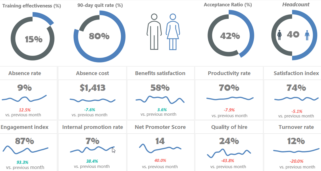
Read more and download the practice file.
Using a social dashboard, get a quick overview of your social media channel’s performance. You can include metrics like unique views, Engagement, Watch Time, and Subscribers. It’s easy to control your strategy using real-time analytics.
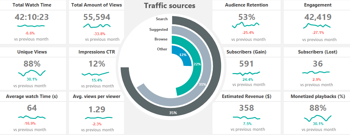
You need only a few steps to use this dashboard. First, pull your data to the Data Worksheet and select or insert your key metrics. After that, change the formatting rules on the Calc Worksheet if you want. Finally, select the given month from a list. Learn more about it and download the practice file.
Financial Dashboard (Profit and Loss)
In financial modeling, keep your eyes on the most vital metrics! First, create a sketch. After that, pull the data from different data sources. Finally, build a great Excel dashboard to view data on a single Worksheet. It is easy to use and tells the data-driven story of a company based on the update of a drop-down list.
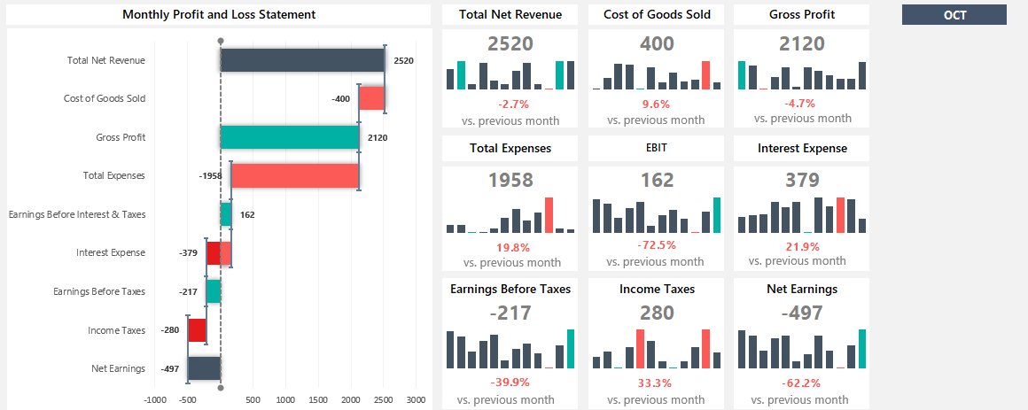
Read more
Traffic Light Dashboard
Please take a closer look at our free Excel Dashboard Widgets! We have an excellent toolkit for managing multiple projects on a single screen.
First, enable the Developer tab and install the add-in. After that, you’ll be able to create advanced dashboard elements in seconds!
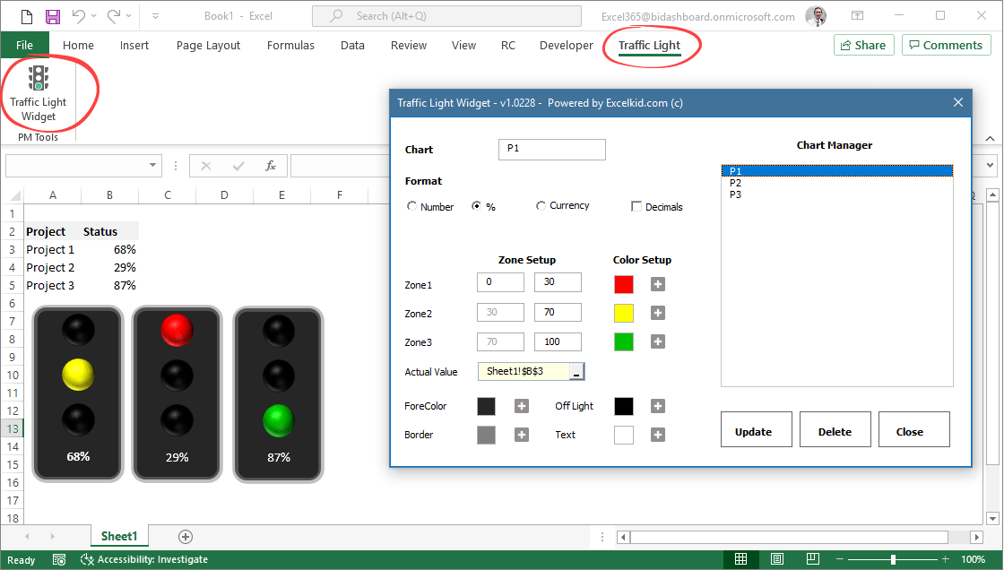
Learn more about traffic lights!
Sales tracking dashboard
Turn activities into actionable and easily editable reports to refine your sales process. For example, the sales tracking dashboard reviews sales activities to spot trends during an exact time frame. In addition, you can compare actual versus targeted results.
Are you tired of boring graphs in Excel? Learn the basics about the sales funnel and download the free spreadsheet!
Product Metrics Dashboard
Track sales revenue with a product metrics dashboard. This spreadsheet offers a clean layout for viewing metrics on multiple products. Show the key metrics, like Net sales and Profit Breakdown by Country, or use them for creating reports for shareholders.
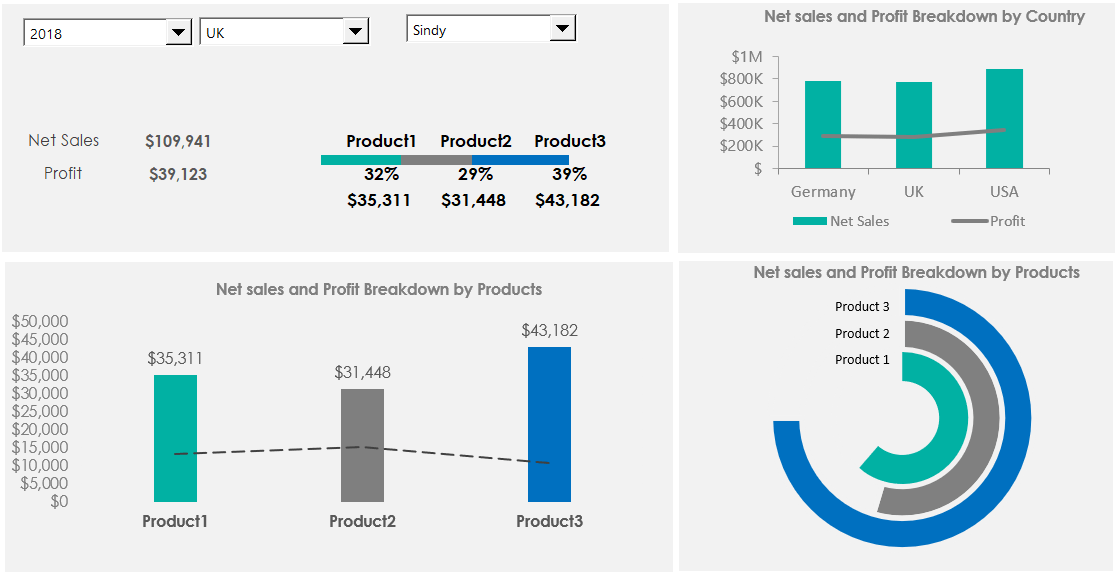
Download the practice file.
Customer Service Dashboard
This Excel dashboard will cover the main business questions we expect to find in the call center activity. First, measure the agent’s efficiency against our KPIs! Moreover, you will track the following metrics: calls, trends, call duration, and resolved calls. Last but not least, you’ll get feedback about customer satisfaction. You can read more about call center measurements here.
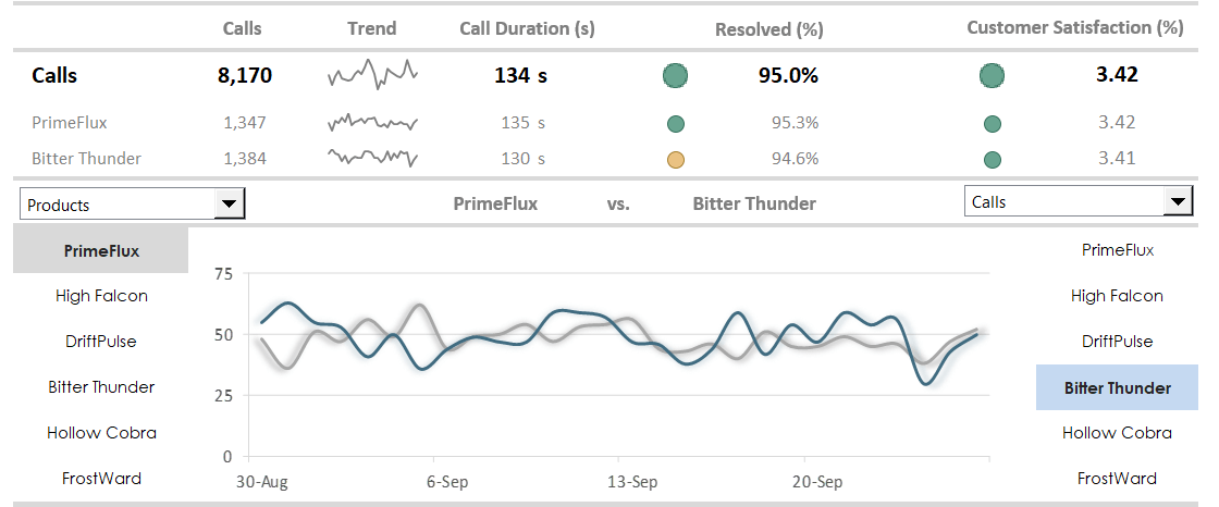
Read more
Business intelligence dashboard: BI dashboards help track core performance metrics in real-time. You can use PowerBI and Microsoft Excel for this purpose!
Web Analytics Dashboard
The web analytics dashboard tracks your site performance in real-time. First, define your key metrics like unique visitors, visits, page views, bounce rate, or average time on site. Then, compare the traffic by sources and track the referring sites, direct traffic, and other sources. Finally, discover the trend using sparklines! This Excel dashboard shows a summary based on 120 days.
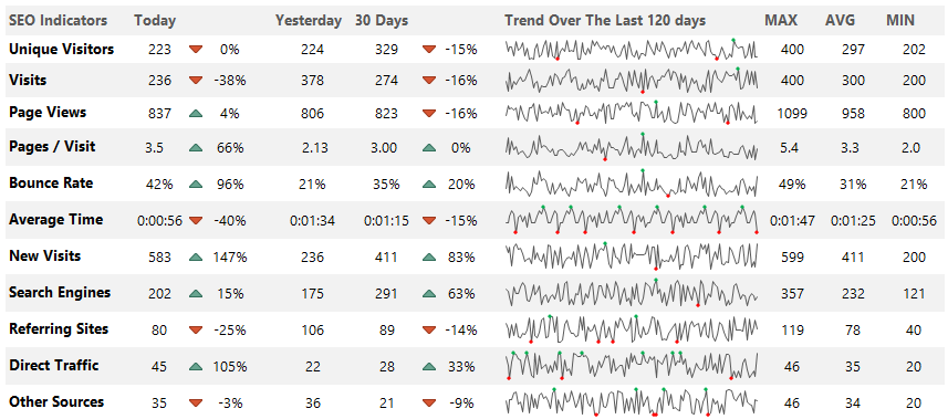
Download the example.
Wrapping things up:
Everyone wants Excel Dashboard! The truth is that creating a dashboard in Excel is more than these ten steps. If you feel comfortable with the basics of Microsoft Excel Dashboards, then have a go at it.
In conclusion:
- Use clearly defined goals.
- Learn all about Excel formulas.
- Build custom charts and be a power user.
This guide gives you a lot of stuff you can do on your dashboards. Go step by step, and success will follow. We hope that you enjoyed our article! Good luck, and stay tuned.
Each interactive Excel dashboard is compatible with Excel 2010, Excel 2013, Excel 2016 to Microsoft 365.
Additional resources and downloads:
- Free Project Management Templates
- Key Performance Indicators
- Knowledge base on Wikipedia
What is a Dashboard in Excel?
The dashboard in excel is an enhanced visualization tool that provides an overview of the crucial metrics and data points of a business. By converting raw data into meaningful information, a dashboard eases the process of decision-making and data analysis.
For example, a department dashboard consists of the following information:
- Financial coverage includes revenues, expenses, profits, operating expenses, and so on.
- Non-financial coverage includes staff turnover, recruitment procedure, quality of new hires, training mechanisms, and so on.
The key metrics incorporated in an excel dashboard can relate to finance, marketing, operations, human resources, banking, and other areas of an organization. With a dashboard catering to such varied fields, the end-users also vary accordingly.
The excel dashboards assist the organization in setting new goals and revising the existing ones based on past performance and the current market trends. Since the negative trends can be identified, quick corrective measures can be implemented.
In addition, the efficiency of employees, teams, and departments can also be assessed with dashboards.
The data source for creating an Excel dashboard can be a spreadsheet, text file, business report, web page, and so on. A dashboard can be static or dynamic depending on the requirement.
Table of contents
- What is a Dashboard in Excel?
- Types of DashBoards in Excel
- How to Create a Dashboard in Excel?
- Example #1–Comparative Dashboard
- Example #2–Performance Analyzer Excel Dashboard
- The Tools Used to Create an Excel Dashboard
- Purpose of Creating a Dashboard
- The Considerations While Creating a Dashboard
- The Cautions While Creating an Excel Dashboard
- Frequently Asked Questions
- Recommended Articles
Types of DashBoards in Excel
The excel dashboards are categorized as follows:
- Strategic Dashboards in Excel–They track the relevant KPIs and forecast performance. They also help in attaining the targeted growth numbers. For instance, a strategic dashboard displays the monthly, quarterly, and annual sales figures of an organization.
- Analytical Dashboards–They help in identifying the current and future market trends. Based on these projections, it becomes easier to make decisions.
- Operational Dashboards–They monitor the operations, activities, and events taking place within an organization.
- Informational Dashboards–They are based on facts, figures, and statistics. For instance, an informational dashboard displays an overview of a player’s profile and performance, the details of a flight’s arrival and departure etc.
How to Create a Dashboard in Excel?
Let us go through a few examples to understand the creation of a dashboard in Excel.
You can download this Dashboard Excel Template here – Dashboard Excel Template
Example #1–Comparative Dashboard
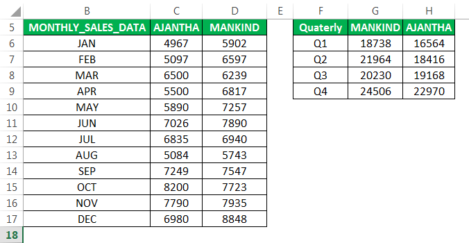
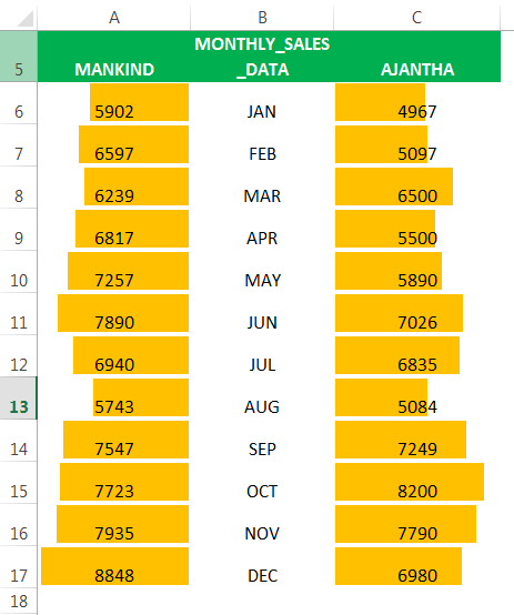
The following tables show the monthly and quarterly sales (in $) of two pharmaceutical companies–“Ajantha” and “Mankind.”
We want to compare the performance of the two companies with the help of a comparative excel dashboard. The purpose is to examine the progress made by both the companies on the revenue front.
The steps to create a dashboard in excel are listed as follows:
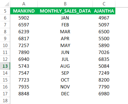
- In column A, enter the sales of “Mankind”, followed by the corresponding month in column B and the sales of “Ajantha” in column C.

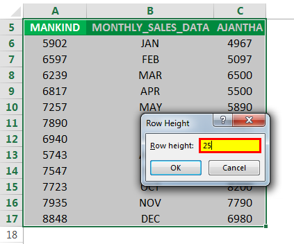
- Select the whole data and create colored data bars. For this, increase the row height from 15 to 25, as shown in the following image.
To open the “row height” box, press the excel shortcut key “Alt+HOH” one by one.

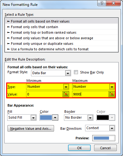
- Select the sales data range of “Mankind”. In the Home tab, click the conditional formatting drop-down. Select “data bars” and click “more rules”.

- The “new formatting rule” window appears. In “edit the rule description”, select the “type” as “number” under both “minimum” and “maximum”.
In “value”, enter 0 and 9000 under “minimum” and “maximum” respectively.

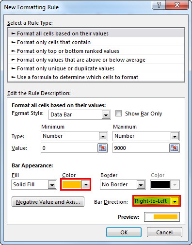
- In “bar appearance”, select the required color in the “color” option. In “bar direction”, select “right-to-left”, as shown in the following image.
- Click “Ok”. In case you do not want numbers to appear with the colored data bars, select “how bar only” under “edit the rule description”.
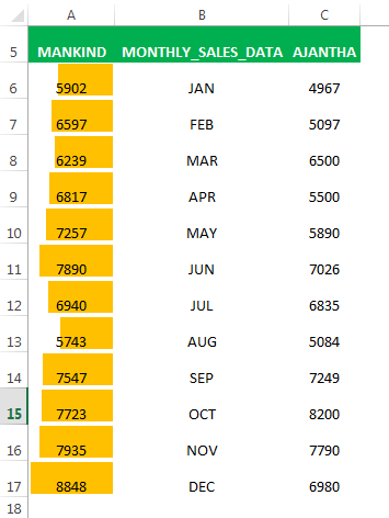
The colored data bars appear in each row of column A, as shown in the following image.
- Likewise, create the same colored bars for the company “Ajantha”. In “bar direction”, select “left-to-right”.
The colored bars appear in each row of column C, as shown in the following image.
- Similarly, create colored bars for the quarterly sales data of the two companies as well. In “edit the rule description”, enter 25000 under “maximum”. Select a different color in the “color” option under “bar appearance”.
The colored bars appear in each row of columns F and H, as shown in the following image.
Hence, with the help of the colored bars, the user can glance through the monthly and quarterly sales figures of both the companies.
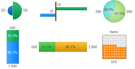
In addition to the colored bars, the following comparison indicators can also be used in a dashboard depending on user requirements.


Example #2–Performance Analyzer Excel Dashboard
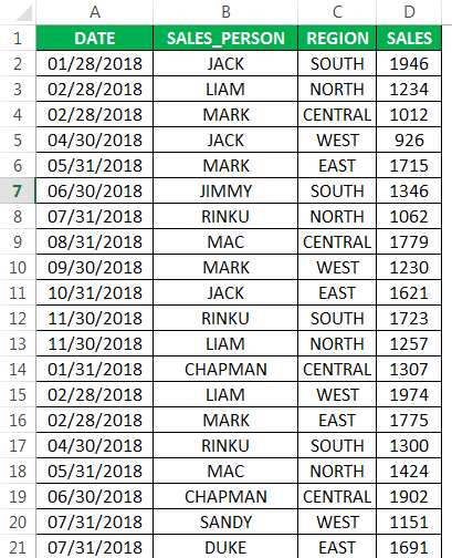
The following table shows the region-wise sales revenueSales revenue refers to the income generated by any business entity by selling its goods or providing its services during the normal course of its operations. It is reported annually, quarterly or monthly as the case may be in the business entity’s income statement/profit & loss account.read more (in $) generated by the different sales representatives of an organization. It also displays the corresponding dates of making these sales.
We want to create an Excel dashboard with the help of a PivotChart and slicer. The purpose is to glance through a summary of the progress made by each salesperson.
The steps to create a performance analyzer dashboard in excel are listed as follows:
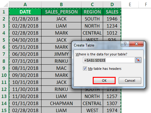
Step 1: Create a table object
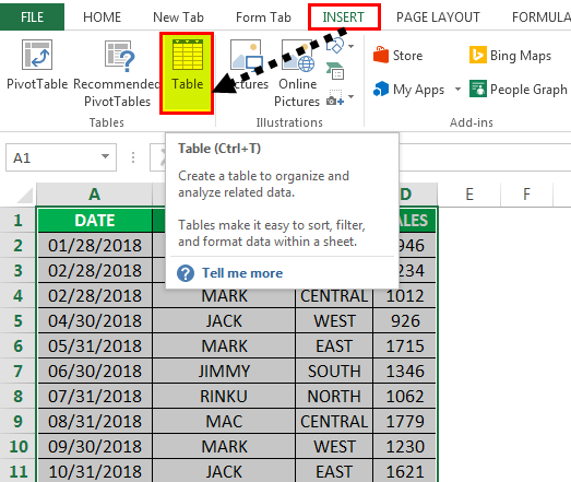
a. Convert the existing data set into a table object. For this, perform the following actions in the mentioned sequence:
- Click anywhere within the data set.
- In the Insert tab, select “table.”
The same is shown in the following image.
b. The create table popup appears. It shows the table range and the checkbox for headers, as shown in the following image. Click “Ok.”
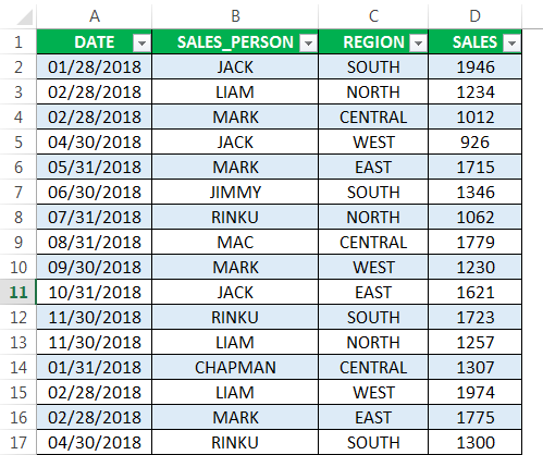
c. The table appears, as shown in the following image.
Step 2: Create a Pivot Table
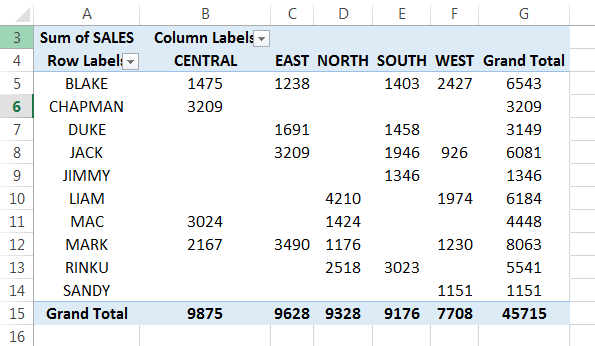
To summarize the progress made by each representative, we want to organize the sales data by region and quarter. For this, we need to create two PivotTables.
a. Create a region-wise PivotTable for the different sales representatives
Perform the following actions in the mentioned sequence:
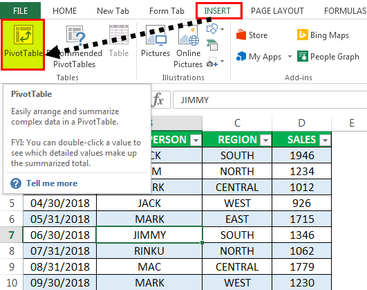
- Click anywhere within the table.
- In the Insert tab, select “PivotTable.”
- In the “create PivotTable” window, click “Ok.”
The PivotTable fields pane appears in another sheet.
Perform the following actions in the PivotTable fields pane:
- Drag the “salesperson” tab to the “rows” section.
- Drag the “region” tab to the “columns” section.
- Drag the “sales” tab to the “values” section.

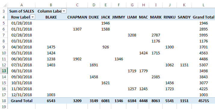
b. The region-wise PivotTable for the different sales representatives appears, as shown in the following image.
c. Create a date-wise PivotTable for the different sales representatives
Likewise, create the second PivotTable. Perform the following actions in the PivotTable fields pane:
- Drag the “date” tab to the “rows” section.
- Drag the “salesperson” tab to the “columns” section.
- Drag the “sales” tab to the “values” section.

d. The date-wise PivotTable for the different sales representatives appears, as shown in the following image.
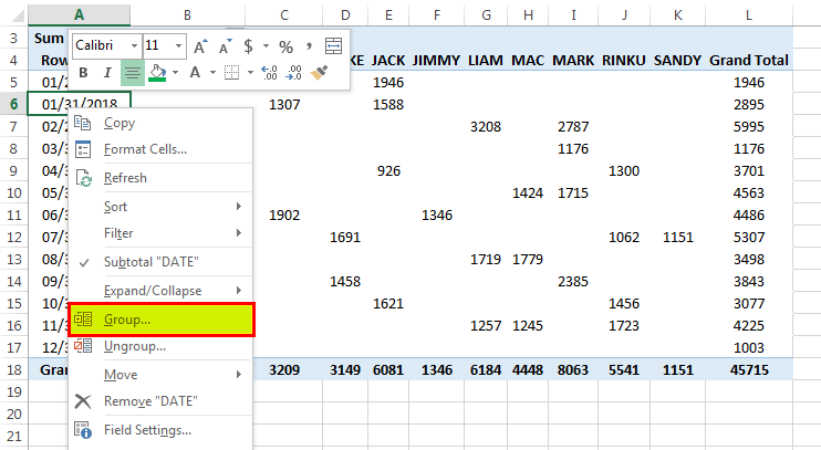
e. Group the dates on a quarterly basis. For this, right-click any cell in the column “row label” (column A) and select “group.”
This is done to view the revenue generated by every representative for all the quarters.
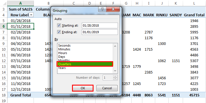
f. The “grouping” window appears with the start date and the end date. Under “by,” deselect “months” (default value) and select “quarters.” Click “Ok.”
g. The quarterly sales data for each representative appears, as shown in the following image.

Step 3: Create a PivotChart
The PivotChartIn Excel, a pivot chart is a built-in feature that allows you to summarize selected rows and columns of data in a spreadsheet. It is a visual representation of a pivot table that helps in the summarization and analysis of datasets, patterns, and trends.read more should be based on the PivotTables created in the preceding step (step 2).
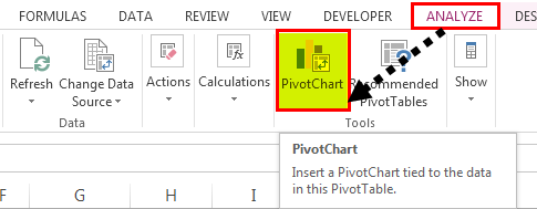
a. Create a PivotChart for the first PivotTable (created in step 2a), which shows the sales data by region. Click inside this PivotTable. In the Analyze tab, click “PivotChart.”
b. The “insert chart” popup window appears, as shown in the following image. From the “bar” option, select “clustered bar chartA clustered bar chart represents data virtually in horizontal bars in series, similar to clustered column charts. These charts are easier to make. Still, they are visually complex.read more.”
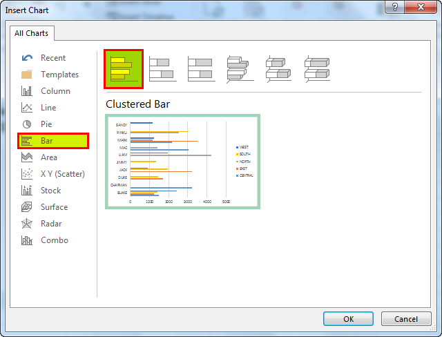
c. The PivotChart showing the region-wise sales for the different representatives appears.
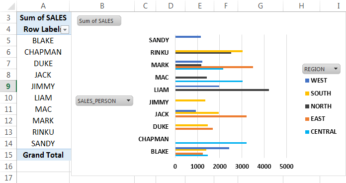
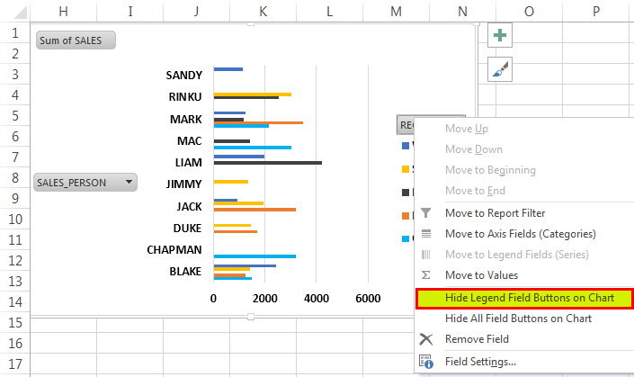
d. To hide the label “region” of the legend, right-click on it and select “hide legend field buttons on chart.”
To hide the labels “sum of sales” and “sales_person,” right-click on either of these and select “hide all field buttons on chart.”
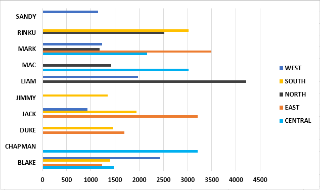
e. All the labels of the chart disappear, as shown in the following image.
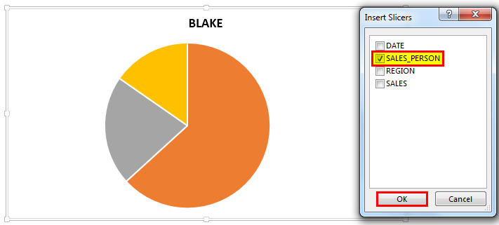
f. Likewise, create a PivotChart for the second PivotTable (created in step 2c), which shows the sales data by quarters. In the “insert chart” window, select a pie chart. Click “Ok.”
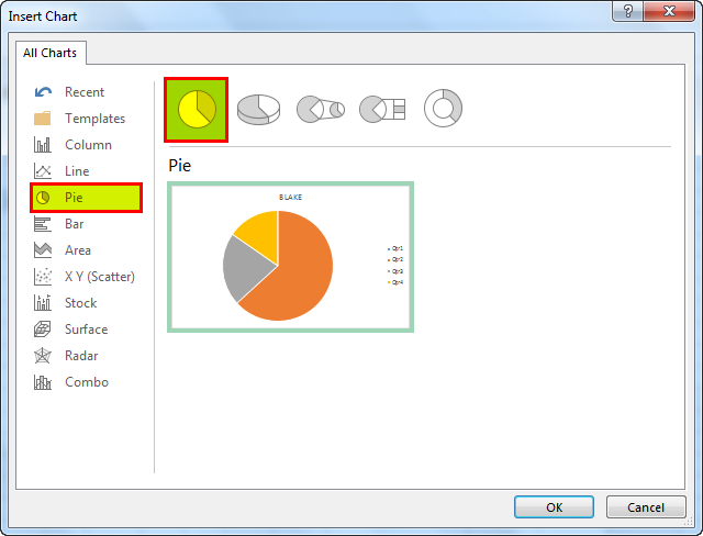
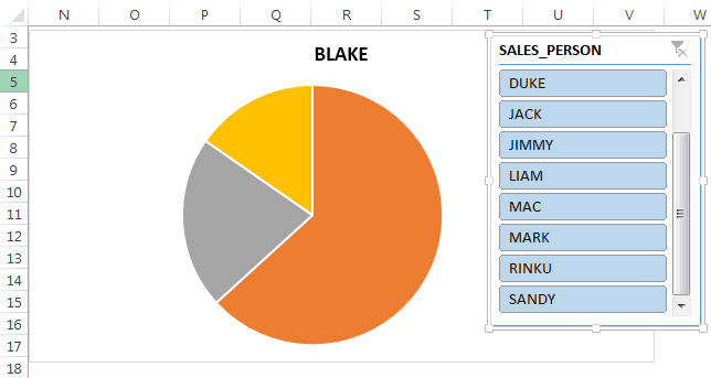
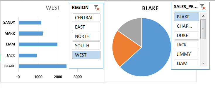
g. The Making a pie chart in excel can help you with the pictorial representation of your data and simplifies the analysis process. There are multiple kinds of pie chart options available on excel to serve the varying user needs.read morehttps://www.wallstreetmojo.com/make-pie-chart-in-excel/Making a pie chart in excel can help you with the pictorial representation of your data and simplifies the analysis process. There are multiple kinds of pie chart options available on excel to serve the varying user needs.read more“]Excel Pie ChartMaking a pie chart in excel can help you with the pictorial representation of your data and simplifies the analysis process. There are multiple kinds of pie chart options available on excel to serve the varying user needs.read more[/wsm-tooltip] showing the quarterly sales data for the representative Blake appears, as shown in the following image. We have hidden the labels.
Step 4: Add slicers
Slicers can be created for the different regions and the various sales representatives. This helps sort the sales by region. It also allows viewing the quarterly performance of the individual salesperson.
a. In the first PivotChart (created in step 3a), click “insert slicer” from the “filter” group of the Analyze tab.
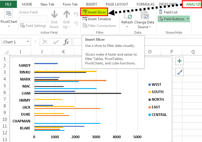
b. The “insert slicers” window appears, as shown in the following image. Select the option “region” and click “Ok.”
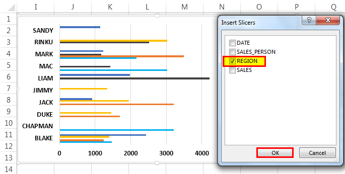
c. The slicer appears, displaying the names of the five regions. Hence, the performance of every salesperson for a particular region can be analyzed.
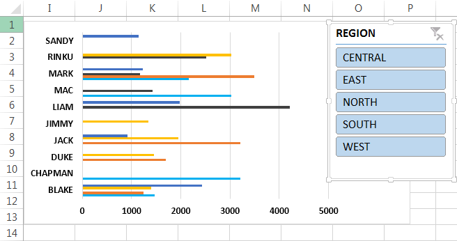
d. Similarly, add slicers to the second PivotChart (created in step 3f). In the “insert slicers” window, select the option “salesperson” and click “Ok.”
e. The slicer appears, displaying the names of the different sales representatives. Hence, the performance of every salesperson for the four quarters can be examined.
Step 5: Create a Dashboard
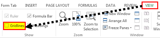
a. Create a new sheet with the name “sales_dashboard.” In this sheet, remove the gridlines by deselecting “gridlines” under the View tab. This enhances the appearance of the dashboard.
b. Copy the PivotCharts (created in step 3) and the slicers (created in step 4) to the “sales_dashboard” sheet.
The user can glance through the region-wise sales data. Moreover, the quarterly progress made by every sales representative can also be analyzed.
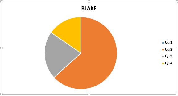
c. For viewing the sales figures on the data bar or the pie chart, right-click the same and select “add data labels.”
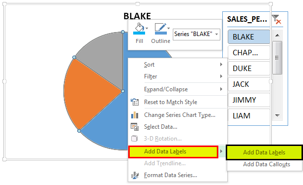
d. The sales figures appear on the pie chart, as shown in the following image. The chart shows the quarterly sales numbers of the representative Blake.

The Tools Used to Create an Excel Dashboard
The tools used in the creation of an Excel dashboard are listed as follows:
- Visualization elements–This includes tablesIn excel, tables are a range with data in rows and columns, and they expand when new data is inserted in the range in any new row or column in the table. To use a table, click on the table and select the data range.read more, charts, PivotTables, PivotCharts, slicersSlicers are a handy feature in excel to use multiple auto filters in a data table. However, it involves many clicks to use a filter on every column to find a date. A slicer makes it easier as it can be done with a few clicks.read more, timelines, conditional formatting (data bars, color scale, icon sets), sparklinesSparklines in Excel are similar to a chart within a cell. They are tiny visual representations of the data’s trend, whether it is increasing or decreasingread more, auto-shapes, and widgets.
- Interactive controls–This includes a scroll barIn Excel, there are two scroll bars: one is a vertical scroll bar that is used to view data from up and down, and the other is a horizontal scroll bar that is used to view data from left to right.read more, radio buttonIn Excel, radio buttons or options buttons record a user’s input. They can be found in the developer’s tab’s insert section. read more, checkbox, and drop-down listA drop-down list in excel is a pre-defined list of inputs that allows users to select an option.read more.
- Excel formulas–This includes SUMIFThe SUMIF Excel function calculates the sum of a range of cells based on given criteria. The criteria can include dates, numbers, and text. For example, the formula “=SUMIF(B1:B5, “<=12”)” adds the values in the cell range B1:B5, which are less than or equal to 12.
read more, COUNT, VLOOKUPThe VLOOKUP excel function searches for a particular value and returns a corresponding match based on a unique identifier. A unique identifier is uniquely associated with all the records of the database. For instance, employee ID, student roll number, customer contact number, seller email address, etc., are unique identifiers.
read more, INDEX MATCHThe INDEX function in Excel helps extract the value of a cell, which is within a specified array (range) and, at the intersection of the stated row and column numbers.read more, etc. - Other tools–This includes named rangesName range in Excel is a name given to a range for the future reference. To name a range, first select the range of data and then insert a table to the range, then put a name to the range from the name box on the left-hand side of the window.read more, data validationThe data validation in excel helps control the kind of input entered by a user in the worksheet.read more, and macros.
Purpose of Creating a Dashboard
Dashboards are used by several industries for varied purposes. The objectives of creating a dashboard are listed as follows:
- To structure business information and create a consolidated data summary
- To plan the future course of action of a business
- To measure the key performance indicators (KPIs) that help evaluate the overall performance of an organization
- To study the effectiveness of various business processes and analyze the forecasted results against actual figures
- To improve business productivity
The Considerations While Creating a Dashboard
An excel dashboard should be created keeping in mind the following aspects:
- The purpose of creating a dashboard
- The intended audience for whom the dashboard is being created
- The relevant metrics to be included based on which decisions will be taken
- The data source to be populated in a dashboard
- The task of renewing dashboard information that can be periodic or as and when required
The Cautions While Creating an Excel Dashboard
The cautions to be observed while creating an excel dashboard are listed as follows:
- Ensure that the data file is appropriately structured by removing duplicates, blanks, leading and trailing spaces, and errors.
- Insert only the relevant information in a dashboard so that it is easy to interpret and not overcrowded.
- Simplify a complicated dashboard by creating a user guide or an instruction manual that assists in navigation.
Frequently Asked Questions
1. What is a dashboard in Excel?
A dashboard in excel is a tool that displays the key metrics of an organization in one place. These metrics may relate to finance, human resources, operations, and so on. The dashboard helps in glancing through, analyzing, and making decisions on the crucial business information.
Excel Dashboards are made up of graphical content like tables, charts, PivotTables, widgets, and so on. Since a dashboard displays only the relevant data, its overview returns quick solutions.
Prior to creating a dashboard, it is essential to study the goal which it intends to meet. Based on the objective, the metrics to be included in the dashboard as graphs and numbers can be selected.
The dashboard must be easy-to-understand, meaningful, and user-friendly.
2. Why is a dashboard used in Excel?
An Excel dashboard is used for the following reasons:
• It helps transform raw data into useful information, thereby making it easier to reach solutions.
• It facilitates instant and calculated decisions to be taken. Since such decisions are backed by relevant data and careful analysis, their accuracy tends to be high.
• It replaces the traditional system of creating detailed reports. Previously, such reports had to be consolidated, analyzed, and interpreted by the management before their practical application.
• It provides quick visibility of the entire situation, thereby helping managers make adjustments to an existing process or a project. Such adjustments act as a response to the changing business environment.
3. What is a KPI dashboard in Excel?
A KPI excel dashboard displays the key performance indicators (KPIs) that are responsible for the success of an organization. Tracking these critical metrics helps the management in setting and achieving organizational objectives.
A KPI excel dashboardIn Excel, KPI dashboard is a single, multiple charts panel view. It is very important to analyze an organization based on their Key Performance Indicators (KPI). The dashboard projects the crux of indicators at one place.read more is essential from a strategic and an operational perspective. This is explained as follows:
• From a strategic viewpoint, a KPI dashboard removes obstacles that impact the achievement of long-term goals.
• From an operational viewpoint, a KPI dashboard fixes the problems that impact the day-to-day processes of an organization.
For example, a KPI dashboard of a car manufacturer includes current market share, profit forecast, cost per unit, customer retention ratio, cost of customer acquisition, and so on.
A KPI dashboard should be simple, easy to navigate, and focused.
Recommended Articles
This has been a guide to the dashboard in Excel. Here we discuss how to create a dashboard in Excel along with practical examples and a downloadable Excel template. You may learn more about Excel from the following articles–
- Database in ExcelWhen we enter data into Excel in the form of tables with rows and columns and give each table a name, we create a database.read more
- Create a Dashboard in Power BIDashboards tells the story in a single page view. Being an interactive tool as well, it is best suited to create such kind of interactive dashboards. So we will show you how to create an interactive sample sales dashboard in power bi.read more
- Create Templates in ExcelCreating Excel Templates helps you to avoid the cumbersome repetitive tasks and help you to focus on the real deal. These templates can be either standard, those which are already present in MS Excel for their ready-made use or you can create your own template and utilize them later.read more
- Create an Excel SpreadsheetTo create an excel spreadsheet, do the following: 1.Open MS Excel 2.Select New from the Menu dropdown list 3. Click the Blank workbook button to start a new worksheet. The keyboard shortcut for this is Ctrl + N.read more
Looking to learn how to create a dashboard in Excel?
Gathering data is an essential process to better understand how your projects are moving. And what better way to manage all that data than spreadsheets?
However, data on its own is just a bunch of numbers. 😝
To make it accessible, you need dashboards.
In this article, we’ll learn about Excel dashboards.
We’ll go over the steps to create one and also highlight a smoother alternative to the entire process.
Let’s start.
What Is A Excel Dashboard?
A dashboard is a visual representation of KPIs, key business metrics, and other complex data in a way that’s easy to understand.
Let’s be real, raw data and numbers are essential, but they’re super boring.
That’s why you need to make that data accessible.
What you need is a Microsoft Excel dashboard.
Luckily, you can create both a static or dynamic dashboard in Excel.
What’s the difference?
Static dashboards simply highlight data from a specific timeframe. It never changes.
On the other hand, dynamic dashboards are updated daily to keep up with changes.
So what are the benefits of creating an Excel dashboard?
Similar to Google Sheets dashboards, let’s a look at some of them:
- Gives you a detailed overview of your business’ Key Performance Indicators at a glance
- Adds a sense of accountability as different people and departments can see the areas of improvement
- Provides powerful analytical capabilities and complex calculations
- Helps you make better decisions for your business
7 Steps To Create A Dashboard In Excel
Here’s a simple step-by-step guide on how to create a dashboard in Excel.
Step 1: Import the necessary data into Excel
No data. No dashboard.
So the first thing to do is to bring data into Microsoft Excel.
If your data already exists in Excel, do a victory dance 💃 because you’re lucky you can skip this step.
If that isn’t the case, we’ve got to warn you that importing data to Excel can be a bit bothersome. However, there are multiple ways to do it.
To import data, you can:
- Copy and paste it
- Use an API like Supermetrics or Open Database Connectivity (ODBC)
- Use Microsoft Power Query, an Excel add-in
The most suitable way will ultimately depend on your data file type, and you may have to research the best ways to import data into Excel.
Step 2: Set up your workbook
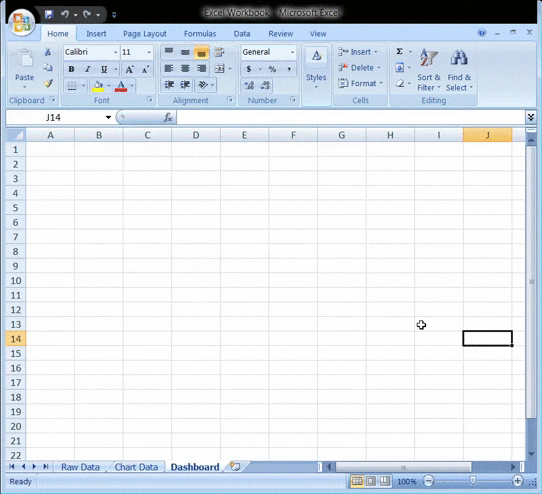
Now that your data is in Excel, it’s time to insert tabs to set up your workbook.
Open a new Excel workbook and add two or more worksheets (or tabs) to it.
For example, let’s say we create three tabs.
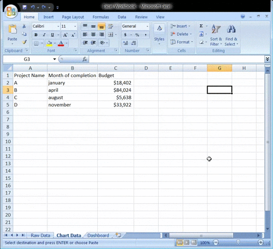
Name the first worksheet as ‘Raw Data,’ the second as ‘Chart Data,’ and the third as ‘Dashboard.’
This makes it easy to compare the data in your Excel file.
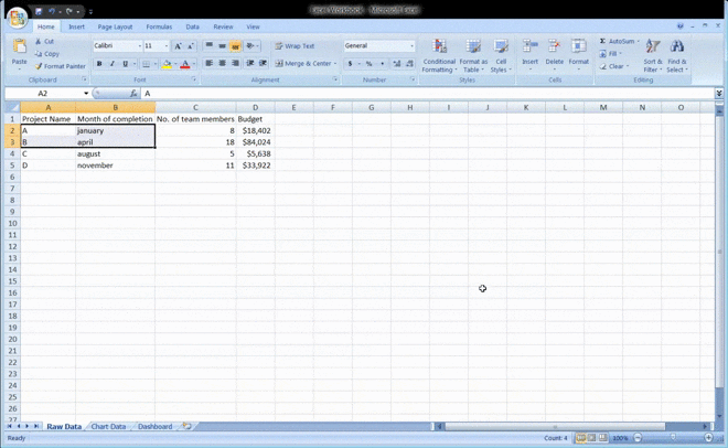
Here, we’ve collected raw data of four projects: A, B, C, and D.
The data includes:
- The month of completion
- The budget for each project
- The number of team members that worked on each project
Bonus: How to create an org chart in Excel!
Step 3: Add raw data to a table
The raw data worksheet you created in your workbook must be in an Excel table format, with each data point recorded in cells.
Some people call this step “cleaning your data” because this is the time to spot any typos or in-your-face errors.
Don’t skip this, or you won’t be able to use any Excel formula later on.
Step 4: Data analysis
While this step might just tire your brain out, it’ll help create the right dashboard for your needs.
Take a good look at all the raw data you’ve gathered, study it, and determine what you want to use in the dashboard sheet.
Add those data points to your ‘Chart Data’ worksheet.
For example, we want our chart to highlight the project name, the month of completion, and the budget. So we copy these three Excel data columns and paste them into the chart data tab.
Here’s a tip: Ask yourself what the purpose of the dashboard is.
In our example, we want to visualize the expenses of different projects.
Knowing the purpose should ease the job and help you filter out all the unnecessary data.
Analyzing your data will also help you understand the different tools you may want to use in your dashboard.
Some of the options include:
- Charts: to visualize data
- Excel formulas: for complex calculations and filtering
- Conditional formatting: to automate the spreadsheet’s responses to specific data points
- PivotTable: to sort, reorganize, count, group, and sum data in a table
- Power Pivot: to create data models and work with large data sets
Bonus: How to Display a Work Breakdown Structure in Excel
Step 5: Determine the visuals
What’s a dashboard without visuals, right?
The next step is to determine the visuals and the dashboard design that best represents your data.
You should mainly pay attention to the different chart types Excel gives you, like:
- Bar chart: compare values on a graph with bars
- Waterfall chart: view how an initial value increases and decreases through a series of alterations to reach an end value
- Gauge chart: represent data in a dial. Also known as a speedometer chart
- Pie chart: highlight percentages and proportional data
- Gantt chart: track project progress
- Dynamic chart: automatically update a data range
- Pivot chart: summarize your data in a table full of statistics
Step 6: Create your Excel dashboard
You now have all the data you need, and you know the purpose of the dashboard.
The only thing left to do is build the Excel dashboard.
To explain the process of creating a dashboard in Excel, we’ll use a clustered column chart.
A clustered column chart consists of clustered, horizontal columns that represent more than one data series.
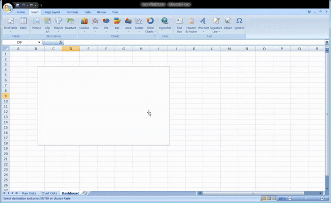
Start by clicking on the dashboard worksheet or tab that you created in your workbook.
Then click on ‘Insert’ > ‘Column’ > ‘Clustered column chart’.
See the blank box? That’s where you’ll feed your spreadsheet data.
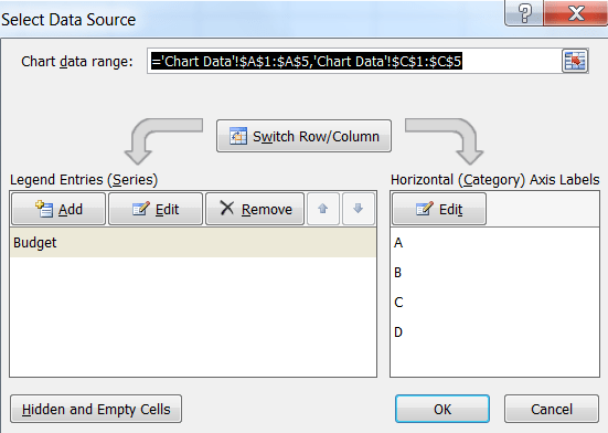
Just right-click on the blank box and then click on ‘Select data’
Then, go to your ‘Chart Data’ tab and select the data you wish to display on your dashboard.
Make sure you don’t select the column headers while selecting the data.
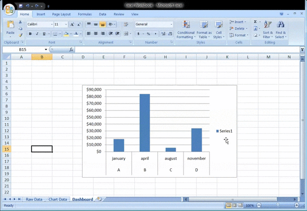
Hit enter, and voila, you’ve created a column chart dashboard.
If you notice your horizontal axis doesn’t represent what you want, you can edit it.
All you have to do is: select the chart again > right-click > select data.
The Select Data Source dialogue box will appear.
Here, you can click on ‘Edit’ in the ‘Horizontal (Category) Axis Labels’ and then select the data you want to show on the X-axis from the ‘Chart Data’ tab again.
Want to give a title to your chart?
Select the chart and then click on Design > chart layouts. Choose a layout that has a chart title text box.
Click on the text box to type in a new title.
Step 7: Customize your dashboard
Another step?
You can also customize the colors, fonts, typography, and layouts of your charts.
Additionally, if you wish to make an interactive dashboard, go for a dynamic chart.
A dynamic chart is a regular Excel chart where data updates automatically as you change the data source.
You can bring interactivity using Excel features like:
- Macros: automate repetitive actions (you may have to learn Excel VBA for this)
- Drop-down lists: allow quick and limited data entry
- Slicers: lets you filter data on a Pivot Table
And we’re done. Congratulations! 🙌
Now you know how to make a dashboard in Excel.
We know what you’re thinking: do I really need these steps when I could just use templates?
Bonus: Create a flowchart using Excel!
3 Excel Dashboard Templates
Excel is no beauty queen. And its scary formulas 👻 make it complicated for many.
No wonder people look for a quality advanced Excel or Excel dashboard course online.
Don’t worry.
Save yourself the trouble with these handy downloadable Microsoft Excel dashboard templates.
1. Excel KPI dashboard template
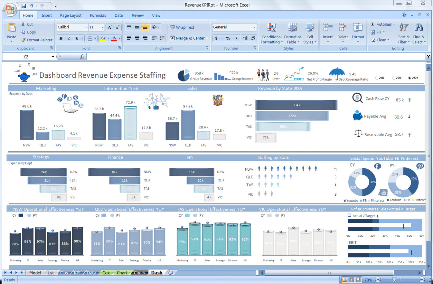
Download this Excel revenue and expense KPI dashboard template.
2. Excel Project management dashboard template
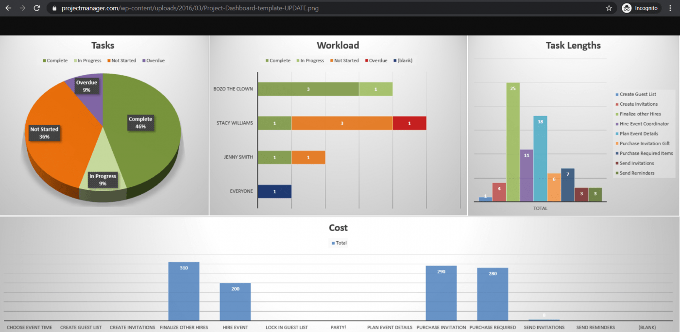
Download this Excel project dashboard template.
3. Sales dashboard template
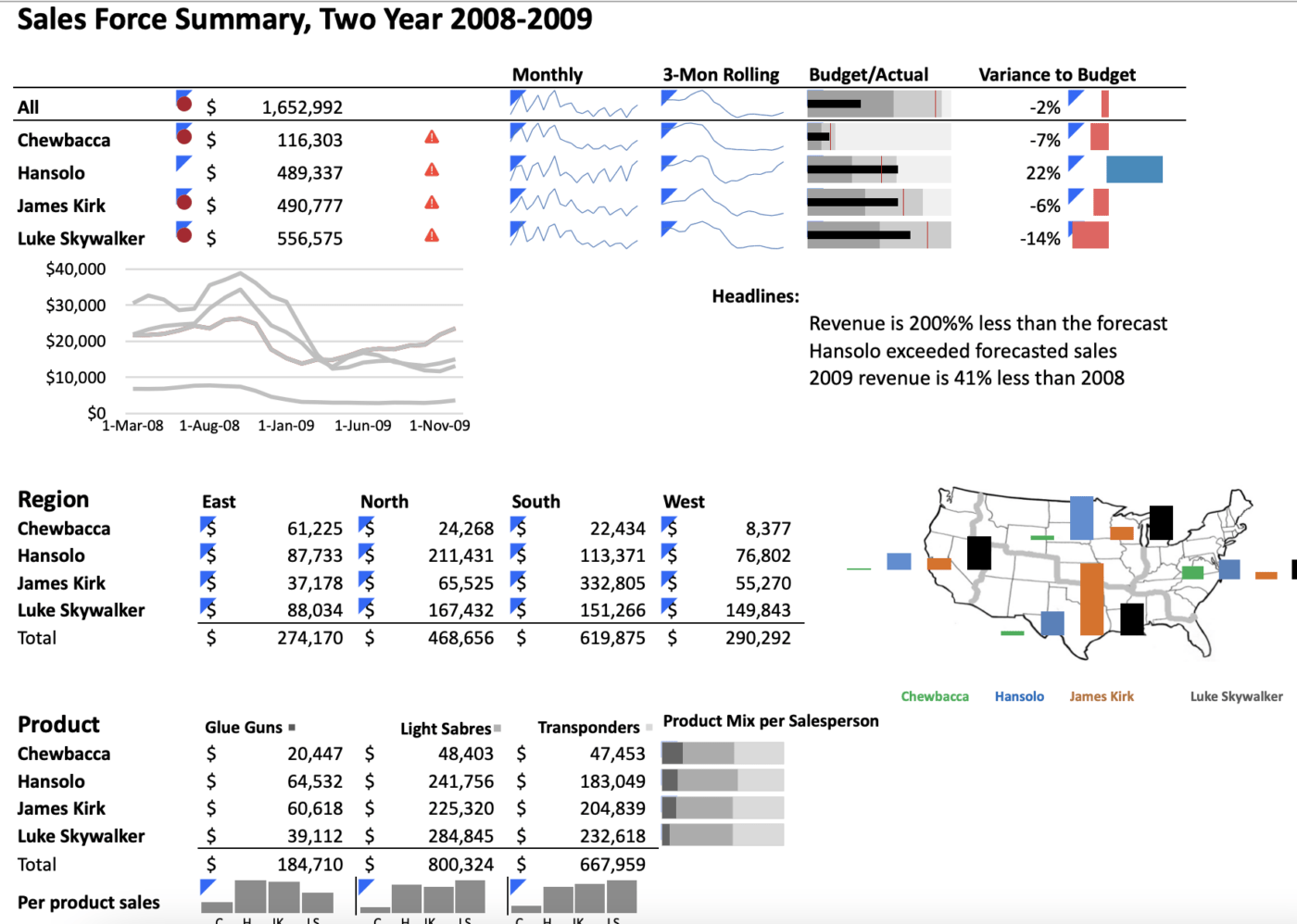
Download this free sales Excel dashboard template.
However, note that most Excel templates available on the web aren’t reliable, and it’s difficult to spot the ones that’ll work.
Most importantly, Microsoft Excel isn’t a perfect tool for creating dashboards.
Here’s why:
3 Limitations of Using Excel Dashboards
Excel may be the go-to tool for many businesses for all kinds of data.
However, that doesn’t make it an ideal medium for creating dashboards.
Here’s why:
1. A ton of manual data feeding
You’ve probably seen some great Excel workbooks over time.
They’re so clean and organized with just data after data and several charts.
But that’s what you see. 👀
Ask the person who made the Excel sheets, and they’ll tell you how they’ve aged twice while making an Excel dashboard, and they probably hate their job because of it.
It’s just too much manual effort for feeding data.
And we live in a world where robots do surgeries on humans!
2. High possibilities of human error
As your business grows, so does your data.
And more data means opportunities for human error.
Whether it’s a typo that changed the number ‘5’ to the letter ‘T’ or an error in the formula, it’s so easy to mess up data on Excel.
If only it were that easy to create an Excel dashboard instead.
3. Limited integrations
Integrating your software with other apps allows you to multitask and expand your scope of work. It also saves you the time spent toggling between windows.
However, you can’t do this on Excel, thanks to its limited direct integration abilities.
The only option you have is to take the help of third-party apps like Zapier.
That’s like using one app to be able to use another.
Want to find out more ways in which Excel dashboards flop?
Check out our article on Excel project management and Excel alternatives.
This begs the question: why go through so much trouble to create a dashboard?
Life would be much easier if there were software that created dashboards with just a few clicks.
And no, you don’t have to find a Genie to make such wishes come true. 🧞
You have something better in the real world, ClickUp, the world’s highest-rated productivity tool!
Create Effortless Dashboards With ClickUp
ClickUp is the place to be for all things project management.
Whether you want to track projects and tasks, need a reporting tool, or manage resources, ClickUp can handle it.
Most importantly, it is THE tool for quick and easy dashboard creation.
So how easy are we talking?
As easy as three steps that are literally just mouse clicks.
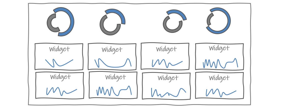
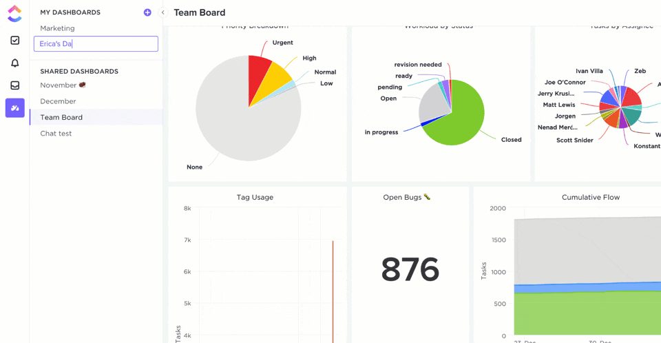
ClickUp’s Dashboards are where you’ll get accurate and valuable insights and reports on projects, resources, tasks, Sprints, and more.
Once you’ve enabled the Dashboards ClickApp:
- Click on the Dashboards icon that you’ll find in your sidebar
- Click on ‘+’ to add a Dashboard
- Click ‘+ Add Widgets’ to pull in your data
Now that was super easy, right?
To power up your dashboard, here are some widgets you’ll need and love:
- Status Widgets: visualize your task statuses over time, workload, number of tasks, etc.
- Table Widgets: view reports on completed tasks, tasks worked on, and overdue tasks
- Embed Widgets: access other apps and websites right from your dashboard
- Time Tracking Widgets: view all kinds of time reports such as billable reports, timesheets, time tracked, and more
- Priority Widgets: visualize tasks on charts based on their urgencies
- Custom Widgets: whether you want to visualize your work in the form of a line chart, pie chart, calculated sums, and averages, or portfolios, you can customize it as you wish
Don’t forget the Sprint Widgets on ClickUp’s Dashboards.
Use them to gain insights on sprints, a must-have feature for your Agile and Scrum projects.
It’s an easy way to enjoy full control and a complete overview of every happening in your Agile workflow.
You can even access ClickUp Dashboards on the go, right on your mobile devices.
We will soon release Dashboard Templates as well, just to add more convenience to what’s already super easy.
You’re welcome! 😇
Need some help creating a project management dashboard?
Check out our simple guide on how to build a dashboard.
Here’s a tiny glimpse of some of our cool features:
- ClickUp Views: enjoy different task view options, including Table view, Board view, Gantt Chart view, Activity view, etc.
- Automations: automate routine tasks with Triggers and Actions
- Team Templates: project templates for all teams, including sales, real estate, and event planning
- Multiple Assignees: assign tasks to more than one person or even an entire Team
- Permissions: protect sensitive data with custom permissions for both Guests and members
- Integrations: integrate easily with your favorite apps, including Slack, Harvest, Google Drive, and more
- Offline Mode: manage agile and scrum projects even when the internet is down
Case Study: How ClickUp Dashboards Help Teams
ClickUp Dashboards are designed to bring all of your most important metrics into one place. Check out this customer story from Wake Forest University to see how they improved reporting and alignment with ClickUp Dashboards:

Whatever you need to measure, ClickUp’s Dashboard is the perfect way to get a real-time overview of your organization’s performance.
Help you Team Excel With ClickUp Dashboards
While you can use Excel to create dashboards, it’s no guarantee that your journey will be smooth, fast, or error-free.
The only place to guarantee all that is ClickUp!
It’s your all-in-one project management and dashboard reporting replacement for Excel dashboards and even MS Excel spreadsheets.
Why wait when you can create unlimited tasks, automate your work, track progress, and gain insightful reports with a single tool?
Get ClickUp for free today and create complex dashboards in the simplest of ways!