
Charts help you visualize your data in a way that creates maximum impact on your audience. Learn to create a chart and add a trendline. You can start your document from a recommended chart or choose one from our collection of pre-built chart templates.

Create a chart
-
Select data for the chart.
-
Select Insert > Recommended Charts.
-
Select a chart on the Recommended Charts tab, to preview the chart.
Note: You can select the data you want in the chart and press ALT + F1 to create a chart immediately, but it might not be the best chart for the data. If you don’t see a chart you like, select the All Charts tab to see all chart types.
-
Select a chart.
-
Select OK.
Add a trendline
-
Select a chart.
-
Select Design > Add Chart Element.
-
Select Trendline and then select the type of trendline you want, such as Linear, Exponential, Linear Forecast, or Moving Average.
Note: Some of the content in this topic may not be applicable to some languages.
Charts display data in a graphical format that can help you and your audience visualize relationships between data. When you create a chart, you can select from many chart types (for example, a stacked column chart or a 3-D exploded pie chart). After you create a chart, you can customize it by applying chart quick layouts or styles.
Charts contain several elements, such as a title, axis labels, a legend, and gridlines. You can hide or display these elements, and you can also change their location and formatting.
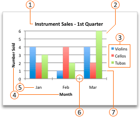
 Chart title
 Plot area
 Legend
 Axis titles
 Axis labels
 Tick marks
 Gridlines
You can create a chart in Excel, Word, and PowerPoint. However, the chart data is entered and saved in an Excel worksheet. If you insert a chart in Word or PowerPoint, a new sheet is opened in Excel. When you save a Word document or PowerPoint presentation that contains a chart, the chart’s underlying Excel data is automatically saved within the Word document or PowerPoint presentation.
Note: The Excel Workbook Gallery replaces the former Chart Wizard. By default, the Excel Workbook Gallery opens when you open Excel. From the gallery, you can browse templates and create a new workbook based on one of them. If you don’t see the Excel Workbook Gallery, on the File menu, click New from Template.
-
On the View menu, click Print Layout.
-
Click the Insert tab, and then click the arrow next to Chart.

-
Click a chart type, and then double-click the chart you want to add.
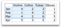
When you insert a chart into Word or PowerPoint, an Excel worksheet opens that contains a table of sample data.
-
In Excel, replace the sample data with the data that you want to plot in the chart. If you already have your data in another table, you can copy the data from that table and then paste it over the sample data. See the following table for guidelines for how to arrange the data to fit your chart type.
For this chart type
Arrange the data
Area, bar, column, doughnut, line, radar, or surface chart
In columns or rows, as in the following examples:
Series 1
Series 2
Category A
10
12
Category B
11
14
Category C
9
15
or
Category A
Category B
Series 1
10
11
Series 2
12
14
Bubble chart
In columns, putting x values in the first column and corresponding y values and bubble size values in adjacent columns, as in the following examples:
X-Values
Y-Value 1
Size 1
0.7
2.7
4
1.8
3.2
5
2.6
0.08
6
Pie chart
In one column or row of data and one column or row of data labels, as in the following examples:
Sales
1st Qtr
25
2nd Qtr
30
3rd Qtr
45
or
1st Qtr
2nd Qtr
3rd Qtr
Sales
25
30
45
Stock chart
In columns or rows in the following order, using names or dates as labels, as in the following examples:
Open
High
Low
Close
1/5/02
44
55
11
25
1/6/02
25
57
12
38
or
1/5/02
1/6/02
Open
44
25
High
55
57
Low
11
12
Close
25
38
X Y (scatter) chart
In columns, putting x values in the first column and corresponding y values in adjacent columns, as in the following examples:
X-Values
Y-Value 1
0.7
2.7
1.8
3.2
2.6
0.08
or
X-Values
0.7
1.8
2.6
Y-Value 1
2.7
3.2
0.08
-
To change the number of rows and columns included in the chart, rest the pointer on the lower-right corner of the selected data, and then drag to select additional data. In the following example, the table is expanded to include additional categories and data series.
-
To see the results of your changes, switch back to Word or PowerPoint.
Note: When you close the Word document or the PowerPoint presentation that contains the chart, the chart’s Excel data table closes automatically.
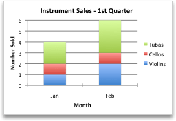
After you create a chart, you might want to change the way that table rows and columns are plotted in the chart. For example, your first version of a chart might plot the rows of data from the table on the chart’s vertical (value) axis, and the columns of data on the horizontal (category) axis. In the following example, the chart emphasizes sales by instrument.

However, if you want the chart to emphasize the sales by month, you can reverse the way the chart is plotted.
-
On the View menu, click Print Layout.
-
Click the chart.
-
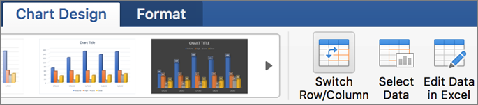
Click the Chart Design tab, and then click Switch Row/Column.
If Switch Row/Column is not available
Switch Row/Column is available only when the chart’s Excel data table is open and only for certain chart types. You can also edit the data by clicking the chart, and then editing the worksheet in Excel.
-
On the View menu, click Print Layout.
-
Click the chart.
-
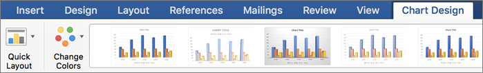
Click the Chart Design tab, and then click Quick Layout.
-
Click the layout you want.
To immediately undo a quick layout that you applied, press
+ Z .
 + Z .
+ Z .Chart styles are a set of complementary colors and effects that you can apply to your chart. When you select a chart style, your changes affect the whole chart.
-
On the View menu, click Print Layout.
-
Click the chart.
-
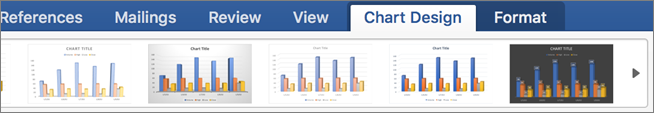
Click the Chart Design tab, and then click the style you want.
To see more styles, point to a style, and then click
.To immediately undo a style that you applied, press
+ Z .
 .
.-
On the View menu, click Print Layout.
-
Click the chart, and then click the Chart Design tab.
-
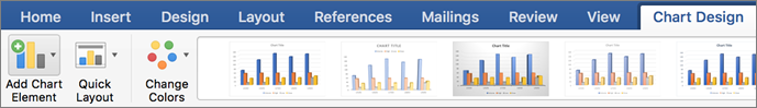
Click Add Chart Element.
-
Click Chart Title to choose title format options, and then return to the chart to type a title in the Chart Title box.
See also
Update the data in an existing chart
Chart types
Create a chart
You can create a chart for your data in Excel for the web. Depending on the data you have, you can create a column, line, pie, bar, area, scatter, or radar chart.
-
Click anywhere in the data for which you want to create a chart.
To plot specific data into a chart, you can also select the data.
-
Select Insert > Charts > and the chart type you want.
-
On the menu that opens, select the option you want. Hover over a chart to learn more about it.
Tip: Your choice isn’t applied until you pick an option from a Charts command menu. Consider reviewing several chart types: as you point to menu items, summaries appear next to them to help you decide.
-
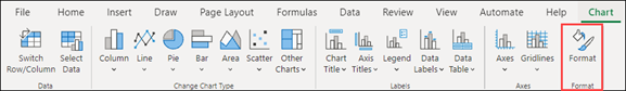
To edit the chart (titles, legends, data labels), select the Chart tab and then select Format.
-
In the Chart pane, adjust the setting as needed. You can customize settings for the chart’s title, legend, axis titles, series titles, and more.


Available chart types
It’s a good idea to review your data and decide what type of chart would work best. The available types are listed below.
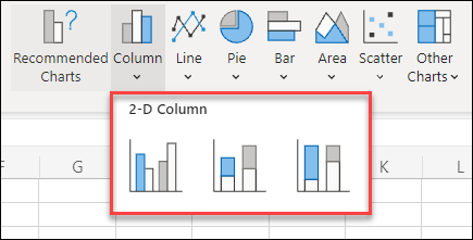
Data that’s arranged in columns or rows on a worksheet can be plotted in a column chart. A column chart typically displays categories along the horizontal axis and values along the vertical axis, like shown in this chart:

Types of column charts
-
Clustered column A clustered column chart shows values in 2-D columns. Use this chart when you have categories that represent:
-
Ranges of values (for example, item counts).
-
Specific scale arrangements (for example, a Likert scale with entries, like strongly agree, agree, neutral, disagree, strongly disagree).
-
Names that are not in any specific order (for example, item names, geographic names, or the names of people).
-
-
Stacked column A stacked column chart shows values in 2-D stacked columns. Use this chart when you have multiple data series and you want to emphasize the total.
-
100% stacked column A 100% stacked column chart shows values in 2-D columns that are stacked to represent 100%. Use this chart when you have two or more data series and you want to emphasize the contributions to the whole, especially if the total is the same for each category.
Data that is arranged in columns or rows on a worksheet can be plotted in a line chart. In a line chart, category data is distributed evenly along the horizontal axis, and all value data is distributed evenly along the vertical axis. Line charts can show continuous data over time on an evenly scaled axis, and are therefore ideal for showing trends in data at equal intervals, like months, quarters, or fiscal years.

Types of line charts
-
Line and line with markers Shown with or without markers to indicate individual data values, line charts can show trends over time or evenly spaced categories, especially when you have many data points and the order in which they are presented is important. If there are many categories or the values are approximate, use a line chart without markers.
-
Stacked line and stacked line with markers Shown with or without markers to indicate individual data values, stacked line charts can show the trend of the contribution of each value over time or evenly spaced categories.
-
100% stacked line and 100% stacked line with markers Shown with or without markers to indicate individual data values, 100% stacked line charts can show the trend of the percentage each value contributes over time or evenly spaced categories. If there are many categories or the values are approximate, use a 100% stacked line chart without markers.
Notes:
-
Line charts work best when you have multiple data series in your chart—if you only have one data series, consider using a scatter chart instead.
-
Stacked line charts add the data, which might not be the result you want. It might not be easy to see that the lines are stacked, so consider using a different line chart type or a stacked area chart instead.
-
Data that is arranged in one column or row on a worksheet can be plotted in a pie chart. Pie charts show the size of items in one data series, proportional to the sum of the items. The data points in a pie chart are shown as a percentage of the whole pie.

Consider using a pie chart when:
-
You have only one data series.
-
None of the values in your data are negative.
-
Almost none of the values in your data are zero values.
-
You have no more than seven categories, all of which represent parts of the whole pie.
Data that is arranged in columns or rows only on a worksheet can be plotted in a doughnut chart. Like a pie chart, a doughnut chart shows the relationship of parts to a whole, but it can contain more than one data series.

Tip: Doughnut charts are not easy to read. You may want to use a stacked column or stacked bar chart instead.
Data that is arranged in columns or rows on a worksheet can be plotted in a bar chart. Bar charts illustrate comparisons among individual items. In a bar chart, the categories are typically organized along the vertical axis, and the values along the horizontal axis.

Consider using a bar chart when:
-
The axis labels are long.
-
The values that are shown are durations.
Types of bar charts
-
Clustered A clustered bar chart shows bars in 2-D format.
-
Stacked bar Stacked bar charts show the relationship of individual items to the whole in 2-D bars
-
100% stacked A 100% stacked bar shows 2-D bars that compare the percentage that each value contributes to a total across categories.
Data that is arranged in columns or rows on a worksheet can be plotted in an area chart. Area charts can be used to plot change over time and draw attention to the total value across a trend. By showing the sum of the plotted values, an area chart also shows the relationship of parts to a whole.

Types of area charts
-
Area Shown in 2-D format, area charts show the trend of values over time or other category data. As a rule, consider using a line chart instead of a non-stacked area chart, because data from one series can be hidden behind data from another series.
-
Stacked area Stacked area charts show the trend of the contribution of each value over time or other category data in 2-D format.
-
100% stacked 100% stacked area charts show the trend of the percentage that each value contributes over time or other category data.
Data that is arranged in columns and rows on a worksheet can be plotted in an scatter chart. Place the x values in one row or column, and then enter the corresponding y values in the adjacent rows or columns.
A scatter chart has two value axes: a horizontal (x) and a vertical (y) value axis. It combines x and y values into single data points and shows them in irregular intervals, or clusters. Scatter charts are typically used for showing and comparing numeric values, like scientific, statistical, and engineering data.

Consider using a scatter chart when:
-
You want to change the scale of the horizontal axis.
-
You want to make that axis a logarithmic scale.
-
Values for horizontal axis are not evenly spaced.
-
There are many data points on the horizontal axis.
-
You want to adjust the independent axis scales of a scatter chart to reveal more information about data that includes pairs or grouped sets of values.
-
You want to show similarities between large sets of data instead of differences between data points.
-
You want to compare many data points without regard to time — the more data that you include in a scatter chart, the better the comparisons you can make.
Types of scatter charts
-
Scatter This chart shows data points without connecting lines to compare pairs of values.
-
Scatter with smooth lines and markers and scatter with smooth lines This chart shows a smooth curve that connects the data points. Smooth lines can be shown with or without markers. Use a smooth line without markers if there are many data points.
-
Scatter with straight lines and markers and scatter with straight lines This chart shows straight connecting lines between data points. Straight lines can be shown with or without markers.
Data that is arranged in columns or rows on a worksheet can be plotted in a radar chart. Radar charts compare the aggregate values of several data series.

Type of radar charts
-
Radar and radar with markers With or without markers for individual data points, radar charts show changes in values relative to a center point.
-
Filled radar In a filled radar chart, the area covered by a data series is filled with a color.
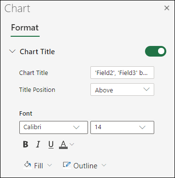
Add or edit a chart title
You can add or edit a chart title, customize its look, and include it on the chart.
-
Click anywhere in the chart to show the Chart tab on the ribbon.
-
Click Format to open the chart formatting options.
-
In the Chart pane, expand the Chart Title section.
-
Add or edit the Chart Title to meet your needs.
-
Use the switch to hide the title if you don’t want your chart to show a title.
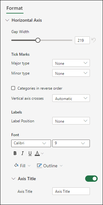
Add axis titles to improve chart readability
Adding titles to the horizontal and vertical axes in charts that have axes can make them easier to read. You can’t add axis titles to charts that don’t have axes, such as pie and doughnut charts.
Much like chart titles, axis titles help the people who view the chart understand what the data is about.

-
Click anywhere in the chart to show the Chart tab on the ribbon.
-
Click Format to open the chart formatting options.
-
In the Chart pane, expand the Horizontal Axis or Vertical Axis section.
-
Add or edit the Horizontal Axis or Vertical Axis options to meet your needs.
-
Expand the Axis Title.
-
Change the Axis Title and modify the formatting.
-
Use the switch to show or hide the title.

Change the axis labels
Axis labels are shown below the horizontal axis and next to the vertical axis. Your chart uses text in the source data for these axis labels.

To change the text of the category labels on the horizontal or vertical axis:
-
Click the cell which has the label text you want to change.
-
Type the text you want and press Enter.
The axis labels in the chart are automatically updated with the new text.
Tip: Axis labels are different from axis titles you can add to describe what is shown on the axes. Axis titles aren’t automatically shown in a chart.
Remove the axis labels
To remove labels on the horizontal or vertical axis:
-
Click anywhere in the chart to show the Chart tab on the ribbon.
-
Click Format to open the chart formatting options.
-
In the Chart pane, expand the Horizontal Axis or Vertical Axis section.
-
From the dropdown box for Label Position, select None to prevent the labels from showing on the chart.

Need more help?
You can always ask an expert in the Excel Tech Community or get support in the Answers community.
Home / Excel Charts / Interactive Charts
A chart is a perfect tool to present data in an understandable way. But sometimes it sucks because we overload it with data. Yes, you heard it right.
I believe that when it comes to charts it should be neat and clean and the best solution to this problem is using interactive charts. By using interactive charts in Excel, you can present more data in a single chart, and you don’t even have to worry about all that clutter.
It’s a smart way. Look at the below chart where I am trying to show target vs. achievement, profit, and market share.

Do you think this is a decent way to present it? Of course not. And now check out this, where have an interactive chart which I can control with option buttons.
What do you think? Are you ready to create your first interactive chart in Excel?
Steps to Make an Interactive Chart in Excel
In today’s post, I’m going to show you the exact steps which you need to follow to create a simple interactive chart in Excel. Please download this file from here to follow along.
1. Prepare Data
- First of all, copy this table and paste it below the original table.

- Now, delete the data from the second table.
- In the Jan month cell of target and achievement, insert the following formulas and copy those formulas into the entire row (Formula Bar).
=IF($A$1=1,B3,NA()) - After that, into the Jan month of profit and copy it into the entire row.
- In the end, Jan month of market share copy it into the entire row.


Your interactive data table is ready.
All the cells in this table are linked with A1. And when you enter “1” in the A1 table will show you data for target and achievement only. For “2” it will show profit and market share for “3”.
2. Insert Option Buttons
- Go to developer tab ➜ Control ➜ Insert ➜ Option button.
- Insert three option buttons and name them as following.
- Button-1 = TGT Vs. ACH
- Button-2 = Profit
- Button-3 = Market Share
- After that, right-click on any of the buttons and select “format control”.
- In format control options, link it to the cell A1 and click OK.
- Now, you can control your data with these option buttons.


3. Insert Secondary Axis Chart
- First of all, select your table and insert a column chart.
- After that, select your data bars & click on “change chart type”. Go to Design Tab ➜ Design ➜ Change Chart Type.
- Now for profit and market share, change the chart type to the line with markers and tick the secondary axis for both.


Congratulations! your interactive chart is ready to rock. You can also make some formatting changes to your chart if you want.
Sample File
Download this sample file from here to learn more.
Conclusion
In the end, I just want to say that with an interactive chart you can help your user to focus on one thing at a time.
And you can save a lot of space in the dashboards as well. Sometimes you feel that it’s a lengthy process but it’s a one-time setup that can save you a lot of time. I hope this tip will help you to get better at charting, but now, tell me one thing.
What kind of interactive charts do you use? Share with me in the comment section, I’d love to hear from you, and please don’t forget to share this tip with your friends, I’m sure they will appreciate it.
More Charting Tutorials
- How to Add a Horizontal Line in a Chart in Excel
- How to Add a Vertical Line in a Chart in Excel
- How to Create a Bullet Chart in Excel
- How to Create a Dynamic Chart Range in Excel
- How to Create a Dynamic Chart Title in Excel
- How to Create a Sales Funnel Chart in Excel
- How to Create a HEAT MAP in Excel
- How to Create a HISTOGRAM in Excel
- How to Create a Pictograph in Excel
- How to Create a Milestone Chart in Excel
- How to Insert a People Graph in Excel
- How to Create PIVOT CHART in Excel
- How to Create a Population Pyramid Chart in Excel
- How to Create a SPEEDOMETER Chart [Gauge] in Excel
- How to Create a Step Chart in Excel
- How to Create a Thermometer Chart in Excel
- How to Create a Tornado Chart in Excel
- How to Create Waffle Chart in Excel
Any information is easier to perceive when it’s represented in a visual form. It’s particularly relevant for numeric data that needs to be compared. In this case, charts are the optimal variant of representation. We will work in Excel.
Moreover, we will learn to create dynamic charts and graphs, which are updated automatically when you change the data. The link at the end of the article will allow you to download a sample template.
How to build a chart off a table in Excel?
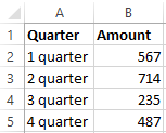
- Create a table with the data.
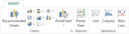
- Select the range of values A1:B5 that need to be presented as a chart. Go to the «INSERT» tab and choose the type.
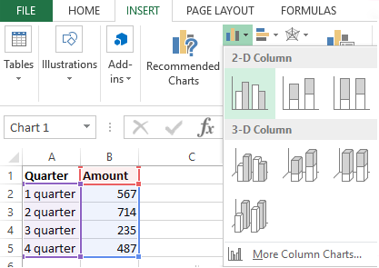
- Click «Insert Column Chart» (as an example; you may choose a different type). Select one of the suggested bar charts.
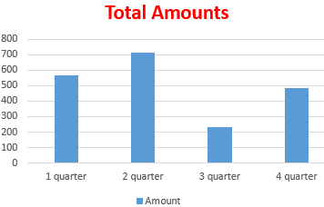
- After you choose your bar chart type, it will be generated automatically.
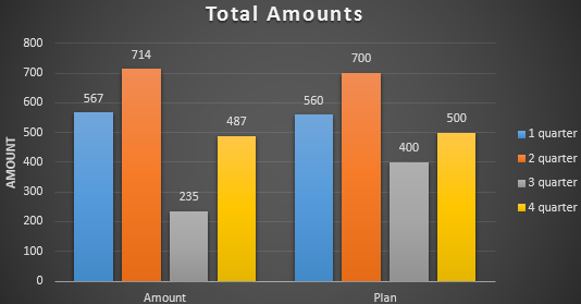
- Such a variant isn’t exactly what we need, so let’s modify it. Double-click on the bar chart’s title and enter «Total Amounts».
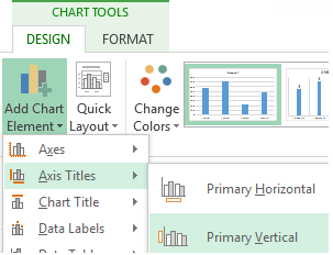
- Add the vertical axis title. Go to «CHART TOOLS» — «DESIGN» — «Add Element» — «Axis Titles» — «Primary Vertical». Select the vertical axis and its title type.
- Enter «AMOUNT».
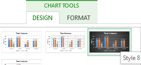
- Change the color and style. Choose a different style number 9.
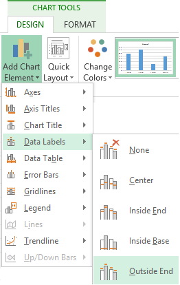
- Specify the sums by giving titles to the bars. Go to the «DESIGN» tab, select «Data Labels» and the desired position.
Done!
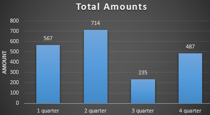
As a result, we have a stylish presentation of the data in Excel.
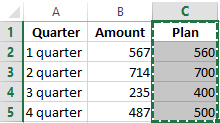
How to add data in an Excel chart?
- Add new values to the table – the «Plan» column.
- Select the new range of values, including the heading. Copy it to the clipboard (by pressing Ctrl+C). Select the existing chart and paste the fragment (by pressing Ctrl+V).
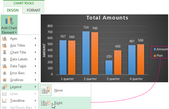
- As it’s not entirely clear where the figures in our bar chart come from, let’s create the legend. Go to «DESIGN» — «Legend» — «Right». This is the result:
There is a more complicated way of adding new data into the existing graph through the «DESIGN» «Select Data» menu (open it by right-clicking and selecting «Select Data»).
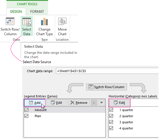
After you click «Add» (legend elements), there will open the row for selecting the range of values.
How to reverse axes in an Excel chart?
In the menu you’ve opened, click the «DESIGN»-«Switch/Column» button.
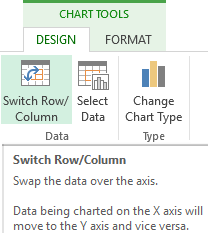
The values for rows and categories will swap around automatically.
How to lock controls in an Excel chart?
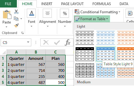
If you need to add new data in the bar chart very often, it’s not convenient to change the range every time. The optimal variant is to create a dynamic chart that will update automatically. To lock the controls, let’s transform the data range into a «Smart Table».
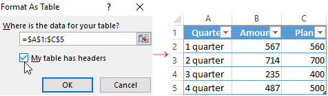
- Select the range of values A1:C5 and click «Format as Table» on «HOME» tab.
- Select any style in the drop-down menu. The program suggests you select the range for the table – agree with the suggested variant. The values for the graph will appear as follows:
- As soon as you begin to enter new information in the table, the chart will also change. It has become dynamic:
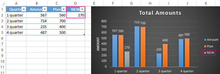
We have learned how to create a «Smart Table» off the existing data. If the spreadsheet is blank, start off with entering the values in the table: «INSERT» — «Table».
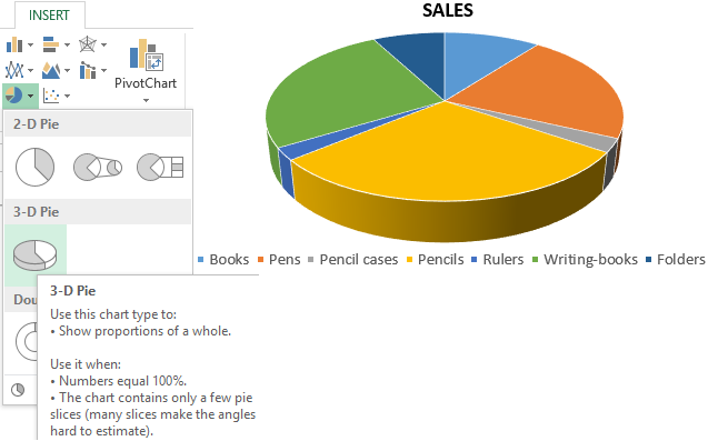
How to build a percentage chart in Excel?
Pie charts are the best option for representing percentage information.
The input data for our sample chart:
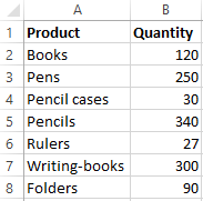
- Select the range A1:B8. «INSERT» — «Insert Pie or Doughnut Chart» — «3D-Pie».
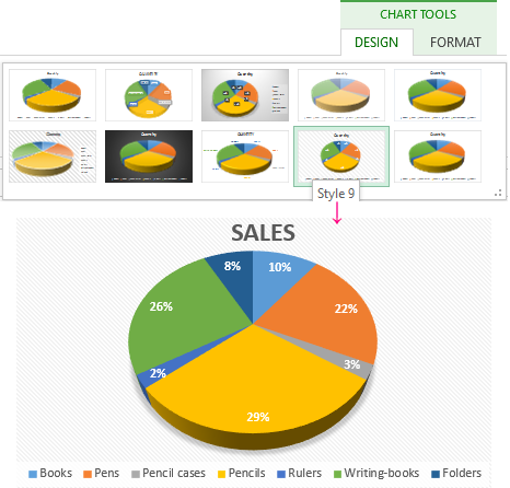
- Go to the tab «DESIGN» — «Styles». Among the suggested options, there are styles that include percentages. Choose the suitable 9.
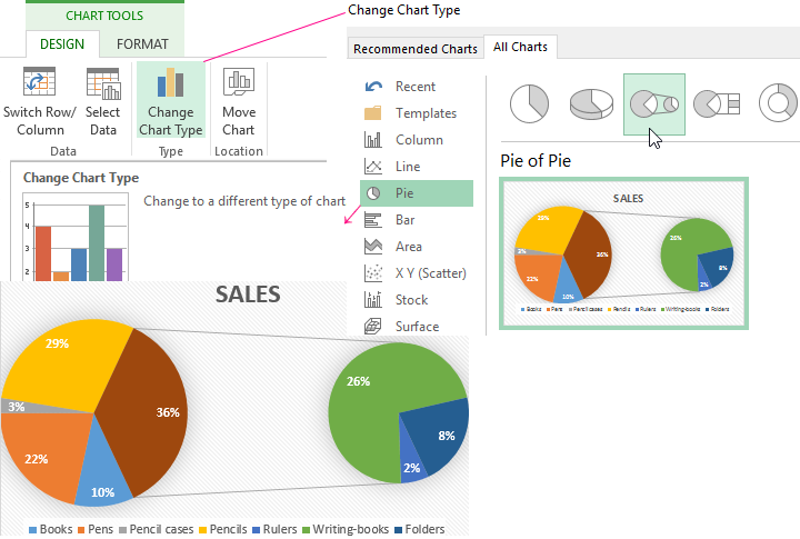
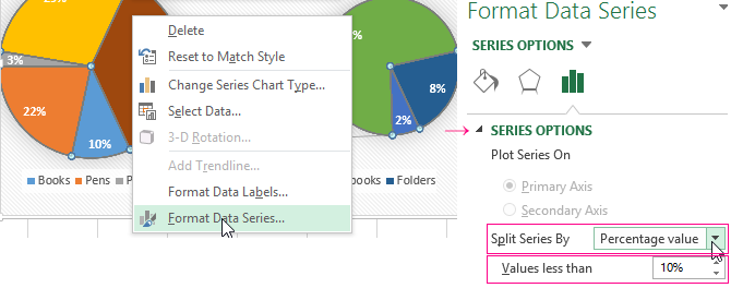
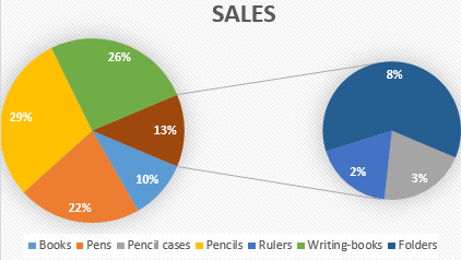
- The small percentage sectors are visible poorly. To highlight them, let’s create a secondary chart. Select the pie. Go to the tab «DESIGN» — «Change Chart Type». Select a pie with a secondary graph.
- The automatically generated option does not fulfill the task. Right-click on any sector. The dots designating the boundaries will become visible. Click «Format Data Series». Enter the following row parameters:
- We have obtained the desired variant:
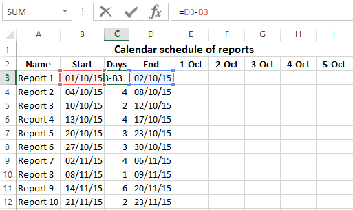
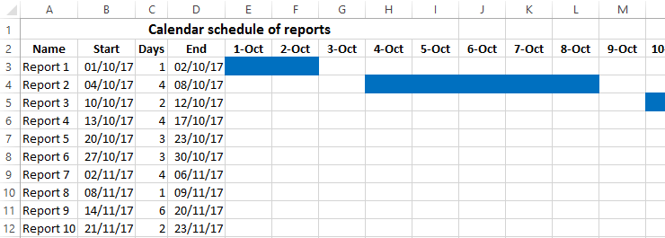
Gantt chart in Excel
The Gantt chart is way of representing information in the form of bars to illustrate a multi-stage event. It’s a simple yet impressive trick.
- We have a (dummy) table containing the deadlines for different reports.
- To create a chart, insert a column containing the number of days (column C). Fill it in with the help of Excel formulas.
- Select the range to contain the Gantt chart (E3:BF12). That is, the cells to be filled with a color between the beginning and end dates.
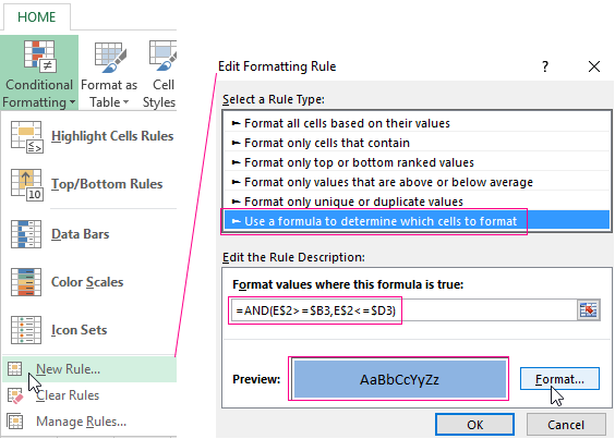
- Open the «Conditional Formatting» menu (on the «HOME» tab). Select «New Rule» — «Use a formula to determine which cells to format».
- Enter the formula of the following type: =AND(E$2>=$B3,E$2<=$D3). Excel uses the operator «И» to compare the date in the current cell with the beginning and end dates. Then, click «Format» and select the fill color.
When you need to build a presentable financial report, it’s better to use the graphical data representation tools.
A simple Gantt graph is ready. You can also download the template with a sample:
Download all examples
If the information is represented in a graphical way, it’s perceived visually much quicker and more efficiently than texts and numbers. It makes it easier to conduct an analytic analysis. It makes the situation clearer – both the whole picture and particular details.
Charts and graphs were specifically developed in Excel for fulfilling such tasks.
After you input your data and select the cell range, you’re ready to choose the chart type. In this example, we’ll create a clustered column chart from the data we used in the previous section.
Step 1: Select Chart Type
Once your data is highlighted in the Workbook, click the Insert tab on the top banner. About halfway across the toolbar is a section with several chart options. Excel provides Recommended Charts based on popularity, but you can click any of the dropdown menus to select a different template.

Step 2: Create Your Chart
- From the Insert tab, click the column chart icon and select Clustered Column.

- Excel will automatically create a clustered chart column from your selected data. The chart will appear in the center of your workbook.
- To name your chart, double click the Chart Title text in the chart and type a title. We’ll call this chart “Product Profit 2013 — 2017.”

We’ll use this chart for the rest of the walkthrough. You can download this same chart to follow along.
Download Sample Column Chart Template
There are two tabs on the toolbar that you will use to make adjustments to your chart: Chart Design and Format. Excel automatically applies design, layout, and format presets to charts and graphs, but you can add customization by exploring the tabs. Next, we’ll walk you through all the available adjustments in Chart Design.

Step 3: Add Chart Elements
Adding chart elements to your chart or graph will enhance it by clarifying data or providing additional context. You can select a chart element by clicking on the Add Chart Element dropdown menu in the top left-hand corner (beneath the Home tab).

To Display or Hide Axes:
- Select Axes. Excel will automatically pull the column and row headers from your selected cell range to display both horizontal and vertical axes on your chart (Under Axes, there is a check mark next to Primary Horizontal and Primary Vertical.)

- Uncheck these options to remove the display axis on your chart. In this example, clicking Primary Horizontal will remove the year labels on the horizontal axis of your chart.

- Click More Axis Options… from the Axes dropdown menu to open a window with additional formatting and text options such as adding tick marks, labels, or numbers, or to change text color and size.


To Add Axis Titles:
- Click Add Chart Element and click Axis Titles from the dropdown menu. Excel will not automatically add axis titles to your chart; therefore, both Primary Horizontal and Primary Vertical will be unchecked.
- To create axis titles, click Primary Horizontal or Primary Vertical and a text box will appear on the chart. We clicked both in this example. Type your axis titles. In this example, the we added the titles “Year” (horizontal) and “Profit” (vertical).


To Remove or Move Chart Title:
- Click Add Chart Element and click Chart Title. You will see four options: None, Above Chart, Centered Overlay, and More Title Options.

- Click None to remove chart title.
- Click Above Chart to place the title above the chart. If you create a chart title, Excel will automatically place it above the chart.
- Click Centered Overlay to place the title within the gridlines of the chart. Be careful with this option: you don’t want the title to cover any of your data or clutter your graph (as in the example below).


To Add Data Labels:
- Click Add Chart Element and click Data Labels. There are six options for data labels: None (default), Center, Inside End, Inside Base, Outside End, and More Data Label Title Options.

- The four placement options will add specific labels to each data point measured in your chart. Click the option you want. This customization can be helpful if you have a small amount of precise data, or if you have a lot of extra space in your chart. For a clustered column chart, however, adding data labels will likely look too cluttered. For example, here is what selecting Center data labels looks like:


To Add a Data Table:
- Click Add Chart Element and click Data Table. There are three pre-formatted options along with an extended menu that can be found by clicking More Data Table Options:


Note: If you choose to include a data table, you’ll probably want to make your chart larger to accommodate the table. Simply click the corner of your chart and use drag-and-drop to resize your chart.
To Add Error Bars:
- Click Add Chart Element and click Error Bars. In addition to More Error Bars Options, there are four options: None (default), Standard Error, 5% (Percentage), and Standard Deviation. Adding error bars provide a visual representation of the potential error in the shown data, based on different standard equations for isolating error.

- For example, when we click Standard Error from the options we get a chart that looks like the image below.


To Add Gridlines:
- Click Add Chart Element and click Gridlines. In addition to More Grid Line Options, there are four options: Primary Major Horizontal, Primary Major Vertical, Primary Minor Horizontal, and Primary Minor Vertical. For a column chart, Excel will add Primary Major Horizontal gridlines by default.

- You can select as many different gridlines as you want by clicking the options. For example, here is what our chart looks like when we click all four gridline options.

To Add a Legend:
- Click Add Chart Element and click Legend. In addition to More Legend Options, there are five options for legend placement: None, Right, Top, Left, and Bottom.

- Legend placement will depend on the style and format of your chart. Check the option that looks best on your chart. Here is our chart when we click the Right legend placement.


To Add Lines: Lines are not available for clustered column charts. However, in other chart types where you only compare two variables, you can add lines (e.g. target, average, reference, etc.) to your chart by checking the appropriate option.
To Add a Trendline:
- Click Add Chart Element and click Trendline. In addition to More Trendline Options, there are five options: None (default), Linear, Exponential, Linear Forecast, and Moving Average. Check the appropriate option for your data set. In this example, we will click Linear.

- Because we are comparing five different products over time, Excel creates a trendline for each individual product. To create a linear trendline for Product A, click Product A and click the blue OK button.

- The chart will now display a dotted trendline to represent the linear progression of Product A. Note that Excel has also added Linear (Product A) to the legend.

- To display the trendline equation on your chart, double click the trendline. A Format Trendline window will open on the right side of your screen. Click the box next to Display equation on chart at the bottom of the window. The equation now appears on your chart.


Note: You can create separate trendlines for as many variables in your chart as you like. For example, here is our chart with trendlines for Product A and Product C.

To Add Up/Down Bars: Up/Down Bars are not available for a column chart, but you can use them in a line chart to show increases and decreases among data points.
Step 4: Adjust Quick Layout
- The second dropdown menu on the toolbar is Quick Layout, which allows you to quickly change the layout of elements in your chart (titles, legend, clusters etc.).

- There are 11 quick layout options. Hover your cursor over the different options for an explanation and click the one you want to apply.


Step 5: Change Colors
The next dropdown menu in the toolbar is Change Colors. Click the icon and choose the color palette that fits your needs (these needs could be aesthetic, or to match your brand’s colors and style).

Step 6: Change Style
For cluster column charts, there are 14 chart styles available. Excel will default to Style 1, but you can select any of the other styles to change the chart appearance. Use the arrow on the right of the image bar to view other options.

Step 7: Switch Row/Column
- Click the Switch Row/Column on the toolbar to flip the axes. Note: It is not always intuitive to flip axes for every chart, for example, if you have more than two variables.


In this example, switching the row and column swaps the product and year (profit remains on the y-axis). The chart is now clustered by product (not year), and the color-coded legend refers to the year (not product). To avoid confusion here, click on the legend and change the titles from Series to Years.

Step 8: Select Data
- Click the Select Data icon on the toolbar to change the range of your data.
- A window will open. Type the cell range you want and click the OK button. The chart will automatically update to reflect this new data range.


Step 9: Change Chart Type
- Click the Change Chart Type dropdown menu.

- Here you can change your chart type to any of the nine chart categories that Excel offers. Of course, make sure that your data is appropriate for the chart type you choose.

-
You can also save your chart as a template by clicking Save as Template…
- A dialogue box will open where you can name your template. Excel will automatically create a folder for your templates for easy organization. Click the blue Save button.


Step 10: Move Chart
- Click the Move Chart icon on the far right of the toolbar.
- A dialogue box appears where you can choose where to place your chart. You can either create a new sheet with this chart (New sheet) or place this chart as an object in another sheet (Object in). Click the blue OK button.


Step 11: Change Formatting
- The Format tab allows you to change formatting of all elements and text in the chart, including colors, size, shape, fill, and alignment, and the ability to insert shapes. Click the Format tab and use the shortcuts available to create a chart that reflects your organization’s brand (colors, images, etc.).

- Click the dropdown menu on the top left side of the toolbar and click the chart element you are editing.


Step 12: Delete a Chart
To delete a chart, simply click on it and click the Delete key on your keyboard.
Building charts and graphs are one of the best ways to visualize data in a clear and comprehensible way.
However, it’s no surprise that some people get a little intimidated by the prospect of poking around in Microsoft Excel.

I thought I’d share a helpful video tutorial as well as some step-by-step instructions for anyone out there who cringes at the thought of organizing a spreadsheet full of data into a chart that actually, you know, means something. But before diving in, we should go over the different types of charts you can create in the software.
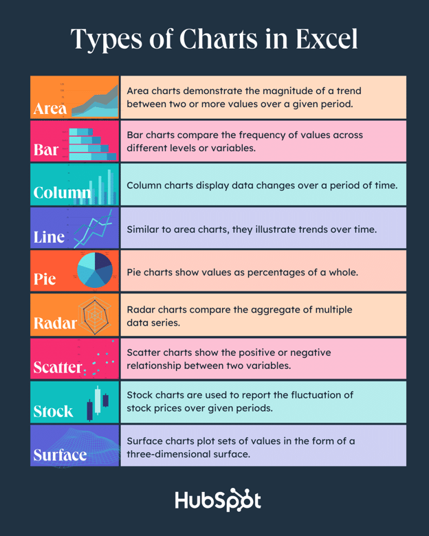
Types of Charts in Excel
You can make more than just bar or line charts in Microsoft Excel, and when you understand the uses for each, you can draw more insightful information for your or your team’s projects.
|
Type of Chart |
Use |
|
Area |
Area charts demonstrate the magnitude of a trend between two or more values over a given period. |
|
Bar |
Bar charts compare the frequency of values across different levels or variables. |
|
Column |
Column charts display data changes or a period of time. |
|
Line |
Similar to bar charts, they illustrate trends over time. |
|
Pie |
Pie charts show values as percentages of a whole. |
|
Radar |
Radar charts compare the aggregate of multiple data series. |
|
Scatter |
Scatter charts show the positive or negative relationship between two variables. |
|
Stock |
Stock charts are used to report the fluctuation of stock prices over given periods. |
|
Surface |
Surface charts plot sets of values in the form of a three-dimensional surface. |
The steps you need to build a chart or graph in Excel are simple, and here’s a quick walkthrough on how to make them.
Keep in mind there are many different versions of Excel, so what you see in the video above might not always match up exactly with what you’ll see in your version. In the video, I used Excel 2021 version 16.49 for Mac OS X.
To get the most updated instructions, I encourage you to follow the written instructions below (or download them as PDFs). Most of the buttons and functions you’ll see and read are very similar across all versions of Excel.
Download Demo Data | Download Instructions (Mac) | Download Instructions (PC)
- Enter your data into Excel.
- Choose one of nine graph and chart options to make.
- Highlight your data and click ‘Insert’ your desired graph.
- Switch the data on each axis, if necessary.
- Adjust your data’s layout and colors.
- Change the size of your chart’s legend and axis labels.
- Change the Y-axis measurement options, if desired.
- Reorder your data, if desired.
- Title your graph.
- Export your graph or chart.
Featured Resource: Free Excel Graph Templates
.png)
Why start from scratch? Use these free Excel Graph Generators. just input your data and adjust as needed for a beautiful data visualization.
1. Enter your data into Excel.
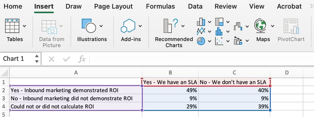
First, you need to input your data into Excel. You might have exported the data from elsewhere, like a piece of marketing software or a survey tool. Or maybe you’re inputting it manually.
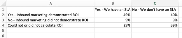
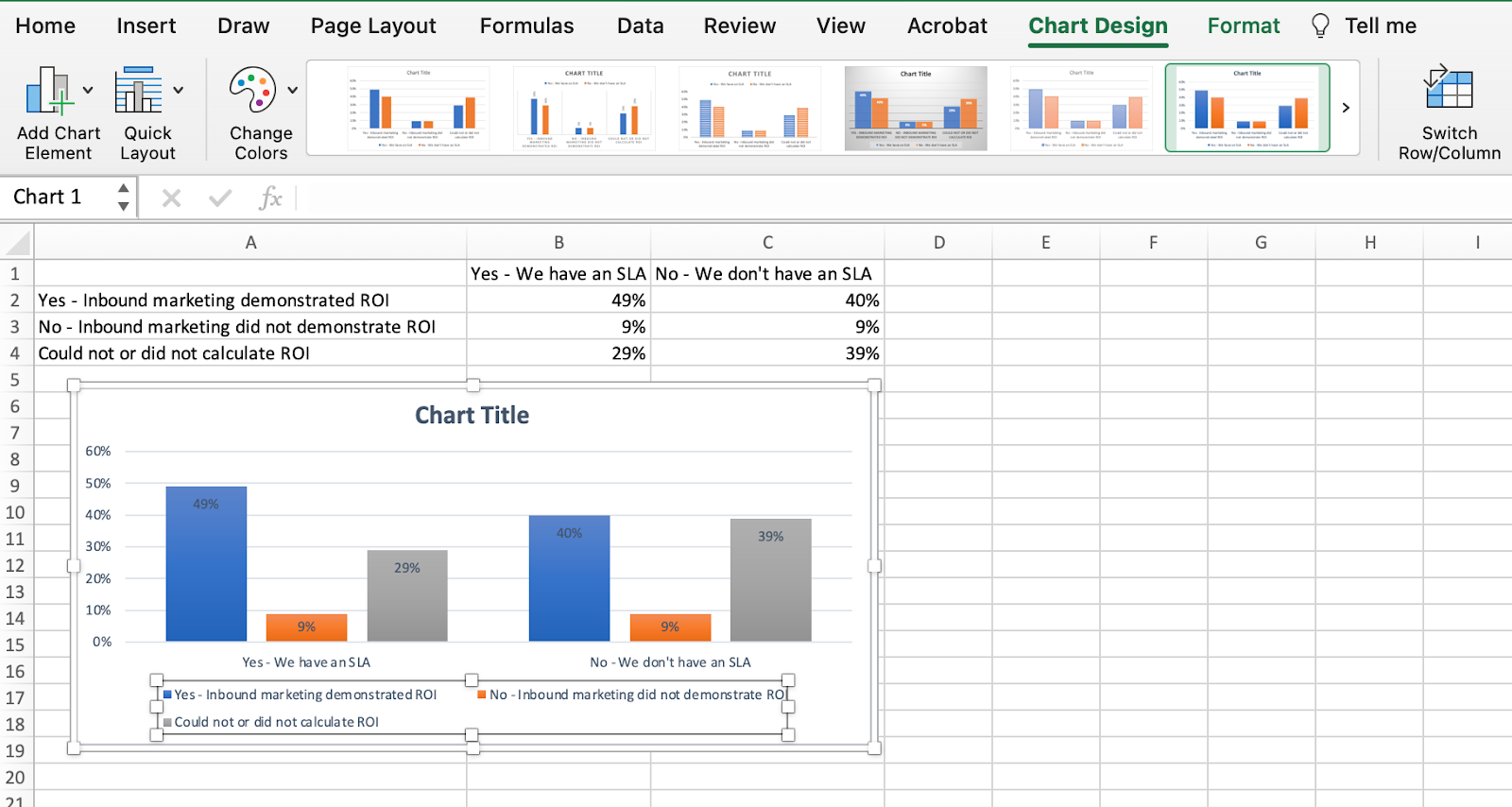
In the example below, in Column A, I have a list of responses to the question, “Did inbound marketing demonstrate ROI?”, and in Columns B, C, and D, I have the responses to the question, “Does your company have a formal sales-marketing agreement?” For example, Column C, Row 2 illustrates that 49% of people with a service level agreement (SLA) also say that inbound marketing demonstrated ROI.
2. Choose from the graph and chart options.
In Excel, your options for charts and graphs include column (or bar) graphs, line graphs, pie graphs, scatter plots, and more. See how Excel identifies each one in the top navigation bar, as depicted below:
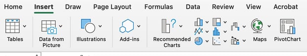
To find the chart and graph options, select Insert.
(For help figuring out which type of chart/graph is best for visualizing your data, check out our free ebook, How to Use Data Visualization to Win Over Your Audience.)
3. Highlight your data and insert your desired graph into the spreadsheet.
In this example, a bar graph presents the data visually. To make a bar graph, highlight the data and include the titles of the X and Y-axis. Then, go to the Insert tab and click the column icon in the charts section. Choose the graph you wish from the dropdown window that appears.
I picked the first two dimensional column option because I prefer the flat bar graphic over the three dimensional look. See the resulting bar graph below.

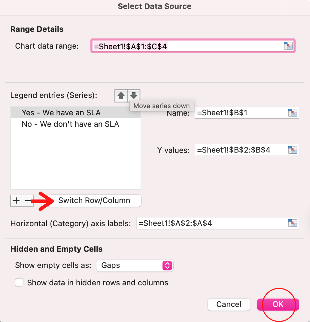
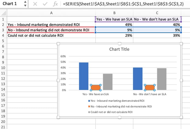
4. Switch the data on each axis, if necessary.
If you want to switch what appears on the X and Y axis, right-click on the bar graph, click Select Data, and click Switch Row/Column. This will rearrange which axes carry which pieces of data in the list shown below. When finished, click OK at the bottom.
The resulting graph would look like this:
5. Adjust your data’s layout and colors.
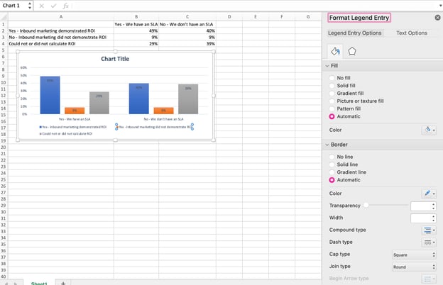
To change the labeling layout and legend, click on the bar graph, then click the Chart Design tab. Here, you can choose which layout you prefer for the chart title, axis titles, and legend. In my example below, I clicked on the option that displayed softer bar colors and legends below the chart.
To further format the legend, click on it to reveal the Format Legend Entry sidebar, as shown below. Here, you can change the fill color of the legend, which will change the color of the columns themselves. To format other parts of your chart, click on them individually to reveal a corresponding Format window.
6. Change the size of your chart’s legend and axis labels.
When you first make a graph in Excel, the size of your axis and legend labels might be small, depending on the graph or chart you choose (bar, pie, line, etc.) Once you’ve created your chart, you’ll want to beef up those labels so they’re legible.
To increase the size of your graph’s labels, click on them individually and, instead of revealing a new Format window, click back into the Home tab in the top navigation bar of Excel. Then, use the font type and size dropdown fields to expand or shrink your chart’s legend and axis labels to your liking.

7. Change the Y-axis measurement options if desired.
To change the type of measurement shown on the Y axis, click on the Y-axis percentages in your chart to reveal the Format Axis window. Here, you can decide if you want to display units located on the Axis Options tab, or if you want to change whether the Y-axis shows percentages to two decimal places or no decimal places.
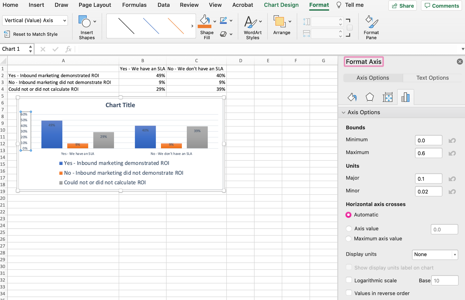
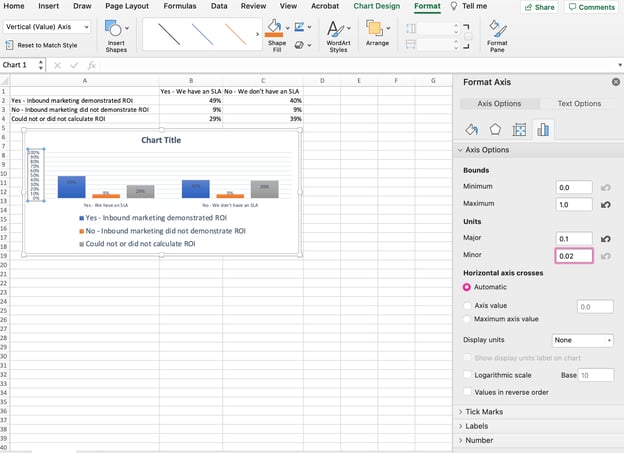
Because my graph automatically sets the Y axis’s maximum percentage to 60%, you might want to change it manually to 100% to represent my data on a universal scale. To do so, you can select the Maximum option — two fields down under Bounds in the Format Axis window — and change the value from 0.6 to one.
The resulting graph will look like the one below (In this example, the font size of the Y-axis has been increased via the Home tab so that you can see the difference):
8. Reorder your data, if desired.
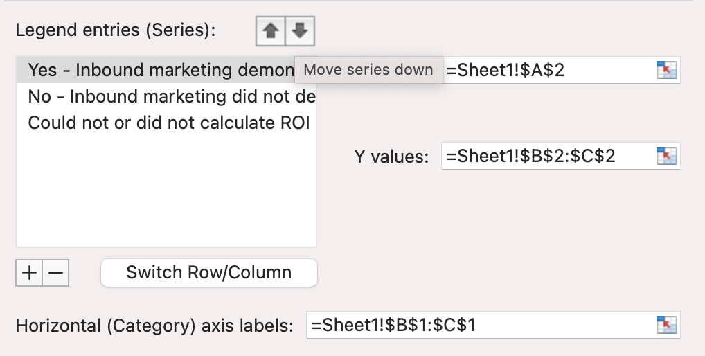
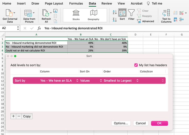
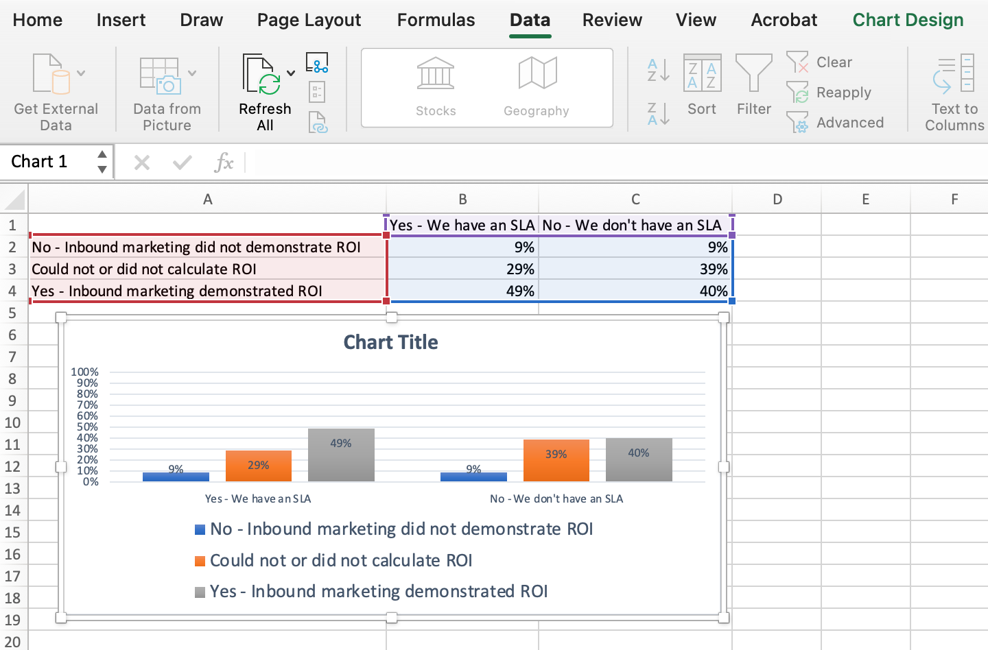
To sort the data so the respondents’ answers appear in reverse order, right-click on your graph and click Select Data to reveal the same options window you called up in Step 3 above. This time, arrow up and down to reverse the order of your data on the chart.
If you have more than two lines of data to adjust, you can also rearrange them in ascending or descending order. To do this, highlight all of your data in the cells above your chart, click Data and select Sort, as shown below. Depending on your preference, you can choose to sort based on smallest to largest, or vice versa.
The resulting graph would look like this:
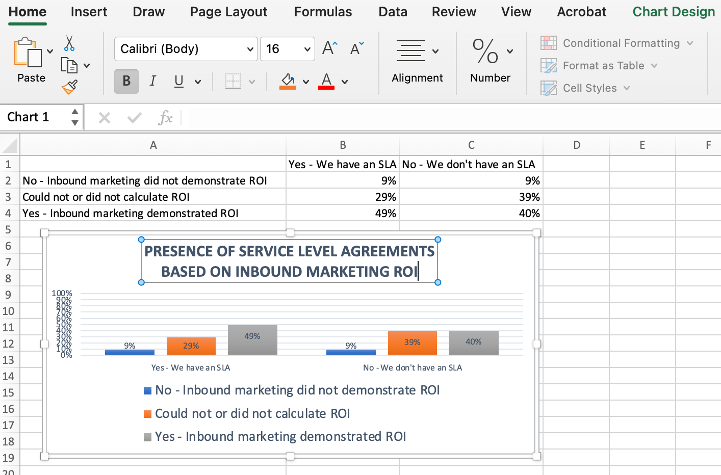
9. Title your graph.
Now comes the fun and easy part: naming your graph. By now, you might have already figured out how to do this. Here’s a simple clarifier.
Right after making your chart, the title that appears will likely be «Chart Title,» or something similar depending on the version of Excel you’re using. To change this label, click on «Chart Title» to reveal a typing cursor. You can then freely customize your chart’s title.
When you have a title you like, click Home on the top navigation bar, and use the font formatting options to give your title the emphasis it deserves. See these options and my final graph below:
10. Export your graph or chart.
Once your chart or graph is exactly the way you want it, you can save it as an image without screenshotting it in the spreadsheet. This method will give you a clean image of your chart that can be inserted into a PowerPoint presentation, Canva document, or any other visual template.
To save your Excel graph as a photo, right-click on the graph and select Save as Picture.
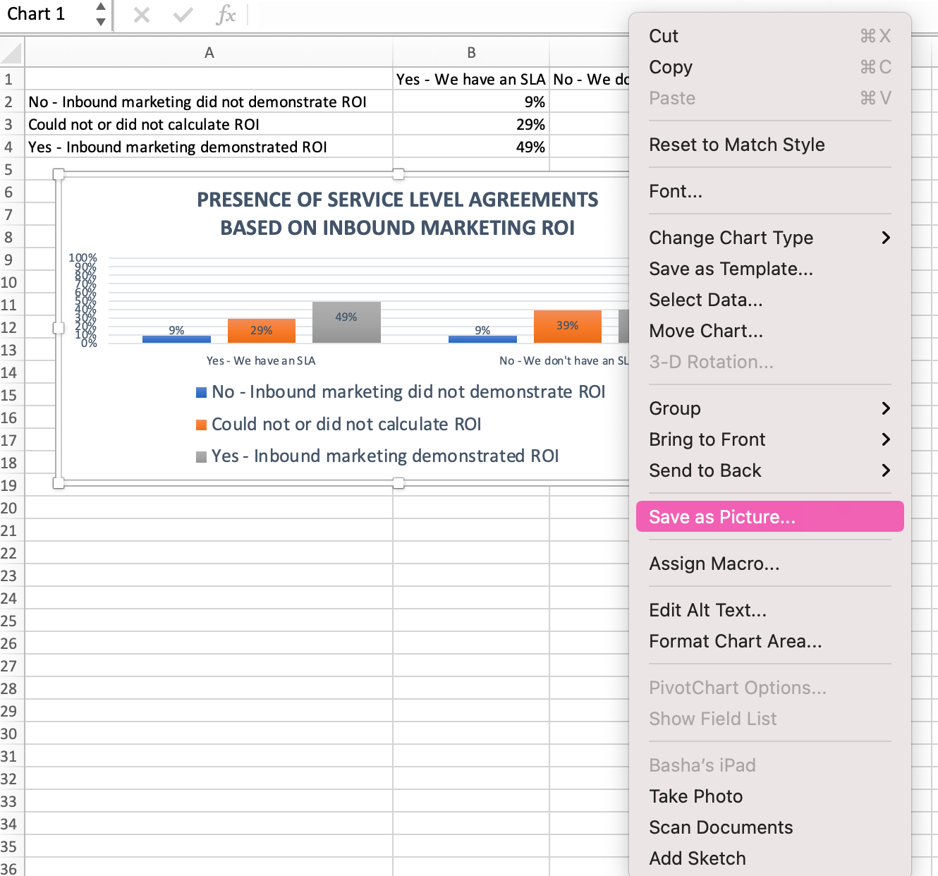
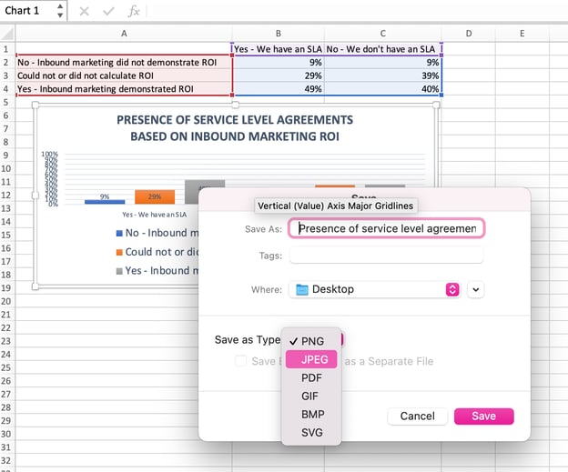
In the dialogue box, name the photo of your graph, choose where to save it on your computer, and choose the file type you’d like to save it as. In this example, it’s saved as a JPEG to a desktop folder. Finally, click Save.
You’ll have a clear photo of your graph or chart that you can add to any visual design.

Visualize Data Like A Pro
That was pretty easy, right? With this step-by-step tutorial, you’ll be able to quickly create charts and graphs that visualize the most complicated data. Try using this same tutorial with different graph types like a pie chart or line graph to see what format tells the story of your data best.
Editor’s note: This post was originally published in June 2018 and has been updated for comprehensiveness.
