
IMPORTANT: Ideas in Excel is now Analyze Data
To better represent how Ideas makes data analysis simpler, faster and more intuitive, the feature has been renamed to Analyze Data. The experience and functionality is the same and still aligns to the same privacy and licensing regulations. If you’re on Semi-Annual Enterprise Channel, you may still see «Ideas» until Excel has been updated.

Analyze Data in Excel empowers you to understand your data through natural language queries that allow you to ask questions about your data without having to write complicated formulas. In addition, Analyze Data provides high-level visual summaries, trends, and patterns.
Have a question? We can answer it!
Simply select a cell in a data range > select the Analyze Data button on the Home tab. Analyze Data in Excel will analyze your data, and return interesting visuals about it in a task pane.
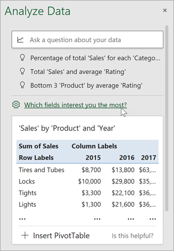
If you’re interested in more specific information, you can enter a question in the query box at the top of the pane, and press Enter. Analyze Data will provide answers with visuals such as tables, charts or PivotTables that can then be inserted into the workbook.
If you are interested in exploring your data, or just want to know what is possible, Analyze Data also provides personalized suggested questions which you can access by selecting on the query box.
Try Suggested Questions
Just ask your question
Select the text box at the top of the Analyze Data pane, and you’ll see a list of suggestions based on your data.

You can also enter a specific question about your data.

Notes:
-
Analyze Data is available to Microsoft 365 subscribers in English, French, Spanish, German, Simplified Chinese, and Japanese. If you are a Microsoft 365 subscriber, make sure you have the latest version of Office. To learn more about the different update channels for Office, see: Overview of update channels for Microsoft 365 apps.
-
The Natural Language Queries functionality in Analyze Data is being made available to customers on a gradual basis. It may not be available in all countries or regions at this time.
Get specific with Analyze Data
If you do not have a question in mind, in addition to Natural Language, Analyze Data analyzes and provides high-level visual summaries, trends, and patterns.
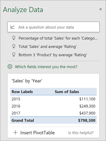
You can save time and get a more focused analysis by selecting only the fields you want to see. When you choose fields and how to summarize them, Analyze Data excludes other available data — speeding up the process and presenting fewer, more targeted suggestions. For example, you might only want to see the sum of sales by year. Or you could ask Analyze Data to display average sales by year.
Select Which fields interest you the most?
Select the fields and how to summarize their data.
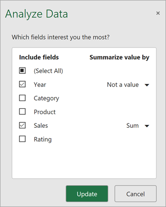
Analyze Data offers fewer, more targeted suggestions.
Note: The Not a value option in the field list refers to fields that are not normally summed or averaged. For example, you wouldn’t sum the years displayed, but you might sum the values of the years displayed. If used with another field that is summed or averaged, Not a value works like a row label, but if used by itself, Not a value counts unique values of the selected field.
Analyze Data works best with clean, tabular data.
Here are some tips for getting the most out of Analyze Data:
-
Analyze Data works best with data that’s formatted as an Excel table. To create an Excel table, click anywhere in your data and then press Ctrl+T.
-
Make sure you have good headers for the columns. Headers should be a single row of unique, non-blank labels for each column. Avoid double rows of headers, merged cells, etc.
-
If you have complicated, or nested data, you can use Power Query to convert tables with cross-tabs, or multiple rows of headers.
Didn’t get Analyze Data? It’s probably us, not you.
Here are some reasons why Analyze Data may not work on your data:
-
Analyze Data doesn’t currently support analyzing datasets over 1.5 million cells. There is currently no workaround for this. In the meantime, you can filter your data, then copy it to another location to run Analyze Data on it.
-
String dates like «2017-01-01» will be analyzed as if they are text strings. As a workaround, create a new column that uses the DATE or DATEVALUE functions, and format it as a date.
-
Analyze Data won’t work when Excel is in compatibility mode (i.e. when the file is in .xls format). In the meantime, save your file as an .xlsx, .xlsm, or .xlsb file.
-
Merged cells can also be hard to understand. If you’re trying to center data, like a report header, then as a workaround, remove all merged cells, then format the cells using Center Across Selection. Press Ctrl+1, then go to Alignment > Horizontal > Center Across Selection.
Analyze Data works best with clean, tabular data.
Here are some tips for getting the most out of Analyze Data:
-
Analyze Data works best with data that’s formatted as an Excel table. To create an Excel table, click anywhere in your data and then press
 +T.
+T. -
Make sure you have good headers for the columns. Headers should be a single row of unique, non-blank labels for each column. Avoid double rows of headers, merged cells, etc.
 +T.
+T.Didn’t get Analyze Data? It’s probably us, not you.
Here are some reasons why Analyze Data may not work on your data:
-
Analyze Data doesn’t currently support analyzing datasets over 1.5 million cells. There is currently no workaround for this. In the meantime, you can filter your data, then copy it to another location to run Analyze Data on it.
-
String dates like «2017-01-01» will be analyzed as if they are text strings. As a workaround, create a new column that uses the DATE or DATEVALUE functions, and format it as a date.
-
Analyze Data can’t analyze data when Excel is in compatibility mode (i.e. when the file is in .xls format). In the meantime, save your file as an .xlsx, .xlsm, or xslb file.
-
Merged cells can also be hard to understand. If you’re trying to center data, like a report header, then as a workaround, remove all merged cells, then format the cells using Center Across Selection. Press Ctrl+1, then go to Alignment > Horizontal > Center Across Selection.
Analyze Data works best with clean, tabular data.
Here are some tips for getting the most out of Analyze Data:
-
Analyze Data works best with data that’s formatted as an Excel table. To create an Excel table, click anywhere in your data and then click Home > Tables > Format as Table.
-
Make sure you have good headers for the columns. Headers should be a single row of unique, non-blank labels for each column. Avoid double rows of headers, merged cells, etc.
Didn’t get Analyze Data? It’s probably us, not you.
Here are some reasons why Analyze Data may not work on your data:
-
Analyze Data doesn’t currently support analyzing datasets over 1.5 million cells. There is currently no workaround for this. In the meantime, you can filter your data, then copy it to another location to run Analyze Data on it.
-
String dates like «2017-01-01» will be analyzed as if they are text strings. As a workaround, create a new column that uses the DATE or DATEVALUE functions, and format it as a date.
We’re always improving Analyze Data
Even if you don’t have any of the above conditions, we may not find a recommendation. That’s because we are looking for a specific set of insight classes, and the service doesn’t always find something. We are continually working to expand the analysis types that the service supports.
Here is the current list that is available:
-
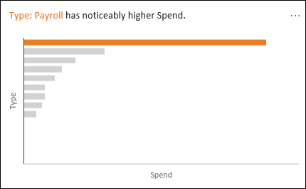
Rank: Ranks and highlights the item that is significantly larger than the rest of the items.
-
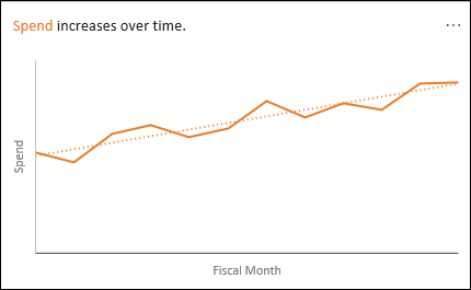
Trend: Highlights when there is a steady trend pattern over a time series of data.
-
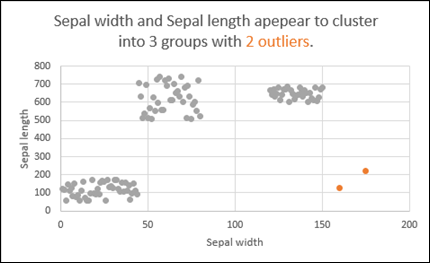
Outlier: Highlights outliers in time series.
-
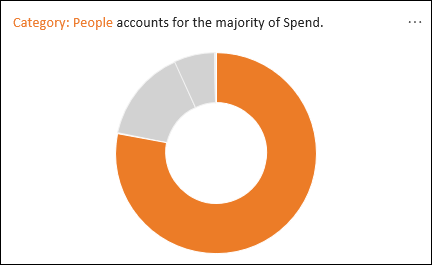
Majority: Finds cases where a majority of a total value can be attributed to a single factor.
If you don’t get any results, please send us feedback by going to File > Feedback.
Because Analyze Data analyzes your data with artificial intelligence services, you might be concerned about your data security. You can read the Microsoft privacy statement for more details.
Need more help?
You can always ask an expert in the Excel Tech Community or get support in the Answers community.
Do you want to know how to analyze data in excel?
Are you looking for the best way to analyze data in excel?
Keep Reading!
Microsoft Excel is one of the most widely used tools in any industry. While some enjoy playing with pivotal tables and histograms, others limit themselves to simple pie-charts and conditional formatting.
Some may create an artwork out of the dull monochrome Excel, while others may be satisfied with its data analysis. In this discussion, we will make a deep delving analysis of Microsoft Excel and its utility. We will focus on how to analyze data in Excel Analytics, the various tricks, and techniques for it. The discussion will also explore the various ways to analyze data in Excel.
We will discuss the different features of Excel analytics to know how to analyze data in excel (much of which are unexplored to the mass), functions, and best practices.
Our discussion will include, but not be limited to:
(i) Best Way to Analyze Data in Excel
(ii) How to Analyze Sales Data in Excel
(iii) Analyzing Data Sets with Excel
(iv) Data Segregation with Excel
(v) The Importance of Data Reporting
(vi) How to Analyze Data in Excel

Register For a Free Webinar
Date: 15th Apr, 2023 (Saturday)
Time: 11:00 AM to 12:00 PM (IST/GMT +5:30)
How to Analyze Sales Data in Excel: Make Pivot Table your Best Friend
A pivot tool helps us summarize huge amounts of data. One of the best ways to analyze data in excel, it is mostly used to understand and recognize patterns in the data set.
Recognizing patterns in a small dataset is pretty simple. But the enormity of the datasets often calls for additional efforts to find the patterns. In such cases, a pivot table can be a huge advantage as it takes only a few minutes to summarize groups of data using a pivot table.
A data analysis example can be, you have a dataset consisting of regions and number of sales. You may want to know the number of sales based on the regions, which can be used to determine why a region is lacking and how to possibly improve in that area. Using a pivot table, you can create a report in excel within a few minutes and save it for future analysis.
A Pivot Table allows you to summarize data as averages, sums, or counts in Excel from data that is stored in another Spreadsheet, or table. It is great for quickly building reports because you can sort and visualize the data quickly.
Taking a data analysis example like, you may have put together a spreadsheet, which you can copy, and paste into Excel, or use in Google Docs if you would prefer (just click File > Make a Copy).
The spreadsheet contains data with a mock company’s customer purchase information. Since companies purchase at different dates, a pivot table will help us to consolidate this data to allow us to see total buys per company, as well as to compare purchases across companies, for quick analysis.
The Pivot table allows you to take a table with a lot of data in it and rearrange the table so that you only look at only what matters to you.
- a) Whether you are using a Mac or a PC, you can select the whole dataset that you want to look at and select: “Data” -> “Pivot Table”. When you hit that, a new tab should be opened with a table.
Data Set
- b) Once you have your table in front of you, you can drag and drop the Column Labels, Row Labels, and Report Filter
- Column Labels go across the top row of your table (for example Date, Month, Company Name)
- Row Labels go across the left-hand side of your table [for example Date, Month, Company Name (same as with column labels, it depends on how you would prefer to look at the data, vertically or horizontally)]
- The Values section is where you put the data you would like calculated (for example Purchases, Revenue)
- Report Filter helps you refine your results. Add anything you would like to Filter by (for example you want to look at Lead Referral Sources, but exclude Google and Direct)
Pivot tables are a great way to manage the data from your reports. You can copy and paste the data into your own Excel file, or create a copy in Google Apps (File > Make a Copy).

How to Analyze Data in Excel: Analyzing Data Sets with Excel
To know how to analyze data in excel, you can instantly create different types of charts, including line and column charts, or add miniature graphs. You can also apply a table style, create PivotTables, quickly insert totals, and apply conditional formatting. Analyzing large data sets with Excel makes work easier if you follow a few simple rules:
- Select the cells that contain the data you want to analyze.
- Click the Quick Analysis button image button that appears to the bottom right of your selected data (or press CRTL + Q).
- Selected data with Quick Analysis Lens button visible
- In the Quick Analysis gallery, select a tab you want. For example, choose Charts to see your data in a chart.
- Pick an option, or just point to each one to see a preview.
- You might notice that the options you can choose are not always the same. That is often because the options change based on the type of data you have selected in your workbook.

To understand the best way to analyze data in excel, you might want to know which analysis option is suitable for you. Here we offer you a basic overview of some of the best options to choose from.
- Formatting: Formatting lets you highlight parts of your data by adding things like data bars and colors. This lets you quickly see high and low values, among other things.
- Charts: Charts Excel recommends different charts, based on the type of data you have selected. If you do not see the chart you want, click More Charts.
- Totals: Totals let you calculate the numbers in columns and rows. For example, Running Total inserts a total that grows as you add items to your data. Click the little black arrows on the right and left to see additional options.
- Tables: Tables make it easy to filter and sort your data. If you do not see the table style you want, click More.
- Sparklines: Sparklines are like tiny graphs that you can show alongside your data. They provide a quick way to see trends.

Ways to Analyze Data in Excel: Tips and Tricks
It is fun to analyze data in MS Excel if you play it right. Here, we offer some quick hacks so that you know how to analyze data in excel.
-
How to Analyze Data in Excel: Data Cleaning
Data Cleaning, one of the very basic excel functions, becomes simpler with a few tips and tricks. You may learn how to use a native Excel feature and how to accomplish the same goal with Power Query. Power Query is a built-in feature in Excel 2016 and an Add-in for Excel 2010/2013. It helps you to extract, transform, and load your data with just a few clicks.
1. Change the format of numbers from text to numeric
Sometimes when you import data from an external source other than Excel, numbers are imported as text. Excel will alert you by showing a green tooltip in the top-left corner of the cell.
Depending on the number of values in the range, you can quickly convert the values to numbers by clicking on ‘Convert to a number’ within the tooltip options.
However, if you have more than 1000 values, you will have to wait a couple of seconds while Excel finishes the conversion.
You may also convert the values to number format is to use Text-to-Columns using the following steps:
- Select the range with the values to be converted.
- Go to Data > Text to Columns.
- Select Delimited and click Next.
- Uncheck all the checkboxes for delimiters (see below) and click Next.
- Text-Columns-Checkboxes
2. Select General and click on Finish
When you have lots of numbers to convert this tip will be much faster than waiting for all the numbers to be converted. In Power Query, you just have to right-click on the column header of the column you want to convert.
- Then go to Change Type.
- Then select the type of number you want (such as Decimal or Whole Number)
- Power-Query-Data-Type
Register For a Free Webinar
Date: 15th Apr, 2023 (Saturday)
Time: 11:00 AM to 12:00 PM (IST/GMT +5:30)
How to Analyze Data in Excel: Data Analysis
Data Analysis is simpler and faster with Excel analytics. Here, we offer some tips for work:
- Create auto expandable ranges with Excel tables: One of the most underused features of MS Excel is Excel Tables. Excel Tables have wonderful properties that allow you to work more efficiently. Some of these features include:
- Formula Auto Fill: Once you enter a formula in a table it will be automatically be copied to the rest of the table.
- Auto Expansion: New items typed below or at the right of the table become part of the table.
- Visible headers: Regardless of your position within the table, your headers will always be visible.
- Automatic Total Row: To calculate the total of a row, you just have to select the desired formula.
- Use Excel Tables as part of a formula: Like in dropdown lists, if you have a formula that depends on a Table, when you add new items to the Table, the reference in the formula will be automatically updated.
- Use Excel Tables as a source for a chart: Charts will be updated automatically as well if you use an Excel Table as a source. As you can see, Excel Tables allow you to create data sources that do not have to be updated when new data is included.
How to Analyze Data in Excel: Data Visualization
Quickly visualize trends with sparklines: Sparklines are a visualization feature of MS Excel that allows you to quickly visualize the overall trend of a set of values. Sparklines are mini-graphs located inside of cells. You may want to visualize the overall trend of monthly sales by a group of salesmen.
To create the sparklines, follow these steps below:
- Select the range that contains the data that you will plot (This step is recommended but not required, you can select the data range later).
- Go to Insert > Sparklines > Select the type of sparkline you want (Line, Column, or Win/Loss). For this specific example, I will choose Lines.
- Click on the range selection button Select Range Excel Button to browse for the location of the sparklines, press Enter and click OK. Make sure you select a location that is proportional to the data source. For example, if the data source range contains 6 rows then the location of the sparkline must contain 6 rows.
To format the sparkline you may try the following:
To change the colour of markers:
- Click on any cell within the sparkline to show the Sparkline Tools menu.
- In the Sparkline tools menu, go to Marker Color and change the colour for the specific markers you want.
For example High points on the green, Low points on red, and the remaining in blue.
To change the width of the lines:
- Click on any cell within the sparkline to show the Sparkline Tools menu.
- In the Sparkline tools contextual menu, go to Sparkline Color > Weight and change the width of the line as you desire.
Save Time with Quick Analysis: One of the major improvements introduced back in Excel 2013 was the Quick Analysis feature. This feature allows you to quickly create graphs, sparklines, PivotTables, PivotCharts, and summary functions by just clicking on a button.
When you select data in Excel 2013 or later, you will see the Quick Analysis button Quick Analysis Excel Button in the bottom-right corner of the range selected. If you click on the Quick Analysis button you will see the following options:
- Formatting
- Charts
- Totals
- Tables
- Sparklines
When you click on any of the options, Excel will show a preview of the possible results you could obtain given the data you selected.
- If you click on the Quick Analysis button and go to charts, you could quickly create the graph below just by clicking a button.
- If you go to Totals, you can quickly insert a row with the average for each column:
- If you click on Sparklines, you can quickly insert Sparklines:
- As you can see, the Quick Analysis feature really allows you to quickly perform different visualizations and analysis with almost no effort.
How to Analyze Data in Excel: Data reporting
Data reporting in Excel analytics requires more than just accounting skills, it also requires a thorough knowledge of excel functionalities and the ability to add beauty to your report.
- Turn Auto Refresh off before editing the Excel workbook. This will stop the table from refreshing when you are making changes on the worksheet. To do this, click on the Refresh icon at the bottom of the Excel Report Designer Task Pane and then select “Switch auto-refresh off”.
- When adding a new row to the layout, select a cell in the table area below where you want to insert the new row. Then right-click and from the context menu select Insert > Table Rows Above.
- When deleting columns or rows make sure you use the Table Delete functions similar to the Insert functions above. To remove a column or row, select a cell in the table area of the row or column you want to remove. Then right-click and from the context menu select Delete and then either Table Columns or Table Rows.
- Remove unneeded rows or columns from the table. Having fewer cells in the layout makes it easier for the table to refresh, so removing any unneeded ones will improve performance.

Excel has several other uses that may not have been covered here. Play around with visualize complex data or organize disparate numbers, to discover the infinite variety of functions in Excel analytics. Strong knowledge of excel is a boon if you are looking forward to a career in data analytics.
Register For a Free Webinar
Date: 15th Apr, 2023 (Saturday)
Time: 11:00 AM to 12:00 PM (IST/GMT +5:30)
This was all about how to analyze data in excel, how to analyze sales data in excel along with a few data analysis example.
Hopefully, you must have understood the best way to analyze data in excel.
We offer one of the best-known courses in Data Analytics Using Excel Course. The course enables you to learn tools such as Advanced Excel, PowerBI, and SQL. The live projects and intensive training program also empower you to come up with solutions for real-life problems.
Excel is currently the most flexible tool used in business. It has been around since the 1980s and continues to be the most essential data structure and analysis tool. It is an indispensable resource for personnel in IT, Finance, HR, Marketing, and virtually every other department imaginable. Let us have a conversation about its usefulness for our esteemed marketers.
Excel was used as a tool for data storage and organization. Over time, it became a tool for doing modest data calculations. Today, after several upgrades, it is recognized as a gateway into the realm of analytics. Let us accept the strength of this instrument and plunge into the realm of Excel-based marketing analytics with this post. This article will help to demonstrate the power of Excel in data analytics.
What does Excel do?
It is true that huge organizations have abandoned spreadsheets for enormous data sets, yet spreadsheets are still utilized for everyday tasks. In its most fundamental form, each cell in Excel contains data points. To facilitate viewing and organizing, exports of raw data, sales dates, SKUs, and units sold are inserted (or imported) into a spreadsheet. An effective Excel spreadsheet will arrange unstructured data into a format that makes it simpler to extract insights that can be put into action. Excel allows you to define fields and functions that perform computations with more sophisticated data. Even with bigger data sets, segmented data may be examined and viewed more thoroughly without the need for additional tools. Determine hypothetical profit margins or budgets for departments. While it cannot create a complete data product on its own, it may provide easy-to-read graphics and precise computations. If you are considering a career as an analyst or need to work with data to create a report, analytics is not the simplest procedure to learn in a single sitting. Use data spreadsheets as a little representation of a bigger data endeavor.
- What is the intent? Overview? What insights do you require?
- Where does the data originate? What exports and imports are required?
- Does the data require translation?
- What obstacles exist? Limitations?
How do you get your conclusions? Which post-analysis choices must be made?
Excel is an excellent starting point for context, but a true big data project requires far more people, expertise, and degree of detail.
What benefits does Data Analysis provide for Sales and Marketing?
Information Analysis will provide additional insights used to boost advertising activities. Be it their budgetary allocations, their interest group, or geology. Let us consider the following scenario: a marketing administrator is arranging a paid assignment on Google. Based on keyword trends, reverberation rates on the landing page, and the number of leads that will be generated from these clicks, he will have a good idea of how many clicks the promotion will generate within a certain time frame. An exhaustive data analysis will reveal the average income/benefits that will be generated by this project, enabling him to easily determine ROI, adjust advertising budgets as necessary, and establish benchmarks for each project.
How to Conduct Data Analysis in Microsoft Excel
Let us discuss the well-known features and functions of Microsoft Excel that are commonly employed by business professionals for data analysis in Excel.
Turn Tables
Turn tables allow you to extract relevant information from a massive dataset. This is considered the most effective method for analyzing information. You may embed a Pivot Table and then move fields, sort, filter, or modify the summary calculation. You may also create a Two-Layer Pivot Table. Group Pivot Table Items, Multi-level Pivot Table, Frequency Distribution, Pivot Chart, Slicers, Update Pivot Table, Calculated Field/Item, and Get-Pivot-Data are useful capabilities.
What-if Evaluation
Consider the possibility that Analysis facilitates the exploration of many routes pertaining to a variety of scenarios involving values or equations. Excel’s What-if analysis is initiated by clicking on the What-if button. After entering details about the anticipated circumstance, click the Outline button. Under this capability, you may also explore Data Tables, Quadratic Equation, and Goal Seek.
Limiting Formatting
The Conditional Formatting feature lets highlight cells with a distinct color based on the value assigned to it. Contingent planning is useful for managing rules, information bars, color scales, symbol sets, observe copies, concealing substitute columns, examining two documents, conflicting rules, the agenda, and Marketing Professionals.
Diagrams
A chart is more useful than a sheet since it displays information in several ways and is extremely easy to create. You can create an outline, alter the graph type, adjust the line or segment, legend location, and information markings. Column Chart, Line Chart, Pie Chart, Bar Chart, Area Chart, Scatter Plot, Data Series, Axes, Chart Sheet Trendline, Error Bars, Sparklines, Combination Chart, Gauge Chart, Thermometer Chart, Gantt Chart, and Pareto Chart are some of the many types of outlines in Microsoft Excel.
Sort and Filter
Sorting and filtering are the most frequently used Excel functions. Within segments, it should be able to arrange in ascending or descending order. List arrangement should be feasible via shading, inversion, or randomization. Channels are utilized to display information that conforms to models. Number and Text Filters, Date Filters, an Advanced Filter, a Data Form, Remove Duplicates, Outlining Data, and Subtotal are all available.
Vlookup and Hlookup
Examiners rely on Vlookup and Hlookup to notice a value in a data collection and get other attributes linked to it. It is frequently used by information analysts to connect and consolidate vital data from several dominant Marketing Professionals.
Can Excel be Used for Complex Data Analysis?
Excel has the capability to do predictive analytics using plugins. For complex data analysis, the add-ons in Excel will centralize all your complex business formulas and calculations from multiple systems in one sheet, view, or graph. Having all your data in one centralized place and detailed, customizable dashboards enable you to easily compare, measure, and analyze complex data so that you can make informed business decisions.
A company may sell its products and services in multiple countries. It uses eCommerce platforms for its Online Stores. They have different marketing platforms, payment gateways, inventories, logistic channels, and target audiences in each country. Hence, businesses are bound to use several tools and applications for each job to be done.
For a simple calculation of profit, where
Profits/Losses = Sales – Expenses
The sales data will come from eCommerce sites, Expenses from the marketing costs on the platforms like Google AdWords, and Facebook Ads. There can be other expenses like purchasing stock which might come from inventory management platforms like Olabi, which further need to be added to all other expenses occurred that is usually present in accounting software like FreshBooks. Additionally, there will be different data silos for each country. Thus, you must pull all these data from multiple platforms for each country separately in Excel, and then analyze all this data together with the expense data and calculate profits. It involves a lot of working hours which cost money, and there is usually a time lag involved, which reduces the accuracy of the analysis and its effectiveness as the data is not analyzed in real-time. Thus, it becomes necessary to consolidate all the data in a data warehouse using a data pipeline.
Daton is a modern cloud data pipeline designed to replicate data to a cloud data warehouse with the utmost ease. Daton, our eCommerce-focused data pipeline, has built-in support for more than 100 applications, databases, files, cloud storage, analytics, CRM, Customer support, and many others. Analysts can replicate data from any source to any destination (BigQuery, Snowflake, Redshift), without writing a single line of code and in a matter of minutes.
Explore the 30 most popular pages in this section. Below you can find a description of each page. Happy learning!
1 Find Duplicates: This example teaches you how to find duplicate values (or triplicates) and how to find duplicate rows in Excel.
2 Histogram: This example teaches you how to make a histogram in Excel.
3 Regression: This example teaches you how to run a linear regression analysis in Excel and how to interpret the Summary Output.
4 Pareto Chart: A Pareto chart combines a column chart and a line graph. The Pareto principle states that, for many events, roughly 80% of the effects come from 20% of the causes.
5 Remove Duplicates: This example teaches you how to remove duplicates in Excel.
6 Gantt Chart: Excel does not offer Gantt as chart type, but it’s easy to create a Gantt chart by customizing the stacked bar chart type.
7 Line Chart: Line charts are used to display trends over time. Use a line chart if you have text labels, dates or a few numeric labels on the horizontal axis.
8 Correlation: We can use the CORREL function or the Analysis Toolpak add-in in Excel to find the correlation coefficient between two variables.
9 Pie Chart: Pie charts are used to display the contribution of each value (slice) to a total (pie). Pie charts always use one data series.
10 Data Tables: Instead of creating different scenarios, you can create a data table to quickly try out different values for formulas. You can create a one variable data table or a two variable data table.
11 t-Test: This example teaches you how to perform a t-Test in Excel. The t-Test is used to test the null hypothesis that the means of two populations are equal.
12 Advanced Filter: This example teaches you how to apply an advanced filter in Excel to only display records that meet complex criteria.
13 Frequency Distribution: Did you know that you can use pivot tables to easily create a frequency distribution in Excel? You can also use the Analysis Toolpak to create a histogram.
14 Scatter Plot: Use a scatter plot (XY chart) to show scientific XY data. Scatter plots are often used to find out if there’s a relationship between variable X and Y.
15 Anova: This example teaches you how to perform a single factor ANOVA (analysis of variance) in Excel. A single factor or one-way ANOVA is used to test the null hypothesis that the means of several populations are all equal.
16 Compare Two Lists: This example describes how to compare two lists using conditional formatting.
17 Bar Chart: A bar chart is the horizontal version of a column chart. Use a bar chart if you have large text labels.
18 Goal Seek: If you know the result you want from a formula, use Goal Seek in Excel to find the input value that produces this formula result.
19 Box and Whisker Plot: This example teaches you how to create a box and whisker plot in Excel. A box and whisker plot shows the minimum value, first quartile, median, third quartile and maximum value of a data set.
20 Shade Alternate Rows: This example shows you how to use conditional formatting to shade alternate rows.
21 Quick Analysis: Use the Quick Analysis tool in Excel to quickly analyze your data. Quickly calculate totals, quickly insert tables, quickly apply conditional formatting and more.
22 Sparklines: Sparklines in Excel are graphs that fit in one cell. Sparklines are great for displaying trends. Excel offers three sparkline types: Line, Column and Win/Loss.
23 Slicers: Use slicers in Excel to quickly and easily filter pivot tables. Connect multiple slicers to multiple pivot tables to create awesome reports.
24 Trendline: This example teaches you how to add a trendline to a chart in Excel.
25 Pivot Chart: A pivot chart is the visual representation of a pivot table in Excel. Pivot charts and pivot tables are connected with each other.
26 Subtotal: Use the SUBTOTAL function in Excel instead of SUM, COUNT, MAX, etc. to ignore rows hidden by a filter or to ignore manually hidden rows.
27 Combination Chart: A combination chart is a chart that combines two or more chart types in a single chart.
28 Randomize List: This article teaches you how to randomize (shuffle) a list in Excel.
29 Unique Values: To find unique values in Excel, use the Advanced Filter. You can extract unique values or filter for unique values.
30 Icon Sets: Icon Sets in Excel make it very easy to visualize values in a range of cells. Each icon represents a range of values.
Check out all 300 examples.
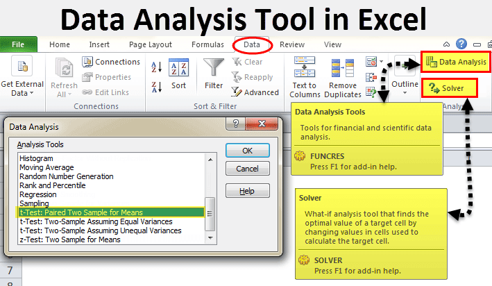
Excel Tool for Data Analysis (Table of Contents)
- Data Analysis Tool in Excel
- Unleash Data Analysis Tool Pack in Excel
- How to Use the Data Analysis Tool in Excel?
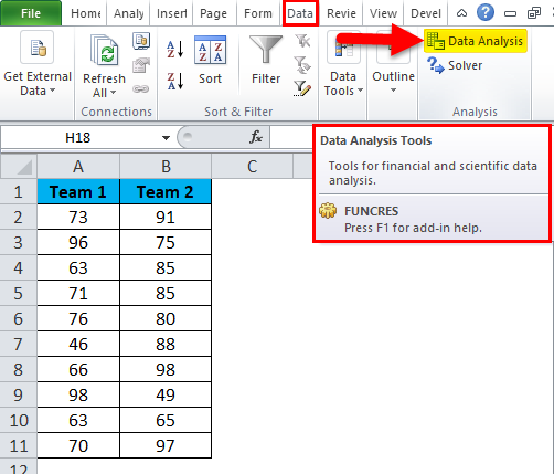
In excel, we have few inbuilt tools which are used for Data Analysis. But these become active only when you select any of them. To enable the Data Analysis tool in Excel, go to the File menu’s Options tab. Once we get the Excel Options window from Add-Ins, select any of the analysis pack, let’s say Analysis Toolpak and click on Go. This will take us to the window from where we can select one or multiple Data analysis tool packs, which can be seen in the Data menu tab.
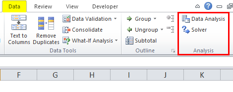
If you observe excel on your laptop or computer, you may not see the data analysis option by default. You need to unleash it. Usually, a data analysis tool pack is available under the Data tab.
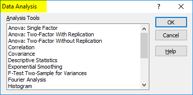
Under the Data Analysis option, we can see many analysis options.
Unleash Data Analysis Tool Pack in Excel
If your excel is not showing this pack, follow the below steps to unleash this option.
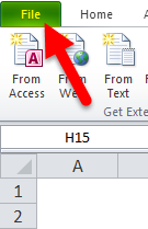
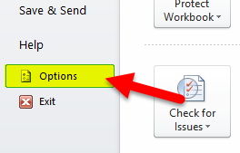
Step 1: Go to FILE.
Step 2: Under File, select Options.
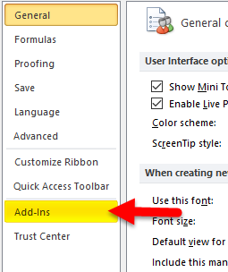
Step 3: After selecting Options, select Add-Ins.
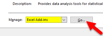
Step 4: Once you click on Add-Ins, at the bottom, you will see Manage drop-down list. Select Excel Add-ins and click on Go.
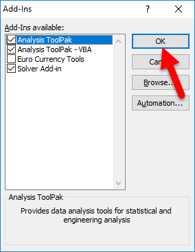
Step 5: Once you click on Go, you will see a new dialogue box. You will see all the available Analysis Tool Pack. I have selected 3 of them and then click on Ok.
Step 6: Now, you will see these options under the Data ribbon.

How to Use the Data Analysis Tool in Excel?
Let’s understand the working of a data analysis tool with some examples.
You can download this Data Analysis Tool Excel Template here – Data Analysis Tool Excel Template
T-test Analysis – Example #1
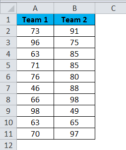
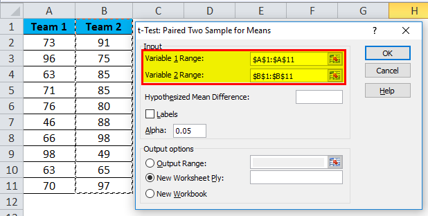
A t-test is returning the probability of the tests. Look at the below data of two teams scoring pattern in the tournament.
Step 1: Select the Data Analysis option under the DATA tab.
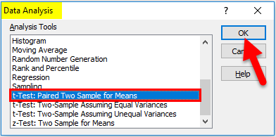
Step 2: Once you click on Data Analysis, you will see a new dialogue box. Scroll down and find the T-test. Under T-test, you will three kinds of T-test; select the first one, i.e. t-Test: Paired Two Sample for Means.
Step 3: After selecting the first t-Test, you will see the below options.
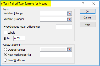
Step 4: Under Variable 1 Range, select team 1 score and under Variable 2 Range, select team 2 score.
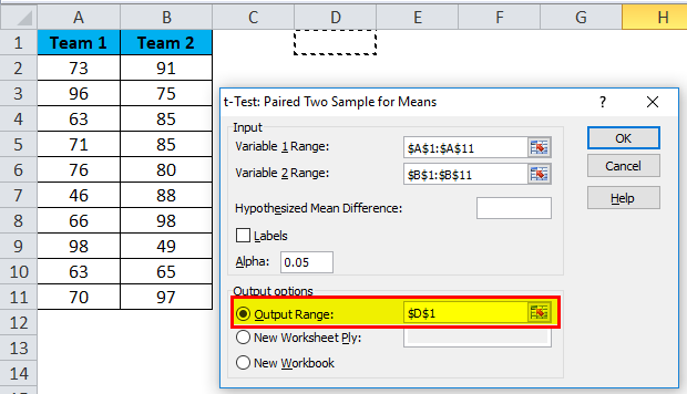
Step 5: Output Range selects the cell where you want to display the results.
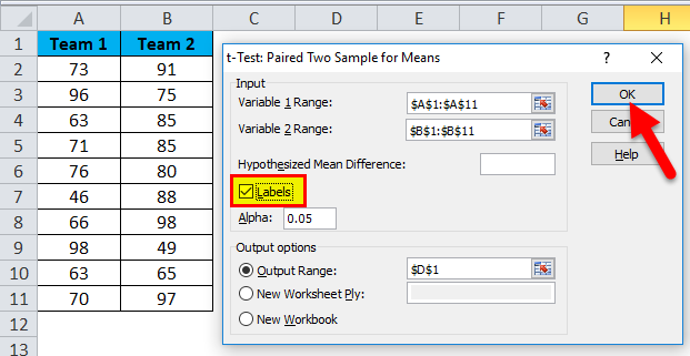
Step 6: Click on Labels because we have selected the ranges, including headings. Click on Ok to finish the test.
Step 7: From the D1 cell, it will start showing the test result.
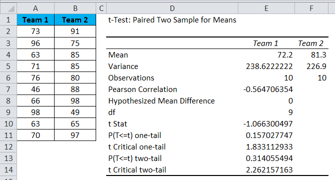
The result will show the mean value of two teams, Variance Value, how many observations are conducted or how many values taken into consideration, Pearson Correlation etc.…
If you P (T<=t) two-tail, it is 0.314, which is higher than the standard expected P-value of 0.05. This means data is not significant.
We can also do the T-test by using the built-in function T.TEST.
SOLVER Option – Example#2
A solver is nothing but solving the problem. SOLVER works like a goal seek in excel.
Look at the below image. I have data of product units, unit price, total cost, and the total profit.
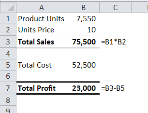
Units sold quantity is 7550 at a selling price of 10 per unit. The total cost is 52500, and the total profit is 23000.
As a proprietor, I want to earn a profit of 30000 by increasing the unit price. As of now, I don’t know how much units price I have to increase. SOLVER will help me to solve this problem.
Step 1: Open SOLVER under the DATA tab.
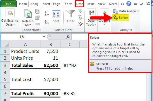
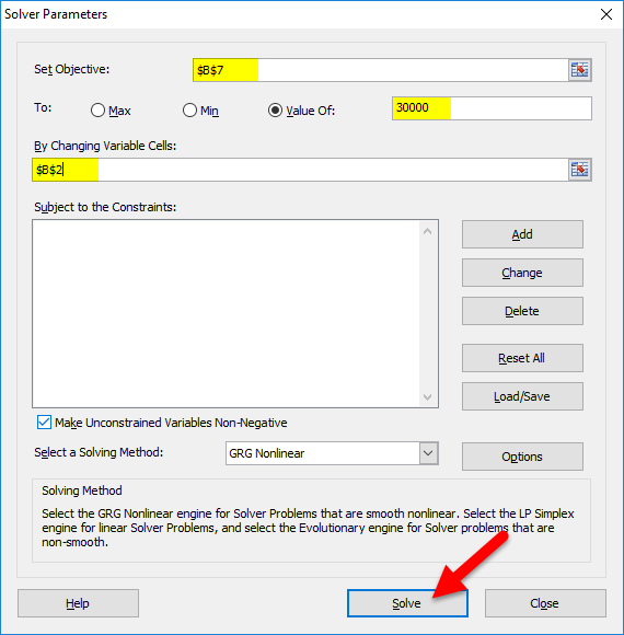
Step 2: Set the objective cell as B7 and the value of 30000 and by changing the cell to B2. Since I don’t have any other special criteria to test, I am clicking on the SOLVE button.
Step 3: The Result will be as below:
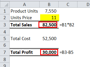
Ok, excel SOLVER solved the problem for me. To make a profit of 30000 I need to sell the products at 11 per unit instead of 10 per unit.
In this way, we can do the analyze the data.
Things to Remember
- We have many other analysis tests like Regression, F-test, ANOVA, Correlation, Descriptive techniques.
- We can add Excel Add-in as a data analysis tool pack.
- Analysis tool pack is available under VBA too.
Recommended Articles
This has been a guide to Data Analysis Tool in Excel. Here we discuss how to use the Excel Data Analysis Tool along with excel examples and a downloadable excel template. You may also look at these useful articles in excel –
- Pareto Analysis in Excel
- What-If Analysis in Excel
- Excel Regression Analysis
- Excel Quick Analysis