
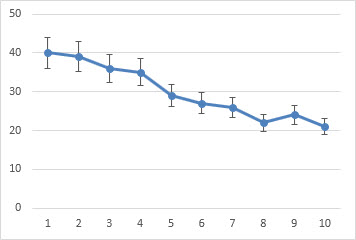
Error bars in charts you create can help you see margins of error and standard deviations at a glance. They can be shown on all data points or data markers in a data series as a standard error amount, a percentage, or a standard deviation. You can set your own values to display the exact error amounts you want. For example, you can show a 10 percent positive and negative error amount in the results of a scientific experiment like this:
You can use error bars in 2-D area, bar, column, line, xy (scatter), and bubble charts. In scatter and bubble charts, you can show error bars for x and y values.
Note: The following procedures apply to Office 2013 and newer versions. Looking for Office 2010 steps?
Add or remove error bars
-
Click anywhere in the chart.
-
Click the Chart Elements button
 next to the chart, and then check the Error Bars box. (Clear the box to remove error bars.)
 -
To change the error amount shown, click the arrow next to Error Bars, and then pick an option.
-
Pick a predefined error bar option like Standard Error, Percentage or Standard Deviation.
-
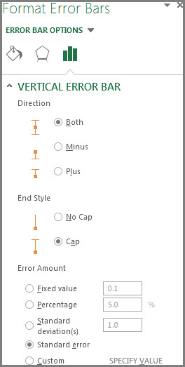
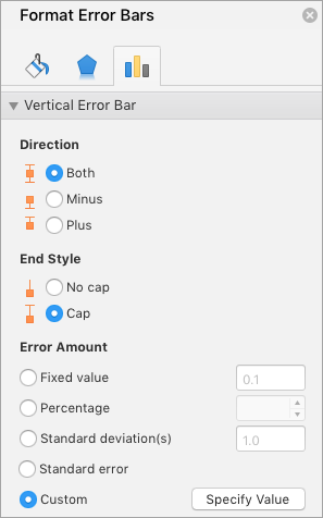
Pick More Options to set your own error bar amounts, and then under Vertical Error Bar or Horizontal Error Bar, choose the options you want. This is also where you can change the direction, end style of the error bars, or create custom error bars.
-
 next to the chart, and then check the Error Bars box. (Clear the box to remove error bars.)
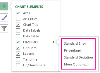
Note: The direction of the error bars depends on the type of chart you’re using. Scatter charts can show both horizontal and vertical error bars. You can remove either of these error bars by selecting them, and then pressing Delete.
Review equations for calculating error amounts
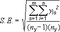
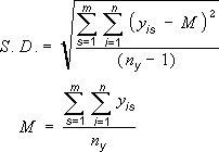
People often ask how Excel calculates error amounts. Excel uses the following equations to calculate the Standard Error and Standard Deviation amounts that are shown on the chart.
|
This option |
Uses this equation |
|---|---|
|
Standard Error |
Where: s = series number i = point number in series s m = number of series for point y in chart n = number of points in each series yis = data value of series s and the ith point ny = total number of data values in all series |
|
Standard Deviation |
Where: s = series number i = point number in series s m = number of series for point y in chart n = number of points in each series yis = data value of series s and the ith point ny = total number of data values in all series M = arithmetic mean |
Add, change, or remove errors bars in a chart in Office 2010
In Excel, you can display error bars that use a standard error amount, a percentage of the value (5%), or a standard deviation.
Standard Error and Standard Deviation use the following equations to calculate the error amounts that are shown on the chart.
|
This option |
Uses this equation |
Where |
|---|---|---|
|
Standard Error |
|
s = series number i = point number in series s m = number of series for point y in chart n = number of points in each series yis = data value of series s and the ith point ny = total number of data values in all series |
|
Standard Deviation |
|
s = series number i = point number in series s m = number of series for point y in chart n = number of points in each series yis = data value of series s and the ith point ny = total number of data values in all series M = arithmetic mean |
-
On 2-D area, bar, column, line, xy (scatter), or bubble chart, do one of the following:
-
To add error bars to all data series in the chart, click the chart area.
-
To add error bars to a selected data point or data series, click the data point or data series that you want, or do the following to select it from a list of chart elements:
-
Click anywhere in the chart.
This displays the Chart Tools, adding the Design, Layout, and Format tabs.
-
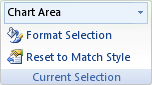
On the Format tab, in the Current Selection group, click the arrow next to the Chart Elements box, and then click the chart element that you want.
-
-
-
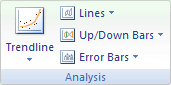
On the Layout tab, in the Analysis group, click Error Bars.
-
Do one of the following:
-
Click a predefined error bar option, such as Error Bars with Standard Error, Error Bars with Percentage, or Error Bars with Standard Deviation.
-
Click More Error Bar Options, and then under Vertical Error Bars or Horizontal Error Bars, click the display and error amount options that you want to use.
Note: The direction of the error bars depends on the chart type of your chart. For scatter charts, both horizontal and vertical error bars are displayed by default. You can remove either of these error bars by selecting them, and then pressing DELETE.
-
-
On a 2-D area, bar, column, line, xy (scatter), or bubble chart, click the error bars, the data point, or the data series that has the error bars that you want to change, or do the following to select them from a list of chart elements:
-
Click anywhere in the chart.
This displays the Chart Tools, adding the Design, Layout, and Format tabs.
-
On the Format tab, in the Current Selection group, click the arrow next to the Chart Elements box, and then click the chart element that you want.
-
-
On the Layout tab, in the Analysis group, click Error Bars, and then click More Error Bar Options.
-
Under Display, click the error bar direction and end style that you want to use.
-
On a 2-D area, bar, column, line, xy (scatter), or bubble chart, click the error bars, the data point, or the data series that has the error bars that you want to change, or do the following to select them from a list of chart elements:
-
Click anywhere in the chart.
This displays the Chart Tools, adding the Design, Layout, and Format tabs.
-
On the Format tab, in the Current Selection group, click the arrow next to the Chart Elements box, and then click the chart element that you want.
-
-
On the Layout tab, in the Analysis group, click Error Bars, and then click More Error Bar Options.
-
Under Error Amount, do one or more of the following:
-
To use a different method to determine the error amount, click the method that you want to use, and then specify the error amount.
-
To use custom values to determine the error amount, click Custom, and then do the following:
-
Click Specify Value.
-
In the Positive Error Value and Negative Error Value boxes, specify the worksheet range that you want to use as error amount values, or type the values that you want to use, separated by commas. For example, type 0.4, 0.3, 0.8.
Tip: To specify the worksheet range, you can click the Collapse Dialog button
, and then select the data that you want to use in the worksheet. Click the Collapse Dialog button again to return to the dialog box.Note: In Microsoft Office Word 2007 or Microsoft Office PowerPoint 2007, the Custom Error Bars dialog box may not show the Collapse Dialog button, and you can only type the error amount values that you want to use.
-
-
 , and then select the data that you want to use in the worksheet. Click the Collapse Dialog button again to return to the dialog box.
-
On a 2-D area, bar, column, line, xy (scatter), or bubble chart, click the error bars, the data point, or the data series that has the error bars that you want to remove, or do the following to select them from a list of chart elements:
-
Click anywhere in the chart.
This displays the Chart Tools, adding the Design, Layout, and Format tabs.
-
On the Format tab, in the Current Selection group, click the arrow next to the Chart Elements box, and then click the chart element that you want.
-
-
Do one of the following:
-
On the Layout tab, in the Analysis group, click Error Bars, and then click None.
-
Press DELETE.
-
Tip: You can remove error bars immediately after you add them to the chart by clicking Undo on the Quick Access Toolbar or by pressing CTRL+Z.
Do any of the following:
Express errors as a percentage, standard deviation, or standard error
-
In the chart, select the data series that you want to add error bars to.
For example, in a line chart, click one of the lines in the chart, and all the data marker of that data series become selected.
-
On the Chart Design tab, click Add Chart Element.
-
Point to Error Bars, and then do one of the following:

|
Click |
To |
|---|---|
|
Standard Error |
Apply the standard error, using the following formula:
s = series number |
|
Percentage |
Apply a percentage of the value for each data point in the data series |
|
Standard Deviation |
Apply a multiple of the standard deviation, using the following formula:
s = series number |


Express errors as custom values
-
In the chart, select the data series that you want to add error bars to.
-
On the Chart Design tab, click Add Chart Element, and then click More Error Bars Options.
-
In the Format Error Bars pane, on the Error Bar Options tab, under Error Amount, click Custom, and then click Specify Value.
-
Under Error amount, click Custom, and then click Specify Value.
-
In the Positive Error Value and Negative Error Value boxes, type the values that you want for each data point, separated by commas (for example, 0.4, 0.3, 0.8), and then click OK.
Note: You can also define error values as a range of cells from the same Excel workbook. To select the range of cells, in the Custom Error Bars dialog box, clear the contents of the Positive Error Value or Negative Error Value box, and then select the range of cells that you want to use.
Add up/down bars
-
In the chart, select the data series that you want to add up/down bars to.
-
On the Chart Design tab, click Add Chart Element, point to Up/Down Bars, and then click Up/down Bars.
Depending on the chart type, some options may not be available.
See Also
Create a chart
Change the chart type of an existing chart
When you represent data in a chart, there can be cases when there is a level of variability with a data point.
For example, you can not (with 100% certainty) predict the temperature of the next 10 days or the stock price of a company in the coming week.
There will always be a level of variability in the data. The final value could be a little higher or lower.
If you have to represent this kind of data, you can use Error Bars in the Charts in Excel.
What are Error Bars?
Error bars are the bars in an Excel chart that would represent the variability of a data point.
This will give you an idea of how accurate is the data point (measurement). It tells you how far the actual can go from the reported value (higher or lower).
For example, in the below chart, I have the sales estimates for the four quarters, and there is an error bar for each of the quarter bar. Each error bar indicates how much less or more the sales can be for each quarter.
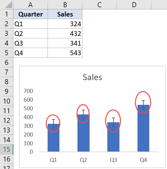
The more the variability, the less accurate is the data point in the chart.
I hope this gives you an overview of what is an error bar and how to use an error bar in Excel charts. Now let me show you how to add these error bars in Excel charts.
How to Add Error Bars in Excel Charts
In Excel, you can add error bars in a 2-D line, bar, column or area chart. You can also add it to the XY scatter chart or a bubble chart.
Suppose you have a dataset and the chart (created using this dataset) as shown below and you want to add error bars to this dataset:

Below are the steps to add data bars in Excel (2019/2016/2013):
- Click anywhere in your chart. It will make available the three icons as shown below.

- Click on the plus icon (the Chart Element icon)

- Click on the black triangle icon at the right of ‘Error bars’ option (it appears when you hover the cursor on the ‘Error Bars’ option)

- Choose from the three options (Standard Error, Percentage, or Standard Deviation), or click on ‘More Options’ to get even more options. In this example, I am clicking on Percentage option


The above steps would add the Percentage error bar to all the four columns in the chart.

By default, the value of the percentage error bar is 5%. This means that it will create an error bar that goes a maximum of 5% above and below the current value.
Types of Error Bars in Excel Charts
As you saw in the steps above that there are different types of error bars in Excel.
So let’s go through these one-by-one (and more on these later as well).
‘Standard Error’ Error Bar
This shows the ‘standard error of the mean’ for all values. This error bar tells us how far the mean of the data is likely to be from the true population mean.
This is something you may need if you work with statistical data.
‘Percentage’ Error Bar
This one is simple. It will show the specified percentage variation in each data point.
For example, in our chart above, we added the percentage error bars where the percentage value was 5%. This would mean that if your data point value is 100, the error bar will be from 95 to 105.
‘Standard Deviation’ Error Bar
This shows how close the bar is to the mean of the dataset.
The error bars, in this case, are all in the same position (as shown below). And for each column, you can see how much is the variation from the overall mean of the dataset.
By default, Excel plots these error bars with a value of standard deviation as 1, but you can change this if you want (by going to the More Options and then changing the value in the pane that opens).
‘Fixed Value’ Error Bar
This, as the name suggests, shows the error bars where the error margin is fixed.
For example, in the quarterly sales example, you can specify the error bars to be 100 units. It will then create an error bar where the value can deviate from -100 to +100 units (as shown below).
‘Custom’ Error Bar
In case you want to create your own custom error bars, where you specify the upper and lower limit for each data point, you can do that using the custom error bars option.
You can choose to keep the range the same for all error bars, or can also make individual custom error bars for each data point (example covered later in this tutorial).
This could be useful when you have a different level of variability of each data point. For example, I may be quite confident about sales numbers in Q1 (i.e, low variability) and less confident about sales numbers in Q3 and Q4 (i.e., high variability). In such cases, I can use custom error bars to show the custom variability in each data point.
Now, let’s dive into more into how to add custom error bars in Excel charts.
Adding Custom Error Bars in Excel Charts
Error bars other than the custom error bars (i.e., fixed, percentage, standard deviation, and standard error) are all quite straightforward to apply. You need to just select the option and specify a value (if needed).
Custom error bars need a little more work.
With custom error bars, there could be two scenarios:
- All data point have the same variability
- Every data point has its own variability
Let’s see how to do each of these in Excel
Custom Error Bars – Same Variability for all Data Points
Suppose you have the data set as shown below and a chart associated with this data.
Below are the steps to create custom error bars (where the error value is the same for all data points):
- Click anywhere in your chart. It will make available the three chart option icons.
- Click on the plus icon (the Chart Element icon)
- Click on the black triangle icon at the right of ‘Error bars’ option
- Choose on ‘More Options’

- In the ‘Format Error Bars’ pane, check the Custom option

- Click on the ‘Specify Value’ button.

- In the Custom Error dialog box that opens, enter the positive and negative error value. You can delete the existing value in the field and enter the value manually (without any equal to sign or brackets). In this example, I am using 50 as the error bar value.

- Click OK


This would apply the same custom error bars for each column in the column chart.

Custom Error Bars – Different Variability for all Data Points
In case you want to have different error values for each data point, you need to have these values in a range in Excel and then you can refer to that range.
For example, suppose I have manually calculated the positive and negative error values for each data point (as shown below) and I want these to be the plotted as error bars.

Below are the steps to do this:
- Create a column chart using the sales data
- Click anywhere in your chart. It will make available the three icons as shown below.
- Click on the plus icon (the Chart Element icon)
- Click on the black triangle icon at the right of ‘Error bars’ option
- Choose on ‘More Options’

- In the ‘Format Error Bars’ pane, check the Custom option
- Click on the ‘Specify Value’ button.
- In the Custom Error dialog box that opens, click on the range selector icon for the Positive Error Value and then select the range that has these values (C2:C5 in this example)
- Now, click on the range selector icon for the Negative Error Value and then select the range that has these values (D2:D5 in this example)

- Click OK


The above steps would give you custom error bars for each data point based on the selected values.

Note that each column in the above chart has a different size error bar as these have been specified using the values in the ‘Positive EB’ and ‘Negative EB’ columns in the dataset.
In case you change any of the values later, the chart would automatically update.
Formatting the Error Bars
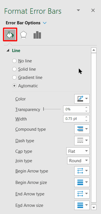
There are a few things you can do to format and modify the error bars. These include the color, thickness of the bar, and the shape of it.
To format an error bar, right-click on any of the bars and then click on ‘Format Error bars’. This will open the ‘Format Error Bars’ pane on the right.

Below are the things you can format/modify in an error bar:
Color/width of the Error bar
This can be done by selecting the ‘Fill and Line’ option in then changing the color and/or width.

You can also change the dash type in case you want to make your error bar look different than a solid line.
One example where this could be useful is when you want to highlight the error bars and not the data points. In that case, you can make everything else light in color to make the error bars pop-out
Direction/Style of the Error bar
You can choose to show error bars that go both sides of the data point (positive and negative), you can choose to only show the plus or minus error bars.
These options can be changed from the Direction option in the ‘Format Error Bars’ pane.

Another thing you can change is whether you want the end of the bar to have a cap or not. Below is an example where the chart on the left has the cap and one on the right doesn’t

Adding Horizontal Error Bars in Excel Charts
So far, we have seen the vertical error bars. which are the most common in Excel charting (and can be used with column charts, line charts, area charts, scatter charts)
But you can also add and use horizontal error bars. These can be used with bar charts as well as the scatter charts.
Below is an example, where I have plotted the quarterly data into a bar chart.

The method of adding the horizontal error bars is the same as that of vertical error bars that we saw in the sections above.
You can also add horizontal (as well as vertical error bars) to scatter charts or bubble charts. Below is an example where I have plotted the sales and profit values in a scatter chart and have added both vertical and horizontal error bars.

You can also format these error bars (horizontal or vertical) separately. For example, you may want to show a percentage error bar for horizontal error bars and custom error bars for vertical ones.
Adding Error Bars to a Series in a Combo Chart
If you work with combo charts, you can add error bars to any one of the series.
For example, below is an example of a combo chart where I have plotted the sales values as columns and profit as a line chart. And an error bar has only been added to the line chart.

Below are the steps to add error bars to a specific series only:
- Select the series for which you want to add the error bars
- Click on the plus icon (the Chart Element icon)
- Click on the black triangle icon at the right of ‘Error bars’ option
- Choose the error bar that you want to add.
If you want, you can also add error bars to all the series in the chart. Again, follow the same steps where you need to select the series for which you want to add the error bar in the first step.
Note: There is no way to add an error bar only to one specific data point. When you add it to a series, it’s added to all the data points in the chart for that series.
Deleting the Error bars
Deleting the error bars is quite straightforward.
Just select the error bar that you want to delete, and hit the delete key.
When you do this, it will delete all the error bars for that series.
If you have both horizontal and vertical error bars, you can choose to delete only one of these (again by simply selecting and hitting the Delete key).
So this is all that you need to know about adding error bars in Excel.
Hope you found this tutorial useful!
You may also like the following Excel tutorials:
- How to Create a Timeline / Milestone Chart in Excel
- How to Create a Dynamic Chart Range in Excel
- Creating a Pareto Chart in Excel
- Creating an Actual vs Target Chart in Excel
- How to Make a Histogram in Excel
- How to Find Slope in Excel?
How to Add Error Bars in Excel? (Step by Step)
Below are the steps to add error bars in Excel:
- First, we must select the data and the line graph from the “Insert” tab.

- Next, we will get the following line graph by clicking the line graph.

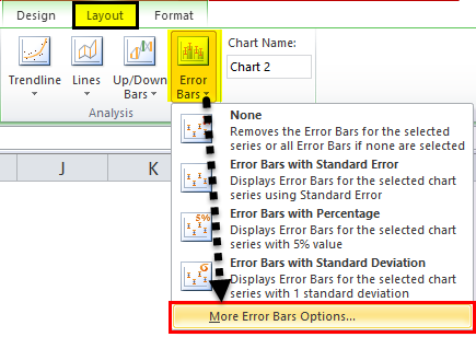
- We can find the “Error Bars” option under the “Layout” tab under the “Analysis” group. For example, the following screenshot shows the same.

- There are various “Error Bars” options available.

- “Error Bars with Standard Error.” “Standard Error,” i.e., SE, is the standard deviation of a sampling distribution. The magnitude of SE helps give an index of the precision of the estimate of the parameter. The standard error is inversely proportional to the size of the sample. That means that the smaller the sample size, the greater the standard errors.

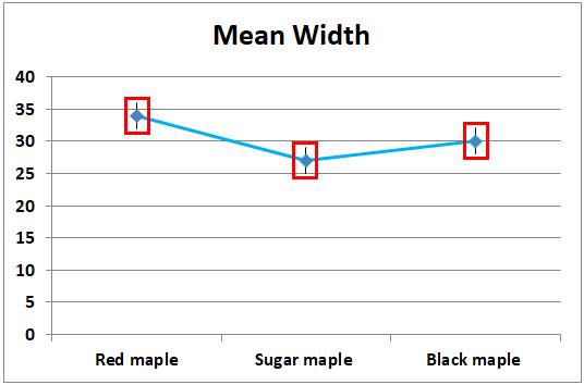
In the below screenshot, the error bars with standard errors are given. All the data points in the series display the amount of error in the same height for Y error bars and the same width for X error bars.

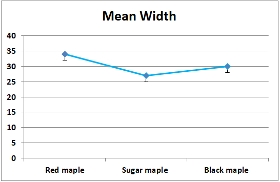
The below screenshot shows that the straight line is drawn from the minimum of the maximum value, i.e., “Red maple” overlaps with the outermost value of the species “Black maple.” It signifies that the data for one group is not different from the other.

- Error bars with Percentage
It uses the percentage specified in the “Percentage” box to calculate the error amount for each data as a percentage of the value of that particular data point. The Y error bars and X error bars are based on a percentage of the value of the data points and vary in size as per the percentage value. By default, it takes the percentage as 5%.


The default 5% value can be seen from the “More Error Bars Options” given in the screenshot below.


- Error bars with Standard Deviation
“Error Bars with Standard Deviation” is the average difference between the data points and their mean. Usually, a one-point standard deviation is considered while creating the error bars. The standard deviation is used when the data is normally distributed, and the pointers are usually at equal distances.

A line is drawn on the maximum data point, i.e., “Red maple” coincides with the maximum error point of “Black maple.” It signifies that the data for one group is not different from the other.

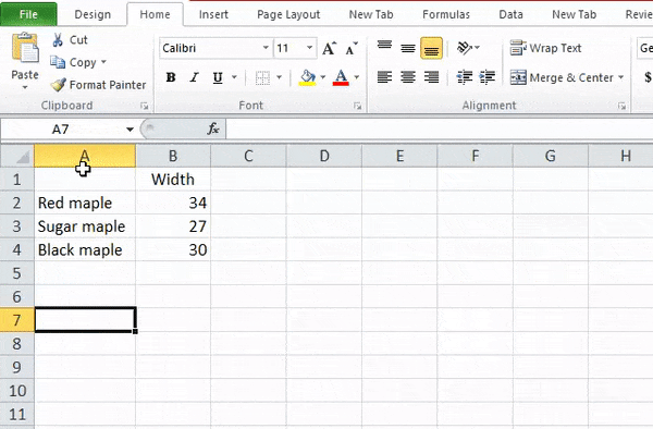
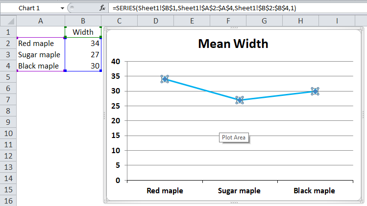


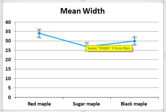
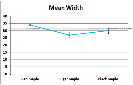
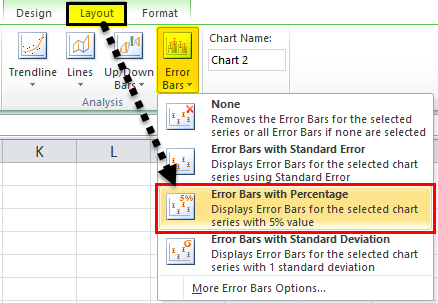
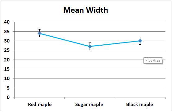
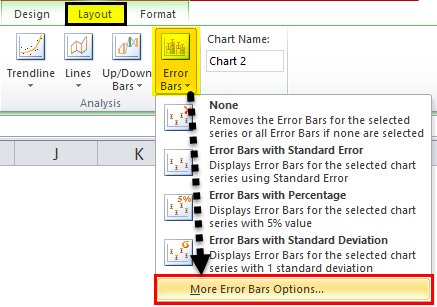
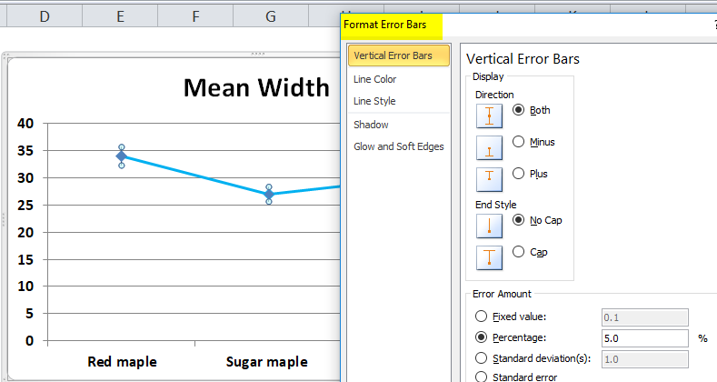
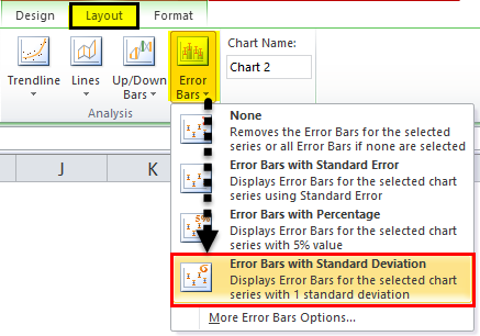

Table of contents
- How to Add Error Bars in Excel? (Step by Step)
- How to Add Custom Error Bars in Excel?
- Things to Remember
- Recommended Articles
How to Add Custom Error Bars in Excel?
We can also make custom error bars apart from the three error bars, i.e., error bars with standard error, error bars with standard deviation, and error bars with percentage.
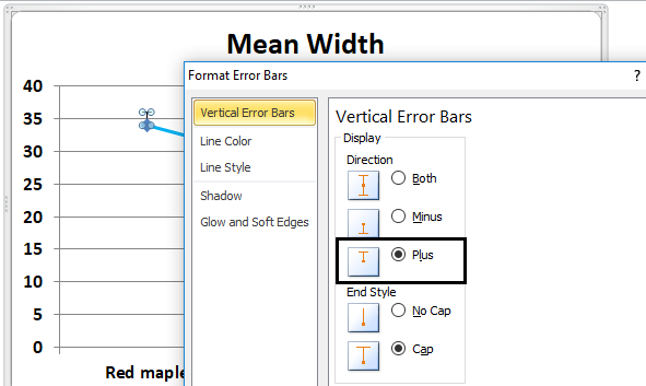
The minus display is the error to the lower side of the actual value. So, click on the “minus” tab.
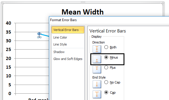
Similar to minus, the plus can also be taken, representing the error to the upper side of the actual value. Therefore, click on the “plus” tab.
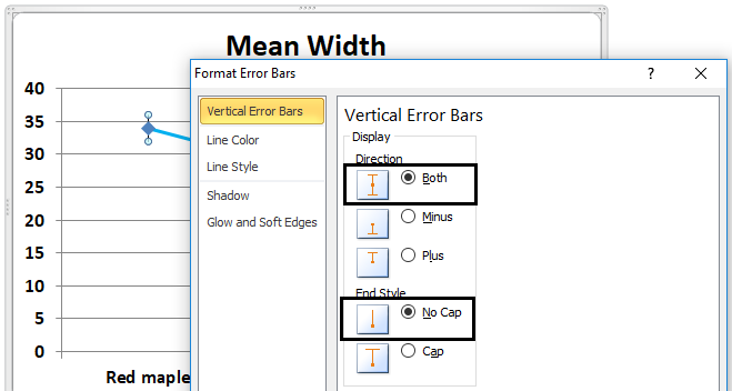
We can also visualize the error bars without the cap. For example, in the vertical error bars tab, we need to click or select direction as an end style and no cap.
You can download this Error Bars Excel Template here – Error Bars Excel Template
Things to Remember
- The error bars in Excel are the graphical representation that helps visualize the variability of data given on a two-dimensional framework.
- It helps indicate the estimated error or uncertainty to give a general sense of how accurate a measurement is.
- The accuracy is understood by the marker drawn over the original graph and its data points.
- The Excel error bars display the standard error, standard deviation, or percentage value.
- Error bars are usually by drawing cap-tipped lines extending from the center of the plotted data point.
- The error bars’ length usually helps reveal the uncertainty of a data point.
- Depending on the length of the error bars, we can estimate the error. For example, a short error bar shows that the values are more concentrated, directing that plotted average value is more likely to be reliable. On the other hand, the error bar indicates that the values are more spread out and are less likely to be reliable.
- We can customize error bars through the more error bars option.
- In the case of skewed data, the length on each side of the error bars would be unbalanced.
- The error bars usually run parallel to the quantitative scale axis. Therefore, the error bars can be visualized horizontally or vertically depending on whether the quantitative scale is on the X-axis or the Y-axis.
Recommended Articles
This article has been a guide to Error Bars in Excel. Here, we discuss adding error bars in Excel (standard deviation, percentage error, and custom error bars), practical examples, and a downloadable Excel template. You may learn more about Excel from the following articles: –
- VBA Status Bar
- Status Bar in Excel
- Scroll Bars in Excel
- Slicers in Excel
Reader Interactions
Note: This guide on how to add error bars in Excel is suitable for Excel 2010, 2013. 2016, 2019, and Office 365 versions.
Error bars in Excel help visualise the error margins or standard deviation in your data. Add them to your charts to show the error in absolute or percentage terms or standard deviations.
They can be added to all the data points in a series to display a preset error percentage of the user’s choice. Error bars are very suitable for bar, column, line, scatter, and bubble charts.
In this guide, I am going to explain how to add error bars in Excel along with their various use cases with the help of illustrations.
Table Of Contents
- Error Bars in Excel – An Overview
- How to Add Error Bars in Excel 2013 and Later Versions?
- How to Add Error Bars in Excel 2010 and Earlier Versions?
- How to Add Custom Value Error Bars in Excel?
- How to Add Individual Error Bars in Excel?
- How to Add Horizontal Error Bars In Excel?
- How to Add Error Bars In Excel for Specific Data Series?
- How to Format Error Bars in Excel?
- Let’s Wrap Up
Related:
How to Extract an Excel Substring? – 6 Best Methods
How to Superscript in Excel? (9 Best Methods)
How To Find Duplicates in Excel? (3 Easy Methods)
Watch this video to learn how to add error bars in Excel
Error Bars in Excel – An Overview
Error bars are a very useful tool to represent the errors or the variability in a data set. That is they display how far the real value can deviate from the measured value. It is a very important tool in statistical analysis and scientific experiments.

In Excel, error bars can be added to suitable charts like bar, column, line, scatter, and bubble graphs. The user has the option to add the following forms of the error bar:
- As a standard error
- As a percentage error
- As a fixed value
- As a standard deviation
Users can also set their own predefined error amount and set individual values for each error bar in the series.
Adding error bars in Excel 2013 and later versions is slightly different from the method applicable to the earlier versions. These are explained in separate sections below.
Also Read:
How to Use Goal Seek in Excel? (3 Simple Examples)
How to Insert Multiple Rows in Excel? The 4 Best Methods
How to Autofit Excel Cells? 3 Best Methods
How to Add Error Bars in Excel 2013 and Later Versions?
To add error bars in Excel 2013, Excel 2016, Excel 2019, and Microsoft Office 365 versions follow these steps after plotting suitable graphs:
Step 1: Click anywhere in the graph
Step 2: Click on the Chart Elements option in the top-right corner of the chart.

Step 3: Click on the Error Bars arrow to expand it and select a suitable option.
- Standard Error – To display the standard error for all values, that is the how far the sample mean is from the population mean of the data series.
- Percentage Error – To add percentage error bars to your chart. The default percentage error is 5%, which can be changed from “More options”.
- Standard Deviation – To show the standard deviation of the data point i.e. how far is it from the average.
- More Options – To edit error bar values and to create custom error bars. It will open the Format Error Bars pane where you can do the following:

- Set custom values for the fixed value, percentage, and standard deviation error bars.
- Choose the direction of the error bars (positive, negative, or both)
- Make custom error bars based on custom values.
- Format the appearance of error bars.
To insert standard error bars in the chart, you can directly select the Error Bars option.
To customize the error bars after adding them, double click on any one of them to access the Format Error Bars pane, where you can edit everything about them.
How to Add Error Bars in Excel 2010 and Earlier Versions?
To add error bars in earlier versions of Excel i.e. versions 2010 and 2007, follow these steps:
Step 1: Click on the chart to access the Chart Tools tab in the Excel ribbon.
Step 2: Under the Chart Tools tab, locate and click on the Error Bars option. It can be found in
the Analysis group in the Layout tab.

How to Add Custom Value Error Bars in Excel?
If you want to add your own custom value error bars to your charts follow these steps:
Step 1: Click Chart Elements > Error Bars > More Options to access the Format Error Bars
pane

Step 2: Click on the Error Bars options tab.
Step 3: Under Error Amount, click Custom and click on Specify Value
Step 4: In the Custom Error Bars Dialogue box enter the Positive Error Value and Negative
Error Value. If you don’t want a positive or negative value you must enter zero.

That’s it, you have added custom value error bars to your graph.
How to Add Individual Error Bars in Excel?
Sometimes, you will need to add different individual error bars of varying lengths to each data point in the series. To do this, follow these steps:
Step 1: Calculate the Standard deviation of each data point using the STDEV.P function in an
adjacent row or column.
Step 2: Click Chart Elements > Error Bars > More Options to access the Format Error Bars
pane
Step 3: Click on the Error Bars options tab.
Step 4: Under Error Amount, click Custom and Click on Specify Value

Step 5: In the Custom Error Bars Dialogue box for the Positive Error Value and Negative
Error Value, enter the cell reference for the Standard deviation values we just
calculated.

Congratulations, you have successfully added individual error bars of varying lengths of standard deviation to each data point in the data series.
How to Add Horizontal Error Bars In Excel?
Horizontal error bars are by default added to horizontal bar charts, bubble, and scatter graphs. They are added along with the vertical error bars.
But, if you need only the horizontal error bars, delete the vertical error bars by right-clicking on any one of them choosing the delete button.
How to Add Error Bars In Excel for Specific Data Series?
In case if you are using a combo chart in your Excel sheet, it is advisable to add error bars only to one particular data series in the chart. This will avoid confusion by reducing the clutter.
To do this, just click on the specific data series you want to add error bars to, and then click on the Chart Elements button. Now, click the arrow next to Error Bars and pick any desired type.
Doing this will add error bars only to the data series you selected.
How to Format Error Bars in Excel?
To edit the appearance of the error bars in Excel follow these steps:
Step 1: Double Click on the Error bars in the chart you want to edit.
Step 2: To change the appearance of the error bar like colour and width, choose the Fill & Line
tab. There, you will have the option to change everything about the appearance of the
error bar.
Step 3: Click on the Error Bars options tab to change the type, direction and style of the error
bars
Suggested Reads:
How to Group Worksheets in Excel? (In 3 Simple Steps)
How to Shade Every Other Row in Excel? (5 Best Methods)
How to Use the Excel Fill Handle Easily? (Top 3 Uses with Examples)
Let’s Wrap Up
We are at the end of this guide on how to add error bars in Excel. If you have any questions about this or any other Excel feature, let us know in the comments. We are always happy to help.
If you need more high-quality Excel guides, please check out our free Excel resources centre.
Ready to dive deep into Excel? Simon Sez IT has been teaching Excel for over ten years. For a low, monthly fee you can get access to 100+ IT training courses. Click here for advanced Excel courses with in-depth training modules.
Adam Lacey

Adam Lacey is an Excel enthusiast and online learning expert. He combines these two passions at Simon Sez IT where he wears a number of different hats.When Adam isn’t fretting about site traffic or Pivot Tables, you’ll find him on the tennis court or in the kitchen cooking up a storm.
In this tutorial, I will show you how to add error bars to graphs in Microsoft Excel. Specifically, I will be adding error bars onto bar graphs.
Here’s the end product:

The error bars for this example will be the standard deviation, or SD.
My example
For this example, I have some data entered for two groups. Within Excel, each group’s data is entered into two columns.
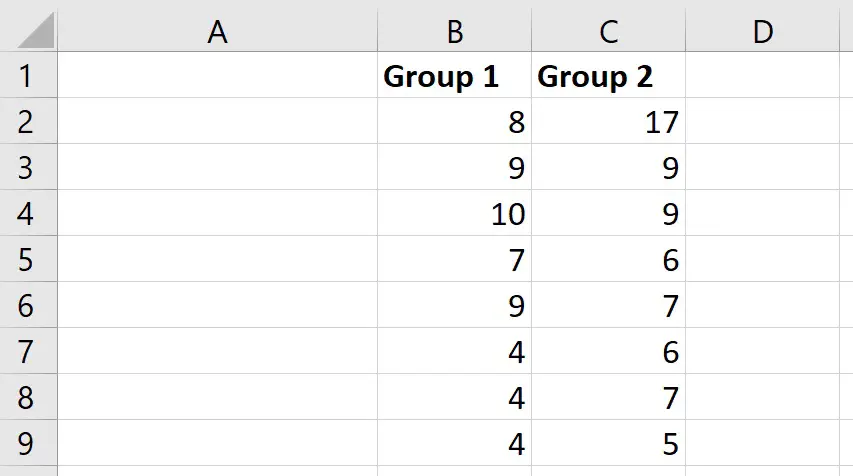
What I want to do is to create a simple bar graph and add error bars that represent the SD.
How to create the bar chart
The first thing I need to do is to calculate the average for these two groups.
To do this, I will select an empty cell, and enter:
=AVERAGE(cell1:cell2)
In this case:
- Cell1 – is the first cell containing data in the group
- Cell2 – is the last cell containing data in the group
Here is what it looks like for my example.

To quickly copy this formula across to calculate the average of the next group, click on the cell containing the formula and click and drag on the little black square.
So, now we have our averages, next we need to calculate what we want our error bars to represent.
There are many types of statistics you can use here, such as:
- Confidence intervals (CIs)
- Standard deviation (SD)
- Standard error of the mean (SEM)
For this example, I will calculate the SD.
If you are interested in calculating the standard error of the mean or confidence intervals in Excel, then check out my previous guides.
To calculate the SD, I will select an empty cell, and enter the formula.
=STDEV(cell1:cell2)
As before, ensure the range of cells containing the data is selected.
Again, copy this formula across to repeat this for the other groups.
Now, we have everything we need to create a simple bar graph.
To create a simple bar graph, I will highlight the average values of my two groups, then I will go to Insert, select the bar chart icon and choose a 2D graph.
So, now we have a simple bar chart showing the average values for the two groups.
I will now add the error bars to the bar graph.
There are a few ways you can add the error bars in Excel.
With the graph selected, you can go to Add Chart Element>More Error Bars. Or, simply select the graph, click on the plus icon in the corner of the graph and select to show error bars.

Now, you should see the error bars with the Format Error Bars sidebar open to the right. If you don’t see this sidebar, simply double-click on the error bars in the graph.
There are a few options in this sidebar, for example, you can choose if you want the error bars above and below the middle point, or just select one or the other. Also, you can change the end cap appearance of the error bars.
But, the thing we are interested in is the Error Amount.
In Excel, you can set this to be different things, but depending on how you have set up your data in the data sheet, it is always best to select the Custom option.
Now, select the Specify Value button.
In the new window, click on the button next to the Positive Error Value box and click and drag to select the error values, in this case they are the SD values. It’s important that you select the data in the same order as is plotted on the graph. Then press Enter.
Now, repeat the steps for the Negative Error Value.
Finally, click OK.
As you can see, error bars have now been added to the graph, which indicate the SD.
Final words
In this quick tutorial, you have learnt how to add error bars to graphs in Excel.
All you have to do is calculate what you want the error bars to be, e.g. SD, and then add this to the graph as a custom error amount.
Microsoft Excel version used: 365 ProPlus