
Excel for Microsoft 365 Word for Microsoft 365 PowerPoint for Microsoft 365 Excel 2021 Word 2021 PowerPoint 2021 Excel 2019 Word 2019 PowerPoint 2019 Excel 2016 Word 2016 PowerPoint 2016 Excel 2013 Word 2013 PowerPoint 2013 Excel 2010 Word 2010 PowerPoint 2010 Excel 2007 Word 2007 PowerPoint 2007 More…Less
Pie charts are a popular way to show how much individual amounts—such as quarterly sales figures—contribute to a total amount—such as annual sales.
Pick your program
(Or, skip down to learn more about pie charts.)
-
Excel
-
PowerPoint
-
Word
-
Data for pie charts
-
Other types of pie charts
Note: The screen shots for this article were taken in Office 2016. If you’re using an earlier Office version your experience might be slightly different, but the steps will be the same.
Excel
-
In your spreadsheet, select the data to use for your pie chart.
For more information about how pie chart data should be arranged, see Data for pie charts.
-
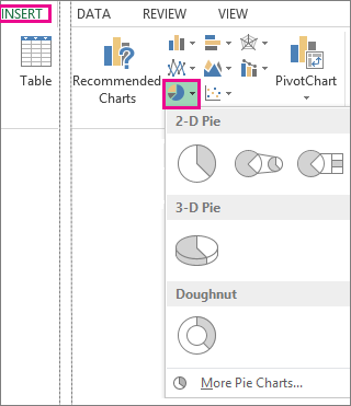
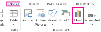
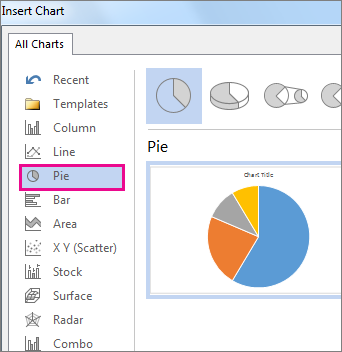
Click Insert > Insert Pie or Doughnut Chart, and then pick the chart you want.

-
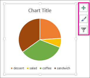
Click the chart and then click the icons next to the chart to add finishing touches:
-
To show, hide, or format things like axis titles or data labels, click Chart Elements
. -
To quickly change the color or style of the chart, use the Chart Styles
. -
To show or hide data in your chart click Chart Filters
.
-
 .
. .
. .
.
PowerPoint
-
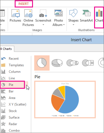
Click Insert > Chart > Pie, and then pick the pie chart you want to add to your slide.
Note: If your screen size is reduced, the Chart button may appear smaller:
-
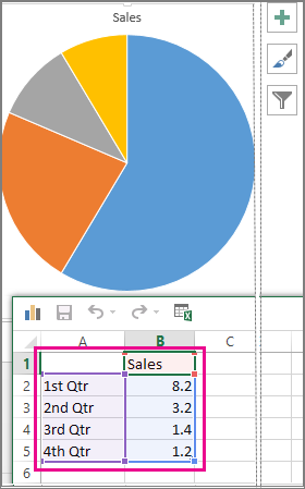
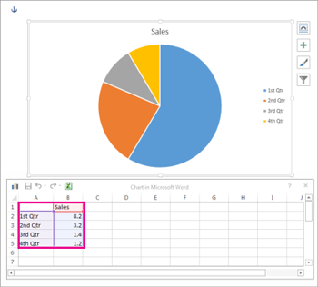
In the spreadsheet that appears, replace the placeholder data with your own information.
For more information about how to arrange pie chart data, see Data for pie charts.
-
When you’ve finished, close the spreadsheet.
-
Click the chart and then click the icons next to the chart to add finishing touches:
-
To show, hide, or format things like axis titles or data labels, click Chart Elements
. -
To quickly change the color or style of the chart, use the Chart Styles
. -
To show or hide data in your chart click Chart Filters
.
-

Word
-
Click Insert > Chart.
Note: If your screen size is reduced, the Chart button may appear smaller:
-
Click Pie and then double-click the pie chart you want.
-
In the spreadsheet that appears, replace the placeholder data with your own information.
For more information about how pie chart data should be arranged, see Data for pie charts.
-
When you’ve finished, close the spreadsheet.
-
Click the chart and then click the icons next to the chart to add finishing touches:
-
To show, hide, or format things like axis titles or data labels, click Chart Elements
. -
To quickly change the color or style of the chart, use the Chart Styles
. -
To show or hide data in your chart click Chart Filters
. -
To arrange the chart and text in your document, click the Layout Options button
.
-
 .
.Data for pie charts
Pie charts can convert one column or row of spreadsheet data into a pie chart. Each slice of pie (data point) shows the size or percentage of that slice relative to the whole pie.

Pie charts work best when:
-
You have only one data series.
-
None of the data values are zero or less than zero.
-
You have no more than seven categories, because more than seven slices can make a chart hard to read.
Other types of pie charts
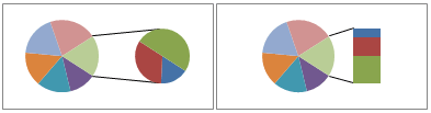
In addition to 3-D pie charts, you can create a pie of pie or bar of pie chart. These charts show smaller values pulled out into a secondary pie or stacked bar chart, which makes them easier to distinguish. To switch to one of these pie charts, click the chart, and then on the Chart Tools Design tab, click Change Chart Type. When the Change Chart Type gallery opens, pick the one you want.
See Also
Select data for a chart in Excel
Create a chart in Excel
Add a chart to your document in Word
Add a chart to your PowerPoint presentation
Available chart types in Office
Need more help?
How to Make and Customize Pie Charts in Excel
Smartsheet Contributor
Diana Ramos
August 27, 2018
A pie chart is a tool to display basic statistical information, and is one of the easier charts to make in Excel. Follow these step-by-step instructions to master creating pie charts, along with tips for customizing the chart and variants you can use.
What Is a Pie Chart?
A pie chart, sometimes called a circle chart, is a useful tool for displaying basic statistical data in the shape of a circle (each section resembles a slice of pie). Unlike in bar charts or line graphs, you can only display a single data series in a pie chart, and you can’t use zero or negative values when creating one. A negative value will display as its positive equivalent, and a zero value simply won’t appear.
When creating a pie chart, the description of each section is called the category, and the number connected to the category is called the value. The categories will add up to 100 percent of whatever is being charted, and the relative size of each category is a visual representation of its relation to the whole. Categories shouldn’t overlap. For example, if one category is “Women” and another is “People Over Fifty,” there’s a pretty good chance that there will be women over 50 and therefore, they would be counted twice.
Pie charts are not effective if there are more than seven categories, but some of the variations available allow charts to display a couple more categories. Some experts don’t like pie charts because they find it difficult to accurately compare the angles, but adding labels to the data can overcome that issue.
Excel offers a number of variations on the basic pie chart. Steps for creating each are included in the instructions later in this article. The first three options displayed below are listed under the pie chart type, the last is listed under the other type.
Pie of Pie and Bar of Pie: Despite their clumsy names, these clever charts make it easier to view smaller values or subsets of the data that make up the category.
3D Chart: Add depth to a basic pie chart with the 3D option. Depending on the perspective, 3D charts may be misleading because smaller categories may appear larger than they are, so use them with care.
Doughnut Chart: This option looks just like a pie chart, but with a hole in the middle. Doughnut charts can have more than one data series.
Some Examples of Pie Chart Uses
Pie charts can be used to display a lot of different data sets, including things like factory output by shift, revenue generated by one product compared to total revenue, or water usage by type.
Some other possible examples are trash vs. recycling, types of pets in a town, price range of products sold, census results, revenues by region, or packages shipped by each carrier.
In this section, we’ll show you the steps to create a pie chart in Excel 2011 for Mac. While the images may differ, the steps will be the same for other versions of Excel, unless they are called out in the text.
- Open a blank worksheet in Excel. Enter data into the worksheet and select the data. Remember that pie charts only use a single data series. If you select the column headers, the header for the values will appear as the chart title, and you won’t be able to edit the text.
- Click Chart > Pie (hovering over the chart types will show brief info about them), and then click Pie
- The pie chart appears on the worksheet.
Other Versions of Excel: The chart types are listed under the Insert tab. This is the only difference.
If you realize there’s an error in the data, there’s no need to start over. Simply update the data on the worksheet and the chart will automatically adjust to reflect the new data. If you’ve copied the chart to another place (excluding other Microsoft Office program), you’ll need to insert the updated chart into the other program. If the chart has been copied into a Microsoft Office program on the same computer, the chart copy will automatically update.
If you only want to display a subset of a long data list, select the data you want to appear in the chart. The rows don’t even have to be contiguous. While the examples used in this article all have data in columns, you can also use data in rows.
How to Read a Pie Chart
Pie charts are easy to read so little explanation is required, but there are a couple things that will make them easier to understand. As mentioned earlier, the data in the chart will always add up to 100 percent. If there are no data labels, hovering the cursor over a category (the official name for a section or slice) will display the corresponding data.
Besides being easy to read, pie charts are useful because they show a lot of information in a small space, and they allow an immediate analysis of the relationship among each category — both to the the others and to the whole.
How Do You Make a Pie Chart in Excel 2016?
To create a pie chart in Excel 2016, add your data set to a worksheet and highlight it. Then click the Insert tab, and click the dropdown menu next to the image of a pie chart. Select the chart type you want to use and the chosen chart will appear on the worksheet with the data you selected.
While the steps are the same as shown above (unless noted), the screenshots will vary based on the Excel version you use.
How Do You Add Labels to a Pie Chart?
When you create a pie chart, a legend is automatically included. If want the category names to appear on or near the chart, right-click on the chart and click Add Data Labels….
By default, the numerical values are added.
To add other labels, such as the categorical values or the percentage of the total that each category represents, right-click on the chart, then click Format Data Labels….
Click Labels, and make your selections. Then click OK.
Add the series name (the column header for your data) followed by the character that separates each item (a new line, comma, space, colon, or semicolon), and the location where the data labels are displayed.
Click and drag data labels to move them. You can also choose to show the category color next to the label (similar to the legend), and include lines connecting the data labels if they are moved away from the chart. By selecting the other options, such as Shadow, Font, or Fill, you can tweak the appearance of the data labels. Experiment with the options until you find what works.
How to Change the Appearance of a Pie Chart
Quick Layouts, Styles, and Themes
Excel offers Quick Layout and Chart Styles options. Quick Layout is a set of options that you use to format the chart and add elements. Chart Styles are ways to format just the chart. Scroll through them to see if any meet your needs.
Excel 2016 and versions more recent than 2011 also offer themes, which are a collection of preselected fonts and colors. Changing these themes will affect the default appearance of any pie charts created after selecting the theme. To view available theme elements, click the Page Layout tab, then click Colors or Fonts.
Moving the Chart
To move the chart to another place on the same sheet, simply click on it and drag it to the new position.
To move the pie chart to another sheet in the same workbook, right-click on the chart and select Move Chart…, then either select an existing sheet, or create a new one.
Resizing the Pie Chart
To change the size of the chart area, click on a corner and drag it to see a larger or smaller version.
Note: There isn’t a way to adjust the size of the chart within the chart area — Excel automatically does that.
Rotating the Pie Chart
To rotate the pie chart (i.e., put a different slice at the top), right-click on the chart, click Format Data Series…, click Options, and enter a value into the Angle of first slice box. You’ll have to experiment to get the chart to look exactly as you envision.
If the goal is to have a particular slice at the top of the chart, it’s easier to rearrange the order of the rows of data, placing the one you want to appear at the top of the chart in the first row of the data column.
Adding Chart Titles
To add a title to the chart, click Charts in the ribbon, click Chart Layout, click Chart Title, and chose the location.
To change the appearance of a title, click Charts, click Chart Layout, click Chart Title, then click Chart Title Options…. Here you can change the font style, color, and size, as well as the background of the box and many other options.
Pie Chart Legends
As noted earlier, a legend is included by default when the chart is created. To delete the legend, right-click on the legend and then click Delete. To change the appearance of the legend, right-click on it, then click Format Legend…, and make your changes.
If you delete the legend, but want it to reappear, click on the Charts tab, click Chart Layout, click Legend, and then choose where you want to place the legend.
Colors, Fonts and Backgrounds
If the default chart appearance or available themes and quick settings don’t fit your needs, you can change the appearance of the pie slices by applying different fonts and adding a color or texture to the background.
Colors
To change the appearance of a pie slice, click on the slice and then double-click it to open the Format Data Point window. Click Fill to change the color, add a texture, or even fill the slice’s space with a picture.
Fonts
Once you’ve added data labels, you can change the size, color, and other appearance factors. Click the data label once, right-click on it, and click Format Text…. The changes made will affect all selected text (i.e. if only one slice’s label is affected, then only that slice’s label will be changed. If you want to change the text on one slice, click on it twice).
You can also perform the same action on any other text in the pie chart, such as the legend or a title.
Backgrounds
If you don’t like the default background, right-click on an empty space in the chart, and then click Format Chart Area…. Not only can you change the background color, but you can also add textures, gradients, and patterns. You can also change the thickness and color of the chart’s border, and add other effects (such as a drop shadow).
Creating Exploding Pies and Exploding Slices
The exploded pie option can be easier to read if there are a lot of values in your data set. If you want to emphasise a particular value, use the exploding slice option.
There are a couple ways to create exploding pies and exploding slices.
- Select the Exploded Pie option when creating the chart.
2. Add the exploding pie after you create the chart. To create an exploded pie, click and drag any slice, and the chart will adjust.
3. To explode a single slice, click once on the pie to select it, click on the desired slice, and then drag it out of the pie.
Note: If the two clicks are too close together, the Format Data Point window will appear.
Additional Pie Chart Formatting Options
There are a variety of ways to customize a pie chart. You can create new categories, sort how the slices appear, and add WordArt.
Resorting By Slice Size
If you want to position the slices based on size (e.g. smallest to largest), sort the original data using Excel’s sorting tool, and the chart will automatically update group the chart slices by size.
Combining Small Slices into an “Other” Category
There are two ways to combine a number of small categories into one “other” category. To do this easily, enter data into Excel but combine the desired numerical values into a single row and name the categorical value “other.”
Below is a more complicated method:
-
Enter data into Excel with the desired numerical values at the end of the list.
-
Create a Pie of Pie chart.
-
Double-click the primary chart to open the Format Data Series window.
-
Click Options and adjust the value for Second plot contains the last to match the number of categories you want in the “other” category.
-
Right-click on one section of the secondary chart, click Format Data Point…, click Fill, then click No Fill from the color drop down.
-
Repeat this for each slice of the secondary plot.
-
If you have data labels, remove them from each section of the secondary plot as well.
-
If there are lines connecting the main chart and the now-invisible secondary chart, right click a line, click Format Series Lines…, click Line, and click No Line from the color drop down.
WordArt
WordArt is a feature found in Microsoft Office applications. You can use WordArt to give text an artistic look (like the example below).
While WordArt can’t be applied to chart elements, you can create them separately and then paste it into the chart as titles or data labels.
Working with Pie Chart Variations
As noted above, there are pie chart variations you can apply when dealing with a lot of information for a category or if you want to break out specific data sets. Here are a few variations you can apply to reveal more data in a pie chart.
Pie of Pie and Bar of Pie Charts
To create a Pie of Pie or Bar of Pie chart, the steps are the same as creating a basic pie chart (with the exception of which chart subtype you choose). Editing the chart is the same as well.
When you create a Pie of Pie or Bar of Pie chart, the number of categories in the second plot (the smaller pie or the bar) are chosen by default: It’s always the final rows in the data set, and the larger amount of the initial set, the larger number of rows included in the second plot. To change the number of categories in the second plot, right-click on the chart, then click Format Data Series… and change the value in the Second plot contains the last box.
You can also change the default series by the value (e.g. numbers lower than five), percent (e.g. all values that are less than 10 percent of the total), or create a custom setting. There’s also a setting to change the size of the second plot relative to the main pie (you can even make the secondary plot larger than the main pie).
To change the distance between the two charts, right-click on the chart, then click Format Data Series… and change the value in the Gap width box.
In a pie of pie chart, the smaller pie can also have a slice or the whole chart exploded. Follow the instructions for exploding the main plot.
3D Pie Charts
Like the basic pie chart, you can rotate the 3D pie chart. Instead of rotating one axis, you can rotate the 3D chart on two axes, and also change the viewing angle.
The steps for creating a 3D pie are the same as creating a basic pie, except for what you choose as the subtype of the chart.
There’s even a 3D exploded pie option.
To rotate the 3D pie, right-click on the chart then click 3D Rotation…
-
The X axis value rotates the chart around its axis.
-
The Perspective arrows will tilt the angle of the chart.
-
The Y axis value will have an effect similar to Perspective.
-
The Height value will change the thickness of the chart (deselect Autoscale to change this value).
Doughnut Charts
Unlike the other variation mentioned above, a doughnut chart is not under the pie chart type. Instead, to create a doughnut chart, on the Charts tab, click Other, then click Doughnut.
Other Ways to Create a Pie Chart
If you’re handy with a ruler and compass, you can create a pie chart by hand, but getting proportions of the slices right requires a steady hand and a keen eye. There are other programs that you can use besides Excel, such as IBM SPS. However, the ubiquity of Excel in business environments often makes it a better choice.
You can also create pie charts in PowerPoint and Word, but once the chart is selected, those applications open Excel, so you may as well start in Excel and copy the chart into Word or PowerPoint. See the instructions above in the moving a chart section.
Make Better Decisions, Faster with Charts in Smartsheet
Empower your people to go above and beyond with a flexible platform designed to match the needs of your team — and adapt as those needs change.
The Smartsheet platform makes it easy to plan, capture, manage, and report on work from anywhere, helping your team be more effective and get more done. Report on key metrics and get real-time visibility into work as it happens with roll-up reports, dashboards, and automated workflows built to keep your team connected and informed.
When teams have clarity into the work getting done, there’s no telling how much more they can accomplish in the same amount of time. Try Smartsheet for free, today.
![]()
Download Article
Display your Excel data in a colorful pie chart with this simple guide
![]()
Download Article
- Preparing the Data
- Creating a Chart
- Formatting Your Pie Chart
- Q&A
- Tips
|
|
|
|
Do you want to create a pie chart in Microsoft Excel? You can make 2-D and 3-D pie charts for your data and customize it using Excel’s Chart Elements. This is a great way to organize and display data as a percentage of a whole. This wikiHow will show you how to create a visual representation of your data in Microsoft Excel using a pie chart on your Windows or Mac computer.
Things You Should Know
- You need to prepare your chart data in Excel before creating a chart.
- To make a pie chart, select your data. Click Insert and click the Pie chart icon. Select 2-D or 3-D Pie Chart.
- Customize your pie chart’s colors by using the Chart Elements tab. Click the chart to customize displayed data.
-
1
-
2
Add a name to the chart. To do so, click the B1 cell and then type in the chart’s name.
- For example, if you’re making a chart about your budget, the B1 cell should say something like «2022 Budget».
- You can also type in a clarifying label—e.g., «Budget Allocation»—in the A1 cell.
Advertisement
-
3
Add your data to the chart. You’ll place prospective pie chart sections’ labels in the A column and those sections’ values in the B column.
- For the budget example above, you might write «Car Expenses» in A2 and then put «$1000» in B2.
- The pie chart template will automatically determine percentages for you.
-
4
Finish adding your data. Once you’ve completed this process, you’re ready to create a pie chart using your data.


Advertisement
-
1
Select all of your data. To do so, click the A1 cell, hold down the Shift key, and then click the bottom value in the B column. This will select all of your data.[1]
- If your chart uses different column letters, numbers, and so on, simply remember to click the top-left cell in your data group and then click the bottom-right while holding the Shift key.
-
2
Click the Insert tab. It’s at the top of the Excel window, to the right of the Home tab.[2]
-
3
Click the «Pie Chart» icon. This is a circular button in the «Charts» group of options, which is below and to the right of the Insert tab. You’ll see several options appear in a drop-down menu:
- 2-D Pie: Create a simple pie chart that displays color-coded sections of your data.
- 3-D Pie: Uses a three-dimensional pie chart that displays color-coded data.
- Donut: Displays color-coded data with a hole in the center for series of data.
- You can also click More Pie Charts… to view all available options.
-
4
Click a chart option. Doing so will create a pie chart with your data applied to it; you should see color-coded tabs at the bottom of the chart that correspond to the colored sections of the chart itself.
- You can preview options here by hovering your mouse over the different chart templates.


Advertisement
-
1
Click Chart Design. This is the tab on the top toolbar, next to Help and Format. You’ll be able to change the way your graph looks, including the color schemes used, the text allocation, and whether or not percentages are displayed.
- If you don’t see this tab, you’ll need to click on your chart first.
-
2
Change your chart style. Switch between styles by clicking the previews above Chart Styles.
- Only one style preset can be applied at a time.
- You can also click the paintbrush icon next to the chart to find Chart Styles in the Styles tab.
-
3
Change your chart color. Click the Change Colors icon. This looks like a color palette. A drop-down menu will appear with multiple color themes listed.
- Click the color scheme you want to apply.
- You can also click the paintbrush icon next to the chart and click the Color tab to change your chart colors.
-
4
Toggle chart labels. Click your chart, then click the + from the side icons.
- To remove data and percentage labels from your chart, uncheck Data Labels underneath Chart Elements.
- To remove category or percentage labels separately, click the arrow next to Data Labels, then More Options. Use the right panel to uncheck Percentage or Category name.
-
5
Customize the Chart Area. With the chart selected, the Format Chart Area will be visible in the right panel.
- Fill & Line: Customize Fill and Border options.
- Effects: Add effects such as Shadow, Glow, Soft Edges, and 3-D Format.
- Size & Properties: Customize the height, width, and scale of your chart.


Advertisement
Add New Question
-
Question
How do I create a pie chart without percentages?

You’ll have to make percentages. A pie chart by definition is 100%. If your data is not in percent, then Excel will create percentages for you.
-
Question
How do I change the color of the pie chart?
Once you have the pie chart on the board, there are different shades next to it that says «change color»; click on that.
-
Question
What am I doing wrong if I tried this method and the pie chart didn’t show up?
You might have entered information wrongly and it can’t process. Try re-entering your data.
See more answers
Ask a Question
200 characters left
Include your email address to get a message when this question is answered.
Submit
Advertisement
-
You can copy your chart and paste it into other Microsoft Office products (e.g., Word or PowerPoint).
-
If you want to create charts for multiple sets of data, repeat this process for each set. Once the chart appears, click and drag it away from the center of the Excel document to prevent it from covering up your first chart.
-
Looking for money-saving deals on Microsoft Office products like Excel? Check out our coupon site for tons of coupons and promo codes on your next subscription.
Thanks for submitting a tip for review!
Advertisement
About This Article
Article SummaryX
1. Open Excel.
2. Enter your data.
3. Select all of your data.
4. Click the Insert tab.
5. Click the «Pie Chart» icon.
6. Click a pie chart template.
Did this summary help you?
Thanks to all authors for creating a page that has been read 1,059,531 times.
Is this article up to date?
A pie chart in Excel is a pictorial representation of data. It is generally used to show the composition of an individual item. Categorical data is best represented using a pie chart, as it makes each slice represent a different category. The main purpose of the pie chart is to show part-whole relationships.
A pie chart can only be used if the sum of the individual parts adds up to a meaningful whole, and is built for visualizing how each part contributes to that whole. This can be the representation of a pie chart. The pie chart is a circular-shaped chart with one or more than one divisions in it, and each division represents some portion of a total circle or total value.
Pie Chart Example:
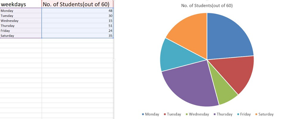
This is the data of students present (out of a total of 60 students) in the class in a particular week.
Creating a Pie Chart in Excel
Now, let’s see the steps involved to create a pie chart in Excel :
- Step 1: Open MS Excel in your system.
- Step 2: In the toolbar, go to the insert option.

- Step 3: Then check the pie chart icon for different pie chart segments.

- Step 4: Choose the type of pie chart you need.

There are really amazing pie charts according to different needs and properties. Before checking them, let’s create data for the pie charts.
Data is information, which has to be displayed pictorially in the form of a pie chart.
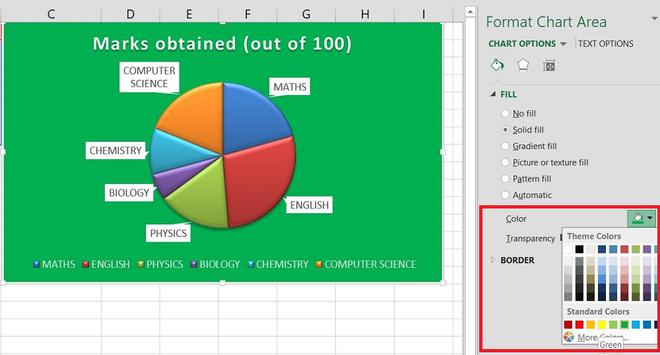
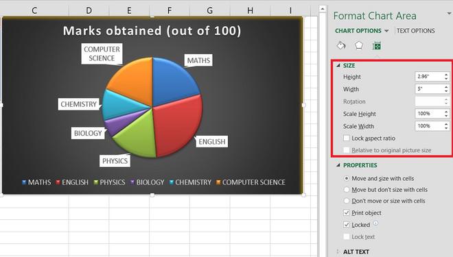
Let’s take a small data table that is related to a student’s marks obtained (out of 100 marks) in six subjects. Data is as follows:

So, here we can see, there are two types of data present: Subject name and Marks obtained. Following that, the values are filled. To create the pie chart of this data, select the data from the table. (Click on the upper-leftmost cell & drag the cursor to the bottom-rightmost cell and leave).
How to Create Different Pie Chart Types
Now go to the Pie chart options, which are already explained earlier. (Insert > Pie chart icon > Select pie chart) Select the type of pie chart you want to create.
In MS Excel, there are different types of Pie charts available. You can view that by clicking on a Pie chart drop-down option (as you have seen above).
- 2D Chart
- PIE of Pie Chart
- Bar of Pie Chart
- 3D Pie Chart
- Doughnut Chart
Let’s see them one by one.
2D Chart

After selecting a 2D Pie chart. We get a colorful Pie chart created with different divisions. At the bottom, there is a legend that determines which color represents which division on the chart.

Now after getting the pie chart. If you want to make some changes in the context of design and format, follow the below:
Step 1. Select the chart.
Step 2. Then select the “Design” and “Format” options that occur in the toolbar.

Different designs will be present there. Choose accordingly.


Different designs and other options (for changing layout, a combination of colors of divisions, etc.) will be present there as follows. Choose accordingly.


Different formats which include (shape insertion, chart boundary color, shape fill etc.) will be present there for modifications as follows. Choose accordingly.


PIE of PIE Chart
Now with the same data, we will create a Pie of Pie chart.
To create this chart, we will follow the same steps we followed for the 2D Pie chart. And then select the required PIE of PIE Chart option, as shown below.

In this type of chart (pie of pie chart), you will have two pie charts. The first one is a normal Pie chart and the second one is a subset of the main pie chart.

In the sub-chart part, we have only two categories which are representing the break-up of 99 (64 + 35 computer science and chemistry). To check the categories of sub chart part, we can add the labels.
To know more about PIE of PIE chart, click here.
Bar of PIE Chart
Now with the same data, we will Bar of the PIE Chart.
To create this chart, just select the Bar or Pie chart, then the below chart will be created.

It is almost similar to Pie of the pie chart with a small difference in that the sub-pie chart is a sub-bar chart.

As of now, we have completed all the 2D charts, and now we will see a 3D Pie chart.
3D PIE Chart
To create this chart, just select the 3D PIE Chart, then the below chart will be created.

A 3D pie chart is similar to a 2D Pie chart, but it has a height in addition to length and breadth. To get a clear image of divisions in 3D, right-click on the chart and select the “Format data series”.
Select the series option and increase the Pie explosion scale (for reference, see the figures).

To rotate the chart, change the “Angle of first slice” option. Rotation will take accordingly

3-D Rotation options for 3-D pie graphs
There are more rotation choices for 3-D pie charts in Excel. Right-click any slice and choose 3-D Rotation, from the context menu to get the 3-D rotation functionality.

3D rotation
The Format Chart Area pane will open, where you can set the following 3-D Rotations options:
- X Rotation for Horizontal rotation
- Y Rotation for Vertical rotation
- Perspective for the degree of perspective (the field of view on the chart)

3D rotation
Your Excel pie chart will instantly rotate to reflect the changes when you click the up and down arrows in the rotation boxes.
Note: The depth axis of an Excel pie graph (Z axis) cannot be rotated, only the horizontal and vertical axis can be rotated.
Doughnut Chart
To create this chart, just select the Doughnut Chart, then the below chart will be created.

The doughnut chart looks different from the other pie charts because this pie chart has a hole in the middle (looks like a ring).
With that hole, it looks like a Doughnut, that is the reason it is referred to as a Doughnut chart.

To reduce the hole size, right-click on the chart and select the “Format Data Series“ and reduce the hole size.
Different options like color change, soften edges, doughnut explosion (as we did earlier with 3D pie chart), etc. are there, use them as per requirements.

Features of Pie Chart
Now, let’s talk about more features for pie charts. To make some more changes for individual division or to some group of division. Select the chart. You will see three signs, named as
- Chart Elements
- Chart styles
- Chart filters
Chart Elements (“+” symbol)
The chart area is divided into three parts:
- Chart title
- Date series
- Legend

In this option, we can add, remove or change chart elements such as title, legend, grid lines, and data labels. Select the Data labels to option ⇢ Data callout.
Data Callout: By which each division on the chart represents its subject name and contributed percentage.

You can try more modifications in the Pie chart representation by these options given. Deselect mark, to remove that portion from the chart or etc…
In chart title, you can make changes like shifting the position of the title, different alignment.

In data labels, you can make changes like shifting the position of data values at different places.

In legend, you can make changes for the legend part of the chart. E.g. color, positions etc.

Chart Styles
In chart style, we get to see amazing different styles.

We can try different combinations of colors for the division of the pie chart. (earlier also saw it, in the design option)

Chart filters
This is one of the dynamic features, this allows you to easily click through your data to visualize different segments by just keeping the cursor on the required data.
Select the chart, then click the Filter icon to expose the filter pane.
When you have multiple charts to filter, that are based on the same range or table. The on-object chart controls in Excel allow you to quickly filter out data at the chart level, and filtering data here will only affect the chart – not the data.

We can also reduce the legend and chart title part. (refer to below data)

In case you want to add the expenses category to the division. Select the chart and right-click from the popup menu, and select “Format data labels”.

You can see different changes by selecting or deselecting some options. You can make changes according to your need.


- If we want to change the colors or other settings of the division, select the required division as below.

Right-click on the selected chart and select the “format data point” option.

Make changes according to your need.
1
2
Exploding the Entire Pie Chart in Excel
In Excel, selecting all the pie slices with a click and then dragging them away from the chart’s centre with the mouse will quickly explode the entire pie chart.

Exploding the pie chart
We can have more control over the pie chart separation, follow the steps below:
- Right-click on a slice within an Excel pie graph, and select Format Data Series from the context menu.
- Drag the Pie Explosion slider to alter the distance between the slices in the Format Data Series pane by selecting the Series Options tab. You might also directly type the desired number into the % box.

Pie Explosion
Formatting a Pie Graph in Excel
You might wish to give an Excel pie chart a professional, attention-grabbing appearance before exporting it or using it in a presentation.
Right-click any section of your Excel pie chart and choose Format Data Series from the context menu to get the formatting options.

format chart area
Now, as we have completed all the types of pie charts. Let’s make some common and important conclusions from all of them.
Excel Pie Chart Tips
- Never use negative values as it will not show any difference in the chart, and it may create confusion too. Hence, the amount should be of positive values because they well-defined and have a magnitude in the chart portion
- It is advisable to use less than 8-9 segments or divisions because more divisions will look more crowded and the clarity of the chart will become dull.
- Always try to use different and effective colors for each division to avoid confusion between little same colors because it may be difficult to differentiate divisions.
- Pie charts are useful for representing the nominal and ordinal data categories.
FAQs on Pie Chart in Excel
1. What is a step chart called?
A Step Chart is also known as Stepped Line Graph, it is useful while highlighting the change occurring at irregular intervals.
2. How do I create a step chart in Excel?
Select the desired data set, and Go to Insert>Charts>2-D Line Chart.