
Building charts and graphs are one of the best ways to visualize data in a clear and comprehensible way.

However, it’s no surprise that some people get a little intimidated by the prospect of poking around in Microsoft Excel.

I thought I’d share a helpful video tutorial as well as some step-by-step instructions for anyone out there who cringes at the thought of organizing a spreadsheet full of data into a chart that actually, you know, means something. But before diving in, we should go over the different types of charts you can create in the software.
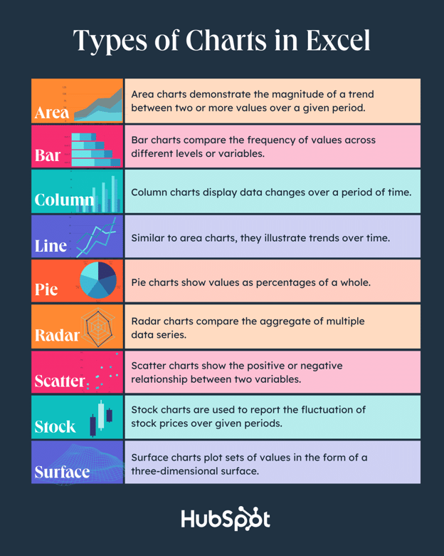
Types of Charts in Excel
You can make more than just bar or line charts in Microsoft Excel, and when you understand the uses for each, you can draw more insightful information for your or your team’s projects.
|
Type of Chart |
Use |
|
Area |
Area charts demonstrate the magnitude of a trend between two or more values over a given period. |
|
Bar |
Bar charts compare the frequency of values across different levels or variables. |
|
Column |
Column charts display data changes or a period of time. |
|
Line |
Similar to bar charts, they illustrate trends over time. |
|
Pie |
Pie charts show values as percentages of a whole. |
|
Radar |
Radar charts compare the aggregate of multiple data series. |
|
Scatter |
Scatter charts show the positive or negative relationship between two variables. |
|
Stock |
Stock charts are used to report the fluctuation of stock prices over given periods. |
|
Surface |
Surface charts plot sets of values in the form of a three-dimensional surface. |
The steps you need to build a chart or graph in Excel are simple, and here’s a quick walkthrough on how to make them.
Keep in mind there are many different versions of Excel, so what you see in the video above might not always match up exactly with what you’ll see in your version. In the video, I used Excel 2021 version 16.49 for Mac OS X.
To get the most updated instructions, I encourage you to follow the written instructions below (or download them as PDFs). Most of the buttons and functions you’ll see and read are very similar across all versions of Excel.
Download Demo Data | Download Instructions (Mac) | Download Instructions (PC)
- Enter your data into Excel.
- Choose one of nine graph and chart options to make.
- Highlight your data and click ‘Insert’ your desired graph.
- Switch the data on each axis, if necessary.
- Adjust your data’s layout and colors.
- Change the size of your chart’s legend and axis labels.
- Change the Y-axis measurement options, if desired.
- Reorder your data, if desired.
- Title your graph.
- Export your graph or chart.
Featured Resource: Free Excel Graph Templates
.png)
Why start from scratch? Use these free Excel Graph Generators. just input your data and adjust as needed for a beautiful data visualization.
1. Enter your data into Excel.
First, you need to input your data into Excel. You might have exported the data from elsewhere, like a piece of marketing software or a survey tool. Or maybe you’re inputting it manually.
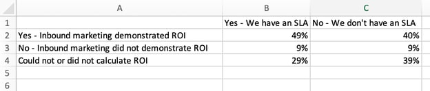
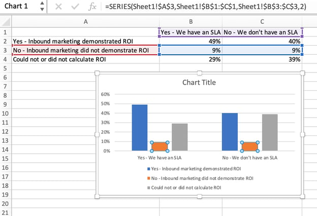
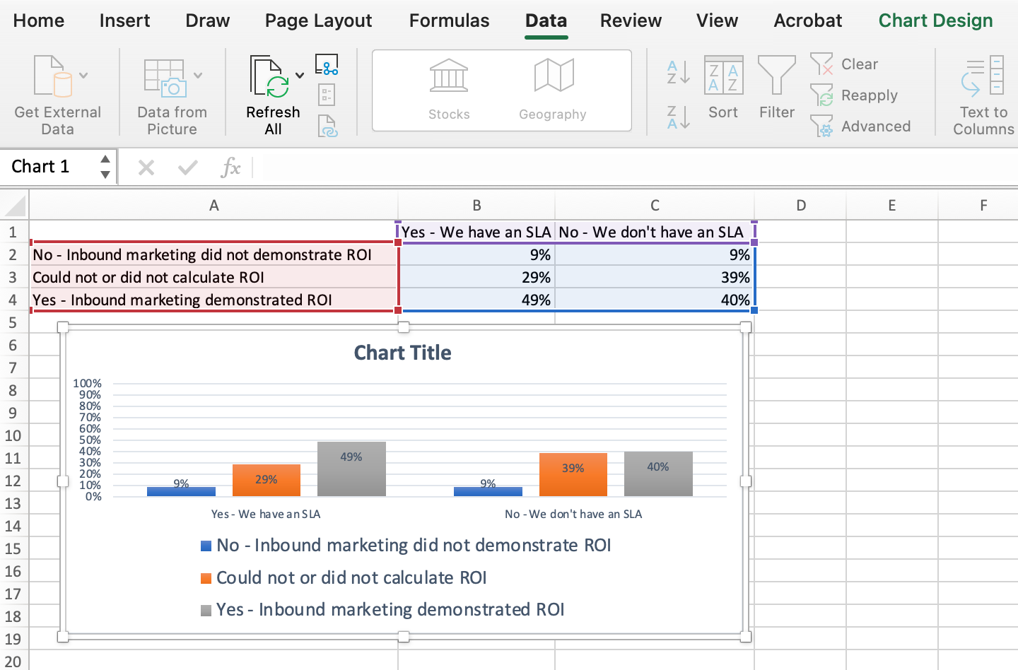
In the example below, in Column A, I have a list of responses to the question, “Did inbound marketing demonstrate ROI?”, and in Columns B, C, and D, I have the responses to the question, “Does your company have a formal sales-marketing agreement?” For example, Column C, Row 2 illustrates that 49% of people with a service level agreement (SLA) also say that inbound marketing demonstrated ROI.
2. Choose from the graph and chart options.
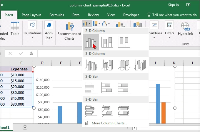
In Excel, your options for charts and graphs include column (or bar) graphs, line graphs, pie graphs, scatter plots, and more. See how Excel identifies each one in the top navigation bar, as depicted below:
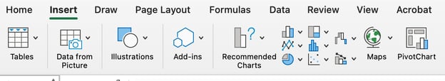
To find the chart and graph options, select Insert.
(For help figuring out which type of chart/graph is best for visualizing your data, check out our free ebook, How to Use Data Visualization to Win Over Your Audience.)
3. Highlight your data and insert your desired graph into the spreadsheet.
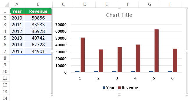
In this example, a bar graph presents the data visually. To make a bar graph, highlight the data and include the titles of the X and Y-axis. Then, go to the Insert tab and click the column icon in the charts section. Choose the graph you wish from the dropdown window that appears.
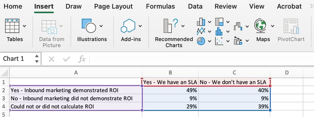
I picked the first two dimensional column option because I prefer the flat bar graphic over the three dimensional look. See the resulting bar graph below.

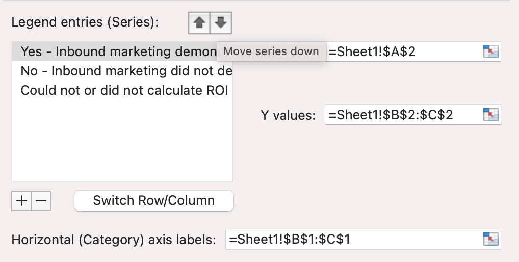
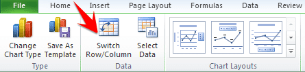
4. Switch the data on each axis, if necessary.
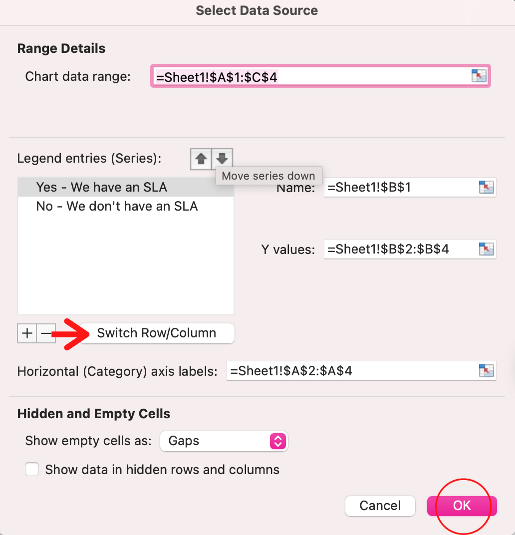
If you want to switch what appears on the X and Y axis, right-click on the bar graph, click Select Data, and click Switch Row/Column. This will rearrange which axes carry which pieces of data in the list shown below. When finished, click OK at the bottom.
The resulting graph would look like this:
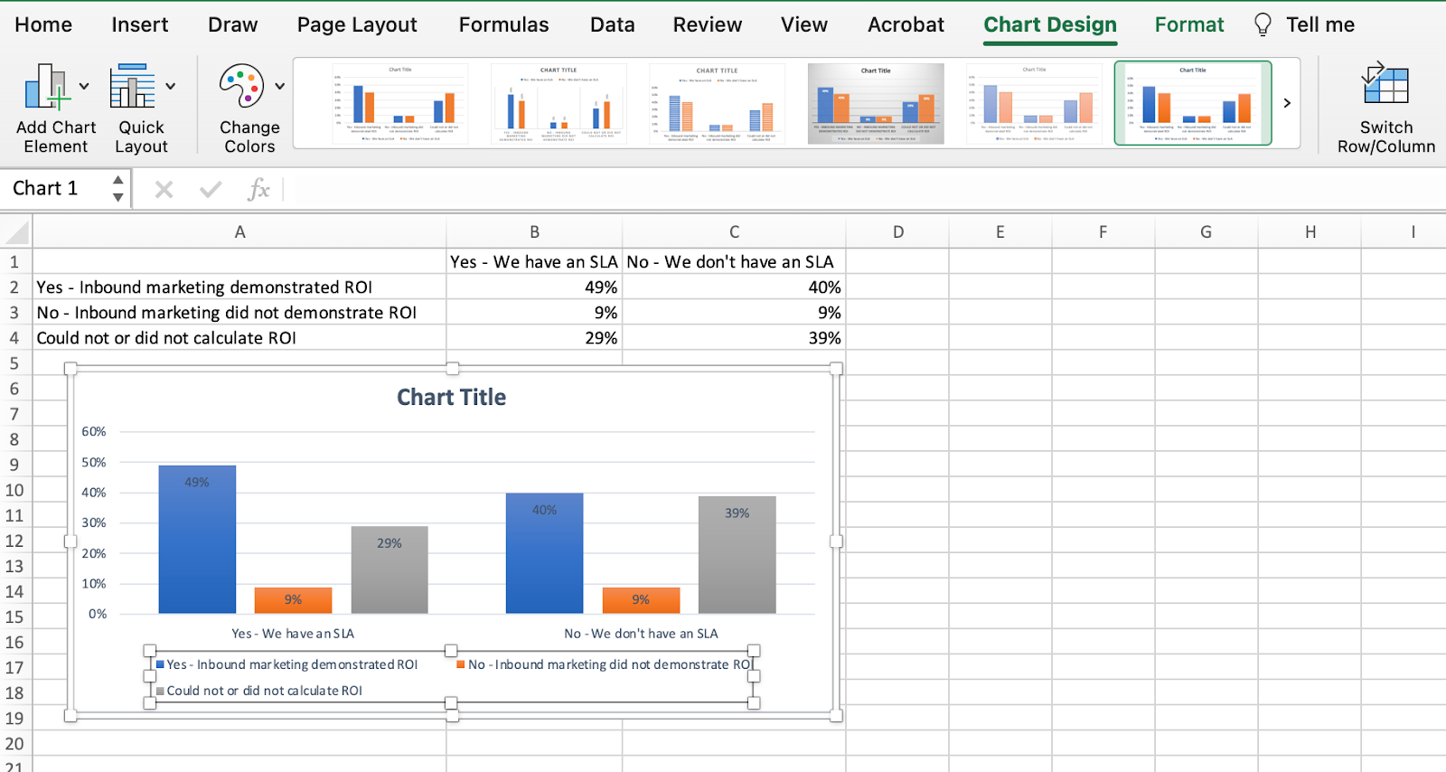
5. Adjust your data’s layout and colors.
To change the labeling layout and legend, click on the bar graph, then click the Chart Design tab. Here, you can choose which layout you prefer for the chart title, axis titles, and legend. In my example below, I clicked on the option that displayed softer bar colors and legends below the chart.
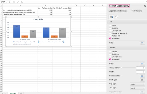
To further format the legend, click on it to reveal the Format Legend Entry sidebar, as shown below. Here, you can change the fill color of the legend, which will change the color of the columns themselves. To format other parts of your chart, click on them individually to reveal a corresponding Format window.
6. Change the size of your chart’s legend and axis labels.
When you first make a graph in Excel, the size of your axis and legend labels might be small, depending on the graph or chart you choose (bar, pie, line, etc.) Once you’ve created your chart, you’ll want to beef up those labels so they’re legible.
To increase the size of your graph’s labels, click on them individually and, instead of revealing a new Format window, click back into the Home tab in the top navigation bar of Excel. Then, use the font type and size dropdown fields to expand or shrink your chart’s legend and axis labels to your liking.

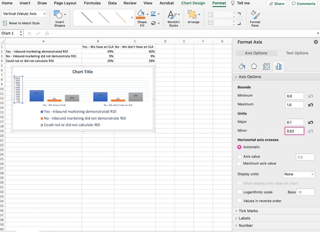
7. Change the Y-axis measurement options if desired.
To change the type of measurement shown on the Y axis, click on the Y-axis percentages in your chart to reveal the Format Axis window. Here, you can decide if you want to display units located on the Axis Options tab, or if you want to change whether the Y-axis shows percentages to two decimal places or no decimal places.
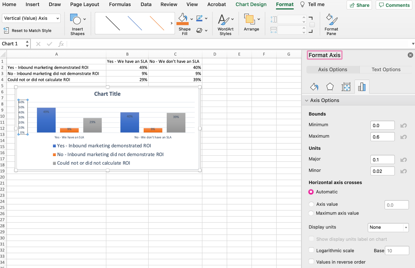
Because my graph automatically sets the Y axis’s maximum percentage to 60%, you might want to change it manually to 100% to represent my data on a universal scale. To do so, you can select the Maximum option — two fields down under Bounds in the Format Axis window — and change the value from 0.6 to one.
The resulting graph will look like the one below (In this example, the font size of the Y-axis has been increased via the Home tab so that you can see the difference):
8. Reorder your data, if desired.
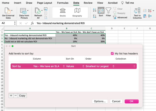
To sort the data so the respondents’ answers appear in reverse order, right-click on your graph and click Select Data to reveal the same options window you called up in Step 3 above. This time, arrow up and down to reverse the order of your data on the chart.
If you have more than two lines of data to adjust, you can also rearrange them in ascending or descending order. To do this, highlight all of your data in the cells above your chart, click Data and select Sort, as shown below. Depending on your preference, you can choose to sort based on smallest to largest, or vice versa.
The resulting graph would look like this:
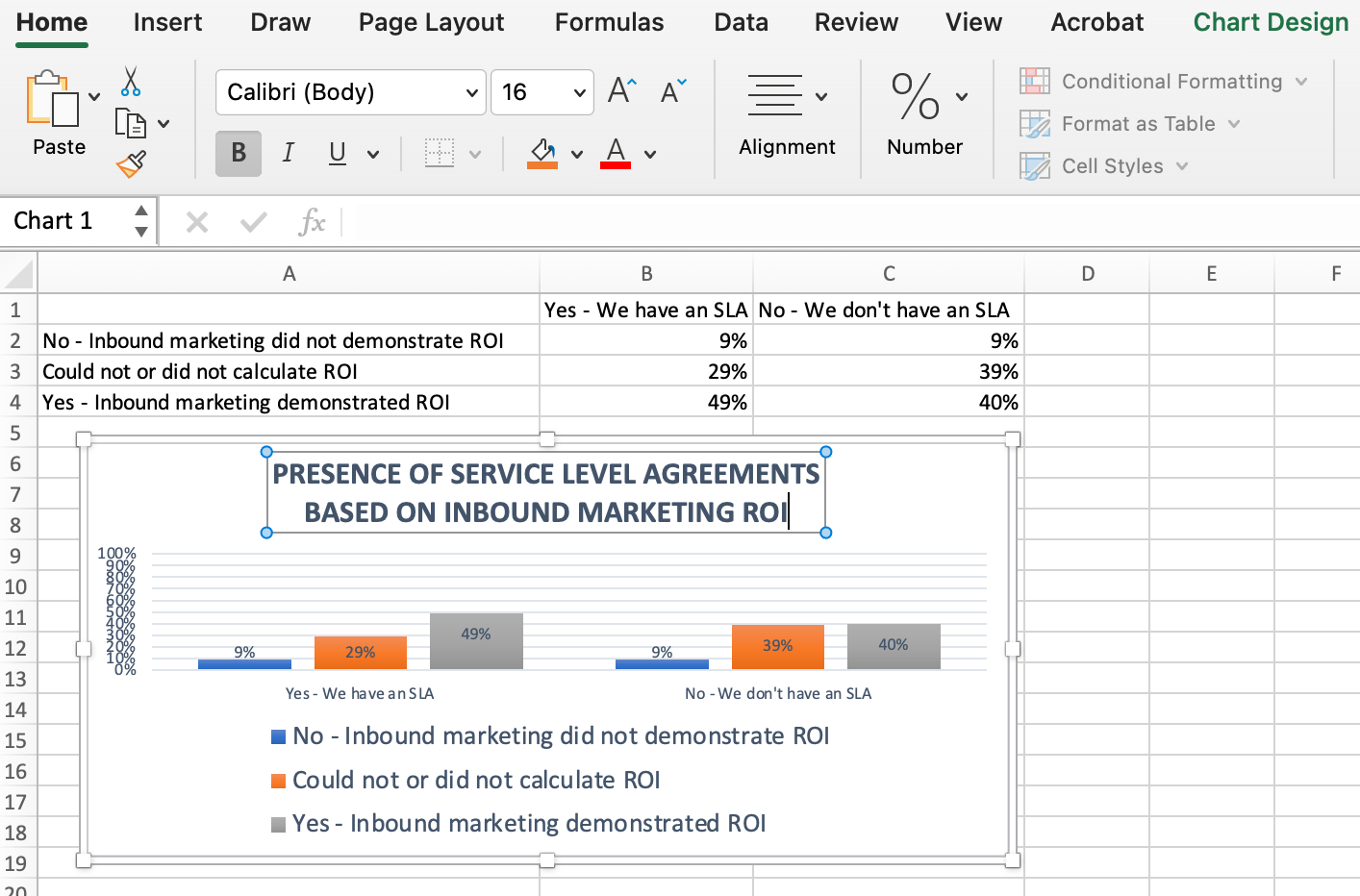
9. Title your graph.
Now comes the fun and easy part: naming your graph. By now, you might have already figured out how to do this. Here’s a simple clarifier.
Right after making your chart, the title that appears will likely be «Chart Title,» or something similar depending on the version of Excel you’re using. To change this label, click on «Chart Title» to reveal a typing cursor. You can then freely customize your chart’s title.
When you have a title you like, click Home on the top navigation bar, and use the font formatting options to give your title the emphasis it deserves. See these options and my final graph below:
10. Export your graph or chart.
Once your chart or graph is exactly the way you want it, you can save it as an image without screenshotting it in the spreadsheet. This method will give you a clean image of your chart that can be inserted into a PowerPoint presentation, Canva document, or any other visual template.
To save your Excel graph as a photo, right-click on the graph and select Save as Picture.
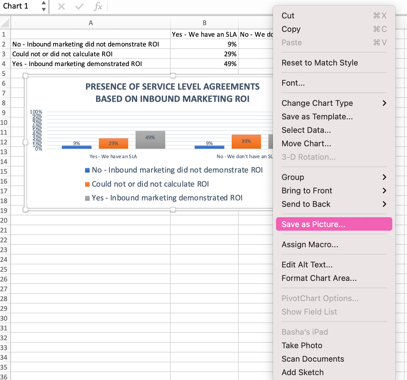
In the dialogue box, name the photo of your graph, choose where to save it on your computer, and choose the file type you’d like to save it as. In this example, it’s saved as a JPEG to a desktop folder. Finally, click Save.
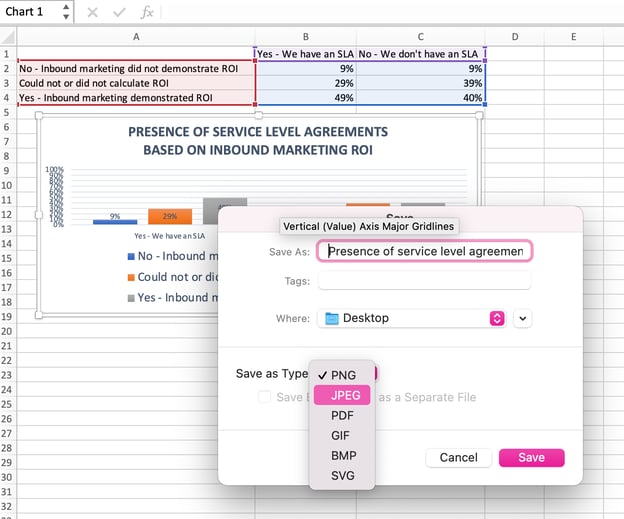
You’ll have a clear photo of your graph or chart that you can add to any visual design.

Visualize Data Like A Pro
That was pretty easy, right? With this step-by-step tutorial, you’ll be able to quickly create charts and graphs that visualize the most complicated data. Try using this same tutorial with different graph types like a pie chart or line graph to see what format tells the story of your data best.
Editor’s note: This post was originally published in June 2018 and has been updated for comprehensiveness.

After you input your data and select the cell range, you’re ready to choose the chart type. In this example, we’ll create a clustered column chart from the data we used in the previous section.
Step 1: Select Chart Type
Once your data is highlighted in the Workbook, click the Insert tab on the top banner. About halfway across the toolbar is a section with several chart options. Excel provides Recommended Charts based on popularity, but you can click any of the dropdown menus to select a different template.

Step 2: Create Your Chart
- From the Insert tab, click the column chart icon and select Clustered Column.

- Excel will automatically create a clustered chart column from your selected data. The chart will appear in the center of your workbook.
- To name your chart, double click the Chart Title text in the chart and type a title. We’ll call this chart “Product Profit 2013 — 2017.”

We’ll use this chart for the rest of the walkthrough. You can download this same chart to follow along.
Download Sample Column Chart Template
There are two tabs on the toolbar that you will use to make adjustments to your chart: Chart Design and Format. Excel automatically applies design, layout, and format presets to charts and graphs, but you can add customization by exploring the tabs. Next, we’ll walk you through all the available adjustments in Chart Design.

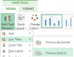
Step 3: Add Chart Elements
Adding chart elements to your chart or graph will enhance it by clarifying data or providing additional context. You can select a chart element by clicking on the Add Chart Element dropdown menu in the top left-hand corner (beneath the Home tab).

To Display or Hide Axes:
- Select Axes. Excel will automatically pull the column and row headers from your selected cell range to display both horizontal and vertical axes on your chart (Under Axes, there is a check mark next to Primary Horizontal and Primary Vertical.)

- Uncheck these options to remove the display axis on your chart. In this example, clicking Primary Horizontal will remove the year labels on the horizontal axis of your chart.

- Click More Axis Options… from the Axes dropdown menu to open a window with additional formatting and text options such as adding tick marks, labels, or numbers, or to change text color and size.


To Add Axis Titles:
- Click Add Chart Element and click Axis Titles from the dropdown menu. Excel will not automatically add axis titles to your chart; therefore, both Primary Horizontal and Primary Vertical will be unchecked.
- To create axis titles, click Primary Horizontal or Primary Vertical and a text box will appear on the chart. We clicked both in this example. Type your axis titles. In this example, the we added the titles “Year” (horizontal) and “Profit” (vertical).


To Remove or Move Chart Title:
- Click Add Chart Element and click Chart Title. You will see four options: None, Above Chart, Centered Overlay, and More Title Options.

- Click None to remove chart title.
- Click Above Chart to place the title above the chart. If you create a chart title, Excel will automatically place it above the chart.
- Click Centered Overlay to place the title within the gridlines of the chart. Be careful with this option: you don’t want the title to cover any of your data or clutter your graph (as in the example below).


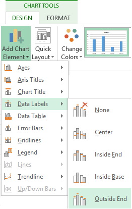
To Add Data Labels:
- Click Add Chart Element and click Data Labels. There are six options for data labels: None (default), Center, Inside End, Inside Base, Outside End, and More Data Label Title Options.

- The four placement options will add specific labels to each data point measured in your chart. Click the option you want. This customization can be helpful if you have a small amount of precise data, or if you have a lot of extra space in your chart. For a clustered column chart, however, adding data labels will likely look too cluttered. For example, here is what selecting Center data labels looks like:


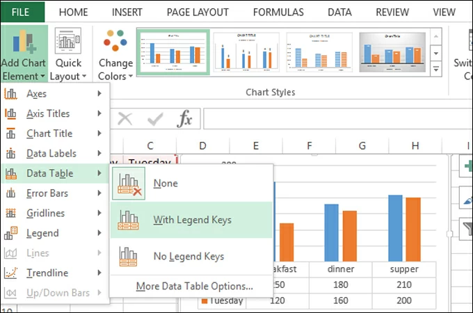
To Add a Data Table:
- Click Add Chart Element and click Data Table. There are three pre-formatted options along with an extended menu that can be found by clicking More Data Table Options:


Note: If you choose to include a data table, you’ll probably want to make your chart larger to accommodate the table. Simply click the corner of your chart and use drag-and-drop to resize your chart.
To Add Error Bars:
- Click Add Chart Element and click Error Bars. In addition to More Error Bars Options, there are four options: None (default), Standard Error, 5% (Percentage), and Standard Deviation. Adding error bars provide a visual representation of the potential error in the shown data, based on different standard equations for isolating error.

- For example, when we click Standard Error from the options we get a chart that looks like the image below.


To Add Gridlines:
- Click Add Chart Element and click Gridlines. In addition to More Grid Line Options, there are four options: Primary Major Horizontal, Primary Major Vertical, Primary Minor Horizontal, and Primary Minor Vertical. For a column chart, Excel will add Primary Major Horizontal gridlines by default.

- You can select as many different gridlines as you want by clicking the options. For example, here is what our chart looks like when we click all four gridline options.

To Add a Legend:
- Click Add Chart Element and click Legend. In addition to More Legend Options, there are five options for legend placement: None, Right, Top, Left, and Bottom.

- Legend placement will depend on the style and format of your chart. Check the option that looks best on your chart. Here is our chart when we click the Right legend placement.


To Add Lines: Lines are not available for clustered column charts. However, in other chart types where you only compare two variables, you can add lines (e.g. target, average, reference, etc.) to your chart by checking the appropriate option.
To Add a Trendline:
- Click Add Chart Element and click Trendline. In addition to More Trendline Options, there are five options: None (default), Linear, Exponential, Linear Forecast, and Moving Average. Check the appropriate option for your data set. In this example, we will click Linear.

- Because we are comparing five different products over time, Excel creates a trendline for each individual product. To create a linear trendline for Product A, click Product A and click the blue OK button.

- The chart will now display a dotted trendline to represent the linear progression of Product A. Note that Excel has also added Linear (Product A) to the legend.

- To display the trendline equation on your chart, double click the trendline. A Format Trendline window will open on the right side of your screen. Click the box next to Display equation on chart at the bottom of the window. The equation now appears on your chart.


Note: You can create separate trendlines for as many variables in your chart as you like. For example, here is our chart with trendlines for Product A and Product C.

To Add Up/Down Bars: Up/Down Bars are not available for a column chart, but you can use them in a line chart to show increases and decreases among data points.
Step 4: Adjust Quick Layout
- The second dropdown menu on the toolbar is Quick Layout, which allows you to quickly change the layout of elements in your chart (titles, legend, clusters etc.).

- There are 11 quick layout options. Hover your cursor over the different options for an explanation and click the one you want to apply.


Step 5: Change Colors
The next dropdown menu in the toolbar is Change Colors. Click the icon and choose the color palette that fits your needs (these needs could be aesthetic, or to match your brand’s colors and style).

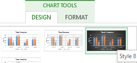
Step 6: Change Style
For cluster column charts, there are 14 chart styles available. Excel will default to Style 1, but you can select any of the other styles to change the chart appearance. Use the arrow on the right of the image bar to view other options.

Step 7: Switch Row/Column
- Click the Switch Row/Column on the toolbar to flip the axes. Note: It is not always intuitive to flip axes for every chart, for example, if you have more than two variables.


In this example, switching the row and column swaps the product and year (profit remains on the y-axis). The chart is now clustered by product (not year), and the color-coded legend refers to the year (not product). To avoid confusion here, click on the legend and change the titles from Series to Years.

Step 8: Select Data
- Click the Select Data icon on the toolbar to change the range of your data.
- A window will open. Type the cell range you want and click the OK button. The chart will automatically update to reflect this new data range.


Step 9: Change Chart Type
- Click the Change Chart Type dropdown menu.

- Here you can change your chart type to any of the nine chart categories that Excel offers. Of course, make sure that your data is appropriate for the chart type you choose.

-
You can also save your chart as a template by clicking Save as Template…
- A dialogue box will open where you can name your template. Excel will automatically create a folder for your templates for easy organization. Click the blue Save button.


Step 10: Move Chart
- Click the Move Chart icon on the far right of the toolbar.
- A dialogue box appears where you can choose where to place your chart. You can either create a new sheet with this chart (New sheet) or place this chart as an object in another sheet (Object in). Click the blue OK button.


Step 11: Change Formatting
- The Format tab allows you to change formatting of all elements and text in the chart, including colors, size, shape, fill, and alignment, and the ability to insert shapes. Click the Format tab and use the shortcuts available to create a chart that reflects your organization’s brand (colors, images, etc.).

- Click the dropdown menu on the top left side of the toolbar and click the chart element you are editing.


Step 12: Delete a Chart
To delete a chart, simply click on it and click the Delete key on your keyboard.
How to Make Charts or Graphs in Excel?
Steps in making graphs in Excel:
- Numerical Data: The first thing required in your Excel is numerical data. Charts or graphs can only be built using numerical data sets.
- Data Headings: These are often called data labels. The headings of each column should be understandable and readable.
- Data in Proper Order: It is very important how the data looks in Excel. If the information to build a chart is bits and pieces, we might find it difficult to construct a chart. So arrange the data properly.
Table of contents
- How to Make Charts or Graphs in Excel?
- Examples (Step by Step)
- Example #1
- Example #2
- Things to Remember
- Recommended Articles
- Examples (Step by Step)
Examples (Step by Step)
Below are some examples of how to make charts in Excel.
You can download this Make Chart Excel Template here – Make Chart Excel Template
Example #1
Assume we have passed six years of sales data. We want to show them in visuals or graphs.
- First, we must select the date range we are using for a graph.

- Then, go to the “INSERT” tab > under the “Charts” section, and select the “COLUMN” chart. We can see many other types under the “Column” chart but prefer the first one.

- As soon as we have selected the chart, we can see the below chart in Excel.

- It is not the finished product yet. We need to make some arrangements here. So, we must select the blue-colored bars and press the “Delete” button. Else, right-click on bars and choose “Delete.”

- Now, we do not know which bar represents which year. So, right-click on the chart and select “Select Data.”

- In the below window, we must click on “EDIT,” which is on the right-hand side.

- After we click on the “EDIT option,” we will see a small dialog box below. It will ask to select the “Horizontal Axis Labels.” So, choose the “Year” column.

- Now, we have the “Year” name below each bar.

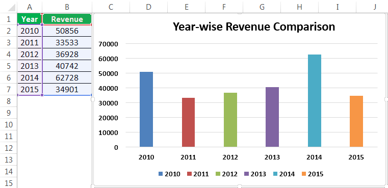
- After that, change the heading or title of the chart as per the requirement by double-clicking on the existing header.
- Add “Data Labels” for each bar. The “Data Labels” are each bar’s numbers to convey the message perfectly. Right-click on the column bars and select “Add Data Labels.”

- Change the color of the column bars to different colors. Next, select the bars and press “Ctrl + 1.” We may see the format chart dialog box on the right-hand side.

- Now, go to the “FILL” option, and select the option “Vary colors by point.”

Now, we have a neatly arranged chart in front of us.


Example #2
We have seen how to create a graph with auto-selection of the data range. Next, we will show you how to build an Excel chart with a manual data selection.
- Step 1: First, we must place the cursor in the empty cell and click on the “Insert Chart.”

- Step 2: After we click on the “Insert Chart,” we can see a blank chart.

- Step 3: Right-click on the chart and choose the “Select Data” option.

- Step 4: In the below window, click on “Add.”

- Step 5: In the below window, under “Series name,” select the heading of the data series, and under the “Series values,” select data series values.

- Step 6: Now, the default chart is ready.

Now, we must apply the steps shown in the previous example to modify the chart. Next, refer to steps 5 to 12 to alter the chart.
Things to Remember
- For the same data, we can insert all types of charts. It is important to identify a suitable chart.
- If the data is smaller, it is easy to plot a graph without any hurdles.
- In the case of percentage data, we must select the PIE chartMaking a pie chart in excel can help you with the pictorial representation of your data and simplifies the analysis process. There are multiple kinds of pie chart options available on excel to serve the varying user needs.read more.
- We must try using different charts for the same data to identify the best fit chart for the data set.
Recommended Articles
This article is a guide to Making Charts in Excel. Here, we discuss how to make charts or graphs in Excel, practical examples, and a downloadable Excel template. You may learn more about Excel from the following articles: –
- Organization Chart in Excel
- Examples of Line Chart in Excel
- Excel Chart Templates
- 8 Types of Charts in Excel
- Infographics in Excel
Reader Interactions
Most companies (and people) don’t want to pore through pages and pages of spreadsheets when it’s so quick to turn those rows and columns into a visual chart or graph. But someone has to do it…and that person must be you.
Ready to turn your boring Excel spreadsheet into something a little more interesting?
In Excel, you’ve got everything you need at your fingertips. Excel users can leverage the power of visuals without any additional extensions. You can create a graph or chart right inside Excel rather than exporting it into some other tool.
What is the difference between Charts and Graphs?
According to reference.com…“The difference between graphs and charts is mainly in the way the data is compiled and the way it is represented. Graphs are usually focused on raw data and showing the trends and changes in that data over time. Charts are best used when data can be categorized or averaged to create more simplistic and easily consumed figures.“
So technically, charts and graphs mean separate things, but in the real world, you’ll hear the terms used interchangeably. People generally accept both so don’t worry too much about it!

In this post, you’ll learn exactly how to create a graph in Excel and improve your visuals and reporting…but first let’s talk about charts. Understanding exactly how charts play out in Excel will help with understanding graphs in Excel.
Charts in Excel
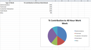
Charts are usually considered more aesthetically pleasing than graphs. Something like a pie chart is used to convey to readers the relative share of a particular segment of the data set with respect to other segments that are available. If instead of the changes in hours worked and annual leaves over 5 years, you want to present the percentage contributions of the different types of tasks that make up a 40 hour work week for employees in your organization then you can definitely insert a pie chart into your spreadsheet for the desired impact.
Graphs in Excel
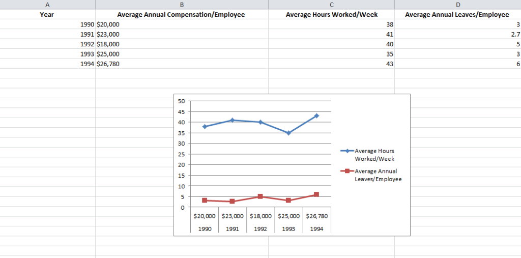
Graphs represent variations in values of data points over a given duration of time. They are simpler than charts because you are dealing with different data parameters. Comparing and contrasting segments of the same set against one another is more difficult.
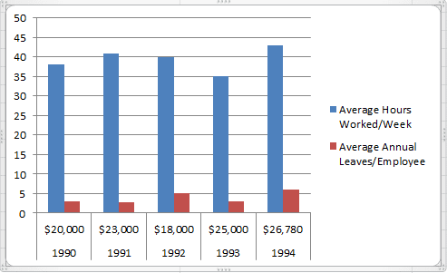
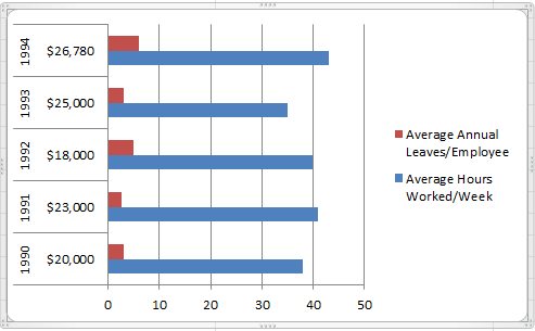
So if you are trying to see how the number of hours worked per week and the frequency of annual leaves for employees in your company has fluctuated over the past 5 years, you can create a simple line graph and track the spikes and dips to get a fair idea.
Types of Graphs Available in Excel
Excel offers three varieties of graphs:
- Line Graphs: Both 2 dimensional and three dimensional line graphs are available in all the versions of Microsoft Excel. Line graphs are great for showing trends over time. Simultaneously plot more than one data parameter – like employee compensation, average number of hours worked in a week and average number of annual leaves against the same X axis or time.
- Column Graphs: Column graphs also help viewers see how parameters change over time. But they can be called “graphs” when only a single data parameter is used. If multiple parameters are called into action, viewers can’t really get any insights about how each individual parameter has changed. As you can see in the Column graph below, average numbers of hours worked in a week and average number of annual leaves when plotted side by side do not provide the same clarity as the Line graph.
- Bar Graphs: Bar graphs are very similar to column graphs but here the constant parameter (say time) is assigned to the Y axis and the variables are plotted against the X axis.
1. Fill the Excel Sheet with Your Data & Assign the Right Data Types
The first step is to actually populate an Excel spreadsheet with the data that you need. If you have imported this data from a different software, then it’s probably been compiled in a .csv (comma separated values) formatted document.
If this is the case, use an online CSV to Excel converter like the one here to generate the Excel file or open it in Excel and save the file with an Excel extension.
After converting the file, you still may need to clean up the rows and the columns. It is better to work with a clean spreadsheet so that the Excel graph you’re creating is clean and easy to modify or change.
If that doesn’t work, you may also need to manually enter the data into the spreadsheet or copy and paste it over before creating the Excel graph.
Excel has two components to its spreadsheets:
- The rows that are horizontal and marked with numbers
- The columns that are vertical and marked with alphabets
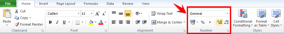
After all the data values have been set and accounted for, make sure that you visit the Number section under the Home tab and assign the right data type to the various columns. If you do not do this, chances are your graphs will not show up right.
For example if column B is measuring time, ensure that you choose the option Time from the drop down menu and assign it to B.
Choose the Type of Excel Graph You Want to Create
This will depend on the type of data you have and the number of different parameters you will be tracking simultaneously.
If you are looking to take note of trends over time then Line graphs are your best bet. This is what we will be using for the purpose of the tutorial.
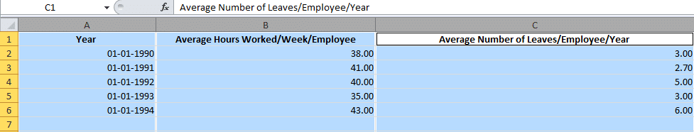
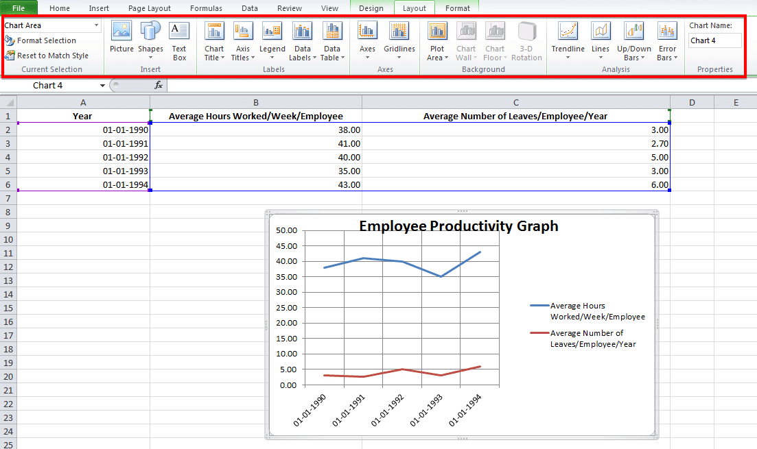
Let us assume that we are tracking Average Number of Hours Worked/Week/Employee and Average Number of Leaves/Employee/Year against a five year time span.
Highlight The Data Sets That You Want To Use
For a graph to be created, you need to select the different data parameters.
To do this, bring your cursor over the cell marked A. You will see it transform into a tiny arrow pointing downwards. When this happens, click on the cell A and the entire column will be selected.
Repeat the process with columns B and C, pressing the Ctrl (Control) button on Windows or using the Command key with Mac users.
Your final selection should look something like this:
Create the Basic Excel Graph
With the columns selected, visit the Insert tab and choose the option 2D Line Graph.
You will immediately see a graph appear below your data values.

Sometimes if you do not assign the right data type to your columns in the first step, the graph may not show in a way that you want it to. For example, Excel may plot the parameter Average Number of Leaves/Employee/Year along the X axis instead of the Year. In this case, you can use the option Switch Row/Column under the Design tab of Chart Tools to play around with various combinations of X axis and Y axis parameters till you hit on the perfect rendition.
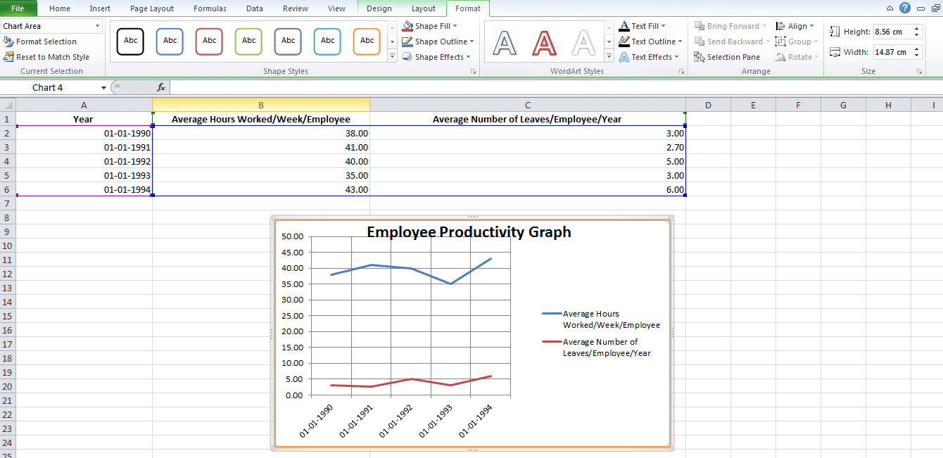
Improve Your Excel Graph with the Chart Tools
To change colors or to change the design of your graph, go to Chart Tools in the Excel header.
You can select from the design, layout and format. Each will change up the look and feel of your Excel graph.
Design: Design allows you to move your graph and re-position it. It gives you the freedom to change the chart type. You can even experiment with different chart layouts. This may conform more to your brand guidelines, your personal style, or your manager’s preference.

Layout: This allows you to change the title of the axis, the title of your chart and the position of the legend. You might go with vertical text along the Y axis and horizontal text along the X axis. You can even adjust the grid lines. You have every formatting tool conceivable at your fingertips to improve the look and feel of your graph.
Format: The Format tab allows you to add a border in your chosen width and color around the graph to properly separate it from the data points that are filled in the rows and columns.
And there you have it. An accurate visual representation of the data that you have imported or entered manually to help your team members and stakeholders better engage with the information and utilize it to create strategies or be more aware of all the constraints while taking decisions!
Challenges with Making a Graph In Excel
When manipulating simple data sets, you can create a graph fairly easily.
But when you start adding in several types of data with multiple parameters, then there will be glitches. Here are some of the challenges that you’re going to have:
- Data sorting can be problematic when creating graphs. Online tutorials might recommend data sorting to make your “charts” look more aesthetically appealing. But beware of when the X axis is a time-based parameter! Sorting data values by magnitude may mess up the flow of the graph because the dates are sorted randomly. You may not be able to spot the trends very well.

You may forget to remove duplicates. This is especially true if you have imported the data from a third-party application. Generally, this type of information is not filtered of redundancies. And you might end up corrupting the integrity of your information if duplicates sneak into your pictorial representation of trends. When working with copious volumes of data, it is best to use the Remove Duplicates option on your rows.
Creating graphs in Excel doesn’t have to be overly complex, but, much like with creating Gantt charts in Excel, there can be some easier tools to help you do it. If you’re trying to create graphs for workloads, budget allocations or monitoring projects, check out project management software instead.
Many of those functions are automated and without manual data entry. And you won’t be left wondering about who has the latest data sets. Most project management solutions, like Workzone, have file sharing and some visualization capabilities built-in.

Skills For the Young Analyst
Charts and graphs are used to make information clearer and easier to understand. A good picture is worth a thousand numbers. The most common place for people to see charts and graphs is in the news. News publishers use graphics all the time to show comparisons and explain important trends for things such as weather, gas prices, crime rate, or who is winning an election and by how much. Charts and graphs are also critical to engineers, scientists and financial analysts who use them to help visualize large amounts of information, make better decisions, and communicate their results to other people.
There are good reasons for learning to create graphs by hand, but there are also some great tools that everyone ought to learn how to use at some point, such as Excel. The purpose of this article is to highlight some of the common types of graphs and charts that you can create with Excel, explain when you might use the different types, and provide a great set of resources for learning about and teaching about charts and graphs.
Bar Graph
A bar graph is a graph that shows you information about two or more discrete objects, events, locations, groups of people, etc. You can use the bar graph to make comparisons. For example, if you count the number of students in your class who are girls and the number who are boys, you could make a bar graph to compare the totals. One bar would represent the number of boys, and another bar would represent the number of girls.
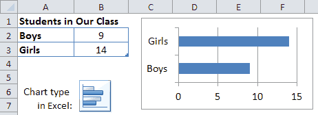
Example of a bar graph created with Excel.
Below are some useful resources for helping kids learn about bar graphs.
- Tally Charts and Bar Graphs (Movie)
- Kids Have Pets: A Lesson on Using Graphs
- Bar Graph Worksheets
- Graphing Lesson Examples
- Basic Bar Graph Worksheet (PDF)
Column Chart
A column chart in Excel is just a bar graph where the bars are displayed as columns. Instead of the labels or categories listed on the left, they are listed on the bottom. The example below shows how you can set up the data table for creating a column chart showing the number of apples eaten in a particular month.
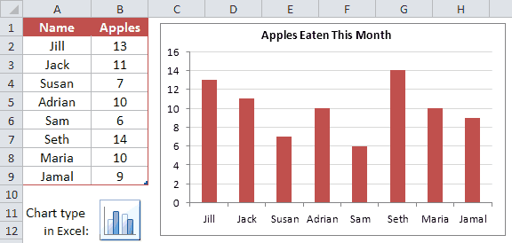
Example of a column chart created using Excel
Pictograph
A pictograph shows data using a series of pictures, where a picture represents a number. The example below takes the same data used for the column chart but uses pictures of apples, where one complete picture represents 5 apples eaten. Pictographs can be a fun way to display information, and they are easy to create in Excel. You first create a bar graph or column chart and then you edit the fill options for the bars or columns.
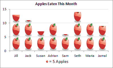
Example of a Pictograph created with Excel
Pictures can say a lot more than numbers. But, it is very important that we don’t misrepresent information by the way that we use images and graphics. For example, it would be very confusing if the pictograph above used images of oranges instead of apples to represent the number of apples eaten. We must think about whether the sizes, shapes and colors of graphics are helping to make information more clear and helping to increase understanding.
Line Graph
A line graph is great for showing continuous change over time. For example, you could use a line graph to watch the changes in temperature in the month of March. If it is hotter one day than on the day before, the line will go up. If it is cooler, it will go down. By analyzing the line graph, you can get a better idea of the changes that took place as time went on. You can also easily determine when the value you are graphing was highest or when it was lowest. Including 2 lines on the same graph lets you visualize comparisons, such as the difference between the High and Low temperatures for each day.
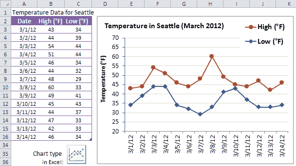
Example of a line graph in Excel
Data Source: http://www.beautifulseattle.com/mthsum.asp
You can create a line graph from the same data table as a bar graph, and vice versa. But, what you decide to use should largely depend upon whether you are showing how something changes over time (line graph) or showing comparisons between discrete things (bar graph).
It is important to be aware of color choices when using graphs. People often associate meanings with different colors, such as red for hot and blue for cold, so in the example above it could be confusing if the colors of the lines were switched. It makes more sense for red to be used for the High temperature and blue to be used for the Low temperature.
Pie Charts
A pie chart is a circular graph where the pieces of the pie are used to represent a percentage of a whole. For example, if you took a survey of the students in your class and asked them each about their favorite pizza, you could use the results to make a pie chart that would show what toppings earned the most votes. In this case, each triangle would represent a different topping. The triangle with the largest area would represent the topping that got the most votes, while the toppings that got the least votes would be represented by smaller triangles.
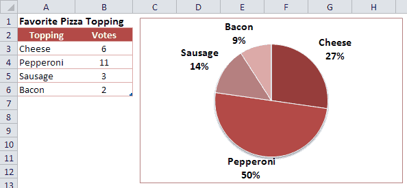
Example of a pie chart in Excel
In the example above, it is pretty easy to see that Pepperoni was the favorite. It is also easy to see that Pepperoni received the same amount of votes as all of the others combined. That would not be as easy to see if you were just staring at the numbers in the table. One problem with a pie chart is that it can take up a lot of space to show only a little bit of information.
Another major problem with pie charts is making comparisons between a lot of different things, and especially when you have a lot of little slices. To help with that, Excel provides a «Bar of Pie» graph that breaks out some of the pieces into a separate stacked bar graph like in the example below.
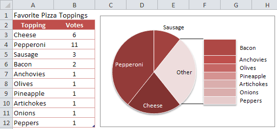
Example of a «bar of pie» graph in Excel
People already have a hard time comparing sizes of areas when they are fairly close in size. But, it is even harder when the areas are different shapes. If you tried to compare Sausage and Bacon in the above example (without using the data table), you could end up coming to an incorrect conclusion. Can you tell why? Is the Sausage slice larger or smaller than the Bacon? Without the numbers to help you, you probably couldn’t tell for sure. In fact, the Sausage received 3 votes and the Bacon only received 2. It turns out that the sizes of the rectangles can only be compared within the stacked bar chart. The size of the rectangles cannot be compared to the size of the pie slices — not only because of the difficulty between comparing rectangles and pie slices, but also because the total area of the stacked bar chart is not the same as the total area of the «Other» slice from which it was taken.
- Pie Graph Lesson Plan
- Circle Graph Generator
Area Charts
An area chart or area graph combines some of the characteristics of line graphs with the characteristics of bar graphs. It looks like a line graph with shading underneath the line. Sometimes, the shading can help add meaning to a line graph. For example, if a line graph represented the height of water in a reservoir over time, shading the area under the line could make the line graph look like actual water rising and falling.
Stacked area charts and stacked column charts provide a way to compare differences or proportions over time or between different locations or groups of people. The height of each of the areas as well as the total height of all the areas may change over time. If you had a series of pie charts that compared the same items from month to month, all of that information could be displayed in a single area chart. For example, let’s say that a teacher offered the same pizza topping survey to each of her classes over a period of 10 years. You can display that information as an area chart like the image below.
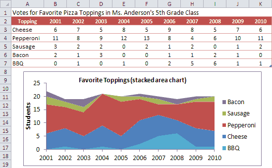
Example of a stacked area chart in Excel
This type of area chart is time-based (same survey offered year after year), but it’s not truly continuous because the class stays the same throughout the entire year. So, this is a case where it might be more appropriate to show the graph as a stacked column chart (see below) which will depict the results as discrete events. Everything about the data table and the graph is pretty much the same. All you have to do is change the chart type.
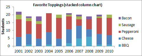
Example of a stacked column chart in Excel
XY Graph (Scatter Plot)
An X-Y graph, also called a coordinate graph or scatter plot, is a graph that shows different ordered pairs on an X-Y axis (Cartesian coordinate system). X-Y graphs are used to look at and find patterns in sets of data and to plot mathematical formulas. The points on the graph may form a straight line or a curved line, and may be connected with a line. Unlike bar graphs and line graphs, the line in an X-Y graph can curve back on itself, forming complex patterns such as the spirograph shown on the right. In some cases, the points may not form a line at all. They might just be shown as a bunch of random dots scattered all over the place (thus the name).
To plot a point on graph paper, you first need to draw the coordinate system and then you simply find the point’s x-coordinate, move straight up or down the line to its y-coordinate, and draw a point. To create a scatter plot in Excel, you first create a simple table with one column for listing the X-coordinates and a second column for the Y-coordinates, select the data table, then insert the scatter chart by choosing it from a menu.
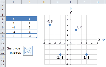
Example of a scatter plot in Excel
More information about scatter plots:
- What’s the Point?
- Examining Scatter Plots (nces.ed.gov)
There are many other types of charts and graphs, as well as many other variations on the types listed above. But most of the more advanced types of graphs, charts, and plots require a more advanced knowledge of math, science, and statistics. Some of the names for these other types of charts (but definitely not all of them) are: surface plots and other 3-dimensional graphs, bubble charts, candlestick charts, radar plots, forest plots, glyph plots, histograms, stem-and-leaf plots, dot plots, biplots, box plots, gauge charts, control charts, geo charts, tree maps, combination charts, stepped area charts, dendrogram plots, and many others.
Disclaimer: This article is meant for educational purposes only.
Over the past years, one of the things we’ve learned is that Microsoft Excel is like a Hallmark movie.
Some of us can’t get enough of them and others just can’t stand it. 💔😬
Regardless of your preference, if you’re a manager or business owner, you’ll probably have to rely on Excel for business insights.
Tools like Microsoft Excel graphs are helpful for data analysis and tracking.
And wayyy better than endless spreadsheets that can easily trigger a migraine.
Then why not turn your boring Excel spreadsheet into something interesting?
In this article, we’ll learn what an Excel graph is, how to make a graph in Excel, and its drawbacks. We’ll also suggest an alternative to create effortless graphs.
Let’s graph away!
What are Graphs & Charts in Microsoft Excel?
Graphs in Excel are graphical representations of variations in values of data points over a given period.
In other words, it’s a diagram that represents changes in comparison to one or more variables.
Too technical? 👀
Take a look at the image for clarity:

Wondering if graphs and charts in Excel are the same?
Graphs are mostly numerical representations of data as it shows how one variable is affecting or changing another.
On the other hand, charts are visual representations where variables may or may not be associated. They’re also considered more aesthetically pleasing than graphs. For example, a pie chart. 🥧
However, if you’re wondering how to make a chart in Excel, it isn’t very different from making a graph.
But for now, let’s focus on the main plot: graphs!✨
Steps To Make a Graph in Excel
The first (and obvious step) is to open a new Excel file or a blank Excel worksheet.
Done?
Then let’s learn how to create a graph in Excel.
⭐️ Step 1: fill the Excel sheet with data
Start by populating your Excel spreadsheet with the data you need.
You may import this data from different software, insert it manually, or copy and paste it.
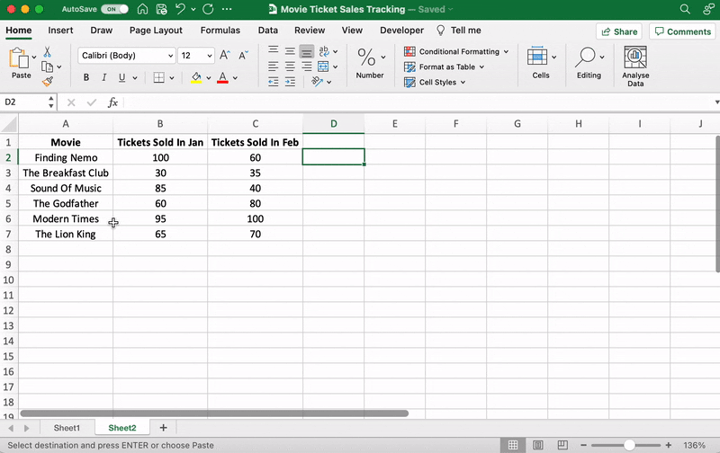
For our example, let’s say you’re an owner of a movie theater in a small town, and you often screen older movies. You probably want to track the sales of your tickets to see which movie is a hit so you can screen it frequently.
Let’s do that by comparing the ticket sales in January and February.
Here’s what your data might look like:

Column A contains the movie names.
Column B contains tickets sold in January.
And column C contains tickets sold in February.
You can bold headings and center align your text for better readability.
Done? Okay, get ready to pick a graph.
⭐️ Step 2: determine the Excel graph type you want
The type of graph you pick will depend on the data you have and the number of different parameters you want to track.
You’ll find the different graph types under the Excel Insert tab, in the Excel Ribbon, arranged close to one another like this:

Note: The Excel Ribbon is where you can find the Home, Insert, and Draw tabs.
Here are some of the different Excel graph or chart type options you can choose from:
- Line graph
- Column graph or bar graph
- Pie graph or chart
- Combo chart
- Area chart
- Scatter plot chart
➡️ Fun fact: Excel can help you decide the graph or chart type with the Recommended Charts (formerly known as Chart Wizard) option.
If you want to take notes of trends (increase or decrease) over time, then a line graph is perfect.
But for a long time frame and more data, a bar graph is the best option.
We’ll use these two graphs for the purpose of this Excel tutorial.
How To Create a Line Graph in Excel – 3 Steps
A line graph in Excel typically has two axes (horizontal and vertical) to function.
You need to enter the data in two columns.
Lucky for us, we’ve already done this when creating the ticket sales data table.
⭐️ Step 1: select data to turn into a line graph
Click and drag from the top-left cell (A1) in your ticket sales data to the bottom-right cell (C7) to select. Don’t forget to include column headers.
This will highlight all the data you want to display in your line graph.

⭐️ Step 2: insert line graph
Now that you’ve selected your data, it’s time to add the line graph.
Look for the line graph icon under the Insert tab.

With the data selected, go to Insert > Line. Click on the icon, and a dropdown menu will appear to select the type of line chart you want.
For this example, we’ll choose the fourth 2-D line graph (Line with Markers).
Excel will add your line graph representing your selected data series.

You’ll then notice the names of the movies appear on the horizontal axis and the number of tickets sold on the vertical axis.
⭐️ Step 3: customize your line graph
After adding the line graph, you’ll notice a new tab called Chart Design on your Excel Ribbon.
Select the Design tab to make the line graph your own by choosing the chart style you prefer.

You can also change the graph’s title.
Select the Chart Title > double click to name > type in the name you wish to call it. To save it, simply click anywhere outside the graph’s title box or chart area.
We’ll name our graph “Movie Ticket Sales.”
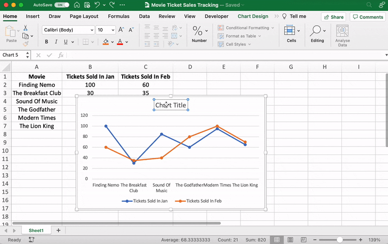
Anything else you need to tweak?
If you spot anything, now is the time to make those edits!
For example, here you can see The Godfather and Modern Times are smooshed together.
Let’s give them some space.
How?
Just drag any corner of the graph until it’s how you desire.

These are just some examples. You can customize every chart element if you like including the Axis Labels (the color of the lines that represent each data point, etc.)
Just double click on any chart element to open a sidebar for formatting like this:
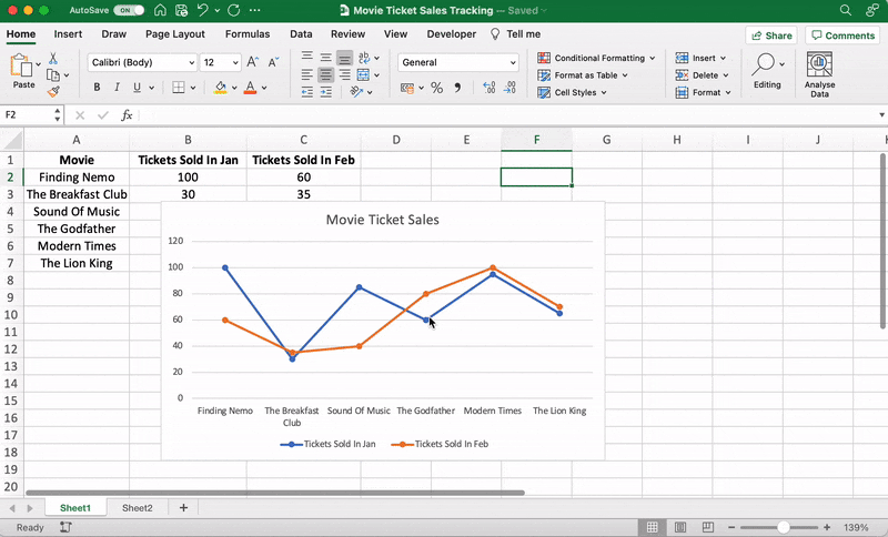
That’s it! You’ve successfully created a line graph in Excel!
Now, let’s learn how to make a bar graph. 📊
3 Steps To Create a Bar Graph in Excel
Any Excel graph or Excel chart begins with a populated sheet.
We’ve already done this, so copy and paste the movie ticket sales data to a new sheet tab in the same Excel workbook.
⭐️ Step 1: select data to turn into a bar graph
Like step 1 for the line graph, you need to select the data you wish to turn into a bar graph.
Drag from cell A1 to C7 to highlight the data.
⭐️ Step 2: insert bar graph
Highlight your data, go to the Insert tab, and click on the Column chart or graph icon. A dropdown menu should appear.
Select Clustered Bar under the 2-D bar options.
Note: you can choose a different type of bar chart option like a 3D clustered column or 2D stacked bar, etc.
As soon as you click on the bar graph option, it’ll be added to your Excel sheet.

⭐️ Step 3: customize your Excel bar graph
Now, you can go to the Chart Design tab in the Excel Ribbon to personalize it.
Click on the Design tab to apply a bar style you prefer from the many options.

You know the next step! Change the bar graph’s title.
Select the Excel Chart Title > double click on the title box > type in “Movie Ticket Sales.”
Then click anywhere on the excel sheet to save it.

Note: you can also add other graph elements such as Axis Title, Data Label, Data Table, etc., with the Add Chart Element option. You’ll find it under the Chart Design tab.
And that’s a wrap. 🎬
You’ve successfully created a bar graph in Excel!
Well, that was fun.
But the question is, do you have the time for graphs in your busy work schedule?
And that’s just the teaser when it comes to Excel graph drawbacks.
Read on to watch the full movie. 👀
Bonus: Check out these Excel Alternatives!
Create Effortless Graphs With ClickUp
If ClickUp were a Hallmark movie, graphs and this project management tool would be the perfect match.
A forever kind-of-love. ❤️
Whether you want to create graphs to monitor time, projects, people, ticket sales… you name it because we can do it all within a few clicks.
All without the drawbacks of using Excel!
Excel can be:
- Time-consuming and manual
- Complex and pricey
- Error-prone
The best part?
Most of those functions are automated without manual data entry. Phew.
1. Line Chart Widgets
The Line Chart Widget is a Custom Widget on our Dashboard. Use this ClickUp production to visualize literally anything in the form of a line graph.
It can be tracking profits, total daily sales, or how many movies you’ve watched in a month.
Like we said, a-n-y-t-h-i-n-g!

Visualize any set of values as a line graph with the Line Chart Widget on ClickUp’s Dashboard!
And that’s not it. You can visualize your data in many different ways too.
Just use any of these Custom Widgets:
- Calculations
- Bar charts
- Battery chart
- Pie chart
- And more

Present your data visually as a pie chart with Custome Widgets in ClickUp!
2. Gantt Chart view
Just like it’s difficult to love just one movie genre, we totally get that graphs alone don’t work.
And that’s why we have charts too!
Specifically, ClickUp’s Gantt chart, an interactive chart with live updates and progress tracking that can help you:
- Plan projects
- Assign tasks and assignees
- Schedule a timeline
- Manage dependencies
- And more

Drawing a relationship from one task to a future task in ClickUp’s Gantt Chart view!
3. Table view
If you’re a fan of the Excel grids, ClickUp has your back.
Starring… ClickUp Table view!
This view lets you visualize your tasks in the spreadsheet style.
It’s super fast and allows easy navigation between fields, bulk edits, and data export.
➡️ Fun fact: you can quickly copy and paste your table’s data into other programs, like MS Excel. Just click and drag to highlight the cells you want to copy.
Highlight data from your table in ClickUp to copy and paste into other programs!
And that was just the trailer for you. 📽️
Here are some more powerful ClickUp features in store for:
- Send and receive emails right from your project management tool with Email in ClickUp
- Work even when the wifi acts up with Offline Mode
- Work how you like with multiple ClickUp Views, including Calendar, Mind Maps, Chat, etc.
- Reduce your workload with ClickUp Automations
- Track time spent on tasks with ClickUp’s Native Time Tracker
- Share Table view or Dashboards with clients and external users using Public Sharing and Permissions
- View all graphs and charts on the go with ClickUp mobile apps
Now Showing: ClickUp 🎥🍿
You can surely make tons of graphs in Excel.
No doubt there.
But does that make it a smart choice?
I mean, if you have to Google how to make a graph in Excel, maybe that’s your red flag. 🚩
Tools are supposed to make your life easier.
Take ClickUp, for instance.
Our project management tool can be your graph maker, chart creator, spreadsheet builder, time tracker, workload manager…
It’s a hallmark for a quality tool that can be your all-in-one solution.
Get your ClickUp ticket for free today and enjoy watching your graphs come to life in minutes!
Related readings:
- How to create Gantt charts in Excel
- How to create a Kanban board in Excel
- How to create a burndown chart in Excel
- How to create a flowchart in Excel
- How to show dependencies in Excel
- How to create a KPI dashboard in Excel
- How to create a dashboard in Excel
- How to create a database in Excel
- How to make a work breakdown structure in Excel
Any information is easier to perceive when it’s represented in a visual form. It’s particularly relevant for numeric data that needs to be compared. In this case, charts are the optimal variant of representation. We will work in Excel.
Moreover, we will learn to create dynamic charts and graphs, which are updated automatically when you change the data. The link at the end of the article will allow you to download a sample template.
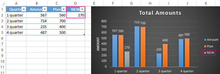
How to build a chart off a table in Excel?
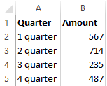
- Create a table with the data.
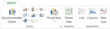
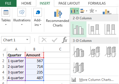
- Select the range of values A1:B5 that need to be presented as a chart. Go to the «INSERT» tab and choose the type.
- Click «Insert Column Chart» (as an example; you may choose a different type). Select one of the suggested bar charts.
- After you choose your bar chart type, it will be generated automatically.
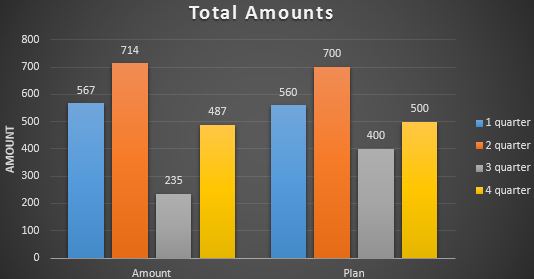
- Such a variant isn’t exactly what we need, so let’s modify it. Double-click on the bar chart’s title and enter «Total Amounts».
- Add the vertical axis title. Go to «CHART TOOLS» — «DESIGN» — «Add Element» — «Axis Titles» — «Primary Vertical». Select the vertical axis and its title type.
- Enter «AMOUNT».
- Change the color and style. Choose a different style number 9.
- Specify the sums by giving titles to the bars. Go to the «DESIGN» tab, select «Data Labels» and the desired position.
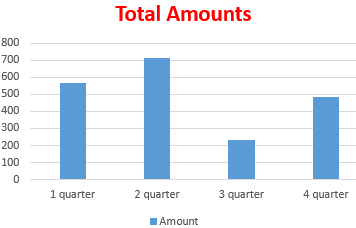
Done!
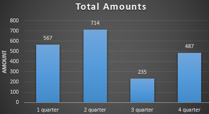
As a result, we have a stylish presentation of the data in Excel.
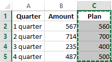
How to add data in an Excel chart?
- Add new values to the table – the «Plan» column.
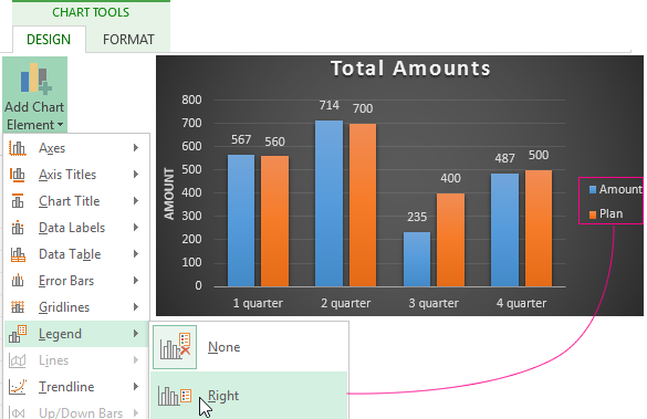
- Select the new range of values, including the heading. Copy it to the clipboard (by pressing Ctrl+C). Select the existing chart and paste the fragment (by pressing Ctrl+V).
- As it’s not entirely clear where the figures in our bar chart come from, let’s create the legend. Go to «DESIGN» — «Legend» — «Right». This is the result:
There is a more complicated way of adding new data into the existing graph through the «DESIGN» «Select Data» menu (open it by right-clicking and selecting «Select Data»).
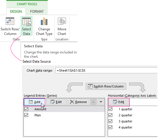
After you click «Add» (legend elements), there will open the row for selecting the range of values.
How to reverse axes in an Excel chart?
In the menu you’ve opened, click the «DESIGN»-«Switch/Column» button.
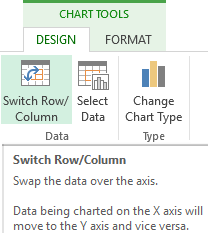
The values for rows and categories will swap around automatically.
How to lock controls in an Excel chart?
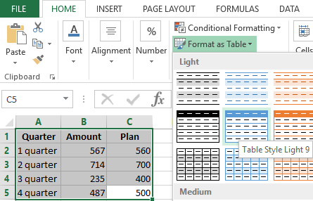
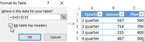
If you need to add new data in the bar chart very often, it’s not convenient to change the range every time. The optimal variant is to create a dynamic chart that will update automatically. To lock the controls, let’s transform the data range into a «Smart Table».
- Select the range of values A1:C5 and click «Format as Table» on «HOME» tab.
- Select any style in the drop-down menu. The program suggests you select the range for the table – agree with the suggested variant. The values for the graph will appear as follows:
- As soon as you begin to enter new information in the table, the chart will also change. It has become dynamic:
We have learned how to create a «Smart Table» off the existing data. If the spreadsheet is blank, start off with entering the values in the table: «INSERT» — «Table».
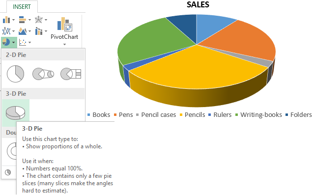
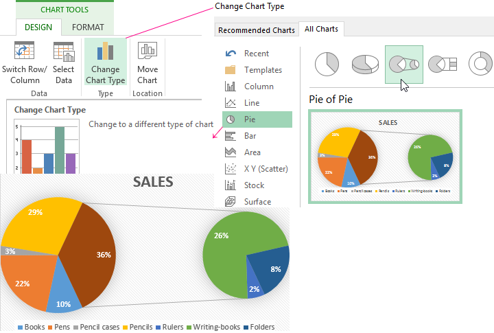
How to build a percentage chart in Excel?
Pie charts are the best option for representing percentage information.
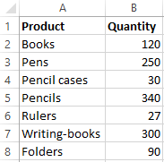
The input data for our sample chart:
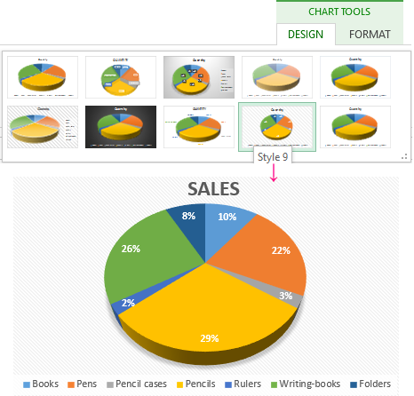
- Select the range A1:B8. «INSERT» — «Insert Pie or Doughnut Chart» — «3D-Pie».
- Go to the tab «DESIGN» — «Styles». Among the suggested options, there are styles that include percentages. Choose the suitable 9.
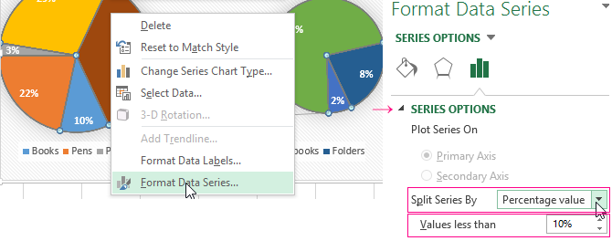
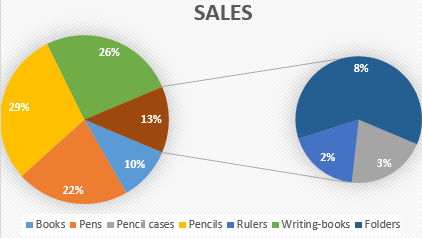
- The small percentage sectors are visible poorly. To highlight them, let’s create a secondary chart. Select the pie. Go to the tab «DESIGN» — «Change Chart Type». Select a pie with a secondary graph.
- The automatically generated option does not fulfill the task. Right-click on any sector. The dots designating the boundaries will become visible. Click «Format Data Series». Enter the following row parameters:
- We have obtained the desired variant:
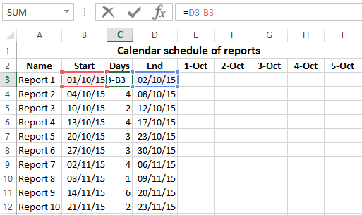
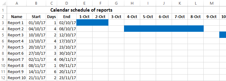
Gantt chart in Excel
The Gantt chart is way of representing information in the form of bars to illustrate a multi-stage event. It’s a simple yet impressive trick.
- We have a (dummy) table containing the deadlines for different reports.
- To create a chart, insert a column containing the number of days (column C). Fill it in with the help of Excel formulas.
- Select the range to contain the Gantt chart (E3:BF12). That is, the cells to be filled with a color between the beginning and end dates.
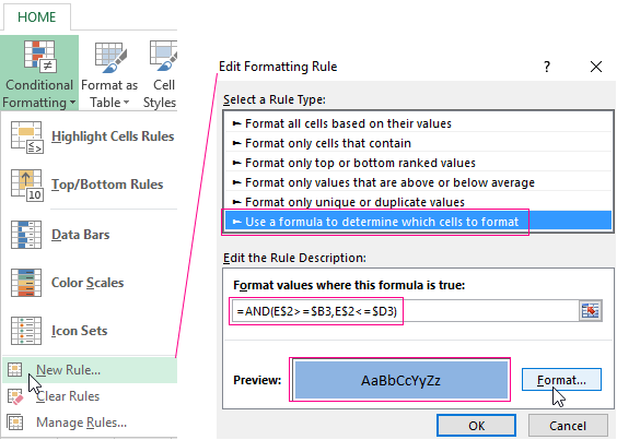
- Open the «Conditional Formatting» menu (on the «HOME» tab). Select «New Rule» — «Use a formula to determine which cells to format».
- Enter the formula of the following type: =AND(E$2>=$B3,E$2<=$D3). Excel uses the operator «И» to compare the date in the current cell with the beginning and end dates. Then, click «Format» and select the fill color.
When you need to build a presentable financial report, it’s better to use the graphical data representation tools.
A simple Gantt graph is ready. You can also download the template with a sample:
Download all examples
If the information is represented in a graphical way, it’s perceived visually much quicker and more efficiently than texts and numbers. It makes it easier to conduct an analytic analysis. It makes the situation clearer – both the whole picture and particular details.
Charts and graphs were specifically developed in Excel for fulfilling such tasks.
Charts and graphs are visual representations intended to interpret sets of data in a visual manner. These representations are commonly used for determining a change in businesses’ different aspects like sales or production. You can usually find this when showing trends, relationships between data, or patterns. Meanwhile, there are several types of graphs and charts you can utilize depending on the set of data you will interpret. Learn its types, ways to make charts in Excel, and discover another effective method to create these representations.
Excel Quick and Simple Charts Tutorial
- Chart and Graph Types
- How to Make a Chart in Excel
- How to Make a Chart Online
- 3 Chart Making Principles
Chart and Graph Types
Charts and graphs come in various types that will allow you to clearly show readers the relationship between a set of data and patterns visually. Below are some of the common types of graphs and charts used. Learn about their characteristics and when to use them.
Types of Graph
- Line Graph
Line graph depicts changing data in a continuous manner. You should see two axes namely the x-axis and y-axis wherein each axis represents data. One of which shows the value and the other displays the timeline. You can create graph in Excel easily when comparing variables or showing trends which is the use of line graphs.
- Bar Graph
Bar graph is another popular type of graph that focuses on comparing values in numeric form. Likewise, it consists of two axes representing the categories and value of each data. There is a rectangular bar with height and length that is directly proportional to its value. This graph is often used to show data comparison among categories. Additionally, you can select between horizontal and vertical bars and create graph in Excel.
- Pictograph
As the title suggests, this type of graph represents data based on pictorial information instead of lines or bars. It shows comparison through the use of repetition of the same icon or symbol. Say you want to graph the number of VIP customers in a certain restaurant every day of the week, numbers of VIP customers may differ every day. Pictograph could be of great help in cases like this.
Types of Charts
- Pie Chart
You can also make a chart in Excel when trying to show the composition of something. The chart for this purpose is Pie chart. The pie comes into parts where each pie slice represents a value of a particular category and their sizes vary depending on how much they represent. This works best for displaying population segments or budget allocations for businesses.
- Gantt Chart
If you want to show project schedules in an easy-to-understand illustration, Gantt chart has a special place. It lists the activities or tasks along with the timeframe for the project. Each task has a bar length that is proportional to the start and end of the activity. You can make a chart in Excel of this type and create a schedule for project tasks.
- Flowchart
As far as the process is concerned, a flowchart is a suitable chart for this kind of need. Most of the time, it is used for illustrating complicated processes to show decisions, steps, actions from start to end. Moreover, it comes with special shapes or symbols for each part of the process. On some occasions, there are legends that explain the meaning of each shape or symbol in addition to the actual flowchart.
How to Make a Chart in Excel
Learning how to make Excel charts and graphs is quite easy. Microsoft Excel can help you organize gathered data and it provides convenient ways to create visual representations. To show you how this is done, below is a simple step-by-step instruction to guide you.
- Launch the Excel app and open a new Excel document. In order to insert chart in Excel, you need to provide all the data to be used and input them in a worksheet.
- Once data input is complete, select the data cells in a worksheet which should be included in the graph or chart you want to make. Then, click the “Insert” tab and select your desired type of chart.
- After selecting a chart type, you should be able to create a chart in Excel in no time. You can further enhance the chart by going to the “Chart Design” tab where you can modify the Axes, Axis Title, Legend, and a lot more.
How to Make a Chart in GitMind
Apart from the above solution to make a chart in Excel, there is another convenient and effective method to create charts and graphs. GitMind is an amazing visual tool that allows you to generate various types of diagrams. This tool provides shapes dedicated to a specific diagram and for general usage. If you want to know how to create Excel chart or graphs but want to try something better, this tool is a great alternative. Find out how to use this amazing tool by following the steps below.
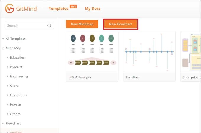
- Search for GitMind on the web then hit the “Get Started” button to use the web-based tool. Download the tool to operate on your computer.
DOWNLOAD
- Next, click on the “New Flowchart” button and you will be directed to its editing interface. Alternatively, you can look for an illustration that fits your needs from the template gallery.
- Get shapes you need from the left menu, resize them and arrange accordingly. Once done, click the “Insert” option and choose “Text” to put labels on the chart.
- You can now customize the look of the chart. Select a shape or text to modify and then look adjust its properties from the right-side menu. You can also change the arrangement according to your needs. Finally, you can export the chart as an image or PDF file.
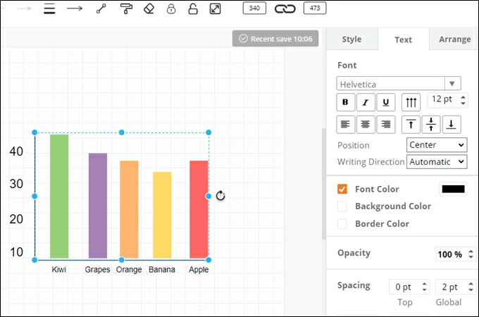
Chart Making Principles
3 Chart Making Principles
You know now how to make a chart in Excel. But one more important thing to learn is how to construct in a way that is understandable for everybody. This includes the font or text to use, placement of elements and so much more. That said, we listed some pointers that may help you present charts and graphs well.
- Neat and clean graph– a clean and neat graph means you are not using too many colors, as well as shocking colors that draw away the attention of your viewers. You should also consider using readable text. Summarize a long text into short while retaining the meaning of the information.
- Appropriate theme– of course, one of the crucial parts is to choose the right theme for the topic. Never also neglect your audience when choosing the theme or style for your charts. In other words, choose the theme you think appropriate for the audience, topic, and purpose.
- Elements placement– some creators fall short of this mistake when trying to create graph in excel. Always look for standard positioning of the elements of your chart including titles, symbols, and added graphical elements. They must be able to convey the message and enhance your presentation rather than confusing your audience.
Conclusion
In summary, charts and graphs allow you to interpret and present information in a brain-friendly manner. The good thing is you can easily create a chart in Excel or using other programs that will make things convenient.